#the piece's color scheme was inspired by the music video as well
Note
Are those Aurora lyrics on your non vasco x machete art?? Sorry i just got distracted by that but your art is SO LOVELY
They are! Big fan of hers.
#answered#anonymous#the “when the last three has fallen and rivers are poison you cannot eat money” line is from her song “The Seed”#the piece's color scheme was inspired by the music video as well
123 notes
·
View notes
Text
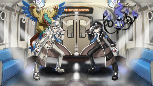
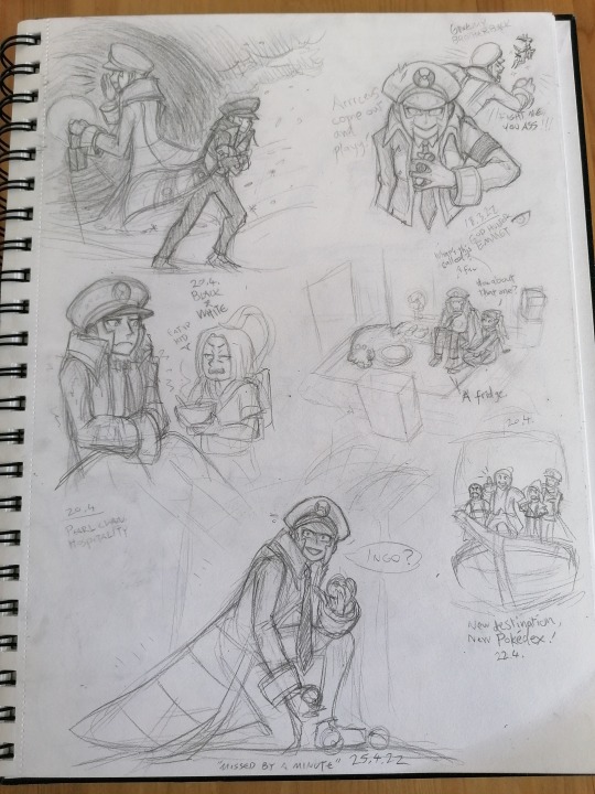
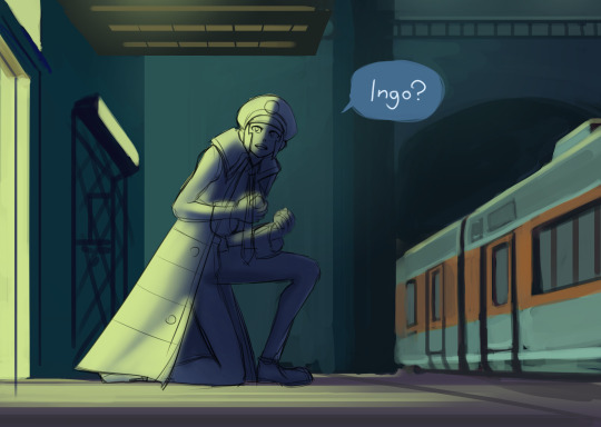
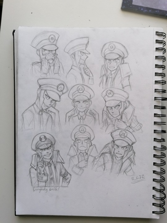
Submas sketchdump! Vol. 1
April-June 2022
Literally dumping all the presentable works as promised, whether I'm proud of them or not! This is where I started, even before the first thing I posted online (That subway station one). Many of these are not on Twitter yet so there's lots to see!
The top piece above the header is my very first digital Submas artwork!! I never finished it bc I didn't know how to pull my vision of as I wanted & started modeling the train and didn't finish that either, whoops! I really want to remake this later and make it super cool!
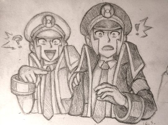
^^^ My reaction to breaking 500 likes & 100 followers in a single day with my first tweet (the battle subway one) all the way back in May!! I was completely floored by all the attention, oh how it skyrocketed my excitement and anxiety! Crazy times, I was so super nervous to be there with so many amazing artists and doubted if I could ever survive there ahahah!! Many had joined the community much much earlier than me, so I had arrived with a late train to PLA/neo Submas hype!
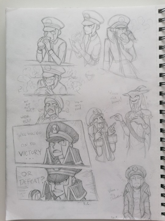
Next up is a bunch of stuff I haven't posted before:

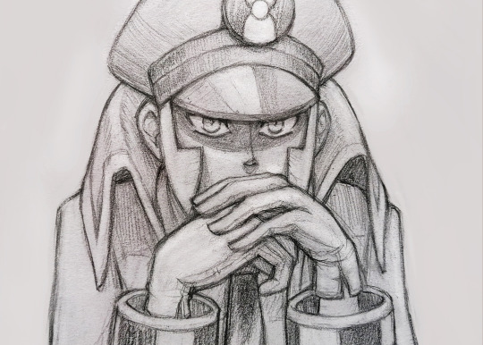
One of my fav sketches! Been saving this for so long bc I really really want to finish this one day!
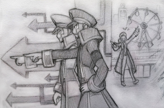
One of the first submas sketches with an actual story behind it! The subway bosses are running late for their flight because they didn't pass the safety check! The irony!! This would never happen as bosses are always on schedule. But Emmet hadn't noticed a wild Joltik hiding under his coat, so he set up the alarm and they got examined and interrogated of smuggling! How embarrassing for them! The bosses resolved the situation by catching the Joltik, but will they be able to catch their flight anymore?? Maybe if Elesa can distract the stuerts performing the safety protocol for a minute!
More sketchbook stuff...


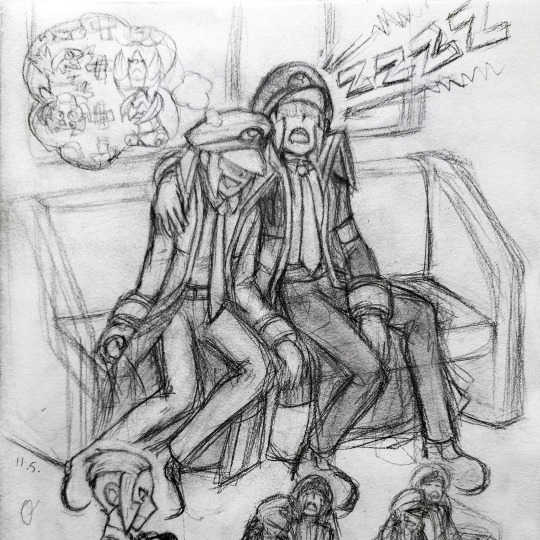
In case you can't make any sense of it, Emmet's dreaming of different combinations of pokémon. Meanwhile Ingo snores louder than the train! HONK SHOO!
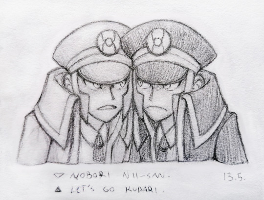
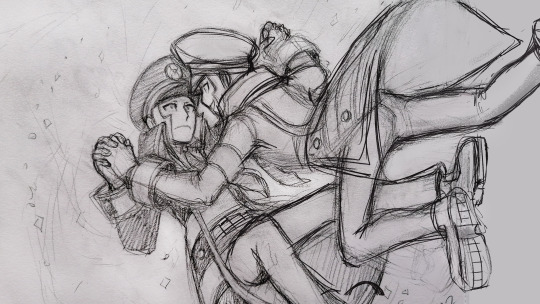
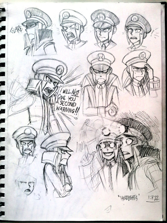
Top 7 every submas fan draws at some point!
Submas trademark posing
submas sleeping in a train
sad Emmet
Emmet with Joltik
Ingo with a cool solo pose
Emmet being chaotic & Ingo reacting to it
a bunch of mirrored submas poses
I sure have a full bingo card lmao, most of them you can see here XD
Next up is a sad man...

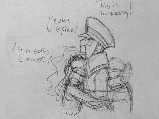
Stay strong our friends!
My typical sketchbook pages, crammed and messy as usual. x)
Post-PLA exploration:
A few examples of how my pencil sketches evolve.

I've done so much art experimenting with submas. I really like this black & white painting but I don't think I'll finish it anytime soon.
Where did you go?
The way I draw the twins' faces has changed a lot. They started with softer features and somewhat neutral emotions, because I wasn't as familiar with them or comfortable drawing them yet. Now there's hundreds of submas sketches, and they still keep evolving! My style is also kinda hard to pull off well, so their features differ from picture to picture.

This one was inspired by some submas music videos, can't recall their names anymore. The glowing eerie eyes and yellow&orange + black&white color schemes were neat!


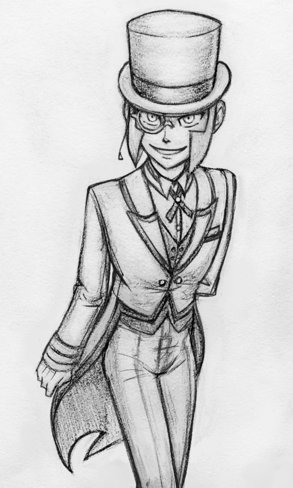
I keep telling myself I need to draw more butlers, these twinks look so lean and neat and have more color and are posh with their monocles and have fun tailcoats!
(...why eyeglasses are not called binocles??)

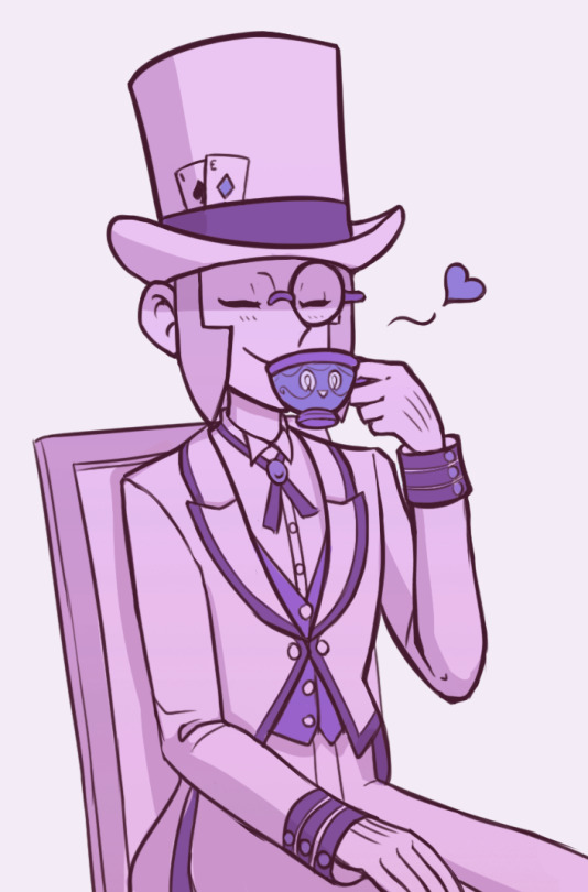
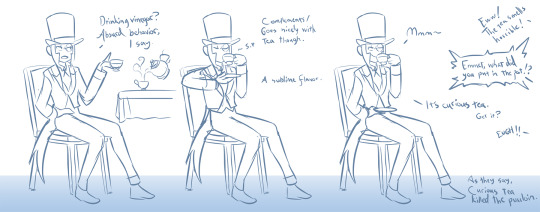
I was there for the vinegar chaos. Good times!
That's all for now, I hope you got something fun out of this! Still got loads more art to share but I'll save them for another time. Next round I'll bring in my first submas comic!
#submas#sbms#submas ingo#submas emmet#pokemon ingo#pokemon emmet#subway boss ingo#subway boss emmet#ingo and emmet#sketch dump#chandelure#archeops#sinistea#submas butlers#butler ingo#butler emmet#too many ideas#butlermas
1K notes
·
View notes
Note
hi tamelee!
I'm here to ask for a little bit of advice if that's okay (: about a month ago I bought a Wacom drawing pad so I could start experimenting with digital art. artists like you here on tumblr have really inspired me to start making art. but I feel kinda.. lost. I've been mostly drawing naruto manga caps and I'm getting better but I guess I don't know where to go from here. coloring and shading scares me lol. I'm using clip studio paint and it's just a little.. intimidating. I feel discouraged, like I won't be able to do it. how did you do it tamelee? did you watch a lot of tutorials, or did you experiment until you figured things out? any advice you'd have for a beginner artist I'd really appreciate.
thank you veryvery much for your time ^^
Hi Nonee! 🧡
Sure!
Oh I think that’s a very good place to start. As well as drawing subjects you like ^^!
Hmm, tbh I’ve just experimented a lot, but I don’t think my way of having done things was the most efficient. You might want to follow tutorials step by step? You can try coloring only with flat colors until you feel a bit more confident with that as well as cell-shading (toon-shading/non-realistic, like in anime) instead of rendering further as that can all be confusing at first. I personally never truly understood shading until I studied cell-shading and made my art a lot more readable. A lot of Anime uses this;

You see how there is a base color, a darker color for shadows and highlights? (Sometimes not even highlights.)
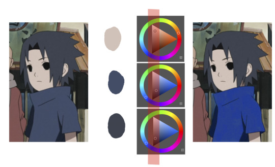
When you start to study it from existing work you’ll start to notice things like color always being in the same area of saturation and when you suddenly have a color that is way more saturated than the other it can look off. (See example.) But this is a guideline, not a rule. In your own art you can especially use saturation and brightness to help aid you to direct a viewer's focus and even tell a story.
I LOVE ‘How to train you dragon’ and ‘Kung Fu Panda’ for this because their coloring is so inspiring and if you truly want to learn from professionals... well those are the type of media to look for of course! I have an entire folder to inspire me just based on those.


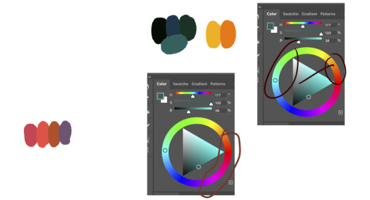
Do you see how calculated those color combo’s are?!?! Here you see both analogous and complementary schemes and it is actually through looking at the things I like that I learned it >< The orangey colors stand out and are bright which helps you to focus on that area whereas the complimentary scheme is used to bring characters together.
If drawing Manga-caps is something you love to do, then maybe for coloring you can study screen-caps from Anime or even other animated films. I’d recommend to take it step by step, though I haven’t really applied it myself, from the video’s I’ve seen and artists I’ve followed it is always advised to have an art-goal that you can work toward. Maybe you first want to focus on lineart and then laying down a base color where the colors are harmonious and next would be cell-shading maybe and then you can start adding another light-source etc- eventually you can decide to create more depth or practice with monochromatic coloring, maybe even greyscale to learn values. But right away that can all sound a bit intimidating doesn't it?
Find things that you like and then maybe you can open them in your program and just study. Find a brush you like, put on some music or a show on the background and for a moment play around with it without needing to create a finished piece. This is also how I learned how things like adjustment layers work or what all the different kinds of tools do. I have to agree with you, CSP is intimidating for me as well >< so this is kinda how I approach it as there are so many add-ons and additions within it but I try to only learn what I need for that moment so I don't overwhelm myself. I definitely try to find video’s that can help me with creating Manga though! ^^ There are plenty!
It'll get easier eventually, you'll learn the program and you start to recognize placements for shadows and you will get a feel for the coloring- no worries 💪 Learning something new will always stay intimidating, every time I open up a new document I feel it too. It's not easy at all, but you kinda have to allow yourself to experiment and even make mistakes because practice is never perfect.
I have some beginner tips written here- I hope any of this is somewhat helpful 🌷🫶
16 notes
·
View notes
Text
TFP MUSIC INSPIRED PAINTING PROJECT (Wowie!!)
Hey gamers, remember this and this art piece from a while back? (the latter of which just turned a year old)
WELL.
I had the idea of hosting a duo of polls to select the next music inspired illustration as a fun little project! The first being to select the song itself, and the second to select the character who will be the focus. (Unfortunately, the character selection is somewhat limited; I’ve only included designs I already know how to draw, as trying to learn how to draw and PAINT a character I’ve never drawn before will be a lot more challenging.) These will be fully rendered full body illustrations like the two up above.
The goal of this project is to try creating something that captures the sort of “vibe” of the music it’s based on, while attempting to also utilize the album artwork (or music video) as an art style influence. (Examples provided down below!) I’ve selected five different songs as choices for this, each of which being pretty different from the last. In varying degrees. Fair warning before I get into what the songs are! They… might not be the most conventional options? And they might also not fit all of the character choices well, like some will fit certain songs better than others in my opinion.
Anyways, let’s begin!
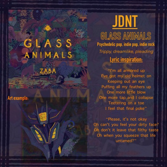
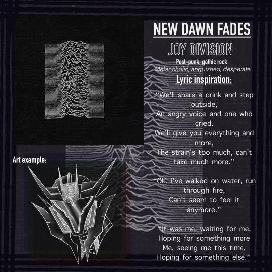
Down below, I’ve made info cards for each song containing information such as: Album artwork, name, artist, genres, what sort of feel I get from the music (which could be subjective), some lyrics I particularly like either from just what they say or what that part of the song sounds like. Sometimes both!
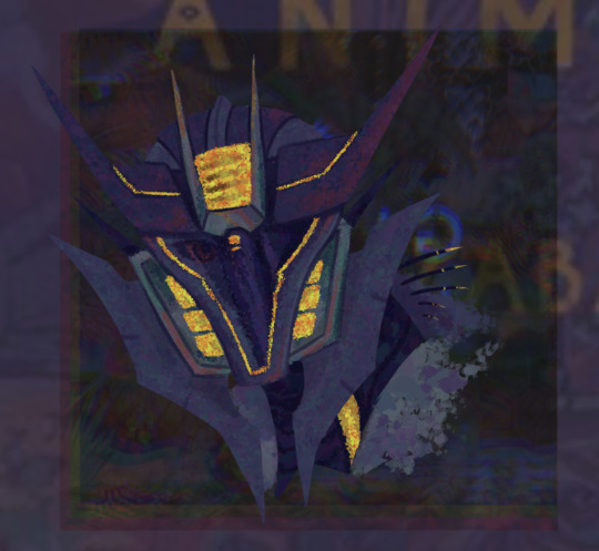
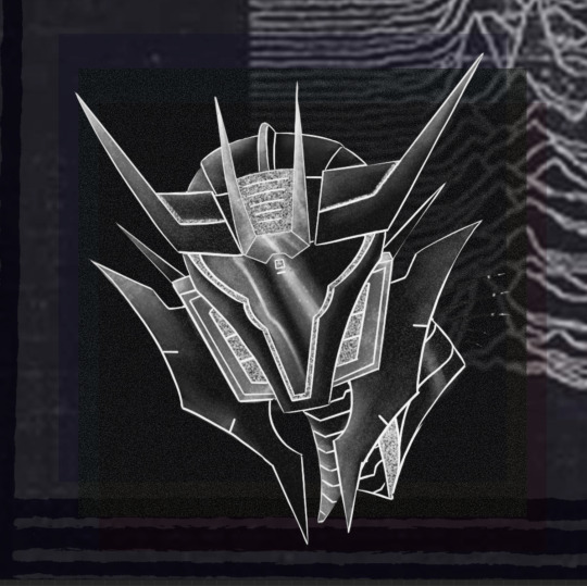
Each of which also has an example of what the piece might look like in the form of this lopsided Soundwave sketch I used as a base. He’s not an option in the character poll because homeboy was literally the subject matter of THREE of the five music pieces I’ve done- with those three being the only rendered ones. 💀 So he’s just gonna chill here as a set of art examples.
Annnnnd it looks like it got compressed as I type this. ANYWAYS.
The general rules I’ll be going off of while working on these are basically as follows:
Color scheme must be similar in some way to the base song’s album art or music video.
Art style should have at least a few influences from the aforementioned references.
The piece should have a similar “feel” to its source material.
The song should at least make s o m e sense for the character who will be drawn for it. At LEAST a section of lyrics.
THE SONGS:
JDNT- GLASS ANIMALS
NEW DAWN FADES- JOY DIVISION
PINK LEMONADE- CLOSURE IN MOSCOW
BLOOD HANDS- ROYAL BLOOD
PROBLEMS- MOTHER MOTHER
And now… the character choices.
God help us all.
This may be a kinda… bizarre project idea, but it’s supposed to be a fun experiment sort of deal! I hope y’all think this sounds somewhat interesting! ^^’
I almost added a sixth song, but I had already been working on those slides for seven hours at that point and I was too excited about sharing it 💀
#maccadam#tfp#transformers#transformers prime#decepticons#art project#fanart#tfp soundwave#tfp knockout#tfp starscream#tfp megatron#soundwave#knockout#starscream#megatron#poll
47 notes
·
View notes
Note
Artist wrapped ask game!
5, 10, 24, 28, 30
YES!
5. What work are you most proud of (regardless of likes/reblogs)?
Oooh that's a tough one! I'm proud of a lot of the things I drew this year, but I think this piece of Juniper with the tigers is my personal favorite. The depth of field and color scheme came out EXACTLY the way I envisioned it.
(con't under the cut)
10. What inspired/motivated you this year?
I struggled with motivation at some points, but really worked on paying attention to what my heart wanted to draw in those stagnant moments. Looking at the work of others was a big inspiration this year - I really want to try more techniques and mediums come 2024, I see so many short form vids of paintings that make me go awooga. I'm also deeply inspired by animation right now, would love to get back into that more seriously as well.
24. What did you listen to while creating this year?
Ohhh ok let's see. Depending on what creative mode I was in...
a) In the early stages of a piece, I usually have on something without words, like lo-fi VGM remixes or movie soundtracks. That provides me background noise (v. important for me, bc my hearing is super sensitive and ambient noises like the fridge humming can really impede my concentration) but still allows me to focus for all the heavy lifting that gets done at the start of a piece (posing, composition, value studies, etc)
b) Once the stuff I really need to Think About is done, I usually move on to listening to podcasts or youtube videos. My big podcasts were Friends at the Table, You're Wrong About, and Shelved by Genre. My big video essayists were Swoop, Hbomberguy, Hannah Alonzo, Izzzyzzz, and Jarvis Johnson. Honorary mention to Dimension 20 which isn't really a podcast or a youtube video but a secret third thing (actual play narrative video series)
c) When I'm just doodling in my sketchbook, I'm usually listening to my OC playlists OR trying to find new music. (Everyone should introduce me to their fav musicians, I wanna broaden my listening!)
30. Share a fun quick little sketch because why not!
Fellow Strixhaven players DNI, but here's a concept for my Sorlock's pact familiar (base form of a tressym) taking on a new form come the fourth year of magic school:
6 notes
·
View notes
Text
Darling, I forgive you, after all
Anything is better than to be alone
And in the end I guess I had to fall;
Always find my place among the ashes…
So, a short time back, I released a poll asking people if they wanted new angst art for Cherish, and the replies given were overwhelmingly positive, so here it is: the first work in a two-part set of angst art pieces.
There is a lot I would like to say in regards to this particular piece and the symbolism behind it, but I think that I will save that for under the cut, due to post length, zoomed in images, and talk of some much heavier subjects.
The idea behind creating these two art pieces was initially to participate in Domestic Violence Awareness Month (which is of course in October, which is also coincidentally Arthur’s birth month), if that gives you any idea of some of the subjects that will be below the cut (along with the usual stuff that I include in all of my art posts).
…And most importantly, if you can, please consider donating to some of the lovely organizations that help victims of various forms of abuse. I don’t want to recommend any particular ones in this post, as I don’t want to accidentally link to a place that may not be as on the level as some others out there, but if you have the time, please explore the Domestic Violence Awareness Month topic online, as I’m sure there are many lovely folks who can direct you to some great ones.
Also, if you think you or someone you know is being abused, or you just want to educate yourself on domestic violence and abuse, please visit thehotline.org and loveisrespect.org, which are two very very lovely sites dedicated to helping people in abusive situations that I myself have visited in the past.
I love you all so much.
Do not repost this artwork anywhere without my explicit permission or claim it as your own. See F.A.Q.s for details.
So, let me start off by saying that Arthur in this artwork was originally supposed to have a similar injury on his head to that which is described in Chapter 13 of my fic, but that was ultimately scrapped as I decided I did not want to be quite that heavy-handed and obvious with the imagery.
With that out of the way, let’s examine the finished piece a bit closer!
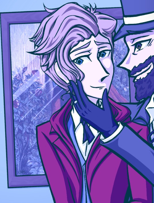
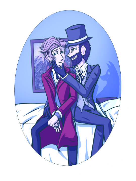
First, let’s talk about the (slightly crooked) painting in the background: this piece is actually not created by me at all, but rather, it is a painting from 1870 called Little Red Riding Hood at Her Grandmother’s Door, by Frederick Warne — with the subject, as the title implies, being Little Red Riding Hood arriving at her Grandmother’s cottage.
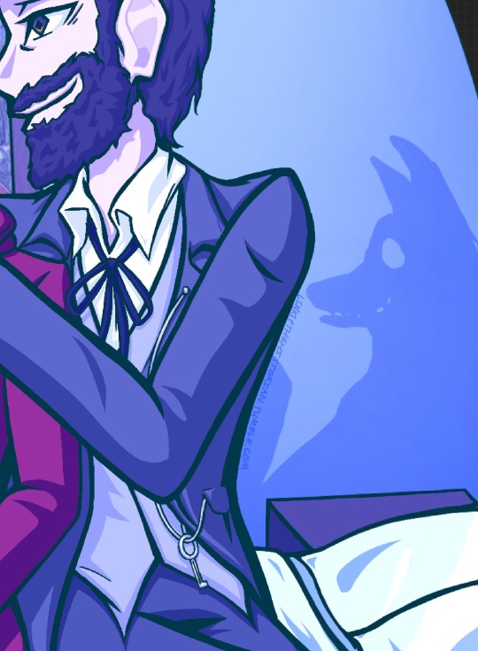
This sets a subtle nod for the main theme of this piece — with Arthur dressed in an outfit inspired by and matching the same coloring scheme of Little Red Riding Hood’s iconic garb. Paul, on the other hand, sports the gray, white, and black colors of the Wolf, with his shadow coming out behind him as an unsettling and somewhat uncanny wolf shape, grinning with its teeth bared.
The purpose of this symbolism is threefold: Firstly and most superficially, the music video for the song that the second piece was most inspired by also has a slight Little Red Riding Hood theme to it, so this can be seen as a subtle nod to it, but more importantly, it not only sets the precedent of Paul as the predator and Arthur as his prey, but also is meant to hold the same implications of sexual trauma — as well as the old physical violence and “wolf in sheep’s clothing” adage — that the fairytale is commonly viewed through the lens of and thought to represent in modern times.
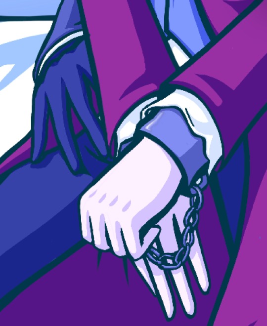
Continuing forward from that idea, we can see Paul’s right hand reaching uncomfortably close toward Arthur’s inner thigh, whilst Arthur’s hands are in chains — lending not only to the sense that the teen is trapped in this relationship, but that his significantly older lover very simply does not care if he wants to be in it or not, and will do whatever necessary to keep him where he wants him — even if it means mental or some variety of physical harm.
Furthermore, if we examine Rimbaud’s hands, we can see that he is making a careful attempt at signaling his distress to the viewer of the photo — using both of his hands to try to show off the chains and also subtly form and display the two phases of the sign for help — at the same time trying to keep his pose seeming as natural as possible in front of his abuser by not facing them towards the camera, but rather letting them rest downward in his lap.
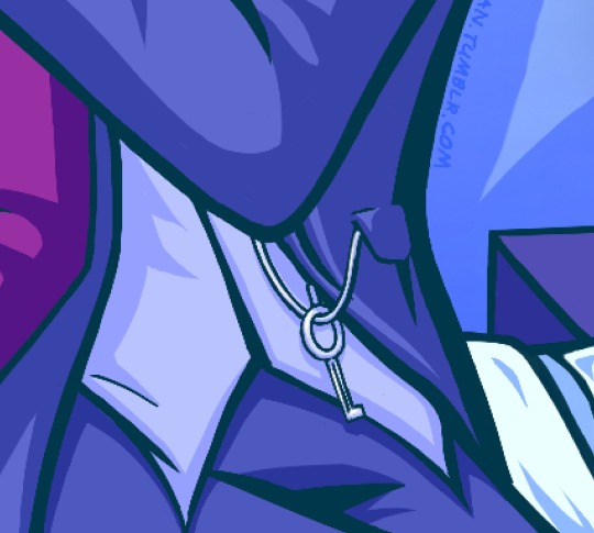
And to further drive home the point that Verlaine is keeping him trapped in their partnership, we can see the key to Arthur’s cuffs dangling from the chain of the stopwatch in the elder poet’s pocket that is fastened to his lapel.
If we then look to Arthur’s and Paul’s faces, we can further determine the mood of the two men by examining their eyes and expressions.
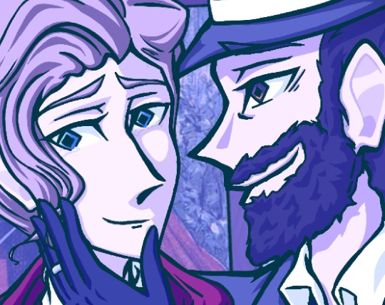
Whereas Paul is staring intently into his young affair partner’s eyes and grinning widely — with the slightest shimmer visible in his irises — unbothered and uncaring of the wedding ring he still has boldly worn upon his hand, Rimbaud will not look him in the eyes, instead glancing off to the side (almost in the direction of his lover’s ring) with lightless eyes (this is the first time I have drawn Arthur without any form of eye shine to emphasize this point), furrowed eyebrows, and only a half-smile on his face, as barely visible tears well up in the corners of his eyes.
…And yeah, that’s been my little deep-dive on the symbolism of this art piece! I really wanted to create something that at just a quick glance would mostly appear happy and cute, but which — like the painting which is only very slightly tilted) would get increasingly more unsettling the longer and closer you looked at it, and I really hope that I successfully captured that feeling in this work and that you enjoyed reading along with my notes on it!
See you in the next piece!
—
Songs I listened to while drawing this:
My Cherish Playlist (the public and currently only partial version of which you can listen to here.)
Lithium — Evanescence (also linked above in lyric excerpt)
Call Me When You’re Sober — Evanescence
Love the Way You Lie — Eminem ft. Rihanna
Love the Way You Lie (Part 2) — Anson Seabra
His Hands — Jennifer Nettles
Concrete Angel — Martina McBride
Alyssa Lies — Jason Michael Carroll
Do Me a Favor — Anson Seabra
Walked Through Hell — Anson Seabra
Haunted — Evanescence
Surrender — Evanescence
Narcissist — Lauren Spencer Smith
My Heart Can’t Tell You No — Sara Evans
My Heart Can’t Tell You No — Rod Stewart
It’s A Heartache — Rod Stewart
I Don’t Want to Talk About It (1989 Version) — Rod Stewart
The Last Song I’m Wasting On You — Evanescence
I Fell in Love With the Devil — Avril Lavigne
My Happy Ending — Avril Lavigne
Because of You — Kelly Clarkson
Please Don’t Leave Me — P!nk
Try — P!nk
Everybody’s Fool — Evanescence
Tainted Love — Chase Holfelder & Tom Evans
Animal — Chase Hofelder
Vampire — Olivia Rodrigo
Memories — Conan Gray
Summer Child — Conan Gray
How Could You — Jessie Murph
(And mostly unrelated to the vibe but I listened to these too)
The First Cut is the Deepest — Rod Stewart
Half a Man — Dean Lewis
Complicated — Avril Lavigne
Before He Cheats — Carrie Underwood
Raise Your Glass — P!nk
Don’t Speak — No Doubt
Whisper — Evanescence
Taking Over Me — Evanescence
Footnote — Conan Gray
Family Line — Conan Gray
#linklethehistorian#linkle’s art blog#bungou stray dogs#bsd#my artwork#my original content#digital art#procreate#iPad Pro#apple pencil#cherish#spoilers#cherish spoilers#Arthur Rimbaud#paul verlaine#my fanfic#verrim#rimlaine
11 notes
·
View notes
Text
DanganDJ Talent Cards


I also want to discuss what special powers I think each Talent gives each character, so here we go!
Rinku can talk to animals (especially monkeys) and/or always knows where True North is.
Maho can sense spoiled food, or cook it such that it's safe to eat again. The reason this fails her in Chap 3 is because the mushrooms she cooked weren't spoiled, they were spiked.
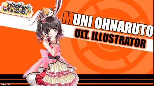
Muni is so good at identifying exact color codes and shades that she can see "more colors" than the average student.
Rei has perfect pitch and/or can "Charm" people with her music if it's a piano piece. (Ex: She can play a happy song and someone who was deeply upset seconds before will genuinely feel happy enough to laugh seconds later).
Shinobu can actually use any weapon IRL so long as she's used it in a game first.
Yuka can tell what type of photo she's looking at, and what edits were made, if any at all, in just one look. This makes her useful in trials since she can determine if something's photoshopped. Or she has photographic memory.
Esora also has a form of "Charm" in that she can naturally get people to do what she wants. She can mobilize a crowd in minutes, which means she can build armies as well as she can build structures.
Ibuki has super-speed and/or the ability to feel and identify others' emotions (empath), inspired by her role as Ult. Team Captain.
Saki is naturally gifted with building machines because of her love of rockets/space. And her Synesthesia can be seen as byproduct of her Talent since space involves working with/seeing a lot of radiation (color) in things that might technically not have color (ex: thermal imaging of a planet). By that extent, Saki could have the ability to see on all frequencies of the EM spectrum, not just visible light.
Noa can she convincingly pull off any act she needs to, and she can always tell how others are acting, and even why, with just a glance. She can also literally throw her voice wherever she wants and rumor has it that she can get puppets to move without their strings. Or she can move them without having to actually touch their strings.
Towa knows enough about idols that she can automatically identify any of them on sight, as well as some of the people they're most likely to be seen with, and she has mild "Charm" powers of her own.
Rika can serve so well that, if she wants, she can literally make fire shoot out from between her hands and the ball.
Saori's calligraphy is so good that she can forge anything (although she sucks at identifying forgeries) or the poetry she writes can actually compel people to do things (Ryota's Hope anime or Junko's brainwash videos).
Marika can shapeshift like Tsumugi, but only into real people, and people whose appearances are similar to hers.
Dalia can either fight with any dance style, has any power related to martial arts (kamehameha!!!!), or can identify poison in drinks if she has a barista Talent.
Tsubaki's voice can hypnotize.
Aoi's jam makes people fall more in love with her.
Hiiro can actually see the future.
Nagisa can turn electric guitars into sonic weapons or literal axes.
Miyu is just always lucky in a good way, though I've also imagined giving her power to connect to the divine (like she can actually speak to deities).
Haruna innately knows laws or good amendments to them, or her leadership can compel people to follow her.
Kurumi can control how successful her pranks are based on how much she allows them to surprise her as well (similar to Nagito manipulating his luck). For example, Kurumi can make a prank to steal something, but based on how much she leaves to chance, that increases the odds of her scheme succeeding in increasingly comical and impressive ways. Or she can tell when people are lying (Kokichi stuff).
Miiko can learn any language, including animal and computer.
#d4dj#danganronpa#fanganronpa#dangandj#d4ronpa#monochio#monyochio#hope's peak academy#hope's pinnacle academy#killing school transfer#crossover#dig delight direct drive dj
1 note
·
View note
Text
Art Block tips that helped me
I’ve recently experienced art block after 3 or so months of overcoming my last one. Thankfully this block only lasted a few days thanks to some things I’ve observed and noted down from the previous time. So I’m sharing these few tips in hopes that it might help someone get unstuck :D!
First and foremost if you’re tired, sad or anxious don’t be surprised that you can’t make art, go and take care of yourself by treating yourself with kindness and patience, the sketchbooks and canvases will wait for you :)
The tips are under here:
Separate art studies from the creative time: When you do art studies you’re there to focus on specific things, learn and understand how things work so you can apply them later in your art. Studies take a lot of energy and focus and are the opposite of the creative "flow” of making your own pieces. If you combine the two the results are either unfocused studies or stiff drawings. When you sit down at your desk ask yourself “Do I want to learn something new or do I want to create something of my own?”
When you have an idea don’t be afraid of being messy: Let’s say you want to make a picture of several cats kolo dancing in the moonlight. How do you go about doing this? Well since you came up with the idea you already have a vague image in your mind, sketch it out with simple shapes, stick figures, circle and spheres etc Don’t worry about cat anatomy, or the dancer’s moves, sketch out the essence of it. This method removes the need to be perfect or accurate.
Ok after the messy sketch then what? Well now that you have sketched out the essence of your idea (and hopefully had fun doing so) now you go on to look for references! You put the creative process on pause and you can do a few brief studies if you need to: anatomy, color schemes, values, poses. Pick out a few of your favorites but don't obsess over them, they are a guide, a tool.
You know much more than you think. You’ve probably been drawing for a few years now. You’ve probably done some studies and drawn more than one type of subject. Then you have already internalized some of that information. I used to be obsessed with capturing the minute detail of the subject, and not be able to draw ANYTHING without reference. Instead of a useful tool, references became another obstacle to my creativity. That’s perfectionism my friend, and that’s no good. Here is an exercise a good friend of mine offered: Draw a few characters, animals and objects from imagination. Make sure that the subjects have no personal value to you (no ocs for example) so that if you make a mistake you won’t feel bad about it. Make the process relaxed and comfortable, pour a nice cup of joe, listen to your favorite music ... You will notice that you do indeed know how to draw some things without reference, and it’ll help with your confidence.
The more you do studies the more you understand This seems evident but the more you understand your subject the freer you can be and the easier it’ll be to draw it from imagination in the future. If you really struggle with something to the point of frustration (as in you can’t get it right even with reference) It means you have to study it. Have a study list, for example: hands, perspective, color theory etc. And one of those days you want to study pick something from the list, and look for videos on youtube or useful sites like line of action etc. Only study one thing at the time. You can go from studying hands to studying arms since they’re more immediately connected, but you can’t study hands and then jump to learning perspective right after. Trust me you can learn perfectly fine with the resources online, and I’m sure you’re clever enough to do it :D
Mistakes don’t mean you “suck” I’ve noticed that the two most common causes for art block are perfectionism and lack of self-confidence. The two can often go in tandem which is worse :’D But let me remind you of something, you can fix your piece along the whole process. Use erasers, lasso tools, liquify , select, paint it all over etc If something looks off to you then you also know deep inside how to fix it. Useful ways to see what clunks: flip canvas horizontally (helps with placement, proportions), turn the image to grayscale (helps to check values and where your eye tends to look), look at your image in thumbnail size and ask yourself if it’s clear, see the pose’s silhouette and ask yourself if you can tell what the character is doing etc. Don’t fret, everything can always be fixed :)
Perfectionism, sometimes it stops you before you begin Perfectionism causes you to overwork a piece, it makes you draw less, it makes art stressful, it brings insecurity. Let’s remove it with a simple exercise. It can be combined with the “draw things from imagination” once you’ve drawn something you like: dont do line art, don’t shade it, keep it as simple and crude as possible and then...post it. Yes, post it. You’re not at your best? You’re only human, this will help you embrace that very human side of you. You make mistakes. So what? The more mistakes you make the more you know what you need to study and the better at art you become. Mistakes are there to show us what we need to learn. See them as another tool and not a sign of failure.
Make the process as enjoyable as possible: You like art. You love drawing. Never forget this. Otherwise why are you drawing if you don’t enjoy it? It’s easy to fall prey to the mentality of those relatable memes that “art= suffering” or “I can’t even draw the other eye”. No no no my friends, these messages are fueling your insecurities instead of overcoming them. Let me tell you what, art is fun. It is. Art is fun, because I decided to make it fun again. And you should decide on that too. Personally I adore lineart but my hand-eye coordination is lacking to do it digitally, so....I just skipped it. Yes. I skipped it. I do the sketch, I clean it up a bit and then jump onto color which I adore. It allowed me to draw more and more freely. When I draw I listen to music, make strokes with the rhythm, I take breaks often and I drink my favorite iced teas. If you don’t like coloring do it in grayscale, if you love lineart then do that etc It doesn’t mean you won’t learn your weak points in the future with studies and practice, but you won’t let your weaknesses prevent you from drawing at all. No no, you won’t let them. You draw because you want to, despite of them.
Don’t wait for inspiration, provoke it Inspiration is not a divine and capricious muse. You make inspiration. It’s easy just collect all the things you like, music, artists, objects, characters, animals, patterns, plants etc Make boards on pinterest or similar sites, combine things you like. You like suits? You like birds? You can draw a bird in a suit, or a bird-inspired suit design, there is frankly a lot of ideas that can spring up from little things like these.
When a project stops being enjoyable either pause it for now or move on to the next thing. Pieces aren’t precious. They’re not “the one time I got x right” they are one of many. This advice goes mainly to hobbyists who can afford the luxury of passing to a new project. I have a WIP of a character who is overly complicated (I enjoy a challenge from time to time) sitting for half a month. I sometimes come back to it and add something... but as soon as it starts to create discomfort and insecurity instead of enjoyment I move onto something else. In the meantime I created 3 or 4 new pieces. If I had waited on finishing that piece I would have been severely creatively and physically exhausted. The art comes from you, not inspiration. The more art you make the better you become.
That’s about it :D I know it’s long but I prefer to be thorough and cover all the possibilities. If you have read of this: Thank you so much I hope this helps you at least a bit, if it helps only 1 other person I’d still be very happy. Have a nice one, and kick art block’s butt!
#art block#art block tips#art block advice#art advice#art help#BloggityDiary#art reference#I hope this will help someone out#This will also help me remember my own advice sksksk
200 notes
·
View notes
Photo

ALEXANDRA SAVIOR is a musician from Portland, Oregon whose songs are painted with texture and enthralling melodies. She shares her take on what it means to be a performer and gives a glimpse into her latest work.
How are you doing right now? What has this past year looked like for you?
I’m not great, I’m grateful for my health and my loved ones. This year has been insane, I’m sure we all feel exhausted. I’ve spent a lot of time selling paintings to make a living, writing songs, watched The Sopranos twice over, etc.
Yes it definitely has been an insane year. So, you released your sophomore album, “The Archer”, years after starting to write it. Some of the songs even predate your first album. What does it feel like to release music so long after you’ve written it? I assume you’re in such a different headspace when songs are coming out than when you were writing/recording them.
Yeah it is a different headspace. It feels like I understand the songs more once I’ve become removed from the environment or relationship that inspired them, and I build them up with instrumentation, I start to see what they really mean. So, yeah it’s a less emotional headspace to release music from, and I think that makes performing and talking about the songs much easier, because you’ve had some time to build up your strength and understanding.
Sort of a follow on, do you feel like you see your songs in a new way once they’re out? Does it mean something else to you when you’re writing it versus when they’re being consumed by others?
No, not really. After my first record, I very quickly understood that people are not going to interpret my music the way I do, and that’s okay! People relate art to their own experiences and knowledge, and sometimes those are different from my artistic intention, but that doesn’t make me feel bad or different about my work.
How was this album’s process different from your first?
I think obviously it’s different because I didn’t write it with anyone else, so I took my time and allowed myself to be more vulnerable. I also did not have a major label, or any label at all backing me when I wrote it, so I had complete freedom to find the narrative I wanted, without feeling any pressure.
In a previous interview, you said each song on the album represents a different emotional state, that you were aware you were going through different stages of grief and trying to understand it. Does writing help you move through those emotions?
Yes, it does. When I write sometimes, sometimes I am very confused as to where they come from, and sometimes I know exactly what I want to convey. But, with “The Archer”, I was aware that I was experiencing rejection and loss, and so that was sort of an easy topic to write around. Writing helps me understand myself and my emotions more than anything. I’m grateful for it.
I feel that artists fall at various spots on the spectrum of taking on a persona (lyrically, performatively, etc), versus not. i don’t think either is necessarily less authentic than the other, but just different forms of self expression. Where would you say Alexandra Savior falls on that spectrum?
Well, I don’t believe that persona is always a conscious or calculated choice. But regardless I seem to be very aware of how terrible I am at maintaining one, if I were better at it I would probably be more successful. Having a persona is like having a mask or shield around you, it’s setting a boundary for yourself so that you can give to the audience and still survive. I think “Alexandra Savior” is really just 12-year-old Alexandra McDermott playing dress up and telling a story, if I do have a persona I think she has completely failed to do her job! (laughs)
You once described your sound as “being abducted into a desert realm where there is a bar with a red light spotlighting the corner of it.” That’s very specific, and I enjoyed it. Would you say that still holds, or is there anything you’d like to add or change about that?
(laughs) Thanks, well I think I was probably stoned whenever I said that, but for my first record it makes sense. I hope my sound has evolved, it’s pretty much conducted of whatever my interests are at the time of making whatever record. For my second record “The Archer”, that was a lot of thermin, Mina Mazzini, and Rosemary’s Baby. So I guess I would describe my sound as “that scary moment in the horror movie where the little kid is possessed and starts rocking back and forth, singing the Lizzie Borden song or like ‘Ring Around the Rosie’, and then glass shatters, and you don’t know if you hate the kid or you feel bad for her because she’s possessed and evil, but she still looks innocent”. (laughs)
In an interview, you mention that your memories are divided into outfits. That comment stood out to me because in various live performances I’ve watched of yours online in addition to your music videos, your style and use of color always stand out to me. I’m curious to know more about what role, if any, fashion plays in your life.
Oh goodness! Well, I’ve always expressed myself through the way I dress, and I think that’s something I really indulge in when I’m performing or making a music video. I think clothing is a great way to express your intention artistically, and I’ve always kind of had a weakness for costumes. If I didn’t have the excuse of being a performer, It’d probably be considered a problem! (laughs)
I heard that you’ve been writing a lot lately. In general, what does that process look like for you?
Yes! Well, lately it’s been different. I’m writing on a nylon string guitar, I just sit there with myself and try to get a chord structure, then the lyrics come together like a puzzle over a few days, I’ve been letting things happen naturally and trying to be completely myself.
What did you take away either from your first and second record that you’re carrying into the new pieces you’re writing?
Well, I realize now that stressing over my music only makes me less productive. I also realize how unimportant my art is in the grand scheme of the world, and that I shouldn’t compare myself to anyone but myself.
I’d love to know more about the Alexandra Savior outside of music. Anything in particular you love doing? Early riser or someone to sleep in? Love to make soup? Hate soup?
Well, I am a huge fan of soup and soup making, so that’s spot on! I enjoy walking in nature, lately with my scruffy mutt Marvin, I paint a lot, and I also love collecting trinkets like dead moths, Virgin Mary statues, shells, and anything gold or glittered.
#alexandra savior#interview#2021#inbtwn mag#the grammar of the questions/writing in this were so weird.. like they weren't really wrong something abt it just felt Off#anyway alexandra is truly a wonder#*
10 notes
·
View notes
Text
Black Monday's Producers Explain Why Confessed and Went to Prison in Season 2 Finale
If you stuck with the joyously demented carnival that is Showtime's Black Monday for all of Season 2, you know it took bonkers to new heights, even for a show that was pretty bonkers to begin with. By the time it was done, we'd seen a half-dead man sing a song through a computer; an epic shoot-out that looked like something out of Rambo; the precursor to the modern-day dick pic via a Xerox'd willy; and a whimsical musical number inside a white-collar prison that celebrated the joys of wealthy white privilege. Yes, the jokes, set pieces, and gags in Season 2 of Black Monday were a lot, in the gleeful, "I can't believe they just did that" way that makes the enjoyably absurdist romp unlike anything else on TV. Season 2 also juggled a dizzying number of overlapping storylines involving financial jargon and backstabbing schemes, with Mo (Don Cheadle), Dawn (Regina Hall), Blair (Andrew Rannells), Tiff Georgina (Casey Wilson) and Keith (Paul Scheer) tangled up in crisscrossing tales of revenge and oneupmanship. At the conclusion of its 10 episodes, we'd seen Mo try to do something right for a change, the once-innocent Blair turn dark, Keith cozy up to the Lehmann brothers, and Dawn land in prison after confessing that she was the one who engineered the Black Monday crash that kickstarted the series. Even if the intricacies of every story turn became a little head-scratching at times, the overall movements made Season 2 like a wild, intoxicating ping-pong match that ultimately finished with Dawn in the clink and Mo back at square one. Why did Dawn tell on herself? And what might a Season 3 look like if the Showtime gods smile on us? Executive producers Jordan Cahan and David Caspe talked with TV Guide about how the madcap season came to be, some of their favorite moments, and what they're thinking about next. There was so much happening inside this season; how'd you map out what you wanted to have happen? Jordan Cahan: Well, that's funny, because I was thinking before this call, as comedy people, it's rare that we get to go story first. Usually, it's like, what jokes, what is a funny set piece. But it's good to go story first, and that was what so fun about the season. We really did talk about where we wanted the characters to end up. What is the final frame of each character? Where are they? And then the real question was, how do we get them there in a way where we're juggling all the characters but where you can't get so cleanly ahead. So that it feels like a drama where the journey is exciting and unexpected, but hopefully at the end, it all feels like it makes sense. We're not used to doing that for comedy. I think the fun of that was looking at a board and bringing out where the characters' peaks and valleys were and how we could get them to all interact. David Caspe: I think the end game that we were excited about was Regina [Dawn]. The room as a whole got to a place where they're like, "Okay, the most interesting thing is that a Black woman is responsible for [Black Monday] which was actually a brilliant trade, but also something very illegal. There's such an interesting dichotomy of wanting the credit or something that also would take you down, but being so frustrated over the course of the season that you're not getting the credit you deserve, that in the end, she basically turned herself in to get the credit more than anything. We had where everyone begins and we had where Regina ends and we had to figure everything else out. Black Monday Wasn't Conceived with Black Leads, but It's All the Better for ItOne of the things that stood out to me was the feminist theme of the season. You have Dawn in charge of a mostly female firm at the start, and then this subplot where Wayne (Horatio Sanz) is this incel character determined to punish women. Was Season 2 intended to be an overtly feminist statement? Caspe: I think every character we have is, for lack of a better word, not a straight white man. Looking at how they have to navigate today through the lens of the '80s is really been what the show is about a little bit and I think inevitably women are a big part of that. The Just for Men thing from Wayne was very much about a lot of men's reactions to like, the female Ghostbusters and stuff like that just felt insanely ridiculous to us. It just felt natural that if we've got this woman who was the mastermind behind Black Monday, she would break the glass ceiling and start this all-female firm, but inevitably you're gonna have one of these sort of incel type-men who reacts in this misogynist way. You see it constantly now, as a reaction to the Time's Up movement. They always frame it as like, "I'm a men's rights activist," which, you know, straight white men don't need activists. They've done just fine. So a lot of the story is, "How did we get to the end game?" We really wanted all the characters and stories to be very interconnected. You've talked before about how your writers' room is mostly people of color and/or women — and you had that in place before the new push for more inclusivity behind the scenes. Do you feel like you were ahead of the curve there? Cahan: Saying it's a mandate is sh---y. For us, it's always been our absolute desire to have the most diverse rooms as humanly possible. I've never worked any other way and I won't. Yes, it happens to fit this show hand in glove, but I just think it's the way shows should be made. Caspe: And it's also selfish, frankly, in that you get a better show that way...the more perspectives you get and voices you get in the room [you get] more variety of hilarious jokes and experiences that inspire storylines.
Cahan: I can think of two or three storylines that I would be really afraid to touch, that would be like third rails, and the room was so encouraging going in that direction. Ultimately, you want them to lead you. Not only did it end up educating me, but I think it makes the show richer. Dawn borrowing from what is essentially the United Negro College Fund. Stories like that where it's like "Do we really want to do this?" and then having the room get so excited, to put that character in such a difficult moral pose
Caspe: And the story itself is just not one that I would think of. The relationship between Dawn and her mother is informed by Black women in the room. I wouldn't have come up with the nuanced, intelligent version; I would come up with like, an outsider looking in assumption of it rather than something that felt authentic. A lot of [Blair's] story was inspired by people that went through similar things of what it means to be gay in a religion that doesn't accept it. That's not my story to tell; I also don't know it, because I haven't been inside it. Let's talk about the brilliant song "White Collar," Keith sings in Episode 5. How'd that come to be? Cahan: We knew we wanted to [take on] Club Fed because it was such an '80s anomaly. And it was so weirdly written about in the '90s as like, "Can you believe this happened?" It felt almost like a Simpsons-style step out where all of a sudden you're seeing things...it felt like a fun, silver bullet way to describe what you're seeing in these prisons but in the same way but a silly, fun thing that stretches the limits of credibility where we didn't know if we could pull it off and still feel like you're in the real world. Caspe: It was very inspired by the Simpsons musical numbers. Cahan: It was "See My Vest" from The Simpsons. It was Maison Derrière Simpsons. We probably pulled the rubber band back as far as we could with that one. In that vein, the visual gags and set pieces in Season 2 went to a new level — the bank shootout, in Episode 3 ("The Idiot Inside") for example, the most over-the-top. What were your favorites of the season?
android tv box
Cahan: I would say the things that got me excited are on two ends of the spectrum. And I'm sure Dave's would be different but on one end, the bank is as ambitious anything we've ever done. I mean, the idea of not just making it a little music video or alluding to it, but actually playing it, and really destroying that bank digitally and physically, having to do a lot of practical effects and plotting that whole thing out. We had never done an episode that didn't have a B-story. So we have never done an episode that didn't cut away to the other characters. So it was very much like writing a play, but a play that could get explosive very quickly. I can't tell you how much fun it was for somebody who grew up with '80s action movies and loves them so dearly, to be able to do that. And then weirdly, on the complete other side of that, I would say the very next episode, which was on purpose, was the country club episode. We wanted it to feel zany and goofy, almost like a Three's Company episode in the same way that our bank episode feels like a Miami Vice or something like that. The country club episode deals with race and class and sexuality and religion; we really wanted that to feel like a farce. And I think I think we got really lucky with our writers, directors. I really love the way the show can go from one complete extreme to the other. It sure seems like Mo is full-on in love with Dawn, but he just can't seem to get over himself. What's up with their dynamic and why he's so reluctant to be vulnerable with her?Caspe: I think this season he was a victim of circumstance, which was like sort of the most tragic [part]. Usually, in the past it's been his own ego and his own lack of vulnerability that has [messed things] up with her, you know, I think this season, he was getting on that plane. He was going to disappear forever. Now granted, he had just completely f---ed her over, but he was completely f---ed over by her Black Monday. She did steal his entire company and basically took all his money. So he was pissed. And he did his one last piece of revenge to screw up her bank deal. And then he got on that plane and was leaving. When the FBI caught up to him, they forced him back to help them find who was responsible for Black Monday. And in that respect, he was trying to keep Dawn out of it, and he was genuinely trying to steer them towards Blair and saved Dawn.
He just kind of wasn't able to. But he really was trying to do the right thing by her. I also think we were trying to look at [how] there's still sexism within races or cultures. When you flashback to him, he genuinely looked at it as like, I'm the one who got the seed money, I'm the one who got on the [Wall Street] floor. Like I think it never occurred to him that Dawn would have been his partner. Mo has some sexism [about him] too. Discover your new favorite show: Watch This Now!But, he's willing to take the rap for her. I read that as a sign of his deep abiding love for her, and I reading that wrong? Cahan: No, you got that. He literally says, "I'm going to be the tragic hero." He's trying to display that he's changed. At the end he runs into Keith and Keith is basically telling him "You are going to go away for life." And Mo continues on. He goes to the FBI and he confesses, he's willing to do the sacrificial thing. Where are you thinking about for Season 3, if you get renewed?Caspe: Maybe the '90s. It's almost '89 by the end of Season 2, so there's something interesting about 1990, or even jumping ahead.
Cahan: I'm really excited by where the four chess pieces are. We really wanted to position them in these exciting places. Season 2 starts with Blair making a deal with Tiff and they have this understanding, and they're going to help each other. And by the end of the season, you can see she's kind of terrified of him, and how far he'll go for power. And we get a glimpse into his background and know that when his back is against the wall, he's not afraid to push back all the way to protect himself. Now I'm like, "Oh, God how bad is this going to get?" I think for Mo, it hinges on a little be careful what you wish for. Now he's inadvertently got the immunity he's always wanted. All of his old transgressions are wiped away.android tv box
He's a new man. He can start again clean, but the question is at what cost? For Dawn, we were very careful to not mention how long she'd been put away or how deep of trouble she's in. But clearly it's a very serious crime. We've painted ourselves into a corner of how could that possibly work? And then for Keith it's another be careful what you wish for [situation]. He's finally found someone who really appreciates him. But there's a bit of a Single White Female relationship. I feel like if Season 1, we painted ourselves into a corner, I think Season 2, it would be even more fun to watch how these four people, who seem to not be able to get out of each other's way, and their lives would continue.h96 tv box
Last question is, in the final moments, we see Lenny, that poor twin who's just come back from the brink of death, being attacked by a wolf after being left in the woods by his brother. The guy can't catch a break. Is he dead, or just in bad shape again?Caspe: I think it would be the same thing as Season 1. So if he died again at the end of Season 2, if you're a betting man I would bet on Lenny's triumphant return at some point in Season 3 if we get it, probably even more mangled than he was at the end of Season 1. In classic '80s villain.
1 note
·
View note
Text
Now let’s be creating some little statements with a new brand! This company got in touch and wanted me to test out their products. At first, I thought they were a little different to what I was used to (mainly because they’re a thicker denier with different designs) but I really had to give them a go.
I have to say their whole brand is pretty quirky – and it’s something that is right up my street as long as I can style them right!
Oh and this is also Blog 1 of 2 – I have another one coming up for you all tomorrow 🙂
About 77Denari
77DENARI is an Italian line of tights & socks of Italian manufacture produced in limited edition.
The line has an experimental and at the same time ancient character: the tights, of an elastic nature, are in fact printed according to the original artisan method and with water colors, a technique in use for “still” supports of natural origin.
Every single graphic element has changed to a frame, thus becoming an absolutely prized piece, a unique piece, and the ethical-aesthetic choice of using water colors alone makes the product complex and innovative; therefore the study of colors, designs and print media are the result of a combination of ingenuity and magic, feasibility and disruption of the rules.
77denari was born in 2012 and is composed of 8 tights / stories per collection; starting from 2018, 77news grows and launches the Socks collection, and the “STRIPPANTI” Other Line.
The entire creative and printing process is carried out by the two founders of 77denari, Simona Berardi and Carla Armillei, and is inspired by the crude vision of geometric elements typical of the instinct of Nature.
77denari also boasts the collaboration of various artists working in the field of graphic design and illustration, photography, music, video and styling. Each of them supports the project becoming an integral part of the creative process; their participation opens the circle of possibilities towards still unexplored and seductive alchemies, and they contribute to creating, for the 77DENARI project, an imprint that is renewed over time.
The idea on which the project is based is the desire to give “beauty” an extra value, in which harmony and proportions of the parts go beyond the absolute, of time and memory, and focus on the “Physical soul” of intrigued consciences. In this case in fact the work is worn and moves: it walks, runs, dances and lives stories, reinterpreting the proposed contents with its own voice, and in the meantime creating a new identity.
Tights – talisman therefore, capable of breaking the classical scheme of gender and form and of ruffling with wonder.
A special thanks goes to the “DUEC Calzificio” and to our consultant Renato Altimani.
– taken from their website
The Spec
Colour: Cream
Style: #55
Size: One Size
Denier: 60
Materials: 85% polyamide, 15% elastane
Price: N/A
Website: 77Denari – A/W 18-19 #55
My Outfit
Instead of creating something loud, I thought I would incorporate the tights into my outfit. I wore my cream bodysuit paired with my teal skirt and added my mustard boots to finish off the look. You could easily pair any other colour footwear with them to create a colour block, but I wanted to fuse it altogether to create a piece 🙂
My Deets
Bodysuit: Pull & Bear
Skirt: H&M
Tights: 77Denari
Boots: New Look
The Review
From The Website: 77denari, for autumn-winter 18/19, explores the vast world of feelings, and the multiple points of view they can generate. Thanks to the senses, the body in fact receives information from the interior and exterior environment. They are accessing the world itself within us. Each of them has the ability to form a perceptual opinion before the action of intelligence.
We have been taught that there are five senses: sight, hearing, taste, smell and touch, and that is anatomically, but also admits that we have a thermal sensitivity, and we know how to recognize the sense of well being, pain, or discomfort of the organism as a whole.
For this reason 77denarians have explored various currents, which have identified from 9 to 21. We have embraced 12 of them; precisely 7 more than the 5, through which we think we can fully experience our perception, and then transform us into what surrounds us, to try to increase that degree of cooperation, according to which individuals build together a reality and a shared truth.
– 100% made in Italy: the basic pantyhoses and socks are made by Italian manufacturer DUEC Calzificio located in Goffredo Castiglione;
– 100% handmade screen printing: no use of printer;
– composition: 85% polyamide and 15% elastane;
– one size fits all: the basic product is extremely elastic for sizes S-M-L;
– drawings only with water colors;
– limited edition: max 100 pieces for model;
– high resistance and durability of the design: hand washing at 30 degrees is recommended.
The Packaging: now I have to say how impressed I was with their packaging. They were sent in a super padded envelope, in 2 small boxes.
Very simple, but they are certainly different and I love it. Even though there isn’t much detail to them in terms of model, sizing, blurb about the hosiery etc, they still aren’t bad at all.
Getting Them On: now as the pattern is symmetrical on each leg, I took my time doing the scrunch and roll up the legs making sure I pair it as evenly as I can so I don’t have to do it again later.
These were fine rolling up the legs, and going over anklets. I had no issues at all – if anything they were super soft and so easily to glide right up.
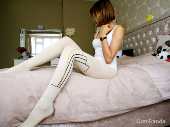
On The Legs:
well all I can say is how funky are these?!?!?!
The quality of these are really good I have to say. They are such a gorgeous fit on the legs; even if they are a one size pair! They have so much stretch to them and really do hug the legs well. I expected them to be slightly loose, but in actual fact that is not the case!
They look like they are a block cream colour, but if you stretch them (like how they stretch on my thighs) they do go slightly lighter. You still do get really good leg coverage overall, but it’s something to note if you want a true opaque block colour.
The design is super awesome; I have done something similar a while ago with a Jonathan Aston pair (called Dynamic) which was black sheer with a black design and they really rocked. I love how they have worked the black and goldy-yellow colour at the side of the legs, which gives you the opportunity to actually pair up colours easily with it. As I mentioned, I kept with my mustard boots, but I could have easily done purple or blue (with a different skirt too) and it would just enhance the colour and design even more.
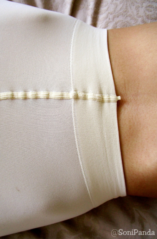
The only downside I had was that the print was a little off on the left leg; it’s like it got stuck and slightly peeled off a little. It’s nothing major but if I’m going into the nitty gritty details, that is something I picked up on when I got them out the packaging.
The fit of these are great; as I said for a one size pair, these are fab. I do feel it could fit up to a large size but you would be looking at a sheerer cream colour than a block opaque.
The feel of them are super soft and so nice on the legs. They’re smooth (both inside and out), they’re soft to touch and they really do caress the legs.
The Toes & Ankle: are also great. I expected some chunky seams around the toes creating little bumps around the ends but nothing of the sort. They fit and shape to the toes really nicely so you get a smooth looking finish. This also carries around the foot and up the ankles too.
You will find these will wrinkle slightly around the ankle due to the higher denier, but nothing too major.
I do think these are reinforced – and I will say that as the denier is quite thick so it would be pretty hard to create holes in these!
The Waistband: is so soft and so comfortable I don’t wanna take these off! I love the way they sat on the waist and actually just moved with me. They don’t fall down or move out of place once you set them, and they certainly don’t lose elasticity quickly either no matter how many times you pull them down and back up again.
It’s a proper comfort band, and I really like it!
My Thoughts?
I gotta say I really loved being in these. They were such an experience. I know most higher denier can be a hit or miss, but these are a pair which I would class as a luxe pair. I say this purely because of the way they are made, how they feel on the legs and the quality is just lovely. Trust me when I say when you roll these on, you instantly tell what they’re gonna be like for the next 10+ hours!
I am so looking forward to my 2nd pair I get to try out!
77Denari A/W 18-19 Cream Printed Tights Now let's be creating some little statements with a new brand! This company got in touch and wanted me to test out their products.
19 notes
·
View notes
Text
2 - The Peacock Room & Filthy Lucre

Image Credit
This week’s episode explores the unique story behind two related objects: The Peacock Room and Filthy Lucre.
LISTEN NOW
Resources Used (in order of reference)
The Peacock Room Comes to America
The Peacock Room in Blue and White
The Story Behind the Peacock Room’s Princess
Filthy Lucre
Filthy Lucre Events
The Peacock Room: REMIX
Smithsonian Press Release on Filthy Lucre
The Making of Filthy Lucre This Far Blog Post
Further Readings
Washington Post on Sackler Family
Forbes on the Louvre
Time on the Louvre
Observer on Sackler Family
Smithsonian Video on Peacock Room: REMIX
For show notes, keep reading.
Greetings and welcome to Alternative Artifacts, a museum in your ear, the podcast that explores the strange stories behind the most unique objects in museum’s collections. Ever wonder how a gigantic Naked George Washington ended up in the American History Museum? Or why there is an entire museum dedicated to art made from human hair? Now you can listen to the stories of America’s most iconic objects from your favorite exhibit or from the comfort of your own home. My name is Lexi and I will be your tour guide.
[Transition Music]
As mentioned in our previous episode, this season is focused on the Smithsonian Institution. Throughout this season, some of the object’s stories we explore will expose the complicated, colonial history of the Institution, some will reveal how museum methods effect objects, and others will provide a glimpse into the lives of objects beyond the confines of the museum. Today’s objects represent a cross-section of these topics.
What do you picture when you picture an artifact? Is it something manmade or natural? Does it fit inside a breadbox? Or could it be an entire room? Today’s first object is in fact, an entire room. If you ever visit the Freer|Sackler Gallery in Washington, D.C., you will notice that one gallery sets itself apart from the rest. You see, the gallery itself is a piece of art. This work of art is The Peacock Room, a decadent, excessive expression of wealth which is sometimes home to rotating displays of Chinese porcelain and has occasionally been left empty to accent its own artistic prowess.
[Transition Music]
The history of The Peacock Room is complex. It is a story fit for a historical drama, entangled by conflicts over money, creativity, and presentation. Frederick R. Leyland was a rich shipping tycoon of nineteenth century England. His personal hobby was collecting Chinese porcelain. Frederick displayed this vast collection of porcelain in his dining room. On one wall of the dining room, he presented his most beloved possession and the focal point of his home, a painting by James McNeill Whistler called The Princess from the Land of Porcelain. This painting was a fitting accent to the vases and bowls which surrounded it. The painting depicts a Western woman dressed in traditional Chinese clothing.
Eventually, Leyland’s collection outgrew his current dining room. In order to design a new display place for his collection, Leyland commission the architect Thomas Jeckyll to update his space. Considering the importance of Whistler’s painting in the overall aesthetic of the room, Jeckyll decided to ask the artist to work alongside him. In particular, Jeckyll was hoping Whistler could provide guidance on what color scheme would best suit the painting that Leyland saw as the focal point of the room. However, in the middle of the project Leyland left London for a trip, and shortly after, Jeckyll fell ill. With Leyland abroad and Jeckyll unable to work, Whistler gained total control of the design of the room. Going beyond his duties of assigning colors, he began to develop intricate details for the room, including designing the golden bird patterns which would later give the room its infamous name. Returning from his ventures, Leyland arrived to his home and instead of a classy new dining room found a goody, overdone art project, with a price tag far higher than he initially proposed. When Leyland refused to pay Whistler the full commission for the extra work he had completed by his own will, the angry artist just kept adding even more gold-gilded birds to the wall of the dining room. In a flash of rage, Whistler painted two shimmering, gold peacocks, mid-battle, on the wall directly opposing The Princess from the Land of Porcelain. This duel of featherful fates was a metaphor for the tension between Leyland and Whistler. The artist titled this portion of the room Art and Money; or the Story of the Room. Or as I like to call it, “You are tearing me apart Leyland.”
In 1904, Charles Lang Freer, a Whistler collector who had already purchased The Princess from the Land of Porcelain, purchased the rest of the Peacock Room. He had the room dismantled, packed, shipped across the sea, delivered to his home in Detroit, and reassembled, reuniting the princess and her peacocks. Over time, Freer filled the room with his own personal collection of ceramics from Japan, Korea, China, Iran, and Syria, a collection which would later become the permanent collection of the Smithsonian’s Freer Gallery museum. When the Freer Gallery of Art was first opened in 1923, the Peacock Room was installed as a permanent exhibit, serving both as an art piece and as a place to display artifacts. The Freer has been its home ever since. But in 2014, the Peacock Room, for the first time, was forced to face its own reflection.
[Transition Music]
You walk into a room of red light and melted gold. You feel a shiver run down your spine. It appears as if the darkness itself has weight. An eerie familiarity lurks between the rows and rows of broken vases, each painted a unique shade and pattern. They crack and crumble, many of them barely remaining on the shelves. Some of them have already reached the floor, leaving traces of their former form in a smashed trail behind them. The emotion invoked here begs you to ask, “Where have I seen this before?” From behind the walls and under the floors, the sounds of womens’ voices and strange, distant music echo. They whisper, “I am a thing of beauty.” Or is it the mysterious painting of the faceless woman, the one in the kimono, is she whispering? A red light blares behind closed shutters on the wall, like blood emerging from a fresh wound. Above you, two huge birds vie in a life or death battle, their golden wings outstretched. They seem to tear at each other's guts, both beautiful and tragic with their intricate and shining feathers. With your eyes, you trace the melted gold which runs down from this image and across the hardwood, reflecting the red rays in the false windows. This piece is not just a feast for the eyes. Rather, it is an experience for the whole body. This is Filthy Lucre, a twisted, modern update of The Peacock Room.
Filthy Lucre is the modern piece which serves as an in-depth commentary of the role of wealth, art, and power in both modern and historical contexts, using the original Peacock Room and it’s story as a guide. Filthy Lucre is Darren Waterston’s dynamic response to the Peacock Room. In Waterson’s vision of the infamous piece, he uses artistic metaphors to demonstrate how the tensions developed by the creation of the intricate room represent the social tensions of modern America. For example, the melting gold which runs through the desk, onto the floor and even outside the room, represents the “Gilded Age,” in simple terms a time when things seem to be going quite well, but underneath it all they are corrupt. An age “gilded in gold”. Not only does Waterson intend to reference the Gilded Age of the nineteenth century, but he also intends to evoke conversations about the modern Gilded Age in which we live now and use the historical time period as a metaphor.
Filthy Lucre serves as both metaphor and commentary, connecting images from the past to issues of the present. In 1876, Whistler saw Leyland as a crook for hoarding his excessive amounts of money and refusing to pay for the painter’s services. This act was a microcosm to the state of the world economy during this era. As more nations were industrializing in the nineteenth century, it seemed the rich grew richer and the poor grew poorer. Waterson effectively paralleled the image of the Gilded Age to today through the visual cues his piece. When you see gold running down the wall and onto the floor, you may pause to think of the exuberant spendings of the wealthy in our society. These lavish purchases, much like gold melting along the floor, hide the dark modern issues surrounding how money is acquired. Beyond the visual cues in the room, sounds make a strong stance for Waterson’s themes. The voices and music in this room come from three women who call themselves BETTY. Generating a score for the room, they use ambient electric string instruments and they repeat the mantra “I am a thing of beauty,” which they speak eerily and haphazardly. This draws in the visitor, both with fear and curiosity. In the context of the room, the sounds continue to convey a theme of the destruction and distortion caused by wealth. Just as the melting gold and broken vases conjure images of wealthy negligence, the whispers of women convey vanity, a trait often associated with the rash decisions of the wealthy.
In a modern world plagued by hunger, homelessness, and poverty, the rich still grow richer and the poor still grow poorer. In this way, Waterson compares the state of the world which inspired Whistler’s artistic vision to the state of our modern world. The artist presents a dominant theme of negativity towards those who choose to hoard excessive wealth, even at great cost to the poor. This theme directly connects to the title of the piece “Filthy Lucre,” which is a term literally meaning “money, especially when gained in a dishonorable way.”
Interestingly enough, the title and meaning of Filthy Lucre itself directly relates to a very current issue in the museum industry: the issue of museums taking money from philanthropists who earned their fortunes in an unsavory way. Arthur M. Sackler, for whom the Sackler Gallery at the Smithsonian is named for, is a member of the Sackler family. It has recently come to light in the museum community that the Sackler family’s Pharmaceutical business was heavily involved in the sale and spread of an addictive pain killing drug in the United States, which has lead to the death of many Americans. For this reason, protestors have asked many institutions including the Met, the Louvre, and the Smithsonian to erase the Sackler name. The Louvre was the first to fully remove the name, but the Smithsonian has asserted they will not be removing the name for the foreseeable future. If you are curious for more details, please review this week’s further readings that I believe show a broad scope of details surrounding the issue and address it in a much more thorough manner than I am possibly capable of.
[transition music]
Unfortunately, you can no longer see Filthy Lucre, which was on display at the Smithsonian Freer|Sackler Gallery as part of an exhibition called “Peacock Room:REmix” from 2014 to 2017. Currently, there is no set date for another exhibition of Filthy Lucre, but photos of the piece are available on the artist’s website darrenwaterston.com. You can, however, view the Peacock Room daily from 10am - 5:30pm at the Freer|Sackler Gallery, 1050 Independence Ave SW, Washington, DC. The current display featured in The Peacock Room is called “The Peacock Room in Blue and White” and it is a collection of Chinese ceramics, representative of how the room looked in the 1870s when Leyland was the owner. The Peacock Room shutters are open every third Thursday from noon to 5pm. Viewing the room with the shutters open provides a whole new perspective, allowing visitors to see the way the natural sunlight accents the colors of the space. In extreme weather, the shutters are not opened.
Now, the museum tip of the week. Missing the sticker activity books of your childhood? Love museums? Check out Stickertopia: The Museum by Quintet Publishing Company. The book is avaliable for $7.89 at Barnes and Noble, and you can check for local availability on their website. Stickertopia and Barnes and Noble are not sponsors or anything, I just am an adult who loves sticker books and appreciates cool design and I wanted to share something that makes me happy with all of you.
Want to learn more? Show notes including sources, further reading, links to cool stuff and podcast transcripts for each episode are available through our tumblr, alternativeartifactspodcast.tumblr.com. Alternative Artifacts is hosted through Anchor.fm, a free hosting service for podcasts of all kinds. You can subscribe to us on Anchor.fm directly or through Spotify Podcasts. Interested in sponsoring an episode? Have an awesome idea for an episode? Want to be a guest star? Email us at [email protected]. Special thanks to Dr. Suse Anderson, whose class on Museum Ethics and Values in part inspired the form this episode took. Theme music was created by NordGroove and downloaded via Fugue. Additional Music by Dural and downloaded via Fugue. Remember, as Tommy Wiseau said, “if a lot of people love each other, the world would be a better place to live.”
2 notes
·
View notes
Text
Custom T-Shirts – Plan And Design Your Own!
Even though t shirts are easy to find, and you can get many existing designs, there’s something incredibly appealing about getting your own shirt made. You can get these made in a physical store or purchase them online.
Quick Navigation
Planning a Custom T Shirt Design
Choosing a Color Scheme
Finalizing the Design
Creating a Digital Image
How to Transfer Your Design
Using a Screen Printer
Using a Stencil
Finding Custom T Shirts Without Really Trying
Enjoying Your New Custom T Shirts
Of course, you could go the full customization route and design your own custom t shirt from the ground up. Whether you want to do this as a hobby or plan to turn it into a small business, you should know how to design t shirts. It won’t take long to become an expert.
Planning a Custom T Shirt Design
What exactly do you want to do with your custom t shirt? It could be a really cool new design to show off, or some kind of symbol to promote a brand that you’re working with. Whatever it is, the purpose behind the design should motivate the design itself.
If you’re advertising anything from a professional background, the point of the image should be to highlight the logo. Go for something simple but effective when you’re trying to push a product. If you’re promoting a sports team, ensure that you include the team’s colors when you create the shirt. If it’s for a music group, try to incorporate the style of music or the image of the band itself.
You could also start with a photo and work from there. Make sure to use a photo that you won’t have to credit to anyone else. If it specifically came from a stock photo with explicit free-use instructions, this is fine.
Choosing a Color Scheme
Contrast is one of the biggest things to consider when making a custom t shirt. You’ll need to think about how certain ink colors will blend with each other when going with lights vs. darks. There are some kinds of ink that will appear to stand out more than used on an actual shirt as compared to what they look like on a digital screen.
When working with lighter shirts, stay away from light blues and pinks, as well as anything with yellow. They’ll stand out on a shirt, but you won’t be able to tell what they say from a distance. If you need a shirt with a logo, you need that logo to be visible from as far away as possible.
If you go with pastel colors, throw in an outline of a darker color to make the text jump out. It will make the entire shirt easier to read.
A dark-colored shirt will look amazing when you use lighter ink. You do need to be careful, though, when using dark on dark. Shirts that are colored maroon, dark green, or dark blue can distort any ink when you go to print them.
Anyone that uses Adobe Illustrator will find that the Global Colors settings will help out a lot.
Finalizing the Design
Next, you can add dimensions into your existing design. After you have finished work on the coloring aspect, you might find that it still doesn’t “pop” enough. To give your shirt a bit more depth, you can add colors that are the same shade as what can be seen beneath it. This way, you can brighten your image and add to the dimensions.
Making a vector outline inside your software is a great way to resize anything in your design that you might need. If you’re using software that has a lot of customization options, like Gimp or Paint Shop Pro, you can start with an image and manipulate it however you like. The possibilities for t shirt choices are endless.
Get some balance throughout your design by combining all the parts into a whole. This might sound unnecessary, but you need to work with your image to give it some clarity. You might have a lot of smaller elements that need to be organized into a bigger canvas.
Make sure that everything comes together evenly on the t shirt. If the whole image is balanced, it will draw more attention to what you’re trying to convey.
As you finalize the design, figure out where it should be placed on the shirt. Do you want to center it, or create an image that ends up wrapping around? For a more professional display, something simple and in the middle tends to be the most effective. Don’t forget about the back of the shirt as a supplemental spot, too.
Creating a Digital Image
Once you have your design worked out, you can take what you’ve made on paper and feed it into your computer. Use a scanner or camera to transfer your sketches into your imaging program, where you can clean up any uneven lines. You can make adjustments with filters, brightness, and saturation if you need to.
Throw in some lines and splatter effects before you get any further. Ensure that the whole layout is consistent by keeping all of your measurements and proportions at an effective level.
If something isn’t working for you, you can create more sketches from scratch inside your imaging program. Add color inside your tablet if you want to take the image with you to work on the go. You never know when inspiration might strike you, especially if you notice a color scheme while you’re out walking or on the train.
When working with fonts, you need to complement the design and not take away from it. Using the wrong type of font can completely take a viewer out of the image and ruin the entire concept. Use any filters you have on the font as well as the image and check to see that your layers are properly applied inside Photoshop.
You can find tons of fonts on different websites. Many are free as long as you aren’t using them in a commercial property like a film or video recording. If you’re an expert in design, you might even consider making a new font from the bottom up. It’s hard to argue against the effectiveness of an original font to bring in awareness.
How to Transfer Your Design
You have several options for how to move your image from printer to an actual t shirt. Obviously, you want to start by having a blank t shirt for printing. From here, your supplies will depend on how you want to print your image.
Using a Screen Printer
For this method, you’ll need access to a printing screen. You can easily find these on Amazon or at your local art supplies store. You’ll be mixing emulsion and sensitizer together with this method, so make sure you are comfortable with different kinds of chemicals.
Once you have created the image and put it into a transparency, you can burn the entire image into the shirt. You’ll need a powerful bulb for this, around 500 watts. This can be done in about 15 minutes.
You can then rinse the screen under a thin layer of water for a couple minutes. Tape off the edges of the underside and get your screen-printing ink ready. Once you’re done with the application, you can cure the ink with a hairdryer.
SaleBestseller No. 1
256 Reviews
F2C 5 in 1 Professional Digital Transfer Sublimation Swing-away...
Non-stick surface W/ Detached upgraded aluminium alloy cradle for use of the mugs, hats & pads...
Large 12" x 15" Heat Press, provides a big surface to create your own custom T-shirt etc;
Full 360-degree rotation and professional swing-away design.Note: If the heating plate is not flat,...
Check Price on Amazon
SaleBestseller No. 2
170 Reviews
Xyron 624632 Creative Station, 9" with 5" Option
Xyron-Adjustable 9 Inch Creative Station
The New Creative Station Was Designed To Take Up Less Space On A Desk With Its Compact Style And...
It Will Also Allow For Greater Flexibility With Less Material Waste By Using Two Cartridge Sizes In...
Check Price on Amazon
Using a Stencil
When stenciling, you’ll need contact paper. Tape the paper to the peeling side to keep the design visible throughout the process. Use the sharpest possible knife to cut out any black parts on the design, and peel off the sticky side from the contact paper. Now, you can slide a piece of cardboard inside the shirt.
With a sponge brush, you can apply the fabric paint. Don’t out the spots anywhere that the contact paper hasn’t been cut and let it dry. Once you peel off the contact paper, your stencil work will be complete.
Finding Custom T Shirts Without Really Trying
If you aren’t especially artistic, you don’t have to worry. Plenty of online merchants sell custom t shirts directly to customers. In fact, you might find some people who have the same ideas as you for designs even if you can’t make them yourself.
Look into Etsy or Redbubble to find designs that you would like to wear for yourself. If you’re looking for a new design for a business, you might consider commissioning a new logo through someone whose art you admire. Be sure to show courtesy when asking about a potential job, as artists can get busy fairly quickly.
Enjoying Your New Custom T Shirts
All that’s left for you to do is proudly display your new creation. If you’re promoting a band or a new product, wear the shirt wherever you can to raise the visibility. Scan your design and hashtag it on Instagram or Twitter to see how far you can get the message out.
It only takes one person to notice your custom t shirts before they become popular. You never know exactly who could be looking, so give it your best shot when designing your logo or image. You might even have someone ask how they can buy the exact same shirt.
The post Custom T-Shirts – Plan And Design Your Own! appeared first on Heat Press Machine Reviews.
from Heat Press Machine Reviews https://heatpressmachineguide.com/custom-t-shirts/
2 notes
·
View notes
Text
Secondary Research

https://www.theartsshelf.com/2014/03/25/elder-scrolls-online-new-concept-art-and-previously-unseen-artwork-released/
The art above inspires me to create a concept art fantasy village, because it’s very creative idea and it can be very colourful or dark depending on the ideas taken whilst creating something like this.

https://www.pinterest.co.uk/pin/384283780695660319/?autologin=true
The art above give me idea of creating a future fantasy city, it is very creative idea as multiple thoughts are emanating through, of what could be done, a dystopian or utopian world, depending on what colours and style of city wanting to re-create, and what story wish to add, make it humans only or add perhaps alien’s or elve’s, possibilities are endless.

https://questgamingnetwork.com/classic-elder-scrolls-73-summerset-isles/1s65s/
Art above shows a elvish fantasy town, that creates idea of wanting to make your own version of it as add some vibrance, life, story and ambience, to the concept art of wanted to make, vibrant colours are going through the head and how I could make a land showing life form.

https://www.google.com/imgres?imgurl=https%3A%2F%2Fwallpaper-gallery.net%2Fimages%2Fconcept-art-wallpapers%2Fconcept-art-wallpapers-2.jpg&imgrefurl=https%3A%2F%2Fwallpaper-gallery.net%2Fgallery%2Fconcept-art-wallpapers.html&docid=cslsqU8KS9UbvM&tbnid=ym9rqaxZb8NjXM%3A&vet=1&w=992&h=496&bih=969&biw=1920&ved=2ahUKEwiIwczhwp_hAhXbQRUIHaZZBG84ZBAzKA4wDnoECAEQDw&iact=c&ictx=1#h=496&imgdii=ym9rqaxZb8NjXM:&vet=1&w=992
Image above inspire me to re-create a statue inside a village or city, landscape, or some structure for the concept art.

https://www.google.com/imgres?imgurl=https%3A%2F%2Fpbs.twimg.com%2Fmedia%2FDrk-UjBWwAAEIun.jpg&imgrefurl=https%3A%2F%2Ftwitter.com%2Ftesonline%2Fstatus%2F1060949139113066496&docid=fMMygZE7ULqOwM&tbnid=AOLb6E246M9_fM%3A&vet=10ahUKEwihg-Spvp_hAhUDxxoKHfeiAtEQMwicASgmMCY..i&w=1200&h=675&bih=969&biw=1920&q=eso%20concept%20art&ved=0ahUKEwihg-Spvp_hAhUDxxoKHfeiAtEQMwicASgmMCY&iact=mrc&uact=8
Above art, inspires me to what armour could be made if the concept art would be decided to make a character for a game, the armour looks Japanese style but fantasy which I do like.
It also gives thought to what weaponry could be used by the character and what style they can be made in.
Colour scheme looks fabulous with the dark red, silver and black, giving a scary look to the warrior’s.

https://elderscrolls.fandom.com/wiki/Vvardenfell_Flora_and_Fauna
The art above give me idea, what can be done or made for a mood board of the foliage that may appear in my own landscape, whilst giving me some more ideas of what colour schemes’ can be used.


https://www.artstation.com/artwork/mrra
Top three images and one below arts are made by artist Jeremy Fenske who is a freelancer, concept artists and art director at singularity 6, They inspire to create some ancient American civilisation style concept art with the fantasy twist to the art work.
The amount of detail in these arts show many different combinations of digital art and how colours’ can me mixed together to create a astonishing art piece.
https://wilvarin1980.wordpress.com/2014/03/28/eso-concept-art/
The cross hatching path is very interesting because, it adds depth and a form of perspective and it does not make the image look orthographic, it also adds form and a story in the image, which is highly looked up on it makes it interesting, which I would like to add something this sort as well in my final major project.
https://www.behance.net/gallery/56464093/ENVIRONMENT-CONCEPT-ART-ENVIRONMENT-DESIGN
Art above interests me in a way that there are just simple colours and shapes splashed together to create a wonderful image, it gives idea and inspiration to make something similar and get very creative.

source: unknown
Image above features basic shapes, with a wonderful entrance to some sort of a city/temple in Middle East or North Africa give idea to of different architectural locations depending where and with what story I could make my own concept art.

https://www.google.com/search?rlz=1C1GCEB_enGB819GB819&biw=1920&bih=969&tbm=isch&sa=1&ei=pu-ZXNGEM7GAur4PivGXmAw&q=eso+concept+art&oq=eso+concept+art&gs_l=img.3..0j0i7i30l4j0i30.68114.68757..69218...0.0..0.63.240.4......1....1..gws-wiz-img.AcU1XbMx6hI#imgrc=Ce6krICdpymL9M:
The image above, is most favourable for landscape wished to create, simple shapes, few colours, shows distance, nice simple but detailed, concept art.
Very inspirational to do a landscape in the same style.
https://www.elderscrollsonline.com/en-us/media
Link above features all the media work from the elder scrolls team and Zenimax studio and Bethesda, as well as other studios working under them, it shows great amount of concept arts for landscape, characters, Screenshots, Music, and Animations’ video that inspires me from various artists.
Artist: Jeremy Fenske
http://conceptartworld.com/artists/jeremy-fenske/
https://www.artstation.com/jandrew/profile
Links above contains lots’ of art and work made by a freelance, concept artist, art director of singularity 6, who lives in Los Angeles, California, USA.
His artwork inspires me to be able to do good looking art like him. Which is why I will do concept art to get better at it because practice makes a master.
Equipment:
Sketchbook: to be able to plan out and practice some art.
Computer: to be able to work on a device.
Graphic tablet: to actually draw things on the computer.
Internet: to be able to post my work and the process of my work into blogs.
Pencil: to draw ideas and quick sketches in the sketchbook.
Camera/Phone: to be able to take images from my work in the sketchbook and take primary images of landscapes for primary research and primary references’.
Game art design and its role:
Game art design is a subset of game development. It is the process of creating the artistic aspects for video games. Video game art design begins in the pre-production phase of creating a video game. The video game artists are visual artists involved from the conception of the game and they make rough sketches of the characters, setting, objects. The starting concept design can also be created by the game designer before the game is moved into actualisation. Sometimes the concept designer’s are called “programmer art”. After the rough sketches are completed and the game is ready to be moved forward those artists or more artists are brought in to bring these sketches to life through graphic design.
The art design of a game can involve anywhere from two or more. The larger the gaming company is the more people there are likely to design game. Small companies tend to not have as many artists meaning that their artists must be skilled in several types of art, whereas the larger the company, although an artist can be skilled in several types of development, the roles each artist plays becomes more specialised.
Concept art is a form of illustration used to convey an idea for use in films, video games, animation, comic books, or other media before it is put into the final product. Concept art usually refers to world-building artwork used to inspire the development of media products, and is not the same as visual development art or concept design, though all three are often confused.
https://en.wikipedia.org/wiki/Concept_art some information above are taken from the listed website.

Above image taken from https://depositphotos.com/9004018/stock-photo-karlstejn-castle-in-czech-republic.html Karlstejn castle, Czech Republic.
The castle interests me with it’s colors, it blends in nicely with dark and light colours, it gives me ideas’ on which color pallet I may decide with what to go for in the final design, the brick and stone fits well with the location of the castle to make it blend in well with the surrounding environment.

Image above taken from https://commons.wikimedia.org/wiki/File:Neuschwanstein_Castle_LOC_print.jpg Neuschwenstein Castle, Germany.
Castle is very interesting because, it is located in a mountain region which would make the concept art feel more alive to the story of a MMO RPG game, it also interests me because it appears to be a challenging adventure for the character and the stone of the castle is just incredible almost as if it part of the mountain which is very interesting and makes me do something similar, Would like to take that bit from the design into my concept art.

Above Image from http://canidrinkthewater.blogspot.com/2014/06/malbork-castle-and-teutonic-knights.html Malbrok Castle, Poland.
Castle above inspires me from the outside walls that I like, because it is not common to see roofed walls in western European which perhaps may add some uniqueness to the world I am creating.

Above image from https://www.viator.com/sv-SE/tours/Paris/3-Day-Mont-Saint-Michel-and-Loire-Valley-CastlesTour-from-Paris/d479-2050ML3 Saint Michel Castle, France.
The castle inspires me on what style of architecture I would like to use in my concept art design, such as Gothic, this will make the theme of fantasy fit well.

Above image https://en.wikivoyage.org/wiki/Himeji Himeji castle, Japan.
The roof of Asian structures are very interesting it would help me create a more fantasy theme of the final art itself using the form of Asian/oriental mix of roofs using the European structures itself.

Above image https://www.123rf.com/photo_13746664_bizarre-rocks-in-sahara-desert-tadrart-algeria.html?fromid=djA3U3dLWTROMklPMDF5RHlzYkFDUT09 Austria, Lake Halstatt.
Image above is very interesting, because the rocks formation seems uncommon with its pointing out of the ground, which I would like to add something like this in the concept art.

Above image https://www.123rf.com/photo_13746664_bizarre-rocks-in-sahara-desert-tadrart-algeria.html?fromid=djA3U3dLWTROMklPMDF5RHlzYkFDUT09 England, Lands end.
Image above inspires me by its depth and field of view of how distant things appear, because it is simple yet complex with the perspective and shades of colours.

Above image http://medomed.org/2016/inventory-and-convention-of-the-cultural-landscapes-of-the-mediterranean-and-middle-east/ Jordan.
Image above is a idea of how I would like to use the colours and shades if I would decide I would like to make my concept art in more of a desert hot location.

Above image https://www.123rf.com/photo_13746664_bizarre-rocks-in-sahara-desert-tadrart-algeria.html?fromid=djA3U3dLWTROMklPMDF5RHlzYkFDUT09 Tardrat, Algeria.
Image above is giving ideas on how the stone looks in the alternative atmosphere/environment looks like so I would have a better understanding of structures to make them fit in a specific location.

Image above taken from https://en.wikipedia.org/wiki/Alhambra Alhambra Castle, Grenada, Spain
Castle above is located in a warm area meaning the stone is different, which will help me decide on colours if I would have a idea to create a concept art in the sort of hot area of the world.
1 note
·
View note
Photo

INTERVIEW: Dolores Haze.
Since releasing their stunning debut album The Haze Is Forever back in 2015, Swedish three-piece Dolores Haze have been solely on the offensive ever since.
Described by The Guardian as having “an unfuckwithable attitude that makes them a force to be reckoned with,” the band now look to cement their legacy as one of Sweden’s most captivating outfits, they unveiled the follow-up to their 2017 standalone release ‘White House’ with their eyebrow-raising new single ‘Banana’; a track that aims to echo the sentiment of the #MeToo movement.
The trio followed up 'Banana' with electro-pop swoon ‘Play Hard F*ck Hard Love Hard’. Much like ‘Banana’, ‘Play Hard F*ck Hard Love Hard’ continues the band’s unrelenting attitude towards female empowerment in the music industry, yet sees them adopt a far softer approach in the process.
It is clear from this new aesthetic that Dolores Haze are beginning a new journey and looking to branch out from their familiar ways.
We had a chat with the band about what they've been up to, the insane 'Banana' video, their upcoming new album, performing live and much more. Read the interview below.

Since releasing your debut album you've won an award for “Best Rock” act at the prestigious P3 Guld-Award, as well as two nominations at the Swedish GRAMMYS, and even a performance at the Swedish Music Hall of Fame initiation ceremony. Wow, that's a lot to have happened in three years! Tell us what that journey as been like.
"It’s been filled with hard work, dedication, parties, fights, life lessons. And also turning 18."
Your comeback single 'Banana' is an alt-pop corker, rich in irony with a strong and powerful message at its core which echoes the sentiment of the #MeToo movement. Tell us a bit more about why you wanted to put out a song on this subject?
Groovy Nickz: "When there’s a lot of feelings involved, it’s somehow easier to write. By the time all women started sharing their experiences during #MeToo everything just felt so dark, and we also found out some shit about people we used to trust. So I wanted to do a catchy lyrics with rhymes and stuff, wrote the whole song in about an hour and then we started recording with our producer lil pz. It’s funny tho the amount of people on Youtube being provoked by it, I thought people could appreciate it with a pinch of salt but apparently not!”
The video for 'Banana' is well, frankly bananas! And we love it, it's so playful and vibrant. What was it that inspired the visuals? (Apart from the yellow fruit, obviously!)
"Thank you!! Well the color scheme was yellow and hot pink, so we just bought a lot of props at the flea market and spray painted everything. Hot guys was also necessary otherwise Groovy Nickz would cry and refuse to do the video."
We've been informed that you have a new album planned for this year. What can you tell us about it?
"It’s mostly really, really sad and will be stuck on repeat in lonely teenagers bedrooms. But there are also some more up-beat tracks to dance to at the club while looking for your next heart breaker."
Aside from the #MeToo movement, what other things have been influencing your songwriting lately?
Lucky Lollo: "My songwriting just comes from within. Music is therapy to me and I write songs to process emotions. So basically my own sorrow."

We love your unique style. Who or what has inspired your aesthetic?
"Diamonds, white wine, rich people and their blowouts, maximalism, The Runaways, small dogs, partying hard, pop punk music, punk rock music, a lot of lipstick."
For anyone that hasn't been fortunate enough to experience a Dolores Haze live show yet, what could they expect?
"The Swedish phenomena we call “tros-chock” (directly translated to panty shock)."
What do you love most about performing and being on stage?
"Seeing our fans, rolling around in the pink light on the stage and being inspired to interpret and perform our own songs in different ways."
Which new artists/bands are you loving right now?
"Swedish acts ShitKid, Busu, Lykke Li and Tami T. International acts Princess Nokia, Tommy Genesis, Die Antwoord, Cardi B, TR/ST."
Is there anyone you would love to collaborate with and why?
"Charli XCX seems fun, she’s a good songwriter, loves to party and she puts out music at a rate that suits our patience i.e. very often."
We’re big Charli fans and think that collab would be awesome! Finally, what does the rest of 2018 and beyond hold for Dolores Haze?
"New album coming out and hopefully playing abroad. We love the fans we have in Sweden but it’s a small country and most people don’t get us."
youtube
‘Banana’ and ‘Play Hard F*ck Hard Love Hard’ are available now.
1 note
·
View note
Text
6 Home Décor Trends that You 'MUST' Follow In 2021
Decor trends come onto the picture quickly, but they don’t last forever. As we are in the Year 2021, after spending most of 2020 cocooned at home, it is time to freshen up the house with the top home decor trends likely to rule in the new year. These popular trends are hot in 2021! These trends show how our living spaces are coping, too, as we learn to live in a pandemic situation. Try using your favorites to keep your home in style this year.
1. Pop of Colour
It is a known fact that colors make us feel more positive. In 2021 one will see cheerful hues ruling the home. It could be a bright cherry or yellow accent wall, bright floral sofa upholstery, or a bright, inspiring artwork that will split the monotony of the space.
2. Workspace at Home
With space limitations, innovative and flexible solutions, particularly mini-study nooks, are being integrated at home. Due to the pandemic, work from home and homeschooling have become the new standard. There is a rise in demand for flexible spaces which can work as comfortable and productive study areas and home offices. Well-organized working space with proper lighting, ergonomically designed office chairs, shelves, attractive backgrounds for video meetings, and a folding chair that helps for digital detox after work are need-based trends that will dictate the home interiors.
3. Nurturing Nature
One of the consequences of the imposed lockdown is the reduced accessibility to green and open spaces. As a result, the need to bring greens into the home has risen. People will like to nourish a kitchen garden in their balcony, window sill, or terrace, add a shot of freshness, and animate the spaces. The addition of indoor plants in tabletops or corners will increase.
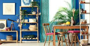
4. Accent Furniture and Statement Pieces
Since people are bound to entertain and have social gatherings at home, interior spaces will be reflective of personal style. Prioritizing the design of one’s home is a definite trend.
The post-pandemic client will look at home decor and especially homes as living spaces and spaces to express themselves. Besides, people have been moving towards accent or statement articles of furniture nestled amongst subtle, modest monotone schemes over-elaborating design schemes.
5. Technology will be Embraced in a Big Way
Demand for home automation has grown with the penetration of affordable internet and smart devices. Technology will play a significant role in the way we work, practically revolutionizing home spaces. Smart home technology will appeal to buyers. One will see a rise in smart wall and floor lights and gadgets controlled through remote commands or voice commands, be it music, TV, lighting, heating artifacts, or security.
6. On Display
Being at home so much makes us look around at what we have and view it in a different light, creating displays and moving things around for a great look. Something is soothing about choosing favorite pieces, arranging them, rearranging them, or adding new home decor elements. Floating shelves are the ideal way to achieve this, and of course, it makes the perfect Zoom background.
0 notes
Last Seen Blogs

withoutalice
How can we know the future?
lizaray2
ЛИЗА РЭЙ

mcdeofdiamonds
*⛧⋆ diamond castle heiress
infinitomeu
Meu Infinito