#thanks so much for reading lovelies!
Text
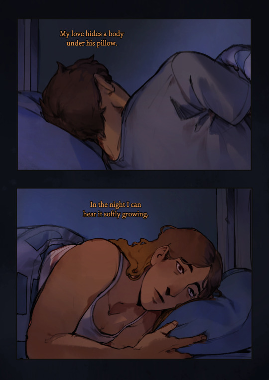
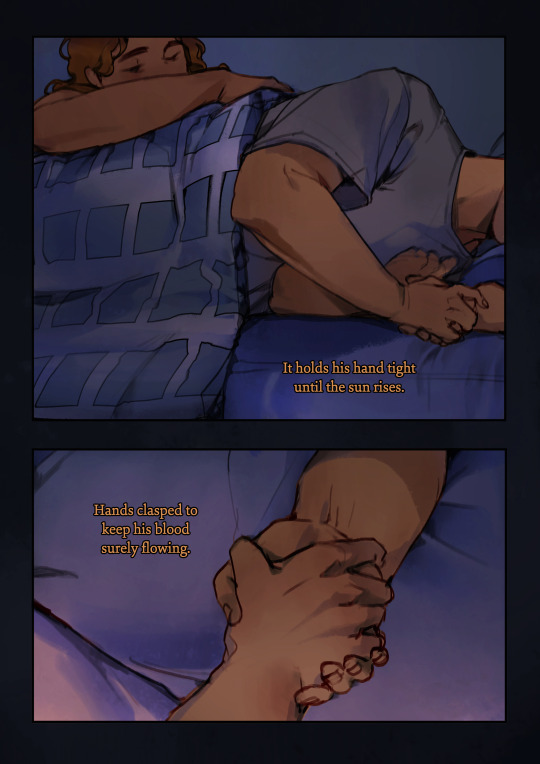
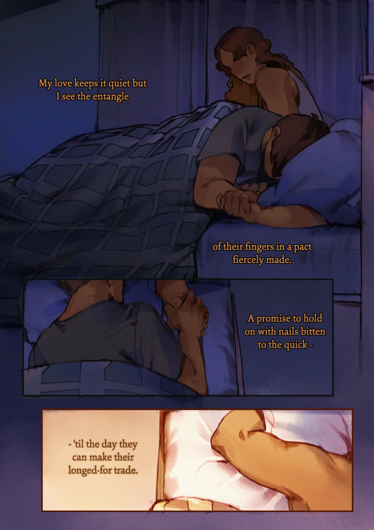

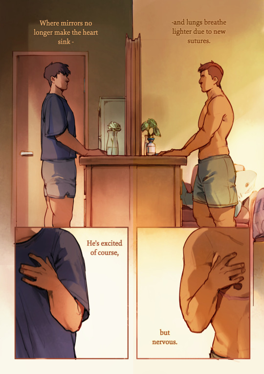
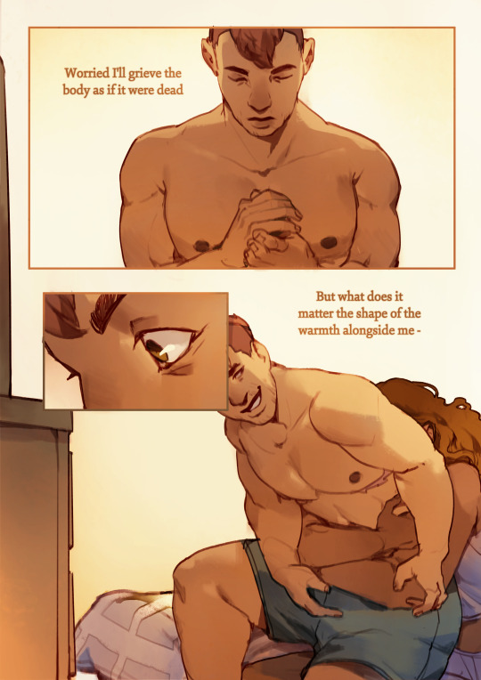

warmth.
a comic about not being alone.
--
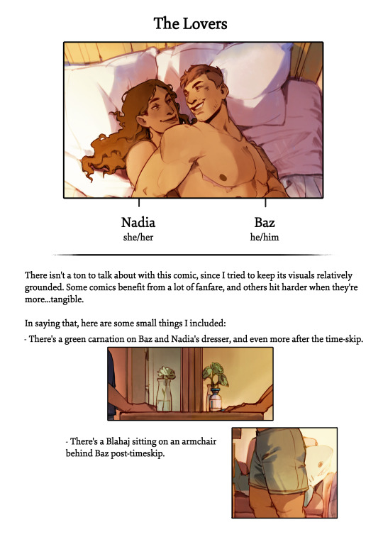
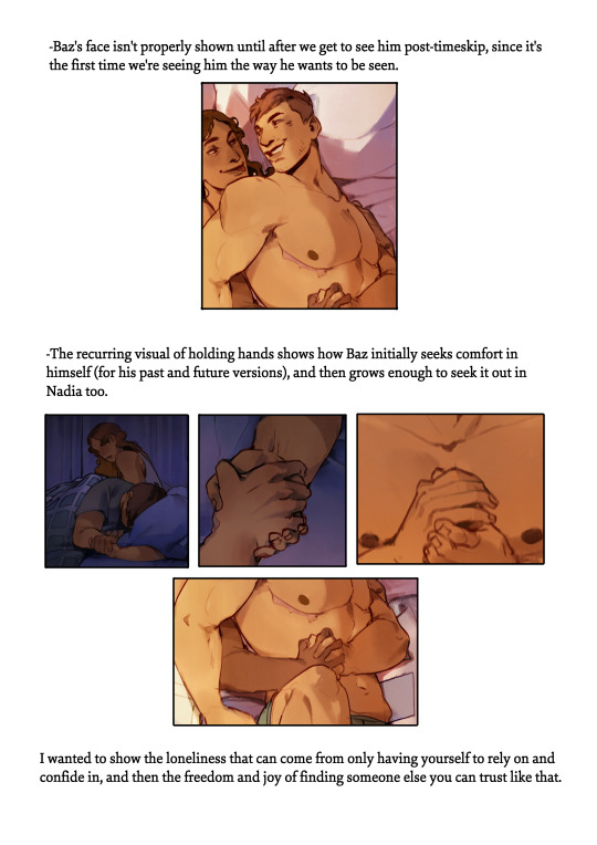
creative notes:
--
all my other comics
store
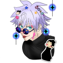
#to all the trans men and women and anyone who feels like they have to stifle themselves for their own safety#may you never feel like youre alone in this#this comic is one of my more grounded ones#it just felt right to not try to decorate this one in a lot of symbolic fanfare#sometimes i have to go above and beyond to fit the vision. this felt right being pretty understated.#i really did my best with this one and i hope it shows#you all deserve so much joy and so much love from your partners in life#and i hope you like this and if you dont thats okay too#thats all#thank you for your support#and as always#thank you for reading#comic art#lgbtqia+#queer comics#hearteaters#stillindigo art#stillindigo comics
7K notes
·
View notes
Text
proper thank you

words: 600
warnings: 18+ only!, stepbro!rafe, sending nudes, stepcest, kinda dumb/baby reader???
“carry me up to bed rafey?” you coo at your step brother, fluttering your lashes as your pout turns into a giggle when he sighs, unable to resist your pleading face.
“you're the most annoying little sis ever.” rafe says, calling you the nickname just to tease you as he leans down, scooping you into his arms. he carries you like you weigh nothing, so easily slotting into the good older stepbrother role when your parents married, despite him being only a few months older than you.
“thank you rafey.” you say sweetly as he walks you up the stairs, your arms holding him around the shoulders, head leaned against his broad chest.
“yeah, you gotta give me a better thank you than that.” rafe rolls his eyes as he carries you into your bedroom. only once the door is closed do you press a wet kiss to his cheek as a proper thank you.
rafe plops you down on the bed unceremoniously. “there ya go.” he waves as he walks away, knowing it's not actually goodnight as you let out a whine.
“tuck me in?”
rafe hides his smirk before turning around, putting on his slightly annoyed act like he always does when you ask him.
rafe pulls the fluffy blanket out from under you. it's slightly weighted so it naturally tucks around your body anyways as rafe covers you, but his hands still move slowly, feeling your body as he pushes in the blanket until you're stuck tight underneath it.
“anything else? want me to tell you a bedtime story?” rafe says it as a joke, but with the way your eyes light up, he finds himself sitting on the edge of your bed, recounting three little pigs from memory the best he can.
“alright, you gotta get to bed now.” rafe glances at the clock on your nightstand as the hour hand ticks closer to midnight. “goodnight.”
“goodnight rafey.” you smile softly before letting out a yawn. “ill give you a proper thank you soon.”
rafe isn't sure what you mean until he makes it back to his room, scrolling aimlessly through his phone until a text message appears from you.
he clicks it to open up the image, his eyes widening and dick swelling as he sees you in a silky nightgown, the swell of your breasts clearly visible, nipples poking through the fabric. he recognizes the nightgown from a few days ago, but you clearly got further undressed.
rafes eyes bulge as the next image loads, the same pose, now sans nightgown, tits bare and thighs clenched together to make a delicious looking v that rafe wants to dive into.
a proper thank you ;) reads your text, along with one last image, this time with your legs spread, smile on your face as your cunt is on clear display. you took the marker tool to add to your lower stomach “property of big brother.”
rafe is in your room untucking you from your bed before the clock reaches midnight.
taglist: @drewstarkeyslut @forstarkey @f4ll-for-you @dilvcv @drudyslut @jjmaybankswifes-blog @rafescokenostril @jjsmarijuana @seeingstarks @angelofcigs @cece45450 @babygorewhore @vanessa-rafesgirl @michelleisheres-blog @outerbankspov @drewstarkeyswifehoe @cutielando @kamninaries @rafeyslove @rafeinterlude @bellbottombaby @deeaardiary @rubixgsworld @wearemadeofstardust0 @leighbronk @starkeysheart @pradabambie @tobesolovelysstuff @alexiskirkland @rafestar @brioffthegrid @juniebugg @magicalyoura @cokepewpsii @mysticallystilinski @luvdella @aerangi @vogueprincess @yourenogoodforme @auryyz @mayhem-72 @thestarlithideout @marvelfanfics1recs @rafesgiirl @ditzyzombiesblog @chiaraanatra @tobiaslut
#this is also my thank you for 5k!#wow#crazyyyyyy#thank you guys so so much i cant believe 1 person wants to read my work#LET ALONE 5 THOUSAND??? HELLO???#thats actually crazy#im gonna cry i love yall#okay to the actual tags now#rafe smut#rafe cameron smut#obx smut#outer banks smut#rafe fic#rafe fanfic#rafe fanfiction#rafe cameron fic#rafe cameron fanfic#rafe cameron fanfiction#rafe x you#rafe x y/n#rafe x oc#rafe x reader#rafe cameron x you#rafe cameron x y/n#rafe cameron x oc#rafe cameron x reader#rafe imagine#rafe blurb#rafe drabble#rafe one shot
1K notes
·
View notes
Text

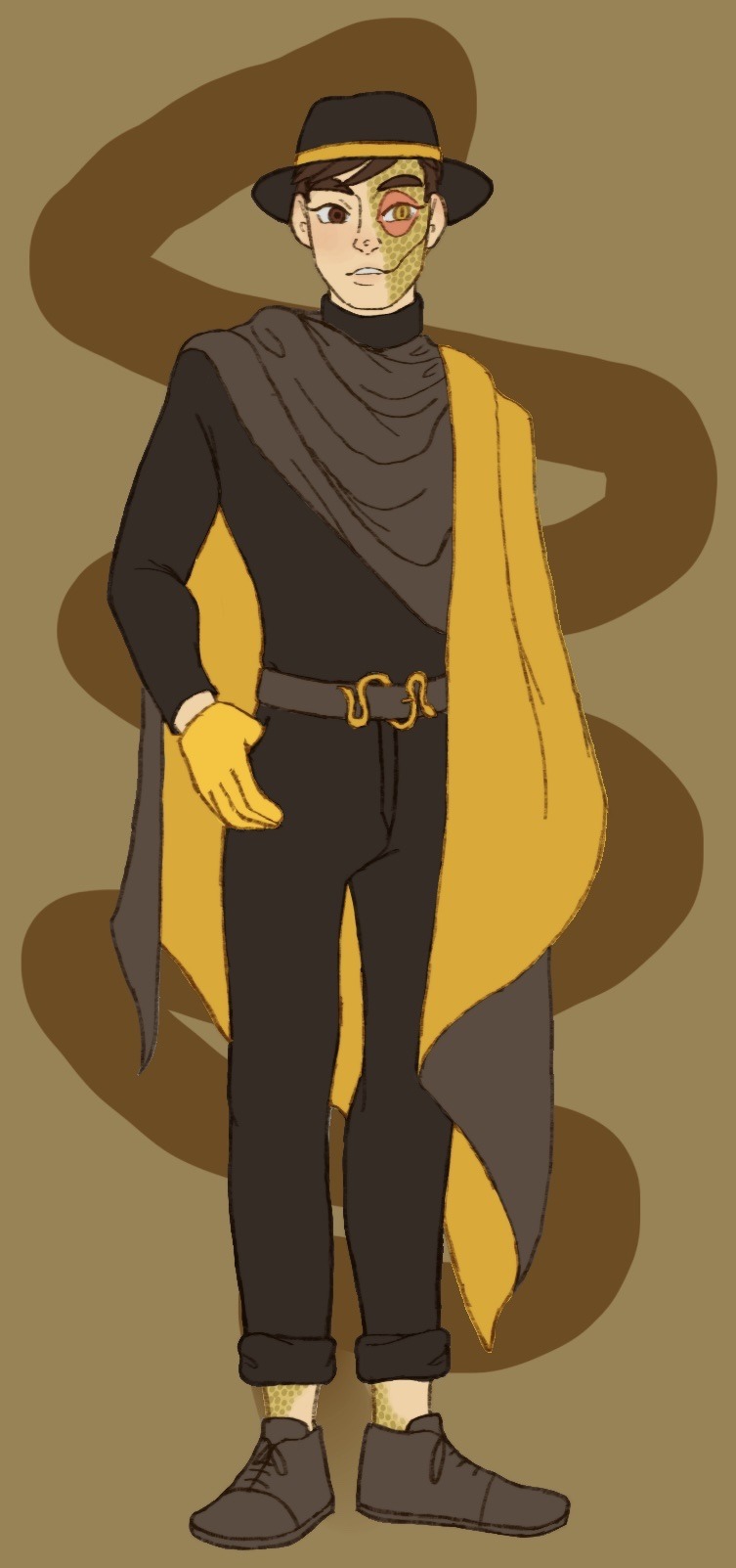
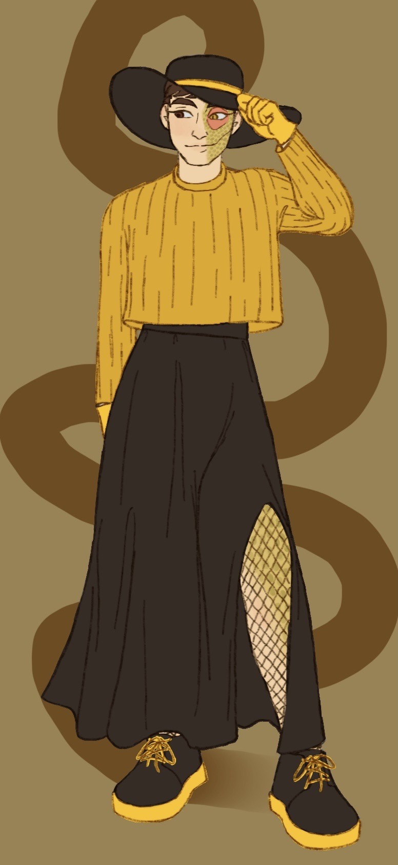
What do you mean I’m a bit late for Janus’ big day? Of course not, how could you say such a thing! I definitely didn’t forget all about it in my absence and only get reminded in the incorrect quotes video live chat; that’s not like me at all ;]
Anyways I decided to dress our sassy snake in some different outfits I think he’d like. He seems like the type to get all dolled up on his birthday and it goes with Thomas posting pics in outfits inspired by the sides on their appreciation days!
@thatsthat24
#sanders sides#janus sanders#ts janus#thomas sanders#sanders sides fanart#my hoard#I’ve returned!#the newest asides came out and I remembered how much I love it#so I’m hyperfixated again and I’ve not now peace since#it is nice to actually finish something again tho#I’ve been pretty busy working lately and now I’m starting to pack to move into my first apartment!#so not much time to really sit down and draw#and when I do have time I can’t get the motivation to actually draw anything#I want to get better about posting stuff on here#(even though it feels like I’m just dreaming into the void a lot)#even just silly little things or rough sketches I’ll never finish#I hope it’ll help me continue to draw and make things again#I forgot how nice it is#anyways if you’ve read this far thanks#have a cookie :] 🍪
1K notes
·
View notes
Photo
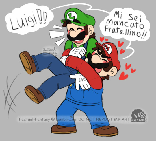


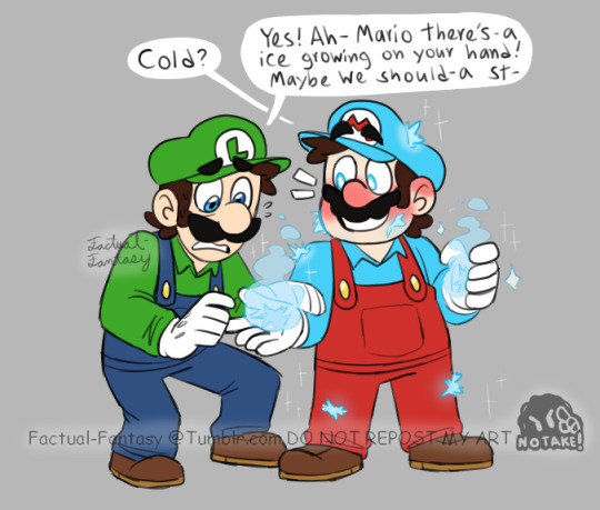


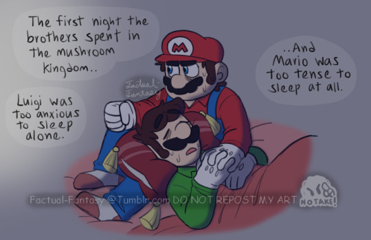

Wow, you guys blew me away!
The response to my last Mario post was so immediate and so overwhelming that I just HAD to give you more!
This time with some hugs, because I committed a crime by not including some brotherly hugs in the last post... and some more angst! Because too many people walked away from that post unscathed! :D
Also I apologize if not being able to read what the brothers are saying is a bit annoying.. I liked the idea that during tender moments or casual conversation, Mario and Luigi speak in Italian with each other. And I didn’t want that aspect to be lost in my work by just writing in English.. (aside from the last one lol-)
But hey I provided some Italian to English translations at least! <:D
1: “Luigi!! I missed you baby brother!”
2: Mario!! It’s so good to see you!
3: “There there... easy does it. Take deep breaths.
4: “I’m right here Luigi, you can do this. Just breathe..
9: Mario! That was stupid! What are you 5??”
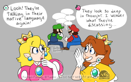
#super mario bros#mario and luigi#princess peach#princess daisy#daisy and peach#do not tag mario and luigi as ship please thats nasty#Thank you guys so much for all the lovely replies!#I read every single one#my heart is full#y u maka me cry
11K notes
·
View notes
Note
Monster Clover, like this is so awesomecool.
They're such a little beast and it is amazing and please i need more, like written text even i just need the juicy lore and emotional moments that are circling in ur brain.
HAT: RETRIEVED!!
#undertale yellow#uty clover#flowey the flower#chara dreemurr#frisk undertale#monster clover au#my art#as for emotional moments. hang in there for another day or 2. got a big batch of comics coming 😈#if i ever made a fic for this au i would not advertise it. i got irls following me#they can look at all my cringe ass art but if they read a WORD of fic i wrote i would have to end it all. hope this helps#anyways. frisk appears!! i wont be doing too many canon ut characters in this little au but i like frisk :)#theyre also important for the next part#narrator chara makes an appearance too bc i love them#cowboy (gender neutral)#SORRY I LOVE RAMBLING IN TAGS </3 i love Talking#BUT THANK YOUU i also love my little skrungly im so glad other people like them so much too#mcau comic#mcau art
615 notes
·
View notes
Text
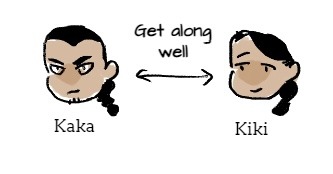
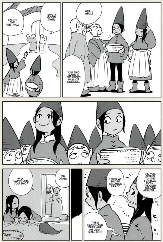
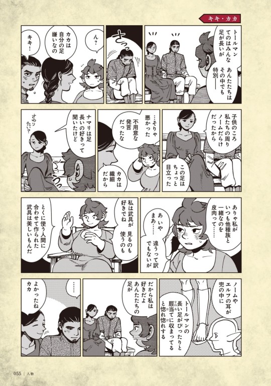
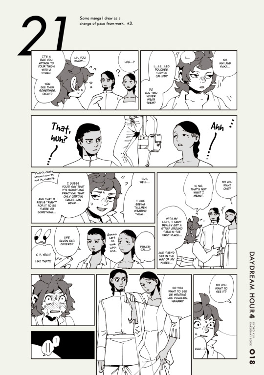
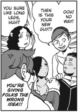


Kaka compilation
Because everyone is sleeping on him. Witness his greatness!!
First two Kaka colored icons were colored by me, lineart by Ryoko Kui though!
Kaka & Kiki are kinda like Laios & Falin… Kaka being stoic and giving repressed energy like early Laios, Kiki being cryptic and always smiling and kinda soft-looking. Autism siblings 2, ostracized and othered as kids and have a deep bond due to sticking together through it all, though unlike with Laios their parents are very loving so Kaka developed family as a big value more than Laios (bc asides for Falin Laios doesn’t care much about it).
In the gnome festival comic you can see Kaka is more emotive than he seems! Full with a :3 face, and he’s the one crying at the end. He’s insecure about his legs and being tall… It really got to him. Conceal don’t feel. In the gnome festival comic you also see him sensing others’ gaze on him and that something is off unlike Kiki, again Laios-like in the way that judgement from others gets to him more than her.
#The twins are so autistic swag#A falin just as chilled out and smiling and a laios who never stopped repressing#They’re so neurodivergent and they’re allowed to just exist I love you Kui. Kaka is just literally me#I looove characters that are hard to know and hard to read/easily misunderstood. They’re my favorite thing#LOOK AT THE WAY HE SMILES THE WAY HE BLUSHESSS HE’S PERFECT and I would take a harpoon to the chest for him thank u#I do love Kiki too btw but I’ve been seeing her in fancontent and posts way more than Kaka so I had to give him some spotlight#But also Laios is my fave of the Toudens so this very much checks out#Their pre-Flokes story would be interesting to analyze too#Dungeon meshi#delicious in dungeon#kaka floke#Kaka#Kiki and kaka#floke twins#As you may guess from my new-ish icon I am in my kaka era#ALSO I SWEAR TO GOD STOP BEING MEAN ABOUT HIS NAME#KA IS A SYLLABLE IN MY IRL NAME. YES I WAS BULLIED AND CALLED KAKA AS A KID. MY NAME ALSO MEANS UGLY STUFF IN A DIFFERENT LANGUAGE#KAKA’S A PRETTY NAME I’LL DIE ON THIS HILL. IT’S NOT WEIRD IF YOU DON’T MAKE IT WEIRD#Oh also another laios falin parallel: they both sort-of-date the same woman
640 notes
·
View notes
Text
why Aurora's art is genius
It's break for me, and I've been meaning to sit down and read the Aurora webcomic (https://comicaurora.com/, @comicaurora on Tumblr) for quite a bit. So I did that over the last few days.
And… y'know. I can't actually say "I should've read this earlier," because otherwise I would've been up at 2:30-3am when I had responsibilities in the morning and I couldn't have properly enjoyed it, but. Holy shit guys THIS COMIC.
I intended to just do a generalized "hello this is all the things I love about this story," and I wrote a paragraph or two about art style. …and then another. And another. And I realized I needed to actually reference things so I would stop being too vague. I was reading the comic on my tablet or phone, because I wanted to stay curled up in my chair, but I type at a big monitor and so I saw more details… aaaaaand it turned into its own giant-ass post.
SO. Enjoy a few thousand words of me nerding out about this insanely cool art style and how fucking gorgeous this comic is? (There are screenshots, I promise it isn't just a wall of text.) In my defense, I just spent two semesters in graphic design classes focusing on the Adobe Suite, so… I get to be a nerd about pretty things…???
All positive feedback btw! No downers here. <3
---
I cannot emphasize enough how much I love the beautiful, simple stylistic method of drawing characters and figures. It is absolutely stunning and effortless and utterly graceful—it is so hard to capture the sheer beauty and fluidity of the human form in such a fashion. Even a simple outline of a character feels dynamic! It's gorgeous!
Though I do have a love-hate relationship with this, because my artistic side looks at that lovely simplicity, goes "I CAN DO THAT!" and then I sit down and go to the paper and realize that no, in fact, I cannot do that yet, because that simplicity is born of a hell of a lot of practice and understanding of bodies and actually is really hard to do. It's a very developed style that only looks simple because the artist knows what they're doing. The human body is hard to pull off, and this comic does so beautifully and makes it look effortless.
Also: line weight line weight line weight. It's especially important in simplified shapes and figures like this, and hoo boy is it used excellently. It's especially apparent the newer the pages get—I love watching that improvement over time—but with simpler figures and lines, you get nice light lines to emphasize both smaller details, like in the draping of clothing and the curls of hair—which, hello, yes—and thicker lines to emphasize bigger and more important details and silhouettes. It's the sort of thing that's essential to most illustrations, but I wanted to make a note of it because it's so vital to this art style.
THE USE OF LAYER BLENDING MODES OH MY GODS. (...uhhh, apologies to the people who don't know what that means, it's a digital art program thing? This article explains it for beginners.)
Bear with me, I just finished my second Photoshop course, I spent months and months working on projects with this shit so I see the genius use of Screen and/or its siblings (of which there are many—if I say "Screen" here, assume I mean the entire umbrella of Screen blending modes and possibly Overlay) and go nuts, but seriously it's so clever and also fucking gorgeous:
Firstly: the use of screened-on sound effect words over an action? A "CRACK" written over a branch and then put on Screen in glowy green so that it's subtle enough that it doesn't disrupt the visual flow, but still sticks out enough to make itself heard? Little "scritches" that are transparent where they're laid on without outlines to emphasize the sound without disrupting the underlying image? FUCK YES. I haven't seen this done literally anywhere else—granted, I haven't read a massive amount of comics, but I've read enough—and it is so clever and I adore it. Examples:


Secondly: The beautiful lighting effects. The curling leaves, all the magic, the various glowing eyes, the fog, the way it's all so vividly colored but doesn't burn your eyeballs out—a balance that's way harder to achieve than you'd think—and the soft glows around them, eeeee it's so pretty so pretty SO PRETTY. Not sure if some of these are Outer/Inner Glow/Shadow layer effects or if it's entirely hand-drawn, but major kudos either way; I can see the beautiful use of blending modes and I SALUTE YOUR GENIUS.
I keep looking at some of this stuff and go "is that a layer effect or is it done by hand?" Because you can make some similar things with the Satin layer effect in Photoshop (I don't know if other programs have this? I'm gonna have to find out since I won't have access to PS for much longer ;-;) that resembles some of the swirly inner bits on some of the lit effects, but I'm not sure if it is that or not. Or you could mask over textures? There's... many ways to do it.
If done by hand: oh my gods the patience, how. If done with layer effects: really clever work that knows how to stop said effects from looking wonky, because ugh those things get temperamental. If done with a layer of texture that's been masked over: very, very good masking work. No matter the method, pretty shimmers and swirly bits inside the bigger pretty swirls!
Next: The way color contrast is used! I will never be over the glowy green-on-black Primordial Life vibes when Alinua gets dropped into that… unconscious space?? with Life, for example, and the sharp contrast of vines and crack and branches and leaves against pitch black is just visually stunning. The way the roots sink into the ground and the three-dimensional sensation of it is particularly badass here:

Friggin. How does this imply depth like that. HOW. IT'S SO FREAKING COOL.
A huge point here is also color language and use! Everybody has their own particular shade, generally matching their eyes, magic, and personality, and I adore how this is used to make it clear who's talking or who's doing an action. That was especially apparent to me with Dainix and Falst in the caves—their colors are both fairly warm, but quite distinct, and I love how this clarifies who's doing what in panels with a lot of action from both of them. There is a particular bit that stuck out to me, so I dug up the panels (see this page and the following one https://comicaurora.com/aurora/1-20-30/):

(Gods it looks even prettier now that I put it against a plain background. Also, appreciation to Falst for managing a bridal-carry midair, damn.)
The way that their colors MERGE here! And the immense attention to detail in doing so—Dainix is higher up than Falst is in the first panel, so Dainix's orange fades into Falst's orange at the base. The next panel has gold up top and orange on bottom; we can't really tell in that panel where each of them are, but that's carried over to the next panel—

—where we now see that Falst's position is raised above Dainix's due to the way he's carrying him. (Points for continuity!) And, of course, we see the little "huffs" flowing from orange to yellow over their heads (where Dainix's head is higher than Falst's) to merge the sound of their breathing, which is absurdly clever because it emphasizes to the viewer how we hear two sets of huffing overlaying each other, not one. Absolutely brilliant.
(A few other notes of appreciation to that panel: beautiful glows around them, the sparks, the jagged silhouette of the spider legs, the lovely colors that have no right to make the area around a spider corpse that pretty, the excellent texturing on the cave walls plus perspective, the way Falst's movements imply Dainix's hefty weight, the natural posing of the characters, their on-point expressions that convey exactly how fuckin terrifying everything is right now, the slight glows to their eyes, and also they're just handsome boys <3)
Next up: Rain!!!! So well done! It's subtle enough that it never ever disrupts the impact of the focal point, but evident enough you can tell! And more importantly: THE MIST OFF THE CHARACTERS. Rain does this irl, it has that little vapor that comes off you and makes that little misty effect that plays with lighting, it's so cool-looking and here it's used to such pretty effect!
One of the panel captions says something about it blurring out all the injuries on the characters but like THAT AIN'T TOO BIG OF A PROBLEM when it gets across the environmental vibes, and also that'd be how it would look in real life too so like… outside viewer's angle is the same as the characters', mostly? my point is: that's the environment!!! that's the vibes, that's the feel! It gets it across and it does so in the most pretty way possible!
And another thing re: rain, the use of it to establish perspective, particularly in panels like this—

—where we can tell we're looking down at Tynan due to the perspective on the rain and where it's pointing. Excellent. (Also, kudos for looking down and emphasizing how Tynan's losing his advantage—lovely use of visual storytelling.)
Additionally, the misting here:

We see it most heavily in the leftmost panel, where it's quite foggy as you would expect in a rainstorm, especially in an environment with a lot of heat, but it's also lightly powdered on in the following two panels and tends to follow light sources, which makes complete sense given how light bounces off particles in the air.
A major point of strength in these too is a thorough understanding of lighting, like rim lighting, the various hues and shades, and an intricate understanding of how light bounces off surfaces even when they're in shadow (we'll see a faint glow in spots where characters are half in shadow, but that's how it would work in real life, because of how light bounces around).
Bringing some of these points together: the fluidity of the lines in magic, and the way simple glowing lines are used to emphasize motion and the magic itself, is deeply clever. I'm basically pulling at random from panels and there's definitely even better examples, but here's one (see this page https://comicaurora.com/aurora/1-16-33/):

First panel, listed in numbers because these build on each other:
The tension of the lines in Tess's magic here. This works on a couple levels: first, the way she's holding her fists, as if she's pulling a rope taut.
The way there's one primary line, emphasizing the rope feeling, accompanied by smaller ones.
The additional lines starbursting around her hands, to indicate the energy crackling in her hands and how she's doing a good bit more than just holding it. (That combined with the fists suggests some tension to the magic, too.) Also the variations in brightness, a feature you'll find in actual lightning. :D Additional kudos for how the lightning sparks and breaks off the metal of the sword.
A handful of miscellaneous notes on the second panel:
The reflection of the flames in Erin's typically dark blue eyes (which bears a remarkable resemblance to Dainix, incidentally—almost a thematic sort of parallel given Erin's using the same magic Dainix specializes in?)
The flowing of fabric in the wind and associated variation in the lineart
The way Erin's tattoos interact with the fire he's pulling to his hand
The way the rain overlays some of the fainter areas of fire (attention! to! detail! hell yeah!)
I could go on. I won't because this is a lot of writing already.
Third panel gets paragraphs, not bullets:
Erin's giant-ass "FWOOM" of fire there, and the way the outline of the word is puffy-edged and gradated to feel almost three-dimensional, plus once again using Screen or a variation on it so that the stars show up in the background. All this against that stunning plume of fire, which ripples and sparks so gorgeously, and the ending "om" of the onomatopoeia is emphasized incredibly brightly against that, adding to the punch of it and making the plume feel even brighter.
Also, once again, rain helping establish perspective, especially in how it's very angular in the left side of the panel and then slowly becomes more like a point to the right to indicate it's falling directly down on the viewer. Add in the bright, beautiful glow effects, fainter but no less important black lines beneath them to emphasize the sky and smoke and the like, and the stunningly beautiful lighting and gradated glows surrounding Erin plus the lightning jagging up at him from below, and you get one hell of an impactful panel right there. (And there is definitely more in there I could break down, this is just a lot already.)
And in general: The colors in this? Incredible. The blues and purples and oranges and golds compliment so well, and it's all so rich.
Like, seriously, just throughout the whole comic, the use of gradients, blending modes, color balance and hues, all the things, all the things, it makes for the most beautiful effects and glows and such a rich environment. There's a very distinct style to this comic in its simplified backgrounds (which I recognize are done partly because it's way easier and also backgrounds are so time-consuming dear gods but lemme say this) and vivid, smoothly drawn characters; the simplicity lets them come to the front and gives room for those beautiful, richly saturated focal points, letting the stylized designs of the magic and characters shine. The use of distinct silhouettes is insanely good. Honestly, complex backgrounds might run the risk of making everything too visually busy in this case. It's just, augh, so GORGEOUS.
Another bit, take a look at this page (https://comicaurora.com/aurora/1-15-28/):

It's not quite as evident here as it is in the next page, but this one does some other fun things so I'm grabbing it. Points:
Once again, using different colors to represent different character actions. The "WHAM" of Kendal hitting the ground is caused by Dainix's force, so it's orange (and kudos for doubling the word over to add a shake effect). But we see blue layered underneath, which could be an environmental choice, but might also be because it's Kendal, whose color is blue.
And speaking off, take a look at the right-most panel on top, where Kendal grabs the spear: his motion is, again, illustrated in bright blue, versus the atmospheric screened-on orange lines that point toward him around the whole panel (I'm sure these have a name, I think they might be more of a manga thing though and the only experience I have in manga is reading a bit of Fullmetal Alchemist). Those lines emphasize the weight of the spear being shoved at him, and their color tells us Dainix is responsible for it.
One of my all-time favorite effects in this comic is the way cracks manifest across Dainix's body to represent when he starts to lose control; it is utterly gorgeous and wonderfully thematic. These are more evident in the page before and after this one, but you get a decent idea here. I love the way they glow softly, the way the fire juuuust flickers through at the start and then becomes more evident over time, and the cracks feel so realistic, like his skin is made of pottery. Additional points for how fire begins to creep into his hair.
A small detail that's generally consistent across the comic, but which I want to make note of here because you can see it pretty well: Kendal's eyes glow about the same as the jewel in his sword, mirroring his connection to said sword and calling back to how the jewel became Vash's eye temporarily and thus was once Kendal's eye. You can always see this connection (though there might be some spots where this also changes in a symbolic manner; I went through it quickly on the first time around, so I'll pay more attention when I inevitably reread this), where Kendal's always got that little shine of blue in his eyes the same as the jewel. It's a beautiful visual parallel that encourages the reader to subconsciously link them together, especially since the lines used to illustrate character movements typically mirror their eye color. It's an extension of Kendal.
Did I mention how ABSOLUTELY BEAUTIFUL the colors in this are?
Also, the mythological/legend-type scenes are illustrated in familiar style often used for that type of story, a simple and heavily symbolic two-dimensional cave-painting-like look. They are absolutely beautiful on many levels, employing simple, lovely gradients, slightly rougher and thicker lineart that is nonetheless smoothly beautiful, and working with clear silhouettes (a major strength of this art style, but also a strength in the comic overall). But in particular, I wanted to call attention to a particular thing (see this page https://comicaurora.com/aurora/1-12-4/):

The flowing symbolic lineart surrounding each character. This is actually quite consistent across characters—see also Life's typical lines and how they curl:

What's particularly interesting here is how these symbols are often similar, but not the same. Vash's lines are always smooth, clean curls, often playing off each other and echoing one another like ripples in a pond. You'd think they'd look too similar to Life's—but they don't. Life's curl like vines, and they remain connected; where one curve might echo another but exist entirely detached from each other in Vash's, Life's lines still remain wound together, because vines are continuous and don't float around. :P
Tahraim's are less continuous, often breaking up with significantly smaller bits and pieces floating around like—of course—sparks, and come to sharper points. These are also constants: we see the vines repeated over and over in Alinua's dreams of Life, and the echoing ripples of Vash are consistent wherever we encounter him. Kendal's dream of the ghost citizens of the city of Vash in the last few chapters is filled with these rippling, echoing patterns, to beautiful effect (https://comicaurora.com/aurora/1-20-14/):

They ripple and spiral, often in long, sinuous curves, with smooth elegance. It reminds me a great deal of images of space and sine waves and the like. This establishes a definite feel to these different characters and their magic. And the thing is, that's not something that had to be done—the colors are good at emphasizing who's who. But it was done, and it adds a whole other dimension to the story. Whenever you're in a deity's domain, you know whose it is no matter the color.
Regarding that shape language, I wanted to make another note, too—Vash is sometimes described as chaotic and doing what he likes, which is interesting to me, because smooth, elegant curves and the color blue aren't generally associated with chaos. So while Vash might behave like that on the surface, I'm guessing he's got a lot more going on underneath; he's probably much more intentional in his actions than you'd think at a glance, and he is certainly quite caring with his city. The other thing is that this suits Kendal perfectly. He's a paragon character; he is kind, virtuous, and self-sacrificing, and often we see him aiming to calm others and keep them safe. Blue is such a good color for him. There is… probably more to this, but I'm not deep enough in yet to say.
And here's the thing: I'm only scratching the surface. There is so much more here I'm not covering (color palettes! outfits! character design! environment! the deities! so much more!) and a lot more I can't cover, because I don't have the experience; this is me as a hobbyist artist who happened to take a couple design classes because I wanted to. The art style to this comic is so clever and creative and beautiful, though, I just had to go off about it. <3
...brownie points for getting all the way down here? Have a cookie.
#aurora comic#aurora webcomic#comicaurora#art analysis#...I hope those are the right tags???#new fandom new tagging practices to learn ig#much thanks for something to read while I try to rest my wrists. carpal tunnel BAD. (ignore that I wrote this I've got braces ok it's fine)#anyway! I HAVE. MANY MORE THOUGHTS. ON THE STORY ITSELF. THIS LOVELY STORY#also a collection of reactions to a chunk of the comic before I hit the point where I was too busy reading to write anything down#idk how to format those tho#...yeet them into one post...???#eh I usually don't go off this much these days but this seems like a smaller tight-knit fandom so... might as well help build it?#and I have a little more time thanks to break so#oh yes also shoutout to my insanely awesome professor for teaching me all the technical stuff from this he is LOVELY#made an incredibly complex program into something comprehensible <3#synapse talks
743 notes
·
View notes
Text

Happy new year 1997! 🎉🍾
I'm meaning. 2023.9999999999999999999!!!!!!! 🎉🍾
#a quick doodle for midnight here - happy new year!!!!!!!!!/#these two's resolutions are to never get sick or commit crimes ever again and they break it after only three days/#deltarune#ambyu lance#virovirokun#myart#congratz everyone for making it to another year! my resolution is to think of a good resolution for 2025 DFKBJDFKDJF/#also thank you so much for all the lovely messages ;; they've made me so happy & blessed to read thru/#u are all funky little superstars!! <3/
635 notes
·
View notes
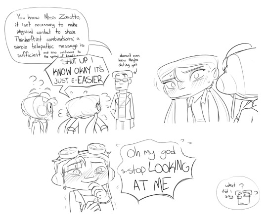
Note
your narumitsu art made me weep with joy and I heard you want more requests 👀
idk if this is the right place to put them but I think phoenix coming with miles to try on his glasses for the first time would be sweet :,) miles asking how they look and phoenix being just smitten. the good stuff
Dear anon… you sure know how to pick em! Things got very out of hand very quickly while drawing, and well. You inspired me to draft a comic! I didn’t want to make you wait long, so here are the sketches for the pages relevant to your request <3

Thanks so much, and hope you enjoy~! 💜
#narumitsu#wrightworth#we do love a good oh moment but i think beanix deserves something more like a sack of bricks. you’re fucked king!#if it’s not clear beanix is imagining ALL of that. like photoshopping the glasses onto memories#the glassesfication of miles edgeworth#also i can’t promise this comic will see the light of day because i’m VERY bad at writing these two despite what you might think#the whole time i was writing it i was like ‘he would not say do or think that. draw it.’ in a i-cant-do-any-better-rn way#still despite that this was super fun so THANK YOU SO MUCH FOR THE INSPO!!!#hope edgeworth enjoyers approve bc idk what im doing#thank you for your time if you’re reading this welcome to the prison of my mind <3#rendoodles#phoenix wright#miles edgeworth#beanix#fan comic#fan art#aa#anonymous#asks
2K notes
·
View notes
Text
Every now and then I think about how subtitles (or dubs), and thus translation choices, shape our perception of the media we consume. It's so interesting. I'd wager anyone who speaks two (or more) languages knows the feeling of "yeah, that's what it literally translates to, but that's not what it means" or has answered a question like "how do you say _____ in (language)?" with "you don't, it's just … not a thing, we don't say that."
I've had my fair share of "[SHIP] are [married/soulmates/fated/FANCY TERM], it's text!" "[CHARACTER A] calls [CHARACTER B] [ENDEARMENT/NICKNAME], it's text!" and every time. Every time I'm just like. Do they though. Is it though. And a lot of the time, this means seeking out alternative translations, or translation meta from fluent or native speakers, or sometimes from language learners of the language the piece of media is originally in.
Why does it matter? Maybe it doesn't. To lots of people, it doesn't. People have different interests and priorities in fiction and the way they interact with it. It's great. It matters to me because back in the early 2000s, I had dial-up internet. Video or audio media that wasn't available through my local library very much wasn't available, but fanfiction was. So I started to read English language Gundam Wing fanfic before I ever had a chance to watch the show.
When I did get around to watching Gundam Wing, it was the original Japanese dub. Some of the characters were almost unrecognisable to me, and first I doubted my Japanese language ability, then, after checking some bits with friends, I wondered why even my favourite writers, writers I knew to be consistent in other things, had made these characters seem so different … until I had the chance to watch the US-English dub a few years later. Going by that adaptation, the characterisation from all those stories suddenly made a lot more sense. And the thing is, that interpretation is also valid! They just took it a direction that was a larger leap for me to make.
Loose adaptations and very free translations have become less frequent since, or maybe my taste just hasn't led me their way, but the issue at the core is still a thing: Supernatural fandom got different nuances of endings for their show depending on the language they watched it in. CQL and MDZS fandom and the never-ending discussions about 知己 vs soulmate vs Other Options. A subset of VLD fans looking at a specific clip in all the different languages to see what was being said/implied in which dub, and how different translators interpreted the same English original line. The list is pretty much endless.
And that's … idk if it's fine, but it's what happens! A lot of the time, concepts -- expressed in language -- don't translate 1:1. The larger the cultural gap, the larger the gaps between the way concepts are expressed or understood also tend to be. Other times, there is a literal translation that works but isn't very idiomatic because there's a register mismatch or worse.
And that's even before cultural assumptions come in.
It's normal to have those. It's also important to remember that things like "thanks I hate it" as a sentiment of praise/affection, while the words translate literally quite easily, emphatically isn't easy to translate in the sense anglophone internet users the phrase.
Every translation is, at some level, a transformative work. Sometimes expressions or concepts or even single words simply don't have an exact equivalent in the target language and need to be interpreted at the translator's discretion, especially when going from a high-context/listener-responsible source language to a low-context/speaker-responsible target language (where high-context/listener responsible roughly means a large amount of contextual information can be omitted by the speaker because it's the listener's responsibility to infer it and ask for clarification if needed, and low-context/speaker-responsible roughly means a lot of information needs to be codified in speech, i.e. the speaker is responsible for providing sufficiently explicit context and will be blamed if it's lacking).
Is this a mouse or a rat? Guess based on context clues! High-context languages can and frequently do omit entire parts of speech that lower-context/speaker-responsible languages like English regard as essential, such as the grammatical subject of a sentence: the equivalent of "Go?" - "Go." does largely the same amount of heavy lifting as "is he/she/it/are you/they/we going?" - "yes, I am/he/she/it is/we/you/they are" in several listener-responsible languages, but tends to seem clumsy or incomplete in more speaker-responsible ones. This does NOT mean the listener-responsible language is clumsy. It's arguably more efficient! And reversely, saying "Are you going?" - "I am (going)" might seem unnecessarily convoluted and clumsy in a listener-responsible language. All depending on context.
This gets tricky both when the ambiguity of the missing subject of the sentence is clearly important (is speaker A asking "are you going" or "is she going"? wait until next chapter and find out!) AND when it's important that the translator assign an explicit subject in order for the sentence to make sense in the target language. For our example, depending on context, something like "are we all going?" - "yes" or "they going, too?" might work. Context!
As a consequence of this, sometimes, translation adds things – we gain things in translation, so to speak. Sometimes, it's because the target language needs the extra information (like the subject in the examples above), sometimes it's because the target language actually differentiates between mouse and rat even though the source language doesn't. However, because in most cases translators don't have access to the original authors, or even the original authors' agencies to ask for clarification (and in most cases wouldn't get paid for the time to put in this extra work even if they did), this kind of addition is almost always an interpretation. Sometimes made with a lot of certainty, sometimes it's more of a "fuck it, I've got to put something and hope it doesn't get proven wrong next episode/chapter/ten seasons down" (especially fun when you're working on a series that's in progress).
For the vast majority of cases, several translations are valid. Some may be more far-fetched than others, and there'll always be subjectivity to whether something was translated effectively, what "effectively" even means …
ANYWAY. I think my point is … how interesting, how cool is it that engaging with media in multiple languages will always yield multiple, often equally valid but just sliiiiightly different versions of that piece of media? And that I'd love more conversations about how, the second we (as folks who don't speak the material's original language) start picking the subtitle or dub wording apart for meta, we're basically working from a secondary source, and if we're doing due diligence, to which extent do we need to check there's nothing substantial being (literally) lost -- or added! -- in translation?
#translation#linguistics (sorta)#I love language so much#long post#subtitling#dubbing#transformative work#if you read all the way to the end - THANK YOU I am so impressed#localisation#this is not an academic essay but I still feel bad for not citing sources#low vs high context cultures and languages are concepts from intercultural communication studies#but idk how up to date that is or whether folks even still actually use them#I know they oversimplify things#but it helped me say what I was trying to here so shrug#languages#language soup#meta#language meta#fandom meta of sorts#thanks for the help sorting this out kayla <3#my nonsense
1K notes
·
View notes
Text
TFW A POPULAR BLOG RANDOMLY REBLOGS YOUR SHITPOST AND NOW YOU HAVE A CONSTANT 99+ ON YOUR ACTIVITY AND A SUDDEN INFLUX OF NEW EYES ON YOUR BLOG WITHOUT ANY TIME TO PREPARE OR LOOK PRESENTABLE


#strange-aeons if you're reading this: hi. thank you so much. love your work. also hi people who follow strange-aeons#shebbz shoutz
405 notes
·
View notes
Note
do you think we could pretty please have some razlili they give me life🙏🙏🙏
DON'T MIND IF I DO!!! i am sorry anon that this is sososo late, i fell crappy ill for several days and also was drawing a whole several page comic in response to this ask for some reason. i'll post that too but here
busteeed
#psychonauts#lili zanotto#razputin aquato#razlili#sasha nein#AND KNUCKLES! (and sasha)#fanart#my art#thank you SO MUCH for the ask by the way. i love these kids. i love my kids#[anything psychic happens]#lili: well raz looks like we have no choice but to touch foreheads#what no wayy i dont just want to feel comforted and encircled by your aura because i'm too anxious to ask for a hug haha#noooo dont accidentally read my thoughts about how cute you are and how i want to kiss you we already did that bit xD dont DO it#\ i think razlili should just be raz and lili embarrassing themselves over each other back and forth
234 notes
·
View notes
Text

Introduction
Hi! I'm an anonymous asker who sometimes sends fellow simmers questions. "Simblr Question of the Day" is something I saw going on around September '23 and I wanted to revive this "trend"! After a bit, some simmers suggested a SQOTD blog, to which I agreed and finally did it! I can broaden my asking horizons to blogs w/o anons now :)
^ Due to time, I can only post questions, and not send asks, I'm very very very sorry :(
I'm going to continue preserving my anonymity, but I'd like to share some basics about me ! ~
You can call me squat or squatty! A name I chose based on the way I pronounce "SQOTD," You can also call me SQOTD Anon! I like the colors yellow and pink/red, I've been playing the sims since I was 5 and I like to read and write :)
And below the cut will include a little rundown of how I will run this blog and navigation hashtags ~
-I will queue a question for once a day around 4am-5am PST, I will try to vary the type of questions (builds/renders/cas/sims/ocs).
-Interact with these posts in anyway you prefer: reblog, reply or a separate post! (make sure to tag me ;p)
-I FULLY encourage YOU to continue sending asks with SQOTDs (crediting/tagging me is optional). I don't expect every simblr to know about this blog and SQOTD is intended to be a community thing, so while this blog will extend SQOTD reach, asks will spread even further
-If you have your own SQOTD, you can send me an ask with your q!
-Since this isn't my main blog, I probably won't follow others, but I will check into the "SQOTD" tag, leave likes on SQOTD answers and maybe even reblog answers
Navigation
〘 Main Tags -
╭
| - SQOTD, Simblr question of the day, Squat's TXT.Files, Squat's reblogs
╰
〘 Question Tags -
╭
| - Sim/OC Questions, Build Questions, Gameplay Questions, Render Questions, CAS Questions
╰
↳ I am very open to critique, suggestions and feedback, feel free to send me these messages via ask or DMs :)

#feels good getting this out! Thank you for the feedback and thank you for your SQOTD answers! I love reading them so much!#simblr question of the day#SQOTD#SQOTD anon#new simblr alert#navigation#introduction#simblr#ts4#ts4 simblr#sims 4#sims 4 simblr#the sims 4
291 notes
·
View notes
Text


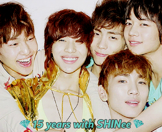
☆♥⁺˚*•̩̩͙✩•̩̩͙* SHINee ✰ HAPPY 15th ANNIVERSARY *•̩̩͙✩•̩̩͙*˚⁺♥☆
Words cannot fully express just how thankful I am for you, my five shining stars ✨💞💞 You are an inspiration every day not only with your passion, hard work and endless creative talent but also with your genuine deep love & kindness for each other and for others. Thank you for these past 15 years, for the pure legendary talent. For all the light and laughter. For always being by our sides through the happy times and the sad times. Thank you for all the fun and love and comfort. But mostly thank you for being you because you're simply wonderful 💞✨💎 I love you so very much - thank you for everything 💞💞💞
#shinee#onew#jonghyun#key#minho#taemin#15 years with shinee#i tried to express myself in the read more but it never feels like enough#i love you so very much 💞💞💞#thank you for everything#my.gifs#1k
2K notes
·
View notes
Text
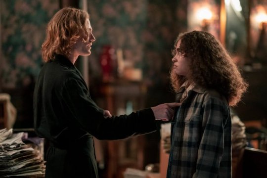


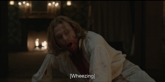
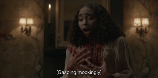

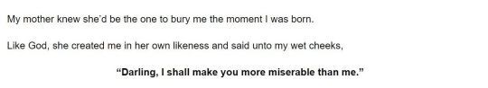

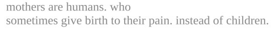


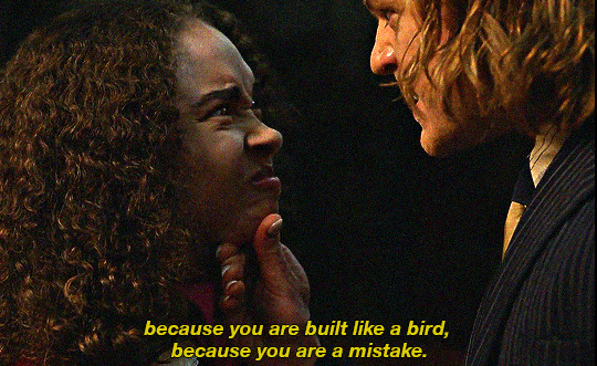


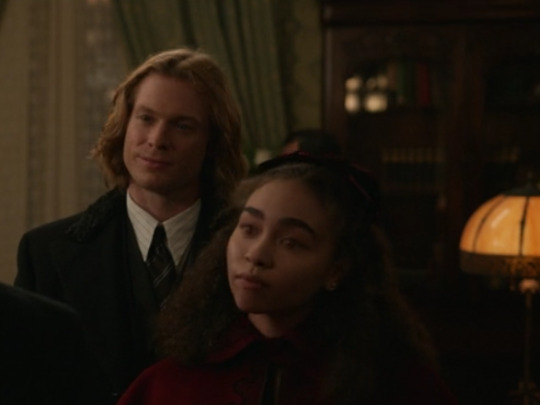
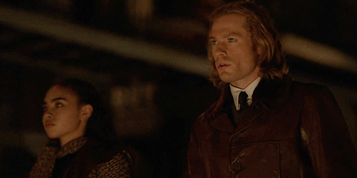
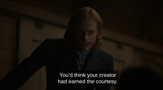
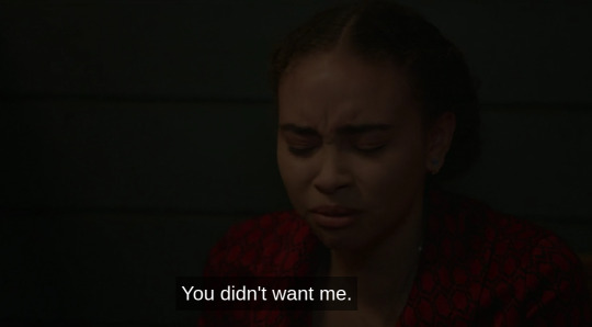
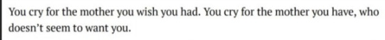
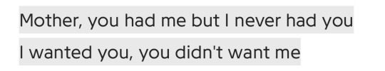
claudia & lestat + on mothers and daughters
"my infant death. it was never you."
bailey bass & sam reid in interview with the vampire (2022) cr. by rolin jones // 1. this post // 2. this post // 3. piss river - kevin morby // 4. a mother's hate - sam gordon // 5. elektra - sophocles // 6. on earth we're briefly gorgeous - ocean vuong // 7. unknown // 8. nayyirah waheed // 9. susan smith - wych elm // 10. unknown // 11. elektra - sophocles // 12. the ghost is dead, long live the ghost - mara avoth // 13. this post // 14. this post // 15. love drought - beyonce // 16. confessions - ijeoma umebinyuo // 17. unknown // 18. mother - john lennon
#like he quite literally brought her into the world#he's her mother#it was giving lady bird meets sharp objects meets some other secret third thing#the fact that they were so alike yet could never read each other's minds#she ached for him to love him unconditionally like louis#and i believe that lestat was genuinely fond of her in those easy times as claudia called them#but once she became too much of a mirror of himself that's when he pulled away#and also bc she was slowly pulling louis away from him#just really a fucked up and tragic dynamic#interview with the vampire#web weaving#lestat de lioncourt#claudia de pointe du lac#amc iwtv#edit: thank you for the notes!#edit: officially complete with the finale#and with sources
4K notes
·
View notes
Text

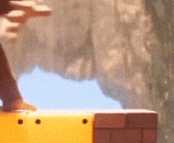
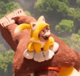
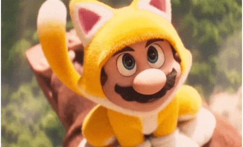
Okay I can't be the only one who gets so much joy out of him unconsciously doing cat things in the cat suit - like okay I know it's a cat power-up but technically it's just supposed to give him cat reflexes and abilities, not behaviors. When he dodges DK's swing, his cat ears flip down and back, when DK is running at him or moving in an unpredictable way he arches his back, when he was taking in the praise from the crowd he started kneading little biscuits on DK's back. I just love these cute little details they make me so happy
Bonus Tanooki tail wag because it makes me so so happy and I could talk about it for hours and I think more people need to acknowledge it
#super mario movie#super mario#the super mario movie#mario movie#the super mario bros movie#super mario bros#super mario bros movie#Mario#your honor they are everything to me#they mean so much to me guys I#I'm saying they like this post isn't only Mario but AUGH the brothers#the amount of loving detail put into this movie makes me want to cry /pos#I could talk about this movie for years#if you read all this sorry it was so much haha but thank you#🧡🧡🧡🧡
1K notes
·
View notes
Last Seen Blogs

moonjuicewiththepresident
capitalism knows me carnally
theemeraldscribe
wise words
chocolate-strawberries
Chocolate Strawberries
clarypisces
clary.