#shape language art
Text
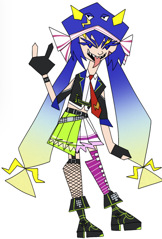
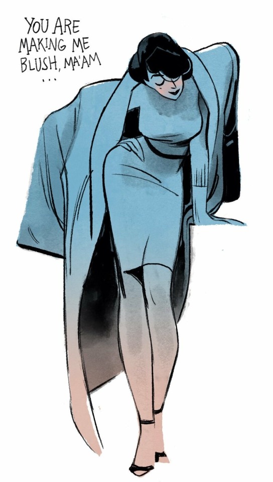
#347: shape language practice!!!! sugar una never
#shape language#shape language art#otomachi una#una otomachi#vocaloid#vocaloid una#una vocaloid#vocaloid otomachi una#otomachi una vocaloid#otomachi vocaloid#vocaloid otomachi#otomachi una spicy#una otomachi spicy
11 notes
·
View notes
Text

two sets of guardians, one trailblazers for the future, the other pallbearers for the past.
light -> life, hope, drive
dark -> death, futileness, stagnancy.
while one set innovated for the future the other was stuck figuring out just how to survive the end.
#homestuck#hom3stuck#theres also shape language ARRGH#jake english#grandpa harley#bro strider#dirk strider#dave strider#alpha dave#alpha rose#rose lalonde#borzoi talks#borzoi meta#homestuck meta#something something pallbearers something something i cant get over alpha session death theme#anyways#borzoi art
2K notes
·
View notes
Text
riz redraw!
side-by-side comparison under the cut :-)
#i didn't try very hard to mimic the vibe or tone or whatever but ehhhh#riz gukgak#fantasy high#dimension 20#d20#fanart#my art#illustration#i believeee that this riz is the very first piece of art i ever posted to this blog#back in ye olden days of three and a half years ago#look at how i've improved!!#the colours are way more cohesive#the general shape and body language is less stiff and more stylized#the composition in general is better imo#and you can see i've gotten a way better handle on perspective when you look at the floor and how riz is positioned#all in all. feeling good about this :-)#i am returning to my fantasy high roots
2K notes
·
View notes
Note
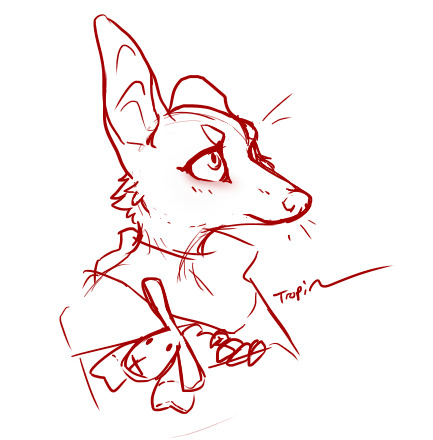
The Sheep plush has delighted me so much that I had to pause my work to quickly scribble a young Machete. please enjoy.
.
#auough#b baby#and his sheep...#that's distressingly cute#and you remembered the floppy left ear too#now I'm very tempted to give him that plush in canon#even though it wouldn't come off as historically accurate the shape language is too modern and dog toy-ish#hhhh hhh#;_;#thank you! I'm in pain#tropinui#gift art#own characters#Machete#why can't he have nice things huh#let the crinkle rest for five minutes
514 notes
·
View notes
Text
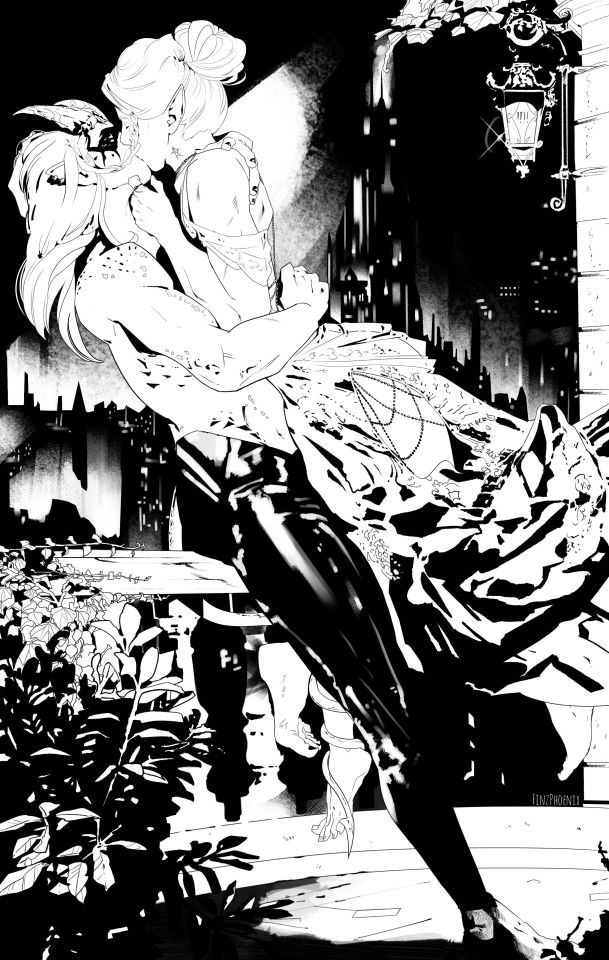
"I would have you by my side in Menzoberranzan."
Minthara and Kalius sharing an intimate moment above the lights of Menzoberranzan city, commissioned by @ilikedetectives!🖤🤍 Their inwoven braids representing the bond of marriage; symbolising memories, fate, and someone's personality/essence.
Kalius, OC © ilikedetectives
Minthara © Larian Studios
Art © FinzPhoenix
#Thanks again for the commission!^^#If this comm taught me one thing then that I'm not made for planning out my backgrounds.#I tried so hard to be systematic. Tried to figure out the correct shape language and balance the focal point and composition...#paid so much attention to creating the right foreground middleground and background...#But nah nothing looked good. Then I just took a break said f this and instead went with my intuition and it turned out great!^^#Nightwarden Minthara#Minthara#Kalius OC BG3#Tav BG3#Minthara x Tav#BG3#Baldur's Gate 3#Baldurs Gate 3#Finz art#Commission
519 notes
·
View notes
Text
I have a personal headcanon that while underwater, SeaWings use mainly ASL to communicate ideas and thoughts and that the bioluminescent flashes are there to give tone, tense, etc.
(I'm new to learning ASL, please forgive any mistakes I made here in the signs)
#wof#wings of fire#wof art#wings of fire art#wof theory#wof headcanon#wings of fire theory#wings of fire headcanon#wings of fire lore#wof lore#wof oc#wof oc art#wings of fire oc#wings of fire original character#my art#asl#asl in media#american sign language in media#oh by the way. this is an oc i made purely for this idea. her name is moonjie#short for moon jellyfish#OH ALSO the face shape is bogcreacher inspired. thank you bogcreacher
373 notes
·
View notes
Text
Another bonus to learning a fiber art is being able to speak to others in a Lovecraftian language that nobody else understands...
...and also being able to read things like THIS:
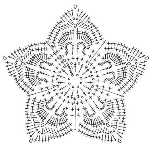
#art#crochet#fiber art#described images#image description in alt#used a crochet pattern for this because it's just INSANE#see i can recognize some of these stitch markings but i haven't done them all yet#i actually kind of prefer the diagram pattern because it actually shows you the shape and the way stitches compliment the piece#with a 'normal' pattern (e.g. 1 dc in fifth ch from hook ch 2 4 dc) i understand it sure but. it isn't the same.#i was reading somebodys recommendations for tapestry yarn and understood all the abbreviations and what they mean#plus i feel like diagrams can be a great way to teach you not only how stitches look but how they contribute to the larger piece#one of my crochet proficiency goals is to be able to look at a piece and know instantly what made it#*cue me at the store analyzing a crochet piece so i can replicate it for 5× the cost*#if you're selling a crocheted piece for like $20 then it's my imperative to replicate it and not buy it 🫡#i think that has the same moral implication as like... 'proplifting'#did crochet as the example because thats what i do as a fiber art. if theres a similar thing for knit/weave/ect then DROP IT BELOW I BEG YO#i want to learn all the lovecraftian languages of the fiber artists <3#i feel like describing the image in exactly what stitch marking indicates what would have been too much so hopefully the explanation as to..#...what the diagram DOES and how it visually indicates a pattern was helpful <3
818 notes
·
View notes
Text
In the course of fucking around, I came across a game called Roller Drama. It’s not my kind of game. But… look at this. Check this art out.


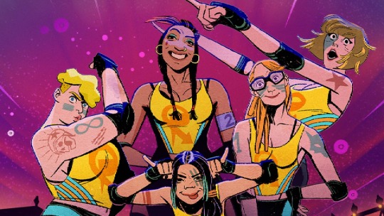
So of course, I had to find out who the artist was. It’s Vic Macioci.
She’s very good!!!
1K notes
·
View notes
Text
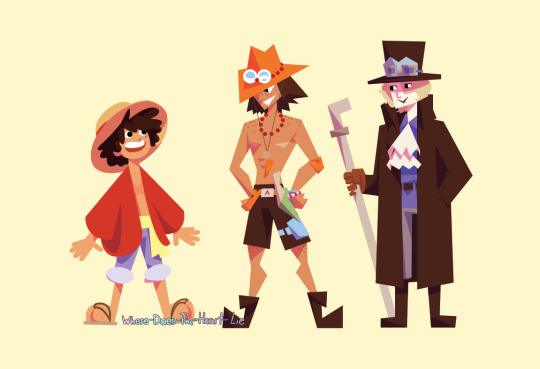
Thinks about shape language thinks about shape language thinks about shape language again thinks about shape langu
Straw Hats Shapes Post
Everyone read my ramblings. 👇
Shape language is defined as “a concept used in art and animation to communicate meaning based on shapes we are familiar with” (source). This concept uses circles, triangles, and squares to convey an idea of the “personality” of the design without using any words.
In designs, using circles and rounded edges in your silhouette and detailing gives the design a soft and squishy look. They tend to be harmless, approachable, or changeable.
Designs using squares gives the design a solid, sturdy, and strong look. They are supportive, reliable, and inflexible
Lastly, triangle designs are sharp and directional. They are dynamic, dangerous, and unpredictable.
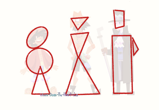
Here are the main silhouette shapes i used, i wanted to generally use one main shape for each of them. Everytime i normally draw sabo, i just think to myself “this man is just a big-ass square,” and im right. This art is such a long time coming im glad to finally do it.
Luffy and Sabo may be the circle and square, but theyre so triangle coded they simply needed triangles in their design as well. Technically luffy’s whole body besides his head is a big ol triangle too, but i felt that a circle for his torso looked better. And also Sabo’s cravat is a triangle as well, but im only using 3 shapes to outline this picture rn. Ace is just straight up all triangles though.
This was such a fun little exercise, i think these little guys came out so well. I dont usually draw in this kind of style so it was a very nice breath of fresh air.
Thank you for reading my ramblings, i love talking about this topic. I did my senior project on it in high-school and it was such a fun topic to write about.
#my art#one piece#asl brothers#sabo#monkey d. luffy#one piece fan art#sabo the revolutionary#portgas d ace#fire fist ace#straw hat luffy#shape language
2K notes
·
View notes
Note
CHALLENGING YOU TO DRAW THE BUG DRAGONS
on it boss o7
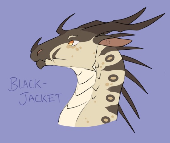
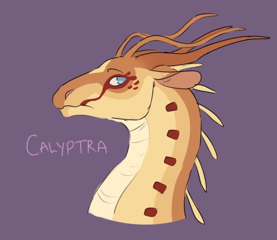
#Sorry they’re ocs#and sorry if I got anything wrong about hivewings or silkwings#I love the shape language with the pantalan tribes#the leafwing plant cell scales are inspired#my art#oc art#oc stuff#horst#wof art#wings of fire#Calyptra#Blackjacket
274 notes
·
View notes
Text
modern au red carpet gala lewks.... working on a proper thing for these but for now I just wanted 2 share the vision🙏
#yes because I am TIRED of designing im sry ill get back 2 this#but they're finally like.... I think they're finally fitting#neither of them would go super formal or in a blend-in-average-suit way#nd also blah blah trying to keep their personal style nd vibe and shape language#i <3 designing clothes (thru gritted teeth)#modern au gortcas#art tag#casim carnarvon
246 notes
·
View notes
Text
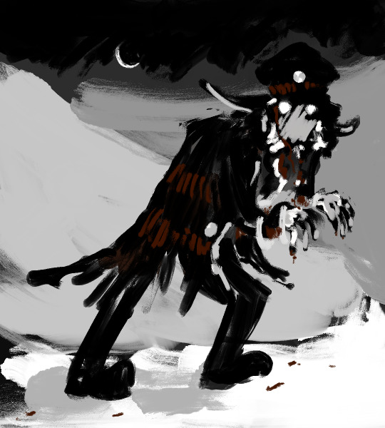
there's that fucked up three-eyed thing that lives in the woods. whose turn is it to chase it off again??
#submas#submas art#so long story short i cant fucking draw people. i can draw all sorts of beasties but alas the human Face has always eluded me unless im#drawing direct from reference#which simply means. i guess come up with ideas where i get to draw a lot of pokemon and maybe some dude From A Distance#anyway i really like all the like. one of them has to go a little fucking nuts in the woods. aus#submas microwave au#you see a subway boss from far away and his eyes shine like medallions just like his hat pin#in the naked twilight of a snowy night where everything glows and nothing is truly dark#and maybe he's got a mega concussion and amnesia#get adopted by creatures. idiot#submas ingo#i just feel like in an age and era where 'unusual/strange human' = dog thats going to maul my face#that this would. not go well yk#ft his little clown shoes. theyre so funny to me. little as in honkin big#loud booming calls in a language known only to it. even the zoroark seem to shun it#taking a mockery of its shape and trying to chase it down#though some in turn embrace it#seen especially commonly with ghost pokemon#perhaps its a ghost itself?#whatever it is. its not allowed in camp
176 notes
·
View notes
Text

calamari
#the emperor#bg3#illumone art#this guy chooses to dress like a supervillain#and then gets upset when you don't think he's a good guy#shape language 101 buddy catch up
357 notes
·
View notes
Note
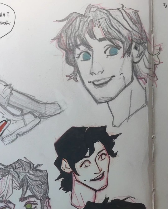
Got any advice on drawing McCoy? I hear people all the time saying how hard Jim is to draw (and he 100% is almost impossible i don’t deny) but McCoy T-T that wrinkley old bastard just completely eludes me for some reason lmao
ANON hiiiii!! i gotcha buddy. hope this helps!
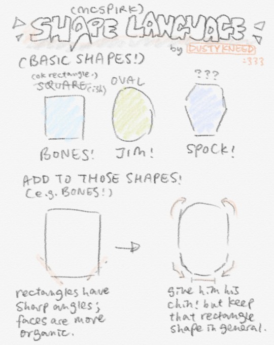
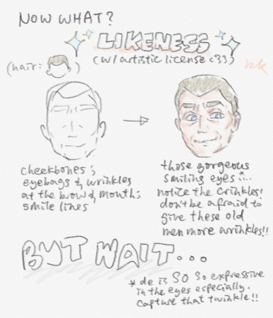
obv this is just how i interpret them in my style. there's no right way to go about this and another thing that helps is to, aside from referencing the source material, look at how other artists (off the top of my head, toboldlymuppet's trek art on tumblr definitely had some influence in how i drew them when i'd freshly gotten into trek!)
also forgot to mention but mcspirk definitely has really distinct silhouettes!! so don't be afraid to mess around with stylisation and emphasize the features that characterize each of em :]]
for this references are your good friend! (i'm a hypocrite bc i only use refs when im completely stuck LMAO it's a bad habit. use those refs liberally. don't be like me 💀💀)
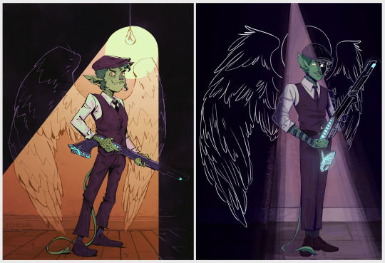
learning to stylise blorbos always takes some work but i promise you'll get there<33 here's a side by side comparison of one of my earliest bones scribbles and one of the most recent-- you can really see the evolution of how i was able to get more comfortable with characterization (even though I used refs for neither of these LOL).
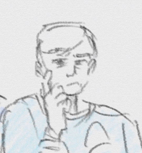
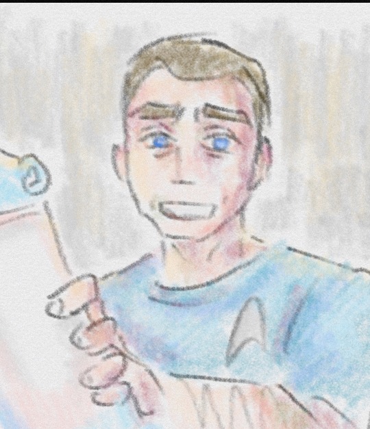
you got this!!!
#star trek#star trek tos#star trek fanart#tos#star trek the original series#leonard mccoy#bones mccoy#leonard bones mccoy#leonard mccoy fanart#mcspirk#shape language#how to draw#art style
183 notes
·
View notes
Text


I think he's slowly becoming unrecognizable and turning into a different character, but i can't stop drawing @naffeclipse 's orca siren eclipse on just about every other page of my sketchbook
#art#fanart#apex polarity fanart#siren eclipse#sketches#colored sketches#eclipse fnaf#eclipsed heart#hes so fun to practice shape language with#and also get more into creature design#hes so fun to just. make a quick sketch of#and having the long tail forces me to think of more dynamic poses to make things look natural
208 notes
·
View notes
Text
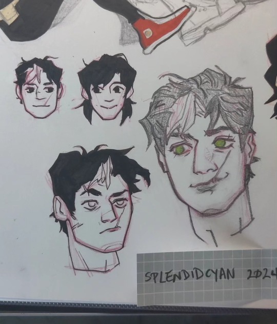

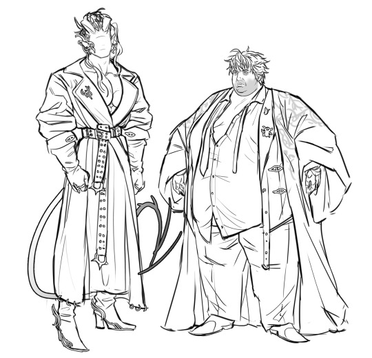
Can I offer you some bat boys in this trying time 🥚 did the Timmy and Jason first, but didn't like how Jason turned out so I did some design work for his face. Designed Dick alongside bc I like the idea of them being opposites (square vs thin face, down turned vs upturned eyes, ect). The inked ones are pushed further in shape terms than the pencil ones.
#my art#batfam#jason todd#dick grayson#tim drake#robin#red hood#nightwing#illustration#character design#shape language#2024
168 notes
·
View notes
Last Seen Blogs

motions1ckness
birdie

wintersbucky
em♡
stephenthewriter-blog
BLOCKED!

emeraldsummers
Drowned in moonlight