#new curvature pen tool
Text
youtube
الحل السحري لعلاج تقوس وانحناء الظهر The magic solution to treat curvature and curvature of the back
#magic the gathering#back relaxation device#yoga to correct spinal curvature#back pain#back relaxation#back stretcher#curvature pen tool#photoshop curvature pen tool#curvature pen tool photoshop#new curvature pen tool#curvature tool#photoshop curvature tool#curvature pen tool in photoshop cc 2018#curvature pen photoshop#photoshop curvature pen#back pain relief#curvature#correct spinal curvature#learn magic the gathering#spinal curvature#gym body#gym bro#gym routine#gymlover#gymlife#gymfit#gym#home gym#tumblr milestone#gymwear
0 notes
Text

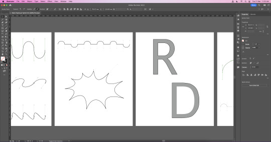
adobe illustrator..... bad.......
this was my first experiment with illustrator as part of an exercise to try out a new program! i didn't like it! i'm fairly comfy with the adobe suit but illustrator is just... not.. good to use.... as my girlfriend put it, "it's less a learning curve and more a learning u-turn". but i'm relatively proud of my ability to trouble shoot and self-learn new programs that are objectively not user friendly though!
skills i used/learned:
creating a pattern, creating a brush with that pattern, pen tool, creating vector shapes with curvature, adjusting artboards and resolution
3 notes
·
View notes
Text
Vector path Photoshop
A vector path in Photoshop is a type of graphic element that consists of a series of points connected by lines or curves. It is a mathematical representation of a shape or outline that can be easily modified or resized without losing any quality.
To create a vector path in Photoshop, you can use the Pen tool or any other shape tool such as the Rectangle tool, Ellipse tool, or Custom Shape tool. The Pen tool allows you to create paths by adding and manipulating anchor points, which determine the direction and curvature of the lines or curves. Once you have created a vector path, you can apply various operations and effects to it, such as stroke, fill, or gradient. You can also convert the path into a selection or a shape layer, which gives you more control and flexibility in editing and styling. Vector paths are particularly useful when working with logos, icons, or any other graphics that require scalability and precision. Unlike raster-based images, vector paths in Photoshop can be resized and manipulated without pixelation, making them ideal for both print and web design projects.
How to create a vector path in Photoshop?
To create a vector path in Photoshop, follow these steps:
1. Open Photoshop and create a new document or open an existing one.
2. Select the Pen Tool from the toolbar. It is typically located in the left sidebar.
3. Choose the path type you want to create by selecting one of the three options: Shape, Path, or Pixels. For creating a vector path, choose the "Path" option.
4. Click on the canvas to start creating the path anchor points. Click and drag to create curved segments, and click without dragging to create straight segments.
5. Continue clicking and creating anchor points to define the shape of your vector path.
What is the purpose of a vector path in Photoshop?
The purpose of a vector path in Photoshop is to create and manipulate scalable, resolution-independent shapes and lines. Unlike raster images, which are made up of pixels and can lose quality when resized, vector paths are defined by mathematical equations, allowing them to be resized and edited without any loss of quality.
In Photoshop, you can use the Pen tool to create vector paths. These paths can be used for a variety of purposes, such as creating precise and smooth selections, designing custom shapes, creating paths for text to follow, or creating complex artwork. Vector paths are especially useful for tasks that require precision and flexibility, such as logo design, illustration, and typography.
By using vector paths, you can easily modify and transform shapes, apply stroke and fill attributes, and even convert paths into selections or masks. This makes vector paths an essential tool for creating and editing graphic elements in Photoshop.
How to edit a vector path in Photoshop?
To edit a vector path in Photoshop, you can follow these steps:
1. Open your image in Photoshop and select the Pen Tool from the toolbar. Alternatively, you can press the "P" key on your keyboard to select the Pen Tool.
2. Click and create anchor points to outline the shape or path that you want to edit. Each click creates an anchor point, and you can connect these points to form straight or curved lines.
3. To adjust an existing anchor point, select the Direct Selection Tool from the toolbar or press the "A" key on your keyboard. Click on the anchor point you want to modify, and you will see handles appear that allow you to adjust the shape.
4. To add or remove anchor points, select the Pen Tool and position it on the path where you want to make the change. To add an anchor point, simply click on the path. To remove an anchor point, press and hold the "Alt" or "Option" key on your keyboard and click on the anchor point.
5. To modify the path between anchor points, select the Convert Point Tool from the toolbar or press the "Shift" + "C" keys on your keyboard. Click and drag the handles attached to an anchor point to reshape the path segment.
6. You can also move the entire path by selecting the Path Selection Tool from the toolbar or pressing the "A" key on your keyboard. Click and drag the path to reposition it within your image.
7. Once you have made the desired modifications to the vector path, you can save your changes. If you want to keep the vector path editable, save your document in a format that supports Photoshop's vector features, such as PSD. If you want to export your vector path as a non-editable format, such as a JPEG or PNG, you can use the "Export As" or "Save For Web" options under the "File" menu.
Remember, when working with vector paths in Photoshop, it's always a good idea to make a copy of your original image layer or save your work as a separate file. This way, you can always go back to the original if needed and avoid accidentally overwriting your original image.
How to convert a raster image to a vector path in Photoshop?
To convert a raster image to a vector path in Photoshop, you can follow these steps:
1. Open Photoshop and import your raster image by going to "File" > "Open" and selecting the file.
2. In the Layers panel, right-click on the layer containing your raster image and select "Rasterize Layer." This will convert your image into a bitmap raster layer.
3. Use the "Pen Tool" from the toolbar on the left side of the screen. Zoom into the image for precision.
4. Start tracing the shape or outline of the image with the Pen Tool by creating anchor points. Click and drag to create curves if needed.
5. Continue placing anchor points along the desired path, following the contours of the image. Be patient and take your time to accurately trace the shape.
6. Once you have completed the path, right-click on the path and choose "Make Selection." This will create a selection based on the vector path.
7. With the selection active, go to "Layer" > "New Fill Layer" > "Solid Color." Choose a color and click "OK." This will create a new layer with the vector path filled in with the chosen color.
8. You can also use the "Paths" panel to save the path for future use or export it for use in other software.
Keep in mind that converting a raster image to a vector path may not always produce perfect results, especially for complex or detailed images. It is recommended to use dedicated vector editing software like Adobe Illustrator for more accurate and precise results.
How to use the Pen tool to create a vector path in Photoshop?
To use the Pen tool to create a vector path in Photoshop, you can follow these steps:
1. Select the Pen tool from the toolbar. It looks like a pen nib.
2. Determine which type of path you want to create: a shape or a path. You can switch between these options in the toolbar at the top of the screen.
3. If you're creating a shape, ensure the "Shape" option is selected in the toolbar. If you're creating a path, ensure the "Path" option is selected.
4. Click on the canvas to place the first anchor point of the path. This will be the starting point of your path.
5. Click again on a different part of the canvas to add a second anchor point. Photoshop will automatically create a straight line between the two anchor points.
6. To create curved segments, click and drag the mouse after placing an anchor point. This will create direction handles that control the direction and curvature of the path.
7. Continue adding anchor points and adjusting the direction handles to create your desired path. You can create straight and curved segments as needed.
8. To close the path, click on the starting anchor point. A small circle will appear next to the Pen tool cursor when you're hovering over the starting point to indicate that the path will be closed.
9. Once you've created the desired path, you can modify it further by adjusting the position and length of the direction handles. You can also add or delete anchor points using the Pen tool or other path editing tools.
10. If you're creating a shape, you can fill it with a color or apply a stroke by selecting the shape layer and using the options in the toolbar or the Layer Style window.
That's how you use the Pen tool to create a vector path in Photoshop. Practice and experimentation will help you become more proficient with this powerful tool.
How to apply different stroke styles to a vector path in Photoshop?
To apply different stroke styles to a vector path in Photoshop, you can follow these steps:
1. Use the Pen Tool (P) to create a vector path on the canvas. You can also use existing shape layers or text layers with vector masks.
2. Select the "Path Selection Tool" (A) from the toolbar.
3. Click on the vector path or layer that you want to apply the stroke style to. This will activate the path.
4. From the menu, go to "Window" > "Properties" to open the Properties panel.
5. In the Properties panel, locate the "Stroke" section. If you can't see it, click on the disclosure triangle next to "Properties" to expand the options.
6. Adjust the stroke settings to customize the style according to your preference. You can modify parameters such as size, color, opacity, and alignment.
7. To change the stroke type, click on the drop-down menu next to "Stroke" and choose from the available options, such as Solid, Dashed, Dotted, or Custom.
8. For custom stroke styles, click on the "More Options" button (represented by three dots) next to the drop-down menu. This will open the Stroke Options dialog box where you can adjust parameters like dash length, gap length, and dash offset to create a unique stroke style.
9. Once you are satisfied with the stroke style, you can further customize it by applying layer effects, such as Bevel and Emboss, Outer Glow, or Gradient Overlay, from the "Layer Style" dialog box.
How to apply different fill colors to a vector path in Photoshop?
To apply different fill colors to a vector path in Photoshop, you can follow these steps:
1. Select the "Path Selection Tool" from the toolbar. It looks like a black arrow.
2. Click on the vector path you want to apply a fill color to. This will select the path.
3. In the top options bar, you will see the "Fill" option. Click on the small color swatch next to it to open the color picker.
4. Choose a color from the color picker or enter the specific color values you want. Click "OK" to confirm the color.
5. The selected vector path will now be filled with the chosen color.
If you have multiple vector paths and you want to apply different fill colors to each path, you can repeat the above steps for each path individually.
How to transform and modify a vector path in Photoshop?
To transform and modify a vector path in Photoshop, you can follow these steps:
1. Open your vector path in Adobe Photoshop by selecting "File" > "Open" and navigating to the file location on your computer.
2. Make sure the "Paths" panel is visible. If it's not already visible, you can go to "Window" > "Paths" to enable it.
3. In the Paths panel, you should see your vector path listed. If you don't have a path yet, you can create one by using the pen tool or any other selection tool and converting it into a path.
4. Select the vector path you want to modify by clicking on its thumbnail in the Paths panel. This will make the path active.
5. To transform the path, you can use the Free Transform Path tool. Select the tool from the toolbar or press "Ctrl+T" (Windows) or "Command+T" (Mac) to activate it. This will create a bounding box around the path with handles that you can use to resize, rotate, and shear the path.
6. To modify the shape of the path, you can use the Direct Selection tool. Select the tool from the toolbar or press "A" to activate it. With this tool, you can click and drag individual path points to move them or adjust the handles to change the curvature of the path.
7. If you want to add or remove points from the path, you can use the Pen tool or the Add Anchor Point tool and Delete Anchor Point tool, respectively.
8. You can also apply various layer styles and effects to the vector path by selecting the path layer in the Layers panel and using the options in the Layer Style dialog box.
Remember to save your work when you're done by selecting "File" > "Save" or "Save As".
How to combine multiple vector paths in Photoshop?
To combine multiple vector paths in Photoshop, you can use the "Path Operations" feature. Here are the steps:
1. You can also press "A" on your keyboard to access it.
2. Hold down the "Shift" key and click on each vector path that you want to combine. This will select multiple paths at once.
3. Right-click (or Ctrl-click on a Mac) on one of the selected paths and choose "Combine Shapes" from the context menu.
4. In the "Path Operations" dialog box, choose one of the operations to combine the paths. The options include "Add", "Subtract", "Intersect", and "Exclude Overlapping Shapes". Select the appropriate option based on the desired outcome.
5. Click the "OK" button to apply the selected path operation and combine the paths.
The combined vector paths will now be merged into a single path based on the chosen operation. You can then manipulate, fill, or stroke the combined path as needed.
Note that the ability to combine vector paths in Photoshop is only available when working with vector shapes and paths, not with pixel-based layers or images.
0 notes
Text
Mastering Water Drops Effects in CorelDraw: A Step-by-Step Guide
1. Introduction
Creating stunning water drop effects in graphic design can elevate your designs to a whole new level. Whether you're a seasoned designer looking to enhance your skills or a beginner eager to learn the ropes, this step-by-step guide will walk you through the process of mastering water drop effects in CorelDraw. From creating the perfect shape to applying realistic textures and reflections, this tutorial will provide you with the techniques and tools you need to create eye-catching designs that will leave a lasting impact. So, grab your pen tool and let's dive into the world of water drop effects in CorelDraw!
https://unsplash.com/@thisisengineering
2. Understanding the Water Drops Effect in CorelDraw
Understanding the Water Drops Effect in CorelDraw
Before we dive into the process of creating water drop effects in CorelDraw, it's important to have a clear understanding of what this effect entails. The water drop effect is a popular technique used in graphic design to create a realistic and visually appealing representation of water droplets.
In order to achieve this effect, it's crucial to pay attention to the details such as shape, texture, and reflection. By carefully manipulating these elements, you can create water drop effects that are so lifelike, viewers will be tempted to reach out and touch the droplets.
In the upcoming sections, we will explore the various tools and techniques in CorelDraw that you can use to create stunning water drop effects. We will discuss the importance of shape creation, texture application, and reflection adjustment, providing you with the knowledge and skills necessary to master this effect.
So, let's roll up our sleeves and get ready to delve into the world of water drop effects in CorelDraw!
3. The Tools and Techniques for Creating Realistic Water Drops
In order to create realistic water drop effects in CorelDraw, it's important to familiarize yourself with the various tools and techniques available. These tools and techniques will allow you to manipulate shapes, textures, and reflections in order to achieve the desired effect.
One useful tool for creating water droplet shapes is the ellipse tool. By adjusting the size and curvature of the ellipse, you can create droplets of different sizes and shapes. Additionally, the shape tool can be used to refine the edges and add dimension to the droplets.
Texture application is another important aspect of creating realistic water drops. CorelDraw offers a variety of texture fill options, such as gradient fills or pattern fills. Experimenting with different textures can help you achieve a more lifelike effect.
Lastly, adjusting the reflection of the water drops can greatly enhance their realism. CorelDraw provides tools for adjusting reflection, such as transparency options and blending modes. By playing around with these settings, you can create reflections that mimic the appearance of water.
In the next section, we will explore these tools and techniques in more detail, providing step-by-step instructions for creating stunning water drop effects in CorelDraw. So, grab your creative gear and let's dive in!
4. Step-by-Step Guide to Mastering Water Drops Effects in CorelDraw
In this section, we will provide a comprehensive step-by-step guide to mastering water drop effects in CorelDraw. By following these instructions, you will be able to create stunning and realistic water droplets in your designs.
Step 1: Creating the water droplet shape
- Select the ellipse tool and draw an ellipse on your canvas.
- Use the shape tool to refine the edges and shape of the droplet.
- Experiment with different sizes and curvatures to achieve the desired droplet shape.
Step 2: Adding texture to the droplet
- Select the droplet shape and choose a texture fill option from the fill options menu.
- CorelDraw offers gradient fills, pattern fills, and other texture options. Try different textures to achieve a more realistic water droplet appearance.
Step 3: Adjusting reflection
- Adjust the reflection of the water droplet by using transparency options and blending modes.
- Play around with different settings to create reflections that mimic the appearance of water.
Step 4: Enhancing realism with additional effects
- Consider adding additional effects like shadows or highlights to enhance the realism of the water droplet.
- Experiment with different effects and settings until you achieve the desired result.
By following these step-by-step instructions, you will be well on your way to mastering water drop effects in CorelDraw. Stay tuned for the next section, where we will provide tips and tricks for adding finishing touches to your water droplet designs.
5. Tips and Tricks for Enhancing the Realism of Water Drops
In this section, we will provide you with some valuable tips and tricks to enhance the realism of the water drop effects you've created in CorelDraw. These techniques will add that extra touch of authenticity to your designs.
Tip 1: Play with transparency and opacity
Adjusting the transparency and opacity of the water droplet can create a more convincing effect. Play around with these settings to achieve the perfect level of transparency for your droplets. Remember to observe how light interacts with water in real life to replicate the effect accurately.
Tip 2: Experiment with lighting and shadows
Incorporating realistic lighting and shadows can greatly enhance the realism of your water droplet designs. Utilize CorelDraw's lighting effects and shadow tools to experiment with different angles and intensities for the droplets. Mimicking natural lighting conditions will make the droplets appear more authentic.
Tip 3: Utilize the power of gradients
Gradients can add depth and dimension to your water droplet designs. Experiment with different gradient fills, especially those that mimic the colors present in water droplets. By carefully selecting and placing gradients on your droplets, you can make them appear more lifelike.
Tip 4: Add water ripples or splashes
To take your water droplet designs to the next level, consider adding ripples or splashes around the droplets. You can create these effects using various tools and techniques in CorelDraw, such as the distortion or mesh warp tools. Be careful not to overdo it though, as subtlety is key for a realistic appearance.
With these tips and tricks, you will be able to enhance the realism of your water drop effects in CorelDraw. Stay tuned for the final section of this guide, where we will showcase some inspiring examples of water droplet designs and provide additional resources to further improve your skills.
6. Applying Water Drops Effect in Various Design Projects
In this final section, we will explore how to apply the water drop effect in various design projects using CorelDraw. The versatility of this effect allows you to elevate your designs in different contexts. Let's dive in!
1. Advertising: Incorporating water drops in advertisements can add a touch of freshness and realism. Imagine a crisp, dewy water droplet on a vibrant fruit or a refreshing drink. It instantly captivates the viewer's attention and enhances the overall visual appeal.
2. Packaging: The water drop effect is a popular choice in packaging design, particularly for beverages, skincare products, or any items associated with water. The droplets create a sense of luxury and purity, making the product appear more enticing and desirable.
3. Web design: Add a dynamic element to your website by integrating water drops. They can be used as hover effects, where the droplets appear when users hover over a specific area. This interaction not only engages the audience but also reinforces the theme or concept of the website.
4. Branding: Incorporating the water drop effect into your brand identity can convey a sense of freshness, purity, and reliability. Use it in your logo, stationery, or promotional materials to create a cohesive and visually appealing brand image.
By applying the water drop effect in these various design projects, you can elevate your visuals and create a lasting impression on your audience. Don't be afraid to experiment and explore different ideas to find the perfect application for your designs. Remember to always keep the principles of balance and harmony in mind.
With that, we conclude our guide on mastering water drop effects in CorelDraw. We hope this step-by-step guide has empowered you to create realistic and captivating water droplet designs. Don't forget to continue practicing and exploring new techniques to further improve your skills. Happy designing!
7. Final Thoughts and Further Exploration of CorelDraw Effects
Final Thoughts and Further Exploration of CorelDraw Effects
Congratulations on mastering the water drop effect in CorelDraw! By following this step-by-step guide, you now have a powerful tool in your design arsenal that can enhance various projects.
Remember that CorelDraw offers a wide range of effects that can take your designs to the next level. Take some time to explore and experiment with other effects such as shadows, transparency, and gradients. These effects, when combined with the water drop effect, can create stunning visuals that leave a lasting impact on your audience.
Additionally, continue honing your skills by practicing and creating new designs. Join design communities or forums to connect with other designers and learn from their experiences. CorelDraw also provides tutorials and resources that can further expand your knowledge.
In conclusion, mastering the water drop effect is just the beginning of your journey as a designer using CorelDraw. Embrace new challenges, stay open to learning, and keep pushing the boundaries of your creativity. The possibilities are endless. Happy designing!
1 note
·
View note
Text
How to Make a Curved Line in Photoshop Elements
Introduction
Photoshop Elements is a versatile and powerful software that allows users to enhance their images and unleash their creativity. One of the fundamental skills every Photoshop Elements user should learn is how to create curved lines. Curved lines can add a touch of elegance, fluidity, and dynamism to your designs, whether you're working on digital illustrations, graphic designs, or photo manipulations. In this article, we will guide you through the step-by-step process of creating curved lines in Photoshop Elements, helping you unlock endless possibilities for your artistic endeavors.
Understanding the Pen Tool
Before diving into creating curved lines, it's essential to familiarize yourself with the Pen Tool in Photoshop Elements. The Pen Tool is a versatile tool that allows you to create precise and customizable paths. With the Pen Tool selected, you can click on specific points to define straight lines, and by adding anchor points, you can create curves. Mastering the Pen Tool will empower you to create any curved line with ease.
Read More
Step 1: Selecting the Pen Tool
To begin creating a curved line in Photoshop Elements, select the Pen Tool from the toolbar. It is represented by a pen icon. Alternatively, you can use the keyboard shortcut "P" to activate the Pen Tool.
Step 2: Creating the First Anchor Point

Click on the canvas where you want your curved line to begin. This click will create the first anchor point of your path. Ensure that you click on the desired location with precision, as this will determine the starting point of your curve.
Step 3: Constructing the Curved Line
To create a curved line, click and drag on the canvas. This action will create direction lines extending from the anchor point you just created. The length and angle of these direction lines will determine the curvature of your line. Experiment with different click-and-drag motions to achieve the desired curve. Remember, you can always adjust the shape of the curve later.
Step 4: Adding Additional Anchor Points
Continue adding anchor points along the desired path of your curved line. Each new anchor point will connect to the previous one, forming a continuous curve. Add as many anchor points as necessary to create complex and intricate curves.
Step 5: Modifying Anchor Points and Direction Lines
After constructing your curved line, you can further refine its shape by adjusting the anchor points and direction lines. To modify an anchor point, select the Direct Selection Tool from the toolbar (shortcut: A) and click on the desired anchor point. You can then click and drag the anchor point or its associated direction lines to reshape the curve.
Step 6: Converting Paths to Selections or Shapes
Once you have created your curved line, you may want to convert it into a selection or a shape for further manipulation. To convert your path into a selection, right-click on the path and choose "Make Selection" from the context menu. Adjust the selection settings as needed and click "OK." To convert the path into a shape, right-click on the path and select "Define Custom Shape." You can then access the shape from the Custom Shape Tool (shortcut: U) for future use.
Learn More: Product photo editing service
Step 7: Applying Stroke and Fill
To enhance the appearance of your curved lines, you can apply stroke and fill options. With the path selected, navigate to the Options bar at the top of the Photoshop Elements interface. Choose a stroke color by clicking on the color swatch and selecting the desired color. Adjust the stroke width to your preference, keeping in mind that thicker strokes create more prominent lines. You can also apply a fill color to the enclosed area created by your curved line, giving it a solid or gradient color.
Step 8: Experimenting with Brush Styles
In addition to stroke and fill, you can explore different brush styles to further customize your curved lines. Select the Brush Tool from the toolbar (shortcut: B), choose a brush style from the Brush Preset Picker in the Options bar, and adjust its size and hardness. With the Pen Tool-selected path active, click on the "Stroke Path with Brush" button located at the bottom of the Paths panel. This action will apply the selected brush style to your curved line, adding texture and artistic flair.
Step 9: Combining Curved Lines
Creating complex designs often requires combining multiple curved lines. To merge two or more curved lines into a single path, select each individual path while holding down the Shift key. Once all the paths are selected, right-click on any of the selected paths and choose "Combine Shapes" from the context menu. This action will merge the paths into a single shape, allowing you to manipulate and style them collectively.
Step 10: Saving and Exporting
Once you're satisfied with your curved lines and overall design, it's important to save and export your work. To save your project as a Photoshop Elements file (.psd), go to File > Save As and choose the desired location on your computer. This format allows you to retain all the layers, paths, and other elements for future editing. If you want to share your design with others or use it in other applications, consider exporting it as a common file format like JPEG, PNG, or TIFF.
Conclusion
Congratulations! You've learned how to create curved lines in Photoshop Elements and discovered various techniques to enhance their appearance. By mastering the Pen Tool, adjusting anchor points and direction lines, converting paths, applying strokes and fills, exploring brush styles, combining paths, and saving/exporting your work, you now have the ability to rejuvenate your imaginative dreams. Remember, practice and experimentation are key to mastering any skill in Photoshop Elements, so continue exploring and pushing the boundaries of your artistic capabilities. Happy designing!
0 notes
Text
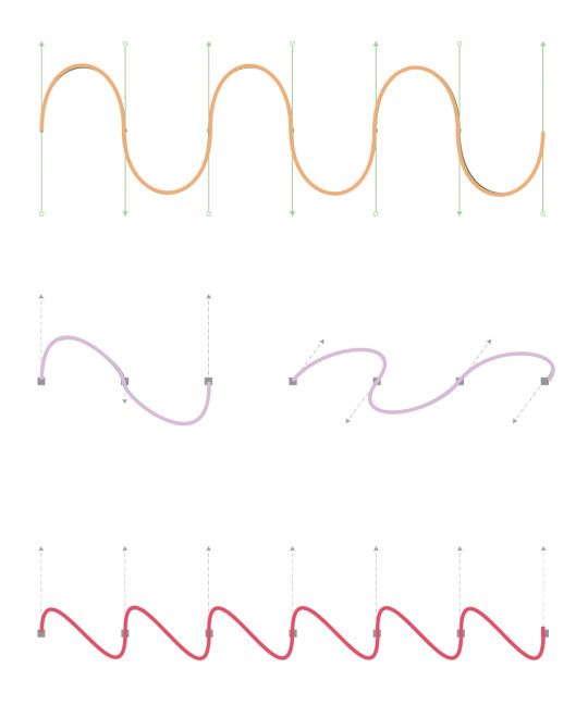
I chose the quote, "Artists are just children who refuse to put down their crayons" from Al Hirschfeld because I wanted a quote that had to do with artists, and the crayon part really fits with a coloring book. I used "Goudy Stout" font for the "Artists" because I wanted that word to be bold but still look hand drawn. I used the font "Jokerman" for "children" since it looks playful like a child. "Kristen ITC" font was used for the word "crayons" because it looks whimsy. The other fonts I used for the in-between words were "Cooper Black," "Fort," and "Ink Free" since I needed fonts that wouldn't take away from the most important words, but were still fun. I included the design element of symmetry into piece so that it looks balanced. I also added recognizable shapes, such as crayons, rainbow, and clouds. I plan on using the design more as a border, and maybe I will create other designs for a different pattern in the background. To make my design, I mainly used the curvature and pen tool.
I only repeated my main design (with the crayons and rainbow) once by reflecting it horizontally in order to create symmetry and have the lines of the rainbow lead your eyes back to the quote. However I made a new design of wiggly lines around the corners of the page which I made using the curvature pen and then copying and pasting. I also added some wiggly lines going down the side with the pencil tool. I used the pencil tool for the two straight border lines on the top and bottom too in order to make lines that felt more organic and hand drawn. For the other shapes, I mainly used the pen and curvature tool. The stars were created using the star tool. I tried to make sure every design is able to be colored in, even by outlining the text.
0 notes
Text
Reflection
Looking back on fundamentals I think the class has reinforced my skills in regard to using adobe software - the most helpful was InDesign which I had never used before.
For Illustrator & Photoshop the class has reinforced my previous knowledge while building new knowledge about different tools/processes and has made me think about the process of using the software and made me more organised through learning techniques, shortcuts & file management - something which I didn't pay much attention to previously.
For Illustrator my main struggle was using the pen tool as I had previously only used the curvature tool and would default to using it instead of the pen tool. This class forced me to actually learn the tool and improve which I am very grateful for as I probably wouldn't have otherwise.
With Photoshop the main learning for me was masks - which are also something I generally avoided previously. The class made me learn them which is something that i'll be taking through to whenever I work in photoshop in the future.
Adjusting to InDesign was a challenge at first as I kept wanting to use it like Illustrator & Photoshop but learning the software and continuing with it will be important for my future design work.
For the final book I wish I had been able to spend more time on it as feel I could have done a much better job particularly with the illustrations as I just did silhouettes for the most part.
This is a generally bigger problem that I have with my work sometimes as I can let the amount of work i have to do pile up - The catch up session that we did earlier in the course was a big help for this though.
In regards to the class itself the moments I enjoyed it the most were the ones where we were driving the work - eg when we created our illustrations independently using the previous tools we learnt. This helped with learning alot as the lesson was much more engaging for me.
This is a problem that I have with the course sometimes as I feel the tutorials could be presented in a more engaging way so as we aren't just copying whats on the board. I also feel as if some classes could have been shorter so as to keep the information short and sweet so it sticks in the mind easier.
Thanks
0 notes
Text
Making of the AUT Map
After the class where we went over the pen and curvature tool on illustrator, I felt much more prepared to begin my map. Had I missed that class, I feel as though I would’ve struggled quite a lot.
I begun the task by opening the map up in illustrator and then determining which part of the map I would include/exclude.


I then added my map onto InDesign and began putting in the names of buildings and streets.

I originally had changed the colour to the colour found in the tag of my visual from my poster but once I had changed the concept/style of my work, I adapted it to the new design by making it greyscale.
I also adjusted the stroke of the main buildings to be bolder as the weight was getting lost in my document.
0 notes
Text
In class activity on Illustrator


In class we did this activity where we used the pen tool, learnt how to use the anchor point as well as the curvature tool. This tool for this specific assignment will help us with illustrating our map for this project. I’m very confident illustrating and designing pathways but I learnt something new as I always struggled on how how to use the anchor point and all these activities helped me with that.
- Holding the option key gives you the handles (to round the corners)
- Object > Path > Outline stroke
0 notes
Text
WK4.1 Workshop - Path Practice


Adobe Illustrator: Exploring different ways to use the Pen tool & the Curvature tool. This can be helpful especially with illustrating the the map for the pamphlet on the information side of the poster.
In today’s workshop we also learnt new shortcuts that can be used for Illustrator to make editing/illustrating easier & faster.
P - Pen Tool. H- Hand Tool. V - Selection Tool. A - Direct Selection Tool. The list goes on, this will be really effective for editing my project because it will help me move faster.
0 notes
Text
Putting patterns onto the final outfits
Since our group has now selected the three strongest designs which will be used in our final project, I am in the process of editing the textiles samples and patterns which I have created onto these outfits.
This post will be about my process to do this on Photoshop.
To begin with, I started out with a sketch which was drawn and then scanned and put onto Photoshop.

First, I made the skirt black and experimented with the opacity and then, using the pen tool, I shaded in the skirt and added extra detail to it. Since one of the main features of these clothes is the drawstring (which makes each garment adaptive) I took my time rendering this area of the skirt to ensure that the drawstring and the texture of the ruched fabric was emphasised.
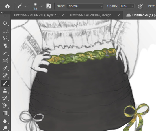
I used a clipping mask of some fabric samples i made for the belt, ribbons and legwarmers. I may experiment further with colour options; I have two different shades of green in mind, as I used 2 different types of green yarn to create samples.


After doing a detailed comparison of the two options, I decided upon using the light green samples as I feel they match better with the theme, but also because they have better contrast against the skirt, making them stand out. and catch the viewer's attention.
The colour green holds connotations of new beginnings and growth, so incorporating these green statement pieces into the outfit (which is otherwise made up of neutral colours) gives the outfit an edge and makes it exciting and unique. Green is a colour which can be observed most recently in new trends. It is a colour which is coming back into style, so by incorporating this into our line, we are keeping current with the trends while simultaneously keeping our collection minimalistic and timeless.
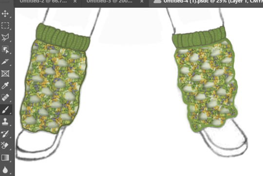
To finish off the legwarmers, I used the pen tool to fill the cuffs green and then I used a darker shade of green to shade in the legwarmers and add depth. I added a knitted texture to the cuffs as this kind of knitting would be stretchy and soft, ideal to hold the legwarmers up whilst also being comfortable.
Next, I added colour and shading to the top. To begin with, I used the curvature pen tool to create an outline of the top.
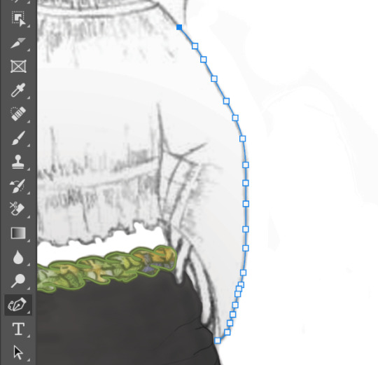
Then I filled it and lowered the opacity to reveal the shading and details in the drawing. I further emphasised these details, and added more shading, using the pen tool at a low opacity, and building up layer by layer to make the shading more realistic. Below to the left is the top without the shading, and to the right is after adding shading and emphasising the ruched detailing.
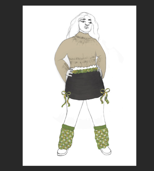

I am very happy with the outcome of this outfit as I think the rendering/shading on the skirt is very detailed and effective, and the colours in the outfit match together nicely. I have kept the basics of the outfit very simple with beige and black, but then to add some intrigue and a pop of colour I have included a green mesh pattern I made to use for the belt, bows and legwarmers. I did originally experiment with leaving the belt and ties plain, however in my opinion it really brings the outfit together and makes it cohesive when all three are green.
0 notes
Text
NM3217 - Assignment 1
Abstraction.
Having heard of abstraction only when referring to famous art pieces, I was initially concerned about how I was going to pull off a concept that seemed so elusive, complex, and simple all at once. The lecture, however, helped me to ground my fears and slowly understand the concept as a whole. The main concepts that resounded in my head while I took a look at the assignment brief were efficiency, intentionality, and simplicity. Visually communicating an object/person in the most efficient yet simplest manner without losing any of the intended meaning definitely looked like a mighty challenge, so I turned to what I knew best - music.
Having been in music for multiple years now, I realized that the more comfortable and knowledgeable I was about something, the easier it would be to work with as a starting base to bounce my creative ideas of off. Therefore, I turned to the electric guitar - an instrument I’m constantly in awe of for the beauty that it produces and the intricate fashion in which it is designed.
Self-Reflection:
A virtue and a lesson in itself, that was constantly reinforced while I was working on this assignment was patience. It truly hit hard that good design cannot be rushed. In my case, patience was needed to see my vision through till the end - to give myself time to process the creative block I was facing so I could eventually move past it and push through. With that patience, comes a sweet reward - that small thrill of achievement obtained post-problem-solving.
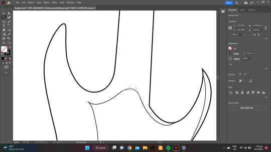
Adobe Workspace:
The tools that were most helpful while using Adobe Illustrator were the Pen Tool, Curvature Tool, Selection Tool, Direct Selection Tool, Lasso Tool, Anchor Point Tool, Rectangle Tool, and the Ellipse Tool. I changed the opacity of the picture I had taken and made it fairly transparent so that I could start tracing the guitar. Being able to do that helped me focus on the precision of my linework more. I also rounded a lot of the rectangles on the guitar to resemble the original as closely as possible.
Critique:
Critique has been extremely helpful as a guide. It truly opens your eyes up to new perspectives that you had not thought of before, but suddenly make so much sense! When you’ve been staring at your computer for hours or more, you slowly start to lose sight of what you wanted the design to take shape of (and also your sanity..sigh).
For instance, during my critique session, a suggestion garnered was that the last stage of abstraction resembled that of the back of an electric guitar and not the front. I had been pretty conflicted on my final stage of abstraction but that very comment suddenly just flipped the switch inside my brain as I could very much understand that perspective. Other suggestions I got were to space out the strings on my guitar as an aesthetic choice, to re-order my abstractions, and to keep the inner outline of the guitar till the final stage as it was in their words, “quite iconic and recognizable”.
One of the great things about critique though, is that you can acknowledge these suggestions but ultimately still decide for yourself, whether you want to implement them into your final outcome or not. Through trying out these changes though, I got to dive deeper and gain a deeper understanding of what I did not like and what I did, thus refining my abstraction process and honing my vision for the designs.
I was quite grateful for all of these suggestions and implemented most of them to see how they could change the design for the better. There has been a noticeable difference (and hopefully improvement) from the designs presented during critique to my final assignment in that I think my designs have become more intentional than they were earlier. Every little design choice I have implemented has been thought through for its functionality and aesthetic.
The rationale for the Final Stage of Abstraction:
For instance, for the final stage of abstraction, I chose to remove all elements of the electric guitar apart from the main silhouette, the tuners/tuning pegs, and the inner outline seen on the body of the guitar. The main, sleek, and tall silhouette serves to give off a strong impression of the electric guitar. My rationale for leaving the three tuning pegs was to differentiate it from that of a bass guitar, which has four larger pegs. The inner outline although quite common in both types of guitars is seen a tad bit more frequently in electric guitars. Hence, the three main elements at the final stage of abstraction attempt humbly to serve its purpose, thereby alluding to striving towards aesthetics, intentionality, functionality, and simplicity.

0 notes
Text
2023.2.16-2.21
Year 1
Illustration Practice: Methods and Processes
Hybrid Forms
Digital Skills & Laser cutting
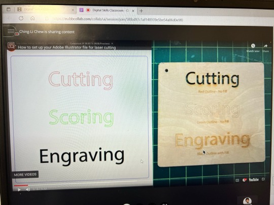
•In digital skills class, I learnt about the basics of laser cutting and how we can draw a design for laser cutting in Adobe Illustration. There are four basic colours that we can use to draw a pattern: black, green, red and blue, and these four colours can be used to ask the computer to make commands to cut in different ways.
After the class I booked 3D workshop for laser cutting because I wanted to be able to make something real, so I found more instructional videos on YouTube about laser cutting to get more familiar with how to partition the design according to colour.


As the theme was about packaging design and my target audience was 'a new parent', I drew a pattern of a newborn baby wrapped in something like a bubble or moon.
I sketched it in procreate firstly, then opened the image in Adobe Illustration and did image tracing, but I found that the automatic tracing was not sure that every line was 1pt in size and that many details were not smooth, even with the smooth tool, so I adjusted the transparency of the original image, traced it with the pen and curvature tools, and separated the colours at the same time. I wanted to be able to use the effect that each colour gives. Overall, it was a very fresh but interesting process, and not particularly difficult for me.
0 notes
Text
friendship ended with the pen tool curvature tool is my new best friend
1 note
·
View note
Text
Illustrator refresher

We started with the pen tool where we traced the ‘viscom’ type. I used the direct selection tool to perfect my lines. I found it quite easy to get used to using the pen tool again. I also had a go at using the curvature tool which I found more difficult that the pen tool. We also briefly went over the width tool.

We then looked at different tools to manipulate type. We created outlines on the type and ungrouped it. Next I used the direct selection tool to move around the anchor points. We also went over the pencil tool which I hadn’t used before which I found very useful and will be using it for typography in the future.

We briefly looked at the pathfinder tool which I am very familiar with.

Next, we looked at global colour. We made a new swatch and made it a global colour, this makes changing the colour of multiple shapes at once very easy.

We finally looked at pantone colours which you can find in a library in swatches
0 notes
Text
Adobe illustrator training

How to use masks on shapes or text, and opacity masks for gradients and highlights.Merge shapes with the Pathfinder and Shape Builder tools.Blend lines or shapes gradually with the Blend tool.Distort shapes and type, and add perspective with the Free Transform tool.Add text and adjust its size, style and formatting.Create basic paths which can be used to trace an image.Work with preset brushes and create your own custom brushes.How to use the Pen tool and Curvature tools to create shapes.Add color with fill and stroke, and apply linear and radial gradients.Understand the fundamentals of CMYK and RGB colors and when to use each.Explore the different types of documents you can create in Illustrator for print or web.Video tutorials are recorded in Adobe Illustrator CC 2017. Step by step, you will get familiar with the essential tools you need to create beautiful vector art through practical tutorials, hands-on application and example files. If you are an aspiring graphic designer or budding artist, this Adobe Illustrator beginner course online will help you harness Illustrator's powerful design tools to create breathtaking works of art.ĭesigned for beginners, no prior experience with Illustrator or other design applications is required. If you’re ok in Illustrator but you know there is so much more in there to be unlocked then please join me and become an Illustrator super hero.Adobe Illustrator is the industry-leading vector drawing program used by professional designers around the globe for digital graphics, illustrations, and typography.

There is an entire section dedicated to learning how to speed up your personal workflow & how to speed up Illustrator and get it running super fast. Your creativity will be doubled once you finish the transform, distort & blending section of the course. There is a colour mastery section where you will learn to make quick colour adjustments, gradients meshs & how to blend it all together. We’ll make beautiful charts & graphs for your indesign documents. You’ll learn advanced logo design & graphic design techniques. We’ll set permanent defaults for fonts, colours & learn how to turn hyphenation off once and for all. You’ll master depth & perspective in Illustrator, creating semi-flat presentations. You’ll learn advanced anchor point & pen tool tricks. There is a really fun section on mastering lines & strokes. You’ll learn the quick way to take hand drawn sketches and vectorize & color them. It is project based, so you will learn the tools & tricks to create some really beautiful current design styles.Įven if you consider yourself an experienced user, I promise there will be things in here that will blow your Illustrator mind. This course will speed up your productivity & workflow. If you already know what an anchor point is and how to adjust it this course is for you. This course is for people who can already understand the fundamentals of Illustrator.

It’s not designed for people who are brand new to Illustrator. I’m an ACI & ACE for Illustrator. This course is a more advanced look at Illustrator. Hi there, welcome to this Adobe Illustrator advanced tutorial. Do you know you’re only using 50% of Illustrator’s capabilities? Ready upgrade yourself? Then this course will take to you the top level of Illustrator mastery.
0 notes
Last Seen Blogs

adobe-error-messages
Adobe Error Messages

micksmattresscleaningbrisbane
Micks Mattress Cleaning Brisbane

blazeturbo102
EVAN BUCKLEY IS CANONICALLY BISEXUAL

gummymagpie
SWOOPING INTENSIFIES

babymarkshow-blog
Без названия