#photoshop curvature tool
Text
youtube
الحل السحري لعلاج تقوس وانحناء الظهر The magic solution to treat curvature and curvature of the back
#magic the gathering#back relaxation device#yoga to correct spinal curvature#back pain#back relaxation#back stretcher#curvature pen tool#photoshop curvature pen tool#curvature pen tool photoshop#new curvature pen tool#curvature tool#photoshop curvature tool#curvature pen tool in photoshop cc 2018#curvature pen photoshop#photoshop curvature pen#back pain relief#curvature#correct spinal curvature#learn magic the gathering#spinal curvature#gym body#gym bro#gym routine#gymlover#gymlife#gymfit#gym#home gym#tumblr milestone#gymwear
0 notes
Text
i figured out how to make custom shapes in photoshop today i’m unstoppable
#i can’t stand photoshop tutorials so it’s just a long process of doing things the hard way until i figure out how to do it the easy way#curvature pen tool is my best friend
0 notes
Text
Week 6 - Continuation from Week 5
Part 3 - Digital Rendering
I found myself really enjoying this week's task, which surprised me, since I haven't delved much into digital drawing techniques and don't have much Photoshop experience at all. I found it a really therapeutic process, and I was definitely able to familiarise myself with some of the tools that were used in the tutorials which will be really helpful for future projects.
I decided to go with a colour palette and style which communicated the essence of my emotion for Studio rather than sticking to the tutorial steps exactly. I really enjoyed the process of playing around with light, shadow and blurring. The carving process was also really enjoyable and rewarding, seeing shapes and form come to life from a 2D rectangle.
Process pictures:


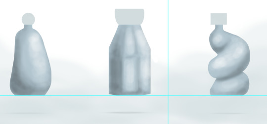
Final product:

I'm pretty happy with the final product for my first time trying to render on photoshop. I think I definitely need to get to know where light and shadow hits an object from different perspectives, as there were times where I felt stuck as to where to place more tones and where to place highlights.
I like the bottle on the right side the most, since I was able to envision how the lights would hit the curvature of the form. I struggled more with the first two, especially the one in the middle, going back and forth between highlight and shadow.
Overall, this was probably my favourite exercise so far and I'm keen to learn more about drawing digitally and rendering.
14 notes
·
View notes
Text
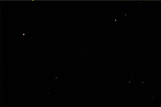
Crab Nebula Work in Progress
Hi guys! I'm back, and this is a project that I've been working on. This is the crab nebula, and I spent my time trying to edit this image to be more visible with the stars and the gas that are in this image. I used the program GIMP. I personally liked it not because it had a raccoon as its logo but because it was very simple and easy to use. GIMP is a powerful open-source graphics editor used for projects such as photo retouching, image composition, as well as graphic design. GIMP offers a wide range of tools and features similar to Adobe Photoshop, including layers, filters, and unique brushes. If you can see closely some of the stars that are visible in the image above are green or purple. I was able to colorize those stars simply by stacking green, red, and blue images of the multiple photo layers of the Crab Nebula. I achieved these green, red, and blue images through color filters using GIMP. It was tedious trying to arrange certain colors such as red so the overall image wouldn't look too purple. Therefore, when the images are stacked together they create color to the image. Before even adding color to my images, I had to adjust the contrast or brightness of the black and white images itself to make the stars and gas in this image more prominent. Because had I not done that, you wouldn't even see anything LMAO. To do this I would use this tool that looked like a function graph and I could manipulate the curvature to either brighten or darken the image. I know its not the most accurate or best description but that's the best description I can provide at the moment. I had to use the classes computer because my Chromebook doesn't support GIMP :( My professor guided me to put a luminance layer on the image which enhances or modifies the brightness and contrast of an image without affecting its color (chatGBT). When putting the luminance layer on it felt like everything just "popped" in the sense that the image looked more "alive" I guess lol. At first, this was very challenging for me because I'm not particularly an expert in Photoshop. Surprisingly, I was able to not only align the photos by lining up the layers but also adjust each color to produce this beautiful photo. To align the images together I would have to click on the particular image I wanted to manipulate around and align that certain layer to match up with the other layers such as aligning the stars. :D Overall, I'm very happy with the outcome of the photo but also if I could improve something about this photo I would try to make the stars and the gas image in the center more prominent. I would highly encourage you guys to take the opportunity to do an astrophotography project like this one, as I personally think this project was a wonderful experience for hands-on learning as well as a meditative activity while simultaneously creating art.
Anyway, I hope you guys enjoy reading my own experience! ;3
LOVE YALL <3
1 note
·
View note
Text


CHRISTMAS BREAK: Enamel pin creation continued. Manually vectorised my chosen pin designs in Illustrator. My prior knowledge of Illustrator was very limited, so I went about teaching myself how to use the pen tool by following illustrator Brad Colbow’s video tutorial on YouTube, which was super clear and helpful and allowed me to quickly adjust to the rules of using the pen and curvature tools. I also learned how to adjust a sketch to make it as visible as possible for tracing via the curves panel in Photoshop. I used the pen tool and curvature tool to line and colour my sketch in Illustrator, making sure to use the Pantone swatches for my colour and limiting my colour palette as much as possible. Honestly very proud of how sleek this design is. Hoping to make another ready for the deadline.
0 notes
Video
youtube
Test 5 Photoshop'ta Pen Kalem Aracı ile Seçimler Yapmak Aykut ilter Bilgisayar Destekli Tasarım 5. PHOTOSHOP’TA PEN (KALEM) ARACI İLE SEÇİMLER YAPMAK YazdırTüm Cevapları GizleMateryal Listesine Dön ________________________________________ Soru 1: Photoshop yazılımında “Pen” aracı ile çizim modlarından hangisinde otomatik olarak yeni katman oluşur ve vektörel özellikte bir çizim yapılır? (Çoktan Seçmeli) ✔ Shape Path Pixel Marque Polygonal Cevap : Shape ________________________________________ Soru 2: Photoshop yazılımında “Pen” aracı ile manuel seçim yaparken en sık kullanılan ve hem kavis hen de doğrusal çizimlere imkan veren araç aşağıdakilerden hangisidir? (Çoktan Seçmeli) ✔ Pen Tool Freeform Pen Tool Curvature Pen Tool d ) Path Selection Tool Direct Selection Tool Cevap : Pen Tool ________________________________________ Soru 3: Photoshop yazılımında “Pen” aracı ile yapılan çizimi seçime dönüştürmenin kısayolu aşağıdakilerden hangisidir? (Çoktan Seçmeli) Ctrl + “Space” tuş kombinasyonu ✔ b ) Ctrl + “Enter” tuş kombinasyonu Ctrl + “Shift” tuş kombinasyonu Ctrl + “BackSpace” tuş kombinasyonu Ctrl + “Alt” tuş kombinasyonu Cevap : b ) Ctrl + “Enter” tuş kombinasyonu “Pen” aracı,Shape,Bilgisayar Destekli Tasarım,PHOTOSHOP’TA PEN (KALEM) ARACI İLE SEÇİMLER YAPMAK,manuel seçim,kavis hem de doğrusal çizimlere imkan veren araç,Pen Tool,“Pen” aracı ile yapılan çizimi seçime dönüştürmenin,Ctrl + “Enter” tuş kombinasyonu,Photoshop yazılımı,doğrusal çizimler,Curvature Pen Tool,Freeform Pen Tool,Path Selection Tool,Direct Selection Tool,Ctrl + “Shift” tuş kombinasyonu,Ctrl + “BackSpace” tuş kombinasyonu,Ctrl + “Alt” tuş kombinasyonu
0 notes
Text
Seamless Edges, Stunning Results: Clipping Path Mastery
In the world of visual content creation, the precision of edges can make or break the impact of an image. Clipping paths, often considered the unsung heroes of graphic design and image editing, play a pivotal role in achieving those seamless edges that elevate the quality of visuals. From product photography to digital artistry, mastering the art of clipping paths can transform ordinary images into extraordinary visual experiences.

Understanding Clipping Paths
At its core, a clipping path is a technique used to isolate a specific portion of an image from its background. This technique allows for the removal of unwanted elements, the creation of a transparent background, or the placement of the clipped object onto a different backdrop. It involves precise outlining using tools like the Pen Tool in software like Adobe Photoshop or Illustrator.
Importance of Seamless Edges
Seamless edges are the hallmark of professional-grade visual content. They ensure that the subject stands out cleanly and precisely, free from jagged edges or remnants of the original background. Whether for e-commerce product images, marketing materials, or artistic compositions, seamless edges contribute significantly to the overall quality and impact of an image.
Challenges in Achieving Seamless Edges
However, achieving this level of precision isn't without its challenges. Perfecting clipping paths requires a keen eye, a steady hand, and a deep understanding of the tools and techniques involved. Even the slightest deviation in the path or inconsistency in curvature can disrupt the seamlessness, requiring meticulous attention to detail.
Techniques for Achieving Seamless Edges
To achieve mastery in clipping path creation, several techniques prove invaluable. Precision in path creation, refinement using various tools, and employing adjustment layers and masking techniques are fundamental to achieving those flawless edges.
Precision in Path Creation: The Pen Tool is the go-to for creating clipping paths. Understanding its functionalities and mastering Bezier curves is crucial for accurate outlining.
Refinement and Smoothing Methods: Utilizing tools like the Anchor Point or Direct Selection Tool aids in refining the paths and smoothing out curves for a more natural appearance.
Adjustment Layers and Masking: Leveraging adjustment layers and masking helps fine-tune the clipped object, adjusting contrast, color, and transparency for a seamless integration into different backgrounds.
Steps to Clipping Path Mastery
The journey towards mastering clipping paths entails gradual progress from basics to advanced techniques and industry best practices.
Learning the Basics: This involves understanding the foundational tools and practicing precision with simple shapes before advancing to more complex subjects.
Advanced Techniques: Delving into complex object outlining, handling transparency, and mastering batch processing techniques enhances proficiency and efficiency.
Industry Best Practices: Embracing quality control measures and effective communication with clients ensures the delivery of high-quality, tailored results.
Benefits of Clipping Path Mastery
The benefits of mastering clipping paths extend beyond achieving seamless edges. They include enhanced visual appeal, increased professionalism, time and cost efficiency, and a competitive edge in the visual content creation industry.
Case Studies and Examples
Exploring before-and-after demonstrations, real-life applications across diverse industries, and success stories from professionals who've mastered clipping paths offer practical insights and inspiration.
Conclusion
In conclusion, the mastery of clipping paths isn't merely about technical proficiency but about the enhancement and transformation of visual content. With dedication, practice, and an eye for detail, achieving seamless edges through clipping path mastery becomes a cornerstone in elevating the quality and impact of visual storytelling.
0 notes
Text
Vector path Photoshop
A vector path in Photoshop is a type of graphic element that consists of a series of points connected by lines or curves. It is a mathematical representation of a shape or outline that can be easily modified or resized without losing any quality.
To create a vector path in Photoshop, you can use the Pen tool or any other shape tool such as the Rectangle tool, Ellipse tool, or Custom Shape tool. The Pen tool allows you to create paths by adding and manipulating anchor points, which determine the direction and curvature of the lines or curves. Once you have created a vector path, you can apply various operations and effects to it, such as stroke, fill, or gradient. You can also convert the path into a selection or a shape layer, which gives you more control and flexibility in editing and styling. Vector paths are particularly useful when working with logos, icons, or any other graphics that require scalability and precision. Unlike raster-based images, vector paths in Photoshop can be resized and manipulated without pixelation, making them ideal for both print and web design projects.
How to create a vector path in Photoshop?
To create a vector path in Photoshop, follow these steps:
1. Open Photoshop and create a new document or open an existing one.
2. Select the Pen Tool from the toolbar. It is typically located in the left sidebar.
3. Choose the path type you want to create by selecting one of the three options: Shape, Path, or Pixels. For creating a vector path, choose the "Path" option.
4. Click on the canvas to start creating the path anchor points. Click and drag to create curved segments, and click without dragging to create straight segments.
5. Continue clicking and creating anchor points to define the shape of your vector path.
What is the purpose of a vector path in Photoshop?
The purpose of a vector path in Photoshop is to create and manipulate scalable, resolution-independent shapes and lines. Unlike raster images, which are made up of pixels and can lose quality when resized, vector paths are defined by mathematical equations, allowing them to be resized and edited without any loss of quality.
In Photoshop, you can use the Pen tool to create vector paths. These paths can be used for a variety of purposes, such as creating precise and smooth selections, designing custom shapes, creating paths for text to follow, or creating complex artwork. Vector paths are especially useful for tasks that require precision and flexibility, such as logo design, illustration, and typography.
By using vector paths, you can easily modify and transform shapes, apply stroke and fill attributes, and even convert paths into selections or masks. This makes vector paths an essential tool for creating and editing graphic elements in Photoshop.
How to edit a vector path in Photoshop?
To edit a vector path in Photoshop, you can follow these steps:
1. Open your image in Photoshop and select the Pen Tool from the toolbar. Alternatively, you can press the "P" key on your keyboard to select the Pen Tool.
2. Click and create anchor points to outline the shape or path that you want to edit. Each click creates an anchor point, and you can connect these points to form straight or curved lines.
3. To adjust an existing anchor point, select the Direct Selection Tool from the toolbar or press the "A" key on your keyboard. Click on the anchor point you want to modify, and you will see handles appear that allow you to adjust the shape.
4. To add or remove anchor points, select the Pen Tool and position it on the path where you want to make the change. To add an anchor point, simply click on the path. To remove an anchor point, press and hold the "Alt" or "Option" key on your keyboard and click on the anchor point.
5. To modify the path between anchor points, select the Convert Point Tool from the toolbar or press the "Shift" + "C" keys on your keyboard. Click and drag the handles attached to an anchor point to reshape the path segment.
6. You can also move the entire path by selecting the Path Selection Tool from the toolbar or pressing the "A" key on your keyboard. Click and drag the path to reposition it within your image.
7. Once you have made the desired modifications to the vector path, you can save your changes. If you want to keep the vector path editable, save your document in a format that supports Photoshop's vector features, such as PSD. If you want to export your vector path as a non-editable format, such as a JPEG or PNG, you can use the "Export As" or "Save For Web" options under the "File" menu.
Remember, when working with vector paths in Photoshop, it's always a good idea to make a copy of your original image layer or save your work as a separate file. This way, you can always go back to the original if needed and avoid accidentally overwriting your original image.
How to convert a raster image to a vector path in Photoshop?
To convert a raster image to a vector path in Photoshop, you can follow these steps:
1. Open Photoshop and import your raster image by going to "File" > "Open" and selecting the file.
2. In the Layers panel, right-click on the layer containing your raster image and select "Rasterize Layer." This will convert your image into a bitmap raster layer.
3. Use the "Pen Tool" from the toolbar on the left side of the screen. Zoom into the image for precision.
4. Start tracing the shape or outline of the image with the Pen Tool by creating anchor points. Click and drag to create curves if needed.
5. Continue placing anchor points along the desired path, following the contours of the image. Be patient and take your time to accurately trace the shape.
6. Once you have completed the path, right-click on the path and choose "Make Selection." This will create a selection based on the vector path.
7. With the selection active, go to "Layer" > "New Fill Layer" > "Solid Color." Choose a color and click "OK." This will create a new layer with the vector path filled in with the chosen color.
8. You can also use the "Paths" panel to save the path for future use or export it for use in other software.
Keep in mind that converting a raster image to a vector path may not always produce perfect results, especially for complex or detailed images. It is recommended to use dedicated vector editing software like Adobe Illustrator for more accurate and precise results.
How to use the Pen tool to create a vector path in Photoshop?
To use the Pen tool to create a vector path in Photoshop, you can follow these steps:
1. Select the Pen tool from the toolbar. It looks like a pen nib.
2. Determine which type of path you want to create: a shape or a path. You can switch between these options in the toolbar at the top of the screen.
3. If you're creating a shape, ensure the "Shape" option is selected in the toolbar. If you're creating a path, ensure the "Path" option is selected.
4. Click on the canvas to place the first anchor point of the path. This will be the starting point of your path.
5. Click again on a different part of the canvas to add a second anchor point. Photoshop will automatically create a straight line between the two anchor points.
6. To create curved segments, click and drag the mouse after placing an anchor point. This will create direction handles that control the direction and curvature of the path.
7. Continue adding anchor points and adjusting the direction handles to create your desired path. You can create straight and curved segments as needed.
8. To close the path, click on the starting anchor point. A small circle will appear next to the Pen tool cursor when you're hovering over the starting point to indicate that the path will be closed.
9. Once you've created the desired path, you can modify it further by adjusting the position and length of the direction handles. You can also add or delete anchor points using the Pen tool or other path editing tools.
10. If you're creating a shape, you can fill it with a color or apply a stroke by selecting the shape layer and using the options in the toolbar or the Layer Style window.
That's how you use the Pen tool to create a vector path in Photoshop. Practice and experimentation will help you become more proficient with this powerful tool.
How to apply different stroke styles to a vector path in Photoshop?
To apply different stroke styles to a vector path in Photoshop, you can follow these steps:
1. Use the Pen Tool (P) to create a vector path on the canvas. You can also use existing shape layers or text layers with vector masks.
2. Select the "Path Selection Tool" (A) from the toolbar.
3. Click on the vector path or layer that you want to apply the stroke style to. This will activate the path.
4. From the menu, go to "Window" > "Properties" to open the Properties panel.
5. In the Properties panel, locate the "Stroke" section. If you can't see it, click on the disclosure triangle next to "Properties" to expand the options.
6. Adjust the stroke settings to customize the style according to your preference. You can modify parameters such as size, color, opacity, and alignment.
7. To change the stroke type, click on the drop-down menu next to "Stroke" and choose from the available options, such as Solid, Dashed, Dotted, or Custom.
8. For custom stroke styles, click on the "More Options" button (represented by three dots) next to the drop-down menu. This will open the Stroke Options dialog box where you can adjust parameters like dash length, gap length, and dash offset to create a unique stroke style.
9. Once you are satisfied with the stroke style, you can further customize it by applying layer effects, such as Bevel and Emboss, Outer Glow, or Gradient Overlay, from the "Layer Style" dialog box.
How to apply different fill colors to a vector path in Photoshop?
To apply different fill colors to a vector path in Photoshop, you can follow these steps:
1. Select the "Path Selection Tool" from the toolbar. It looks like a black arrow.
2. Click on the vector path you want to apply a fill color to. This will select the path.
3. In the top options bar, you will see the "Fill" option. Click on the small color swatch next to it to open the color picker.
4. Choose a color from the color picker or enter the specific color values you want. Click "OK" to confirm the color.
5. The selected vector path will now be filled with the chosen color.
If you have multiple vector paths and you want to apply different fill colors to each path, you can repeat the above steps for each path individually.
How to transform and modify a vector path in Photoshop?
To transform and modify a vector path in Photoshop, you can follow these steps:
1. Open your vector path in Adobe Photoshop by selecting "File" > "Open" and navigating to the file location on your computer.
2. Make sure the "Paths" panel is visible. If it's not already visible, you can go to "Window" > "Paths" to enable it.
3. In the Paths panel, you should see your vector path listed. If you don't have a path yet, you can create one by using the pen tool or any other selection tool and converting it into a path.
4. Select the vector path you want to modify by clicking on its thumbnail in the Paths panel. This will make the path active.
5. To transform the path, you can use the Free Transform Path tool. Select the tool from the toolbar or press "Ctrl+T" (Windows) or "Command+T" (Mac) to activate it. This will create a bounding box around the path with handles that you can use to resize, rotate, and shear the path.
6. To modify the shape of the path, you can use the Direct Selection tool. Select the tool from the toolbar or press "A" to activate it. With this tool, you can click and drag individual path points to move them or adjust the handles to change the curvature of the path.
7. If you want to add or remove points from the path, you can use the Pen tool or the Add Anchor Point tool and Delete Anchor Point tool, respectively.
8. You can also apply various layer styles and effects to the vector path by selecting the path layer in the Layers panel and using the options in the Layer Style dialog box.
Remember to save your work when you're done by selecting "File" > "Save" or "Save As".
How to combine multiple vector paths in Photoshop?
To combine multiple vector paths in Photoshop, you can use the "Path Operations" feature. Here are the steps:
1. You can also press "A" on your keyboard to access it.
2. Hold down the "Shift" key and click on each vector path that you want to combine. This will select multiple paths at once.
3. Right-click (or Ctrl-click on a Mac) on one of the selected paths and choose "Combine Shapes" from the context menu.
4. In the "Path Operations" dialog box, choose one of the operations to combine the paths. The options include "Add", "Subtract", "Intersect", and "Exclude Overlapping Shapes". Select the appropriate option based on the desired outcome.
5. Click the "OK" button to apply the selected path operation and combine the paths.
The combined vector paths will now be merged into a single path based on the chosen operation. You can then manipulate, fill, or stroke the combined path as needed.
Note that the ability to combine vector paths in Photoshop is only available when working with vector shapes and paths, not with pixel-based layers or images.
0 notes
Text
How to Make a Curved Line in Photoshop Elements
Introduction
Photoshop Elements is a versatile and powerful software that allows users to enhance their images and unleash their creativity. One of the fundamental skills every Photoshop Elements user should learn is how to create curved lines. Curved lines can add a touch of elegance, fluidity, and dynamism to your designs, whether you're working on digital illustrations, graphic designs, or photo manipulations. In this article, we will guide you through the step-by-step process of creating curved lines in Photoshop Elements, helping you unlock endless possibilities for your artistic endeavors.
Understanding the Pen Tool
Before diving into creating curved lines, it's essential to familiarize yourself with the Pen Tool in Photoshop Elements. The Pen Tool is a versatile tool that allows you to create precise and customizable paths. With the Pen Tool selected, you can click on specific points to define straight lines, and by adding anchor points, you can create curves. Mastering the Pen Tool will empower you to create any curved line with ease.
Read More
Step 1: Selecting the Pen Tool
To begin creating a curved line in Photoshop Elements, select the Pen Tool from the toolbar. It is represented by a pen icon. Alternatively, you can use the keyboard shortcut "P" to activate the Pen Tool.
Step 2: Creating the First Anchor Point

Click on the canvas where you want your curved line to begin. This click will create the first anchor point of your path. Ensure that you click on the desired location with precision, as this will determine the starting point of your curve.
Step 3: Constructing the Curved Line
To create a curved line, click and drag on the canvas. This action will create direction lines extending from the anchor point you just created. The length and angle of these direction lines will determine the curvature of your line. Experiment with different click-and-drag motions to achieve the desired curve. Remember, you can always adjust the shape of the curve later.
Step 4: Adding Additional Anchor Points
Continue adding anchor points along the desired path of your curved line. Each new anchor point will connect to the previous one, forming a continuous curve. Add as many anchor points as necessary to create complex and intricate curves.
Step 5: Modifying Anchor Points and Direction Lines
After constructing your curved line, you can further refine its shape by adjusting the anchor points and direction lines. To modify an anchor point, select the Direct Selection Tool from the toolbar (shortcut: A) and click on the desired anchor point. You can then click and drag the anchor point or its associated direction lines to reshape the curve.
Step 6: Converting Paths to Selections or Shapes
Once you have created your curved line, you may want to convert it into a selection or a shape for further manipulation. To convert your path into a selection, right-click on the path and choose "Make Selection" from the context menu. Adjust the selection settings as needed and click "OK." To convert the path into a shape, right-click on the path and select "Define Custom Shape." You can then access the shape from the Custom Shape Tool (shortcut: U) for future use.
Learn More: Product photo editing service
Step 7: Applying Stroke and Fill
To enhance the appearance of your curved lines, you can apply stroke and fill options. With the path selected, navigate to the Options bar at the top of the Photoshop Elements interface. Choose a stroke color by clicking on the color swatch and selecting the desired color. Adjust the stroke width to your preference, keeping in mind that thicker strokes create more prominent lines. You can also apply a fill color to the enclosed area created by your curved line, giving it a solid or gradient color.
Step 8: Experimenting with Brush Styles
In addition to stroke and fill, you can explore different brush styles to further customize your curved lines. Select the Brush Tool from the toolbar (shortcut: B), choose a brush style from the Brush Preset Picker in the Options bar, and adjust its size and hardness. With the Pen Tool-selected path active, click on the "Stroke Path with Brush" button located at the bottom of the Paths panel. This action will apply the selected brush style to your curved line, adding texture and artistic flair.
Step 9: Combining Curved Lines
Creating complex designs often requires combining multiple curved lines. To merge two or more curved lines into a single path, select each individual path while holding down the Shift key. Once all the paths are selected, right-click on any of the selected paths and choose "Combine Shapes" from the context menu. This action will merge the paths into a single shape, allowing you to manipulate and style them collectively.
Step 10: Saving and Exporting
Once you're satisfied with your curved lines and overall design, it's important to save and export your work. To save your project as a Photoshop Elements file (.psd), go to File > Save As and choose the desired location on your computer. This format allows you to retain all the layers, paths, and other elements for future editing. If you want to share your design with others or use it in other applications, consider exporting it as a common file format like JPEG, PNG, or TIFF.
Conclusion
Congratulations! You've learned how to create curved lines in Photoshop Elements and discovered various techniques to enhance their appearance. By mastering the Pen Tool, adjusting anchor points and direction lines, converting paths, applying strokes and fills, exploring brush styles, combining paths, and saving/exporting your work, you now have the ability to rejuvenate your imaginative dreams. Remember, practice and experimentation are key to mastering any skill in Photoshop Elements, so continue exploring and pushing the boundaries of your artistic capabilities. Happy designing!
0 notes
Text
Reflection
Looking back on fundamentals I think the class has reinforced my skills in regard to using adobe software - the most helpful was InDesign which I had never used before.
For Illustrator & Photoshop the class has reinforced my previous knowledge while building new knowledge about different tools/processes and has made me think about the process of using the software and made me more organised through learning techniques, shortcuts & file management - something which I didn't pay much attention to previously.
For Illustrator my main struggle was using the pen tool as I had previously only used the curvature tool and would default to using it instead of the pen tool. This class forced me to actually learn the tool and improve which I am very grateful for as I probably wouldn't have otherwise.
With Photoshop the main learning for me was masks - which are also something I generally avoided previously. The class made me learn them which is something that i'll be taking through to whenever I work in photoshop in the future.
Adjusting to InDesign was a challenge at first as I kept wanting to use it like Illustrator & Photoshop but learning the software and continuing with it will be important for my future design work.
For the final book I wish I had been able to spend more time on it as feel I could have done a much better job particularly with the illustrations as I just did silhouettes for the most part.
This is a generally bigger problem that I have with my work sometimes as I can let the amount of work i have to do pile up - The catch up session that we did earlier in the course was a big help for this though.
In regards to the class itself the moments I enjoyed it the most were the ones where we were driving the work - eg when we created our illustrations independently using the previous tools we learnt. This helped with learning alot as the lesson was much more engaging for me.
This is a problem that I have with the course sometimes as I feel the tutorials could be presented in a more engaging way so as we aren't just copying whats on the board. I also feel as if some classes could have been shorter so as to keep the information short and sweet so it sticks in the mind easier.
Thanks
0 notes
Text
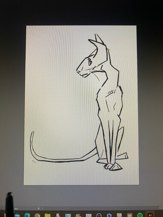
Week Eight
Today's session was our opportunity to showcase our Illustrator skills across two separate drawings - one silhouette and one that includes both colour and shading.
To start off I found a cute tooth drawing on Noun Project that I thought would be a great warm up and a chance for me to really practice keeping my handles straight as the fingers are made up of several curves very close together.
After tracing my chosen image I scanned it and loaded it up into Illustrator as reference so I could trace over top of it:

I decided to start with the hands as I thought this would be the hardest part to finesse and get right. Initially I just went through and placed my points roughly where I wanted them, making sure to keep my bottom handles straight, and then I went back in and tweaked. Each 'knuckle' join was made using broken points.

As I was playing around I decided I really liked the look of having loops in between each finger as it tied in with the loop at the top of the tooth's body, so I strayed from my original drawing to include this. Using the stroke palette I changed the corner join to round to take away the sharpness that the loops created.

Once I was happy with where my hand was at, I duplicated it and mirrored it so I could use it for the other side.
Using layers to keep my work tidy, I went ahead and drew the rest of my image - again keeping handles straight where possible.
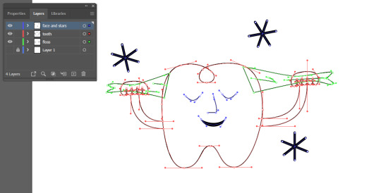
To create the stars I drew one and then duplicated it twice more and readjusted them to where I wanted them.

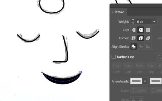
For the face I drew one eye and then duplicated and mirrored to match the other side. The nose is made from a hybrid point so I could have a flat bottom while still having a nice curve for the bridge. And for the mouth I went into the stroke palette to both increase the stroke weight and change the stroke profile so it would be thicker in the middle.
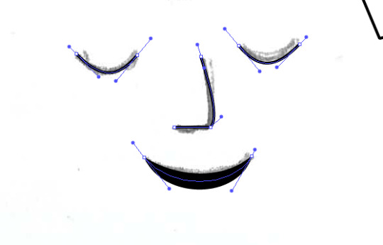
I then just added a white fill to the tooth elements and changed the floss fill and outline to grey to finish the first image off and voila:
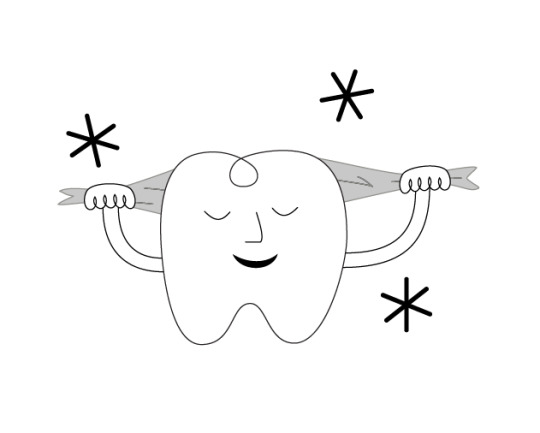
Although I am slowly getting more comfortable with Illustrator, it is definitely the Adobe program I struggle the most with. While my drawing may not be perfect, I am super happy with how it turned out and it served as a great warm up for my next image.
I admittedly really struggled to get started on my second image because I just kept getting myself confused, and it wasn't until I was taking a break did I have a brain wave. The reason I was struggling, was because I was trying to use Illustrator how I would use Photoshop when they are completely different and need to be used differently.
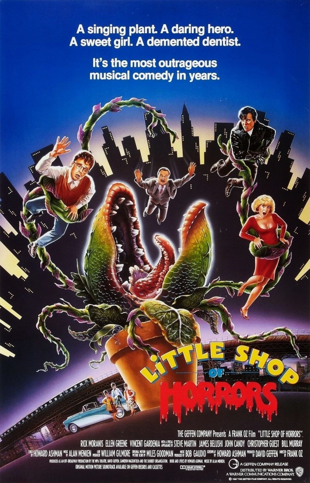
After much frustration I did what I should have done in the beginning and revisited our penguin from week three to try and refresh the ole' noggin, I also picked a less complicated image. Initially I set off wanting to create my own version of Audrey II from Little Shop of Horrors to challenge myself - but it was just a little beyond my current skill set.

Instead I chose to do a dinosaur sitting on a laptop, mainly so I can tell my boss it's him.
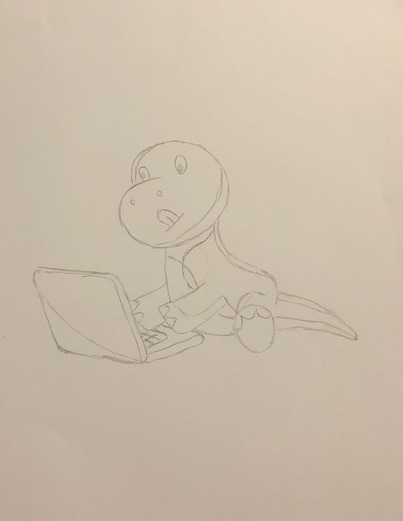
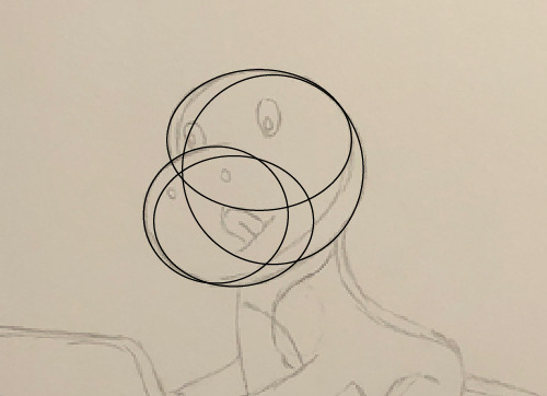
I wanted to start with creating my dinosaurs head and body, so used a series of circles to make up the shape of the head and then used the Pathfinder 'Merge' to make them all one shape.
I then traced the outline of his body, and merged this shape with his head to create one shape.

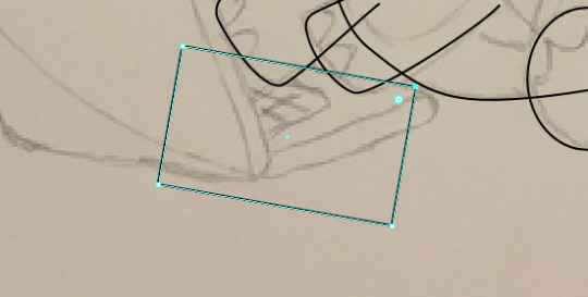
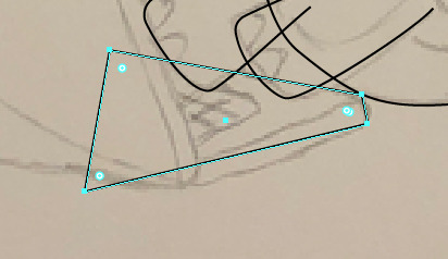
I traced both his arms and his foot out in separate layers, and then moved to the laptop which I created using rectangles, the Direct Selection tool and the Curvature tool. I followed the same process as I did for the body and created the lid and the base as two shapes and then used pathfinder to merge.


Once I had my base shapes established it was time to add some colour. I went through and added my base colour and then dropped the opacity down so I could see my reference underneath. I traced where I wanted my shadows and highlights, you only need to be tidy on the inner edge because the rest will get cut away. I then duplicated my base layer, selected both the copy and the shape I just traced and using Pathfinder 'Intersect' to leave behind my desired shape.

I then repeated this process until I had all my shadows and highlights placed where I wanted them.
Instead of having to copy the body layer a million times, we can select multiple shapes, right click and "create compound path" (which essentially joins the items together), and then select this "new shape" and the body layer and use Pathfinder to cut out.


I used this process to cut out the toes of my dinosaur. I created multiple ovals with a white fill and green outline, placed them where I wanted them, make a compound path with them, and then cut them out with Pathfinder.
At this stage old Greg was looking like this:

He was lacking some facial details, so using a combination of the Pen tool and the Ellipse tool I went in and added/coloured my details.

At this point I was starting to feel a lot more confident as it all started to come together. I was already pretty happy with it but knew the eyes needed a little more attention to make him interesting and feel complete.

I added some red gradient eyes, some extra circles as highlight, and also went in with the Pen tool by the foot/tail to add a couple of extra lines. At this point I was very happy to call him complete and I'm very proud I continued to persevere because it finally feels like I've made that missing connection with this program.
Now that I've made that missing link I feel confident moving forward as a designer using Illustrator and I am excited to one day revisit my Audrey II drawing and give it another go once I have developed my skills a little further.
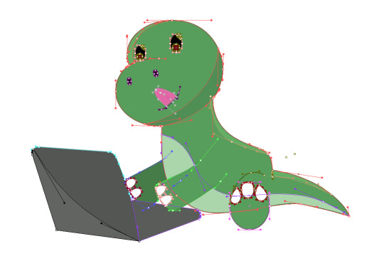
And just for funsies, here is what Dino Greg looks like when all his handles are exposed:
1 note
·
View note
Text
Fixing over + under exposed photos. The task was to choose to photos that need fixing up through the curves tool in photoshop (2 black/white and 2 in colour).
So typically under exposed photos have barely any light so the brightness will lean to the left side of the graph (black). Whereas over exposed photos whave little darkness so the brightness leans to the right of the graph (white). - As shown in my examples.
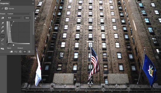
For this photo I had to balance the darkness with more light, I made a pretty steep curve on the left to make the coverage cross over with the curve. Definines the lights, lowering the shadows and increasing the highlights + mid tones.

The second photo I had to add more darkness for balance. Looks like the photo was used with a flash so it was sorta difficult to balance out the harsh light. I decreased the higlights and increased the shadows. I also upped the saturation to show a bit more contrast between the colours.


This photo was VERY under exposed to a point where you can only see 2 dots (the reflection highlights in the boy's eyes). I had to move the top right point all the way to the left right before it meets the coverage (moving from extreme darkness to extreme brightness). Then make a sudden vertical drop to get all the light in the photo be visible.

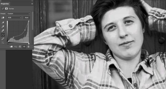
This is a quite an over exposed photo, but there's still a lot of darks in the backgound so the curve does not need to be very steep. I downed the whites a bit and darkened the blacks, creating one small curve on the left and a bigger curve on the right. It was easy to tell when to stop with the curves by looking at the details in the face. Got a good balance between the bright and darks.
Overall a learned a lot from this task, definitely understand more about colour theory and lights vs darks. A lot of it is trial and error which is good as you learn what works and what doesn't. Eventually I should know what type of curvature to use just by viewing the image and it's graph coverage.
0 notes
Text
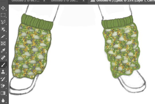
Putting patterns onto the final outfits
Since our group has now selected the three strongest designs which will be used in our final project, I am in the process of editing the textiles samples and patterns which I have created onto these outfits.
This post will be about my process to do this on Photoshop.
To begin with, I started out with a sketch which was drawn and then scanned and put onto Photoshop.

First, I made the skirt black and experimented with the opacity and then, using the pen tool, I shaded in the skirt and added extra detail to it. Since one of the main features of these clothes is the drawstring (which makes each garment adaptive) I took my time rendering this area of the skirt to ensure that the drawstring and the texture of the ruched fabric was emphasised.
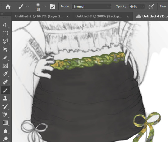
I used a clipping mask of some fabric samples i made for the belt, ribbons and legwarmers. I may experiment further with colour options; I have two different shades of green in mind, as I used 2 different types of green yarn to create samples.


After doing a detailed comparison of the two options, I decided upon using the light green samples as I feel they match better with the theme, but also because they have better contrast against the skirt, making them stand out. and catch the viewer's attention.
The colour green holds connotations of new beginnings and growth, so incorporating these green statement pieces into the outfit (which is otherwise made up of neutral colours) gives the outfit an edge and makes it exciting and unique. Green is a colour which can be observed most recently in new trends. It is a colour which is coming back into style, so by incorporating this into our line, we are keeping current with the trends while simultaneously keeping our collection minimalistic and timeless.
To finish off the legwarmers, I used the pen tool to fill the cuffs green and then I used a darker shade of green to shade in the legwarmers and add depth. I added a knitted texture to the cuffs as this kind of knitting would be stretchy and soft, ideal to hold the legwarmers up whilst also being comfortable.
Next, I added colour and shading to the top. To begin with, I used the curvature pen tool to create an outline of the top.
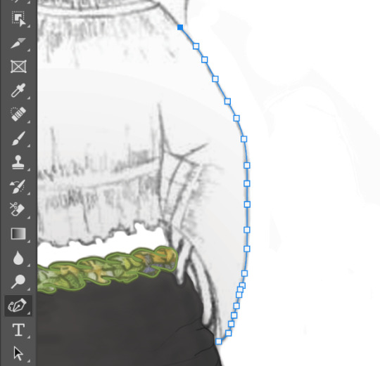
Then I filled it and lowered the opacity to reveal the shading and details in the drawing. I further emphasised these details, and added more shading, using the pen tool at a low opacity, and building up layer by layer to make the shading more realistic. Below to the left is the top without the shading, and to the right is after adding shading and emphasising the ruched detailing.
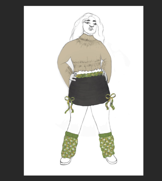

I am very happy with the outcome of this outfit as I think the rendering/shading on the skirt is very detailed and effective, and the colours in the outfit match together nicely. I have kept the basics of the outfit very simple with beige and black, but then to add some intrigue and a pop of colour I have included a green mesh pattern I made to use for the belt, bows and legwarmers. I did originally experiment with leaving the belt and ties plain, however in my opinion it really brings the outfit together and makes it cohesive when all three are green.
0 notes
Text
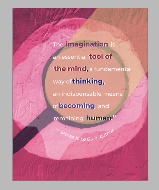
Blog post four
When I reflected on all the work that went into creating the project three poster during the past critique my group members were impressed. Based on the content shown in the topmost image, they liked how I color coded and increased the weight of certain words. However, my group members and Dr. Chi noted that the overlapping-colored layers of the bold words were inconsistently placed. Additionally, a group member suggested that I could shift the last word of the quote to the left a bit more so it would not overlap with the magnifying glass. When Dr. Chi observed my poster she liked the texture from the background, but she recommended that I shift the author's name down to make it interact more with the background.
The picture below the previous one is the finalized version of the poster. Realigning the colored layers of text and adjusting the placement of the last word in the quote were straight forward tasks. However, centering the quote took additional effort. Since I had glued the visual elements onto the poster, moving them was not easy. Nonetheless, I figured that using the content-aware scale function on Photoshop would extend the length of the background. It took me a while, but with a little research I learned how to adjust the background's proportions. Looking back, I observe a clear distinction between the critique and polished versions of the poster. Rearranging the quote and author and resizing the dimensions of the background have all centered the text. This change has made the quote the clear focal point of the poster.
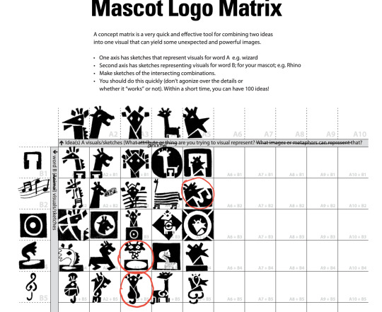
Since the start of project four, I have been familiarizing myself with my two assigned words--"funky" and "giraffe"--while pondering how to combine them into a logo. When starting out, I thought the best visuals for my logo would clearly represent my two words. Finding pictures to represent a giraffe was simple but trying to visually represent the adjective "funky" proved a challenging task. At first, I thought that "funky" might best be depicted by making the giraffe look like a dancer. However, after researching the word's meaning, I realized that "funky" is associated with music. As a result, I chose to design my mascot to represent a music album. The fourth image from the top displays my reference photos. I settled on musical notes and a pair of headphones to visually represent "funky" since nouns are an easy way to illustrate an adjective.
The third image from the bottom shows my matrix sketches. Out of the twenty-five designs, only three made the cut. Although all three sketches stood out, I especially liked the one sketch that combined continuity with figure and ground. During Mondays in progress check-in, I received some suggestions about simplifying my thumbnails in the third image from the bottom to make the text more legible. I was also told to consider studying the photo references in image three more closely and round out the shapes of the giraffe in my subsequent sketches.
Following the advice given, I drafted fifteen more thumbnail sketches that were variations on a previous thumbnail. When I was sketching out these thumbnails I made sure to simplify the giraffe and emulate the curvature of its head and sloping neck. The two bottom most images display the refined marks of the three thumbnails I chose. What I liked most about these sketches is the adequate alignment and spacing of the text. Since these sketches are also more simplified, they should be easier to interpret when viewed from afar.
A notable concept addressed by Veronique Marrier--an interviewee from these past two weeks' assigned readings--states that graphic designers conceptualize ideas from a broad to a narrow scope. This idea seems relevant to our current project since envisioning what good or service our mascot could represent was among the initial stages in the brainstorming process. I believe that this form of abstract thinking is a special tool that is constantly being cultivated through our in-progress checks and critiques. Having a broad vision, narrowing, and refining it are all steps that transport a project from a budding idea to a polished design.


0 notes
Text

Adobe Photoshop
Adobe Photoshop offers a variety of tools for graphic artists, photographers, web developers, and other design professionals to improve or enhance their work.
Adobe Photoshop is the world’s most popular image editing software , used by photographers, web designers, graphic designers, video editors, concept artists and others related to the multimedia industry
Photoshop is most useful for photo manipulation, pixelated art, and web graphics.
Adobe Photoshop Features
Photoshop allows you to edit photographs,MockUps, image based designs
It also allows you to add grids and smart guides which helps us to know the safe lines where we can add our text and which is tension free so that while printing any photographs, designs etc.. the texts don’t cutoff and spoil the design.
It allows you to work with single ARTBOARD inside a project
It allows you to create and edit raster images
It allows to save a single object in a layer where you can edit the the layer without disturbing other layers in the work file.
It allows you to edit text according to you perspective of the object .
Photoshop Makes the work more easier where This gives a option of removing background within a tool .
SOME SHORTCUTS
W-MagicWand tool ,object selection
G- gradient tool,PaintBucket
P-pen tool,curvature pen tool,content aware pen tool
Ctrl+D-Deselect
Ctrl+J-Duplicate of layer
Ctrl+enter -Make select
Shift+F5- fill
Ctrl+shift+S- Save As
0 notes
Text
Adobe photoshop cc keygen mac

#ADOBE PHOTOSHOP CC KEYGEN MAC HOW TO#
#ADOBE PHOTOSHOP CC KEYGEN MAC CRACKED#
#ADOBE PHOTOSHOP CC KEYGEN MAC SOFTWARE#
#ADOBE PHOTOSHOP CC KEYGEN MAC WINDOWS 8.1#
#ADOBE PHOTOSHOP CC KEYGEN MAC PROFESSIONAL#
Similarly, Adobe Photoshop CC 2022 23.1.1.202 carries a basic video editor that is integrated with all of the conventional tools. Adobe Photoshop CC 2022 Crack 23.1.1.202 Key + Keygen Lifetime It previewed project Aero, a brand new AR authoring tool that permits creators to style reality experiences. A brand new program designed to accelerate painting and drawing workflows across Project Gemini, apparatus, coming to iPad from 2022.
#ADOBE PHOTOSHOP CC KEYGEN MAC PROFESSIONAL#
Adobe Photoshop CC 2022 Keygen is a professional image editing application that has been the industry standard for amateurs and graphic designers. And with your Adobe Photoshop CC 2022 membership, you get them when we release them. Photoshop is getting better, with new attributes rolling out. Paint in designs, get polished looks and make textures. Paint and draw anything you dream up using gear made for illustrators.Īdobe Photoshop CC 2022 23.1.1.202 Free Windows + Mac With templates and tools, even novices can make something awesome. Adobe Photoshop CC 2022 Crack 23.1.1.202 From posters to packaging banners to sites that are amazing logos to icons that are eye-catching, Photoshop retains the world. Adobe Photoshop CC 2022 23.1.1.202 Crack Key Download Make and enhance 3D art, illustrations, and photos. Adobe Photoshop CC 2022 23.1.1.202, then you can create it using Photoshop CC, design program, and the world’s most exceptional imaging.
Also, Use the crack to activate the software.Adobe Photoshop CC 2022, the industry standard for digital image processing and editing, provides a comprehensive package of professional design tools and can be packaged with robust editing features created to inspire.
Then, Start installing Adobe Photoshop CC.
Then, pick up which version you want to download.
First of all, click on the direct download link to download the crack.
Supports Intel Core 2 Duo processor or advanced.
The RAM memory size is required to be 2GB.
A 2GB free hard disk space is required.
#ADOBE PHOTOSHOP CC KEYGEN MAC WINDOWS 8.1#
Supported Operating System is as follows Windows 7, Windows 8, Windows 8.1 and Windows 10.
Wonderful Properties panel improvements.
Copy and paste a number of layers in classes.
Incredible brushes out of Kyle T.Webster: Offers over than 1000 electronic brushes from the popular award-winning Kyle T.Webster.
Curvature Pen tool: Enabling you to improve paths faster, in addition, to pull & push segments right.
You might even attain cleaner lines & curves to get a fantastic polished appearance with new brush stroke smoothing.
Advanced Brush Management and performance: this attribute lets you organize your brushes on how that you desire.
has tools such as fast conversation menu, changeable fonts, curvature pencil instruments, lightroom photograph accessibility, brush smoke thumbnails, paint saturation, luminance and color hiding controls, and brush direction. Electronic customization is also considered by having brushes, effects, and patterns. For professionals, they will enjoy making great works with the photography tools which has various options. The layouts fit perfectly into photographers and designers preference. The picture editor handles all types of retouching from illustrations to 3D layouts. Its compatibility with various devices makes it easy for you to create stunning pictures.
#ADOBE PHOTOSHOP CC KEYGEN MAC SOFTWARE#
Its advanced new tools make it easy for users to build professional images by retouching pictures, masking undesired elements and also building realistic portraits.Īdobe Photoshop CC CrackThe software creates an opportunity to edit photographs in a professional outlook. Besides, users can create professional images with Adobe Photoshop CC Latest version with ease. Adobe Photoshop CC Final release provides creative tools with an intuitive interface in addition that it is based on Adobe Mercury graphics which allows its users to retouch pictures, merge images, add effects, add colors, add brightness and also build professional images and designs. A number of templates are in place making it easy to design. The program is contained in the Adobe creative cloud support. Among the tools in the program imaging and design.
#ADOBE PHOTOSHOP CC KEYGEN MAC CRACKED#
And in this tutorial, we are going to share a thorough manual to download the cracked versionThe intuitive tools makes it easy to design posters, banners, sites, mobile applications, and icons.
#ADOBE PHOTOSHOP CC KEYGEN MAC HOW TO#
So for one to experience this, we will explain to you how to install the has been rolled out recently. And of course eye and professional after-effect as possible. This software will make your photos look more attractive. If you love to flaunt yourself to the camera edit pictures, then here is the program for you. Download Now Download Setup Adobe Photoshop Elements 2020 Crack + Keygen freeloadĪdobe Photoshop Elements 2020 Crack the very best picture editing software presently.
0 notes
Last Seen Blogs

johnnyx37
lovely

hollow-gypsy
“Cutthroat” 💀

breaking-point-aimbot-dowzc
🔥 breaking point aimbot download (2022 trainer)
cheekycheetahny
Untitled
ash-shark
☆AshShark☆