#love redesigned header
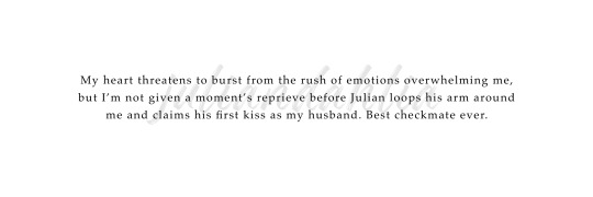
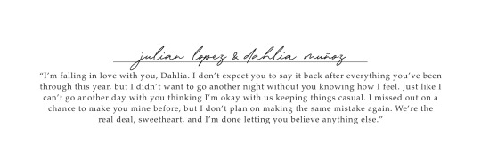
Text

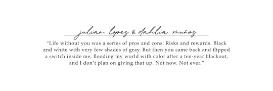
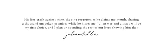
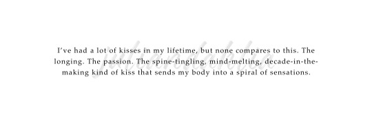
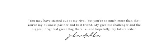


Love Redesigned headers
like/reblog if saved © maddiesflame
#headers#love redesigned#lauren asher#julian lopez#dahlia muñoz#lakefront billionaires#book header#julian x dahlia#love redesigned header#book headers#header#juliandahlia#dahliajulian#header books#romance books
35 notes
·
View notes
Text
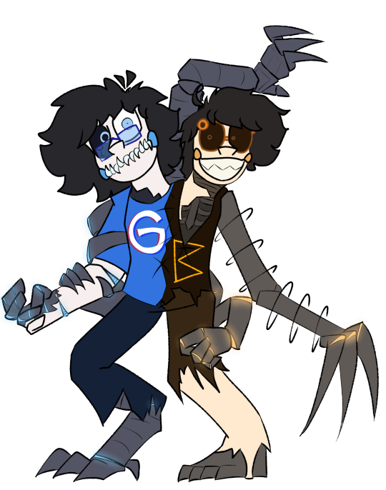
cringetober - self insert
i think this is the most embarrassing thing ive ever drawn. im making it my header image.
and omg! biggie likeness reveal!! but in the iconic howl outfit of course. (technically as i post this my nails arent painted and my hair isnt purple but its just because i need to repaint/redye them so. i do look like this regularly. the only real difference is that i transgendered my proportions a little bit, as is my right as an artist.) also i know he doesnt wear this in this scene AND i didnt really match the background or pose from the scene at all but idc i just put together all the stuff i liked into one drawing. happy cringetober
also i showed this to my sisters when it was almost done and the one who hasnt watched howls moving castle said this

so. i think i nailed it
#biggie draws#howls moving castle#cringetober 2023#wow i just realized ive only completed and posted 3 of these so far#and october is almost over ;-;#dont worry i have more planned!! i'll probably set my cutoff at the end of november bc i dont wanna drag it on TOO long#the next one will probably be hot villain or objecthead. or i might try to do halloween in time for halloween! we'll see :3#anyway im loving this challenge :D i wasnt kidding about making this my header either im gonna redesign my blog right now
19 notes
·
View notes
Text
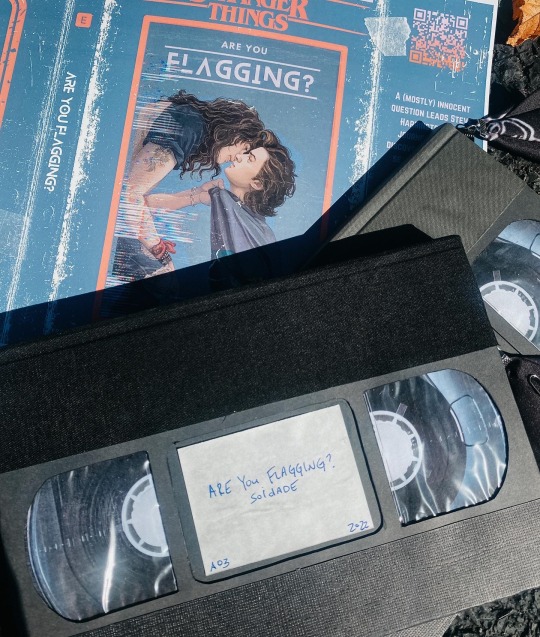
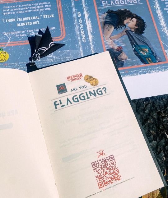

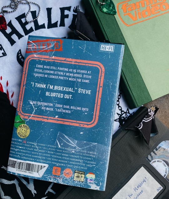
I posted my bind of Are You Flagging? earlier where I had a placeholder for a dust jacket.
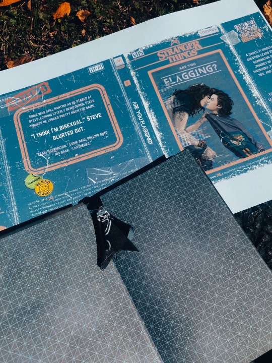
I finally got my new design in!! I love it so much! I decided to go with a 80s style VHS box aesthetic and made it look vintage and grimy. I ended up liking it so much that I thought it’d be clever that if you “took the case off” it’d reveal an actual VHS tape 📼 📺 📼 📺
It was in incredibly tedious, but I love the concept and effect.
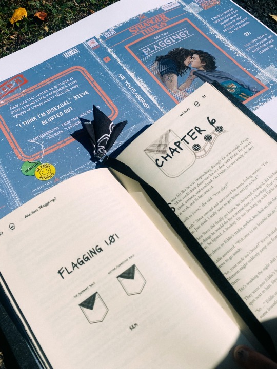
I like to use graphics in my typesets on blank pages to ensure all chapter headers start on the right, and I decided to go with a cute little Flagging 101 lecture! I was nosy and googled what the other colors meant, so by the end of the fic you’d know what all the basic colors stood for. And of course for the bookmark I just had to use a mini versions of Eddie’s hanky 🥹
My chapter headers represent Eddie and Steve- Eddie with his chain and bats 🦇 , Steve with his preppy polo buttons and a film strip from Family Video 🎞
This copy is for the author! the end papers are changed to tie in both the VHS cover and an alternate cover I’ll be posting later!
It’s watercolor babygirl pink and iykyk 😏
As always a huge thank you to the backbone of fandom- the writers and artists for providing such amazing products for us to consume and enjoy!
Are You Flagging? By Soidade on ao3 is an amazing top tier Steddie fic that I urge you to read. You can find it pinned on the authors page @ao3soidade
Also a huge thank you to @littleststarfighter for letting use their gorgeous art! I was so inspired I completely rebound this fic, redesigned the typeset AND redesigned my hardcase just so it’d match. They have quite a few stunning Steddie pieces so be sure to go show them love 🖤
#fanbinding#bookbinding#st fanfic#stranger things fic#stranger things#steve harrington#eddie munson#steve x eddie#steddie fic#steddie fanart#steddie
1K notes
·
View notes
Note
what's the story behind aardvarks and yellow roses?
Yellow Roses
Ok so yellow roses are a bit more straightforward to explain, so I’m gonna start there. Outside of the aromantic community, yellow roses traditionally symbolize friendship. Because of this symbolism, when the first aromantic flag (the four stripe flag with green, yellow, orange, and black, shown below) was published on the website for the National Coalition for Aromantic Visibility (NCAV), the flag included a yellow stripe which represented romantic friendship, friends with benefits, friendship dating, and queerplatonic relationships.

The redesigns of the flag also included a yellow stripe (to represent lithromantics) though I’m not sure whether this was at all inspired by the yellow stripe in the original flag (if anyone knows please lmk). Still, it’s an interesting piece of aro history for sure. We still see yellow being used to represent platonic attraction sometimes (notably, on the queerplatonic flag), so there could be some link there as well (though that’s a bit of speculation).
Before the “ace discourse” era on here, I also used to see yellow roses by themselves being used as a symbol of aromanticism by aromantics due to platonic love being intrinsic to how many people experience their aromanticism. It wasn’t as common of a symbol as, say, aardvarks or spades, but it was common enough to be recognizable as a symbol. It was especially used as a symbol of platonic love and attraction within the aro community, as one might expect. Here’s a screenshot of one instance of this that I found digging through old posts by @aromanticaardvark on Wayback Machine. The post is from 2015.

I’m not sure why, but I’ve always personally liked the yellow roses as an aro symbol even if I don’t entirely relate to the platonic love symbolism (in fact, I could be considered aplatonic, though I don’t often label myself as such).
I actually use the blue roses in my header as a nod to the old yellow rose symbol, in case anyone was curious about that. (I chose blue roses instead of yellow since, as I said, the platonic love symbolism isn’t particularly relatable to me. Plus blue roses are often used to symbolize unattainable or unrequited love, which I thought was fitting since I myself am unattainable, and any romantic feelings directed towards me will forever be unrequited).
Aardvarks
So, I’m about 90% sure that the aardvark symbol was started by @aromanticaardvark, who used to be one of the big name blogs in the aro community (though their blog has been inactive since 2016). Back when advice animal memes were a thing, the person behind the Aromantic Aardvark blog used to post aromantic-themed advice animal memes which featured an aardvark. (An example of one such meme originally posted on the Aromantic Aardvark blog in 2011 is shown below).

In 2015, Aromantic Aardvark received the anonymous ask “What does the aardvark have to do with it?” to which they replied “Nothing, really, it’s just alliterative. Aromantic Aardvark was founded when advice animals were a common meme here on tumblr, and my friend and I thought it’d be funny if there were an aromantic meme. That aspect of the blog eventually went away however, and it became more of a general resource/advice blog for aro spectrum people.” This would seem to imply that the use of aardvarks to symbolize aromantics originated on the Aromantic Aardvark tumblr blog.
This would make sense seeing as Aromantic Aardvark was one of the early aromantic blogs, and was even linked on the NCAV website back in 2014.
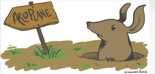
Aardvarks were used pretty commonly as an aromantic symbol for a while. Notably, the AroPlane forum, where a lot of early discussions about aromantic symbols and flag redesigns took place, used a drawing of an aardvark in its website banner (see below).
I’m honestly not quite sure when aardvarks started to decline in use as an aromantic symbol though.
209 notes
·
View notes
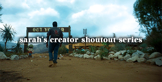
Text
Hi everyone! Here’s the newest addition to my Creator Shoutout Series (september 17 - september 24)! I want to appreciate editors and their creations that i love from the past week. To track this series or look at previous shoutouts, please check out the tag on my blog *creatorshoutouts. Have a great week everyone!
narcos: javier pena gifset by @perotovar
the bear: sydney adamu gifset by @eatandsleepwell
yellowjackets: 1x01 gifset by @ordinarybarbie
taylor swift: album redesign edit by @sapphic-girls
barbie (2023): president barbie gifset by @venka
scream (1996): tatum riley gifset by @possession
the good place: the soul squad gifset by @nelsonnicks
barbie (2023) gifset by @marv-el-spot
taylor swift: foolish one graphic by @sombrewoodlandfairy
barbie (2023): gloria gifset by @strandtk
taylor swift: fall gifset by @cametotheshowinsd
barbie (2023) gifset by @morgots
yellowjackets: jackie and shauna gifset by @jynersso
taylor swift: 1989 tv vault tracks edit by @thehoax
barbie (2023) gifset by @kitconnor
taylor swift: slut! graphic by @cellphonehippie
barbie (2023) gifset by @zeindaya
chappell roan graphic by @bloodmoonlich
taylor swift: new romantics graphic by @andtosaturn
abbott elementary: tv tropes gifset by @goabbott
taylor swift gifset by @mikelogan
the last of us: pantone colors gifset by @belasdimitrescu
taylor swift: 1989 tv headers by @greatests-hits
34 notes
·
View notes
Note
Thanks to your beautiful cql redesigns, every time I think of Jin Zixuan, he is blond (best idea anyone's ever had this decade). Also ever since I found your art you've been one of my favorite artists. 💐 (If you're allergic to flowers, just imagine they're Lego flowers instead ❤️)
Thank you!!! I really love bleached blonde jzx and wish the Jins were more....more. I want to change his volumous wavy hair to fairer straight like on my header picture 😁 kinda want to redraw my old chengxuan art with new jzx...
20 notes
·
View notes
Text
Hello? Hello Hello?
...Well, this place has been dead for a little bit, hasn't it?
Mentioned a little bit before on that collab piece I did, but figured I'd be better to do a full post bout it here!
So, this AU...has been laying dormant for quite some time, and there's not really any excuses for that. I've just been a little busy with school and life in general, but mainly...haven't had much motivation to do it in all honesty, and their's two main factors to that unmotivation.
1. I kinda realized I'd be needing to write a lot for this story, and though I love writing in general...the scope of this would be like writing a few novels if I continued on, and I just wouldn't have the time or sanity to do that, but more on that later for a solution...
And 2. ...I kinda fell out of FNaF for a moment. Well- Not entirely, I'll always love this series, but I guess it was mainly...the state of the fandom after one certain game...Security Breach. After that game came out, it kinda broke the fandom in half. One half being those who hate the game and left the franchise entirely, now seeing it as nothing but for kids and not taken seriously, and the other...well, actually kids. Y'know the ones. You know.
So that kinda left me kinda unsure for my AU, since I thought if I put stuff out now...it wouldn't really be that appreciated. From the start it was meant to harken back to the original classics of FNaF, but with the fandom mostly filled with newcomers for just this one game, and the original fans gone and unhopeful for the franchise, I just kinda...left this place dorment till I felt motivated again.
...And then the Ruin DLC happened, which gave me a spark of motivation. Seemed this franchise was starting to to head to a better place, getting some old fans back, so that's nice. Got me thinking more bout this AU again...
And then the movie happened, and now i've been slapped in the face with motivation.
SO- Guess that's my excuse for why things have been so empty, but now...I AM READY TO OFFICIALLY SAY IT IS STARTING BACK UP! And not just that...but starting fresh! ...Which, isn't saying much, since I only wrote two chapters for it...y e a h - But there's a reason I'm starting fresh, not just for improved art or retconing some of the mistakes of what I did give out, but mainly because...
I'm turning the AU into a comic!!
That's right! Gonna be drawing the whole thing start to finish! Figured this would be better to me since it's quicker then writing it all, and get to show and improve more of my art, so works out! (You can already kinda see some of that with the new pfp and header) Maybe might get some help in the future, maybe might dable in some animation, maybe a lot of things, but guess we'll just hafta see where it goes from here!
What does that mean for the previous content though? All...f o u r of it? Well, that stuff is gonna be non-canon from here on out! It'll be easier this way since those stuff have either some continuity errors that'll effect the story in the long wrong, or just simply I've changed my mind on some things and it'll be a bit more different! I'm still leaving them up, however! Just cause I think it'll be fun to see how far I've come, and ey some art pieces there weren't bad! ...Too bad...okay like one or two were d e c e n t
TLDR of it tho is this: AU's getting a reboot, gonna be made into a comic now, previous stuff is non-canon, and this page should be a bit more active now!
But yeah! Big things are coming, and I am excited to start up this AU again! I have so many plans for this story that I'm just hoping you guys will love, wanna do justice to both sides of the story! So keep an eye on this blog, might take a little longer, but hoping to get things officially and finally started soon!
And to prove some of that, before I go...you guys deserve a a bit of a sneak peak of what's to come, so...hope you enjoy these redesigns >:]


EDIT: THE SERIES HAS OFFICIALLY BEGUN- READ EM HERE- AH-
#bringing this place back to life!#including finally changing the header and pfp oh gOd-#why did i shade the r e f p a g e s hhHHhHHH-#au#fnaf#fnaf au#markiplier#markiplier au#five nights at freddy's#tiny box tim#darkiplier#wilford warfstache#warfstache#google#googleplier#bing#bingplier#the host#the host markiplier#eric derekson#eyesore talks#eyesore's art
24 notes
·
View notes
Text
NEW PINNED CUZ UHH YEAH >.< uwwaahh
୧ ‧₊˚ 🍮 ⋅ ☆ About me
——🎀🩸🐾——
| 🩷Name: (I have multiple…) Mackenzie / N / Doll / Steven / Spin (Any is fine to use, and nicknames are okay too ( ≧ᗜ≦) )
| 🌈Age: 15 !!!
| 🫧DMS / @‘s: OPEN DMS!!! (Won’t respond fast, I’m anti social HELP) and @ whenever !
| 🎀Pronouns: He / She / They
| 💘Likes: MURDER DRONES!!!!!!!!! Drawing, N murder drones, Doll murder drones, V MURDERDRONESGGRGAGETWYGSGHA, N murder drones again, J murder drones <3333, did I say I like N murder drones? ૮꒰ྀི∩´ ᵕ `∩꒱ྀིა
|❌Dislike: a lot idk lol
| 🧸 MY SIS IS @niniscookiecafe AND YOU SHOULD TOTS FOLLOW HER RN ૮꒰˶ᵔ ᗜ ᵔ˶꒱ა˖⁺‧₊˚
——🎀🩸🐾——
୧ ‧₊˚ 🍮 ⋅ ☆ About my art / blog
| 🐾 This blog is both for my drawings, writings, and reblogs (Bc I don’t feel like making separate blogs for all three -_-;)
| ⭐️ This blog is mainly SFW, but I do sometimes draw / reblog gore, body horror, nudity, etc. I will tag them with TWs like “(( body horror, (( gore, (( nudity, (( suggestive” etc etc. ofc, I tag spoilers as well.
| 🧶 I do not care about people spam liking and or rebloging me, go wild! Asks are always open! Don’t be afraid to say hi or spam me, I encourage it! PLEASE ask about my ocs / au… I beg… ₍⑅ᐢ..ᐢ₎
| 🎭 #ShutitKenzie, #Kenziebabbles ; my talk tag (I don’t shut up)! #Kenziedraws ; my art tag! #Kenzieiswrting… ; my write / fanfic tag! #Kenzieanswers ; my ask tag! And lastly, #ArtforKenzie ; is fan art / write tag!
| 🌙 I used ibisPaintX for the majority of my drawings, and will sometimes post traditional stuff! I’m a multifandom blog, but rn it’s 999% MURDER DRONES, ocs, and 1% other stuff.
| 🩸 I don’t do commissions (as of yet,) but I will accept art trades (with moots only, please.) I also take art requests thru asks, usually I’ll make a post asking for reqs but don’t be shy to send some anywayz! ૮(๑>◡<๑)ა
| 💌 I don’t care about others using my art / writings as heavy ref and or inspiration. I’d greatly appreciate it if you’d tag me, because I wanna see it! Tracing my art is also okay for practice and whatnot, but if you do post it, also tag me! I allow reposts, put please credit me if doing so. Idc about people using my art for headers, boards, pfps covers ETC all I ask for is credit lol. If you make fan art / write of my stories/aus designs and or original characters, DONT be afraid to tag me!!!! ദ്ദി ˉ͈̀꒳ˉ͈́ )✧
——🎀🩸🐾——
୧ ‧₊˚ 🍮 ⋅ ☆ DNI
(What I say in my dni is final, I will not debate about it so please don’t start arguments! It’s for my own comfort and safety)
| ❌ Racists, homophobes, transphobes, pro Israel’s etc, basic dni criteria.
| ❌ People who whitewash, and who think “blackwashing” is real. Along with people who erase canon lgbt rep. ໒꒰ྀིっ˕ -。꒱ྀི১
| ❌ If you’re an nsfw account, a proshipper, comshipper, or disrespectful / toxic “anti”. If you support anyone problematic (yandev, theftking, matpat, dream, Wilbur etc etc)
| ❌ I block empty blogs! If ur not a bot, at least have a pfp or I’ll block u 。°(°.◜ᯅ◝°)°。
| ❌ If you’re going to whine about my interpretation / redesigns of media, than my blog is not for u…… I don’t want to deal with people constantly saying what’s canon and what isn’t cuz Idrc lol. Please don’t argue with me over ships either, I’m a multishipper and don’t have to follow canon. (If u insist on doing this, I’ll block u.)
——🎀🩸🐾——
୧ ‧₊˚ 🍮 ⋅ ☆ Thank you for reading, if you’ve read all this, then you are more than welcome to follow! Don’t be afraid to dm and talk to me, I love making friends despite my antisocial tendencies ……!!!! I hope you enjoy your stay, and if you don’t, then I’m sorry ૮꒰ ྀི >⸝⸝⸝< ྀི꒱ა ୧ ‧₊˚ 🍮 ⋅ ☆
. •🎀🍰🐾 • .

#Kenziebabbles#shut it kenzie#new intro !!!#HIIII!!!!!!! UM!!!! N HERE#I think this is good#like it better than the other one JSJSJ#anyway uhhh yeah!! >.<
8 notes
·
View notes
Text
Porter Gage Masterpost
[Blog Masterpost] [Ruby Lennox fo4] [Nuka World]
Romantic (and spicy) Illustrations
[Porter loved that]
Fever Blossom 🌶️
Need somethin' boss?
Ruby and Gage [ 1 ] [ 2 ] [ 3 ]
Gage and Ruby with their horses (header)
"Hot Gage pls"
Stripper Gage
Illustrations where Gage forgot his shirt
In the shower
In Fizztop Grille
Tattoo Ideas [ 1 ] [ 2 ]
Other Illustrations
Checking Colter's armor
Gage is the cool uncle
Babyboi
Smoking
Smoking in a yellow jacket
Armor redesign [ 1 ]
Realistic Gage Edit
Pixel Gage
Gage in Dishonored
Gage in a battlecoat
"Buy a sweet gun instead"
Text posts
Gage describing Ruby
Memes
Pocahontas meme
Fo 4 romance in a nutshell
The Gauntlet in a nutshell
Clearing out Dry Rock Gulch
29 notes
·
View notes
Text
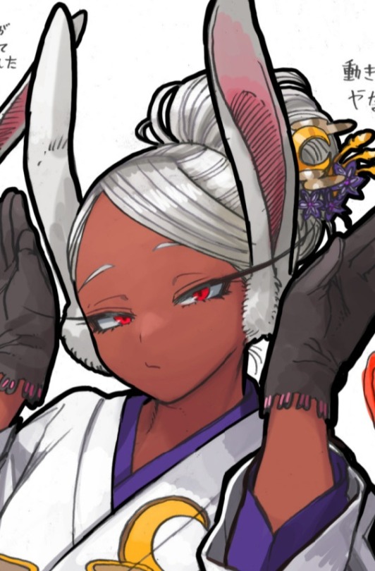
🐇 FAVE MIRUKO POSTS! 🌙
Okay, here are some of my favorite posts I have had on my blog(s) so far! Meta, headcanons, fics by me, pictures, etc. I tried to limit it down though because if I had the time and patience... every post would probably be included.
૮₍ ´ ꒳ `₎ა
Not #1 Material, My Ass!
"Overrated", My Ass!
Miruko is Much More Entertaining
The Costume
If You're Gonna Complain About Her Fanservice...
"Talk About Weak"
Miruko in TUM
Teen Rumi
Miruko & Midoriya Similarities
The Rabbit Duo
The Rabbit Duo (Remix)
There's 3 of Them...
Tiger 🐯 & Rabbit 🐰 (PART 1)
Tiger 🐯 & Rabbit 🐰 (PART 2)
Tiger 🐯 & Rabbit 🐰 (PART 3)
Mer!Miruko & Mer!Deku
She Deserves a Vacation
Am I the Only One?
Miruko & the Commission
Miruko Infiltrates the Paranormal Liberation Front
Miruko Really Took Thanos' Advice
She Does Not Give a Damn
She Could Kick His Ass
The Time Haiku Bot Got Me...
What a Rabbit Wears
She's Fun Sized!
More Miruko-centric Fics
It's a Charade
She Can Play Nice
Miruko Headcanons (PART 1)
Miruko Headcanons (PART 2)
Miruko Headcanons (FAMILY EDITION)
Bunny Beats 🎶
Bask in Her Beauty
She's Cute!
Her 🐰 Pose!
What About Fics Like This? (1)
What About Fics Like This? (2)
Beware of the Bunnies (FIC)
Beware of the Bunnies in a Nutshell
There's Miruko, There's Rumi (FIC)
Forbid a Woman from Being Great (FIC)
Here's All the Miruko-related Fics I Wrote
BurnBunny & Here's Why
BurnBunny Headcanons
BurnBunny Headcanons (PART 2)
BurnBunny Ship Ask
Miruko's 🌈 Eyes
Miruko Lockscreens (Kiya's Birthday Edition)
Miruko Icons & Header Set
Miruko Gif Set
Miruko Moodboard
Neon Purple Miruko Icons
Taysudon's Redesign & Deku!Miruko (BOUNS, I really love these!)
Seasidejuniper's Other Heroes!Miruko (ANOTHER BONUS, I really love this, too!)
૮₍ ´ ꒳ `₎ა
Hope these posts show you why she's my #1 BNHA character (tied with Midoriya).
#just kiya's thoughts#bnha#mha#boku no hero academia#my hero academia#miruko#mirko#miruko bnha#miruko mha#mirko bnha#mirko mha#rabbit hero miruko#rabbit hero mirko#rabbit hero: miruko#rabbit hero: mirko#rumi usagiyama#usagiyama rumi#I'M SHIFTING INTO MIRUKO FANGIRL MODE#💜🐇🌙#kiyaedits#kiya writes#midoriya izuku#izuku midoriya#deku
48 notes
·
View notes
Text

Last weekend we made the difficult decision to pull Banda's Grove out of layout, and rewrite the core rules from scratch, reorganize all the sections, condense, simplify, and also redesign the entire graphic design aspect of it.
Here's why.
For the last few months I have been hand editing a physical copy of Banda's Grove and something has felt off about the entire game to me, and so I haven't been promoting or talking about what I consider to be our biggest game that defines who Pandion is.
What I've come to realize is that I LOVE Banda's Grove and its world, but the game text and current rules have become sloppy. Its not at the standard that we produce today. BG was one of our first games, and it shows now that I've grown as a designer.
Knowing what to print to play has become confusing
Understanding and reading the rules is difficult
Maps are not interesting
Online play is difficult
The book is bloated and disorganized
Legacy terms are still used
The graphic design is inconsistent & inaccessible
This is all hard to admit. But the players have hinted at this over the last year with incredibly polite feedback. But the simple truth is, Banda's Grove is not a game I'm proud of anymore. But I am still proud of what it is trying to be.
So, it's time to correct that.
Everyone will get this update if you've already bought Banda's Grove. We are pausing our plans for taking it to print, and going to focus on getting this right. We'll keep you updated along the way about the changes we're making, and sharing the new designs we've created.
The core rules of Banda's Grove are starting over as headers in a doc, and being rewritten from scratch. It's still token-based, it's still about building your quantum slice of life community, but we're reviewing everything and condensing, simplifying, or deleting.
If you've made content for Banda's Grove, it will still be compatible! And the setting's content will not change, like the Nature Watching Creatures, and Quantum Events. But how we introduce the Grove's setting is being revised for clarity and consistency.
Again, we are going to keep you updated on this progress, and we're already more excited about the game now than we have been in months. So keep an eye out, and expect to be hearing more about the fantastical Quantum Convergence of Campgrounds more in the future!
24 notes
·
View notes
Text
SU reclaimed pearl rambles
im gonna use some annoying comments i got on my reclaimed pearl as a springboard for what i think could be interesting discussion because i think its good to engage with criticism/different opinions. but also if you talk to me like an asshole i want you to fuck off and i promised i wouldnt engage in that kind of stuff bc its not good for me and it doesnt Look good for me either.
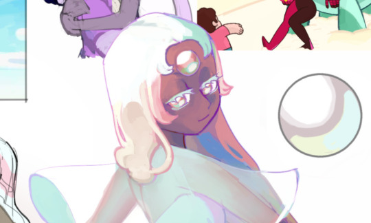
so i can talk about my thoughts but not engage directly, win win. its been months but im still really fond of the pearl i made specially this art. like it coudl be better but i like it well enough. just a little header so this isnt a boring post with only text
i think like, its good to establish ground rules that like, i think most of the poor reactions ive seen towards my art were missing, mostly in bad faith probably but in case theres ppl who earnestly want to understand. actually maybe i can format it like a little FAQ even though theyre not frequent or asked lskdjg just for outlining my points. ill put it behind a cut but ill frontline w this: if youre a fan of pearl in the show, this content is not for you. youre allowed to like whatever you want and so am i. if you like her, we probably wont get along and you probably will feel very personally irritated by how i FEEL about her, so just walk away now. im not gonna engage with petty shit taht juts boils down to 'im mad you dont like what i like'
onwards to more rambling / sorta responding to some criticism
i scrolled back and i guess i sorta never have actually done a proper full explanation post about this AU have i? or maybe i have and deleted it, i forgor
why did you change pearl?
because i hate her, simple as. i went from a huge SU fan to hating watching it (i did finish) and pearl is probably The biggest reason why, as like issues with her character seep into other aspects of the show that i also hate. like i mean i Realyl hate her. she makes the experience of watching the show really irritating and miserable for me. if you dont feel taht way about her thats totally normal and whatever but no one is gonna change my experience and feelings that i had watching SU since the 1st season was coming out.; anyway answering. there is a Lot i love about SU and want to engage with, so i had the idea of like,maybe ill just change pearl, cause i wanted to delete her, really, but she is one of the main characters and she hasa function as a character that you cant just do away with. essentially im just like, some guy, who draws, coping and trying to reclaim his teenage investimetn in this show. literally its just for ME. but if anyone else feels like i do, then they can enjoy it too. if somoene doesnt feel like i do, go watch like pearl fancams or smth. like ill never be able to literlaly change the show as it is, like its happened, and its a tragedy im trying to move on from (begrudgingly)
why do you hate pearl?
the long laundry list of reasons are probably apparent in the ways i remade her lol (theyre not i can tell ppl are gonna project whatever worst bad faith reason for any change i make) but tbh the core of it is this, which is like, beyond whatever traits she has and whatever: she reminds me of my abusers. always had, from season 1, but like it became worse as the series went on. its like really infurating and upsetting to watch SU bc of her. had my abusers been a different kind of person, maybe i wouldnt hate her so much (kinda doubt tbh). like her personality and behavior are like hough disgosting!!
why did you change (some physical trait about her design)?
i dont really necessarily have a PROBLEM with canon pearls design. over the years ive come to like SU's style less and less but like, gestures, whatever. like i didnt like it or anything but its not like a bit deal compared to the actual offender that is her personality and behavior. the reason i redesigned her at all is bc like, if i hadnt, i would still be thinking about the way she is in canon all the time. like ive visually associated her like, appearance with all the shit about her thta makes me upset so i had to so she didnt look like the same person anymore, and i can try to let go of some of the hatred in my heart. like i want to think about the thigns about SU that i loved and also the potential i always saw in it and canon pearl is like, an active obstacle to that, to the point taht i cant even see her without getting like irked. i tried to keep enough similar traits so from a glance youd be like, who the fuck- is that pearl? rather than like. completely change her entirely to whatever i wanted. i do want to like, its a creative exercise. i want to try and change the things that would make me happy to see gone but try to work within the constraints of the SU we Did get as much as i can tolerate. bc like.... if the sky was the limit then at this poin wed just have to throw the whole thing away and start from scratch. like its kinda not really very salvageable, like im not rewirting SU to be like a Good show or fix Everything, its kinda too broken. im just chnaging enough so i can look at the actual show, screenshots, songs etc, and not feel overcome wtih like the grief and irriatation of how much it sucked ass. its just so i can enjoy more of it again
i dont like your redesign for (insert reason)
cool. thanks for your input. youre welcome! eat my asshole.
seriously though, like, shrugs. i didnt make it for anyone other than myself. tbh im not fully satisfied with it either bc i think the SU style is kinda ugly, so im at a crossroads. should i mostly abandon the SU style? ive like, tested out tweaking things, it mightve been noticeable in screenshot redraws. drawing within the SU style is to create that coping 'oh it was totally like this haha' vibe but maybe im old enough to not need that anymore lol. like ive heard ppl say shit like shes ugly, or like sneakily trying to imply im like, got some agenda over beauty or racism etc. like whatever, think whatever you want, its not for you. go back to sucking up to rebecca or smth like i cant take the og pearl away from you
still i am open for like that kind of criticism like, do i have personal biases affecting my design decisions? probably. i do try to keep aware of why im choosing certain things, but really in this case i cant emphasize enough how like, irritating it is that i have to change her design at all. like its hard to come up w smth else when the rest of the cast ahs already been design to balance off the og pearl. i probably wouldnt change almost anything if the sight of her didnt piss me the fuck off! most of all i kinda wouldve preferred to keep her hair short bc it messes up the sillouete but it makes me think too much of canon pearl so i made it long :/ i was like let me tell you my design thought process:
-im gonna try to keep as many recognizable traits about her design while taking away bit by bit until she doesnt look like the og pearl to me anymore and i dont feel angry seeing her. pearl is lanky, tall, spindly, with a gem on the forehead, blue white pink yellow pastel colors, large pointed nose. i kinda tried to keep these traits while slightly tweaking their design until she looked different enough. is it a good design? eh idk. like the purpose is to make me not hate her and it does that job
now this hate comment im gonna grace with keeping it intact except removing the person bc its not about them. its like, a very stupid ass headed comment but im actually kind of interested in like,jumping off of it to ponder some things
im not heterosexual or cis enough to know what exactly wife bate means in this context so im gonna like guess, that maybe i could extract this q from that reply (also not looking like shes from steven universe is a compliment thanks)
you took away her personality and made her boring
the only thing i can assume is that like, some people must interpret the absence of an assholey personality or like abusive behavior is 'boring'. i know thats a really bad faith assumption but like, if ive written down a bunch of personality traits and you still come out saying thats 'no personality' what am i to make of that lol. based on my experience like Existing online, people tend to often call nice characters 'boring', like dude ive done it before, but i think im kinda over that edgy phase. also again, its for me and not for you so if you think shes boring, thanks for your input i dont care. but thinkign about it earnestly, i dfeintely dont want to make a character thats just no flaw and not interesting ofc, i havent done that with reclaimed pearl. that being said i havent like, probably written a lot demonstrating what i want her to be like instead of the canon pearl so, maybe ppl just are feeling lost with the lack of information.
personally, if i hear someone thinks a character is boring bc theyre not abusive anymore like, nothing of value has been lost. but characters do need flaws in order to create conflict and cause things to happen, like in a way canon pearl is like All flaw, which wouldnt be a problem except she gets away wtih all the horrible shit she did. heres some traits i want to explore with reclaimed pearl, some are similar to canon i just wanna go about it a different way: being overprotective/possessive to steven in a smothering way, projecting abandonment issues, not reaching out/communicating her emotions properly, lacking indepedence/self worth, depending on others to avoid confronting her own issues, being very passive and insecure and lacking initiative (this being the totally opposite trait that canon pearl has), stunting stevens development due to her not being ready for him to grow up and not need her anymore. and more, this is just from the top of my head. maybe thats still too 'boring' for ppl because shes not being selfish and inconsiderate enough to others so you can relate to her but i dont care :p
gosh how do i go about like, presenting the content i ahve in my head for this AU).. i cantjust remake the whole damn show. i would if i could, tbh
i have concerns about racist implications wrt (insert thing here about my redesign)
imma be frank. i dont know how to compltely 'clean up' any possible bad associations wrt pearl as a character given how like, rebecca has literally like, made her to be a slave in love with her slave owner and made it to be like, an uwu ideal lesbiab thing for most of the show until they tried to pretend no we understood the flaws in this dynamic all along and its bad actually , uhh, anyway shows over haha
ill say the main reason i changed her skintone is, bc that would be the like most instant way to make her look differnt from canon (which is vital for me for the reasons said above), and i did consider like, does this make the whole thing worse, or, ?? like, as they made it in the show, techincally All the gems are slaves to the diamonds, arent they? including all the very totally progressive poc based gems including and specially the ones who are made to be understood as black women. bruh like idk what to tell you this show is just fuckig bad sdlgkj like its just way too like, pervasive in my teen years forme to throw the baby w the bathwater entirely. and ill just straight up say it, like, im not a specialist on these topics nor do i hav ea position of authority to speak on about it. like the pearls read more clearly as slaves (very intentionally by the showrunners) bc they are meant to be subservient to gems Other than diamonds. and also bc they like fit in the stereotype of housemaid servant. like the rubies being made to just be forced to go and fight like they are slaves too, they have no rights and no like, authority to disobey or autonomy. but fsr like, slavery as in physical labor just doesnt immeidately set off ppls alarms as much as housework slavery does fsr.
i can only rly like change the canon so much and try to like, tweak things so it doesn feel as gross but i think for it to be cmpletely not insneistive at all youd have to throw away the whole show. and like i said, this isnt like me saying like im making the show good or as it shouldve been, im making it so I (and ppl who share my feelings about the show) can feel less shitty just thinking back to it. its just an exercise. im not like mass media im just one independent artist and shit will come out insensitve sometimes and im sorry but im also like, my art isnt meant to be representative and like, responsiuble for fixing all of society and racism like i actually cant do that. ill just do the best i can as an asian dude but like, if my work makes you upset, im sorry, but also just block me. like i cant please everyone. or like, even better, make YOUR take on pearl taht you feel would be better, like make the art you feel should exist.
this post is too damn long and id be surprised if anyone reads all of it but if you do, tahnk you! i felt kinda like ready to fight tonight so im triyng to redirect it from aggression to like, thinking. i cant guarantee im making new content for su reclaimed anytime soon but i would really like to, tbh
17 notes
·
View notes
Text
Links, tag system, and additional info.
I try to avoid reblogging things to this account - that's what my main blog is for. If you see a reblog on here, feel free to let me know so I can delete it!
I handle all commissions through my professional email, artcommissionsbyred (at) gmail (dot) com. For the foreseeable future, my commissions are closed.
If you would like a heads-up on upcoming commission availability, please subscribe to my mailing list here! (Mailing list subscribers also get earlier or sometimes even exclusive access to things like limited-time slots, which I sometimes do when I'm hard up for quick cash.)
Outside Links:
Twitter: OozeAndGoo_Art
Ko-Fi: OozeAndGoo_Art
Bigcartel: OozeAndGooArt
Wordpress: OozeAndGooArt
FurAffinity: TheRedDragon13
Main Blog: @bitegore
Rules of Engagement:
This is a sideblog. I have a lot of people blocked from my main blog, none of which are blocked from this blog. It's okay if you've been blocked from my main for you to reblog from this sideblog - I have genuinely thousands of people blocked, for reasons that are arcane and sometimes really stupid even to me, and if you behave in a rude or unpleasant manner I'll just block you from this blog when it comes up. Go nuts.
This blog contains quite a bit of adult-oriented art, all of which is both marked "mature" using Tumblr's content settings and tagged accordingly. Please browse at your own discretion, and remember to use filtering options where necessary.
In general, off-topic commentary in the reblogs, tags, and replies is totally fine and I like seeing what you guys have to say even when it's not directly about the art. That being said, please do not talk about either how much you hate the character in the art or think the art looks bad. "If you have nothing nice to say, don't say anything" is a good rule to live by, and also it's annoying and rude. Likewise, don't put discourse on my posts. I don't want to hear about it. If you have an opinion about the characters or art that is negative, feel free to make your own post! You can even add my art to it (with a link to this page) if you really want to talk about the art in particular.
Please repost my work only with credit (a link back to this page). Use of my art for avatars, header/sidebar banner images, edits, remixes, collages, and related is entirely okay as long as credit is given. My canon character redesigns are also completely free to use and no credit is required as long as you've done the actual drawing yourself. If you're using my art for something, I'd like to hear about it, but it's not required - it's just really flattering.
Please do not remove my captions, however. Just make a repost.
If you want to print one of my pieces for personal use, feel free to reach out to me! I will happily re-color/re-balance the colors so that it will print nicely if I have the time, free of charge.
If you want one of my pieces tattooed, go for it, consider this blanket permission. I'd be surprised and I'd love to hear about it, and also I have no qualms at all. Go for it.
Everything is okay to tag as kin/id/etc or claim as muse references. Have fun with it, I don't care. This goes for my ocs too, I really couldn't care less. However, if you disagree on characterization from what I've drawn, please don't tell me about it.
Obligatory "don't be bigoted." This is a racism, sexism, homophobia, classism, xenophobia, religious discrimination, and everything else-free zone. I'm not perfect, and therefore if I've created something that comes over wrong, you are more than welcome to voice your opinion on that, but please approach me in private first*, and message me on my main blog rather than the sideblog as I actually check that account.
Feel free to ask me to tag for more than I currently tag for- either for search reasons or to be able to more easily filter things. I may refuse to use certain tags at my discretion.
-
Tags:
content warnings: all content warnings begin with the phrase "contents" to help disambiguate them from generic phrases.
#contents: a little raunchy for tumblr - not quite dirty, but still running on adult themes. Rated pg-13 instead of nc-17.
#contents: not safe for Tumblr - the Naughty stuff. All should be marked mature already.
#contents: blood - has blood
#contents: gore - has organic/meat gore
#contents: robogore - has robot gore, presented like something other than organic flesh
#contents: death - someone's dead on screen
#contents: flashing - something in the image flashes in a way that may not be safe for photosensitive viewers.
#contents: dubious or nonexistent consent - there is sex or sex acts of dubious or explicitly nonconsensual nature happening on screen.
#contents: all edge and no point - general assorted tag for finding things that are just really edgy for no good reason. suicide jokes and torture and that sort of thing.
fandom-specific tags:
#transformers - transformers art, including humanformers. At this time I don't tag continuity.
#macaddam - safe-for-work transformers art (for search discovery)
#valveplug - spike and valve NSFW transformers art
#plug and play - cable-play NSFW transformers art
#sparkplay - spark-play NSFW transformers art
#humanization - a character that isn't normally a human, depicted as one.
#rukaan and #deer - Fields of Valhalla (deviantart ARPG) art, mostly depicting fantasy deer creatures. (#deer is there for search discovery and being easy to remember; "rukaan" is the actual name of the fantasy species.)
#dragon - there is a dragon. everyone likes those
#scalie - anthro reptiles - in this case, basically all dragons.
#oc - original characters. Everyone's got em, right?
[character names] - tagged as needed for search purposes. Characters with multiple names may or may not be disambiguated at essentially random. OCs are also tagged by name.
personal navigation:
#red redesign g1 stunticons - my stunticon fan redesigns. sometimes you don't want to see fan redesigns, so now it can be filtered - without having to filter anyone else's stuff, even!
#au: androidformers - the specific humanoid-android designs for the transformers G1 "humanformers" au I have lying around.
#fursona - this character is one of my fursonas. Typically this just refers to Taz.
#mass post - if there's a bunch of pictures in one post because I don't think they can really stand on their own merits or are part of a sequence, this lets you filter that away.
#closerverse - art for a personal original universe.
art navigation:
background - art with a significant focus on the background or scenery. This may include photo overpaintings where the background is significantly relevant even if I didn't paint the background by hand.
#monochrome - art in monochrome - may include duochrome (two-color) work. This tag used to be "black and white" - older pieces may still be tagged with that instead.
#lineart - art that is just relatively clean lines
#doodle - unfinished art with a focus on round, smooth lines and cute shapes
#sketch - unfinished art with more jagged shapes and realistic proportions
#traditional media - art made in "real life", typically with some element of digital color or retouching anyway.
#3d - art that uses some element of 3d renders in it, either as part of a painting that was then painted over or as a whole 3d render without painted-on effects.
#photo overpainting - art where I saw a cool photo and painted something into it without repainting the entire photo from scratch, so large chunks were not made by me.
#animation - animated work (typically short looping gifs), stuff where the characters move
#animated effects - animated work where elements move, but the characters are static - flickering light effects, stuff like that.
#meme redraw - art made in the style of a meme. Sometimes this is entirely redrawn and sometimes it's a photo overpainting.
#gift art - art made for other people for free or with minimal direction
#commission - art made on commission with significant input from the client
*Why do this in private? There are a number of reasons:
the first, and most relevant, that it means other people aren't going to randomly jump in and change the subject, so we can have an actual conversation rather than something that comes over more like a random accusation I may not fully understand out of the blue.
Secondly, I have a solid handful of followers that I expect would probably defend me, and you don't need people jumping down your throat for "attacking" a person they like, especially if you're right but even if I think you're wrong. I also don't want to deal with that.
Finally, I don't like being stuck between trying to understand more and feeling like I have to "save face" because the latter is bad for actually learning and growing as a person. I - of course - still do my best to learn in public, but without the pressure of a significant amount of outside observers it's easier for me to form an initial response and have a normal conversation.
You can always take it public later, if you're convinced I've done something wrong and won't make amends. At that point I'm sure we're just going to be enemies so asking you not to is gonna go nowhere lmao. I take bigotry and my own biases seriously, but it's possible that after we discuss and I do some of my own research, we may come to different conclusions as to the relative problems with a certain depiction, discussion, or behavior. This is a normal part of socializing. Please give me the grace of holding a conversation with me first before jumping to getting on my case publicly.
(If you're scared of reprisal, first of all, don't be because I don't like to do that, but secondly, you can just make a throwaway account to message me with. It's easy.)
6 notes
·
View notes
Text
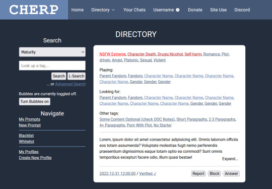
i , once again, for no good reason at all, have redesigned cherp. not posting screenshots of the last time cuz it was ugly and i was just curious what i could get up to with the existing css. this, however, is a ground-up purely design-based rebuild that i did from scratch that required me to brute-force learn javascript because i am.... insane.
heres the link if you wanna click things though 95% of the things you can click do nothing, except the directory menu and the expand/collapse buttons on the prompts. i coded the javascript myself and its only my second attempt at doing so.
notes/fun stuff i learnt while doing this under the cut, with information starting from the top of the doc to the bottom.
so when i started this project my first thought was about how to make the header look less like "cherubplay with the serial numbers ground off" and i decided to go for a single inline "logo"/nav setup. i like the two navbars and actually preserved it on smaller screens/mobile (as is necessary, frankly) but tossed it for the desktop version. i think this looks fun & modern and adds a unique touch that keeps it from looking too much like cherubplay.
the nav bar gave me some trouble. if you click the "directory" button, you get a dropdown of links accessible through the directory (which, since this happens to be a directory page, is the links under "navigation" in the sidebar as well.) this gave me so much trouble-- right now its just a onClick toggler that adds or removes the "show" class, which is just... a single class with the "display: block;" declaration. i did at one point have this as a clickable link that would take you straight from the directory, but if you HOVERED (or rather, onMouseOvered) over the directory button, it would actually bring a popup menu of these links. and when you stopped hovering over the popup link menu (or onMouseExited as the case may be) the menu would disappear. however this proved to be a huge bitch on mobile and i didnt love it so i replaced it with the current onClick menu.
im not sure this is done as best as it can be done. the onClick menu isnt in the nav element, its outside of it, which i think is probably bad for screenreaders. unfortunately i was using a flex div inside the header (which holds the "cherp logo" which is actually text (h1) as well as the navigation links) so when i tried to keep it inside the nav header it just caused the whole thing to expand, which i didnt love. i have no clue how i would go about fixing this right now, so its staying
i was thinking of coding some meta elements for this-- like, say, a toggler for if you wanted to preview the site as if you had a new unread-- but decided not to because i was getting angry. but maybe in the future. for the record, my idea for new unreads was to have a "glowing" (read: span of "(1 unread" with a text shadow of the lightest color) notification in the header. this would obviously be lost on mobile..... or maybe it wouldnt. i just realized ive never tried to apply text-shadow to bootstrap icons. maybe that would work. idk
anyway moving on toooo THE SIDEBAR!
the sidebar on cherp has always pissed me off. everything about it makes me angry. i am not joking. i "fixed it" (read: made it look the way I WANT!!!) in stylus and imported those styles here. here are the major changes i made
i made the search dropdown the full width of the div to match the search box which IS the full width of the div
i moved the dropdown links out of the dropdowns
i made the text size consistent across the buttons, inputs, and dropdowns
i moved the advanced search button beneath the other two (this one i did because i aligned the buttons to the right and i felt it looked silly otherwise.)
i used the hr element which. holld on what does hr stand for. like img srrc stands for image source but what does. okay w3schools was useless for that but i used the hr tag to separate the different sections rather than having two dropsdowns. i think this looks neater.
and now moving on to THE MAIN CONTENT!
the changes here are incredibly minor and are mostly quality of life. however i think they would be useful but even more importantly, fun!
first of all, i changed the nsfw extreme tag to a different color red. the other warning tags-- and every other warning that isnt nsfw extreme (so nsfws and nsfwv) show up as the slightly darker red that the regular extreme warning tags show up as. originally this had a little text-shadow too for a glow but i thought that was overkill becausseeeee
i was thinking that, if you were searching the directory by a tag, it would be fun to highlight the tag you were searching for as it appears in prompts. this would be kind of redundant given that every single prompt that would appear when you searched would obviously have the tag in it, but like..... i think it would be fun.
anyway, aside from that, i divvied up the fandom/character/gender tags with some colors to show where they end and begin. i think this looks neater. it looks nice with a few fandoms and is helpful if you have a LOT of fandoms because it would show where the characters start, so if youre, say, in a tag for a fandom and the prompt has 20 fandoms tagged with 5 characters each, you can see at a glance where the characters start to see if the character you want to play is one that theyre looking for.
this is a minor detail, but in the expand/collapse buttons, i tried to add enough padding that they didnt partially cover up the last word in the prompt. i care.
some final notes:
the code in this is so messy and contains a lot of redundant code or code that i started to use and then decided not to use and just left. it was also my second attempt at writing my own javascript (the first was creating a dark mode for a different webpage) so its probably............ inefficient. but i made it work and im very proud of myself. yes it took hours because i tried to brute force it
its mobile compatible! peek at it on your phone.
i would have liked to have added other features such as darkmode and a meta information toggler (preview a fake unread for instance) but i didnt do that
if you are scrolled any amount down the page, when you click on the directory button, it brings you to the top. i think i know why this happens but idk how to fix it sorry lol
i would have added keyboard prompt navigation which is like my #1 cherp 3.0 wish but unfortunately when i googled it it looked like it required jquery which i am not fighting with until i finish this stupid javascript course on vanilla javascript
........ yup. thats it bye
7 notes
·
View notes
Note
your theme is so pretty! i love your header.
aw thank you! i love the redesign of yours
also happy pride :)
3 notes
·
View notes
Text
Hi everyone! Here’s the newest addition to my Creator Shoutout Series ( april 16 - april 23)! For info about the series, I explained it in the first post here, but generally, it’s to show appreciate to editors and their creations that i love from the past week. To track this series or look at previous shoutouts, please check out the tag on my blog *creatorshoutouts. Have a great week everyone!
the last of us: joel miller gifset by @skyshipper
succession: kendall and stewy gifset by @stewy-hosseini
the last of us: joel and ellie gifset by @laufeysons
succession: stewy in 4x04 gifset by @shesnake
taylor swift: tied together with a smile graphic by @beachsread
anya taylor joy: birthday gifset by @userdanewhitman
the last of us: ellie and joel gifset by @schemingkaz
daisy jones & the six: daisy and billy gifset by @greatcometcas
succession: willa in 4x04 gifset by @ladyhawke
abbott elementary: jacob hill gifset by @bellamysgriffin
the last of us: joel miller gifset by @arthurpendragonns
stranger things: destiny choice chance gifset by @kitconnor
the last of us: joel saving ellie gifset by @rogerhealey
taylor swift: you’re on your own kid gifset by @loversmore
paramore: hard times anniversary gifset by @paramores
the last of us: joel & his daughters gifset by @tomshiddles
taylor swift: eras tour headers by @lavenderhazes
boygenius: me & my dog / letter to an old poet graphic by @cruellesummer
the last of us: ellie swearing by @trashcora
taylor swift: rain lyrics through the years gifset by @mrperfectlyfinetv
knives out gifset by @kitherondale
yellowjackets + art parallels edit by @everythingeverywhereallatonce
taylor swift: midnight rain graphic by @piecesintoplaces
succession: roman roy gifset by @rasputinaillyanna
barry: 4x01 4x02 gifset by @lousolversons
taylor swift: lyric parallel edit by @thisisustrying
yellowjackets: most new jersey gifset by @natscatorccio
taylor swift: you’re on your own kid graphic by @gofightwin
yellowjackets: 2x05 gifset by @thesoldiersminute
taylor swift: debut redesign edit by @mrperfectlyfinetv
assorted musicians + flower symbolisms gifset by @antoniosvivaldi
taylor swift: the roaring twenties gifset by @cametotheshowinsd
stranger things: text posts gifset by @lamberts
heartstopper: nick nelson gifset by @birthdaysentiment
taylor swift: anti-hero graphic by @anervousmirrorball
nope (2022) gifset by @nickoffermen
yellowjackets: natalie in 2x05 gifset by @loveexpelrevolt
taylor swift: closure headers by @your-closure
parks and recreation: ben and leslie gifset by @trueloveistreacherous
taylor swift: eras tour - florida night 1 gifset by @newromantics
the last of us: horror/apocalypse tropes gifset by @dadjoelmiller
stranger things: hawkins video gifset by @bitchsteve
taylor swift: eras tour outfit graphic by @amycurtismarchs
stranger things: mike wheeler in episode 7 gifset by @bylrndgm
taylor swift: reputation redesign edit by @newromantics-tv
succession: you first gifset by @arthurpendragonns
halsey: hopeless fountain kingdom gifset by @comeinwiththerain
taylor swift: tim mcgraw gifset by @wespers
the last of us: art parallels gifset by @fkevin073
heartstopper: season 1 gifset by @thatwasthenightthingschanged
taylor swift: wonderland graphic by @h-f-k
54 notes
·
View notes
Last Seen Blogs
catmanbowser
☆BUG SMILER☆

helldivers-2
HELLDIVERS™ 2
clairecourat
Claire Courat

tnetv
TNE TV

holly-jolly-casmas
its casmas time!