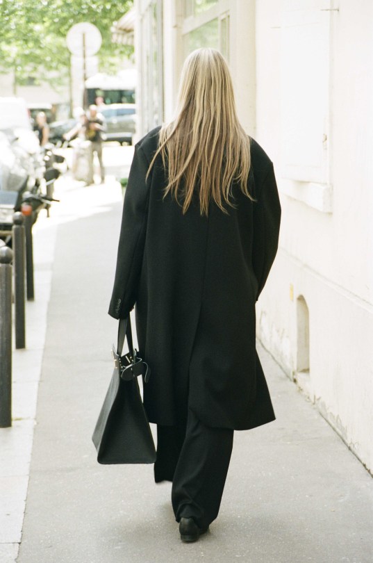
#look 3
Photo
37 notes
·
View notes
Text


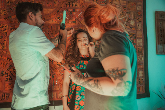
Mary Mouser - Heather Keopp Photography for Saturne Magazine
Part 9 of 17
Look 3 - Part 1 of 3
#Mary Mouser#Saturne Magazine#Heather Keopp Photography#photoshoot#and BTS#fashion#style#makeup#hair#look 3#these looks#🤩🤩🤩
3 notes
·
View notes
Text

When the heroes are not in the camp
#bg3#bg3 fanart#baldur's gate 3#baldurs gate 3#Withers#Scratch#owlbear cub#Grandpa Jergal will look after them >w<
29K notes
·
View notes
Text
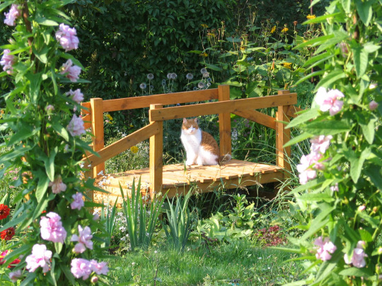

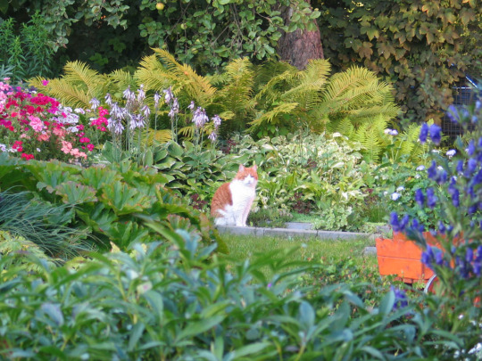
‘My cat Max’ by Irina ♡
#cottagecore#look at this adorable cat having a good time in his beautiful garden <3#makes me happy#nature#naturecore#flowers#flowercore#warmcore#cats#animals#photography#garden#summer aesthetic#cute
62K notes
·
View notes
Text
Something I try to keep in mind when making art that looks vintage is keeping a limited color pallette. Digital art gives you a very wide, Crisp scope of colors, whereas traditional art-- especially older traditional art-- had a very limited and sometimes dulled use of color.
This is a modern riso ink swatch, but still you find a similar and limited selection of colors to mix with. (Mixing digitally as to emulate the layering of ink riso would be coloring on Multiply, and layering on top of eachother 👉)

If you find some old prints, take a closer look and see if you can tell what colors they used and which ones they layered... a lot of the time you'll find yellow as a base!
Misprints can really reveal what colors were used and where, I love misprints...
Something else I keep in the back of my mind is: how the human eye perceives color on paper vs. a screen. Ink and paint soaks into paper, it bleeds, stains, fades over time, smears, ect... the history of a piece can show in physical wear. What kind of history do you want to emulate? Misprinted? Stained? Kept as clean as possible, but unable to escape the bluing damages of the sun? It's one of my favorite things about making vintage art. Making it imperfect!

You can see the bleed, the wobble of the lines on the rug, the fading, the dirt... beautiful!!
Thinking in terms of traditional-method art while drawing digital can help open avenues to achieving that genuine, vintage look!
#talkin pasm#art advice#vintage art#the bottom 3 are#my art#but the rest is pulled from old comics :)#also you don't always need halftone or dot brushes to make vintage looking art! most vintage art is painted anyway
45K notes
·
View notes
Text
I’ve got the BG3 gang goes to a gala quest tadpole wriggling around in my head
#my art#bg3#baldurs gate 3#astarion#oc rithsyn#shadowheart#lae’zel#karlach#wyll ravengard#gale of waterdeep#I don’t want to look at this anymore I don’t want to tHINK#got incredibly lazy and refused to shade anything but the faces
35K notes
·
View notes
Text
this is your reminder to give Shadowheart all the pretty armor
#bg3#baldur's gate 3#shadowheart#bg3 spoilers#baldurs gate#shart#my art#yes astarion looks pretty in it#but SHART#looks so hot#in this armor#it kills me#the armor is elven chainmail and you can find it in myrns corssing outside of baldurs gate#wyms crossing#wYRMS CROSSING#oh my goodness
38K notes
·
View notes
Text
[Astarion] is a cat. He's a black cat. There's a stray that comes into my house called Red... and he's quite feral. It took me three years before I could pick him up and hold him. He's totally cool with me now. Three fucking years. He gave me a lot of inspiration about Astarion.
- Neil Newbon, on developing Astarion's physicality and mannerisms
#astarion#astarion meta#baldur's gate 3#confirmed: astarion is a cat#makes me wonder if he did the mo-cap for the spicy scene with tav on the grave#bc i've seen so many people (quite accurately) remark that astarion's movements there make him look like a big cuddly cat lol#neil newbon
36K notes
·
View notes
Text
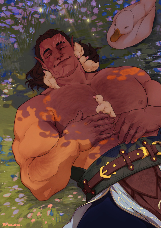

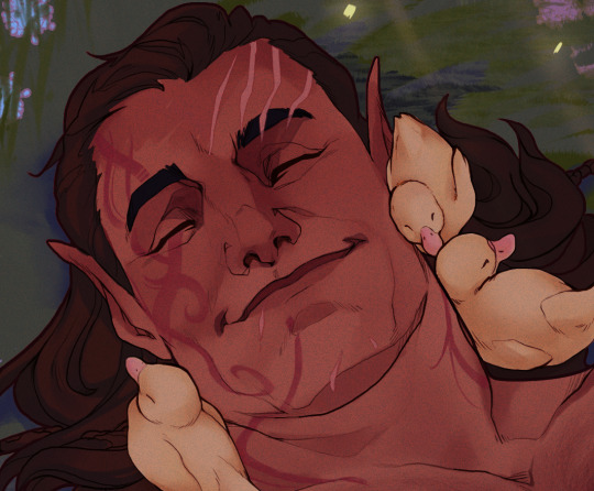
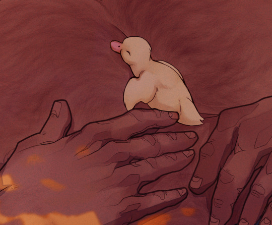
This man holds my heart just like he holds these ducks
#Halsin#BG3#baldurs gate 3#Look I cannot put into words how much Halsin means to me#I do not have the vocabulary#But he is so gentle#and he is so powerful#like I knew I was done but the MINUTE I heard he loves ducks I was sent into oblivion#my art#I will love this man until the sun dies out
41K notes
·
View notes
Text
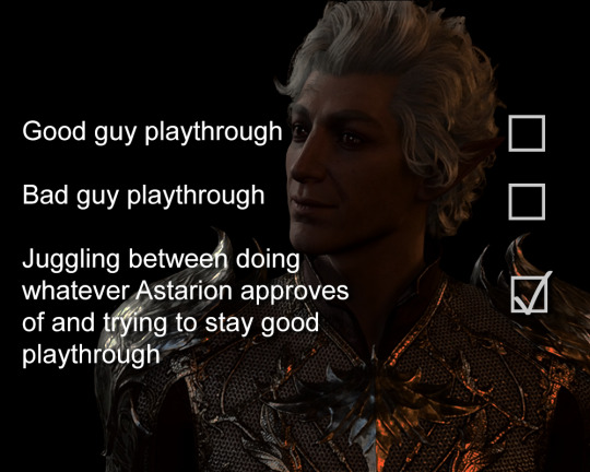
I surely can't be the only one in this
#i spent 100 hours on my first ever playthrough just to try and make him happy#and i succeeded#look at that face!#it was worth it#not gw2#baldur's gate 3#baldur's gate iii#astarion#bg3
43K notes
·
View notes
Text

Karsus' legacy
#gale of waterdeep#Gale#Gale Dekarios#baldur's gate 3#bg3#baldur's gate#look what I just fished out of the Chionthar
23K notes
·
View notes
Text


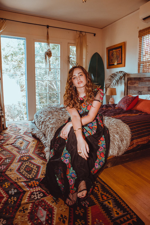
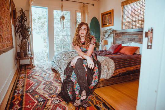
Mary Mouser - Heather Keopp Photography for Saturne Magazine
Part 11 of 17
Look 3 - Part 3 of 3
#Mary Mouser#Saturne Magazine#Heather Keopp Photography#photoshoot#and BTS#fashion#style#makeup#hair#look 3#these looks#🤩🤩🤩
2 notes
·
View notes
Text
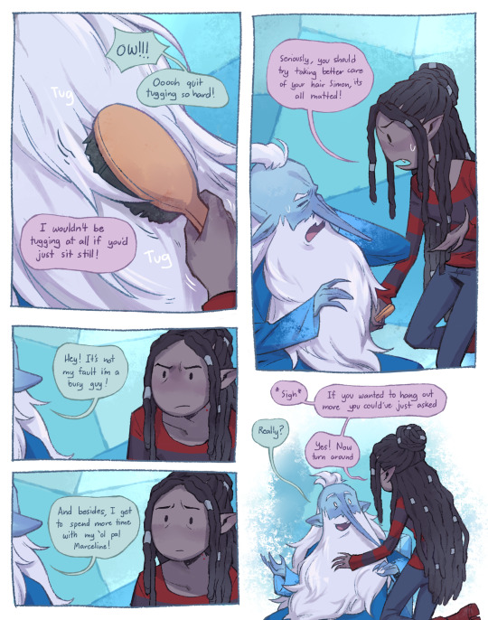


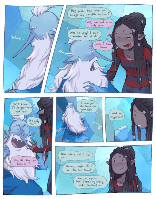
Hair routine and rituals
#might do a part 3 for F&C Simon and Marcy#this was inspired by a fanfic (but it doesn't look it till i reference it on pt3) i gotta go find it again#adventure time#simon petrikov#marceline abadeer#fanart#my art#digital art
15K notes
·
View notes
Text
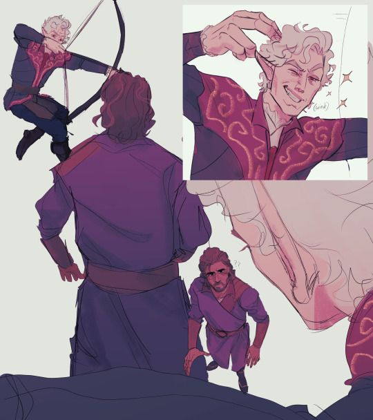
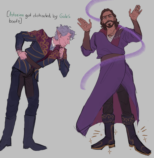
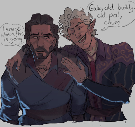
Really quick doodles of a few scenes from the stream yesterday. Including combat flirting taunting, gale’s magnificently distracting shoes and.. whatever you wanna call gale agreeing to give 15 gold to astarion 😐😑😐😑😐 (that’s me blinking)
#bloodweave#astarion x gale#gale x astarion#bg3#baldur's gate 3#gale dekarios#astarion ancunin#they are so funny god help. thank you to whoever sat Neil next to Tim#my roommate turning to look directly at me whenever they were interacting lik bestie please stop I am trying to be normal. don’t look at me#my roommate also said Neil acting low-key obsessed with gale and I could only say wow he’s just like me fr fr.#if I didn’t still struggle with getting shadowhearts likeness you would get a drawing of her hugging bing bong too but alas …#anyway the stream was so fun#can’t wait til tomorrow hehe
27K notes
·
View notes
Text

“Accursed creator! Why did you form a monster so hideous that even you turned from me in disgust?”
#Frankenstein#gothic literature#gothic lit art#victor frankenstein#happy new year lads#ive been thinking about nothing else but them for the past 3 days#been trying to figure out a decent design for victor and i think im getting closer#he needs to have a cruelness to him#and he needs to be kind of pathetic#someone who the creature could snap in half yknow#and i need to make the creature more Mean looking but it just feels right to draw him sad and despairing#THAT BEING SAID i think i did a good job here hehe#henry is next :)))#my art#illustration
13K notes
·
View notes
Text
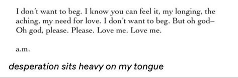
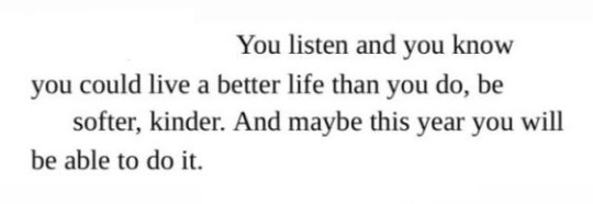
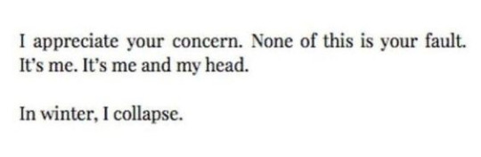

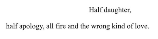
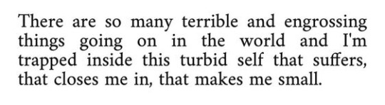
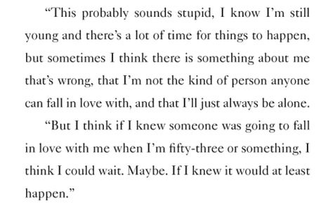

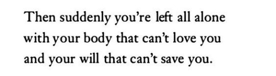
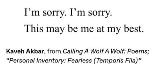

i beg you to love me, say that i'm enough, but you tell me—
why are you like this? i think there's something wrong with you.
for @shestrying
thanks to @acelania for finding the unknowns!
in image / desperation sits heavy on my tongue, tumblr user tullipsink / mary oliver, ‘north country’ / virginia woolf, letter to violet dickinson / in image / blythe baird, from if my body could speak / Alice in Bed: A Play' by Susan Sontag (link in comment) / lynee rae perkins, criss cross / elena ferrante, Those Who Leave and Those Who Stay' (trans. Ann Goldstein) / rainer maria rilke, from rilke’s book of hours / in image/ in image
#webweaving#webweave#poetry#aesthetic#quotes#spilled ink#poems and poetry#poems and quotes#writing#poem#spilled poetry#words#spilled thoughts#dark academia#web weaving#*mine: graphics#brought to you by my anxiety running wild and my brain deciding today's a fine; fine day to ponder on the realisation that-#- all i've been doing is failing since a past few months... years#okay tho this one looks sorta ugly#some images blurred some not; unfortunately; i dont have the diligence to correct it as of yet#we'll see#added sources - 27/3/24
10K notes
·
View notes
Last Seen Blogs

gothrones
shine on until tomorrow

heavenlybackside
Untitled
jesselmeneses
chibiharu

lisocabeloproduit-blog
Lisocabelo

dianux-27
✨Dianux27✨