#joh. enschedé en zonen
Text

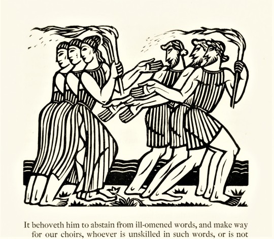
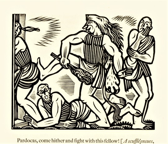
It's Fine Press Friday!
A Classic Representation
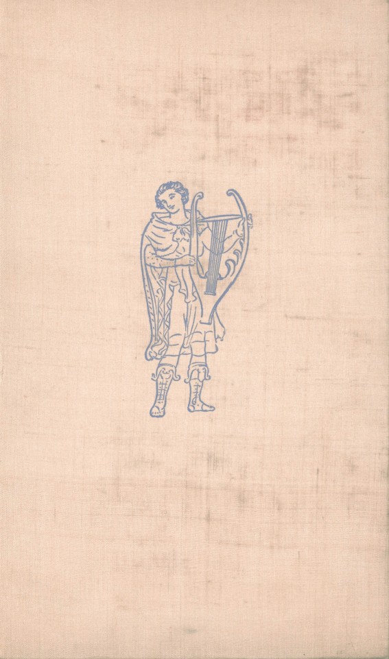
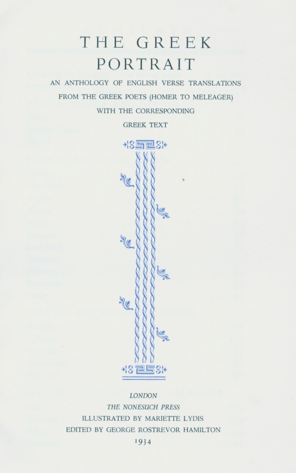
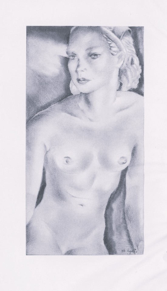
The Greek Portrait is an anthology of English verse translations of eminent Greek poets, from Homer to Meleager, with the corresponding Greek text presented alongside. Numerous translators provided the translations, taking on the arduous task of translating essential works from the Classical Period, including epic, lyric, and dramatic poetry.
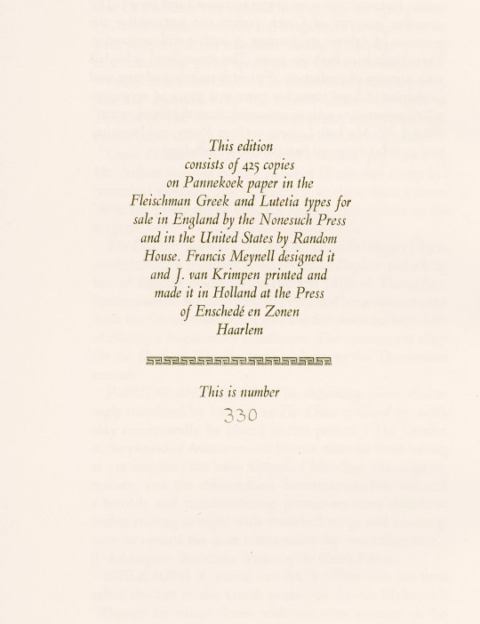
This 1934 edition was designed by British fine-press publisher Francis Meynell (1891-1975) and printed in an edition of 425 copies by Dutch book and type designer Jan van Krimpen (1892-1958) at the Press of Enschedé en Zonen in Haarlem for Meynell's Nonesuch Press in London. The text was edited by English poet and critic George Rostrevor Hamilton (1888-1967) and printed on Pannekoek paper in Fleischman Greek and van Krimpen's Lutetia types.
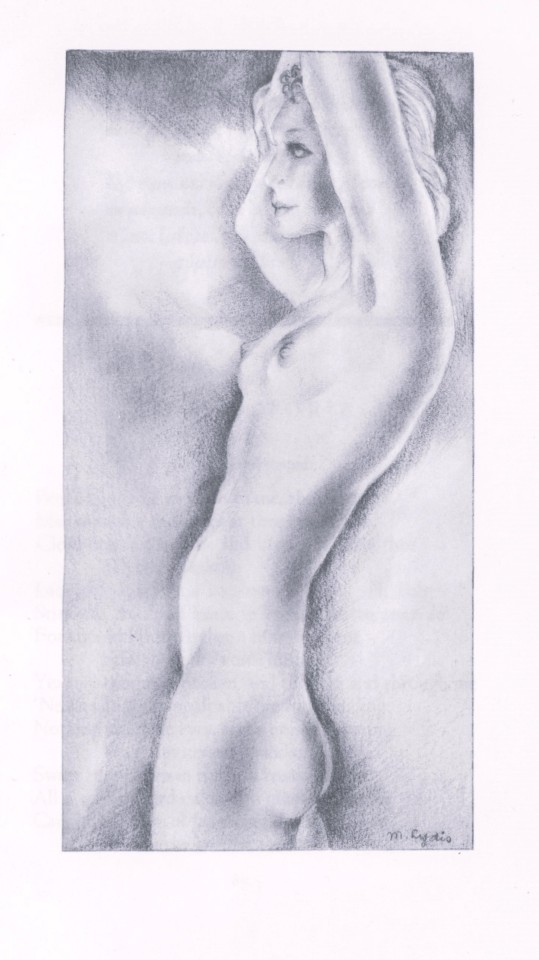
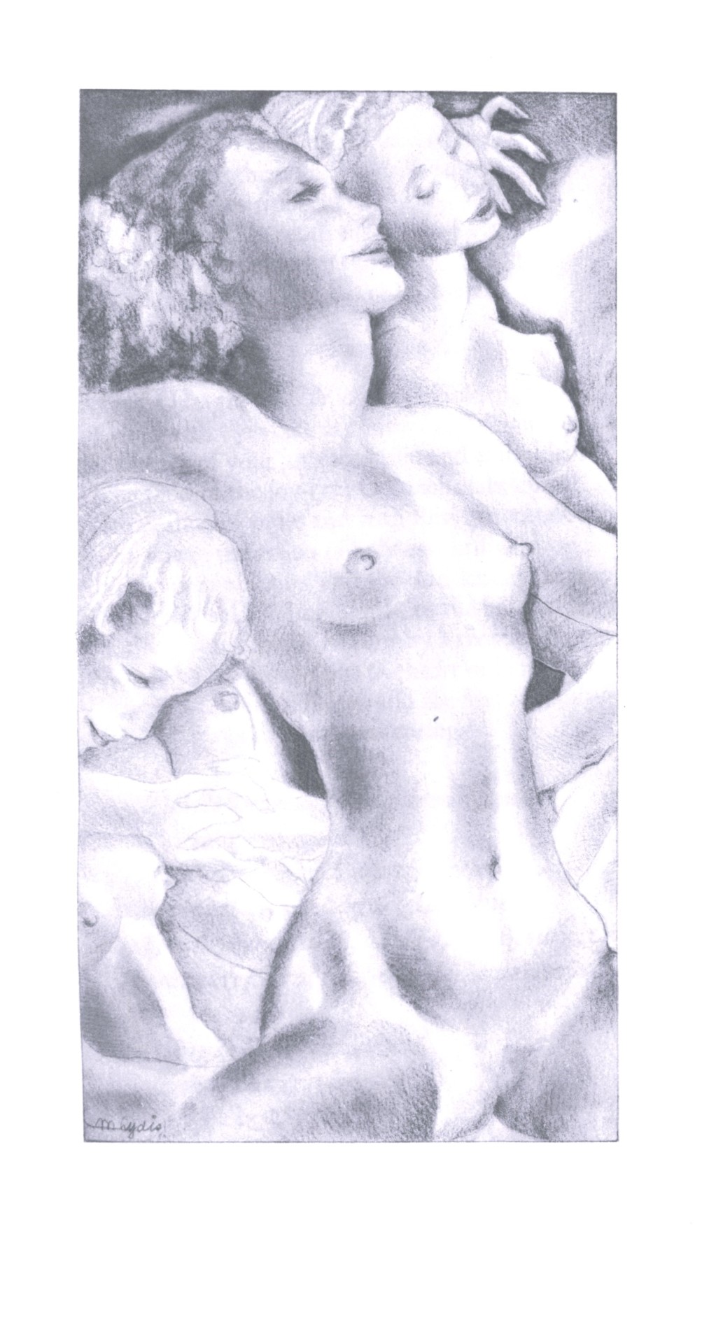
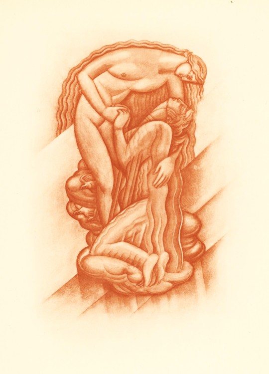
The illustrations are by Mariette Lydis (1887-1970), an Austrian-Argentine painter known for her portraits, illustrations, and erotic engravings. She was a self-taught artist who began her career at a young age and had a history of creating what was considered controversial artwork during her lifetime. She gained recognition for creating lithographic depictions that celebrated lesbian and bisexual relationships. However, some critics of her work described the illustrations as "perverse.” We find these prints to be quite lovely, however.
-Melissa, Special Collections Classics Intern
View another post with illustrations by Mariette Lydis.
View our other posts with books from the Nonesuch Press.
View other Classics posts.
#classics#Nonesuch Press#The Greek Portrait#ancient greek#greek#greek poetry#Greek poets#Mariette Lydis#Francis Meynell#Jan van Krimpen#Joh. Enschedé en Zonen#Enschedé#George Rostrevor Hamilton#illustrations#english translations#epic poetry#lyric poetry#Fleischman Greek type#Lutetia type#Pannekoek paper#classical period#classical literature#anthologies#fine press books#fine press publishing#so dramatic#melissa
58 notes
·
View notes
Photo
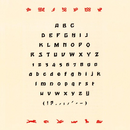
Houtsneeletter, André van der Vossen for Joh. Enschedé en Zonen, 1927 #woodcut #typespecimen
4 notes
·
View notes
Photo
not schöffer’s roman
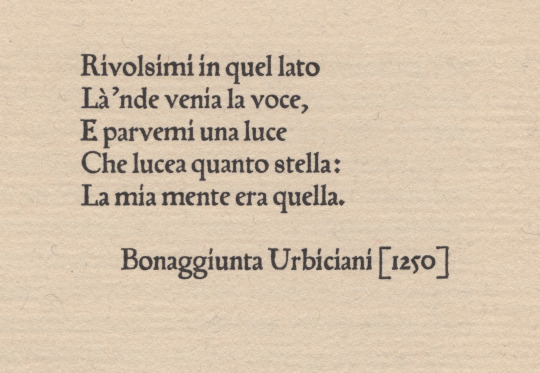
peter schöffer of gernsheim [1425-1503] was a scribe who apprenticed to the inventor of the black art, johannes gutenberg. schöffer united with gutenberg’s partner, johann fust, in legal proceedings against gutenberg resulting in «appropriation» of guntenberg’s printing apparatus; after which he married fust’s daughter, christina, & articled with fust in a new printing office—fust & schöffer.
urbiciani’s poem [1st illustration*] prefaces a little book entitled Hand and Soul by dante gabriel rossetti [the halcyon press, maastricht, 1928]: it is set in types attributed to schöffer—which would have been amongst the first transalpine romans. the matrices descended schöffer’s family until jacobus scheffers, a printer at bois-le-duc [’s-hertogenbosch], sold them to johannes enschedé on 26 august 1768—enschedé used them only for study. the book is set in a fount cast by the historic firm of joh. enschedé en zonen, haarlem, in the early 20th c., from the restored material [ibid., colophon].
however, we learn from a.f. johnson: «One roman of this class has survived to our day, and is part of the wonderful collection of early types owned by Enschedé of Haarlem. In the specimen of this roman issued in 1926 they attribute it to Peter Schöffer of Mainz, and consider it to be the oldest type in their collection. It came to the Haarlem firm in 1768 from one Jacobus Scheffers, a printer at Bois-le-Duc, a descendent of the Schöffers. Their dating of the type is too early, but it is at least early sixteenth century. It is first found at Cologne in 1527.» [Type Designs, grafton & co., london, 1959, p.44].
johnson further directs us via footnote [ibid.] to A History of the Old English Letter Foundries by talbot baines reed (edition edited & expanded by johnson) who puts us firmly in the picture: «Thomas Berthelet, who succeeded Pynson as King’s printer in 1530, introduced two, or possibly three, new romans and an italic from Cologne, where there was an anonymous punch-cutter at work in the twenties, one of whose designs has survived to our generation. Whether he worked as an independent founder or was an employee of one of the leading Cologne printers, Quentel or Cervicorn, cannot be discovered. … The 88 roman [2nd illustration†] is found at Antwerp with J. Steelsius in 1539. This type seems to have some relation to Quentel’s roman first found in 1527, a type which has survived, at least in part.» [faber&faber, london, 1952, pp 87-8]. the textile research centre in leiden has an interesting page about peter quentel & his activity in 1527.
* printed letterpress on van gelder mould-made paper in the office of joh. enschedé en zonen.
† frank isaac, English & Scottish Printing Types 1535–58 * 1552–58, the bibliographical society, 1932, fig. 4.
#typography#letterpress#peter schöffer#poetry#bonaggiunta urbiciani#joh. enschedé en zonen#thomas berthelet#peter quentel#alfred forbes johnson#talbot baines reed
0 notes
Text


It's Fine Press Friday!
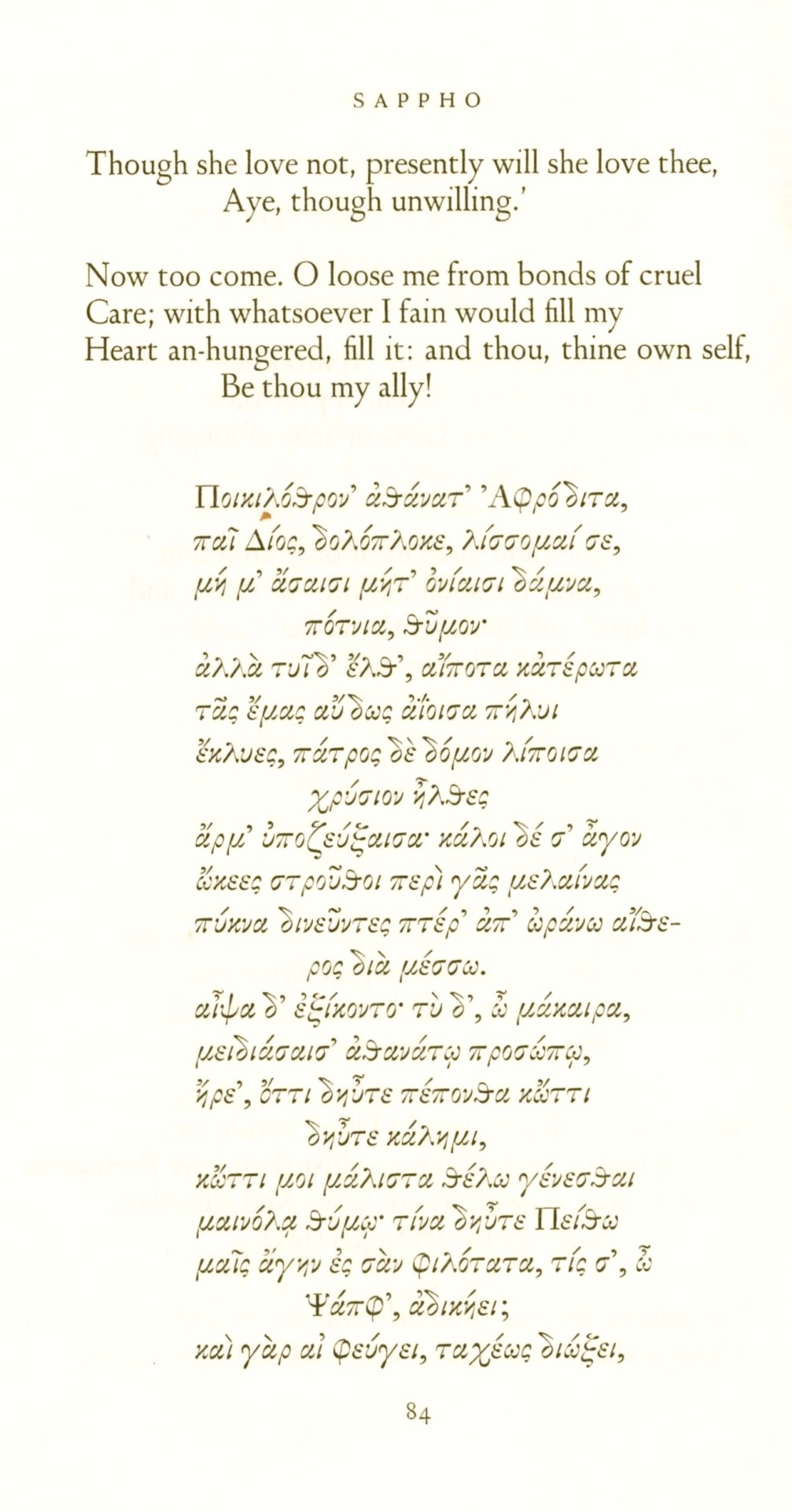
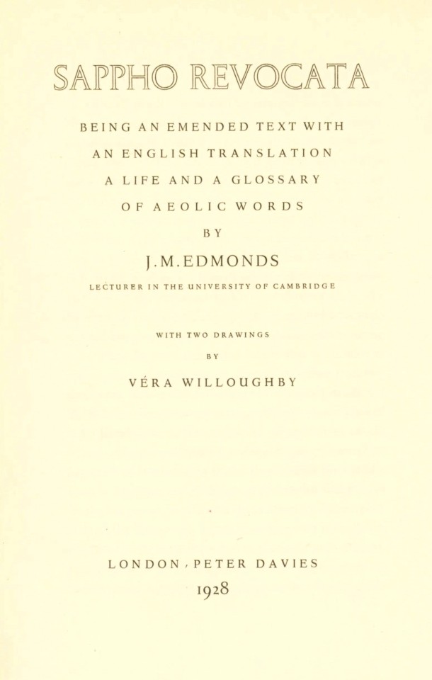
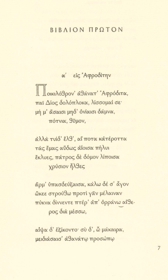
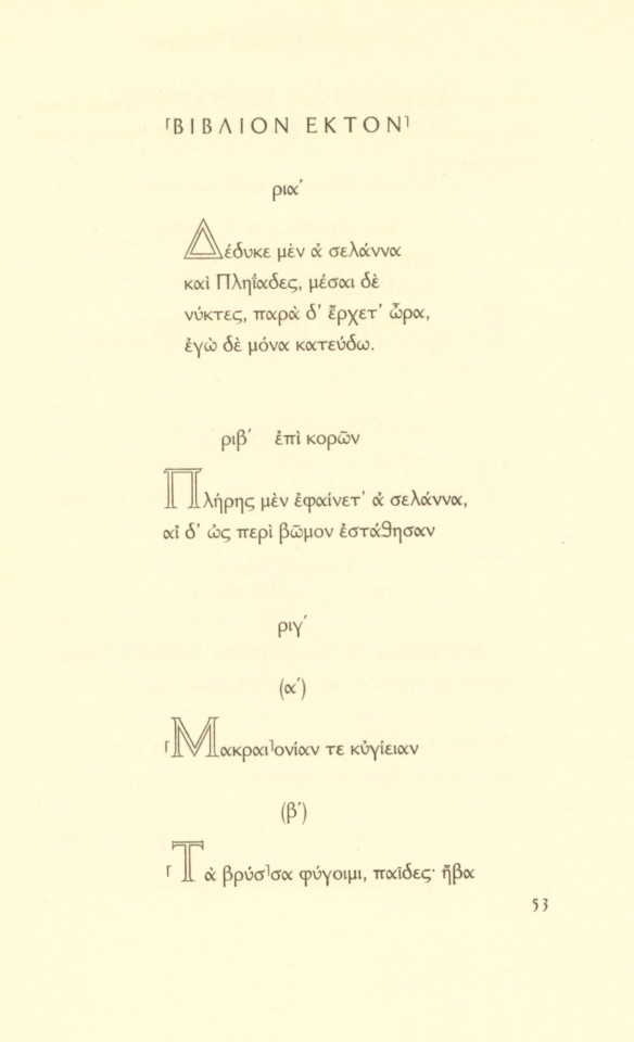
On this Fine Press Friday we present a collection of poems by Sappho entitled Sappho Revocata, compiled and translated by poet, English classicist, and Cambridge lecturer J.M. Edmonds with two drawings printed in collotype by British artist Véra Willoughby, and published in 1928 by Peter Davies in an edition of 350 copies.
Sappho Revocata includes Sappho’s complete and fragmentary poems in two sections; the first half records her poetry in Greek, while the second half has the corresponding English versions of the same works. Sappho is particularly lauded in popular culture for her frequent discussion of romantic love between women. Her poetry was so admired in the ancient world that Plato referred to her as “the tenth muse” in his writings.
This book is the first to use Jan van Krimpen’s Greek type Antigone, with his Lutetia type for the preliminary pages and English section of the text. It was printed by the distinguished Dutch printing house of Joh. Enschedé en Zonen in Haarlem, Holland. The two illustrations by Véra Willoughby were printed at the Chiswick Press in London. 150 copies were reserved for the United States and distributed by Random House.
Our copy, another gift from our friend Jerry Buff, bears the bookplate of Joan Whitney. We're not sure who that may be, but we know this copy was acquired in New York, so we're hoping that it belonged to American heiress, art collector, and co-founder and former majority owner of the New York Mets, Joan Whitney Payson (1903-1975).
View more Fine Press Friday Posts.
– Sarah S., Special Collections Graduate Intern
#fine press friday#sappho#poetry#greek#sappho revocata#vera willoughby#j.m. edmonds#peter davies#collotype#Jan van Krimpen#antigone#antigone type#lutetia#lutetia type#Joh. Enschedé en Zonen#joh. enschede#chiswick press#Sarah S.#fine press#fine press books#fine press printing#fine press fridays#Jerry Buff
21 notes
·
View notes
Photo


Wood Engraving Wednesday
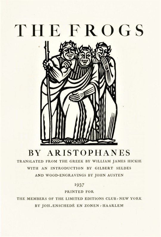
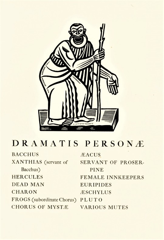
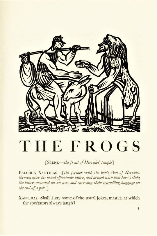
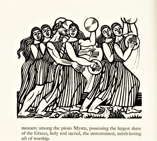
JOHN AUSTEN
In the 1930s, the Limited Editions Club sent out a list of titles to selected artists and asked them to choose a book to illustrate and present their ideas for illustrations. The well-established English book illustrator and wood engraver John Austen replied that he wished to illustrate The Frogs by Aristophanes even though it did not appear on the list. His proposal and preliminary designs were so strong that the Club agreed. Austin provided 28 wood engravings and an edition of 1500 copies were printed at the venerable Haarlem, Netherlands, printing house of Joh. Enschedé en Zonen and signed by the artist.
View all 28 engravings at the Book Graphics blogspot.
View our other posts with illustrations by John Austen.
View more posts on works by the Limited Editions Club.
View other posts related to the Enschedé firm.
View more posts with wood engravings!
#Wood Engraving Wednesday#wood engravings#wood engravers#John Austen#Limited Editions Club#The Frogs#Aristophanes#Joh. Enschedé en Zonen#Joh. Enschedé#Enschedé#fine press books
181 notes
·
View notes
Photo
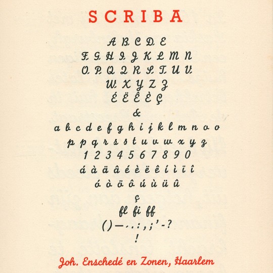
Scriba aka Monoline Script, Lettergieterij Joh. Enschedé en Zonen, 1933 #typespecimen #monotype
1 note
·
View note
Photo


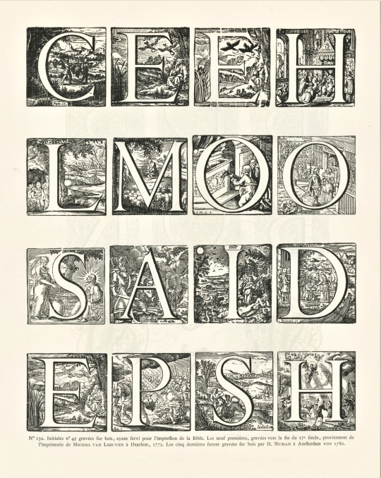
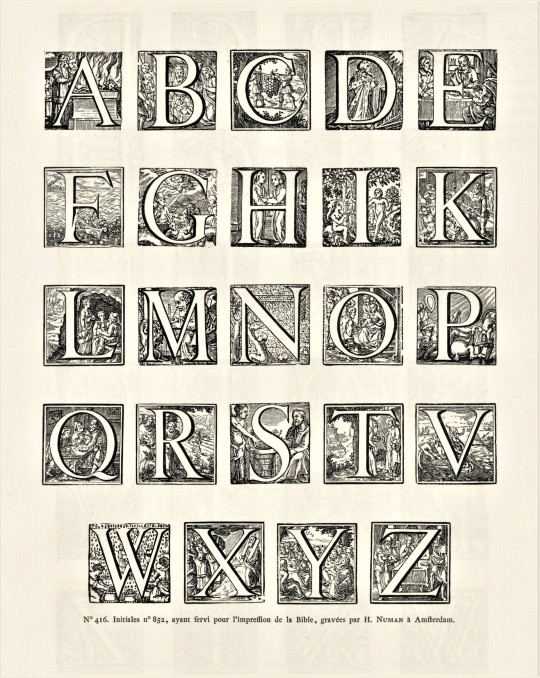
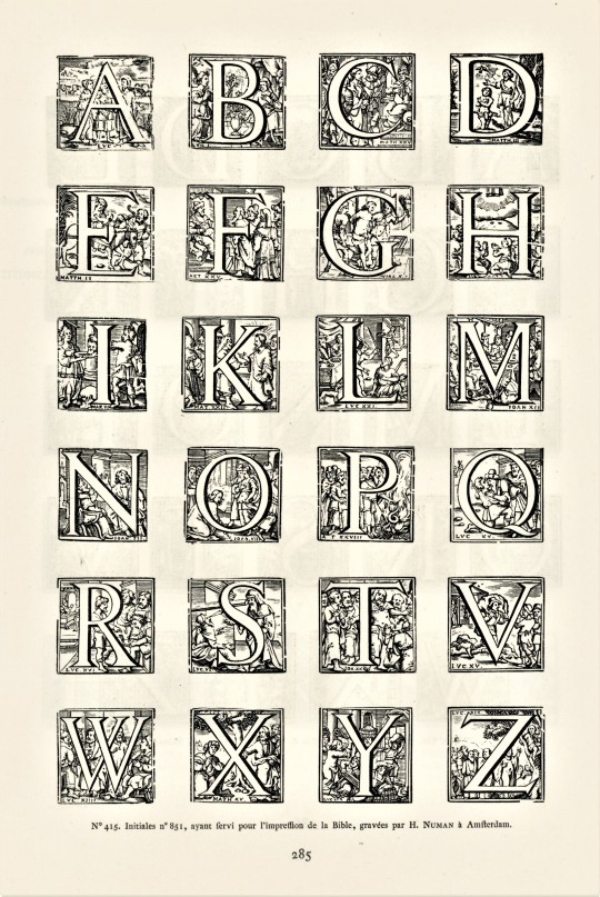
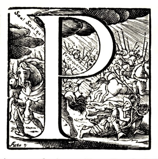
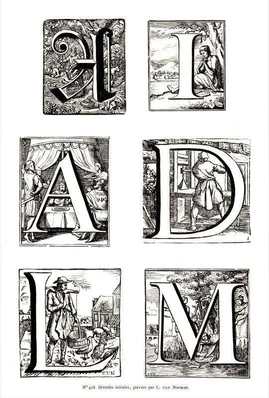
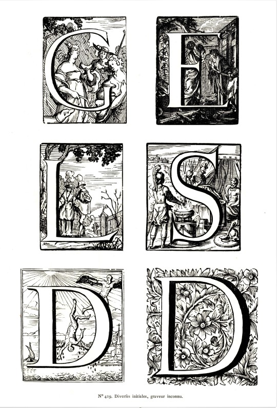
Typography Tuesday
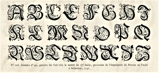
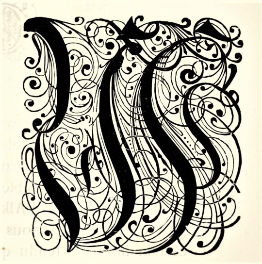
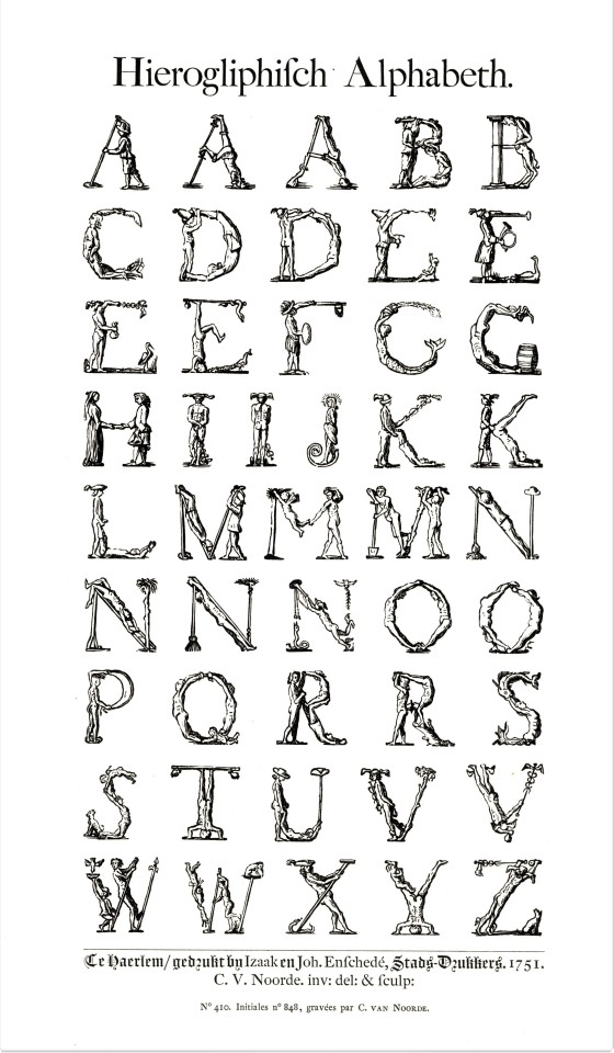
Here are some fancy, schmancy wood-engraved initials from our recent acquisition, Fonderies de caractères et leur matériel dans les Pays-Bas du XVe au XIXe siècle by Charles Enschedé (1855-1919), with specimens from the extensive typographic collection of the venerable 320-year-old printing and typefounding firm Joh. Enschedé en zonen, published in Harlem by De Erven F. Bohn in 1908.This title is one of type historian and designer Jerry Kelly’s recent One Hundred Books Famous in Typography (The Grolier Club, 2022).These highly calligraphic Gothic initials were engraved in wood in 1741 and were from the printing house of Pieter de Vries in Schiedam, Netherlands. Our copy of Fonderies de caractères is from the collection of New York artist Elijah Silverman and bears his signature.
View other posts related to the Enschedé firm.
View more Typography Tuesday posts.
#Typography Tuesday#typetuesday#Joh. Enschedé en zonen#Enschedé#Joh. Enschedé#Enschedé type foundry#Enschedé Font Foundry#Charles Enschedé#De Erven F. Bohn#initials#wood engravings#Gothic type#Typography Tuesday#Fonderies de caractères et leur matériel dans les Pays-Bas du XVe au XIXe siècle#Jerry Kelly#One Hundred Books Famous in Typography#Elijah Silverman#18th century#18th century type
118 notes
·
View notes
Photo


Typography Tuesday
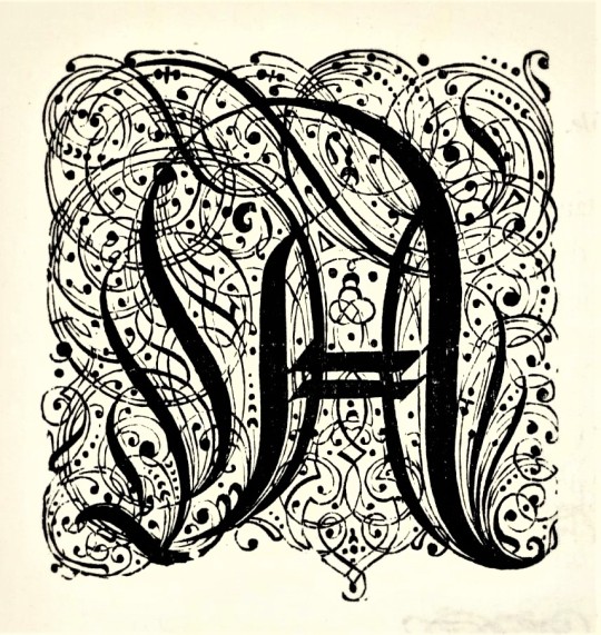
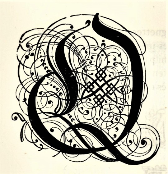
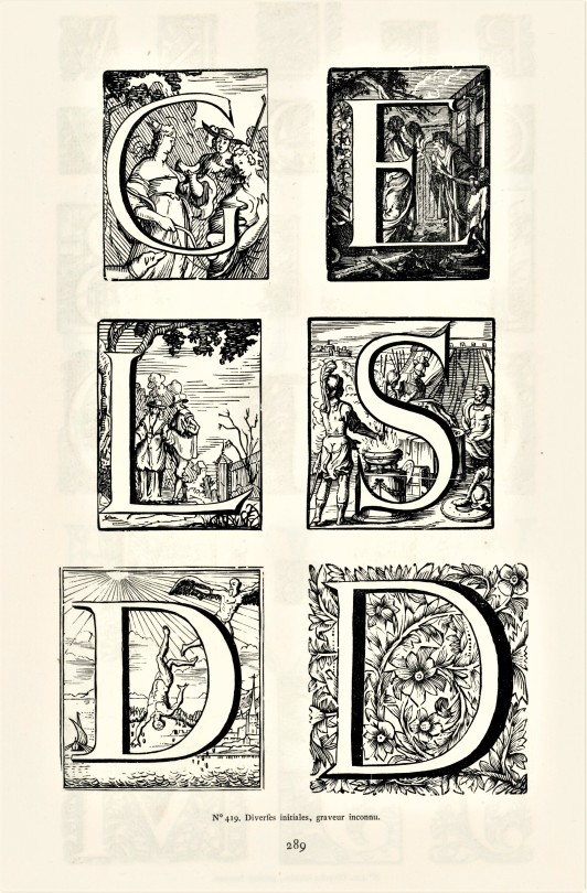
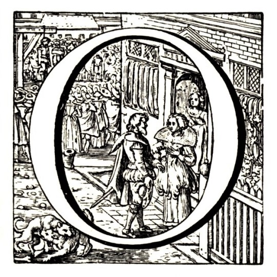
HISTORIATED INITIALS FROM THE ENSCHEDE COLLECTON
A couple of weeks ago, we highlighted some fancy-pants wood-engraved initials from Charles Enschedé‘s historical survey of Dutch types, Fonderies de caractères et leur matériel dans les Pays-Bas du XVe au XIXe siècle, published in Harlem by De Erven F. Bohn in 1908. This week we present some wood-engraved historiated initials from the 18th century. These specimens were drawn from the extensive typographic collection of the venerable 320-year-old printing and typefounding firm Joh. Enschedé en zonen. Click on the images for the engraving credits.
This publication contains nearly 5,000 type specimens including alphabets in a variety of languages, as well as ornaments. The author, Charles Enschedé, was a member of the founding family and one of the firm’s directors. He began this work in 1893 on the occasion of the 150th anniversary of the Enschedé type-foundry, taking 15 years to bring to completion.
View other posts related to the Enschedé firm.
View more Typography Tuesday posts.
#Typography Tuesday#typetuesday#Joh. Enschedé en zonen#Joh. Enschedé#Enschedé#Enschedé type foundry#Enschedé Font Foundry#Charles Enschedé#De Erven F. Bohn#initials#historiated initials#wood engravings#Fonderies de caractères et leur matériel dans les Pays-Bas du XVe au XIXe siècle#18th century#18th century type#Typography Tuesday
47 notes
·
View notes
Photo


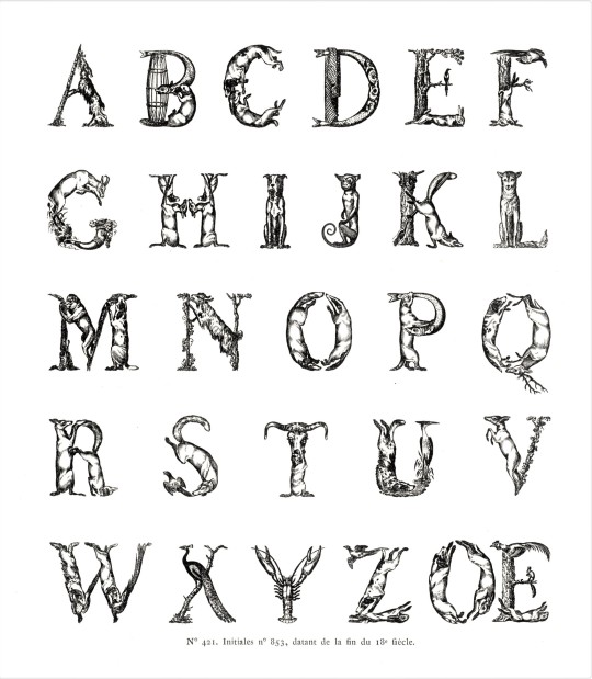
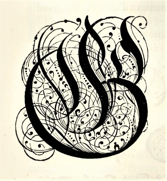
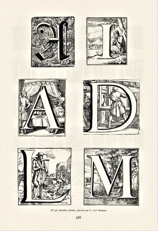
Typography Tuesday
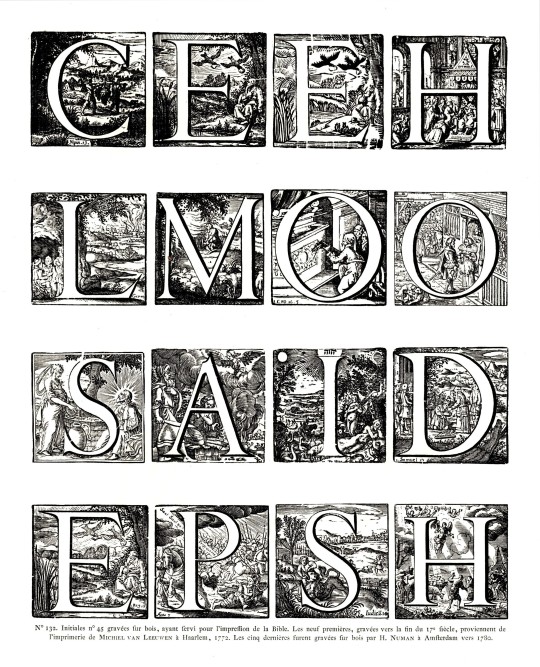
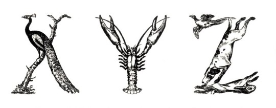
Here are some historiated initials and some initials made from people and animals (there’s probably a name for these kinds of letterforms but we can’t figure out what that is. Our department manager Alice calls them alphabetiforms; we're going with that!).These type forms are from a new acquisition on the historical typefaces of the Enschedé type foundry in the Netherlands: Fonderies de caracteres et leur materiel dans les pays-bas du XVe au XIXe siecle by Charles Enschedé, published in Haarlem by Erven F. Bohn in 1908.
This massive publication is a review of Dutch foundry type in the Netherlands from the 15th to the 19th centuries. The types documented here are from the collections of the Dutch firm Joh. Enschedé en Zonen in Haarlem, Netherlands, which was founded in 1703 as a printing establishment. At the time, the firm bought out a number of other foundries that were struggling and therefore became owners of historical types from the fifteenth century onward. The company began manufacturing its own type in 1743 and the foundry soon became the most important part of the Enschedé business, which continues to this day.
This volume contains nearly 5,000 type specimens including alphabets in a variety of languages, as well as ornaments. The author, Charles Enschede, was a member of the founding family and one of the firm’s directors, and wrote a number of works on the firm and its history. He began this work in 1893 on the occasion of the 150th anniversary of the Enschedé type-foundry, taking 15 years to bring to completion.
View our other Typography Tuesday posts.
#Typography Tuesday#typetuesday#historiated initials#alphabetiforms#Joh. Enschedé en Zonen#Enschedé type foundry#Dutch type#Charles Enschedé#type specimens#Fonderies de caracteres et leur materiel dans les pays-bas du XVe au XIXe siecle#Typography Tuesday
93 notes
·
View notes
Photo
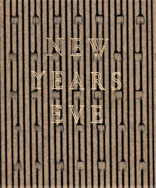
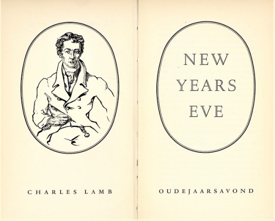
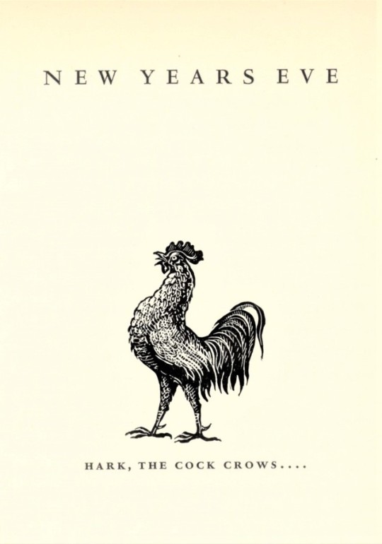
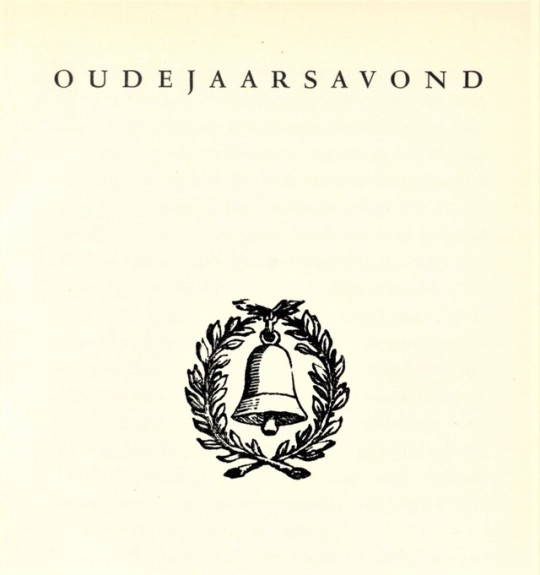
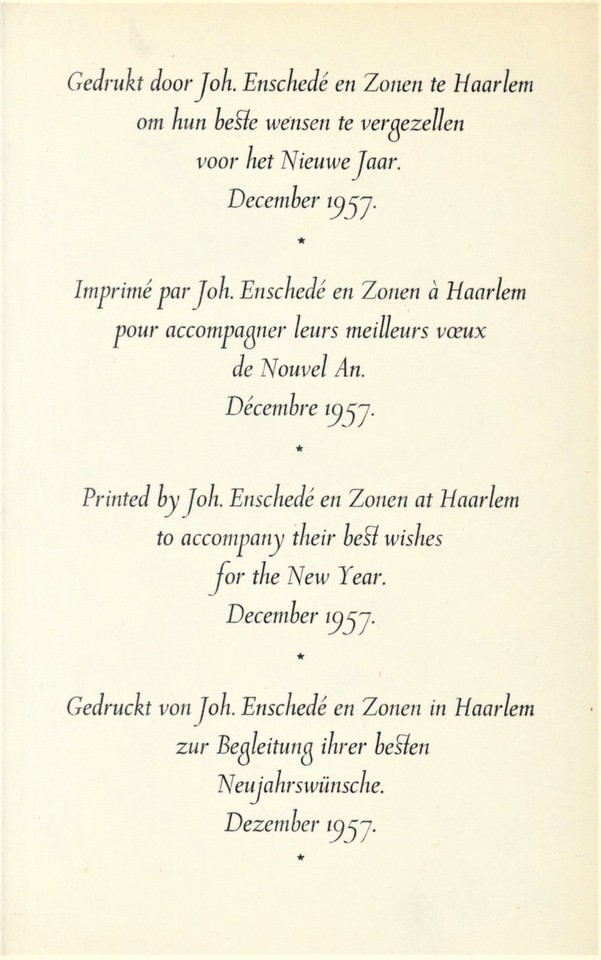
A New Year’s Eve Greetings
On this last day of 2018, we present a few images from a bilingual English/Dutch publication of Charles Lamb’s wistful essay New Year’s Eve in which he declares “I saw the skirts of the departing Year,” but is reticent to “Welcome the coming, speed the parting guest,” because he is “shy of novelties; new books, new faces, new years, from some mental twist which makes it difficult in me to face the prospective.” The essay first appeared in the January 1821 issue of The London Magazine, and was later included in in Lamb’s Essays of Elia in 1823.
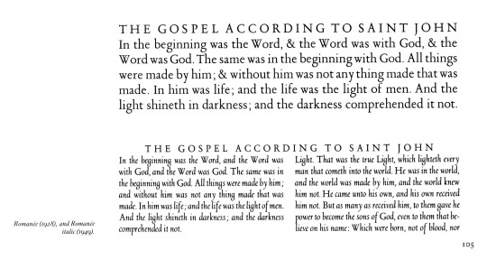
The edition shown here is a 1957 New Year’s keepsake printed in Haarlem by the noted Dutch type foundry of Joh. Enschedé en Zonen, founded in 1703 and still in operation today. The book was printed for friends of the type foundry in Romulus types designed by Jan van Krimpen and Molé Foliate capitals designed by S. L. Hartz, who also executed the portrait of Lamb for this book. Our copy, another gift from our friend Jerry Buff, is from the collection of the eminent American wood engraver John DePol, and bears his self-designed bookplate.
In his essay, Charles Lamb writes:
. . . the birth of a New Year is of an interest too wide to be pretermitted by king or cobbler. No one ever regarded the First of January with indifference. It is that from which all date their time, and count upon what is left. It is the nativity of our common Adam. Of all sounds of all bells . . . most solemn and touching is the peal which rings out the Old Year. . . . Another cup of wine . . .while that turn-coat bell . . . just now mournfully chanted the obsequies of 1820 departed . . . . And now another cup of the generous! and a merry New Year, and many of them, to you all, my masters!
View other posts on Enschedé publications.
HAPPY NEW YEAR!
#new year's eve#holidays#Charles Lamb#essays#Enschedé Font Foundry#Joh. Enschedé en Zonen#Jan van Krimpen#S. L. Hartz#John DePol#John De Pol#Jerry Buff#bookhistory#Enschedé
30 notes
·
View notes
Photo
caxton
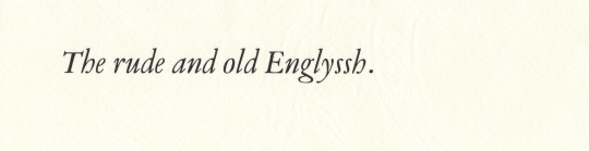
«Printing [typography] was introduced in England in 1476 by William Caxton, who owes his fame, however, to more than the fact that he was England’s proto-typographer. For he was not only the first of English printers—he was also ‘the first in a long line of English publishers who have been men of letters … and was likewise one of the earliest in the succession of English merchants and men of affairs who have found recreation and fame in the production of literature’.» [d.b. updike, Printing Types, vol. 1, oxford university press, 1937, p113; updike is quoting from a paper by george parker winship: William Caxton, doves press, 1909]. it is a misnomer referring to caxton as printer—conjures images of setting type & pulling prints: he was a printer in the sense that he owned a printing establishment; but his press was for him a means to effect trade—he was his whole life a professional merchant. severin corsten in his paper «Caxton in Cologne» gives strong argument, deduced from the misty history surrounding caxton’s acquisition of the black art, that the city of cologne occasioned caxton’s close study of this new technology while seeing an edition of bartholemew’s De Proprietatibus Rerum through the press in johann veldener’s printing office (veldener had learned the art in the office of ulrich zell—cologne’s first printer); caxton may have also materially participated in this publication [Journal of the Printing Historical Society, No.11, 1975/6]. caxton set up his first office at bruge in 1472, where he issued the first printed, english language book in 1474, his first literary translation, Recuyell of the Historyes of Troye. finally, caxton removed back to london in the autumn of 1476 with apparatus & assistant, wynkyn de worde, establishing his office within the precincts of westminster abbey.
richard deacon [donald mccormick] tells us in his interesting book William Caxton the First English Editor [frederick muller, london, 1976, p92]: «It is clear that Caxton had a passion for the English language, for developing it and for changing it from a hotchpotch of dialects to a cohesive, expressive force.» caxton lamented the kentish weald dialect of his upbringing: «He was for ever striving after changing what he called ‘the rude and old Englyssh’.»* [ibid., p55].
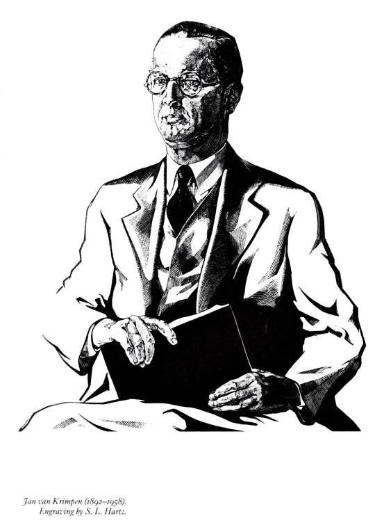
deacon’s book is set throughout in monotype van dijck [english monotype 203]—inspiration for setting caxton’s locution in monotype’s digital reissue of van dijck italic. monotype van dijck italic is jan van krimpen’s 1937-8 adaptation of the Augustijn Romeyn italic cut by christoffel van dyck, as shown on the 1681 specimen issued as a sales catalogue by the widow of daniel elsevier, in amsterdam [stanley morison, A Tally of Types, cup, 1973, appendix p113 ]. the punches for van dyck’s founts passed down by sale through several foundries, finally again reuniting in 1799 in the famed amsterdam foundry joh. enschedé en zonen [ibid., p115].
digital print [toner] on cartiera amatruda amalfi.
*full context: «[I] somwhat have chaunged the rude and old Englyssh, that is to wete certayn wordes which in these dayes be neither usyd ne understanden» [cf. n.f. blake, Caxton and his World, andre deutsch, london, 1969, p181].
#english#literature#typography#caxton#typesetting#johann veldener#christoffel van dyck#jan van krimpen
3 notes
·
View notes
Photo


Typography Tuesday
JAN VAN KRIMPEN
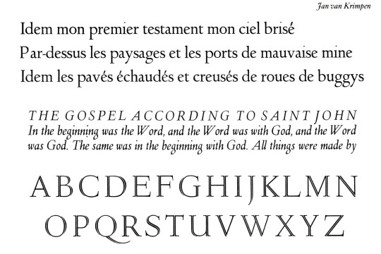
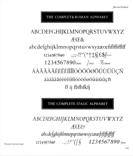
This week we focus on the type designs of the noted Dutch type and book designer Jan van Krimpen (1892-1958) as presented in Twentieth century type designers by Rampant Lions Press proprietor Sebastian Carter, published by Taplinger Publishing Company in 1987. Van Krimpen spent nearly his entire working life at the great Haarlem printing house of Joh. Enschedé en Zonen beginning in 1923.
His first design for Enschedé was his Lutetia in 1925 (shown here in roman, italic, and open capitals just below his portrait), named after the Roman name for Paris and cut by the German punchcutter Paul Helmuth Rädisch. This established the long working relationship between the two. In 1928 Lutetia was recut for the Monotype Corporation to van Krimpen’s specifications, also beginning a long and important relationship between van Krimpen and Monotype. Lutetia was so successful that Enschedé made van Krimpen their house designer, which he remained until his retirement in the 1950s.
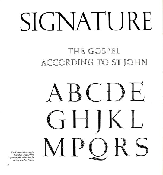
Van Krimpen did accept commissions from others besides Enschedé, such as the titling for Oliver Simon’s graphic design periodical Signature (1947) and the decorated capitals for Simon at the Curwen Press (1929), shown here with van Krimpen’s Open Capitals (1928) in between. His next typeface for Enschedé was his 1928 Romanée typeface, named after an encounter with a particularly good bottle of Burgundy, for which he designed an italic over 20 years later in 1949. He produced his Romulus type face in 1931 at the suggestion of Monotype’s Beatrice Warde. It is shown here just below the Romanée in roman, italic and open capitals, along with an alternate italic, a cursive Cancelleresca Bastarda suggested by Monotype’s Stanley Morrison.
Perhaps van Krimpen’s most noted typeface is his Spectrum, originally designed for the Spectrum publishing company of Utrecht between 1941 and 1943, and later adapted for Monotype setting in 1955. Shown here also are Juliana (1952-8) and Molé Foliate (1960) designed by van Krimpen’s colleague and successor at Enschedé, Samuel Louis (Sem) Hartz, although there is some dispute over how much credit Hartz should get for the Molé Foliate, as another colleague Pieter Wetselaar appears to have had a considerable hand in its design. The portrait of Jan van Krimpen shown here is by Sem Hartz.
View our other posts about Enschedé and Jan van Krimpen.
View another post from Twentieth century type designers.
View our other Typography Tuesday posts.
#Typography Tuesday#typetuesday#jan van krimpen#Joh. Enschedé#Twentieth century type designers#Sebastian Carter#Paul Helmuth Rädisch#Monotype Corporation#Oliver Simon#Curwen Press#beatrice warde#Stanley Morrison#S. L. Hartz#Pieter Wetselaar#Jerry Buff#Typography Tuesday#type design#type designers#Lutitia#Romanée#Romulus#Signature#Spectrum#Juliana#Molé Foliate
17 notes
·
View notes
Photo
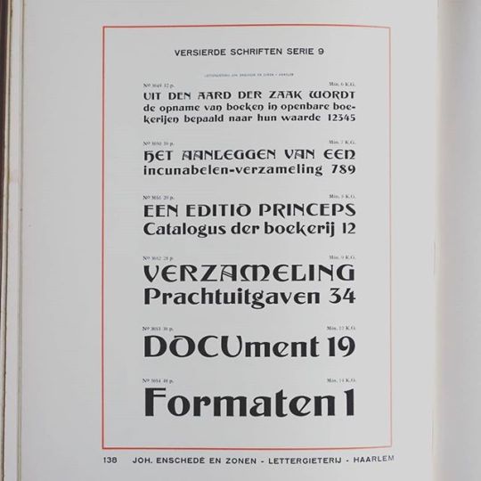
Versierde Schriften Serie 9 by Lettergieterij Joh. Enschedé en Zonen #typespecimen
3 notes
·
View notes
Photo
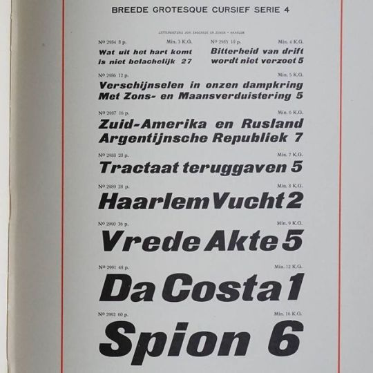
Breede Grotesque Cursief Serie 4, Joh. Enschedé en Zonen, approx. 1912 #typespecimen
4 notes
·
View notes
Photo
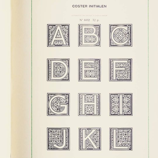
Coster Initialen from Joh. Enschedé en Zonen #typespecimen #initials
7 notes
·
View notes
Last Seen Blogs

animentality
wretched thing, pull yourself together


hafojecetulo
Untitled

groupkiller
Danish Slash Lover
animentality
wretched thing, pull yourself together