#Enschedé
Text

It's Fine Press Friday!
A Classic Representation
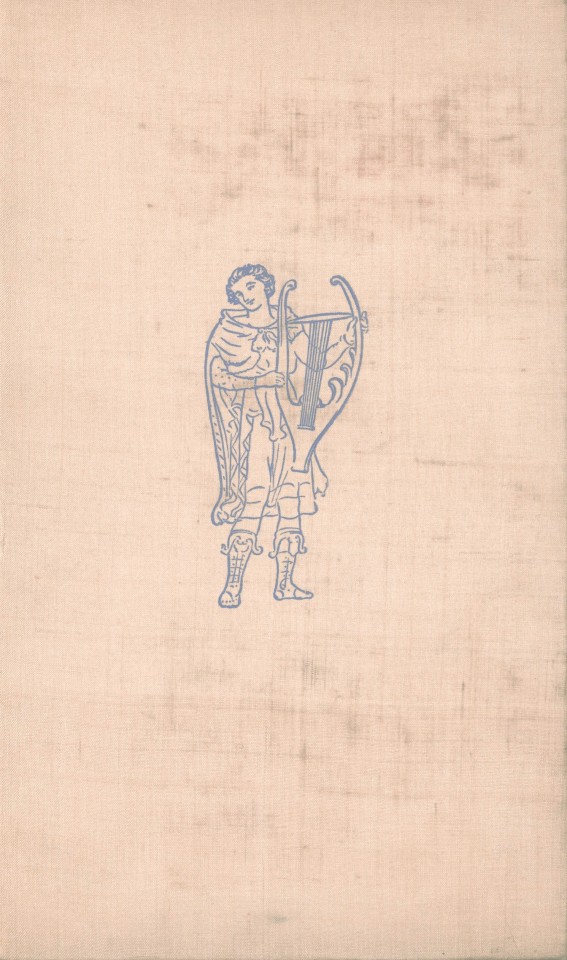
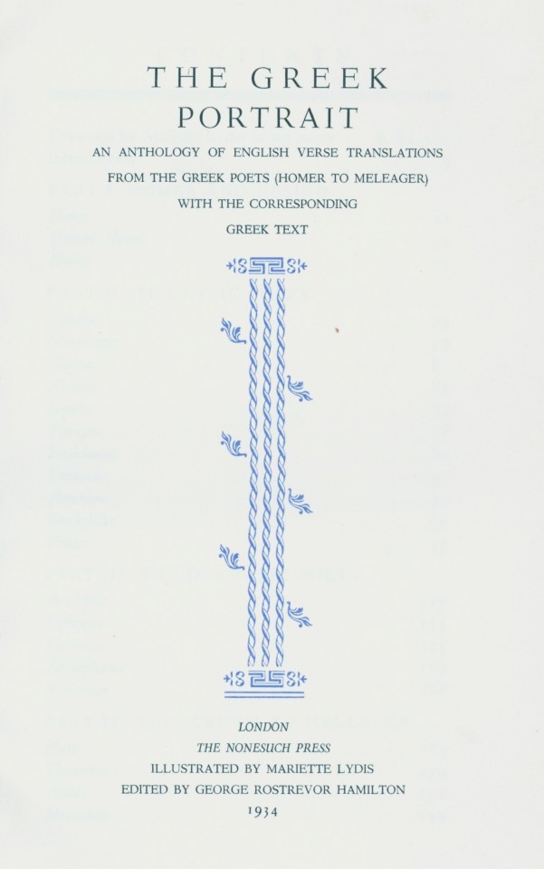
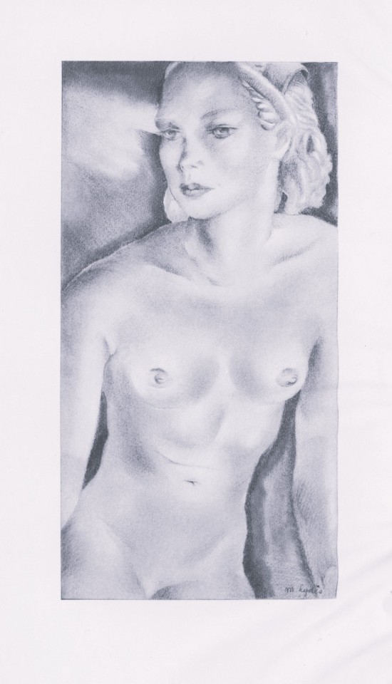
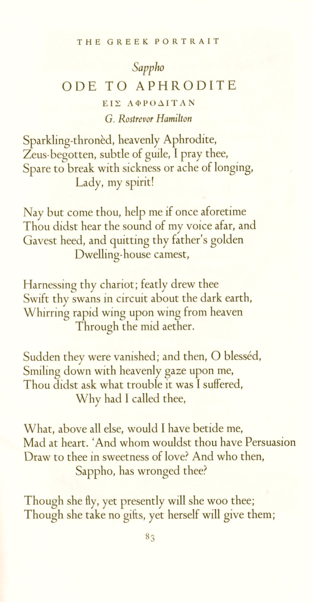
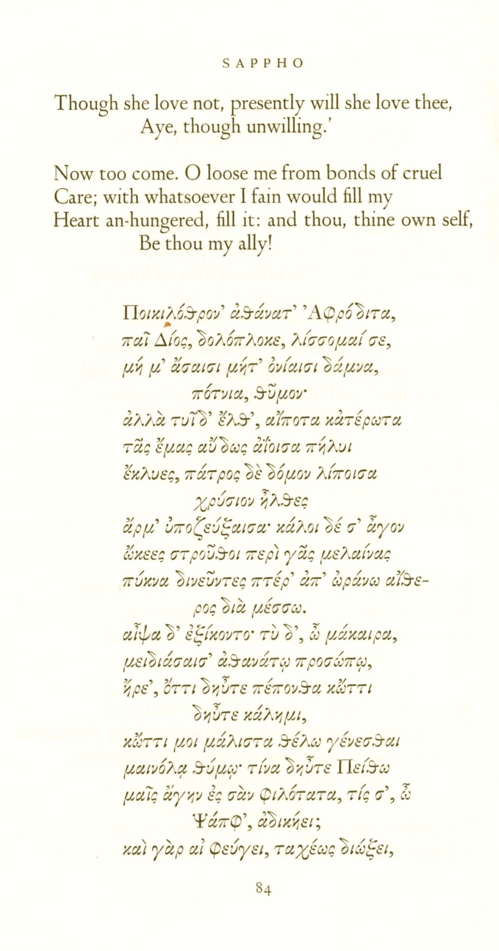
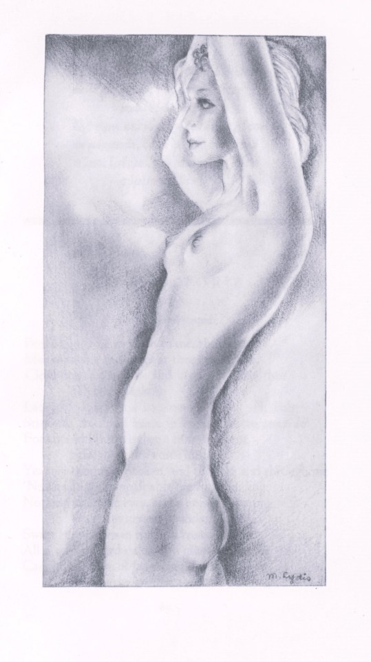
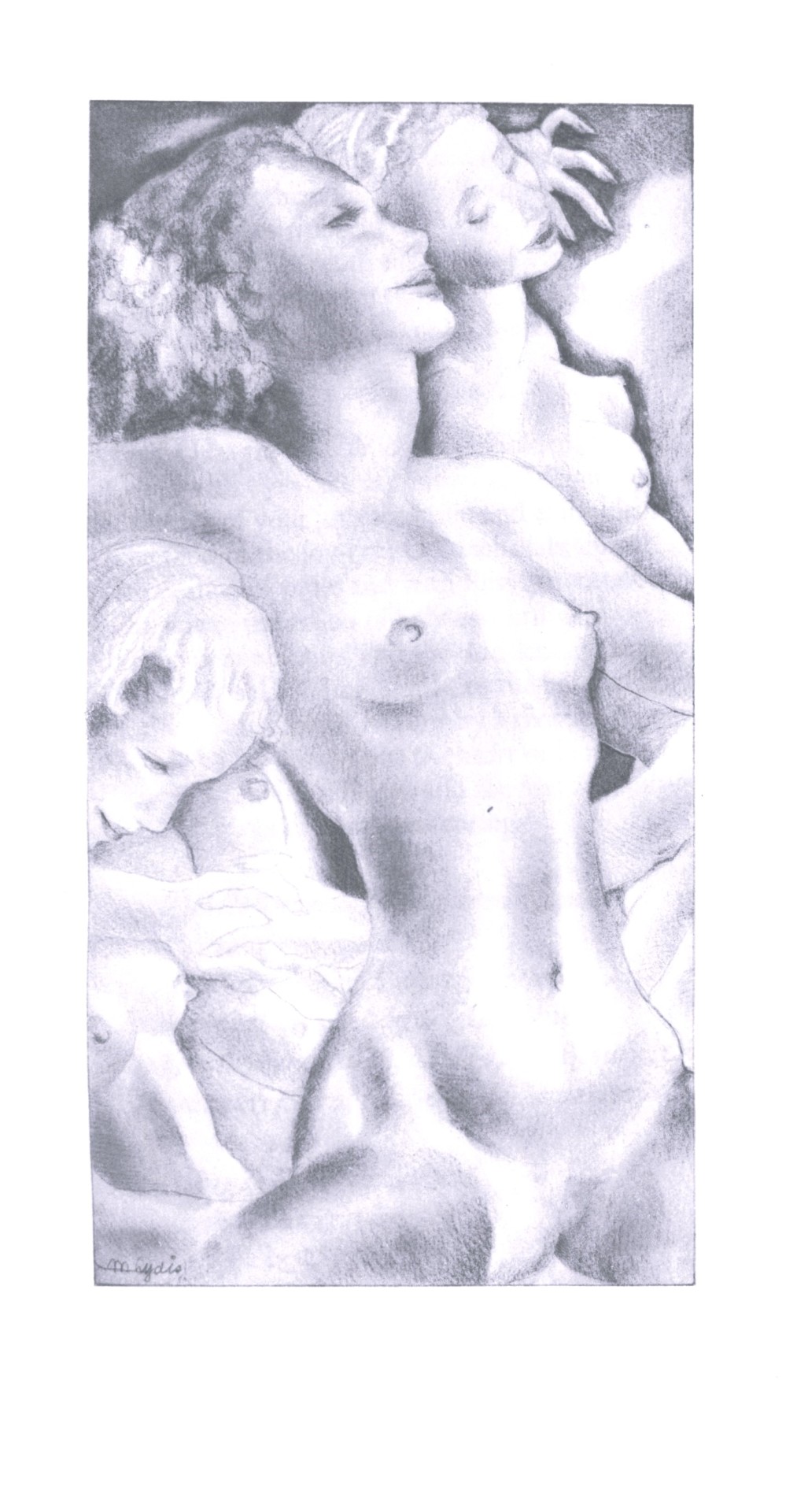
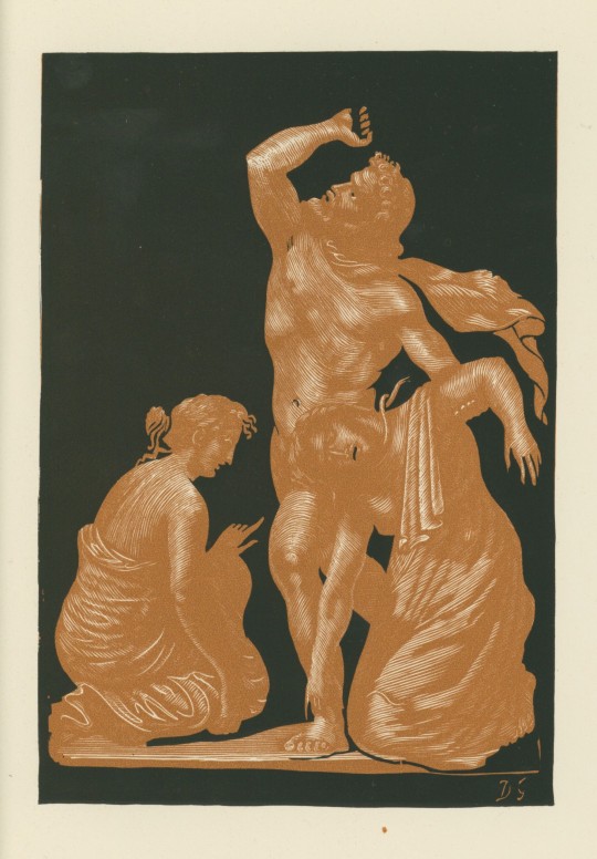
The Greek Portrait is an anthology of English verse translations of eminent Greek poets, from Homer to Meleager, with the corresponding Greek text presented alongside. Numerous translators provided the translations, taking on the arduous task of translating essential works from the Classical Period, including epic, lyric, and dramatic poetry.
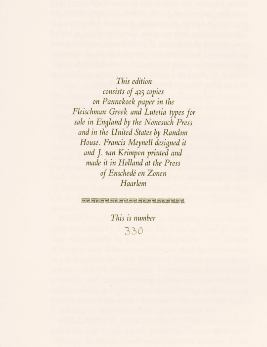
This 1934 edition was designed by British fine-press publisher Francis Meynell (1891-1975) and printed in an edition of 425 copies by Dutch book and type designer Jan van Krimpen (1892-1958) at the Press of Enschedé en Zonen in Haarlem for Meynell's Nonesuch Press in London. The text was edited by English poet and critic George Rostrevor Hamilton (1888-1967) and printed on Pannekoek paper in Fleischman Greek and van Krimpen's Lutetia types.
The illustrations are by Mariette Lydis (1887-1970), an Austrian-Argentine painter known for her portraits, illustrations, and erotic engravings. She was a self-taught artist who began her career at a young age and had a history of creating what was considered controversial artwork during her lifetime. She gained recognition for creating lithographic depictions that celebrated lesbian and bisexual relationships. However, some critics of her work described the illustrations as "perverse.” We find these prints to be quite lovely, however.
-Melissa, Special Collections Classics Intern
View another post with illustrations by Mariette Lydis.
View our other posts with books from the Nonesuch Press.
View other Classics posts.
#classics#Nonesuch Press#The Greek Portrait#ancient greek#greek#greek poetry#Greek poets#Mariette Lydis#Francis Meynell#Jan van Krimpen#Joh. Enschedé en Zonen#Enschedé#George Rostrevor Hamilton#illustrations#english translations#epic poetry#lyric poetry#Fleischman Greek type#Lutetia type#Pannekoek paper#classical period#classical literature#anthologies#fine press books#fine press publishing#so dramatic
57 notes
·
View notes
Text

Still Life with Fruit (1829) by Christina Enschedé (Netherlands, 1791–1873).
Oil on canvas.
Frans Hals Museum
Photographer Geheugen van Nederland
Wikimedia.
98 notes
·
View notes
Photo
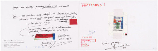
Joh. Enschedé Security Print, Jan Bons – Drukproef voor postzegels Nederland 1995 H.N. Werkman, Haarlem, 1994 [Nationaal Archief, Den Haag]
#graphic design#typography#handwriting#joh. enschedé#joh. enschedé security print#jan bons#hendrik nicolaas werkman#nationaal archief#1990s
13 notes
·
View notes
Link
In de laatste aflevering van de serie 'Haarlemse Iconen' staat het oudste bedrijf van dit seizoen centraal: Koninklijke Joh. Enschedé. Opgericht in 1703, heeft dit bedrijf een rijke geschiedenis op het gebied van beveiligd drukwerk. Van kleinschalige drukkerij tot wereldleider in beveiligd drukwerk Izaak Enschedé begon in 1703 een kleinschalige drukkerij in Haarlem, samen met zijn zoon Johannes - naar wie het bedrijf vernoemd is. De kleine drukkerij groeide uit tot de officiële drukker van de stad Haarlem en produceerde wat nu een van de oudste kranten ter wereld is. In 1810 drukte Joh. Enschedé de eerste bankbiljetten voor gebruik in Nederlands-Indië en de West-Indische gebieden, gevolgd door de eerste Nederlandse bankbiljetten in 1814. Marcel Klok over de geschiedenis van Joh. Enschedé In de aflevering gaat presentator Rudy Nicola o.a. in gesprek met Marcel Klok, Sales Director bij Koninklijke Joh. Enschedé. Marcel vertelt over de beginjaren van de drukkerij, de bepalende momenten in de geschiedenis van het bedrijf en hoe Joh. Enschedé specialist werd in het drukken van bankbiljetten. En een opvallende anekdote over Walt Disney. Verhuizing naar de Waarderpolder en groei tot marktleider Na bijna 300 jaar gevestigd te zijn geweest aan het Klokhuisplein, verhuisde het bedrijf in de jaren 1980 naar de Waarderpolder. Van 1900 tot 2000 groeide het bedrijf uit tot een marktleider op het gebied van hoogwaardig beveiligd drukwerk, met de productie van nieuwe producten als cheques, visa, belastingzegels en certificaten. Joh. Enschedé werd een van de eerste drukkers van eurobankbiljetten. De toekomst van Joh. Enschedé In de aflevering wordt ook vooruitgeblikt op de toekomst van Joh. Enschedé. Het bedrijf staat midden in de transitie van klassiek drukwerk naar de digitale economie. Ondanks dat het drukken van bankbiljetten niet helemaal is verdwenen, wordt er volop geïnnoveerd. Zo werd er vorig jaar een speciaal tientje gedrukt voor Nick & Simon, met een koppeling naar Augmented Reality. Waar en wanneer? De aflevering over Joh. Enschedé is vanaf vrijdag 27 oktober vanaf 18.00 uur te zien op Haarlem105-TV en wordt de hele week herhaald. Ook zijn de afleveringen te zien via het YouTube-kanaal van Haarlem105. Dit is de laatste aflevering van het 1e seizoen van Haarlemse Iconen. Laatste aflevering van 1e seizoen De aflevering over Koninklijke Joh. Enschede is de laatste van het 1e seizoen van Haarlemse Iconen. In dit seizoen stonden naast Joh. Enschede, ook Dansschool Schröder, Proeflokaal de Blauwe Druif, Hotel Lion D’or, Feestwinkel Jan Monnikendam en Van der Pigge in de spotlights. Presentator Rudy Nicola zegt: "Ik heb al jaren de ambitie gehad om een programma te maken over de oudste bedrijven van Haarlem. Ik kom er al mijn hele leven, maar stond er nauwelijks bij stil welke geschiedenis erachter schuilt. Als kijker krijg je een uniek inkijkje in deze 'Haarlemse iconen'. Het was een eer om te maken. Ik kijk nu al uit naar het 2e seizoen."
0 notes
Photo
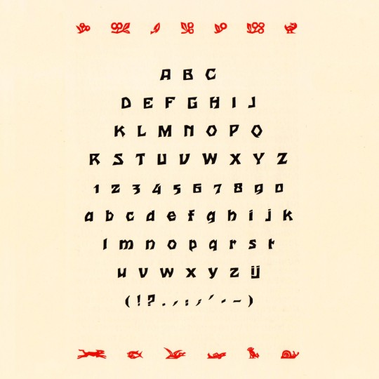
Houtsneeletter, André van der Vossen for Joh. Enschedé en Zonen, 1927 #woodcut #typespecimen
4 notes
·
View notes
Text
The Christmas Experience in het Vikingschip in Den Oever
Er op uit: 'The Christmas Experience in het Vikingschip in Den Oever'
DEN OEVER – De Koninklijke Joh. Enschedé (drukkerij van postzegels, waardepapier, voorheen de gulden bankbiljetten) is hoofdsponsor van de Stichting The Christmas Experience. The Christmas Experience is een show orkest welk een anderhalf uur durende kerstshow produceert en uitvoert. De entreeprijs is op verzoek van de sponsor zeer laag met € 12,50 (incl. consumptie). De show vindt slechts plaats…

View On WordPress
0 notes
Text
KLM: lançamento da 104º casa-miniatura é prenda de aniversário
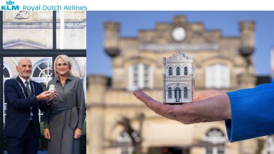
A KLM Royal Dutch Airlines acaba de celebrar o seu 104º aniversário de forma tradicional. Ou seja, apresentando a mais recente adição à sua coleção em porcelana Delftware de réplicas de edifícios com uma história única nos Países Baixos.
A nova miniatura retrata o edifício da estação de comboio mais antiga neerlandesa, que se situa em Valkenburg aan de Geul, na província de Limburgo. Esta estação é ainda utilizada como paragem na linha de Heuvelland, entre Maastricht e Heerlen. Com quase 170 anos de idade, o edifício é património nacional, propriedade da NS Dutch Railways e da companhia de gestão ferroviária ProRail.
A casa-miniatura foi apresentada pelo presidente da KLM, Marjan Rintel, ao presidente da câmara local, Daan Prevoo, numa receção realizada em frente ao edifício da estação.
O edifício da estação de comboios, semelhante a um castelo, foi concebido pelo arquiteto Jacob Enschedé em estilo revivalista gótico inglês, com torres de canto e ameias, e estava de acordo com o estilo preferido dos sumptuosos spas pelos quais Valkenburg é famosa. A estação entrou em funcionamento há quase 170 anos, a 23 de outubro de 1853, como paragem da primeira ligação ferroviária internacional entre Maastricht e Aachen. Totalmente restaurada em 2005, a estação continuou a desempenhar um importante papel em termos de infraestruturas para a cidade de Valkenburg aan de Geul, que atrai turistas de todo o país e não só.
Read the full article
0 notes
Text
Research - Type Design
1600–1650
Baroque and rococo aesthetic trends, use of the pointed-pen for writing, and steel engraving techniques effected a gradual shift in typographic style. Contrast between thick and thin strokes increased. Tilted stressing transformed into vertical stressing; full rounds were compressed. Blunt bracketed serifs grew sharp and delicate until they were fine straight lines. Detail became clean and precise.
Transitional roman types combined the classical features of lettera antiqua with the vertical stressing and higher contrast between thick and thin strokes characteristic of the true modern romans to come.
The roman types used c. 1618 by the Dutch printing firm of Elzevir in Leyden reiterated the 16th-century French style with higher contrast, less rigor and a lighter page effect. After 1647 most Elzevir faces were cut by the highly regarded Christoffel van Dyck, whose precise renditions were regarded by some experts at the time as finer than Garamond's.
1650–1700
1670–1672 for use by the Oxford University Press. The so-named Fell types, presumed to be the work of Dutch punchcutter Dirck Voskens, mark a noticeable jump from previous designs, with considerably shorter extenders, higher stroke contrast, narrowing of round letters, and flattened serifs on the baseline and descenders. The design retained a retrogressive old-style irregularity, smooth modeling from vertical to horizontal, and angled stressing of rounds (except a vertically stressed o). Fell capitals were condensed, even-width, with wide flattened serifs; all characteristics of the definitive modern romans of the late 18th century. Fell italic types were distinguished by high contrast matching the Fell romans; wider ovals; a split-branching stroke from the stems of m n r and u; and long, flat serifs—prefiguring modern. They repeated the non-uniform slant of French models, and the capitals included swash J and Q forms.
1700–1750
The first major figure in English typography is reckoned by type historians to have ended the monopoly of Dutch type founding almost single-handedly. The gun engraver-turned-punchcutter William Caslon spent 14 years creating the stable of typefaces on the specimen sheet issued in 1734. The complete canon included roman, italic, Greek, Hebrew, Arabic etc. Caslon's Great Primer roman and English roman were retrogressive designs that very closely followed the Fell types and the roman of Miklós (Nicholas) Kis c. 1685 falsely attributed to Anton Janson. Caslon's slightly bracketed serifs and old-style irregularity were not novel, but a precise cut and perpendicularity gave legibility to the forms. Caslon's italic structures follow the Fell italics, but at a condensed width and with conventional branching from stems.
Joan Michaël Fleischman (1701–1768) was born in Nürnberg where he trained as a punchcutter. He found employment with Dutch type founders in Holland and settled there c. 1728. At the Enschedé foundry in Haarlem he cut punches for a large amount of material. Some time after 1743 he produced a distinguished roman design—related to the preceding transitional types but departing from them. It prefigured modern romans with sparse transaxialmodeling, joining the vertical stressing to hairline thins and ball-ends. Fleischmann borrowed from the general mode of Phillipe Grandjean's and Louis Simonneau's "Romain du Roi," commissioned by Louis XIV in 1692 for the Imprimerie Royale, but did not imitate that face. Fleischmann's capitals were a new variety; an even-width scheme, compressed rounds, all-vertical stressing, and triangular beak ends of E F L T and Z, all characteristics prefiguring the "classical" moderns of Bodoni and Didot. Fleischmann's italic bore some resemblance to Granjean's but had longer ascenders and followed the established Dutch structures for h v and w.
1750-1775
About 1751, John Baskerville, having found financial success in producing goods from sheet metal, moved into the printing business. His roman and italic types appeared later than Fleischman's but are considered transitional and partly retrogressive with a return to lower contrast, smooth transaxial modeling, finely modeled bracketed serifs, and long stems. The exquisite design and finish of Baskerville's roman however, combining elegance and strength, was modern. His roman design, and especially his italic, were rococo-influenced. His letterforms are an intentional transition between old-style forms and modern styles. They were informed by his prior experience as a writing master and the influences of his time. The types of Joseph Fry, Alexander Wilson, and John Bell closely followed Baskerville, and through his correspondence with European type founders Baskerville's influence penetrated most of western Europe. Baskerville was a meticulous artist who controlled all aspects of his creation, devising more accurate presses, blacker inks and paper sealed with hot rollers to ensure crisp impressions. Of particular note, the lower storey of his lowercase g does not fully close. Derivatives of Baskerville are often identified thus. A modern revival of Baskerville, a font called Mrs Eaves, is named after Baskerville's mistress-turned-wife Sarah Eaves, the widow of Richard Eaves.
1775–1795
The Spanish designer Joaquín Ibarra's roman was influenced by Baskerville, Didot and Bodoni, but hewn nearer to old-style and used in the same classical manner, including spaced capitals. In England modern romans resembling Bodoni's were cut for the printer William Bulmer c. 1786 by the punchcutter William Martin, who had been apprenticed to Baskerville and influenced by him. Martin's italic mirrored the open-tail g and overall finesse of Baskerville's.
1795–1820
In Britain and the United States, modern romans (emerging around 1800 and totally dominant by the 1820s) took a somewhat more rounded, less geometrical form than the designs of Didot and Bodoni; an obvious difference is that in Anglo-American faces the upper-case C has only one serif (at the top) whereas in European designs it has two.
1820s
In Britain and the United States, modern romans (emerging around 1800 and totally dominant by the 1820s) took a somewhat more rounded, less geometrical form than the designs of Didot and Bodoni; an obvious difference is that in Anglo-American faces the upper-case C has only one serif (at the top) whereas in European designs it has two.
1830-1910
The 19th century brought fewer stylistic innovations. The most notable invention was the rise of typefaces with strengthened serifs. Forerunners were the so-called Egyptienne fonts, which were used already at the beginning of the 19th century. Their name likely comes from the enthusiasm of the Napoleonic era for the orient, which in turn was started by Napoleon's invasion in Egypt. In fact slab-serif fonts (e. g. Clarendon from 1845) were newspaper fonts, whose serifs were strengthened in order to prevent damage during the printing process. Stylistically the serif fonts of the mid-19th century appeared very robust and otherwise had more or less neo-classical design features, which changed during the course of time: By the application of the slab serif design feature and by appending serifs to more and more typefaces, an independent intermediate group of heterogeneous fonts emerged during the 20th century. Meanwhile, the slab serifs are listed as an independent group in most typeface classifications—besides both main groups serif and sans serif.
Slab-serif and sans-serif types were rarely used for continuous bodies of text; their realm was that of advertisements, title-pages and other attention-catching pieces of print. By about 1820, most western countries were using modern romans and italics for continuous texts. This remained true until the 1860s, when so-called 'old style' faces—a largely English-speaking phenomenon—came into use. These went to the opposite extreme from the modern faces; 'thick' strokes were attenuated, and serifs at the end of thin strokes (as in C, E, L and T) were narrow and angled whereas in modern faces they were broad and vertical or nearly so. All the upper-case characters were somewhat 'condensed' (narrowed). Old style faces remained popular until about 1910.
Above all the 19th century was innovative regarding technical aspects. Automatic manufacturing processes changed the print as well as the graphical illustrations. The illustration of printed matters could be considerably standardised due to the lithography technique invented by Alois Senefelder. Finally, another invention was photography, whose establishment at the end of the 19th century led to the first halftoning and reproduction procedures. The step-by-step development of a modern mass society provided a growing demand of printed matters. Besides the traditional letterpress beginnings of a newspaper landscape as well as a broad market for publications, advertisements, and posters of all kinds appeared. The challenges had changed: since printing and typography had been a straightforward craft for centuries, it now had to face the challenges of an industry-ruled mass society.
1920-1960
A result of the industrialisation process was the unimagined number and distribution of new typefaces. Whether digital variants of Garamond and Bodoni or new contemporary type designs like Futura, Times, and Helvetica, nearly all currently used typefaces have their origin either in the following and ongoing digital typesetting era or are based on designs of this epoch. The basis was the appearance of large type foundries and type manufacturers. The result: Successful typefaces could quickly gain the status of a trademark—and therefore were able to assign a unique "branding" to products or publications.
Chicago contributed much to typography design at this time as Frederic Goudy, designer of 123 typefaces, founded several presses. Oswald Cooper, designer of Cooper Black studied under Goudy
During the 1920s, typographers in central and eastern Europe experimented with forms of avant-garde typography. The main places of development of avant-garde artists had been: Budapest, Zagreb, Belgrade and, after 1924, also Prague. However, since 1925 avant-garde typography had been spreading to the cities of western and eastern Europe and, as a result, the previous cities gradually lost their relevance.
In 1924 two exhibitions important for development of avant-garde typography were organized: one by Ljubomir Micić (the First International Zenitistic Exhibition of New Art in Belgrade) and the other by Ion Vinea and Marcel Iancu (the First International Exhibition Contimporanul).
1960s
The 1960’s birthed one of the most influential typefaces that shaped visual communication around us today in branding, advertisements, and environmental signage. Helvetica was created by type designer Max Miedinger in 1960. During the postwar era, companies were looking for ways to differentiate themselves from other brands and create a new identity. The clean, bold design was created to reflect the modern and industrial times that they were in, making it legible and quick to read on the go or just passing by. For example car brands like Ford, Chevrolet, and Chrysler used Helvetica in their advertisements to promote new cars and technology. Communication was the key aspect in the design of Helvetica, and now is a common standardized choice for typography in advertisements and branding all over the world. We can see Helvetica in many major brand identities and logos such as American Airlines, North Face, American Apparel, Microsoft and Target.
The psychedelic era also had a large impact on typography and branding in the 1960’s. Art Nouveau was a decorative art style that consists of organic and elaborate lines created in the early 19th century, but was brought back to popularity in the 60’s during the psychedelic era. Designers were inspired by the past, in hopes of a better creative future, they merged elegance and sophistication of Victorian art; floral print playful lines and aesthetics combined with intense, high contrast colours. Artists wanted to break away from the post war era of the strict, uniformed designs (Helvetica) and create a playful and fluid design. This style was used on posters, signage and album covers, we can now see them in the way companies design their logos and packaging.
1970s
Graphic design in the 1970s was all about bright and clashing colors with balloon like letter forms. It was as if the serif fonts of the 60s got eaten by the rounded typography of the decade. However, the psychedelic rock concert posters remained and added to the bright and glorious 70s. Bell-bottoms and disco ruled the decade. Some hated it, others feel nostalgic about it. Either way, graphic design in the 1970s got to be experimental. Everyone was playing with different styles and types. It was a playful and memorable time for everyone.
1980s
Predominantly though, the 1980’s offered futuristic type styles with modern effects and colourful aesthetics.
80’s font were heavily influenced by the advancement of technology. These styles in particular have a futuristic style commonly using either neon aesthetics, gradients and a mirrored sheen effect. These fonts tended to have an almost overdone style, with plenty of distinct layering and over the top text effects – neon, multiple colors, glow spots. The 80’s has a certain nostalgic feel to many as it was a staple in history or their childhood to witness the development of technology, which was a catalyst for modern typography
1990s
90s Typography was the sexy thing for graphic designers to get into. Émigré was in full swing, Neville Brody was an 80s superstar, Raygun magazine rose and fell.
Be expressive, Look back, Craft, Look forward, Reinvent, Become invisible, Be Honest, Order, Look Sideways, Be Vocal,
2000s
The first trending font of the new millennium (arguably) was Gotham.
2010s
While the first web font was actually made in late 1997, it wasn’t until 2009 that the Web Open Font Format (WOFF) was developed and added to the W3C open web standards. It took another 4 years for all major browsers to adopt and support WOFF allowing to really customize websites as we could print pieces. As the second decade progressed, with it came a flood of geometric sans serifs - those without serifs or contrast in stroke width.
In the early years of the new decade, there was a renewed interest in uncluttered geometries, a trend that had appeared a few years earlier with the spread of linear typefaces such as Gotham, and that propelled typefaces such as Akkurat and Circular to popularity towards the mid-decade.
Alongside technological innovations, an elemental, minimalist style of typography developed, linked to digital aesthetics, which replaced all elements of traditional ornamentation, considered as superfluous or even problematic.
One of the most important reasons for this return to minimalism was the need for greater legibility, fundamental in a world in which most content is accessed through the screens of smartphones or even smaller devices. This was keenly felt by Apple, to the point that, specially for the Apple Watch, the company launched “San Francisco”, a typeface that successively became standard for all products by the Cupertino-based company.
At the same time, from the mid-2010s, there was a powerful interest in more experimental forms of typeface. This trend was made possible by the introduction of user-friendly software such as “Glyphs”, which enabled increasing numbers of designers to enter the world of type design, and fuelled an increase of typography’s popularity on social media. Good examples include viral projects such as “36 Days of Type” which over the course of 6 years collected over 670,000 participants.
Typographical experimentation has also included the redesign of historic, classic typefaces. It is no coincidence that the last decade saw an increase in popularity of the Didone family, typefaces of French inspiration that emerged in the 18th century, and that were given new interpretations compliant with the needs of new technology.
2020s
In the 2020s type has taken in all trends and elements from previous eras whilst adding a touch of modernisation to create unique type styles.
0 notes
Photo
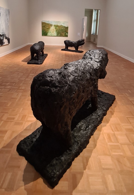
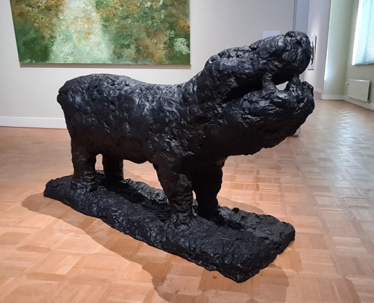
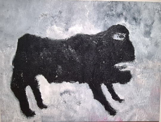
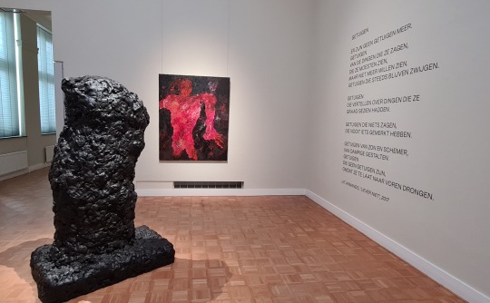
Wat? 3 X Das Tier (brons, 2005), Das Tier (olieverf op doek, 2005), Körperlich (brons, 2013), Gestalt (olieverf op doek, 2013)
Waar? Tentoonstelling Armando- Gestalten in Rijksmuseum Twenthe, Enschedé
Wanneer? 5 maart 2023
Regelmatig kom ik werk van Armando (1929-2018) tegen. In 2018 zag ik in Museum Voorlinde de, vanwege zijn overlijden vervroegde, tentoonstelling Armando. Zijn werken zijn altijd indrukwekkend, misschien niet eens zo zeer vanwege de werken zelf, als wel vanwege het verhaal erachter. Armando groeide op in de buurt van Kamp Amersfoort en deze ervaring heeft zijn hele verdere leven zijn werk gekleurd. De verwerking van het verleden door de overlevenden van de oorlog, met name door de Duitsers, loopt als een rode draad door zijn veelzijdige oeuvre. Armando verrijkte onze taal met de uitdrukking ‘schuldig landschap’: een op het oog lieflijk landschap waar zich in het verleden vreselijke dingen hebben afgespeeld.
Op de dag dat ik Rijksmuseum Twenthe bezoek, opent daar de tentoonstelling Armando - Gestalten. Dit is de eerste tentoonstelling die is gewijd aan de levensgrote, bronzen sculpturen van de kunstenaar. De vroegste bronzen sculpturen zijn veelal iconische objecten, zoals een vlag (Fahne) of brokstuk (Bruckstück). Later ontstaan er vormen die grofweg de vorm van menselijke figuren volgen: Gestalten. In Armando’s werk keren steeds dezelfde thema’s terug. Een tekst op de website van het museum verwoordt dit als volgt: “Zijn werk gaat over de mens, de vergankelijke mens, die zich een weg door het leven baant, laverend tussen goed en kwaad, schuld en onschuld, dader en slachtoffer.”
Bijzonder aan de tentoonstelling in Enschedé is het feit dat de sculpturen worden gecombineerd met schilderijen en poëzie- en prozateksten van deze veelzijdige kunstenaar. Die combinatie werkt uitstekend. Op een of andere manier versterken en verdiepen de verschillende kunstvormen elkaar. Zo is in de zaal waar het beeld Körperlich en het schilderij Gestalt zijn geëxposeerd, de volgende tekst aangebracht op de wand:
Getuigen
Er zijn geen getuigen meer.
Getuigen
Van de dingen die ze zagen,
Die ze moesten zien,
Maar niet meer willen zien.
Getuigen die steeds blijven zwijgen.
Getuigen
Die vertellen over de dingen die ze
Graag gezien hadden.
Getuigen die niets zagen,
Die nooit iets gemerkt hebben.
Getuigen van zon en schemer,
Van dampige gestalten.
Getuigen
Die geen getuigen zijn,
Omdat ze te laat naar voren drongen.
Uit: Armando, ‘Liever niet’, 2017
0 notes
Text
Matthew Carter
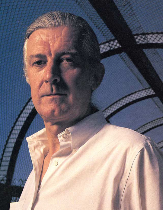
Pic of Matthew Carter
Intro:
Matthew Carter is a British type designer live in London and born in October 1st 1937. Carter career begin in the early 1960s and bridged with three major technologies that are use in type design like physical type, phototypesetting, and digital font design. Carter has experience type design more than 40 years. Carter’s most used fonts are the classic web fonts Verdana and Georgia and the Windows interface font Tahoma as well as Bell Centennial, Miller, and Galliard. Carter career begin with him experience in graphic design and printing and his work grow and transition from physical to digital type.
Sections:
- Past life
�� How did they design their typefaces? Traditionally? Digitally?
Carter grew up in London and he is the son of Harry Carter, a book designer and later historian of printing. Carter’s mother worked in preparing scale drawings. Carter early careers was that he was intended to get a degree in English. In 1955 he spent a year at the Enschedé typefoundry in the Netherlands learning to make metal type by hand and the methods he used was metal by hand, metal by machine, photoset, digital, desktop, and screen. His typeface begin with drawing alphabet traditionally. However, when technology came and print type created, he converted to a digital typefaces design and has been working for the digital media like 50+ years and been expert with it.
- Present career
More about his work sec.:
What were the characteristics of their typefaces?
Matthew Carter has been described by The New Yorker as “the most widely read man in the world” for producing some of the most frequently used typefaces, such as Georgia, Verdana, and Tahoma. Carter was commissioned by the Walker Art Center to help create a new typeface for the institution and helping him a designer called Matt Eller. The characteristics of Carter's fonts is in roman and italic features customized “snap-on” serifs and the ability to apply lines above, below, or through the middle of letters and words. In the recent work he is been doing as for now he is now a principal of Carter & Cone Type Inc., in Massachusetts, designers and producers of original typefaces.
Quote: Chose one
“I love getting commissions for things that I have never done before. I always look forward to being challenged in that way.”
“As the saying goes, type is a beautiful group of letters, not a group of beautiful letters.”
Work cited MLA:
MyFonts
MyFonts. “Matthew Carter Font.” MyFonts, www.myfonts.com/collections/matthew-carter. Accessed 12 Oct. 2022.
Role Family | Fontelier. fontelier.com/feature/role/carter.html. Accessed 12 Oct. 2022.
“Matthew Carter: Famous British Type Designer.” Shillington Design Blog, 11 Sept. 2022, blog.shillingtoneducation.com/matthew-carter-tbt
“Matthew Carter.” ADC • Global Awards & Club, adcglobal.org/hall-of-fame/matthew-carter. Accessed 12 Oct. 2022.
Quote
Matthew Carter Quotes. quotefancy.com/matthew-carter-quotes. Accessed 12 Oct. 2022.
Wikipedia contributors. “Matthew Carter.” Wikipedia, 19 Sept. 2022, en.wikipedia.org/wiki/Matthew_Carter.
0 notes
Text
INFO LOWONGAN KERJA BUMN PERURI JAKARTA PUSAT
INFO LOWONGAN KERJA BUMN PERURI JAKARTA PUSAT
BRITAKERJA ID – Perusahaan ini memulai sejarahnya sebagai PT Percetakan Kebayoran (Perkeba) yang berbisnis di bidang percetakan uang kertas dan PN Arta Yasa yang berbisnis di bidang percetakan uang logam. Perkeba didirikan sebagai bentuk kerja sama antara Pemerintah Indonesia dengan Joh. Enschedé asal Belanda, namun Pemerintah Indonesia hanya memegang minoritas sahamnya.
Pada tahun 1959, Perkeba…
View On WordPress
0 notes
Text
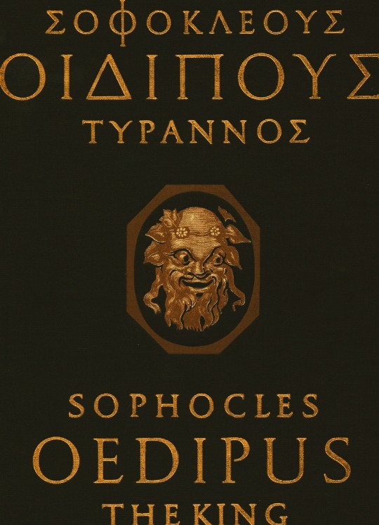
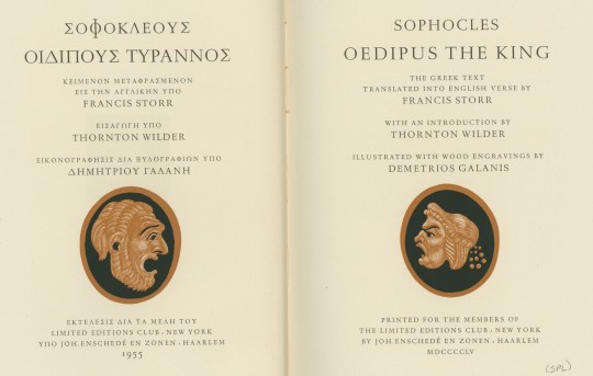
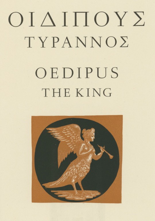


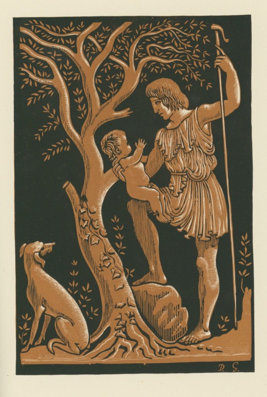

Tragically Greek
This 1955 edition of Oedipus the King, written by Sophocles, features the original Greek text alongside the English verse translation. Offering a rich, immersive reading experience results from hard work, dedication, and creative minds coming together to create this masterpiece.
Jan van Krimpen (1892-1958), Dutch typographer, book designer, and type designer, designed the two typefaces. The Greek type is named “Antigone,” and the English type is called “Romulus.” The translator for this work was Francis Storr (1839-1919), a British classicist, translator, and teacher.
The paper was specially manufactured at the historic Dutch Pannekoek Papermill, a mill with a rich history that unfortunately met its end in a fire in 1944. This exclusive feature adds a touch of rarity to your reading experience. Printed in the offices of Johannes Enschedé, under the supervision of Mijnheer van Krimpen, it was for the members of the Limited Editions Club.
Adding to the richness of this edition is the detailed and insightful introduction provided by Pulitzer Prize winner Thornton Wilder (1897-1975), American playwright, novelist, and native of Madison, WI. His esteemed perspective offers an enlightening preface to the classic tale.
The illustrations are black and terra-cotta wood engravings designed by Greek artist Demetrios Galanis (1879-1966). He was the trailblazer of modern Greek engraving and was once touted as one of the greatest living Greek artists at the time of the book’s release.
Sophocles (c. 497/496 – winter 406/405 BC) was an ancient Greek playwright born in Colonus near Athens. He is one of the three great tragedians of classical Athens, along with Aeschylus and Euripides. Sophocles wrote over 120 plays during his lifetime, although only seven have survived in their entirety. His works are characterized by their complex characters, well-crafted plots, and profound exploration of moral and philosophical themes.
Among his most famous plays is the tragedy Oedipus the King. The story is about Oedipus, the king of Thebes, who tries to uncover the truth behind a plague that has struck his city. In doing so, he discovers that he himself is responsible for the plague, having unknowingly killed his father and married his mother. The play delves into themes of fate, free will, and the consequences of one's actions.
-Melissa, Special Collections Classics Intern
View other Classics posts
#classics#sophocles#oedipus#oedipus rex#oedipus the king#greek mythology#greek#wood engraving#athens#tragedy#greek tragedy#ancient greece#oedipus complex#Limited Editions Club#Johannes Enschedé#Enschedé#Jan van Krimpen#Antigone type#Romulus type#Francis Storr#Demetrios Galanis#Pannekoek paper#LEC#Thornton Wilder
52 notes
·
View notes
Photo
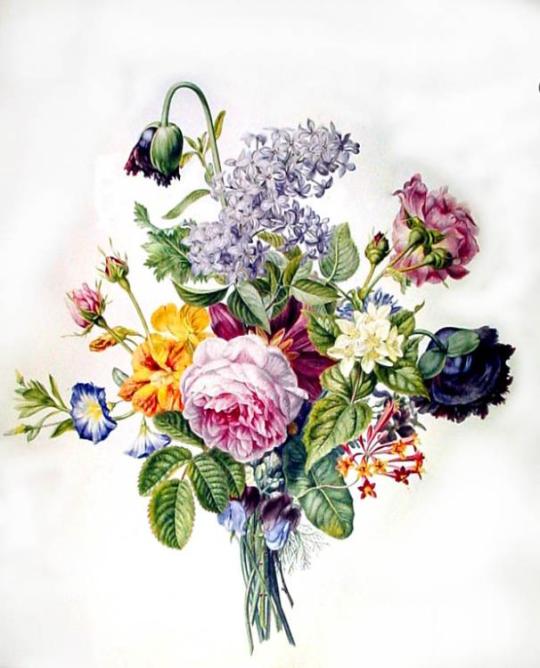
Bouquet with various flowers (circa 1850) by Christina Enschedé (Netherlands, 1791–1873).
Watercolour.
Teylers Museum.
Wikimedia.
108 notes
·
View notes
Link
Diploma Support biedt een alles-in-één serviceplatform voor het bestellen, produceren en afleveren van diploma’s voor onderwijsinstellingen. Gemak staat voorop, met de belofte dat het gehele logistieke proces is beveiligd. De innovatieve diplomaservice is een product van Royal Joh. Enschedé in samenwerking met Prindustry. Elk jaar studeren duizenden studenten af. Ze ontvangen hun diploma samen met een cijferlijst in een fraaie diplomamap. Een mooi bewijs voor de student, maar veel werk voor examencommissies. Diploma Support maakt dit diplomaproces eenvoudiger. Met Diploma Support organiseert een onderwijsinstelling het hele traject vanaf één platform. Elke universiteit, HBO of MBO krijgt een snelle en veilige manier om online diploma's te genereren, te bestellen en te verzenden. Adriaan Kamphorst, Royal Joh. Enschedé: “We bieden een optimaal beveiligd proces voor het hele diplomatraject. Van opmaak en bestellen tot printen en afleveren. Elk document is voorzien van geavanceerde beveiligingsmaatregelen, zoals een microtekst in de digitale handtekeningen. De waardedocumenten leveren we via beveiligd transport af op de gewenste locatie. In slechts een paar stappen ontvangt de onderwijsinstelling zo alle persoonsgebonden diploma’s. En dat altijd binnen de strengste veiligheidskaders. Diploma Support waarborgt onvervalsbare diploma’s.” Voor de automatisering van dit diplomaproces is Royal Joh. Enschedé een samenwerking aangegaan met softwareontwikkelaar Prindustry. Prindustry heeft alle onderdelen van het proces in één platform ontwikkeld. “Medewerkers die toegang krijgen tot het platform, kunnen de gewenste diploma’s en bijbehorende documenten online selecteren”, vertelt Ramon van Wingerden van Prindustry. "Wanneer er een bestelling wordt geplaatst, worden alle studentgegevens gekoppeld aan de diploma's. Er volgt een PDF die ter goedkeuring naar de toegewezen medewerkers gaat. De goedgekeurde bestanden gaan vervolgens in productie bij Royal Joh. Enschedé. Zo zetten we samen met Diploma Support een innovatief en zeer veilig product neer. 100% gemak en toch veilig!"
0 notes
Photo
Joh. Enschedé & Zonen, Haarlem, 1889 #typespecimen
2 notes
·
View notes
Photo
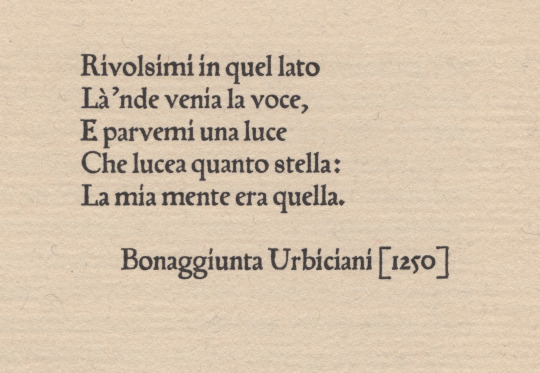
not schöffer’s roman
peter schöffer of gernsheim [1425-1503] was a scribe who apprenticed to the inventor of the black art, johannes gutenberg. schöffer united with gutenberg’s partner, johann fust, in legal proceedings against gutenberg resulting in «appropriation» of guntenberg’s printing apparatus; after which he married fust’s daughter, christina, & articled with fust in a new printing office—fust & schöffer.
urbiciani’s poem [1st illustration*] prefaces a little book entitled Hand and Soul by dante gabriel rossetti [the halcyon press, maastricht, 1928]: it is set in types attributed to schöffer—which would have been amongst the first transalpine romans. the matrices descended schöffer’s family until jacobus scheffers, a printer at bois-le-duc [’s-hertogenbosch], sold them to johannes enschedé on 26 august 1768—enschedé used them only for study. the book is set in a fount cast by the historic firm of joh. enschedé en zonen, haarlem, in the early 20th c., from the restored material [ibid., colophon].
however, we learn from a.f. johnson: «One roman of this class has survived to our day, and is part of the wonderful collection of early types owned by Enschedé of Haarlem. In the specimen of this roman issued in 1926 they attribute it to Peter Schöffer of Mainz, and consider it to be the oldest type in their collection. It came to the Haarlem firm in 1768 from one Jacobus Scheffers, a printer at Bois-le-Duc, a descendent of the Schöffers. Their dating of the type is too early, but it is at least early sixteenth century. It is first found at Cologne in 1527.» [Type Designs, grafton & co., london, 1959, p.44].
johnson further directs us via footnote [ibid.] to A History of the Old English Letter Foundries by talbot baines reed (edition edited & expanded by johnson) who puts us firmly in the picture: «Thomas Berthelet, who succeeded Pynson as King’s printer in 1530, introduced two, or possibly three, new romans and an italic from Cologne, where there was an anonymous punch-cutter at work in the twenties, one of whose designs has survived to our generation. Whether he worked as an independent founder or was an employee of one of the leading Cologne printers, Quentel or Cervicorn, cannot be discovered. … The 88 roman [2nd illustration†] is found at Antwerp with J. Steelsius in 1539. This type seems to have some relation to Quentel’s roman first found in 1527, a type which has survived, at least in part.» [faber&faber, london, 1952, pp 87-8]. the textile research centre in leiden has an interesting page about peter quentel & his activity in 1527.
* printed letterpress on van gelder mould-made paper in the office of joh. enschedé en zonen.
† frank isaac, English & Scottish Printing Types 1535–58 * 1552–58, the bibliographical society, 1932, fig. 4.
#typography#letterpress#peter schöffer#poetry#bonaggiunta urbiciani#joh. enschedé en zonen#thomas berthelet#peter quentel#alfred forbes johnson#talbot baines reed
0 notes
Last Seen Blogs

booboo13-dl
Untitled

kittyball23
Kittyball23

uriel-s-d
"Welcome to The Icebox"

pyratcode
𝐝𝐞𝐯𝐢𝐥'𝐬 𝐨𝐰𝐧 𝐥𝐮𝐜𝐤