
duardius
typographical enthusiasms
direct [not reflected]
281 posts
Last active 4 hours ago
Don't wanna be here? Send us removal request.
Last Seen Blogs

emi0012344
Unbetitelt

sleepydin
go follow @stlaika

thebeardedbarbell
The Bearded Barbell

chicabear15
my fnaf hyper fixation has returned

susanesteel
the girl from venus
Text

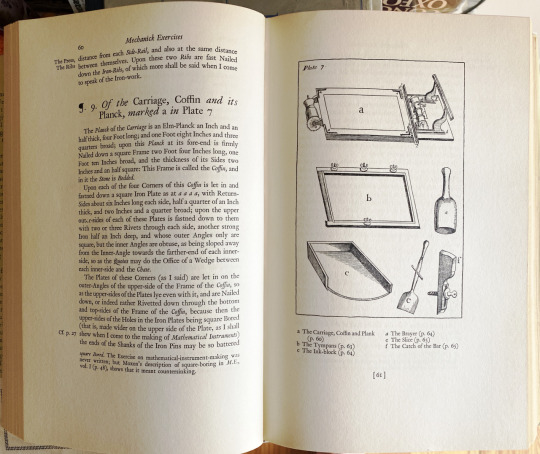
joseph moxon
joseph moxon (1627–91), mathematical instrument maker, & hydrographer to charles ii, added to his skills all those requisite in typography: in 1669 he issued the first complete english typfounders’ specimen [talbot baines reed (a.f. johnson, ed.), A History of the Old English Letter Foundries, faber & faber, london, 1952, p170] .
moxon wrote the Mechanick Exercises, comprising two volumes: volume one addressed smithing, joinery, & building trades in general, & was completed in 1678; volume two on printing issued in sections, 1683-4. illustrated are dust jacket, & spread showing plate 7 that originally appeared facing opening of §10 «Of the Press»—cp. ‹ben franklin’s copy›—from the excellent revised & annotated edition of moxon’s Mechanick Exercises on the whole Art of Printing [herbert davis & harry carter (eds), oxford university press, 1962, pp 60-1]. from the introduction: «His book was by forty years the earliest manual of printing in any language, and it put in writing a knowledge that was wholly traditional.» [ibid., p.vii].
«For almost a century it remained the only authority on the subject; subsequently it formed the basis of numerous other treatises, both at home and abroad, and to this day it is quoted and referred to, not only by the antiquary who desires to learn what the art once was, but by the the practical printer, who may still on many subjects gather from it much advice & information as to what it should still be.» [op.cit., p175].
1 note
·
View note
Text
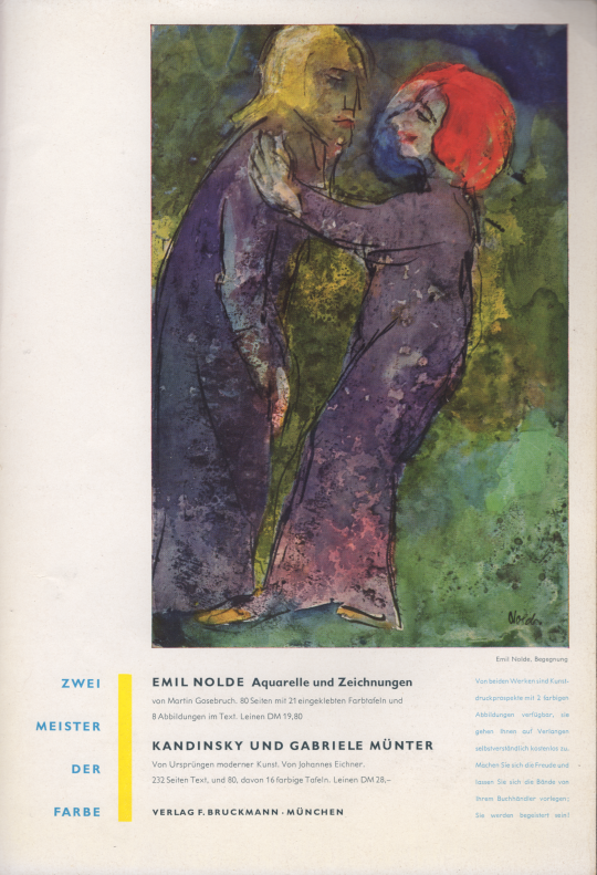
new typography, mid-c
lovely publisher’s ad from inside back cover of Gebrauchsgraphik [1957, no.3]: matter well displayed, referencing the «new typography» of its period.
0 notes
Text
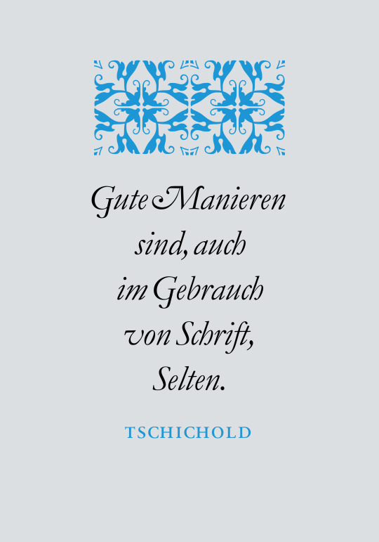
owl forme 2
for details of jan tschichold’s aphorism & the original, letterpress version vide ‹owl forme›.
set in monotype garamond italic— vide ‹granjon›. «tschichold» set in linotype sabon next roman—vide ‹tschichold’s sabon›. the arabesque unit is digital reissue of english monotype 310, from their recuttings of the granjon arabesque, originally engraved by robert granjon & first seen in 1571 in the paris printing office of fédéric morel. [conf. 42: hendrik d. l. vervliet, Granjon’s flowers, oak knoll press, new castle (del), 2016, pp105-6]. for more on the granjon arabesque & another composition with 310 vide «text B». for another granjon arabesque vide ‹a granjon arabesque›.
0 notes
Text
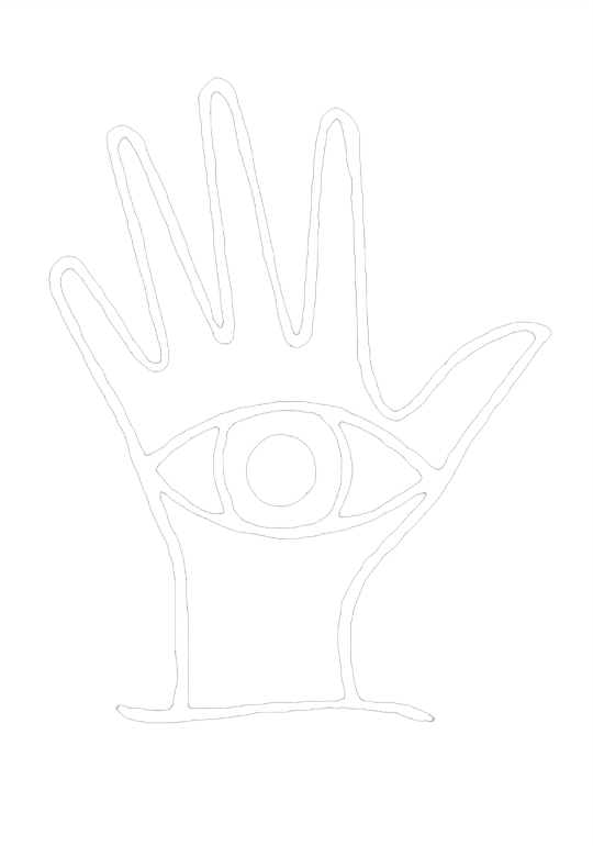

gill hand shirt
eric gill’s device c.1906, Eye and Hand—the original was a wood engraving. gill’s take on ‹hamsa› or perhaps ‹oculata manus›. for more info vide ‹eric gill on typography›.
1 note
·
View note
Text

happy lupercalia!
image is warren chappell’s drawing from the dustjacket to The Natural History of Love by morton m. hunt [alfred a. knopf, nyc, 1959]. setting in frutiger’s linotype herculaneum—vide ‹punic curse›.
2 notes
·
View notes
Text
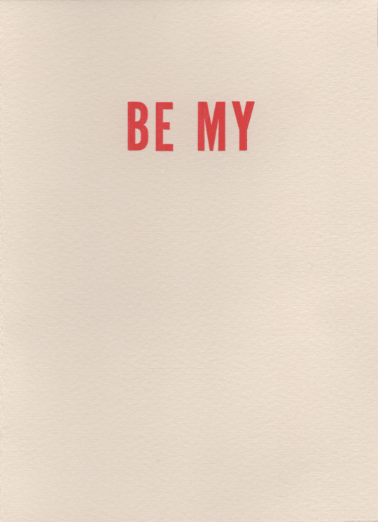
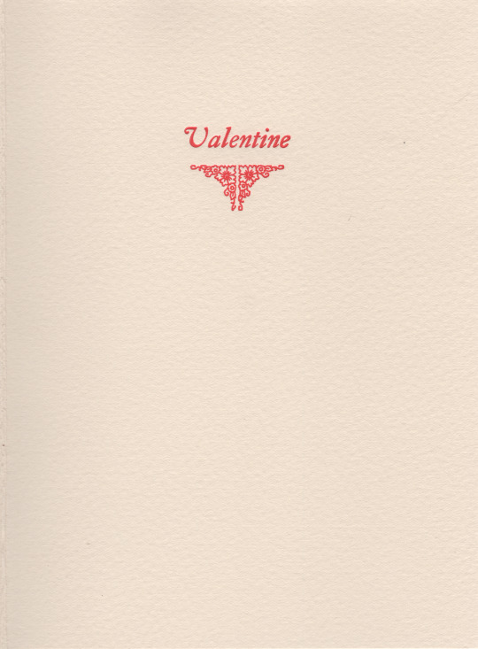
pure typographical valentine. cover set in alternate gothic no. 1 [atf 6]; inside set in caslon old style italic [lanston monotype 3371], finishing swag of ‹lanston corners› [lanston monotype 1209].
letterpress on somerset velvet, antique 250 gm.
2 notes
·
View notes
Text
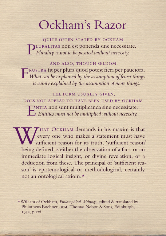
ockham’s razor[s]
set in monotype bembo—vide ‹bembismo›.
0 notes
Text

happy 236th!
george gordon byron, 6th baron byron, born this day (22 january), 1788.
text from peter quennell’s introduction to his Byron [collins, london & glasgow, 1959, p9]. set in monotype bell —vide ‹the letters of john bell›.
8 notes
·
View notes
Text
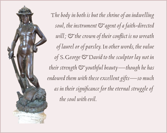
donatello
illustrated is the David cast in bronze for cosimo de’ medici, mid-15c, by donatello [donato di niccolò di betto bardi]; now standing in the bargello.
text from john addington symonds’ Renaissance in Italy / the Fine Arts [henry holt & co, new york, 1888, p138]. set in monotype blado—for details of type & composition vide ‹is a rose a Rose?›.
1 note
·
View note
Text

james wardrop tells us in The Script of Humanism [clarendon press, oxford, 1963, p48] of the cancellaresca testeggiata as written by the milanese gianfrancesco cresci: «It is not difficult to detect, in its contours and flourishes, the prefiguration of Victorian copperplate: less easy, perhaps, to evoke from them the serene and comely form, ‘Noble and nude and antique’ in Swinburne’s words, ‘castigata et clara’ in Petrarch’s, that the Tuscan saw in the pages of Horace.» the context for swinburne is his poem «Dolores»; for petrarch’s words vide ‹humanist eyestrain›.
set in a custom fount of bembo italic—vide ‹tagliente italic›.
letterpress on kitakata.
0 notes
Text
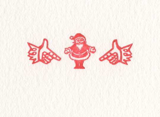
xmas sweetie!
2 notes
·
View notes
Text

happy saturnalia!
15 notes
·
View notes
Text
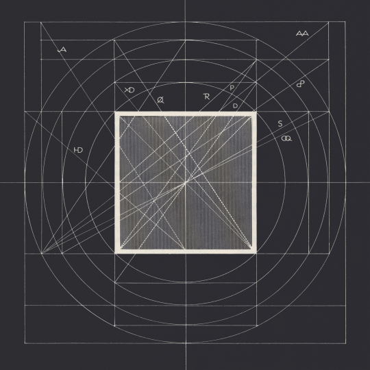
geometric proportion
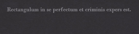
in the 1st illustration is set* an unattributed latin aphorism selected by wolfgang von wersin to inaugurate the 2nd chapter, entitled «Vom Rechteck», of his book Das Buch vom Rechteck [otto maier verlag, ravensburg, 1956, p18]. von wersin translates into german: «Das Rechteck ist in sich vollkommen und ohne Fehl».¹
the leading proponent of geometric proportion in typographical grid design, hans rudolf bosshard, speaking of irrational proportions tells us: «Wolfgang von Versin, der ihnen ein eindrückliches Buch gewidmet hat, glaubt an die ästhetische Wirkkraft der durch Zirkelschläge gewonnenen Rechtecke und zeigt dies an Beispielen von Architektur und Design auf.»² [Regel und Intuition, wallstein, göttingen, 2015, p30]. Das Buch vom Recteck details von wersin’s system of harmonious proportion based upon a series of twelve rectangles that von wersin terms orthogons. in the 2nd illustration von wersin cleverly derives the twelve orthogons in a composite diagram he calls die orthegon-scheibe, & explains: «Die zwölf Orthogone sind alle in einer Konfiguration von vier konzentrischen, auf ein Quadrat bezogenen Kreisen enthalten. Die einzelnen Orthogone sind durch ihre Diagonalen und ihre Zeichen dargestellt.» ³ [op. cit., p34.]
————
* set in monotype bodoni [lanston monotype 375]; letterpress on hahnemühle ingres, black.
¹ the rectangle is in itself perfect & without defect. [my translation] perfect & without defect seem the same thing—tautologous; but perhaps i’m misinterpreting.
² wolfgang von wersin, who dedicated an impressive book to them [irrational proportions], believes in the aesthetic effectiveness attained via rectangles derived from compass arcs, & demonstrates this with examples from architecture & design. [my translation]
³ the twelve orthogons are all derived in a configuration of four concentric circles drawn out from a rectangle. individual orthogons are denoted by their respective diagonal & symbol. [my translation]
#typography#proportion#geometry#wolfgang von wersin#hans rudolf bosshard#letterpress#typesetting#bodoni
1 note
·
View note
Text
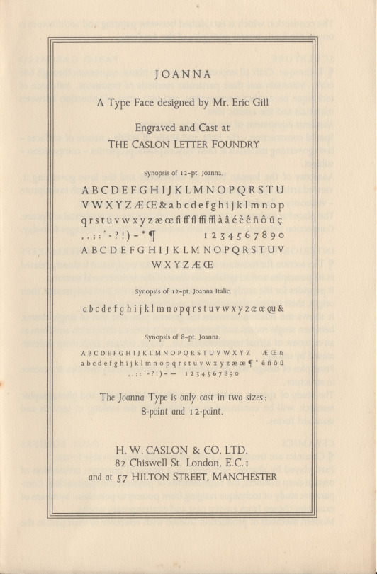
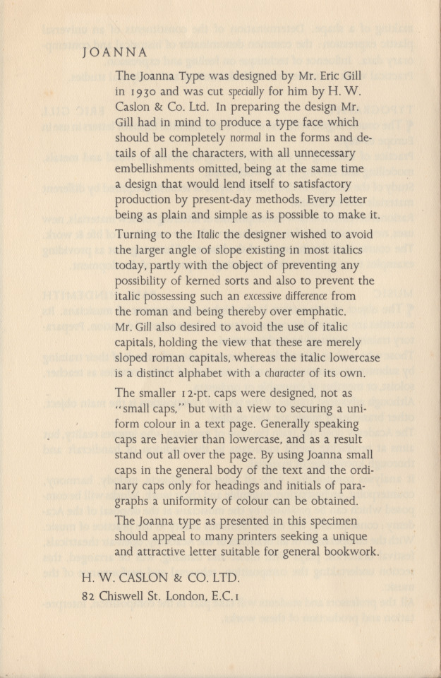
gill’s joanna
named for eric gill’s 2nd daughter, joanna (more often called joan), gill designed the joanna types in 1930, & had them cut by caslon in 1931, for use at hague & gill—printing office of eric gill & son-in-law rené hague (married to joan)—in two sizes, 8 & 12 pt (1st image). joanna is interesting for having lightly-sloped italic lower case that shares a single fount of lower-cap-height capitals with the lower case roman; this configuration is reminiscent of venetian renaissance practice—both scribal & printerly. in 12pt, gill provided a set of capitals fuller in height for display. first showing of joanna was gill’s An Essay on Typography [sheed & ward, london, 1931]—vide ‹eric gill on typography›. as indicated at the specimen close (lower, 2nd image), caslon offered joanna for sale to other printing offices, as well. monotype adapted joanna in 1937 in a range of sizes [uk monotype 478].
images are front & back of the folded single-sheet joanna specimen, issued by h.w. caslon co., london; n.d. but presumably 1931.
for examples of gill’s vision with joanna vide ‹work & property› & ‹gill’s trousers›. for comparison with digital joanna vide ‹life drawing›.
1 note
·
View note
Text

we may wish to know who first said it, but apt dictum from alfred forbes johnson. his next line reads: «This may very well be done in the case of Petrarch in the sixteenth century, of whom there were scores of editions.» [Periods of Typography | The Italian Sixteenth Century, ernest benn, london, 1926, p7.]
set in bembo italic—vide ‹tagliente italic›.
letterpress on johannot.
0 notes
Text

sweet vignette
vignette from a series deigned by prof. emil rudolph weiss for the bauer’sche giesserei, frankfurt a.m., in 1907. text set in elsner+flake sg weiss sb Italic swash, digital version of the swashed weiß-kursiv, designed by prof. weiss, & originally issued by the bauer’sche giesserei in 1928. for the weiß-antiqua vide ‹vase 2›.
#typography#emil rudolph weiss#vignette#typesetting#weiss-kursiv#bauer’sche giesserei#bauer type foundry
0 notes
Text
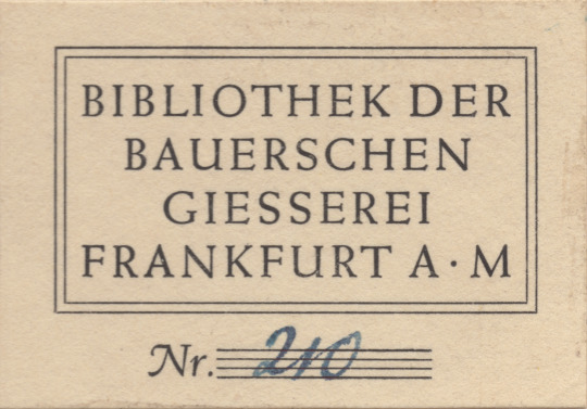
bauer bookplate
simple & tasteful typographical ex libris from the library of the bauer type foundry, frankfurt, germany. set in their weiss types.
i acquired the bauer type foundry library’s copy [after indeterminate journey] of that indispensable reference: A Treatise on Title Pages by theodore low de vinne; being the 1914, 2nd edition issued posthumously by the oswald publishing company, nyc. john clyde oswald, publisher of American Printer, after de vinne’s death obtained rights of publication to several de vinne publications, notably «The Practice of Typography» series. the 1914 oswald edition of A Treatise on Title Pages has a canceled title-page, & so was made up from sheets still standing at the de vinne press. the weiss types did not issue until 1928—cf. ‹vase 2›—thus giving terminus post quem for the volume’s entry into the bauer library.
#typography#ex libris#bauer’sche giesserei#bauer type foundry#theodore low de vinne#john clyde oswald
0 notes