#i will take E-Girl
Text
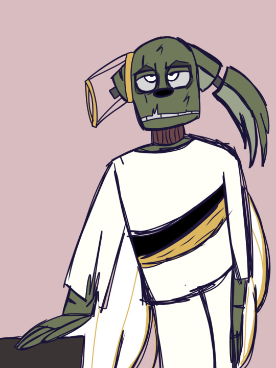
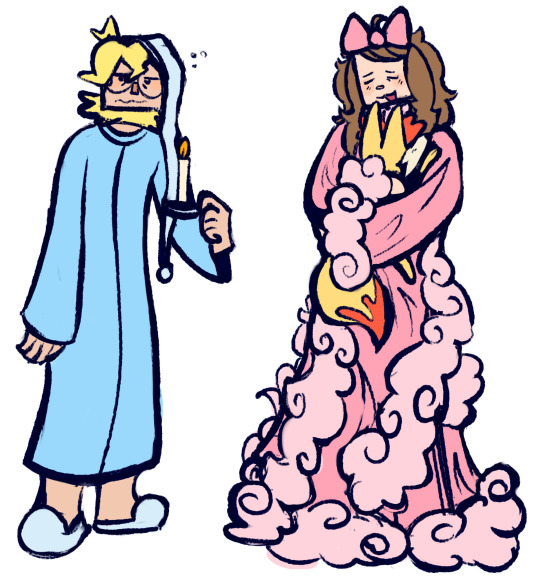
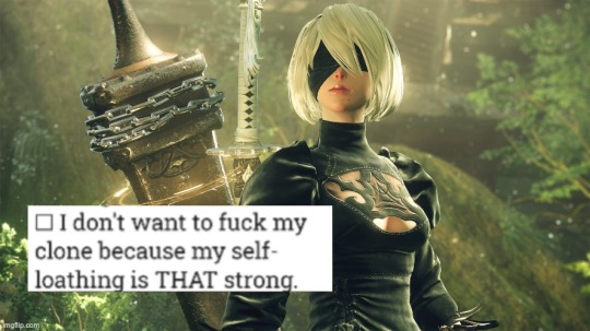
Springtrap considers himself many things, but an angel is not one of them.
For very important context: I spun an aesthetic wheel and got angelcore. It was either this or VSCO-Trap. Visk-Trap, if you will.
#costume#springtrap#anglecore#joke sketch#fnaf fandom#I'm spinning it again#he needs a more fitting aesthetic#i will take E-Girl
4 notes
·
View notes
Text
true pain is liking a character from a show that has little to no no fics/no people thirsting for the same person on tumblr😓🤞🏻
#true pain#i cant take it anymore#so unfortunate#flanaverse#midnight mass#the midnight club#anne with an e#anne with an e fanfic#the conjuring#michael langdon#netflix#good girls netflix#netflix cancellation#the society#so unfair
272 notes
·
View notes
Text

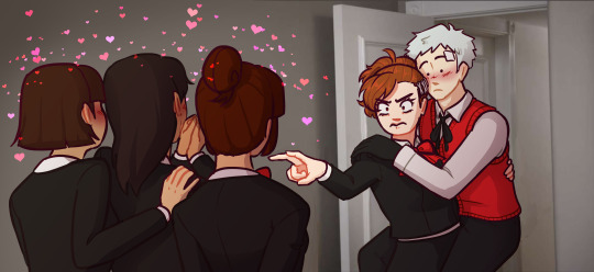
I'm not gonna lie when I started Persona 3 i wasn't particularly invested in Akihiko. Definitely wasn't planning on romancing him. Then I encountered the most insane piece of dialogue. I haven't been the same since. It haunts me.
the full dialogue under the cut:
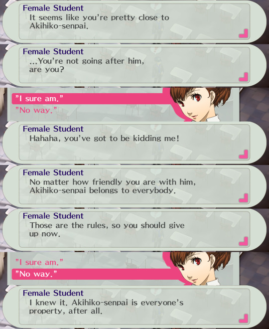
#my art#og post#highlight reel#persona#persona 3#p3#persona 3 portable#p3p#akihiko sanada#Kotone Shiomi#minako arisato#hamuko arisato#persona 3 femc#i think this counts as#akiham#i imply it anyway#going 2 date Akihiko deliberately to piss of those girls#i want to take my naginata to school and challenge them to armed combat#like come on. PROPERTY?? SHE CALLED HIM FUCKING P R O P E R T Y ??????#anyway. yeah this is my first playthrough. i know playing as femc/p3p for your first time isn't recommended. but uhhh i want be girl. sorry#come on if i hadn't played as a girl i wouldn't get this dialogue. i'd probably be still ambivalent to akhiko.#even worse i could have found another insane piece of dialogue from the fangirls#but since the male protag can't hang out with akhihiko i'd be left in the dark. unable to investigate further#anyway i've spent far too much valuable persona 3 playing time on this art. goodbye
976 notes
·
View notes
Text
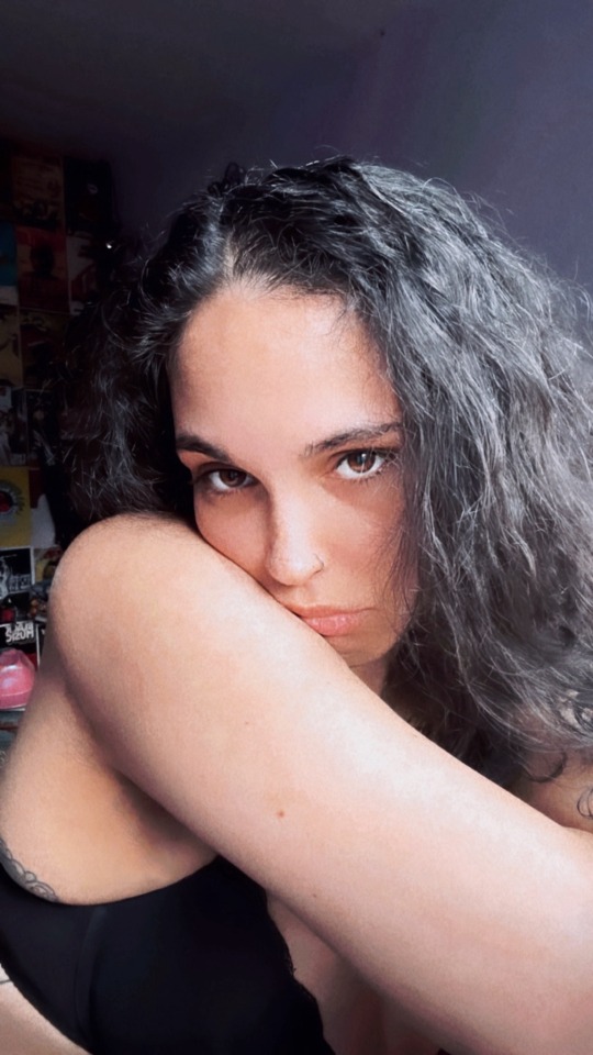
sick note 🤒
#point out my grey hairs and you’re D E A D to me#but fr#all i do is suffer#and take pictures of myself lmao#me#selfie#self#girl#my face#brunette#brunette girl#feminine#cute#pretty#pretty girls#cute girls#mixed girls#soft#soft feminine#soft girl#no makeup#no makeup selfie
69 notes
·
View notes
Text
We all know and love zutara's Hades & Persephone parallels. Complimentary opposites constantly being misunderstood as a captor/victim- badboy/goodgirl- edgy/sunshine trope despite significant nuances; being torn between familial and spousal devotion; ruling over their kingdom as equally powerful forces of nature... Good good stuff.
But may I humbly suggest that we have been woefully neglecting the sheer dramatic potential of taang x Eros & Psyche.
#lonely rich girl reduced to the sum of her physical traits x flighty boy of god-like power c'mon ppl#i feel there is something to be said here#the emphasis on sight and knowing somebody by their soul instead of their face??#turns out there's some animosity between H&P and E&P fans that I was not aware of until today#like yeah there's lots of bad takes on H&P floating around and E&P deserves more attention#but there are literally two cakes ppl#stop pitting two of the only functional marriages in this mythos against eachother!#it's literally mythology there is no 'canon' stop being annoying#zutara#taang#my posts#atla#other thought im chewing on is which mythological love story works for sukka??#Ariadne and Dionysus maybe??#OOOOOr Atalanta and Hippomenes?!?!#was this an excuse to get out my thoughts on greek mythology discourse? maybe#eros and psyche has been my favourite greek myth for nearly the last decade and i need ppl to know#fr context i highly recommend the overly sarcastic productions videos on yt!#zuko x katara#toph x aang#in this house we love Hades & Persephone and Eros & Psyche equally thank you very much
66 notes
·
View notes
Photo

In honor of the last day of this bit of Droughtula, I present to you Count Dracula, King of Vampires, Nosferatu, and Big Spoiled Baby Fit-Throwing Brat Bat as he no doubt behaved during his interim of getting addicted to Lucy Juice.
There is now a part 2 here.
#Sir you have an entire country to drink from all of them taking hard drugs for the common cold and you just have to zero in on this one girl#s p e c i f i c a l l y ?#absolute baby brat fit behavior#figured I'd get some silly stuff in before the Sept 17 entry#it's uh#it's a doozy#anyway#dracula#dracula daily#bat#Count Brat Bat
932 notes
·
View notes
Text
yknow sometimes the way trans women talk about testosterone and being on estrogen is indistinguishable from the way terfs try to convince afab people not to start hrt
this is not a criticism mind you, their experiences are their own and completely legitimate, it's just a matter of competing needs - they need a safe space to talk about their dysphoria and how testosterone makes them feel and i need to not hear about how i am destroying my body with hrt
ordinarily these things are pretty insular to transfem circles but since instagram has been feeding me transfem content i'm seeing it more and more and yet again the algorithm is fucking me
#ransomrambles#like a friend of mine in absolute genuineness told me how my skin was gonna stop being soft and my hair was gonna thin out#and she obviously wasn't trying to dissuade me from hrt .... but like ..... thanks for leading with that mate#with estrogen it's the - no downsides- people often say there aren't many downsides to taking e - save some erectile dysfunction#but when it's the other way it's - make sure you're really sure cause you're permanently ruining your body forever#like i get that - my skin feels so soft now - is an estrogen experience ..... but the reverse framing is not helping anyone here#that's just all you hear about testosterone hrt - a list of downsides you'll have to cope with#idk this isn't a fully constructed thought#like i said trans girls deserve the space to have that conversation#i just need to not be in that space cause it obviously hits me differently#but man the sheer volume of trans girls talking about the /damage/ t has done to them .... in dis tinguishable#the aside to this is also a lot of girls being like i realized i was a girl cause of xyzq#and the list is the same as the one my mother used to be like - see you must be a girl#so it's just tough#competing access needs are hard to manage#and that's why life is best on the curate your own experience webbed site
27 notes
·
View notes
Text


e&a
if i wanted to know who you were hanging with
while i was gone i would have asked you
it's the kind of cold, fogs up windshield glass
but i felt it when i passed you
there's an ache in you put there by the ache in me
but if it's all the same to you
it's the same to me
#everyone say hi blare!!#this is where anyone who has seen this posts and their story goes “huh?”#where tf is avia? why is ella kissing on a different girl#well to make a much more complicated story short#essentially this takes place before avia and ella get together and its all done in secret#blare is a long time friend and is from ellas hometown#when ella was in elementary school she moved to the town that e&a takes place in but she still sees blare during holidays and whatnot#but it had been a second since they'd seen each other and the two of them essentially form a friends with benefits situation#messy! yikes! it doesnt end well but eventually they stay friends#but this would be the very beginning of their romantic relationship#they also both use each other ella uses her as a replacement for avia and blare uses ella as a replacement for her toxic on and off bf#its a whole mess#e&a#daniella gracelynn#blare bier#dont be fooled#there is a tree but blares family is just the type to put it up before thanksgiving is up#this takes place on thanksgiving after ella and her mom visit their hometown#was writing a little blurb to accompany this weeks ago when i started this but i didnt finish it in time#might finish and post it later#and by later i mean real later cause you know me and my super consistent posts
62 notes
·
View notes
Text
Eve on the Ps2 version of the videogame of Wall-E is the equivalent of "we are just friends" and they are cuddling like
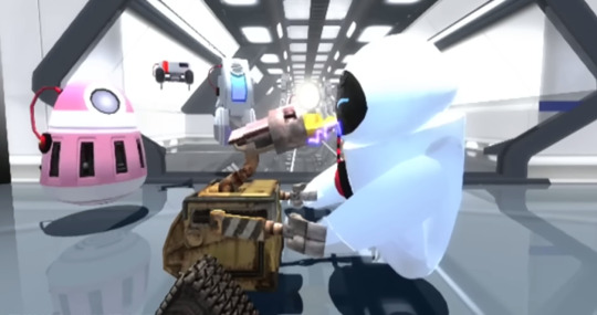
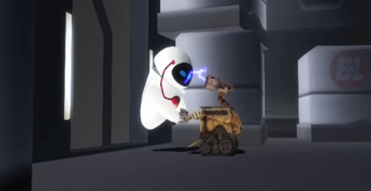
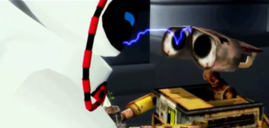
She kissed Wall-E about 3 times in the time they still werent considered a couple and that has me giggling like GIRL CHILL
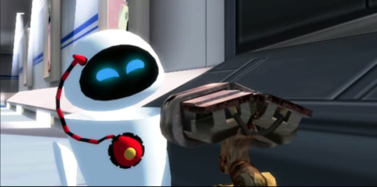
She aint playing around bruh in this version she is so flirty but isnt inlove with Wall-E (yet of course she falls for him on the garbage airlock)
42 notes
·
View notes
Text
Shout out to Z-A for reminding me how much I love this stupid series
#Pokemon#Pokemon XYZ#pokemon clemont#pokemon serena#Clemont Pokemon#serena pokemon#Pokemon anime#Me and who#Beauty sleep vs deep slumber#WHY ARE CLEMONTS PJS LIKE THAT#SIR.#n e ways introducing y'all to the fucker I took my name from#Also hot take but people who shit on Serena are huge red flags#Like she's so sweet and funny and talented and cool#But yeah your right she sucks cause God forbid a teenage girl has hobbies and a crush.#Sigh
28 notes
·
View notes
Text
i got this embroidered a couple hours ago and this is how im looking in my chair while drawing ted rn
#THISIS SO SILLY IM GENUINELY GIGGLING RN#im not tagging this as anything and im putting that doodle because i dont want this image to take up th e whole dashboard#GODDDD I DONT KNOWWW IM JUST SLIGHTLY EMBARRASSED BUT SOSOSO GIGGLY ABOUT IT RN#GIRL HELP!!!! THE ROT HAS CONSUMED ME#nooo face reveal... u are never getting that from me ever but i really wanted to share this because of how hard im laughing rn#that i can just wear this. literally insane.#AHEHEHEEE#IF I GET EVEN MORE EMBARRASSED LATER IM DELETING THIS LMAOAOO
142 notes
·
View notes
Note
The art style of Cloud Castle is absolute ass bro why are their eyes so big
Idk man it just looks.... off
I wish they brought back the og art style like Blue Scarab Hunt because that was gorgeous
Well if you’re referring to the book's artstyle as a whole, then calm down buddy the illustrations as a whole are pretty good all things considered (believe me some of the illustrations in the later books are waaaaayyyyy iffier)
But if you are referring to Danilo Barozzi’s illustrations in the book then uhhhhh… yeah I don’t blame you, I didn’t like the big anime irises either, she didn’t cook with this one,,,
The interesting thing is Barozzi also did pieces for Secret of the Snow and those looked fine (she did well enough that I have to squint to determine which ones were done by her). My guess is either she did a lot of the illustrations for the latter half of SotS and we just got used to it, or it’s because the artstyle of special editions 2 and 3 were more… experimental? Books 4 onwards developed a very specific… look for the artstyle that adhered very closely to the main book illustrations of Spanish Dance Mission onwards, thus the illustrators had to follow suit, resulting in whatever looks off to look especially off.
(Even with this set of pictures, I’m only about 70% sure these are Barozzi’s because of how alike yet different the styles are from each other in the book. The first one could be Barozzi’s, but it could also be Giuseppe Facciotto’s, since he also did illustrations for SotS and his stylization means he sometimes puts the eyes really close to each other in a way that’s weird but still makes sense somehow.)
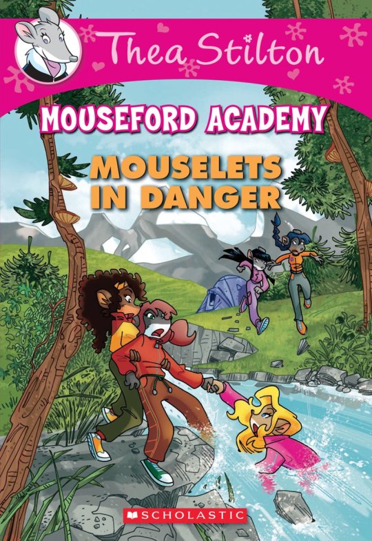
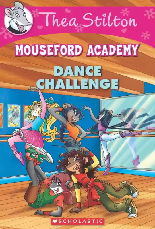
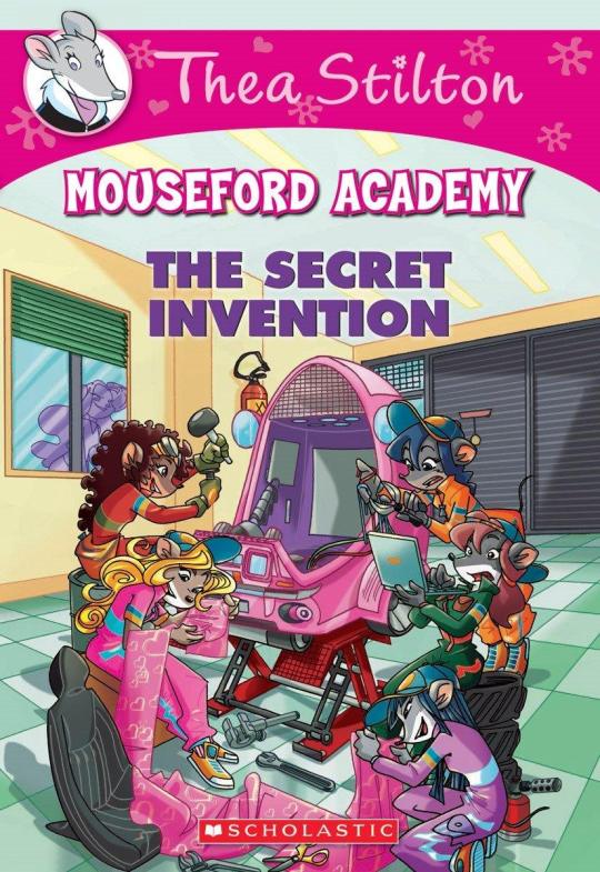
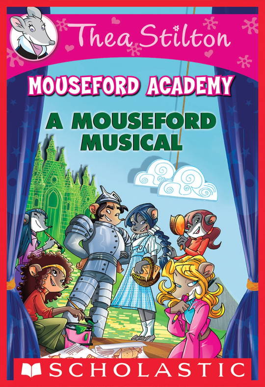
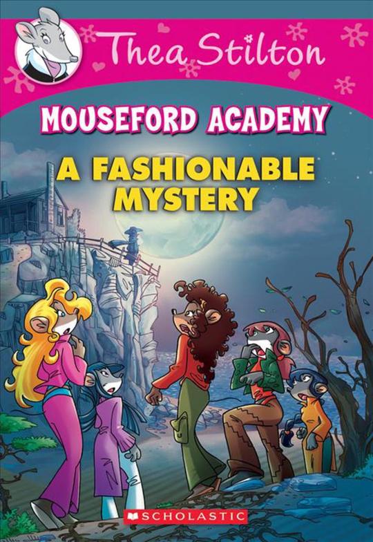
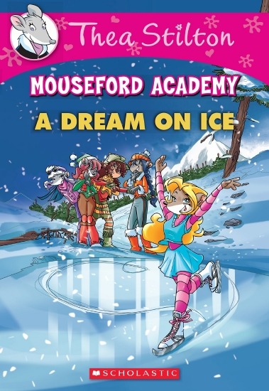
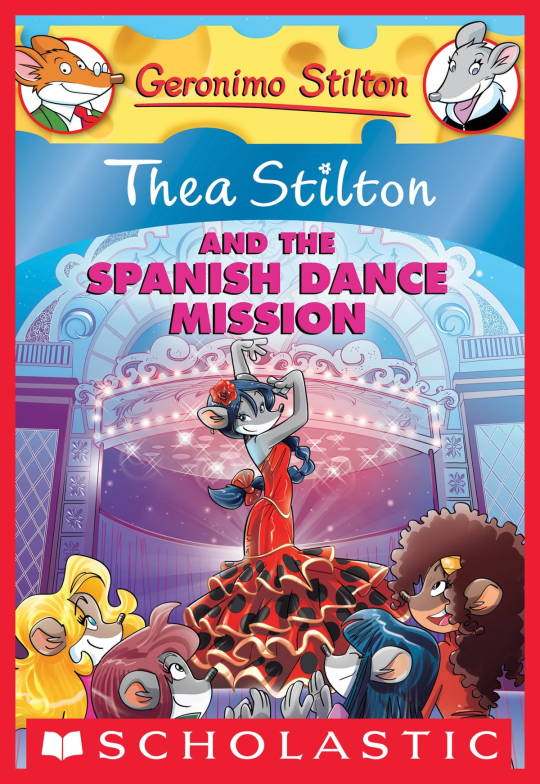
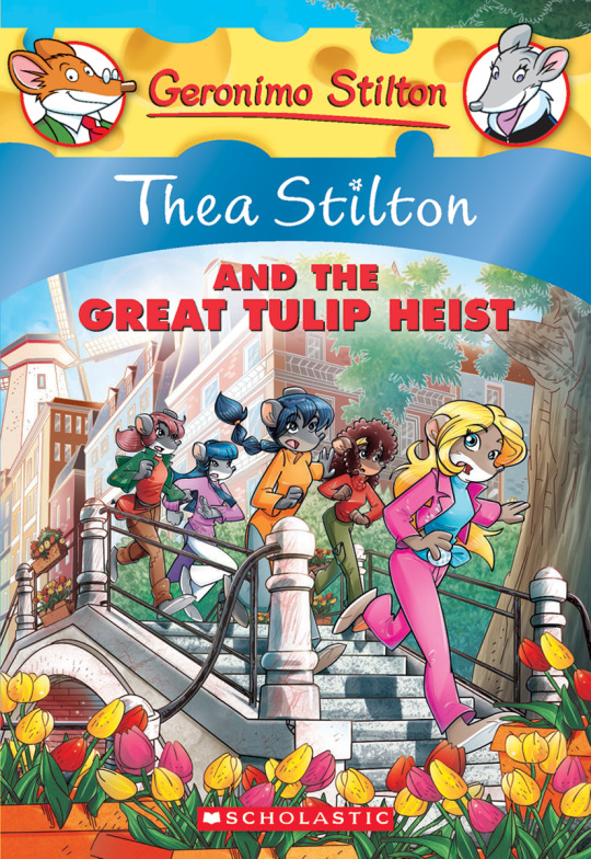
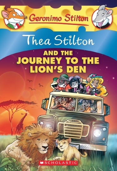
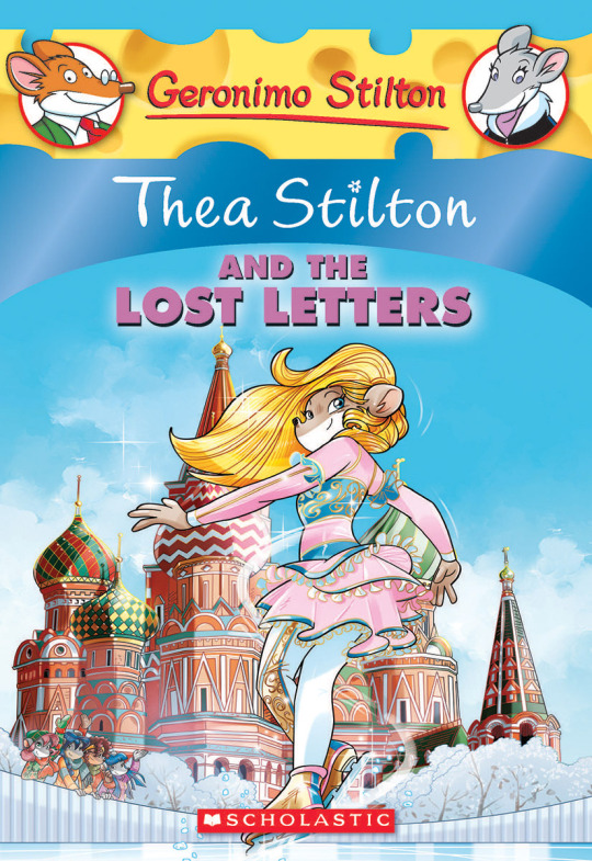
On the contrary, books 2 and 3 (and I would probably even include book 1 there) had a more experimental look to the illustrations, which seems to be based more on (and this is just a theory of mine) Giuseppe Facciotto’s iconic work for the covers of Mouseford Academy books 2-12, 14, 15 and 17 in the English books (he did waaayyy more covers for the Italian Mouseford books— he was basically the cover guy for the Mouseford books for a WHILE) as well as the books from Spanish Dance Mission to Lost Letters. If you’re wondering why those covers go as hard as they do, then now you know why.
(These aren’t all of Facciotto’s works for the covers we know in English but you can see that he popped off <3)
But yeah as you can see with special editions 2 and 3, the art direction seems to be heavily inspired by Facciotto’s artstyle.
However, when Barbara Pellizzari’s works became the aesthetic poster child of the books’ brand, that was reflected in the illustrations and how their aesthetic changed, as seen in the main books and how they look currently, special editions 4-9, and the Treasure Seekers trilogy.
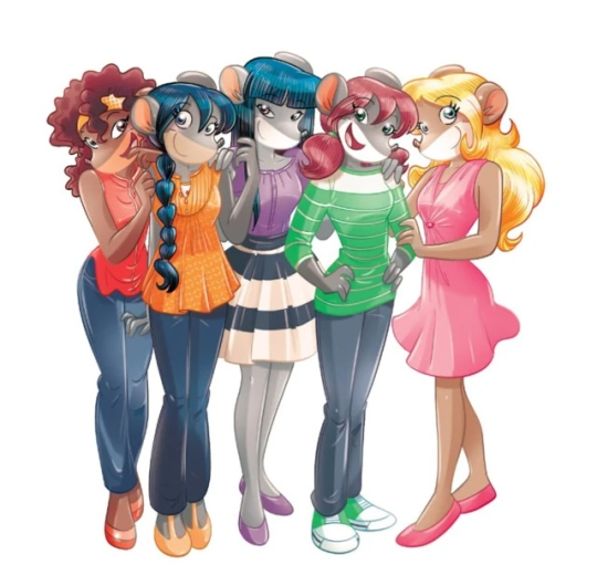
This new profile thing of the girls? This was done by Pellizzari (coloring was done by Flavio Ferron), and thus it became the main reference for how the girls look in the book’s illustrations.
And it’s not just in the general direction to the artists for how to draw the Thea Sisters, but also in the direction given to the colorists. Alessandro Muscillo was the colorist for the special edition books since book 1 and the Treasure Seekers trilogy, and you can see that the direction for the style varied through books 1-3, like maybe direction was experimenting with the mood the illustrations were to convey, beginning with the cartoony and bright colors of book 1, easing into the more grounded and layered palettes of books 2 and 3
Then book 4 was when they transitioned to using digital art /j
I jest, but seriously book 4 was the debut of the coloring style we end up keeping for the rest of the special editions and for all of Treasure Seekers, which is very… bright :D
(I would show more picture examples but I manually took pictures of my physical copies for the Cloud Castle and SotS illustrations and gwuh I’m too lazy to grab my entire collection just to take pictures,,)
Bright as in like… the colors are very defined and saturated. I dunno how to describe it, but when you see it, you get what I mean. It’s very bright and pretty and colorful and it stands out. There are still variations that happen on occasion (Star Fairies in particular uses a good dose of airbrush for the lighting and shadow effects, and Crystal Fairies looks like someone had a bit of fun using sparkle brushes), but other than that, it’s very bright. I don’t hate it, but I do acknowledge that yeah, if I was introduced to the series when it had fully transitioned to the new style, I never would’ve gotten into the series in the first place, because the older books had something that didn’t make it feel specifically catered to girls. The colors were bright, but not too bright. Colorful, but unified. They weren’t that complicated, and they didn’t have to be because the colorists (plural, there were at least 3 per book once upon a time) were popping the hell off with the colors they were given. But y’know, the newer books’ consistent style did give me a good spot to practice drawing mouse furries so I’m not complaining too much about the newer style, haha.
(Tiny baby E’s (it’s literally from 2020 what’re you on about mate) her first mouse Violet drawing using Barbara Pellizzari’s artstyle in Treasure Seekers 1 as an anatomy guide!!)
With that said tho, yeah I miss the old books -m- dunno if it’d fit the aesthetic of the special editions but m a n we could’ve had it and it probably would’ve looked cool
Also the illustrations go way harder in the older books, like Prince's Emerald? I've talked about Prince's Emerald and how it goes hard before, and I still stand by it and say that it does in fact still go hard
Maybe it won't fit the uh splash of color they gave the hardcovers, but imagine they grabbed Giulia Basile's coloring work for the graphic novels and used that as sort've a basis for the coloring style of the hardcovers. Not exactly the same-- would probably still add a touch of whimsical watercolor and/or paint to the very cel-shaded style, but we could've had something pretty dope -m-
Anyway that's my ramble simultaneously defending the hardcovers' artstyle and reminiscing on what could've been haha
#geronimo stilton#thea stilton#thea sisters#questions with e#rambles#the style of the older books is gorgeous but the main thing I'm wondering is can it pull off fantastical whimsy#that's the main thing i dunno if it can do (i would love to be proven wrong tho)#the style is so grounded that i'm wondering if it can pull off what the hardcovers needed it to do#which is convey the otherworldly fantastical thrill of exploring the fantasy worlds (which uh the newer books were able to do but#my main gripe is that fantasy and reality are near indistinguishable in vibes coloring-wise#sure there are sparkles and stuff is more saturated but the girls' dorm in book 4 still has the same-ish feel of the land of clouds#i dunno what it is. the bright colors just feel mundane somehow and don't take a shift when returning to reality)#looked at my books again and i think it might be the fact that the later books have no grounding color?#compare book 3 to book 5 and you'll see it the most distinctly methinks#the newer coloring style doesn't have a color that grounds the illustrations' palettes and thus everything's always bright 100% of the time#the girls' colors are always at their most saturated#like they're always under broad daylight in terms of lighting#it's not eyebleeding or anything but they don't look affected by the lighting in the setting they're currently in#and the result is it looks.... meh?#we get so used to the bright colors that they end up looking meh somehow#i'm not an art expert by any means this is just my observations as someone with a little too much brainrot
33 notes
·
View notes
Text


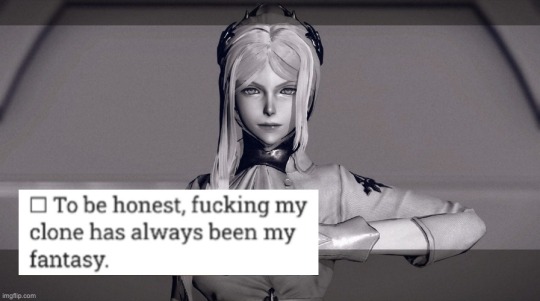
pod gave everyone this poll for science
#or maybe it was the red girls#“we must study the perversions of our subjects”#“We disagree. That's weird.”#“Those who would oppose us... are e n e m i e s”#also that screencap of adam haunts my nightmares so your welcome#for taking a hit for the team#nier automata
64 notes
·
View notes
Text
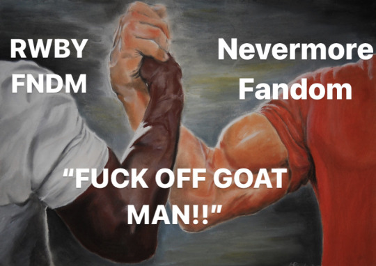
Let’s see here- an abusive, narcissistic prick who manipulates women and has a clear red raging bull design but the fandom calls him a “fucken goatman” regardless?

At the very least Adam was so homophobic that, in a roundabout way, he became the number one Bumbleby truther (“I will make it my mission to destroy everything you love, starting with her”, “WHAT DOES SHE EVEN SEE IN YOU?!”, etc etc), the fuck does Montyass got going fer him???
#also blake and ada are both bisexuals wh got manipulated and hurt by these two respective dipshits but ada got NOTHING on miss bellabooty#ada girl please i understand this is a realistic deciption of someone suck in a cycle of abuse#that as a victim of hostility you are drawn to all that u know and willing to take in any scrap of positive attention u can no matrer how fa#-fake whoops tag limit#BUT GIRLY PLEASE GET UP GET UPPP U CAN DO SO MUCH BETTER LIKE#LIKE YEAH I UNDERSTAND WHERE UR COMING FROM AND HOW U JUST HAD A HUGE MENTAL BREAKDOWN#AND HOW ANNABEL MADE IT WORSE BUT SAYING NO ONE IS GONNA TAKE U SERIOUSLY AND MONTYASS CAPITALIZED ON THIS#BY SEEMINGLY TAKING U SERIOUSLY AND NOW UR UNDER HIS SPELL#BUT HOLY FUCK!!! ARE U MAKING BAD CHOICES RN!!!#meanwhile Blake’s arc of growth past her trauma of domestic abuse and learning to trust others and love herself#the chef’s arent kissing bro this is cHEF’s W E D D I N G#rwby#bumbleby#blake belladonna#nevermore webtoon#ada nevermore#no i wont tag the ship name fuck that noise stay out stay out sTAY OUTTTT‼️‼️‼️
141 notes
·
View notes
Note
You don't have to...but I wanna see Whitty listening to music with headphones in, and Bf is just curious about what he's listening to. Also they're on a bench, and Bf is sitting next to him looking confused as to what he's listening to.
(My guess? It's a Corpse Husband song, since in my opinion, it goes that way for Whitty.)
sorry it's so sloppy and lazy and probably not quite what you wanted but here
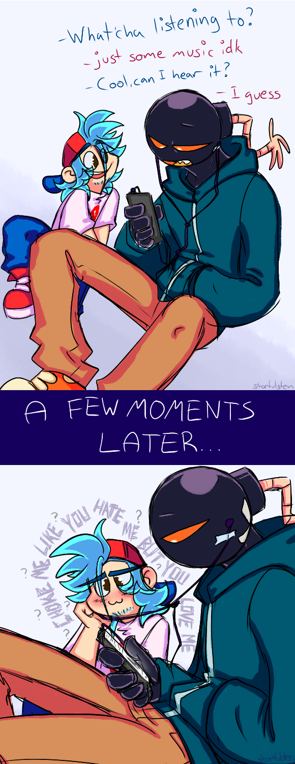
whitty's just vibin and bf is just hella confused bc yea.. hearing some dude that sounds almost exactly like your crush singing about choking and other such things sounds totally groovy and not all that awkward at all no sir lol
#bombeep#whittyxbf#not the shippiest but still ha#bf is crushing so it's still valid totally#couldn't think of much and maybe this wasn't what you had in mind but ye#it's something I guess ha#actually mostly doodled lazily like the day after I got the ask but#didn't know how to do the text so eh#just slapped some on there#also sorry for lack of bench and proper bg idk how to do that either rn so ye apologies#but ye anyways#idk what else to say atm#lyrics are from the song 'e-girls are ruining my life!'#it's a good song very iconic yessir#also any excuse to make vague references to corpse in relation to whitty is cool yes maam#not gonna rant about that rn though enough rambling sorry ha#enjoy or don't#take it or leave it#fnf au#fnf shipping#boyfriend#whitty#bf#I draw what I want#thanks for the suggestion#stay groovy friendo#also yes whitty has to literally tape the earbuds to his head bc he doesn't have any earholes to put them in lol rip
90 notes
·
View notes
Text
356 pages into royal assassin and im feeling the first rumblings 😎
#sorry to my girl robin hobb but i fucking hate this romance. the chemistry is not chemistrying.#assassin's apprentice#rote#books#just takes pages away from fitz's much more interesting relationships with burrich and patience and verity!!! get this woman#outta here!!!! honestly she deserves better!!!!!#give me maia and csethrio style high fantasy strangers to lovers or give me nothing. like he just likes her because shes a girl that h#e knows from childhood. thats it. thats fucking it. boring!#also isnt he cannonically only 15??? having sex??????? huh????????
18 notes
·
View notes
Last Seen Blogs
crabssss
crab safe zone

poop12368764357
Cooper. oof™

pepstop
PEPSTOP
snakefarm42
like a good neighbor
autocorreckt
AUTOCORRECKT