#i might color it later if i feel like it
Text
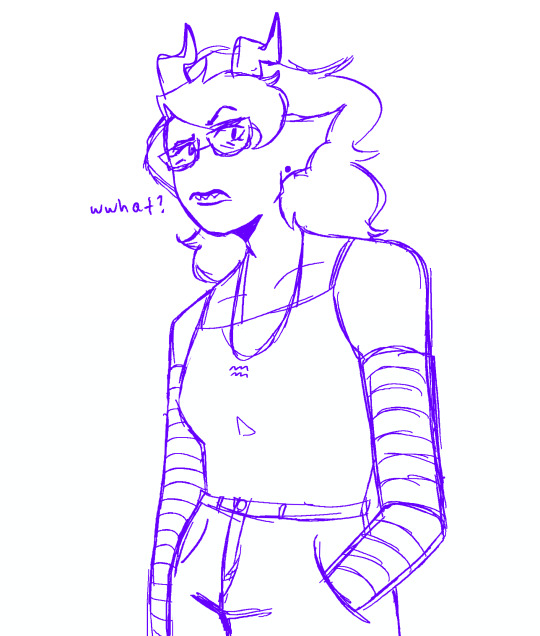
happy march first chat im so tired
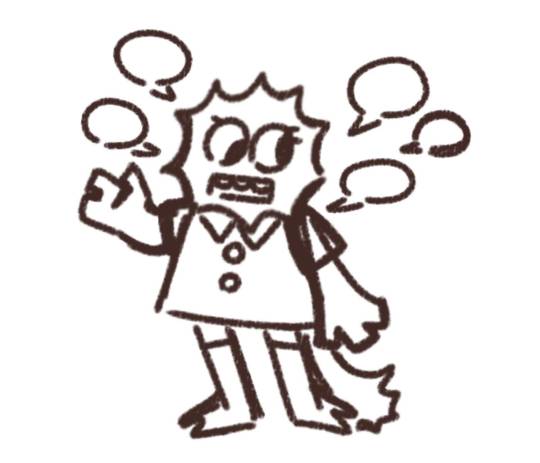
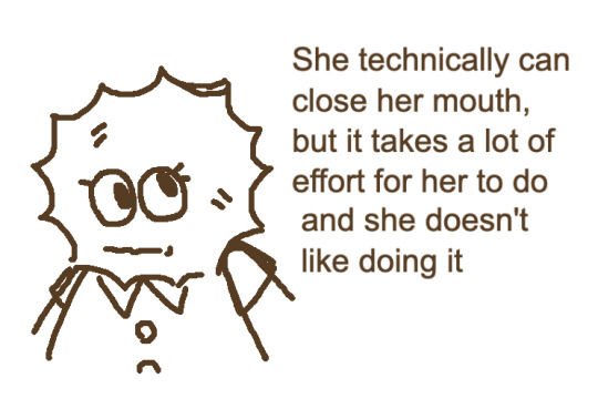
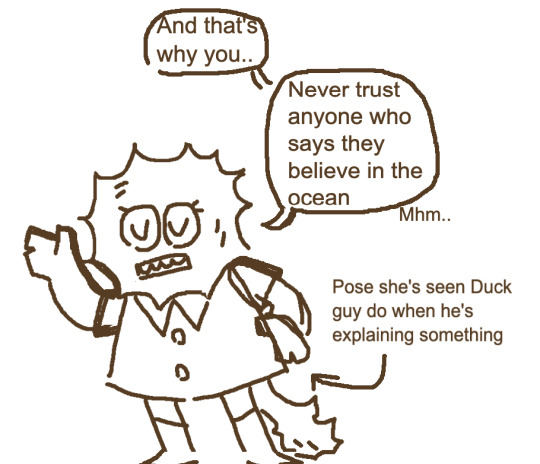
#i dont even know man#homestuck#eridan ampora#march eridan#im sorry#i think?#i dunno i actually kinda like the drawing tbh#i might color it later if i feel like it
196 notes
·
View notes
Text

Rosette🏵️
#jolyne cujoh#jolyne kujo#jjba#jojo's bizarre adventure#stone ocean#deliart#Look at me...trying out a more muted palette...#ok the red is quite strong. but look there are soft colors in there still#i might post a recolor later though since i feel like there are some other versions i wanna try out#also i might need to reopen comms since i am once again moving. and its gonna be an expensive one </333#a hashtag win for all that wanna commission me!#i intended to wait until all platforms become somewhat normal but it keeps getting worse omg. so ill just open them lmao#we will have to see if its before or after the move tho
2K notes
·
View notes
Text
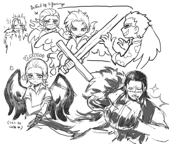
wowza
#jojos bizarre adventure#golden wind#vento aureo#pannacotta fugo#my art#jojo kimyou na bouken#fugo doodle page might delete later. didnt feel like coloring him cause my alcohol markers would smudge the ink like crazy#i dont even bother scanning anymore its so much worl for something that doesnt even look much better than a picture
193 notes
·
View notes
Text

croco-boy still on my mind
(and the seraphim and cross guild as well)
#op#one piece#cross guild op#crocodile op#dracule mihawk#buggy op#seraphim op#fanart#i super dont feel like coloring today but i might color some of them later#ive been reading te manga scans in engligh i didnt know buggy called crocodile kuro-chan (from kurokodile) thats so cute#some fan comics ive seen adapted the same naming pattern for mihawk calling him miho-chan (mihowk) it makes me wanna cry a bit#cross guild
305 notes
·
View notes
Text

Finished reading House in the Cerulean Sea and just had to draw the sillies 🥹
#house in the cerulean sea#arthur parnassus#linus baker#maroart#i might color this later if I feel like it
156 notes
·
View notes
Text
Today was rough. Have some FitPac Mermaid/Pirate AU.
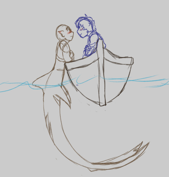
#It's just a sketch but I love drawing mermaids so it was nice#might color it later idk#I have a whole mermaid&Pirates AU in my head#I know what everyone is I have like a whole google doc for this#This AU was brainrot for like a week and a half in November#If people are interested I might do some more art of ideas I have#it's just a bunch of ideas tho#character dynamics really#but if you're curious for whatever reason feel free to ask questions!!#fitpac#qsmp#LCDoodles#LCMermaidAU
55 notes
·
View notes
Text
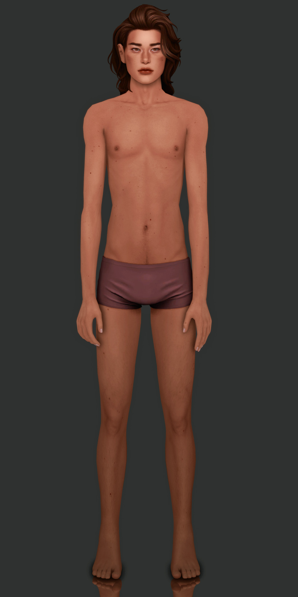

not many people online atm so i figured i’d show off theo’s freshly customized moles :) i'll post a proper close up of his face moles later because i'm obsessed, but for now here’s the full thing.
also this is how this background looks with the character page (this isn't the pic i'll be using, i was just testing things out). i'll probably alter the code to match the background rather than editing the background’s color, i think.
#the cas background was much closer to the page’s color before i turned my preset on </3#river dipping#theodore doe#echthroi#ts4#i might delete this later... we shall see#i just don't like posting theo when he's showing a lot of skin idk why...#ig it's bc i know how theo feels abt his body and everything so eyeeee am just like. everyone close your eyes.#but i want to show his moles off because they took me forever to place where i wanted#he has four!!! moles on his left palm that i love so bad and no one is ever gonna see them kjfdhnkfdjhn#i imagine matthias kisses theo's palm there all the time#…jotting this pose idea down expeditiously ✍️#i’m laying down for bed now so hopefully i get at least four hours tonight 🧎#also i only took test shots today while in cas so tomorrow i have to hop back in there to actually take the pics i want for the oc page#i want to do everyone’s but i just know i should just keep it simple with mattodore first#oh—also! downloaded a ton of clutter cc yesterday and today so i’m hoping i might actually get to that in-my-bag tag game soon#but yeah . . . nothing else to say and my eyes are watering from yawning so i’m going to sleep 🚶#everyone watch over theo for me while i sleep 🔫#gn!!!! <3
68 notes
·
View notes
Text
Ok here's Bunny
She is um. she's a fluffybird fanchild


She's very silly and exists in a sort of post canon au where everybody's ok and no longer affected by the narrative
Her name is actually Gwendolyn, but Yellow said she looked like a dust bunny when he saw her and the nickname stuck. Everyone calls her either Dusty or Bunny (her actual name is reserved for when she's in trouble now)
Some older drawings + a colored version:


#doodles#dhmis oc#Dust Bunny#(sure)#ocs#I like her :)#I might mess with her colors later because idk how I feel about them rn#dhmis au#I also might post more about the au at some point#I don't have a name for it yet but also I'm still figuring stuff out so that's ok#tumblr. where is the alt text tumblr#it's still there when I edit it#but the button to show it is only showing up on the first one#hopefully it's just like that on mobile or just me for some reason#art
322 notes
·
View notes
Photo

All sneasels use their claws to fight and be annoying. Except that one, it only bites.
#warden ingo#emmet#pokemon#they are so fun to draw#what if the reason hisuian sneasels are extinct#is because the johtonian ones are an invasive species#maybe it's one of the very few pokemon ingo doesn't like#which means emmet should catch one#this is for an au i guess?#i might get back to it later maybe not#i just like to draw them i don't feel like explaining everything i do ;^;#trying to get back into the habit of drawing every day#one day i'll draw a proper background and not just a generic gradient or a single color i promise
250 notes
·
View notes
Photo


“i don’t know how you guys live with yourselves.”
“one day at a time.”
it’s always sunny in philadelphia - season 1
#iasip#my caps#always wanted to make one of those screencap/cinematography posts that makes it look like a serious show#but go for sth a little different from the horror vibe#bc the show also lends itself so well to a heist/crime movie vibe#i hope this is good#i feel like this is either super cool or completely stupid#or maybe im just nervous cause ive never tried anything like this#i know usually ppl make them full size but i kinda like being able to play with the organization tbh#might change it for later ones tho idk what im doing here!!!#but im having fun#also so many guides on making gifs but none on formatting ur captions nicely. how do people do colored letters and shit#not that this one needed it i just wanna know the secrets for later
208 notes
·
View notes
Note
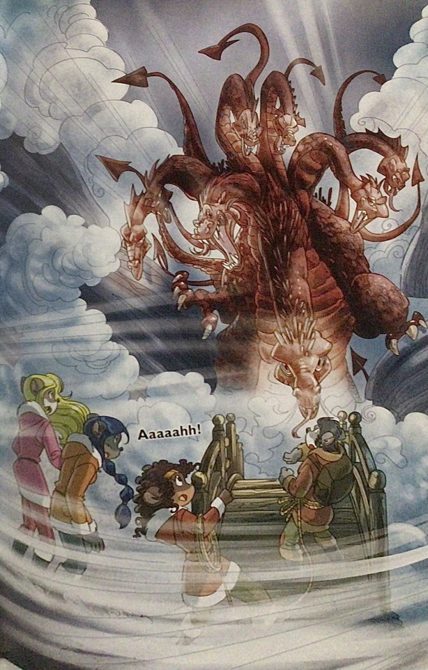
The art style of Cloud Castle is absolute ass bro why are their eyes so big
Idk man it just looks.... off
I wish they brought back the og art style like Blue Scarab Hunt because that was gorgeous
Well if you’re referring to the book's artstyle as a whole, then calm down buddy the illustrations as a whole are pretty good all things considered (believe me some of the illustrations in the later books are waaaaayyyyy iffier)
But if you are referring to Danilo Barozzi’s illustrations in the book then uhhhhh… yeah I don’t blame you, I didn’t like the big anime irises either, she didn’t cook with this one,,,
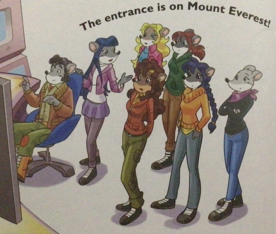
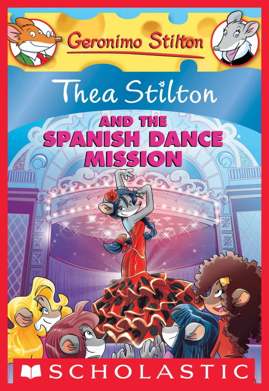
The interesting thing is Barozzi also did pieces for Secret of the Snow and those looked fine (she did well enough that I have to squint to determine which ones were done by her). My guess is either she did a lot of the illustrations for the latter half of SotS and we just got used to it, or it’s because the artstyle of special editions 2 and 3 were more… experimental? Books 4 onwards developed a very specific… look for the artstyle that adhered very closely to the main book illustrations of Spanish Dance Mission onwards, thus the illustrators had to follow suit, resulting in whatever looks off to look especially off.
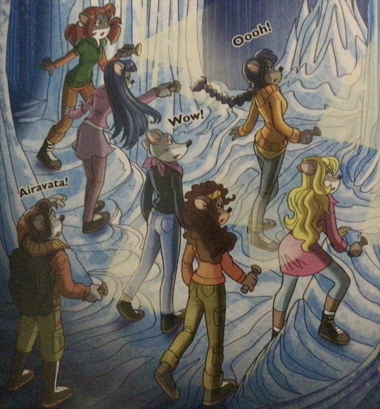
(Even with this set of pictures, I’m only about 70% sure these are Barozzi’s because of how alike yet different the styles are from each other in the book. The first one could be Barozzi’s, but it could also be Giuseppe Facciotto’s, since he also did illustrations for SotS and his stylization means he sometimes puts the eyes really close to each other in a way that’s weird but still makes sense somehow.)
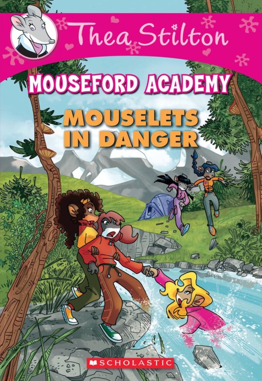
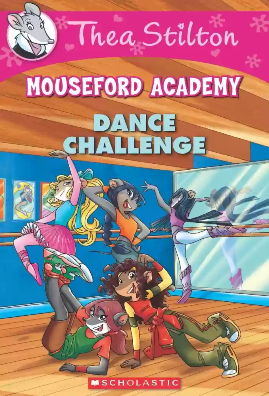
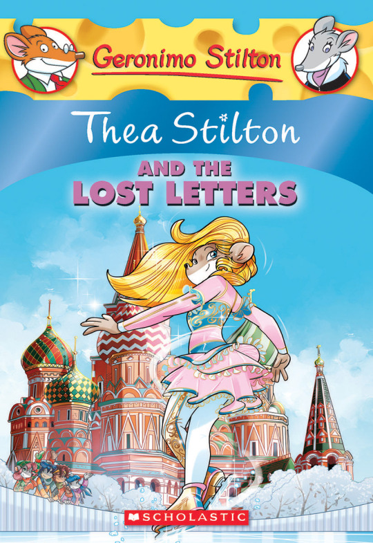
On the contrary, books 2 and 3 (and I would probably even include book 1 there) had a more experimental look to the illustrations, which seems to be based more on (and this is just a theory of mine) Giuseppe Facciotto’s iconic work for the covers of Mouseford Academy books 2-12, 14, 15 and 17 in the English books (he did waaayyy more covers for the Italian Mouseford books— he was basically the cover guy for the Mouseford books for a WHILE) as well as the books from Spanish Dance Mission to Lost Letters. If you’re wondering why those covers go as hard as they do, then now you know why.
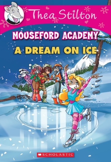
(These aren’t all of Facciotto’s works for the covers we know in English but you can see that he popped off <3)
But yeah as you can see with special editions 2 and 3, the art direction seems to be heavily inspired by Facciotto’s artstyle.
However, when Barbara Pellizzari’s works became the aesthetic poster child of the books’ brand, that was reflected in the illustrations and how their aesthetic changed, as seen in the main books and how they look currently, special editions 4-9, and the Treasure Seekers trilogy.
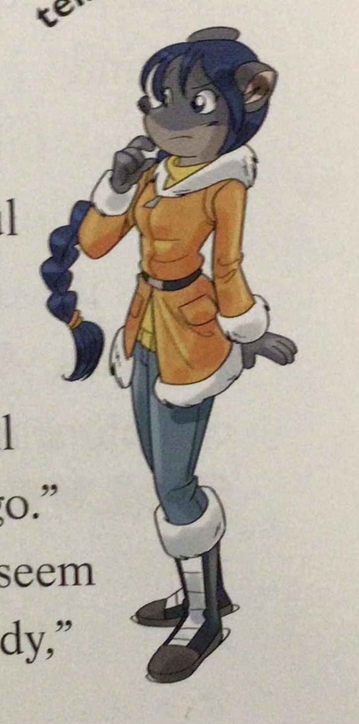
This new profile thing of the girls? This was done by Pellizzari (coloring was done by Flavio Ferron), and thus it became the main reference for how the girls look in the book’s illustrations.
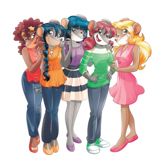
And it’s not just in the general direction to the artists for how to draw the Thea Sisters, but also in the direction given to the colorists. Alessandro Muscillo was the colorist for the special edition books since book 1 and the Treasure Seekers trilogy, and you can see that the direction for the style varied through books 1-3, like maybe direction was experimenting with the mood the illustrations were to convey, beginning with the cartoony and bright colors of book 1, easing into the more grounded and layered palettes of books 2 and 3
Then book 4 was when they transitioned to using digital art /j
I jest, but seriously book 4 was the debut of the coloring style we end up keeping for the rest of the special editions and for all of Treasure Seekers, which is very… bright :D
(I would show more picture examples but I manually took pictures of my physical copies for the Cloud Castle and SotS illustrations and gwuh I’m too lazy to grab my entire collection just to take pictures,,)
Bright as in like… the colors are very defined and saturated. I dunno how to describe it, but when you see it, you get what I mean. It’s very bright and pretty and colorful and it stands out. There are still variations that happen on occasion (Star Fairies in particular uses a good dose of airbrush for the lighting and shadow effects, and Crystal Fairies looks like someone had a bit of fun using sparkle brushes), but other than that, it’s very bright. I don’t hate it, but I do acknowledge that yeah, if I was introduced to the series when it had fully transitioned to the new style, I never would’ve gotten into the series in the first place, because the older books had something that didn’t make it feel specifically catered to girls. The colors were bright, but not too bright. Colorful, but unified. They weren’t that complicated, and they didn’t have to be because the colorists (plural, there were at least 3 per book once upon a time) were popping the hell off with the colors they were given. But y’know, the newer books’ consistent style did give me a good spot to practice drawing mouse furries so I’m not complaining too much about the newer style, haha.
(Tiny baby E’s (it’s literally from 2020 what’re you on about mate) her first mouse Violet drawing using Barbara Pellizzari’s artstyle in Treasure Seekers 1 as an anatomy guide!!)
With that said tho, yeah I miss the old books -m- dunno if it’d fit the aesthetic of the special editions but m a n we could’ve had it and it probably would’ve looked cool
Also the illustrations go way harder in the older books, like Prince's Emerald? I've talked about Prince's Emerald and how it goes hard before, and I still stand by it and say that it does in fact still go hard
Maybe it won't fit the uh splash of color they gave the hardcovers, but imagine they grabbed Giulia Basile's coloring work for the graphic novels and used that as sort've a basis for the coloring style of the hardcovers. Not exactly the same-- would probably still add a touch of whimsical watercolor and/or paint to the very cel-shaded style, but we could've had something pretty dope -m-
Anyway that's my ramble simultaneously defending the hardcovers' artstyle and reminiscing on what could've been haha
#geronimo stilton#thea stilton#thea sisters#questions with e#rambles#the style of the older books is gorgeous but the main thing I'm wondering is can it pull off fantastical whimsy#that's the main thing i dunno if it can do (i would love to be proven wrong tho)#the style is so grounded that i'm wondering if it can pull off what the hardcovers needed it to do#which is convey the otherworldly fantastical thrill of exploring the fantasy worlds (which uh the newer books were able to do but#my main gripe is that fantasy and reality are near indistinguishable in vibes coloring-wise#sure there are sparkles and stuff is more saturated but the girls' dorm in book 4 still has the same-ish feel of the land of clouds#i dunno what it is. the bright colors just feel mundane somehow and don't take a shift when returning to reality)#looked at my books again and i think it might be the fact that the later books have no grounding color?#compare book 3 to book 5 and you'll see it the most distinctly methinks#the newer coloring style doesn't have a color that grounds the illustrations' palettes and thus everything's always bright 100% of the time#the girls' colors are always at their most saturated#like they're always under broad daylight in terms of lighting#it's not eyebleeding or anything but they don't look affected by the lighting in the setting they're currently in#and the result is it looks.... meh?#we get so used to the bright colors that they end up looking meh somehow#i'm not an art expert by any means this is just my observations as someone with a little too much brainrot
33 notes
·
View notes
Text
(redesigns a character we've been using a consistent design for for over a year just because)
#bug fables#bug fables spoilers#bf muse#stuff i made tag#permanence is boring redesign your favorite characters now#thanks everyone who sent us a muse design to draw we might be leeching inspiration from you#we will make a color adjusted version for evprim muse Later when we feel like it
20 notes
·
View notes
Photo


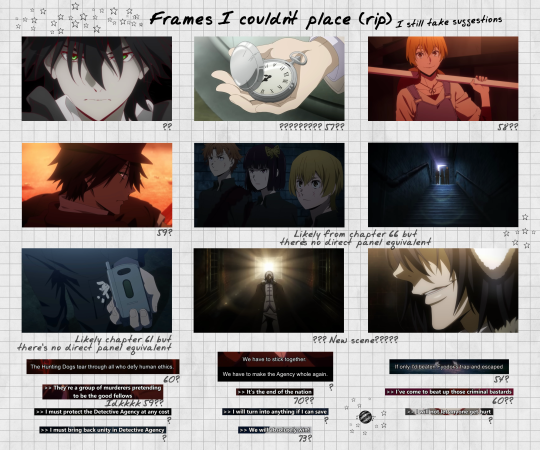
I thought about putting the bsd trailers and manga equivalent panels side by side because clearly there is something wrong with me (open the images to be able to read for better quality)
#bsd#bungou stray dogs#bsd s4#bsd season 4#mine#long post#← SORRY I HOPE YOU LIKE THE COLORS OF THE BSD TRAILER#Please appreciate#Saying I spent days over this is an understatement#Might change the caption later but like. the sentiment is true#Did you know Tumblr doesn't allow you to upload pictures heavier than 20MB? Ask me how I found out#I will probably upload a folder with the original quality later... I need to find an alternative to Dropbox because I filled up all the spac#I will try to upload a folder with the original quality images later...#I need to find an alternative to Dr*pbox because I've filled up all the space there 😪#And I generally try to avoid G*ogle services so Drive isn't an option either...#I feel like photoshop was going to come out of the computer directly to strangle me#Making this was just one “Could not complete your request because the scratch disks are full.” “Could not complete your request because the#Now Tumblr. Please don't break when posting this
184 notes
·
View notes
Photo

single fleshed coffin
#the locked tomb#gideon nav#harrowhark nonagesimus#crows art#gideon the ninth#tlt#EEK stole the colors from the illumicrate designs.sorry it was fitting#might mess around with this one later but!i feel okay enough to post it#its sloppy but i kinda like it that way?
235 notes
·
View notes
Text
“SO BASICALLY THIS KID GETS HIS POWERS BY SAVING HIS CHILDHOOD FRIEND AND FORMS A COMPLEX RIVALRY WITH HIM DESPITE THEIR BAD HISTORY WHICH LEADS THEM TO CONSTANTLY STRIVE TO OUT-DO EACH OTHER IN THE PRESTIGIOUS HERO SCHOOL BUT THEIR OBSESSION WITH THE OTHER NARRATIVELY COMES OFF AS ROMANTIC SINCE THEIR DYNAMIC HAS AN OVERWHELMING AMOUNT OF PARALLELS TO OTHER CANON COUPLES THROUGHOUT HISTORY AND—“
#resisting the urge to tell people I just met that Hori drew them as Godzilla and Mothra who are canonly the King and Queen of the Monsters#that the tarot cards for vol 33 have bkdk standing in The Lovers position#that Deku’s favorite meal is katsudon.. like KATSUKI’S NAME#and that their eyes are complementary colors#Toga’s words of ‘You wanna be the person you love’ when Ochako is asking ‘what would Deku do?’#ONLY FOR DEKU TO ASK ‘WHAT WOULD KACCHAN DO?’ and constantly mimic him#that the 2nd User used ‘hokan’ when saying ‘The one who can complete Midoriya Izuku now is…’ THEN BAKUGO APPEARING IN THE SKY LIKE AN ANGEL#those official rings that have quotes from characters saying things to Deku but DEKU’S RINGS are something said to Bakugo only#’You looked like you needed saving’ and ‘I spent my life chasing after you’#that Deku said ‘I can’t imagine a world in which Kacchan doesn’t exist’ in a light novel#and Deku KNOWING Bakugo had a fever just by how he acted and checked by touching his forehead-#only for Bakugo to angrily check DEKU’S forehead later with ‘You’re burning up too idiot’ IN THE TENT FROM ANOTHER LIGHT NOVEL#AND THE FACT THAT couples in mha LOOK LIKE bkdk… Bakugo’s parents resemble them- Shindo and his GF look identical to them-#Toga and Ochako have the sharp eyes/round eyes thing too !!#the fantasy au ending song was WRITTEN for them as said by LiSA herself#‘I imagined what it would be like if Izuku were singing his honest feelings to Katsuki. This is a song dedicated to Katsuki from Izuku’#and in all the official art from Hori for that au Deku and Bakugo are wielding the same sword from All Might broken right down the middle#*out of breath* there’s a million more but bkdk are always shown side-by-side drawn as equals two halves of the same whole#’win to save save to win’ you know???#I’ve said this already but this story started with them and it will END with them#bkdk#dkbk#bakudeku#dekubaku#:’)
347 notes
·
View notes
Text

swordsmachine saturday
[please reblog my art if you like it]
#ultrakill fanart#ultrakill#swordsmachine#:3#ghosttartt#sillay. i need to be this robot NOW#might color this later if i feel like it ^_^
59 notes
·
View notes
Last Seen Blogs

koreabd
Untitled

prayersforpalestine
Prayers for Palestine

ju-noexiste
aj

stuffdads
Untitled

tttoru
しくはっく