#i hope you all love them as much as i do
Text
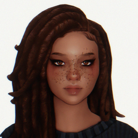

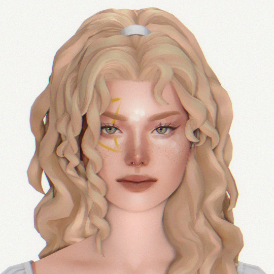


SIM DUMP #1
from left to right: alex, norah, alysia, sade
hair, genetics, makeup, & tray files included
download: sfs
tou: please do not change their genetics if you're going to post them. you may use them as a base for personal gameplay. tag me if you use them!! i'd love to see them in action.
#ts4#sim dump#simblr#sims 4#ts4 edit#ts4 gameplay#the sims#sims 4 edit#ts4 pictures#the sims 4#ts4 sim dump#i hope you all love them as much as i do#MWAH#if the files are too big you can leave out anything from the sliders folder or the adult clothes folder#a few of them may have an outfit but a lot of my adult clothes are merged and i didn't want to include the giant merged file LOL#i tried to read the tou of all of the cc but i may have missed some and i apologize if i did!#my dwnlds
38 notes
·
View notes
Note
Considering Yellow just came out, I'm curious how you interpret Justice!
YEAH IM FINALLY GONNA ANSWER THIS ASK FROM ALMOST TWO MONTHS AGO BECAUSE IM FEELING GOOD
Ok so I don't really know how to start so to get things going I'll begin with some pictures of them

I have to say, they give me SO many feelings. I originally started work on them long before I even knew what undertale yellow was. My first attempts at drawing them (which you can see in the top left that were used for reference) were done back in June, but I was planning things for them several months before.
I remember them actually being pretty much the very first fallen human who I felt motivated to make something with, because I saw a comic of someone's own interpretation of them. I noticed how in that comic, they went to Mount Ebott intentionally, for the other humans or something, and that was sort of the beginning of my inspiration, but I felt like I could do more with it. So, starting off with that I kinda built on it. I wanted to do something different from what I'd seen before, where they wanted to get justice on the monsters FOR hurting the humans. I remember someone saying something along the lines of them thinking justice was a little bitch, which of course was a valid interpretation, and that's what made me sorta go in a different direction.
For me, I saw justice as someone who would've wanted justice for the MONSTERS, from the very start. They were the kind of person who didn't really believe the legend of humans and monsters, but of course knew Mount Ebott was a very dangerous place. And, yknow, believed monsters were just a legend, they loved to think about the fact that if monsters WERE real, they were probably trapped unfairly. Think about Chara for example. Though they were human themself, they still hated humanity, and felt connected to the monsters. They wanted the monsters to be free and to go against the humans. I imagine justice to have been something like that. Not as much hatred for humans as Chara maybe, but still knowing of all the bad that humans had done, and, being an edgy teen, felt genius for the concept that this ""old """"silly"""" legend"" would probably have been biased in favour of the humans. (which they were actually right about. Good for them 👍🏾)
Am I explaining this correctly? I'm not sure if I am lol
So anyways, yes my justice interpretation very much did not want justice on the monsters once they discovered the legend was true, but rather was very much on the side of monsters getting justice on the humans.
Let's see, what else is there... Ah so as I was explaining before, seeing that comic also sparked the idea for me that they went there looking for someone. They'd usually never even get near to Ebott, however, they end up having to. Ok this part is like it's own separate infodump so like take a breath. So this all ties in to one of my other fallen soul interpretations, integrity. I won't get too into them right now because that is like a WHOLE OTHER CONVERSATION, so for now I am going with the BARE ESSENTIALS. Justice went there specifically to go look for integrity, because in my little interpretation thing, they're siblings. I'll show some quick things about them then straight back to Justice I prommy

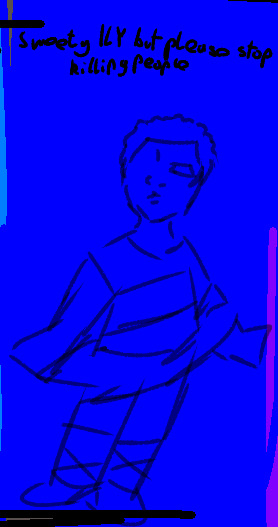
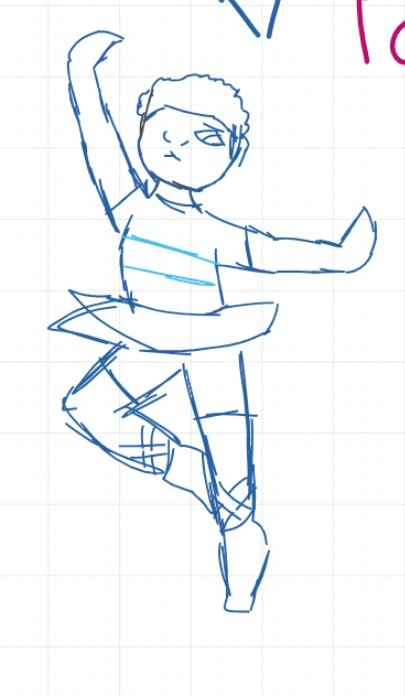
Their name is Leo (I don't have a name for justice yet I'm so sorry Leo is like the only human I've named so far), and ended up on Ebott after a stupid dare by the rest of their ballet class. So anyways after justice finds Leo is like. No where at all. They have to go on over to Leo's dance class cause that's the last place they'd been and ask around the other kids to find out where their 10 year old sibling was because they'd been FUCKING MISSING FOR LIKE SEVERAL HOURS only to find out the other kids left them on MOUNT FUCKING EBOTT, where multiple other children have all DISAPPEARED upon going there. So now justice gotta go to death mountain to find their lost sibling no big deal
I feel much more nervous about talking about my fallen soul interpretations now than I would've, like, four months ago, simply because the presence of uty has had such a grip on the fandom that people have kind of accepted it as canon. I think it's actually a really stupid and petty thing to mad/sad about, because a lot of effort was out into it, and I'm sure it's very very good, but I just, well I guess we all just whish we were the best, right? I'm scared yellow will completely overshadow any other existing interpretations, and people love it so much, they won't care about my own. I REALLY hate myself for this, and I just want to say I think you should all keep loving yellow! It seems really good! This is just my own dumb fear shining through haha
But anyways, enough of that! I'll explain more about the souls another time because if I keep going on right now I might become physically incomprehensible. There is so much more about justice that I'll dump on you all another time, trust me, I just hope you all like what I've got so far ❤️ thanks :)
#ITS INFODUMPING TIME#asks#you dont even KNOW how long i have been wanting to talk about them#they are EVERYTHING to me#EVERYTHING#IT FEELS SO GOOD TO FINALLY GET ALL THIS OUT#i hope you all love them as much as i do#i have been waiting for like a YEAR to tell people their story i am so happy about this#ive just not even had the motion to until this VERY moment so i dropped EVERYTHING to come and write this and have not taken a single break#-since i started writing#undertale#utdr#ut/dr#bogos i binted#integrity soul#justice soul#yellow soul#undertale yellow soul#undertale justice#undertale fallen humans#fallen humans#undertale human souls#i can finally rest#me being a little bitch about everything#<i hope it doesn't come off that way but i kinda just use this tag when i say like slightly negative things about anything because im not-#-sure if what im saying is mean so i ise that tag as a way to say#''if this is mean i am so so so so so so sorry''
27 notes
·
View notes
Note
What do you like about the Diasomnia boys if I may ask?
I always love hearing about the different reasons people enjoy characters.
I mean, c'mon. he has split custody over Sebek okay
also, Lilia in particular has maybe the best timeskip character development of all time
#art#twisted wonderland#twisted wonderland spoilers#twisted wonderland episode 7 spoilers#twisted wonderland book 7 spoilers#twisted wonderland episode 7 chapter 4 spoilers#twisted wonderland book 7 chapter 4 spoilers#stage in playful land#i hope this is legible whoops#anon i am sorry but you made the fatal mistake of asking me to talk about diasomnia#insert 'i just think they're neat' jpg#i do like the other characters a lot but they are definitely my favorites#they just hit a lot of my favorite things in characters i guess!#yes even you sebek even though you keep shrieking NINGEN at me#(it's okay he gets Character Development™ later)#and their dynamic! it's great! these guys frikking love each other SO much and they WILL have terrible terrible angst about it#ohoho delicious#give me all your emotional hangups baybeeeee#also somewhere in there i went from 'i like them all equally (but lilia is the most fun to draw)'#to 'lilia is absolutely my favorite (and still the most fun to draw) (EVEN MORE fun now thank you swishy ponytail!)'#(it was probably when his candy coating got a little scratched and whoops all the tragedy fell out)#(where's that 'get loved loser' post because i need to staple it to lilia's forehead)#i am extremely bad at putting things into words so please don't ask me to explain it any further#just know that the diafam is everything to me and if we don't get more episode 7 soon i'm going to crumble into dust and blow away#we'll be getting the crowleytimes on monday and maybe there will be. idk. some foreshadowing or something in his groovy#probably not but LOOK i'm desperate
3K notes
·
View notes
Photo
#selfie bee#me telling a coworker who I have been working with for 4 months and whose name I do not know about my toenails#i'm sorry Tobias (?? Paul ??) it was the only topic I could come up with after I already told you about the big bird I saw in 8th grade#FRIENDS how are you!! :) how has the new year been so far!!#did you have a lot of snow on christmas!#we did and it was really fun! I had a very bad cold so I just watched the snow from inside but that was good too c:#do you have any plans for the new year?#i always have lot and most of the time I do not do any of them but planning is fun#this year I REALLY want to watch all of Star Trek ヽ(´∇`)ノ#I would also love to learn how to make a handstand#imagine if you could just make yourself upside down#but it is a far away dream because honestly I am not very good at being usual side up most of the time either#but I will try probably at least 2 times to learn it ( ᐛ )#maybe I'll finally finish that website!#new years are good and fun#it's wild to think about how much daily life has changed since last year but I feel just the same :)#who knows what this year will bring!#I hope I don't hit a pheasant with my car#I almost hit a pheasant with my car last year and the pheasant made direct eye contact#I wonder how he is doing today#since that moment I think about pheasants a lot#I knew they were real but I had never seen one#just to know they are out there is a mystical feeling#right know it is raining so all the pheasants might be wet#get dry soon pheasants!!#I don't think I've ever seen a wet bird either#I don't know what do do with all these birds thoughts#also thank you for the person who asked about my skirt!! ( ˊᵕˋ )♡.°⑅#I've finished it and its really really bad#but I love it
7K notes
·
View notes
Text

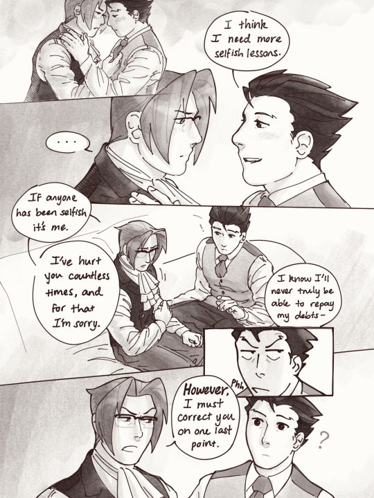
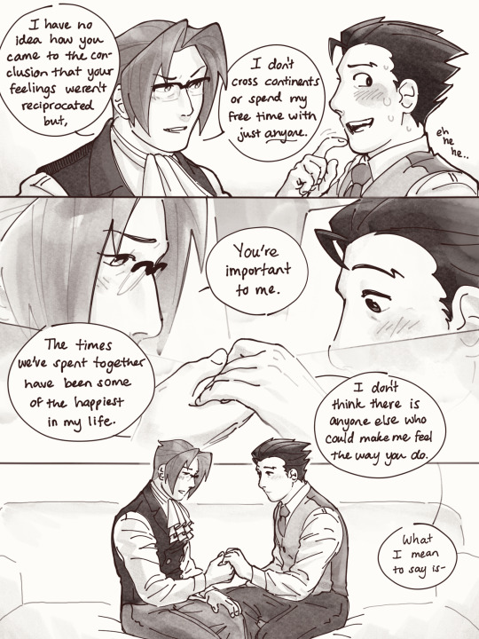
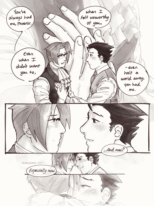
“Take my hand” pages 12-15
1 - 2 - day 3 - 💙free day❤️ - 4
#nmweek23#narumitsu#wrightworth#they’re so in love in this it makes my stomach turn because OOHHHHH MY GOODDDDDDDDD#I WANT. WHAT THEY HAVE! WHEN WILL IT BE ME#SMOOCHES#YALL SHOULD HAVE KNOWN IT WAS COMIN FROM ME#phoenix wright#miles edgeworth#aa#fan art#fan comic#past me wrote this comic like YEAH IM GONNA PUT IN ALL THESE THINGS I LIKE#and now im like [sets myself on fire] [sets myself on fire] [sets myself on fi#I’M SO EMBARRASSSSEEEDDDDDDDDD how the hell do any of you share your work i literally feel like im cutting out my heart for you#my two favorite panels are the 4th one on page 12 and the 3rd one on page 15…. framing them#i hope i was able to make it worth the wait! everyone’s support has meant so much to me as i worked :’^)#rendevok#please imagine them making out from now until the time it takes me to share the next part bc that is what they will be doing in my head
2K notes
·
View notes
Text
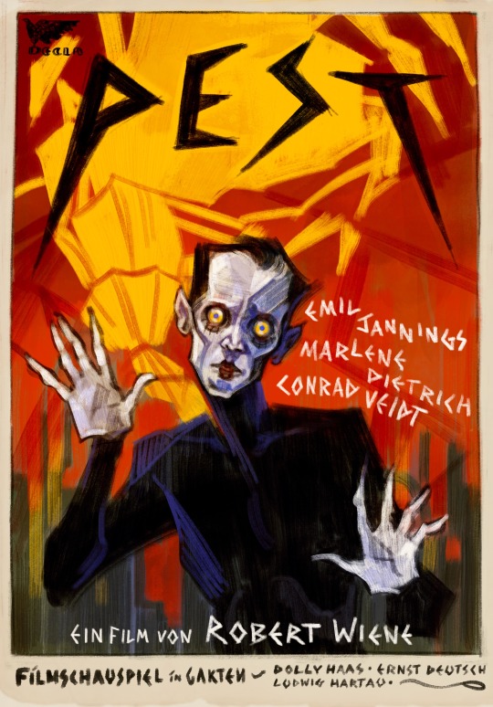
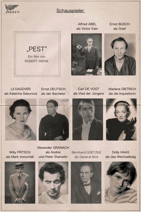

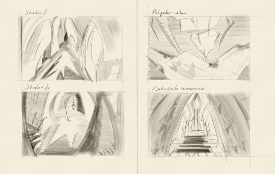
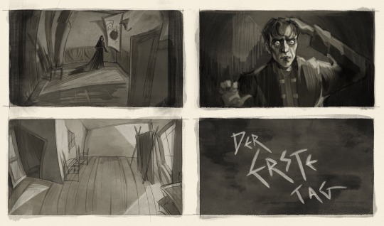
pathologic but it's a lost 1920s german expressionist film [id under cut]
[id:
image 1: a digital drawing of a fake poster, using bright colours and rough, painterly brushstrokes. the title, 'pest' (german for 'plague'), is written at the top in spiky black text. in the foreground a man dressed as a tragedian is staring intently at the viewer, his hands raised and splayed as if in horror. in the background, the town is framed against a red sky, with the polyhedron in yellow behind.
images 2 and 3: fake casting sheets for the film, with the names of the actors and the characters they are playing above a black-and-white portrait photograph of them. all the text is in german. in english it reads:
'Pest', a film by Robert Wiene
Alfred Abel as Victor Kain
Ernst Busch as Grief
Lil Dagover as Katerina Saburova
Ernst Deutsch as the Bachelor
Carl de Vogt as Vlad the Younger
Marlene Dietrich as the Inquisitor
Willy Fritsch as Mark Immortell
Alexander Granach as Andrey and Peter Stamatin
Bernhard Goetzke as General Block
Dolly Haas as the Changeling
Ludwig Hartau as the Haruspex
Brigitte Helm as Anna Angel
Brigitte Horney as Maria Kaina
Emil Jannings as Big Vlad
Gerda Maurus as Yulia Lyuricheva
Lothar Menhert as Georgiy Kain
Asta Nielsen as Lara Ravel
Ossi Oswalda as Eva Yan
Fritz Rasp as Stanislas Rubin
Conrad Veidt as Alexander Saburov and Tragedian
Paul Wegener as Oyun
Gertrud Welcker as Aspity
image 4: four digital sketches of set designs for various locations. all are strongly influenced by expressionist imagery, using extreme angles, warped perspective, and dramatic shapes. they are labelled 'street 1' (a street lined with houses), 'street 2' (a square with a lamppost and a set of steps), 'polyhedron exterior' (the polyhedron walkway), and 'cathedral interior' (the dais at the far end of the cathedral).
image 5: four digital drawings in a black-and-white watercolour style, showing fake stills from the film. all are similarly distorted and lit by dramatic lighting. the first shows katerina's bedroom, with katerina standing in the centre of the floor. the second shows the interior of an infected house. the third shows daniil staring out of the frame in horror, one hand on his head and the other raised as if to ward something off. the fourth shows an intertitle with jagged white text reading 'the first day' against a dark background.
end id.]
#pathologic#artwork#conrad veidt#(i know there are many other actors but i dont have tags for them my bad)#anyway :D this has been my brain project for the past week or so i have been thinking about it so much#i have so many more things i want to draw for it but i am trying to hold myself back. for the sake of my Wrists#also obviously the cast list is way whiter than it should be for pathologic but german expressionist cinema was not particularly diverse an#i was trying to go for realism so apologies for that#i had so much fun with these i dont normally draw locations because i prefer drawing people but i found it so much more enjoyable#when i could mess around with the perspective and make stuff look wacky. thank you expressionism i love you expressionism#also it goes without saying that i was most heavily inspired by the cabinet of dr caligari (which is why i went with robert wiene. he would#do such a great job i think)#i hope you are all well my friends :D kiss you
426 notes
·
View notes
Text

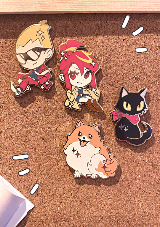
Ghost Trick Enamel Pins!
My first pins ever. They are made with lots of love to feed the hungry ghost trick fans. I hope you like them!!
#Ghost Trick#GUYSSSS#I love them I love them I love them I love ghost trick so much fuck fuck FUCK FUCK FUCK FCUK I hope these ignite a fraction of the love in#you that they've ignited in me. my autistic little ass is just so happy to have these#They'll probs be very limited#like 200 if they all sell out#so as not to step on capcoms toes#i have 100 rn and may order a 2nd batch if they do sell#also the website linked is my new shop!!!#DO YOU LIKE IT I spent ages working on it#I want it to look professional but not too professional#im just a little guy yknow
818 notes
·
View notes
Text
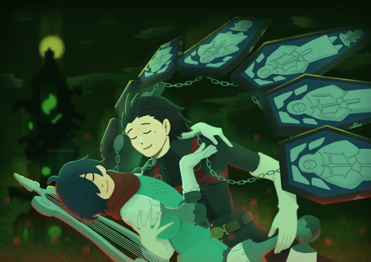
orpheus and thanatos 💚
#persona 3#ryomina#ryoji mochizuki#minato arisato#makoto yuki#lizzy does art#HIII EVERYONE :3 happy halloween.... (has been working on this for four weeks off and on)#i've always yearned to see art of ryoji and minato based on thanatos and orpheus!!!#i know that ryoji can be likened to being the eurydice figure which i agree with but I HAVE BEEN THINKING SO HARD ABT THEM LIKE THIS OK.#it was nice to give drawing something more ambitious (for my standards) an earnest try again! i love working with lineless and lighting#and working on this has inspired me to HOPEFULLY start doing some studies of sorts! i want to learn so many things...#all so that i can make ryomina as epic as possible...#also LET ME TELL YOU that thanatos coffins are making me realize i seriously need to do drawabox or something.#trying to put them in perspective is hard... but im pretty happy with what i made!!!#also can i just say i love how shapely orpheus is?? i love orpheus joints etc etc its so nice. very fresh#sighs longingly. i love them very much they make me want to do better at things. i hope everyone has a wonderful week ahead! 💙#very excited to see what people do for ryomina week (<- they haven't made anything 4 it yet bc Busy... but i'll submit smthn late maybe)
607 notes
·
View notes
Text
HYUNJIN BIRTHDAY COUNTDOWN (2024):
↘ D-DAY | HAPPY BIRTHDAY HWANG HYUNJIN❣️
#hwang hyunjin#hyunjin#stray kids#bystay#createskz#flashing tw#a9gifs#*gif#*hyunjin#*ccarly#*carly:hyunjin#*series:hjbday24#once again i fear we have a whole countdown leading up to this only for it to be lackluster. every year LDJKSSJLKDGLKJSD#sorry if this is a flop finale but i had fun <3#i hope these are synced too science says they should be but my laptop never loads them all at once akldjfajklsdjglks#anyway this concludes the countdown it went by so fast.....thank u for liking it everyone 🫶#i will never be doing this again. LKJSDKFLSJKDGLKSDG#maybe a countdown but not 30 sets. i DID IT THOUGH. very proud of myself for being that insane. good times#also happy birthday hyun i love u so so much and hope you have an amazing day :((((#do something fun...take a nice nap...eat good food...hope u get to celebrate however u want this year
309 notes
·
View notes
Text
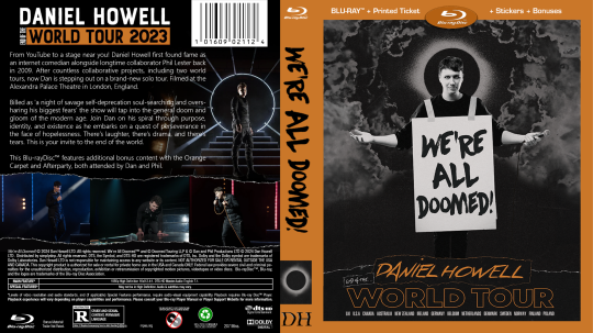
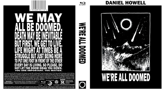
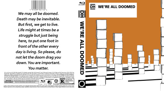
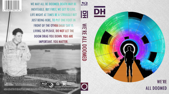
WAD: Cover Art
dan is still working on selling the distribution rights for We're All Doomed! so i decided to make some DVD/Blu-ray disc jacket art!
this is my attempt at a traditional jacket design! none of the images used are mine, but i did create the concept and design:
as i was making the first one for myself, i was struck by the fact that 'well, it's for me, so it doesn't have to look like a stereotypical jacket cover' which led me to be more artsy in my approach for the next one:
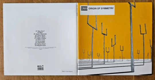
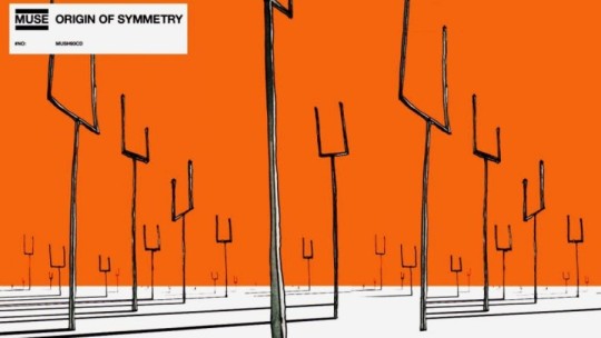
i was really enjoying the creativity and space to explore, so i went looking for more inspiration for a third design. this led me to dan's favourite Muse album: Origin of Symmetry, which i paid homage to:
after the first Muse album, i looked at their catalogue to see if there was more inspiration there. i was just thankful dan's favourite was easy stylistically to mimic, unlike say, 2009's The Resistance...
thank you @danielhowell for the inspiration!
nerdy stuff & reference pics below the cut!
General notes
i don't know how to use photoshop! i entirely brute-forced my way through the whole project, and the only tutorial i looked up was for the gradient text in the 4th cover
this wasn't even the original project i was working on! you'll eventually get to see that though
and this one also inspired art for the disc itself so stay tuned 👀
i will do anything for authenticity so these are Full of intentional details
matching fonts is a nightmare
the traditional cover
took the longest, as it was the first.
the barcode numbers are the date of the first video he uploaded on dinof, and the last tour show date (in m/d/y)
i changed 'iceland' to 'poland' on the front cover, as he never actually went to iceland, and poland wasn't ever on the list even though he did go there
the orange may look a little off-center in the front, but these designs need to include space for a spine between the front and back cover, i promise it's right 😂
the black and white cover
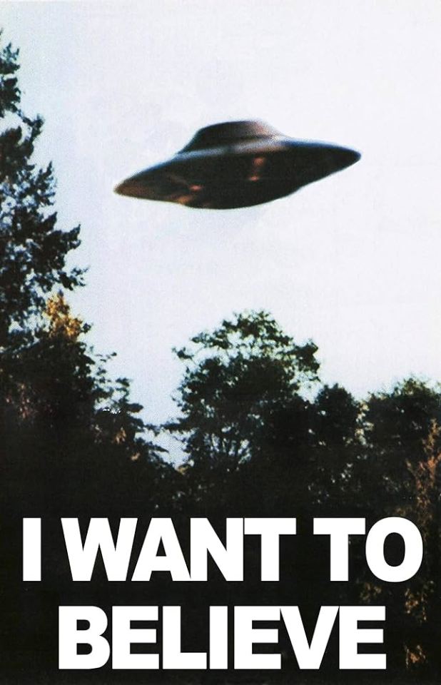
inspired by the 'i want to believe' aliens poster
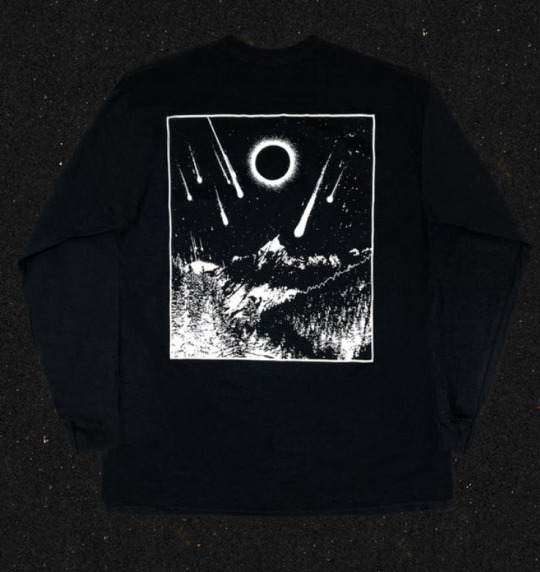
the cover art comes from his metal band merch shirt design
i had to manually shrink the text, line by line, and ensure it all lined up on the back!
i even made the logos on the back greyscale
the Muse: Origin of Symmetry cover
a shockingly perfect style for a WAD cover. i'm so glad i used the cubes, even if they couldn't be orange.
there's some versions of the art online where the sky is even more orange and it baffles me how i haven't seen any parallels like this before
the Muse: The Resistance cover
this cover was never supposed to see the light of day! i meant it when i said i was grateful i didn't have to try to adapt this complex design... and yet, i tried anyway.
i did all the grid lines by hand, including the jagged/broken edge parts, shading each section, and then drawing every star.
the hardest part was getting the gradient on the back text to cooperate. photoshop's gradient settings are surprisingly limited
gotta shout out @amazingphil for being the reason i knew what this cover looked like--it's the only muse album i knew the art of before embarking on this quest!
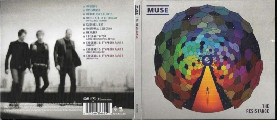
obligatory sob story:
i've been extremely and suddenly ill for 6 months. it is difficult to function moment to moment, but especially in doing little things just for me. this is the first and only art project i've been able to feel inspired to not only work on, but to finish, and despite the pain and long hours, i enjoyed every minute of it. thank you, dan, for creating this space for me to explore, and thank you, everyone here, for being wonderful support during this time 💞
#it's finally here!! i hope you all love them as much as i do#dnp#c.text#dan and phil#daniel howell#phan art#hey phil look at this#we're all doomed#wad#c.art#word
314 notes
·
View notes
Text
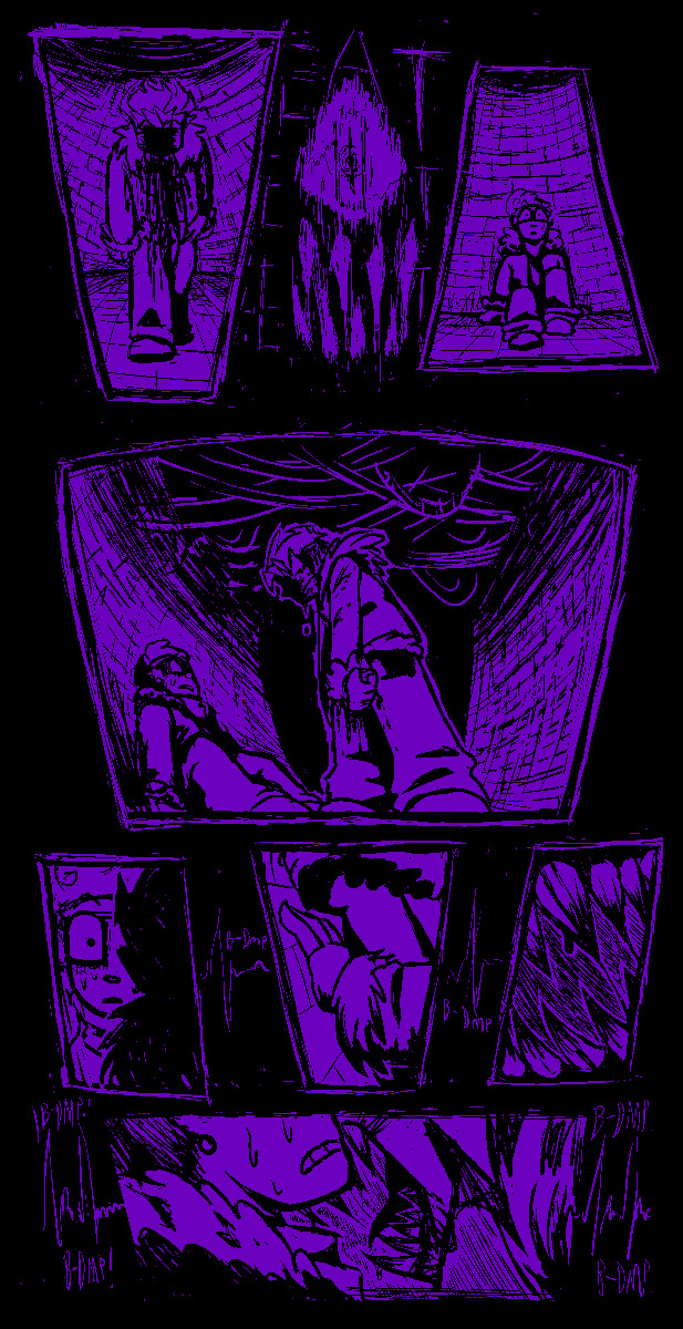
[ cw: violence mention / death mention / ]
Will never stop thinking about how Leo, all alone in an endless void and being beaten again and again and again by the only other living thing around, still finds comfort in that space. The situation he was in was completely hopeless, and in any other circumstances he would not have escaped, at least not fast enough to save him from permanent (or even fatal) damage, be it physical or mental.
And yet, despite the bleakness of his situation, despite the agony and helplessness, all he needs is one glance at a crumbled photograph, one glance to remember his family, and that’s enough of a reason for him to smile.
Maybe that’s why his powers center around manipulating space - because no matter how much space is between them, no matter how dire his own situation may be, just the thought of his family, alive and okay, is enough to give Leo hope.
#rottmnt#rise of the teenage mutant ninja turtles#rottmnt leo#rise leo#the prison dimension is horrifying on its own#add in a monstrous being that towers over you and has vowed to ensure your suffering?#god I can’t imagine how scary that is#Mikey opening the portal was a miracle because if he hadn’t managed it there#it’s really up in the air what could have become of Leo#personally I subscribe by the theory that you straight up can’t die in the prison dimension#so it’s a prison in all ways#but the thought of a Leo who manages anyway who adapts and continues to have hope despite it all…#Leo saying he’s nothing without his family is a double edged sword really#because the thought of his family alone is all he needs to live. to hope.#to smile#nothing without them…but they’re EVERYTHING to him#and maybe he doesn’t realize it but…the feeling is mutual#one thing too is that hope that comforts Leo so much is not just that#should he think his family needs help - that hope can turn into determination#I’m unwell about this family#actually on my point of their powers - I truly do think the abilities tie in not only to their personalities#but to their relationship to family and love in general#kinda like love languages in a way#Mikey with his chains and time abilities values being around his family the most - he wants them to experience living in the moment togethe#Donnie is someone who is 100% a gift giver to show his love - his constructs are exactly that aren’t they? gifts of his mind#Raph is someone who willingly bears the weight of the shield - he protects his family like the best big brother possible#and Leo - he goes off on his own a lot but his mind is constantly on his family anyway#like a sailor at sea no matter how far he travels the compass always point in one direction - and for him that compass points home#even if he can’t make it back - it’s still there#and that’s enough
244 notes
·
View notes
Text
hi i havent drawn in almost 2 weeks. have a summer vibe ichiban🏖️
#ichiban..... ichiban....!!!!!!!!!!!!!!!!!!!!1 i lvoe ichiban!!!!!!!!!!!!!!!!!!!!!!!!!!!!!!!!!!!#50 hours into infinite wealth and my love for him has only grown stronger over time i love him so much#im not gonna like the ending of the game but . ill do it for him. and all his friends ill do it for all of them#hope everyones doing okay playing through the game! for the ppl who finished it! my condolences to you. hope youre ok too </3#like a dragon#ryu ga gotoku#kasuga ichiban#allyart
244 notes
·
View notes
Text


i bring to you sort-of references of every single one of my PMD heroes, both from the games and from my original story!!!
#pmd#pokemon mystery dungeon#pmd oc#tapioca cyndaquil#toffee eevee#pippa pikachu#shiloh riolu#rui riolu#i hope you enjoy them as much as i do they are all my precious little guys#oh yea!! also#casper and sprout are definitely not retired ill still post them sometimes i just started a new psmd file and fell in love with that team..#also also ill draw all their partners soon#this took me a while tho gimme like 3 years
355 notes
·
View notes
Text

"And soda; runs off into the street..."
"...and soda... is totally okay!"
#jrwi fanart#jrwi show#jrwi suckening#cw blood#something something cracking open a boy w the cold ones#IF THERE ARE ANY MISTAKES I MISSED I SWWWEAR TO JEBEDIAH. IF I STARE AT THIS ANYMORE IM GONNA DIE IT NEEDS TO BE DONE#ALSO RRRAAAHAHHHGHGH CAN I JUST TAKEA SECOND TO SCREEAAMM ABT HOW MUCH I LOVE SODA AND EMIZEL.. LIKE THERYE SO CUTE....#THEY ARE HOMIES THAT KISS EACHOTHR GOODNIGHT. THEY CARE SO MUCH FOR EACHOTHER. SODA LOVES SODA AND SODA LOVES YOU#do u guys remember how willing he was to share blood w his vampire bestie. like cmon. remember when emizel memorized sodas Soda Schedule.#LIKE CMON.... they just have eachothers backs so much. ouhhh my god... ANYWAY SO THE ART HUH. I FEEL LIKE I SCRAMBLED W IT FOR A WHILE#DRAWIN IS HARD..... i think i did well in the end tho.. i like the lil heart beat effects. and i hope i made soda look Suffieciently Scared#i ALSO had fun w the teeth. i however did not have fun w the walls. if i had more drugs i mightve done every brick in more detail#but i didnt WANNA!!!! this will suffice.I HOPE IT FLOWS WELL&THAT ITS CLEAR... IVE STARED AT IT SO LONG IT IS NOW VISUAL SOUP. HELP!!!#i want my comics to have more Pauses and Space and Thought and Momence. i feel like normally they go so fast. but THIS time#i think i did good.... huuoouhhhh.... comics are HARD art is HARD but i am HARDER. or something. OH YEAH I HAVE MORE ART THINGS#soda was RLY HARD FOR ME TO DRAW FOR A MINUTE..but i like where his design is now. i wanted his hair to be curly swirly.like soda fizz#i THINK thats all my thoughts for now. if u have thoughts u should spill them in the tags i looooove reading tttaaggsss#have a goodnight i gotta go to work soon. maybe. unless the casinos power goes out AGAIN. OR SEOMTHING... UUGHHH MY SCHEDULE IS IN SHAMBLES#I THOUGHT I WAS WORKIN 3 DAYS INA ROW SO I RENTED A WHOLE DAMN HOTEL BC THE JOB PLACE IS FAR AWAY.. I HAD TO CANCEL THE WHOLE RESERVATOn#annd im MMMMAD ABOUT IT!!! like ill get over it ofc BUT IM PEEVED!!!! IM INCONVIENIENCED AND GENTLY AGGRIVATED. BUT OVERALL FINE.#hope yalls weekend goes well. sleep well. if u get the chance to.
147 notes
·
View notes
Note
Dear the Noritoshi Cult Leader,
May I have Noritoshi in butler outfit with bunny tail and ears? I need it to bless my gloomy day. I really appreciate it you took on my request. Thank you


Lucky for you, cult member, i love butlers. A lot.
#noritoshi#kamo noritoshi#noritoshi kamo#noritoshi x reader#kamo noritoshi x reader#noritoshi kamo x reader#sorry if this is late#SO YOURE A BUNNY ADVOCATE. I SEE I SEE. AMAZING TASTE.#AND YOU DO NOT UNDERSTAND HOW I CHOKED ON MY OWN SPIT WHEN SEEING THE BUTLER PART#I FUCKING LOVE BUTLERS SO FUCKING MUCH MAN. IDK WHY. I DIDNT EVEN KNOW UNTIL IT WAS POINTED OUT TO ME..#CAMEO ARATA THOUGH. I LOVE HIM TOO HES SO CUTE EVEN IF HE WAS THERE LESSTHAN NORITOSHI#i love them both..#i also hope your day gets better.#not to get gushy BUT.#these days are tough but i believe its all for a brighter future.#better days for your strong will to endure your hardships WILL come. youre amazing for getting this far!#i believe in you and so do the many others with gloomy days fightin on alongside you to keep pushin through#this goes to everyone whose having a gloomy day too. i love you lots and im super proud of you for pushin past life's hurdles.
227 notes
·
View notes
Text
i love sapphic people so much we’re all so beautiful and deserve so much love i love you i love you i love you
#hiiii!#it is emotion time for me#listened to some of my favorite songs after midnight#im very emotional#i love you so much#i hate how many people interact with this blog#because i want to grab your faces and tell you how much i hope you’re happy#and how badly i hope you feel loved#i hope you read my posts and feel the love in them#it’s for you#i wrapped it up in all my silly little words and hit post l#and now i just get to live hoping someone could feel it#because i desperately hope they do#because you’re just like me and im just like you and we both deserve SO much from this world#@ future me u can delete this but i hope you’re still this in love with the world when u do#@ people who read all these tags srry it’s late and im having a cry sesh and a lot of emotions#pls ignore me
361 notes
·
View notes
Last Seen Blogs

pesterball-moved
head in the clouds
moliouli
·˚. ★ ·˚. ( MOLLY PREWETT ) !
suiseistars
suisei 彗星☆
critterzstimz
Critterz Stimz! ✨

nishrath
Untitled