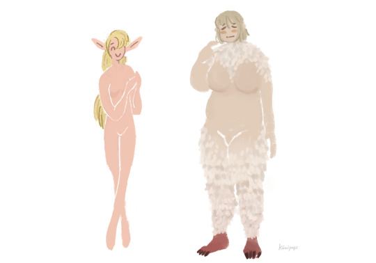
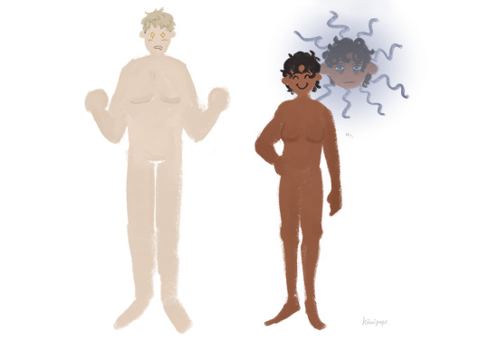
#i have GOT to DRAW MORE STYLIZED
Photo

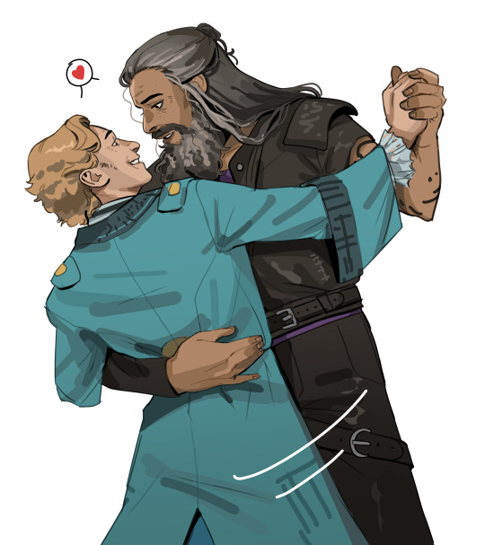
bashir moment 🎾
28 notes
·
View notes
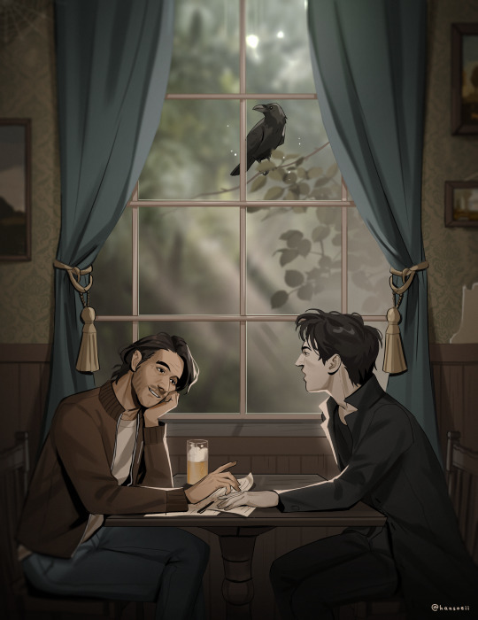
Text


polymer broadcast signal hijack
#pikmin#captain olimar#ft. louie captain shepherd and collin#as well as#moss (pikmin)#watched a stream series of pikmin 4 (its frankenbugs' series) thats what this is about really#but mostly. I just love olimar. I just really enjoy that man#also this really got me flexing those bande dessinée muscles from back thens lol#Ive missed drawin with this kinda proportions... I should do it more#Im gonna draw an olimar to put in my wallet. I need to make my life harder to explain to strangers#I also wanna. add more details to his space suit. make it look more like real life space suit for fun & entertainment#man I enjoy the animals in pikmin so much. they really are just like. animals. theyre animals#its great I love how genuinely bug-lookin the bugs are even with the stylization. pikmin and pokemon are really good at that#would like to learn how to do that... sometimes in the future#oh yeah fun fact. my effort at cleaning up my undercut a few days ago went badly. right before I went to a family reunion thing for 2 days#so I was goin out of my mind at that event postin abt olimar bc I love him#and then. when I got home. I decided to shave my head instead of trying to fix the haircut again#and so the sequence of events becomes I post about olimar -> I enter my bald arc#I am okay with this. have a good night lads. binding books is actually really fun u should try it
2K notes
·
View notes
Text
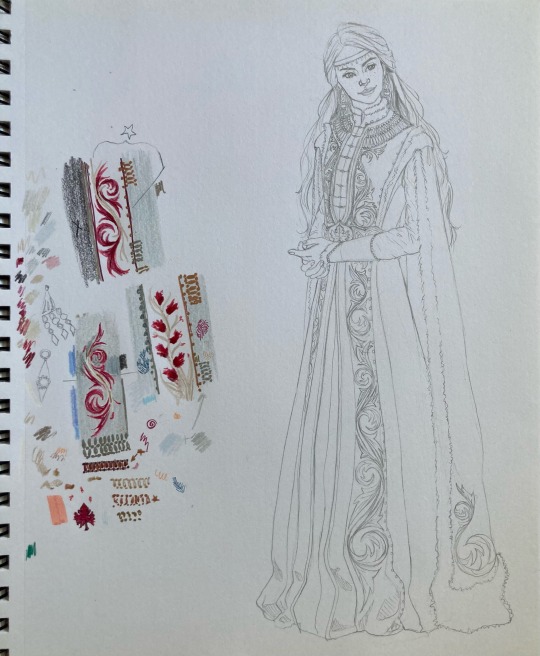
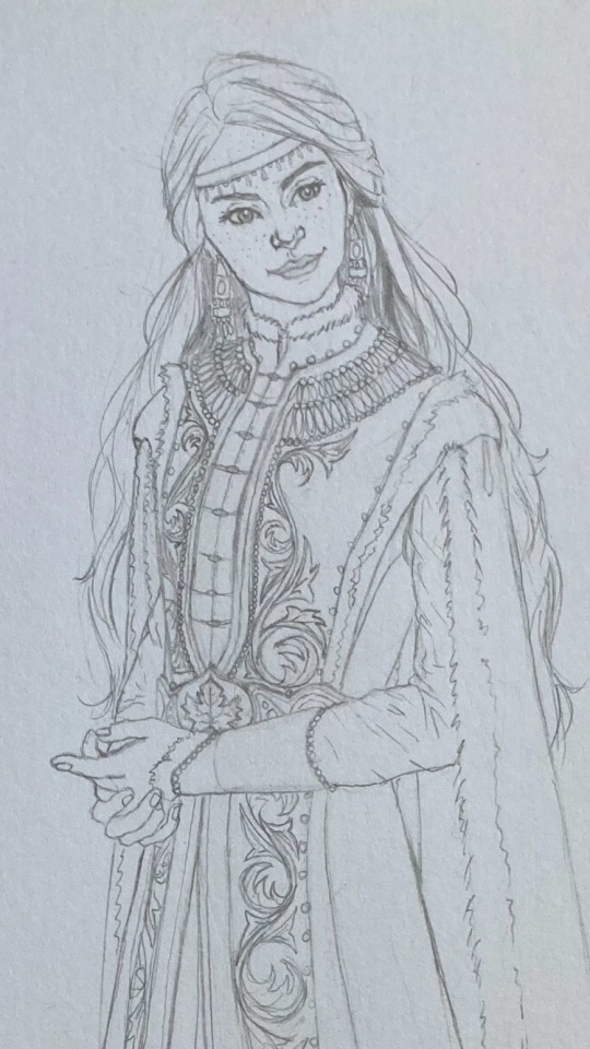
Sansa sketch WIP with some color tests (I don't care what GRRM wrote, I am forever and always a freckled Sansa truther)
#asoiaf art#my art#my artwork#sansa stark#got art#asoiaf fanart#got fanart#art wip#wip#drawings#sketchbook#house stark#if you can hear faint screeching it's me realizing that i have to mirror that pattern on the other fabric panel#I have a detail problem#and i'm going to make that everyone else's problem#i've been trying to focus on drawing in a more stylized way and worry less abt the realism#design somewhat inspired by my deep and abiding love for circassian clothing#this is definitely at least an adult sansa- probably the Sansa from Winter's Child#that was the intent while drawing it at least#but could just be post-canon Sansa if you want#this is honestly what my whole sketchbook looks like#a nice clean(ish) drawing#next to a collection of incoherent scribbles and color/pen tests
194 notes
·
View notes
Text

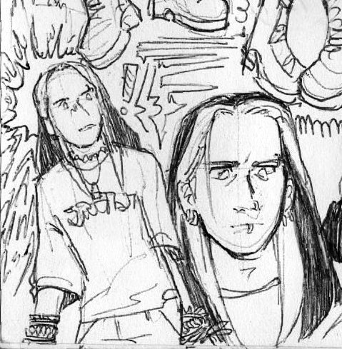
first thing i drew on my new tablet to test it out is the tv beast themselves
#gonna take a while to get used to... tfw u get an intuos for the buttons but realize u have#way too much muscle memory for ur old keyboard shortcuts (im talking YEARS. of the same/similar shortcuts. like. when did i get my first#tablet???? 2015??? YEAH.) (not my latest one btw i went thru a few tablets but yknow)#oh well!! ill see#took a bit to get used to but eventually i got into the swing of it since the work space on this is a bit smaller than my old one#i LOVEEEEE how the pen feels tho like the brush strokes its more consistent and i think ill be able to do good if ... my hand isnt hurty#and once i get less shaky with it!!!!! its sooo good. then again my old tablets pen had...its nib for 2+ish years#YEAH IT WAS BAD BAD....kept asking for replacement nibs but wouldnt get em#oops... oh well! anyways we ar the SMOOOOFFF zone HEE HEE#anyways i misse ddrawing cathal............. the skrunkle . the him. care him much very much a lot#trying out different ways to draw him too#and not try to be as on model as i was before... just have fun yknow??? get stylized and funky with it!§§§§!!!!!!!!!!!!!!!!HEEHEHEHEHEEE#soarry my brain wants to amsh buttons randomly rrly hard rn so its evil laugh time#ok normal tags time GO#toontown#toontown corporate clash#multislacker#cathalposting#guz art
180 notes
·
View notes
Text
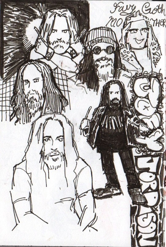
sketchbook dump
#slipknot#joey jordison#whenever i draw older joey i gotta think ''mick. but hes tiny now'' and then im good to go#as yall can tell im in my joey feels today. the pictures of him with his kitties are doing me in#he was a FATHER to those cats#metal's most beloved old cat lady. in my opinion anyway#artings#joey#i hope yall enjoy these lol. the more i draw in my sketchbook the more im like oh yeah i could probably post that. and then i forget#ORIGINALLY it was just gonna be older joey but i figured#since when am i the type of person to not be extra? joey posting is a full time job and i gotta clock in#also you can tell that references are not my friend </3 i have yet to fully stylize slipknot but with faith trust and pixie dust#i may one day. make somethin good#one thing is for certain i got slipkneight locked and loaded to be posted when. i find the will to color them
52 notes
·
View notes
Text


more James Bond doodles from my sketchbook :)
gradually drawing all the Bonds. George Lazenby this time + some Tracy and Blofeld. Telly Savalas is my favorite Blofeld actor by a landslide, I think he’s the only one who really struck a perfect silly/serious balance. He’s such a campy 60s movie villain but he still feels like a real threat to Bond’s life. Though I might be biased since I was already a fan of him in various stupid 60s horror movies before I got into Bond.
#I need to draw more Lazenby Bond. he’s got that great groovy brown outfit towards the beginning of the movie when he meets Tracy’s dad#I have to draw it. tbh I think I lost a bit of likeness in stylizing him this way but I really love the design so I dont care#I got it into my head that he looks a bit like Lupin III and there was no recovering from that lol#james bond#007#george lazenby#on her majesty's secret service#ernst stavro blofeld#telly savalas#tracy bond#tracy di vincenzo
45 notes
·
View notes
Photo
hey don’t cry. 10 million blorbos from your shows, okay?
#commander cody#obi-wan kenobi#uh. i guess implied#codywan#star wars#bytebun draws#ok on twitter sometimes japanese artists i follow will caption their au posts with 'delusion for those who can accept anything'#(and then explain the au) (or at least that's what google translate tells me)#that's how i feel about this one.#can't imagine a universe where this guy would sit down to play mario cart w his bf's family after an obvious crying jag#but like maybe he watched legally blond or something & got rlly moved#abt the main character finding her own path with an identity separate from her partner without losing the core elements of her personality#and self-expression. and also winning at the law. you know?#au cody can have elle woods as his blorbo.#in my au where he's doing law things re: clone citizenship#but also fuck stylizing crying genuinely hard. idk if i can get stylistically simpler than the first pic & still convey the precise emotion#that i want. i'm cheating there with like some actual shading instead of hard lines... more studying required#it's like difficult to draw people crying bc/ it's one of those emotions that changes the whole shape of your face... the invert of a#beaming smile. the tears aren't the important part... that's why the 'stoic guy sheds single tear trope' is so funny#they're out there w their plastic immobile faces and a fake tear when the important part is all those scrunched up microexpressions#someone trying rlly hard not to cry has the deeper mouth corners & tense brow-eyelid combo & that wrinkle near the nostril#unfortunately all of these lines are also the only indication of old age in most anime lmao so its so so hard to figure out how to draw em#shld do some ch*insawman or g*lden kmy studies probably. those guys r pretty good at funny looking faces
316 notes
·
View notes
Note
um spare any genevieve drawings pretty please? 🥺🤲
saved dis to try to make some new art of her but unfortunately i still dk what i want her to look like and i normally dont have the Develop New Oc drive....ill keep pointing u guys to the only existing image of her in the meantime
#skunk mail#Anonymous#idkkkk like. i also know the only way she'll take form is by drawing her#like how talon has already changed quite a bit since 2 yrs ago#but idk. i dont have as tangible of a look for her in my head. i need to observe more ppl.#but its also kind of like how i still struggle to draw al after 10 yrs bc there's a lack of irl ref OR stylized ref to use for him#bc the idea is too specific (tho thats the opposite of my problem wit her)#i may try again soon...#i fear ive got sameface brain rn bc the whole head/face shape i keep giving her is similar to als#i dont want another Square (al) or Long Face (talon)#ykwim. i love faces that arent like mine too much but i cant keep doing em and im not invested enough rn to Push a Brand New#Unique Face
8 notes
·
View notes
Text

Oh to be like everyone else who can doodle him nonstop but i sadly cant bc idk how to draw noodle body
#and also for some reason i haven’t figured out his face much?#like by that i mean i never know how much of the cartoony/stylization i need to push#or how to convey an emotion with just the line eyes rip#IF ANYONE WHO IS GOOD AT DRAWING HIS BODY/FACIAL EXPRESSIONS HAS ANY TIPS ID LOVE TO HEAR?#My snatch IS good I’ve got a grasp on how to draw him and his facial expressions good#It just feels like that grasp isnt as tight as I’d like it to be?#If that makes sense???#Idk like I said If anyone who’s good at drawing noodle snatcher has any good tips lmk like if you need references for how I draw him#If you have any tips for how to improve#Bc like I said mine IS good I just feel I need a bit more practice with how his body and face work and stuff ig#Grace post#LIKE THERES A REASON I MOSTLY EVER DRAW HIM AS SNICE#that and I mostly like to doodle later timeline or angsty stuff with him so it’s usually snince by default in those drawings#SNINCE* I’m tired ok lmao
55 notes
·
View notes
Photo


Me to me: Use the last page responsibly
Me, in return: You got it (Patreon)
#Doodles#Villainsona#Just Desserts#MLP#Nailed it for sure#It is obvious I don't usually draw in MLP style other than the fact that I haven't posted any MLP stuff lol#I mean I only have two MLP OCs and I only draw one of them with any amount of regularity#And even that's been years lol#I wasn't planning on turning Charm into a pony - even less so a Pegasus#It seems obvious now but at first I was like ''I mean she's clearly an Earth Pony right? Wait'' Lol#If /anyone/ would have wings#But I was thinking about Just Desserts proportions and stylized limbs and was like ''Reminds me of MLP hoof-nubs'' lol#I mean honestly how different is her shoe in that middle one from how it usually is lol#I haven't really thought about her cutie mark since I just transferred her clothes specifically it'd be weird for her to be naked lol#But I guess it'd be a candle? Something to do with fire for sure#I like the little swirl tuft that she's got when she's normal Charm haha - still a heavy mane but a little signifier#And then since I was already drawing stressed out TVAU!Charm I was like ''Alright go on then''#I only just thought so but I kinda like the idea of her having bigger wings that are just wax add-ons#Adds more menace to her silhouette but aren't very practical and are ✨metaphorical✨#This is gonna be another one of those styles I return to once I cut her hair isn't it ugh lol#It's also definitely a complete coincidence that I can't stop watching Dusk Till Dawn huh lol#It's just such a banger and an Extremely cool animation
3 notes
·
View notes
Text
this is sooooo silly but i keep thinking about it. disgraced would-be-debut author cait corrain (a youtube video about that if you aren't aware of what i'm talking about). i can't remember where it was shown right now that they were talking to a biracial artist they were commissioning to draw a black character for them. for some reason they just kept wanting to like overexplain why they are going to an artist of color and how they would do a better job (why not just tell that particular artist how you appreciate their particular skills?). bc they were like well a white person probably wouldn't do as good a job on it. this might not seem like the most important thing to point out, but you don't need a reason to commission artists of color. you can just do that. there's nothing inherent to the art of drawing that would make white people less able to drawing people of color, or any person less able to draw anyone else with different features than them. especially if what you're seeking is a realistic piece; an experienced realistic artist shouldn't have trouble drawing ethnic features that they don't personally possess.
it felt like cait corrain was just very much overspeaking on troubles with racial representation in popular art. and they don't really know what those problems are or how they arise. when white artists are bad at drawing people of color, it's usually not that they just have some sort of difficulty of perceiving accurate shapes or forms. it's that their stylistic preference has a bias towards lighter skin, eurocentric features, that sort of thing. you don't have to tell an artist "i think you'd be better at drawing this character because you're non-white." like that's just so weird.
oh wait super important edit im making immediately bc i meant to say this in the original post: U CAN HIRE ARTISTS OF COLOR TO DRAW THINGS OTHER THAN PPL OF COLOR. HIRE ARTISTS OF COLOR FOR ANYTHING U WANT COMMISSIONED. U DONT NEED A VIRTUE-SIGNALLING REASON TO DO IT. u could even have them draw one of your white characters (gasp)
#these stylistic biases can affect anyone first of all#as a VERY VERY VERY amateur artist who doesn't do like stylized art or anything#i've drawn a variety of friends and family members and models and it's not harder to draw poc than white ppl. inherently#i actually will say. and this is my AMATEURITY speaking. this is my has-drawn-only-a-few-years speaking.#i have an easier time drawing my own face than anyone else's. which is probably what got me thinking abt this#tales from diana#when i draw another subject who has long wavy hair i'm like oh that's easy that's just like when i draw myself#versus i do need to pay closer attention to different hairstyles and textures#and my own face/nose/eyes are very familiar to me. but when i draw someone else i have to pay closer attention#after all i look at myself in the mirror every single day. whose face am i more familiar with?#that's kind of natural. but no people of color in a realistic style are not HARDER to draw than white people#everyone's got a different nose and different eyes and lips and all that. you pay attention to your individual subject#(i suppose it also bears repeating that poc and specifically black people dont all LOOK ALIKE)#what you're used to drawing and used to looking at will come easier and more naturally for any artist#but if u have good figure drawing fundamentals and arent drawing caricatures#it's basically all the same.#the same in that it's always different bc everyone's different. yeah#does this make any sense?#making it not rebloggable bc im not ready to be having a wider discussion rn im just rambling lol
1 note
·
View note
Note
Hi!!!!!!
I really love your art and I was wondering if you had any art tips?
I'm pretty good at drawing realistically, but I struggle with more stylized or cartoon-y stuff...
Here I’m going to talk about the two, in my opinion, the most important aspects of stylization is: ‘Simplification’ and ‘Exaggeration’
First, simplification,
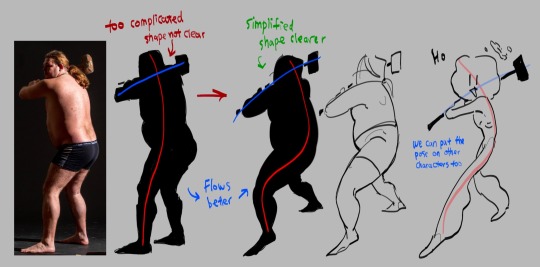
I took this picture of a man holding a hammer, if you just look the silhouette, it is very complicated the pose is stiff
Try summarize the pose with only two simple lines, one representing the head, torso and the leg, the other representing the arms. This is the line of action. Now you got the two lines, play around with it try make it flow better. (Google ‘line of action’ you can find a lot more better examples)
The next step is to simplify the previous drawing throw away all the bumps and little details, take what you think is the most important and draw it based off the line of action you just acquired. this step might take a lot of practices so look at tutorials and draw a lot you’ll get there (Go on YouTube and search ‘life drawing tutorial’ they teach this step really well)
This is how you simplify a complicated pose! I’ll talk about how to simplify character after the next point
Second is exaggeration
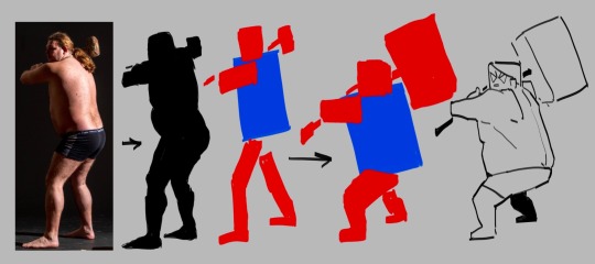
I’m using the same photo here again blocking the person black so we can see the silhouette clear. This time we’re not finding the line of action, we’re reducing this person into a simple shape, to me, he looks like a rectangle.
great, now we try drawing this man with only rectangles
After blocking out the simple rectangles, exaggerate them, make the big ones even bigger, the small ones even tinnier.
Make the main focus of the drawing clear and easy to see, the audience needs to be immediately on that thing the moment this drawing shows up! What’s the focus point of the drawing? The hammer, it’s too small for one to find so let’s exaggerate it make it huge.
Tada, now you have a clear and cartoony silhouette, the rest you can fill in however you like
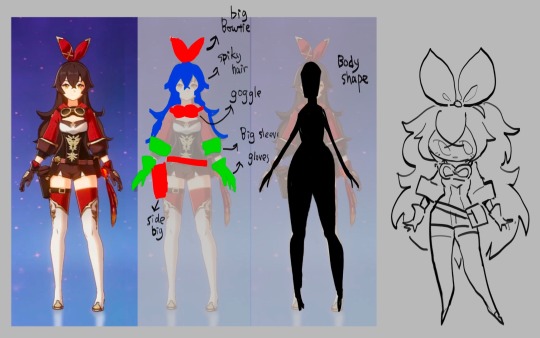
To cartoonify a character is easy, similar to how you cartoonify poses, you take out the little details and leave what you think is the most important, the things that makes the character unique, and exaggerate them
((Here I’m using a genshin character because their character designs are known for being a hell to animate (genshin fans don’t come for my ass this is only for educational purposes))))
I’m… not the best at explaining things so if you can’t understand any of these please let me know!!!!!!!!!!
687 notes
·
View notes
Text

yaoi couple. yuri couple. i see no difference, love is love
(body type refs + notes beneath)
i wanted to try out lightly stylizing dunmeshi characters by drawing their different body types in my headcanons!
some notes:
marcille is very stick-like with GIANT ears. theres no real reason for this, except i wanted to make her look like a noodle.
falin is very soft and squish AND strong, and could DEFINITELY crush marcille in one go. in my mind, a lot of that muscle mass came from being a chimera
laios is built like a wrestler, so i wanted to make him rectangle shaped compared to his sister's pear shape. the easiest to draw by far, but his hair was a pain
kabru's armor and demeanor makes him look very round and approachable, but underneath all that hes on the pointier side. i wanted to give him a bit of a dexterous look. he's still a sword swinger, but his fighting style seems a lot more agile than laios... at least when it comes to humans!
they're all trans in my headcanon. kabru doesnt have top surgery scars because he had a small chest to begin with. marcille also has a small chest, but that's not at all unusual for elves.
laios already got top surgery but even after that his chest is still larger than both kabru and marcille, lol. its all muscle, although i didnt draw it. there's a running gag about how he just donated it all to his sister, but with the way that dungeon revivals work who knows if its a joke or reality
#sorry no regular couple here this series is for the freaks#dungeon meshi#farcille#labru#dungeon meshi spoilers#marcille donato#falin touden#laios touden#kabru of utaya#kiiwi fanart
379 notes
·
View notes
Note
Hello! Hope you're having a great day/night! I absolutely adore your art, you are one of my favourite artists. I love the way you shade and do backrounds. Also everytime I get into a new show I immediately see your art for it??
I was wondering if you had any advice on drawing more realistically (backrounds, anatomy etc) but still keeping a style?
Hey hey!
Thank you so much!
I have a pretty good understanding of facial structures, because before I got into drawing more semi-realisticly, I heavily focused on realistic portraits. Here are some example, these are from around 2019!
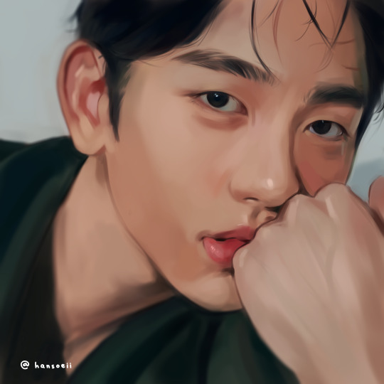
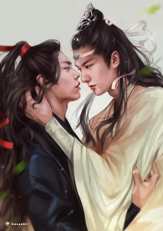
(yes, I was really into danmei and kpop back then, haha)
I just always loved drawing/painting faces and it was all I did. But at some point I realized that I wanted to do more than that because just portraits felt super restricting. So it took me around 2-3 years to somewhat find my style. Thought it would be fun to show a little timeline! Advice will follow afterwards :)
2020
I began working on my OCs in 2020 and since I didn't have an exact reference to work off of, I struggled a lot. My art from this year is super wonky.
2021
Still wonky, but the Lokius obsession was the jumpstart into finding my style! My work from this year is all over the place haha, I was experimenting a lot.
2022
This first ofmd piece is pretty much the first drawing where you can see where my style is gonna go, which I think is pretty cool! This is the year I made the biggest progress cos I was drawing SO much. These two pieces are only six months apart. The one on the right was the first time I gave drawing a background a proper go, too! It was a good year.
2023
And this is where I am now! I'm still constantly learning and improving, but I'd say I have a style you can recognize now!
Now here comes some actual advice, haha:
What I highly recommend you to do is to study your favorite artists as much as you can! I have like 5 A4 sketchbooks all from 2020 that I filled with sooooo many studies, where basically all I did was look at artists I like and copy how they draw stuff, to try and figure out how to stylize certain things. Some of my favorite artists are Ami Thompson, Velinxi and TB Choi. But I also liked to just scroll through pinterest and study all the art I came across that I liked! For example, if I saw a really great drawing of a pair of pants I would copy it many times in my sketchbook and try to learn how they stylized the folds. Doing this for a prolongued period of time will naturally improve your own work! It'll be difficult at first, but you gotta push through, it's gonna be worth it!
I also highly recommend studying unique faces to try and avoid the same-face syndrome. Find some cool looking people and try to draw them as simple as you can! Maybe even draw a little timeline where you first draw them as cartoon-y as you can, and keep going until you end up with a more detailed, realistic drawing. Maybe in the middle of it you find a step that feels the most fun to you, so you can try to build on that! It's a great way to figure out what kind of style might be the best for you.
Here are some cool faces I found on pinterest!
I have a pinterest board with many more!
One REALLY important part of learning how to draw all kinds of things is to understand forms and shapes and how to manipulate them. I have so many pages in my sketchbook filled with just shapes that I drew from all kinds of angles without any references.
This is a great video on it:
6 Ways to Draw Anything by Proko
Learning how to do this is so crucial! Young artists often think they first have to learn all kinds of detailed anatomy before doing anything else, but all that's gonna do is make you tired and hate drawing. Shapes are where it's at! Once you understand how shapes work and which ones to use for certain parts of bodies or objects, drawing is gonna get so much easier! Once you understand them, you can get into details such as muscles and bones!
And honestly the most important point is to just absolutely love what you're doing! I wouldn't be doing this if it wasn't for the fact that I get extreme hyperfixations on certain media that turn me into some kind of beast where I can suddenly draw 10 detailed illustrations a week, haha. Just be passionate about what you do, find something you REALLY love and go crazy!
I really hope this was somewhat helpful! My inbox is always open if there's any more questions :)
#responding to these has made me realize how much I love helping you guys out#it's genuinely really fun and I just hope it's actually helpful haha#my art#art advice#art resources#ask#anon
180 notes
·
View notes
Text

so back in april i had the idea to draw ace attorney characters as if they were in fantasy life (so essentially combining two of my favorite games) but only finished phoenix then. tonight i finished up the page with some more, and since we know what the new lives in fantasy life i will be, i got the excuse to include vera as an artist :))
id under cut
[image ID: 5 digital drawings of some ace attorney characters drawn in the fantasy life art style, which is a very expressive, stylized chibi style. they are drawn in the outfits for different lives as if they were in fantasy life. in the top left, phoenix wright is drawn as a paladin, with text next to his head that says "Phoenix Paladin". he is wearing silver armor with gold trim, the trim forming a 'P' on his chest. the 'P' has a red gemstone in the center of it. his shoulder guards also have red gems on them. he has a long blue cape fluttering behind him, as he stands confidently, holding a sword in his left hand and holding up a shield with his right. the sword and shield are also silver with gold and red accents like his armor. next to phoenix, in the top middle, apollo justice is drawn as a blacksmith. he has text next to his head that reads "Apollo Blacksmith". he is wearing a teal apron on top of a white shirt and pants. his sleeves are rolled up, and he has a red piece of fabric tied around his waist. he is wiping sweat off his forehead with his right hand, and holding a hammer in his left. next to apollo on the top right, is vera misham. she is drawn as an artist, with text next to her head that reads "Vera Artist" she is wearing a pink beret that resembles her bandana, and has a paint brush with pink paint on the very top. she is holding her sketchbook in her right hand, and a paint brush in her left. she is wearing brown gloves that are stained with various colors of paint. she is wearing a pink dress with a darker pink collar and bow, and the skirt of the dress has a darker pink line going horizontally across it. she has a white apron tied around her waist that is also stained with various colors of paint. she is wearing brown sandals. on the bottom left of the drawing is trucy wright drawn as a wizard, with text next to her head that reads "Trucy Wizard". she is in an excited pose, running while holding her staff, a tall wand with a glittering green gem on top. she is wearing a light blue pointy witch hat with a white ribbon wrapped around it. the inside of her hat is pink. she is wearing a medium length black dress with a white belt, and she is wearing pointy white shoes. she is wearing a light blue cloak, with the hood on her shoulders, that has her green diamond brooch hanging where the ends of her hood meet. her cloak is fluttering behind her and trimmed with white and gold, the insides if her sleeves being pink. on the bottom right of the image, ema skye is drawn as an alchemist, with text next to her head that reads "Ema Alchemist". she is wearing gold goggles with pink lenses, and her hair is drawn more poofy than usual. she is wearing a white coat over a light green dress. she has a pink tie loosely around her neck, and she is wearing a darker green corset with gold buttons. her shoes are plain black. she is holding a potion bottle filled with a yellow liquid in her right hand, and is looking at it calmly, with the left hand in her white coat's pocket. end ID].
#my art#ace attorney#fantasy life#fantasy life 3ds#phoenix wright#apollo justice#trucy wright#ema skye#vera misham#i tried my best to replicate the fl art style so hopefully that comes across to the like. 2 people that recognize it VBDBDND#i think phoenix and vera turned out the best but i also like ema too.. shes very shaped :3#kinda glad it took me so long to finish this bc otherwise i probably wouldve drawn vera as a tailor but. theres an artist life now#also accidentally discarded this post the first time i typed it up but thankfully i had the image id copied so i didnt lose all of that text#i think i wouldve lost it if i had to type all that again but alls well that ends well i supposr#also gave me the opportunity to go back and color in apollos hammer bc i forgot the first time and. since the post was gone#i might as well fix it#anyways i had a bit of autism moment while drawing vera but im normal now. maybe#2023
432 notes
·
View notes
Text

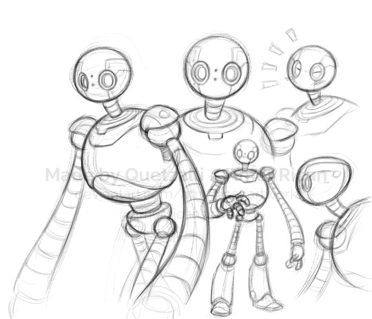
I got so freaking excited seeing the trailer for "The Wild Robot", so naturally some fanart was in order! I didn't expect the painting to look so oily and have so many softer edges, but I still think it came out really nice and was good practice! Colored pencil really has helped me figure out a personal painting process, as here I actually used a similar layering technique as when I work in colored pencil.
Aside from that though, I haven't read the books yet (though I plan to after I see the film) but this movie looks like it's gonna hit so many of my favorite tropes and features when it comes to fiction and animated stories, including: non-human protagonists (and both of my favorite kinds, animals and robots!), stylized visuals, robot learning to be more than just their programming yet still maintaining their original robot skills and behavior to a degree, robot with emotions and unique ways of showing it, character in the wilds adapting by studying the animals, post-industrial-level technology existing in harmony with nature and the wilds rather than being portrayed as inherently harmful to nature and therefore inherently wrong to make (this is a big one for me), the odd duo, the gentle giant, a character finding belonging in an unexpected environment, just general wonder for the beauty of the wilds, and probably other things that'll come to me as I understand this story more.
But even beyond that, I just had to draw Roz because she's so freaking cute! Like, even excluding the adorable way she mimics the animals or glows when happy or how her "eyelids" give her more facial variation, in design alone she's so round and sweet looking! And somehow her being big and bulky to juxtapose her kindness with an strong and imposing stature just makes it even better! I love characters who are large and intimidating at first glance but total softies on the inside. Brightbill's definitely in good hands!
If the film holds up and Roz also has a clear and entertaining personality beyond just being curious and caring, there's a 60% chance that come September she'll become my new robot blorbo (roblorbo?), up there with C-3PO, Wall-E, and Five Pebbles!
Also, another version of the sketches from when they were just the lines for comparison!
#art#artwork#artists on tumblr#drawing#drawings#sketch#sketches#painting#digital#digital painting#digital art#fanart#film fanart#films#dreamworks#the wild robot#roz#twr roz#rozzum unit 7134#quetzalli draws#seriously though she has so much raw blorbo energy even now you guys don't even know#also go watch the trailer of course
259 notes
·
View notes
Last Seen Blogs
spaceslutsworld
Spaceslut💕🌸
dovebugg
dove
littlelittlesimmies
LittleLittleSimmies
an-atlas
somebody get me an atlas

nyakorita
Nyako