#foreshortening is not my strong suit
Text
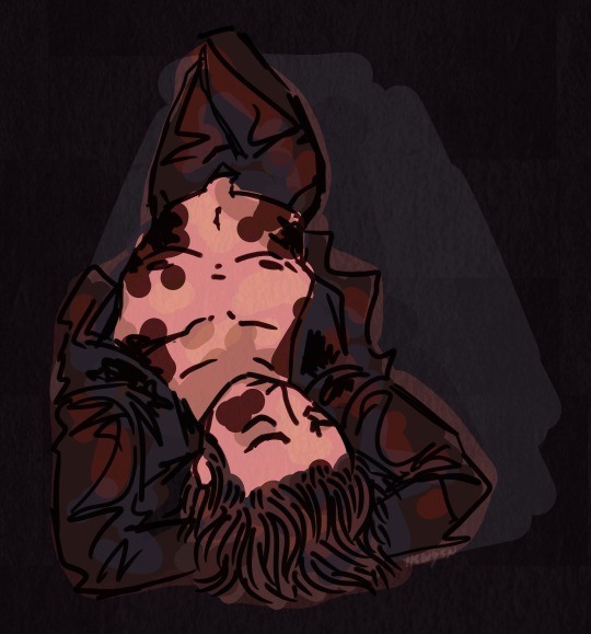
slutty serial killer man dies but in a sexy way
dnkinktober day 22: blood kink
#death note#light yagami#my art#dnkinktober#blood#cw blood#hehehe#i love drawing slutty little men covered in blood#hehehehee#anyways shoutout to my sister who posed for me that was v helpful#foreshortening is not my strong suit#i hope this shows up in the tags the last one didn’t and it has not been reblogged by the dnkinktober account yet bc i think my @s dont wor#so we shall hope
39 notes
·
View notes
Note
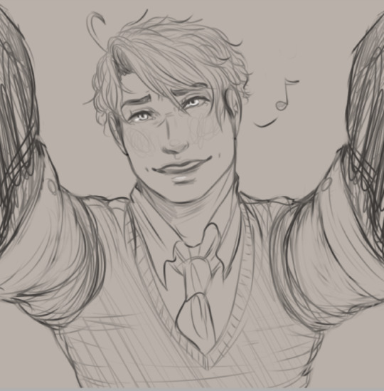
to foklow up: go ahead! i love cxi so im fine w anything wauughhh

Thank you for allowing me to draw him and sorry for the bother!
Listen……… Kurohana Chinatsu is one of my favourite artists, whatever you might want to say about their art-style. And CXI, he's… So handsome. I seem to have a weakness for Riders.
This was one of the requests I did for this palette challenge! Thank you everyone who sent me their request!
#if u come here trying to speak badly of kurohana chinatsu get ready to catch this hands#constantine xi#fgo#fate grand order#fate constantine xi#fanart#palette art#digital art#foreshortening as many other things is not my strong suit
108 notes
·
View notes
Text
So now that I've finished season 1 of bnha, I wanna try and do a little analysis of what I do/don't like about it, or in otherwords: despite being a flashy action shounen with a fun basic hook that is well drawn and voice acted, why does it lose me?
I can't add a readmore, so bear with me here
Overall
I overall like the show a good bit. Switching over to English has definitely made it more engaging for me, though it is Entirely Possible that it's primarily due to Chris Sabat carrying it for me personally. But all of the actors are great, theyre well suited to their roles, and they feel well directed. (And I'm not biased at all that I hear Saitou when Chris speaks shut up, im sorry my fave role of his is such a small one when the man literally voiced in DBZ)
The hook IS genuinely fun. I LOVE the concept of a kid showing such an urgent desire to help that he inspired a known pro hero to push himself as well, and I am always weak for Strong OP Master accidentally adopting a kid that he initially wrote off, but in such a way that he would Kill for said child. Better still when, in order to make the child his apprentice, he gives the child a piece of his own power (see: the breaker for another fun example of this narrative) and this ends up hurting him down the line.
Animation
The animation is also very fun. They let these kids make Great Expressions -- lots of wrinkles and lines, over exaggerated when necessary to drive home the intensity. The action and posing is fun, tons of foreshortening, great camera angles for a lot of the fights.
So with all of that being as fun as it is, I think it loses me in 2 places: narrative and lighting.
Narrative
Basically -- the pacing just feels Off. I think I'm not a huge fan of introducing shigaraki so early in the game, instead of having no build up to them as a threat, and then turning around and going into the sports fest... it isn't even whiplash, it just doesn't feel like those arcs were supposed to come one after the other like that. Like there should have been an arc before USJ that helped ramp things up a bit more, made the USJ bit feel more impact full. In stead it just punched you in the arm, said "Jah! Bet that was scary" then ran off leaving you more confused why you were punched in the arm at all.
Lighting
Lighting really just boils down to All These Scenes Look The Same. They all have the same lighting intensity and shadow placements, every scene is as saturated as the last. Even the shots of Deku in the night, or Deku leaving school at sunset have largely similar lighting, it's just the color itself that is off.
There is only 1 scene I can recall in those first 15 eps (I'm 2 eps into season 2 so shh) that had any distinct lighting: the scene where Deku completes his beach cleaning and the sun is still rising. It created a fun back-lit effect on him, and was gorgeous when combined with the raw emotion and his scream. Loved That.
But there were other opportunities to use lighting just as dramatically, especially in the USJ battle sequences, when Shigaraki first appears. This is such a terrifying, heavy set of fights, but the whole time its illuminated like it's just a sunny day. There's no dramatic shadows that obscure half a characters face, no fun colorful spec lighting to help them stand out against the combat around them. They just look the same as they do in any other scene. I think, writing about this now, that has a huge impact on the fact that these fights are occasionally losing me. They're fun they're fast, theyre flashy, and I like that, but they don't look any different.
That said, I know there's a few scenes later in the show that look to change this up a bit, but I'm not sure when they do, or how often either.
#bnha#mha#my hero academia#major ramblings#im tryong to be more like#ok well WHY dont you like broccoli#is it the taste? the smell? the texture or color?#is there someway to cook it or chop it up to make it easier to eat next time?#otherwise im just gonna keep feeding other people broccoli#without realizing there were ways to make it more apetizing#weird analogy maybe#but maybe you get the point
1 note
·
View note
Text
foreshortening isnt my strong suit but I’m trying
33 notes
·
View notes
Note
7, 19 and 25 for the art asks! Love your stuff btw!!
Aah thank you sm!! 😊 love your bio btw! 💕💕
7. How often do you use references? Sometimes?? Like i often like taking multiple references and inspos and just looking at them all for a while and not use them a lot when i am actually painting, only for the sketching stage. I like to keep my mind open without them. For pose references i usually just set up a timer and take a pic of myself bc i dont know who else has used the references online. When i do actually use a specific picture reference its bc i stumbled upon it on tumblr or something and felt a spark. But more often than not i dont use them
19. What is the most difficult thing for you to draw? Tiles/blocks, especially when im doing more realistic and less styled drawigs, getting the size, spacing, and perspective right is tricky. Buildings because i can never manage to make them look interesting but not in a tacky way. and Foreshortening isnt always my strong suit.
25. Do you like to draw in silence, or with music? Music, always music. I feel like music is suck a key inspiration and factor to my creative process. I like to feel out the vibe of what im doing and make a playlist for it, so it can all flow better. Hell sometimes when i dont have a direction i put some music and let it guide me, thats why i have so many pink floyd-inspired pieces 😂
Thank you sm for asking! 🖤🖤
1 note
·
View note
Text
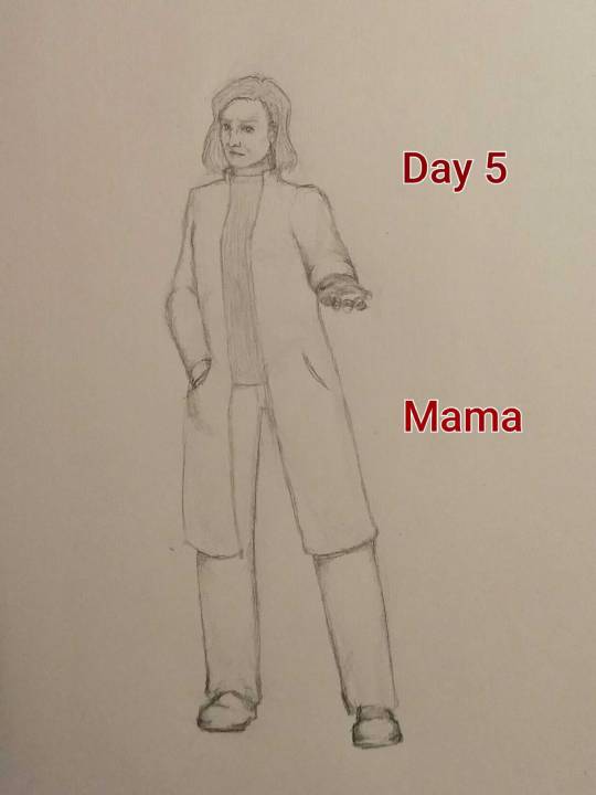
Day 5: Mama. I love her. And I had fun drawing this expression and pose, even though hand foreshortening is... nnnoootttt my strong suit. I'm working on it. Thought about adding ink to this, but I like my pencil shading and didn't want to potentially make it look weird in a way I couldn't fix. Maybe I'll give it a shot anyway. Thanks to @rustic-hospitality for the prompt!
19 notes
·
View notes
Photo
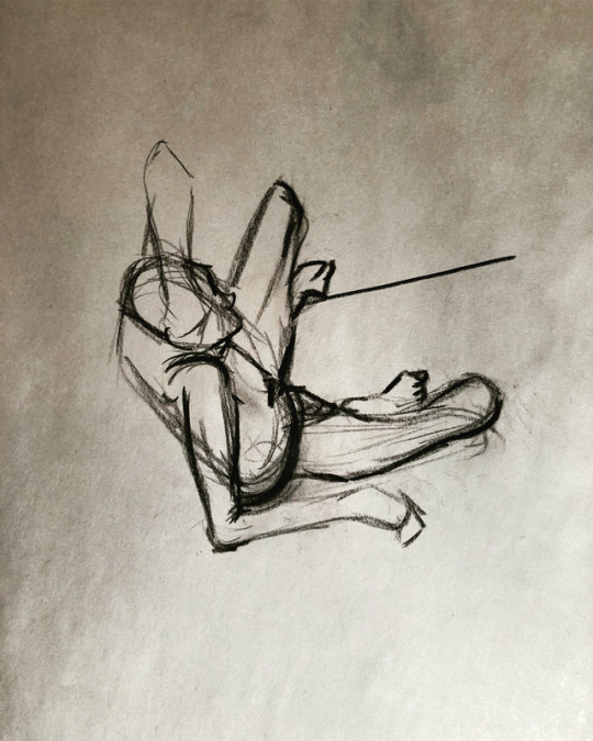
Recruiters would tell me my strong suite was my figure drawings and I used to think I was pretty good at it until i took the hardest class in my life thus far. 😂 it was of courses called “foreshortening and other difficult poses”. It was just a one day seminar, and I was striped away from how I usually draw and learned literally the right way to draw. Even though I have these crappy scraps, I am very grateful for what I learned and can’t wait for more! Really learned that for the rest of my life I’ll never be a “pro” at something and I’ll always keep on learning and doing new things. Ps- thanks @aidanterry1 for letting me borrow your pencils 🤗 #kellidrawssomething #figuredrawing #learning
3 notes
·
View notes
Note
Hello!! I'm not sure if you take criticism on your art or not, and if the latter is true, I apologize and you can disregard this ask. However, I was looking at one of your more recent art pieces (the one of Virgil), and I noticed that you draw your characters' arms very long? This could, of course, be a stylistic choice, and if so more power to you, but if you wish to go for a more "realistic" or, dare I say "pleasing" portrayal of the human figure, I'd suggest working to shorten the arms.
Hello!
I do take critiques, and I appreciate the time of anyone who looks into giving one!
Yeah the anatomy was a bit wonky on him there, I ended up shortening the torso since it was a sketch, but I’ll def look into a bit more of the foreshortening for posing as well as better anatomical structure, it is always a struggle. Realism is also hecka not my strong suit, but it’s important to have that anatomy down of course, I am always gonna give it the good old college try (cause I am still in college lol)
Thank you and have a nice night!
3 notes
·
View notes
Text
Narrative Analysis of My Self-Published Book
Understand why the fire within my spirit continues to spark.
Hello, all! Months ago, I came and returned to working on putting together an anthology of several of my old poems, coupled together with a few new ones.
I decided to title it, Thriving Fire because, in some kind of way, I see myself in this state of constantly dying and dying, only to return to life, like the rekindled flame of a phoenix. Thus, after each death, I’ve come back, thriving to get something out of my life.
I called this my odyssey because, in one way, life is literally just a journey. Life is different for everyone. No one should feel overwhelmed and pressured into reaching an end goal, because I feel like there is no end goal. Life’s just an individual’s constant striving to make something out of this crazy world.
And so, I present you with my written narrative analyzing the entirety of my book.
In reading Patrick’s latest anthology, Thriving Fire: Musings of A Poet’s Odyssey, the reader will find that the poems as a whole, range across an unflinching self-dubiousness and uncertainty that takes reign over the narrator’s life.
“I have lived in a suit of denial, to escape the pain that decors me, / wondering if I might move on from this Life, and faceless journeys to come” — Subsequently (poem), Patrick Jonathan Derilus
The narrator, frightened of the mundaneness and absurdities of life and human existence, are often what causes him to alienate himself from the world. This alienation is his attempt at escaping reality. The narrator describes entities to be “faceless” to mean that they are unknowable until they are seen, not yet experienced, unable to be described, and to some degree, unpredictable. Finding that the narrator feels that he cannot live in full confidence not knowing what will unfold with each day that passes, he is worried and dissatisfied. His character gives the reader an atmosphere of pessimistic calculation and apprehension.
Although he has had fleeting glimpses of having experienced a fulfilled life by his own definition of success and self-contentment, the narrator sees his future as foreshortened. He has thought ahead with a realistic perspective. He felt that it would be smart that he does not have children. He is certain that he would not want to bring a child into the world while he is already conscious, that he himself is not emotionally and financially stable enough to raise a child in the future.
He considers the idea of the White American dream to be self-destructive, capitalistic, and corrosive enough to leave an individual devoid of their sense of meaning and purpose in life. He would somehow like to live without the coercive will of the dominant White society pressuring him to pursue a home, a car, have a wife, and to bear children. These were previous aspirations he’s had albeit he was ingrained with antiquated ideals of white supremacist heteronormative capitalist patriarchy at a younger age; nevertheless, he’s reevaluated the institutional values of the White American dream and has found himself straying away from it. He assigns the White American dream to be nihilistic, and investigates the ideal with numerous, recurring questions:
“Do I want to live the White American dream? Or does the White American society, which has regulated racist, sexist, patriarchal, capitalist, and heteronormative practices for years, demand that I live up to its standards? Why should I be subjected to living these mundane customs? What do I want from my life before I die? What is there to strive for, other than being remembered as a literary? What is out there? What would there be for me to strive for, other than being a literary, which helps me cope with existing in this world? If I live long enough to reach these goals, what will they be, if I am to come up with something genuine to live for? What does it mean for me to be Haitian? To be Black, and American in America?“
In spite of the melancholic and meditative atmosphere of this book, there are lighter pieces that give the reader glances of reaffirmation and motivation to the narrator himself, writers, artists, and the like:
“from solace in nature, write poems that move you / weaved through eloquent stanzas and verses that resonate to soothe you” — Meta-Inner (poem), Patrick Jonathan Derilus
The narrator verses to the reader a selection of his meta-poems and meta-prose pieces as resonating incentives. Finding his pieces of a didactic nature to be helpful, it is his attempt in trying to call other artists to action to create for fun, to create for relaxation. He wants artists to move away from external distractions such as the Internet, people, environmental noise, the uncontrollable mess of thoughts running through their minds, urging them to find places distant from their societies to just create for their self-satisfaction, to feel comfortable in their art.
He thinks to himself,
“What do I truly want out of life? Not anyone else imposing what they want in life onto me, but what do I want? Seriously. I feel as if my will is willing not because I have been choosing to will myself to life, and existing in life. I feel like this will, which has been dragging my neck across life like an existential noose, is from the collective will of my loved ones, suggesting that if one gave up on their life, it would be considered a reprehensible solution. Though I have distanced myself away from my loved ones more than needed, I anticipate that they will dismiss my existential concerns and they will still have a strong, collective faith that I’ll get something out of life regardless of how I feel.”
His character is portrayed as distraught, anxious, and tense in the existential sense of the word. Overall, he undoubtedly has the youthful spirit of an endearing old soul and a provocative insight that is inclusive to many readers.
The thriving fire is an element of continual reemergence that constantly enters and departs the cycle of birth, death, and revitalization. The odyssey is my journey. I am the thriving fire.
via TheOdysseyOnline: https://www.theodysseyonline.com/thrivingfire-musings-poets-odyssey-literature-poetry-anthology
#poetry#black poetry#pain#vent#anger#peace#world#identity#life lesson#black power#america#life#black people#black women#black men#poems#wetheblackpoets#submission
11 notes
·
View notes
Text
Artist’s Commentary
Rather than a new page this week, I will instead be reviewing and providing commentary for the previous 10 pages published. For the most part I will be going over my own mistakes, as well as explaining some of the choices made, and whether or not they worked. Before we start however, I would like to note these pages are not complete, but more of a rough draft. There are several reasons for this. One major reason, is that it has been several years since I have drawn with any regularity. Producing a page each week will, I hope, shake off the rust. Additionally, neither my or my brother's hardware is up to the task of rendering RFO. One day, RFO may see an updated version that better fits our mutual vision of this project. And so, the commentary begins. RFO 1 -Jude Anderson lives in a poor neighborhood; identical row houses with unkempt lawns and no decoration outside. -My first mistake was leaving the sky blank. Its meant to be near midnight, but the bright sky and lack of shading imply otherwise. -Jude's front door and the paneling on it will change in scale just about every panel. Partly, this is because there was no consistent model. -Jude's house -interior and exterior- were modeled in Lego Digital Designer. -Jude's house number is 616, a less popular interpretation of the number of the beast. -My original attempt at this was painted in photoshop. The foreshortened fences were an absolute nightmare. I'm still not too happy about them as drawn now, but its still better than it was. -I forgot to shade the first floor window shutters. Oops. RFO 2 -Jude is whistling the ever popular 'Happy Birthday'. I’m not totally certain about the notation here, because I haven't had to read music since middle school. (side note: This song recently entered the public domain) -Jude's outfit was inspired by Back to the Future's Marty McFly. -I forgot to put a candle in the birthday apple pie. -You may notice Jude has no visible fridge in his kitchen. Jude cant afford a full fridge, or fit it in his kitchen. Instead, anything he needs cold is kept in a basement mini-fridge. -Jude’s facial features and hair take inspiration from Norville 'Shaggy' Rogers of Scooby Doo. -You may notice the quality of characters hands changing. Hands are still difficult for me, but I'm hoping to improve. -My brother pointed out that the carpet in Jude's living room looks like grass. I'm not really certain how one draws carpet. -The leftmost painting depicts two figures with an arm around the others shoulder. A third figure appears later, but there is no story significance, I just forgot what it was supposed to be. RFO 3 -The overly enthusiastic individual at Jude's door is meant to be androgynous. I feel I made them a little too masculine -The design on the handbag clearly denotes a christian denomination, although not any specific one. I wanted it to be generic, but evocative of several things. (a cross, a sword, an angel, a shooting star, etc) -While it was done primarily to help them stand out, the white outline around the stranger nicely implies a holy glow. -I'm most proud of this page, and how uncomfortable and annoyed Jude is by this stranger interrupting his birthday and asking about religion at midnight. -Several of these pages were first sketched in faint colored pencil. Its not meant to show up when scanned, but clearly that didn't work quite as advertised. -You may notice proportions are inconsistent, especially regarding head size. Like most of my mistakes, I did not notice until it was already too late to fix without starting the whole page over. -The handbag is unshaded in the last panel. RFO 4 -I'm not sure how I feel about these sound effects in retrospect. I'm still toying with how they work. -One habit I need to break is placing speech bubbles too close to the papers edge. The scanner sometimes cuts them! -As Jude gets more confused and frustrated by strangers popping up at or in his house, his hair gets wilder. -Jude's house layout is similar to several I personally have been in. RFO 5 -I'm not happy at all with the posing of the officer; they're so stiff and lifeless. While I could try to pass it off as part of the stranger's idea of how a police officer asks, the truth is that even when my skills weren't rusty; posing was never my strong suit. -Some panels have blank backgrounds partly due to laziness on my part, and partly so the paper could be held without smearing -The officer's nametag reads 'GATES'.This, along with his unusual badge and emblems, indicate that this is still the same person who was at Jude's door only a minute before. RFO 6 -I don't have much to say about this page, except that the officers uniform is visibly becoming simpler by the panel. This is because drawing those details was hurting my wrist. In the future I will try to be more economical with character design. RFO 7 -If the past ten weeks have taught me anything, its that I should plan out what I'm going to do more thoroughly. Jude's speech balloon was drawn first, and ended up over the other man's crotch. Now it looks stupid. -The officer (stranger) tends to be to Jude left, while the other man tends to the right. -The middle left panel is another I'm proud of, not for any major thing, but because tilting the head is difficult for me to do on purpose; especially when the part of the head where the jaw meets the neck is visible, but I think I did okay here. -The hard angles and edges of the final speech balloon show the officer is stern and serious. It is also shaped like a stop sign. RFO 8 -While the officer is still left of Jude (to the viewer), he is now right of the other man. Left positioning in RFO signifies benevolence, right signifies malice. It could have been the opposite just as easily, but sometimes you have to make an arbitrary choice for theming purposes. -The other man's hair forms horns on the sides and a tail in the back whereas the officer's (stranger's) hair is more flowing and wing-like. -Jude only owns one other jacket, as seen in his barren closet. -The officer's proportions in the bottom left are so off, I'm not sure why I thought it looked okay. -The other man's outfit and personality are meant to evoke a stereotypical used car salesman. Also Rodney Dangerfield! RFO 9 -Not much to say here. I will continue to simplify the style until an equilibrium is met between making things look good versus not destroying my wrist. -Also, the other man's sleeve in the first panel is missing its vertical stripes. RFO 10 -Jude's face in the last panel seems off to me. I don't quite know why, and I'm the one who drew it. -When I originally planned this page out, there was too much vertical space. It would have left me either having to draw their legs (which would been difficult with the furniture in the scene at leg height) or leaving a terrible amount of dead air above their heads. Instead, I tried to do something more visually interesting with that negative space, by making the last two panels more diagonal than horizontal. Jacob Birmingham
0 notes
Text
Hyperallergic: Beer with a Painter: Peter Acheson
Peter Acheson, “Eva Hesse” (2011-2015), oil, acrylic and collage on canvas, 12 x 16 inches (all photos by Charles Benton and courtesy Brennan & Griffin)
Peter Acheson, who lives in upstate New York, uses his living room as his winter studio. The “hearth,” which we sit around, is an old bookcase/hutch. He uses it as a provisional viewing station for paintings — propping them up and rotating them on the shelves and along the floor — as we talk. It’s also where he keeps the sound system and a stack of CDs. The Stones or Dylan are usually on deck. A paint-splattered tarpaulin lies in front of the bookcase, and chairs are pushed to the edges of the room. Jars of acrylic paint and yogurt containers filled with brushes are right on the floor; this is where he works.
It’s a painting and rock ’n’ roll den, where art is the total, almost devotional focus; Acheson does not care about trading niceties or being ingratiating. He would rather propose and debate philosophical ideas. But he’s been quoting poetry all day, ever since he met me in a café in Hudson, where he was holding a copy of Robert Bly’s Eight Stages of Translation. We read Guillaume IX of Poitier’s “In the Great Sweetness of Spring” together, and one passage in particular became a point of reference: “Our love moves in this way: / like a branch of the hawthorn tree / …I want my God to let me live / to have my hands beneath her cloak again…”
Peter Acheson (photo by the author for Hyperallergic)
A similar combination of rawness and sensitivity is what gives Acheson’s work its potency and range. His paintings are ravaged, earthy, and acutely considered, all at once. They employ a host of painterly gestures, mark-making, and collaged interruptions to the surfaces. He often paints on rough panels, burlap, and wood scraps, and attaches found elements like seashells and animal bones. He makes delicate, scribbly line drawings on paper, à la Henri Michaux. He also makes paintings with mysterious pictographic forms, bands of color, and dense layers of impasto paint. He frequently scrawls the names of his artist-heroes, or lines from poems, across the paintings. They are abstract odes to felt experience.
Peter Acheson was born in Washington, DC in 1954 and received his BFA from Yale in 1976. He was an early member of the Williamsburg art scene in the 1980s, and now lives and works in Ghent, New York. His work has been exhibited at Novella Gallery, New York; John Davis Gallery, Hudson; the Academy of Arts and Letters, New York; Elizabeth Harris Gallery, New York; and Baumgartner Gallery, New York. In the winter and spring of 2017, he was the subject of two solo exhibitions, at Thompson Giroux Gallery, Chatham, New York, and at Brennan & Griffin, New York.
* * *
Jennifer Samet: Do you have childhood memories that factor into your paintings?
Peter Acheson: I have this memory from when I was about four years old. I was on a tiny beach in Cape Cod, digging my feet in the sand at the waterline. I got my legs fully buried under the lapping water, and felt something under my toes. I kept trying to reach it but it was way down at the bottom of a hole. Finally I pulled it out and saw that it was a small toy truck. It was metal and old, probably something from the 1940s. It was so corroded that the original shape of the truck was obscured into a pitted, abstract mass. To my eyes as a child, it was highly mysterious.
I was overwhelmed by the sense of discovery and wonder of excavation. I think about that still, because at certain moments I have felt a shudder of recognition — that same feeling of wonder and discovery. I have felt it with images in my own paintings that seemed to spring from a buried place outside of myself. And I’ve had it when looking at other art and objects. It was strong when I saw Cy Twombly’s plaster sculpture, which can be just on the other side of recognizability, as if they are weathered or eroded. They are like manmade things that are returning to nature. Everything has been softened. That is a quality I am looking for.
Myron Stout’s paintings can look like some kind of goddess sculpture from pre-dynastic Greece that’s been buried in the Mediterranean for one thousand years, and excavated. Is it a creature with two horns, or is it a seashell? That sort of mystery is what art taps into.
Peter Acheson, “Untitled” (2015), oil, acrylic and collage on board, 17.5 x 21.25 inches
JS: You studied at Yale in the 1970s. How did it impact your development as a painter?
PA: Yale was very much a problem-solving environment. Al Held was the dominant force and the graduate critiques would also include William Bailey, Bernard Chaet, and Lester Johnson. They would say things like, “He has to turn the figure three quarters of the way around, or “The foreshortening on the arm isn’t long enough.” There was a dissection of the painting as if it was a math problem to be solved. That affected my thinking about painting; I used to think like that.
Judy Pfaff and Joseph Santore were also there, and everybody talked about how “You’ve gotta make space.” I bought into it for a while, and when I got out of college, I was trying to make overlapping planes. They never looked spatial enough to me. Then I would sort of get confused by Minimalism.
Now, I don’t care about space; I’m interested in place. I want the painting to be an extremely specific event. It is as if you were walking in the woods and you saw a tree with rotting mushrooms growing out of it. You’re interested in it; you’re drawn to it; you’re looking at it thinking, “God, that’s so beautiful.” Then you look up and you see silhouettes of pine trees against the blue sky. It’s a completely different event, but it is the same world.
In several paintings, I have incorporated text from the poem “The Deer Fence,” by the Tang dynasty poet Wang Wei. It is one of the most famous poems in the Classical Chinese canon. “Empty mountain / no one to be seen / but hear — human sounds / returning sunlight enters the dark woods / shining again on green moss.” It is nineteen Chinese characters, but English speakers have translated the poem in a wide variety of ways. Eliot Weinberger wrote about this in his book 19 Ways of looking at Wang Wei: How a Chinese Poem is Translated (1995). I love that idea: how did all that variety get built into it?
Peter Acheson, “Untitled” (2012), acrylic and collage on canvas, 12 x 9 inches
JS: Your exhibition in Chatham incorporated different painting approaches, and work from different periods, installed in little groupings. Why is variation important to you?
PA: When your vocabulary is dispersed enough, you can go from one painting to a totally different one. I am hardly ever stuck on one. It is a formal strategy that I devised for myself: you make fifteen different things, and hopefully they will circumscribe a circle that you could loosely describe as yourself.
I think of it as a polytheistic aesthetic, and it’s my response to the stress of having to find one style that suited me. You and I and each of us are like the cast of Hamlet — a play with many actors. Our psyche incorporates all of those characters. James Hillman is the psychoanalyst writer of the polytheistic soul. He said the Greeks had it right. You have to have your God of War. And when you are in command, you better have your Zeus; you can’t be Eros. All these characters are necessary.
I am not interested in being a reductive formal artist. I grew up in a reductive formal environment. I went to private school, and a private college. I was expected to achieve, to be good. I grew up with Chris Martin; we were best friends since childhood in Washington, DC, and we talk about this all the time. The expectations on us were so high that we just want to fail.
I was told, “You are an Acheson.” So doing what I am doing is tremendous freedom. Once I sent Chris a text message saying, “I made a really bad painting today and I love it.” He sent me back a text saying, “Irrevocably bad, irredeemably bad, terribly bad, awfully bad…!” I have gotten out from under that WASP work ethic. I don’t want to harsh painting’s mellow by getting all formalist on it.
When my youngest daughter was seven, she saw me painting in the house and would ask if she could paint too. At the end of the evening, there would be five paintings by her and one of mine. All of hers were much better and I thought about why that was.
Peter Acheson, “Untitled (Clearing)” (2010), oil and acrylic on canvas, 11 x 14 inches
When I was about seven years old, I was sent to private school and had to start wearing a tie, get my hair cut, shine my shoes. I was being told, “Peter, it’s time to grow up.” I had to leave my seven-year-old imaginative inner feminine behind. My daughter Izzy came along years later and demonstrated what that was, right in front of me. I come to the canvas with all this baggage. In that period, from about 2004-07, I tried to unpack that baggage, to get more childlike and open.
JS: Does being open mean not making many painting decisions in advance?
PA: I don’t want intention to be the driving thing. It’s more about an aesthetic response. It is similar to the response of going outside and saying, “Wow, what a beautiful day.” You didn’t conceive it. You didn’t invent the trees or the sky or the car or whatever. You just go, “Fuck, what beautiful light right now.”
That is the state I want to present to the viewer. It doesn’t matter what the content is. It could be a mud puddle; it could be a bright red tractor in the rain; it could be your girlfriend’s face; it could be a cat.
Hillman discusses how the word “aesthetic” is related to the Greek word “aisthesis,” which means “to breathe in” — a sudden intake of breath. He said when something causes you to suck in your breath, that’s aesthetics. That is what I work for.
JS: You often write the names of other artists right on your paintings. It’s like announcing your influences. I was thinking about how you like Julian Schnabel, who seems to be an artist unafraid of taking from other artists. Can you talk about that, and some of your other artist heroes?
Peter Acheson, “Eva Hesse” (2016), oil and acrylic on canvas, 12 x 28 inches
PA: Yes, Schnabel is a big, grandiose, open-hearted, wear-it-on-your-sleeve artist, and I love that about him. His work is saying, in effect, “I am just making a love letter to Twombly.” They are big acts of erotic interest — in Van Gogh with the Roses, in Twombly with the blobs of paint. The great thing about Schnabel is that it is an act. It is painting as a performance art, like a band up on stage. What is the act? How well does your band play? Schnabel’s whole act is making the movies, being the director, wearing the bathrobe.
In his autobiography C.V.J. (1957), Schnabel talks about the work of a painter as “a bouquet of mistakes.” That is poetry — because we are all going to make mistakes. But, what if you made the mistakes on a twenty-foot scale and they ended up being beautiful?
I am proceeding by means of granting myself more and more permission. It is like, “I just visited [Forrest] Bess in my studio today; we hung out.” Or, it’s a fantasy of being in Raoul de Keyser’s studio and he asks me, “Hey, do you want to study with me for a while?” I say, “Fuck, yeah; you’re one of my heroes.” So I paint like de Keyser for a while.
Peter Acheson, “Palermo in…” (2015), oil, acrylic and collage on panel, 18 x 24 inches
Blinky Palermo’s painting series “Times of the Day” (1974-76) at Dia:Beacon is another thing I am influenced by right now. The paintings are so specific.
JS: You mentioned allowing oneself to make mistakes. Can you talk about the idea of failed paintings and how that is part of your process? Also, you mentioned big paintings, but you tend to work on a medium to small scale. Why is that?
PA: I am interested in the idea of making a painting that fails. Sometimes I will be making a painting and say to myself, “This painting is just failing.” Then I’ll look at it for a long time, and sometimes realize the painting is not actually failing.
I’ve made big paintings before, but I am no longer interested in impressing anyone. I want to draw your attention. My heroes are artists like Myron Stout, Forrest Bess, Gandy Brodie, and Jan Müller, who work on a dense, small scale. You always are walking up to the painting. You’re drawn in.
It is like the way you would look at a rose bush. It draws you in and rewards close looking with the feeling of general erotic attraction. Hillman says that it is not a question of whether it’s good or bad. It is a question of whether you are interested in it. The Latin root of interest is inter esse, which means “to be between.” There is an energy; it’s not just the painting; it’s not just you. It makes you think, “I am interested in this.”
JS: Your work often becomes object-like; you collage pieces of wood or other scraps onto the surface, and sometimes use irregularly shaped panels. How does that impact the work?
PA: I want to proceed by means of violations and defacements. Often, I am trying to violate the abstract painting language. So I will glue scraps of wood onto the work. I tend to save things and have a shop in my studio, so this stuff is around. I love paintings, but I like using objects to challenge their painting-ness.
Peter Acheson, “Untitled (Thornton Dial)” (2012), oil, acrylic and collage on canvas, 18 x 24 inches
I have been in the position before, when I was painting only with oil on canvas and I always had this feeling, “The world doesn’t look like this.” The world has got all this shit in it: thin people, fat people, babies. My sneaker has a hole in it, my car has a flat tire. How do you get all that experience — experiences like watching your wife give birth — into your work?
I want my wobbly, uneven life in the work. An artist with a solid base under him or her can make a work that is, as Schnabel said, “a bouquet of mistakes.” It’s like — I broke up with the wrong woman; I was in love with the wrong woman; I was a fool. The fool can make the painting. Why edit the fool out? Why edit out the bad luck? Why edit out the heartbreak? Why edit out the joy and the ecstatic?
JS: Despite the fact that you talk about incorporating failure, I feel that each one of your paintings in the show at Chatham is so beautifully considered, and has a sense of quality. Do you think about “quality”?
PA: Yes, and I love this question. In the early 1960s, the Beat poets, especially Allen Ginsberg, were criticized for not caring about quality, for just getting drunk and saying whatever they wanted to. Gary Snyder was asked about this in an interview. He said, “I worship at the lotus feet of Quality.”
I agree; I want quality like the experience of seeing a hummingbird on a flower. The particularity of that event, the quality of the flower, the bird, its energy, and the fact that it even exists, puts you in a divine state of grace. You are hooked on the quality of the experience. It is like looking at a lichen-covered rock on the North Peak in the Catskills, seeing an owl feather, or experiencing an autumn day. It is a natural event but it’s stunningly beautiful in its particularity. I don’t want the work to be general. I want it to be extremely specific. The quality is tied to the particular attributes of a place. It’s not space, it’s not casual, it’s not sloppy. I am asking the painting to speak back to me, and until it’s speaking back to me, I will keep working on it. You know when a painting is done when you fall in love.
JS: Tell me more about the connection between love and painting.
PA: Several years ago, I was dating a woman artist who was such a muse. I was in love and it was just fantastic. For six months I went around feeling like I could not fail because all I had to do was work on the paintings, and let that energy be there. The muse energy was bigger than me, and I was spreading it out over all these canvases. I was making the paintings that the art dealer Kevin Rita calls my “vibratory paintings” using the side of the brush. I could make formal decisions, but the general approach was just ecstatic. Then I would go back into the paintings and tighten them up.
Peter Acheson, “Untitled (Reef)” (2016), oil and acrylic on canvas, 18 x 24 inches
I think about Eros and love. The equation is that you start with beauty — beauty in the world, beauty in a person, or beauty in a painting. Beauty creates desire. It creates an attraction, which, in a human being, translates as desire. It is not mere wanting. You can solve wanting by going to the mall. Desire is unattainable. Robert Bly says, “I desire to be as great a poet as Shakespeare.” It’s not going to happen, but the desire for that makes life sweet.
Hillman says, “Desire creates the growth of the wings of imagination.” To me, that makes a lot more sense than sitting around figuring out a problem. There is a Rainer Maria Rilke poem called “Remembering,” which is about this. It is about looking for something that will, in Rilke’s phrase, “infinitely increase your life.” I think about the idea that there is a painting in your future, either as the viewer or the maker, that will “infinitely increase your life.” You haven’t found it yet, but you better get busy.
The key is that you might not find it. It is in the looking, the working hard enough. I am in a hurry to find that painting. I may not find it, but the journey towards trying to find it will be fucking awesome.
The post Beer with a Painter: Peter Acheson appeared first on Hyperallergic.
from Hyperallergic http://ift.tt/2pvxcDZ
via IFTTT
0 notes
Last Seen Blogs

dirtybabygirls
Best Diaper Girls

transfucked
crunch !

knewavatars-blog
avatars baby!

elishablue87
Elisha Blue ♡♢

neptunedits
♆ icons