#eyeondesign
Text
link
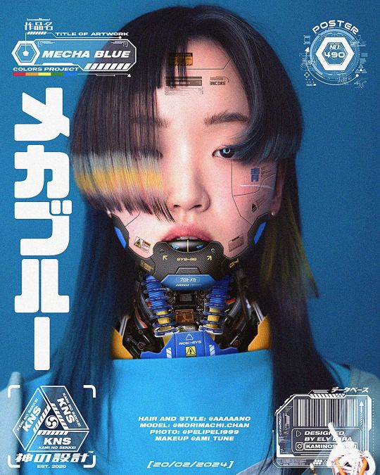
#@kaminosekkei#kaminosekkei#No. 490: Mecha Blue.#graphic design#art direction#graphicindex#behance#visual arts#acidgraphix#postereposter#visualgraphc#gfxmob#digital art#designfeed#typeposter#thedesignblacklist#visualgraphic#collectgraphics#conceptart#eyeondesign#postereveryday#digitalartists#grafikfeed#conceptdesign#art#design#color#style#character design#typography
119 notes
·
View notes
Text
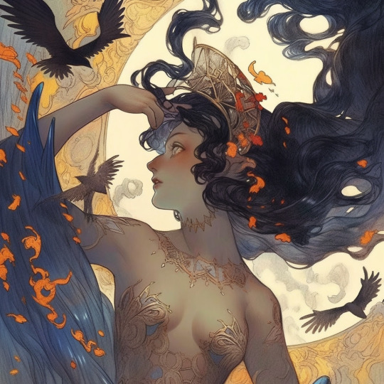
#illustration#digital illustration#manga#aestheitcs#elegant#elegance#art#anime#anime fanart#oil pastles#oil on canvas#oil painting#artists on tumblr#beautiful#black art#lol#dark stalkers#wow#eyeondesign#romance
216 notes
·
View notes
Text
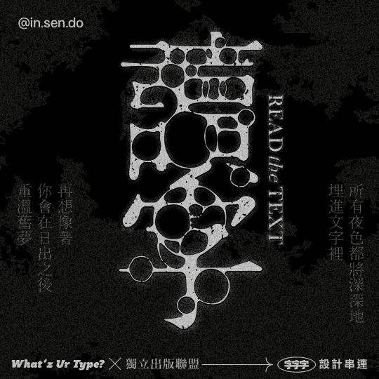

𝗥𝗲𝝰𝗱 𝗧𝗵𝗲 𝗧𝗲𝘅𝘁
十一月主題「讀字」
-
(抽到34號)
「所有夜色都將深深地埋進文字裡,
再想像著,你會在日出之後,重溫舊夢。」
師及《從前的人》── 明銀
天河創思出版社
-
感覺像是沒入水中分解後,
再次浮出水面。
-
#whatzurtype
is a monthly type design event held by @justfont
The topic for this Nov - 讀字(Read the text)
was set by @indiepub.tw(獨立出版聯盟)
There are 34 pieces of texts from different books for people to pick by draw as their design topics.
The copy I got was no.34 -
“The whole night view would be deeply buried in the texts. Then imagine that you will be reminiscent after the sunrise.”
-
It feels like sinking down and dissolving in the water, and then emerging back up.
-
-
-
#字字字串連#typedesign#lettering#graphicdesign#chinesetype#graphicradar#typography#typographic#type#logo#logodesign#logotype#customtype#goodtype#graphik#eyeondesign#coolfont#文字設計#做字#作字#標準字#字体#漢字#디자인#타이포#인생도#타이포그래피#로고#로고디자인제작
62 notes
·
View notes
Text

#jodlic#delaigle#art#illustration#artists on tumblr#beautiful#ai#male model#eyeondesign#surrealism#malefeet#chimera
59 notes
·
View notes
Text
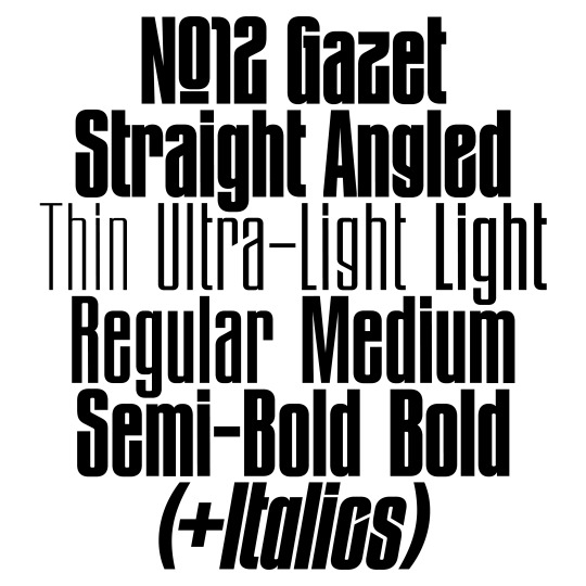
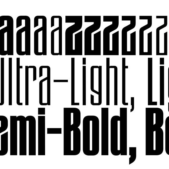
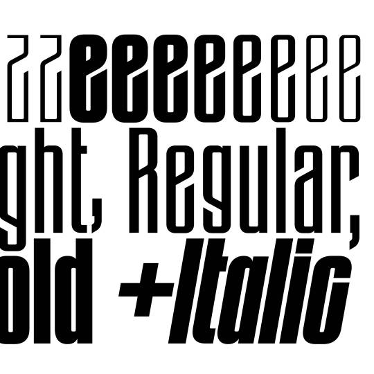
The original »Bold Angled« style has been complemented by lighter weights, italics and an entire family with straight endings making it a versatile family for a wide variety of display usage. OpenType features such as a monocace feature allows tight line spacing and creative typesetting.
www.new-letters.de
#newletters#typography#gazet#condensed#grotesk#thomasjohn#release#graphicdesign#eyeondesign#grafikradar#tomorrow_featured#typeinspire#contemporarytype#typegoodness#thedod#designfeed#typetype#365typefaces#aigadesign#itsnicethat#designeverywhere#type01
30 notes
·
View notes
Photo
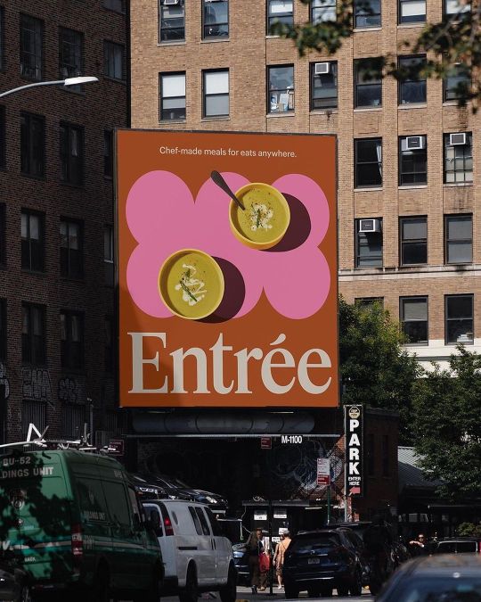
@sainturbain Entrée’s delivery service provides chef-crafted meals that taste as good as a plate from your favorite restaurant. In a highly competitive market, they needed a fresh brand strategy and identity to set them apart and capture a new audience. #identitydesign #thebrandidentity #certainmagazine #eyeondesign #inspofinds #logotype #logodesign #designspiration #graphicindex #brandinspiration #selectedwork #contemporarytype #brandcuration #visualinspiration #logosai #brandidentity https://www.instagram.com/p/CpCRXQKBSt7/?igshid=NGJjMDIxMWI=
#identitydesign#thebrandidentity#certainmagazine#eyeondesign#inspofinds#logotype#logodesign#designspiration#graphicindex#brandinspiration#selectedwork#contemporarytype#brandcuration#visualinspiration#logosai#brandidentity
7 notes
·
View notes
Photo
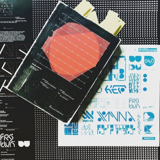
DU™️ #Repost @theageofdata ・・・ 🚧🚧🚧ANALOG ALGORITHM - Source-Related Grid Systems by @christophgruenberger 💥💥💥 • @larsmullerpublishers @detroitunderground • • This book is a tool kit to create new forms. It deals with grid-based design and gives the reader techniques to develop new forms, fonts, logos, and patterns. Both a workbook and a source of inspiration, this publication provides designers and architects with the tool they need to find analytical forms—analog, algorithm-based, exploratory but never of arbitrary origin. • • With a foreword by Paul McNeil @muirmcneil Synopsis by @paul_heys • http://www.analog-algorithm.com • • #corporatedesign #collectgraphics #posterreposter #certainmagazine #typography #thedesignblacklist #curatory #itsnicethat #posterdesign #graphicdesign #eyeondesign #designfeed #posterdesigncommunity #editorialdesign #swissposter #plakat #swissdesign #designinspiration #book #bookdesign #type #typeface #typedesign #pattern #larsmullerpublishers #christophgruenberger #analogalgorithm https://www.instagram.com/p/Cjvf2-qJgMr/?igshid=NGJjMDIxMWI=
#repost#corporatedesign#collectgraphics#posterreposter#certainmagazine#typography#thedesignblacklist#curatory#itsnicethat#posterdesign#graphicdesign#eyeondesign#designfeed#posterdesigncommunity#editorialdesign#swissposter#plakat#swissdesign#designinspiration#book#bookdesign#type#typeface#typedesign#pattern#larsmullerpublishers#christophgruenberger#analogalgorithm
16 notes
·
View notes
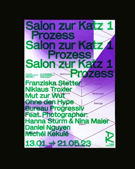
Photo
Poster by @bureauprogressiv @franziskastetter - - - - - - - - - - #typosters #typographicposter #typographic #typeposters #typeinspire #posters #printisnotdead #goodtype #creativedesign #graphicdesign #graphicdesigner #type #typography #eyeondesign #designwork #artdirection #designfeed #designspiration #postereveryday #inspiration #graphix #editorial #printdesign #layout #typographer #plakat #posterdesign https://www.instagram.com/p/CoCdlx4sgyP/?igshid=NGJjMDIxMWI=
#typosters#typographicposter#typographic#typeposters#typeinspire#posters#printisnotdead#goodtype#creativedesign#graphicdesign#graphicdesigner#type#typography#eyeondesign#designwork#artdirection#designfeed#designspiration#postereveryday#inspiration#graphix#editorial#printdesign#layout#typographer#plakat#posterdesign
8 notes
·
View notes
Text
instagram
#loveyourspace#dcdesigner#details#lifeofadesigner#interiordesign#dcdesignerseries#design#whiteonwhite#eyeondesign#interior#epicdesign#blackandwhite#outdoorliving#Instagram
2 notes
·
View notes
Photo

ENDLESS ⠀⠀⠀⠀⠀⠀⠀⠀⠀⠀⠀⠀⠀⠀⠀⠀⠀⠀⠀⠀ ⠀⠀⠀⠀⠀⠀⠀⠀⠀⠀⠀⠀⠀⠀⠀⠀⠀⠀⠀⠀⠀⠀⠀⠀⠀⠀⠀⠀⠀⠀⠀⠀⠀⠀⠀⠀⠀⠀⠀⠀⠀⠀⠀⠀⠀⠀⠀⠀⠀⠀ #fkndesign #selectedwork #grafikradar #lebenliebegrafik #graphicindex #nft #nftart #3dart #lebenliebegrafik #eyeondesign #chrometype #3drender #graphicplanet #graphicdesign #abstract #art #b3d #itsnicethat #c4d #dopedesign https://www.instagram.com/p/CgT5OJ5MoCy/?igshid=NGJjMDIxMWI=
#fkndesign#selectedwork#grafikradar#lebenliebegrafik#graphicindex#nft#nftart#3dart#eyeondesign#chrometype#3drender#graphicplanet#graphicdesign#abstract#art#b3d#itsnicethat#c4d#dopedesign
7 notes
·
View notes
Photo
Subjectieve Feiten door @laura_van_bouwel (6 multimedia) _ #🎷#sintjozefov4 #subjectievefeiten #graphicdesign #designfeed #itsnicethat #thedesignblacklist #designspiration #printisnotdead #newspaperdesign #lebenliebegrafik #eyeondesign #visualgraphc #booooooom #typeworship (bij Sint-Jozef OV4) https://www.instagram.com/p/CkxhHtWITR-/?igshid=NGJjMDIxMWI=
#🎷#sintjozefov4#subjectievefeiten#graphicdesign#designfeed#itsnicethat#thedesignblacklist#designspiration#printisnotdead#newspaperdesign#lebenliebegrafik#eyeondesign#visualgraphc#booooooom#typeworship
3 notes
·
View notes
Photo

#myso #2023 // JugaadMag Last year I had the pleasure of making the Jugaad's visual identity. @jugaadmag is a digital magazine that talks about cinema, photography and subcultures. Take a look and you will surely discover something new! 👌
#myso#2023#graphicdesign#graphicdesigner#graphic#design#magazinecover#designinspiration#stickers#graphicjuice#graphicindex#grafikradar#acidgraphix#thedesignblacklist#thedesigntip#eyeondesign#blkmarket#collectgraphics#certainmagazine#amnestymagazine#fruitsartclub#type#typography#typedesign#letteringdaily
2 notes
·
View notes
Text
🤎🐉🤪
#illustration#digital illustration#black girl moodboard#black artist#blackart#black art#blck girl magic#manga#aestheitcs#art#anime#anime fanart#beautiful#artists on tumblr#dungeons and dragons#dragons#eyeondesign#artistic#lisa frank#fanart#fantasy#sciart#ebony#digital aritst#digital art#digital painting
99 notes
·
View notes
Text
𓇚
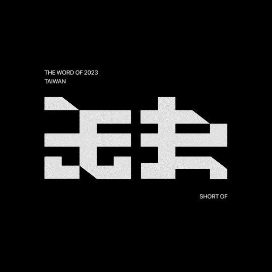

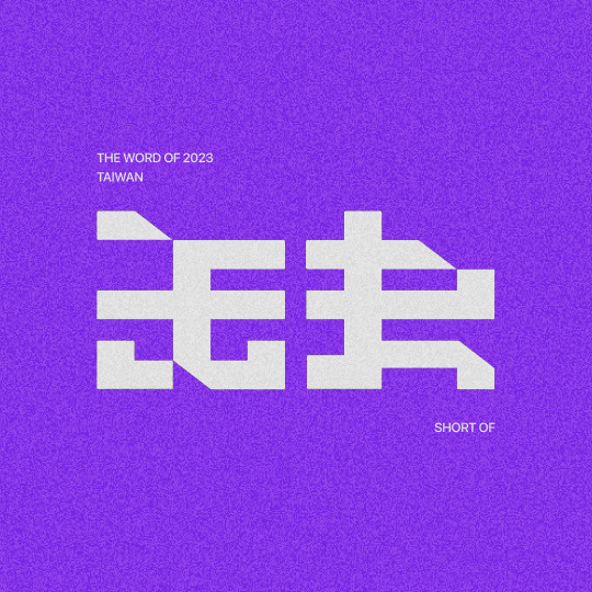
𝗟𝗼𝗴𝗼𝘁𝘆𝗽𝗲 缺:Short Of
聽說2023代表字是「缺」,
應該是我每年的代表字,
缺錢😂
你缺什麼?
-
“缺”(Short Of) was voted the word of 2023 in Taiwan.
-
-
-
#typedesign#lettering#graphicdesign#chinesetype#graphicradar#typography#typographic#type#logo#logodesign#logotype#customtype#goodtype#graphik#eyeondesign#type01#文字設計#平面設計#做字#作字#標準字#字體練習#字体#漢字#디자인#타이포#인생도#타이포그래피#로고#로고디자인제작
16 notes
·
View notes
Text

Instagram.com/_jdelaigle_
#jodlic#delaigle#art#illustration#artists on tumblr#beautiful#ai#male model#eyeondesign#surrealism#malefeet#feetporn#beautiful soles#foot soles#gay art#plague doctor
28 notes
·
View notes
Text
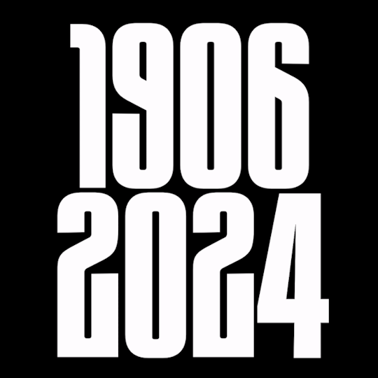
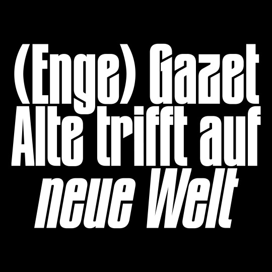


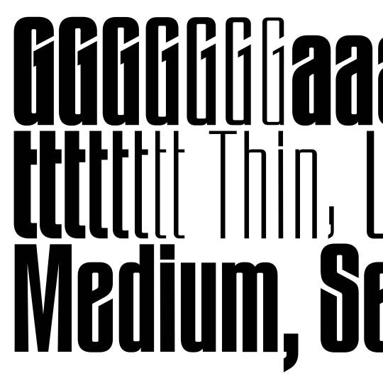
Gazet was created after Thomas John found some old metal letters of a typeface entitled »Zeitungs-Grotesk« by the Bauer foundry from 1906. He was immediately fascinated by its art nouveau influences such as the uppercase »A«, diagonal endings, dense construction and interconnection.
The Angled and Straight subfamilies create a clash between the old and new. Art nouveau meets modernism, sharp meets straight.
www.new-letters.de
#newletters#typography#gazet#condensed#grotesk#thomasjohn#release#graphicdesign#eyeondesign#grafikradar#tomorrow_featured#typeinspire#typespire#contemporarytype#typegoodness#thedod#designfeed#typetype#365typefaces#aigadesign#itsnicethat#designeverywhere#type01#typefoundry
28 notes
·
View notes
Last Seen Blogs

freehugs4ebry1
Mikey

clathrin-adaptin
Way of Ray

springdoy
#𝗨𝗡𝗗𝗘𝗥 𝗖𝗢.


anonimihail-blog
FETE SUPER SEXY