new-letters
www.new-letters.de
NEW LETTERS is a German type foundry and design studio founded by Armin Brenner and Markus John, focusing on typography, graphic design and art direction with the link between cultural and commercial projects. Type design plays the most important role and therefore offering contemporary retail and commissioned typefaces as well as lettering for individual purposes.
www.new-letters.de
[email protected]
946 posts
Don't wanna be here? Send us removal request.
Last Seen Blogs
elinkling
Elin Kling Blog

tatielextraterrestre
Tati el extraterrestre
youve-always-had-me-cas
I cared about the whole world because of you

gifs-kpop
k-gifs

omgkristell
Todos seremos olvidados, excepto los Beatles
Text
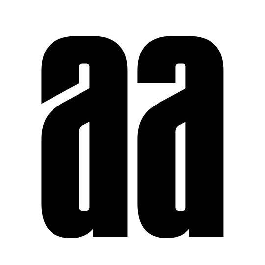
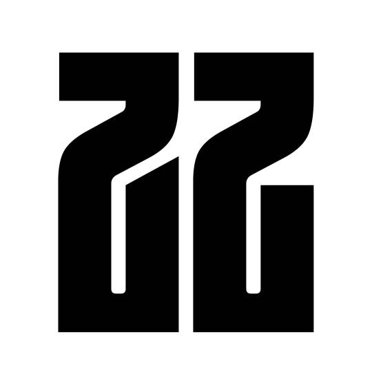


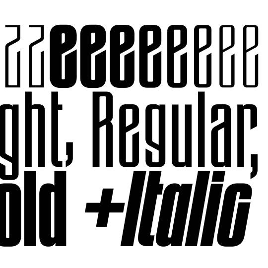
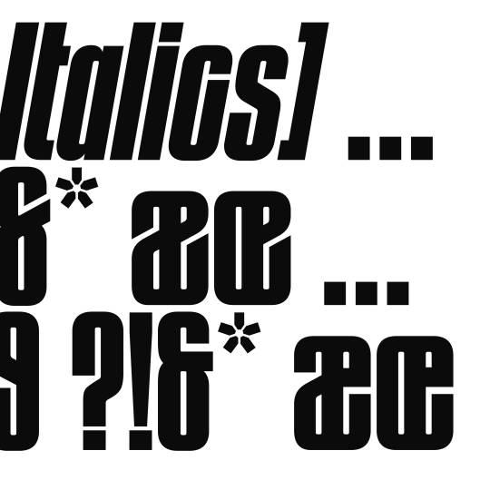
Gazet features a variety of OpenType features making it a versatile tool for all types of creative typesetting. A monocase feature makes even the tightest line spacing possible and contributes to the typefaces dense construction with very little white space.
A historical OpenType feature is a homage to the typefaces origin within the times of art nouveau and is present within the uppercase A, E, F and lowercase p and q.
www.new-letters.de
#newletters#typography#gazet#condensed#grotesk#thomasjohn#release#graphicdesign#eyeondesign#grafikradar#tomorrow_featured#typeinspire#typespire#contemporarytype#typegoodness#thedod#designfeed#typetype#365typefaces#aigadesign#itsnicethat#designeverywhere#type01
14 notes
·
View notes
Text
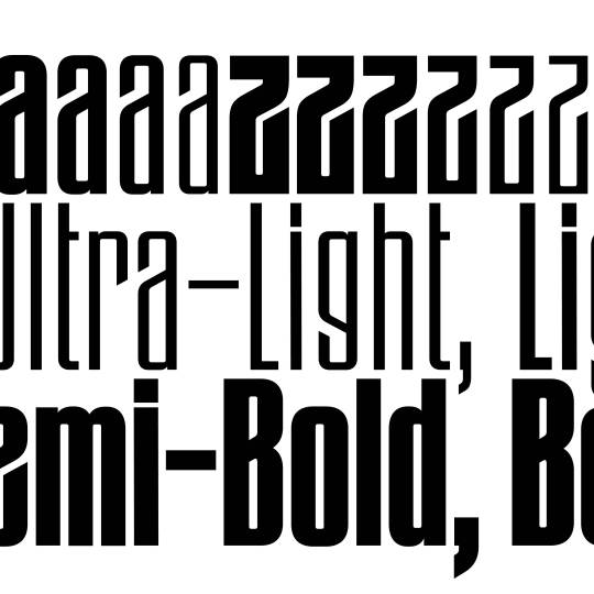
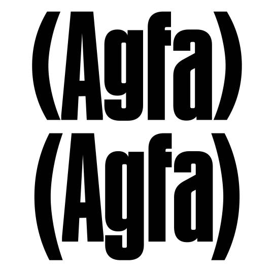
The original »Bold Angled« style has been complemented by lighter weights, italics and an entire family with straight endings making it a versatile family for a wide variety of display usage. OpenType features such as a monocace feature allows tight line spacing and creative typesetting.
www.new-letters.de
#newletters#typography#gazet#condensed#grotesk#thomasjohn#release#graphicdesign#eyeondesign#grafikradar#tomorrow_featured#typeinspire#contemporarytype#typegoodness#thedod#designfeed#typetype#365typefaces#aigadesign#itsnicethat#designeverywhere#type01
29 notes
·
View notes
Text
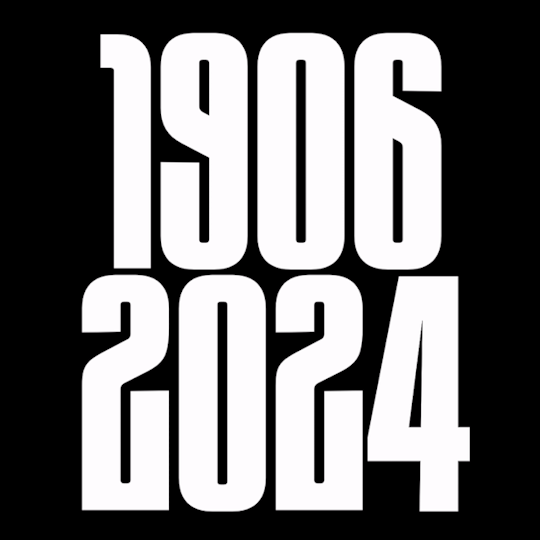
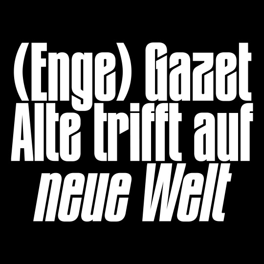


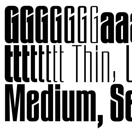
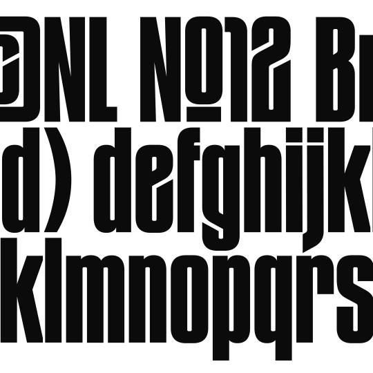
Gazet was created after Thomas John found some old metal letters of a typeface entitled »Zeitungs-Grotesk« by the Bauer foundry from 1906. He was immediately fascinated by its art nouveau influences such as the uppercase »A«, diagonal endings, dense construction and interconnection.
The Angled and Straight subfamilies create a clash between the old and new. Art nouveau meets modernism, sharp meets straight.
www.new-letters.de
#newletters#typography#gazet#condensed#grotesk#thomasjohn#release#graphicdesign#eyeondesign#grafikradar#tomorrow_featured#typeinspire#typespire#contemporarytype#typegoodness#thedod#designfeed#typetype#365typefaces#aigadesign#itsnicethat#designeverywhere#type01#typefoundry
28 notes
·
View notes
Text


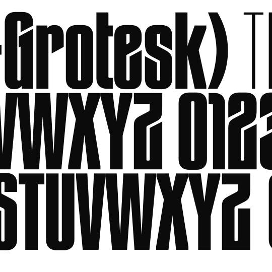

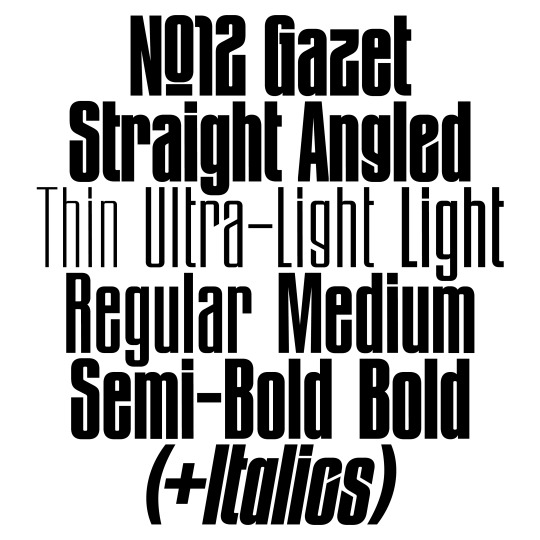
Gazet out now - the typeface consists of the two subfamilies Angled and Straight. The original Angled style features diagonal endings corresponding with the typefaces structure. The Straight subfamily is a rather neutral and more versatile take on the original Angled style due to its horizontal endings.
www.new-letters.de
#newletters#typography#gazet#condensed#grotesk#thomasjohn#release#graphicdesign#eyeondesign#grafikradar#tomorrow_featured#typeinspire#typespire#contemporarytype#typegoodness#thedod#designfeed#typetype#365typefaces#aigadesign#itsnicethat#designeverywhere#type01
9 notes
·
View notes
Text
Our family grows. »Gazet« is a condensed superfamily consisting of 28 cuts ranging from Thin to Bold, with corresponding Italics and 500+ glyphs each - out now.
www.new-letters.de
#newletters#typography#gazet#condensed#grotesk#thomasjohn#release#graphicdesign#eyeondesign#grafikradar#tomorrow_featured#typeinspire#typespire#contemporarytype#typegoodness#thedod#designfeed#typetype#365typefaces#aigadesign#itsnicethat#designeverywhere#type01
5 notes
·
View notes
Text
Our family grows. »Gazet« is a condensed superfamily consisting of 28 cuts ranging from Thin to Bold, with corresponding Italics and 500+ glyphs each - out now.
www.new-letters.de
#newletters#typography#gazet#condensed#grotesk#thomasjohn#release#graphicdesign#eyeondesign#grafikradar#tomorrow_featured#typeinspire#typespire#contemporarytype#typegoodness#thedod#designfeed#typetype#365typefaces#aigadesign#itsnicethat#designeverywhere#type01
4 notes
·
View notes
Text

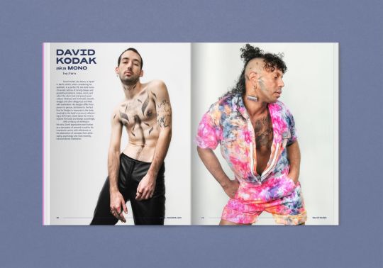


Rediscovered the book Queer Tattoo by Benjamin Wolbergs, Florian Rudolph & Brody Polinsky - using Rois typeface. Published by Verlag Kettler.
verlag-kettler.de/en/books/queer-tattoo
www.new-letters.de
#queertattoo#qttr#queer#tattoo#book#graphicdesign#BenjaminWolbergs#FlorianRudolph#BrodyPolinsky#VerlagKettler#newletters#typography#rois#typeface#typefoundry
18 notes
·
View notes
Text


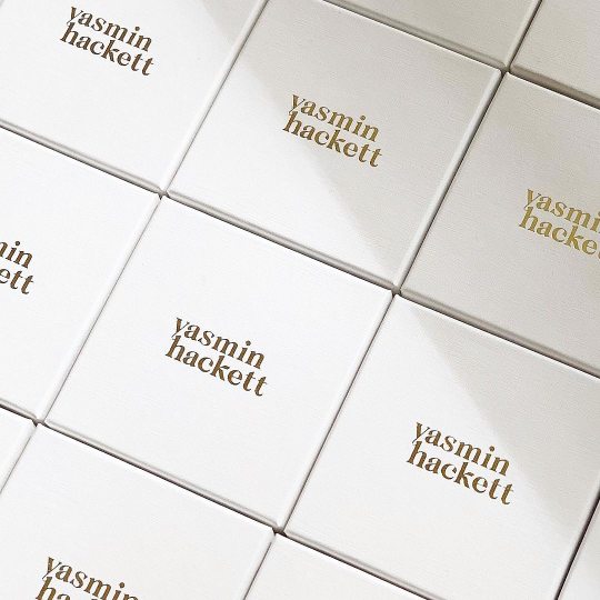
Logo design for Melbourne based yasmin hackett jewellery - by Ashley Simonetto, using Freya typeface.
www.new-letters.de
#logo#jewellery#graphicdesign#yasminhackett#ashleysimonetto#typography#newletters#typefoundry#freya#serif
11 notes
·
View notes
Text
Logo design for yasmin hackett jewellery by Ashley Simonetto, using Freya typeface.
www.new-letters.de
#logo#jewellery#graphicdesign#yasminhackett#ashleysimonetto#typography#newletters#typefoundry#freya#serif
5 notes
·
View notes
Text

Coming soon!
www.new-letters.de
#newletters#typography#typefoundry#release#graphicdesign#eyeondesign#grafikradar#tomorrow_featured#typeinspire#typespire#contemporarytype
16 notes
·
View notes
Text

Something new for 2024 …
www.new-letters.de
#newletters#typography#typefoundry#release#graphicdesign#eyeondesign#grafikradar#tomorrow_featured#typeinspire#typespire#contemporarytype
16 notes
·
View notes
Text

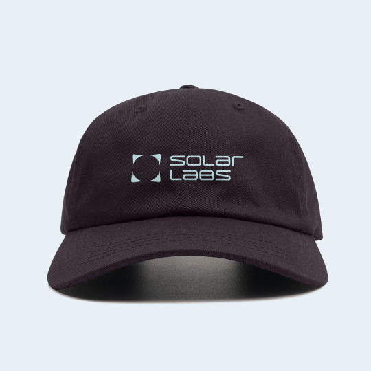
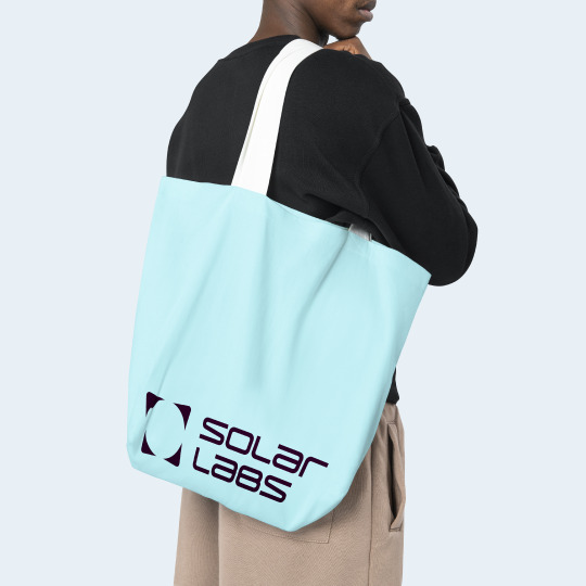
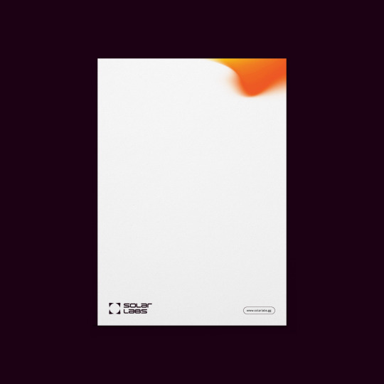


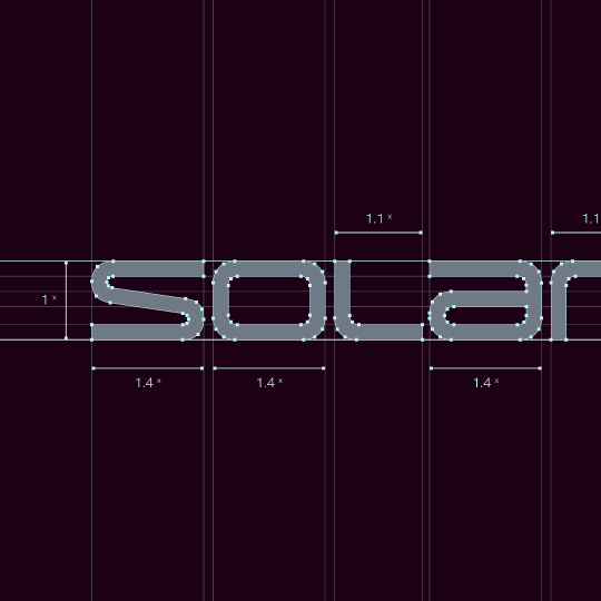
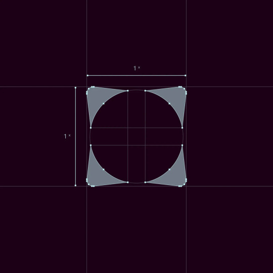
Part 2: Solar Lab´s logo has been developed by Kenshō Agency - based of Laif typeface.
Laif´s characters have been manipulated in order to achieve a unicase logotype, with adjustments made to various letterforms in order to improve legibility and scalability.
www.new-letters.de
#branding#kenshoagency#design#graphicdesign#solarlabs#typography#Laif#typeface#logotype#newletters#typefoundry
52 notes
·
View notes
Text


Solar Lab´s logo has been developed by Kenshō Agency - based of Laif typeface.
Laif´s characters have been manipulated in order to achieve a unicase logotype, with adjustments made to various letterforms in order to improve legibility and scalability.
www.new-letters.de
#branding#kenshoagency#design#graphicdesign#solarlabs#typography#Laif#typeface#logotype#newletters#typefoundry
75 notes
·
View notes
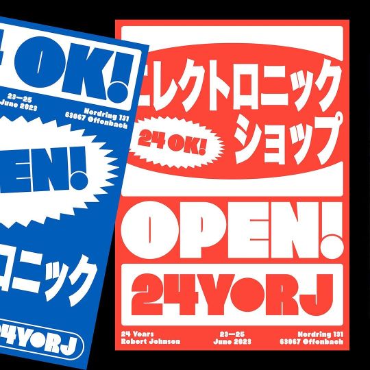
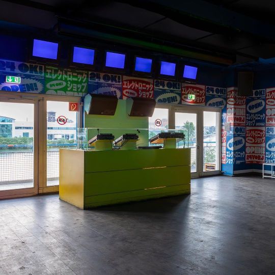
Text

Part 2: Poster & identity for the 24th anniversary of Robert Johnson - design by Dominik Keller with Jonas Huhn using Hanje typeface.
www.new-letters.de
#dominikkeller#jonashuhn#yunghuhn#graphicdesign#eyeondesign#grafikradar#tomorrow_featured#typeinspire#typespire#contemporarytype#typography#hanje#newletters#typefoundry
57 notes
·
View notes
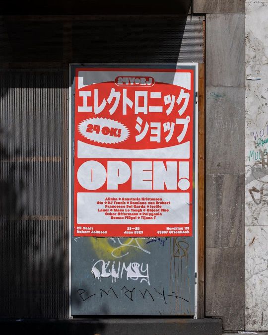
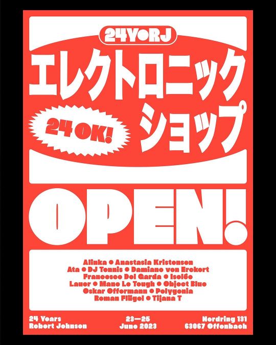
Text


Poster & identity for the 24th anniversary of Robert Johnson - design by Dominik Keller with Jonas Huhn using Hanje typeface.
www.new-letters.de
#dominikkeller#jonashuhn#yunghuhn#graphicdesign#eyeondesign#grafikradar#tomorrow_featured#contemporarytype#typography#hanje#newletters#typefoundry#typeinspire
33 notes
·
View notes
Text
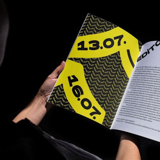
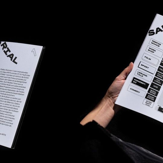
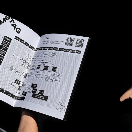
Glimpse into the Millerntor Galleryfestival catalogue, designed by studio Konter - using Rois typeface.
Support by Viva con Agua & Viva con Agua ARTS
www.new-letters.de
#graphicdesign#editorialdesign#corporate#typography#vivaconagua#millerntorgallery#Hamburg#studiokonter#typefoundry#rois#newletters
27 notes
·
View notes
Text
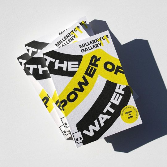
First glimpse into the Millerntor Gallery festival catalogue, designed by studio konter - using Rois typeface.
Support by Viva con Agua & Viva con Agua ARTS
www.new-letters.de
#graphicdesign#editorialdesign#corporate#typography#vivaconagua#millerntorgallery#Hamburg#studiokonter#typefoundry#rois#newletters
18 notes
·
View notes