#typefoundry
Text

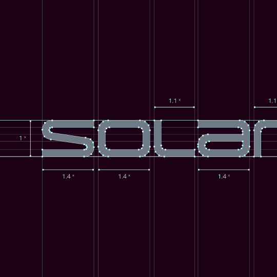

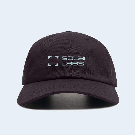
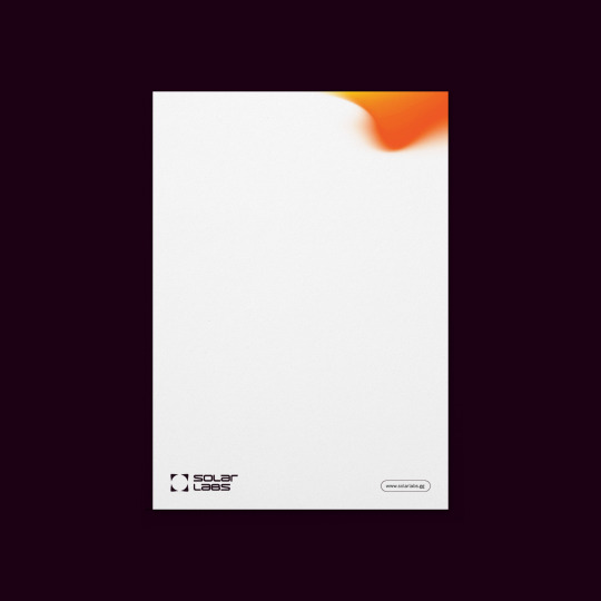
Solar Lab´s logo has been developed by Kenshō Agency - based of Laif typeface.
Laif´s characters have been manipulated in order to achieve a unicase logotype, with adjustments made to various letterforms in order to improve legibility and scalability.
www.new-letters.de
#branding#kenshoagency#design#graphicdesign#solarlabs#typography#Laif#typeface#logotype#newletters#typefoundry
75 notes
·
View notes
Photo

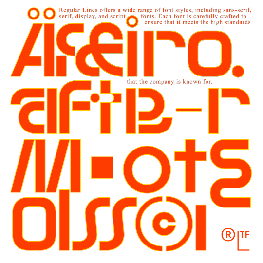
WTF is RLTF?
108 notes
·
View notes
Photo
TEODOR & HAFFER, another showcase of or retail library! #new #displaay #foundry #teodor #haffer #typeface #font #sans #serif #type #typography #typedesign #typefoundry https://www.instagram.com/p/CcoDth8Le6N/?igshid=NGJjMDIxMWI=
55 notes
·
View notes
Text
pride_&_liberation by me
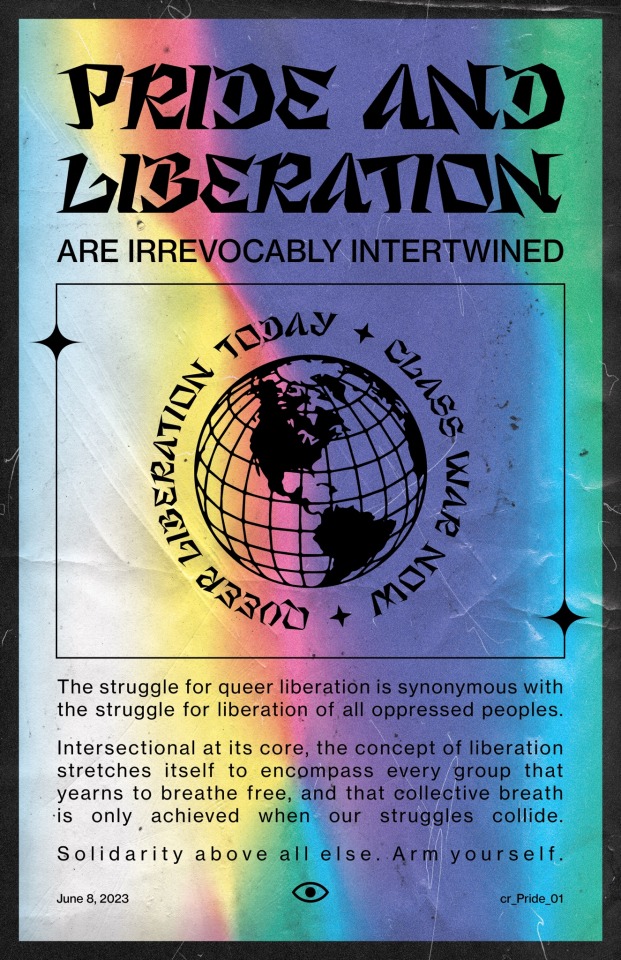
#graphic design#visual art#pride month#leftisim#queer solidarity#classwar#marxism#socialism#photoshop#Adobe#typefoundry
3 notes
·
View notes
Text

A working font called Brushfire it’s currently a WIP, but should be finished soon.
#illustration#graphic design#artwork#design#branding#logo#art#identity#graphicdesign#logos#graphic art#vintage#illustrator#apparel#graphicart#comics#contemporary illustration#typefoundry#typography#lettering#type design#goodtype
6 notes
·
View notes
Photo

‘Mireille’ for Saveurs de fleurs
(typeface based on Stanley Davis’ 1960s ‘Amelia’)
#clothing brand#branding#brand identity#typeface#font#lettering#typefoundry#stanley davis#amelia#graphic design#design
5 notes
·
View notes
Text


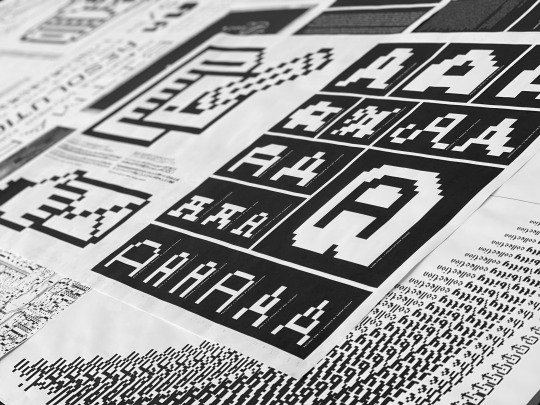

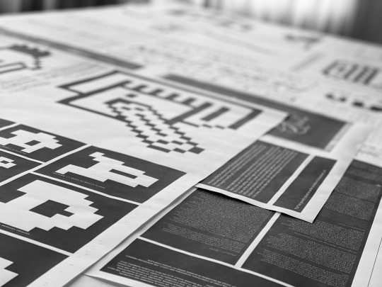
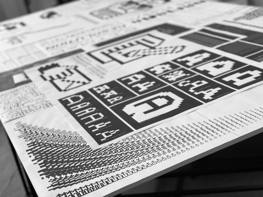


Even after all these years, it is still exciting and rewarding to be awarded for good work, especially from Communication Arts - a bible of the industry. @communicationarts
Our T26 large-format “itty-bitty” project for @t26fonts which showcases an extensive collection of bitmap, pixel, lcd and dingbat fonts is one of the winners in Communication Arts Magazine’s 2024 Typography Competition, one of the most respected in creative industry.
Only 125 selected projects to appear (from 1,262 submissions) in the 14th Communication Arts Typography Annual that will be published in the January/February 2024 issue of Communication Arts . Thanks to CA and the Jury - Anthony De Leo, Bianca Dumitraşcu, Ben Kiel, Trevett McCandliss, Joana Monteiro and Man Wai Wong.
VIDEOS:
www.vimeo.com/manage/videos/564778980
www.vimeo.com/manage/videos/561524742
#design #segura #t26 #print #catalog #brochure #branding #identity #fonts #brand #poster #promotion #logo #type #typography #pixel #bitmap #lcd #newspaper #posters #chicago #ca #communicationarts #competition
#segura#design#print#type#typography#logo#poster#communicatrionarts#t26#fonts#typefoundry#award#award winning
1 note
·
View note
Text
A love letter to discovering historic type foundaries…
Upon admiring a handsome building near work, I discovered it was once a Type Foundry!
Blackfriars Type Foundry (1904-1931) had a catalogue that included beautiful serif fonts such as; Blackfriars, Greyfriars, Whitefriars, Richmond Old Style, Cadmus, etc. Gorgeous type!
This discovery got me really interested in Revival Type. Typographical archaeology if you will… the process of converting pre-digital typefaces into usable modern day formats, while preserving it’s history.


1 note
·
View note
Text
Godfrey Variable Fonts
0 notes
Text
Tiny titted redhead beauty fucked by her boyfriend
Blonde girls desires to be fucked hard and gets thick dark dick in ass
Blackmailed my hot teen stepsis into fucking with me
Familia preparada para o sexo
TINY4K Teenie tiny TEEN DRILLED by HUGE dick
CFNM - Surprise visit from my bf’s mom
Novia de colegiala
Mostrando pinga para las nenas
Tattooed hot teen Felicity Feline fucks pawndude in his office
big booty hoe anal riding
#arriding#lengest#parasnia#pinery#supering#pseudoheroical#Groos#subcommendatory#tentlike#decasualizing#vrocht#backiebird#postform#typefoundry#preaffirms#remene#McGovern#Dianthe#underconstable#tekya
0 notes
Photo
This cover was created with my fonts. Similar projects can be created. Know more: https://pedroteixeirafoundry.com/about/ https://www.fonts.com/font/pedro-teixeira?refby=ptx https://www.myfonts.com/foundry/Pedro_Teixeira/?refby=ptx https://www.fontspring.com/foundry/pedro-teixeira?refby=ptx #typedesign #typeface #fontdesigner #upupcreative #pixelsurplus #fontdesign #typefoundry #fontlovers #freetype #callygraphy #fontlove #crftsco #feedtype #typedesigner #fashionfont #graphicdesigner #logo #logodesign #brandidentity #graphics #branding #digitaldesign #logos #logotype #webdesign #graphicart #logodesigner #dribbble https://www.instagram.com/p/Cf9OSasMVEO/?igshid=NGJjMDIxMWI=
#typedesign#typeface#fontdesigner#upupcreative#pixelsurplus#fontdesign#typefoundry#fontlovers#freetype#callygraphy#fontlove#crftsco#feedtype#typedesigner#fashionfont#graphicdesigner#logo#logodesign#brandidentity#graphics#branding#digitaldesign#logos#logotype#webdesign#graphicart#logodesigner#dribbble
0 notes
Text

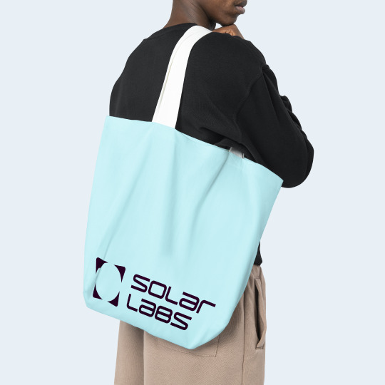


Part 2: Solar Lab´s logo has been developed by Kenshō Agency - based of Laif typeface.
Laif´s characters have been manipulated in order to achieve a unicase logotype, with adjustments made to various letterforms in order to improve legibility and scalability.
www.new-letters.de
#branding#kenshoagency#design#graphicdesign#solarlabs#typography#Laif#typeface#logotype#newletters#typefoundry
52 notes
·
View notes
Text
New Regular Lines typeface is really close to be realeased!
37 notes
·
View notes
Photo
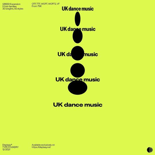
GREED expansion in progress, waitin so long! Condensed, Narrow, Standard, Extended, Expanded, ask for beta. #displaay #foundry #greed #typeface #font #sans #type #typography #typedesign #typefoundry (at Prague, Czech Republic) https://www.instagram.com/p/CeRWcFMMt5B/?igshid=NGJjMDIxMWI=
16 notes
·
View notes
Text
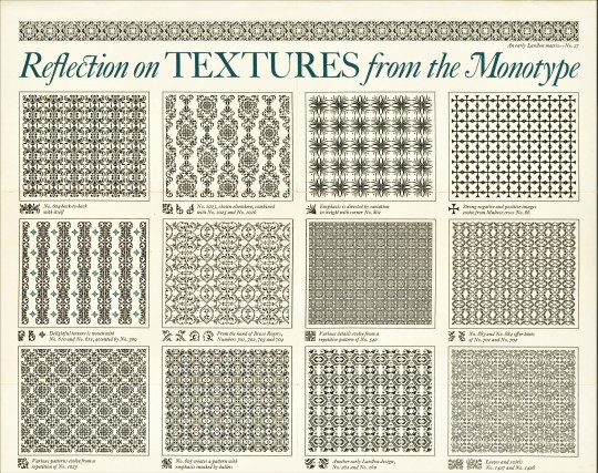


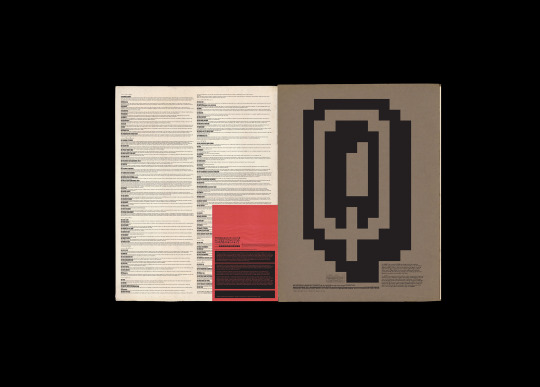
Typography Tuesday
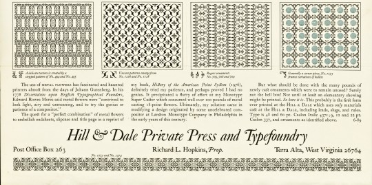
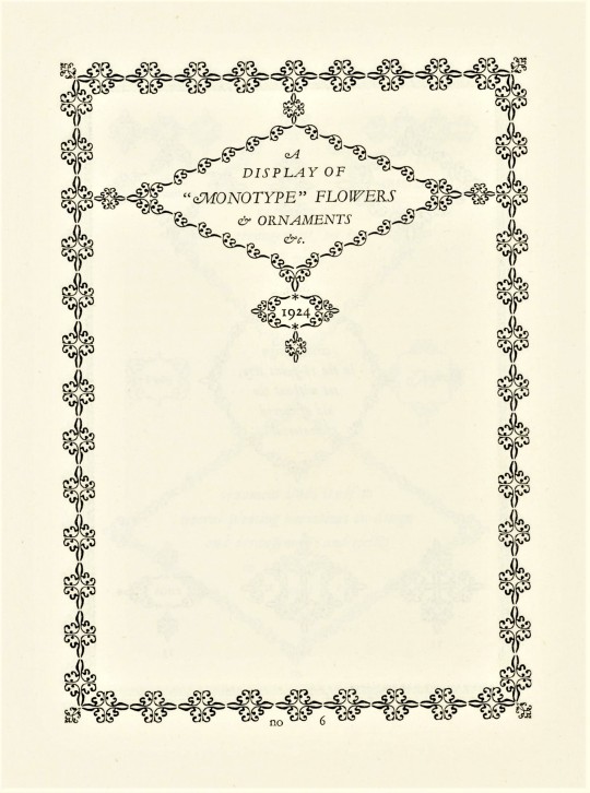
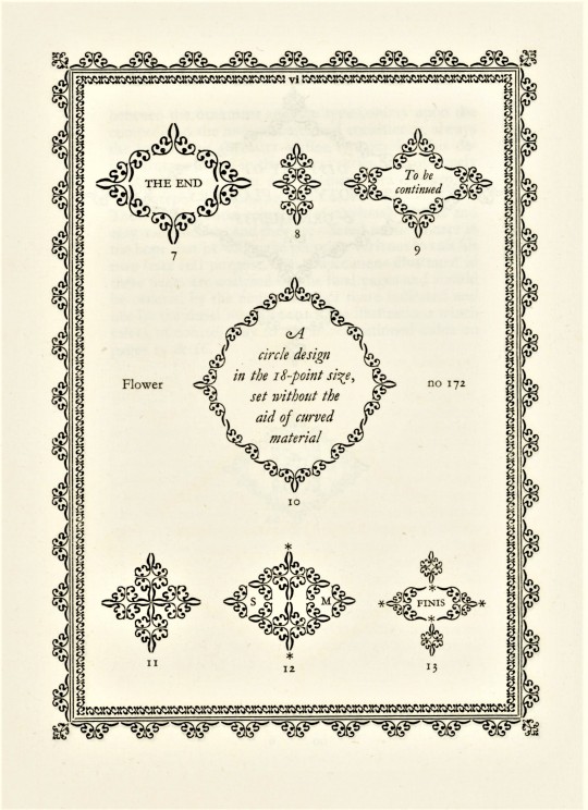
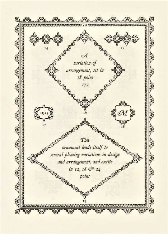
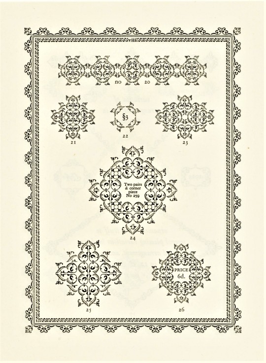
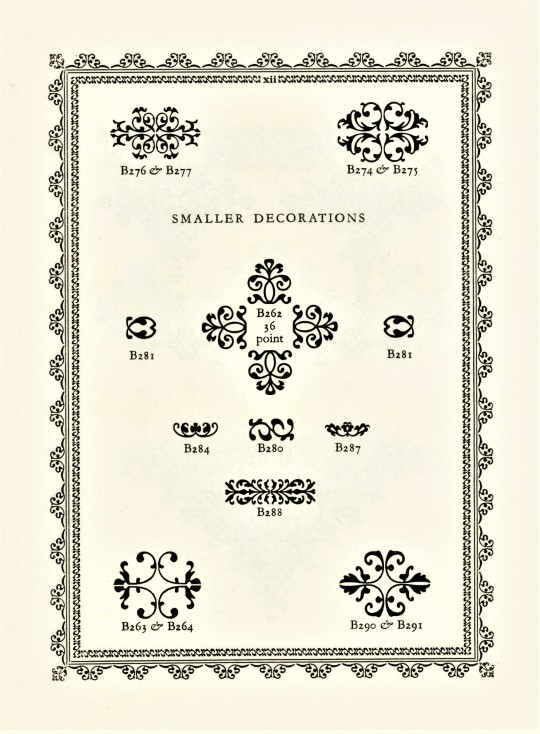
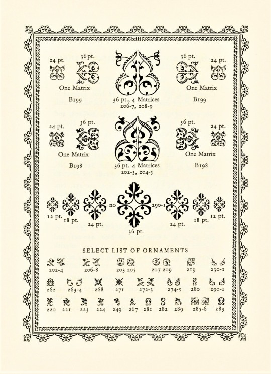
This week we present another type specimen book from the estate of our late friend Dennis Bayuzick: Fine Ornament & Decorative Material Available to "Monotype" Users published in London by the Lanston Monotype Corporation in 1924. It includes 48 specimens intended for printers who could order their types by the indicated matrix number.
From 1923 to 1967, the British typographer and printing historian Stanley Morrison (he was a principal designer for Times New Roman) was a prominent advisor to the Lanston Monotype Corporation. He wrote the introduction to this display book where he outlines the history of the type ornament and states:
In clever hands it is possible to design with one or two units almost an infinite number of combinations. . . . It is here that the printer's flower rises to the height of it potentiality, and . . singularly beautiful results will reward the ingenious compositor. The sympathy in line and colour subsisting between the ornament and the type confers upon the composition the note of unity and consistency, always the underlying necessity of fine typography. This desideratum is joined in the present series to a supremely practical convenience: the ornaments are cast on the "Monotype" Composing Machine.
Laid into this copy is a type specimen sheet of Monotype ornaments (first image) from Hill & Dale Private Press and Typefoundry in Terra Alta, West Virginia
View more posts related to Lanston Monotype.
View a post on Stanley Morrison's Times New Roman.
View other books from the collection of Dennis Bayuzick.
View more Typography Tuesday posts.

#Typography Tuesday#typetuesday#decorative type#type ornaments#Lanston Monotype Corporation#Monotype Corporation#Monotype#Stanley Morrison#Hill & Dale Private Press and Typefoundry#Fine Ornament & Decorative Material Available to “Monotype” Users#type display books#type specimens#ornamental type#fleurons#Dennis Bayuzick#type specimen books
78 notes
·
View notes
Text


The Fort a font that was inspired by smashing wood together in the woods behind my home growing up
#illustration#graphic design#artwork#design#branding#logo#art#identity#graphicdesign#typefoundry#font family#forts#logos#graphic art#apparel#doodles#scribbler#scribbles#font foundry#the bold type
1 note
·
View note
Last Seen Blogs

maeltwink
Mael🍆

asthesternturns
As the Stern Turns

rosestk
Roses Taegguk

denizcigenc0-blog
Denizci Genç
curse-angel
Cuz Why Not?