#early edits of this looked like a French film poster
Text
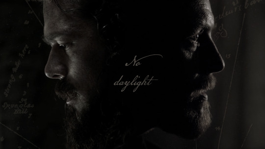
No daylight
"When you and I are of the same mind... there is nothing we have not yet been able to do."
Map
#no daylight#well I said I'd get you back#sirtadcooper#several iterations later and here it is#dark and gritty#turned out way more cinematic than intended#I know it's dark - but that's where the freedom is#early edits of this looked like a French film poster#and yes that is the Treasure Island map in the background#black sails edit#bs edit#black sails fandom#mine#captain flint#john silver#james flint#long john silver#black sails#treasure island
27 notes
·
View notes
Text
Alright charmers, farmers, and idiots. It's a brisk 60 degrees in Los Angeles so don't forget your booties, because it's coooooooold out there. And I'm back with another edition of...
The Worst Movie on Netflix Right Now™
This week's feature was by request of @anasandorpygoscelis. I think. I mean, I'm pretty sure there was a post somewhere. Anyhow, on this marvelous Monday, we're doing...

The Noel Diary. This is a movie starring Justin Hartley (This is Us) and Barrett Doss (Grey's Anatomy) and it's directed by Charles Shyer who is best known for writing and directing some rom-com classics from the late 80s and early 90s like Baby Boom and Father of the Bride.
The film is based on a book by Richard Paul Evans who apparently has a whole series of "Noel" books, so he's really the smartest person involved in this whole production because my bet is this dude is CASHING in on the whole Christmas concept (to the extent that any writer anywhere can cash in on anything, but you know what I mean).
THE PLOT
Alright, so this movie is about a best-selling novelist, Jacob Turner, who returns to his childhood home to handle the affairs of his recently deceased estranged mother when he meets Rachel, who has come to his mom's house in search of her birth mother. ...don't worry, it's revealed early on that her mom was the nanny, so there's no weird Folger's bro/sis thing happening here. But that's the plot.

Anyhow, my favorite part of this fucking movie was how the filmmaker actually used visual storytelling to communicate characters. Like for once we actually get some thoughtful set design - as in woooooooow this is actually trying to show me something other than generic-American-handsome man!
But like, siiiiiiiiiiiigh, nice effort, but did you have to make this dude out like some sort of Esquire magazine wet dream? As the camera pans-and-fades around his Moody Bachelors Anonymous pad, it lingers just long enough to let your eye catch a few key things: books by Bob Dylan and David Sedaris, a bulletin board with handwritten notes and black-and-white travel photos (the Eiffel tower obvs), multiple antique typewriters (an Underwood), an Edgar Allen Poe funko, a record player, and a stack of LPs with the only record showing being Nina Simone. Like... daaaaaaamn. This is the guy I wanted to date when I was twenty and was still trying to be a writer.
And of course his house is this beautifully furnished mid-century, eames-chair-sporting, ready for its Vogue walk-through drool-property. Can I just stop at this point in the movie? Job done. You've sold me. He's hot, rich, and lives in a gorgeous house with real actual art and a cute dog (that's just big enough to not be a small dog but not so big it's cliche). Like... FUCK. OH and then he tunes an actual transistor radio to... you guessed it... the local jazz station. Dating this guy is like dating an OC moodboard on tumblr.com.
This whole scene is only bested by the next set-decorating moment where he returns to his childhood bedroom: Drugstore Cowboy poster (unframed), basketball and football trophy (both???), Larry Bird signed jersey (framed), French New Wave poster (framed????), stack of miscellaneous board games with TRIVIAL PURSUIT GENUS I on top, another antique typewriter, bedside reading featuring On the Road by Jack Kerouac and A Moveable Feast by Ernest Hemingway (like, of course), and another bulletin board with various concert ticket stubs.
Fuck, I need a cigarette.
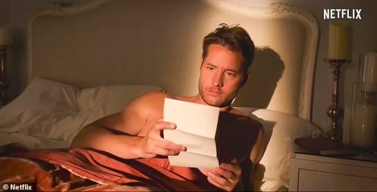
Honestly, that's it, that's all I want to talk about. An hour and 40 minute movie and I'm done with it 12 minutes in. He's THE MOST INTERESTING MAN IN THE WORLD. This dude is too perfect. No amount of trauma makes this guy suddenly undateable. He's an unbelievable character not because we didn't get enough detail, but because the detail is just too perfect. Jesus, he's walking out of a Restoration Hardware catalogue dragging a brass telescope behind him and asking if you want to look at the stars (I do).
Anyhow, here's the thing about this movie - it's actually pretty well done, but FUCK it's really fucking sad. Unlike most Christmas movies that look like they spent too much time at fucking Hobby Lobby, this movie sort of side-swipes Christmas. Like all this shit is happening, and oh yeah, it's Christmas time. This is good because it avoids the cliches, but it's bad because ISN'T THIS SUPPOSED TO BE A CHRISTMAS MOVIE!?!? WHERE IS SANTA!? You can't have an entire Christmas romance movie and the only comic relief is on the dog. That's too much pressure for a pup!
Anyhow, one of my common gripes about these movies is that by the end of the movie you want to think the couple belongs together. The way this movie tries to sell you on it is essentially two key details: Rachel (the love interest) has a tattoo of Billie Holliday on the inside of her forearm and once Jacob starts playing a jazz classic on the piano (OH YEAH HE PLAYS PIANO TOO) and Rachel immediately starts singing, beautifully, along. Seeeeeeeee? They're fucking perfect for each other.
Rachel is also an interesting character in a too-perfect sort of way (she's a language major who speaks fluent Italian on screen HOTTTTTTTT!). It's still a moodboard it's just got black and white photos of Italy on it instead of France. I bet her childhood bedroom has a framed poster that says ITALIAN NEW WAVE. Annnnnyhow... are they perfect for each other?
Nah, they're still not. This entire movie is a lot of sorting through some fucked up childhood trauma and I think that would bond most people. But do they belong together? Naaaaaaah.
Rachel shows some insane amount of patience for the men in her life in this movie and I don't really want to get into the plot too deeply (even though it's a little fucked) cause it's too fucking sad. Jacob apparently suddenly decides he no longer wants to be a permanent bachelor and he's all in for Rachel and we don't know really why. But like... sure, I GUESS.
If your jam is sad Christmas vibes, then this is the movie for you. These two live sadly ever after.
Last note: Bonnie Bedelia is in this movie and she is as radiant as ever.

Where is her movie? Bonnie Bedelia is the nosy neighbor artist next door and I have never felt so in need of a bi rom-com starring her. LET'S GO, NETFLIX. FUCK THIS SAD SHIT. GIVE ME HOT BONNIE.
Alright, that's all I got.
#ptpt reviews#long post#this is definitely one of my more incoherent stream-of-consciousness reviews#but really i'm just living in that house from the opening scene in my mind#so forgive me for leaving the fantasy#that's the real fantasy these days#a man with property
24 notes
·
View notes
Text
“Border Radio”: Where Punk Lived
Some years back, I wrote notes for the Criterion Collection’s edition of Allison Anders’ first feature Border Radio for the Criterion Collection. Tomorrow (June 3), Allison will gab about punk rock with John Doe, Tom DeSavia, and my illegitimate son Keith Morris at the Grammy Museum in L.A. in observance of the publication of the book we’re all in, More Fun in the New World (Da Capo).

**********
“You can’t expect other people to create drama for your life—they’re too busy creating it for themselves,” a punk groupie says at the conclusion of Border Radio. And the four reckless characters at the center of the film certainly manage to create plenty of drama for themselves. In the process, they paint a compelling picture of the Los Angeles punk-rock scene of the 1980s: what it was like on the inside—and what it was like inside the musicians’ heads.
Border Radio (1987) was the first feature by three UCLA film students: Allison Anders, Kurt Voss, and Dean Lent. The subsequent work of both Anders and Voss would resonate with echoes from Border Radio and its musical milieu. Anders’s Gas Food Lodging (1992), Mi vida loca (1993), Grace of My Heart (1996), Sugar Town (1999), and Things Behind the Sun (2001) all draw to some degree from music and pop culture. (She quotes her mentor Wim Wenders’s remark about making The Scarlet Letter: “There were no jukeboxes. I lost interest.”) Voss, who co-wrote and codirected Sugar Town, also wrote and directed Down & Out with the Dolls (2001), a fictional feature about an all-girl band; and in 2006, he was completing Ghost on the Highway, a documentary about Jeffrey Lee Pierce, the late vocalist for the key L.A. punk group the Gun Club.
The three filmmakers met at UCLA in the early eighties, after Anders and Voss had worked as production assistants on Wenders’s Paris, Texas. By that time, Anders and Voss, then a couple, were habitués of the L.A. club milieu; they favored the hard sound of such punk acts as X, the Blasters, the Flesh Eaters, the Gun Club, and Tex & the Horseheads. The neophyte writer-directors, who by 1983 had made a couple of short student films, formulated the idea of building an original script around a group of figures in the L.A. punk demimonde.
Border Radio—which takes its title, and no little script inspiration, from a Blasters song (sung on the soundtrack by Rank & File’s Tony Kinman)—was conceived as a straight film noir. Vestiges of that origin can be seen in the finished film. Its lead character bears the name Jeff Bailey, also the name of Robert Mitchum’s doomed character in Jacques Tourneur’s 1947 noir Out of the Past; its Mexican locations also reflect a key setting in that bleak picture. One sequence features a pedal-boat ride around the same Echo Park lagoon where Jack Nicholson’s J. J. Gittes does some surveillance in Roman Polanski’s 1974 neonoir Chinatown; Chinatown itself—a hotbed of L.A. punk action in the late seventies and early eighties—features prominently in another scene. Certainly, Border Radio’s heist-based plot and the multiple betrayals its central foursome inflict upon each other are the stuff of purest noir. But the film diverges from its source in its largely sunlit cinematography and its explosions of punk humor; Anders, Voss, and Lent also abandoned plans to kill off the film’s lead female character.
In casting their feature, the filmmakers turned to some able performers who were close at hand. The female lead was taken by Anders’s sister Luanna; her daughter was portrayed by Anders’s daughter Devon. Chris, Jeff’s spoiled, untrustworthy friend and roadie, was played by UCLA theater student Chris Shearer.
The directors considered another student for the lead role of the tormented musician, Jeff, but Anders, in an inspired stroke, suggested Chris D. (né Desjardins), whose brooding, feral presence animated the Flesh Eaters. After being approached at a West L.A. club gig and initially expressing surprise at the filmmakers’ desire to cast him, the singer and songwriter signed on, and he helped recruit the other musicians in Border Radio. (A cineaste whose criticism often appeared in the local punk rag Slash, Desjardins would later write an authoritative book on Japanese yakuza films and write and direct the independent vampire film I Pass for Human. He is currently a programmer at the Los Angeles Cinematheque.)
John Doe, bassist-vocalist for the celebrated L.A. punk unit X, and Dave Alvin, guitarist and songwriter for the top local roots act the Blasters, had both played with Chris D. in an edition of the Flesh Eaters. Doe—taking the first in a long list of film and TV roles—was cast as the duplicitous, drunken rocker Dean; Alvin makes an entertaining cameo appearance, essentially as himself, and wrote and performed the film’s score.Texacala Jones, frontwoman for the chaotic Tex & the Horseheads, does a hilarious turn as Devon’s addled babysitter. Iris Berry, later a member of the raucous all-female group the Ringling Sisters, portrays the self-absorbed groupie whose observations frame the film.
Julie Christensen, Desjardins’ vocal partner in his latter-day group Divine Horsemen (and, for a time, his wife), essays a bit part as a club doorwoman. Seen in walk-ons are such local rockers as Tony Kinman, Flesh Eaters bassist Robyn Jameson, and punk hellion Texas Terri. The Arizona “paisley underground” transplants Green on Red and the local glam-punk outfit Billy Wisdom & the Hee Shees were captured in live performance. Those seeking punk verisimilitude could ask for nothing more.
Border Radio had a torturous, piecemeal production history worthy of John Cassavetes. Shooting took place over a four-year period, from 1983 to 1987. Begun with two thousand dollars in seed money, supplied by actor Vic Tayback, the film scraped by on money given to Voss upon his 1984 graduation from UCLA, a loan from Lent’s parents, and cash and film stock cadged here and there. Violating UCLA policy, the filmmakers cut the film at night in the school’s editing bays, where Anders’s two young daughters would sleep on the floor.
The film’s lack of a budget forced Anders, Voss, and Lent to shoot entirely on location; this enhanced the work, as far as the filmmakers were concerned, since they sought a naturalistic style and look for the feature. Lent’s Echo Park apartment doubled as Jeff’s home, while Anders and Voss’s trailer in Ensenada served as his Mexican hideout. The storied punk hangout the Hong Kong Café (whose neon sign can be seen fleetingly in Chinatown) was utilized, as were the East Side rehearsal studio Hully Gully, where virtually every local band of note honed their chops, and the music shop Rockaway Records (one of the few punk stores of the day still around).
Befitting the work of film students on their maiden directorial voyage, Border Radio evinces the heavy influence of both the French new wave of the sixties and the New German Cinema of the seventies. The confident use of improvisation—the cast is credited with “additional dialogue and scenario”—recalls such early nouvelle vague works as Breathless. The ongoing “interview” device immediately recalls Jean-Pierre Léaud’s face-to-face with “Miss 19” in Jean-Luc Godard’s Masculin féminin, while Shearer’s shambling comedic outbursts are reminiscent of the sudden madcap eruptions in François Truffaut’s early films. The work of the Germans is felt most in the great pictorial beauty of Lent’s black-and-white compositions; certain striking moments—a languid, 360-degree pan around Ensenada’s bay; an overhead shot of Chris’s foreign roadster wheeling in circles in a cul-de-sac—summon memories of Wenders’s and Werner Herzog’s most indelible images. (Lent would go on to work as a cinematographer on nearly thirty pictures.)
Though the styles and effects of these predecessors are on constant display, Border Radio moves beyond simple imitation, thanks to a sensibility that is uniquely of its time, spawned directly from the scene it depicts so faithfully. Though putatively a “music film,” very little music is actually on view in the picture; mere snatches of two songs are actually performed on-screen. The truest reflection of the period’s punk ethos can be found in the restlessness, anger, self-deception, and anomie of its Reagan-era protagonists.
In Border Radio, one can see what punk rock looked like, all the way to the margins of the frame: in the flyers for L.A. bands like the Alley Cats, the Gears, and the Weirdos taped in a club hallway, in the poster for Andy Warhol’s Frankenstein and the calendars of L.A. repertory movie houses tacked on apartment walls, in the thrift-store togs and rock-band T-shirts (street clothes, really) worn by the players. But, more importantly, the shifting tragicomic tone of the film, the energy and attitude of its musician performers, and the uneasy rhythms of its characters’ lives present a real sense of the reality of L.A. punkdom in the day.
Put into limited theatrical release in 1987, by the company that distributed the popular surf movie Endless Summer—a film that offers a picture of a very different L.A.—Border Radio was not widely seen and later received only an elusive videocassette release through Pacific Arts (the home-video firm founded, ironically enough, by Michael Nesmith of the prefab sixties rock group the Monkees). With this Criterion Collection edition, the film can finally be seen as the overlooked landmark that it is: possibly the only dramatic film to capture the pulse of L.A. punk—not as it played, but as it felt.
(Thanks to Allison Anders for her invaluable contributions.)

8 notes
·
View notes
Text
10 Music Videos That Deserved a 2018 VMA Nomination

The 2018 MTV Video Music Awards airs Sunday, August 20. The award ceremony has been a long-hailed hallmark, celebrating arguably the second-best part of the music landscape, the accompanying visuals. This year’s award ceremony sees some of today’s most popular leading the pack with nominations: Cardi B with 10, the Carters (Beyoncé and Jay-Z) with 8, and Childish Gambino and Drake both with 8 each. While these accolades are without a doubt well-deserved (I mean, is there anyone more deserving of praise than breakout superstar Cardi B or Childish Gambino who has established himself as one of 2018’s most important artists?), every year it feels something is missing.
There are clear snubs to be griped about and artists who are continually overlooked. In the vein of the latter, the 2018 VMAs all too often disregards the memorable visual efforts of lesser known and rising artists. Outside of the “Push Artist of the Year” category, which sees some notable mentions in Grace Vanderwaal, Sigrid, Jessie Reyez, and Hayley Kiyoko, budding artists rarely have a place to shine. So, ahead of the VMAs, we chronicle ten visual feats of the last year that have had an lasting effect on us.
A$AP Rocky – “A$AP Forever”
youtube
While far beyond the scope of a typical Ones To Watch artist, this particular snub cannot be overlooked. The New York-bred rapper has always shown a penchant for the experimental, but his video for “A$AP Forever” sees A$AP Rocky taking this inclination to new hypnotic heights. Rapping over Moby’s classic hit “Porcelain,” A$AP Rocky places the ethereal backing soundtrack to his native New York. Constantly cycling through varying backdrops in dizzying fashion with A$AP Rocky always at the epicenter, the entire video exists in a world all its own–art house meets the streets of rap.
The Blaze – “Heaven”
youtube
This is not the first time we have nor will it be the last time we will praise The Blaze’s undeniable talent for the cinematic. The French duo comprised of cousins Guillaume and Jonathan Alric, both music producers and film directors, make full use of their skill set to deliver exceptionally human works of sonic and visual art. “Heaven” sees The Blaze celebrating themes of human connection, celebration, and dance in four of the most empathic moments of this year.
half•alive – “still feel.”
youtube
Seemingly shot in one brilliant long take, half•alive’s “still feel.” is currently taking the internet by storm. The technical prowess that underlies “still feel.” is deserving of recognition and admiration in and of itself, but that is only one facet of the surreal dreamscape that half•alive bring to life. The changing color backdrops and sparse use of space give “still feel.” an undercurrent of something sinister without sacrificing its infectiousness.
SG Lewis x clairo – “better”
youtube
Nostalgia is in. Bedroom pop sensation clairo and UK producer SG Lewis capitalize on this sentiment in their nostalgia-ridden video for their joint single “better.” Yet more than simply capitalizing on this generation’s fondness of the past, the video is an accurate homage to music videos of the late ‘90s and early aughts–opening music credits and all. it wouldn’t be too hard to imagine SG Lewis and clairo going home with a VMA for this a couple of decades ago.
The Marías – “Only In My Dreams”
youtube
Los Angeles’ sexiest band The Marías has been steadily making a name for themselves with their unique sound that exists outside of a single genre or fixed point in time. Their video “Only In My Dreams,” which was released at the tail end of last year, sees the Los Angeles band delivering the perfect visual accompaniment for their cinematic sound. Slowly tracking principle members María and Josh Conway through captivating landscapes, each and every still from “Only In My Dreams” looks as if it could have been ripped from a cinematic masterpiece.
Aries – “SAYONARA”
youtube
There is little that is known about growing internet sensation Aries but if there is one thing that is for certain it’s that he has an excellent grasp on how to make something both sonic and visually appealing. The internet enigma’s video for “SAYONARA” is the manifestation of Internet culture. Filled with clever editing, eccentric dance moves, Pokémon textboxes, and 8-bit video game graphics if there was an award for embodying today’s culture it would hands down go to Aries.
Tessa Violet – “Crush”
youtube
Tessa Violet originally found her start as YouTube vlogger, and in fitting fashion, she currently has a viral YouTube hit on her hands with the release of her music video for “Crush.” The quirky, upbeat pop song gets an apt visual accompaniment in the entrancingly edited music video. Despite the video consisting solely of Tessa Violet dancing around a grocery store, the perfectly in-time editing details brings the song to new repeat-worthy heights.
Yellow Days – “The Way Things Change”
youtube
UK-based artist George van den Broek, more popular known by the moniker of Yellow Days, is the 18-year-old prodigy whose cult-like following seems to build more and more with each passing day. “The Way Things Change,” a soulful take on indie rock, received an aptly fitting visual accompaniment that begs that question of where a music video begins and ends. A “moving poster,” the video is comprised of over 6000 frames, 400 of which were printed to make one-of-a-kind posters. Equal parts psychedelic trip and brilliant merchandising, “The Way Things Change” is a sight to behold.
HONNE – “Me & You ◑”
youtube
The British downtempo R&B duo has shown a fascination with Asian culture since their inception; their namesake translates to the idea of true feelings and desires in Japanese, which also serves as a fitting description of their music. For their video of “Me & You ◑,” HONNE enlisted South Korean dance group INTRO Dance Studios. The result is a beautifully choreographed number and equally gorgeous tour of South Korea.
Kim Petras – “Heart to Break”
youtube
Not too long ago, before hip-hop reigned supreme, pop ruled over the over the VMAs, and every award ceremony for that matter. Kim Petras’ brand of unapologetic pop feels like a return to form. The music video for her bubblegum pop single “Heart to Break” finds the perfect middle ground between the futuristic, synthetic pop of today and the over-the-top visual set design of the early aughts. The effect is an effervescent blast into the future of pop with a slight tinge of nostalgia.
#listicles#mtv video music awards#asap rocky#the blaze#half alive#sg lewis#clairo#the marias#aries#tessa violet#yellow days#kim petras#honne
1 note
·
View note
Text
"A Celebration in Animation: The 100 Greatest Cartoon Characters in Television History" by Marty Gitlin and Joe Wos

Synopsis: Few morose thoughts permeate the brain when Yosemite Sam calls Bugs Bunny a "long-eared galoot"or a frustrated Homer Simpson blurts out his famous catchphrase "D'oh!". A Celebration in Animation explores the best-of-the-best cartoon characters from the 1920s to the twenty-first century. Casting a wide net, it includes characters both serious and humorous and ranging from silly to malevolent. But all the greats gracing this book are sure to trigger nostalgic memories of care-free Saturday mornings or after-school hours with family and friends in front of the TV set.
Published: 2018 (Lyons Press)
Genre: Non-fiction, pop culture, ranked list
Rating: 3.5 out of 5
WARNING: There are some spoilers in this review (they don't mention the ranking of the shows I'll mention, just the shows themselves). The cover of the book already spoils things in this regard, but just in case you want to read this yourselves, you may want to skip reading this review until then! :D
Reader Review: Okay, so at this point, I'm literally going to start making a new tag/sub-series of reviews called "judging a book by its cover", because yet again, that's what I did. Heck, I'll even go back to my old reviews and tag them as such I went back to my old reviews and tagged them as such. Working at a library is a blessing and a curse in this regard... Anyway, my allure to this book's cover came from Teen Titans' Beast Boy being smack-dab on it. And with my undying love for the original Teen Titans series, I was instantly curious as to what ranking he'd been awarded (THAT, I will spoil; it'll be in the tags). And I've always had a love of both cartoon history and countdown lists, so this book was right up my alley anyway.
Now, as much as the internet likes to make fun of WatchMojo on Youtube ("Top Ten Anime Betrayals" memes, anyone?), you have to admit that you yourself have watched at least one of their countdown lists, or a countdown list from someone else (ScreenRant, Looper, etc). There's something inherently interesting about putting things, specifically things we see in pop culture, in a ranked order, and the possibilities of the subjects of these lists are limitless so there's something for everyone. That being said, it drives me crazy when people get so mad or defensive about the entry order of a top 10/ top whatever number list, whether it's "How could THIS be #1???", "How could this NOT be #1???", "What about ___???", you get it. So going into reading this list of the top 100 cartoon characters in all of cartoon history, you really have to understand that these are the, albeit well-thought-out and industry-knowledgeable, OPINIONS of two people. This is not the Mayan calendar, the end-all be-all of lists. If anything, it prompts a dialogue, inviting you to hop on discussion train and talk about cartoons yourself.
Both Marty Gitlin, a pop culture author, and Joe Wos, a cartoon illustrator, have both the professional and personal insight of the vast history of cartoons. What is very apparent, though, is that these two have come together for more of their personal love of cartoons than anything else. This didn't bother me personally, because no matter how unbiased a ranking list claims to be, there's always a little bit of bias. The two authors try to base their rankings in fact more than personal preference, and for the most part they do stay unbiased, in both obvious and non-obvious ways (for example: there is one Disney character that ranks decently higher on the list than another Disney character, which was backed by reasonings both personal and professional by the authors, since the initial reaction from anyone would probably be "...Wait, really?"). Their choices do a great job in ranging from the dawn of cartoon history with "Crusader Rabbit" and "Astro Boy" to much more recent cartoons like Archer from "Archer", Tina from "Bob's Burgers" and Korra from "The Legend of Korra", all with the same logic applied to each for why they deserved to be recognized in this book, and not necessarily why they deserve spot number whatever (although they do emphasize the rankings DO matter, but it didn't really matter a whole lot outside of the top 20). I genuinely enjoyed learning about cartoons I wasn't too familiar with, getting little blurbs and fun facts out of it, and just generally getting into the heads of Gitlin and Wos. It's clear they did their research and really applied a lot of thought to this list. After all, it's hard with ALL the cartoons characters that have existed since the early 1900s to simply pick 100. Some liberties are taken for duos, like Sylvester and Tweety and Cosmo and Wanda, but it makes sense because some exist as foils of the other to play off of each other, and their partnership is what made them stand out individually in the first place. In that regard, it's more like a top 125-ish list, but again, the authors take care in making the reasonings make sense. Plus there's a foreword from SpongeBob voice and overall voice-acting marvel Tom Kenny, which is a nice treat that whets our appetite for what this book will unveil.
That being said, this book is very much a first draft that should have had some more time to be edited before release. It's enough sometimes to be overlooked; in the beginning of each new ranking, there's a bio for each character (Created by:____ Debuted in: ___ Voiced by: ____), but rather than a new blurb starting on a new line, there are sometimes two blurbs that exist on the same line. Again, not the worst thing ever. But then there are some that are just impossible to let go; there's literally a ranking (within the ranking) of Pinky and the Brain's most ridiculous "Take over the world" schemes, and there's randomly a line about Racer X of "Speed Racer" fame that is clearly not supposed to be in this ranking, let alone in this ranking's ranking. Consistency is also an issue. For a book about cartoons, there's a big lack of them in this book. Every ranked character, I assumed, would have its own picture to visually show the reader who the character is in a "show, don't tell" kind of way, but that was very much not the case for a large amount of characters. The most logical answer to this could've been that there were copyright issues where the authors couldn't obtain permission to use their images, but several Disney characters appear visually in the book, despite Disney being notoriously stingy about sharing their characters in mediums they don't helm themselves. And where we get a cartoon character visually for #1-45, we don't get any pictures at all for a straight 15 rankings afterwards. For a ranked list about a visual medium, I would've loved to have seen who they were talking about, instead of Google image searching who certain characters were (like I had no idea who Beany and Cecil were before this book, and had to provide my own visual representation). It's just an odd choice for a cartoon book to exclude... cartoons. Though what's more odd are some images they did include. There are a couple of weird choices of photos, like the French TV poster for "Pokemon" that says "Le Film" under a screenshot of Pikachu, and the tiniest picture ever of "Crusader Mouse" obscured by the title sequence. Again, Googling these characters myself showed me better results than the book did.
Finally and most importantly, character information is straight-up wrong. I know I said they do their research-- and they do-- and the authors are obviously not expected to know everything about every character offhand, but where they get tiny details and industry notes spot-on, they get the absolute simplest character information so unusually incorrect. There are two notable examples in my copy of the book. The first one is in Fat Albert's entry, where it states "Cosby Kid Tito is killed by a stray bullet intended for his older brother, who had joined a gang" (Uh... Fat Albert spoilers?). But it's actually Tito's younger brother Fernando who is shot and killed because the older brother who joins a gang is "Cosby Kid Tito". I know the piece is about Fat Albert the character and not Tito, but why bring this up if you don't even use the correct character to mention how progressive the show was to justify Fat Albert's place on the list? The second one is for the Powerpuff Girls regarding Blossom's physical description. It reads: "Blossom boasted light brown hair with a large blow and featured a short cape tied behind her pink dress and black belt." UMMMMMMM. I was so absolutely confused by this one line I had to look up various shots of her character model in case I somehow forgot that she had a cape, and to clarify, she absolutely does not have a cape (unless for specific episodes where's she dressing up outside of her normal attire). Did the authors think her hair was a cape? Did they mistake one episode where she wore a cape for the entirety of the series where she doesn't wear one? NO CAPES (CHECK OUT INCREDIBLES 2 IN THEATRES JUNE 15TH). Also... light brown hair? What adds insult to injury, besides the well-established fact that she has RED hair, is that this character description is written RIGHT NEXT TO A PICTURE OF THE POWERPUFF GIRLS TO PROVE THAT THAT IS NOT TRUE. Honestly, I'll give leniency where it's due for taking on the task of ranking and going in-depth on the origins and noteworthy points of a character, but no one prompted them to make this list. If you're going to talk in-depth about a character, fact-checking is your best friend. This is simple research, or simple picture-looking.
Overall, it's a fun book that helps you brush up on your cartoon history and send you into a state of nostalgia. I do wish there were more than the ten or so characters from Japan, Canada or the UK that appear on this list, but again, it's a book written in America that tends to look at the influence of said cartoons in American history, and asking someone to examine every cartoon character in the WORLD is a daunting, if not impossible task. I do also disagree with the fact that the list starts with #1 and descends from there. I find it more fun to build up to that #1 spot, because who really wants to read who #100 is when you know who #1 is already? I actually read this book backwards because of this, and found it much more satisfying to see the #1 spot by the "end". But I don't think there will be any dispute with who the top 30 or so cartoons are, but even if there are, that's the fun of ranked lists like this: if you disagree, just make your own list! It's all in good cartoon fun.
#book reviews#books#tory reads#a celebration in animation#the 100 greatest cartoon characters in television history#beast boy is number 82 on the list#which is honestly higher than i expected#i'm like a proud weeb mom#marty gitlin#joe wos#non-fiction#pop culture#popular culture#rankings#lists#ranked list#top 100#cartoons#cartoon character#cartoon history#animation#it sounds like i complained more than praised but it's a really nice list?#i'm not mad about any of the rankings and they were overall very informative#but gosh#they desperately needed an editor#10/10 would recommend if you like cartoons#or lists#judging a book by its cover#ttfn ta ta for now
6 notes
·
View notes
Text
Who am I as an artist?
Screen printing/silkscreening
Screen printing as we know was popularised by Pop Artists such as Robert Rauschenberg, Andy Warhol and Roy Lichtenstein in the 1960’s, however the technique hails from ancient China and was used to transfer designs onto fabric. As a result of this, the Japanese adopted a stencilling technique in order to generate their imagery. The stencils they used were cut out of appear and the screens at this time here no woven with silk but with human hair. And rather than a rubber squeegee that would be used now a days to force the ink through the screen, a stiff brush was used instead to push the ink onto the fabric. By the 17th century came around the French were using screens made of silk screens, a step up from the human hair screens used in Japan, but kept the stiff brushes to push ink through the screen. It is not known who popularised the practice of stretching silk over a wooden frame.
Moving forward to the early 20th century, screen printing started to become as we know it now, as rubber squeegees were introduced as the toll the push ink through the silkscreen. A group of New York artist in the 1930’s decided to explore screen printing as an artistic medium on paper. They embraced the term ‘Serigraphy’ as a way to differentiate from the more fine art style of screen printing and the more common commercial based screen printing. Following this, like I mentioned before the the technique was brought to the masses in the 60’s as the 30’s showed the techniques real potential.
Screen printing is something I really enjoy working with as its is a highly versatile medium to work with. One element of screen printing that makes it a superior print method is that you can create anything from the most abstract, colour blocking piece, to highly detailed pieces. Near enough anything you want to print can be created with a silk screen and a squeegee. Another aspect that draws me to screen printing is that it can be used to easily print onto textiles, so opens the door to a lot of different creative opportunities. Prints can also be mass produces with ease in screen printing, so creating prints for sale can be a lot cheaper and easier.
Chuck Sperry is an American printmaker known for his screen prints on both paper and oak panel. He is best knows for his limited edition posters for bands such as Pearl Jam, The Black Keys and Widespread Panic. One of my favourite pieces by Sperry is ‘Semele’ (2016), a seven colour screen print on oak panel. This piece is inspired by posters her created for the band Widespread Panic in 2013, this is clear with the flowers round the women’s neck, the star-like pattern fond on the women’s skin and the halo like circle behind the head of the woman. The piece ‘Semele’ depicts a beautiful woman with long flowing hair that I feel as though creates a flow though the piece, taking your eyes on a journey through the piece. The black blocking and line work in the hair also creates depth in the piece as it creates nice strong shadows, it also build the flow of the hair. Using lighter line work in things such as the face, allowed these areas to remain soft and gentle and the details in these are no where near as bold. In Greek mythology Seleme is a young earth goddess, her themes include playfulness, youthfulness, fertility, joy and pleasure. I feel as though with the brights colours found throughout the piece, it allowed to Sperry to communicate Semele’s themes of joy and playfulness as I find yellow, orange and red quite bright happy colours. Having the you woman with a flower crown also links in with the fact that Seleme is a goddess of earth . Sperry used his own style to create his own depiction of the goddess Seleme beautifully, with his bold line work, colour choice and pattern, also using these tool to communicate themes in the piece.

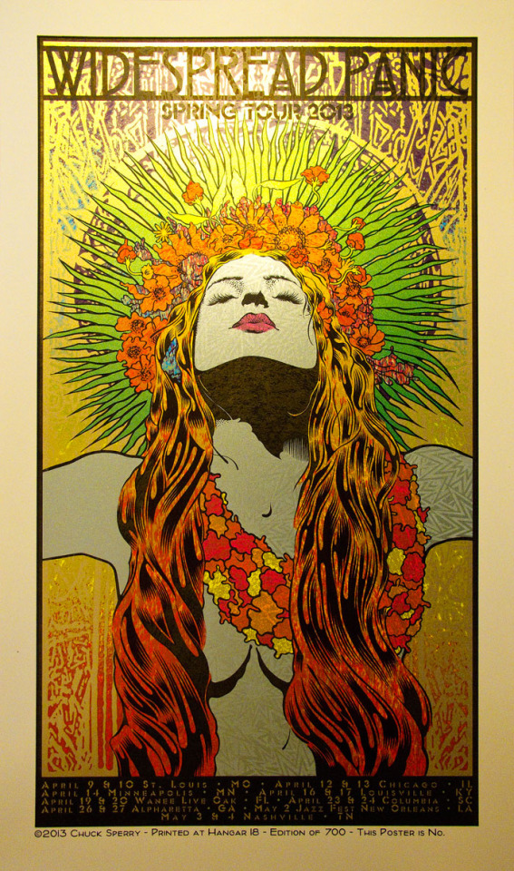
[on the left, Seleme 2019. on the right Widespread Panic, spring tour 2013]
Peter Blake is an English pop artist, who grew in popularity in the late 1950’s. He has worked on a number of different album covers, the Beatles, Sargent Peppers Lonely Hearts Club being the most popular example. Blake has also created work for 2 albums by the band The Who, a cover for Band Aid single ‘Do They Know It’s Christmas?’. On top of this Blake is also known for the design of the 2012 Brit Award statuette. Blake’s contributions to the pop art movement resulted in being knighted at Buckingham Palace in 2002. One print of Blake’s that really stands out to me is his 2019 screen print ‘Red Nose Day’. I find this a really fun piece, especially with the way that Blake has used the red dot in the middle of The Who’s logo as Micky Mouses nose, as though he was wearing his own red nose. Red Nose Day is also often associated with supporting various different issues that children if the world face. So I find using the image of Micky Mouse as a nice way to pay homage to the children the charity supports, but also something that adults can enjoy too. The bright bold colour blocking style of the print also makes the piece very eye catching. The blocks of red in each square in the background of the piece take your eyes around the piece, allowing you to take in every part of the piece. Blake has also used contrasting lines in each square in the background, the round circles in The Who’s logo, and the straight angular lines of the star found down and to the left of the logo. And the diagonal lines in the other 2 blocks going in opposite directions, showing really nice contrast, making the piece that bit more interesting.


[on the left, red nose day 2019. on the right, sargent peppers lonely hearts club 1967]
Andy Warhol was an artist, producer and film director most known for being a key artist for the visual art movement, pop art. Flourishing in the 1960’s, Warhol explored themes such as the relationship between artistic expression, celebrity culture and advertising. Warhol created art using a wide spread of media, in particular he would be seen to be using photography, film, painting, but most importantly, silkscreening. The 1962 silkscreen painting ‘Campbell’s Soup Cans’ and ‘Marilyn Diptych’ are just two of Warhol’s most popular works. I really enjoy Warhol’s silkscreen prints of Queen Elizabeth produced from 1928-1987, as it’s quite rare to see the queen depicted in such a bold manner. As this print when the queen was younger, I think this print captures the Queen’s youth quite nicely in a number of different ways. With his use of bright colours making the piece more relatable to younger rather than seeing the queen In that very bland traditional setting. Warhol also captured the Queens youth by continuing to depict Queen Elizabeth the way he would depict an beautiful woman, not a dark circle, drop of acne or wrinkled forehead in sight presenting them how he felt society saw them, perfect. Having the Queens face this mostly flat white shade really keeps that main focus on her face and eyes, though our eyes are drawn across that piece with the small hints of yellow up in her hair and crown, and down to the blocks of yellow across the Queen’s chest and shoulder. I also find the dark blue line work really nice, as it’s not as harsh as black line work might be, making the overall piece softer. Also the fact that Warhol has not included the dark blue line work in the Queens crown makes the crown seem really delicate, as the crown surly would be.


[Queen Elizabeth, 1928-87. marilyn diptych, 1962]
After looking further into the screen printing process, artists and their work it has only reinforced why screen printing is a process that I very drawn to as I have see the sheer amount of different types of work that can be created with it. With Chuck Sperry I enjoy the complex layered designs that he achieves, something quite different to what I might create myself however I reminds me that a lot can be achieved with screen printing so seeing work like that can almost make me push my boundaries to see how far I can take the method myself. Blake and Warhol’s work is something that pushes me to screen printing bright bold colour blocking is something that I use in my own work so I often see myself taking inspiration for something something as simple as the colour of one of the works.
References
A brief history of screenprinting - Leicester Print Workshop
By Anon Year: 2019 Container: Leicesterprintworkshop.com URL: http://www.leicesterprintworkshop.com/printmaking/screenprinting/a_brief_history_of_screenprinting/
Silkscreen Printing: Serigraphy
By Anon Year: 2009 Container: Visual-arts-cork.com URL: http://www.visual-arts-cork.com/printmaking/screen-printing.htm
What is the difference between Serigraphy and Screen Printing?
By Wicked Blogger Year: 2019 Container: Wicked Screen Printing Supplies Blog URL: https://wickedprintingstuff.wordpress.com/2019/10/08/what-is-the-difference-between-serigraphy-and-screen-printing/
A Brief History of T-Shirt Screen Printing
By Anon Container: Everpress URL: https://everpress.com/creator-toolkit/a-brief-history-of-t-shirt-screen-printing/
*
* Chuck Sperry
By Anon Year: 2020 Container: Wikipedia URL: https://en.wikipedia.org/wiki/Chuck_Sperry
* Semele
* By Anon Year: 2020 Container: Wikipedia URL: https://en.wikipedia.org/wiki/Semele
Peter Blake (artist)
By Anon Year: 2020 Container: Wikipedia URL: https://en.wikipedia.org/wiki/Peter_Blake_(artist)
* Out of Print: Pushing the Boundaries in the Art of Print Archives
By Anon Container: Chuck Sperry URL: https://chucksperry.net/tag/out-of-print-pushing-the-boundaries-in-the-art-of-print/
Andy Warhol
By Wikipedia Contributors Year: 2019 Container: Wikipedia Publisher: Wikimedia Foundation URL: https://en.wikipedia.org/wiki/Andy_Warhol
Widespread Panic Spring Tour 2013 Variant Editions
By Anon Year: 2013 Container: Chuck Sperry URL: https://chucksperry.net/widespread-panic-spring-tour-2013-variant-editions/
Peter Blake - Red Nose Day -- Screen Print, Comic, Pop Art by Peter Blake
By Anon Container: 1stDibs.com URL: https://www.1stdibs.co.uk/art/prints-works-on-paper/animal-prints-works-on-paper/peter-blake-red-nose-day-screen-print-comic-pop-art-peter-blake/id-a_4685372/
* Andy Warhol Queen Elizabeth Silkscreen Portrait Framed Print | #1831319151
By Anon Container: Worthpoint URL: https://www.worthpoint.com/worthopedia/andy-warhol-queen-elizabeth-1831319151
Marilyn Monroe Complete Portfolio
By Anon Container: Revolver Gallery URL: https://revolverwarholgallery.com/portfolio/marilyn-monroe-suite/
0 notes
Text
Wednesday 20th January 2021
History from Long Ago and a Bit of Nature Thrown In
See Update edit at the end of this blog*
Another dark day here, absolutely bogging as we might say. Wet and uninviting. There’s no way I want to venture into the great outdoors despite the younger Nature Watch flagging up this helpful article.
So instead, I’ve stayed snug indoors and embarked upon a history lesson. Settle down as you could lose an afternoon on this one. I do apologise for rambling on so much, but it was one of those that once you started, you I just couldn’t stop.

For obvious reasons photos today are not my own but are credited to the sites linked
On an historic day in American history, when a woman takes a presidential role for the first time, I’ve been focusing on women.
The question is do you know anything about Edith Pretty?

Edith Pretty (1883-1942) photo credit: National Trust
This is she.
Now I very much doubt that Edith Pretty is a name that springs to many people’s mind? but if it wasn’t for her, it seems Britain would have been denied one of its greatest national treasure collections.
I started off looking at Edith and her story at Sutton Hoo because I was looking into another little known but hugely influential woman who made an impact on natural history, with barely any recognition at the time and then I got side-tracked by news of The Dig, a new Netflix film, out at the end of this month - the 29th to be precise. Now I’m not a big film fan, but this tells the intriguing true story of how a wealthy and idiosyncratic widow with a ferocious sense of civic duty, lead an archaeological excavation just before the outbreak of World War II (1939-1945)
Just what I want on these horrid Winter evenings, history and mystery.
Edith had a very privileged background and travelled extensively with family in her youth, not just pleasure trips but educational journeys far and wide. The family were interested in ancient sites and antiquities and this stayed with Edith.
When she married at the age of 42 she purchased a marital home and estate named Sutton Hoo*in South East Suffolk. Frank and Edith went on to have a son born when Edith was 47, but sadly Frank only lived until the boy was four years old, after which it’s possible that Edith became more and more interested in spirituality and lives that had gone before.
Sutton Hoo derives its name from Old English. Sut combined with tun means the southern "farmstead" or "settlement" and Hoh refers to a hill "shaped like a heel spur" Wikipedia
* when the Tranmer family Trustees later donated the house to the National Trust, it was renamed Tranmer House
There’s a far longer and more involved tale than I can unravel here. It started with curiosity, hunches and investigations into some strange mounds of earth in the grounds, with the help of Basil Brown. Brown, who Edith was introduced to via acquaintances, was a self-taught archaeologist with an interest in astronomy.
The mounds of earth had undoubtedly been the subject of investigation by grave robbers centuries before, but fortuitously, they’d not gone far enough to make any significant finds and the land continued to lay undisturbed. It’s incredible to think that before the qualified experts became involved, the first excavations took place using household items such as penknives, pastry brushes and bellows. The whole wonderful significance of such an impressive discovery and the way it came about, is fairly earth shattering.
Basil and Edith’s project uncovered the shape and remains of a ship which was at first thought to be Viking, but later determined to almost certainly be a burial chamber marking the death of an Anglo-Saxon king. Interred with it were many priceless, perfectly preserved gold and silver jewelled and highly decorated artefacts from the early 7th century and before. These treasures had been gathered from far and wide; the products of breathtakingly deft workmanship, which, even today, with precision tools and artificial lighting, cannot be matched easily. Some of the items seem, to me, reminiscent of Fabergé’s finest.

A gold shoulder clasp decorated with garnet and glass cloissoné
Image credit National Geographic
Cloisonné is the technique of creating designs on metal vessels with coloured glass paste. This is placed within enclosures made of copper or bronze wires, bent or hammered into the desired pattern. Known as cloisons (French for “partitions”), the enclosures generally are either pasted or soldered onto the metal body. The glass paste, or enamel, is coloured with metallic oxide and painted into the contained areas of the design. The vessel is usually fired at a relatively low temperature, about 800°C. Enamels commonly shrink after firing, and the process is repeated several times to fill in the designs. Once this process is complete, the surface of the vessel is rubbed until the edges of the cloisons are visible. They are then gilded, often on the edges, in the interior, and on the base
The collection of 263 objects included weapons, silver cutlery, gold buckles, coins, and a distinctive full-face helmet, of a kind never before recovered in Britain.

The purse lid on this Link is photographed from various angles and the standard of the materials, design and workmanship is just mind boggling, as is the condition of something which was crafted in the 7th Century.

Bronze Washing Pot decorated with glass and enamel. The hooks are to hang it up. Image credits National Geographic
Two other women who played a key role in documenting the investigation were Mercie Lack and Barbara Wagstaff. People I hadn’t heard of either. They were both schoolteachers who had a passion for photography and for Anglo-Saxon archaeology. As friends they had previously spent school holidays photographing carved stone for the British Museum and they brought their skills to bear on recording the early days of the Sutton Hoo excavation. They likely responded to a public appeal for photographers to help out and turned the Summer break into a holiday stay as well. Their images, many of them neatly annotated, provide a fascinating insight into the project, and include some of the earliest colour photographs from an archaeological investigation in this country. Of all the volunteers their work was the most professional.
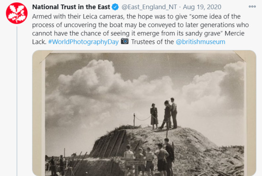
Image credit: National Trust, Twitter
The National Trust has undertaken a project to digitalise this collection and preserve it for posterity.
Unfortunately, as is often the way, in the dramatisation the film follows the book upon which it is based, where the author chose to replace them with a fictional (male) character. Like Edith, Mercie also bequeathed her artefacts from the dig to the British Museum. You’d really liked to have thought that the women’s contributions were recognised and noted and not airbrushed out of the story.
Incredibly, after a treasure trove inquest (August 1939 at Sutton Parish Hall) it was determined that the astounding find - which would entirely revolutionise historians’ understanding of the Anglo-Saxons - belonged not to the Crown but to the landowner and extraordinarily Edith donated the entire haul to the nation.
In 1951, having been stored in Aldwych Tube station during the war, it went on display in the British Museum - albeit with no credit, not a single namecheck, for Basil Brown. Sadly, Edith was no longer around to object. Basil was almost 90 when he died in 1977, but after suffering a blood clot on the brain, she had died in 1942, aged just 59.
Winston Churchill had offered Edith a CBE in recognition of her extraordinary generosity, but she declined the honour, almost certainly on the basis, according to Laura Howarth, archaeology manager for the National Trust, that she had ‘merely been doing her duty’
Laura Howarth says ‘There have been notable Anglo-Saxon finds since, but nothing like this, a fully furnished, undisturbed ship burial. We know of only three Anglo-Saxon ship burials, two at Sutton Hoo and one near by at Snape. So it was a very localised practice’

Wikipedia Link Sutton Hoo
TIMELINE:
1926
Edith Pretty buys the site of Sutton Hoo, and becomes fascinated by the strange mounds of earth on her land.
1939
Basil Brown discovers a funerary cache of 263 objects in tumulus 1. World War II breaks out in September.
1946
After being kept safe underground during the war, the treasure—owned by the British Museum—is put on public display.
1990s
Further excavations uncover another intact burial site in tumulus 17 containing a young man, a horse, and weapons.
The British Museum link to Edith and to the treasures

Photo: Harold John Phillips in the public domain. The ‘skeleton’ of the almost 90′ Ghost Ship imprint in the soil. This size ship would have accommodated 40 oarsmen
There’s also a piece about recreating the ‘Ghost Ship’ on this Daily Mail link and it has a good piece of National Trust video showing the site.
Rebuilding the Ship and why use Green Oak?
The Ship’s Company Team is a group of people with the collective desire to resurrect King Raedwald’s burial ship and turn the famous ghost imprint into a living reality.
Although there is no evidence left to examine the identity of the illustrious occupant of the burial ship, a strong guess is that it was possibly King Raedwald? It certainly must’ve been someone fabulously wealthy and highly regarded. The Sutton Hoo sword video from the British Museum at the end of this blog is very well worth a watch, exploring more about the man.
Within the ship, archaeologists found various treasures from across both the British Isles as well as the Byzantine (eastern Roman) and Frankish (western European) empires — including the famed Sutton Hoo helmet.
The grave itself is thought to belong to King Rædwald of East Anglia, a member of the Wuffingas dynasty which has been associated with the Wulfing clan of Sweden, who appeared in the Old English epic poem Beowulf.
If you’d like to read more and see some absolutely fabulous original photographs do go over to this Anonymous Blog. Edith was the cousin of the author’s Great Grandmother and it is a really personal and detailed account of what the family know of this incredible lady. I highly recommend it.
So there we are, you can see how I became utterly absorbed and went from internet site to site following all the history. I’m really interested in catching the film and seeing how the whole story of the people and the discovery is portrayed. Remember the date 29th January, if you have access to Netflix.
*UPDATE:
Please do read this blog about Basil Brown, written by John Cooper
youtube
WHAT ELSE DID I LEARN TODAY:
The Seventh Century covers the years 601-700 and I picked out this fact
Only one woman has ever sat on China's throne as Emperor in her own right. That woman was Wu Zetian (624-705) of the Tang dynasty
0 notes
Text
Charlie Chaplin in Moscow
Early Soviet filmmakers took great inspiration from Charlie Chaplin, but his critique of mass production put him at odds with them.
In Charlie Chaplin’s 1914 film The Fatal Mallet, you can see “IWW” chalked on a wall in the background. While no one knows if the director — who grew up in south London’s slums and became a globally recognized comedian — supported the Wobblies at the time, we do know that the characters he played in dozens of short films in the 1910s and early 1920s would have.
In The Adventurer, he plays an escaped convict; in Police, an ex-con forced into burglary by unemployment; in The Bank, a janitor working next to, but unable to get ahold of, money; in Work, a downtrodden contractor; in The Immigrant, a migrant so frustrated by his treatment he kicks an immigration officer; and, of course, in The Tramp, a homeless man looking for a stable life. All these men, who populated the rapidly changing, expanding, and radicalizing United States, might well have written IWW on a fence in Los Angeles.
Chaplin wouldn’t state his politics explicitly until well into the 1930s, a move that would put him in the House Committee on Un-American Activities’ crosshairs. But in the aftermath of the Russian Revolution, young Soviet artists, designers, and filmmakers already thought they knew exactly what his politics were.
In 1922, the new Moscow magazine Kino-Fot, edited by the constructivist theorist and committed Communist Aleksei Gan, published a special issue on Chaplin. Throughout, painter and designer Varvara Stepanova depicted the actor as an abstract object, his body’s parts transformed into exploded shards and flying polygons, identifiable only thanks to his trademark hat, cane, and moustache.
Aleksandr Rodchenko’s text declares, manifesto-style:
[Charlie’s] colossal rise is precisely and clearly — the result of a keen sense of the present day: of war, revolution, Communism.
Every master-inventor is inspired to invent by new events and demands.
Who is it today?
Lenin and technology.
The one and the other are foundations of his work.
This is the new man designed — a master of details, that is, the future anyman.
That same year in Petrograd, teenagers Grigori Kozintsev, Leonid Trauberg, and Sergei Yutkevich, who collectively called themselves The Factory of the Eccentric Actor (FEKS), published something called “The Eccentric Manifesto.” Under the sign of “Charlie’s arse,” they demanded:
ART AS AN INEXHAUSTIBLE BATTERING RAM SHATTERING THE WALLS OF CUSTOM AND DOGMA. But we have our forerunners! They are: the geniuses who created the posters for cinema, circus, and variety theatres, the unknown authors of dust jackets for adventure stories about kings, detectives, and adventurers; like the clown’s grimace, we spurn your High Art as if it were an elasticated trampoline in order to perfect our own intrepid salto of Eccentrism!
Meanwhile, a film director was perfecting a technique that would eventually bear his name: the Kuleshov effect, in which the juxtaposition of unrelated material creates a new mental link between them. He argued against slow paced, European montage, which treats cinema as a high art form akin to theater, and for the high-speed American montage that thrilled audiences.
Somehow, these people, all trying to create art in the young Soviet Union, agreed that Chaplin represented their ideal. In a series of theatrical productions and films over the next decade, they would try to make something that had the same effect on their viewers — a socialist, avant-garde slapstick comedy, informed by silent farce, technological romanticism, and contempt for high culture.
This history sits a little strangely with what many know about the Soviet Union’s first fifteen years of experimental filmmaking. Its directors, including Sergei Eisenstein, Lev Kuleshov, and Vsevelod Pudovkin as well as documentary pioneers like Dziga Vertov and Esther Shub, have earned formidable reputation for applying Marxist methodology to film.
Their contributions, including “the montage of attractions,” the “camera eye,” the “intellectual montage,” and the aforementioned Kuleshov effect, have grounded film curricula since the 1960s, often used in contrast to Hollywood’s formulaic spectacles. In fact, when French filmmaker Jean Luc-Godard stopped making crowd-pleasers in the 1960s and opted instead for punishing Althusserian didactic tableaux, he signed his films Dziga Vertov Group.
What this story leaves out is how Soviet directors’ ideas came out of their obsessions with the crassest and most lurid kinds of American film, its chases, special effects, and pratfalls. In translating Chaplin for Lenin, they combined these elements with their equally strong interest in another aspect of 1910s America: scientific management and industrial efficiency, especially the work of Frederick Winslow Taylor and Henry Ford.
The resulting films shared a bizarre and unstable comic Americanism, which you can see still in films like Kuleshov’s Adventurers of Mr West in the Land of the Bolsheviks, a high-speed, Keystone Kops satire about Western perceptions of the Soviet state; Boris Barnet’s Miss Mend, where an international communist secret society foils the evil plans of nefarious capitalists; Sergei Komarov’s A Kiss For Mary Pickford and Pudovkin’s Chess Fever, which used footage of American stars on Soviet visits and put them into new, bizarre farces; and Eisenstein’s first feature, Strike, where insurgent workers move with all the bounce and assurance of a mass circus troupe.
Stage director Vsevelod Meyerhold helped pioneer this style. From the early 1920s onwards, he developed a “biomechanical theater” that borrowed equally from the circus’s high-wire tricks and gymnastic leaps, from Charlie Chaplin’s and Buster Keaton’s jerky, ironic slapstick, and from the USSR’s development of Taylorism, led by government-sponsored think tanks like the League of Time and the Central Institute of Labor. The latter’s founder, Aleksei Gastev, a former metalworker, union leader, and poet, became a key figure for most of the 1920s avant-garde.
Looked at coldly, his ideas are unnerving and dystopian. He imagined the new Soviet working class as nameless machines working in seamless unified motion, a somewhat unlikely and wholly unfulfilled demand of the chaotic, largely rural, and unskilled labor force of the Soviet 1920s. Yet while Taylorism involved monitoring the worker’s motions to transform them into a predictable, high-performance cogs, Meyerhold’s biomechanics saw its protagonists as Chaplin-like comic machines, capable of humor and exuberance, not drab labor.
This appears even more strongly in another form of Soviet Chaplinism, which comes from an unlikely direction — formalist literary criticism. The great Viktor Shklovsky used Chaplin as an exemplar of his concept of “ostranienie” or “making-strange.” In his 1922 Literature and Cinematography, he tried to work out what set Chaplin apart from other actors, finally deciding that “the fact that [the movement] it is mechanized” makes it so funny.
In the American context, Chaplin was satirizing industrial, mass-production labor, but in the Soviet landscape — destroyed by seven years of war and economic collapse — the little tramp who moved with jerky assurance through a mechanized world was exactly the sort of “new man” they needed.
American visitors found this all disconcerting. The sympathetic artist Louis Lozowick had to explain to eager young constructivists in Moscow that he didn’t know anything about biomechanics, and that they, the Russians, had invented it themselves. A Ford Motor Company representative, treated by his hosts to some biomechanical theater, thought the whole thing ridiculous and farcical.
In the mid-1920s, the Soviet Eccentrists would move away from the leaps, special effects, and extravagant silliness of movies like The Adventures of Mr West and develop a more sober style, although equally indebted to the frantic pace of American montage and cartoonish American acting styles. The results, such as Eisenstein’s Battleship Potemkin and Pudovkin’s Mother, had a mixed reception in the USSR but became international sensations. Their kinetic action sequences changed cinema history, and their rousing revolutionary narratives got them banned across the free world.
This is when Charlie Chaplin first became aware of his Soviet fan club. He opposed the bans and helped get these films shown to American audiences. When Eisenstein made an abortive attempt to film Dreiser’s American Tragedy in Hollywood, the two directors became fast friends. But the Soviet film director who had the strongest effect on Chaplin — whose feature films like The Gold Rush and City Lights had become ever more sophisticated and socially critical — was Eisenstein’s great adversary, Dziga Vertov.
A groundbreaking documentarian, Vertov thought fictional films were inherently bourgeois and escapist. Nevertheless, his special effects, comic juxtapositions, and pounding sense of rhythm made him an Americanist in his own way. In 1930, he made the first Soviet sound film, Enthusiasm — Symphony of the Donbas. This hour of grueling industrial propaganda doesn’t much resemble The Fatal Mallet. It depicts mechanizing the Donets coalfield in Eastern Ukraine and teaching the mineworkers Taylorist efficiency.
Chaplin, however, was attracted to the unrivalled intensity of its juxtaposition of sound and image. Using field recordings from Ukraine’s mines and steelworks, Vertov created an industrial jazz of still-astonishing power, a relentless clanging pulse echoing that puts the soundtrack closer to Einsturzende Neubauten than to Al Jolson. Chaplin called it “one of the most exhilarating symphonies I have ever heard.”
Six years later, he made his response. Modern Times has become justly famous for its definitive critique of Taylorism and Fordism. In the factory sequences, machines feed Chaplin, his all-seeing boss monitors him on film, and the production line eventually eats him, until he floats, weightless, through the cogs inside, a tragic and bitter image of the smooth and seamless mechanized labor the Soviets longed for. Insisting on keeping the film wordless, Chaplin used a soundtrack of rhythmic clangs and crashes that mirrored Vertov’s “Donbas” symphony.
Coming when Taylorist speed-up was sparking some of the greatest strikes in American history — not to mention the CIO’s formation — you might expect that the Soviets welcomed the film as a critique of American capitalism’s brutality.
They didn’t. In a text called “Charlie the Kid,” Eisenstein criticized his friend for his satire’s infantilizing and utopic take on what mass production does to workers. Regarding the factory sequence, he asserted, “At our end of the world, we do not escape from reality to fairy-tale, we make fairy-tales real.”
The tramp of Modern Times, exhausted by labor and made homeless by unemployment, accidentally picks up a red flag midway through a strike, getting him arrested as a dangerous agitator. Chaplin himself would be notably supportive of the Soviet Union, and his refusal to fall in with McCarthyism was admirable; but the tramp might have silently held other opinions about industrial efficiency and five-year plans than those he helped inspire.
0 notes
Text
HC: Valoren’s Propaganda Team
Edit: Updated to reflect the new addition of Silvarbelle’s character, Cairis. Link to character blog has been provided under the Read More cut. Minor tweaks have also been given to other characters.
Like any respectable department, Valoren does not work alone as a propagandist. While she serves as “The Voice” and the leader of the Propaganda and “Public Resources and Education” Department (which is just the fancy way of saying she makes other high-up officials look good in propos and makes radio broadcasts about them, or lies for them), there is no conceivable way that she could do her job alone. Instead, she does have a distinct team that she partially inherited from her mentor (well, those that didn’t quit, anyway), and others that she hand-picked for the job.
Koje
They/Them, Male Presenting; ~30
Cold-Climate galra. Floof.
Slightly aloof in personality, but possibly the most devoted of the workers. Rumoured to be tagged as Valoren’s protege and named to take her place as Voice should anything happen to her. Operates almost as her Second in Command.
Has no problem speaking up to Valoren when they feel she is in the wrong and is quick to shut her down if she is stepping out of line with superiors.
Inherited from previous mentor’s team.

Cairis
As played by Silvarbelle. Visit her blog for more in-depth information on the character and to play with her. I encourage it! This character is not one that I own. She just works for my girl.
She/Her, Female Presenting; 25
Acquired by sheer happenstance -- Koje first vouched for her, which gave her a foot in the door. Valoren agreed to allowing her on the team based on his recommendation and, thus far, has been very pleased with the results that Cairis has yielded for her.
Jostann has unofficially adopted Cairis as her own child and has a habit of babying, spoiling, and tending to her as if she were her own.
Torvull likes her puns. Torvull shares puns with her. The less pun-enthusiastic may not be so pleased by this development.
Artwork credited to @tiildeath
Noveena
She/Her, Female Presenting; 19-20.
Has a little bit of floof, but she styles it like one of those french poodles. Pastel colours.
Valoren refers to her as having eyes “set too close together” and ears “too large for her head.” It gives her a very youthful appearance, especially combined with her pastel colouration and her chipper personality.
Comes from a family of wealth and status -- Noveena voluntarily took up a position in Valoren’s department because of idol worship towards the Voice. Valoren hates it.
She is actually an extremely competent worker and produces some of the most gorgeous propaganda posters and artistic edits -- however, Noveena takes hours to do it. The results are immaculate, but time consuming.
Rojeon
He/Him, Male Presenting; 29
Galra based heavily off a peacock. Has soft feathering and plumage that is far too colourful for his own good. Comes from a very warm, tropical climate.
Keeping in the peacock theme, has a bit of an obnoxious voice and is banned from making any broadcasts himself, but could not ask for a better film editor. He has an amazing critical eye and can pull the best angles for the perfect spin on footage to tell a different story.
Is a very cocky individual and a bit full of himself. The rest of the team put up with it.
Inherited from previous mentor’s team.
Jostann
She/Her, Trans; 30s
Half Galra. [TBD further information on this ]
The “mom” of the team, Jostann is the one that has a tendency to fuss over the team, make sure that they have eaten, gotten their sleep, etc. She has a bad habit of looking at the team as her kids that she must protect -- and will.
Brilliant sound editor. Can make audio transmissions do things that no one else on the team can. Has been able to isolate and fix transmissions that the rest thought were absolutely beyong repair with a few clicks. Saved the program more than once.
Valoren chose her to save her from expulsion due to her crossbreed status. Now that Jostann’s talents have come to light, she is very grateful she did.
Orirn
He/Him, Male Presenting; 40s
Think if Burn Gorman were a Galra. That is pretty much what you have with Orirn.
Codenamed “The Grumpy One” by the rest of the team, Orirn rarely has a kind word to exchange. Usually it’s displeased grunts or sarcastic drawls, but he does the job and he does it well.
As it turns out, the bitterness stems from the loss of his mate a few cycles back. This information is undisclosed to the rest of the team. He actually does care about them and would be one of the first to defend the Propaganda Department if it came to it...he’s just going through a tough time right now. Plus, bitter is just part of his personality.
Born with a mal-formed right leg that was removed and replaced with Galra-tech. His family was poor, however, and he was unsuccessful in terms of military careers and did not receive very good tech. It constantly breaks and has worn down dramatically, forcing Orirn to often resort to using a cane to stabilize himself when walking. It doesn’t seem to slow him down very much, but it can cause him a great deal of discomfort.
Inherited from previous mentor.

Torvull
He/Him, Male Presenting; Mid 20s
Unilu.
The rest of the team had their extreme doubts when Valoren introduced the concept, especially with the stereotype that comes with Unilu, but a good argument was made: with how many arms an Unilu has, think of how many cameras one could operate simultaneously for film propos!
Torvull was an acquisition from the Galran prisons. There might have been an exchange of information, coins, and some blackmail from Valoren and her team for him. Torvull is eternally grateful.
Having said all of that, he is a pain in the ass. He is a smart mouth, wise-cracking, pun-loving, practical joker. Valoren is about three tics from throwing him back into his prison cell.
ART: Located HERE and drawn by @vrepit-sal-special! Thank you~
Lufir
He/Him, Male Presenting; Early 20s
Warm Climate-Based Galra -- Probably a desert clime.
Lufir is the newest addition, and the one that everyone questions because he perpetually messes up. Put a camera in his hands? He drops it. Give him footage to edit? He deletes it. Ask him to make a poster? You’ll find him lying on the floor, crying, with the deadline steadily approaches.
They can’t figure out why she picked him. Lufir can’t figure out why she picked him.
Most that are hired in to work for her tend to only last for a short period. They either buckle under the pressures that she places on them to run the programs, or they can’t handle her at her absolute worst when she is approaching a deadline. Those listed are the ones that have managed to actually stay for the long haul.
#Headcanon#{ my peace has always depended on all the ashes in my wake [Valoren] }#I cut most of this and put it under a Read More because of how much there was#Didn't want to clog dashboards#BUT HEY I finally got her team down!#Now I just need to work on getting art of them so you have faces to go with names
10 notes
·
View notes
Text
50 ZINES
collection of cool zines i found
1 - Book Your Own Fuckin’ Life 3

by Maximum RocknRoll + Rocco Publishing 1994
a diy resource guide into booking your life like a musician. laid out like a phonebook pretty neat
2 - bOING bOING Issue 02

by Mark Frauenfelder and Carla Sinclair 1988
influence in the development of the cyberpunk subculture. It reached a maximum circulation of 17,500 copies
themes include technology, futurism, science fiction, gadgets, intellectual property, Disney and left-wing politics
3 - Nightly Walk

by Joseph Park 2018
about inspiration and creation
12 x 16.1 cm, 28pages / 3-color Riso Print, limited edition of 333
4 - incompleteness of the moment

by Olya Andrushchenko 2019
consists of my personal photos, mostly random photos of places I've been to during my summer vacation in my hometown
5 - Anathema
by Hector Kimura 2015
inspired by philosophical concepts and their creators
Launched by Olho Vivo at the Feira Plana + risography at Meli-Melo Press
6 - All The Pieces Fit Together

by Kristina Alijošiūtė 2018
consisting of paper collages and their visual explanations, revealing details usually left unnoticed inside the final composition
Risograph print in crimson, flat gold & black by Drucken3000 Risografie, Berlin
7 - Round Hours

by Yeji Yun 2018
printed by Knust Press, Extrapool in Netherlands
just about some cats
8 - Pale Blue Dot

by Meli-Melo Press, São Paulo 2019
Blue Dot is a photograph of the Earth taken on February 14, 1990, by the Voyager 1 spacecraft
9 - Zine of Mouse
by Bobby Bao 2020
exactly what you think it would be
10 - Rain Drops & Broken Hearts

by Leanna Perry 2018
Complex illustrated patterns weave in and out of stark black and white supergraphics
Nostalgia for early 2000’s Myspace emo graphics bleeds out of heavily adorned diamonds, butterflies, razorblades and traditional black metal lettering
11 - Flash Zine
by Jake Foreman 2017
Rubber band bound Risograph prints
200x280mm 28 pages 100gsm Kaskad Curlew Cream paper
Limited edition of 50. Signed and numbered
12 - Tohoku Zine Travelogue

by Ryan Len
made for The Workbench
documents topics and travels of interest, with the inaugural issue about Ryan's life changing trip to Tohoku, an area badly hit by the 2011 earthquake and tsunami
features a french fold binding, allowing readers to peek between the pages and beneath the surface, uncovering his thoughts
13 - Countries and Cities #02

by Paul Katterl
made for Sketchbox
a series of zines displaying pictures from foreign places
all photographs shot in 35mm film
14 - GON Comic Zine

by Kosco Kosco 2018
15 - OPIO Zine Second Edition

by a collection of artists 2019
printed magazine about latin american art and design
16 - DISC GOLF IS NOT GOLF
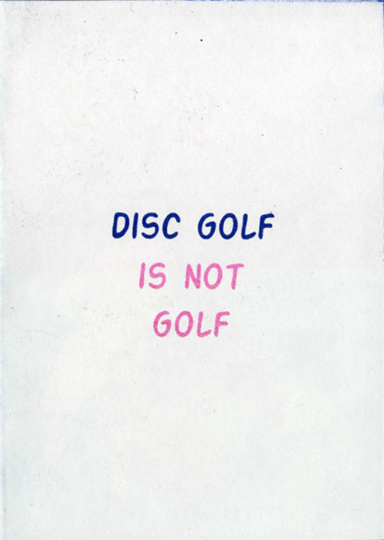
by Galya Dautova 2018
one page zine about differences between disc golf and golf
17 - Overprint Zine

by Anna Linder 2015
Self-initiated project Since I learned the screenprinting technique, I have been very fascinated by the result you get from reusing the same paper for test prints, with a totally random combination of images layered on each other.
cut down to a4 and created handbound zines
18 - The Darknet Zine

by Kasia Wieteska 2017
made for Be Polska
19 - Sudario

by Atto 2014
Design and Risograph-print of Sudario. A photographic fanzine curated by The View From Lucania.
20 - GODVERDOMME

by Marie Schelkens 2017
zine about cursing. 'Godverdomme' means 'God damn it'
It contains some articles and stories about cursing, swear words in different languages, little games and puzzles and a poster at the end
booklet is completely transparant so the text is not readable and you would be swearing because of it
there is an orange paper that you can put behind every page, if you would want to read it
21 - WARSZAWA - STUTTGART ZINE

by Kamila Staniszewska
collaborative zine created during 3-days workshop between Klasse Thomas and Academy of Fine Arts in Warsaw
22 - A NEW ZINE ABOUT RICARD
by Bobby Bao 2020
23 - BOYS ZINE

by Kris Andrew Small 2020
24 - meiauns zine

by Pianofuzz Design Studio 2015
collaborative zine with the professionals who were part of the team
proposal of this work was to make a relation of the space / individual / studio, seeking to answer the question of the exchange between the human (singular) and the studio (collective)
25 - Ruins.

by Once Were Pop 2018
describes an open-minded surreal walk between temples,
columns and all the relics of the Roman Empire
collection of 10 pieces
digitally printed with an old HP 5200 Laserjet
26 - Bauhaus Zine
by Ellie Liew 2019
a zine dedicated to the 100th anniversary of the Bauhaus
27 - American Dream

by Harry Diaz 2014
self published zine that dives into my perception of what it is to pursue the American Dream
24 pages, printed on a risograph with purple soy based ink
28 - Undressing
by Tina Siuda
using silkscreen to print all the elements, including the color of the cover
there are only 30 copies
29 - Nightnight

by Hyunjung Huh 2018
a one page zine
30 - Fears & Loathing
by Ren 2015
5 color Risograph zine printed by Victory Press
explores personal fears and anxieties
31 - Filth.

by Erin Rimmer 2015
about sexual objectification of women in media
32 - Y2K Survival Guide

by Jackson Green 1999
a guide to help people navigate the chaos that was surely to befall us as soon as January 1, 2000
made entirely by hand, from scraps of articles relating to Japanese reactor meltdowns, NASA documents, as well as period-correct tabloid newspapers
33 - chaos vs order

by Dennis Zorn and Jonas Mollenbeck 2016
apart of the 3h zine project - creating a zine in just 3 hours
looking at a new way of designing without restriction
34 - Lithography Zine

by Karolina Krol 2017
35 - RetroGAY

Pedro Nekoi 2019
36 - RedBlue
by Boynova Maria 2019
37 - Deconstruction in history of art as a tool.
by Vasilisa Aristarkhova 2019
contains typographical experiments' catalogue, quotes about deconstruction and self-reflection on the topic
38 - Boat Man

by Aysha Jumari 2019
illustrated fictional narrative, told in an 8-page zine, about the fate of a bumboat operator from the sleepy, coastal district of Changi in Singapore
39 - Shifting Self & Self Shifters
by Owi Liunic 2019
40 - Dog Zine

by Susannah Garden and WES 2018
A5, 26 page zine printed on a risograph with 2 colors
donated 20% to local dog shelters
41 - Disorder Zine

by Daniela Efe 2019
42 - Paper Empty

by rengally 2019
43 - Photo Zine 01

by Nabila Paramita 2019
44 - Snakeskin Zine
by Eugenio Cara 2019
45 - Rally 2U

by Annu Kilpelainen 2019
published by Tan&Loose
24 pages, 4 color risograph
46 - el futuro

by Sartorio Pedro 2019
20 page fanzine printed on inkjet
47 - Part Shoes

by Hannah Ferguson 2020
a short fold out zine
printed on letterpress
48 - Question Zine

by Agata Chudzik 2020
49 - Sun Valley

by Justin Uy 2020
inspired by Japanese Street Fashion
50 - Wired

by Tasha Campbell 2014
hand stitched typography zine on how technology effects society
0 notes
Text
An Adventure at Annecy
Tumblr extended edition

A few years ago, I had discovered the existence of the Annecy International Animated Film Festival in 2015 when some of my online friends had attended it. When they shared their experience on Facebook, I knew I had to go some day.
In finishing the second year of my animation course, I felt this would be the best time for me to visit, so I planned my journey, got advice on what to see and how to get around and made my way.


Annecy is a really nice city. The main building that the Festival was hosted at Théâtre Bonlieu is just across the road from the huge open air screening, the lake and a view across to the mountain range. I was stunned by how the mountains loomed in the distance everywhere I went and everyone just went about their business. Since Norwich doesn’t have a mountain range, I was just in awe of them everywhere I went. There are also a lot of colourful buildings with grand architecture, large comfy cinema theatres and startlingly blue water.
Having never been before, and being unaware of Annecy Festival traditions, I was surprised by the amount of paper planes being thrown while the cinemas filled up. It was a completely different experience to going to the cinema any other day, and was a hard time adjusting to when I returned to England and no one was throwing paper planes and the like.
The experience at Annecy was very informative, and helped develop my ideas on my practice, which is extremely useful as I enter into third year.
WHAT I LEARNT
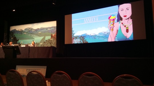
NEW CREATIVE CONTEXTS: A shared talk with Jean-Baptiste Spieser of Teamto and Tom Box of Blue-Zoo about current and upcoming things in the industry. The Teamto talk was about the production pipeline and how it can change radically depending on productions. The Blue Zoo talk was also quite interesting as it explained how they built and overhauled their render farm, as well as how they collaborate creatively within their studio.
The Art of Visual Storytelling with WALT DISNEY ANIMATION STUDIOS: The two speakers were Nathan Engelhardt, an animation supervisor, and story artist Lissa Treiman (who had, coincidentally, illustrated the first few issues that got me hooked to the comic GIANT DAYS). This was a massively helpful talk, very much worth the wait. The two speakers talked about how to make good shots great, through the positioning of cameras to the two cores of 'greatness' in animation – truth and entertainment.
Triggerfish's MAKING REVOLTING RHYMES: Mike Buckland and Sarah Scrimgeour of Triggerfish discussed the creative process of collaborating on the production of the short film Revolting Rhymes, including compositing and rendering.
The Art and Science of RENDERMAN: Dylan Sisson of Pixar held a talk showing the developments and potential for their Renderman renderer. It opened my eyes to the scope of things that Renderman takes into consideration, such as a recent shot in a Pixar film that had over ten thousand individually rendered lights.
VIRTUAL REALITY is the future: Google Spotlight Stories had a VR station set up with new videos daily. I managed to catch the session on Thursday which presented a preview of SON OF JAGUAR (dir. Jorge Gutierrez) and ARDEN'S WAKE: PROLOGUE (dir. Eugene Chung, Jimmy Maidens). I had never understood the true potential of VR in animation until after watching these, so much so that after I'd watched them I wandered around Annecy in a daze. Arden's Wake was especially mind blowing, as you could actually walk into the setting and see it from all angles. This has made me want to experiment with VR in my own practice.
WHAT I WATCHED
THE PEANUTS MOVIE outdoor screening: Having seen this movie before in English, I was surprised at how easy to understand it was in French. The broad animation style of the movie definitely helped.

A SILENT VOICE: A rather touching story about communication, repentance and forgiveness. Quite interestingly featured sign language in animation, which to me feels like a perfect match of two things, visual language and visual storytelling.
DESPICABLE ME 3: This is the first world premiere I have ever been to, and the atmosphere was wonderful. This was without a doubt one of the most active audiences I have ever been in. Whenever a joke hit, there would be a wave of laughter and applause, when one of the characters did something cute, there was a collective 'awww', even the applause at the end of the film ended up slipping into the same beat as the music of the credits. It was wonderful.
CAPTAIN UNDERPANTS: I never read that many Captain Underpants books when I was younger, so I was pleasantly surprised with how funny this was. Much like The Peanuts Movie, it managed to capture the style of its source really well, whilst still giving it their own flair.
ZOMBILLENIUM: An adaptation of a French graphic novel. Before the film began, the crew were on stage and threw production caps into the audience. The film was very stylish, with bold colours and shapes for the characters and making the CG look 2D.
SHORTS: I caught several showings of graduation shorts and shorts in competition. I was amazed by the diversity of shorts on display, showing the talents from animators of all walk-cycles of life. Shorts that stood out to me were the following:
Wednesday with Goddard (dir. Nicolas Menard, Canadian/UK) – a humorous and existential journey as a man tries to find answers to whether or not God exists.
vimeo
When Time Moves Faster (dir. Anna Vasof, Austria) – stop motion using objects like plates and curtains to animate sequences, showing each frame being set up in real time, then speeding up the footage to bring the sequence to life.
Double King (dir. Felix Colgrave, Australia) – there is something in seeing this on a big screen that makes it all that more fun.
youtube
Nachthexen (dir. Julie Herdichek Baltzer, Denmark) – documentary short about the Nachthexen of WW2, animated in the style of Soviet posters
vimeo
The Burden (dir. Niki Lindroth Von Bahr, Sweden) – a musical stop motion based around anthropomorphic animals who are stuck in an anxious and existential space in their lives. Won this year's Cristal for a Short Film award
vimeo
Aenigma (dir. Antonios Doussias and Aris Fatouros, Greek) – a surreal trip through a painter's landscape mind-bendingly presented in 3D
Tuhi rumm (dir. Ulo Pikkov, Estonia) – stop motion of a doll in a doll house-like setting, has a mix of a nostalgic and haunting feeling
Casino (dir. Steven Woloshen, Canada) – a musical, energetic drawn-on-film animation capturing the frenetic energy of a casino
vimeo
After All – Michael Cusack (Australia) – a very poignant stop motion film about a man going through his recently-deceased mother's belongings and reliving memories he had, very heart-rendering but with the occasional splash of humour


TIPS FROM MY EXPERIENCE
Take care of yourself: In the height of summer in the south-east of France, Annecy is hot. But when you are standing, walking, waiting and surrounded by other people who are also hot, the heat becomes unbearable (so much so that my watch had condensation on it at several points). Drink lots of water, try to keep in the shade when waiting outside, remember to eat.
Learn key phrases in France: This is something I'm going to try and pick up should I go again. I used to know quite a bit of French, but having forgot most of it, struggled at points of my visit. A lot of the hosts are bilingual should you have any questions, but knowing the sound of general phrases and what they mean is helpful in a pinch.
Beat the crowd: The Festival's 'first come first seated' events will fill up fast, and the queues for the screening events might result in you not getting in if you don't book a place during ticketing. The 'first come first serve' events that I missed were with popular big names, such as a talk with Guillermo del Toro and another with the creators of The Amazing World of Gumball and Don't Hug Me I'm Scared, which I am still kicking myself over, so be sure to arrive early for those.

Patience is a virtue: The queueing process at Annecy is quite arduous, but the wait is always worth it. I got into the talk with Walt Disney Animation Studios by waiting two hours earlier. It pays off very much.
Be tactical: Annecy is a big festival in a big city. Events conflict and travel times might be longer than you expect if you are travelling by foot or if you need to retrace your steps. When it comes down to seeing a mainstream film or a studio focus talk, choose which one would be a more informative experience. This links in well with taking care of yourself too. If you haven't eaten or drank anything for a while and you are thinking of joining a queue for something that needs you to wait for an hour and a half in the sun, it's better to take care of yourself first and foremost.
If you can, go in a group: Not only will this be a 'strength in numbers' type deal, where you can book into the same events and wait together in the queue and tap out should you need to get food, but this experience is one to share if you are enthusiastic about animation and the like.
Don't be afraid to try: I hate plane travel. I knew very limited French. I have the worst sense of direction in the world at times. But I went to Annecy regardless of these things and actually had a brilliant time.
3 notes
·
View notes
Text
How One Master Educator Uses Visuals and Tech to Make Dracula a Must-Take Course
When Stanley Stepanic was growing up in Latrobe, Pennsylvania, he lived in a house built in 1823. “Back then,” he says, “it was always cool to say, ‘I live in a haunted house. There’s a ghost here, and she committed suicide during the Civil War.’”
“I was obsessed with ghosts and skeletons,” he says, “and Halloween was always my favorite holiday.”
When he was five or six years old, Stepanic told his mother he wanted a Halloween-themed birthday party. “I had a cake with a skeleton,” he says, “and I dressed as Dracula.”
It was destiny.
You have to envision yourself as basically an entertainer.
Decades later, Stepanic teaches a standing-room-only class at the University of Virginia entitled—cue up the spooky organ music—Dracula. The course is one of the school’s most popular, with a waitlist that once swelled to 1600; it was included in a roundup of “Top 10 Must Take Classes at UVA.”
An associate professor in UVA’s Department of Slavic Languages and Literatures, Stepanic earned the Graduate School of Arts and Sciences Teacher of the Year Award in 2012. He has also been selected as a Master Educator by the education technology company Course Hero, which produced a ten-minute film that features Stepanic and his crowd-pleasing class.
With Halloween upon us, we chatted with Stepanic about what his course addresses, how it became so popular, and why Bram Stoker’s Dracula is not a required read.
EdSurge: Can you give us a little background on the history of the Dracula course?
Stanley Stepanic: When I first came to UVA in 2005 to study for my master’s and my PhD, I was a teaching assistant to the course and was mentored by Professor Jan Perkowski. He had originally taught the class under the title of Vampires of the Slavs. He later changed the name of the course to Dracula. When I came here in 2005, the course had been taught for at least two decades.
When Perkowski retired, the department wanted to keep the course because it was their biggest in terms of enrollment. Since I was the last person who had taught it and knew anything about the subject at all, they asked if I wanted to do the course myself.
So I said, “Sure, but I’m going to do it entirely different. I am going to rework the course from the ground up. It’s going to be nothing like how it originally was, other than that title. I’ll keep the title.”
Master Educator Stanley Stepanic discusses his course, Dracula; video source: Course Hero
Professor Stanley Stepanic
What do you cover in your course?
The title, Dracula, is actually just symbolic. Basically, I track the development of human experience and human history, using the vampire as the frame to make it fun. We talk about anthropology. We talk about diseases, issues of racial identity, homosexuality—things you wouldn’t expect. Students usually are amazed when they take it.
We talk about the prehistory, the Slavs, Eastern Europe, then we go all the way to the modern day. Then we see what is a vampire, in the original folklore what does it mean, and then from there we see how that thing was adapted and assimilated and appropriated by Western culture and gets into literature. And then we go from literature to theater and then films and then pop culture in general.
The big takeaway is that the vampire is an expression of the human species itself. It has over time become a mirror for what we are, or for things we strive to be and haven’t achieved.
How do you teach a class called Dracula and not require students to read Stoker?
I used to have Dracula as one of the core texts. But students didn’t like it; they hated the book. Typical complaints are that it’s too confusing at some points; there are plot holes in it; and the characters are fake, I can’t connect with them. I don’t like the book personally. So I just took it out.
It’s really interesting to me that most people actually have not read the book. But they know that name and they think it’s the most famous work in horror literature ever written.
. . . you just can’t keep teaching the same notes with coffee stains from the 1950s on them.
How do you keep your students engaged?
This is one of the big changes I implemented. If you’re not entertaining students enough, they’re not going to pay attention to you. Professors will often ask me, “Why are you so good? What do you do that’s different?” I always say the same thing: You have to envision yourself as basically an entertainer.
Even though you’re teaching them, you have to entertain them at the same time. Otherwise 1) they’re not going to pay attention, and 2) they’re not going to learn. If you entertain them while they learn, they’re going to learn a lot more. I’ve always loved public speaking, so that was easy. But I realized early on, students are more and more visually oriented. So, if I’m talking about a film, I’ll show some of the original film posters or perhaps a clip or a trailer. It gives you a visual perspective of that time period.
How do you leverage technology in your course?
I’ve automated the grading for my essay test, which I was finally able to do with the help of a friend who programmed me a special little system this past year that I call Alucarda. [Editor’s note: What is alucarda spelled backward?] That’s made grading a lot faster and easier. I can do 30 exams in 15 minutes, which used to take me three days.
There’s one other thing I should mention about why the class has become so popular. I’ve always tried to keep up-to-date with the way the technology is advancing. So now I’ll use Google maps, archive.org, YouTube, the Internet and other sources students use.
Resources to Inspire Your Course Design
Professor Stanley Stepanic’s Dracula course file, with links to notes, quizzes, and study guides
Bram Stoker’s Dracula comprehensive study guide, featuring character maps, plot summaries, helpful context, and more
Bram Stoker’s Dracula infographic, highlighting characters, themes, symbols, and biographical information about the author
“Why do we associate vampires with sex?” — Course Hero Master Class by Professor Stanley Stepanic
“How did Dracula become the world's most famous vampire?” — TEDEd Lesson by Professor Stanley Stepanic
How do you pump new blood into your course?
Every semester I’m like, “I don’t like this slide. I need a clearer picture of this. I don’t like the way the text appears.” Every once in awhile, I’ll come across something new like a video. “Ooh, I could use this for this lecture.” I download them to save for later. So there are always things that I’m changing. Every semester it’s going to be a different course. The other thing we’ve got going is, of course, the vampire’s not going anywhere. It’s going to be in the media probably until the human race is extinct. Because the vampire represents problems we have yet to solve, and until we solve those problems, it will be one of the methods we use to symbolize them in order to cope with our lack of understanding.
As a friend of mine once said, as a professor these days, you just can’t keep teaching the same notes with coffee stains from the 1950s on them. You’ve got to be updating. You’ve got to be looking at what students are doing. So who knows how lectures will be taught 20 years from now. Whatever it is, I’ll be teaching that way. Maybe we’ll have some new social media app and we’ll be plugged into computers in our brains and you can experience Dracula through your eyeballs.
Whatever is going to happen, I’m going to have to adapt to it. You have to make yourself as relevant as possible every single year.
The Good Words
Here are six of Professor Stepanic’s go-to books for research on vampires:
1. The New Annotated Dracula, by Bram Stoker and Leslie S. Klinger
2. Bram Stoker: A Biography of the Author of Dracula, by Barbara Belford
3. Vampires, Burial, and Death: Folklore and Reality, by Paul Barber
4. The Vampire Film: From Nosferatu to True Blood (Fourth Edition), by Alain Silver and James Ursini
5. Bram Stoker's Notes for Dracula, by Robert Eighteen-Bisang and Elizabeth Miller
6. Dracula (Norton Critical Edition), by Bram Stoker, edited by Nina Auerbach
Vamping for the Camera
The vampire has been a cinematic stock-in-trade since the French short "Le Manoir Du Diable" was released in 1896, a year before Stoker’s Dracula was published. Here are five vampire films and one anime series recommended by Professor Stepanic:
1. "Hellsing Ultimate" (2006–2008, 2012, 2014; created by Kohta Hirano)
2. "Blade" (1998; directed by Stephen Norrington)
3. "Bram Stoker's Dracula" (1992; directed by Francis Ford Coppola)
4. "Dead of Night" [aka, Deathdream] (1974; directed by Bob Clark)
5. "Dracula’s Daughter" (1936; directed by Lambert Hillyer)
6. "Interview with the Vampire: The Vampire Chronicles" (1994; directed by Neil Jordan)
How One Master Educator Uses Visuals and Tech to Make Dracula a Must-Take Course published first on http://ift.tt/2x05DG9
2 notes
·
View notes
Text
lecture 5 Anchorge - Denotation & Connotation, Treachery of Images
Anchorage - Denotation & connotation
Frame of reference/ context
Frame of reference/context
Presentation - live Event
Representation - mediation
Re-representation - reframing
Watching something live compared to something filmed means it’s mediated through the camera man and the editing.
The commentator in wrestling is only experienced for views in tv and give context and helps fix the meaning for viewer and adds authenticity.
When and how something is being consumed as it may affect the way we consume it.
Anchorage
From Barthes: Used to describe the ‘relay’ between words & visuals… where text and images stand in a complementary relationship
In our culture it’s rare that images and words are not placed together. We rarely see images that are not supported and placed with words
Types of Anchorage:
Word specific
Image specific
Dual message
Intersecting or Convergent
Parallel or Divergent
Word specific:
Words (either text or verbal) words providing all or most of the information need
Barbara Kruger – her work depends on the type to show the meaning if no words the meaning is completely lost
Image Specific:
Images providing most, or all of the information needed to decode the message.
Paul Poe THB no text in this comic so you need to carefully read the images to gain the story and context
Intermediately & the record sleeve 1950s Jazz abstract images used to communicate the feeling of the music
Dual Message
Words or images communicating the same message in either tone or context, quite rare
Early Levi’s Advertising.. the tag line just described the image to show the meaning
done in movie posters
Intersecting or Convergent
Words or images working together whilst also contributing information independently… to convey an idea that neither could do alone
Same image with different text bubbles can change the meaning if what the images is saying
Parallel or Divergent
Words & images appear to follow different ‘paths’ and or communicate ideas that do not seem to intercept
Like the news when the anchor-man is talking but at the same time there is a different story on screen at the bottom through text or a banner
Barthes and connotation
signifier -
= denotative sign
signified -
Denotation and Connotation
Denotation – Primary meaning
Non–coded -the most immediate reading of a sign
Connotation – secondary reading
For example, the reader/viewer may pick up on
Style, mode of production, expressive qualities
Dog: denotation
Four-legged beast
Dog: Connotations (Secondary meaning)
Loyalty/obedience
Tenacity/sense of smell
Breeds
Crufts dog show
Tiredness (dog tired)
Hangover cure (hair of the dog)
‘Working like a dog’
Blue jeans: Connotations
Casual, non-formal dress code
Marker of individuality/uniformity
Used to be workers wear but now a fashion piece
The treachery of images

The Treachery of Images by René Magritte 1929
Ceci n’est pas une pipe – this is not a pipe
Before knowing this meaning, its clearly a painting of the pipe and with getting the information of ‘Ceci n’est pas une pipe’ with having the image without the text and then having the text without the image. They are both still communicating that it is just a painting of a pipe and not a real actual pipe. Creating a visual representation of the pipe. But with both. The pipe painting connotation is the smell of the smoke and the people looking at this advert/painting would think smoke/ smokers would already have the feel or what smoke a pipe would feel like.
Text of painting:
Denotation (literal meaning):
Syntagm > French language – this not a pipe
Written as a statement of fact
Not a font written by hand
Text connotation:
Key word/sign pipe
Hand written mean informal and personal
Pipe is a statement of class and value
Image message:
Denotation:
Oil painting
Iconic sign of the painting recognisable and obvious what it is
Connotation
Plain of expression
Painted carefully and realistically
Pipe smoking as leisure
Frame of reference- Painted in the 1920’s
Magritte, R., 1929. The Treachery of Images. [Art] (Los Angeles County Museum of Art).
0 notes
Last Seen Blogs

luvxxriki
sunghoonslut

gigabyte-flare
Pixel | Gigabyte Flare

janisbukumsband
Jānis Bukums

sjaejoneswriter
moot point

howlcakes
u are beautiful i love u a lot