#digital coloring tutorial
Photo
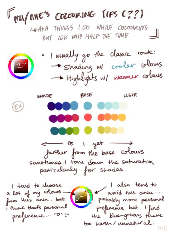

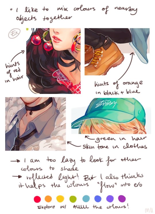
Digital Coloring Tutorial by Mii
5K notes
·
View notes
Text
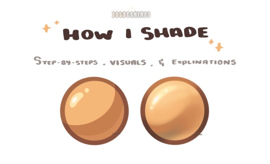
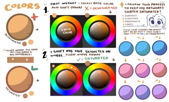
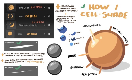
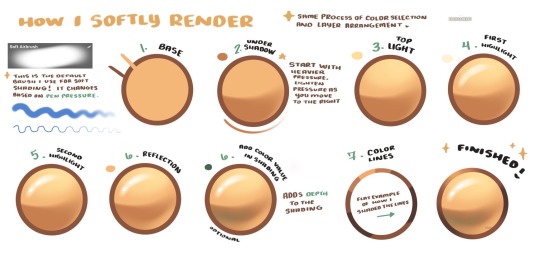
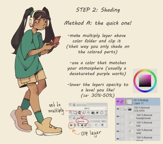
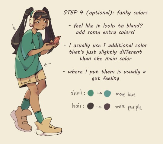
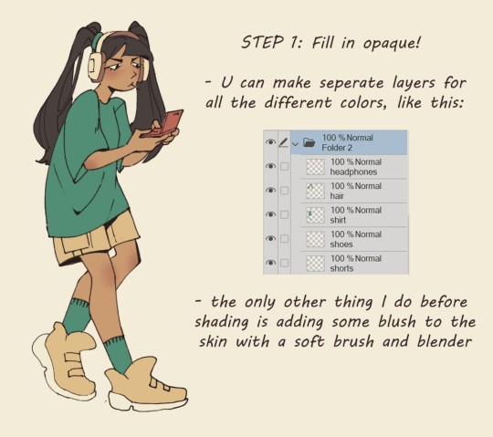
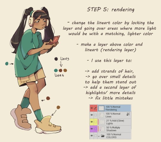
GoldCanines: “I had lots of questions on how I go about my shading ! ✨
Here is how I pick my colors, determine my layers, and lay out my shading !”
Source: GoldCanines on Twitter
#art tutorial#digital art#art reference#tutorial#art tips#illustration#drawing tips#shading#drawing color#drawing colors#color#colour#cell shaded#cell shade#cell shade tutorial
959 notes
·
View notes
Text
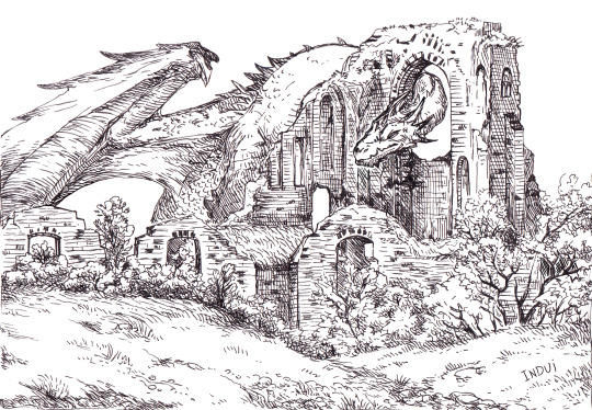
I've been asked a few times now, if these kinds of illustrations are traditional or digital. it's both <: The inks are traditional, made with 03 or 05 micron pen.
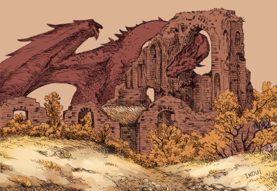
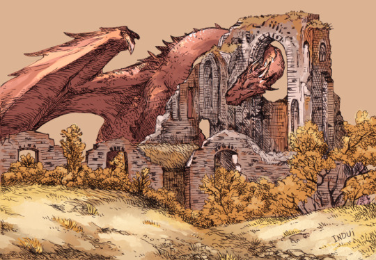
Then I take it to Clip Studio. Paint-bucket and basic brushes are used for big blocks of color and some preliminary details.
Brushes: Dense Watercolor, Transparent Watercolor, India Ink Darker Bleed, Bit Husky, G-pen, Milli Pen, Cross hatching texture brush. Blend: Running Color On Fiber
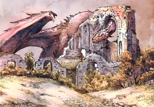
Somewhere in there, I'll pick up a free-to-use watercolor texture and set it on overlay, to see how it meshes with the values I already sketched in. I'll finish up the rest of the smaller details/values with the same above brushes. And voila.
Hope that's helpful <:
#art#art tutorial#dragon#I really enjoy this method because I find inking traditionally more fun than doing it digitally#And meanwhile#I find coloring digitally very fun and fast#Getting a pleasing result very efficiently has been super rewarding to me with this style#it's why I've been doing it so much lately#step-by-step#dragons#dragon art
1K notes
·
View notes
Text
I’m case you wanted to know how I color, here’s a tutorial!
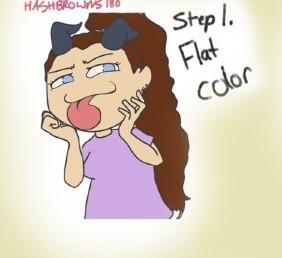
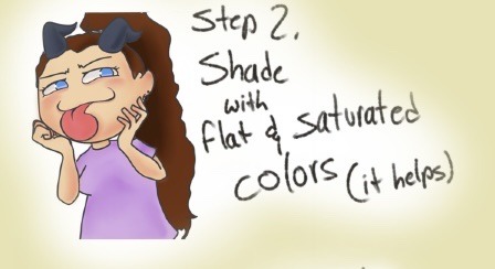
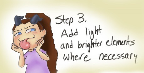

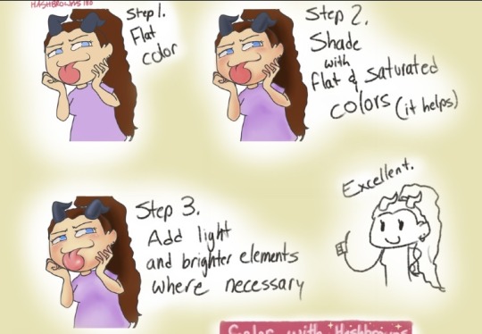
#coloring#tutorial#digital drawing#digital coloring tutorial#digital art#self insert#oc#original character#digital illustration#original art#drawing tips#drawing tutorials#digital coloring#autodesk sketchbook#Hashbrownz180#hashbrowns180
1 note
·
View note
Photo

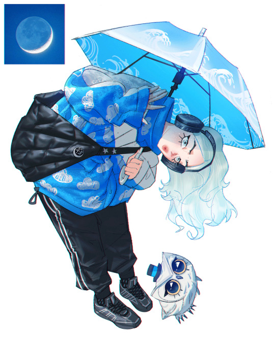
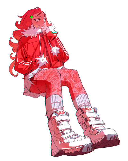
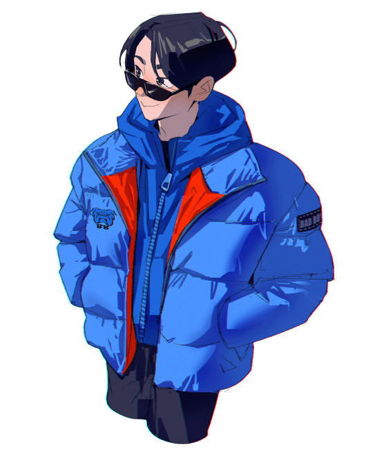

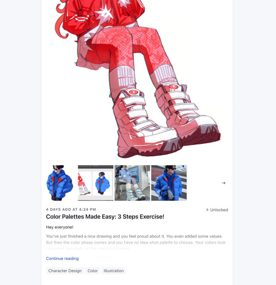
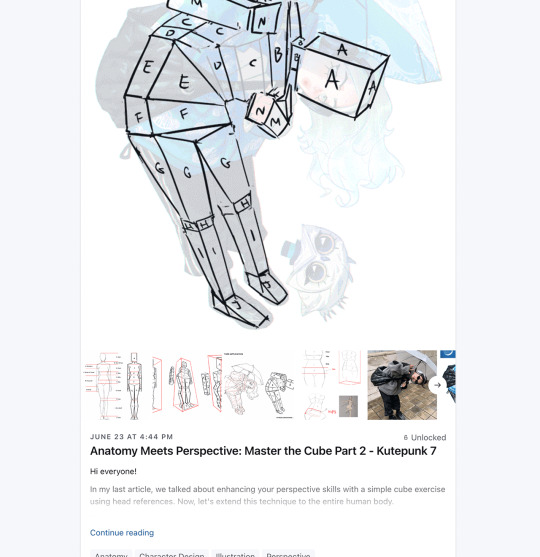
Get access to my brushes, process videos, and files here https://www.patreon.com/ramonn90
#fashion#anime#character design#illustration#color#values#lighting#shadows#art fundamentals#tutorial#digital art#drawing#brushes#photoshop brushes#ramonn90#ramon nunez art#arte#patreon#tips about art#tips about digital art
492 notes
·
View notes
Photo
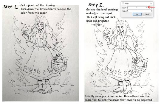

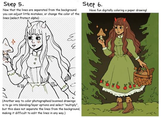
Quick lineart extraction tutorial!
The program used in this example is Firealpaca, but as far as I know these type of settings exist in most basic art programs (firealpaca is like the most basic of all anyway lmao). I dont own a scanner so a lot of the time I simply take a photo of the drawing with my phone, cleaning and extracting the lines still only takes a few minutes! Hope this is helpful :)
#The moment I learned this from a friend I pretty much stopped doing lineart digitally#because its just comfier to draw with actual pencils#but coloring digitally is fun and way faster so combining them is peak for me#art tutorial#lineart#inks
2K notes
·
View notes
Note
Hello! Nice to meet you. Been following this blog for a while and I've become a big fan of your work~♡
So, about this question here, could you elaborate a bit more about using references and "editing" the colour palettes? Also, what is colour dropping?
As a (not digital) painter I also often struggle a lot with finding the right colour scheme to make what I want. I think that's partly why I have trouble finding inspiration too.
color dropping is using the eyedropping tool on an image and taking the colors from it directly!

so basically i find a picture i like the vibes of/think it could be pretty and just edit the color. I draw with photoshop so I edit the colors with it as well! i use the curves tool usually and just mess with it until im happy! above is an axample.
first image is the original then i color edited it, then i used the color dropping tool on photoshop (pictured in the top right corner) to create the palette then i usually edit the colors a bit more!
generally when i color pick i start w the lightest then go darker! this isnt what i do every time, this has gotten me to the point of being intuitive enough with colors that I can pick my own now, but I think its a great way to learn abt colors digitally!
#color tutorial#color#artist help#artist tutorial#artist tips#pixel art color theory#digital art#digital art help#pixel art#reference#art reference#art tips
525 notes
·
View notes
Text
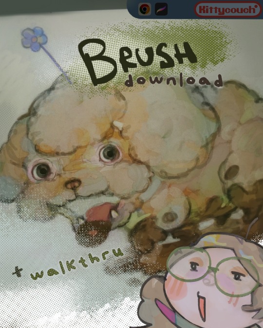
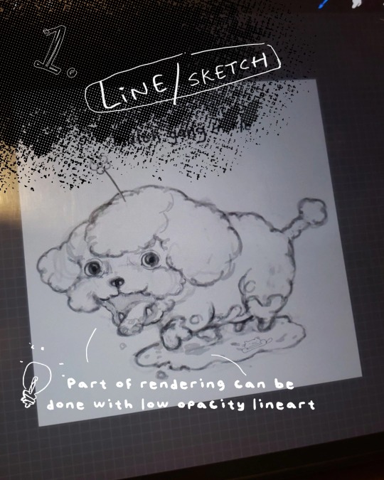
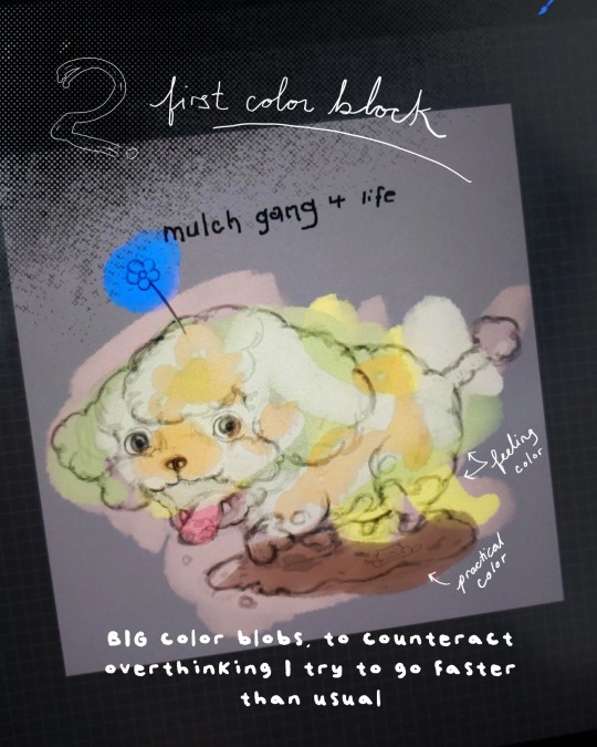
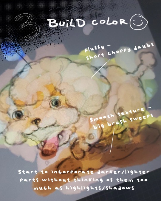
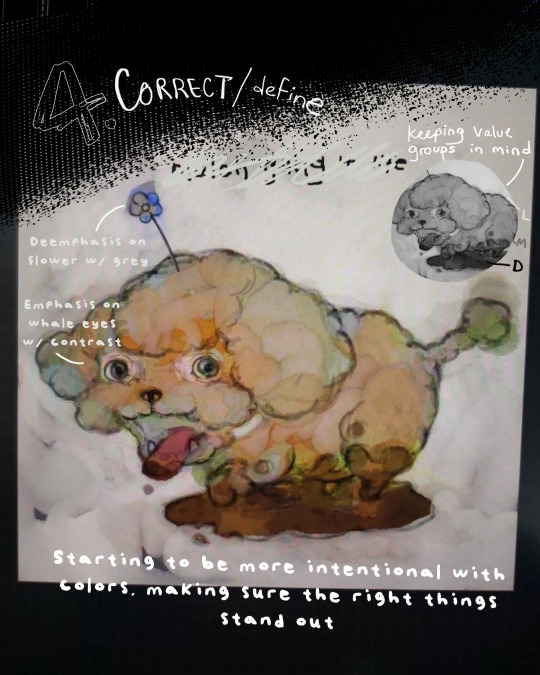
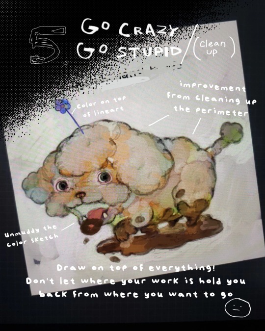
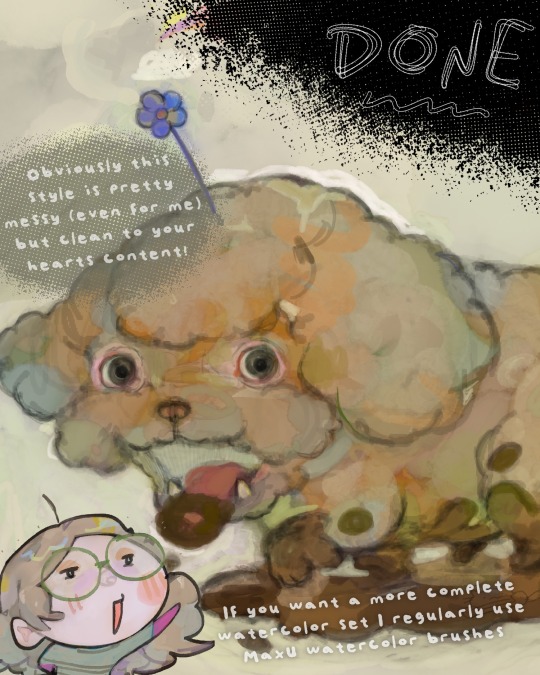
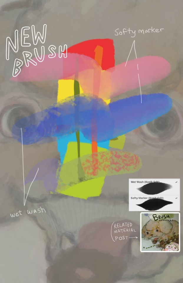
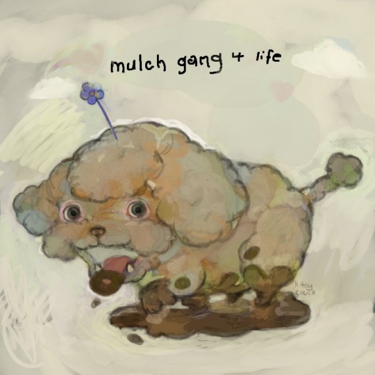
Small painting/coloring walkthrough with brushes that can be found here (softy brush + wet wash)
65 notes
·
View notes
Text
instagram
Sorry for the instagram link, but I literally spent all afternoon editing this - WAY too long to not share it here.
It's a really simplified rundown of my coloring process. If you watch this and you have questions, let me know!
#art process#coloring process#art tutorial#drawing tutorial#multimedia art#digital art#traditional art#pencil drawing#process video#Instagram
60 notes
·
View notes
Note
Would you be able to do a tutorial on your coloring/rendering process? Love your art!
Thank you! 💛 It was pretty fun to make actually! (It's a bit long tho)
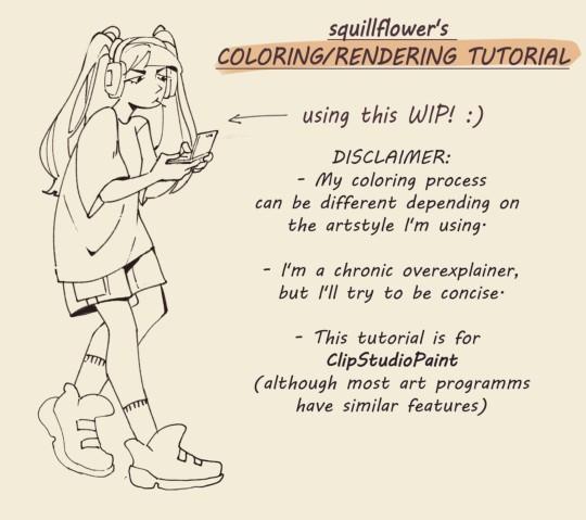

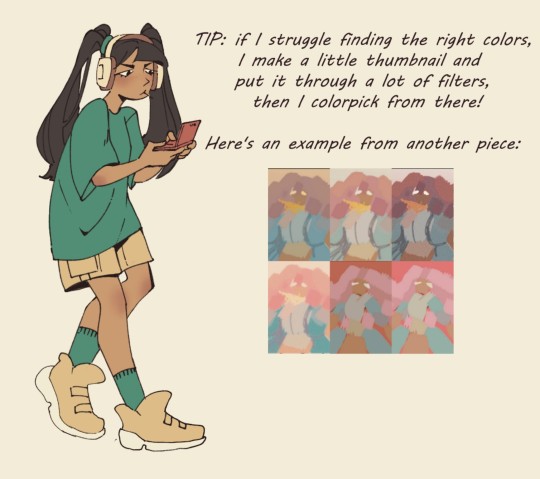

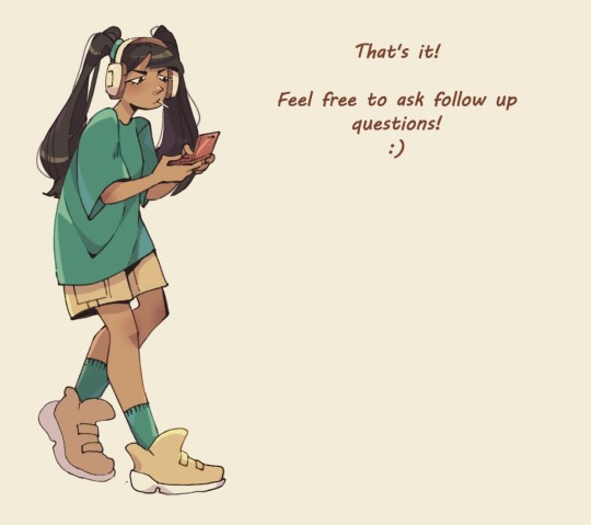
If you're curious about my brushes, I have a separate post about it under #art tips
I thought about doing a video but there would have been so much rambling.
#art tips#digital art#tutorial#art tutorial#coloring#rendering#clip studio paint#digital art tutorial#answered#anon ask
823 notes
·
View notes
Text
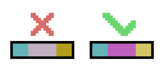
color palette tip: if you're putting a color palette together and you think the colors look wrong, try making sure that you're not pairing high-saturation colors with low-saturation colors
#pixel art#pixelart#artists on tumblr#artwork#digital art#color palette#color palettes#art tips#art help#art advice#art tutorial#art tutorials#art resources
131 notes
·
View notes
Link
A combination tutorial for character design stylization and digital coloring by tokyolondon
#art#art tutorial#tokyolondon#clip studio paint tutorial#digital coloring tutorial#character design tutorial#how to make an OC
104 notes
·
View notes
Text
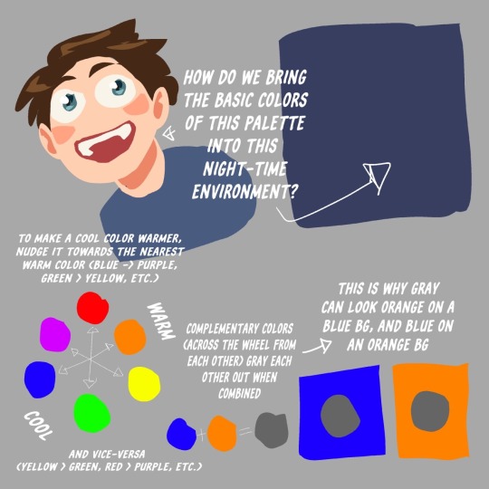
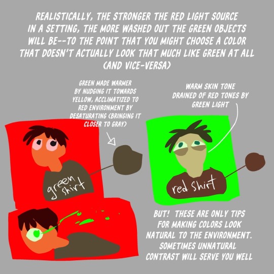
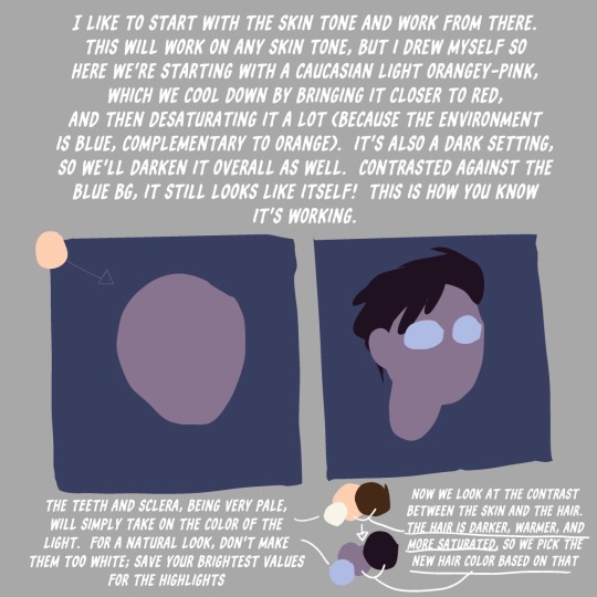
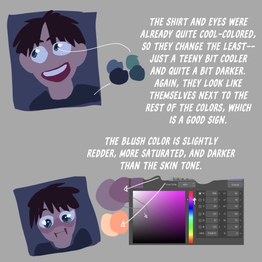
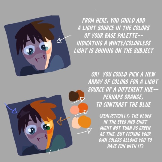
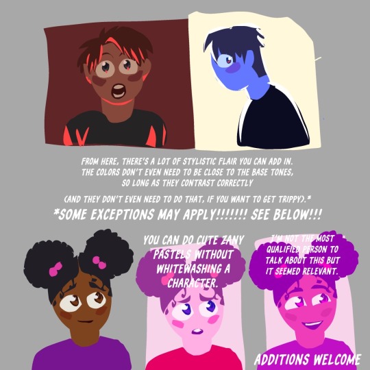
Toastyglow: “local colors!!!! relative hues!!!! listen I love a good adjustment layer they are so helpful especially when you need to work fast. but I also love picking special colors myself so here is a crash course in that–as I understand it, anyway.”
Source: Twitter toastyglow
#relative colors#art tutorial#digital art#art reference#art tips#illustration#drawing tips#local colors#relative hues#color theory#colour theory
350 notes
·
View notes
Text
youtube
I made a tutorial!
This was requested of me a while ago, so apologies for the wait! In this video I cover my entire process when it comes to coloring/drawing gold. I did my best to explain in-depth and detail how light, shadows, contrast, and color work together to create a polished gold look, applicable to any metal in art. Hopefully it's not too difficult to follow and I hope it helps!
--
ko-fi / patreon
twitter / youtube
#jaskdraws#art tutorial#how to color#gold reference#how to gold#coloring gold#coloring metal#gold tutorial#metal tutorial#digital art tutorial#artist#coloring reference#Youtube
89 notes
·
View notes
Photo
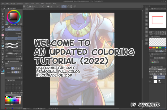

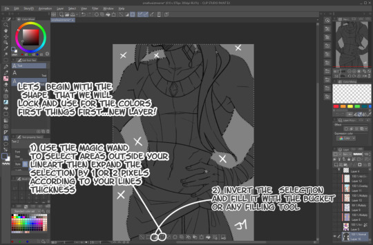


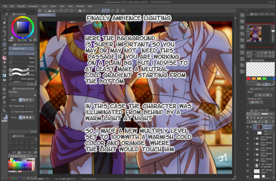
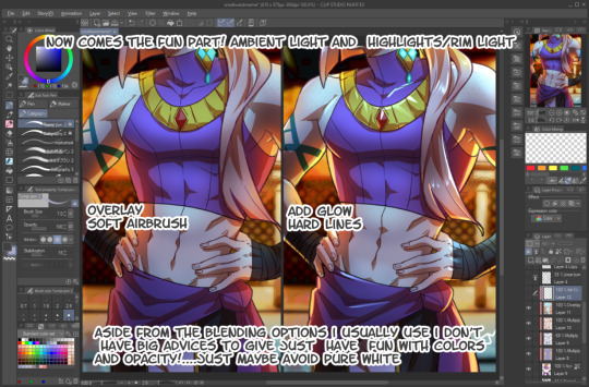

since over time a few friends and followers asked how i color, here’s the way i’0ve been using the past few years despite having sone a few little jobs as a colorist i still do not define myself as a professional so yeah just have fun
1K notes
·
View notes
Note
how do you determine your color palette...? color is something i have a lot of difficulty with and i really want to learn how to at least figure out a color palette 😅
i guess another way to phrase it is how did you go about learning color theory?
the number one most helpful thing i did for myself when teaching myself to color was to realize that every artist colors differently.
i already knew color theory in advance, i memorized every word i had been told throughout every highschool art class i had taken, but knowing the actual facts and knowing how to apply them are very different skills!
if you haven't learned the facts of color theory, i highly suggest these two videos (thing 1) (thing 2). <- the most important part of watching those videos is to hold them in your head as facts. if watching them doesn't make you necessarily understand how to apply them, that's okay! these videos are to give you the skills to be able to study color.
for a simple example, when it comes to picking colors based off the mood of your piece, pretty much everyone knows that blue will make an image feel more sad and emotional. yellow feels happy, red feels angry, pink feels affectionate.
a great way to teach yourself how to APPLY mood through color is to go back to a drawing you're already very proud of, and just mess around recoloring it. pick one thing you want to work on and try to use your color choices change the emotional effect of the piece.
it's incredibly helpful to use a piece that you have already colored, preferably one you're the most proud of. this is so that you aren't stressing yourself thinking about things like proportion or composition, and allows you to think solely about your color choices.
here's my example! for this example, my goal was to make this one feel far more bleak than my original finished piece.
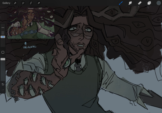
i achieved this change by shifting the colors to all be more cold and desaturated, as well as making the blacks of his undershirt and tie look more washed out. most people associate cool colors with sadness, and dull colors with defeat. mixing those two makes the mood more bleak. color placement can also change a lot— for this version, i placed a lot of the blush color (which i desaturated significantly) higher up his face, which gives him a more horrified and thoughtful expression
once you've done exercises like this once or twice, a great way to decide how you want to color is to find out how other people pick their colors. one way to do this is color picking studies, and another is to watch youtube videos like this one where an artist explains their personal thought process while choosing colors.
if you'd like to know how i, personally, go about picking my colors, i would be happy to make a separate post outlining my process! it would take a pretty long time, though, because a lot of my process is to not leave things alone until i'm satisfied with how they look
the thing about being a self-taught artist is that everyone tells you that the way to get better is to "just practice," but that's not the whole story! art is a skill you have to build, and i've found the most effective ways to improve are to do studies, and to learn how to spot your mistakes and problem-solve until you can fix them.
i hope this was a good way to get you started on learning how to internalize and apply color theory! the more you study, and the more you learn, the better your results will be
youtube
#color theory#echolocating#art tutorial#art tips#artists on tumblr#digital artist#tma#the magnus archives#jonathan sims#how to color
44 notes
·
View notes