#color palettes
Text

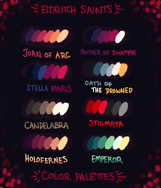
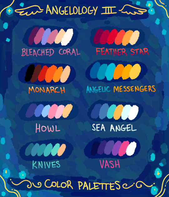
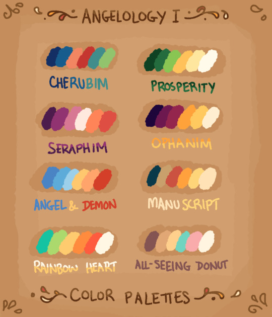
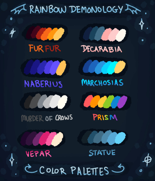
I added Angelology III to my collection of color palettes. Feel free to use these colors, and tag me if you'd like.
6K notes
·
View notes
Photo
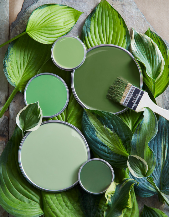
~ Featuring Green ~
791 notes
·
View notes
Text
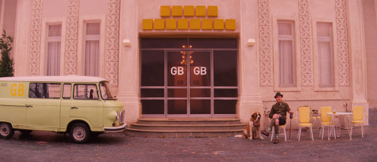

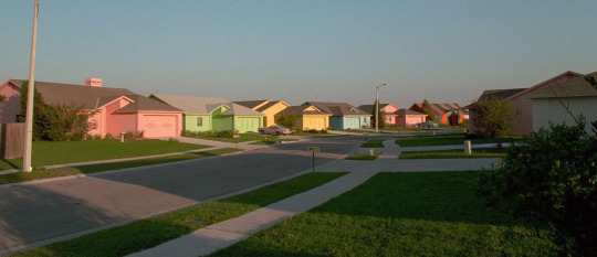

a collection of films with pastel color palettes
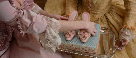
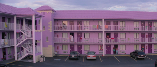
✧ ‘The Grand Budapest Hotel’ (2014) dir. Wes Anderson
✧ ‘The Young Girls of Rochefort’ (1967) dir. Jacques Demy
✧ ‘Edward Scissorhands’ (1990) dir. Tim Burton
✧ ‘Marie Antoinette’ (2006) dir. Sofia Coppola
✧ ‘The Florida Project’ (2017) dir. Sean Baker
✧ ‘Le Bonheur’ (1965) dir. Agnès Varda
#color palettes#pastel#french cinema#french films#edward scissorhands#films#cinema#movies#film#film frames#cinematography#film stills#screencaps#film tag#wes anderson#the grand budapest hotel#film is not dead#film lovers
538 notes
·
View notes
Text
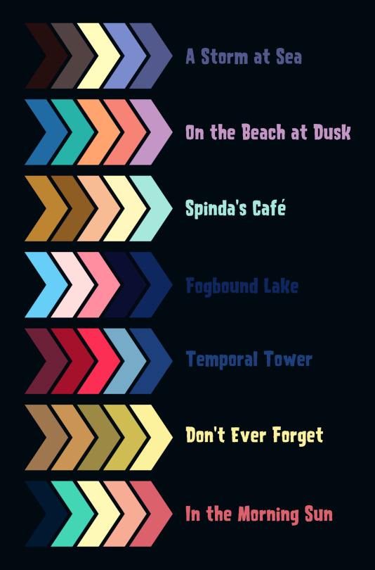
Some PMD inspired color palettes 🎨
Free to use- just ask that you tag me when posting the finished art ✌️ Would love to see what y'all end up making
#pokemon mystery dungeon explorers of sky#pokemon mystery dungeon#explorers of sky#pmd explorers#pmd eos#pmd2#pmd#color palettes
382 notes
·
View notes
Text
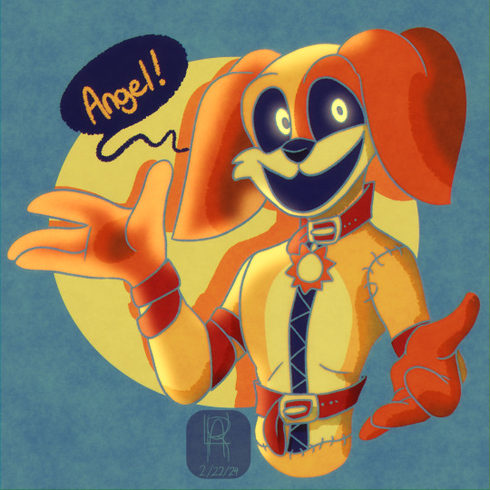
Have some happy DogDay, y'all
__
Art (c) @shadow-turtle-234
Poppy Playtime (c) MOB Entertainment
Reblogs & Likes are appreciated!
No reposting onto other sites (Facebook, Twitter, etc.,)
#art#fanart#digital art#artwork#illustration#drawing#artists on tumblr#limited color palette#color palettes#color palette#poppy playtime#mob entertainment#dogday#poppy playtime chapter 3#poppy playtime 3#smiling critters#poppy playtime fanart#orange#yellow#red#blue#hyperfixation#i am hyperfixating#im hyperfixating so hard rn#my son#shade's art#my art#shade tee
154 notes
·
View notes
Note
if you're still doing pallette req's (no worries if not!) grunkle-era stan in some sort of fight in Old Maui (get it? like old man?? i'll see myself out)
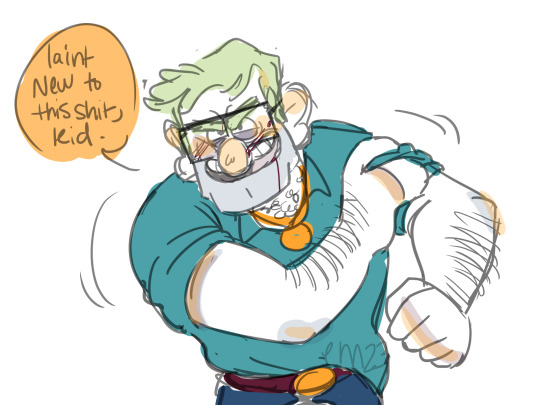
he won btw
583 notes
·
View notes
Photo
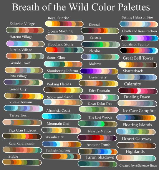
After a stupidly arduous journey of taking about a hundred screenshots, I have completed it. Please send me characters you’d like to see and the color scheme I should use! If you use it yourself please give me credit for the palettes.
my favorite screenshots used for this under the cut!
I would recommend everyone spend a blood moon on top of Mount Lanayru, the colors are so good

For Hateno I used a lot of the dye colors, otherwise it would’ve just been the red stone roof tiles and the same color wood that every place uses and the pale stucco. The dye shop is the most unique thing about the place lol.
I just thought it was cool to catch Dinraal in the distance, this one was used for ‘Waking Flames’

It’s unfair how pretty the world gets when you’re on top of the castle, I also love the framing that the archways provide.

rocks are pretty, thats my whole thought process with this one
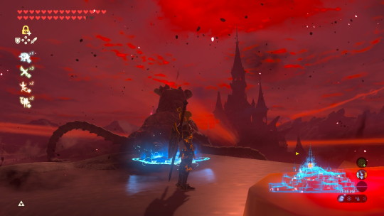
the big pillars surrounding the castle have the best views, it sucks that they’re so hard to get to.

i love the blue rocks

just going to any super high up place is worth it. btw I was being attacked in this image. that bow belonged to a stal bokoblin. he was an asshole
I died on purpose to get mipha feet pics

this is the magic tent thing, when you’re under it the whole screen gets a little pinker. it’s kinda trippy

the fire glowy effect in the snow is one of my favorite visual parts of the game. I love glowy things so much
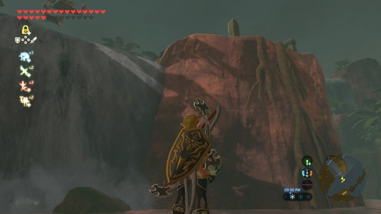
idk the color contrast of the gray water and the red rock is so cool to me

For all the village palettes I wanted to focus on the buildings and decorations rather than the environment itself, I loved the burnt orange flags in lurelin and the stalls in Gerudo Town


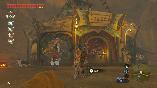
all the places that are populated are just so colorful that it was hard to choose what colors to include in the color schemes. Many times, different shops are color coded and it makes it difficult to limit the colors to just the ones I chose, this world is just so colorful!
#they can be any loz character or lu or for extra points they can be from my own AUs#I haven't done a color palette challenge in a while and Ive never made my own ever so I thought this would be fun#color palette#color palette challenge#botw color palette#color palettes#art challenge#color scheme#color schemes#botw color schemes#color scheme requests#linked universe#loz#legend of zelda#botw#breath of the wild
2K notes
·
View notes
Note
th colors u use for ur sonas is so pretty, like the u brown and tans? just thought u shoukd know
like idk smth abot the colors togehthe is… relly nice :3
THANK UU !! i love using browns , have some color palettes plus optional matching accent colors for fun :33

96 notes
·
View notes
Text
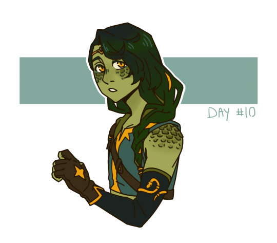
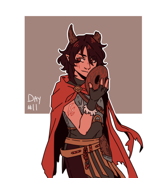
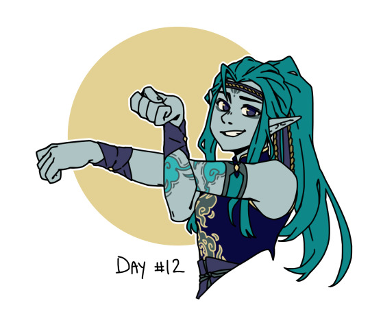

(most of) palette week!
#oc-tober#bweirdoctober#bweirdoctober 2023#dungeons and dragons#tiefling#yuan ti#elf#firbolg#color palettes
191 notes
·
View notes
Text
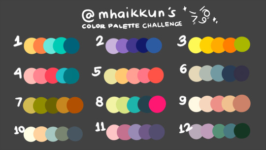
was feeling antsy about doing a color palette challenge so I made my own!!! you know the drill: pick a number, name a character, and I'm on it >:3c
you don't have to pick characters from any of these, but the likelihood of me drawing out your suggestion increases if they're from: dungeon meshi (I'm an anime-only consumer so no spoilies please!), jack jeanne, and persona 3 (esp femc, but other persona games work too)
#mhai says#color palette#color palettes#color palette challenge#I also like fmab#and ouran#and ib#annnnd botw#aND kuroko no basuke#if you've been around here long enough you should be familiar with my fandoms#even if I haven't been active in them for a while#I'm sure I love them enough to enjoy drawing them for this!
77 notes
·
View notes
Text
Look, I don’t know what I was doing with this one. It was a bit of an experiment and overall it turned out okay.
There are still things that could be improved, but I’m trying to blitz through art WIPs at the moment. It was a good experiment, even if it took a while to come to fruition.
Colour palette that I used can be found here
#bramble arts#kingdom hearts#xion#kingdom hearts 3#color palette#colour palette#colour palettes#colour palette challenge#color palettes#color palette challenge
331 notes
·
View notes
Text


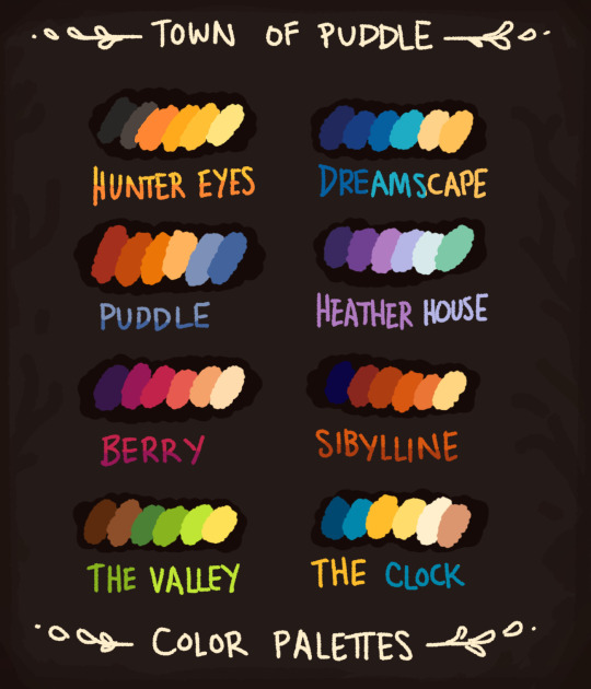
All the color palette collections I've made so far. These are on Gumroad too. Feel free to use these colors, and tag me if you'd like.
And let me know if you have a favorite set! My personal favorite is Town of Puddle.
3K notes
·
View notes
Note
Hi, I've seen your colour palette post and I just wanted to say that Accismus and Dearest instantly reminded me of Edogawa Conan. All of those palettes are so nice to look at, I love them! (For some reason I fell in love with Prep, it's so soothing and whimsy and joyful!)
Hai there, hope you're doing great!!
Aww, thanks Anna!! That's so sweet of you! It makes me very happy to hear that you liked my palette collection!! ♥
And in return, have Conan in 'Dearest'!!
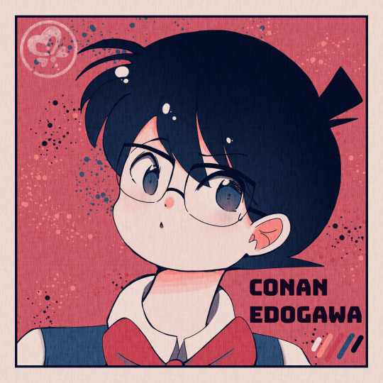
(Color palettes here! - Requests closed!!)
#thanks for the ask!#sorry this took sometime but i just had to draw him because you are so right about how well the colors suit him#i wanted to do accismus too but alas i figured id draw just one#but ill keep it mind for later!#anyways hes just a lil guy!!!#still figuring out how to draw detco characters in my style so ive still got some figuring out to do..#asides from that i hope you like it!! :)#detective conan#meitantei conan#detco#dcmk#conan edogawa#my art#yucaillusts#god i love him sm#color palette challenge#color palettes
83 notes
·
View notes
Photo


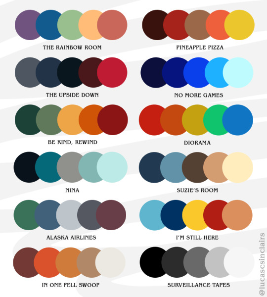
Color Palettes Inspired by Stranger Things 4
Send me a palette and a Stranger Things episode, character, character dynamic etc and I’ll make a gifset!
Feel free to reblog and use for your own works, but remember to like and reblog!
#stranger things#stranger things 4#stedit#strangerthingsedit#color palette meme#color palettes#palette challenge#color palette challenge#mine#st4palettes#i haven't made my own color palettes before#but it was really fun to go through some of my fave shots and scenes of the season and pick colors from them#the names were fun to come up with too let me know if you connect them all to their scenes#so please send me a palette and a topic and i'll make a set for it!#and feel free to use these for your own art just remember to reblog
682 notes
·
View notes
Text
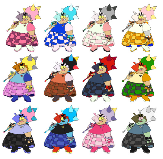
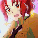
palette challenge ft shark chick!! try and see if u can guess em!
72 notes
·
View notes
Text

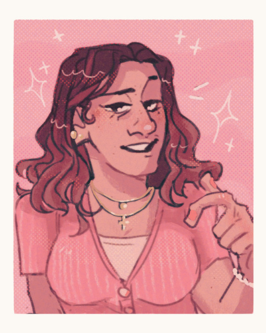
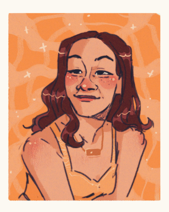


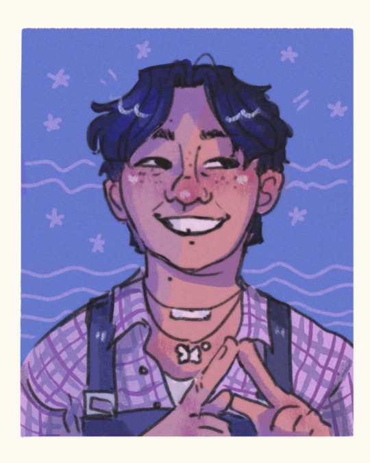
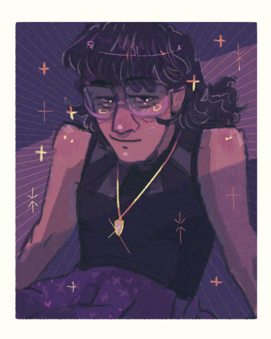
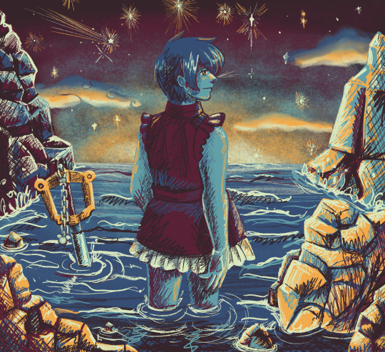
Color studies part 2 I am !!! so normal !
#purple is my gf I love her <3333#artists on tumblr#digital art#portrait#digital portrait#portrait study#color study#color palettes#color schemes#starry eyed
183 notes
·
View notes
Last Seen Blogs
venganxa
~VENGANXA~
yixtel-blog
YIXTEL

xtarotdollx
Victors Secret trans masc lingerie store
have-you-seen-my-sniper
The Lonely Queen (10 minutes version)

obrienstfu
dballs