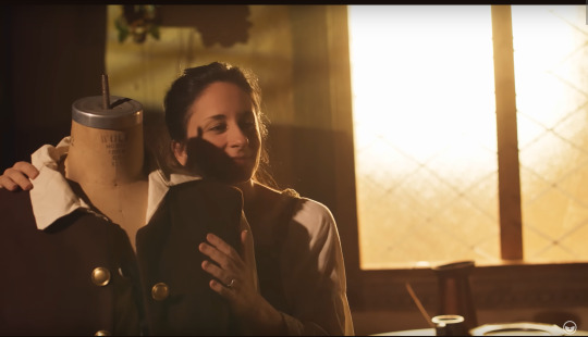
#background is another edited screencap
Text
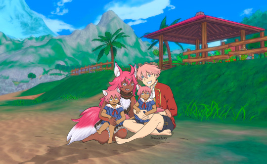
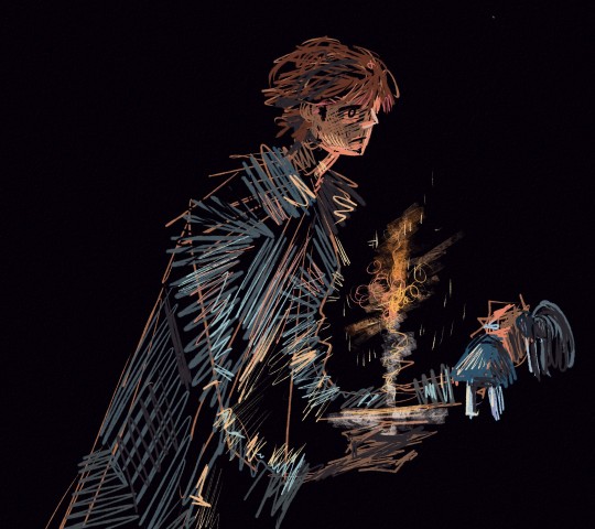
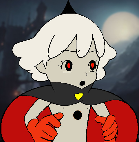
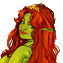
Family Beach Day!
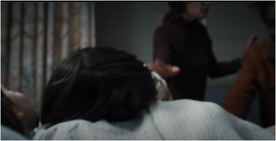
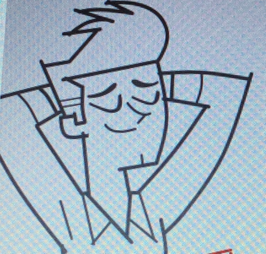
I adore Cecil/Fuuka as a ship so much, I made them a pair of OC twin boys named Hyuwa and Nalhwa. Their names mean Wind and River in Hailaimew, Fuuka’s native language. (Hyuwa is the smiling baby, and Nalhwa is the distracted baby.) The twins are were-animals like their mama, but otherwise they take after both of their parents. The twins are free for anyone to use in any Cecil/Fuuka fics or comics! (Just credit me and let me know so I can throw you kudos/reblogs!)
#darkacey draws#rune factory#rune factory 5#rf5#rf5 cecil#rf5 fuuka#rf5 Fuuka/Cecil#background is another edited screencap#I referenced a photo I found online for the family portrait#I like to think Ari (my OC ranger) and Lucas took the photo of them#you can’t tell me Lucas *wouldn’t* adore photography given how much he loves documenting everything#Lucas is gonna be a scrapbooking god
44 notes
·
View notes
Text

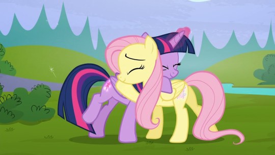
another another checkmatch pony screencap edit :3
(manehattan central park background by cloudyglow on deviantart)
original screencap under cut
#amity does shit#my art#ghostbusters#my little pony#mlp fim#mlp g4#ghostbusters mlp au#mlp au#phoebe spengler x melody#phoebe spengler x melody ghostbusters#phoebe spengler#melody ghostbusters#checkmatch#phelody#screenshot edit#screencap edit
42 notes
·
View notes
Text
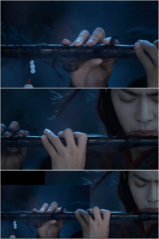
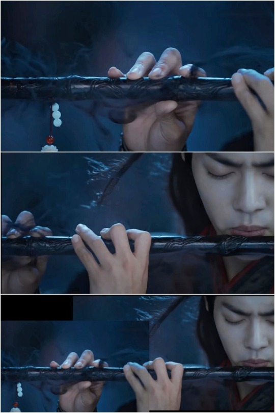
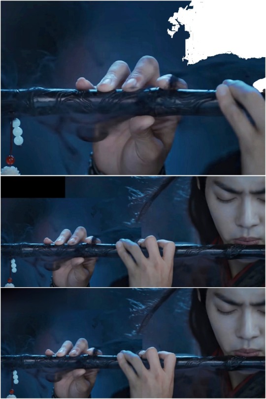
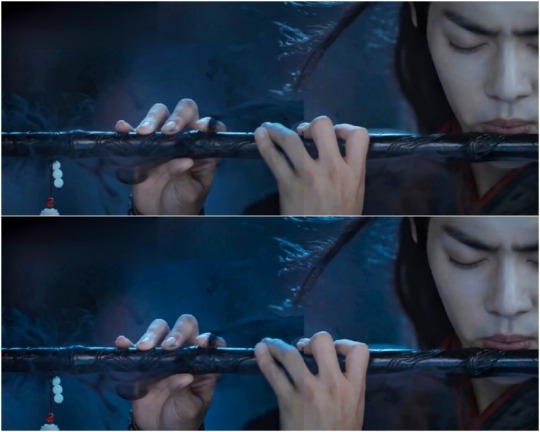
mike S1 analysis (kinda)
this isn't a character analysis, its regarding the framing of mike after the events of the upside down.
so i was rewatching S1 for the hundredth time (as one does looking for byler crumbs) and something struck me.
i was on the last few mins of ep8 and i noticed something that was worth telling y'all. or maybe its just that i'm skin deep in delusion lol. also this is LONG.
background : isolated shots of people in a group setting are always used to indicate a deeper connection of that person with the object/person of focus in that particular scene.
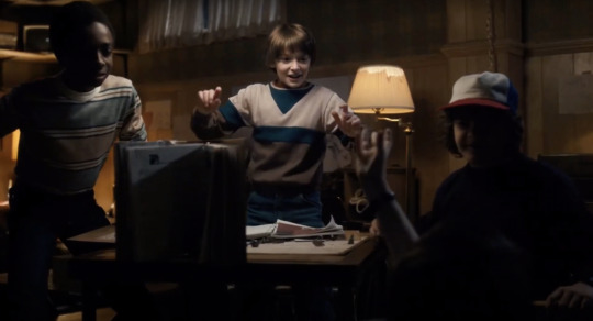
thinking about how we got isolated shots of mike like this (when will was found) :
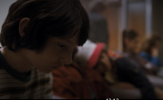
mike was the focus of this shot
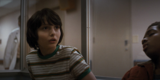
then we were shown this as the camera zoomed in on mike (telling us that we're seeing his perspective)

then these infamous shots. the duffers had no reason to highlight mike's eagerness here (other than indicating the fact that mike and will have a very tender relationship diff than the others because we already know that the party love each other very much)

now I know this shot doesn't have mike in it but STILL we are told through that "Mike laughs". they all were jumping with excitement and were laughing so WHY HIGHLIGHT ONLY MIKE?

we see mike again when they've all shared hugs and here if you pay attention his expression says a lot. he is bubbling with pure happiness upon seeing will again.
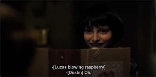
but the intention of showing mike alone in this shot was to feed to our subconscious that mike's relationship with will is stronger (and different) than dustin and lucas's. this next shot proves my point.
dustin and lucas are blabbering about the events that happened during his disappearance and are shown TOGETHER, thus not having any indication of intimacy that we were shown in the case of mike.
then will coughs and we see mike (isolated in this shot) again with a little bit of concern on his face. (if the boys were to be shown to have equally strong friendships we would've got all three of them together in this shot but NO. we see a concerned mike and THEN we see a shot of dustin and lucas together). but WHERE do we see a group shot?

when el comes up in there convo. isn't that interesting? if mike had genuinely romantically fallen for her (as he said in his monologue) wouldn't it make sense for mike to have isolated shots here? but we don't get even a SINGLE shot of mike alone when el is being talked about. we get all three of them as if they all have the same relationship with el (platonic friendship).
then fast forward to the DnD game

we see will rolling the dice and mike looking at him fondly (pt.1)
EDIT : after reading @dinitride-art 's wonderful lighting analysis i saw another thing worth mentioning here

@dinitride-art mentioned how in s4 will is always shown in different/soft/angelic lighting whenever we're in mike's perspective.
see how in this will is bathing in light and is literally glowing while dustin and lucas are similarly lit (in low lighting).
and i don't need to say anything about this next one honestly

this means we're meant to see mike's perspective of will (soft/angelic/glowing) through the lighting choices all along.
this is when jonathan comes to pick will up and lucas is making fun of dustin. we see mike looking at will fondly(pt.2 coz honestly, this screencap of mike the preceding screencap are EXACTLY the same, as in, mike has the exact same expression on two different occasions (the second one where will isn't even the focus on the convo as opposed to the earlier one))
now one last one
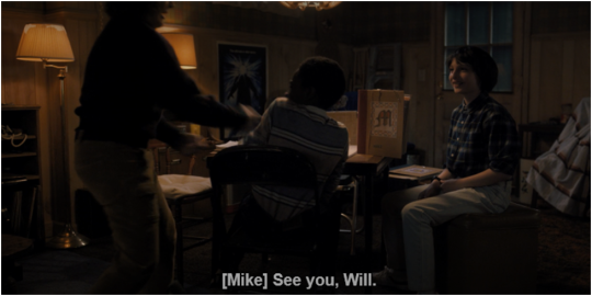
mike is shown bidding will farewell TWICE, once when him and dustin are saying together and the second time here, as if he wants will to explicitly know that HE is saying goodbye.
the duffers are telling us from the beginning that there is a lot more to mike and will's relationship and they've been building it up from the start.
byler endgame.
384 notes
·
View notes
Note
how do you make your oc screencap edits?? i also have a td oc and i dont really know where to start 😭
ok so!!! i use firealpaca which is just my usual drawing program. so i'll keep using it as a reference for my steps but of course im sure whatever similar program u use should have similar features
i'll be long winded for funsies as usual 💕
FINDING YOUR SCREENSHOTS
the key to decent td edits is to flat out trace screenshots whenever possible. stock pics will do, but of course itll be a lot more fun and less obvious if u use a screenshot from the show and put it into your new context
in terms of making your ocs, you will likely have to do what someone once called "frankensteining" your pics. this is where you use pics of other characters for their specific features and put them together since your oc doesnt have official screenshots to trace. this also absolutely comes in handy w canon characters! maybe you have a pose but u need them to be sitting. so try to stitch together two different pics to get what u need
it will look very scary but just trust the process. here is a random example i made using a dawn screenshot (where i removed the background), gwens eyes and eyebrows, and kittys hair

the sketching part is semi-optional. if you think you can freehand the lineart then go ahead but i assume your oc wont be a complete copy of something found in canon and therefore you will have to draw the newer/different features (such as the hair or the outfit) at least a little bit. and sometimes when i frankenstein the pics, my brain gets all overwhelmed so sketching makes me feel better jfbdjdnd
(in terms of my own oc, i screwed myself over bc his body type is so unique i gotta freehand it like all the time 😭
you can see i traced his head from his render (ALWAYS DO THIS BTW!!! TRACE CONSTANTLY), but then the body was freehanded using a canon pic as reference because tracing the pic wouldve been inaccurate)
THE LINEART
yes the iconic td thick, sharp, flat lineart. i achieve this by using a normal pen tool, turning off the pen pressure, and then turning up my pen stability to 40-60 (very high). you could use a curve tool if that works for you! but i would suggest against that for ALL of it bc the tool just wont respond well to rly drastic curves and such
the pen size varies on the pic. if the characters are close-up, itll likely be a bigger one. and then the characters' little details and facial features are usually a slightly but definitely noticeable smaller size. for the most part, ive had the bigger pen size at 13 while the details are around 9. or big size 10 and smaller size 7.
heres my technique:
as u can see, all of my lines go a bit too far. this is so that when im done drawing them, i can go back in and slowly erase where they meet and get them all sharp and pointy. this is just how i personally do it lmao. when it comes to facial features and other stuff that doesnt connect to anything, just get a close look at your reference to see how thick or how thin the edges get and do ur best to erase the edges to the point where they should be
THE COLORING
not much to it! the bucket tool is the best way to go. again just get a good look at your references just in case any parts have the lineart also colored in
THE BACKGROUND
you can find some generic td background pics on google or u could get them from the show and try to erase any character in the way lmao. if ur recreating something like, say, a dunc/ney scene w a different ship, then its very tedious but youll have to do your best to erase the canon characters and piece the background back together.
i like using the smudge tool a lot for this!!! just kinda pulling whats already there towards the characters. to save time, put your drawing visible on a top layer as you do this so that you dont have to edit the ENTIRE background, just what you need
THE RENDERING
ok so heres a big one imo. after youre done, youre gonna have to fuck up the quality at least a little. well not that u HAVE to but like..... to match the standard quality of a td screenshot? ive never seen a td screenshot in perfect hd quality outside of stock art. so u could blur ur drawing just a little bit. maybe add in the teeniest bit of chromatic aberration (just set it to 1 or -1). not ALL of them together but u do whatever u gotta do
my personal favorite is blurring just a little and then saving it as a jpeg (around 65-80%) so that its pretty crunchy and looks all the more real
obviously not a NECESSARY step but just something to point out. especially if ur background isnt the best quality so the characters have to match it
this one from yesterday i didnt even redraw topher bc i was lazy and he looks fine enough. i just put danny onto the pic to cover the other character. so i blurred danny a little bit and then saved it in a pretty low quality so that they match one another. look at those pixels. that crunch.
SO THE TLDR IS just trace and copy your references as close as possible. if you cant find a reference for your character, try finding another character w something close enough
26 notes
·
View notes
Text
Hello Dreamers, I’m participating in the fandom charity drive @dreamlingforukraine!
--🌧Rainy-days-and-nights/Watercubebee🌧--

That means I’ll be creating fanworks in exchange for donations for one of these charities which are providing relief for the victims of the war in Ukraine and the destruction of Kakhovka Dam.
What I offer: ARRRRTTT!!! (In full color)
EDIT: ALL SLOTS TAKEEEEN
Suggested Donation Amount:
No render type (with solid color background)
Bust: 15 usd
Half-body: 20 usd

--Adding another character + 10 usd each category --
--------------------------------------------------------------------------
Detailed type (with full color abstract background)
Bust: 35 usd
Half-body: 40 usd

--Adding another character + 15 usd each category--
EDIT: // ALL SLOTS TAKEN
🌧 EDIT : 2 slots in no render type /// EDIT: 2 slots in detailed type 🌧
----------------------------------------------------------------------------
Additional Info:
Expected turnaround time: 1-2 weeks for no render type and 2-4 weeks for detailed type
Will make: Gore, NSFW, Oc´s, Characters from existing media (Mostly Human-esque characters)
Won’t make: Kids/toddlers characters, Mecha, Animalistic/Anthro characters.
**If there is any previous drawing of mine you want me to base your commission on, don´t hesitate to let me know, that way it´s more easier for me to have in mind colors and background
**Please have your references/main idea already at hand, I kinda have a bit of a trouble understanding information(not always but, it doesn´t hurt to mention it) so please try to be as concise as possible regarding your commission info
----------------------------------------------------------------------------
How to commission me:
I will be accepting donations until July 18th ‘23
Send a message here telling me what you'd like me to make for you (main or secondary blog)
Wait until I reply. Do not donate until I confirm your commission! All money donated to charity is non-refundable.
Once I confirm your commission, donate within the next 48 hours. PLEASE remember to screencap your receipt and black out your personal details. You need to send me this to prove you’ve donated.
Once I’ve seen your receipt, I’ll start working on your project.
I reserve the right to refuse commissions if I’m not comfortable with them or feel like I’m unable to accept them for lack of time, skill or any other reason.
#dreamlingforukraine#dreamling#please...be patient with me#this this is a kinda new experience for me
95 notes
·
View notes
Text
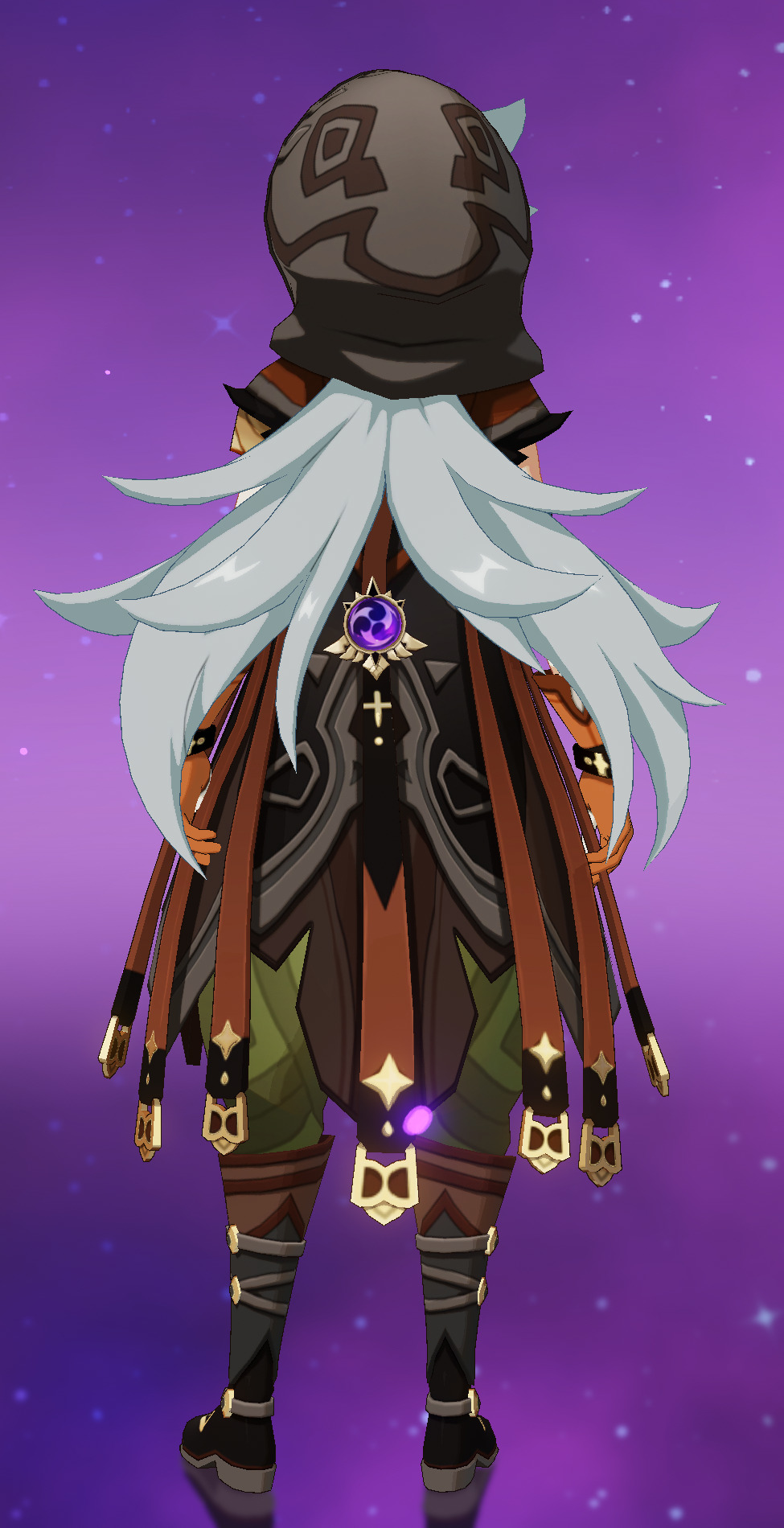

[image ID: two images of Razor from the game Genshin Impact.
the first image is a screencap of Razor's in-game model from the back. he's wearing a dull grey/brown leather coat with a bunch of red/brown leather belts hanging down the length of it. his hood is up, but his long, messy grey hair is streaming out from a slit in the back of the hood. this hair is split down the middle, streaming to either side of his spine to show the Electro Vision centered on the lower back of the coat. the sleeves of the coat are torn off, showing his bare pale arms, and orange leather gloves. he's wearing poofy green pants, and black/grey leather boots.
the second image is a cartoony drawing of Razor from the back, standing more hunched and looking slightly over his shoulder. his hair has been cut short and no longer sticks out from the back of the hood. the extraneous leather belts have been removed from the coat, with more visible, geometric patterning in its place. a rope hangs across the lower back of the coat, below the Vision. a few small, dead animals (a rabbit, a couple ferrets) hang from this rope, with text reading, "small game gives the vague impression of a wolf tail". Razor's boots have been removed, leaving bare feet and lower legs messily wrapped in white wrappings, and covered in dirt. nearby text reads, " you cannot convince me they wrestled this boy into boots".
end ID]
back again with another redraw instead of a screencap edit! though I did honestly attempt the edit before I gave up (Razor's hair covers up too much, it woulda been annoying to redraw it all..)
also, it's just the back view b/c I don't have much problem with the front of his design. and since Razor is one of my faves and mains, I'm intimately familiar with the back of his design, considering how often I have to stare at it..
more design notes under the cut~
more than anything else, I just hate Razor's hair. usually I'm all for male characters with long hair, but Hoyo just fucked up Razor's so bad. which is insane cus' a wolf tail shape feels so obvious, for a kid literally raised by wolves. I would've even forgiven the stupid hood slit for that-- sure, Hoyo could've just put the hood down for Razor's hair, but I like the hood up, so whatever. but Hoyo just had to split the hair in half, ruining the potential tail shape. and it's clear that they split the hair so that the Vision on the coat is visible, but the obvious solution there should be to just... put the Vision somewhere fucking else. like, the Vision could have been literally anywhere else, good god
either way, I just decided to cut off the hair, cus' I had a better idea for a "faux tail" anyways. I know dead animals are prolly too morbid for Genshin designs, but it definitely fits my feral vision of Razor <3
finally, evidence that I did genuinely attempt the model edit, before I decided, "oh, fuck this"

[image ID: the same back-view screencap of Razor's in-game model from earlier, but centered on his torso region. much of his grey hair has been manually blocked out using the purple background color. the parts of his back/arms that the hair covered have been roughly drawn back in as a messy sketch. end ID]
#genshin impact#razor genshin impact#ganch redesigns#had to get this settled b/c I'm drawing him for... something very silly rn. hehe
22 notes
·
View notes
Text
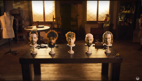
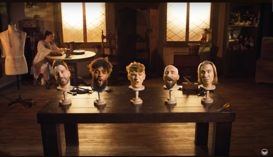
Voiceplay Visuals: Golden Hour
From one post about a kinda-strange Voiceplay video to another!
It took me a while to decide to watch this video as well (because basically I saw the thumbnail and was like "Hm."), but I'm very glad that I did, because, well, if you've seen the video, you know what I'm talking about. 😁
This video was uploaded on the 18th of March, 2023 (almost exactly 11 months ago as I type this, though for you it will be just slightly over a year ago), and stars the young and talented Anthony Gargiula (pronounced gar-jool-a) in his first guest collaboration with Voiceplay, and, in an acting role, the video also features Kathy Castellucci as "the toymaker"! So let's get into this!

For any of you who haven't already realized: "Stimmen Spiel" is the literal German translation of "VoicePlay"! (Also I wonder if 1999 was when 4:2:Five (aka VoicePlay) officially began and/or got its original name?)

You'd think this would be obvious enough for all reactors to notice/comment on it, but no
VoicePlay certainly never fail on the creative front, I'll give them that!
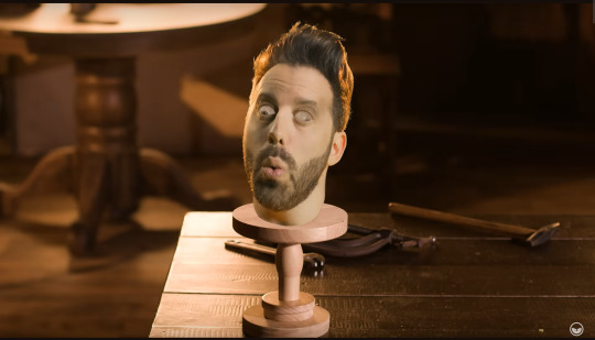
It was Geoff's head that struck me as the most odd-looking here, and it took me a while to figure out why that was (kinda embarassing, really ^^;). It wasn't until I was watching a reaction video where the reactor was speculating on if it was very difficult to edit around Cesar's beard that it hit me: it's the hair. It's notably flatter than it usually is (i.e. less volume), and possibly shorter (or at least shorter-looking) as well.
It then wasn't until a while later (I'm really not always the sharpest tool in the shed 😅) that I realized that this explains why in Geoff's Headless Horseman video, the disembodied back-up Geoffs have their hair pulled back - to make the editing easier!
Geoff asks in the comments "who thinks they know what's in the mug that Kathy's drinking?" For the record, I have no clue, but I'm gonna guess coffee 😄
(If you think you're gonna be getting a lot of screencaps of the "singing heads", think again!)
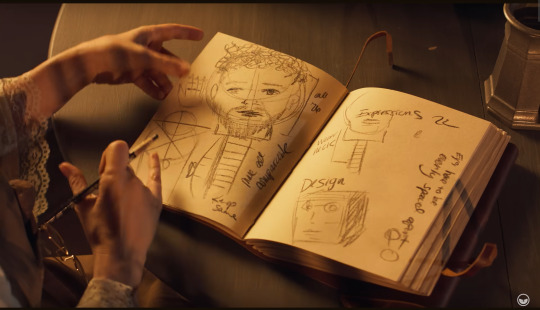
Really good drawing actually (kinda looks like Cesar - deliberate perhaps?), I wonder who actually did it?
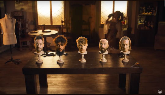
Not entirely sure what the sideways writing on the left page says, but I think the third word is "comparable"? And the writing underneath it I believe says "legs same". The sideways writing along the edge of the right page says "eyes have to be evenly spaced apart".
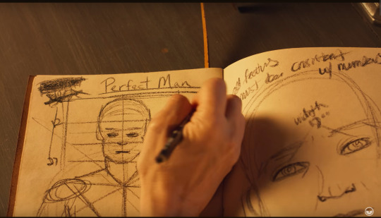
"Perfect Man"
(Also the writing across the top of the right page says "all features must be constant by numbers")
The width measurement between the two eyes on the right page is 9 inches, and I wonder if that was just a random number/average distance between the centres of a person's eyes, or if actual measurements were taken from you-know-who for this? (Same goes for the other measurements written in the book!)
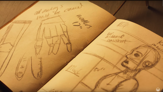
Did the person who did the drawings in this book do all the writing as well? Because it's aesthetically nice, but not the easiest to read!
The writing on the left page says "all markings must be [????]" (I can't make out that last word).
Also might as well take this opportunity to point out the Pinocchio doll sitting in the windowsill in the background! (Above Geoff's head.) Pinocchio is of course the story of a puppet who becomes a "real boy", so a very fitting inclusion/easter egg for the video (and Pinocchio is originally an Italian story - coincedence? 👀)
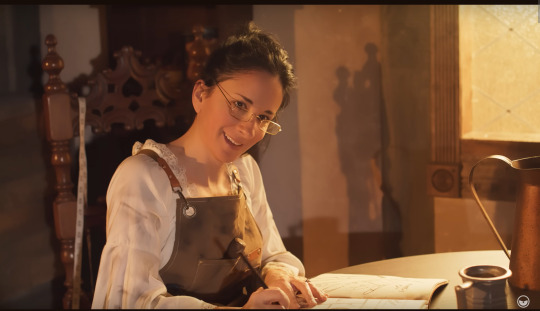
We stan Kathy Castellucci in this house! Love her! 💜
Partially sharing this as a "this was an interesting little visual effects/editing moment in the video that I felt like I had to acknowledge" thing, and partially sharing this as a "if I had to see this, so do you!" thing 😆
(Layne really had fun with this one honestly)
The mannequin body now has a white shirt with slightly-puffy long sleeves and a loose collar. Hm, who of the group has occasionally worn shirts like that I wonder?? 🤔 (😜😁)
I'm wondering a lot of things about this video I know, but did Kathy actually do any proper tailoring/stitching on that outfit?

*gasp* Geoff's head is missing! I Wonder What The Reason Could Be For This! /j

There's my boy <3
Also shoutout to Geoff on the acting here! Very doll-like, definitely got the characterisation down-pat!
One of the comments made a joke about "of course the first thing Geoff does after getting a body is try moving his hands around" 😂
(Also compare Geoff's hair here to his hair in one of the previous shots where he's still bodyless; different, right?)
🥺🥺🥺
God help me they're TOO CUTE
Honestly what a freaking payoff for a video that my brain was otherwise reluctant to fully process. Sure, there are reasons for at least listening to this song on Spotify, such as swoon-worthy original bridge section written by the one and only Geoff Castellucci, and the gorgeously stunning 5-part harmony on "shine" right after that bridge, but THIS ^ right here is the reason for watching the video. Shoutout to Layne, who edited this video and did the arrangement (other than the bridge, which was all Geoff's), and shoutout to both Layne and Tony, who are both credited with video concept, set design, and direction!
(And I feel like I must add that Kathy herself commented on this video, telling fans that "This only shows me creating prototype #1. You can safely assume my next projects were numbers 2, 3, 4 and 5. And they all turned out perfect 💙")
2023 was one heck of a year for Voiceplay content, so I have a lot of big videos to cover. Stay tuned!
#voiceplay#acapella#golden hour#geoff castellucci#eli jacobson#layne stein#cesar de la rosa#anthony gargiula#kathy castellucci#acaplaya analysis#voiceplay visuals
7 notes
·
View notes
Text

Oh no, he's smoking again!
After reposting this Tag of the Week -post by @lanwangjihouse and calling WWX smoking hot (which he is), I got an inspiration to make an edit where he is... smoking. Literally. And then I just had to add LWJ. Because.
Anyway, the smoking hot Yiling Laozu there is an edit of two screencaps from ep33. I do not usually have a clear plan on how I'm gonna do the editing of an image (and if I had to repeat the process I most likely couldn't 😄), so I decided, for once, to loosely document the different steps on how I ended up with that one. If anyone's interested, check below the cut (it's not very specific, though).
My computer is an ages-old relic with no proper software, so I make all my edits (and screencapping) on my smartphone, using mostly free image editing apps from the Google app store. I usually jump between various apps when making an edit, using one for something and another for something else, as I have not yet come across one that could be used to do everything. I have mentioned the apps I used on this one, in case someone wants to check those out. They are pretty handy 🙂.
Below are the original screencaps with the dark edges and the WeTV logo removed (with my phone's photo editor), and the first trial of the fitted together image (made with an app called "Text on Photo") to see if they work (the first cap roughly resized to match the second):
Not an exact match, but close enough, although in the first cap, the fingers of the left hand are more shadowed. So, tweaking. Below are the images after a bit of sharpening and overall lightening; I also further lightened the left hand in the first image and darkened it in the second; I lightened his face as well and added some colour saturation on it (all with an app called "Snapseed"). The match is better now:
Not perfect but good enough. Next, I removed part of the upper right corner and the tip of the left hand's middle finger from the first cap (with a "Background Eraser"-app) to show his hair and finger tip from the second cap. I also more or less removed the black box (background from the "Text on Photo") from the upper left corner of the combined image (using my phone's photo editor):
At this point, I remastered the image (using my phone's photo editor), then tweaked the colours and contrast a little bit further (with "Photoshop Express"-app):
Getting there... but the left hand and the area just above it still needed fixing, so I did some blending and painting by hand (using an app called "Sketchbook" which is pretty neat) to take care of that (painted some further little wisps of resentful energy above his left middle finger while I was at it):

And a bit more tweaking of colours and brightness etc. (with the "Photoshop Express"-app):

Then I decided to desaturate his hands a bit to better match his face (with the "Snapseed"-app) and re-coloured some of the highlights on his fingers by hand, because the one on his left ring finger was too blue compared to the others (so back to the "Sketchbook"-app):
Thats it 🙂.
#wei wuxian#yiling laozu#lan wangji#wangxian#theuntameddaily#cql ep33#the untamed#cql#image editing stuff#random late night screencap edits#mine
82 notes
·
View notes
Note
Pelipper Mail: Flashdrive in a baggie in a well-taped and padded re-used tissue box! It’s password protected. There’s a note in the baggie that says she’ll send the main password separately. It also mentions jokingly that she let her autism have free reign of organizing it all lmao.
Inside are several meticulously labelled folders.
Inside the first folder are several written documents with labels like ‘Full Transcript’ and ‘Audio Only Transcript’ and ‘Descriptions’. There’s timestamps that correspond to screenshot titles. The Descriptions document has a rundown of things she identified in the background that might be noteworthy, along with any identifying features of the douchebags surrounding you she could tell. She even tried to screen-measure what size the circle was, and there’s a picture of what she thinks the shape and pattern to be.
Inside another folder is many carefully organized and labelled picture files, organized into subfolders so it’s not just a giant wall of text. It’s set to where you can’t see picture previews. There’s a document with quick explanations of what each picture is and suggestions of which screencap seems the most helpful or noteworthy. All screenshots with fire have carefully edited so you can’t see the fire and all screenshots showing you have you carefully blacked out so you can only see a plain black shape that is vaguely recognizable as you if you squint. Any screenshots where the fire is partly obscuring something she thought was important is color-inverted in the obscuring part and have as much fire blacked out as possible.
One more folder has a couple audio and video files. Another document tells you which one has what. Both the audio and video files are separated into portions; none of them have the entire thing. The video files have no audio to them at all and have optional subtitles. The audio files have small transcripts telling you what you’re hearing.
The last folder is labelled ‘Raw Screenshots’ and has the unaltered screenshots, also set so you can’t see previews, organized into subfolders with passwords on all of them. There is another document with timestamps and the passwords to each folder.
There is one picture file that literally is just the poo emoji.
She made damn sure he couldn’t see anything on a whim or worse, on ACCIDENT. And that he could find everything he might want to see as quickly and painlessly as possible.
//Pretend you got this later. I just wanted you to definitely see it before mod goes to sleep lol. I maybe spent too much time on this. 👍
@suddenlyauntiemaya
I..... thank you Maya. This... this will be useful.
#pokeblog#pokeblr#pokeblogging#irl pokemon#rotumblr#rotomblr#pkmn irl#pkmn rp#irl pkmn#in character#ask to tw
2 notes
·
View notes
Note
12, 14, 16 ❤️
Hi there! Thank you for these questions - any excuse to ramble about editing.
12. What gifset made you feel the happiest to work on? (link)
There's perhaps some irony in this, but this edit of Crozier and Fitzjames. I was knee-deep in a Terror fixation at the time, and finally feeling inspired to make and edit after a few months of nothing. The idea I had for the edit is almost exactly what I ended up posting, which is unusual for me. I was able to locate good quality screencaps and cut out and colour what I needed to cut out and colour. I was happy because I was editing again, happy because the editing was going smoothly. The point of that edit is to make as many people cry as possible, but I had fun making it, and that's the main thing.
14. What gifset was the most difficult to make? (link)
This edit of Fourteen and Donna turned into a bit of a nightmare, actually, and not in a way that I expected. Two specials deep into the 60th Anniversary, I was very much in the mood to make a Doctor Who edit. I didn't really have an idea, but I coloured that promo photo of Donna and Fourteen and then fiddled around in Photoshop until I came up with the rotating galaxy idea. I did not know, however, that rotating a layer in Photoshop reduces its quality. I was animating the background by duplicating it and rotating the layer by one degree as I went along, leaving me with a stack of slightly different layers. By layer 40 the starry background was a blurry mess. I just didn't understand it. I had to delete all of my rotated layers, and I found another starry background, this time with light trails, but by layer 50 it was also a mess. I still don't know why that happened, but I realised that I could get away with rotating the light trailed stars by about 30 degrees and they looked like they were moving more than they actually are. The finished edit is only three frames or so.
16. Do you have a favourite gifset you made this year? (link)
I'm still very proud of this edit of Silver and Flint. The screencaps of the scene I wanted to use didn't lend themselves to being cut out and coloured very easily, so I decided to just use them as they were. I like the balance I managed to achieve between the two parts. I remember the struggle I had with the second half especially, trying to get that text to look right. When I finally came up with the idea of using the Gaussian blur and flickering animation on both Silver's "shadow" and the text I was over the moon. I think it looks great and also tells a story. I always try to shove as much symbolism into my edits as possible.
gifmakers (and editors) asks | send me an ask
#ask#blakbonnet#thanks again! i hope you were able to understand what i was trying to say#it's really hard to describe photoshop sometimes i just click and hope a lot of the time
2 notes
·
View notes
Text
An explanation to my Discord profile picture.
Alright, so my Discord profile picture has been pretty much the exact same ever since I got Discord way back in 2017. When I do change it, it's to a recolor of the same picture.
So, what is my profile picture?
It's this. A screencap of an anime called Kaiba. I wont do an explanation of what the anime is about, but basically it's my favorite anime so I just started using it as my pfp on Discord and it's basically just kind of become my thing.
I would like to just to just double mention that the original screen cap is not drawn by me, it is from the anime Kaiba directed and created by Masaaki Yuasa so please go give it a watch.

The oldest edit I have still on my computer is this one here where I basically tried making a "retrowave" type pfp. At the time I never really liked it, and looking back on it I really don't like it because I've gotten a lot better at making these things.

That said, I did add to that specific picture right after this and removed the background to replace it with the original Kaiba background which does look better.
I tried making a Pride pfp not long after and it turned out pretty bad.
My very first Christmas pfp in 2018 was...well it was not good if I'm being honest.
My first official recolor that I have wasn't until 2020. That's when I decided to recreate the outline of the original drawing so I could do my own thing.
The colors I used for this come from Kamina from the anime Gurren Lagann.
The next one I did after Kamina was Stocking Anarchy, a character from Panty & Stocking, another one of my favorite anime.
Next up is Halloween of 2020. This would be the first Halloween pfp I have saved, and probably ever made. It is just a jack-o-lantern.
The concept of it I think is pretty clever, but the actual execution just didn't work. Maybe I can do it again another year and make it better.

And after Halloween comes Christmas, this being the second Christmas pfp I have means it has to be better....right? I had a whole year to get better. You can decide that.
This next one isn't one I did, it's actually one a friend of mine did for me. It's just the normal Kaiba picture, but they made him a cat boy!
I actually do come back to this one from time to time.
Ok so shockingly, for 2021 I didn't really have any new pfps, at least none that I saved, so we're jumping right into Halloween 2021. It's Dracula and I actually really like this one. This I think is when I think I can see a change in myself getting better at making these, and graphic design as a whole.
Christmas 2021 was also really good, it's a gingerbread man! Has texture and everything. Also one of my favorites I've done.
I eventually decided to upscale the original Kaiba picture, remove the background, and leave just the outline and was left with this.

I was then able to do cool things like this Nonbinary Kaiba. I did this when me and a bunch of friends in a server were doing similar pfp.
One that I really love is this "real" Kaiba that I made. I usually use Paint.net to make all my stuff be that YouTube thumbnails or these profile pictures, but I decided to try out Gimp just for this one specific pfp to get the warp tool and I think it worked out.
I'm not going to show all of my pictures, but I do want to leave it off with this years Halloween pfp. It's Sally from The Nightmare Before Christmas.
With that being said I'm going to go ahead and leave a screenshot of the folder that hold all of my Kaiba pictures just so you can see the rest of them that I didn't show here. It's funny how this little joke of a profile picture has unintentionally been helping me better myself at graphic design.
#Discord#Kaiba#anime#profile picture#Gurren Lagann#Studio Trigger#Gainax#Masaaki Yuasa#panty & stocking with garterbelt#Halloween#Christmas#gimp#paint.net
2 notes
·
View notes
Text
Remembering How To Write
Y’all already saw me reblog that one post about the StimuWrite program (twice), but I’ve been having some fun thoughts about it (and introspective discoveries) so it’s time for a bit of a ramble!
If you want to check it out personally, I’ve linked it above, or you can click this link if things break. You never know with Tumblr.
https://eveharms.itch.io/stimuwrite
Also, for courtesy’s sake, I’m going to put a “read more” here so the average dash-scroller doesn’t have to suffer the full long post. But please pass it along! This is a story about learning to work with a different brain, and accommodating myself. I hope it helps you, too.
So part of the reason I’ve been so excited about getting to work again is my misconception that I can only write when I’m “supposed to be doing something else”. Like my actual job, or schoolwork, for example. The vast majority of As Long as We Remember was written during my last year in undergrad, in the margins of my class notes (or sometimes as my class notes, with the actual note-taking happening in the margins). I’d also tuck myself away in a corner in the Student Union between classes and either play Starbound for more screencaps, or type a scene based on those screenaps. Some of you have been here long enough to remember: the days when I could bang out 700-1000 word scenes three times a week. It was glorious, the words never stopped.
Come summer or winter break, every year, my brain dried up. That was transcription time, when I’d assemble all the handwritten stuff. But I could never really get a solid idea rolling when I was home. They tended to hit when I was out on walks (rarely) or driving somewhere (pretty common), to the point that I started carrying a voice recorder with me at all times because there’s nothing worse than having a brilliant idea or poem smack you when you’re on the interstate and you can’t pull over to scribble it down.
So it went for years, and I’d get some writing done when I was supposed to be editing, because the old ADHD likes nothing more than procrastinating from something that makes me nervous. And let’s be real, there’s nothing more nerve-wracking than sending your work off to an editor, even (or especially) a really good editor. Loving shout-out to both my editor and my main contact at Fantastic Books Publishing, you’ve all heard me sing the praises but they really did a wonderful job taming the anxiety beast. Anyway, it was alright. That’s where Arc Two happened mostly, though the burnout was biting already. I’d get writing done during the rare in-person class too, while working on that Master’s.
Then my job got automated.
Now this wasn’t awful from a practical standpoint. I was able to devote myself to the degree more fully, and I would have needed to leave at some point anyway to do the teaching practicals (this is something we really need to fix, requiring teachers to do unpaid practical internships, but that’s a side rant for another day). But though I did have a fantastic month as school librarian for summer school, it wasn’t enough. Once that dried up, I sank into a routine of being at home, doing homework, rinse and repeat.
You might notice the lack of writing in this situation. Because writing became painful around this time. It wasn’t depression, or anxiety... Heck, my book got published then! I was over the moon for that!
But I still couldn’t write like I used to, and I was so scared that I’d somehow used it all up, that I would lose it if I didn’t use it. Or that I’d somehow sold it to public approval, when comments started drying up... something like that. Fear is rarely nice enough to put it into words. I was able to figure out enough to listen to music or an ASMR video in the background sometimes and get words out that way, but... Yeah. You saw things dry up too. You know how it went.
It’s worth noting that until two months ago, I lived for 17 years in a quiet suburban neighborhood where there aren’t any young kids playing outside anymore (we all grew up). No major sound, almost no traffic.
In June, I finally moved out of my parents’ house and into a lovely little condo of my very own. We’re in the middle of everything here. It’s actually walkable, there’s traffic sounds, there’s construction, there’s even a train once or twice a day. I hear my neighbors coming and going by the bang and rattle of the heavy steel-and-glass door downstairs.
And I’ve been writing again. I’ve been drawing again. It’s slow still, because I’m so busy. New kitten to look after, older cat to tend, household to set in order (who knew how many things we take for granted at our parents’ houses, like buckets and dustpans). New job starting next week.
At some point in all this newness and activity, I saw that post about StimuWrite, and it reminded me that I wanted, I needed to create again. So... I pulled up an old story I started long before I ever heard of Starbound or dreamed of publishing, opened the app, and gave it a try. And it bloomed.
Characters I haven’t touched in years are back and alive under my hands. And I’m alive with them. It’s magic, but the kind of magic I can make happen, not the kind I have to wish and wait for. I can understand now, where it all comes from.
I think this is something people don’t realize, when handling neurodivergence. I’m both ADHD and autistic, so I don’t know if it’s one, the other, or both causing my problems. But in the silence and stillness, it was too quiet to think. My brain was somehow too loud for itself, in that silence. I wonder how many other creators suffered this, in the sudden stillness of lockdown, or when they’re isolated in other ways. How many stories are stifled by silence.
I didn’t grow up with my diagnoses, partially because my parents didn’t know better and partially because the stigma was too huge to test me back then. So I barely know about things like stimming. We didn’t have that word when I was growing up. But I’m so, so glad that there are creators out there who understand ourselves well enough to make apps like StimuWrite, and share them so that we realize we aren’t alone in this. Because even if I did somehow stumble into my magic on my own again, finding another noisy classroom to write in, I wouldn’t have understood why, and I would have stayed afraid of losing it.
My words and worlds are part of me, just as the little quirks are. And my community, those with disabilities like mine, they gave that to me. I’m not afraid anymore. I think that’s the core of what I’m trying to say here: that we need to speak with each other, to share what helps and what hurts. Someone, somewhere, needs to feel what you have felt. Community is the single best thing we have.
I wanted to share this courage, this story, in hopes that I can help someone else out of their fears too. Maybe your brain works at least a little like mine: too loud in the silence. Try a little noise. Find something soft or crinkly or nice to touch while you work. Rest, and don’t punish yourself for not making. There will always be ways to get your magic back. It’s part of you, too.
6 notes
·
View notes
Photo

(Part of the Crews AUs series) | ISS Enterprise crew, TOS Mirror
The ISS Enterprise senior crew and additional officers by 2267.
“Where no one has conquered before”
Ship’s Name: I.S.S. Enterprise
Ship’s Registry: NCC-1701
Command History: Captain Robert April (2245-2250)
Captain Christopher Pike (2250-2265)
Captain James T. Kirk (2265-PRESENT)
Ship’s Class: Constitution Class
Ship’s Type: Heavy Cruiser
Ship’s Overview: The flagship and pride of the Imperial Starfleet, its mission to conquer and submit new civilizations for the dominance of the Terran Empire.
Ship’s Service History, abridged: _
<< unavailable data >>
Status: Active (2267)
Timeline Name: Mirror Universe
Timeline Details: Terran Empire, repressive government, in place of United Federation of Planets. Same people as prime universe, good characteristics swapped for morally bad one (and vice versa).
Annotations: This parallel universe coexists with the prime universe in the same space, but on another dimensional plane.
Superiors who fail to follow the rules of the Empire can be killed by other officers looking for promotions. Torture is a common form of interrogation, discipline and punishment.
Encounter date: ---
Encounter location: ---
Encounter cause: ---
Crew complement: 418 (430)
Crew manifest: _
Commanding officer: Captain James T. Kirk
First officer and Chief science officer: Commander Spock
Chief engineer: Lieutenant Commander Montgomery Scott
Chief medical officer: Lieutenant Commander Leonard McCoy
Chief communications officer: Lieutenant Nyota Uhura
Science officer: Lieutenant Marlena Moreau
Senior helmsman and Chief of security: Lieutenant Hikaru Sulu
Chief Navigator: Ensign Pavel Chekov
Captain's personal guard: Crewman Farrell
Transporter chief: Lieutenant Winston Kyle
Security guard: Crewman Wilson
Security officer: Ensign Davis
———————————————————————————————
All the characters shown have appeared in the episode (duh!) but positions, on top of the names of two, aren't strictly canon.
There is no official motto for the ISS Enterprise. I decided to modify the classic intro into one that would fit for the Empire.
The tv show uses the old Stardate method. No specific stardate is offered, besides the year.
In some renderings, the Terran Empire emblem is added on the hull. On the I.S.S Enterprise, as we see it in both the original and the CGI-remade episode, the emblem is missing. I decided to stick with the canon.
———————————————————————————————
Tec stuffs (aka Behind The Manip)
Not satisfied. Everything looks better with the AOS colors (gray background). Also, working with characters taken from screencaps is a big no-no in my house.
Credits
Don't own anything on this. Some text about the Mirror Verse lifted from Memory Alpha's pages about the Mirror Verse and the Terran Empire.
———————————————————————————————
Crossposted
Livejournal: prue84.livejournal.com/97704.html
Dreamwidth: prue84.dreamwidth.org/89166.html"
Deviantart: deviantart.com/prue84/art/Star-trek-edits-TOS-Mirror-crew-959268252
#Star Trek#1.5 (mirror!TOS)#James Kirk#Spock#Montgomery Scott#Leonard McCoy#Nyota Uhura#Hikaru Sulu#Pavel Chekov#Series: Trek crews AUs#Edits#||#uss enterprise#iss enterprise#star trek tos#terran empire#Star Trek Mirror Universe#mirror universe#the original series
5 notes
·
View notes
Note
oh thank you! for two bottom gifs of that set and with the wall of victims/suspects - it just looks great the way its not overpowering but the colour is standing out and vibrant (if that makes sense lol)
I have gone through how I coloured each gif below the cut (as it gets a little long/screenshot heavy) - it might not be exact to the gifset as I always colour everything by scratch but the basics of what I did would be the same. I really hope this helps <3
Ok for all of them I started with a layer of curves and set that to Auto - usually when I am making colourful sets like this that is what I do rather than colour correcting the scene like I normally would. Then I usually drag the bottom black slider on the curve a little forward to bring a little more depth and vibrance to the image. It doesn't usually look like much, but I think it adds to the overall product.


I then add a Vibrance layer to bring out the colours in the gif which makes it easier for me to manipulate them. I usually do between +50 and +60.
Then I start to edit my colours. :)
This already has pink and purple undertones so not much work needs to be done. The background is neutral, so I start in the "Neutrals" tab.


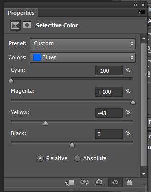
Then go to the Blues tab (to edit the board which looks bluey purple to start with) to bring more purple into the image


I'd say this is pretty close to how I left this gif in the original set. I'd also like to note that for this gif I had "Relative" ticked in the selective colour box. Changing to "Absolute" will change how the gif looks (colour changes will be more noticable and you will lose more of the individual colours within a gif idk how to explain it). Here is a screencap of what the gif would look like if absolute had been ticked instead. I think it can make the colours a little overpowering if not careful
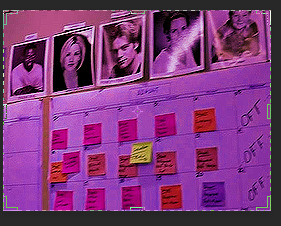
I do use this option sometimes and depending on the effect I'm going for, but it was not what I was going for with this set
____________________
For the next gif I manually adjusted the curves slightly up and down because I didn’t like the Auto option (felt it was too white and washed out)

Then I added Vibrance (about 56)

Once again I start by editing the Neutrals (basically adding in more magenta and less cyan to make pink)


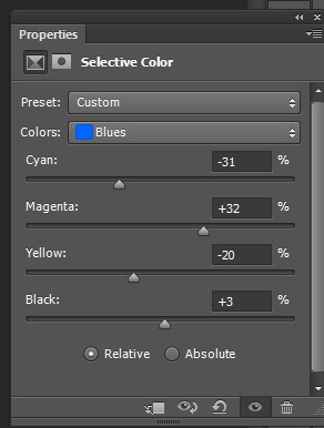
This is a little paler than the other gifs so I add another Selective colour on top to emphasise the colours I brought out in the first layer.
Add another layer of neutrals and also go into the magentas. I also adjust the blues in the image (even though there aren’t many to act as sort of a purple accent)


^ this isn’t exactly what I had in the actual set but I feel it’s pretty close :)
_____________________
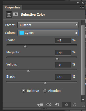
This gif was the easiest :)
The gif already had a blue background and there wasn’t much manipulation needed to get the colour for the gif
This is the gif after curves and vibrance

I just added a Selective Colour layer and edited the Blues and Cyans to make the gif more purple

Lastly thank you for the kind comments and I hope this helps💖
5 notes
·
View notes
Note
Hi! I love your art. Could you give us a quick rundown/explanation on how you make it? No pressure though. Keep up the great work!
Thank you, really happy people are enjoying my artwork!
For my 3D renders, I use Source Filmmaker for my posing + Photopea/Photoshop for post-processing. I recommend learning Blender if you're getting started instead of SFM: Blender is better in almost every aspect & every bit of creative control, I just use SFM because it's faster to render, easier to get assets for without needing to do as much manual work, and I've learned how to make it look decent.
With VALORANT and Overwatch (non-TF2 or Source assets in general), maps aren't ported to SFM. Props are ported sometimes for scene-building but I'm really bad at scene-building and lighting scenes tbh, so this has been my workflow for the past few years:
Export foreground elements: usually object of focus. In this case it's models that I alpha out. In this case, Phoenix & Astra with the table are one element, while KAY/O is another element, which I then put together. They've already been lit and posed within the software

2. Add a background & background elements: in this case I used a screencap of a map from VALORANT in-game, blurred it, and colour corrected it. KAY/O has also been shifted and blurred since he's a background element for this piece (though not as much as the backdrop, which remains simple so my foreground elements stand out)

3. Post-process and do paintover: At this point I make my touchups to the foreground elements. Here you can see Phoenix & Astra get some adjustments here & there, as well as the props on their dishes overgoing some repainting (such as the coins turning into plantains and adding sauce + meat filters on the meat)
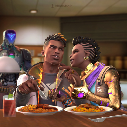
This is where I also added some more details such as the front dishes (which was a separate render), giving them some paintover if they needed it, blurring them out to add DOF, and adding shadows to the cutery since my models' in-software shadows weren't casting on the surface as well

4. Edit the lights & colour grading: to make Phoenix & Astra stand out from the background I added some lights behind them as well as started adjusting the lighting & colour grading overall of the elements to make everything look like it belongs
5. Add the final touches: any additional filtering, paintover, colour grading, and VFX that need to be done gets done. In this case, I added some subtle paintover on Phoenix's face, added some dust particles in the back, added a soft filter, and added more warmth & vibrance for the colours.

4 notes
·
View notes
Text
SHIT I THUNK OF WHILE ON THE ROAD, ACTOR AU EDITION:
*A screencap of Sasha, like it's from a show. She has a stern expression, but yellow text under it say "You're a whore, you know that?" like how some people put lines over someone voices from one tv show to another.
*An interveiw with Matthew and Sasha. The interveiwer asks "Is your relationship on the show like in real life?" where Sasha answers "Oh dear, no, never! Matthew's too sweet to harm." whereas Matthew states, "Sasha waterboards me if I snooze my alarm once.".
*in the background, all of my ocs are just doing dumb dances to songs like "I love me" and "Life is a highway".
1 note
·
View note
Last Seen Blogs
sunshineandwhiskey111
~ Always Stay Humble & Kind ~
cuteness--overload
Cuteness Overload
jevart
ᴊᴇᴠᴀʀᴛ
incandescentwarmth
In Which Otherwise I Have Wasted So Much Time
tofallasleep
bad habits