#art style study
Text
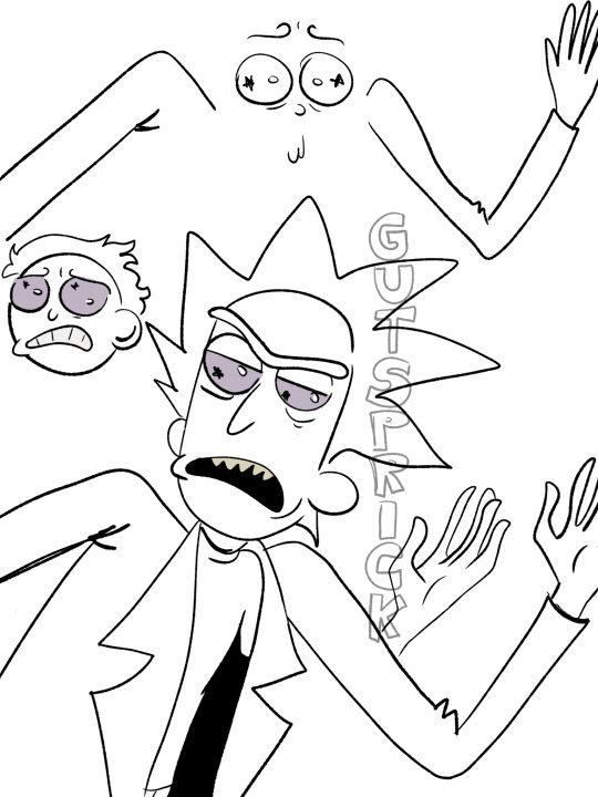
rick prime in rick and morty comics artstyle
I NEEDED TO SEE THIS SO BAD ILOVE HIM IM HIS

ref:
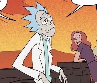
#rick sanchez#prickcest#rick prime#weird rick#prime rick#hes so pathetic so cool and so crazy i love him#art style study#rick and morty
70 notes
·
View notes
Text
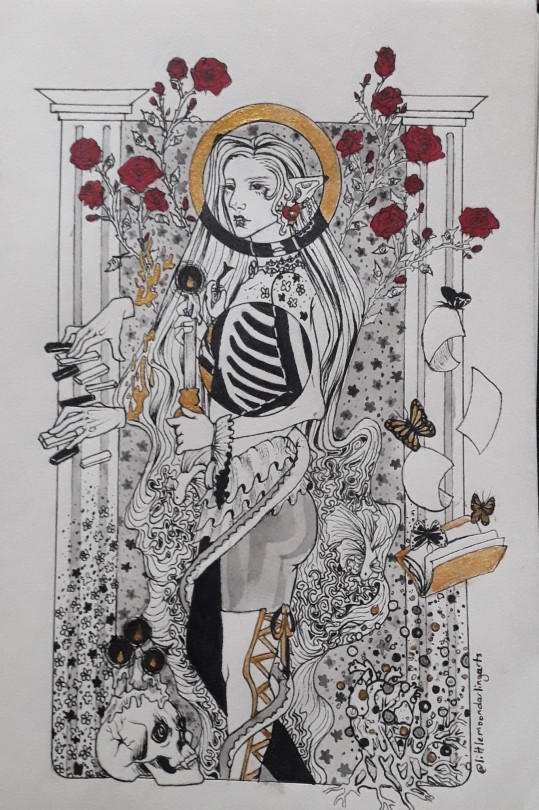
Did an artstyle study of the gorgeous art of @iliothermia and I genuinely learned alot so I'm very thankful that he gave me permission to do this 🙏🏻🙏🏻
As usual, rambles and process pics under the cut, be warned that I talk alot because this drawing was a true labor of love both for his art and Rouge
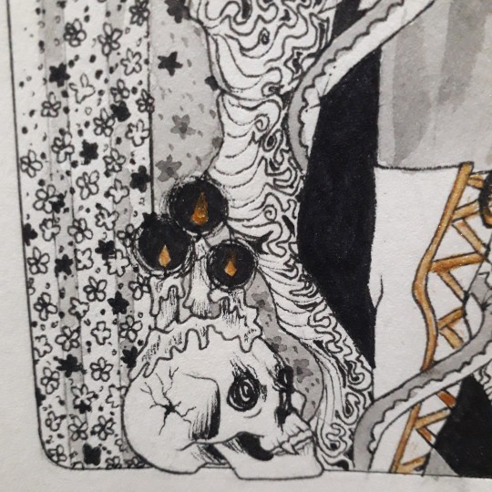
I wanted to use elements from his art but at the same time i know how deeply personal his art is to his own life and struggles and culture so i tried to be as respectful as possible (and if I failed at that please tell me I have no problem in deleting this) and tried to minimize my use of direct elements from his art to keep it to the skull which was heavily inspired by a drawing he has done, the waves which are such a beautiful staple of his art that I just couldn't not put it and the use of candles and small floral patterns and the style of the mold, but I tried to keep the rest to things that are symbolic to the character.
While he may have restraint to not explain everything, I'm not famous for that lol, so I will be explaining the symbolism behind my choices.
Part 1: the symbolism:
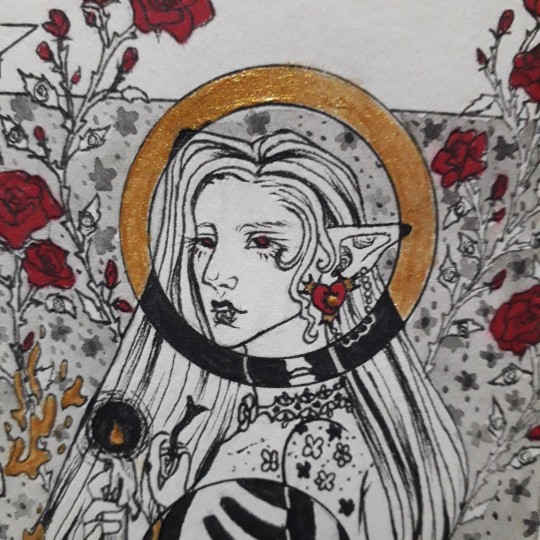
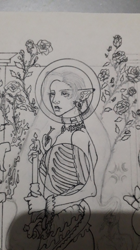
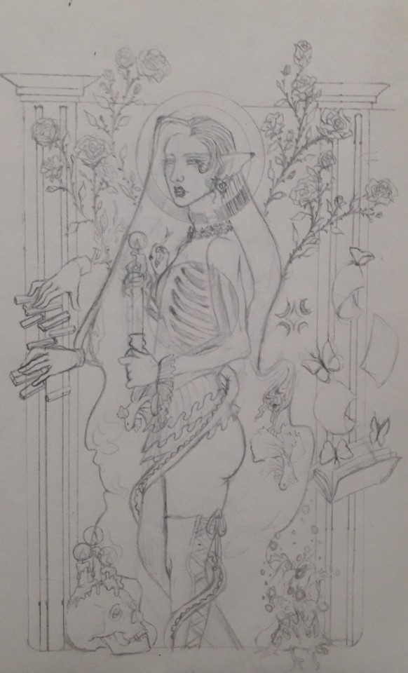
The red rose is Rouge's flower and it is heavily associated with him. The meaning of it being romantic desire and passion mixed with the thorns of it perfectly sum up his position as a beautiful black widow.
Voyeurism is a big part of this drawing and it is first noticed with the eyes motif on the roses' leaves, this symbolises his response to his trauma which left him feeling like an unwanted pervert on his own self. I can talk about this aspect of his story for hours but I'll spare you lol.
The X-ray cutouts are his complicated relationship with his own body and death, it is a thing that is constantly on his mind as he suffers from suicidal thoughts but at the same time he is always running away from it in fear, but he knows that eventually, he will have to stop running.
The candles melting represent him being only wanted when he is useful, when he is giving parts of himself up for others to use and abuse, when he is lighting their lives by slowly draining his own.
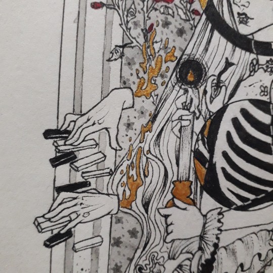
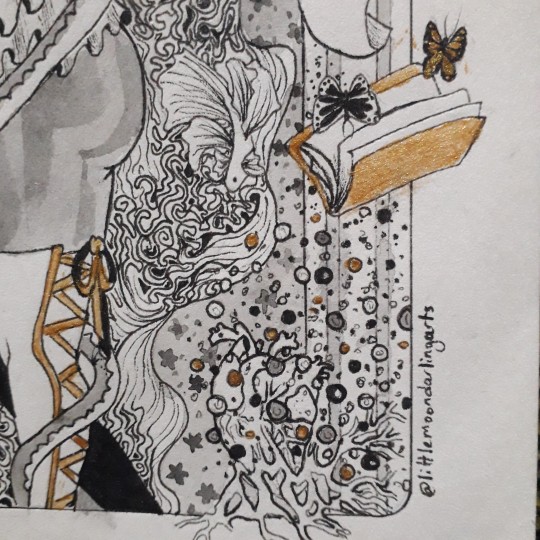
The piano is one of the rare things that bring him happiness and peace, but he needs to be heavily dissociated to be able to enjoy it which is represented by the hands being disconnected from the rest of the drawing and just floating in their own reality.
The snake represents two things, one is him being venomous to those around him, the mistakes he's made, the promises he's broken, the pain he's caused etc. But it also represents those who slowly wrap themselves around him in a warm embrace, presenting themselves as a saviour in his most dire times only to end up being the ones who will hurt him the most.
The book is about his obsession with keeping track of everything and of studying people, accidentally turning himself into an unwanted voyeur on their lives to the point where he has written the life stories of many people who would never want to be remembered through his eyes in his little books.
The butterflies are him, both in the way they are seen as "the good insects" and the beautiful delicate ones despite the fact that they eat flesh sometimes, it is also related to the way his simple presence for a few minutes in someone's life can create a whirlwind of change that will leave it unrecognizable, or he can simply be another body in their bed.
The hair turning into waves is meant to reflect the way he is always drowning in his own thoughts, a hand crafted constant state of misery.
The beta fish are some of the most beautiful and colourful fish out there, yet they are seen as cheap and easy first pets, leading to them being neglected and given environments that are too small and crammed, making their beautifully slow death the only thing they can offer to their owner. I don't think I need to explain more..
The skull is probably someone he's loved, or someone he's killed, or both.
The heart is his, it is rotten and covered in mold, any love he offers is tainted by his inability to heal and it is spreading to infect every aspect of his life.
Part 2: the inspirations:
The roses are a homage to the way Rachamim always places flowers in his art, either in the background or as a focal point of the illustration, most of the flowers he uses are cultural in nature, so I opted to not reuse any of them and changed it to a flower related to my oc.
Eyes are a repeated theme in his art, whether it be angel eyes, the evil eye or anything else, and as you can tell both of these are cultural and religious and while the evil eye exists in my culture, it does not in my oc's so I didn't use it. Instead I opted to pay homage to one of his beautiful merman drawings in which he used the plants to make an eye-like shape that stares at the viewer.
I thought I was being real smart in turning the hair into waves but yesterday I saw an illustration where he did the same so rip to me thinking i was being original lol.
The snake and butterflies are my way of replicating his use of animals while trying to not directly copy any animals that have a connection to himself or his culture/religion.
The beta fish is just to reference the ever present fishies in his art. I know he uses them because they represent friendship for him and they are the only animals safe from the evil eye (thanks for the fun fact) so I uh... I don't really know if this was disrespectful or not to be honest but I tried to use a different type of fish, idk this might still be slightly problematic and again I'm always ready to delete this if it makes anyone uncomfortable.
The waves are a direct copy of how he draws the gorgeous waves in his art, another case of something I fear may be crossing the line because the waves are drawn in the style of cultural jewelry 😭
The tiny flowers are an obvious reference to his own tiny flowers that decorate his art and characters.
The skull with the candles is heavily inspired by a specific drawing of his.
The cutouts are my way of paying my respects to my absolute favourite piece of art he's done without directly copying its concept because as far as I can tell, it is a very personal and emotional piece.
The mold style is a reference to his mold man (I forgot his name I'm sorry).
And the candles are another repeated motif in his art as well as the pillars and the pant style.
And ouf I sure do talk alot don't I? I just really love the amount of things I was able to cram into this piece and I haven't even mentioned everything😭😭 I will NOT be doing this again because I'm simply not as patient as he is and as proud as I am of the result, this was torture. I hope I didn't disrespect him, his art or his culture and I genuinely tried my best to be as respectful as possible but I might have some blind spots due to our experiences being so vastly different so again, please don't hesitate to inform me if you want this deleted!
#my art#art#artists on tumblr#oc#my oc#rouge#original characters#oc artist#oc artwork#oc art#lineart illustration#artsyle study#art style study#art study#idk how to tag this#anyway#hii#ty for reading#i hope you like it
219 notes
·
View notes
Text


AidaIro style study I did for class!
I did a color practice & then did my own attempt with drawing rin in the style from scratch. i might post all my study notes for the style after i pass this year if people are interested
#aidairo#style study#art style#art style study#jibaku shounen hanako kun#toilet bound hanako kun#kagamine rin#vocaloid#kagamine rin fanart#college work
161 notes
·
View notes
Text
Was supposed to be working on my comic but did this instead

Shaped
#weepingart#rain world iterator#rain world fanart#rw fanart#rw seven red suns#rw looks to the moon#rw five pebbles#rw no significant harassment#art doodles#art style study
250 notes
·
View notes
Text
Getting ready for his interview🎤
I've been trying some new art styles recently, most of which I won't post because they look HORRID, but I quite liked how the "jelly" style turned out! It was surprisingly quick to draw as well, clocking in at 2h and 15 min. Kid Ritz is my third favourite character from Trolls 3, behind two VERY obvious characters if you've seen my digital footprint recently.
Without camera lens
I just love this little guy, alright?
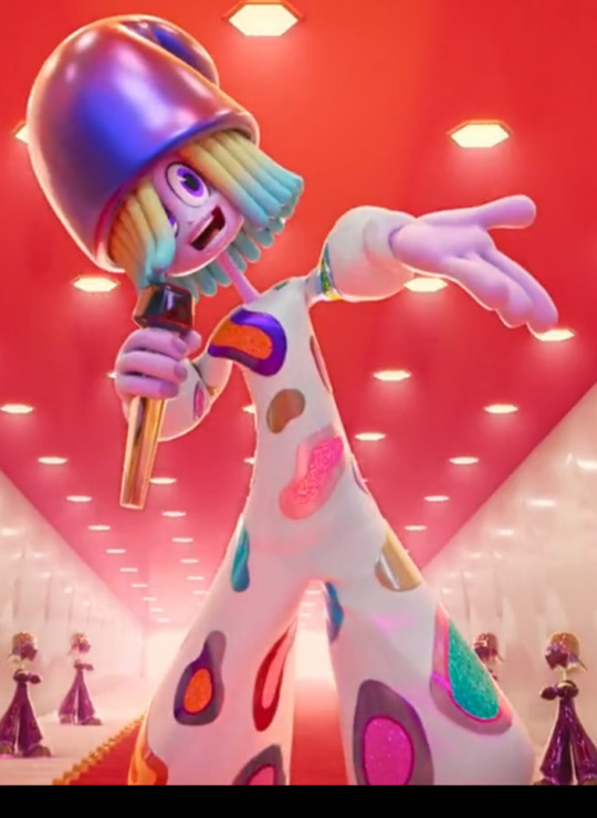
#kid ritz#trolls fanart#digital art#trolls band together#dreamworks trolls#trolls 3#kid ritz trolls#art style study#lizard's trial and error era
153 notes
·
View notes
Text
Why I draw Spamton the way I do and in defense of the "Tumblr sexyman" Spamton G. Spamton. An ESSAY.
EDIT 2/3/24 - Fixed some grammatical errors, changed font colors to make them easier to read against a white background, and reframed some of my arguments, especially regarding the "Yaoi style" portion, as it came across as ignorant and spiteful.
I follow the #spamton tag here, and I hate to say it, but it's full of artists jabbing at other artists who so happen to draw Spamton handsome. I see comments like, "No, he's a middle-aged sleazeball who is grungy and dirty." Often, these depictions show him with graying hair, ratty clothes, and covered in filth and grime. While there is nothing inherently wrong about drawing him this way, I find it disingenuous that the same people who draw him this way criticize people who draw him more handsome and or clean-cut because this depiction is even less based on his canon appearance than someone simply drawing him more realistically proportioned and with a pleasing visage (the definition of what this is varies by artist, but they're all often reduced to just "tumblr sexyman.") I see similar comments by people who draw him in what they may describe as "disgusting" or a "dirty scammer."
If Toby intended for Spamton to look dirty and gross, he would have simply gone with a similar design route to this character as an NPC in Undertale.
Toby or other official arts never depict him with the following, even though I see it in fan art all the time:
Ball-jointed hands. Some artists draw them properly and make them look super cool. Simple lines aren't how they look in reality, but I get why people do that. Either way, it's not canon.
Dirty with tattered clothes. Spamton is only ever shown with a black blazer. It's debatable if he wears pants, but Toby has also drawn him with a collared shirt and tie.
Graying hair. Should be obvious. He's only ever seen with jet-black hair.
Overweight/Fat. While some fan depictions of this are cute, it's not canon. Spamton is always drawn thin but not necessarily in shape.
Buff. Same as the above. It looks really good in some fanart but is also not canon.
Tail. It can look really, really cute, but not canon for him or any of the Addisons.
Feathers. Only Swatch and the Swatchlings are depicted with feathers in Cyber World.
"40+ years old" - There is zero evidence of this in-game or in official merchandise or media. This assumption apparently comes from people assuming that his birthday would be the same as the first "spam email," which (at the time of this writing) was 46 years ago. This is a false equivalency since there is no indication that Spamton has any associations with our real-world history of spam emails. It should also be noted that this was not a true spam email. The only thing closest to Spamton in association with real spam email history may be his favorite year, 1997, in which spam marketing emails became frequent nuisances. However, actions to stop spam mail started in 1996, and it was by the 2000s that they became a serious concern because technology had since advanced. If he were truly born in 1978, he would only be 19 by 1997. While not impossible, it's not how most people see him in his Big Shot years of barely just entering adulthood.
Also, as someone who has lived through most of the 90s, I can attest to a lot of this. Spam stuff existed, but news reports only heavily got into it by the 2000s.
100% Inorganic or Robot. While a cool idea, there is more evidence against this, like his ability to eat, sleep, and genuinely feel pain.
Boobs. I get most people who do this are doing it for fun, but it's not canon to his design, lol.
Tall. The most obvious one. Spamton is below average height, as made evident by his nearly 1:1 scale with Kris, a teenager.
Toddler-sized. Same as above. I won't lie that it can be drawn super cute, though. Haha!
With all that being said, why is it such a contention among his fans to depict him as handsome?
There is evidence to support that Spamton is at least, to some degree, good-looking but unconventionally attractive based on several sources. It should be noted that people often use his shop sprite as the best representation of his head, but this isn't accurate, either. In Undertale and Deltarune, because of its cartoonish sprites, it shouldn't surprise anyone that Spamton's are the most inaccurate and change frequently. Another user posted an entire comparison of all his sprites and how drastically inconsistent they are. I tried searching through my likes for this, but I can't find it. If anyone finds this, please link or reblog it to this post. Anyway, the intent of the post was to show artists that there are numerous different ways you can interpret Spamton's design with what's provided in the game, alone.
Stuff people often miss that is canon:
Lips. Believe it or not, this bastard's got kissable lips. Toby's recent art and his Neo attack are proof of this.
Eyes under the glasses. Seen in his sprite of going "BIG SHOT" the first time with Kris. It also hints at heterochromia because they contrast in color with yellow pupils under the pink and pink under the yellow.
NEO has no visible jaw hinge line. Only puppet Spamton does. Big Shot Spamton doesn't have one, either.
NEO's glasses' colors are reversed, and they are pince-nez style.
Androgynous sense of fashion. This is the least missed one, but it's worth mentioning. Spamton has no issues wearing pink, a color nowadays associated with women, and the NEO body has fabulous heels in addition to mostly being a magenta pink. The dress on the mannequin that greatly resembles him (and may hint at him being a white Addison before) shows a pretty dress that mirrors the one Mettaton wore in Undertale.
So then, WHY is he being depicted as handsome or unconventionally good-looking a BAD thing?
There really shouldn't be an issue with it at all. It's less offensive and technically more canon than many of the supposed depictions of him being a sleazebag who looks like he hasn't showered in a century and is hooked up on drugs or booze. You don't become a media darling without a charming personality. Mettaton only got successful in Undertale before he got his EX body because there was literally nothing else the people could watch. Spamton, on the other hand, was competing against many, so he had to stand out and look good even with the help of Mike (and possibly Tenna).
I often see people make this very reductive argument that it's a "yaoi style." This is by far one of the stupidest arguments I've ever seen. Drawing good-looking men is NOT equivalent to liking Yaoi. There are plenty of other genres of Asian-origin or Anime-styled media that feature pretty boys that have nothing to do with Boy's Love. Even Shounen anime has some bishies. Drawing bishounen-style male characters is a design choice and does not indicate someone's interest in Yaoi media. I swear, I have never seen this problem with Eastern fans. It's rude to lump people with similar art styles under something most people who make this claim don't even understand. I've seen people make upset comments about other people calling their style stuff like "Cal-Arts" even if they never went to Cal-Arts or like the media produced by them. It's the same principle. Stop lumping entire artists under one umbrella.
I draw him handsome because it's simply the way I see him. I love many other depictions of him, undoubtedly, and I even have a sticker set that depicts him with the graying hair, but it looks really good anyway. My point is, the fact that people who draw him dark and handsome shouldn't be scrutinized any more than people who draw him way more off base.
My personal contentions with the assumption he is a "dirty sleazebag old man."
I find this absolutely hilarious because this is a genuine stereotype and stock character of people similar to him. The douchebag salesman is a trope that's been around for a long time, but people don't seem to realize that this is a caricature and not representative of real salespeople.
Go to any @$%^ing department store or even an electronics one. Do you ever see anyone selling you stuff looking like they crawled out of the trash? Most are lower-class people who can't find any other job, meaning they are stuck with sales. It takes skill to be a good salesman, and I hate to brag, but I can probably sell you a #@$%ing soap bar and convince you that the extra $10 you're spending on it over a drugstore brand is better for your hands by deeply moisturizing them through herbal extracts and only "naturally" derived cleansing agents. Your hands are dry from the cold, drawing moisture out of them, so the investment would be worth it for the health of your skin during this harsh winter season. Why risk a drugstore brand that will only make your hands feel even rougher, flakier, and cracked? Stuff like this requires you to look someone in the eyes and observe who they are—their body language, way of carrying themselves, and the cadence of how they respond to your words. Does it always work? No. However, do you think anyone would $%^&ing buy ANY LEGAL PRODUCT if a salesperson looked like they were a shady crack dealer who was suspicious as %^&( to deal with? NO. It's a stereotype caricature for a REASON. It's meant to demean the reality of the salesperson who is forced to peddle a stupid product for a living. It's hard, and if anything, GET MAD at the people who are the ones making the crappy product! Yeah, some salesmen are bad at their jobs, but do you really believe that Cyber City's #1 RATED SALESMAN got there from being mediocre?! He may have gotten outside help for something that Toby never made clear, but he definitely does NOT lack the personality to make a great salesman.
And believe it or not, there is plenty of evidence to prove he WASN'T bad at it! The other NPCs sell stuff that was once his goods but with his labels removed, and based on his statement of wanting to "make his own deals," this heavily implies he was NOT selling products he wanted to sell before he became a Big Shot. He has a strong sense of pride in the way he sees and presents himself, and I think this may be overlooked by people who make him look as ratty as possible.
I will also CLEARLY state this but this depiction overall does several of the following, which I KNOW many people will say is bad:
Ageism. Why do so many people, mostly Zoomers, assume that a man in his 40s is washed-up, gross, or even considered old? I've seen hotter men in their 40s than some young men in their early 20s.
Downplays his mental health struggles. One of the best things about Spamton is how he DOESN'T play into just the "sleazebag" stereotype. Once we go into his shop, we see that he is truly just a very broken man. His theme song is a FARCE to try and convince you that he's tougher than he really is.
Classist/Poor-Shaming. The assumption that a homeless person has to have no sense of cleanliness. Please, for the love of all that is good, meet actual homeless people. Not all of them are like this. Spamton clearly keeps himself rather clean for someone who dumpster dives. He is trying to stay true to himself, and his sense of self is one of pride. There is no dialogue or description to imply he smells or lacks proper hygiene.
Again, while there is nothing inherently wrong with drawing him this way, I just want people to be more aware of why they draw him this way. Think of it like a thought experiment to reflect on why you see him the way you do. How I draw Spamton comes from a place of deep empathy, love, and life experiences I've had in sales in addition to ALWAYS being customer-facing, meaning I know what works and what doesn't for over a DECADE. It's rather bizarre to me that people who claim to be big fans of him draw him in such a demeaning way that goes beyond the canon depiction and lowers him to absolute dirt, almost like beating this character with the ugly stick just because it's "funny." Is he a tragic character to you? Or is he simply a clown to laugh at for his failures and hardships? How we depict and see people is utterly fascinating because it reflects in real life, too.
You can take the exact same person and show them to different groups of people, and they will all see the same person differently. They don't have to be artists, but they tend to vary if you ask their opinions. For example, I think the actor Mads Mikkelsen is very attractive, but I know many who wouldn't understand why. A guy I've had a crush on for years is one of the hottest men ever to me, but a friend of mine called him "just a guy."
I fully understand that some people find the way I draw him stupid. It is what it is. I can't force you to like it.
I'm simply trying to point out my reasonings for why I draw him this way, and I would like others to think about their methods, too, and NOT to bash other people outright or go "ewww Yaoi tumblr sexyman" just because someone doesn't depict him with stereotypical traits or as "100% canon style" (which is mostly just copying the game's sprite style.)
#musings#character analysis#character design analysis#spamton#essay#spamton g spamton#deltarune#big shot spamton#spamton neo#sneo#cw long post#long post#art style study#art style
116 notes
·
View notes
Text
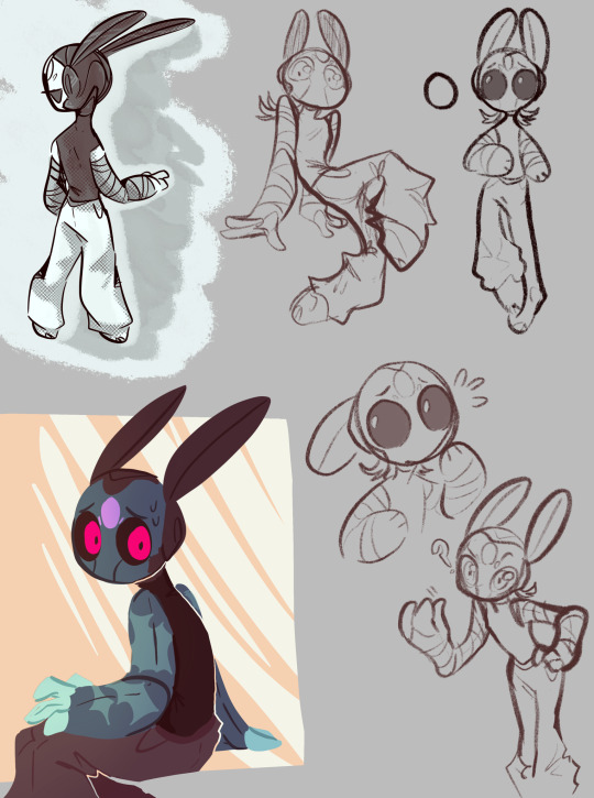
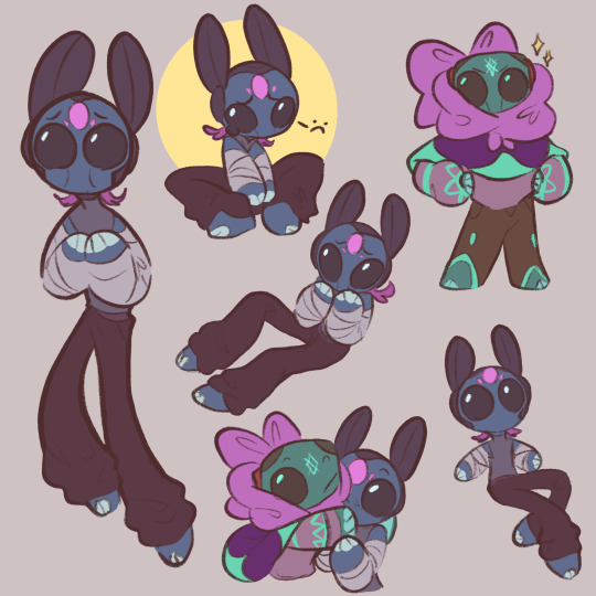
some stylized drawings of puyo for a thing i'm cooking up :3c
i wonder what they're looking at


111 notes
·
View notes
Text
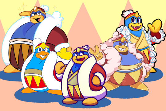
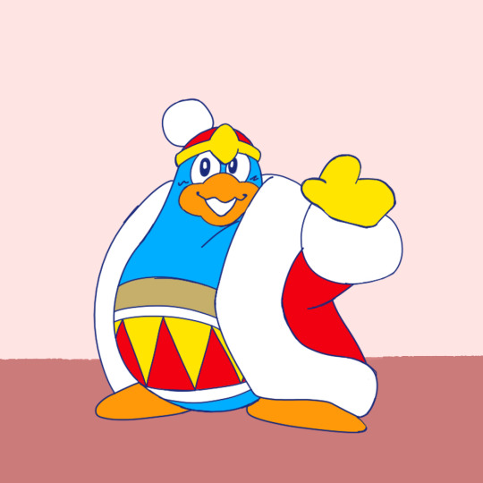
If there's one thing I'm proud of as an artist, it's the fact I'm a style chameleon. I decided to sit down and recreate 4 artists I really love, and who better to do it with than with the most varied character in the entire franchise: King Dedede! This isn't just for appreciation though, but a study on how other people translate DDD's design, since character design is a passion of mine!
Let's start with @miniiieevee!
Oh my gosh their art is super great, and I think the most important part of getting the style right was the sparkles. I have never seen someone do highlights this way, and it's both super recognizable and super cute! For the King himself, we have a nice round beak, visibly blue eyes, a distinct head, pointed crown jewel, an undershirt, and stripes along the top of the belt. Like most of us, they use the (owo) kind of mouth and really fluff up the coat. Separate fingers can also show up for posing, following Spongebob physics. The stitching on the gloves and the little round eyebrows are another really cool touch! Out of all of the styles I looked at, this one has the most pastel colors.
-
Next is @das-a-kirby-blog!
Das-a-kirby-blog has such a cool variety in their work, from really shapey sketches to super abstracted color schemes, which while super amazing, didn't provide me the best ref material. The colors here are frankensteined from a few sources, so I hope they capture their actual base color palette. They go for the pin-shaped route for body shape, with the undershirt (though sometimes there's no under layer), typically black eyes, extra belt stripes, and a chunky diamond shaped crown jewel. My favorite touch is the cottonball on the crown. Like I said at the top, they excel at shapes in their art!
-
Third is @jojo-schmo!
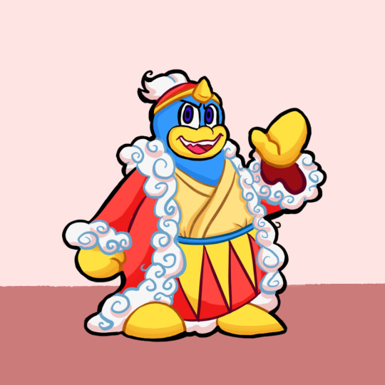
I've been silently reading their roleswap comic, but I should've been loudly reading it because I super recommend it! I'd also say design wise their Dedede is the most unique! Besides myself they're the only one here to pick the kimono, they have a single blue stripe at the top of the belt, a triangular jewel, and the coolest element of the style, spirals! I've not seen anyone stylize the trim this way, and it's so cool in execution. Another unique element that really adds to certain expressions is the spiky teeth (which matches real life penguins! ...Don't look it up).
-
Last but not least, @cosmicwhoreo!

God, their art is everything. The flow of the lines is so clean and smooth and everything they draw is super expressive. Their Dedede is by far the hugest, and also marks the 4/5 DDDs with a separate head, and 3/5 with black eyes. We have the belt stripes, occasionally a shirt, and a smooth tear drop jewel, but a uniquely shaped crown band. This design sees a lot of influence from the anime unlike the others here, so the color scheme is the most unique.
-
As a conclusion, it's really cool to see all the different design elements that we pick and choose for DDD. Some give him his smash outfit. Some people give him a body type closer to K64 or KATFL. Some people draw his eye color, or separate eyebrows, and others don't. There's no detail that's the same across every version, but they're all our lovable king. If you don't recognize one of these artists, check them out! I can only do a fraction of the incredible work they do, and let me know if there's any other characters or artists you'd like to see this exercise with!
#my kirby art#kirby#king dedede#art style study#I actually have no idea if @s notify the person or not#Probably?#I hope I did you guys justice
446 notes
·
View notes
Text
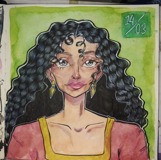
Mother Gothel 14.03.2024
Just got new brush pens for the lineart, so i tried 'em out here.
I tried out @ssavaart 's style a little ( for the hair especially) and i had so much fun, i think i need to go deeper with the values though.
<3
#art#drawing#artists on tumblr#digital art#fanart#painting#mother gothel#Tangled#tangled fanart#disney#disney tangled#rapunzel#princess rapunzel#tangled the series#Mother gothel fanart#watercolor painting#watercolor sketch#watercolor illustration#watercolor art#traditional painting#art style study
128 notes
·
View notes
Text
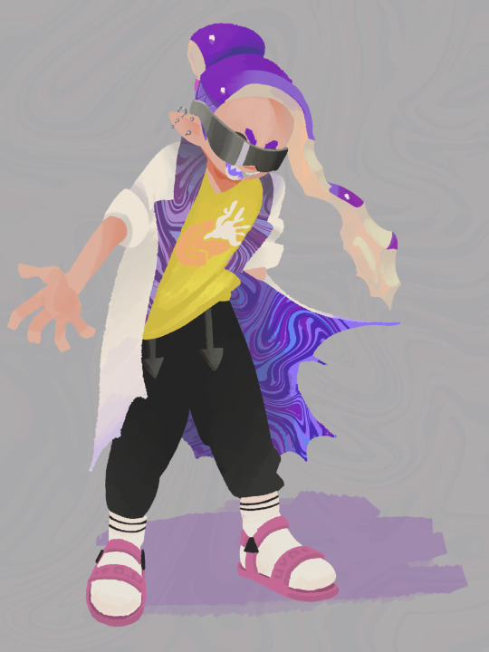

Splatoon art style study
#peepart#splatoon 3#splatoon 3 oc#splatoon oc#inkling oc#splatoon#art style study#splatoon art style#inkling#character design
71 notes
·
View notes
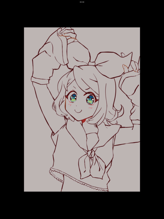
Text

Oh, I think that's reToga!
63 notes
·
View notes
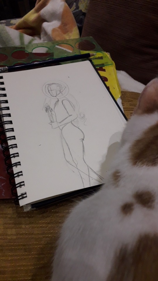
Text
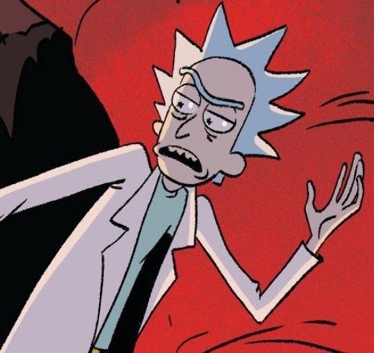
another drawing trying to understand rick and morty comics artstyle
im just randomly drawing random references, lol
:

36 notes
·
View notes
Text
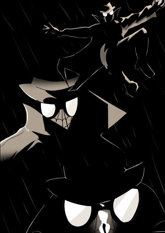
Spider noir study cause h e
#I keep posting stuff on insta but that new update man ;-;#tumblr is my safe space#spiderman#Spider-Man#spider noir#spiderman noir#study#art style study#art style#spiderman into the verse#spiderman into the spiderverse#spiderman across the spiderverse#atsv#itsv#spiderman itsv#spiderman atsv
270 notes
·
View notes
Text
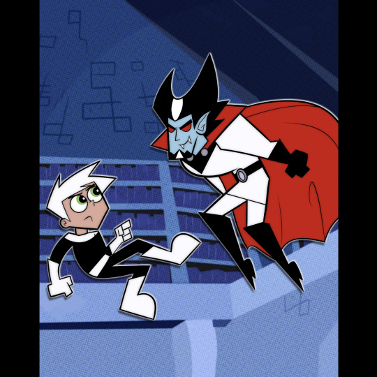
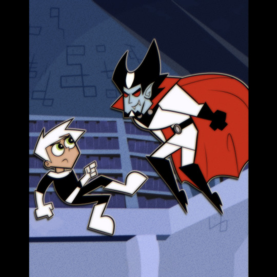
I never really tried the PPG/Dexter's Lab/misc style before, and I thought DP would be a good show to spring board off of since they have similar vibes
Don't know if I'll make more of these but! We'll see!
Org screenshot

#Danny Phantom#Danny Fenton#Vlad Plasmius#Danny Phantom: 1999#Art style study#MAN its so hard to research this style because there arent many good screenshots of the bg characters
84 notes
·
View notes
Text
So like, I was doing a lil style study cuz I don’t really like how my doodles look :( I LIKE MY COLORFUL ART PIECES DON’T GET ME WRONG!! But my doodles really don’t represent me all that much. So I did a study!
But then… as you can tell in the top right, there is a skinny, very long legged, short armed, bug eyed Moon there. I liked it so I drew another one….
After that I got carried away \(٥⁀▽⁀ )/
Oops
#rain world fanart#rain world iterator#rw iterator#rw looks to the moon#rw no significant harassment#my art style#art style study#art study#art doodles#fan art#guys… don’t stay up till 3 like me#you’ll start drawing bug eyed creatures#and giggling like a lil fairy afterwards
219 notes
·
View notes
Text
happy silly fukase saturday guys :3
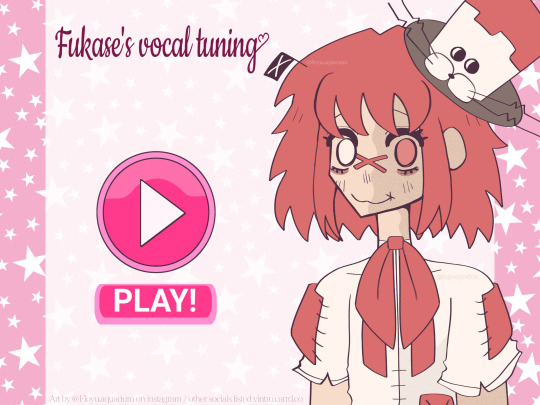
#art#artwork#fanart#fanartwork#vocaloid#fukase#vocaloid fukase#fukase vocaloid#lacey flash games#lacey#lacey games#laceys#laceys flash games#laceys wardrobe#laceys petshop#laceys kitchen#laceys media player#art style#art style study#meow#:3#he def relates to lacey in some ways#the sillies ever#he prob caught up on all the lacey lore#ya#🤯🎉🥳yippee#vs art
74 notes
·
View notes
Last Seen Blogs

babovens
Grad School Era Weeee

poisonlikemercury-blog
Poison Like Mercury
cigsonvinyl
Kat

cielsulfur-blog
Drive Qualia