#another thing i learned is that & <- this thing is a called an ampersand. and it's a ligature of a n 'E' and a 'T' supposed to be 'et'
Text
i literally had to make a heat map today. i deserve something good.
#unimportant#doyouknow how good ben&jerry's tiramisu is?#it's so freaking good#i was thrown off by the solid chocolate shell on top of the tub tho.#another thing i learned is that & <- this thing is a called an ampersand. and it's a ligature of a n 'E' and a 'T' supposed to be 'et'#which is roman for and apparently.#i also literally had to code for my website too. no good things happen to me#i ALSO SAW JAMIE#FUCK JAMIE
9 notes
·
View notes
Text
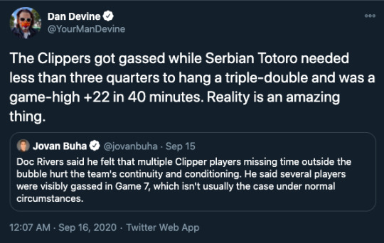
Team Calm Raid: Koffing-Time Debriefing
Hi guys, update after yesterdays very exciting events.
I'm typing this while on the plane back home, so it's gonna be a bit for me until it's up, but once you can read it, i'm probably back at the café.
I think i have to take the day off, to care for all my pokémon (more on that below), but Olivia has agreed to run the café for another day. (If it's urgent, i'll be around though) I am so thankful my friend, you are saving my ass! (Otherwise we would have been closed today)
So... what happened?
I posted a few tiny things, and maybe you saw post by other people, so you might already know. @champion-class-hatsune-miku made a call to action, and i decided to answer. Yesterday, we went to raid the Alola-Base of Team Calm. You know, those guys that do terrible genetic experiments to create so called "ultra-domesticated Pokémon". I don't want to go into detail, basically: these Pokémon are either passive beyond recognition, or get intimidated incredibly easy. They will not defend themself if attacked, and if they are a carnivorous species, they also refuse to hunt. Often to a degree where they can barely function at life. A lot of them have other health issues as well. And, well, those are the "successful" UDs. The less fortunate have horrible mutations. If you want to learn more, i recommend checking in with @prof-lemon and their initiative @team-violence.
The raid was overall a success. The base was destroyed, which was not what we were aiming for, but i'm not mad. This just means they won't be able to continue doing this stuff, at least in Alola. As far as i know, nobody was left inside when it collapsed, neither one of the raiders nor team calm grunts or the Pokémon they bred. The only uncertainty left (to my knowledge) would be Circe, the leader of team calm. I have to say, i hope she got away. Just to clarify, she did horrible things, but i want her to stop, not to die. A few grunts were hurt, some raiders got hit in the face as well, but nothing life threatening happend, as far as i know. Me and my Pokémon are fine. We didn't go for the front line with battles, we took on the role to care for the frightened UDs and give first aid to those who got hurt. (Big thanks to everyone who supported me there! I was not alone and this was very very VERY helpful)
The rescued Pokémon will be cared for. Each of us took a few with us, but the bulk had to be rehomed to shelters, at least temporarily. Another big thanks to Miku, she contacted a lot of them to prepare. I think most of the UDs are in Alola, but a lot of shelters all over the world have supported this cause. If you want to do your own little thing to help us out and adopt one of them, go and ask around. (Prof. Lemon and Miku can probably tell you which shelters exactly have some UDs). But be warned: these ultra-domesticated Pokémon sound cute, nice and easy to care for, but the vast majority of them are very high maintenance. Please make sure you are ready for such a commitment.
As for myself: i have 4 of these Pokémon with me right now. They are 2 Trubbish, a Mareanie and a Petilil. This is the main reason i have to take the day off. I have to show them around, and i should also spend some time with Flit and Ampersand (the Beedrill ad Sliggoo that i adopted from the Snowbelle City shelter. Thank you again @oh-shinx, for doing that event!)
That being said, if you have questions, don't hesitate to ask! And i'll see you all on wednesday for @frostbite-yinny's Babyshower, all right?
#tix.txt#pokeblogging#team calm raid#pkmn irl#pokemon irl#long post#//sorry for the pings everyone :)#Koffing-Time-1.0
20 notes
·
View notes
Text
no one really asked for this, but here is an atsuhina fic rec list composed of 15 of my absolute favorites (i have more, but i think 15 is good for now lol)
1. “you, me, and the sweet sun” by caniculeo - i think this is perhaps my favorite atsuhina fic ever. plus it is one of the only fanfics that has actually made me cry. the perfect mixture of angst and fluff, with some elements of magic. atsumu miya wakes up one day and finds his sunflower has finally blossomed. what is more shocking is the naked stranger kneeling by his bed.
2. “timmy play your trumpet (let the people go beserk)” by farozaan - if you want something funny, this is the fanfic for you. the MSBY quartet live together, hinata being the newest addition, and chaos ensues. atsumu is not quite sure how to deal with his crush on hinata, sakusa is exasperated certain people do not know how to follow the house rules, and bokuto is just in for the ride.
3. “and they were roomates!” by boomturkey - an absolute classic in the atsuhina fandom and the quarantine fanfic we have all been waiting for. japan is put under lockdown due to covid, leaving hinata worried about where he will be living for the time being. atsumu graciously invites hinata to stay with him in his house with a yard and home gym, despite previously claiming he hates living with other people.
4. “murphy’s law abiding citizen” by whatthehelena - i cherish msby fanfics and this one holds a special place in my heart because it is all sakusa's pov. this one is incredibly funny as well. watch as sakusa suffers at the hands of his wild card roommates.
5. "the better miya twin" by infanbtblue - this one is very funny and super sweet. no one seems to believe that atsumu confessed to hinata after losing to him at nationals. promising to set for him in the future is basically a marriage proposal (it's a setter thing). the rest of the inarizaki volleyball team doesn't seem to think so. or, atsumu is annoyed everyone seems to favor his twin. he just hopes hinata doesn't think the same.
6. "like a dream that you can't quite place" by slumber - a "Your Name" atsuhina fanfic adaption! atsumu wakes up one day in the body of a stranger.
7. "moving in slow motion" by simplerushes - i am usually not a big fan of getting back together fanfics, but this one is so well written with the perfect level of hurt and comfort. atsumu gets a call from one hinata shouyou, asking him if he can pick him up from the airport. atsumu of course says yes. oh by the way, they have been broken up for about a year now.
8. "king of disaster" by caniculeo - college au. hinata and atsumu develop a rivalry after one atsumu miya decides to call him small and hinata out does him in one-handed push-ups. i love this fanfic so much, i am a sucker for enemies to lovers and this one is so well written and just a lot of fun to read.
9. "why would you even stream live while you're drunk" by BowDownToAtsumuPeasants - oh god, if you want to laugh your ass off please do yourself a favor and read this fanfic. after his plans of scoring a date with hinata are ruined by one oikawa tooru, atsumu gets drunk. and what better thing to do when drunk than go live to your thousands of followers. nothing bad can happen, right?
10. "only fools rush in" by mirabilis - i think one of my favorite things about the haikyuu timeskips is the way social media is used in fanfics in order to further the narrative. this fanfic does it beautifully and has my perfect amount of pining.
11. "sky full of song" simplerushes - atsumu comes down with a fever and decides he is going to marry the hell out of hinata. atsumu spends the rest of this fanfic attempting to propose. it's really endearing.
12. “in gold daylight” by lavendori - an atsumu miya character study where he learns how to be the happiest twin alone.
13. "ampersand" by infantblue - i debated putting this one here ONLY because i feel like everyone who ships atsuhina has probably read this fanfic before. oh to erase my memory and read it for the first time again. the angst is amazing.
14. “happiness” by noyabeans - although atsuhina is not the main focus of this fic, i have the need to recommend this one because of how amazing the characterization is. this is such a good post-time skip fic that focuses on atsumu and osamu’s relationship as they grow apart from one another.
15. “wait for it, wait for it” by slumber - i lovee outsider pov fics and this one is great. written from the perspective of MSBY’s new junior publicist, misaki hana, here are 5 times where #atsuhina trended on twitter and one time it didn’t but should have.
bonus - if you’re an atsuhina fan and have not read boomturkey’s inarizaki!hinata series, please do yourself a favor and read it!! it is very long and just so much fun to read. the characterization is so on point, and if you were disappointed inarizaki did not get screen time outside the volleyball match, this is the series for you. the characters are so much more fleshed out.
#atsuhina#fic rec#haikyuu!!#i still have more but maybe i'll post that another day lmao#if anything just check out the authors bc a lot of them have other amazing fics
192 notes
·
View notes
Text
Some Truth of the Divine speculation, now that I've finally gotten around to reading Lindsay Ellis' Axiom's End and had a blast with it. Seriously, it's the most fun I've had in a while (I stayed up until 4am reading it), and at certain points I put the book down and went, "Oh. Oh no. Ellis knows EXACTLY what I'm weak for. Please send help."
So here are an assortment of thoughts on what might be in book two:
- We know that Cora and Kaveh will be point of view characters for book two, with possibly a third pov. I'm thinking that if we do get a third pov, it will be from Ampersand's last symphyle.
- I think Ampersand's last symphyle will be the "agent of chaos" mentioned in the blurb. I'm also wondering if this symphyle's arrival will kick off the discussion of what genders the amygdalines identify as.
- I also wonder if Cora will gel with this last symphyle, kicking off an on-page poly relationship between Cora, Ampersand, and the last symphyle. Poly relationships do appear to be the cultural norm for amygdalines.
- Alternatively, maybe the last symphyle is doing poorly from losing all of their group except for Ampersand, and is in full lashing out and causing chaos mode. I definitely don't want a repeat of Obelus--because then you really have to wonder how healthy Ampersand's original group was--but the blurb for Truth of the Divine seems to suggest that this new arrival makes the tense situation on Earth much worse.
- Nils is unfortunately probably going to appear in the book and be a charming, manipulative jerkass to Cora, because of course he's going to try to take advantage of her role as an interpreter for Ampersand. On the plus side, I cannot wait for Ampersand to realize how much Nils is hurting Cora, because then he can fulfill the protective monster boyfriend role. It is always delicious, even if I think Ampersand will go a little far with it (there will probably be some blood. I am a bad person and would be okay with this).
- "While asking the question of what constitutes a 'person,' Ellis also examines what makes a monster." So yeah, the monster or monsters in this will probably be humans behaving badly, rather than amygdalines. The blurb mentions hate groups, after all. One of these monsters will also probably be Nils, because he's already been set up as a villain with great PR (and sometimes a point). Also, don't think I don't see that line as a reference to Beauty and the Beast and The Hunchback of Notre Dame, Ellis.
- Cora and Ampersand are most likely going to have sex in this book. According to Ellis, there will be smut, but it's not like what we're imagining. I'm wondering if it's not like what we're imagining because it will involve more people than just them? Maybe Cora hooks up with someone and Ampersand is psychically there and possibly experiencing sexual pleasure for the first time? Maybe Ampersand's and his symphyle have the psychic equivalent of a steamy reunion and Cora gets some feedback from that?
- Okay though, so it's supposed to be a darker book. Let's say that Cora and Ampersand do get it on, and Ampersand is experiencing sexual pleasure for the first time through their psychic bond (since that isn't a Thing for amygdalines). Would he get a bit...intense about that? Seek it out multiple times? He's a traumatized adult in the middle of grieving the loss of yet another symphyle, and he WANTS to be close to Cora, and who knows how that psychic bond is going to grow between them (I feel like there are hints that Cora could learn high language someday, it'll just be something that develops over time). So what if that is going on, and maybe they're not as careful with it as they should be, and they get caught on a recording? Which someone, probably Nils, then leaks? The backlash from it on all sides--because I don't get the sense that the amygdalines would be cool with it any more than the humans would--would cause a lot of drama and pain that would need to be dealt with. Also, that would be the ultimate violation from Nils. Do I want it to happen? Definitely not. Could I easily see it happening, given how under surveillance the amygdalines are and how leaky the information about them is? Unfortunately, yes.
- "Questionable use of non-human anatomy" will probably be Ampersand shapeshifting his fingers into...some other things. Given that he's a nervous system encased in a dragon-shaped mechanical body, he will need to get creative to make things work.
- I live in fear of what secrets Ampersand is keeping and what he lied about in the first book. What are his "machinations" that no one was meant to see?
- Is Cora going to call Ampersand out for not asking her if it was okay to fusion bond with her? I'm unclear on how that happened without her consent. Also, the implication that an amygdaline can form a fusion bond with someone whenever, without them knowing about it or needing to accept the invite into their headspace, makes me worried about amygdaline society (unless that was just how it worked with Cora?). I have a feeling that a part of why Ampersand told her to keep their bond a secret wasn't just because it could put them both in danger, but because it's probably something that would be illegal to do in amygdaline society.
- Ampersand is going to have to learn how to not be such a control freak in this book, as Obelus implied he would be. The whole idea that cultural assimilation/fusion isn't possible, only cultural conquest, will also need to be challenged.
- The Genome's body being taken away will come back in a horrifying way, maybe with some cloning.
- Will Ampersand find the people whose brains he damaged and fix them? If he does, I'll bet it's because he doesn't want Cora to be mad at him, rather than from genuine remorse.
- Felix is totally going to run away with Nils and that is going to backfire 100%.
- I hope Esperas has a Pet the Dog moment with Cora, maybe while literally petting her dogs. I could really see him empathizing with Cora over how much of a jerk Ampersand is being.
- Maybe we'll learn how Nils got the Fremda Memo and what Luciana had to do with it.
23 notes
·
View notes
Text
Some stuff that made me happy in 2020, in no particular order
God send you no greater loss. It’s something my grandmother said a lot — a bit of highly Irish Catholic wisdom intended to remind you, warmly but sharply, that whatever you’re currently suffering through isn’t all that bad compared to what lots of other people are dealing with. That it probably isn’t too much to complain about, in the grand scheme of things. That you should, instead, be grateful for what you’ve got, big and small and everything in between.
God sent a great many people a great many unfathomable losses this year, and as hard as it felt at times, our family wasn’t among them; we’re lucky, in the big picture. In the past, people have recommended I try writing those reasons down, to give myself a list of stuff to be thankful for, for the times it’s tough to summon up the gratitude. I figured the end of the year was as good a time as any to make that list, to highlight the stuff that helped me get through this year — the reasons big, small, and in between.
So: here goes.
Peanut butter and jelly
I haven’t counted how many peanut butter and jelly sandwiches I’ve eaten since March 11, which is good, because that would be an absurd thing to do, and a sure sign that I have succumbed to a very specific kind of madness. It’s also good, though, because I would undoubtedly be ashamed by the number; the figure would be titanic, like the unsinkable ship of same name, or the iceberg that sunk it.
Or, at least, I would be ashamed under normal circumstances. This fuckin’ year required whatever flotation device you could find, and you know what I found in the fridge and cupboard? A couple of slices of bread, some strawberry jam, and some goddamn Skippy.
Need a weird mid-morning “brunch” after not having breakfast because you went right from waking up to remote school with the 6-year-old? Crank up a PB&J with that third cup of coffee. Need to pack something in the diaper bag to feed everyone while you’re out at the playground for the afternoon? Stack ‘em up, son. Need a late snack after working the overnight shift filing weird bubble playoff columns? Three letters, one ampersand, one love.
I need to eat better in 2021. But I kind of needed to eat sort of like shit to get through 2020, and time and again, when your man needed it most, PB&J was there.
Sunday night Zoom sessions with college friends
I know that most of us started something like this back in March; I’m not sure how many have stuck with it. I hope the answer is “a lot,” because honestly, knowing that I’m going to end the week by seeing a few friends — some here in Brooklyn but mostly beyond our reach for safety’s sake, some who’ve moved away — has felt like a stabilizing agent on more than a few occasions. It’s important, and no small blessing, to have people in your life who really know you, weird messy ugly bits and all, and in front of whom you can let everything go.
That gallery view’s provided a place to vent, to seethe, to laugh, to cry, and to try to find some semblance of center before heading back into another week. I’m grateful for it, and for the people in those little boxes. Except for the time they reminded me that, when I was 18, I was pretty sure I was a Pacey, and they were all extremely confident I was a Dawson. They were right, but still: a bitter pill to swallow, then and now.
Olivia calling herself “Dr. Bloody”
She took out her little toy doctor kit and just turned into a cackling villain.
View this post on Instagram
A post shared by Dan Devine (@yourmandevine)
Deeply disconcerting, yes, but also adorable.
All Fantasy Everything
What got me in the door was the conceit: three very funny stand-up comedians (Ian Karmel, David Gborie, Sean Jordan), often with a very funny guest but sometimes without, pick some topic or another and engage in a fantasy draft of their favorite aspects or representations of that topic. (It is, crucially, a serpentine draft. Now what is that? That’s a great question.) Some favorite examples: Mikes; Words That You Think Make You Sound Smart, vols. 1 and 2; Things You Yell After You Dunk on Someone; Fictional Athletes; Crimes We’d Like to Commit. Yeah. It’s that kind of podcast.
What kept me around was the friendship. Listen to an episode and it becomes really clear really quickly just how much the three hosts love each other, how much fun they have being around each other and making one another laugh. The warmth radiates, just pours out of the speakers; in a year where I sorely needed some good vibes, I appreciated my regular check-ins with the Good Vibes Gang to just ... unclench for an hour and a half or so.
Drinking beer
OK, I’ll admit: This doesn’t sound great for me. It’s true, though. I really like beer. (We brewed one in our kitchen, which I realize is something of a “bearded guy in Brooklyn” cliche, but here we are. It was exciting to complete a project, and it tasted OK-ish.) At some points this year, it didn’t feel like there wasn’t much to look forward to, and sometimes drinking some High Lifes or Narragansett tall boys — with my wife in our living room, with friends on the computer, whatever — helped take the edge off a shitty day/week/month/year. I look forward to being able to do that outside with people again.

The Good Place
I am sure some very smart cultural critics and political thinkers and social revolutionaries have forwarded compelling arguments for why this show is Bad, Actually, because that seems to be more or less true about most things, whether because said thing is Actually Bad or because the economics of the attention economy on the internet functionally necessitate the composition and publication of pretty much every position on pretty much every issue, and especially ones that present a counterargument for why you shouldn’t like the thing you like, and might be kind of a piece of shit for liking it. But I liked this half-hour comedy about the way the universe might be put together, why we should try to take better care of each other, and how doing so might be a pretty great way to take better care of ourselves.
Andrew let me write about it a little bit for a big project we did before the series finale aired, which was really nice of him. I found myself thinking about this part a lot this year:

I also thought a lot about Peeps Chili, but that happens every year.
Taking pictures of my dog
Check out this flumpy goddamn champion:


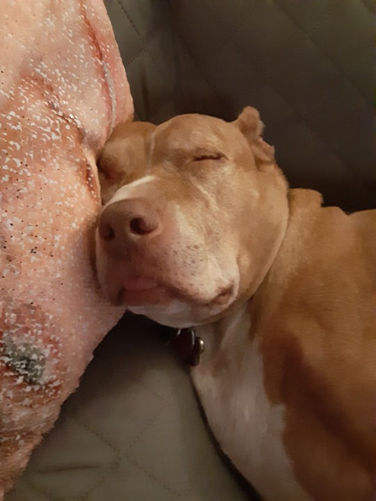


“Lugar is a good boy” is the main takeaway here. They don’t all have to be complicated.
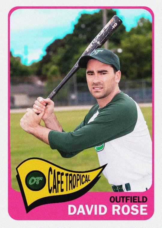
Schitt’s Creek
I know we’re not alone in this, but we inhaled this show this year. A half-hour comedy about people being laid low, learning how to deal with who they actually are, and finding some grace and community and opportunities for growth kind of hit the spot, I guess.
One of the most wholesale enjoyable ensemble comedy casts I can remember; Catherine O’Hara was already in Cooperstown, but what she made with Moira Rose only polishes her plaque. I’ll never be able to describe with any specificity the thing Chris Elliott does, but I know it has made me laugh since I was a child too young to understand the Letterman bits or see Cabin Boy in the theater, and it’s probably going to make me laugh until I am dead.
I love that people who, for years, never got to see themselves or people like them on screen got to see David Rose on screen and maybe recognize themselves a little bit. The idea that seeing the David/Patrick relationship might make them maybe feel a little more at home, a little safer and more whole, makes me happy. Sad, about the before, but happy, about the now and the what comes next.
Past that, I just love how what was ostensibly a family-and-friends production for a Canadian channel just got absolutely everything right—the tone, the look, the sound, the theme song, the cast, the jokes, my goodness, the jokes—and before long, the rest of the world just got it. Like catching a fastball square on the barrel. Something the show clearly knew a little bit about.
Finding new outdoor places it was safe to go
Necessity is the mother of invention, and the need to give the kids a place to be that wasn’t unnecessarily dangerous but also wasn’t inside our two-bedroom apartment led us to do more exploring than we had before. Shirley Chisholm State Park is great. Canarsie Pier was a fun place to spend a Sunday morning; so’s Canarsie Playground. If we got there early enough or made our peace with some rain, the beaches at Jacob Riis Park and Fort Tilden were pretty rad this summer. I lived in Staten Island from ages 8 through 18, and during breaks throughout college, and don’t think I ever hiked in High Rock Park — that’s dumb, because it was nice!
Even if all those little excursions did was kill a little time and reduce the overall stress level of the four humans stuck in our four walls, that’s not nothing. Some days this year, it was everything.
Cobra Kai
I know I’m late here; I didn’t rush to seek it out because I don’t consider myself a huge fan of The Karate Kid, or at least not a big enough fan to sign up for YouTube’s premium service. I checked it out when it came to Netflix, though, and I honestly can’t believe how much I enjoyed this show. Give me “dumb, but with heart” every day of the week.
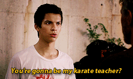
I believe in Miguel Diaz; I believe in Johnny Lawrence; I believe I will be firing up Season 3 next month, and perhaps drinking some Coors Banquets in its honor. (I cannot, however, believe how the “get him a body bag” thing came back around, but that’s neither here nor there.)
Closing unread tabs
I’m a serial hoarder of links, and I am bad at finishing all of them. I’ve tried to get into Pocket and Instapaper, but I’ve never been able to turn that sort of workflow — open link, save to third-party service, go back to third-party service later to read, then delete from there — into something that felt instinctual, natural, or habitual. So: lots of tabs. Like, lots of tabs.
This was a dicier proposition than usual in 2020, because cutting my work week in half to be able to more effectively coparent two kids who didn’t have school or day care for most of the year meant less time to read things.
I tried to do my best to keep up with the important stuff for work, and to read at least some stuff about how other parents were dealing with their anxiety/anger/depression/frustration at having to be on 24/7 and work, and to stay abreast of (at least some of) what was happening in the world. Sometimes, though, I would wake up and realize I’d been holding onto blog posts about Really Interesting Rotation Decisions on the 11th-Seeded Team in the East or whatever for literally nine months, and I would go against my nature and just hit the eject button on a 25-deep window, and something amazing would happen: I wouldn’t get fired for being shitty at my job. I would move on with my day, and I would feel about 10 pounds lighter.
I still keep too much stuff open. (As we speak, I’ve got three different Chrome windows open on two different laptops. I choose not to count the total tabs.) But I do so knowing that, if it gets too heavy, I can experience the momentary joy of surrendering to the inevitability that I can’t catch everything. In that moment, I feel OK with my decay.
Reading writers I wasn’t familiar with before
Two in particular stand out in my mind: Nekias Duncan, now of BasketballNews.com, who does excellent film breakdowns and statistical analysis, and Katie Heindl, who writes basketball stuff of all types all over the place, and strings sentences together in a way that scratches an itch inside my brain. I’m grateful I got more chances to read them this year, I look forward to bigger and better things for both of them, and I’m hopeful that, if things calm down and our schedules go back to something approximating normalcy, I’ll have more bandwidth to hunt out more new voices in the year ahead.
The time I ambushed my wife as she was trying to break down and put away the girls’ space tent

Pretty good.
Siobhan learning to ride a bicycle (with training wheels, but still)
The moment passed pretty quickly; Not Exactly A Mechanic over here can’t get the training wheels to reliably work right without either loosening them too much or tightening them so much that she can’t pedal it. In that first moment, though, and for as long as it lasted, it was really great to see her get excited about doing something new, big kid shit, for the first time.
youtube
She was proud. I was proud of her. And then we went to a playground for a few hours. Pretty good day.
Tyler Tynes roasting me
Tyler did some incredible work this year — The Cam Chronicles is getting deserved praise as one of 2020′s best podcasts, and his reporting on the Movement for Black Lives was exemplary. It’s hard to top this, though:

You know what the messed up part is? I was excited to tell him what I was doing, just because I knew the reaction would be so violent. Like a body rejecting a transplant. So lucky to have such a dear, dear friend.
PUP
I’m late on everything, so I didn’t start listening to PUP until the spring of 2019, but I haven’t really stopped since. This year has been too sedentary too often; this band is too kinetic to allow me to stay there.
youtube
“Bloody Mary Kate and Ashley Kate” is never more than about 20 minutes away from returning to the front of my mind. I would fucking love for it to be safe enough to watch these guys live at some point, and I am absolutely going to take Steve up on his offer.
Someone sending me a shirt based on a joke I tweeted
First:
youtube
Then:
Then:

I’m not sure you should be rewarding my behavior, SnoCoPrintShop, but I appreciate it all the same.
Which reminds me:
Family dinner/family movie night
My wife works in Manhattan and commutes back on the train, and we've tried to prioritize getting the girls to bed early since they were little, so that doesn’t leave much of a window between when she gets home and they go in the tub for us all to connect; before everything shut down, we almost never really ate together. We’re still not great about it, but for a while now we’ve carved out Saturday as family dinner night, where we sit down to eat and talk about our “up” from the day — something that happened that made us feel good or happy, or something we’re looking forward to. (We used to talk about our “down,” too, but that kind of seemed like overkill. Why try to focus on more bad shit right now, you know?)
Then we settle in for a movie, with who gets to pick rotating each week. It’s mostly been Pixar, which has been great but also has its drawbacks; after she caught me crying during one of them (maybe the Bing-Bong scene in Inside Out? or Miguel singing to Grandma Coco?), Siobhan straight up told me, “You need to get yourself together, man.” We just watched My Neighbor Totoro, too, which they loved, so we’re probably going to try some more Miyazaki soon. It’s a really simple thing, but it’s one we rarely made time for before, and it’s been really nice to manufacture something positive that we can share and look forward to together.
Sometimes looking like a shiftless drifter
No shade to anyone who felt strongly about getting a lineup or whatever, but I haven’t really felt like going to the barbershop was worth the risk, and I continue to refuse to believe that my wife can actually pull off the fade she’s long wanted to give me. (It is also possible that she just means she’s intending to run my fade, and that I will before long wind up cold-cocked and slumped by my bride of nine years.) So I’ve just kind of been growing out my hair like it was when I was single, and sometimes been letting my beard get kind of out of control too, and, well, I sort of like looking a little bit like a Wildling, it turns out.

I have since trimmed things up a little. It didn’t go over well with my youngest. Oh, well. I’ll try to do better next time.
My wife and daughter singing the Pixies
View this post on Instagram
A post shared by Dan Devine (@yourmandevine)
We don’t know all the words to too many lullabies, so we sing the ones we do know the words to. This will probably come back to bite us in the years ahead. For now, though: Pretty good.
Doughboys’ Tournament of Chompions: Munch Madness: Mac Attack
I can’t believe how invested I became in Nick Wiger and Mike Mitchell’s quest to determine the best menu item at McDonald’s in a 64-seed tournament that spawned hours and hours of delightfully funny audio featuring all-time home-run guests like Jon Gabrus and Nicole Byer, who gleefully feed into the often warm, sometimes antagonistic, always entertaining chemistry between the two hosts. I have also never found myself wanting to go to McDonald’s more in my entire life. I have hit the drive-thru a couple of times since, and the boys are right: The McDonald’s fountain Coke does just hit different.
Sound Only
I’ve lost track of whether or not a 38-year-old is considered a millennial, but I’m quite confident that I’m not exactly plugged into “the millennial lifestyle” as my teammates Justin Charity and Micah Peters discuss it on their podcast, which relaunched this summer. Doesn’t matter, though, because I love hearing Charity and Micah talk to each other even if I don’t know what they’re talking about.
Their conversation about Dave Chappelle was great. After listening to their Travis Scott episode, I felt like I kind of understood who he is and why he occupies the space he does in pop culture now. I had no idea how they were going to get me to give a shit about set photos from The Batman, but this they not only got me there, but wended their way toward blaming 50 Cent for needing to know who Groot is to have a conversation on the internet, which is something for which Abraham Lincoln did not die. The show is good, it's getting better, it’s fun to hear them talk their shit, and Charity’s regular bellowing of “I, TOO, AM AMERICA” has made me smile for four straight months.
Siobhan’s letters and notes
She’s in first grade now, and she’s taken to communicating her feelings through the written word. A lot.


I won’t pretend that I loved all of these in the moment. I can only get so upset, though, when she’s already writing with such a clear voice. (And trying to use proper punctuation. (And drawing little cartoons to drive the point home.)
Palm Springs
I’m having a hard time remembering too many specifics about it right now, which probably means it’d be a good thing to rewatch over the holidays. But, as I’m sure many people noted many months before we got around to watching it, a comedy about living the same day over and over again, and about trying to figure out how to make your life mean something when everything seems meaningless, scratched a pretty particular, and particularly important, itch this year. It could’ve been twice as long, and I would’ve eaten up every second of Andy Samberg and Cristin Miloti together.

I’m pretty sure I cried, although this year, that doesn’t necessarily mean much. Also, put Conner O’Malley in more things.
Joining our union’s bargaining committee
I won’t say too much about this, but I will say that becoming an active participant in the process of a labor union negotiating its first contract with management has been an extremely educational experience. It’s pushed me to have conversations, sometimes difficult ones, about our priorities as a staff and a company. It's helped me get closer with the other past and present members of the BC, and has led me to start developing relationships with members of our staff that I otherwise might not have had much of an opportunity to get to know.
The organizing work takes time, effort, and energy, but trying to do what I can to help take better care of my colleagues has been well worth all of that. Here’s hoping that in 2021 we can reach a deal that helps make our workplace even better, stronger, and more equitable for all of us.
Publishing a story about Stevie Nicks’ Fajita Roundup
I swear this is true: After I accepted my offer to work at The Ringer, but before I started, I told a friend that one thing I was excited about was that you had the chance to work on offbeat stuff here, in both the “kind of weird” and “not about the NBA” senses. That, I thought, might maybe open the door to me getting to write a story about a Saturday Night Live sketch I saw when I was a teenager about Stevie Nicks from Fleetwod Mac running a cheap Tex-Mex restaurant in Sedona, Arizona — a sketch that I wasn’t sure anyone else remembered, but that was stuck in my head forever.
That story ran on May 26.

A lot of people seemed to like it.
Accomplishing this goal was, as dumb as this might sound, a highlight of my year, and, honestly, a highlight of my career. I’d like to do some more stuff like this next year, time permitting; we’ll see. Whether or not I do, I got to do this. I’ll always have that.
3 notes
·
View notes
Note
Hi Leslie, I had a quick question. I'm relatively new to AO3 and I was just wondering if people use the terms crossover and AU interchangeably? I noticed a few crossovers that were labeled AUs (in various fandoms, not just SC). My understanding is if characters from one fandom interact w/ characters from another, it's a crossover, but if characters from one fandom are simply placed into the universe of another, it's an AU? Or is it more complicated than that?
nope, that’s pretty much exactly correct. AUs are the characters in one fandom being placed into a different setting/situation, either just generally (david and patrick but they work in a coffee shop) or media-specific (david and patrick but they’re living out the plot of you’ve got mail--this kind is also sometimes called a fusion instead of an AU). either way, it’s generally just the characters of one fandom. crossovers, on the other hand, are basically smashing two fandoms together and forcing the characters in them to interact with one another (mulder and scully come to schitt’s creek to investigate twyla’s claims that two of the regulars at the cafe are actually aliens).
as for the labeling issues, that’s likely just mistakes or misunderstandings on the part of the author. it can be hard to parse out the difference between them, especially if you’re new to fic. people also sometimes struggle with differentiating between the slash and the ampersand for relationships and end up labeling those incorrectly as well. (in case anyone’s unclear on that, slash is for romantic and/or sexual relationships; ampersands are for platonic relationships. therefore, david/stevie is for a different kind of fic than david & stevie.) it’d be great of course if everyone understood the tags for those kinds of things and used them properly, but it’s definitely part of the learning curve, so mistakes happen. if it’s someone you know personally, you can maybe reach out to them privately and politely say hey i think this might be better tagged a different way, but otherwise, it just is what it is, and that’s okay!
4 notes
·
View notes
Text
The Magician
The Magician : a muggle guide to tarot
- Through the dark of futures past, the magician longs to see. One chants out between two worlds … Fire Walk with Me.
David Lynch’s Twin Peaks
I realize it’s hard to convince you of my view that tarot doesn’t have anything to do with magic per se, when the title of the card we are discussing is ‘the magician’. But it is perhaps the most worldly, practical, unmagical card in the entire deck, so bear with me. Today we’ll be talking philosophy and raw action. The magician caries the numbered one. So take out your magician card, or your favorite magician card if you have more than one. The magician is a card for which I feel a profound affection; I identify deeply with it (along with two others: the chariot and the king of swords). You could almost say that in this early stage of the tarot’s journey I have halted and stopped at the first step and there is some truth in that.
Symbolism
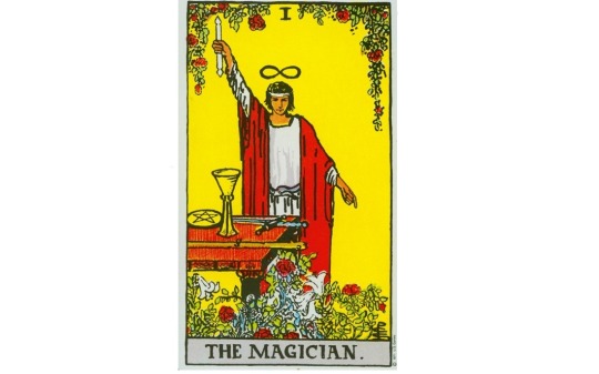
We see a figure with one arm pointing upwards, sometimes holding a staff or a wand and one pointing downwards. This represents the ancient phrase “as above, so below”. The idea of a macrocosm and a corresponding microcosm is an old one. We know the ancient Greeks philosophized a lot about this and the idea has spread across big parts of the world ever since. Plato believed in the existence of a perfect world of ideas, next to our world of imperfection. Christianity believes in a temporary existence here on earth and an eternal existence close to god.
On a more mundane scale we can see the outer world of everyday life and our inner world of hopes, dreams, ideas and fantasies. And in each one there is something that bridges these two. I have always found it intriguing that moons revolve around planets and planets around suns in a colossal void, very much like electrons revolve around the nucleus of an atom, also mostly in void. In short, it symbolizes that the stuff that makes up the universe can be found inside ourselves. Between the above and the below is the magician, us, at the center of all this. It is a profoundly anthropocentric card; we are, each one of us, the god of our own universe.
Did I just call you a god? Yes, I did.
In front of the magician is an altar with four objects: a sword, a wand, a cup and a pentacle (or coin). These four objects represent the four elements, the stuff the universe is made of, in a symbolic way. The altar and the four objects represent everything, the world (the macrocosm) but right in front of us, small and tangible, symbolized (the microcosm). They are there for the taking. In certain decks the magician is called the juggler, the capable artist that keeps all four elements in the air at the same time. The altar is a miniature world under the control of the magician.
Another crucial symbol is the infinity symbol above the head of the magician, symbolizing the unity of male and female principles. In my post-gender worldview, I don’t like male and female stereotyping, but the tarot is rife with it, luckily in a very nuanced manner. Tarot isn’t inherently patriarchal if that’s what you are wondering. The magician, like the fool, is an androgynous figure, uniting male and female principles. To be an able person, one does indeed need a mix of both, lest we are hollow, ridiculous clichés. The infinity symbol lives on in the character “&” often used on marriage invitations when a couple puts an ampersand between their names, indeed a union of two.
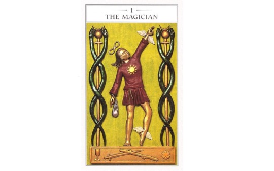
Is there no end to this symbolism? Jesus. We’re almost there; I know it’s a lot; it’s not an easy card concerning its symbolism but I’ll make it up to you later, because its meaning is real simple, I promise. In the Renaissance Tarot we recognize the symbols we talked about (the up and down arms, the altar with the four elements is a plinth here, and we see the infinity symbol). The figure is very androgynous, one leg is straight and muscular, one is almost that of an elegant ballerina. There is a hint of breasts and that hair is long and yet short.
Some extra symbols are added like the two caduceui (still used by pharmacists as their symbol) but also by the alchemists of old. The two intertwined snakes represent – can you guess it? – the intertwined male and female energies. Between the snake heads is the symbol of the planet Mercury, a blend of (surprise) the male and female symbol. The wings on the arm and feet (like the ancient god Mercury) refer to his ability to ascend and descend in the world above and below. I’ll shut up about the magician’s belt which represents the ouroboros, you can google that one if you’re really into the ouroboros. I am seriously done with its fucking endless symbolism.
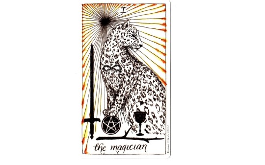
In the wild unknown card we recognize a few things: the four elements and the infinity symbol but the magician has been replaced by a wildcat. Which brings us seamlessly to its meaning (finally). A lot of cards in tarot are about contemplation but this one is all about action. A wildcat runs and runs fast, it runs gracefully, it is made for running. This card says only one thing: go!
Upright meaning
- Knowing is not enough; We must apply. Willing is not enough; We must do.
Goethe
Just as the magician manipulates the four objects on the altar in front of him (remember, representing the microcosm), so can we manipulate the world around us. The magician is able, he knows his shit, he doesn’t sit idly by, he acts and transforms A into B, he makes changes as he sees fit, he shapes the world around him to his liking. He is whole, male and female combined, confident in his abilities.
If this card represents a situation it tells us to believe in ourselves and act. Do it! Go for it! Stop doubting, stop thinking and just fucking do it already.
If it refers to a person, it is someone confident, someone with abilities that bring about change in the real world in any possible way. Someone who knows his trade always seems like a wizard to an uneducated outsider. The things my IT-guy does to my computer look like magic to me; how my pharmacist prepares medicine that heals me looks like magic, how poets juggle and play with words, is magical to me.
The magician is always someone who believes in themselves and has real skill and influence, not some cog in a machine but maybe an independent employee or anyone with a specific skill set. Or simply someone who works a little practical magic for you. See what I did there? If you know yourself well, it helps to know the world; if you can change, so can the world. In contrast with the fool, the magician knows really well what he wants, he has a plan and he’s already working on it. The magician is deeply androgynous, he knows when to use his male and when her female side to best reach the goal.
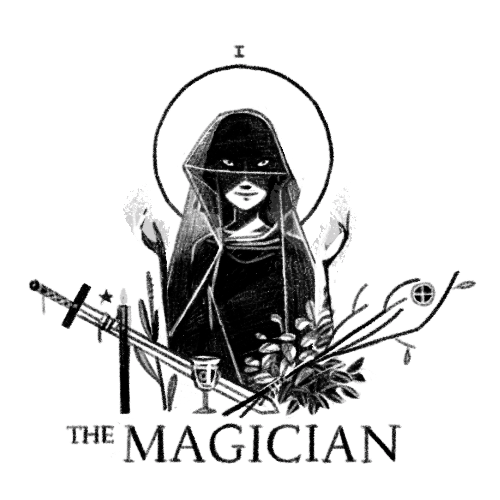
> The Magician by Stephanie Davidson
Reversed meaning
When reversed it can mean one of three things:
1. Exactly the opposite: inactivity. Someone is sitting on their lazy ass. Maybe thinking, dreaming, fantasizing or calculating risks, weighing options, whatever it is, now is not the time! Just get up and start working. Yes work, you will get tired. Stop talking, stop complaining. Work.
2. Something blocks you: you lack the confidence of the magician, you don’t believe in your own abilities. Maybe you compare yourself to people who do it better. But honestly with seven billion people out there, someone is bound to be better at no matter what you do. Maybe you believe you are worth jack shit. In any case: you are wrong. You are able. Put that in your pipe and smoke it.
3. Taken too far: the magician holds the meaning of the charlatan, the imposter, the foul smell that drips from the word manipulating. This is someone who abuses his abilities in a way too selfish and harmful to others. He is a deceiver and quite good at it as well.
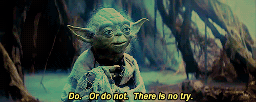
The path of the magician
When you meditate on the magician, or if the magician represents you in a spread, it asks us to act. It is Yoda telling us to do or do not because there really is no try. It is Galadriel telling Frodo that this task was appointed to him and that if he does not find a way, no one will.

It is Obama yelling at us ‘yes we can’ or Karl Marx telling us that the point is not to think about society, the point is to change it. Few cards are so straightforward.
Just like last time, a little meditation exercise to let you grow, to step by step define who you are. Note down three skills that you possess that influence the outside world, grand or modest, doesn’t matter. They don’t have to be unique or super-snowflake-special. Skill is skill. Three things you are good at.
Next jot down three things you want to learn in the future. Like, before you die, preferably.
Again, I’ll be open and honest; not out of some misguided exhibitionism but because as your guide I want to give the example.
1. I am a decent enough librarian. I help my readers find the information they need, I teach them a skill set so they can find It themselves and analyze it’s worth in a critical way. I run a smooth library.
2. I am verbally strong if I want to. I can communicate, inspire, analyze and I have a certain way with words. I write and guide roleplaying games as storyteller, which brings joy and excitement to people. I also use this for evil purposes. I have been known to bend truths.
3. Strategy, long-term planning, making plan B, C and D (and in secret E, F and G). Destroying resistance, guiding the process, improving along the way, optimizing, motivating and cheering at the end.
Three things I want to learn before I die: to dance, speak German fluently, and sew clothes.
TLDR:
Upright meaning: confidence, action, skill
Reversed meaning: passivity, lack of confidence, manipulation
Hollander, P. Scott, Tarot voor beginners, ‘s-Gravenhage, 2004. P30-33.
Lyle, Jane, The Secret Tarot, New York, 1998. P16-19.
Krans, Kim, The Wild Unknown Tarot Guidebook, New York, 2016. P159-160.
#a muggle guide to tarot#tarot#the magician#tarot readings#003#magician#major arcana#magician reversed#004
32 notes
·
View notes
Text
Symboles Facebook

The list of special characters and symbols below can be copied and pasted into your Twitter and Facebook posts to give your posts and tweets originality. Tip Microsoft Windows 10 users can press and hold the Windows key and then press the period key to open a window that allows you to insert emoji, kaomoji, and symbols.
Cool Characters and Symbols for Facebook
Emoji - also called, emoticons or smiley faces. IOS and Android natively support 845 emoji, and Facebook supports half of them, including choices such as heart/love symbols, stars, signs and animals. After you insert these emoji codes into Facebook, your friends will see the colorful icons across all desktop, iPhone and Android devices.
Facebook users are able to post a number of things whether as a status update or through chat. One entertaining way of communicating with your friends is by putting symbols on your chat messages. Better yet, people can use symbols to get creative in their status updates. To learn how to use symbols on Facebook, see method 1.
If you are looking for a detailed list of Facebook abbreviations and symbols, then you have come to the right page. In the following article, you will find some of the common abbreviations and their meanings that will make your social networking experience fun.
Copy-paste these ones.
If you are looking for a way to type symbols right from your keyboard then view Alt Codes. But most of symbols listed here cannot be inputted by using Alt codes. In fact, you can type only 255 different characters with Alt codes. So these facebook symbols are cooler. =)
Coolest signs
ツ ♋ 웃 유 Σ ⊗ ♒ ☠ ☮ ☯ ♠ Ω ♤ ♣ ♧ ♥ ♡ ♦♢♔ ♕ ♚ ♛ ★ ☆ ✮ ✯ ☄ ☾ ☽ ☼ ☀ ☁ ☂ ☃ ☻ ☺ ۞ ۩ ♬ ✄ ✂ ✆ ✉ ✦ ✧ ∞ ♂ ♀ ☿ ❤ ❥ ❦ ❧ ™ ® © ✗ ✘ ⊗ ♒ ▢ ▲ △ ▼ ▽ ◆ ◇ ○ ◎ ● ◯ Δ ◕ ◔ ʊ ϟ ღ 回 ₪ ✓ ✔ ✕ ✖ ☢ ☣ ☤ ☥ ☦ ☧ ☨ ☩ ☪ ☫ ☬ ☭
Smileys
☹ ☺ ☻ ت ヅ ツ ッ シ Ü ϡ
Gender, love, heart
♋ ♂ ♀ ☿ ♥ ❤ ❥ 웃 유 ♡ ۵ ❣
Weather: sun, rain, snow, temperature
☼ ☀ ☁ ☂ ☃ ☄ ☾ ☽ ❄ ☇ ☈ ⊙ ☉ ℃ ℉ °
Music
♪ ♫ ♩ ♬ ♭ ♮ ♯ ° ø
Flower
✽ ✾ ✿ ❀ ❁ ❃
Copyright, registered trademark
™ ℠ © ® ℗
Money - Currency symbols
€ £ ¥ ¢ ƒ ₩
Percent
% ℅ ‰ ‱
Symbols by categories
Chess
♚ ♛ ♜ ♝ ♞ ♟ ♔ ♕ ♖ ♗ ♘ ♙
Hands
☚ ☛ ☜ ☝ ☞ ☟
Snow/Star
✦ ★ ☆ ✰ ✮ ✯ ❇ ❈ ❅ ❄ ❆ ╰☆╮
Messaging/Writing
✉ ✍ ✎ ✏ ✐✑✒ ⌨
Checked
☑ ✓ ✔
X, No/Unchecked, band aid
☐ ☒ ☓ ✕ ✖ ✗ ✘
Pinned
☌
Scissors
✄ ✂
More symbols
All text symbols for Facebook ϡCollection of cool computer text symbols. All facebook symbols. ❤ ♥ ❥ My large hand-made list of more than a hundred cool characters. Truly amazing! ヅ ツ ッ
Symbol tools
Encool tool - generate cool text with symbolsMake cool text messages with special text signs and symbols. Enrich your text with cool symbols. Fantastic funny accent letters and symbols. Ḉσмє їη❣
aboqe - Flip message letters and text characters Upside Downaboqe generator is a tool that can flip your text upside down by using special letters, symbols and characters. Flip your messages 180°. For Facebook, MySpace, etc.
Post on Facebook
All Answers on facebook symbols problemsBasic help on facebook symbols. Why some symbols may show up as squares. How to do symbols from keyboard, laptop. How to make big font for special characters. How to post symbols to your website.
Change Facebook name ت to add symbols, or fully hide FB namesExplaining how to change your Facebook name. Also explaining how you can add Facebook symbols to your name/surname on FB.
Other Symbols
Alt CodesUse Alt codes to make text symbols and special characters from your keyboard, or laptop. Guide for PC and laptop + full list of Alt codes. Windows alt codes and keyboard symbols on Mac and Linux. Pimp your MySpace and Facebook profiles, or create some useful text symbols like umlauts, copyright, trademark, registered sign, euro, pound, etc. right from your keyboard.
Foreign language LettersGreek, French, Spanish, German letters and punctuation signs. List of foreign language text letters, symbols and characters and their Alt codes. Umlauts, diacritics, acute accents, breve, circumflex letters, upside-down question/exclamation and other. Small capital letters.
Text Emoticons and SmileysText emoticons and smileys for messages, chat and status on Facebook, Myspace, etc. Made with and without the use of cool text symbols.
For Facebook chat
Facebook Chat codes for Bold and Underlined text styleFacebook chat codes to make your text bold or underlined. Use _ and * signs to make where you want to underline chat text, or make it bold.
Facebook plugins - smileys and moreBrowser plugins and add-ons for Facebook. Plugins for things like additional Facebook smileys and cool custom layouts.
Character codes for Websites
Enty tool - Escape special HTML / JavaScript character entitiesJavascript tool to convert your text with symbols into HTML, or Javascript character entities. You can insert the whole text and it will just escape special characters, leaving other characters alone. You can leave tags and ampersands unconverted.
Quick info
Facebook symbols are Unicode-encoded special characters. I picked some cool and unusually-looking symbols for my collection. You can find here funny chinese signs, cross, peace symbol, cool skull, stars, and the list seems endless. People usually use them in facebook chat, status, to make text emoticons, nicknames or whatever. So use your imagination and have fun, lucky.
How to use
Just copy-paste symbols that you like into your status, comments, messages. You can't put it into facebook names, as of now, but there still are many uses.
Though, strangely, it seems like some symbols can form 'combos' (like in video games) =) and don't work if you put them one after another. So if you see some of your symbols turning into squares after you have put some new symbol into the input field - that might be a problem. To solve it just press 'Ctrl' + 'Z' and don't put these troublemaker symbols. Or put them in a first place.
Right-left
Notice that there are some right-to-left written symbols here, and if you put them - characters you put after them may appear before them. Tricky ones ^.^
Fonts
Funny thing about these symbols is that they are different in different fonts (like 'Arial', 'Helvetica', etc.). I noticed this when I've seen snowman and umbrella look different in Firefox and Chrome. They looked better in Firefox.
Partners:
поисковая оптимизация веб сайтов
реклама сайта
цена SEO оптимизации
реклама сайта в интернете
цена контекстной рекламы
официальная реклама инстаграм
реклама в Facebook
продвижение в соцсетях
заказать раскрутку сайта
цена баннерной рекламы
silicone sex dolls for sale
female sex dolls artificial intelligence price
sex doll online
love doll for sale
realistic silicon sex dolls cheap
life size sex dolls for sale
tpe sex dolls on sale
japanese sex dolls purchase
affordable customizable sex dolls
Emoji Symbols Facebook Copy Paste
Symbols
☮ ✈ ♋ 웃 유 ☠ ☯ ♥ ✌ ✖ ☢ ☣ ☤ ⚜
♨ ❖ ❤ ❥ ❦ ❧ ♡ ✗ ✘ ⊗ ♒ Ω ♦ ♠ ♥ ♣ ♢ ♤ ♡ ♧ ✦ ✧ ♔ ♕ ♚ ♛ ★ ☆ ✮ ✯ ☄ ☾ ☽ ☼ ☀ ☁ ☂ ☃
☻ ☺ ۩
♪ ♫ ♬ ✄ ✂ ✆ ✉
∞ ♂ ♀ ☿ ▲ ▼ △ ▽ ◆ ◇ ◕ ◔ ʊ ϟ ღ 回 ₪ ✓ ✔ ✕ ☥ ☦ ☧ ☨ ☩ ☪ ☫ ☬ ☭ ™ © ® ¿¡ №⇨ ❝❞ ∃ ⊥ ∀ Ξ ∞ Σ Π
⌥ ⌘ 文 ⑂
ஜ ๏ ⚓ ⎈
Smileys
☹ ☺ ☻ ت ヅ ツ ッ シ Ü ϡ ﭢ
Also, take a look at my Text Emoticons and Smileys collection.
Money - Currency symbols
€ £ ¥ ¢ ƒ ₩
Blackboard bold (Double-struck) letters
ℂ ℍ ℕ ℙ ℚ ℝ ℤ
Antique letter characters
ℬ ℰ ℯ ℱ ℊ ℋ ℎ ℐ ℒ ℓ ℳ ℴ ℘ ℛ
ℭ ℮ ℌ ℑ ℜ ℨ
Chess
♚ ♛ ♜ ♝ ♞ ♟
♔ ♕ ♖ ♗ ♘ ♙
Hands
☚ ☛ ☜ ☝ ☞ ☟ ✌
Cross
☩ ☨ ☦ ✙ ✚ ✛ ✜ ✝ ✞ ✠
Snow/Star
⋆ ✢ ✣ ✤ ✥ ✦ ✧ ✩ ✪ ✫ ✬ ✭ ✮ ✯ ✰ ★ ✱ ✲ ✳ ✴ ✵ ✶ ✷ ✸ ✹ ✺ ✻ ✼ ❄ ❅ ❆
Flowers
✽ ✾ ✿ ❀ ❁ ❃ ❋
Music
♪ ♫ ♩ ♬ ♭ ♮
Weather: sun, rain, snow, temperature
☼ ☀ ☁ ☂ ☃ ☄ ☾ ☽ ❄ ☇ ☈ ⊙ ☉ ℃ ℉ ° ❅ ✺ ϟ
Beliefs
✌ ☮ ♆ 卐
Religious
☪ ✡ † ☨ ✞ ✝ ☥ ☦ ☓ ♁ ☩
Political
Ⓐ ☭ ✯
Gender, love, heart
♥ ❤ ❥ ❣ ❦ ❧ ♡
♋ ♂ ♀ ☿ 웃 유
ღ ۵
Text-message, Write
✉ ✍ ✎ ✏ ✐✑✒ ⌨
Checked
☑ ✓ ✔ √
X, No/Unchecked, band aid
☐ ☒ ☓ ✕ ✖ ✗ ✘ ✇
Question, exclamation marks
❢ ❣ ⁇ ⁈ ⁉ ‼ ‽
More symbols
All cool symbols
All text symbols for Facebook ϡCollection of cool computer text symbols. All facebook symbols. ❤ ♥ ❥ My large hand-made list of more than a hundred cool characters. Truly amazing! ヅ ツ ッ
Facebook text art symbols
You can also input ASCII symbols right from your keyboard by using Alt Codes. In this way you can write a part of facebook symbols that is visible on any system. People usually use those characters to draw text art.
Symbol tools
Encool tool - generate cool text with symbolsMake cool text messages with special text signs and symbols. Enrich your text with cool symbols. Fantastic funny accent letters and symbols. Ḉσмє їη❣
aboqe - Flip message letters and text characters Upside Downaboqe generator is a tool that can flip your text upside down by using special letters, symbols and characters. Flip your messages 180°. For Facebook, MySpace, etc.
Post on Facebook
All Answers on facebook symbols problemsBasic help on facebook symbols. Why some symbols may show up as squares. How to do symbols from keyboard, laptop. How to make big font for special characters. How to post symbols to your website.
Change Facebook name ت to add symbols, or fully hide FB namesExplaining how to change your Facebook name. Also explaining how you can add Facebook symbols to your name/surname on FB.
Symbols Facebook Copy And Paste
Symbols Facebook Copy
Other Symbols
Alt CodesUse Alt codes to make text symbols and special characters from your keyboard, or laptop. Guide for PC and laptop + full list of Alt codes. Windows alt codes and keyboard symbols on Mac and Linux. Pimp your MySpace and Facebook profiles, or create some useful text symbols like umlauts, copyright, trademark, registered sign, euro, pound, etc. right from your keyboard.
Foreign language LettersGreek, French, Spanish, German letters and punctuation signs. List of foreign language text letters, symbols and characters and their Alt codes. Umlauts, diacritics, acute accents, breve, circumflex letters, upside-down question/exclamation and other. Small capital letters.
Text ArtCool ASCII text art. Text pictures made with standard keyboard symbols and basic ASCII computer symbols and characters. Made specially for Facebook and MySpace users. Biggest and best collection.
Text Emoticons and SmileysText emoticons and smileys for messages, chat and status on Facebook, Myspace, etc. Made with and without the use of cool text symbols.
Facebook Codes For Symbols
For Facebook chat
Facebook Chat codes for Bold and Underlined text styleFacebook chat codes to make your text bold or underlined. Use _ and * signs to make where you want to underline chat text, or make it bold.
Symboles Facebook Caracteres Speciaux
Facebook plugins - smileys and moreBrowser plugins and add-ons for Facebook. Plugins for things like additional Facebook smileys and cool custom layouts.
Character codes for Websites
Enty tool - Escape special HTML / JavaScript character entitiesJavascript tool to convert your text with symbols into HTML, or Javascript character entities. You can insert the whole text and it will just escape special characters, leaving other characters alone. You can leave tags and ampersands unconverted.
0 notes
Text
Getting the Most Out of Variable Fonts on Google Fonts
I have spent the past several years working (alongside a bunch of super talented people) on a font family called Recursive Sans & Mono, and it just launched officially on Google Fonts!
Wanna try it out super fast? Here’s the embed code to use the full Recursive variable font family from Google Fonts (but you will get a lot more flexibility & performance if you read further!)
<link href="https://fonts.googleapis.com/css2?family=Recursive:slnt,wght,CASL,CRSV,[email protected],300..1000,0..1,0..1,0..1&display=swap" rel="stylesheet">
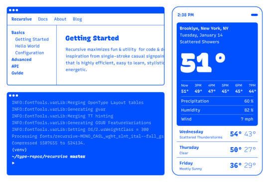
Recursive is made for code, websites, apps, and more.

Recursive Mono has both Linear and Casual styles for different “voices” in code, along with cursive italics if you want them — plus a wider weight range for monospaced display typography.
Recursive Sans is proportional, but unlike most proportional fonts, letters maintain the same width across styles for more flexibility in UI interactions and layout.
I started Recursive as a thesis project for a type design masters program at KABK TypeMedia, and when I launched my type foundry, Arrow Type, I was subsequently commissioned by Google Fonts to finish and release Recursive as an open-source, OFL font.
You can see Recursive and learn more about it what it can do at recursive.design.
Recursive is made to be a flexible type family for both websites and code, where its main purpose is to give developers and designers some fun & useful type to play with, combining fresh aesthetics with the latest in font tech.
First, a necessary definition: variable fonts are font files that fit a range of styles inside one file, usually in a way that allows the font user to select a style from a fluid range of styles. These stylistic ranges are called variable axes, and can be parameters, like font weight, font width, optical size, font slant, or more creative things. In the case of Recursive, you can control the “Monospacedness” (from Mono to Sans) and “Casualness” (between a normal, linear style and a brushy, casual style). Each type family may have one or more of its own axes and, like many features of type, variable axes are another design consideration for font designers.
You may have seen that Google Fonts has started adding variable fonts to its vast collection. You may have read about some of the awesome things variable fonts can do. But, you may not realize that many of the variable fonts coming to Google Fonts (including Recursive) have a lot more stylistic range than you can get from the default Google Fonts front end.
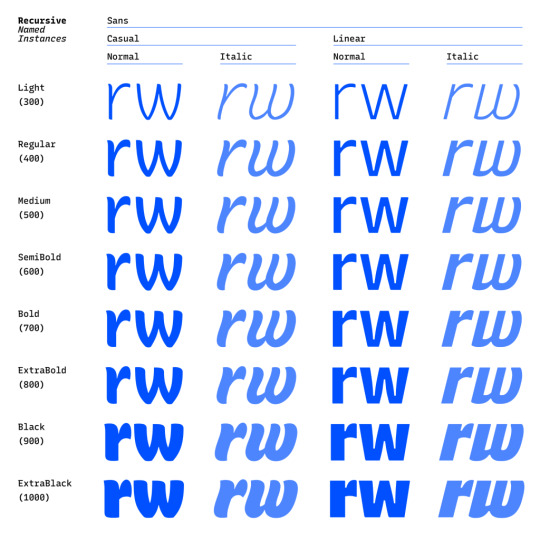
Because Google Fonts has a huge range of users — many of them new to web development — it is understandable that they’re keeping things simple by only showing the “weight” axis for variable fonts. But, for fonts like Recursive, this simplification actually leaves out a bunch of options. On the Recursive page, Google Fonts shows visitors eight styles, plus one axis. However, Recursive actually has 64 preset styles (also called named instances), and a total of five variable axes you can adjust (which account for a slew of more potential custom styles).
Recursive can be divided into what I think of as one of four “subfamilies.” The part shown by Google Fonts is the simplest, proportional (sans-serif) version. The four Recursive subfamilies each have a range of weights, plus Italics, and can be categorized as:
Sans Linear: A proportional, “normal”-looking sans-serif font. This is what gets shown on the Google Fonts website.
Sans Casual: A proportional “brush casual” font
Mono Linear: A monospace “normal” font
Mono Casual: A monospace “brush casual” font
This is probably better to visualize than to describe in words. Here are two tables (one for Sans, the other for Mono) showing the 64 named instances:

But again, the main Google Fonts interface only provides access to eight of those styles, plus the Weight axis:
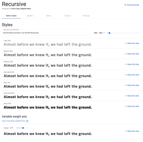
Recursive has 64 preset styles — and many more using when using custom axis settings — but Google Fonts only shows eight of the preset styles, and just the Weight axis of the five available variable axes.
Not many variable fonts today have more than a Weight axis, so this is an understandable UX choice in some sense. Still, I hope they add a little more flexibility in the future. As a font designer & type fan, seeing the current weight-only approach feels more like an artificial flattening than true simplification — sort of like if Google Maps were to “simplify” maps by excluding every road that wasn’t a highway.
Luckily, you can still access the full potential of variable fonts hosted by Google Fonts: meet the Google Fonts CSS API, version 2. Let’s take a look at how you can use this to get more out of Recursive.
But first, it is helpful to know a few things about how variable fonts work.
How variable fonts work, and why it matters
If you’ve ever worked with photos on the web then you know that you should never serve a 9,000-pixel JPEG file when a smaller version will do. Usually, you can shrink a photo down using compression to save bandwidth when users download it.
There are similar considerations for font files. You can often reduce the size of a font dramatically by subsetting the characters included in it (a bit like cropping pixels to just leave the area you need). You can further compress the file by converting it into a WOFF2 file (which is a bit like running a raster image file though an optimizer tool like imageOptim). Vendors that host fonts, like Google Fonts, will often do these things for you automatically.
Now, think of a video file. If you only need to show the first 10 seconds of a 60-second video, you could trim the last 50 seconds to have a much small video file.
Variable fonts are a bit like video files: they have one or more ranges of information (variable axes), and those can often either be trimmed down or “pinned” to a certain location, which helps to reduce file size.
Of course, variable fonts are nothing like video files. Fonts record each letter shape in vectors, (similar to SVGs store shape information). Variable fonts have multiple “source locations” which are like keyframes in an animation. To go between styles, the control points that make up letters are mathematically interpolated between their different source locations (also called deltas). A font may have many sets of deltas (at least one per variable axis, but sometimes more). To trim a variable font, then, you must trim out unneeded deltas.
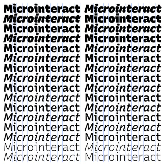
As a specific example, the Casual axis in Recursive takes letterforms from “Linear” to “Casual” by interpolating vector control points between two extremes: basically, a normal drawing and a brushy drawing. The ampersand glyph animation below shows the mechanics in action: control points draw rounded corners at one extreme and shift to squared corners on the other end.
Generally, each added axis doubles the number of drawings that must exist to make a variable font work. Sometimes the number is more or less – Recursive’s Weight axis requires 3 locations (tripling the number of drawings), while its Cursive axis doesn’t require extra locations at all, but actually just activates different alternate glyphs that already exist at each location. But, the general math is: if you only use opt into fewer axes of a variable font, you will usually get a smaller file.
When using the Google Fonts API, you are actually opting into each axis. This way, instead of starting with a big file and whittling it down, you get to pick and choose the parts you want.
Variable axis tags
If you’re going to use the Google Fonts API, you first need to know about font axes abbreviations so you can use them yourself.
Variable font axes have abbreviations in the form of four-letter “tags.” These are lowercase for industry-standard axes and uppercase for axes invented by individual type designers (also called “custom” or “private” axes).
There are currently five standard axes a font can include:
wght – Weight, to control lightness and boldness
wdth – Width, to control overall letter width
opsz – Optical Size, to control adjustments to design for better readability at various sizes
ital – Italic, generally to switch between separate upright/italic designs
slnt – Slant, generally to control upright-to-slanted designs with intermediate values available
Custom axes can be almost anything. Recursive includes three of them — Monospace (MONO), Casual (CASL), and Cursive (CRSV) — plus two standard axes, wght and slnt.
Google Fonts API basics
When you configure a font embed from the Google Fonts interface, it gives you a bit of HTML or CSS which includes a URL, and this ultimately calls in a CSS document that includes one or more @font-face rules. This includes things like font names as well as links to font files on Google servers.
This URL is actually a way of calling the Google Fonts API, and has a lot more power than you might realize. It has a few basic parts:
The main URL, specifying the API (https://fonts.googleapis.com/css2)
Details about the fonts you are requesting in one or more family parameters
A font-display property setting in a display parameter
As an example, let’s say we want the regular weight of Recursive (in the Sans Linear subfamily). Here’s the URL we would use with our CSS @import:
@import url('https://fonts.googleapis.com/css2?family=Recursive&display=swap');
Or we can link it up in the <head> of our HTML:
<link href="https://fonts.googleapis.com/css2?family=Recursive&display=swap" rel="stylesheet">
Once that’s in place, we can start applying the font in CSS:
body { font-family: 'Recursive', sans-serif; }
There is a default value for each axis:
MONO 0 (Sans/proportional)
CASL 0 (Linear/normal)
wght 400 (Regular)
slnt 0 (upright)
CRSV 0 (Roman/non-cursive lowercase)
Choose your adventure: styles or axes
The Google Fonts API gives you two ways to request portions of variable fonts:
Listing axes and the specific non-default values you want from them
Listing axes and the ranges you want from them
Getting specific font styles
Font styles are requested by adding parameters to the Google Fonts URL. To keep the defaults on all axes but use get a Casual style, you could make the query Recursive:CASL@1 (this will serve Recursive Sans Casual Regular). To make that Recursive Mono Casual Regular, specify two axes before the @ and then their respective values (but remember, custom axes have uppercase tags):
https://fonts.googleapis.com/css2?family=Recursive:CASL,MONO@1,1&display=swap
To request both Regular and Bold, you would simply update the family call to Recursive:wght@400;700, adding the wght axis and specific values on it:
https://fonts.googleapis.com/css2?family=Recursive:wght@400;700&display=swap
A very helpful thing about Google Fonts is that you can request a bunch of individual styles from the API, and wherever possible, it will actually serve variable fonts that cover all of those requested styles, rather than separate font files for each style. This is true even when you are requesting specific locations, rather than variable axis ranges — if they can serve a smaller font file for your API request, they probably will.
As variable fonts can be trimmed more flexibility and efficiently in the future, the files served for given API requests will likely get smarter over time. So, for production sites, it may be best to request exactly the styles you need.
Where it gets interesting, however, is that you can also request variable axes. That allows you to retain a lot of design flexibility without changing your font requests every time you want to use a new style.
Getting a full variable font with the Google Fonts API
The Google Fonts API seeks to make fonts smaller by having users opt into only the styles and axes they want. But, to get the full benefits of variable fonts (more design flexibility in fewer files), you should use one or more axes. So, instead of requesting single styles with Recursive:wght@400;700, you can instead request that full range with Recursive:[email protected] (changing from the ; to .. to indicate a range), or even extending to the full Recursive weight range with Recursive:[email protected] (which adds very little file size, but a whole lot of extra design oomph).
You can add additional axes by listing them alphabetically (with lowercase standard axes first, then uppercase custom axes) before the @, then specifying their values or ranges after that in the same order. For instance, to add the MONO axis and the wght axis, you could use Recursive:wght,[email protected],0..1 as the font query.
Or, to get the full variable font, you could use the following URL:
https://fonts.googleapis.com/css2?family=Recursive:slnt,wght,CASL,CRSV,[email protected],300..1000,0..1,0..1,0..1&display=swap
Of course, you still need to put that into an HTML link, like this:
<link href="https://fonts.googleapis.com/css2?family=Recursive:slnt,wght,CASL,CRSV,[email protected],300..1000,0..1,0..1,0..1&display=swap" rel="stylesheet">
Customizing it further to balance flexibility and filesize
While it can be tempting to use every single axis of a variable font, it’s worth remembering that each additional axis adds to the overall files ize. So, if you really don’t expect to use an axis, it makes sense to leave it off. You can always add it later.
Let’s say you want Recursive’s Mono Casual styles in a range of weights,. You could use Recursive:wght,CASL,[email protected],1,1 like this:
<link href="https://fonts.googleapis.com/css2?family=Recursive:CASL,MONO,wght@1,1,300..1000&display=swap" rel="stylesheet">
You can, of course, add multiple font families to an API call with additional family parameters. Just be sure that the fonts are alphabetized by family name.
<link href="https://fonts.googleapis.com/css2?family=Inter:slnt,[email protected],100..900?family=Recursive:CASL,MONO,wght@1,1,300..1000&display=swap" rel="stylesheet">
Using variable fonts
The standard axes can all be controlled with existing CSS properties. For instance, if you have a variable font with a weight range, you can specify a specific weight with font-weight: 425;. A specific Slant can be requested with font-style: oblique 9deg;. All axes can be controlled with font-variation-settings. So, if you want a Mono Casual very-heavy style of Recursive (assuming you have called the full family as shown above), you could use the following CSS:
body { font-weight: 950; font-variation-settings: 'MONO' 1, 'CASL' 1; }
Something good to know: font-variation-settings is much nicer to use along with CSS custom properties.
Another useful thing to know is that, while you should be able to activate slant with font-style: italic; or font-style: oblique Xdeg;, browser support for this is inconsistent (at least at the time of this writing), so it is useful to utilize font-variation-settings for the Slant axis, as well.
You can read more specifics about designing with variable fonts at VariableFonts.io and in the excellent collection of CSS-Tricks articles on variable fonts.
Nerdy notes on the performance of variable fonts
If you were to using all 64 preset styles of Recursive as separate WOFF2 files (with their full, non-subset character set), it would be total of about 6.4 MB. By contrast, you could have that much stylistic range (and everything in between) at just 537 KB. Of course, that is a slightly absurd comparison — you would almost never actually use 64 styles on a single web page, especially not with their full character sets (and if you do, you should use subsets and unicode-range).
A better comparison is Recursive with one axis range versus styles within that axis range. In my testing, a Recursive WOFF2 file that’s subset to the “Google Fonts Latin Basic” character set (including only characters to cover English and western European languages), including the full 300–1000 Weight range (and all other axes “pinned” to their default values) is 60 KB. Meanwhile, a single style with the same subset is 25 KB. So, if you use just three weights of Recursive, you can save about 15 KB by using the variable font instead of individual files.
The full variable font as a subset WOFF2 clocks in at 281 KB which is kind of a lot for a font, but not so much if you compare it to the weight of a big JPEG image. So, if you assume that individual styles are about 25 KB, if you plan to use more than 11 styles, you would be better off using the variable font.
This kind of math is mostly an academic exercise for two big reasons:
Variable fonts aren’t just about file size.The much bigger advantage is that they allow you to just design, picking the exact font weights (or other styles) that you want. Is a font looking a little too light? Bump up the font-weight a bit, say from 400 to 425!
More importantly (as explained earlier), if you request variable font styles or axes from Google Fonts, they take care of the heavy lifting for you, sending whatever fonts they deem the most performant and useful based on your API request and the browsers visitors access your site from.
So, you don’t really need to go downloading fonts that the Google Fonts API returns to compare their file sizes. Still, it’s worth understanding the general tradeoffs so you can best decide when to opt into the variable axes and when to limit yourself to a couple of styles.
What’s next?
Fire up CodePen and give the API a try! For CodePen, you will probably want to use the CSS @import syntax, like this in the CSS panel:
@import url('https://fonts.googleapis.com/css2?family=Recursive:CASL,CRSV,MONO,slnt,[email protected],0..1,0..1,-15..0,300..1000&display=swap');
It is apparently better to use the HTML link syntax to avoid blocking parallel downloads of other resources. In CodePen, you’d crack open the Pen settings, select HTML, then drop the <link> in the HTML head settings.

Or, hey, you can just fork my CodePen and experiment there:
CodePen Embed Fallback
Take an API configuration shortcut
If you are want to skip the complexity of figuring out exact API calls and looking to opt into variable axes of Recursive and make semi-advanced API calls, I have put together a simple configuration tool on the Recursive minisite (click the “Get Recursive” button). This allows you to quickly select pinned styles or variable ranges that you want to use, and even gives estimates for the resulting file size. But, this only exposes some of the API’s functionality, and you can get more specific if you want. It’s my attempt to get people using the most stylistic range in the smallest files, taking into account the current limitations of variable font instancing.
Use Recursive for code
Also, Recursive is actually designed first as a font to use for code. You can use it on CodePen via your account settings. Better yet, you can download and use the latest Recursive release from GitHub and set it up in any code editor.
Explore more fonts!
The Google Fonts API doc helpfully includes a (partial) list of variable fonts along with details on their available axis ranges. Some of my favorites with axes beyond just Weight are Crimson Pro (ital, wght), Work Sans (ital, wght), Encode Sans (wdth, wght), and Inter (slnt, wght). You can also filter Google Fonts to show only variable fonts, though most of these results have only a Weight axis (still cool and useful, but don’t need custom URL configuration).
Some more amazing variable fonts are coming to Google Fonts. Some that I am especially looking forward to are:
Fraunces: “A display, “Old Style” soft-serif typeface inspired by the mannerisms of early 20th century typefaces such as Windsor, Souvenir, and the Cooper Series”
Roboto Flex: Like Roboto, but withan extensive ranges of Weight, Width, and Optical Size
Crispy: A creative, angular, super-flexible variable display font
Science Gothic: A squarish sans “based closely on Bank Gothic, a typeface from the early 1930s—but a lowercase, design axes, and language coverage have been added”
And yes, you can absolutely download and self-host these fonts if you want to use them on projects today. But stay tuned to Google Fonts for more awesomely-flexible typefaces to come!
Of course, the world of type is much bigger than open-source fonts. There are a bunch of incredible type foundries working on exciting, boundary-pushing fonts, and many of them are also exploring new & exciting territory in variable fonts. Many tend to take other approaches to licensing, but for the right project, a good typeface can be an extremely good value (I’m obviously biased, but for a simple argument, just look at how much typography strengthens brands like Apple, Stripe, Google, IBM, Figma, Slack, and so many more). If you want to feast your eyes on more possibilities and you don’t already know these names, definitely check out DJR, OHno, Grilli, XYZ, Dinamo, Typotheque, Underware, Bold Monday, and the many very-fun WIP projects on Future Fonts. (I’ve left out a bunch of other amazing foundries, but each of these has done stuff I particularly love, and this isn’t a directory of type foundries.)
Finally, some shameless plugs for myself: if you’d like to support me and my work beyond Recursive, please consider checking out my WIP versatile sans-serif Name Sans, signing up for my (very) infrequent newsletter, and giving me a follow on Instagram.
The post Getting the Most Out of Variable Fonts on Google Fonts appeared first on CSS-Tricks.
You can support CSS-Tricks by being an MVP Supporter.
Getting the Most Out of Variable Fonts on Google Fonts published first on https://deskbysnafu.tumblr.com/
0 notes
Text
Getting the Most Out of Variable Fonts on Google Fonts
I have spent the past several years working (alongside a bunch of super talented people) on a font family called Recursive Sans & Mono, and it just launched officially on Google Fonts!
Wanna try it out super fast? Here’s the embed code to use the full Recursive variable font family from Google Fonts (but you will get a lot more flexibility & performance if you read further!)
<link href="https://fonts.googleapis.com/css2?family=Recursive:slnt,wght,CASL,CRSV,[email protected],300..1000,0..1,0..1,0..1&display=swap" rel="stylesheet">

Recursive is made for code, websites, apps, and more.
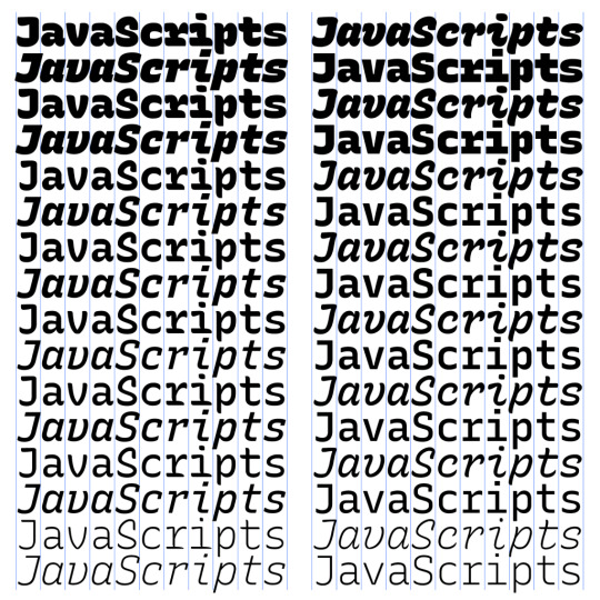
Recursive Mono has both Linear and Casual styles for different “voices” in code, along with cursive italics if you want them — plus a wider weight range for monospaced display typography.

Recursive Sans is proportional, but unlike most proportional fonts, letters maintain the same width across styles for more flexibility in UI interactions and layout.
I started Recursive as a thesis project for a type design masters program at KABK TypeMedia, and when I launched my type foundry, Arrow Type, I was subsequently commissioned by Google Fonts to finish and release Recursive as an open-source, OFL font.
You can see Recursive and learn more about it what it can do at recursive.design.
Recursive is made to be a flexible type family for both websites and code, where its main purpose is to give developers and designers some fun & useful type to play with, combining fresh aesthetics with the latest in font tech.
First, a necessary definition: variable fonts are font files that fit a range of styles inside one file, usually in a way that allows the font user to select a style from a fluid range of styles. These stylistic ranges are called variable axes, and can be parameters, like font weight, font width, optical size, font slant, or more creative things. In the case of Recursive, you can control the “Monospacedness” (from Mono to Sans) and “Casualness” (between a normal, linear style and a brushy, casual style). Each type family may have one or more of its own axes and, like many features of type, variable axes are another design consideration for font designers.
You may have seen that Google Fonts has started adding variable fonts to its vast collection. You may have read about some of the awesome things variable fonts can do. But, you may not realize that many of the variable fonts coming to Google Fonts (including Recursive) have a lot more stylistic range than you can get from the default Google Fonts front end.
Because Google Fonts has a huge range of users — many of them new to web development — it is understandable that they’re keeping things simple by only showing the “weight” axis for variable fonts. But, for fonts like Recursive, this simplification actually leaves out a bunch of options. On the Recursive page, Google Fonts shows visitors eight styles, plus one axis. However, Recursive actually has 64 preset styles (also called named instances), and a total of five variable axes you can adjust (which account for a slew of more potential custom styles).
Recursive can be divided into what I think of as one of four “subfamilies.” The part shown by Google Fonts is the simplest, proportional (sans-serif) version. The four Recursive subfamilies each have a range of weights, plus Italics, and can be categorized as:
Sans Linear: A proportional, “normal”-looking sans-serif font. This is what gets shown on the Google Fonts website.
Sans Casual: A proportional “brush casual” font
Mono Linear: A monospace “normal” font
Mono Casual: A monospace “brush casual” font
This is probably better to visualize than to describe in words. Here are two tables (one for Sans, the other for Mono) showing the 64 named instances:

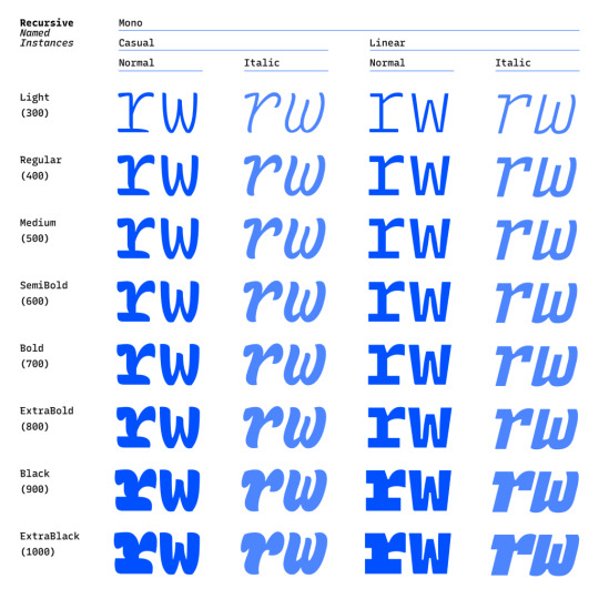
But again, the main Google Fonts interface only provides access to eight of those styles, plus the Weight axis:

Recursive has 64 preset styles — and many more using when using custom axis settings — but Google Fonts only shows eight of the preset styles, and just the Weight axis of the five available variable axes.
Not many variable fonts today have more than a Weight axis, so this is an understandable UX choice in some sense. Still, I hope they add a little more flexibility in the future. As a font designer & type fan, seeing the current weight-only approach feels more like an artificial flattening than true simplification — sort of like if Google Maps were to “simplify” maps by excluding every road that wasn’t a highway.
Luckily, you can still access the full potential of variable fonts hosted by Google Fonts: meet the Google Fonts CSS API, version 2. Let’s take a look at how you can use this to get more out of Recursive.
But first, it is helpful to know a few things about how variable fonts work.
How variable fonts work, and why it matters
If you’ve ever worked with photos on the web then you know that you should never serve a 9,000-pixel JPEG file when a smaller version will do. Usually, you can shrink a photo down using compression to save bandwidth when users download it.
There are similar considerations for font files. You can often reduce the size of a font dramatically by subsetting the characters included in it (a bit like cropping pixels to just leave the area you need). You can further compress the file by converting it into a WOFF2 file (which is a bit like running a raster image file though an optimizer tool like imageOptim). Vendors that host fonts, like Google Fonts, will often do these things for you automatically.
Now, think of a video file. If you only need to show the first 10 seconds of a 60-second video, you could trim the last 50 seconds to have a much small video file.
Variable fonts are a bit like video files: they have one or more ranges of information (variable axes), and those can often either be trimmed down or “pinned” to a certain location, which helps to reduce file size.
Of course, variable fonts are nothing like video files. Fonts record each letter shape in vectors, (similar to SVGs store shape information). Variable fonts have multiple “source locations” which are like keyframes in an animation. To go between styles, the control points that make up letters are mathematically interpolated between their different source locations (also called deltas). A font may have many sets of deltas (at least one per variable axis, but sometimes more). To trim a variable font, then, you must trim out unneeded deltas.
As a specific example, the Casual axis in Recursive takes letterforms from “Linear” to “Casual” by interpolating vector control points between two extremes: basically, a normal drawing and a brushy drawing. The ampersand glyph animation below shows the mechanics in action: control points draw rounded corners at one extreme and shift to squared corners on the other end.
Generally, each added axis doubles the number of drawings that must exist to make a variable font work. Sometimes the number is more or less – Recursive’s Weight axis requires 3 locations (tripling the number of drawings), while its Cursive axis doesn’t require extra locations at all, but actually just activates different alternate glyphs that already exist at each location. But, the general math is: if you only use opt into fewer axes of a variable font, you will usually get a smaller file.
When using the Google Fonts API, you are actually opting into each axis. This way, instead of starting with a big file and whittling it down, you get to pick and choose the parts you want.
Variable axis tags
If you’re going to use the Google Fonts API, you first need to know about font axes abbreviations so you can use them yourself.
Variable font axes have abbreviations in the form of four-letter “tags.” These are lowercase for industry-standard axes and uppercase for axes invented by individual type designers (also called “custom” or “private” axes).
There are currently five standard axes a font can include:
wght – Weight, to control lightness and boldness
wdth – Width, to control overall letter width
opsz – Optical Size, to control adjustments to design for better readability at various sizes
ital – Italic, generally to switch between separate upright/italic designs
slnt – Slant, generally to control upright-to-slanted designs with intermediate values available
Custom axes can be almost anything. Recursive includes three of them — Monospace (MONO), Casual (CASL), and Cursive (CRSV) — plus two standard axes, wght and slnt.
Google Fonts API basics
When you configure a font embed from the Google Fonts interface, it gives you a bit of HTML or CSS which includes a URL, and this ultimately calls in a CSS document that includes one or more @font-face rules. This includes things like font names as well as links to font files on Google servers.
This URL is actually a way of calling the Google Fonts API, and has a lot more power than you might realize. It has a few basic parts:
The main URL, specifying the API (https://fonts.googleapis.com/css2)
Details about the fonts you are requesting in one or more family parameters
A font-display property setting in a display parameter
As an example, let’s say we want the regular weight of Recursive (in the Sans Linear subfamily). Here’s the URL we would use with our CSS @import:
@import url('https://fonts.googleapis.com/css2?family=Recursive&display=swap');
Or we can link it up in the <head> of our HTML:
<link href="https://fonts.googleapis.com/css2?family=Recursive&display=swap" rel="stylesheet">
Once that’s in place, we can start applying the font in CSS:
body { font-family: 'Recursive', sans-serif; }
There is a default value for each axis:
MONO 0 (Sans/proportional)
CASL 0 (Linear/normal)
wght 400 (Regular)
slnt 0 (upright)
CRSV 0 (Roman/non-cursive lowercase)
Choose your adventure: styles or axes
The Google Fonts API gives you two ways to request portions of variable fonts:
Listing axes and the specific non-default values you want from them
listing axes and the ranges you want from them
Getting specific font styles
Font styles are requested by adding parameters to the Google Fonts URL. To keep the defaults on all axes but use get a Casual style, you could make the query Recursive:CASL@1 (this will serve Recursive Sans Casual Regular). To make that Recursive Mono Casual Regular, specify two axes before the @ and then their respective values (but remember, custom axes have uppercase tags):
https://fonts.googleapis.com/css2?family=Recursive:CASL,MONO@1,1&display=swap
To request both Regular and Bold, you would simply update the family call to Recursive:wght@400;700, adding the wght axis and specific values on it:
https://fonts.googleapis.com/css2?family=Recursive:wght@400;700&display=swap
A very helpful thing about Google Fonts is that you can request a bunch of individual styles from the API, and wherever possible, it will actually serve variable fonts that cover all of those requested styles, rather than separate font files for each style. This is true even when you are requesting specific locations, rather than variable axis ranges — if they can serve a smaller font file for your API request, they probably will.
As variable fonts can be trimmed more flexibility and efficiently in the future, the files served for given API requests will likely get smarter over time. So, for production sites, it may be best to request exactly the styles you need.
Where it gets interesting, however, is that you can also request variable axes. That allows you to retain a lot of design flexibility without changing your font requests every time you want to use a new style.
Getting a full variable font with the Google Fonts API
The Google Fonts API seeks to make fonts smaller by having users opt into only the styles and axes they want. But, to get the full benefits of variable fonts (more design flexibility in fewer files), you should use one or more axes. So, instead of requesting single styles with Recursive:wght@400;700, you can instead request that full range with Recursive:[email protected] (changing from the ; to .. to indicate a range), or even extending to the full Recursive weight range with Recursive:[email protected] (which adds very little file size, but a whole lot of extra design oomph).
You can add additional axes by listing them alphabetically (with lowercase standard axes first, then uppercase custom axes) before the @, then specifying their values or ranges after that in the same order. For instance, to add the MONO axis and the wght axis, you could use Recursive:wght,[email protected],0..1 as the font query.
Or, to get the full variable font, you could use the following URL:
https://fonts.googleapis.com/css2?family=Recursive:slnt,wght,CASL,CRSV,[email protected],300..1000,0..1,0..1,0..1&display=swap
Of course, you still need to put that into an HTML link, like this:
<link href="https://fonts.googleapis.com/css2?family=Recursive:slnt,wght,CASL,CRSV,[email protected],300..1000,0..1,0..1,0..1&display=swap" rel="stylesheet">
Customizing it further to balance flexibility and filesize
While it can be tempting to use every single axis of a variable font, it’s worth remembering that each additional axis adds to the overall files ize. So, if you really don’t expect to use an axis, it makes sense to leave it off. You can always add it later.
Let’s say you want Recursive’s Mono Casual styles in a range of weights,. You could use Recursive:wght,CASL,[email protected],1,1 like this:
<link href="https://fonts.googleapis.com/css2?family=Recursive:CASL,MONO,wght@1,1,300..1000&display=swap" rel="stylesheet">
You can, of course, add multiple font families to an API call with additional family parameters. Just be sure that the fonts are alphabetized by family name.
<link href="https://fonts.googleapis.com/css2?family=Inter:slnt,[email protected],100..900?family=Recursive:CASL,MONO,wght@1,1,300..1000&display=swap" rel="stylesheet">
Using variable fonts
The standard axes can all be controlled with existing CSS properties. For instance, if you have a variable font with a weight range, you can specify a specific weight with font-weight: 425;. A specific Slant can be requested with font-style: oblique 9deg;. All axes can be controlled with font-variation-settings. So, if you want a Mono Casual very-heavy style of Recursive (assuming you have called the full family as shown above), you could use the following CSS:
body { font-weight: 950; font-variation-settings: 'MONO' 1, 'CASL' 1; }
Something good to know: font-variation-settings is much nicer to use along with CSS custom properties.
Another useful thing to know is that, while you should be able to activate slant with font-style: italic; or font-style: oblique Xdeg;, browser support for this is inconsistent (at least at the time of this writing), so it is useful to utilize font-variation-settings for the Slant axis, as well.
You can read more specifics about designing with variable fonts at VariableFonts.io and in the excellent collection of CSS-Tricks articles on variable fonts.
Nerdy notes on the performance of variable fonts
If you were to using all 64 preset styles of Recursive as separate WOFF2 files (with their full, non-subset character set), it would be total of about 6.4 MB. By contrast, you could have that much stylistic range (and everything in between) at just 537 KB. Of course, that is a slightly absurd comparison — you would almost never actually use 64 styles on a single web page, especially not with their full character sets (and if you do, you should use subsets and unicode-range).
A better comparison is Recursive with one axis range versus styles within that axis range. In my testing, a Recursive WOFF2 file that’s subset to the “Google Fonts Latin Basic” character set (including only characters to cover English and western European languages), including the full 300–1000 Weight range (and all other axes “pinned” to their default values) is 60 KB. Meanwhile, a single style with the same subset is 25 KB. So, if you use just three weights of Recursive, you can save about 15 KB by using the variable font instead of individual files.
The full variable font as a subset WOFF2 clocks in at 281 KB which is kind of a lot for a font, but not so much if you compare it to the weight of a big JPEG image. So, if you assume that individual styles are about 25 KB, if you plan to use more than 11 styles, you would be better off using the variable font.
This kind of math is mostly an academic exercise for two big reasons:
Variable fonts aren’t just about file size.The much bigger advantage is that they allow you to just design, picking the exact font weights (or other styles) that you want. Is a font looking a little too light? Bump up the font-weight a bit, say from 400 to 425!
More importantly (as explained earlier), if you request variable font styles or axes from Google Fonts, they take care of the heavy lifting for you, sending whatever fonts they deem the most performant and useful based on your API request and the browsers visitors access your site from.
So, you don’t really need to go downloading fonts that the Google Fonts API returns to compare their file sizes. Still, it’s worth understanding the general tradeoffs so you can best decide when to opt into the variable axes and when to limit yourself to a couple of styles.
What’s next?
Fire up CodePen and give the API a try! For CodePen, you will probably want to use the CSS @import syntax, like this in the CSS panel:
@import url('https://fonts.googleapis.com/css2?family=Recursive:CASL,CRSV,MONO,slnt,[email protected],0..1,0..1,-15..0,300..1000&display=swap');
It is apparently better to use the HTML link syntax to avoid blocking parallel downloads of other resources. In CodePen, you’d crack open the Pen settings, select HTML, then drop the <link> in the HTML head settings.

Or, hey, you can just fork my CodePen and experiment there:
CodePen Embed Fallback
Take an API configuration shortcut
If you are want to skip the complexity of figuring out exact API calls and looking to opt into variable axes of Recursive and make semi-advanced API calls, I have put together a simple configuration tool on the Recursive minisite (click the “Get Recursive” button). This allows you to quickly select pinned styles or variable ranges that you want to use, and even gives estimates for the resulting file size. But, this only exposes some of the API’s functionality, and you can get more specific if you want. It’s my attempt to get people using the most stylistic range in the smallest files, taking into account the current limitations of variable font instancing.
Use Recursive for code
Also, Recursive is actually designed first as a font to use for code. You can use it on CodePen via your account settings. Better yet, you can download and use the latest Recursive release from GitHub and set it up in any code editor.
Explore more fonts!
The Google Fonts API doc helpfully includes a (partial) list of variable fonts along with details on their available axis ranges. Some of my favorites with axes beyond just Weight are Crimson Pro (ital, wght), Work Sans (ital, wght), Encode Sans (wdth, wght), and Inter (slnt, wght). You can also filter Google Fonts to show only variable fonts, though most of these results have only a Weight axis (still cool and useful, but don’t need custom URL configuration).
Some more amazing variable fonts are coming to Google Fonts. Some that I am especially looking forward to are:
Fraunces: “A display, “Old Style” soft-serif typeface inspired by the mannerisms of early 20th century typefaces such as Windsor, Souvenir, and the Cooper Series”
Roboto Flex: Like Roboto, but withan extensive ranges of Weight, Width, and Optical Size
Crispy: A creative, angular, super-flexible variable display font
Science Gothic: A squarish sans “based closely on Bank Gothic, a typeface from the early 1930s—but a lowercase, design axes, and language coverage have been added”
And yes, you can absolutely download and self-host these fonts if you want to use them on projects today. But stay tuned to Google Fonts for more awesomely-flexible typefaces to come!
Of course, the world of type is much bigger than open-source fonts. There are a bunch of incredible type foundries working on exciting, boundary-pushing fonts, and many of them are also exploring new & exciting territory in variable fonts. Many tend to take other approaches to licensing, but for the right project, a good typeface can be an extremely good value (I’m obviously biased, but for a simple argument, just look at how much typography strengthens brands like Apple, Stripe, Google, IBM, Figma, Slack, and so many more). If you want to feast your eyes on more possibilities and you don’t already know these names, definitely check out DJR, OHno, Grilli, XYZ, Dinamo, Typotheque, Underware, Bold Monday, and the many very-fun WIP projects on Future Fonts. (I’ve left out a bunch of other amazing foundries, but each of these has done stuff I particularly love, and this isn’t a directory of type foundries.)
Finally, some shameless plugs for myself: if you’d like to support me and my work beyond Recursive, please consider checking out my WIP versatile sans-serif Name Sans, signing up for my (very) infrequent newsletter, and giving me a follow on Instagram.
The post Getting the Most Out of Variable Fonts on Google Fonts appeared first on CSS-Tricks.
You can support CSS-Tricks by being an MVP Supporter.
via CSS-Tricks https://ift.tt/30djpnF
0 notes
Text
Martin Puryear Bears Witness (Hyperallergic)

According to the wall text in the not-to-be-missed exhibition Martin Puryear: Multiple Dimensions at the Morgan Library & Museum (October 9, 2015–January 10, 2016), the artist was in “the Peace Corp in Sierra Leone, West Africa” from 1964 to ’66. While there, “he [taught] English, French and Biology, as well as “[learned] traditional craftsmanship from local carpenters.” In 1966-68, Puryear was “enrolled in the printmaking program at the Royal Swedish Academy of Art” in Stockholm.
I mention these biographical facts for a number of reasons. First, Puryear was in West Africa and Sweden during the latter half of the 1960s, a period in which America got further mired in the Vietnam War, as well as witnessed race riots and the assassinations of Malcolm X, Martin Luther King and Robert Kennedy. It was in 1965, shortly after Malcolm X’s assassination, that LeRoi Jones started the Black Arts Movement, specifically the Black Arts Repertory Theater, in Harlem. The Black Arts Movement advanced the view that a Black poet’s primary task is to produce an emotional, lyric testimony of a personal experience that can be regarded as representative of Black culture—the “I” speaking for the “we.” Ethnic writers and artists have to become witnesses who lay out the evidence.
Second, rather than bring a camera to Sierra Leone, Puryear decided to make drawings and woodcuts as a record of his experience. While it was easier to take a picture, he wanted to document his engagement with a particular subject, whether it was a person, a hut, a beetle or a cactus, all of which became subjects of his drawings and woodcuts. One sees in these early works the seeds of his preoccupation with certain processes, materials, and forms. I am thinking of his woodcut of a boy hauling wood, a pen and black ink drawing of a thatched hut and a graphite drawing of “Gbago”, a man wearing a hat that anticipates the artist’s interest in the Phrygian cap, or ‘liberty cap,’ which was the inspiration for some of his recent sculptures. Again, the wall text is instructive, as it quotes Puryear as saying that his development is “linear in the sense that a spiral is linear. I come back to similar territory at different times.” In 1966, he would make a drypoint etching, “Gbago,” based on his earlier drawing, with particular attention paid to the hat.
Third, during his time in Sweden, Puryear made the etching “Quadroon” (1966–67). The title is a loaded term historically used to define individuals of mixed race ancestry, specifically someone who is one-quarter African. In using this title to inflect an abstract circular form made of four sections, he opened it up to a history that includes slavery and official categories imposed by the dominant society to define who is subordinate and why. What Puryear recognizes in “Quadroon” is that everything — including color — has a history, which the dominant group in a society may choose to suppress or marginalize when it is convenient to do so.
As I see it, “Quadroon” marks a crucial transition in Puryear’s development. He has moved away from the figural, anecdotal records and studies he made in West Africa, and he has begun to infuse an abstract form with the history of categorization, without shying away from the official terms designed to limit an individual’s possibilities. Moreover, the print reveals Puryear’s sensitivity to color (skin tones), and the meaning it might embody. It is also in this early etching that one senses why he would reject Minimalism’s ideal of making pure, non-referential objects. The idea that a work need only to have presence — and, as Donald Judd states “only needs to be interesting” — denies history.
This is how Puryear described his response to Minimalism (and, by implication, Frank Stella’s credo: “What you see is what you see.”):
I looked at it, I tasted it, and I spat it out.
Puryear’s response is visceral rather than intellectual, and most likely refers to the time he was a student in the Yale MFA Program (1969–71), where the visiting artists included Richard Serra and Robert Morris. As the title “Quadroon” suggests, he had by this time recognized that he could not assimilate into society or, in the context of the art world, the dominant mode of production. His choices at this stage were significant because in some deep way he would never fit in, never become part of the establishment. The point is to remain true to that understanding of difference no matter what the consequence, something that Puryear has done admirably.
At the same time, Puryear’s early experience in West Africa and Sweden gave him access to a very different understanding of race, history and craft. It seems to me that his experience in the Peace Corps, working in a society that was predominantly black, with a history that was very different than the one he experienced in Washington, DC, where he was born and raised, has exerted a strong influence on his entire approach to art making. Abstraction, and his understanding that traditional craftsmanship, such as he learned in Sierra Leone, embodied a rich cultural history, enabled him to move away from the paradigm of the “I” speaking for the “We” without forgetting his personal experience.
If one aspect of modernist art, beginning with Paul Gauguin and Pablo Picasso, is about appropriating from so-called “primitive” cultures, Puryear seems bent on recovering that which was taken or supposedly lost. More importantly, it is wrong to see Puryear’s work as a reaction to Minimalism, or as an anomaly, or as a throwback to the age of craftsmanship. There is a commonly accepted narrative that stresses sculpture’s abandonment of craftsmanship and traditional materials for fabrication and modern materials. Within this highly exclusive telling, the history of the discrete abstract sculpture begins with Brancusi, passes through David Smith, to the Minimalists, before dissipating in the expanded field.
There is another narrative, however, that has been routinely ignored, where Brancusi leads to Isamu Noguchi and Ruth Asawa, both of whom anticipate Puryear, and is picked up by artists as diverse as Mel Kendrick, Arlene Schechet and Patrick Strzelec. Two other artists that I would connect to Puryear are the sculptor Mel Edwards and the Cuban-born modernist painter, Wifredo Lam, whom Puryear remembers seeing when he was in Sweden, though he did not talk to him. In Mel Edwards’ sculpture, “Some Bright Morning” (1963), a heavy chain and a collar-like form open up modern materials — steel and iron — to a history that included blacksmithing, slavery, and the physical pain inflicted by metal restraints. Both Edwards and Puryear recognize that abstraction does not have to necessarily culminate in non-referentiality, that it can be open to suppressed, marginalized and lost histories.
In “The Jungle” (1942–43), Lam used everything he had learned from Pablo Picasso and the European avant-garde to articulate a complex set of characteristics that were entirely his own. Made after he returned to Cuba from France, Lam wanted to recover the Yoruba gods and goddesses of his childhood, as well as depict the plight of the descendants of African slaves in Cuba. This is how Lam described what he was up to:
"I decided that my painting would never be the equivalent of that pseudo-Cuban music for nightclubs. I refused to paint cha-cha-cha. I wanted with all my heart to paint the drama of my country, but by thoroughly expressing the black spirit, the beauty of the plastic art of the blacks. In this way I could act as a Trojan horse that would spew forth hallucinating figures with the power to surprise, to disturb the dreams of the exploiters. I knew I was running the risk of not being understood either by the man in the street or by the others. But a true picture has the power to set the imagination to work, even if it takes time."
Lam’s words came back during my second visit to the Puryear exhibition, while I was looking at his white bronze sculpture, “Face Down” (2008), which I had been haunted by since first seeing it.
The sculpture is an elongated head lying face-down on a pedestal. Its shape recalls a Fang Ngil mask worn by members of a secret society of judges. The silvery patina of the white bronze reminded me that the masks were covered with the white pigment of kaolin clay, which the Fang people believed to be the color of the dead or of spirits. The head’s orientation makes it appear as if the mask’s face is sunken into the pedestal. Puryear has hidden the face (that is to say, the part that Picasso and other European artists had appropriated); he has both given it a proper burial and turned it into a memorial, all while turning its face away from the viewer. The neck, a cylindrical form extending up at a slight angle, can be read as a handle, implying the object might be used for an unstated purpose. Finally, might not “Face Down” also be seen as Puryear’s response to Brancusi’s “Sleeping Muse” (1910) — one archetypal form talking to another?
For “Vessel” (1997–2002), which rests on the floor, Puryear made a large open structure out of sections of wood. The shape of “Vessel” is the same as “Face Down,” right down to the contour of the ears articulated on either side. Enclosed within its open structure is a large ampersand covered in tar. Just like the wood joinery that holds the sculpture together, the ampersand (an abstract, seated figure) conveys Puryear’s belief in the capacity of the individual consciousness to make connections, to join one thing to another. The head becomes a vessel and a repository, the site of imagination. And yet, if I had not seen “Face Down,” I might not have recognized that “Vessel” can be viewed as an abstract head.
Informed by Puryear’s knowledge of Fang art, the head occupies the “similar territory” that he has returned to throughout his career. In “Maquette for Bearing Witness” (1994) and a related drawing, Puryear once again uses the elongated shape associated with Fang masks. Again, it is as if the face has been sheared off, leaving only the back of the head and neck, an abstract column. Puryear’s title is open-ended and can be read a number of different ways, from “baring” or uncovering the witness, to one’s deportment, or bearing, to a ball bearing, to possessing a relation or connection to a particular subject (“to have a bearing on”). All these readings seem pointedly relevant when we consider where this colossal public sculpture has been placed. According to the GSA website (General Services Administration), “the sculpture stands in the grand, semicircular courtyard in front of the Reagan building’s Woodrow Wilson Center. “
As anyone who has followed the news knows, a group of Princeton students recently occupied the university president’s office, demanding that Woodrow Wilson’s name be removed from two of the school’s buildings. While Wilson was the president of Princeton, he declared that it was “altogether inadvisable” for blacks to apply. As Governor of New Jersey, he refused to confirm the hiring of blacks in his administration. Finally, as President of the United States, he pushed for segregation in government departments, undoing the desegregation that had slowly started to happen since the end of the Civil War. I am sure that Puryear is aware of this history.
Again from the GSA website:
In a 1998 Sculpture magazine interview, Puryear stated: "This is one of the more challenging pieces I’ve done, because it’s in such an official public place … Its context is weighted. For myself, I wanted my work to be directed toward people rather than toward the government. In a democracy, the people talk back to the government."
In Puryear’s transformation of a Fang mask, a faceless monument becomes an eloquently mute speaker talking back to the government. This is what Puryear shares with Lam, “the power to set the imagination to work.”
While Puryear’s ability to convert history and traditional craftsmanship — from basket-weaving to ship building — into powerfully expressive presences is unrivaled, I believe he is driven by a stronger motivation. On one level, it is his determination to recover that which has been marginalized, lost or appropriated, but that I think this is only part of what makes his work so necessary and important. It seems to me that his deepest concern is with dignity, with restoring self-esteem and honor. Originally, a judge wore the Fang mask. Now, you might say it can represent anyone and everyone who knows the true story.
Source: Hyperallergic / John Yau.
Link: Martin Puryear Bears Witness
Illustration: Martin Puryear [USA] (b 1941).
'Face Down', 2008. White bronze (152 x 38 x 49 cm).
Moderator: ART HuNTER.
#art#contemporary art#martin puryear#sculpture#article#brainslide bedrock great art talk#hyperallergic
8 notes
·
View notes
Note
1-154
Eeeeeeee!! Thank you!!!!!!!!!❤️❤️❤️1: Full name. Madalyn Kate2: Zodiac sign. Gemini3: 3 fears. Being alone, losing my babies, fire4: 3 things I love. My cats 😻, sleep, potatoes lol5: 4 turn on’s. Bruising, blood (inflicted on me by my partner), passionate kissing, turning my partner on6: 4 turn off’s. Being stinky/dirty (me and my partner both), feet, scat, vomit7: My best friend? Daddy 💕8: Sexual orientation? Pansexual9: My best first date? Hmmm my best first date was probably with my current partner, he took me out to eat and then took me to the fire station (he's a firefighter!!!) and let me sit in the fire trucks!10: How tall am I? 5'8"11: What do I miss? A regular, normal, healthy sleep schedule12: What time was I born? 11:34pm13: Favorite color? Light blue, but really any pastel-y color14: Do I have a crush? Maybe15: Favorite quote? "Fuck off"16: Favorite place? Bed lmao17: Favorite food? Depends on my mood! Always down for pasta/chicken tenders/any form of potatoes tho18: Do I use sarcasm? Nah 😏19: What am I listening to right now? The bedroom fan and Calista purr20: First thing I notice in new person? Their attitude21: Shoe size? 9ish22: Eye color? Blue/grey23: Hair color? Brown24: Favorite style of clothing? Pajamas25: Ever done a prank call? Yeah26: What color of underwear I’m wearing now? None27: Meaning behind my URL? I was put to eat w my friends, and the restaurant's website was "meatballs.com" and my friend was like ayy it's you but sad! And here we are28: Favorite movie? Don't have one29: Favorite song? 1-800-273-8255 by Logic at the moment 30: Favorite band? Twenty one pilots!31: How I feel right now? Kinda sleepy and hungry32: Someone I love. Daddy33: My current relationship status. Taken34: My relationship with my parents. Good35: Favorite holiday. I hate holidays36: Tattoos and piercing I have. Well shit. I've got my ears pierced in several places, my nose, and both of my nipples. For tattoos, I have an ampersand on my thigh, Paisley's paw print behind my ear, two flowers on my right forearm, a sunrise with the quote "the sun will rise, and we will try again" on my left forearm, a cat on my upper arm, a semicolon on my ankle, and the anti-possession symbol on my chest!37: Tattoos and piercing I want. SO MANY38: The reason I joined Tumblr. I don't even remember anymore39: Do I and my last ex hate each other? I want her dead, so yeah I guess so40: Do I ever get “good morning” or “good night” texts? sometimes!41: Have I ever kissed the last person I texted? Yes!42: When did I last hold hands? Hmm yesterday, maybe?43: How long does it take me to get ready in the morning? 10-20 minutes depending on how tired I am44: Have I shaved my legs in the past three days? No lmao45: Where am I right now? Sitting on my bed46: If I were drunk & can’t stand, who’s taking care of me? Daddy47: Do I like my music loud or at a reasonable level? LOUD48: Do I live with my Mom and Dad? No49: Am I excited for anything? Dinner!!!!!!!!50: Do I have someone of the opposite sex I can tell everything to? Yes51: How often do I wear a fake smile? Almost every day52: When was the last time I hugged someone? This evening53: What if the last person I kissed was kissing someone else right in front of me? Depends on the situation, if it were in the bedroom I'd be so into it. Outside of the bedroom, I'd be heartbroken54: Is there anyone I trust even though I should not? Yeah55: What is something I disliked about today? I worked a 10 hour shift and my feet hurt56: If I could meet anyone on this earth, who would it be? Hmmmm57: What do I think about most? Death58: What’s my strangest talent? I can brush my teeth with my feet!59: Do I have any strange phobias? Strange? Probably not60: Do I prefer to be behind the camera or in front of it? Behind61: What was the last lie I told? "I'll let you know!" With no intentions of going to said plans w that person62: Do I prefer talking on the phone or video chatting online? Phone 63: Do I believe in ghosts? How about aliens? Yes and maybe64: Do I believe in magic? No65: Do I believe in luck? No66: What’s the weather like right now? Getting chillier and chillier as the night goes on! 67: What was the last book I’ve read? Into The Water68: Do I like the smell of gasoline? Love it!69: Do I have any nicknames? Nah70: What was the worst injury I’ve ever had? My skiing accident probs71: Do I spend money or save it? Depends72: Can I touch my nose with a tongue? No73: Is there anything pink in 10 feet from me? My sheets!74: Favorite animal? Cats75: What was I doing last night at 12 AM? Uhhhh talking to Daddy I think 76: What do I think Satan’s last name is? Who knows?77: What’s a song that always makes me happy when I hear it? Way too many to list!78: How can you win my heart? By treating me like the princess i am, duh79: What would I want to be written on my tombstone? Nothing80: What is my favorite word? Hmm81: My top 5 blogs on tumblr? Fuuuuuuck uhh @jeff-granger that's all I got I don't wanna pick favorites 82: If the whole world were listening to me right now, what would I say? End my life????83: Do I have any relatives in jail? Not that I know of84: I accidentally eat some radioactive vegetables. They were good, and what’s even cooler is that they endow me with the super-power of my choice! What is that power? Being invisible85: What would be a question I’d be afraid to tell the truth on? "How are you?"86: What is my current desktop picture? My computer is broken 😭87: Had sex? Yes88: Bought condoms? No89: Gotten pregnant? No90: Failed a class? Yes91: Kissed a boy? Yes92: Kissed a girl? Yes93: Have I ever kissed somebody in the rain? No94: Had job? Yes95: Left the house without my wallet? Yes96: Bullied someone on the Internet? No97: Had sex in public? Yes98: Played on a sports team? Yes99: Smoked weed? Yes100: Did drugs? Yes101: Smoked cigarettes? Yes102: Drank alcohol? Yes103: Am I a vegetarian/vegan? No104: Been overweight? Yes105: Been underweight? Yes106: Been to a wedding? Yes107: Been on the computer for 5 hours straight? Yes108: Watched TV for 5 hours straight? Yes109: Been outside my home country? Yes110: Gotten my heart broken? Yes111: Been to a professional sports game? Yes112: Broken a bone? No113: Cut myself? Yes114: Been to prom? It was senior ball, but same idea, yeah 115: Been in airplane? Yeah116: Fly by helicopter? Yup117: What concerts have I been to? A few religious ones with my mom, Jordan sparks, warped tour (several bands there but the big ones were mayday parade, of mice and men, bowling for soup), pierce the veil&sleeping with sirens, twenty one pilots118: Had a crush on someone of the same sex? Yes119: Learned another language? Oui 120: Wore make up? Yes121: Lost my virginity before I was 18? Yes122: Had oral sex? Yes123: Dyed my hair? Yes124: Voted in a presidential election? Yep125: Rode in an ambulance? Mhm126: Had a surgery? Yeah127: Met someone famous? Yup!128: Stalked someone on a social network? Yes lol129: Peed outside? Yeee130: Been fishing? Yes131: Helped with charity? Yes132: Been rejected by a crush? Yup133: Broken a mirror? No134: What do I want for birthday? More stuffies!135: How many kids do I want and what will be their names? None136: Was I named after anyone? No137: Do I like my handwriting? Eh it's okay138: What was my favorite toy as a child? My bratz dolls lmao139: Favorite TV Show? Ahhhh so many!140: Where do I want to live when older? Vermont141: Play any musical instrument? Piano142: One of my scars, how did I get it? Big giant one on my leg, I was in a bad skiing accident and cut my leg open! You could touch the bone 😅143: Favorite pizza topping? Extra cheese144: Am I afraid of the dark? Sometimes145: Am I afraid of heights? No but they make me nervous 146: Have I ever got caught sneaking out or doing anything bad? Yes147: Have I ever tried my hardest and then gotten disappointed in the end? Yup148: What I’m really bad at. Keeping up on dishes/laundry/etc149: What my greatest achievements are. Well I'm alive, so there's that 150: The meanest thing somebody has ever said to me. Uhh151: What I’d do if I won in a lottery. Pay bills, buy a car and a house, give to friends and family, save the rest 152: What do I like about myself? My tits are okay 153: My closest Tumblr friend. Chris!154: Something I fantasize about. Dying
2 notes
·
View notes
Link
Reading Time: 10 minutes

Have you ever wanted to learn Sass, but you didn’t find a good tutorial? Chances are that you are quite good with CSS. However, you feel like there is a better way of working with CSS. You want to take your skills and efficiency to another level. In that cases, learning how to use preprocessor like Sass is one way to achieve that goal. This will be the goal of this mini series, to help you learn Sass. Today, you will learn about topics like variables, mixins, extends, imports and more. Let’s start!
Table of Contents:
Why Sass?
The Beginner’s Guide to Learn Sass
Nesting, ampersands and variables
The power of ampersand
Variables and more maintainable code
Mixins and extends
Mixins vs Extends
Imports and partials
Closing thoughts on how to learn Sass
Why Sass?
What are the main reasons why you should learn Sass, or at leas consider doing it? CSS is great and, with time, it is getting even better. One of the biggest changes in the recent time was that CSS finally “learned” to use variables. This is a big step forward. And, I think that there is even more to come. Yes, the future of CSS seems to be quite good. Still, I think CSS is far from being perfect. The biggest disadvantages of CSS are probably lack of any way to re-use style rules.
Sure, you can create special class with set of styles and then use it repeatedly. However, even this approach is quite limited. You can’t change the styles on the fly unless you add additional CSS to override the original. Also, you can’t use any conditions or parameters to switch between “versions” of the styles. Again, the only way is adding more CSS code. Also, you need to either put on the right place in the cascade. Or, you have to increase CSS specificity.
Another common problem with CSS was that there was no way to specify variables. If you wanted to re-use specific value across the project, you had to do it in the old fashioned way. Sure, there is nothing bad with it. However, imagine you would decide to change that value. Now, you would have to find every instance. This can be quite a feat in large code base. Luckily, the majority of text editors offers search & replace functionality.
Another problem with CSS is math. When you use plain CSS, you can’t use even simple calculations, adding, subtracting, multiplication or division. This problem also disappears when you learn Sass. You can use calc(), but Sass is more advanced. And, lastly, CSS can be quite hard to maintain. Without preprocessor, you can’t use atomic Design (modular CSS), SMACSS or anything like that. You have all CSS code in a single file. And, no, @import is not really a fix for that.
The Beginner’s Guide to Learn Sass
If you want to learn Sass, you have to install it first. You can install Sass in a coupe way. In case of Mac users, this is quite fast. You only need to install Sass gem via terminal. In case of Linux, you will need to install Ruby first and then Sass gem. You can install Ruby via package manager. For computers with Windows you need to install Ruby first as well. I suggest downloading Ruby installer as this is the easiest way to do it. After installing ruby, install Sass gem.
In cmd:
gem install sass
In terminal:
sude gem install sass
You can check if you have Sass gem installed on your computer with a simple command below. It should return specific version of the Sass gem. For example, Sass 3.4.23 (Selective Steve). If you see something similar to this, congrats, you are ready not only to learn Sass, but also to start using it. However, if you want to try Sass without installing anything, you can use online Sass playground called Sassmeister. This website will allow you to use and test Sass immediately.
In cmd/terminal:
sass -v
Nesting, ampersands and variables
Let’s start this journey to learn Sass with a couple of things that are easier. These are nesting, using ampersand and variables. I guess that you already know nesting from working with HTML or JavaScript. You can nest elements inside other elements or functions inside other functions. In CSS, there is no such a thing as nesting. Sass brings this feature to CSS. When you learn Sass, you can nest CSS selectors just like you do in HTML.
Sass:
// Example of nesting nav { ul { margin: 0; display: flex; list-style-type: none; } li { padding: 16px; } a { color: #212121; text-decoration: none; } }
CSS:
nav ul { margin: 0; display: flex; list-style-type: none; } nav li { padding: 16px; } nav a { color: #212121; text-decoration: none; }
Side note: Those two slashes (//) are used to mark comments in Sass. In Sass, you can use both. The difference between Sass comment (//) and CSS comment (/**/) is that Sass comments are not compiled into CSS. So, every comment you make using Sass syntax will stay in your Sass files. Any comment you make using CSS syntax will be compiled into CSS. In other words, you will find CSS comments in final CSS file, not Sass comments.
I should warn you that it is easy to go over the board with nesting. When you fall in love with it, you can create code that will result in over-qualified CSS. And, this can make work with CSS even bigger pain that before you learn Sass and started to using it. For this reason, I suggest nesting CSS selector to three levels at max, no more.
Sass:
.level-one { .level-two { .level-three { color: red; } } }
CSS:
.level-one .level-two .level-three { color: red; }
The power of ampersand
One very useful feature you will probably use very often, after you learn Sass and nesting, is ampersand. Ampersand allows you to reference parent selector. You simply replace the parent selector with this character. You can use this for with pseudo-classes such as :before, :after, :hover, :active, :focus, etc. You can also use ampersand for adjoining, or adding, CSS classes to create selector with higher specificity.
Sass:
ul { &.nav-list { display: flex; } & li { padding: 8px 16px; } } a { position: relative; &:before { position: absolute; bottom: 0; left: 0; content: ""; border-bottom: 2px solid #3498db; } &:focus, &:hover { color: #3498db; &:before { width: 100%; } } &:active { color: #2980b9; } }
CSS:
ul.nav-list { display: flex; } ul li { padding: 8px 16px; } a { position: relative; } a:before { position: absolute; bottom: 0; left: 0; content: ""; border-bottom: 2px solid #3498db; } a:focus, a:hover { color: #3498db; } a:focus:before, a:hover:before { width: 100%; } a:active { color: #2980b9; }
I have to mention that ampersand also allows you to use CSS combinators, such as the child combinator (>), adjacent sibling combinator (+) and the general sibling combinator (~).
Sass:
section { & + & { margin-top: 16px; } & > h1 { font-size: 32px; } & ~ p { font-size: 16px; } } // You can also omit the ampersand before the combinator and the result will be the same. section { + & { margin-top: 16px; } > h1 { font-size: 32px; } ~ p { font-size: 16px; } }
CSS:
section + section { margin-top: 16px; } section > h1 { font-size: 32px; } section ~ p { font-size: 16px; }
Finally, you don’t have to put the ampersand as first. You can use it in the end to change the selector entirely.
Sass:
section { body main & { background: #fff; } }
CSS:
body main section { background: #fff; }
Variables and more maintainable code
The last of the three I mentioned are variables. I have to say that variables were one of the main reasons why I wanted to learn Sass. Actually, I think that they were the number one reason. Work with CSS gets so much easier when you can make changes on a global scale by changing a single line of code. You no longer have to search for all occurrences of this or that value. You store the value inside a variable. Then, you have to change only that variable. Sass will do the rest.
As you can guess, this can immensely simplify and speedup your work. Also, it makes your styles much easier to maintain. Variables work with numbers, strings, colors, null, lists and maps. The only thing you must remember is to use “$” symbol every time you want to define a variable. Then, when you want to use that variable, well, you know what to do.
Sass:
// Declare variables $color-primary: #9b59b6; $color-secondary: #2c3e50; // Use variables a { color: $color-secondary; &:hover { color: $color-primary; } }
CSS:
a { color: #2c3e50; } a:hover { color: #9b59b6; }
One thing to keep in mind on your journey to learn Sass and use variables is scope. Variables in Sass works like variables in any programming language. Variables declared in global scope are accessible globally, local not.
Sass:
a { // locally defined variables $color-primary: #9b59b6; $color-secondary: #2c3e50; color: $color-secondary; &:hover { color: $color-primary; } } p { color: $color-secondary;// Undefined variable: "$color-secondary". }
This also means that you can use the same name for different variables without the worry of changing some. Just make sure to declare your variables in the right scope.
Sass:
$color-primary: #9b59b6; $color-secondary: #2c3e50; a { // local variables $color-primary: #fff; $color-secondary: #212121; color: $color-secondary; } p { color: $color-secondary; }
CSS:
a { color: #212121; } p { color: #2c3e50; }
Mixins and extends
Let’s take this journey to learn Sass on another level. When you are ready for more advanced Sass, a good place to start are mixins and extends. Do you remember when we were talking about the biggest disadvantages of CSS, namely re-usability of the code? This is where mixins and extends enters the game. Both these Sass features allow you to create re-usable chunks of code. It is safe to say that mixins and extends are similar to functions you know from JavaScript.
You create new mixin using “@mixin” directive and some name and put some styles inside it (inside curly brackets). Then, when you want to use that mixin you reference to it using “@include” followed by the name of the mixin. Extends work in a similar way. The difference is that extends don’t require creating some “extend”. Instead, you use CSS classes you already created. Then, when you want to use extend you use “@extend”, not “@mixin”.
Sass:
// Example of mixin @mixin transition($prop, $duration, $timing) { transition: $prop $duration $timing; } // Use mixin a { @include transition(all, .25s, cubic-bezier(.4,0,1,1)); }
CSS:
a { transition: all 0.25s cubic-bezier(0.4, 0, 1, 1); }
Sass:
// Random CSS class .btn { padding: 6px 12px; margin-bottom: 0; display: inline-block; font-size: 16px; } Examples of extend .btn--success { @extend .btn; background-color: #2ecc71; } .btn--alert { @extend .btn; background-color: #e74c3c; }
CSS:
.btn, .btn--success, .btn--alert { padding: 6px 12px; margin-bottom: 0; display: inline-block; font-size: 16px; } .btn--success { background-color: #2ecc71; } .btn--alert { background-color: #e74c3c; }
Mixins vs Extends
The advantage of mixins is that you can use parameters to make mixins more flexible. For example, you can add a simple condition and if statement to switch between two or more sets of rules. Every parameter starts with “$” symbol. Then, use that name inside the mixin. And, you can also set a default value to make the parameter optional. Setting a default value is like assigning value to variable. Use “$” symbol followed by colons and default value. Extends don’t have this ability.
Sass:
// Example of mixin with optional parameters @mixin transition($prop: all, $duration: .25s, $timing: cubic-bezier(.4,0,1,1)) { transition: $prop $duration $timing; } a { @include transition(); }
CSS:
a { transition: all 0.25s cubic-bezier(0.4, 0, 1, 1); }
When you want to change only some parameters and use default values for the rest, you can use the name of parameter when you use that mixin.
Sass:
@mixin transition($prop: all, $duration: .25s, $timing: cubic-bezier(.4,0,1,1)) { transition: $prop $duration $timing; } // Use different value only for parameter for duration a { @include transition($duration: .55s); }
CSS:
a { transition: all 0.55s cubic-bezier(0.4, 0, 1, 1); }
Another very useful feature of mixins is to use it along with “@content” directive. This way, you can provide the mixin with block of content. A good way to use this is for creating media queries.
Sass:
// Mixin for media query @mixin media($screen-width) { @media only screen and (max-width: $screen-width) { @content; } } // Use the media query mixin with @content directive .container { @include media(768px) { max-width: 690px; } } // Mixin for retina display media query @mixin retina { @media only screen and (-webkit-min-device-pixel-ratio: 2), only screen and (min--moz-device-pixel-ratio: 2), only screen and (-o-min-device-pixel-ratio: 2/1), only screen and (min-device-pixel-ratio: 2), only screen and (min-resolution: 192dpi), only screen and (min-resolution: 2dppx) { @content; } } .hero { background-image: url(/images/image.png); @include retina { background-image: url(/images/[email protected]); } }
CSS:
@media only screen and (max-width: 768px) { .container { max-width: 690px; } } .hero { background-image: url(/images/image.png); } @media only screen and (-webkit-min-device-pixel-ratio: 2), only screen and (min--moz-device-pixel-ratio: 2), only screen and (-o-min-device-pixel-ratio: 2 / 1), only screen and (min-device-pixel-ratio: 2), only screen and (min-resolution: 192dpi), only screen and (min-resolution: 2dppx) { .hero { background-image: url(/images/[email protected]); } }
Imports and partials
The last thing we will touch upon to help you learn Sass is @import directive. Along with variables, this was another major reason for me to learn Sass. With Sass, you can split your stylesheet into unlimited number of files. Then, you use @import directive to import these chunks into single file. When you compile this file, Sass will automatically import content from all files and create one CSS stylesheet. Make sure to use correct names of files to import. Otherwise, Sass will throw an error.
Sass:
// This is _base.scss file html, body { padding: 0; margin: 0; } html { font-size: 100%; } body { font: 16px "Roboto", arial, sans-serif; color: #111; } // This is _typography.scss file h1, h2, h3 { margin-top: 0; font-weight: 200; } h1 { margin-bottom: 26px; font-size: 40px; line-height: 52px; } h2 { margin-bottom: 18px; font-size: 27px; line-height: 39px; } h3 { margin-bottom: 18px; font-size: 22px; line-height: 26px; } // This is main.scss // Note: you don’t have to use “_” in filenames when you import files /* Main stylesheet */ @import 'base'; @import 'typography';
CSS:
/* Main stylesheet */ html, body { padding: 0; margin: 0; } html { font-size: 100%; } body { font: 16px "Roboto", arial, sans-serif; color: #111; } h1, h2, h3 { margin-top: 0; font-weight: 200; } h1 { margin-bottom: 26px; font-size: 40px; line-height: 52px; } h2 { margin-bottom: 18px; font-size: 27px; line-height: 39px; } h3 { margin-bottom: 18px; font-size: 22px; line-height: 26px; }
Important thing to mention is that you can use imports whenever you want. You can import file A in the middle of the file B and then import file B into your main Sass stylesheet. The only thing you must remember is to use the right order of files.
Sass:
// File _base.scss html, body { padding: 0; margin: 0; } @import 'typography'; nav { list-style-type: none; } nav a { text-decoration: none; } // File main.scss /* Main stylesheet */ @import 'base';
CSS:
/* Main stylesheet */ html, body { padding: 0; margin: 0; } h1, h2, h3 { margin-top: 0; font-weight: 200; } nav { list-style-type: none; } nav a { text-decoration: none; }
Closing thoughts on how to learn Sass
This is all I have for you today on how to learn Sass. My intention for this article was to give you enough information to get started with Sass. Hopefully, this article makes this journey to learn Sass as easy as possible for you. Keep in mind that what we discussed today were only the basics. We barely scratched the surface. If you want to not only learn Sass, but master it, there is more we need to talk about. Don’t worry. We will cover these advanced topics in another article next week.
For now, take some time, go through the topics we discussed today and practice your new knowledge. Doing so will help you prepare for the more advanced techniques and features Sass can provide you with. So, stay tuned for the sequel. Until next time, have a great day!
Thank you very much for your time.
Want more?
If you liked this article, please subscribe or follow me on Twitter.
The post The Beginner’s Guide to Learn Sass – Mastering the Basics of Sass appeared first on Alex Devero Blog.
1 note
·
View note
Text
Brands Without Meaning Are No Longer Essential
Retailer J. Crew announced a bankruptcy filing last month that will potentially close its nearly 200 stores and those of sister company Madewell. Problems for the company have been racking up for years: unsustainable debt, fit and quality issues, a misguided push toward higher income consumers (which alienated its core customer base) and extreme discounting. But J. Crew’s real problem is that the company doesn’t mean anything to anyone. It has no thematic reason for being.
The challenge of creating a successful anything is to take a product that is essentially meaningless — let’s say a T-shirt — and imbue it with meaning.
Brand identity, relevance and changing media landscape — cited in The New York Times as J. Crew’s fault lines, are all just game stakes — like style, fit, quality and selection.
As a consumer if you don’t mean anything to me, I don’t care.
Truth is, meaning is created through story and J. Crew has no storyline or narrative spine to hold everything together. No pattern of meaning, no mythology. Where do they come from? What do they stand for? No rites of passage or celebratory gatherings. Even skater, surf and street brands have a mythos that they cling to. (Yes, especially skater, surf and street brands.) The brand created no heroes worth exalting. (J. Crew stakeholders tried to insert brand-thinking by hiring legendary GAP champ Mickey Drexler, but today’s post-traditional marketing methods eluded him.)
And unlike skater, surf and street brands, J. Crew gave us no one to hate. Nothing bitter, tangy or solid heat. The enterprise remained solidly middle of the road vanilla, with click funnels attached. At the expense of establishing long-term human relationships.
J. Crew has fallen and they will not be alone. The entire fashion industry is guilty of believing that they can piece together an outfit, hire a photographer, attach a celebrity and call it a “Brand”. Consumers, meanwhile, are calling it bullshit.
Try this at home: Remove the labels from a couple pairs of pants and tops and try to re-attach the correct label to the goods. (Makes for a fun game while quarantined in place. Run to your closet. Seven items makes it fun. Twelve will make it hysterical.)
Build Your Brand Narrative
Brand identity, relevance and changing media landscape, are all part of the same whack-a-mole narrative. Confused identity and diluted sales fit together like polo shirts and khaki pants.
The solution? Design your strategic brand narrative, then disperse that narrative across the omnichannel spectrum of social, digital and traditional media. Look at Rhiannon, look at Gwyneth, look at baby Kardashian. They all create media ecosystems so seamless, graceful and seemingly at their leisure that they make the process look commonplace.
Born back in the personality age of Ralph Lauren, Calvin Klein, Liz Claiborne and Donna Karan, J. Crew hopped on the bandwagon with the persona sans the person. There was no J. Crew, male or female. J. Crew showed the promise of being as authentic as, say, Warby Parker (another imaginary figure). But they never showed up to make the declaration.
Today’s equivalent might be the runaway cult of ampersand brands trying to follow the likes of Dolce & Gabbana, Zadig & Voltaire, or Rag & Bone. There’s Mark & Graham, Scotch & Soda, Black & White, Kopper & Zink, Craft & Commerce, Côte & Ciel, Cutler & Gross, Dimissianos & Miller and more. How many of these enterprises are already Dead & Gone? (Kit & Ace has gone. H&M just posted that sales are down 57%, since March 2020.)
Beware Of Your Success
Marketers can become victims of their own (or another’s) success. If something works, they do it over and over again — beyond the point of effective differentiation, increased share or anything that matters. This becomes marketing by rote. The post-COVID-19 world will not afford anyone that luxury.
Reaction times will now be measured in days, hours and moments. Anyone who can’t adjust in real time will become perishable. Note the surfeit of weary “unprecedented times” messaging going on right now. Over.
Empathy and compassion will rule. If the heart and soul of your enterprise is dispassionately attribution-driven, you are prone to blunder.
There will be pent-up demand for the things that we haven’t been able to do during Quarantine: noisy restaurants, food shopping, spontaneous friendships, hugs, skin moisturizer.
Paradoxically, there will also be pent-up self-loathing. We have learned that we have too many pillows, candlesticks, jangles. Not enough hobbies, me-time, poetry, down time. The wonder of old things — rather than the sparkle of new things.
The words “shopping” and “therapy” will never be attached again. Spontaneous purchasing will be reconsidered. Pent-up regret and self-abuse becomes compressed into the pragmatic notion — What if I had one bracelet that I really really loved, rather than a tangled drawer-ful?
(Next comes the existential follow-up, WHAT IS the one thing that I really love?) Gap, Saks, Neiman Marcus, H&M are already feeling this backlash.
A recent brand intimacy study shows that 38% of Apple owners can’t live without their iPhones. 32% of Amazon customers can’t live without getting a box shipped to their doorstep. 26% can’t live without Disney. We got along without J. Crew pre-Covid19, we’ll get along without them after.
Contributed to Branding Strategy Insider by: Patrick Hanlon, Author of Primal Branding
The Blake Project Can Help: Get actionable guidance from the experts on Building Brand and Business Meaning
Branding Strategy Insider is a service of The Blake Project: A strategic brand consultancy specializing in Brand Research, Brand Strategy, Brand Growth and Brand Education
FREE Publications And Resources For Marketers
from WordPress https://glenmenlow.wordpress.com/2020/06/01/brands-without-meaning-are-no-longer-essential/
via IFTTT
0 notes
Text
Brands Without Meaning Are No Longer Essential
Retailer J. Crew announced a bankruptcy filing last month that will potentially close its nearly 200 stores and those of sister company Madewell. Problems for the company have been racking up for years: unsustainable debt, fit and quality issues, a misguided push toward higher income consumers (which alienated its core customer base) and extreme discounting. But J. Crew’s real problem is that the company doesn’t mean anything to anyone. It has no thematic reason for being.
The challenge of creating a successful anything is to take a product that is essentially meaningless — let’s say a T-shirt — and imbue it with meaning.
Brand identity, relevance and changing media landscape — cited in The New York Times as J. Crew’s fault lines, are all just game stakes — like style, fit, quality and selection.
As a consumer if you don’t mean anything to me, I don’t care.
Truth is, meaning is created through story and J. Crew has no storyline or narrative spine to hold everything together. No pattern of meaning, no mythology. Where do they come from? What do they stand for? No rites of passage or celebratory gatherings. Even skater, surf and street brands have a mythos that they cling to. (Yes, especially skater, surf and street brands.) The brand created no heroes worth exalting. (J. Crew stakeholders tried to insert brand-thinking by hiring legendary GAP champ Mickey Drexler, but today’s post-traditional marketing methods eluded him.)
And unlike skater, surf and street brands, J. Crew gave us no one to hate. Nothing bitter, tangy or solid heat. The enterprise remained solidly middle of the road vanilla, with click funnels attached. At the expense of establishing long-term human relationships.
J. Crew has fallen and they will not be alone. The entire fashion industry is guilty of believing that they can piece together an outfit, hire a photographer, attach a celebrity and call it a “Brand”. Consumers, meanwhile, are calling it bullshit.
Try this at home: Remove the labels from a couple pairs of pants and tops and try to re-attach the correct label to the goods. (Makes for a fun game while quarantined in place. Run to your closet. Seven items makes it fun. Twelve will make it hysterical.)
Build Your Brand Narrative
Brand identity, relevance and changing media landscape, are all part of the same whack-a-mole narrative. Confused identity and diluted sales fit together like polo shirts and khaki pants.
The solution? Design your strategic brand narrative, then disperse that narrative across the omnichannel spectrum of social, digital and traditional media. Look at Rhiannon, look at Gwyneth, look at baby Kardashian. They all create media ecosystems so seamless, graceful and seemingly at their leisure that they make the process look commonplace.
Born back in the personality age of Ralph Lauren, Calvin Klein, Liz Claiborne and Donna Karan, J. Crew hopped on the bandwagon with the persona sans the person. There was no J. Crew, male or female. J. Crew showed the promise of being as authentic as, say, Warby Parker (another imaginary figure). But they never showed up to make the declaration.
Today’s equivalent might be the runaway cult of ampersand brands trying to follow the likes of Dolce & Gabbana, Zadig & Voltaire, or Rag & Bone. There’s Mark & Graham, Scotch & Soda, Black & White, Kopper & Zink, Craft & Commerce, Côte & Ciel, Cutler & Gross, Dimissianos & Miller and more. How many of these enterprises are already Dead & Gone? (Kit & Ace has gone. H&M just posted that sales are down 57%, since March 2020.)
Beware Of Your Success
Marketers can become victims of their own (or another’s) success. If something works, they do it over and over again — beyond the point of effective differentiation, increased share or anything that matters. This becomes marketing by rote. The post-COVID-19 world will not afford anyone that luxury.
Reaction times will now be measured in days, hours and moments. Anyone who can’t adjust in real time will become perishable. Note the surfeit of weary “unprecedented times” messaging going on right now. Over.
Empathy and compassion will rule. If the heart and soul of your enterprise is dispassionately attribution-driven, you are prone to blunder.
There will be pent-up demand for the things that we haven’t been able to do during Quarantine: noisy restaurants, food shopping, spontaneous friendships, hugs, skin moisturizer.
Paradoxically, there will also be pent-up self-loathing. We have learned that we have too many pillows, candlesticks, jangles. Not enough hobbies, me-time, poetry, down time. The wonder of old things — rather than the sparkle of new things.
The words “shopping” and “therapy” will never be attached again. Spontaneous purchasing will be reconsidered. Pent-up regret and self-abuse becomes compressed into the pragmatic notion — What if I had one bracelet that I really really loved, rather than a tangled drawer-ful?
(Next comes the existential follow-up, WHAT IS the one thing that I really love?) Gap, Saks, Neiman Marcus, H&M are already feeling this backlash.
A recent brand intimacy study shows that 38% of Apple owners can’t live without their iPhones. 32% of Amazon customers can’t live without getting a box shipped to their doorstep. 26% can’t live without Disney. We got along without J. Crew pre-Covid19, we’ll get along without them after.
Contributed to Branding Strategy Insider by: Patrick Hanlon, Author of Primal Branding
The Blake Project Can Help: Get actionable guidance from the experts on Building Brand and Business Meaning
Branding Strategy Insider is a service of The Blake Project: A strategic brand consultancy specializing in Brand Research, Brand Strategy, Brand Growth and Brand Education
FREE Publications And Resources For Marketers
0 notes
Text
Everything You Need to Know About Writing Meta Descriptions
Meta descriptions — sounds complicated, right? If someone asked me about a meta description two years ago, I would’ve assumed they were trying to talk nerdy to me. It sounds like code, and way over a marketer’s head.
I’m happy to report that’s not the case.
Meta descriptions, despite their reputation, can be broken down in a fairly simple way. The more content you create and the further you dig into inbound marketing, the more you’ll discover how important meta descriptions are to the traffic and leads you expect your content to generate.
What is a meta description?
A meta description is the brief snippet of text that appears below the blue link in a search engine result. This description summarizes the content of the webpage linked above it, and although it is not an official ranking factor in Google search results, it can be edited to encourage people to click through to the webpage.
A meta description is basically what helps the searcher decide whether or not to click the link to an article or webpage. A meta description helps convince or persuade readers to choose your site. Oh, and the bolded words within a meta description — as shown in the screenshot below — indicate which words match those in the search query. Nothing too complicated, right?
Do I Really Need a Meta Description?
Now that we’re on the same page and you know what a meta description is, let’s answer another common question: Do you really need one? The short answer is yes. Here’s why:
1. Increases Clickthrough Rates & Visits from Organic Search
There might be 10 blue links per search engine results page (SERP), but they don’t all get clicked by an equal number of people. The higher up the result ranks, the more people who will see it and, in turn, click on it. To get your result to rank well, however, you need people to start clicking on it. Meta descriptions are your opportunity to entice people to click on your link instead of someone else’s.
2. Gives the Right People the Right Information at the Right Time
Although meta descriptions do not directly influence your website’s rank on Google, they can benefit you when people conduct an Advanced Search. These types of searches allow searchers to enter more criteria for what words they want the results that follow to include. These criteria are known to affect your meta description, and can therefore determine if your webpage shows up at all.
3. Increases Visits from Social
Google isn’t the only website that displays your meta description when you publish a piece of content. Social networks like Facebook use what’s called an “open graph” to present the most important data on your webpage when you share it with your followers. This open graph includes a meta description. In other words, your meta description doesn’t just drive search engine traffic (also known as organic traffic) — it drives social media traffic, too.
Meta Description Length
The ideal length of your meta descriptions is, well, not so lengthy: no more than 160 characters, including spaces. But that ideal length has also changed somewhat in the last few years.
In December of 2017, SEO experts all over the world noticed something different about how much meta text Google’s search results were producing on each results page. Results were increasingly showing upwards of 300-character meta descriptions. Marketers took notice and began to adapt, but not before Google’s Danny Sullivan confirmed a retraction from the change it originally made:
Our search snippets are now shorter on average than in recent weeks, though slightly longer than before a change we made last December. There is no fixed length for snippets. Length varies based on what our systems deem to be most useful.
— Danny Sullivan (@dannysullivan) May 14, 2018
To echo Sullivan’s insight, above, there is no perfect length to meta descriptions because the length displayed depends on how “useful” Google considers each description. However, staying within 155-160 characters will ensure your meta description isn’t cut off with a mysterious ellipsis (learn more about that in the following section).
Meta Description Examples
Just as there isn’t a perfect length for meta descriptions, there isn’t a perfect meta description, either. What you write in your meta description depends entirely on the topic of your article, blog post, or webpage.
Of course, just because there isn’t such a thing as a perfect meta description doesn’t mean there aren’t good models for how to write your own. Here are a few meta description examples — the good and the bad.
Good Meta Descriptions
1. The entire keyword is included in the meta description.
Keyword: “how to plant a tree”
Meta descriptions are not an official ranking factor in Google search results, which means what you put here doesn’t directly affect your ranking. However, they do affect how many clicks you get, which does affect your ranking. Including your entire keyword in the meta description can tell people right away that your webpage answers their question.
2. The meta description teases the answer to a question.
Keyword: “best time to plant a tree”
While some good meta descriptions incorporate the entire keyword to get people’s attention, others can do so by adding an element of mystery to entice their audience to learn more. In the example above, readers know the answer is related to seasons, but they don’t yet know which season is best for planting.
Bad Meta Descriptions
1. The meta description is too hard to follow.
Keyword: “how to plant a tree”
Meta descriptions like the one above simply don’t use time wisely — the short time they have to convince a reader to click on their content. In the example above, the text opens with an “old axiom,” but it’s hard to immediately understand the connection it’s making with how to plant a tree.
2. The meta description is too long to appear in full.
Keyword: “best time to plant a tree”
This is one of the most common misfortunes in SEO, and many times it’s out of our control. If your meta description is deemed too long for Google’s liking, it may get cut off, and the tail end of a sentence can get replaced with an ellipsis (“…”) that can cost you a searcher’s interest in clicking through. Remember, 155-160 characters (including spaces) or less is best.
Picking an SEO-Friendly Meta Description
For every blog, webpage, and piece of copy we write, we follow the best practice of creating a corresponding meta description. Now that you know why you should write a meta description, here’s the how.
1. Write compelling content.
Write a short sentence previewing the content or telling the searcher why they should read your post. Give them a clear benefit of clicking through and reading your post, if necessary. This is your chance to sell them on what you have to offer: informative, valuable content.
2. Use one or two keywords in your meta description.
You might already include keywords in a webpage’s body copy and title. But the meta description should also include keywords that help describe the content of the webpage. Focus on one or two unique keywords in the meta description of each webpage you publish. Don’t stuff these keywords anywhere you can — make sure they fit naturally and help explain what people can expect to see if they click on your link.
3. Aim for 155-160 characters.
I know I said the number of characters that make up your meta description is important, and it is. But when actually displaying this meta data, Google doesn’t measure by characters — it measures by pixels. That is, it’ll cut off a meta description after a certain width. The reason we say 155-160 characters is to give marketers a benchmark to abide by.
4. Eliminate “non-alphanumeric” characters.
Ampersands (&), plus signs (+), em-dashes (—), and other special characters might appear just fine on your computer screen, but search engines can’t read these symbols as easily. These are known as “non-alphanumeric” characters, and you should avoid using them in your meta descriptions. Some of them don’t appear in search results the way you intend for them to. Others can ruin the entire snippet: Any time double quotation marks are used in a meta description, for instance, Google removes it from the search result.
To sum up the makings of a truly powerful meta descriptions, I’ll leave the final words to Google:
“Use quality descriptions … make sure your descriptions are truly descriptive. Because the meta descriptions aren’t displayed in the pages the user sees, it’s easy to let this content slide. But high-quality descriptions can be displayed in Google’s search results, and can go a long way to improving the quality and quantity of your search traffic.” – Google
The Exception
As I get older — and wiser, hopefully — I find there is an exception to every rule. Meta descriptions are no different. As I’ve noted above, conventional logic agrees it’s wise to write a good meta description for any given page.
But for webpages that are targeting three or more major keywords, according to Moz, your best bet might be to let Google’s artificial intelligence extract the text it thinks is most relevant for a meta description. After all, you can’t address all three keywords in the same meta description, and there is always some risk that Google doesn’t care what you put in your content management system’s meta description box.
If you have a page that lists several articles (think a blog or newsletter archive, or something like “your cart” if you’re ecommerce), it might be okay to forego the meta description. When in doubt, spend time writing an engaging sentence or two, and feel confident the right people will find the right information from you, at the right time.
(function() { var _fbq = window._fbq || (window._fbq = []); if (!_fbq.loaded) { var fbds = document.createElement('script'); fbds.async = true; fbds.src = "http://connect.facebook.net/en_US/fbds.js"; var s = document.getElementsByTagName('script')[0]; s.parentNode.insertBefore(fbds, s); _fbq.loaded = true; } _fbq.push(['addPixelId', '770933992942418']); })(); window._fbq = window._fbq || []; window._fbq.push(['track', 'PixelInitialized', {}]);
Source link
0 notes
Last Seen Blogs

dejott
Hello

inspiracionsthings
poesía escritos en español

milestoneadventure
Untitled

superhappymeaty
君のケツを食べていますか?

rosecolouredsecrets
Sentenced To Twelve Years In Maradova Prison