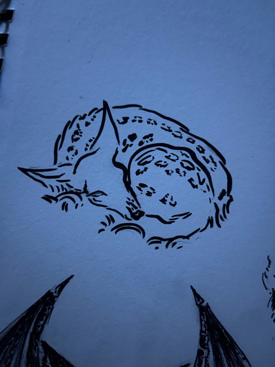
#and sketching for traditional art but I do want to get back to using inks
Text
ORNAMENT ILLUSTRATION COMMISSIONS - OPEN
the basics:
- black and white linework
- traditional ink done on recycled, toothy 24lb paper
- usually 7”x9” or 9”x7”
- base price starts at $300. Payment is half down, half on delivery
- you get the original, jpegs/pngs and one or two prints of it

I am very interested in and comfortable drawing:
- nudity
- trans and queer bodies
- historical interiors & exteriors
- western weapons and armor (from the early middle ages on)
- richly patterned fabrics (but richly patterned all sorts of things)
- religious motifs
- bdsm scenes & fetish wear (leather, pup & pony play, bondage, etc)
- occult and esoterica
- soulsborne stuff
I do not draw:
- underage or bestiality
- furry art (yes, ik there's a small overlap w this in some fetish wear, but I do not draw fursonas)
- anything sci-fi, futuristic. mechs, androids, machines, that sort of thing. idk how!
- fan art of anything live action, or living people
More detailed info:
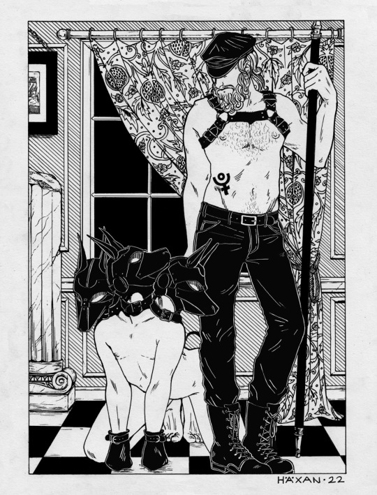
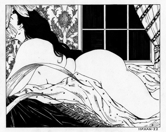
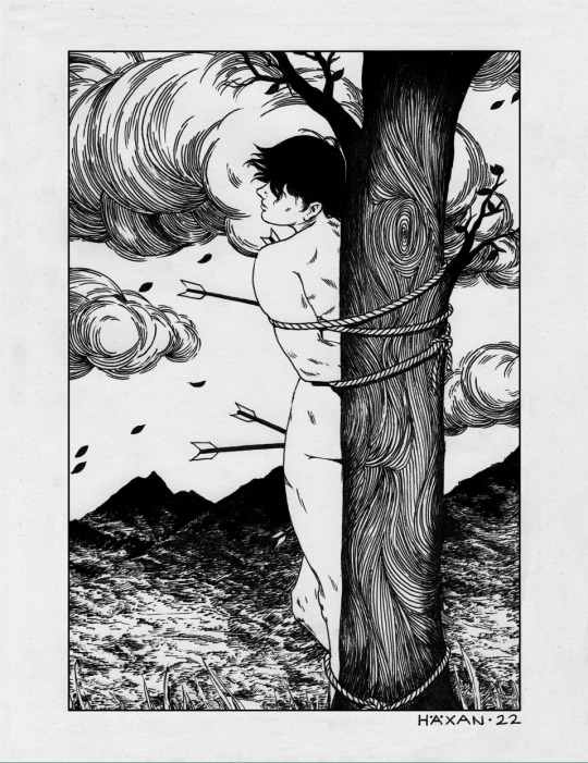
‘Ornament Illustrations’ is what I call these highly-patterned black and white linework pieces. Base price for these pieces starts at $300 and goes up for extra complexity. There are no hard-and-fast rules to what is included subject matter wise in that $300. Most subjects (unless it's an orgy of 100 people and you want it drawn to 18" x 24") is gonna fit in a $300 price tag.
(This more simply put: I don't do the type of commissions based on number of characters & complexity of background.)
These are entirely traditionally drawn, and usually put together here and there digitally if I'm layering in patterns, or have a lot of black fill to do. I do not do digital linework or color.
I am not super inclined to draw a lot of fan art, mainly due to unfamiliarity with the subject. I'm open to discussing it however! Some prompts for a commission I might reject for reasons not shown here.
Payment is required half up front, half upon completion. Completion time varies, as this depends on how quickly you get back to me with reviewing sketches. It's usually about 2-4 weeks. I do have shit hands these days, though, and can't ink as much at once as I used to be able to. So my work goes a bit slower now.
For your money, you get:
- the original inked piece
- one or two high quality prints of the finished piece
- digital files of the work
Please note that I tend to layer in patterns and background shading digitally sometimes, which means they will not show up on the original inking. That's why I provide a print.
I do enjoy being able to provide prints in my shop of commissioned pieces, but let the client choose whether or not they want prints made available to the public.
How to commission:
Email me at thornapplepress(a)gmail.com with your idea. It can be fully fleshed out—Hades as a leather daddy & Cerberus as a non-binary sub in 3-headed pup play—or more vague—something sapphic, intimate and lush.
I do my best to get back to commission requests in 2-3 days, but please do note that I don’t do email on the weekends to help preserve my attempt at work/life balance and my sanity.
410 notes
·
View notes
Note
for a while since i got into transformers 3 years ago and i loved the franchies instiantly even since i was a kid especially the designs of transformers and Seeing fan arts and fan Designs and fans make thire own continuity made me me want to start learning to draw when im ready but i don't know how to draw cybertronians so do you have any tips and advices for someone who want to learn to draw transformers characters both Traditional & digital art?
Biggest advice I can give is: "Break a character apart into simple components!"
Drawing bots is honestly not that difficult, I find it much easier than people because you can more easily break a character apart into simplified blocks.
When it comes to designing characters it can take a few times to get one you're happy with so doing lots of basic sketches can help. References are always useful too! Every artist uses references.
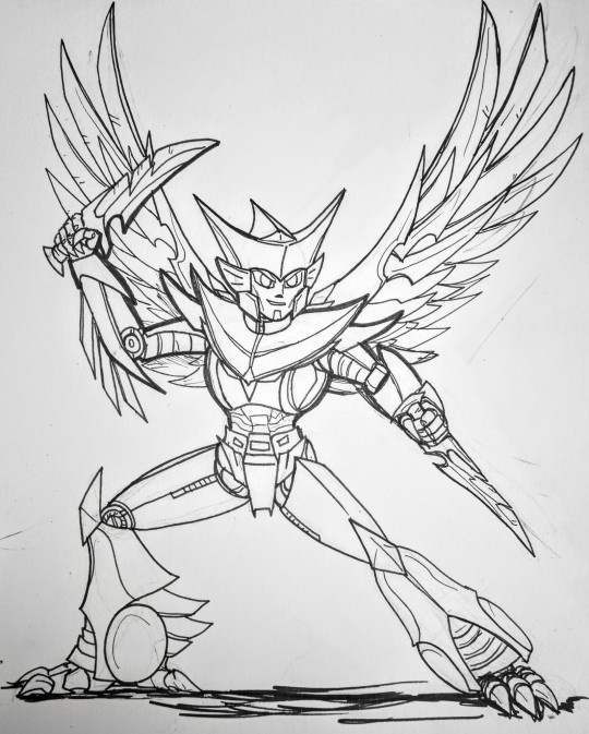
Here's how I do it (In this case I'm doing an alt design for tfe Nightshade):
(It's not a definitive guide as you kinda have to figure out what works best for you both in terms of technique and art style. I'm aware my art style is definitely not for everyone, as it veers more on the cartoony side. I've had comments about how my faces all look effed up etc XD)
Initial sketch

Break a bot down into basic shapes, circles and sausage shapes for more rounded characters and boxes for squarer ones. I normally start with the head and draw the rest of the body down from it (torso and arms then legs then any back kibble that might be visible) Think of it like the protoform beneath the armour.
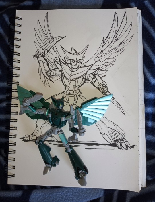
To help with figuring out a pose I'll often use my toys. It can help you visualise where their arms and legs etc go along with whether part of a bot is actually visible from a certain angle. For example in this case:

(Yes that's my cat chilling in the background)
This can help you to figure out if a certain design can pull a given pose, for example would a bot with kibble on their hips or arms be able to move their legs or arms a certain way. I used POTP Elita one as a reference for my SG Megatron a lot for example as they've got very similar builds. But this is not essential.
(There are mannequin apps on mobiles etc. you can use to help with pose references too, and image searches are always useful for references.)
For more dynamic poses it helps to think about how the character is moving, so add a curve to the torso/spine to add to any implied motion etc.
Details
Once I'm happy with the basic shape and pose I typically add the armour over the top. Again the head is usually the first bit I do. You can see I got a bit lazy with their left hand and just did a scribble here XD
Inking

Normally when inking I do the edges of each armour piece first then add any details on afterwards in a finer pen. Generally I'll do one body part at the time eg. fully ink the arm before doing the head etc. Its best to make sure you do parts that are in front first!
Here's the finished picture:
Though it'll need some digital cleaning up at another time.
As for digital art...
I can't really give much advice on starting a drawing digitally as I never quite got the hang of it (colouring and corrections I do digitally but all my line art is traditional), I need the feedback of a pen in my hand and pressure on the paper to get it right.
These days the Hardware I mainly use is a refurbished huion art tablet (it was about £120 when I bought it) that's probably the cheapest your going to find a graphics tablet with a screen. BUT it's really not essential to get one especially if you're just starting out. Basic graphic tablets without a screen (just a pen and a pad) are much cheaper or you can use a mouse. I used a mouse for ages when I was first starting out.
In terms of software, for colouring and edits on the PC I use GIMP (I've been using it since like 2009 so I'm not really going to change any time soon!). It's freeware software and can do a lot of stuff, but it's user interface isn't the most user friendly especially if you're not familiar with graphics software but there are plenty of tutorials available for it. I'll try to remember to make a post showing how I use that another time :) as I'm not at my computer at the moment.
There are plenty of alternative image manipulation/graphics software to use as well, some free, some free but with ads, and some paid for (either one off payment or subscription). It's best to see what other artists have to say about them though as I've never really used them!
#my asks#my ask box#fan art#art stuff#how i draw#my ask is open#ask me stuff#nightshade#transformers nightshade#earthspark#transformers Earthspark#tfe#tfes#nightshade malto
45 notes
·
View notes
Note
I've just found your blog and I'm blown away by your amazing pencilwork! I'm particularly enjoying your sketch studies. They're incredibly inspirational.
I realize this might be a dumb question to ask an illustrator, but do you carry a sketchbook with you in your day-to-day routine? If yes, what kind? (Small, large, spiral, etc) Do you have a preference for a certain type of pencil? (Mechanical, traditional, etc) I'd love to get back into doing traditional art and your blog has really lit a motivational fire. Keep up the fantastic work!
Hi! Thank you very much for your kind words! It makes me happy to hear that you find my sketches inspirational <3
Not a dumb question at all! I normally always have a sketchbook with me or, in the last months, more often just throwaway copy paper (but I want to get back in the habit of a continuous sketchbook again). At the moment I still have lots of self-made sketchbooks from partially used paper, with paper that is suited for watercolour and normal, thinner paper as well.
There's lots of different sizes and paper that I tried but my favourite are probably the ZAP Book 100% recycled from Clariefontaine (softcover), which is perfect for any kind of pencil though nothing watery, and because the paper is very cheap from look and feel, I don't feel like wasting precious paper while just scribbling little things! But the next sketchbook I want to get is a hardcover sketchbook I had before with 200g/m² thick paper, because then I can also use ink and watercolour in the same book.
As for preference for pencil, I love coloured pencils called polychromos, they are very soft and have a very intense colour and are great for outlining and colouring. And I love softer lead pencils like 2B or 4B. Ballpoint pen is not my favourite but when you want to concentrate on the line without having the possibility to erase and redo parts again and again (as some kind of challenge and training to accept mistakes) that is possibly your best choice!
But in general you can get accustomed to any medium and any pencil type after some time. If you want to get back into traditional art the only thing to watch out for is probably not being afraid of wasting precious paper! Any sketch you do will hone your abilities like your hand eye coordination, so there's no bad sketch.
Hope that helps and happy sketching!
21 notes
·
View notes
Note
Hey I know I'm a total stranger but I follow you and I think your art is really cool! I wanted to ask what brush is best on Procreate? New to digital art and I'm trying to make art of my own characters. Taking a lot of inspo from you!!

I am of the firm belief that most basic brushes are real good!! I came from clip studio so i was mainly used to charcoal/pastel feeling pencils, as well as REALLY smooth/textured inking brushes and LOTS of opacity, which i think has changed but you can still see the influence??
I am also an avid hater of procreate brush settings which is why I sorta chose to modify most of my basic brushes!!
Mainly i usually pick two brushes per drawing... Sometimes I'm not feeling the same sketch brush so i tend to switch between script, Sean sketcher, hb pencil, and peppermint!
For inking i tend to do script or gesinski ink but i recently inked zephyr with the marker brush!! It was so fun!! I also sometimes ink/clean up with my sketch brushes, it can be faster.
I started using peppermint and spectra because of @purlty though i have kept spectra as a texture brush rather than for coloring :D i like it a lot
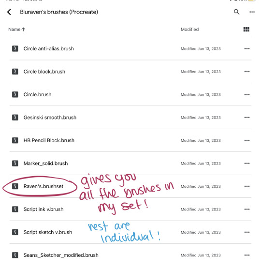
My brushes really aren't special but i have the odd habit of changing EVERY setting until i find one i enjoy so I'm going to link my brush set below!!
Make sure if you want all the brushes in Raven's set, you only download that file, and additionally you will need to download HB pencil block, and Script Sketch, to have all of my brushes, but otherwise you can pick and choose which you want!
There's also some resources on how to modify brushes/import them and some REAL good tips and tricks i have found to make the program more usable, however!! It's a learning curve and it will only get easier with time, I've been using procreate as my main program for a year now and I still sometimes have to go back to clip studio or traditional art to be able to get a grasp haha!!!
↓ ↓ ↓ !!
youtube
youtube
youtube
youtube
youtube
These videos are A LOT OF INFORMATION but will likely help you get a good grasp of BASIC procreate functions! My suggestion is, don't take everything to heart, because you actually won't use a lot of the things they show, just stick with what you understood and are interested in using!! You don't have to master it right away :D
Most importantly i am very happy to be able to help you with this, even if you are just a stranger, so am I! And when i started with art programs and digital art I had to spend YEARS trying to figure out how to be like the artists i looked up to without being able to buy so many of the cool brushes and expensive software, so anything i can do to help, even if it's just sharing my already modified basic brushes so that you don't have to fidget with all the settings!! I'm more than happy to do!! And i really hope this helps you and anyone else who might need em!
#raven helps with art!#bluravenite resources#raven rambles#sorry this was so long#art resources#brushes#procreate resources#procreate brushes
70 notes
·
View notes
Text
tips/resources that taught me how to Art as an Adult - a masterlist
Four years ago I decided that “I’m too old to learn how to draw” is a pointless lie I’d believed for too long and you’re never too old to learn something new. I still definitely consider myself a novice and a learner but I’m at a very happy place with my art and I’m having a ton of fun so I thought I’d pass along the tips/resources that helped me get started and kept me motivated.
I’ll get into resources under the cut, but here are personal tips I lined up for myself that helped during the early stages of frustration and wanting to give up. obviously they won’t work for everyone, but they really kept me going
fill 14 sketchbooks. if you still want to give up after that you can (I’m currently at 13 sketchbooks and could not imagine ever letting it go)
what specifically do you want to be able to draw? For me my goal has always been characters and cats. I’ve added things to it here and there, but starting out overwhelmed with how much you don’t know isn’t great. find a handful of things you really want to draw and see where it takes you.
get yourself a sketchbook fancy enough that you feel cool as heck but cheap enough that you don’t mind absolutely destroying it. Personally, I love EXCEED bullet journals. the dotted paper keeps me from being too picky but are less intrusive than lined paper. From my experience, EXCEED bullet journals takes acrylic and ink like a champ, and they’ve got nice covers that just make you “feel” cool. confidence is important!
acrylic paint and post-it notes are great ways to cover mistakes. I personally love anything that makes my sketchbooks feel “sketchbooky” so this is super fun.
it is okay to “waste”/”ruin” pages. one time I was in “I’m a failure” artblock and so I poured black coffee onto my sketchbook. (it was gonna get dumped out anyway and I was Very frustrated with my art.) then when the pages dried I just kept right along using it. taught me a lot about not being perfect. sketchbooks are about learning and love, not about perfection.
try drawing in pen. seriously, draw in pen. it’s scary as frick to not be able to go back on mistakes but that’s what the post-it acrylic-paint tip is for, and it’ll help with all sorts of stuff like lineweight and line confidence. it takes some of the stress off too because, you screw up? oh well! Try again! it encourages “try again” over “meticulously nitpick until it’s perfect” and has done wonders for me. I started out my first two sketchbooks in pencil before making the switch and I’ve never gone back.
(also sketching in highlighter and lining with pen is super fun and cool and satisfying!)
the first page doesn’t matter. I usually just use the first page of the sketchbook to write my favorite songs at the time and then do the same thing on the last page. first page jitters begone.
(starting in the middle of the sketchbook also gets rid of those jitters pretty nicely. I tried this a couple times and personally still prefer the linear front-to-back but it was fun for a while.)
picking a color theme for your sketchbook can make it feel more “sketchbooky” too. I usually go with blue or orange- blue acrylic paint, blue post-it notes, those cheap blue BIC pens, etc. I like this bc it makes the sketchbook feel like a sketchbook and is very satisfying.
And figure out why you’re doing it. I did it because I always wanted to make cool art and draw my characters, but if you’re doing it for a career then obviously the path to that looks much different. Don’t compare yourself to others. Be inspired by people who are better than you. Acknowledge where you need to grow and where you’re strongest. Lean into those strengths. Adapt to those weaknesses. Be proud of being a beginner- you won’t be one for long.
Now: some of my favorite creatives and resources!
///
CREATORS:
"Kasey Golden"
Mostly traditional art, mostly watercolor, cartoonist, art challenges
"DrawingWiffWaffles"
Mostly traditional art, alcohol markers & pens, semi-realism
"LavenderTowne"
Digital art, art tips/tutorials, cartoonist
"ABD Illustrates"
Digital art, speedpaints, semi-realism
"Proko" (or "Stan Prokopenko")
Realism, anatomy tutorials, free complete "Anatomy For Artists" series- basically as hogwild as you can get learning hyper-realistic anatomy
"Ethan Becker"
Digital art, ex-DreamWorks employee, tips/tutorials, "Perfect Practice"
"Sinix Design"
Digital art, anatomy tips/tutorials, general tips/tutorials, realist
"Oliver's Antics"
Digital and traditional art, tips/tutorials, speedpaints, semi-realistic style
“Nerdforge”
Traditional art, painting, metalwork, woodwork, bookbinding, building, seriously these people do everything they’re incredible
///
FOR GESTURE DRAWING:
Line of Action
Gesture drawing, figure drawing, optional timed practice sessions
AdorkaStock
fantastic line of unique reference poses
///
Aaand that’s about all I’ve got! there are so many resources out there and so many amazing artists to be inspired by. just have fun with art! art is freedom. be proud to be a beginner and be excited for how you’ll grow. I hope these tips are helpful for someone out there! <3
Here’s my first digital artwork (April 2019) up against my latest (August 2022)
April 2019:
August 2022:
best of luck to you all. I believe in each and every one of you. <3 happy drawing!
#art#resources#cloud rambles#masterlist#obviously this isn't TOTALLY comprehensive#but I've been talking to a lot of friends lately who preemptively give up on art bc they're 'too old'#and I just felt like making this#i believe in all of us
330 notes
·
View notes
Note
What art supplies do you use for coloring in your sketchbook? It looks amazing
Hey there! Thanks so much! Sorry if this feels like a trick, but I actually just draw lines/inks in my sketchbook and then I add color in Photoshop. I'll do a little explanation of how I add color though in case anyone finds it helpful!
Details and pics under the cut!
First I take a photo of the sketch:
This one was done in 2023 so he's in pencil, but so far in 2024 all my sketchbook drawings have been with a ballpoint pen. Anyway I adjust the contrast how I like and sometimes I nudge things around if they were asymmetrical or if the head was too big, for example. In this image if you look closely at his neck you can see a "seam" where I had used the lasso tool to make an adjustment.
Then I add a bit of warm tone and cream background to everything:

Then I do the the colors on a "multiply" layer that's on top of the lines. I end up with this:
I could definitely stop here if I wanted to, but I like to do an "overpaint" layer on top of everything where I paint with a simple circle brush to bring out some details:
So in the final version you can see that I cleaned up his eyes and put the little sparkle of life in there, and I painted the shine on his armor. I also outlined his jaw so the contour wouldn't get lost against the neck of his black. On this drawing in particular I was really happy with the tiny highlights on his brow, nose, and the corner of his mouth. I thought it did a lot to put more life in the sketch!
Years ago most of the art I posted was sketchbook drawings with color added digitally. I had really missed doing that so I'm glad I'm back to it and that people seem to enjoy it. I think having the texture of the traditional materials is really appealing.
Thanks so much again for your ask!
11 notes
·
View notes
Text
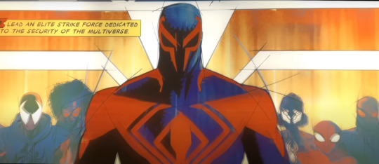
Miguel O'Hara: What's his deal
Ok so ever since the theatre realease of Across the Spiderverse back on May 31st (yes in France we get our new releases on Wednesday, this is why the early videos on YT had French subtitles btw in case you were wondering), I have been deep in it. Like. DEEP. The main offender for that being Miguel O'Hara, who immediately started living rent free in my head and he is clearly not leaving any time soon. Anyway, this is completely out of topic for my blog but I do what I want so let me rant about the aforementioned Depressed and Overworked DILF because we love men with problems in this house.
WATCH OUT FOR THE SPOILERS (and unhinged ramblings that totally sidetrack).
Ever since the release of ATSV, a lot of videos have been available on YT to dissect everything, and of course I have been having an intense focus on character analysis, because that movie is absolutely brilliant at establishing character arcs and presenting new Spiderverse characters in one of the most efficient, thrilling and engaging way I've ever had the pleasure to witness. We've been blessed with Gwen's heartwrenching character arc (and she deserves none of the hate she's been receiving, but don't get me started on that), Hobie more like Homie in the span of 5 minutes on screen... And Miguel, who blesses us with his ego, anger issues and massive trauma while also dropping bits of a gentler side - but only bits of it. And I have been extremely normal about Miguel, since he absolutely doesn't tick all of the boxes of the Tickle My Fancy list.
I have been ranting about him in many YT comment sections for more than 2 months now (hi Purple Kisseokjin and Schnee lol), but with the digital release of the movie, I finally remembered I have a Tumblr blog where I can yell about Miguel all I want, so here we are now. Now where do I start...
First Part: Miguel's character design
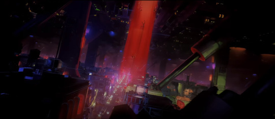
I've overall been highly impressed by the various art styles given to the Spiderverse cast, and how it reflects who they are and where they come from. Miguel in particular hits many soft spots for me for a good reason: his association with architecture and industrial designs, which are topics I'm interested in (especially architecture). As such, I will begin this study by analysing both the character and environmental designs for Miguel and Nueva York, and how the depiction of Nueva York 2099 reflects the state of the narration as well as how Miles and Miguel feel and think - following the same logic as what we get to see with the use of watercolours on Earth-65B, during Gwen's sequences, to express emotional states. A mandatory tangent will be made in regard to Miguel's themes as well, because they fall in line with my arguments for the character and background designs.
There are some main points to take into account when it comes to anything related to Miguel's design: straight lines everywhere, light rough sketch lines, gouache tones. Where do we find these elements? In architecture design. Older ones made in a traditional way usually have gouache for the colours (although ink and watercolour are also present), and the light sketch lines and straight lines are present to study the perspective, as shown in the example below:

Feels familiar? Well, will you look at that:

One of the reasons why I am giggling everytime he appears on screen is because of these delightful sketch lines. Looook, it has the same style as architecture concept art! Even better, from the mouth of one of the character designers, Kris Anka: NO CURVES!
Even his face has sharp angles (he truly has the most powerful cheekbone game), look at the sketch lines:

And you know what else has a lot of straight lines and sharp angles? Nueva York.
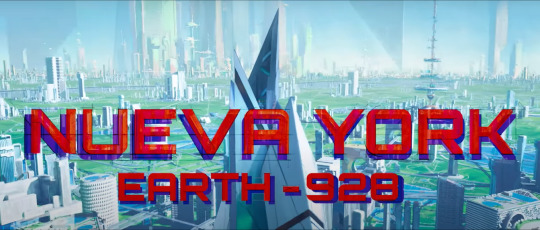
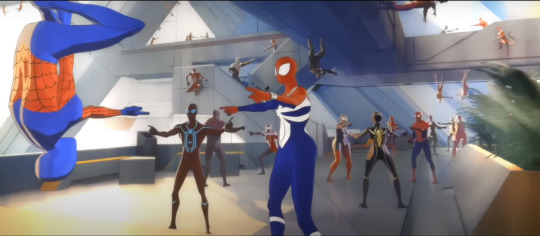
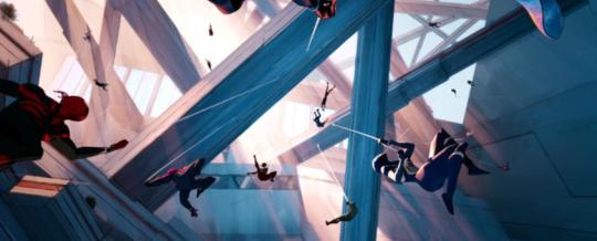
Look at this. Look at this. It's even in the title card when Miles arrives at the Spider Society.
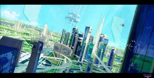
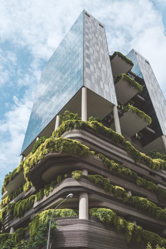
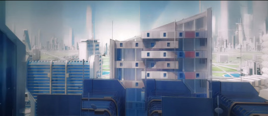
Allow me to make a slight detour to explain what we are looking at while looking at the architecture of Nueva York 2099. What we are seeing here is a blend of brutalism and eco-brutalism. Brutalism is characterised by its materials, steel and concrete, as well as its intent: in a post-WW2 world, architecture is seen with more pragmatism and values function first. Eco-brutalism is a branch deriving from Brutalism, and aiming to reintegrate nature in the concrete jungle in order to create an harmony - albeit a fully man-made one.
The concept artists took (eco-)brutalism and ran away with it for a massive Solarpunk vibe, which makes the whole setting very interesting considering that in the comics, Nueva York is also very much a futuristic dystopia. Yet, using (eco-)brutalism to have us experience the place for the first time along with Miles is a great way to give a sense of awe by way of what we envision as the future to be now:
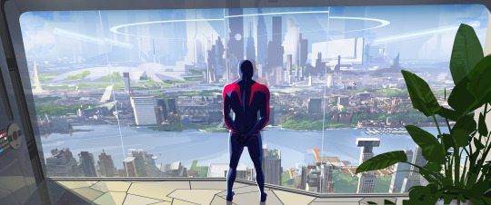
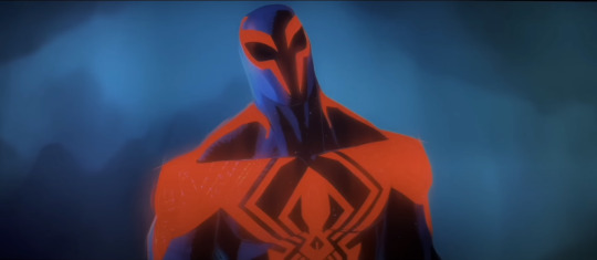
The interesting bit about it is how (eco-)brutalism and the adjacent solarpunk aesthetic are associated with a rather hopeful future, one where humanity manages to harmonise its modern way of life with a new development of nature. It feels like a haven mixing the relaxing greens of nature with the sharp lines of brutalism architecture, and that's how Nueva York feels on first sight. Similarly, Miguel O'Hara's first appearance leaves quite the memorable impression: tall, with broad shoulders and everything about him being sharp (it's even exagerated in the comics part), even his web.
(Fun fact time: ball pens have initially been designed for architecture and industrial drawings, they are fantastic tools to draw neat lines and create a nice variety of shading as well based on how you push on the pen and how you hatch/cross-hatch to modulate the intensity of the shading. You know who and what could be drawn solely with a couple of ball pens? Check the answer below.)

He also shines at the Guggenheim by showing how competent he is, with a certain benevolence on top of it: he initially rejects Jessica Drew's suggestion of adding Gwen to the lineup (yes Miguel, you don't want her because she's buddy buddy with Miles), yet saves her from being shot by her own father and ends up getting her on board as she finds herself with nowhere to go. It certainly leaves a similarly good first impression as the bright and harmonious first sight we get of Nueva York.
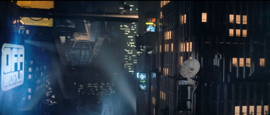
However, the environmental and character designs both give us a deeper look into Nueva York and Miguel, and it's certainly not as pristine as it seems. Just as Miles is about to discover the truth of the Spider Society, he enters a darker lab and Hobie keeps warning him, until they reach the area where Miguel is pretty much playing Big Brother by watching them through some of his screens:

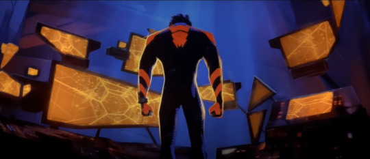


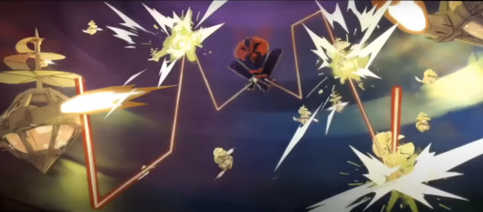
I'd argue that the darker space is a callback to the comics, in which Miguel becomes sensitive to light after his genetic mutation, But it is the very opposite of what we've been shown when introduced to the Spider Society: soft whites and greens are traded for deep blues and the stark orange of multiple screens as well as the tone on Miguel's own costume - the bright orange light of the screens is even reflected on him. This is not a pleasant place, and everytime we see it (the Go Home Machine area has a similar style, albeit more organic in the creepiest way, as displayed above on the 4th screenshot), we witness Miguel having outbursts of anger as well. There is also something that feels disconnected from humanity in the sense that it's colder and more methodical in the design, either with all the sharp angles and stark contrasts, or the alien design of the Go Home Machine.
It's an impression that can also be found once we discover the underbelly of Nueva York, while Miles is being chased:
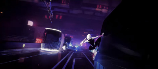
Here, we also have dark tones with stark neon lights that create the impression of a colder, less caring place, that points to the dystopic nature of the place. The impression is created with great efficiency not only by intense contrasts, but also by using the classic codes for a dystopic society: the solarpunk tones can be found in other stories such as the video game Mirror's Edge (classic case of solarpunk hiding a dystopia), and of course the darker cyberpunk aspects are a staple of the Dystopic Futuristic Society, that goes as far back as the first Bladerunner movie at least, and that can also be found in movies, series and games such as the Ghost in the Shell movies/series and the Cyberpunk TTRPG/video game (which pretty much gave its name to the genre) - I'd even argue we could go further back in time for the references with classics such as Aldous Huxley's Brave New World. It matches with the atmosphere of the Spiderman 2099 as well, which is set exactly in that type of darker, cyberpunk dystopia.

I argue that there's something coldly methodical in Miguel's design and, by extension, Nueva York 2099's design as well. And it is delightfully balanced through an initial positive introduction of both, before being broken down for a darker turn later on during the movie, as it matches Miles' own amazement-turned-disappointment throughout the sequences in Nueva York when his initial desire to belong somewhere is brutally turned on its head by the very persons who could have given him that sense of belonging he was seeking.
Interestingly, even the soundscape for Miguel, "Spiderman 2099" and "Lab 2099", expresses the underlying coldness of Nueva York 2099 and Miguel's own scientific, methodical approach to problems. As explained by Youtuber Azcona in his Miguel O'Hara Suite playlist:
"I'd argue that it has the same tonal resonance that the Prowler theme in the first movie had, though is less villainous and dreadful as that theme. Miguel's theme is a five note synth line that sounds akin to an alarm or siren. It's blaringly loud, but is also used for more calm dialogue scenes in an effective way. The words that come to mind when describing the musical soundscape of Miguel O'Hara is "methodical", because no matter how loud or abrasive his theme gets it has an underlying feeling of coldness and efficiency. This is further shown through a repetitive synth ostinato that plods and chugs during a lot of his scenes/scenes involving the multiverse at large. It's reminiscent of Blade Runner in tone and it's mechanical nature, and I think it suits someone as jaded and distant as Miguel. Not only is his theme alarming and efficient, but also efficient in it's cold, electronic soundscape and melodies."
And this very methodical, cold tone is itself used during the infamous Train Chase and Miguel's on-screen mental breakdown... But more on that in the next part!
#across the spiderverse#atsv#miguel o'hara#atsv miguel#atsv spoilers#character analysis#spiderman 2099#not twisted wonderland#THE HOLD MIGUEL HAS ON ME IS SO REAL#He truly lives rent free in my head since May 31st#we love Depressed and Overworked DILFs in this house#and now you have to deal with my latest insane ramblings#I hadn't gone that far since Hell's Paradise lmao that was 4 years ago#but man does it feel GOOD#i live and breath for character analysis AND I get a bonus on architecture this time too
30 notes
·
View notes
Note
Hi there! This is random, but I really really love the way you do line art! I love how simple, clean, and direct it feels. It has great energy and feels really appealing! I’m trying to improve my own line art right now… I feel like it takes me a long time to choose the “right” lines and end up with clean finish. What to you think has helped you get up to this point with your line art the most? Do you have any suggestions of ways to study and practice? Any favorite artists you look up to for their lines?
I love your work ❤️ thank you
Hello! Thank you for the kind words. I enjoy doing linework a lot, so this is nice to hear :)
These days my line art is more of a "clean drawing" rather than what one usually imagines under traditional line art, which would be opaque lines with varying weight. Right now I like to use a brush that doesn't vary size with pen pressure but varies opacity only. It gives the lines a very soft feeling that I've grown to love.
I browsed through your art, and I was a bit blown away actually, because I think you have a fantastic energy and expression in your drawings, which is something I aspire to have myself. You are very knowledgable about line weight and shapes, so I won't bore you with explaining any of that, haha.
I think good line art comes down to confidence. Obviously, an artist needs a confident hand to avoid shaky lines, to lead them exactly the way they want to, to give them an energy. This sort of mechanical skill is acquired through experience.
But! I've always felt there is a sort of a mental side to this as well, which is best observed during traditional inking. You have to commit to your lines, you have to trust them. You have to sit back and give control to your hand, because with the experience it has, it also has a mind of its own. This sounds pretty out there, but it's about letting go and not overthinking it. I realized this when I looked up to Jim Lee's work as an older teen. There's a lot of videos on YT where you can see his process, which looks utterly effortless. Take this one for example. It's quick, so it's a bit rough, but it does look like his hand is just doing whatever!
I fostered that approach in my art while doing daily drawing from life - straight to inks without sketching. The drawings look wonky a lot of the time, but it gave me confidence where it mattered later. To this day, when I do clean lines in digital too, I adopt this mindset of letting go, which gives the lines more leeway, which also means that if the line doesn't go exactly where it should according to the sketch, I can still trust it. (Although contrary to this, I still put a lot of controlled effort into faces, and this approach comes more easily while drawing bodies and clothes.)
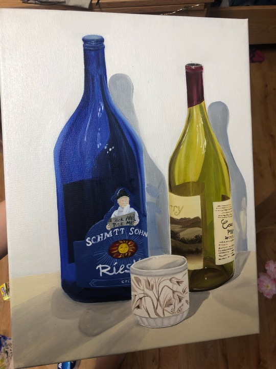
As for suggestions for practice, as I've already mentioned, drawing from life straight to inks (I recommend this over going straight to inks from imagination as that's extremely difficult, at least for me). Have a fast hand, and do long lines even if they come out wobbly. Try to let your hand roleplay Jim Lee here and there - let it do that flick that crosses a line it shouldn't have, let it make a turn with an accidental squiggle, let it pool a bit of ink at the end of the line. Fake it till you make it. At first, I suggest trying this on subjects that aren't your expertise (eg. in my case, draw a bottle instead of a person), so you don't subconsciously compare this to your best work, but make sure you're still having fun :)
Of course, it helps to like doing line art too. I don't know what your relationship to it is, but if it suffers, I suggest busting out the traditional inks with dipping pens, wodden skewers and brushes. It connects me with the process like nothing else.
As for my favorites, I can recommend one of my favorite manga artists - Satoru Noda. Superbly confident and energetic linework. Check out his series Golden Kamuy or Dogsred :)
I hope this will give you a small idea of how I approach my line art. It might be a mess… If you have any more questions as a result of this, or related to anything else, don't hesitate to ask!
10 notes
·
View notes
Note
What program/brushes do you use?
Hello, anon! I use Krita, a desktop program that is completely free ✨ (The current version I am using is 5). I switched to Krita from CSP because I found painting there to be easier.
As for brushes, apart from the standard flat brush and eraser tool, I use these two that come with Krita by default:


I generally use Pencil-2 for sketching, line art, and details and Dry Bristles for painting and laying down flat colors, but I do use them interchangeably. Pencil-2 does not blend and Dry Bristles blends only a little.
The following is an explanation of how I draw with them, because technique and process also influence my style as much as the brushes do. I felt that that kind of information is more useful in case anyone wanted to try drawing like I do!
---
My main painting technique is to layer and blend colors using Dry Bristles and draw in details with Pencil-2. I also tend to use only one layer (after merging the sketch/line art with flat colors) or anywhere between 2 to 4 layers, in which I have separate layers for sketch/line art and flat color and one or two layers on top to add details and draw over the errors. In the latter I usually focus on corrections in the detail layers instead of switching back and forth to fix the lines and flats (unless I needed to erase something outside of the lines). With this relaxed drawing process I am able to create some of my favorite pieces that are featured below:
---

Here I used Dry Bristles for the flat colors and Pencil-2 to scribble in some details. The blush on the face was also painted using Dry Bristles with light pressure.
---
For these ones I use the same brushes but with the color jitter effect applied (here is a tutorial on how to do that). I like using color jitter because it gives this more analogue (traditional) feel, like drawing with dry medium. The unpredictability of the colors is a bit hard to get used to at first but you learn to work with it! When I am happy with the colors I will switch back to plain Pencil-2 (w/o the jitter) to add details, along with the eyedropper tool to blend and "even out" the jittered colors for a better effect.
---
For this one I used both Dry Bristles and Pencil-2 to blend colors into each other. You can better see where and how I did it in these close-ups:

The way I blend here is like using a colored pencil.
---
Sometimes my lines are crisp, sometimes my lines are sketchy. In most cases I use a "painting" method to draw lines, which is to say I draw a line and then I erase/paint on top of it to get the desired look and weight (like cleaning up a sketch), instead of following an "inking" method (where you draw the line art as it is before coloring). I really just approach it as if I'm painting with acrylics!
I hope this explanation is okay! Let me know if you need more clarity on some parts ^^
#brushes#i would record a video of my process so i can show it better but it's difficult to do it in krita#csp is a lot better for recording but i still have yet to find brushes that closely replicate my favorite krita brushes#someday! someday#jakkenpoy answers
127 notes
·
View notes
Text
EMERGENCY Commissions
I owe $550 October 3rd and I only have $25 to my name. I would not be doing this if it were not my last possible option. I have been job searching for five months now with no luck. I have sucked my savings dry for rent, bills, and food + litter for my cat. I have lost weight in the past couple weeks due to me having to ration out my groceries. I can’t even do DoorDash and Instacart because i have to save the last bit of gas I have going to my classes (they have mandatory attendance). I am a full time student with classes from 10:30AM-4:30PM, so this schedule does not make me attractive to employers. I am diagnosed with MDD, GAD, SAD, PTSD, and ADHD, so juggling these debilitating disorders is very difficult for day-to-day life, but especially while trying to juggle work and school. I understand that I should not use these as excuses, but I am at a loss for what to do. I genuinely do not know how I am going to pay my bills at the end of the month and I am at my wit’s end.
This is my first time doing commissions online, so please bear with me as I work out the kinks. If this proves itself to be reliable income (even just enough to get me by) I will open up an Etsy shop and invest more into my art.
I will draw ANYTHING, including N*FW (Excluding n0n-c0n, @ge play, !nc3st, or any other k!nks that I do not condone).
The only digital art I can do is on my phone, but I don’t mind doing this if you are willing to pay. Because I mainly make traditional art, I will ship it to you if you pay for shipping.
I am so sorry that this post is not more organized and professional. I am not sure of how to correctly advertise commissions. My art is not very organized either because I work in many styles in many mediums. I am so sorry for this and I promise to reinvest if I am able to make a living off my art.
These are my pieces I’ve done in colored pencil, ink, charcoal, and oil:


If you would like something this detailed, they will take a month and the pricing will vary on what you want done in what medium.
Here are some tattoo designs I’ve done for a friend:
If you want little sketches like this, they are $10.
I did this line work on my phone. Line work of this detail will cost more, upwards of $50. Line work with no background or with less detail will be $30-40, depending on the piece.
I even make clay earrings, which I will send examples of if you request.
I will require a 50% deposit on all my artwork due to my dire circumstances. I take payment through Zelle, CashApp, Venmo, and PayPal.
I understand that is post is very long and disorganized, but please, anything helps. I am just trying to get back on my feet with the only thing I have left.
#art#mutual aid#illustration#drawing#taking commisions#commisions open#drawing commisions#financial help#painting#clay sculpting#linework#digital drawing#charcoal#portrait#sketch#female artists#artists of tumblr#artistsupport#women artists#oc art
16 notes
·
View notes
Note
I think your art style is so cool. Do you think you can share your art process sometime?
Okay, I’m gonna do my best to share my ‘process’ even though I don’t even know what it is 😅 bare with me here!
Rather than give you a step by step (because the steps are never the same for me) I’ll show you one of my speed draws and try to hit a few points about what I consider/ think about while I’m drawing. This will only be for drawing human figures, just FYI.
I’ll use my lil Steddie sketch I did recently since it’s freshest in my mind and I think I did a good job with the posing.
Here’s the video!
Now let's see if I can articulate my thoughts.
I would also like to note that there was no reference for this drawing. This was only a warm up drawing that I developed a little to much because I was having a good time making it
Things I consider when drawing people:
Gesture drawing/ Pose: Make a loose gesture drawing first so you can get a feel for where you wanna go then build off that. Where is the weight of the body leaning? What direction are they facing? As you can see when I first start I keep it all fairly loose until I really figure out wear the body is leaning. Once I have they're torso/ centerline figured out the limbs follow. As you can see I was having a tough time figuring out what position for for Eddie's legs looked the most natural/ interesting. Which brings me to my next point!
Keep your first sketches loose, and don't be afraid to test things as you go. As you can see in the video I basically start from scribbles and build off of that. Adjust shoulders, move limbs around, tilt heads, whatever you think would look best. All in all I probably redrew the figures 2 or 3 times before I started on line art.
Shapes! Once I have the pose and sketch to my liking I build off the gesture by making shapes and angles a little sharper. This is, of course, specific to my personal preference in style but I think just slightly exaggerating the shape of a muscle or the point of a feature really takes a drawing to a new level in terms of style. I believe Ethan Becker (highly recommend his tutorials) has a good youtube video about how an elongated triangle shape is a fun dynamic shape to use in cartooning. I just make things a little pointer than they are. That's all.
Line weight! Building off of how I illustrate shapes, I use line weight to exaggerate it even further and also literally show the weight of the figure. Parts of the body that have weight on them or are foreshortened towards the camera get at thicker outline to exaggerate them. (Though sometimes I don't always do this) Parts that are soft outlines (Facial features and clothing details) get thinner lines or a small series of cross hatching lines. It's all about what you choose to put emphasis on. I also like to use exaggerated lines for clothing wrinkles to add to the gesture. Most of my specific art style is in how I do my line work. I use inking brushes with a dramatic taper to get the shapes I do. I highly recommend getting a traditional art inking brush and practicing on paper just to see the cool shapes you can get.
And finally, black space/ shading. I do have rather dramatic shading being that it's just part of my line art. Honestly, it's often rather unrealistic but really what's the point of drawing if you can't make things look really cool and dramatic? When laying out what the black space will be I suppose I think of how it'll frame the figure and what's really important. For example, Steve's back leg its all blacked out behind his front leg because it's not an important part of his pose and I wanted to use it show the surface he's sitting on without actually drawing it. Draw less details to show the details somewhere else, ya know? Use filled in shadows to frame other parts and put more emphasis on details. Admittedly, it does take some practice to get good at inking this way.
Little drawing rules for humans I don't even think about anymore but use all the time
Shoulders and hips always tilt opposite each other. It's what keeps the body balanced.
The main parts of the human body that show expression are the eye's and the hands. Also emotion in the eye's is like 80% in eyebrows.
It's okay to rework something that doesn't look right at any stage in the drawing.
Most average sized humans are 7 heads high and their shoulders. 2-3 heads across (Think this is in every 'how to draw' book ever)
The blank space of a pose is just as important and interesting as the filled space.
Okay! I think that's all I got. I'm not much of a teacher but I hope this was at least interesting and HOPEFULLY mildly helpful.
Thanks for the ask!
117 notes
·
View notes
Note
Shame we got that last post with Thorax and Phara a day late. That would have been the perfect Mother's Day post. ;2
Thank you kindly for the compliment. I really wanted to get that up on Mother's Day but ended up a day late, I know. I know I'm answering this a BIT late. I want to work on that and get to a more regular schedule of getting the Big Love out for folkes to enjoy.
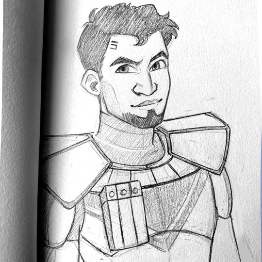
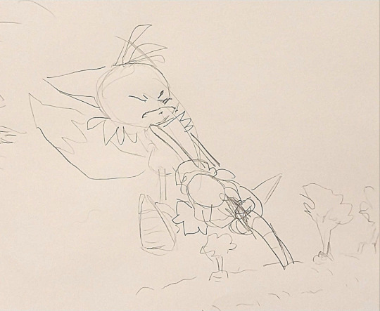
Part n Parcel to the problem of being a traditional artist and all the outside responsibilities. To use a recent piece as an example; Hammering out a rough pencil only takes maybe ten or fifteen minutes. Like so-

I do my sketching in the living room, some at my desk. mostly when I'm playing couch monster with my family. Getting to scan an image means heading to the PC in our bedroom and transferring that scan to a flash drive or my back-up hard-drive. Scanning takes a tick, colour correcting as IRL image gets digitized, cleaning up particles on the glass showing up in the image, tiny changes in tone that do NOT show up on the paper but the scanner decides are there...
Now, experience has taught me to scan at multiple stages. You never know when a piece of paper can get ruined, crinkled up, pen leaks, a well-meaning loved one spills their dinner, ONE STRAY CRUMB of greasy chips stains something, etc.
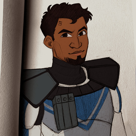
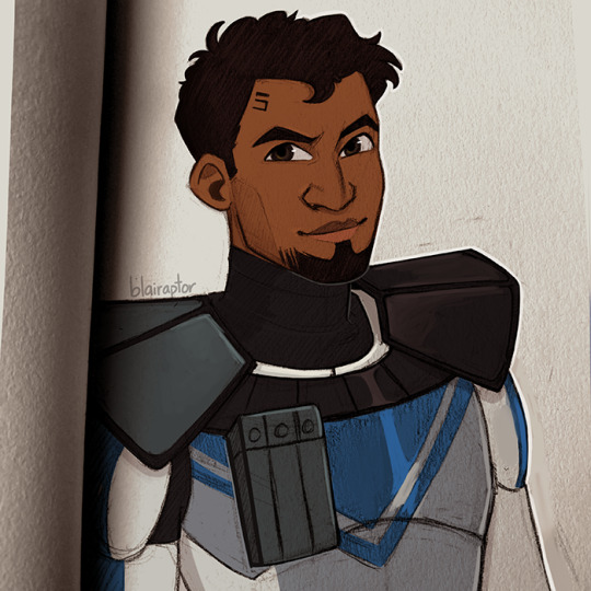
Still, I take what I like as the image comes together, refine it with inks, usually standard Bic V5 pens or Sakura art pens for finer deetail. Add this, erase that and move on to whipping out the final stage weapons of choice, Kopic Markers, Strathmore colored pencils and whatever other hoobajoobs I've got on hand.
At the end of the day, I love sharing the joy of the world I see with y'all, as told through the lens of fantasy, romance and little gay ponies. The Eternal Courtship stories I write and the art I do are as much an exercise in my relaxation as they are an expression of worldview- but above all else it's a world of love, love crossing boundaries of race, ethnicity and culture. Folkes growing beyond learned\indoctrinated black-n-white perception and seeing the beauty in the rainbow of ideas and emotions in the world around them- that's beautiful to me. It's sometimes difficult and it hurts, but that's the reality of growth.. That's life. That's love.
Thank y'all to all the folkes who enjoy the Big Love with me in this world. Stick around because there's WAY More to come!
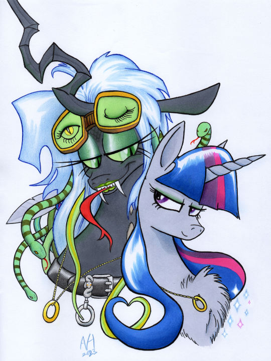
#my art#twisalis#mlp g4#mlp au#friendship is magic#queen chrysalis#twilight sparkle#lgbtq#love#lesbian#traditional art#my artwork#eternal courtship#ashleyfableblack#romancelvania
17 notes
·
View notes
Text
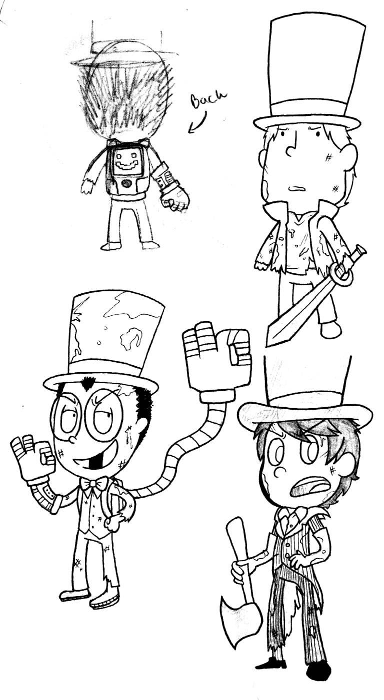
TOP HAT TRIO ARCHIVES: Part 1

Warden: Look at all this lovely art of us! We could fill a museum!
Professor: There's so much it seems like we can't keep up...
Once-ler: ..... Y'kno what guys? I'm gonna take a break...
((A small fraction of my old old old trio art, most of which has never seen the light of tumblr (under the cut)! None of this is colored. Some of this is pre-blog or just... REALLY early-era Trio art, so some of it is... dated. Also, as indicated by the top, this is part 1. Meaning there will probably be more, LOL...))
((I hope it's okay if I ramble some fun facts in the middle of this!))
We're gonna start off with this silly lil doodle of the lads! This was drawn during the era where I did my silly crossover drawings, before I mustered the courage to turn them into an askblog.
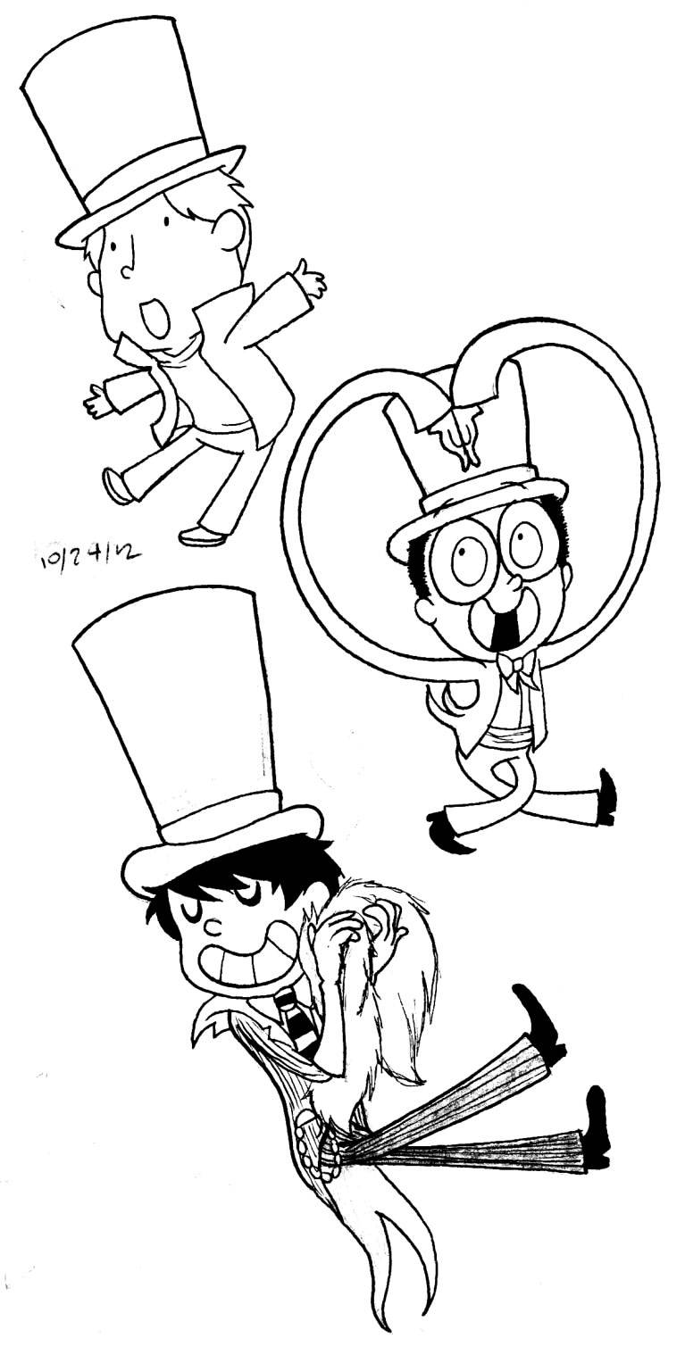
Based on the date, I must've drawn this next one while I was in the process of actually making the blog... potentially their original "profile" images? Or just a doodle I did to get me hyped...
As you can see, all the drawings so far are pencil and ink... that's because (if I remember correctly) this is when I was VERY new to computer tablets! I felt more confident in my traditional art so I would slap quick colors onto the back of a bunch of ink-drawn replies and make minor adjustments with the tablet. I remember being hesitant to switch to a fully digital style since I felt the sketchiness was almost part of the style of trio? But I've come to accept change is good! Everything post-Greed M!A is all (or mostly) digitally lined (with the occasional trad sketch), but if you look closely at the trio in this (and many other) early-day responses, you can definitely see the pencil marks!

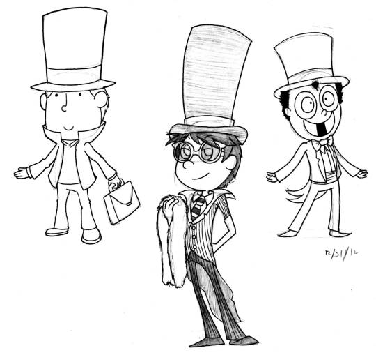
Unposted Thneedville High Trio!!! I was SO obsessed with the Once-ler Askblog AU's back in the Once-ler Fandom's hayday... they were a lot of fun to observe on the side and I wanted to be part of that in my small way, but unfortunately, I was a coward so I never did LOL... I'm thinking this was drawn in February or March 2013...
And, something I drew on the same page, Truffula Flu Trio!!!! I think I briefly thought about making it (and thneedville high) a sideblog but I felt like I couldn't commit for multiple reasons: (1) AU hype was dying down a little, (2) It was a bit too serious a concept for Trio; I wanted to keep them lighthearted and silly (covers bad end with a hand). And (3) I was still doubting whether or not my blog counted as a Once-ler blog (being only 1/3 once-ler) and whether I was valid to participate in events. Eventually I got over that fear when I joined Camp Weehawken and participated in the fandom revival of 2015, but the fear was definitely there at the very beginning and I hesitated to jump in on some stuff because of it!!
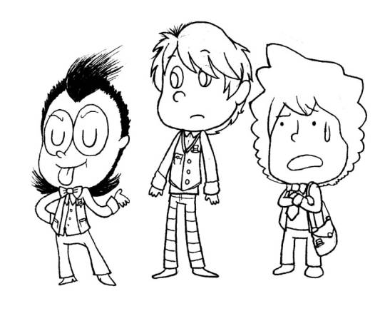
These were some of my earliest (unanswered) asks! I think for a while I thought I accidentally deleted the Pinkie Pie one, but it mysteriously came back one day?? I don't plan to finish these but might as well get some closure since I already drew them. I had to look up which troll typing was the one being used here so I might be wrong, I know nothing about homestuck except chapter 1 and 2 and whatever I osmosis from my mutuals LOL...
Peacock was drawn before I knew anything about Skullgirls...... within the past few years I recently watched her gameplay/storyline! She's defs a fun character. Trio are probs neutral about her. I'm not confident enough to do anything major with her, but I would love to cameo her more!
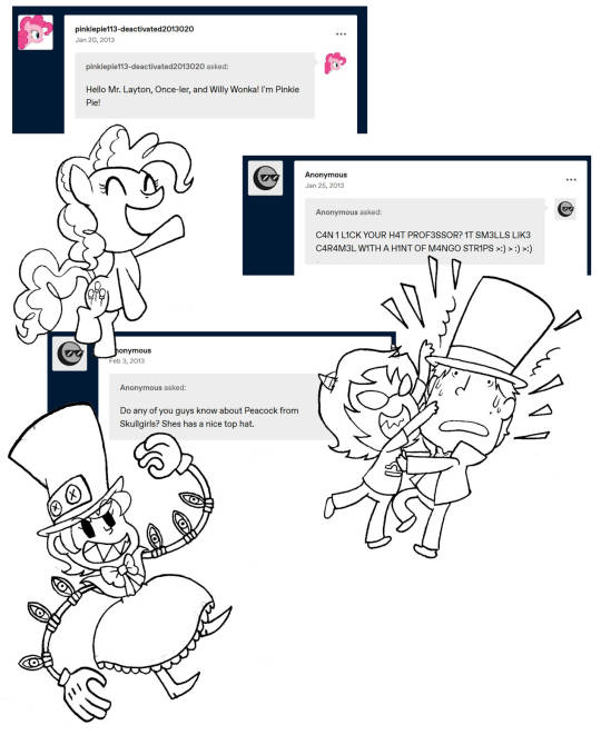
I got a few asks / M!A's about genderbent versions of the trio back in early 2013 and these were my doodles for that. The designs were based off of different designs floating around tumblr at the time that I liked. I'm not interested in doing this M!A anymore, but the dresses are cute!
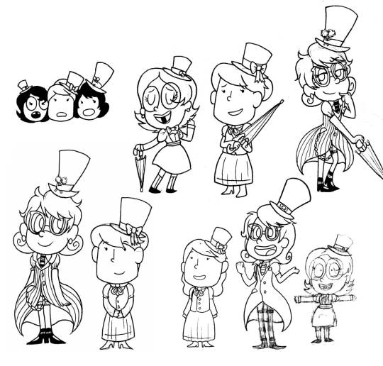
Some glasses shenanigans I never posted for some reason?? (For reference: (1) (2) (3) (4).) It's silly stuff like this that make me realize Trio!Professor is a little bit like "Cheerful Mystery" Professor but like... waaaaay more tame HAHA (I never read the manga back then because I was upset they made Layton OOC, but from what I've seen he's... a lot more chaotic there). Which, ykno, good chance explains why Trio!Professor stays sane around Once-ler and Warden and their wacky selves.
Some wardlers and layclaires!! Also a few super old things I doodled out for Lovestruck M!A part 2 (including warden being a perv and oncie being flustered and confused, LMAO) but... idk if I have the energy to commit to it at the moment... partially bc thinking about getting an influx of shippy-type asks gets me overwhelmed and idk if I can commit to another magic anon all my magic anons manage to kill the blog somehow 😭, but ykno... saving the anons in my inbox in case I change my mind... Love these guys dearly regardless,,, <3
Some doodles of Layton and his rivals!! I think someone sent a small "Descole takes over the blog" M!A (hence the itty bitty chibi head LMAOO) but (again) I don't have the energy to commit to anything but vanilla THT right now. I still thought the idea was fun enough to draw out and anticipate in advance! If I change my mind y'all will know about it...
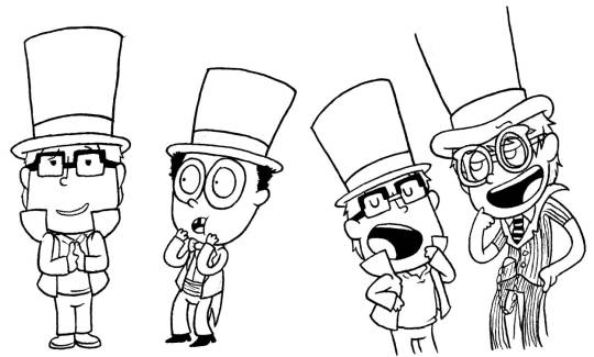
My first drawing of Wilson from Don't Starve!! I didn't even play Don't Starve at the time, but I wanted to do research if I was going to properly execute the magic anon and I fell in love with him immediately. Unfortunately he (and his game) became my new brainrot and I still feel really bad about that LAUGHS, but hey! Was worth it! Maybe someday I'll redo trio mods for DST...
I may have him cameo again, but potentially after his character update in Don't Starve Together eventually drops, of course, :3 chants give us lore lore loRE LORE-

Aaaaaand that's all I'm gonna show for now... until next time everyone!
PART 1 (you are here!) || PART 2 (TBA) || PART 3 (TBA) || …
#((I will try to post one of these at the end of next month too))#((gives me time to compile them and get them sorted out...))#((not all of them are gonna be in chronological order tho... I'm doing the greedler archive next because I feel like it))#tophattrio#top hat trio#modart#ooc#professor layton#warden#onceler#top hat foes#top hat friends#top hat assistants#other#archives
39 notes
·
View notes
Text
Commonly Asked Questions.
I get asked the same 3-5 questions all the time, so I thought I might make this new lil pinned post to help everyone out! But first, I want to thank you all for visiting my blog!
Do you take requests?
No, I do not.
Are your commission open?
Yes currently! Honestly now a days they’re almost always open. You can check them out on my website HERE!
Are you okay with gift art?
Of course! I would be flattered! If you’d like, you can find most of my characters here on toyhouse (I promise to update it soon!)!
How do you get the retro/vhs effects on your art?
I actually made a tutorial on that here! But honestly at the end of the day it’s a lot of “I plug this picture into several different apps and video editing software.” I wish I could give you a simple answer, but there is no easy way to do it that’s the same every time. I rarely if ever do it the same way back to back. Some colors look better when edited in Photoshop, some in Photomosh Pro. I pay almost $100 a month to have access to all of the software I use to make these effects because it’s part of my job. But luckily you can find so many free tutorials and apps out there, you just need to be curious and try new things!
What do you use to draw?
Another vague answer whoo! Sorry, but I use so many things to draw! But usually it’s sketch/ink/color/shade in Paint Tool Sai, and then move it to Photoshop to add the background, effects and details. I also use Procreate and Clip Studio from time to time. When it comes to traditional, it’s usually standard cardstock or a mixed media sketchbook. Then I draw and color with microns, copic pens, jelly rollers/gel pens, prisma colored markers and copic markers.
Did you draw the backgrounds in your art? And if you use screenshots, where do you get them?
In the majority of my pictures, I use screenshots from old cartoons. I get these screenshots from the shows themselves. My friend is kind enough to set up a program that takes snapshots hundreds of times during the show. Then when the episode is over, they send them to me. I then spend HOURS, going through thousands of images and delete all but the good pieces. A majority of the time they take a lot of editing to be usable. I have to clean them up, remove character and scale the images.
This isn’t always the case however! I do often draw my own backgrounds! If you ever want to know, feel free to ask!
As for the more aesthetic/abstract backgrounds, I make those myself! I spent far too much money buying licenses and rights to use tons of different patterns and vectors. With those, I love recreating authentic backgrounds in the style of those seen in the 80s and 90s!
I see you draw a lot of Transformation/Chubby/(insert common movie trope here). Are you a fetish artist?
No, I am not a fetish artist. Do I draw art that might be someone’s fetish? Do I take commissions from people with a fetish for this subject matter? Yes, of course. But people need to realize, furry characters alone are a kink to some people. For me the difference is in how it’s drawn. And I personally do not draw my art in a way that sexualizes the piece.
I love drawing transformation scenes, people being swallowed by a monster, extra big tummies, but not because it’s something that I find hot. I just like drawing fun scenes. I get bored of just drawing a character standing in place all the time. I like drawing wacky scenes!
A lot of my love for these come from cartoons. Edmund getting turned into a cat in Rock a Doodle. Hercules getting swallowed by the hydra. Kaa hypnotizing... everyone xD It’s just a story telling tool and sometimes it’s fun to draw! I’m not into hypno but I do like drawing big, colorful eyes. I’m just whatever about tf but I love drawing the swirling magic effects and the character changing from human to animal. It’s just cool to me!
In short, when I draw these things, it’s like I get to draw scenes from cartoons and movies in my style. It’s so wonderful to attempt to emulate some of the effects and details they used in movies from my childhood. It’s not about the hand changing into a paw for me, it’s the magical sparkles and how it’s so bright and vibrant compared to everything else. Where you see it go from hand to paw, that’s what I love drawing about tf art! Or being able to exaggerate the body and make a character look weighty by making them really round. Getting to draw a comically big mouth, giving a fun and interesting perspective shot. I think that stuff is so neat! Because it’s art!
I don’t care if it is someone’s fetish. I’m not drawing it in a way that’s sexual. Heck, it even says I wont in my TOS! Everything is G-PG here in Sunday’s Playzone! I’m not here to make that kind of content. It’s okay if adults have fetishes, and so long as you and others aren’t sexualizing my art, all is well!
37 notes
·
View notes
Note
Hi, I’m a real new shiny here (on Tumblr, but also at drawing), and it’s the first time I ask anything, so I hope it’s ok. I must say first that I love the way you draw TCW characters (especially the clones)! 😍 I just came across this sketch you made on canvas (if I remember correctly) https://www.tumblr.com/thepatchycat/729224397978828800 and I was wondering, if you don’t mind sharing, how do you get the perfect white background on non-digital drawings? I currently use a scanner app on my sketches and the results are always inconsistent and far from that white… thanks a lot in advance!! 😊
Welcome to the Tumblr crew, shiny! ;) And thank you kindly!
So my dirty secret for that sketch is... it actually is completely digital! I drew it in a program called Rebelle 5, which is designed to mimic traditional canvas/paper and pencils/paints. I picked it up for super cheap during a huge sale last year, and it's a lot of fun; unfortunately, it's usually pretty expensive, as many art programs are. I highly recommend keeping an eye out for sales though if you ever get into digital drawing--and if you'd like a free program, the one I use most of the time is MediBang. But those programs are really mostly helpful for digital art, not so much for scanning actual pencil sketches.
While I tend to stick to digital drawing nowadays, I definitely feel you on the scan cleanliness issue; phone pictures and even proper printer scans tend to end up either kind of dirty or faded. The short answer is that I don't actually have an easy and effective solution, but there might be some things you can try depending on what you have available. I wouldn't be surprised if you've already explored more methods than I have, and there are definitely people with better ideas and more experience than me, but I'll share what I've tried.
Long(er)-winded rambling under the cut!
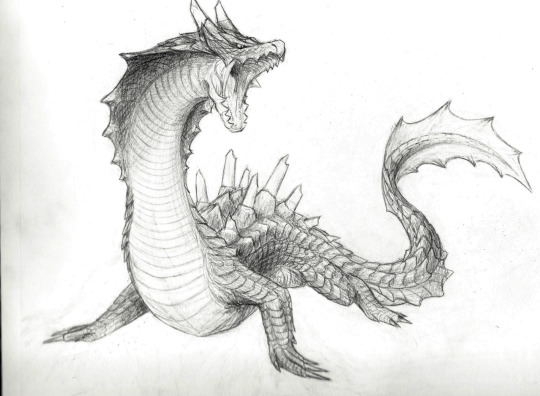
So, I currently have an unfinished piece sitting in my files that began as a traditional drawing, one that I want to keep all the pencil details for. Here's the sketchbook page, scanned using a household printer:
Not terrible, but it'd be nice to have clearer contrast between the lines and the background. In MediBang, I can adjust the contrast by going to Filter>Levels (or Ctrl+L), which gives me a little box that looks like this:
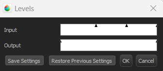
I don't technically know the nitty gritty of how it works, but by my understanding, the outer triangles for the input and output indicate the range boundaries. Adjusting the input--particularly the darker boundary--so that the output boundary exceeds it basically tells the program to make the darker parts even darker, resulting in this:
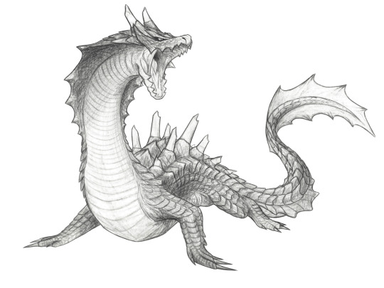
Better! As you can see, though, the darker parts of the background also show up a bit more. Rather than relying only on contrast adjustments, what I actually ended up doing was carefully erasing the background around the drawing after adding a plain white layer underneath, and also going over some of the lines digitally. I did this first in MediBang (the only art program I had when I started working on it), then transferred the file over to Rebelle.

MediBang (left) has the pure white background, while the Rebelle (right) canvas settings I chose are a little off-white and more textured, which I think blends a bit better with the texture and shading of the image. It's possible to add textures and the like in MediBang, too, but Rebelle has it built into its design, so it's a little easier to figure out there; I'll likely finish this piece in Rebelle (whenever I get back to doing so, haha), since the canvas and brush settings will be easier to match to the texture of everything that came directly from the drawing.
Most of this is much easier to do with a drawing tablet/pen, unless you're a wizard with a mouse. As for traditional means... the best suggestion I can come up with is to try inking sketches, or at least darkening them further with a pencil. The more contrast you can get between your lines and the background, the more easily you can digitally tease that contrast out even further. I think most photo editors have at least some contrast, color, and brightness adjusters, and probably more useful functions I don't even know about--it never hurts to mess around with any program's filters and settings to see what happens!
Good luck, and happy drawing! :D
#Patchy Babbles#Asks#I love getting asks so it's more than okay!#Sorry the answer is basically that that sketch is a lie haha#Someone on the internet has probably figured out more effective tricks but that someone is not me#Also your art looks super good!#You have a great eye for detail~
5 notes
·
View notes
Note
Hi! I actually am wondering about trying watercolors for the first time but feel a little anxious haha.. how you go about drawing on the paper with confidence? Like, watercolor paper isn’t exactly cheap. I think I got the cheapest one avaible from Canson but still the anxiety is real… do you pick very light pencils like 2B so you can sketch veryyy lightly, or before sketching on the paper itself you do a planning sketch in another paper?
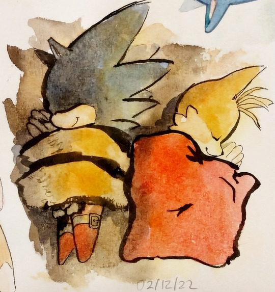
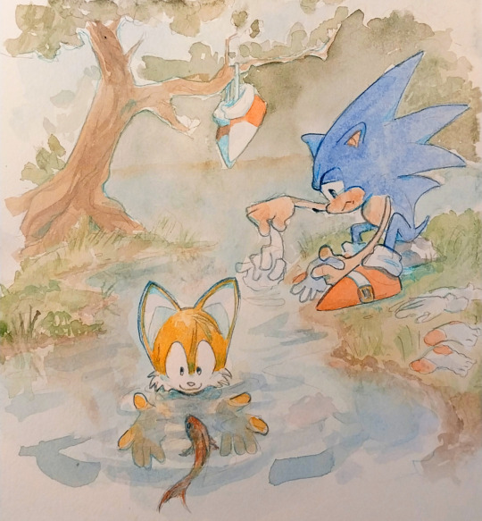
Im asking this cos I really love your art and it’s so cool that it’s mostly traditional! And the way you draw Tails is too adorable and consistent while being in your style, it always feels like you have confidence when you draw him.
oh i think this is gonna be a long one
all in all?i have the same anxiety as you. but i've confidense that i can make something good sometimes, but not that i will get it right every time. So i keep trying, but heres some stuff that helped
a warning though, i keep going on and on in this reply and can get pretty negative at times
my watercolor paper i use costs 2 dollars and has 20 sheets so that's 10 cents per sheet. which i feel helps with my anxiety... it's the canson multimedia block too, 140 msg .....
watercolor sketchbooks i'd find online were around 80 or more BRL, and then 20 BRL shipping.... that's 20 USD in total...
but a block of this plus getting it binded costs me 4 USD.....so i think that one [price] helps alot lol.....
as for the confidence.....

i've had enough time to do quite a bit of trad art, specifically ink and watercolors so im USED to the material and now quite as scared to "mess up" as when i first started it.... [hint, i still am]
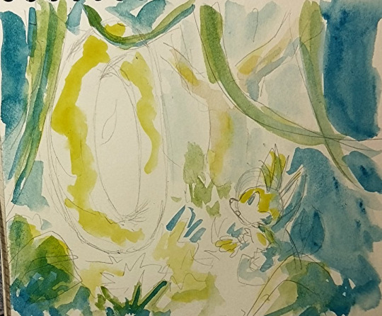
this is one example of a sketch page, they vary in size, and how "done" they are... i dont really worry too much about maintaining a rule of "everything in this sketchbook must be fully rendered " bc it ended up stunting my creativity

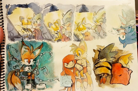
i did try the "sketch it onto a sketchbook and then pass it to watercolor paper" approach and tbh...? not really my thing... i've found that to me the first sketch always end up being looser than when i pass it on... i'm always more focused on getting the flow, composition and pose there than i am getting the right details or right lines or colors etc....
like this one, im more happy with the sketch, it's mroe dynamic, mroe fun
i DO sketch stuff on cheaper paper first when it's for trad art commissions though, just bc there i HAVE to make sure the client is getting what they asked
and i do use 2b pencils AND a "soft lead" mechanical pencil, btu tbh it's mroe bc of the feeling of it on paper than for the look of it...
here for example you can see the circle i used to have a basis on where tails would be.. i didnt erase it as i continued painting bc tbh it was just the sketch. i ended up liking it tho
i actually got quite MAD and angry at myself recently bc i noticed how much my sketches were looser in the sketchbooks when i did try the passing onto watercolors thing and i had a full on discussion with a fellow artist about daring myself to be bolder in the future, it has been working well

I sadly have to say though, that figuring out how to build confidense is more of a personal journey, and i cant claim that what worked for me [trusting my first sketch] would work for you.....
It's time, practice, trial and error....
OH, one thing though that DID help me. is:
-There's no art wasted, even if it doesnt turn out how you wanted it, you still learned something.
-Makins these personal art/fanarts isn't some school paper you have to hand it to be graded and then not get it back. You can re-do a piece as many times as you want until you get it right!
I have quite a queue of pieces i plan on re-doing in the future bc i didnt like the first ones i did. im not perfect on confidence and i get scared of fully committing to drawings alot, many of them are pale not for choice bc bc i got scared of making my art too saturated and overworking it
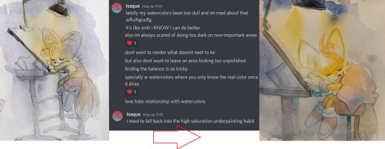
i am about to get negative now so stop reading if you dont want to see that.
HERE NOW i's a alot of pieces i made that im unsatisfied with and plan on re-doing one day:
too dull, simply way too watered
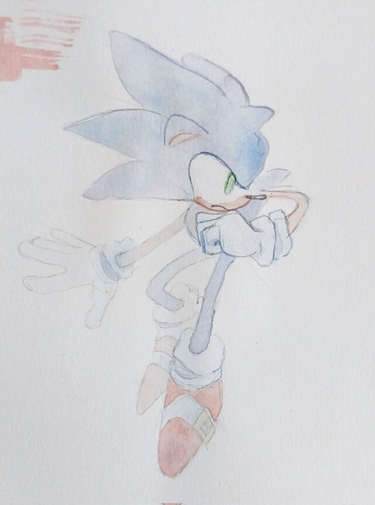
which led me to make THIS piece and do better colors
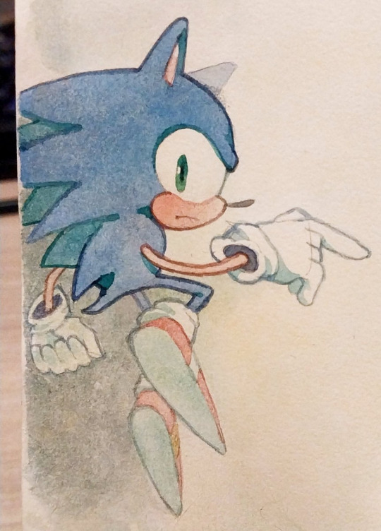
i hATE the way i did the lineart here. it's boring, the anatomies are wonky. it's a good concept but i didnt excecuted it as well as i wanted. but this piece has made me just go and try inking MORE so i could make up for it
which lead to this piece here eventually
This one here.... the colors look so muddy it just makes me SAD, bc i had been so scared to use high saturation that i went with the muddier colors by choice, if i had allowed myself to experiment i wonder how happier i'd be about it
which led me to make THIS piece with softer in value and more saturated colors
The colors and blending of this one are too soft and not bold enough for what i had envisioned it, i made it as fanart of a friends fic and it made me feel like i failed my friend and insulted her fic when i finished this. I dont think the piece looks bAD, mind you. i know it looks cute. and good even. But i had such high hopes for it.

which led me to make this one
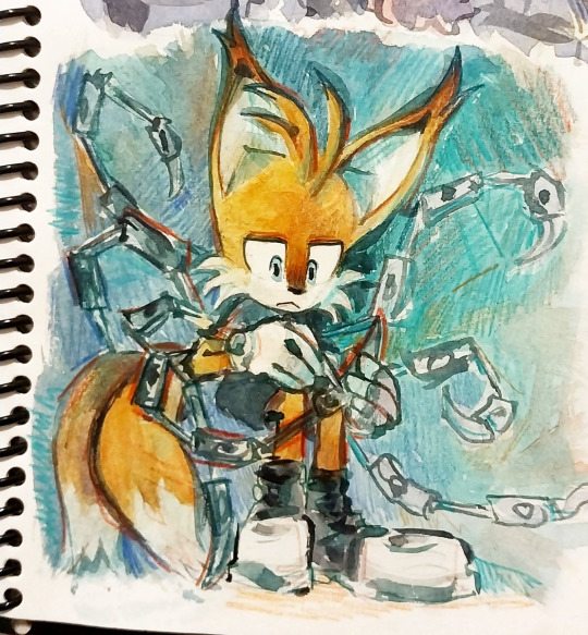
THIS ONE OH MY GOD HOW I HATE IT. sonics expression is SO creepy hes like a horror movie weirdo , honestly not my best work when it comes to anatomy

so i've been doodlin sonic now and then as practice so that i could make this one eventually

The perspective on knuckles could be better and the characters look out of place on this scene, the background is ok

but in this piece here i was able to get a better harmony between colors, background and whatever sparse linework i threw in

Theres so many more haha but i'll stop for now....
Dont get me wrong i dont ACTUALLY think those pieces are HORRIBLE horrible,,,, i see the flaws in them yes, but theres always something i like too, and i know people like them, and that people wont throw away a whole piece over one small detail that in the end doesnt even affect the overall thing....
i've just been getting into the headspace of "ok. at least this one is done, onto the next"
plus the whole thing i told you of realising my first sketches are looser....
sorry im not too good at talking about this and my points arent very clear, i dont think this is going to be quite the help you expected it to be because the truth is that the struggle with your art is soemthign that doesnt go away no matter what skill you have...
at times to me it feels more like a mentality practice than skill, reasurring myself that it's ok to get it wrong and try again, etc etc....
i used to go to therapy and one of the things we talked about was my perfectionism, how i used to be so scared to mess up a piece. that i wouldnt even start, and wouldnt draw for months. this has been going for years now and hey i've gotten better.
but..... yeah im in the same boat as you.... except mine is no longer just about the paper quality!
Sorry this got so personal now, i hope that this hasnt killed your hopes on getting better at the anxiety. it does get way better haha... trying to force your brain to not judge yourself so harshly is half the battle in my opinion, the practice of drawing is the other half....
good luck i hope you have fun painting, i know i do, i love the process even when i dont like the result, good night and thank you for the question
23 notes
·
View notes
Last Seen Blogs
somuchtostudysolittletime
Study, Study, Study

wearehaawks
Haawks

sherimoonzombie
SHERI MOON ZOMBIE
dreamiesdotcom
♡♡♡
theonlyparadox
This City's Made Us Crazy and We Must Get Out - M5