#also. the reason the first panel looks so different in style is because i sketched the second panel on paper
Text

has this been done already
#hermitcraft#hermitcraft fanart#hermitblr#docm77#docm77 fanart#grian#xisumavoid#ender dragon#its been forever since ive drawn a dragon#i was really worried i wouldnt be able to get it right#also. the reason the first panel looks so different in style is because i sketched the second panel on paper#it takes me at least 10 times as long to draw things on my phone. im hardly joking#ANYWAY enough complaining ab art. DOC#WHAT THE DOC DOIN#clumsy art#my art
883 notes
·
View notes
Note
How's the comic going along? have anything fancy or little secrets planned? Looking forward to more :D
ps I like the sketch style
pps what art thing do you use
ppps smorestuck -> 🍞🍫⚪🍞 🏠
ghfdjkgdfgjkhg didn't get any work done last week as i was busy with commission stuff~
come monday i'm gonna get back to work on it (and try to balance it with the remaining comms as best i can, so update mightttt be the week after that? art hard </3)
also eheehehehe you have NO idea how many secrets i got planned >:)
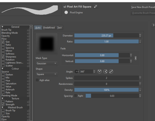
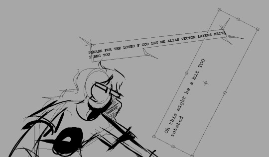
the art thing i use is krita!! i like the way that program works + it has good animation tools which helps with some stuff~
i use a modified version of krita's pixel brush, (i hit f5 to open the brush editor and set the shape to square instead of circle)

my process is mostly trying to get as much done as i can in as few layers as possible?
a LOT of my panels are just first draft rough sketches (this is to help me get pages out at something resembling a reasonable rate, because i have the constitution of a poor victorian orphan chimney sweep)
i generally just have a colour/value layer, a rough sketch layer, and then another layer for dialogue/text/what have you. (though i'll often end up using more if it's just convenient for other stuff to have it's own layer, or if i'm having trouble drawing something specific and just wanna keep trying at it without effecting the stuff around it)
oh and i do huge swathes of the comic in just one file because i'm insane
(though for pages with animation i tend to just copy and paste the page's layer group into it's own new file and do the animation there because i severely doubt krita can handle BOTH animation, AND like a hundred fucking layers at the same time)
OH and i do all my typesetting in GIMP because krita doesn't let me do non-antialiased text for some reason
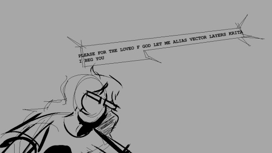
for this i just type it out in gimp, 14pt courier new as our god homestuck intended

(and depending on what i'm using it for i'll probably scale it up an integer amount)
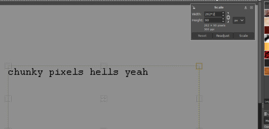
and then i paste it into my image and usually rotate or transform it a bit (with nearest neighbour scaling <3)
small peak into my artistic process, this doesn't cover dissonance logs and such but that's like a whole different thing, messy messy spaghetti code and html~
i realise you didn't ask for most of this but i felt like sharing anyway lmao
also om nom smore stuck
#asks#itemised-unreality#comic stuff#watch as i perform my own tracheotomy (working title)#my art#juney.png#juney.txt
22 notes
·
View notes
Note
how do you get inspiration for your art? i love the vibes your art gives, it reminds me of manga panels if that makes sense <3 sorry if im bothering you i just love how you draw
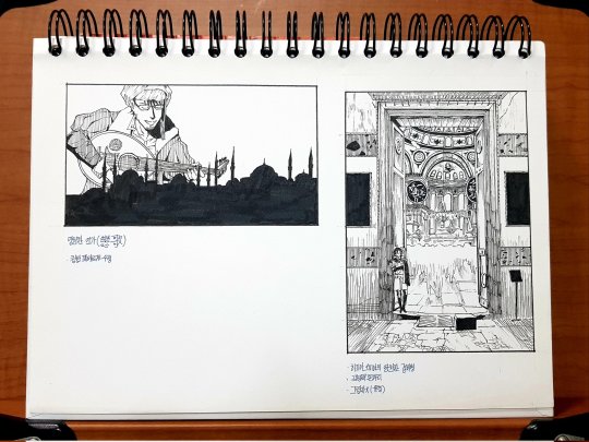
Thank you for your question! I am happy to explain my work process here. It's been about a year since the process of work and painting style were established.
There are many ways I get inspiration. First, do research on the character and write down the information and keywords that can be used for the work in a notebook. Look for information about the character and background information of the original person who became the motif (history, legend, another work that the person became the motif, etc.).
This painting, for example, was painted while reading Judith Herrin's <Byzantium>. But I don't go through this research every time I paint. Usually I do a quick survey, and I happen to be inspired.
I subscribe to a number of accounts on Twitter that post history/old photos/scapes/pictures, and that also seems to have affected me.
When I come up with an idea, I sketch briefly. If I like the sketch, I'll shape it into a picture, and if I don't like it, I'll put it on hold. And in my case, in the process of painting, there's a painting that's quite different from what I planned. I usually draw black and white pictures, so I'm not used to coloring.
I use a sketchbook and a notebook for ideas and notes separately. The reason why most pictures have borders is because I divide the area in the sketchbook, draw it by hand, and then scan it.

16 notes
·
View notes
Photo
A Broken Blade, Short comic: Making-of
The very short comic I drew for A Broken Blade took me a lot of time and effort and I would like to share the list of resources I used as well as some of the concept arts, sketches and drafts I made throughout the process. I don't know if anyone will be interested, but I feel the need to share anyway. =)
Sorry for any grammatical or spelling mistakes, English is not my first language.
Literature resources
First things first, while drawing the first page I decided to read some books about how to draw comics because I have very little experience in this field. I chose two books:
Foundations in Comic Book Art: Fundamental Tools and Techniques for Sequential Artists by John Paul Lowe
The Complete Guide to Self-Publishing Comics: How to Create and Sell Comic Books, Manga, and Webcomics by Comfort Love & Adam Withers
It's been a while since I read them, but if I remember correctly I liked The Complete Guide to Self-Publishing Comics better because it's very complete (it’s in the title) and covers all aspects of how to draw a comic. It has a lot of great examples too. Foundations in Comic Book Art talks a lot about inking (which I wasn't particularly interested about), but it also has a nice chapter about perspective. Both have very useful tips so if you are interested to draw comics you might want to read them.
I've also read really good stuff on Making Comics – with Salgood Sam, in particular the article about flow in comics.
Inspiration
I usually start every project by making an inspiration/mood board so I made a small collection of comic pages on Pinterest to see what kind of layout and style I could use. I was mostly interested to see different ways of representing movements and sounds.
Layout & composition
The first thing I did was to draw a thumbnail for each page to get an idea of how I would represent the scenes. I think you're supposed to draw several thumbnails for each page but I was okay with the first ones I drew so I decided to keep them.
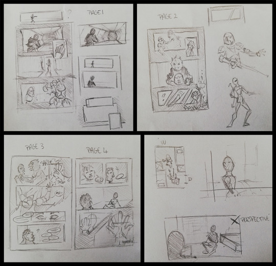
I worked on each page separately after that, always starting with a draft. It was really the most important step for me because it helped me to visualize what kind of atmosphere I wanted to use and where to place the lighting. I tried to keep them simple but you can see different degrees of laziness depending on the page. xD
Some of these sketches are very ugly but it does the job. ¯\_(ツ)_/¯
I wasn't satisfied with the first composition I made for the second page so I made another, more sketch-like, version. I ended up using a mix of the two versions for the final page.
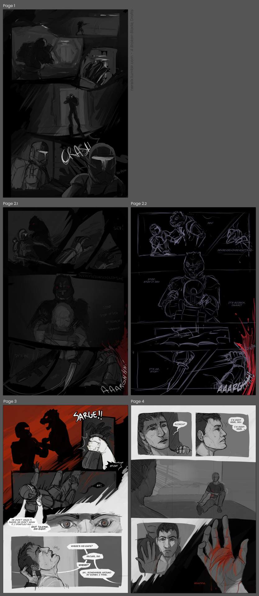
Now, a very important point was that the part of the fic I decided to draw is about Sev having a nightmare. I really wanted to bring this aspect in the comic so I tried to play a lot with the lights, shadows and blurred elements. For the same reason, I decided not to use straight lines for the panels’ borders. I had in mind that it could depict how confused Sev is.
I think colors also play an important part in telling a story. For the general atmosphere, I decided to use the complementary colors blue and orange to separate the moment Sev is dreaming of cold, fear and death to when he wakes up to warm, security and family. And of course the red is for danger, blood and Sev himself.
References
First of all, I can't talk about references without mentioning PureRef, which is the program I use to make reference boards. I can't praise this tool enough so don't hesitate to check it out.
I always use a ton of references when I draw, and I'm not even exaggerating, I can easily spend hours searching for the right ones. There are plenty of places where you can find good references but sometimes you also need to be creative. I usually gather most of my references from Pinterest, Google Images, DeviantArt and Sketchfab (for 3D models). I also have a big folder of refs saved on my computer for the things I often draw. When I can't find what I'm looking for, I try to make it myself with 3D, videos and photos.
Here is a part of the references I used for the comic:
I said it's only a part because I also have separate boards for clones armors and SW characters/species designs.
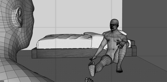
Among all of these you can see some concept arts and screenshots from various Star Wars series/games that I used as inspiration to draw the interiors. And since I'm bad with interiors, for the panel with Scorch I used SketchUp for the first time to make a very quick model of the scene. I tried to use the rule of thirds for the composition:
There are a lot of photos of my hands too, I don't have much trouble drawing them but references are still very welcome.

After finishing the first page I've invested in a drawing mannequin (S.H.Figuarts - Body Kun) and I can say for sure that it was my best purchase of the year! It's absolutely amazing to make custom references:
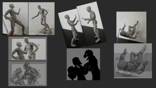
I decided to draw over the photos of the mannequin taking the pose because it is waaaay easier that way than trying for hours to get the proportions and perspective right.
Finally, I often put tutorials from other artists on my reference boards, here is the links of those visible on this one:
[Nose tutorial] • [Ears tutorial] • [Hands with knife] • [Folds tutorial] • [Mouth tips] • [Arm studies] • [Folds material comparison] • [Pant shapes and folds]
Character & knife design
For Sev, I decided to use the original design from the Republic Commando game rather than the simplified version we see in SW:TCW. I really struggled to find references for his armor's markings that showed all angles so it's not 100% accurate to the original design, but I don't think that's really a problem. For the armor itself, I prefer the more realistic look so I used references from Star Wars Battlefront II as well as 3D models (mostly this one and this one).
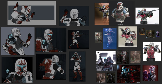
Since I'm a perfectionist at heart, I tried to keep all scratches on the paint the same from one panel to another. :’)
The trandoshan is only visible on a couple of panels but he still needed a design. I used references from different sources but I was mostly inspired by the trandoshan concept arts visible in The Art of Star Wars: the Mandalorian (bottom left and bottom right images).
As a side note, I used one of my own character’s design as inspiration for his muzzle’s markings.
In the fic, the blade is described as being “beautiful” and the image that immediately came to my mind was one of these knives with a Damascus pattern (I just learned that's what it's called). I used various references from regular knives and vibroblades. One of my friend made a speed modelling of the knife I designed and I used it as reference as well, look at this!
Sources of the middle top vibroblade here and bottom left here. The reference on top right is from The Art of Star Wars: the Mandalorian.
Did you know that non-energized blades are called dead blades in Star Wars? It's a pretty cool name in my opinion.
Fonts
The fonts I used on the comic come from Blambot. I used Anime Ace for the regular texts and Death Rattle for the big sound texts. I also use NexusFont to manage the fonts on my computer, it’s pretty useful if you want to use fonts without having to install them.
I think that's all. I hope someone will find this useful and kudo to you if you read the whole thing! ^^
12 notes
·
View notes
Text
10 Anti LO Asks
1. Can we talk about how Semele was like, forgotten? 😐
I mean, better for us, I don't want to see what RS will do with Dionysus 🙃
2. are we sure the art team on lo actually likes it tho bc i see the current art and it looks like a hot mess. tho maybe thats just bc the sketches arent good and her instructions arent clear? idk i would think putting the best product forward esp on a work i like would be better than having it be so rushed and kinda bad?? her name is the only one who is on it at the end of the day so i guess they really have no reason to make it look good when she takes the credit for it.
3. also like ... of course rachel can (supposedly) crank out a panel in 30 minutes, its HER style and SHE knows what she wants, but the team, especially a newbie, DOESNT, so how could they know what exact time saving tricks she uses or her work flow? theres so many factors that go into pay and shes to be basing it off herself, as opposed to the differences in her assistants and the fact it has to be done in a small amount of time. also kinda weird none of her team seems to be long-term but 🤷🏿
4. girl, her last two editors QUIT webtoons after working with rachel, despite them even getting promotions. that on top of the high turnover rate in her art team is a bit concerning, ngl.
5. i dont think rachel was being malicious, but i do think she was aware she was underpaying for the amount of work she was asking for, because turning off comments and replies pretty much immediately gives that away, as well as going through her social media accounts instead of actual artist networks of which there are countless avenues to do so (including through webtoons itself). i dont think shes evil for it, but it seems more a case of being careless over being fair, IMHO.
6. i just wanna talk about that one art assistant rachel had in 2019(?) that literally drew LO porn and that was like, the only one she actually promoted. what a weird summer that was.
7. obvs you'd raher have people who are passionate about the comic work on it and all (tho going off the editors for LO they dont like it) but, and this is not an insult to them, but is the sketches and instructions rachel giving them just not good? because ive checked out some of their instagrams and they make lovely work, even better than rachel's old stuff, but the actual comic's art is just... bad? i really dont see how they have such creative man power behind it and it still looks like that?
8. Oh GOD can you imagine RS portraying the Trojan War in the LO universe??? It sounds like a trainwreck that I would absolutely love and hate to see
-----FP Spoilers/Mention-----
9. (FP) girl i swear if rachel introduces hypnos just to pull the "wah look at thanatos the unloved twin" i might actually lose it. theres only like three things to thanatos in myth and one is that nyx loves him and him and hypnos are as close as can be. she already ruined the loving sibling relationship between apollo and artemis so can we just hope she doesnt ruin another one too
10. FP// I also found it very forced to now say Hades is actually the father figure to Thanatos because we saw since Than's first intro Hades belittled him, and Than p obvs didn't like or respect him and it's so like I get it's put in to try and justify Hades' favoritism towards Persephone (which is dumb) but its done so poorly and only makes Hades look worse. Also it implies he'd be a terrible father if when taking care of a child he just makes them a servant then treats them terribly as an adult.
34 notes
·
View notes
Text
LGBTQ Manga Review – Yuri Is My Job Vol. 1-5

Yuri is a genre deeply rooted in its history and traditions. Dating back over a century, many of the scenes and situations from early "Class S" literature still predominate Yuri titles today. Common elements include senpai-kohai relationships between a bright and cheerful younger girl and an older, more assertive upper-classman. The bonds between the two were not the romantic and sexual love of lesbian narratives, but more sate or "pure" relationships often devoid of lesbian identity or attraction. The presence of S elements ebbed and rose over the past century, but they experienced a surge at the end of the 20th century. Contemporary S literature dominated the Yuri scene for at least a decade, and even now, its effects are still seen in many works today.
Naturally, as with any genre that becomes too entrenched with tropes or clichés, Class S literature became the subject of parody, commentary, and deliberate defiance. And while numerous works have repeated, twisted, rejected, and exaggerated tropes, perhaps none have done so quite as masterfully or as enjoyably as Miman's Yuri Is My Job! The series uses S Yuri's ideas uniquely and masterfully weaves a narrative in and out of them with a layered setting and great characters. The constant balance between and integration of reference, humor, and a strong core narrative had me gleefully enthralled and thoughtfully pouring over every page. I ravenously consumed the series, not just because of the cute cakes and elegant young women, but because I was so invested in the story and intrigued by the manga's premise.

Breaking down every reference is far too daunting a task that frankly deserves its own dedicated article. Still, to briefly overview, Yuri Is My Job! is set primarily at a café themed after an all-girls mission school, Liebe Grils Academy. The servers of the café act as the elite students of the fictitious academy and offer outside visitors, patrons of the establishment, a glimpse into their forbidden world of elegance and sisterly love. The series follows high school student Hime after she starts working at Liebe after accidentally injuring the manager, Mai. The series takes off from there, with Hime participating in the various themed events and navigating challenging relationships with coworkers, including her hostile schwester, the upperclassman who mentors her, and, in the world of the café, partners her.
Yuri Is My Job! is much more enjoyable with an understanding of S literature and themes, as references can slip by readers otherwise. However, particularly after the first volume, the series opens up a little more with an overarching plot that dips in and out of the thematic S material. Even without a grasp of S tropes, readers can enjoy watching server Kanoko struggle with her hidden affection for Hime or get caught up in the excitement and scheming during a popularity competition between the staff.
Throughout the first five volumes, multiple shorter narratives, such as the cook getting sick or Hime learning how to serve guests, are interwoven with the overarching character and relationship-driven story. Although almost every character has plenty of time to shine and distinguish themselves, the main plot revolves around three characters, Hime, Yano, and Kanoko.

Hime, the protagonist, maintains a constant facade of the sweet and beloved princess. However, her adorable and charming act is just that, and only two people in her life know her secret, Yano, and Kanoko. Inside the café, Yano acts as Hime's "onee-sama", holding her close and praising her to the delight of Liebe's patrons. However, she is terse and often angry with the girl, unable to move beyond a misunderstanding in their shared past and her insecurities about Hime's true feelings. Kanoko however, acts as a foil to Yano. She relishes Hime's facade, specifically in that she is one of the few privy to the truth, and harbors an attraction to her; she hides these feelings rather than wear them on her sleeve as Yano does. The dynamic between these three drives much of the "action" in the manga.

The more I read Yuri Is My Job! The more I was able to see and appreciate the distinct patterns of storytelling and how the main plot is woven between three layers. The first, and most prominent, is inside the café, in a world dominated by S tropes. Here, characters play politics and plot against each other using their performance and the audience's reaction. For example, thinking how they will get votes for themselves or others during a contest, or else Hime acting cute and loving around Yano, forcing her to return the affection to maintain their roles as schewstern. Outside the fictional world of the café, elements of the story alternate between more grounded drama and thematic moments featuring Yuri tropes. Miman beautifully navigates the relationship between the plot and the parody, weaving a delightful story in and out of different classic Yuri scenarios.
Miman matches this creative story and setting with excellent artwork. Character designs are distinctive and well constructed. So much, that when characters say something "off-screen", a small sketch of their eyes and mouth in the speech bubble is more than sufficient to identify the speaker. Of course, the robust and developed personalities also assist here, as most lines are easily attributable thanks to solid writing and strong personality. The art also features very creative paneling, with almost every page having an entirely different layout. However, the order is still easy to follow and reads naturally.
Not only is the art pleasing to look at, but it also adds to the manga's setting and parody of Yuri tropes. Panels feature the girls holding each other in dramatic and literally flowery poses, like a shot straight out of Strawberry Panic, complete with a backdrop of lilies. Appropriately, these fantasy-inspired poses occur in the café, often to the pleasure of adoring patrons screaming in celebration (thus mirroring my reactions). Like the other Yuri tropes, these artistic presentations occasionally jump outside of the café in more emotional or poignant moments. However, in a few crucial scenes, those more related to the narrative when it steps outside the boundaries of Class S, feature more grounded, although still dramatic, art. A particular shot in Volume 4 where Kanoko confides her hidden feelings to her senior, Sumika, and is comforted, sticks out in my mind just for this reason. It is a perfect example of art assisting the themes of the narrative and changing to suit the situation.

Yuri Is My Job! focuses mainly on Class S style storytelling, and thus, while it has plenty of traditional Yuri imagery, there is a starkly limited amount of lesbian content. Sure, readers can enjoy a decent number of illustrations featuring girls holding each other in a dramatic pose, but this is the act put on for the cafe, which is copying the "practice" relationships of S literature, themselves devoid of lesbian attraction. It is an imitation of an imitation, not queer content. Of course, this is by design, but it does mean that if readers want a grounded lesbian romance, they will find the series lacking. A bit of lesbian content does exist, Kanoko's crush on Hime exists outside the boundaries of work and S tropes, a relationship told in a flashback was, at least to one of the characters, "real," and there are signs of an eventual romance. However, the lack of lesbian identity should not be a reason to avoid this excellent manga.

Yuri Is My Job! is one of the most brilliant and exciting Yuri works out there. The ways Miman plays with the tropes and expectations of the genre are hilarious, complex, and exceptionally compelling. The characters are exciting and watching their stories weave through different classic Yuri scenes and tropes is as breathtaking as it is enjoyable. My sincere thanks to Diana Taylor, and Jennifer Skarupa and editor Haruko Hashimoto, for so deftly translating this series and preserving the S ties. I cannot wait to visit the students, or rather employees, of Liebe Girls Academy, in Volume 6.
Ratings:
Story – 10
Characters – 8
Art – 9
LGBTQ – 3 (Yuri 10)
Sexual Content – 1
Final – 9
Review copies provided by Kodansha Comics
Get Yuri Is My Job! digitally and in paperback today: https://amzn.to/3gNNeRt
Buying manga helps support developers and publishers. YuriMother makes a small commission off sales to help fund future content.
#yuri#lgbt#lgbtq#lgbtq+#queer#gay#romance#manga#art#reviews#yuri is my job#lesbian#shoujo#comics#literature#girls love#wlw
394 notes
·
View notes
Text
Remote 10 Dance Ball
I know this is coming way late (as in, 3 months after it occurred!), but I’d always been planning to write up a report about the Real 10 Dance event that took place shortly after vol. 6’s release in Japan. Before I get into the explanation of what exactly this is under the cut, enjoy this promo image that ticket holders were able to print out at Japanese convenience stores (mine had to be printed by friends who live there and then scanned to me)
The Real 10 Dance is a series of events that have taken place over the past few years featuring real life pros performing routines inspired by the manga, meaning that most of the dances feature male-male couples (though they all have female partners in their regular careers, for these performances they dance together, and the women are given a group number to perform). The most recent live event took place in September 2019 shortly after vol. 5’s release, and there was another planned for 2020 in Osaka, but it was delayed and eventually completely canceled due to Covid restrictions. Wanting to still put on the event in some form, they later announced that it would take place virtually, and would be branded as the Remote 10 Dance Ball. For the cost of 1,000 yen, viewers could watch a stream of the event as many times as they pleased from the time it went live on March 20 until the viewing deadline 72 hours later. Unlike the in person events, there were no merchandise buying opportunities, but there was the option of paying additional 1,000 yen tips to either the performers, the production committee, or Inouesatoh herself. Choosing any of these options would give that ticket holder access to a code to print the postcard shown above, as well as a link to view a 17 minute making-of video of the event.
Before I get into the rundown, The Real 10 Dance Twitter account posted a preview video a couple weeks before the event, which you can watch if you’d like to see some of the action instead of just still images (and the only ones I’ll share here are those that were posted publicly, since they were pretty adamant about no screenshotting/recording of the event…not gonna lie, I did attempt to screenshot a couple parts, but due to the shaky streaming quality, the official photos are much better than what I was able to capture anyway :P) Also, I only made bare minimum notes while I was watching this (and was drinking hard cider), so I’ll give as much detail as I can remember, but there are definitely things I’ll have forgotten by now.
The show started off with one of the female pros giving a demonstration of how to apply makeup for competitions. After this came an introductory show with all of the participants dancing to the opening theme from La La Land.
Next up was some of the pros talking about the characteristics of their costumes, such as the Latin outfits having features like illusion netting to make their limbs look longer, and fringe to create movement.

After this, some of the pros gave tours of the dance schools that they run, which also served as advertisements for those who may be interested in signing up for lessons.
Then came some step demonstrations, showing specific panels from the manga and then describing how to perform the moves. This included Al and Suzuki’s rumba walk from chapter 18, and the throwaway oversway from the chapter 4 scene where Sugiki turns Suzuki into a princess. For the oversway, they performed the move a few different times, using prompts such as “do it like the world’s about to end” to show how the same move can feel very different depending on the emotion behind it.
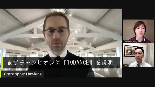
This was followed by an interview with former standard world champion Christopher Hawkins. The interview was conducted in Japanese, as he is fluent in the language (Inouesatoh tweeted about him being the inspiration to have Norman speak some Japanese in the story, though she acknowledged that Chris’ abilities are far above Norman’s very basic phrases). It included two interviewers asking questions that were submitted by Inouesatoh and her editor. It started off with some basic talk about the process of training and getting prepared for competitions, then moved on to topics like whether he had any competition related superstitions/habits, such as how some dancers will have a pair of lucky underwear they always wear when competing. He said he had a specific order to how he would button his shirt and attach his cufflinks (as in, not just going straight up or down, but skipping over some and coming back to them), and if he didn’t do this specific routine it made him feel like the competition would go poorly. After telling this story, he laughed and said that he’s never told anyone about this before, so it was definitely an interesting question. Then came probably the most important question for fans of 10 Dance: since the series centers around men dancing together, what sort of experience does Chris have dancing with other men? (Funnily enough, for some reason, the male interviewer first asked this question in Japanese, then rather enthusiastically asked the question in English as well lol). Chris said that of course he’s danced with male students a lot in the course of teaching them, but outside of that also had times where he would train in the female role so he knew how it felt to be the following partner, and therefore could become a better lead. He mentioned some performance he did with another high level male dancer that was pretty amazing (forgive me, I didn’t catch the name at all, or even whether he was a standard or Latin specialist), which caused the female interviewer to joke about writing a love story about the two of them.
Then came the main draw of the event, the dance show! I’ll include the song, dance style, and an image from each performance below.
One Way or Another by Blondie, jive
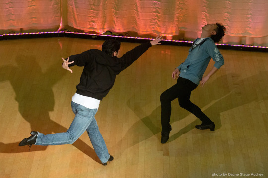
Lady Marmalade (I believe it was the Moulin Rouge movie version), ladies group cha-cha

Half of Me by Ken Hirai, rumba (I don’t know if it’s just because it made me think of the melancholy rumba shown on vol. 6’s cover, but this made me both want to cry and watch it multiple times over, definitely my favorite because apparently I like to punish myself with sadness :P)

All of Me by Michael Bublé, foxtrot (this was filmed both in the performance space and out on the streets in one of the locations used in chapter 33, as shown in this video from one chilly looking morning. Also, this dance featured a leader switch partway through!)
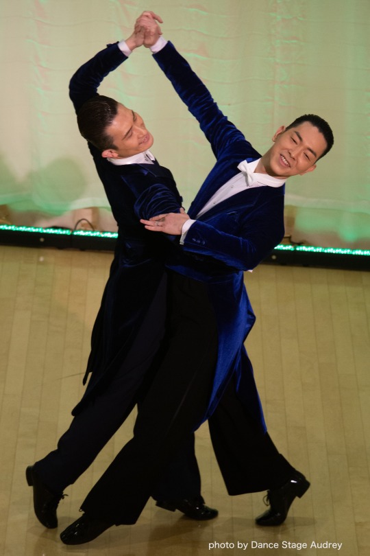
If I Can’t Have You by Shawn Mendes, cha-cha

Finale with all participants to It’s Time to Dance from “The Prom” musical
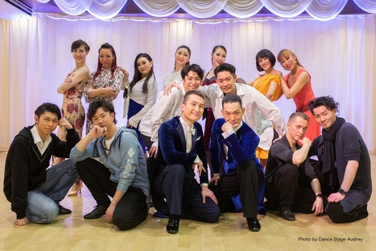
Last up was a virtual art exhibition featuring 17 sketches by Inouesatoh, including the most powerful sexual stimulant in the known universe, Bathrobe Sugiki.
Overall, I was very happy to get the chance to witness this event. Normally, the number of people would be limited to just those who were in Japan and able to purchase tickets before they sold out, but this remote version allowed a much larger number of people from all over the world to watch (I bought my ticket not even knowing if it would be region locked or not, but thankfully it wasn’t). I hope that the world situation improves and they can put on the event live and in-person again (even better if I could somehow find a way to attend when that happens!), but I think this was a great alternative, and probably a good way to make some revenue in a time when the ability to stage events is limited. The price of 1,000 yen was an incredibly good deal for all the content that was presented (and you better believe I slammed an extra 1,000 straight to Inouesatoh; the only merch I’ve been able to buy is secondhand, and while this satisfies my needs as a collector, it unfortunately doesn’t provide any support to the author). If real life performances are still a long way off and they decide to do a virtual one again, you bet your ass I’ll be right there in the (imaginary) front row!
18 notes
·
View notes
Text
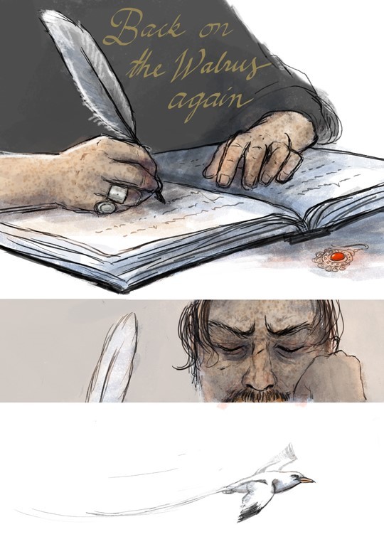
part 2/6
2nd part of my old Black Sails scraps and doodles from 2016–2021. Not in any particular order.
This time the drawings are short comics that were abandoned for a reason or another, mostly because I lost the interest or felt like there was too much to redraw compared to the satisfaction of finishing something else more interesting. There’s also some talk about rigid mindset and how overthinking can lead to stagnation.
Contains early silverflint moments, specks of dust, rackham's glasses are found, jealous-Billy spying, desk-Flint gets caught, "squint-squint", a quiet moment and its bird dilemma etc.
And please do not steal and repost elsewhere. But if you do get inspired, feel free to make your own interpretations!
Long-ish post under the cut!
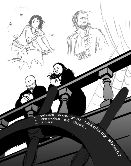
“What are you thinking about?”
“Specks of dust.”
“Liar.”
The idea was to show how much they and their relationship had changed. This was around 2016 when the season 3 began and I was still re-learning to draw with a tablet. Another art from the same time period (and idea) is this art: The Dynamic Duet.
And for some reason I was really stuck up thinking that I’d have to first do the sketch, then the clean line art, then planes underneath, then shadows etc. and I have always struggled with that kind of approach! Mainly because I hate doing clean line work, lol. And I was a fool for trying to start with a white canvas! It’s so much harder to find values and plan things, or at least in my opinion..
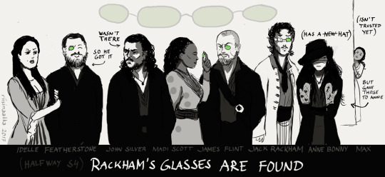
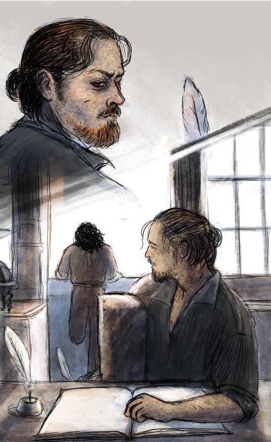
“Rackham’s glasses are found”
To celebrate their new pirate alliance, they share the four lenses of Rackham’s sunglasses as they were also found at the time (because I wanted it to resurface and they could be made into jewellery you know...). This was right after the episode where Anne fights and hurts her hands (here wearing protecting mittens from Max even though she’s not trusted at the moment). Uh, this doesn’t spark joy interest me much and it’s quite stiff and would recuire a lot of redrawing faces, so - discarded!
I somewhat like the idea still (them having something to share, although it’s on Jack’s detriment). I tried to find a stylished comical easier doodlier? way to draw them and draw clean lines etc, but it just wasn’t for me. Also here too, the background is blank and too bright. Later I started to think things as scenes and draw everything at the same time instead of adding the bg later or trying to show everything (and everyone) at the same time.
Here’s also Billy in the same story:
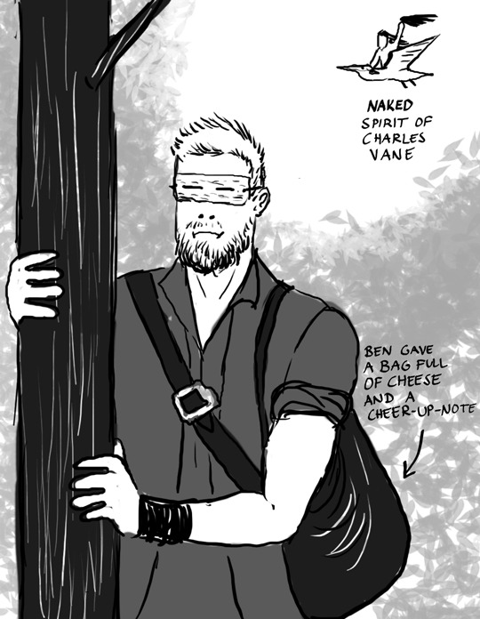
He’s spying on them and since it’s so bright he’s wearing his diy “sunglasses” and being envious to the others. *cough* uhhh...Idk? Also people were shipping Ben Gunn (and cheese) with Billy, so that bled into this too... Charles’ spirit is riding the “big white bird” that was mentioned in Teach’ story and in this case it’s a pelican.
As you can see, I also wasn’t using the brushes that I use nowadays. A hard (or soft) round brushes with no change in opacity just aren’t for me. For example, in traditional art, I struggle with markers and copics, but really enjoy charcoals and watercolours. I prefer ragged edges, layering and thus blending things into each other (and leaving the viewer to fill in the gaps) instead of having stark or definite things. I also struggle with vector drawings, although I have decided to finally start learning to use them...somedayyyy.
Also, I wasn’t paying attention to anatomy, like, at all LMAO. I was just so happy to be able to put something on the canvas.
This is one of my first ink drawings, but I cannot find the original anymore. Again, I like the idea, but not how things look art-wise. And I was so adamant, that I have to get everything right in the traditional drawing and not fix anything later on on photoshop because then it would be cheating. And thus, I was never able to move on or finish this properly the way I liked it (idiot).
BUT! It was a good practise to just draw and test things on paper and gain confidense on drawing things in overall (as I was still getting back into art). To get over the fear of blank paper you know, and try to find my style whatever it would start to form into.
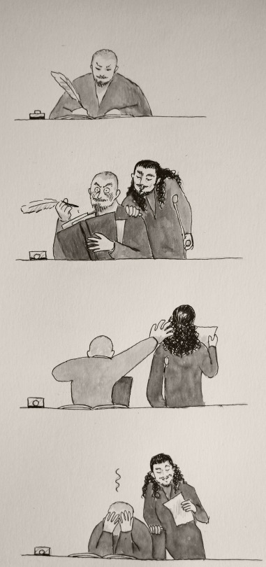
Oh, yeah, Desk Flint.
Desk Flint was a thing for a while (still is, lol). Another drawing from that time is this Slingshot Pirate (2016). And Desk Flint keeps repeating in many later works too. The point is mainly “Flint sitting behind his desk and people interrupt him and I don’t have to draw him fully”
Well, anyway... moving on.
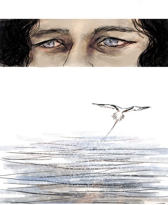
Here’s a plan that has been stuck for years. It’s name is “Squint-squint.” Left is the sketch (with another sketch underneath because the expressions were clearer in the old one). On the right is the continued piece with colour scheme but I cropped the eyes panel and faces out (it was so ugly for some reason) but if I ever continue/finish this, it will be redrawn there in the middle.)
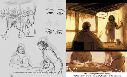
Left. “On that moment their eyes were literally open(ed).”
Right. “After squinting on the shore for days, they had actually forgotten how pretty the other idiot’s eyes were.”
I still like it, quite a lot, but my perfectionist ass only sees too much “boring” things to draw and get right, so it hasn’t been a priority for a long time and other works have kept me occupied and more interested in them.
--------------------
“Quiet Moment.” 2018 (a wordless comic happening after the events of Charles Town)
I’m going to explain after these pictures, but see how big the difference is when you start to look at references and plan things together (the space, “camera” movement, background etc). I also started to colour with coarser brushes:
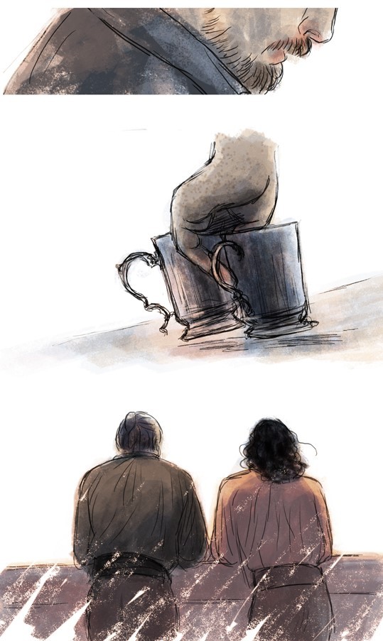
I drew this around early 2018. A lot of improvement! Still quite a lot of negative space (empty white backgrounds), but it fits this work. A few things tell where we are (the ship’s cabin and the balcony). Changing distances and how things are cropped/framed make things more moving and focused (and less to draw, lol). Colours and brush strokes are softer, more layered and so on.
But guess why it’s still a wip!
I couldn’t decide what bird is flying over there.
Yeap! At first it was an albatross (doesn’t go to Bahamas?). Then a seagull (but which seagull? there’s so many subspecies! Is the ship at sea or at the harbour? what birds are there on the open water/ close to the shore?? oh noo...) So, yeah, wayyyy too much over-thinking.
At some point I ended up with white-tailed-tropic-bird which was a plus! because it sounds like the bosun’s whistle, but at that point I was so tangled and frustrated and still had so much to finish with this that I left it be. Also Flint’s face looks different in every frame so I would’ve had to change some parts, lol. And then I forgot it for a couple of years! And then I had learned to draw a bit differently and again saw too much things to do, so it’s quite hard to take on this again, especially when there are so many other interesting wips waiting...
But I still really like the feeling of it! And the colour scheme. So I might just limit the things I’m allowed to fix and then post it as it own someday. I mean, it’s 90% finished, but the last reach just feels like miles.
And that’s what usually happens with my wips. They reach a certain point and it suddenly becomes really hard to finish or get back into.
But every time I learn things and then use the information in another work! :D
Final note for this post (altough this has been said hundreds of times): use references and look how things go and try to see the structure and form beneath things. And think where it is happening and how the light and surroundings affects the characters and/or spaces. And maybe think what you’re trying to convey with the art, what idea? what emotions? what purpose? or like, what are you trying to learn with the piece? and so on...
Thanks for checking this out, I hope you had fun <3
#black sails doodle#long post#but not as long as the future ones heh#tag for Block Spoils doodles#<- if you want to black list these
36 notes
·
View notes
Text
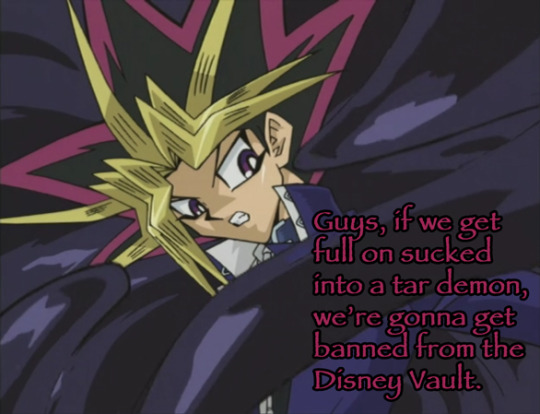
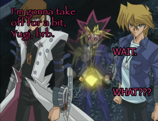
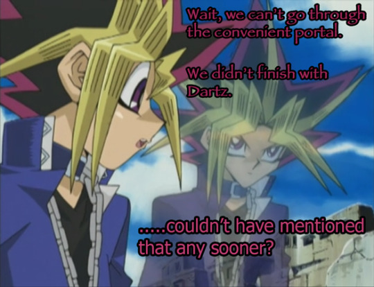
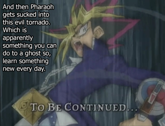
S4 Ep 39: Pharaoh Can Fly (Selectively)
Guys, they’re back
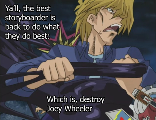
Best storyboarder is back, and the visual difference between last episode and this episode is like when your art teacher picks up your charcoal and just fixes everything wrong with your gesture drawings. It’s like...I mean look at this:
I just really love and appreciate how illustrative this storyboarder is. And I say just storyboarder because this had about the same budget as the last episode--there wasn’t that much actual animation as per usual. But, all of the scenes were drawn so well, like panels out of a good manga. They just...they always nail it when they’re at the helm and I don’t know why they’re on Yugioh, but bless this storyboarder.
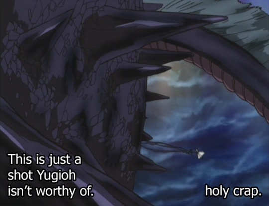
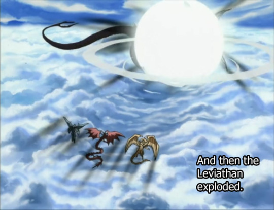
Plot wise, everyone got pulled into the dragon by gooey tentacles that came out of it’s stomach, don’t think about it.
Meanwhile, all of the minibosses could communicate with them and beg for help, yes, even the same miniboss who may have dressed up like Pegasus and catfished Seto Kaiba.
(keep reading under the cut)
The whole process of getting absorbed into the Orichalcos demon was a whole lot of symbolism and it was...kinda gross. Also kinda sketch. Also, for Kaiba it is a neat little nod to S1 when he had a vision that his brother was absorbed into a dragon mass.
I don’t think that the makers of the show remember S1, but either they just really like goopy dragons, or it’s a coincidence or I dunno, on purpose? Probably a coincidence.
And like I made this joke and realized...what if they actually meant to make that parallel though? This is the America crossover season, and they have referenced America’s love of trickster rabbits before with Pegasus but do they know about Br’er rabbit in Japan? Do they know? It’s a pretty Americana Deep-cut, and I have no idea how common this folktale is outside of the states.
I see anime busting out absorbing goopy masses all the time so I’m gonna assume that there might be a Japanese folklore I don’t know about which uses a similar structure (although I’m also assuming it has an extremely different history and association ((which I won’t be going into because I don’t feel like putting a trigger warning on this recap)).)
And looking at Wikipedia, there’s people that think the original reference to moist, absorbing creatures could have even come from as far as India. Which is...fascinating to how it also developed in Africa, and then the Cherokee also made the same story independently and then it fused together here in the States to make it what was eventually made into a Disney movie that will never be released again--this is just a really old ass story, all in all, possibly like over a thousand years old.
And a FASCINATING google deep dive I won’t go into for obvious reasons but knock yourself out.
Also, lets get distracted for a sec and see how well this storyboarder drew a fitted jacket at that angle. Dear Lord, did they get reference for that or did their brain just already know that those folds would be there? You can even tell that Pharaoh has just a little bit of padding at his shoulders. Ugh. Guys this storyboarder is so freakin good at these little fitted jackets.
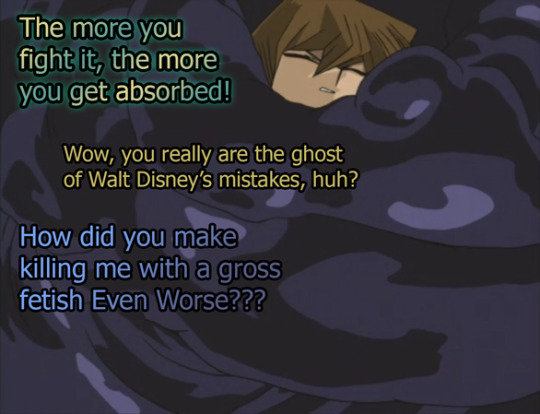
So, once Yugi and his friends are absorbed into the mass, where they should have died...and maybe some of them did, but I don’t know if I should add that to the Death Count because like...they could have held their breath in the amount of time they were stuck in there...maybe...Anyway, they are saved by being tossed into the figurative briar patch--by the souls all hanging out in the Leviathan’s stomach--which again makes me wonder...did they pull a folklore on us? Again, I have no idea.
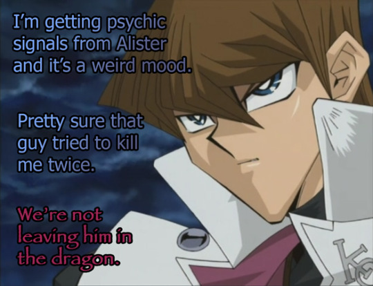
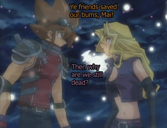
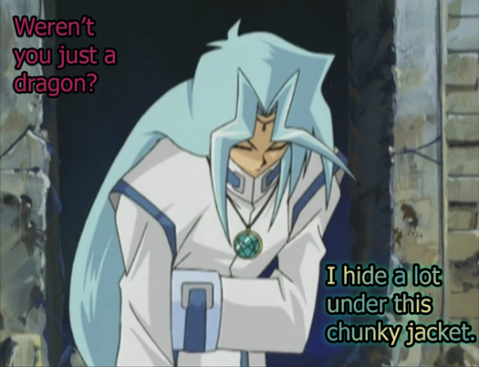
Like a lot of the people in this dragon have been thorns in their side this entire season, they’ve all tried to kill them at one point--all the minibosses, Mai, Pegasus--but now they have decided to team up with Pharaoh (along with the rest of the human race) and offer whatever they can to free them from the grip of the gross dragon mass.
And like, the ending of the folk tale is that the thorny ass briar patch is also where the rabbit lives usually. It hurts everyone else, but the rabbit--the rabbit can deal with it. And likewise, Pharaoh is freakin dead. He’s at home here. He’s surrounded by spirit power, his friends and their friendship power, this is like his zone, and now he’s crazy powerful for it and will be for the rest of the episode.
And like Yami is a very trickster God (especially Season Zero Yami) so like...it does make sense that he would mirror a folk tale based on trickster Gods, even if it is by complete accident.
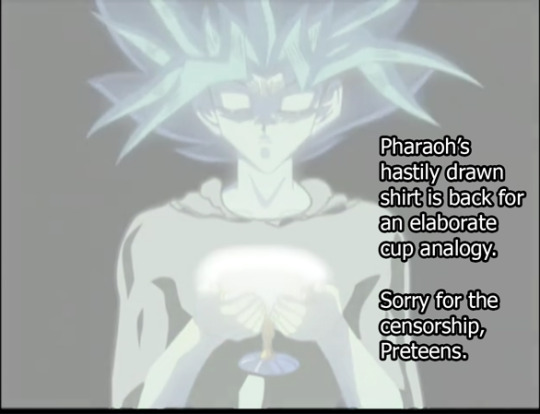
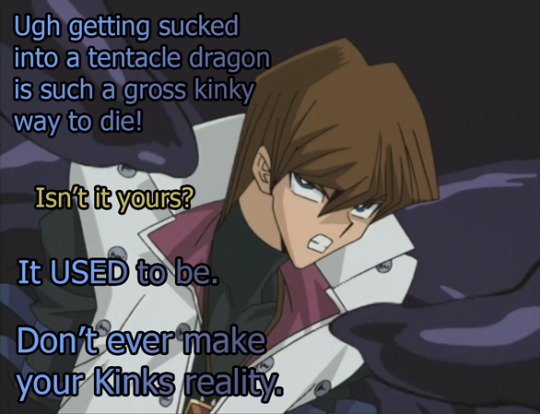
So Pharaoh imagines everyone’s tears as individual drops in a glass or something--it’s not a literal glass or anything--it’s just there because the only thing actually happening on screen was his hand hanging out of this dragon’s weird puss skin.
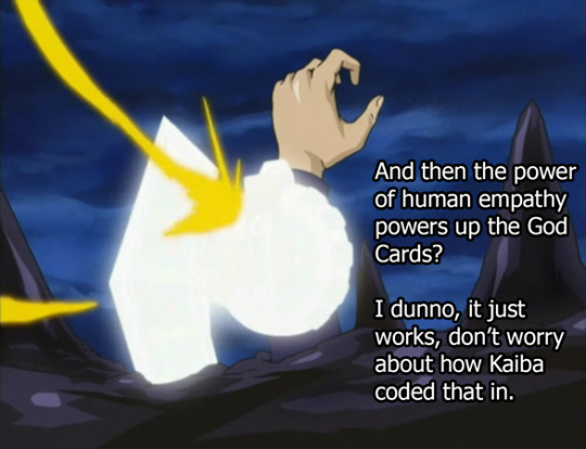
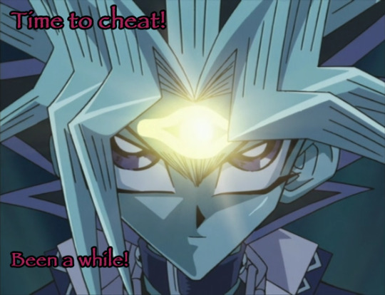
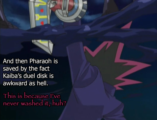
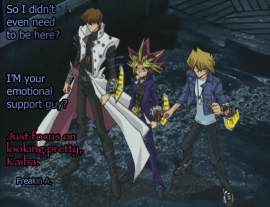
And he’s now a fully charged Sonic the Hedgehog and no longer needs Kaiba or Joey at all. Just gonna grab his God card demons and take charge of everything else from here on out.
By first exploding his buddies right the hell out of this lizard and across hundreds of feet of open ocean.

Joey decides to remind Kaiba that he lost the Battle City tournament.
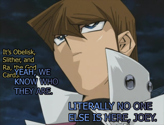
Seto’s roast was actually in the show, PS. He is not super excited to be reminded that Yugi owns every card that he spent 2 seasons failing to get.
And then Pharaoh did something really, really...
...just really really wild.
OH OK.
YEAH JUST TAKE OFF.
GO AHEAD THERE’S NO REASON THIS WOULD BOTHER ME.
I mean he IS super powered right now but like...
Like...WTF?
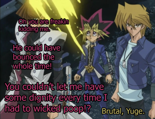
4 SEASONS. 4 SEASONS I thought this guy was glued to Yugi like Peter Pan’s Shadow and apparently--he can bounce.
Can Pharaoh do this every time Yugi asks Tea out on a date and tries to instead make the ghost in his head do all the work now? Can Pharaoh just be like “NOPE” and then phase out of the house, leaving Yugi to actually do the hard stuff?
It really adds a level of complexity to their relationship if Yugi can get a room.
(If not a room for romance, but at the very least a room to poop in.)
OR has he been able to allow Yugi to wicked poop in peace this whole time, but the show just never felt like telling us because they felt like it wasn’t important (although it is crazy important)?
Either way I am just...floored at this character development.
Yami just let Yugi out of his sight for like...I want to say 8 full minutes. Just incredible amount of trust on Yami’s part. Incredible. Knowing Yugi’s track record, he should have died in those 8 minutes but...he was being babysat by both Kaiba and Joey.
So Yami summons the Gods and they shoot lasers--you kinda expect this sort of thing.
And this is...probably...the real reason why Dartz didn’t bother trying to attack Pharaoh 5,000 years ago.
I can still think it’s because of Bakura but like...this is probably the real reason. It felt pretty chump to just shoot a laser at the bastard. Pharaoh just had to be reminded that this is a thing he can just do. If he felt like it.
Which he never feels like doing, because he’s too busy watching Yugi’s every move, and getting distracted by High School shenanigans.
After this happens, the giant snake falls to the ocean, splitting into just sooooooo many ghosts.
Over 7.8 billion ghosts, if we’re to assume that this is most of the population on Earth.
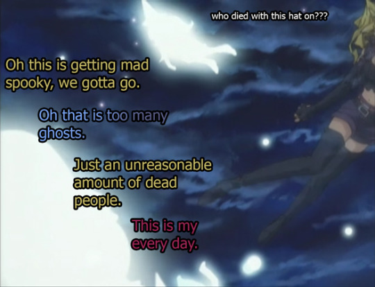
(thinking the weird-o in the hat is probably a Duel Monsters card? The duel monsters were throwing themselves into the Leviathan at one point so this is probably like a dark magician boy or something...I just don’t get very attached to the monster cards so it was like...whatever. The cards die like constantly so who cares?)
It is a pretty set dressing. Like Christmas lights but...dead people.
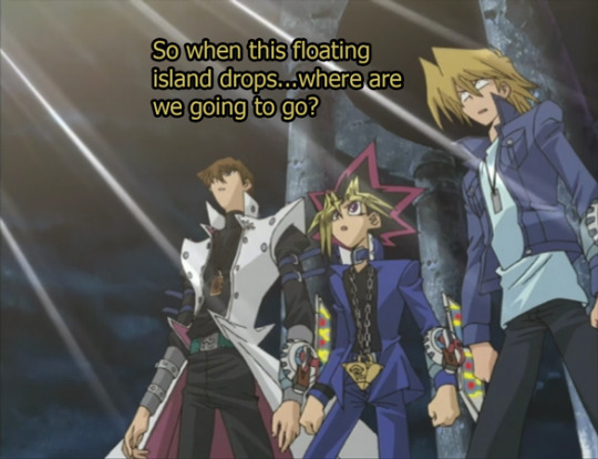
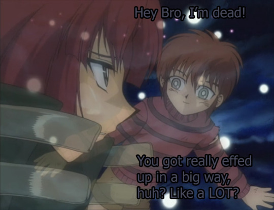
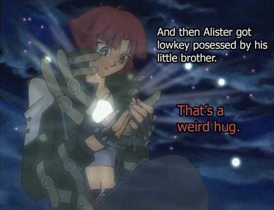
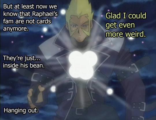
We also find out that the lost family of our minibosses Alister and Raphael, have indeed spent the last many years inside the Leviathan stomach, which is pretty tragic. We get a bitter sweet conclusion to Alister and Raphael’s story--although it’s not a full on ending for either character. Their life still hella sucks, they are in therapy for basically forever.
Where is Gurimo?
I don’t know what sort of job or life these two are qualified to have now, but youknow...Marik’s boat probably has jobs available.
Hold up. Can we talk about the windows?
I know absolutely none of you care about this, but I do, not to be picky or condescending to an overworked art team, but because I just want to know what they were trying to aim for.
There’s an iron stained glass style windowpane thing going on and that’s what’s really getting me. Like...I know these guys were technologically advanced, but why did you use this WW2 background? What happened to Ancient Greece that you were doing before?
Like doing a super past with future tech is so cool to me--I love that sort of concept art. That’s going into like Black Panther stuff where you’re referencing the earliest stuff in Africa and then blending it with stuff beyond our science. But Atlantis is a real big shrug and a “listen we ran out of time and had to press print,” and it’s such a shame. It feels less cohesive than even when this show does Egypt.
And yo this show and how it draws ancient Egypt--I feel like I’ve already talked about that. I have a feeling I’m going to talk a lot more about it next season. I’ll get to it when we get to it. I’m hoping that they have more time and budget to actually DO Egypt for once. (I say knowing they won’t)
Like it’s one of those things where this isn’t a history show, like at all, and it’s very much a fantasy. I’m not going to be like those sewing people on youtube that get annoyed because their TV show doesn’t have handsewn stitching in their Victorian bodices they rented from the costume department from an LA discount warehouse. Because, yo, it’s TV, and I can stretch my own imagination because it’s acting. (although I confess, I watch every single one of those videos).
But...the potential, y’all...the potential.
Anyway, Dartz isn’t dead. He was just taking his toot sweet time getting down the steps of his Gazebo.
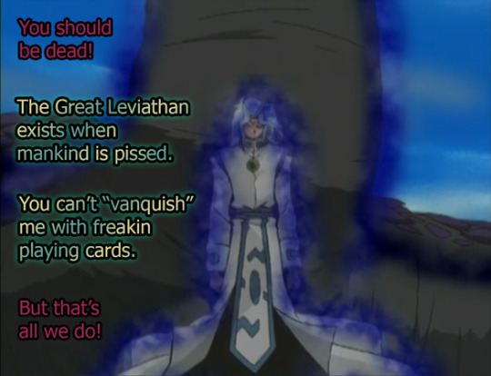
This is where things get very anime. I get this problem a lot with anime, I really do--and maybe it’s just me. But like...sometimes it feels like anime changes the rules during the boss fight.
That happens a lot, right? Where suddenly the final boss reveals something that like...should have been addressed way earlier? And he’s alive but you don’t get why?
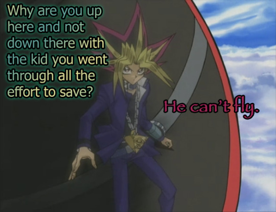
Anyway, Pharaoh reacts by getting maybe way too attached to his newfound independence.

Which like...I can understand Tea forgetting that Yugi is one people that is two people all the time, but the writers as well?
And what’s kind of great about this scene is that Dartz does see Yugi as two people here. He doesn’t look at Yugi, he looks at both. When Pharaoh is like “Leave me, Yugi!” Dartz heard all of that.
Just kind of a neat thing that we finally have a dude that can just...see Pharaoh for what he is, but it probably won’t matter because there’s like only one more episode left of this season.
Anyway, Pharaoh and Dartz have a chat about where evil comes from...and like...it’s some Yugioh lore, all right.
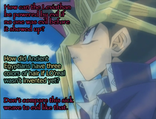
So before the show decides to give us the Genesis on Yugioh and reveal where the evil of the Orichalcos comes from, or if all evil was created by Orichalcos itself (which is IMPLYING stuff about Orichalcos) the snake shuts him the hell up.
As it should. Leave that Pandora’s box freakin closed. That’s going into extended universe of Star Wars books territory (RIP.)
As an aside--pretty sure that Yugi is standing outside that tornado. Maybe it was just the editing of the episode but like...
Yo I’m pretty sure Yugi is just standing there. For the first time, it’s not his nuts getting roasted. Wow. Tables have turned so much since he was dead.
Anyway, here’s the link for new people so you can read these in order
https://steve0discusses.tumblr.com/tagged/yugioh/chrono
There’s only one left! We can do it! We can finish this season in 2020! And actually get back to recapping Full Metal Alchemist! ~~Woooo~~
Oh man that movie better still be on Netflix or I’ll have to buy it lolol.
#Yugioh#ygo#Yu-Gi-Oh#Yami Yugi#Yugi Muto#Seto Kaiba#Joey Wheeler#Dartz#Alister#Raphael#Valon#Mai Valentine#My favorite storyboarder#who deserves to be listed as a character in the show#ep 39#S4#recap#photo recap#episode recap
37 notes
·
View notes
Note
How much do you draw for day? Asking because your art got much better (not to say the previous drawings were bad). Conglatu-freaking-rations.
TLDR; I only draw for the comic and my commissions/Patron Requests, and the following is a long, drawn out, rambling answer about how I don’t put as much effort into my comics as I’m capable of and also a small chronicle of where I started and why I’m making such quick progress.
Firstly I want to thank you for the compliment! I tend to not like comments like this because people compare my earliest pages to my latest ones and I’ll get to why I don’t appreciate that so much in a minute, but I do think I’m improving, and I can actually show that improvement now! Look at this glow up: (heck I didn’t even draw Steven in this first one lmao)

So, as for your question, honestly, I’m a terrible person to look to for being a good artist role model, because I never draw. I only draw for the comic and my Patreon requests (and the few commissions I get) and for the comic? Well, I don’t put out my best work for that. I draw at 100%, I only do one terrible sketch, and then lineart the finals directly over that. I don’t do warm up sketches. I just don’t draw.
Part of the reason I’m getting so much better is that I used to draw. I used to draw every day, constantly, so so much, every day, every year, until 2012. Then I hit a rough patch and I just stopped altogether. I actually didn’t start drawing again until I started Twiniverse! So, I took a 7 year break from drawing. I do not recommend this. I’m re-learning everything I knew, and it’s going quicker than it would take someone who’s new to drawing altogether, but it’s still a rough process!
So I’m already aware I’m kind of rambling but I really want to be clear, there’s three reasons the earliest pages of Twiniverse suck: I took a 7 year break, I never tried to make the pages look halfway decent- they only took about 30 minutes or less per page!!!, and I was starting with an entirely new style to me. Back when I was doing art regularly, I was strictly an anime artist. I had to re-learn how to draw and re-learn in SU style!
This was one of my last (and most complex drawings ever) pieces that I did back in 2012 before I quit:

And while there’s obviously some issues with it, I think it was pretty darn good. Compare it to my first Steven Universe style stuff, after a 7 year break? I definitely lost a good amount of progress that I’m only now gaining back by working on this comic.
Also, like, hooray for comics? Even if I’m not drawing every day, comics are an amazing way to learn how to draw more quickly. Even if I never put my best effort into my comics (I sure as hell didn’t at the beginning, and honestly while I’m doing better now you can tell I’m not doing my best) I’m still learning to get better with things like... poses and hands and stuff. So like, I prefer people to compare pieces I’m actually trying on (like, compare the banner to the Tapas cover!) but it is true that the comics are getting better as I get more comfortable with the Steven Universe Style.
FINALLY, I have to give a big thank you to some of my other artist friends. Particularly @thechekhov and @trapdoornumberthree because when I really get stuck with a pose, or I really need help with hands, or I just want a fresh eye to look at something I think is kind of weird, they and other friends will help me with those things. Having someone look at your work, sometimes redlining what looks weird to them, and just in general offering feedback about your layouts or whatever, can make so much difference as opposed to flying blind. If you look carefully, you will actually be able to see a pretty big improvement in my art just from Cry in the Dark to Mirror Gem, and I can tell you exactly where that happened. In Cry in the Dark, Chekhov helped me with two panels I was really struggling with- the panels where Ronaldo asks “Nora” about being able to see, followed immediately by a scream. And having Chekhov’s sketch to work off of made something click in my brain about how I was drawing faces and expressions. When Mirror Gem comes out on Monday, I guarantee you’ll see some pretty good progress in the expressions category. Having friends makes all the difference in the world!
So... in conclusion... yeah, I’m improving! And thank you so much for noticing! But it’s not because of drawing every day, it’s because I’m making a comic, because I had somewhat of a decent artistic background to start with but I’m just starting over with a new style, and because I have some great friends helping out =)
52 notes
·
View notes
Text
Effy Does SheIn: Winter 20/21
[Sponsored Post]
Anonymous said to effys-closet: could you do Effy does shein x
Anonymous asked:
Could you do Effy does SHEIN? thank u if you can! also I really appreciate your effort you put into this blog x
Hi guys! I’m back with another Effy Does... post. I get requests to do an “Effy Does SheIn” post a lot, so this time I reached out to SheIn to see if they’d like to sponsor this post. They said yes, so if you buy something, you’ll also be supporting this blog and everything I do here! I’m also excited to share some discount codes with you guys. These are a limited time offer, so order soon if you’re interested!
If you’re in the US, get an extra $40 Off Orders Over $200 with Code 40SNOWUS at us.SHEIN.com.
If you’re in the UK, get an extra £30 off orders orders over £160 with Code 30SNOWUK at SHEIN.co.uk.
If you’re in the EU, get an extra 15% off orders over €17 at eur.SHEIN.com with the code: SNOWEUR15.
If you’re in Mexico, get an extra 15% off orders over $ MXN425 with code 15SNOWMX at SHEIN.com.mx.
If you’re in Australia, get an extra AU$40 off orders over AU$199 with code 40SNOWAU at au.shein.com.
If you’re in Canada, get an extra CA$10 Off orders over CA$99 with code 10SNOWCA at ca.SHEIN.com.
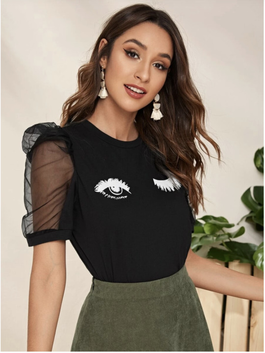
Now, let’s get into the post! Starting with tops, there are a lot of great options for Effy’s style, both causal and dressier.
Wink Eyes Print Tee (https://shrsl.com/2p941) (this one reminded me of the Winking Eye tee Effy has in episode 307)
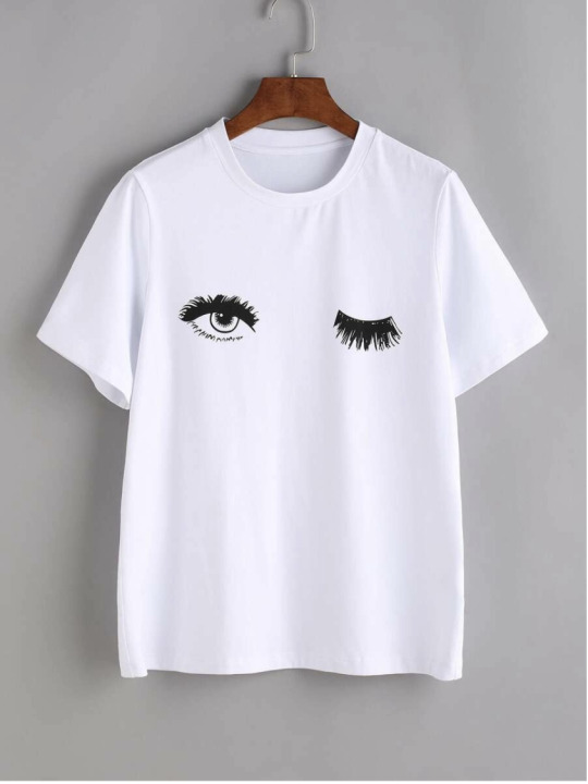
Wink Eye Graphic Mesh Sleeve Tee (http://shrsl.com/2p93w) (like the one she wears in 307, but dressier and a little bit girlier, too)
Reflective Figure Graphic Oversized Tee (https://shrsl.com/2p93n) (I thought this would be a great basis for a going-out outfit, especially because the graphic glows in the dark)
Contrast Sequin Panel Top (http://shrsl.com/2p942) (the sequined sleeves felt very “beginning of series 4 Effy” to me)
Keyhole Back Puff Sleeve Sequin Top (http://shrsl.com/2p945)

Sheer Mesh Sleeve Zip Black Dot Sequin Crop Top (http://shrsl.com/2p948) (the mesh sleeve/sequin combination reminds me of her outfit in 402)

Double Strappy Draped Neck Satin Top (http://shrsl.com/2p94a) (reminds me of her top in 404)

Frill Neck Sheer Mesh Puff Sleeve Top (http://shrsl.com/2p94c) (you guys can tell me if I’m crazy on this one but for some reason I could totally picture Effy wearing it)
Puff Sleeve Glitter Crop Tee (http://shrsl.com/2p94e) (another one that felt very series 4/glam Effy)

I love the mix of grungy black velvet and little pearl details in the Pearls Beaded V Neck Velvet Tee (http://shrsl.com/2p94g). I think it blends masculine and feminine together really nicely.

Now, onto bottoms. Effy loves her leather, her sequins, and her black jeans, so here are a few options to try:
High Waist High Stretch Ripped Skinny Jeans (http://shrsl.com/2p94j) (pair with a graphic tee, a ripped sweater, a leather jacket, and your favorite boots)

If you like a more distressed look, the High-Waisted Distressed Raw Hem Skinny Jeans (http://shrsl.com/2p94k) are a great choice:

For your more glam outfits, try the Buttoned Front Faux Leather Pants (http://shrsl.com/2p94n). They can take a regular outfit and make it look edgy.

If you love Effy’s look in 402, try the Zipper Back Sequin Shorts (http://shrsl.com/2p94m). The black is a little bit more toned down than the blue, making them easier to wear.

Moving on to dresses, a staple in Effy’s wardrobe. She wears dresses all the time and for every occasion, from casually hanging out to going to school to going to a rave.
First up, the Sketch Face Graphic Mini T-Shirt Dress (http://shrsl.com/2p94o). It reminds me of the casual-cool look of her winking eye tee in 307.

The Drop Shoulder Mixed Print Tee Dress (http://shrsl.com/2p94p) is a little bit of a wild card, but I thought Effy might find it to be funny.

I just think the Contrast Sequin Mouth Sheer Mesh Dress (http://shrsl.com/2p94z) is super fun:

The V Neck Striped Pointelle Knit Sweater Dress (http://shrsl.com/2p953) reminds me of her sweater dress in 303, but a little bit more structured and streamlined:

Flower Print Belted Button Front Dress (http://shrsl.com/2p94q) (take away the belt and I think this would be exactly the type of dress Effy might wear to school)
Contrast Lace V-back Smock Dress (http://shrsl.com/2p94r) (this one gave me some series 2 Effy vibes with the black lace)

Flounce Sleeve Solid Dress in Burgundy (http://shrsl.com/2p94s) (perfect for a 302 Effy look)
Fuzzy Mesh Belted Tunic Dress (http://shrsl.com/2p94v). This is another one where I would remove the belt, but I love the unexpected fuzzy detailing.

Shoulder Padded Self Belted Glitter Dress (http://shrsl.com/2p951) (again, take away the belt. It reminds me a little bit of the color of Effy’s dress in 301, mixed with the shape of her dress in 305 and the glitter of her top in 404).
You can’t have a perfect Effy look without a jacket, so here are a few of my picks for outerwear:
Faux Leather Biker Jacket (http://shrsl.com/2p956)
The Lapel Neck Zip Detail Belted Faux Leather Moto Jacket (http://shrsl.com/2p958) is perfect if you want a little bit of a roomier fit:

The Shawl Collar Tailored Blazer (http://shrsl.com/2p95c) is perfect if you want to try making your own badge blazer. It’s just the right amount of oversized, and the scrunched sleeves give it a more laid back, causal vibe.

The right shoes can really bring an outfit together. I’m really liking the Faux Leather Zip Up Lug Sole Boots (http://shrsl.com/2p95a) as a less expensive alternative to Doc Martens.


Finally, accessories. Effy is never seen without her necklaces, so to complete the look, combining a bunch of different necklaces (or looking for a layered necklace) is a good idea.
Multi-Strand Faux Pearl Statement Necklace (http://shrsl.com/2p95f)

Faux Pearl Decor Layered Necklace (http://shrsl.com/2p95h)
#effy#effy stonem#effy stonem style#effy stonem fashion#skins#skins uk#skins generation 2#skins gen 2#skins style#skins fashion#shein#sponsored post#sponcon#grunge#grunge style#grunge fashion
18 notes
·
View notes
Photo

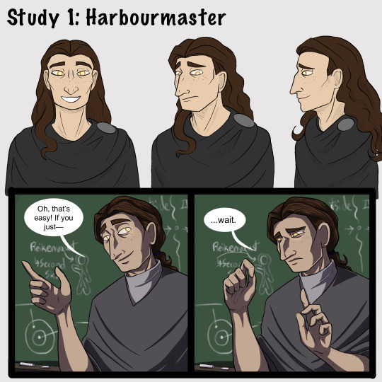


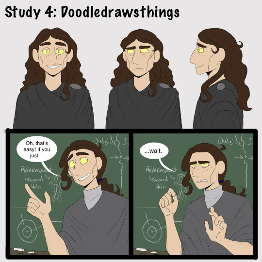

[Brief image description: A series of illustrations of Gerou teaching in front of a blackboard. The illustrations repeat, each in a different art style; at the end is a collection of doodles mixing the art styles and a few notes reflecting on the exercise. Full description and transcript starting at the heading below the cut. End ID.]
Part one of some recent style studies I’ve been doing, featuring Gerou struggling with student teaching!
I wanted to explore how different artists that I like handle stylization and simplification in comics, and when I asked around several people gave me permission to post the results. I recommend checking them out!
1) Harbourmaster is by @waywardmartian.
2) Never Satisfied is by @ohcorny.
3) Broken is by @yubriamakesart.
4) @doodledrawsthings makes a lot of content that is posted to tumblr, most recently a fair amount of A Hat in Time fanart.
Thank you all for the permission to post! ^_^ I'm having a lot of fun with this.
.
Side notes:
I genuinely thought that the Harbourmaster style would be easiest for me, since it contains roughly the same amount of detail as my own style and since I’m like 75% sure that reading it as a younger teen informed a lot of my own style and character designs. Turns out it was actually the hardest! Perhaps because, since there aren’t as many blatantly fundamental differences, I had to pay more careful attention to proportions and specific forms?
.
Never Satisfied was interesting! Alongside the work of Doodledrawsthings it’s definitely the furthest from my own style, and choosing Gerou for this honestly doesn’t do that difference full justice. I looked a lot at Fidelia, Sylas’s mom, and Thierry in trying to figure out how Gerou’s facial features would translate. Part two of my plans is to explore different character designs that might make fuller use of the difference in style, heh. (In other news: Colored lineart looks very neat and studying how it’s handled in NS is the first time I’ve been able to carry it off in a reasonable time frame, hah.)
.
Broken is just... very pretty, y’all. xD I don’t think it really saved me any time or much ease of drawing over my own style, but it’s very nice to look at. And I think the style differences and specific simplifications do lend themselves very well towards creating more consistency than I ever manage in my own art. Noticing the patterned way of drawing ear details was a fun moment for me, I’d never really thought of codifying anything that way before!
.
I did the first drawing in Doodledrawsthings’s style (the 3/4ths view in the turnaround) and thought “Oh goodness this is lovely and quick and feels nice.” It’s very nearly the first time drawing something in a cartoony style has ever come easily for me. But... I struggled much more with every other drawing in that style, ahah. Still, it was comparatively quick and I do love the expressiveness of the stylized eyes. :D This is another style where I think I’ll need to explore a wider range of character designs, though. I think it’s also worth thinking about how character design is fundamentally changed in some ways by the change in style; some of what I would think about designing a character specifically for that style is very different from the details I would normally think about when designing a character.
.
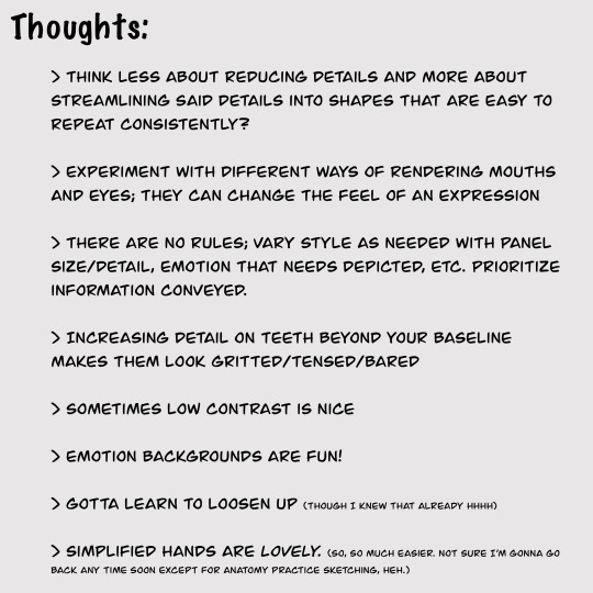
[Detailed image description:
A series of images repeating the same content in different art styles, followed up by a page of sketches and a page with text notes.
The repeated content is a turnaround of the character Gerou as well as a short two-panel comic showing Gerou as a student teacher in front of a blackboard. Gerou is a thin white man with sallow freckled skin, a large hooked nose, long wavy brown hair, and glowing orange-yellow eyes. In the comic, in the first panel he gestures animatedly with a wide smile and says, “Oh, that’s easy! If you just--” then breaks off. In the second panel he holds up a hand as if asking for a pause, and says, “...wait,” with visible consternation.
The sketches feature continued style experimentation with Gerou making a number of expressions and gestures, including: absolutely failing to maintain a good pokerface; looking stressed; various smiles, from tired to nervous to wide and happy; sighing tiredly; sticking out his tongue with arms crossed huffily; arguing with someone; drinking tea; and fighting off a dizzy spell.
The text image is headlined Thoughts and reads as follows:
Think less about reducing details and more about streamlining said details into shapes that are easy to repeat consistently?
Experiment with different ways of rendering mouths and eyes; they can change the feel of an expression
There are no rules; vary style as needed with panel size/detail, emotion that needs depicted, etc. Prioritize information conveyed.
Increasing detail on teeth beyond your baseline makes them look gritted/tensed/bared
Sometimes low contrast is nice
Emotion backgrounds are fun!
Gotta learn to loosen up (though I knew that already hhhh)
Simplified hands are lovely. (So, so much easier. Not sure I’m gonna go back anytime soon except for anatomy practice sketching, heh.)
End image description.]
#I have been hyperfocused on this for a week straight whoops#art#style study#artists on tumblr#style experiment#comics#my art#my stuff#sketches#Gerou#Imperfect Science#image described
35 notes
·
View notes
Text
Positive but personal (and somewhat hilarious) fan art related things (cp2077 for what its worth) behind the cut
I skipped writing yesterday and ended up drawing instead -- after my pencil charged up.
So, luckily those apple pencils charge up to full pretty quickly. Last night I accomplished a little bit of digital drawing on an ipad (sorry, on computer now, ipad charging in another room).
And ... for reasons... reasons of 🙃oh how much I enjoyed my years at daygig 🙃
I actually haven’t drawn a single human head, realistic or stylized or just sketched or anything, in a couple of years.
And drawing digitally on glass (an ipad or many non-cintiq drawing-tablet-displays) is very different from paper (although, actually sort of similar in slipperiness to the first pass of paint when using oil paint on a very slick hard panel).
So, I had a blurry cell phone photo (lol) of my V from cp2077 (console, much lower res than fancy graphics card PC gamers are getting).
Set the photo in front of me and did a quick gestural sketch followed by a realistically proportioned block in drawing. Realized that I need to hold my apple pencil the same way (far end away from tip for gesture, and then switch to the backwards overhand that many artists normally use with traditional media) while drawing and was very pleased that years of portrait means I can still draw (block in) the under-drawing and nail the measurements for naturalism (obviously, if I want to stylize, I need to work toward a stylized style for proportions, which I haven’t done, at least, not yet -- and for those wondering, drawing realistically is actually FAR EASIER than drawing stylized on purpose as opposed to “stylized” because you haven’t mastered proportions yet).
Once that sketch/underdrawing was done, I drew a giant blank.
How the fuck does one (meaning, myself) paint an interesting digital portrait?
Like, I really am NOT into ultra-realism or painterly realism as a style (🙃do you want to ask me why? I mean, I can most certainly do it, and upload a portfolio proving it, but you really don’t want to ask me why, trust me 🙃)
So then I started looking at other art -- lots of fanart but also other contemporary media/comics/gaming art that DEPARTS from the ultra-realism that has been the bread and butter of entertainment art in the west for 20 years (e.g. ever since consumer-oriented programmable pipeline graphics cards appeared in PCs).
And, I mean, I guess I could just mentally translate all of the steps I know for doing a realism-oriented oil painting to digital. 🙃🙃🙃🙃
🙃🙃🙃
But I really 🙃the fuck do not want 🙃to do that.
So now i have this sketch (on the ipad charging in another room)
And I ... will tackle it. Somehow.
Because FANART IS FREAKING AWESOME FOR LEARNING NEW THINGS AND PLAYING WITH NEW STYLES as zero money and zero “professional” expectations are riding on it. Fanart is like -- let’s just do shit and have fun no matter how it turns out because who cares! WHoo hoo!!! FUN IS FUN. (and learning is learning)
What I really want to do is find a GOOD watercolor brush pack for procreate.
What I will probably do instead is mess around with either a comic book inking style
or
A big strokes of bold colored paint (painterly mark making) style that uses “non-naturalistic” colors. (technically, there is no such thing as non-naturalistic colors because the color you see of anything is based heavily on the color of the light illuminating it).
1 note
·
View note
Link

Before we dig into the series proper, there was an issue of Marvel Age promoting this series, including an interview with the creative team written by Sholly Fisch, who has apparently had a much longer history in comics than I was aware of. There’s not a ton to say about the interview; it feels very effusive in that promotional enthusiasm sort of way.
The issue starts with a note from editor Jim Salicrup about why Marvel features so many licensed characters on Marvel Age covers. In short, comics based on licensed characters bring in a new audience:
When Marvel buys the rights to license characters from a movie, TV show, or even a toy, we usually try to find characters that are incredibly popular—that have a huge following of their own. That way, when we publish the comic book based on such a character we're hoping to reach thousands of people who may not have picked up a comic book in years!
That passage starts with a potshot at their competition, which is both kind of funny since He-Man started at DC, and kind of fitting since (for whatever reason) DC didn't hang onto the license.
Before we cover the cover feature, there's an issue I need to head off at the pass: Mike Carlin is the writer on the first eight issues of this series, and I feel like I’d be remiss if I didn’t mention his history as a (credibly alleged) sexual harasser. It sucks, and if I’d realized when I started this project that he was the main guy for a bit here, I might have had second thoughts.
Fisch begins with a brief summary of the He-Man concept and characters, then gets into an interview with writer Mike Carlin and penciller Ron Wilson, who had previously been working on Ben Grimm's solo title, and editor Ralph Macchio. "He-Man will be a mixture of fun and adventure that won't just be for kids!" Fisch says, (the "biff! pow!" is presumably implied) before Carlin promises not to "write down" to the readers. That's a comment I'm going to come back to over Carlin's tenure on the book, because so far in my reading, it feels like it's increasingly untrue as the series progresses.
Macchio compares Wilson's art style to Jack Kirby and John Buscema, which is high praise that I'm not sure comes through in this series. Then there's this baffling comment:
While it [Wilson & Janke's art] will be slightly different from that of the HE-MAN cartoons, it will be every bit as down to earth!"
Nothing says "down to earth" like the show about a man in furry shorts fighting a skull-faced wizard for control of a castle shaped like a head.
Carlin compares the simplicity of the He-Man comics to Silver Age storytelling, with "clear-cut stories without plot complications that carry on for years." He also says that the biggest shift from previous collaborations with Wilson is that now Carlin is doing full-script with panel layout thumbnails, presumably in contrast to a more Marvel Method approach to The Thing. I wonder if this change was necessary in order to get stories cleared by the people at Mattel in a timely fashion. Macchio discusses later how the stories have to be cleared by Mattel, something that's true even with modern licensed comics, but "so far, the stories have been so good that Mattel hasn't asked for any major changes!"
Unspoken in that is how much input Mattel had on the stories before they were written, particularly in terms of which characters/vehicles get the spotlight in each issue. I suspect the answer is "a great deal."
The sample sketches Wilson did were apparently good enough that Mattel wanted to hire him on the spot.
And then Fisch goes into a description of upcoming issues, including erroneously claiming that #2 introduces the Slime Pit. That would end up being the story for issue #3, and #4 has a slight credit change, with Wilson on breakdowns and Dennis Janke finishing, which makes me wonder what behind-the-scenes shuffling and deadline stuff was going on.
The meat of the exuberantly effusive article (wherein nearly every sentence and quote ends with an exclamation point) ends with the claim that "Ralph was so overcome talking about HE-MAN that he leaped on his desk, pulled out a tennis racket, and cried, 'By the power of Cresskill!' (invoking the name of his hometown)." I'm trying to pinpoint exactly what makes me feel like that story absolutely did not happen as described, and I think it's the tennis racket.
Fisch ends, as each episode of the He-Man cartoon does, by offering a moral:
Listen to your mother and father, brush your teeth after every meal, look both ways before crossing the street, never take candy from a stranger with a blue hood and a skull face, and most of all, accept no imitations!
I'll follow suit by offering this moral: sponsored content and promotional writing hasn't really changed in 30 years. Reading that gives me flashbacks to the SEO-infused content I was once paid to write for online stores.
The next article in the issue is a promo for Doctor Who Monthly, published by "Marvel's British division," and then a new talent spotlight for the late, great Tom Lyle.
Huh, I did not expect to fill a whole installment of this with just the Marvel Age promo, but here we are. Next time, we dig into the wild world of Marvel's Star imprint.
2 notes
·
View notes
Text
A totally self indulgent compilation of my favorite works on this blog of the year June 13, 2019 - June 13, 2020
I wanted to do this for the blog's first anniversary but then completely forgot about it lol.
The following lists are all in chronological order according to the date each post was first published.
Top 10 panel edits:

#1: Don and Gilda - Chapter 138: Demon serch (1)
Date: Jun 14th, 2019
Time: ~ 1:30 h
My very first redraw from my very first edit posted here, so it deserves an honorable mention. Back then I was young and inexperienced, I didn't even apply a gray filter (lmao I was so unskilled I even unintentionally scratched the picture, I hadn't realized until today). I'm actually very happy my first redraw was of Don, boy deserves all the love.

#2: Emma and Ray - Chapter 140: I’m Here!
Date: Jun 28th, 2019
Time: ~ 1 h
Back then this looked like so much work to me!!! And to this day, I think it turned out pretty well. I'm particularly proud of how the bow turned out. This is one I was really proud of right after having finished it; it gave me the confidence to try redrawing bigger areas. Also, the edit were I first applied the opacity of layer / opacity of brush for the gray filter that would have stuck with me.

#3: Krone's birthday edit
Date: Jul 15th, 2019
Time: 15 mins
I don't know I just really like how Krone's hair vanish to a more sketch-like style here– and consequently, how I managed to replicate such effect. I think Krone's beautiful.
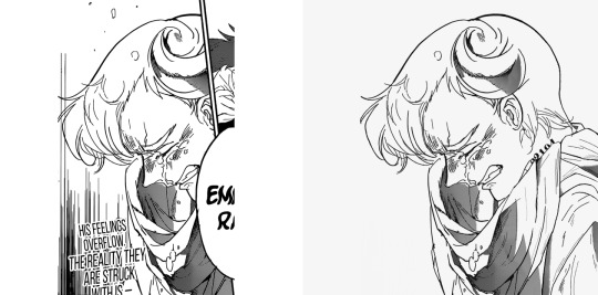
#4: Emma, Norman and Ray - Chapter 153: Coward
Date: Oct 4th, 2019
Time: 4:07 h (and 67 layers lmao)
Probably the single panel redraw I'm the most proud of. That Norman panel was beautiful and very poignant at the end of a chapter I adored, so I believe it deserved all the time I've spent working on it. It's far from being perfect - the back of his head is too plain, and the difference between my brushes and the original brushes is pretty visible - but I still like it very much and am extremely attached to it. The horn looks kinda big but I honestly believe it to be more of an issue with the original than with what I had redrawn lol. Funny enough, the whole picture didn't make it to the final edit and had to be trimmed.
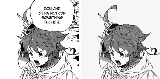
#5: Full Score Trio - Chapter 154: A Breakthrough
Date: Oct 11th, 2019
Time: 29 mins
I don't have a particular reason for this I just think Emma's hair turned out amazing. It took just half an hour and I didn't even use references like. Wow. @Redrawing skills where did you go please come back
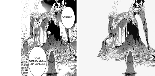
#6: Mujika and Queen Legravalima - Chapter 158: The Reason I Was Born
Date: Nov 17th, 2019
Time: 2:09 h
Sis I love this so freaking much. The shift from redrawing almost exclusively people and clothes to redrawing this mess was so fun and refreshing. Even though it's a mess I think it turned out very clean and overall it looks beautiful? I remember after finishing this I felt so powerful, like now that I had redrawn this thing I would have been able to redraw anything I set my mind on lol.
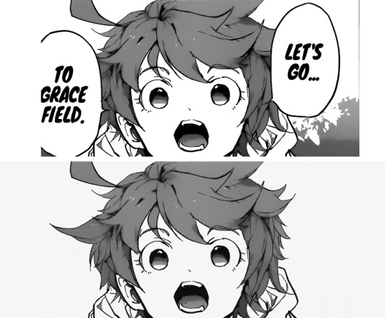
#7: Emma - Chapter 161: Never Be Alone
Date: Dec 13th, 2019
Time: 57 mins
Again no particular reason except this is a very cute Emma and I think the redraw turned out pretty well. There's this big lock on the left that doesn't make a lot of sense but overall I really like it. Cute Emma is cute, and I love her determination.
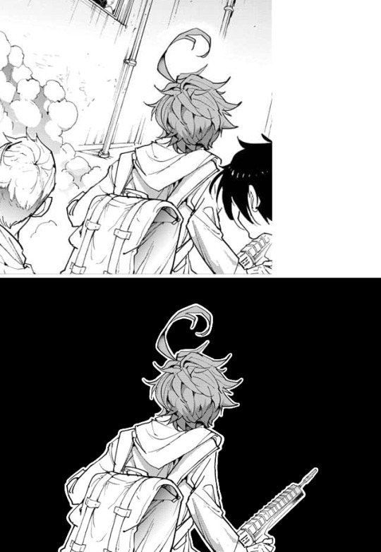
#8: Emma - Chapter 166: Going Back Home
Date: Mar 9th, 2020
Time: 3:45 h
I'M SO FREAKING PROUD OF THAT RIFFLE I have not the slightlest idea why this took so damn long BUT I'M SO PROUD OF IT
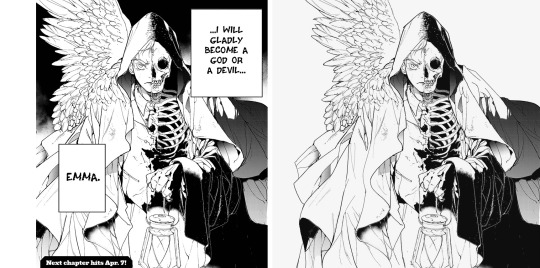
#9: Norman's birthday edit
Date: Mar 21st, 2020
Time: 1:04 h
This is cool! I didn't know I could manage to draw this, but I did it! The feathers were particularly hard to clean but I think they turned out fine.
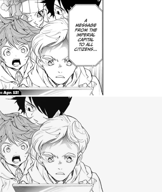
#10: Full Score Trio - Chapter 174: A New World (part 1)
Date: Apr 6th, 2020
Time: 2:11 h
I just think they're very pretty? I can't understand if I like Ray's face a lot, or not at all, but I think overall there was a lot to redraw and it turned out pretty cute! Sorry Gillian.
(Also insert pretty much every panel from the chapter 177 Isabella edit– I've spent so many hours on basically every panel there's no way I could choose only one).
Top 5 edits as whole:
#1: Emma and Ray - Chapter 140: I’m Here!
Date: Jun 29th, 2019
Complessive time: 2:57+ h
The very first edit I'm actually proud of; I'm really attached to it. It's the first edit I had put all of my effort into, and I remember feeling anxious people would have left it without notes. It kinda feels weird to think about it now, because I really don't care about notes anymore; yet, it somehow makes me happy to think that past-me wasn't let down. Thank you @neverlandstrio for your support, you may not remember but it really meant a lot to me back then! And it still makes me smile. You're the best!!!!!!
#2: Mujika and Queen Legravalima - Chapter 158: The Reason I Was Born
Date: Nov 20th, 2019
Complessive time: 7:12+ hours
This whole edit was an hella wild ride. It's midnight before a school day, when I think: "Mh, it's been a while since I last made an edit, why not make one about Musica and the queen from the last chapter?" And seven hours after this was born. I'm particularly proud of the queen's redraws on the 3rd, 7th and 9th picture (ofc), the areas which have been redrawn are pretty huge yet I think the difference with the original is almost impossible to notice?? @Redrawing skills where did you go please come back (part 2)
#3: Emma - Chapter 174: A New World (part 1)
Date: Apr 12th, 2020
Complessive time: 6:53+ h
I think the panels that were selected work very well together, especially considering the close-up / full body alternation. I love Emma, and I've always been kinda sad noticing that edits that focus one her take the less notes... She deserves all the love. Also, fun fact: for the last but one panel, I had redrawn Emma's whole left ear before remembering she doesn't have one, so I had to redraw the panel from the start. Besides from the error with the ear, the reason why this (and all the others after) took so long is because official panel take way longer to clean.
#4: Isabella and her children - Chapter 177: Mother
Date: May 22nd, 2020
Complessive time: 13:41+ h (ahah.)
Lmao tbh I can't understand how this has so few notes it's like. Technically speaking, probably the best edit I've ever done. I don't even like Isabella that much, I haven't got the slightlest idea why I decided to spend so many hours on this. Anyway, I find the composition (full body on the left / headshots on the right) really good looking in this as well! And I think the redraws turned out fine, especially Isabella's.
#5: The Promised Neverland manga ending countdown→ 1/7 chapters: chapter 1 - Grace Field House
Date: Jun 9th, 2020
Complessive time: 1:59+ h
I don't know how I came up with that idea for the composition but I find it really beautiful??? I think it does a pretty good job conveying the sudden, terrific shift of atmosphere from the first chapter, and I think that sharp bridge is very nice. I'm very, very proud of this.
Honorable mention #1: Full Score Trio - Chapter 154: A Breakthrough
Date: Oct 13th, 2019
Complessive time: 3:44+ h (+ 1:13 h of working on a panel that ultimately didn't make it to the final edit)
A very good chapter, and the edit turned out surprisingly amazing??? All the redraws look great and make it almost impossible to distinguish them from the original; honestly I feel like I'll never be able to redraw so neatly again lol.
Honorable mention #2: Don and Gilda (+ Norman) - Chapter 160: Shackles
Date: Dec 11th, 2019
Complessive time: 3:14+ h
That one is really one of my favorite scenes; I'm telling you peoples, Gilda and Don are a blessing to the earth. I think I've never mentioned it, but Gilda's hair is a nightmare to redraw??? More specifically, it takes me h o u r s to fill the texture without making it look too weird, it's the worst.
Honorable mention #3: Norman and Ray - Chapter 179: Compensation
Date: Jun 6th, 2020
Complessive time: 4:16+ h
I was so glad to finally be able to make a Norman / Ray edit, and it turned out it was just in time before the series' finale. I like how it turned out and I'm pretty satisfied with the redraws (even though my sister helped me with the lineart of some panels - it was exams time and I really couldn't afford to spend more time on it), too bad we didn't have more chapters that focused on the boys. Ray sweetie one day I'll fix your ear it's just today's not that day.
Btw, I justed realized I have never done an Emma / Norman centered edit? I'll have to make one eventually. I remember considering focusing on them alone for the chapter 154 one, but then I thought "even if the manga is gonna ignore Ray, I will chose to do not" lol.
Top 5 long posts:
#1: Reconstruction of how the Grace Field children were settled in the three bedrooms
Date: Aug 28th, 2019
I just had really a lot of fun doing it. I love putting all the little things to their own place, it's so calming to do and that's why I love making this kind of things. Also, loved how @temporoom contributed to the post! It was so nice of them to add what they had noticed to come up with more exact conclusions, that's one of the things I love the most about the internet.
#2: A study of how many times the characters of The Promised Neverland call each other through the first season of the anime
Date: Sep 10th, 2019
I REALLY LOVE IT! I mean it *was* kinda stressing to note everything, but it was very also very satisfying to see everything methodically divided and organized! And it's not just that– it's also the fact that it looks good. That's one post I have fun rereading because it's actually pretty! Also, even though it can be very stressing to learn to use new programs and sites, it's always very satisfying to look at the final result. Again, I really adore compiling these tiny little details! I would love to make more posts of that kind if i had the time.
#3: The Promised Neverland musicals headcanons
Date: Oct 27th, 2019
I mean it's literally. Putting my two favorite fandoms together how could I not love it. This is another one I really enjoy rereading, I find all the musical / character associations so fitting! I really want to make a second part, I hope to find some time to do it.
#4: Considerations on the reward / eventual series' finales (and Emma's sacrifice)
Date: May 7th, 2020
It's always nice to put down all your thoughts regarding a particular matter. It can take a lot of time (at least for me it does because... I need time to think about things), but it's so satisfying to see all of them there once you're done. Bonus points when, like in this case, it was something asked by someone else because “Wow! Somebody wants to hear my opinion on this subject! I'm flattered (◍•ᴗ•◍)”
#5: Some other considerations on the series' finale and Emma sacrificing herself
Date: Jun 13th, 2020
Pretty much the same as above. It's like some kind of clarity when the post is done and signed. Another fun fact, I had to censore the post a lot; the first version was extremely sharp and harsh, but I believe it's right to express your opinions calmly and politely.
Bonus: A thread of what the tpn characters would wear at the Oscars
Date: Feb 9th, 2020
Imagining all the children in those pretty dresses makes me so incredibly happy (╥﹏╥) I go back to look at that post a lot. I really love red carpets, I love looking at pretty dresses!!!!!
Lmao it's so funny how the post of mine I like the most are also the ones with the less notes
Anyway this was just a personal report! You don't have to read it all (or any of it actually). But it was indeed fun making it! Here's to many more months in the fandom!!!
#This was supposed to be posted on July 13th as one year and one month since I made the blog#but Tumblr decided to be a jerk and deleted all of it 😊#So here we are#tpn#tpn manga spoilers#long post#Again this is just a personal report don't stress over reading all of it#But it was fun to make!#To the people I tagged: sorry for tagging you in this long post but also it would have felt weird not to do so? I hope you don't mind#It felt like... Giving credits foe something you've done y'know
40 notes
·
View notes
Text
Caerul Design Notes,
because I’ve actually put a lot of thought into creating Caerul’s aesthetic and I’m lowkey really proud of it. I won’t get into her actual character concept/personality/backstory/etc. since this got super long, but this is how/why I made the choices I did with regards to her name and visual design!
▶ Caerul’s color scheme started off way bluer (hence the name “Caerul,” from caeruleus/a/um - “blue”/“cerulean”/“azure”/“of the sky/sea” in Latin) and less saturated, but when I gave her a (dead) twin with a red theme, I wanted them to look more alike and made both of their hair purple (although I haven’t actually done more than sketch Roseus before... he’s got purple hair and red eyes). Purple’s my favorite color, and unnatural hair colors don’t seem to be uncommon in Orth, so why not, right? ¯\_(ツ)_/¯ The red elements in Caerul’s design are meant to represent her honoring Roseus!
All of the base colors I use when drawing Caerul! They all end up looking a bit darker once they’re shaded though.
▶ As well as shamelessly using one of my favorite Latin words (I’m a Classics major, okay ;;>~>), I also tried to pick a name that sounded similar to the ones that already exist in-universe. This was actually fairly tricky, since as far as I can tell the names in Made in Abyss have a WIDE variety of influences. Some of them seem passably Japanese-sounding (Riko, Jiruo, Kiyui, Nanachi) disclaimer I bring dishonor to my ancestors and know 0 Japanese so this is just about vibez, others seem Western-ish (Reg, Nat, Lyza, Prushka). Some are fairly whimsical (Shiggy, Maruruk, Mitty) while others are more mysterious and fantastic (Any of the White Whistles besides maybe Lyza). The only common thread I could really settle on was a general fantasy feeling to all of the names. I tried to capture that nebulous vibe with Caerul’s name, although with something so vague and subjective it’s pretty much impossible to say if I was entirely successful. I named her siblings afterward with other Latin color words and ended up with a RGB theme lol.
▸ By the way, “Caerul” is pronounced “KAI-rool.” It rhymes with “Hyrule.” The ae diphthong makes an “eye” sound in Latin #TheMoreYouKnow
▸ “Caducalae” is a portmanteau of “caducae alae,” literally “falling/doomed/futile wings” in Latin (again), playing off how pointless it is to be able to fly when the Curse of the Abyss is a thing. Originally, they weren’t supposed to work at all outside of the Abyss, but I decided that was boring for crossovers/other verses so I scrapped it. I’m not too happy with the name since it doesn’t fit the naming scheme of the canon relics (there is no precedent at all for gratuitous Latin in Made in Abyss, which is a good thing because it’s overused in fantasy, but Latin was the only thing I was good at in high school sooooo... ^^;), but I didn’t like any of my other ideas that much, either. “Wings of Futility” feels more canon, but it’s also kinda depressing :/
▶ I’ve mentioned before that Caerul’s build is based off of mine for art reference purposes (it’s convenient to just look in the mirror while making the pose I want =w=)b), but another reason she’s so short is that I didn’t have to make the caducalae quite as big since she’s smaller, so she can actually go indoors if she’s careful.
▶ Long hair isn’t super practical with mechanical wings with lots of bits for it to get caught in, but Caerul idolizes Lyza, so I left her hair as long as I could reasonably get away with.
▶ I heavily referenced the canon Made in Abyss character designs for Caerul’s clothing so she would fit into the world, but made some alterations to make everything more personal to her and accommodate for her wings. In general, I lightened everything up, since she takes a bunch of short, quick trips rather than lengthy expeditions. Her gloves, for instance, are loosely inspired by the ones we see many delvers wearing in the manga/anime, but are less heavy-duty and are convertible mittens/fingerless gloves for better dexterity with handling letters and such.
The best close up of the gloves I could find was actually a screenshot of the aftermath Reg & Riko’s orb piercer encounter, but I didn’t want to have to tag this for gore, so you get Lyza ^^;
There’s a filter over Caerul here so you can see the glove better which is why she looks kinda washed out :/
▶ Her coat is heavily influenced by Jiruo’s, since he’s the only Moon Whistle we’ve seen in canon.
yeah, uhhhh, sorry to yoink your style my dude ^^;
▸ Caerul’s has a different color palette, a simpler lapel border, an extra set of outer pockets, and three separate panels in the back that button around her wings so she can put it on! I haven’t drawn it, but her shirt works similarly.

This is my favorite detail about her design tbh... it’s just really satisfying what a logical solution it is for some reason???
the original doodle is off rotting somewhere in my Modern European History notes, but I tried to recreate it just as sloppily here =w=)b
▶ Caerul’s corset isn’t just a painful fashion choice - it’s actually meant to be a(n admittedly heavily stylized) brace for her back against the weight of her wings.
▶ Since Caerul can’t wear a backpack with the wings, I had to get creative with storage options for her. In addition to an undetermined number of pockets on the inside of her coat, I gave her these two pouches on her thighs to carry more stuff.
I wonder how buff your quads could get carrying a significant amount of weight there...
▸ Messenger bags don’t seem super practical for delving, so I didn’t design a specific one for her to carry all the time, but Caerul does use them on occasion. Even with that, though, she still has far less carrying capacity than the average delver, which is a problem she has to deal with when carrying out her duties!
▶ The wings/caducalae were by far the most difficult part of designing Caerul, and it took several redesigns over 2+ years before I was finally happy with them. Their first design was deliberately far simpler in the interest of having to draw them a zillion times, but they ended up clunky and unwieldy looking:
chonky o~O
▸ The final design is MUCH more of a pain to draw (in fact, a lot of the time I cheat and just copy and paste them from drawings I’ve already done), but I think it looks much sleeker and more “functional”.
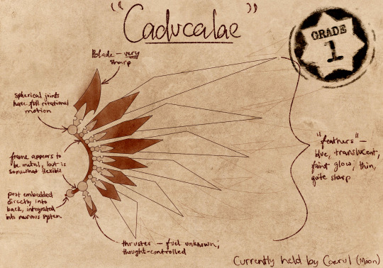
I also got better at making my diagrams look slightly more authentic ;0
▸ I knew I wanted jetpack-style thrusters to be a component of the wings to somewhat justify the shit I wanted Caerul to be able to pull with them (especially to eliminate the need for accounting for the damage landing suddenly could do to her ankles), but incorporating them proved to be one of the biggest problems of the design. At one point, they were going to have a whole separate attachment point on her back, but I finally just made them an offshoot of the first “joint,” as you can see in the final design.

A really messy intermediate caducalae sketch. The weird double pentagon shape was meant to be the part of the relic actually fused to Caerul’s back, but I scrapped that too when I scrapped the separate limbs for the thrusters.
▸ Speaking of the joints, they’re all balls so they can rotate all over and I don’t have to fuss too much about how they move. Likewise, the frame is metal, but I treat it like it’s kind of flexible, so Caerul can “flex” the wings open and closed. These wings are hard enough to draw period okay I’m giving myself every excuse to be inconsistent af on purpose.
▸ The caducalae have some “bonus” features that I’ve sketched out, but that Caerul hasn’t unlocked yet, and won’t for a while.
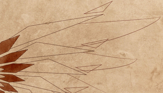
owo what’s this?
▸ For the wings, I think my biggest inspirations were some of the mechier Cardfight!! Vanguard dragon units (although I don’t remember which cards specifically) and the energy wings on the ninth-generation knightmares in Code Geass R2.
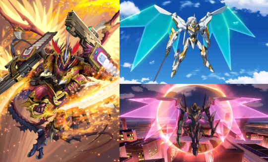
I’ve made a lot of OCs, and since I don’t like to use faceclaims, I’ve done a fair amount of character designing. I don’t think I’ve ever spent as much time or had as much fun with any of them as I have with Caerul, though! OCs aren’t always super well accepted in fandom roleplay, but the Made in Abyss community has been super welcoming and I’ve had a blast. Thanks for listening to me gush about Caerul if you got this far, and thank you to everyone who’s interacted with her!
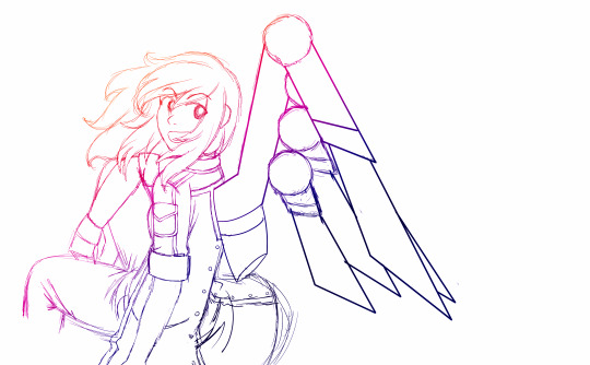
The original sketch of Caerul from back in 2017. How far we’ve come :’D
#miscellaneous info#mun art#appearance#ooc#((no one cares lol))#((but I had fun putting all my thoughts down in writing ^^;))#((also! the full version of the new caerul art from the promo!))
5 notes
·
View notes
Last Seen Blogs
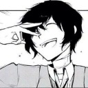
bsd-headcanons-and-shit
bsd headcanons
sweetsova
oh sweet sova
morbidmary
Nevermore

naysyy
Naysy
madiisixx2-0
Madiisixx2.0