#I don't have a tag for this stuff
Text
i got rickrolled today but it didn't work because i have adblocker installed, so youtube just told me i violated the terms of service. yesterday i was trying to edit a picture as a joke for my girlfriend, and google made me check a box to prove i'm human because i wasn't "searching normally".
it isn't just that capitalism is killing fun and whimsy, it is that any element of entertainment or joy is being fed upon by this mosquito body, one that will suck you dry at any vulnerability.
do you want to meet new friends in your city? download this app, visit our website, sign up for our email list. pay for this class on making a terrarium, on candlemaking, on cooking. it will be 90 dollars a session. you can go to group fitness, but only under our specific gym membership. solve the puzzle, sign up for our puzzle-of-the-month-club. what is a club if not just a paid opportunity - you are all paying for the same thing, which makes you a community.
but you're like me, i know it - you're careful, you try the library meetings and the stuff at the local school and all of that. the problem is that you kind of want really specific opportunities that used to exist. you are so grateful for libraries and the publicly-funded things: they are, however, an exception - and everything they have, they've fought tooth-and-nail to protect. you read a headline about how in many other states, libraries have virtually nothing left.
do you want to meet up with your friends afterwards? gift your friends the discord app. you can choose to go to a cafe (buy a coffee, at least), a bar (money, alcohol) or you can all stay in and catch a movie (streaming) or you can all stay in bed (rent. don't get me started) and scream (noise complaint. ticket at least).
you want to read a new book, but the book has to have 124 buzzwords from tiktok readers that are, like, weirdly horny. you can purchase this audiobook on audible! your podcast isn't on spotify, it's on its own server, pay for a different site. fuck, at least you're supporting artists you like. the art museum just raised their ticket price. once, they had a temporary exhibit that acknowledged that ~85% of their permanent art galleries were from cis white men, and that they had thousands of works by women (even famous women, like frida! georgia o'keefe!) just rotting in their basement. that exhibit lasted for 3 months and then they put everything away again.
walmart proudly supports this strip of land by the street! here are some flowers with wilting leaves. its employees have to pay out-of-pocket for their uniforms. my friend once got fined by the city because she organized a community pick-up of the riverfront, which was technically private property.
no, you cannot afford to take that dance class, neither can i. by the way - i'm a teacher. i'm absolutely not saying "educators shouldn't be paid fairly." i'm saying that when i taught classes, renting a studio went from 20 bucks an hour to 180 in the span of 6 months. no significant changes to the studio were made, except they now list the place as updated and friendly. the heat still doesn't work in the building. i have literally never seen the landlord who ignores my emails. recently they've been renting it out at night as an "unusual nightclub; a once-in-a-lifetime close-knit party." they spent some of those 180 dollars on LEDs and called it renovating. the high heels they invite in have been ruining the marley.
do you want to experience the old internet? do you want to play flash games or get back the temporary joy of club penguin? you can, you just need to pay for it. i have a weird, neurodivergent obsession with occasionally checking in to watch the downfall and NFT-ification of neopets. if i'm honest with you all - i never got into webkins, my family didn't have the money to buy me a pointless elephant. people forget that "being poor" can mean literally "if i buy you that toy, i can't afford rent."
you and i don't have time to make good food, and we don't have the budget for it. we are not gonna be able to host dinner parties, we're not made of money, kid. do you want some kind of 3rd space? a space that isn't home or work or school? you could try being online, but - what places actually exist for you? tiktok counts as social media because you see other people on it, not because they actually talk to you.
there was a local winter tradition of sledding down the hill at my school. kids would use pizza boxes and jackets and whatever worked, howling and laughing. back in september, they made a big announcement that this time, rules were changing, and everyone must pay 10 dollars to participate. when im not scared shitless, i kind of appreciate the environmental irony - it hasn't gone below 40. so much for snow & joyriding.
i saw a bulletin for a local dogwalking group and, nervous about making a good first impression, showed up early. the first guy there grimaced at me. "sorry," he said. "there's a 30-dollar buy-in fee." i thought he was joking. wait. for what? the group doesn't offer anything except friendship and people with whom to walk around the city.
he didn't know the answer. just shrugged at me. "you know," he said. "these days, everything costs money."
#spilled ink#warm up#“why did u tag it warm up” bc i wrote it off the cuff while drinkin coffee lol#btw the 30 dollar buy in for the dog walking is bc they pay the organizer a small pittance so she can#run fb ads and stuff and like she does put in a lot of work i don't mind paying her#but that's exactly what im fucking talking about like.#ppl can't afford to volunteer their time anymore and we all understand it!!! everything costs money for everyone!#like we didn't have to use to say ''do you mind paying me back for the stuff we ate''#we used to be able to afford to feed our friends once in a while!!!
47K notes
·
View notes
Text

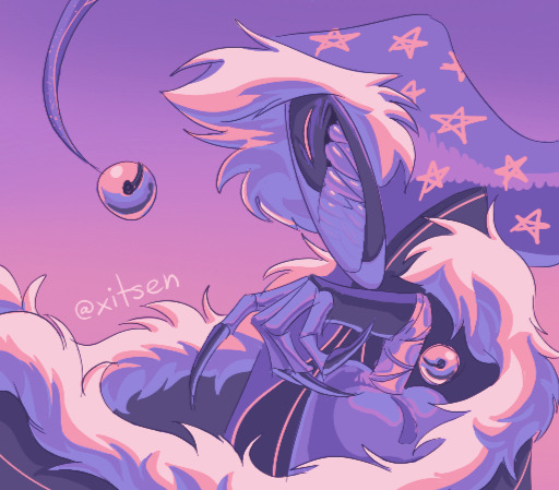
the beastie <3
#totk spoilers#<- (? yet another schrödinger's spoiler she shows up during the beginning sequence but uhhh just 2 be safe)#totk#light dragon#the light dragon#totk light dragon#loz#tloz#zelda#id in alt#dragon doodles#(I don't know the TAGS for this fandom grrgrhgrgrhg I'll decide eventually)#hiiiiiii so the uh new zelda game was good. I beat that after 140 hours like a week ago (explode emoji)#and now I'm brainrotting zelda HARD which means I have feelings about like 17 dudes all at once#we'll have to see if that means I'll bombard you with characters!! lately art's been blah but I've got some stuff cooking hopefully#hey I'm happy with this tho!! happy with tha beastie :]#this worm is my best friend
16K notes
·
View notes
Text
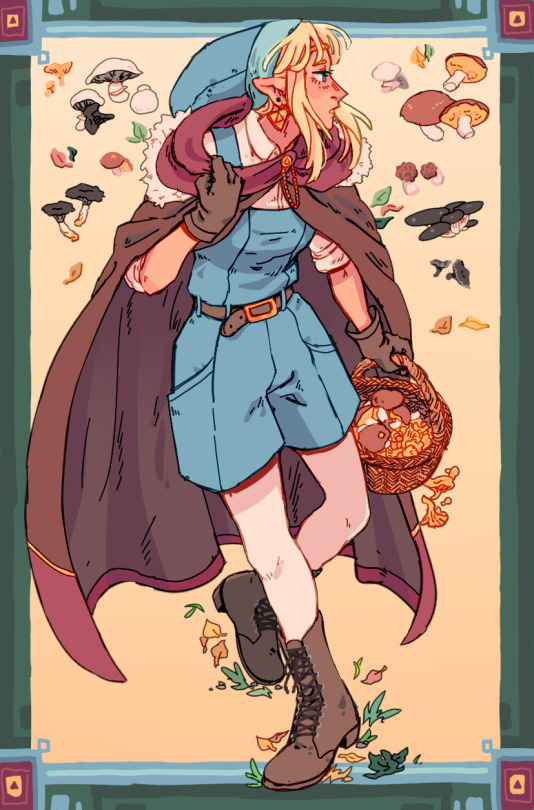

Zelda goes mushroom girl
#tloz#a link to the past#zelda#link#my art#I was happy with that first one but for some reason decided it still needed a companion piece so I spent way too long on that second one...#I don't think there was any time during the progress where I was happy with it but hfduhdfu at least I got to Attempt drawing moss hell yea#I also at some point sat in Pyu's art stream and said I enjoy drawing legs As I was being murdered by the infamously impossibe (imo) squat.#it's ok I had fun !! but I need to learn how to let doodles be doodles or I'll never finish stuff at this rate dfsuhfd#if everything in my tloz tag looks like it was drawn by different people uuuh 2023 was art crisis year ngl......#I'm falling back into my old ways rn though#anyway I think about these two a lot I think they're both stone faced and awkward ppl in different ways but they try rly hard to be friends#like I like to think it starts out so incredibly awkward and a bit sad bc they keep stepping over each other's toes accidentally the harder#they try but idk they find comfy middle ground idk in my brain they have a very interesting friendship I wanna get around to drawing it#in a proper way that might make sense....#if I don't write 200 tags I will die maybe it's bc I grew up on dA or smth#and yes I know how to find 1 (one) type of mushroom /I/ am not mushroom girl unfortunately smh
3K notes
·
View notes
Text

Trying to draw HK with ULTRAKILL artstyle
#hollow knight#hollow knight art#hk fanart#hk art#hk knight#ghost hk#hk ghost#ultrakill#ultrakill art#art ultrakill#ultrakill artstyle#i don't know how to use tumblr#i'm still so new to this tagging stuff#this is just a randomly idea I have#i'm more active on twitter so you guys can check there for more arts
2K notes
·
View notes
Text

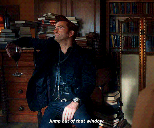
i can be your angle or yuor devil
#good omens#goodomensedit#goedit#anthony j crowley#david tennant#good omens spoilers#gos2#i have exactly 2 gifset ideas that i need to get out of my system#bc i couldn't find them in the tags#and then i'm going back to my void#also i forgot how to gif#and i don't understand how tumblr's posting system works anymore#my stuff
7K notes
·
View notes
Note
okay but like. I just had the weirdest thought about that ‘don’t look I’m naked’ comic. Which is that that’s essentially the same thing Adam and Eve did after they ate the fruit of knowledge of good&evil. So I feel like the theological implications of that could kneecap Gabe if he doesn’t think V1 is a being with free will.
yeah ok. i dunno man. is this anything
((side note. this isn’t necessarily meant to be in-character or story-accurate or take place at any particular point in time, just a way to explore some Thoughts. i was also imagining more that V1’s words aren't actually spoken, more like Gabriel’s more articulate interpretation of whatever garbled mechanical noise V1 is using to communicate. I think an angel could do that.))
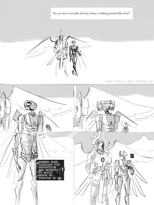

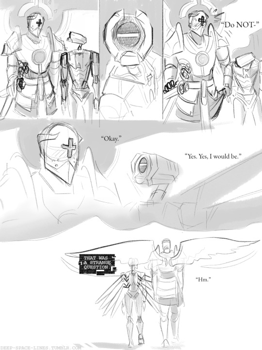
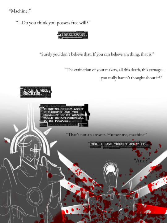
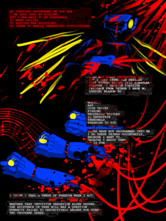
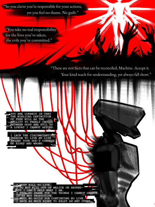
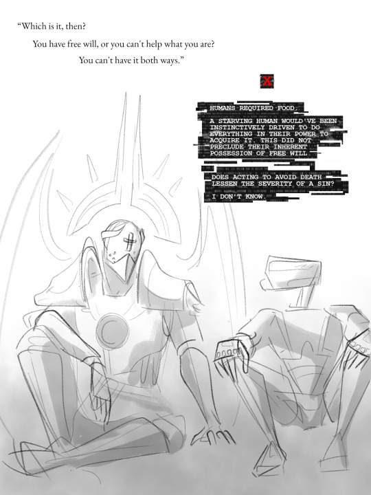

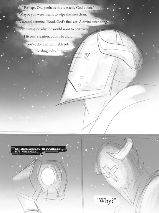

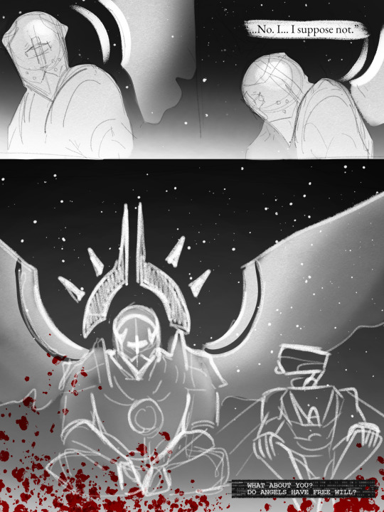
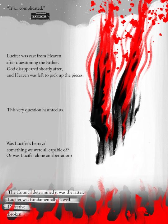
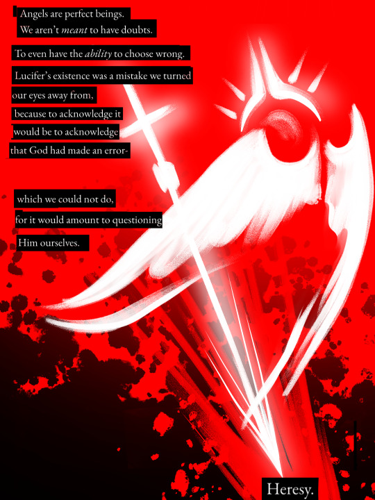


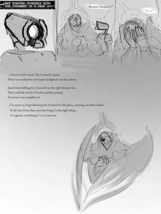


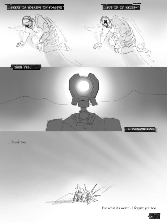


and then they fucked nasty the end
#my art#my writing#who fuckin sent this. fuck you. come off anon so i can kick your ass. (the thoughts this ask sparked consumed almost 3 days of my life)#i dont know what this even is#i just work here#disclaimer i don't come from a particularly religious background so like.#most of my knowledge of christianity comes from when my mom sent me to vbs for cheap babysitting in middle school or absorbed via osmosis#so i have no idea what im talking about except for when i do! hope this helps#i love how i say that like i expect biblical scholars to tear apart my ultrakill gay fanfiction#if you are a biblical scholar and you want to tear apart my ultrakill gay fanfiction please know i am not going to read the bible for this#ultrakill#v1 ultrakill#gabriel ultrakill#gabv1el#blood#love tagging ultrakill stuff with blood. hmm yes the floor here is made out of floor
1K notes
·
View notes
Text
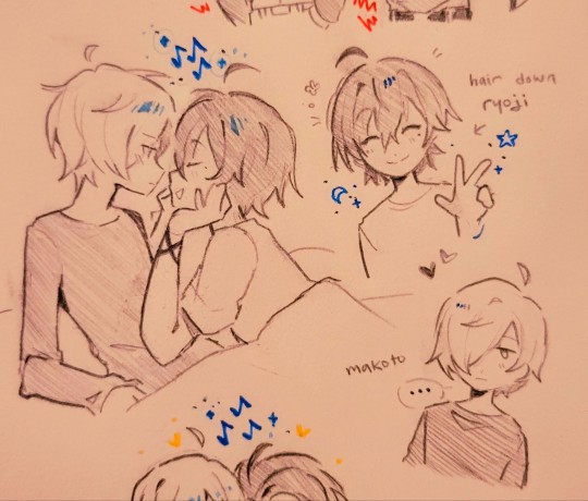
ryomina demons are winning
#does anyone here like them idk. theyre funny#putting off finishing p3re to draw these so i don't have to be sad just yet#cat’s art#ryomina#ryoji mochizuki#makoto yuki#minato arisato#p3#persona 3#p3re#p3 reload#sorry for traditional sketch stuff... idk i just feel like i do better on paper even tho its literally the same style#like i can just get the lines better on paper. i think my brush is probably too thick digitally if i'm having this problem lol#makoto makes me so emo u guys have no idea. i didn't quite get this guy in the beginning but now...#full force understanding of a character. hes. he :( (incoherent sobbing)#tag ramble again SORRY I UEBRO4Y39NRMFMT#oh yeah the period thing going around is so funny. PERSONA 3 PERIOD SIMULATOR
922 notes
·
View notes
Text
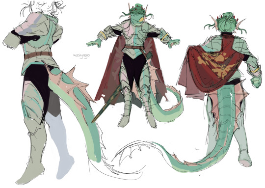
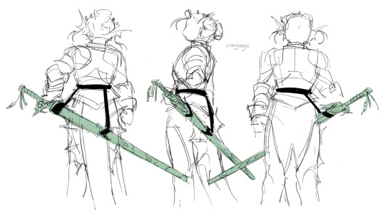
we're at it again🕺
#jrwi riptide#gillion tidestrider#my art#sketch#back on my bullshit woo yeah woo yeah woo yeah#genuinely a lot happier with this design than the previous ones. the lighter metal looks better on him#and this one doesn't have a lot of detail (or any detail tbh) so it looks more solid and fun i think#and you can see im trying to figure out how gill would carry his sword around#technically he should just carry it in his hands and don't have a scabbard because its a longsword and isn't supposed to be sheathed...#but like... its not practical to always carry it in his hands. especially in a day to day life. because he always has the sword on him-#but he doesn't necessarily always hold it? like. he needs hands for stuff#i think i like the back scabbard better (even if i drew the whole turnaround for the hip one) just because it doesn't mess with his tail#plus that way destiny's blade is higher up and gets to look around at stuff and i think its funny#but then like... the cape is a little awkward if it has to go above the sword...#but its not a big deal. if he has a cape and armor on he probably holds the sword in his hands anyway#am i putting too much thought into this unnecessary detail? yes#am i rambling in the tags again instead of making a separate post? also yes
2K notes
·
View notes
Text
Sometimes... the world can be a little too much.
#cod#call of duty#cod mw2#call of duty modern warfare 2#call of duty ghost#simon ghost riley#manysart#manyrambles#vent in the tags beware#drew a little ghost to see if it made me feel a little better and it did... maginarly...#I have been having the roughest month (roughest year reallly) of my life mental wise...#I feel so drained everything is too much everything is too little#it's like my brain is covered in static and not the good kind#I'm exausted mentally#my nerves feel rubbed raw#feels like I'm so close to snapping#I don't even know why I'm like this that's why it's so frustrating#now I'm gonna work on my assigment that does involve soap so that makes me a little happy#personal stuff yee haw
7K notes
·
View notes
Note
Do you play genshin impact or honkak a
Star rail?
I don't play Honkai, but I've just started looking into Genshin Impact's story (someone described Neuvillette's character to me and I was like. hmm. HMM.) I haven't gotten far yet -- really JUST started looking at it -- but I'm looking forward to more! :D
(I know almost nothing about these characters yet, I'm probably drawing them SUPER wrong, sorry)
#art#genshin impact#(another sorry to everyone in the tag) (i really don't know what i'm doing)#oh no i'm going to have to learn to draw even more complicated anime hair aren't i#man i would like to get into more things though#but alas there is too much stuff and not enough time#me: part of being a responsible adult is carefully thinking about and prioritizing my media consumption#also me: (watches the entire wownow thanksgiving movie) no regrets
872 notes
·
View notes
Text
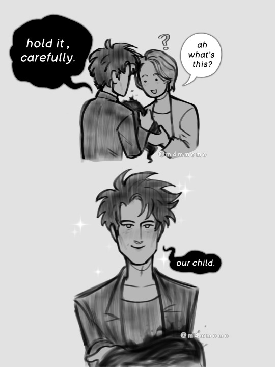

Had a little baby fever so better idea to give my favorite pair a baby, but ,me being me and taking advantage of the interesting things, I decided that the baby would be a little (literal) nightmare, yes
Bonus

Baby's name is Dusk, I use any pronouns to refer to them.
#dreamling#dream of the endless#hob gadling#parents au#fanchild#Hob aka I don't fear the horror i'm fact i'm having a lovely family with them#everyone wants to be a monsterfucker but not everyone decides to raise a child with the creature beyond human comprehension#I think Hob would be a brave one#nightmare child au#would probably use the tag again if I make more stuff#dream x hob#my art
2K notes
·
View notes
Text
Limited colour palette palooza magma bhtf moon I love him but I almost died because of lags lmao
#biting the hand that feeds au#bhtf au#bhtf au art#bhtf moondrop#moondrop#fnaf moondrop#fnaf moon#moondrop fnaf#moon fnaf#my art#also sorry to people who tag me in stuff and fanart i just don't want to reblog without comments#but don't have energy for comments#sorry</3
2K notes
·
View notes
Text
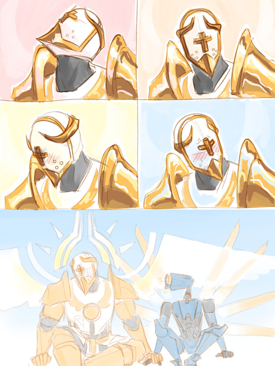
councilor 3D model
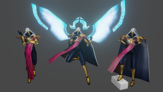
i learnt 3d modelling from the ground up to bring him to life. he's yours now. do whatever you want with him
[link]
please credit me if you make something using the model (or even ping/link me to it, i would love to see what you made!)
currently available as a .blend, .fbx and an SFM port.
#hello councilnation i'm finally releasing him to the wild#have fun playing toys with him#ultrakill#councilor#councilor ultrakill#3d stuff#obviously with the councilor having just 1 full body image of him means that some stuff i had to improvise on#so you get to enjoy my headcanons on how he looks#(like obviously the wings & halo)#(but also the chestplate design)#but did you know that the councilor's canon design has subtle engravings on his forearm armor pieces?#i only barely noticed them when painting textures and i was floored#i had to add them#to the sfm anon and whoever else wants to use this for sfm stuff-#i did my best with a port for sfm and i'm quite proud of the result#but please be aware i have never used it before so if you find that something doesn't work as it should please please let me know!!#gonna pour my heart out in tags as always so close your eyes if you don't wanna see me being sentimental but#i'm not kidding when i say i learnt 3d modelling from the ground up for this#i have meddled with blender before but never actually came close to finishing a project#and i don't know how i did it and how i kept going#(i do know) (it was my friend encouraging me every time i showed him progress)#this was like 1 entire month in the making#but i'm so fucking proud of this and how it turned out and people's tags in my act 2 render genuinely were such a huge confidence boost#so thank you guys for liking it <3#i'm still very much thinking of doing a version with just his bloodied head#but it might take a while because i want a break and i want to play warframe
495 notes
·
View notes
Text

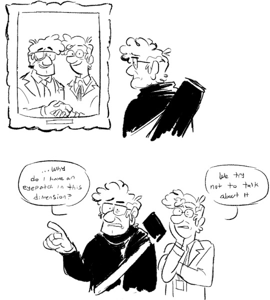


idk man
(and credit to divorcedfiddleford for the video that inspired the first drawing)
giving additional context for some of these
3rd pic: So I have some very specific thoughts on how the "a better world" stuff all plays out but namely I don't think it was a.... painless or easy process trying to get bill out of both their dimension and ford's head. I think it's better if it's ambiguous
4th: more parallel ford including eye injury detail, he's in his 40's here
5th: okay now I'm really getting off the rails but please god bear with me. along the lines of "things probably didn't get easier right away if bill was still threatening parallel ford" I had this crazy 3 am thought of "oh man what if ford voluntarily had fiddleford erase something from his mind so he could come to terms with it Later when they weren't pressed for time." if the situation was dire enough for ford (say, leaving him unable to sleep or focus on protecting their dimension from bill) I think he could very well have been pushed to use the memory gun. then again maybe I'm insane
6: this is parallel fidds again sorry I'm obsessed with him helping ford build a fucking death ray to destroy bill
8: this has some dialogue I thought about when I was fleshing out jheselbraum for a waaay future ad astra chapter but I ended up cutting it. sad
#gravity falls#fiddleford mcgucket#stanford pines#fiddauthor#a better world au#uhm. do their parallel counterparts have a tag... whatever they're the same#i know the 'a better world' stuff in journal 3 is divisive but listen to me Listen to me i think it has so much potential.#because there's sooo muchhhh we don't know about it#lab creations
920 notes
·
View notes
Text
Every time Nijika says Daijoubu / 大丈夫
#bocchi the rock!#bocchi the rock#my edit#compilation#random stuff I'd make a compilation of for no reason#the particular one from the episode 7 preview is giving angst potential#the way Nijika says 'it's okay...you don't have to force yourself' like damn?? That felt a bit personal#I had to edit a different scene for that cuz the one in the preview is too silly for such a somber delivery of a line#most of these are directed to Bocchi which makes me kinda want to tag it as boniji#it's so sweet ain't it? Nijika always checks if Bocchi is okay 🥺🤧 she's so gentle with her 💕
535 notes
·
View notes
Text
why Aurora's art is genius
It's break for me, and I've been meaning to sit down and read the Aurora webcomic (https://comicaurora.com/, @comicaurora on Tumblr) for quite a bit. So I did that over the last few days.
And… y'know. I can't actually say "I should've read this earlier," because otherwise I would've been up at 2:30-3am when I had responsibilities in the morning and I couldn't have properly enjoyed it, but. Holy shit guys THIS COMIC.
I intended to just do a generalized "hello this is all the things I love about this story," and I wrote a paragraph or two about art style. …and then another. And another. And I realized I needed to actually reference things so I would stop being too vague. I was reading the comic on my tablet or phone, because I wanted to stay curled up in my chair, but I type at a big monitor and so I saw more details… aaaaaand it turned into its own giant-ass post.
SO. Enjoy a few thousand words of me nerding out about this insanely cool art style and how fucking gorgeous this comic is? (There are screenshots, I promise it isn't just a wall of text.) In my defense, I just spent two semesters in graphic design classes focusing on the Adobe Suite, so… I get to be a nerd about pretty things…???
All positive feedback btw! No downers here. <3
---
I cannot emphasize enough how much I love the beautiful, simple stylistic method of drawing characters and figures. It is absolutely stunning and effortless and utterly graceful—it is so hard to capture the sheer beauty and fluidity of the human form in such a fashion. Even a simple outline of a character feels dynamic! It's gorgeous!
Though I do have a love-hate relationship with this, because my artistic side looks at that lovely simplicity, goes "I CAN DO THAT!" and then I sit down and go to the paper and realize that no, in fact, I cannot do that yet, because that simplicity is born of a hell of a lot of practice and understanding of bodies and actually is really hard to do. It's a very developed style that only looks simple because the artist knows what they're doing. The human body is hard to pull off, and this comic does so beautifully and makes it look effortless.
Also: line weight line weight line weight. It's especially important in simplified shapes and figures like this, and hoo boy is it used excellently. It's especially apparent the newer the pages get—I love watching that improvement over time—but with simpler figures and lines, you get nice light lines to emphasize both smaller details, like in the draping of clothing and the curls of hair—which, hello, yes—and thicker lines to emphasize bigger and more important details and silhouettes. It's the sort of thing that's essential to most illustrations, but I wanted to make a note of it because it's so vital to this art style.
THE USE OF LAYER BLENDING MODES OH MY GODS. (...uhhh, apologies to the people who don't know what that means, it's a digital art program thing? This article explains it for beginners.)
Bear with me, I just finished my second Photoshop course, I spent months and months working on projects with this shit so I see the genius use of Screen and/or its siblings (of which there are many—if I say "Screen" here, assume I mean the entire umbrella of Screen blending modes and possibly Overlay) and go nuts, but seriously it's so clever and also fucking gorgeous:
Firstly: the use of screened-on sound effect words over an action? A "CRACK" written over a branch and then put on Screen in glowy green so that it's subtle enough that it doesn't disrupt the visual flow, but still sticks out enough to make itself heard? Little "scritches" that are transparent where they're laid on without outlines to emphasize the sound without disrupting the underlying image? FUCK YES. I haven't seen this done literally anywhere else—granted, I haven't read a massive amount of comics, but I've read enough—and it is so clever and I adore it. Examples:


Secondly: The beautiful lighting effects. The curling leaves, all the magic, the various glowing eyes, the fog, the way it's all so vividly colored but doesn't burn your eyeballs out—a balance that's way harder to achieve than you'd think—and the soft glows around them, eeeee it's so pretty so pretty SO PRETTY. Not sure if some of these are Outer/Inner Glow/Shadow layer effects or if it's entirely hand-drawn, but major kudos either way; I can see the beautiful use of blending modes and I SALUTE YOUR GENIUS.
I keep looking at some of this stuff and go "is that a layer effect or is it done by hand?" Because you can make some similar things with the Satin layer effect in Photoshop (I don't know if other programs have this? I'm gonna have to find out since I won't have access to PS for much longer ;-;) that resembles some of the swirly inner bits on some of the lit effects, but I'm not sure if it is that or not. Or you could mask over textures? There's... many ways to do it.
If done by hand: oh my gods the patience, how. If done with layer effects: really clever work that knows how to stop said effects from looking wonky, because ugh those things get temperamental. If done with a layer of texture that's been masked over: very, very good masking work. No matter the method, pretty shimmers and swirly bits inside the bigger pretty swirls!
Next: The way color contrast is used! I will never be over the glowy green-on-black Primordial Life vibes when Alinua gets dropped into that… unconscious space?? with Life, for example, and the sharp contrast of vines and crack and branches and leaves against pitch black is just visually stunning. The way the roots sink into the ground and the three-dimensional sensation of it is particularly badass here:

Friggin. How does this imply depth like that. HOW. IT'S SO FREAKING COOL.
A huge point here is also color language and use! Everybody has their own particular shade, generally matching their eyes, magic, and personality, and I adore how this is used to make it clear who's talking or who's doing an action. That was especially apparent to me with Dainix and Falst in the caves—their colors are both fairly warm, but quite distinct, and I love how this clarifies who's doing what in panels with a lot of action from both of them. There is a particular bit that stuck out to me, so I dug up the panels (see this page and the following one https://comicaurora.com/aurora/1-20-30/):

(Gods it looks even prettier now that I put it against a plain background. Also, appreciation to Falst for managing a bridal-carry midair, damn.)
The way that their colors MERGE here! And the immense attention to detail in doing so—Dainix is higher up than Falst is in the first panel, so Dainix's orange fades into Falst's orange at the base. The next panel has gold up top and orange on bottom; we can't really tell in that panel where each of them are, but that's carried over to the next panel—

—where we now see that Falst's position is raised above Dainix's due to the way he's carrying him. (Points for continuity!) And, of course, we see the little "huffs" flowing from orange to yellow over their heads (where Dainix's head is higher than Falst's) to merge the sound of their breathing, which is absurdly clever because it emphasizes to the viewer how we hear two sets of huffing overlaying each other, not one. Absolutely brilliant.
(A few other notes of appreciation to that panel: beautiful glows around them, the sparks, the jagged silhouette of the spider legs, the lovely colors that have no right to make the area around a spider corpse that pretty, the excellent texturing on the cave walls plus perspective, the way Falst's movements imply Dainix's hefty weight, the natural posing of the characters, their on-point expressions that convey exactly how fuckin terrifying everything is right now, the slight glows to their eyes, and also they're just handsome boys <3)
Next up: Rain!!!! So well done! It's subtle enough that it never ever disrupts the impact of the focal point, but evident enough you can tell! And more importantly: THE MIST OFF THE CHARACTERS. Rain does this irl, it has that little vapor that comes off you and makes that little misty effect that plays with lighting, it's so cool-looking and here it's used to such pretty effect!
One of the panel captions says something about it blurring out all the injuries on the characters but like THAT AIN'T TOO BIG OF A PROBLEM when it gets across the environmental vibes, and also that'd be how it would look in real life too so like… outside viewer's angle is the same as the characters', mostly? my point is: that's the environment!!! that's the vibes, that's the feel! It gets it across and it does so in the most pretty way possible!
And another thing re: rain, the use of it to establish perspective, particularly in panels like this—

—where we can tell we're looking down at Tynan due to the perspective on the rain and where it's pointing. Excellent. (Also, kudos for looking down and emphasizing how Tynan's losing his advantage—lovely use of visual storytelling.)
Additionally, the misting here:

We see it most heavily in the leftmost panel, where it's quite foggy as you would expect in a rainstorm, especially in an environment with a lot of heat, but it's also lightly powdered on in the following two panels and tends to follow light sources, which makes complete sense given how light bounces off particles in the air.
A major point of strength in these too is a thorough understanding of lighting, like rim lighting, the various hues and shades, and an intricate understanding of how light bounces off surfaces even when they're in shadow (we'll see a faint glow in spots where characters are half in shadow, but that's how it would work in real life, because of how light bounces around).
Bringing some of these points together: the fluidity of the lines in magic, and the way simple glowing lines are used to emphasize motion and the magic itself, is deeply clever. I'm basically pulling at random from panels and there's definitely even better examples, but here's one (see this page https://comicaurora.com/aurora/1-16-33/):

First panel, listed in numbers because these build on each other:
The tension of the lines in Tess's magic here. This works on a couple levels: first, the way she's holding her fists, as if she's pulling a rope taut.
The way there's one primary line, emphasizing the rope feeling, accompanied by smaller ones.
The additional lines starbursting around her hands, to indicate the energy crackling in her hands and how she's doing a good bit more than just holding it. (That combined with the fists suggests some tension to the magic, too.) Also the variations in brightness, a feature you'll find in actual lightning. :D Additional kudos for how the lightning sparks and breaks off the metal of the sword.
A handful of miscellaneous notes on the second panel:
The reflection of the flames in Erin's typically dark blue eyes (which bears a remarkable resemblance to Dainix, incidentally—almost a thematic sort of parallel given Erin's using the same magic Dainix specializes in?)
The flowing of fabric in the wind and associated variation in the lineart
The way Erin's tattoos interact with the fire he's pulling to his hand
The way the rain overlays some of the fainter areas of fire (attention! to! detail! hell yeah!)
I could go on. I won't because this is a lot of writing already.
Third panel gets paragraphs, not bullets:
Erin's giant-ass "FWOOM" of fire there, and the way the outline of the word is puffy-edged and gradated to feel almost three-dimensional, plus once again using Screen or a variation on it so that the stars show up in the background. All this against that stunning plume of fire, which ripples and sparks so gorgeously, and the ending "om" of the onomatopoeia is emphasized incredibly brightly against that, adding to the punch of it and making the plume feel even brighter.
Also, once again, rain helping establish perspective, especially in how it's very angular in the left side of the panel and then slowly becomes more like a point to the right to indicate it's falling directly down on the viewer. Add in the bright, beautiful glow effects, fainter but no less important black lines beneath them to emphasize the sky and smoke and the like, and the stunningly beautiful lighting and gradated glows surrounding Erin plus the lightning jagging up at him from below, and you get one hell of an impactful panel right there. (And there is definitely more in there I could break down, this is just a lot already.)
And in general: The colors in this? Incredible. The blues and purples and oranges and golds compliment so well, and it's all so rich.
Like, seriously, just throughout the whole comic, the use of gradients, blending modes, color balance and hues, all the things, all the things, it makes for the most beautiful effects and glows and such a rich environment. There's a very distinct style to this comic in its simplified backgrounds (which I recognize are done partly because it's way easier and also backgrounds are so time-consuming dear gods but lemme say this) and vivid, smoothly drawn characters; the simplicity lets them come to the front and gives room for those beautiful, richly saturated focal points, letting the stylized designs of the magic and characters shine. The use of distinct silhouettes is insanely good. Honestly, complex backgrounds might run the risk of making everything too visually busy in this case. It's just, augh, so GORGEOUS.
Another bit, take a look at this page (https://comicaurora.com/aurora/1-15-28/):

It's not quite as evident here as it is in the next page, but this one does some other fun things so I'm grabbing it. Points:
Once again, using different colors to represent different character actions. The "WHAM" of Kendal hitting the ground is caused by Dainix's force, so it's orange (and kudos for doubling the word over to add a shake effect). But we see blue layered underneath, which could be an environmental choice, but might also be because it's Kendal, whose color is blue.
And speaking off, take a look at the right-most panel on top, where Kendal grabs the spear: his motion is, again, illustrated in bright blue, versus the atmospheric screened-on orange lines that point toward him around the whole panel (I'm sure these have a name, I think they might be more of a manga thing though and the only experience I have in manga is reading a bit of Fullmetal Alchemist). Those lines emphasize the weight of the spear being shoved at him, and their color tells us Dainix is responsible for it.
One of my all-time favorite effects in this comic is the way cracks manifest across Dainix's body to represent when he starts to lose control; it is utterly gorgeous and wonderfully thematic. These are more evident in the page before and after this one, but you get a decent idea here. I love the way they glow softly, the way the fire juuuust flickers through at the start and then becomes more evident over time, and the cracks feel so realistic, like his skin is made of pottery. Additional points for how fire begins to creep into his hair.
A small detail that's generally consistent across the comic, but which I want to make note of here because you can see it pretty well: Kendal's eyes glow about the same as the jewel in his sword, mirroring his connection to said sword and calling back to how the jewel became Vash's eye temporarily and thus was once Kendal's eye. You can always see this connection (though there might be some spots where this also changes in a symbolic manner; I went through it quickly on the first time around, so I'll pay more attention when I inevitably reread this), where Kendal's always got that little shine of blue in his eyes the same as the jewel. It's a beautiful visual parallel that encourages the reader to subconsciously link them together, especially since the lines used to illustrate character movements typically mirror their eye color. It's an extension of Kendal.
Did I mention how ABSOLUTELY BEAUTIFUL the colors in this are?
Also, the mythological/legend-type scenes are illustrated in familiar style often used for that type of story, a simple and heavily symbolic two-dimensional cave-painting-like look. They are absolutely beautiful on many levels, employing simple, lovely gradients, slightly rougher and thicker lineart that is nonetheless smoothly beautiful, and working with clear silhouettes (a major strength of this art style, but also a strength in the comic overall). But in particular, I wanted to call attention to a particular thing (see this page https://comicaurora.com/aurora/1-12-4/):

The flowing symbolic lineart surrounding each character. This is actually quite consistent across characters—see also Life's typical lines and how they curl:

What's particularly interesting here is how these symbols are often similar, but not the same. Vash's lines are always smooth, clean curls, often playing off each other and echoing one another like ripples in a pond. You'd think they'd look too similar to Life's—but they don't. Life's curl like vines, and they remain connected; where one curve might echo another but exist entirely detached from each other in Vash's, Life's lines still remain wound together, because vines are continuous and don't float around. :P
Tahraim's are less continuous, often breaking up with significantly smaller bits and pieces floating around like—of course—sparks, and come to sharper points. These are also constants: we see the vines repeated over and over in Alinua's dreams of Life, and the echoing ripples of Vash are consistent wherever we encounter him. Kendal's dream of the ghost citizens of the city of Vash in the last few chapters is filled with these rippling, echoing patterns, to beautiful effect (https://comicaurora.com/aurora/1-20-14/):

They ripple and spiral, often in long, sinuous curves, with smooth elegance. It reminds me a great deal of images of space and sine waves and the like. This establishes a definite feel to these different characters and their magic. And the thing is, that's not something that had to be done—the colors are good at emphasizing who's who. But it was done, and it adds a whole other dimension to the story. Whenever you're in a deity's domain, you know whose it is no matter the color.
Regarding that shape language, I wanted to make another note, too—Vash is sometimes described as chaotic and doing what he likes, which is interesting to me, because smooth, elegant curves and the color blue aren't generally associated with chaos. So while Vash might behave like that on the surface, I'm guessing he's got a lot more going on underneath; he's probably much more intentional in his actions than you'd think at a glance, and he is certainly quite caring with his city. The other thing is that this suits Kendal perfectly. He's a paragon character; he is kind, virtuous, and self-sacrificing, and often we see him aiming to calm others and keep them safe. Blue is such a good color for him. There is… probably more to this, but I'm not deep enough in yet to say.
And here's the thing: I'm only scratching the surface. There is so much more here I'm not covering (color palettes! outfits! character design! environment! the deities! so much more!) and a lot more I can't cover, because I don't have the experience; this is me as a hobbyist artist who happened to take a couple design classes because I wanted to. The art style to this comic is so clever and creative and beautiful, though, I just had to go off about it. <3
...brownie points for getting all the way down here? Have a cookie.
#aurora comic#aurora webcomic#comicaurora#art analysis#...I hope those are the right tags???#new fandom new tagging practices to learn ig#much thanks for something to read while I try to rest my wrists. carpal tunnel BAD. (ignore that I wrote this I've got braces ok it's fine)#anyway! I HAVE. MANY MORE THOUGHTS. ON THE STORY ITSELF. THIS LOVELY STORY#also a collection of reactions to a chunk of the comic before I hit the point where I was too busy reading to write anything down#idk how to format those tho#...yeet them into one post...???#eh I usually don't go off this much these days but this seems like a smaller tight-knit fandom so... might as well help build it?#and I have a little more time thanks to break so#oh yes also shoutout to my insanely awesome professor for teaching me all the technical stuff from this he is LOVELY#made an incredibly complex program into something comprehensible <3#synapse talks
743 notes
·
View notes
Last Seen Blogs
wally-darling-hyperfixation
Welcome Home Darlings
l-idiota
L'idiota
nourishedegg
Hearts, Stars, Love!!
saint-faustus
Saint Faustus

mintkoi
MintKoi