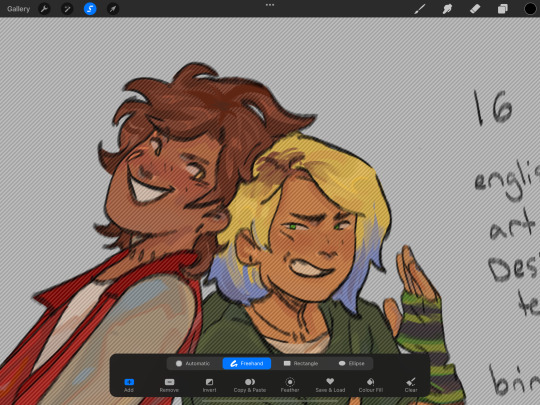
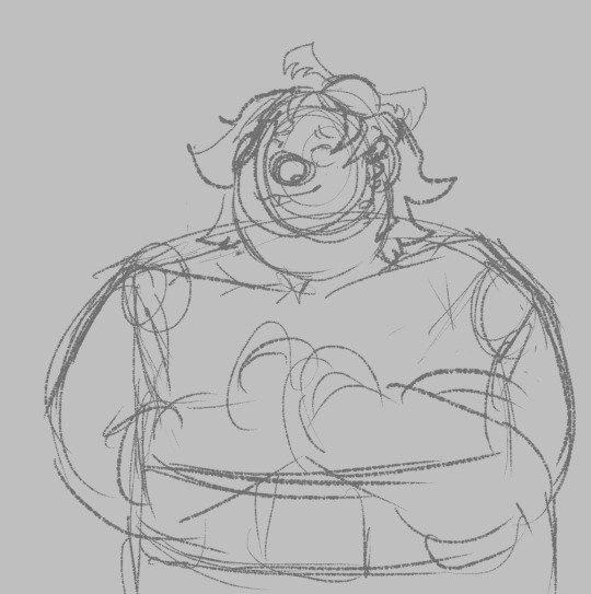
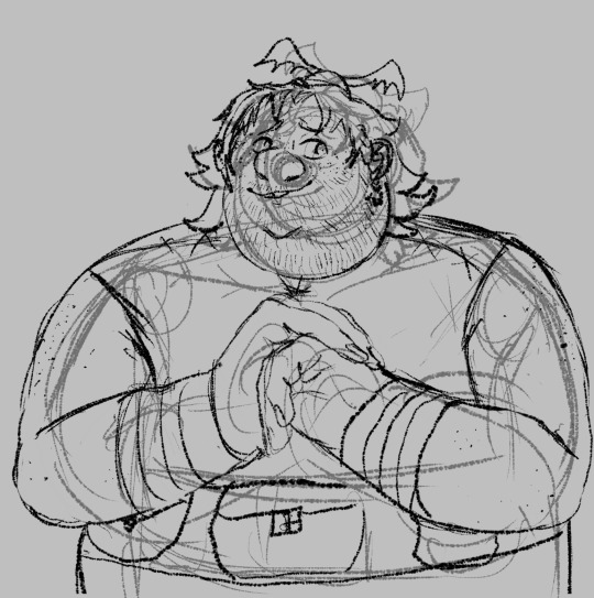
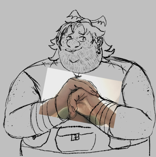
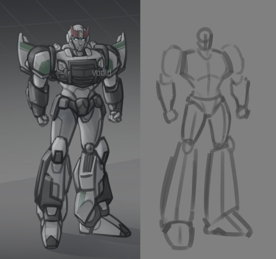
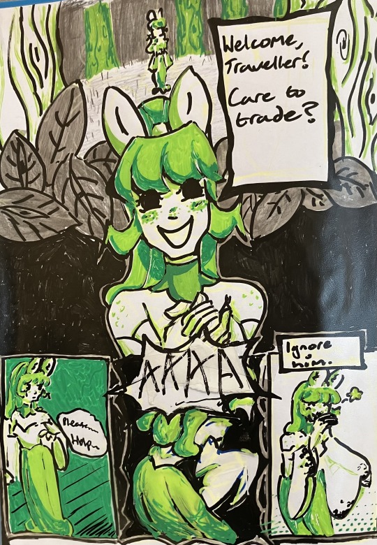
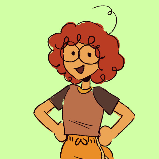
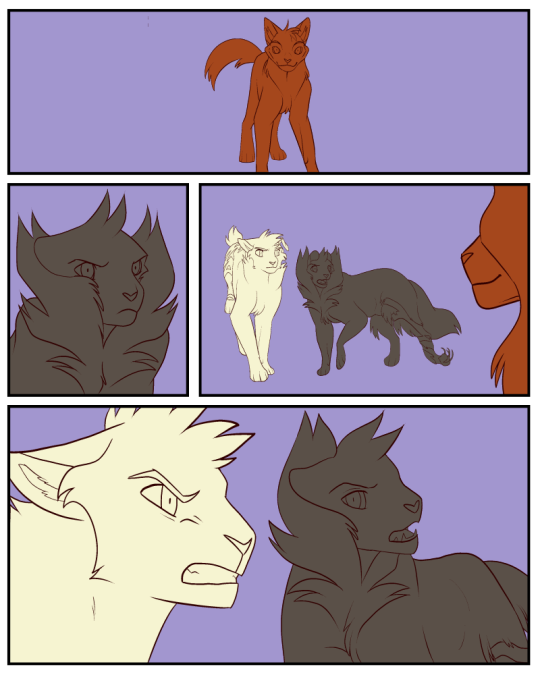
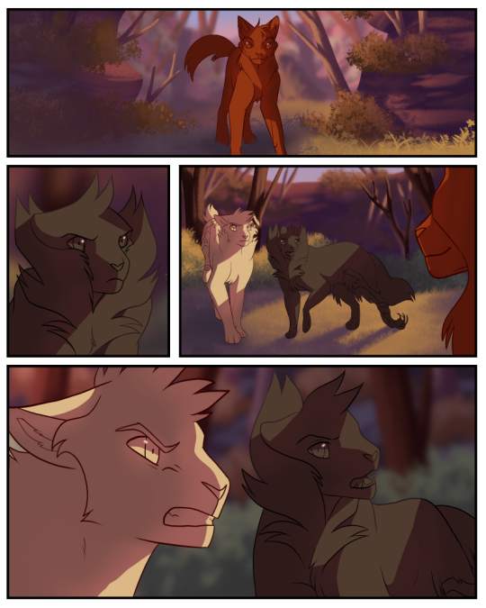
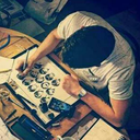
#I also just took my second sketch and used that as my lineart and it’s red vs black which was fun to do instead!!
Text

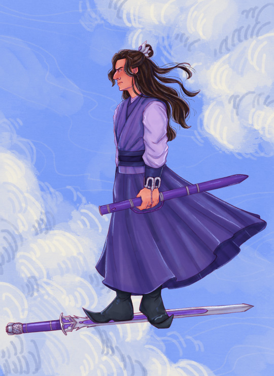
Flying with a purpose (just look at his face >:((( )
#katan art#mdzs#cql#the untamed#jiang cheng#jiang wanyin#sandu shengshou#I don’t draw for a few weeks and then I come back and just draw him#I drew the sketch in one of my classes there’s something about sketching when you aren’t supposed to that makes them turn out so well HAKDJ#I also just took my second sketch and used that as my lineart and it’s red vs black which was fun to do instead!!
167 notes
·
View notes
Note
Hello! I love your art sm and it’s so pretty! If you don’t mind me asking, how do you make draw your art-? Like what’s the process behind it?
(Sorry if this doesn’t make sense I’m bad at explaining stuff lol)
hi! i’m stoked anyone would want to know my process, no i don’t mind at all! tumblr deleted the draft i made where i went in depth about everything and i’m extremely mad about it, but hopefully this one sends.
i’m not sure if there was a specific drawing you were referring to, bc sometimes my process changed depending on how enthusiastic i’m feeling about the piece, but this is a general guide using the au as a reference :
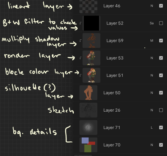
1. sketch! i mostly just get down the main shapes.
2. finalise lineart!
3. Block colours! on the layer below lineart, use select tool within the lineart, alpha lock it, and add in block colours (this is where i experiment, you can see the remnants of lloyd’s other shirt colours near the collar before i decided i didn’t like them). i also put in loose details if i think i’m going to forget them before the render (eg i knew i wanted kais pants to be a gradient so i put it on the colour block layer so i could use the gradient later on in the render layer).
4. render! on the layer above colour, i put all my details. i use the lasso took a lot for shading and for hair (second image has a selection i used for kais roots. i select an area that i want to give depth w lasso tool, and airbrush either a shade lighter or darker than base).

5. shadows! set the layer above render to multiply and add in shadows to create more depth. i blend some of the shadows in, but mostly not bc i like the texture the harsh lines give (also the colours are gone so the shadows are more obvious for tutorials sake)

6. check values and colour lineart!
on a layer above everything, i fill with a completely desaturated shade (can be any) and set to saturation. this makes the image black and white, and i can go through and see if i need to change any colours or shading to make it more readable. i also alpha lock the lineart and add a warm red where ever i think blush would be on the face, or flesh is.
7. backgrounds if any then done! i also have a speedpaint of the nya and zane process to see it in action plus the order of layers
#hope this was okay!#i’m a massive fan of rendering all on one layer just bc it makes changing things i don’t like easier but some ppl hate that lol
96 notes
·
View notes
Note
Hi! I love your art and I’m so curious to know what your art process is like!
i've been trying to figure out how to answer this & i've honestly realized that my process is a mess LOLOL i did record myself!!! drawing fishlegs bc he is the fave & easiest for me to draw! i hope everything i explain under the read more makes sense!!
it took me over 44 minutes to draw & the screen recording in the art program i use (autodesk sketchbook) brought it down to about 7 minutes and 25 seconds. i didn't wanna speed it up even more bc it'd be way too fast & jarring i think but!! i've uploaded the video to youtube (with some animal crossing music <3)!! i will still try to explain what i did here tho!!
my initial sketches are EXTREMELY loose! i start with the head by drawing a circle & extending past it for the chin of the character & proceed to do the nose, eyes, & mouth!! hair is next, but if there's a helmet i need to draw, i'll do that before the hair!! then i'll do the body starting from the shoulders & going down!! for the hands i just do circles/a general shape! no details!!
the sketch layer is a layer of black for the brush color with with lower opacity
i immediately do lines on top with the same brush but with black at full opacity on the kayer above!! this time i actually take my time to be more careful with details BUT i am still very sketchy & if smth isn't 100% accurate after i try a few times, i leave it be! hands however...
i almost always end up taking a photo of my hands using the front facing camera set to a 5 second timer on my phone! i also draw using my phone so it's literally having everything i need all in one place lol!! i do trace my own hands but obv i adjust based on what i'm drawing!! fish's hands are def gonna be wider than mine!!
NOW for color i color pick directly from screenshots!! however i use it mostly for flats & then pick my own for shading!! let's focus on the flats for now!! i start with the skin always!! the skin is going to have color layers above and below it, so it's easier for me to see where everything else will go if i've got the skin all settled. here you can see my color layers!! these are ALL flats!!

shading & lighting i don't rlly... focus on being accurate 100% but i try to do it based on where a shadow would absolutely be/to give the appearance of some type of depth (my art is very flat either way tho!) like where his lower hand is cupping i'll shade but leave the top of the upper hand unshaded for the most part! i lay out everything in a multiply layer first (can be any color u want based on the vibe u want!!) & then use a smudge tool to blend it out!! same goes for the lighting layer!!!

my art overall is a lot of scribbling big lines & curves then using the lineart to do the same but slowly make adjustments until it looks acceptable to me. it's SO much erasing & reshaping & i always have sketch lines everywhere but i like how it looks. it looks like i drew it, u know? plus the httyd books art style is a HUGE inspiration to me, at my core. i didn't even realize it was until ppl on here pointed it out :') i also enjoy drawing fast & moving on!! which is just smth i've trained myself to do since my star fox days (the reason i draw in the first place!!)
thank u!!!! i hope this made sense!!
#rose answers#evilwriter37#httyd#fishlegs ingerman#httyd fanart#🌹 art#i hope this makes sense!!!!!!!#this was rlly fun to do!!!#i'm so unaware of my own process that i feel like it's a lil painful to watch the screenrecording of me#BUT u know what it works!!!!#also: i love drawing freckles LOLOL
25 notes
·
View notes
Note
Your style of characters is so beautiful!! How did you learn/develop/practice to draw like that?
Ah!!! Thank you!! 💗💗💗✨✨
Here comes a long rant, get ready
Talking about your own art style is kinda tricky, I feel like to artists it comes as second nature, so one doesn't really see it as a so-called separate "style". Rather they see it as a continuation of themselves in a drawn form (at least i do). But if i had to, i'd say that one's art style consists of two things:
1) What comes naturally.
I look at 5 year old kids drawing and see that each one of then has their own unique style. Already. Without even trying.
I've been drawing my whole life and I never tried to shape my drawing style into a box that I could call "my style". I just let the lines flow naturally and followed where they led me.
I started going to live-drawing sessions again recently and my friend told me that she could see "my style" of drawing that she sees in my digital works in those quick sketches that I make during these sessions. I think that's because when I work on digital illustrations, I don't think about how I should draw this or that. I just do it.
So, practise! With time, the ways you personally draw things will flow to you. When you draw one thing a 100 times you start to notice simularities in all of the 100 different examples, and then you systematize what you've learned and put it to use drawing your 101 drawing. After a while you won't even think about it before drawing them in the usual for you way.
I like to draw freely, not picking up a pencil from paper, with my lines just flowing naturally everywhere that I want them to. And I try to keep that same feeling in my finished drawings (where there is lineart still visible).


Here, found an example of a quick live sketch without any boobies for ya (just to be safe) and a linework for one on my more recent digital works. See how I try to keep the lines alive in the same way. And add highlights where I deem them necessary just for something interesting to the eye.
2) Your inspiration.
Everything that you see and like impacts your style, whether you mean it or not. My friend (other friend) watched Wolfwalkers the other night and immediately texted me saying she could see the inspiration that I've drawn from that movie. And she was right. I am a fan of the artstyle of the whole studio, so it's only natural that i, maybe even unconsciously, took something that i liked from their works and incorporated it into my own art style.
When I asked my friend what exact simularities she saw, she couldn't pinpoint them, she said it's just the vibe that she's getting. And i was content with that answer. Means i didn't copy and paste, but rather interpreted what i liked in my own way.
Also. Very important. You have to love what you draw. You're gonna wanna spend some extra time and add those extra couple of strokes that don't add anything in meaning, but are there to just be pretty. Sometimes those couple of strokes make the biggest difference. I think it's is very important to take time to just sit with your work and listen to what it needs to make it truly finished. A drawing can go from empty and unfinished to fantastic in just a couple of lines.
So. There it is. Sorry for the long answer. Or maybe you're welcome? Anyway hope it satisfies you!💖💖
#maybe some time later i'll make a compilation of my nude sketches if you all are interested#there are some really lovely ones with some fat ladies
19 notes
·
View notes
Text
So I'm going to post about an ongoing project of mine even though it's probably a bit premature. I call it the Princess Paper Doll project although it involves a fair number of not princesses. It technically started as the Disney Princess Paper Doll project but it stopped being Disney about ten minutes after I conceived the idea. Anyway, it's gonna be a long one so if you're at all curious it's under the cut.
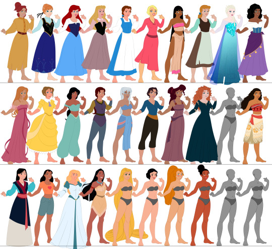
About a decade ago now (I think) my mom bought a set of Disney Princess paper dolls for my niece. This delighted me, first because I had Disney paper dolls as a kid, and second because of a unique feature of this particular set.
See, in this set, all of the princesses were in the same pose. Like so:
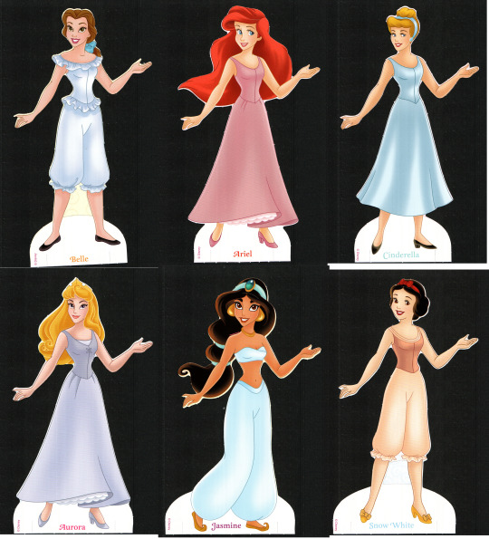
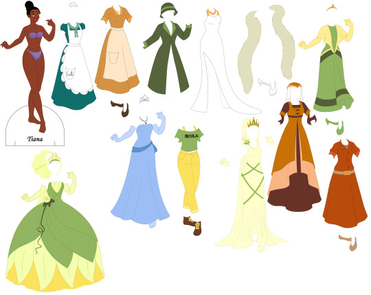
And I immediately thought that was pretty cool because they could all wear each other's clothes. I also thought that because they were all posed the same and they could therefore all wear each other's clothes, it would be fairly easy (for a moderately savvy artist) to copy the base and add other characters to the lineup and even if it took longer to make their outfits, they wouldn't have to be naked in their underwear. The Princess and the Frog being the last movie that Disney had released at the time and my niece being from New Orleans and some of her family being kinda grossly racist I decided to begin with Tiana:

However, the more observant among you may notice, as I did not for a while, that they cannot all wear each other's clothes. Tiana here, along with half of the other princesses, is wearing a wide skirt. So none of them can wear anything designed for Jasmine. Also, the set kind of sucks so Aurora up there can't even keep one of her own dresses on, there are just not enough tabs to defy gravity.
So I started over with a new base and tried again.

I worked on that long enough to get most of the bases for the Disney Princesses done, decided I didn't like the pose, I think, and set it aside.
Time for version 3.

I apparently did not get very far with this one. I only made 4 bases this time (Anna, Ariel, Pocahontas, and Mulan). But I made an entire dress for Anna (her coronation gown) and all of the outfits for Mulan. Then I started drawing clothes for Pocahontas and realized that I'd made a terrible mistake. See, Pocahontas, in the sequel, wears a ballgown and full cage crinolin and they weren't going to get along with that hand on the hip. So time to try again.
Version 4 is where I start gaining some consistency. The model here is mostly what I stick with going forward and I made some pretty good progress.
I did eventually scrap this one too, because I was having trouble navigating some of the skirts on the wide stance as evidenced by Charlotte (I do not profess to be a master artist).
So version 5.

You'll note that aside from Chel they are all only in Kida's underwear and that's because I decided fairly quickly into the clothing process that these ladies were too damn skinny. I'm not actually sure why they got so much skinnier from v4 to v5 but it had to go.
Version 6. Actually, I'm going to skip version 6 entirely here. It is identical to version 7 (the current version) except that I decided their busts were a little too big to accommodate everyone (and even the ones it seemed to accommodate looked better with the adjustment). Luckily this is the point where I started using Illustrator for the lineart so it was fairly easy to make the adjustment on the wealth of clothes I had already finished in v6. Anyway, now I've made most of the bases I have planned and at least one outfit for each (except Rapunzel because there is soooo much detail that after I did the rough sketch I was not prepared to do the clean lines). I started experimenting with how to make the different hairstyles work with Belle and Anastasia (why those two? who knows) so they have all of their hairstyles to go with their bases, and Tiana and Pocahontas have all of their clothes (and almost all Tiana's hair, though I haven't fixed it for actual interchangeability when printed).


These do have tabs, by the way, they're just hidden unless I'm running a test print to make sure they work.
Now, full disclosure I mostly traced their heads from screencaps. I am not sufficiently versed in animated women that I can confidently draw all of those faces. I drew the base and I'm drawing the clothes.
Nothing is shaded partly because I'm not great at shading and partly because I've learned the hard way that it sucks to do all the shading and then make a minor adjustment and have to do it all over again.
Also I say Tiana has most of her hair because I want to include her Wreck-It-Wralph 2 hair (you'll note the outfit is there) but I am shit at drawing hair in general and worse at drawing curly hair (you'll note Merrida) and I can't find any 2d art of her with that hairstyle that I can use either to trace or as reference.
Incidentally, as much as possible I am trying to make each piece separate so the aprons come off of the Duke's and Cal's diner dresses for Tiana, Anna, Ariel, and Aurora are wearing a blouse, skirt and corset, so on and so forth. It allows for a lot more mixing and matching and it creates a more 3d effect that's kind of neat.
The full list, in case you can't recognize everyone or read their name on the base is: Anastasia (Anastasia), Anna (Frozen), Ariel (The Little Mermaid), Aurora (Sleeping Beauty), Belle (Beauty and the Beast), Charlotte (The Princess and the Frog), Chel (The Road to El Dorado), Cinderella (Cinderella), Elsa (Frozen), Esmeralda (The Hunchback of Notre Dame), Giselle (Enchanted), Jane (Tarzan), Jasmine (Aladdin), Kayley (Quest for Camelot), Kidagakash (Atlantis), Marina (Sinbad), Megara (Hercules), Merrida (Brave), Moana (Moana), Mulan (Mulan), Nani (Lilo & Stitch), Odette (The Swan Princess), Pocahontas (Pocahontas), Rapunzel (Tangled), Snow White (Snow White and the Seven Dwarfs), Thumbelina (Thumbelina), and Tiana (The Princess and the Frog).
I'm planning on adding Amalthea (Last Unicorn) at some point. I also keep waffling about Mirriam and Tzipporah (Prince of Egypt) because they are awesome animated women who deserve to be included but also I am not Jewish and I worry it's disrespectful somehow (although Pocahontas is in there so that ship's kinda sailed, hasn't it?). I'll probably try to add Mirabel (Encanto) eventually. I ought to add Nancy (Enchanted), but that's still a big question mark. In the theoretical grand plan I'm going to do the fellas eventually to, though that may be a bit more complicated. I'm also open to suggestions. However, I'm probably gonna try to get more of these ladies finished before I add to the roster.
By the way, do not come on this post to complain about women's body types in animation. This is for fun. I'm having fun with it. I worked really hard to make this work at all. Just don't.
8 notes
·
View notes
Note
my toxic trait is looking at your art and thinking that i could do that too. everytime i try drawing Transformers it ends up lookin like a pile of metal that got ran over by two semi trucks blasted to cybertron and back then got the shit beaten out of it by Optimus Prime himself 😭
but fr though, how do you do it? like what kinds of shapes are they made of? how do all their weird alien metal parts move?
what may work for my style might not for you, as i've unfortunately learned through my years of yearning for/trying out another artist's skill, and that's okay. but i am very honored to be that kind of artist to you 💗 beating yourself up for not being like me won't help you, though 🥹 your art is great, regardless of if it looks like mine or not. i'm going on 7 years of doing this after all! (also i started with bayverse of all things 😵)
and honestly, a lot of it is just experimenting and finding what's right for you, what you need to improve/improvise on, and what you want out of your art. for me, i found that i have a very difficult time actually getting that sharp, blocky industrial style of robots down and eventually opted for a more organic, squishier look. but i do maintain their proportions as they're wildly different from a human's ghsdfsjs
you're already off to a great start doing exactly what i did to learn: redrawing screenshots from the shows. i learned most of what i know from tfp, with a lot of bayverse and g1 mixed in there. it took me about two years of that before i felt confident enough to start making original art consistently. it takes time (and tbf, i was still learning how to art in general when i started. so you really are off to a great start)
this is the kind of art i made in 2017:
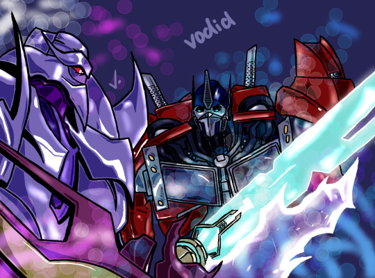
massively different from my art now, right? through all these screenshots, i'd test out new ways to draw and color. at one point, every piece i made was trying something new. and it was okay if it didn't work out. means i know what not to do next time lol generally though, i'd NEVER do lineart. i mostly focused on building up my sketching and coloring skills, as seen here in my 2018 art:
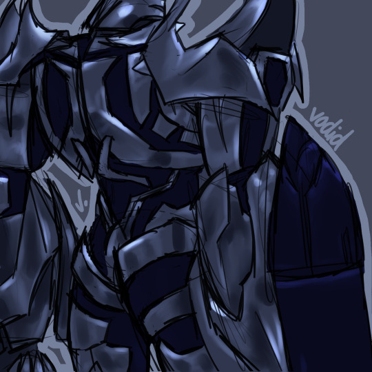
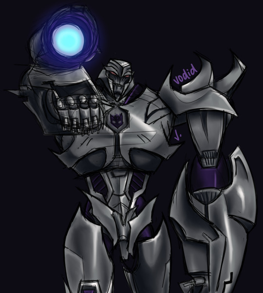
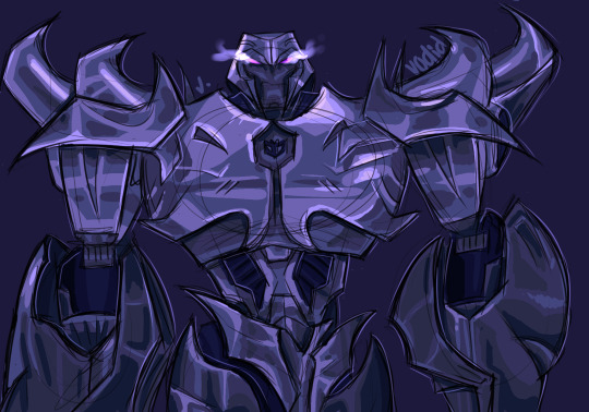
and that kind of fucked me over for life so now i am left with painting over the sketch 😂 i digress though
in all honesty i've spent my entire art career figuring out how the fuck all their weird alien metal parts move 💀 a lot of it is BSing, some is recycling the same poses to make things easier on yourself and the rest is studying studying studying. cannot tell you the amount of times i've rewatched certain bayverse scenes frame by frame to figure out how all their parts move in tandem — i still don't know! 😅 g1 was a nightmare to figure out because of its blocky simplicity and limited range of motion. it's still a struggle to this day haha
it's really difficult how to explain how exactly i draw transformers, as it's just... something i do nowadays. there's not a ridiculous amount of thought put into it since i've built up my skill. but here's generally how i sketch their bodies and what shapes i use:
the first is slightly different as its a more detailed approach than g1 so just imagine the arms are a little rounder — "marshmallow," as my brother would call it — like the sketches in the second (even if those are a little more advanced in the process than the first)
my best advice to you is to learn their proportions and articulation via redrawing screenshots — various ones! i chose the most dynamic poses for my megatron practices in 2018 to nail it in my head lol but yes shows like tfp and earthspark are great for that (you could probably even do with looking at the storyboard animations for earthspark to help!)
and remember, i'm still learning too! i'm not gonna pretend like i know what i'm doing. but i'm glad i inspire you :)
12 notes
·
View notes
Text

This was another Christmas' present for my nephew. They were visiting, and at night, I worked on this to eventually give to him. (Actually later inspired him to ask for his own Faux Stainglass making stuff.) Click below for the crazy process to get it made.
Now... I was in my families guest bedroom, since my bedroom was larger and better for my brother's family to be in. Previously in this room, was our collection of weapons. Because my family appreciates the astetic and well, also the use in some regards. Though mainly machetes and hatches, for outdoor yard work. A bunch are just wall hangers. Though some are sharp, and some are heavy.
(Dad has taken them down, so he can build a better, safer case to put them in. So smol children can't get grabby.)
Trying to get the piece done in time. I realized that it was late, and I needed a good straightedge. Now, I grew up in a family, that had many sharp things about the house. With my father being a woodcarver. I was taught at an early age, to appreciate and respect sharp things. For being useful, and also dangerous. As an adult, I think I own... (counts) um... ALOT of sharp and pointys in my bedroom. But my bedroom also doubles as my workshop, so it makes sense. Though, I do have some collection stuff in here. But mostly functional blades, like my exactos, box cutters and the like for crafting/building.
And the reason I tell this story, is because it was second nature, to just do this...

Reached back, (since I couldn't go to my room to possibly grab the Jill Ruler) And took out the collection's oldest resident. My father's Machete he brought to America from his birthplace in Columbia. It's older then me by a long shot, probably 50-55 years old, and beloved as a main staple when it comes to outdoor wood chopping. It is certainly a first reach when needing to do things, and using it as a straight edge was normal for me... But as I was working on it, forgot that this isn't normal and had a chuckle about it. And sent pictures to friends who know me, and they were amused.
Note: it is sharp, and can be dangerous. Treat any sharp object with respect and care. Don't just grab things willy nilly.
So, with a straight edge secure, I started working on the design.
The process of making Faux Stainglass, usually takes me 3-4 days. Sketching and doing the lines, is day one. Because the liquid leading needs to ideally, cure overnight. I tend to sketch out the design, then overlay it with Sharpie. Since the general thickness of a basic sharpie, is about what the lines are in Liquid leading. (Though a properly skilled person, probably could make the lines how ever they want. I am still learning)
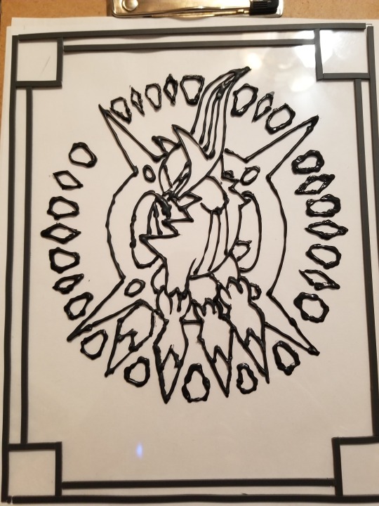
As you can tell from my Wobbly lines. It also doesn't help that often these projects were at minimum, a year apart. If not several. So any good lineart skill I gained, might have been downgraded as I worked on a new project.
Day 2 is color, which then needs to cure overnight as well.
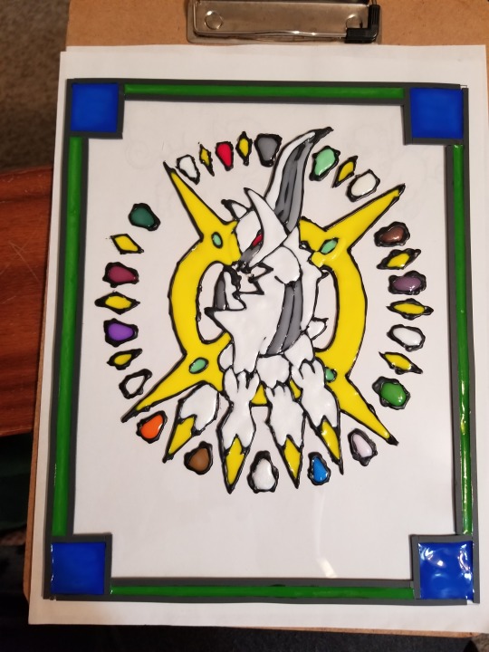
And this is what it looked like, before drying. So, there is some color change as it becomes more transparent. Day 3-4 is letting it cure fully. In case various sections might have had too thick of paint, and it taking longer to cure. Mainly a choice I make to make sure that the piece is finished, before being presented as a present.
#my art#pokemon arceus#notfr#pokemon#faux stained glass#be safe when using sharp objects. Even for straight edges#Arceus
2 notes
·
View notes
Text
Creativity 02.2024
Since in February I decided to focus on drawing and painting, I tried getting back into traditional art (pencil and paper). With the permission from my friends and family I sketched their semi realistic portraits in my sketchbook, therefore practicing my pencil skills and my proportions/anatomy of human faces (being a thing I draw most readily).
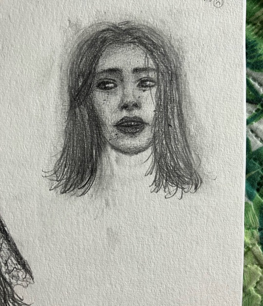

I preferred to go a safe way and only draw front facing portraits. A problem appeared when a friend of mine sent me a 3/4 selfie, despite me asking for a front one. I didn’t have the heart to tell her that was not what I meant, so I tried a harder perspective. It probably would’ve looked a little better if it wasn’t a different angle, but the point of practice is literally to get better, so that challenge was more valuable than the rest.
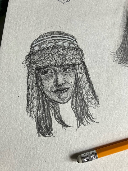
A more physical issue I faced was that I was not able to find my white gel pens necessary for the highlights, so trying to be resourceful I used a correction pen being nowhere close to the precision of a gel pen, and still managed to overcome the lack of professionalism and made good of what I had. I later on remembered where I hid my accessories, but decided to stick to the correction pen for consistency and the challenge in the challenge. Using creativity in not creating, but also dealing with unexpected problems is just as important and will be useful in everyday life. That is meaningful creativity.
For the second time this month I had the opportunity of using my CAS practice for making a birthday gift, because with the motivation and further practice I made a card for my sister with the additional challenge of incorporating watercolors and black lineart that I have not used for a few years. Another challenge in a challenge of a challenge. I took the risk of possibly ruining the pencil sketch and was satisfied with the result.
0 notes
Text
After my first attempt at risograph, I worked out the issues I had with my first piece.
1.The layers of the paper weren’t lined up properly
2. The scanner didn’t pick up the colour tones I wanted them too
3. I didn’t like how the layers looked afterwards because the values weren’t varied enough, making the comic panels feel flat
I decided to redo my comic page with these things in mind.

I started out by doing swatches of all my Posca markers. I wanted to see how they showed up in black and white, so I took a picture and put on a monochrome filter. This helped me understand my values a lot better.
I filled in the first layer in black and white, before going in with a grey marker to block out what areas I wanted to be darker. I kept it in black and white for now, so I could map out the details later.
I used the manga ‘Houseki No Kuni’ as reference for conveying tones and making backgrounds using values.
After the first layer sketch and lineart was done, I blocked out the colours with Posca markers. I used light green, dark green and black. This made it easier to tell what shade of grey I was using, while having a range of greys to choose from.
I did the same thing for the second layer. This time around, I was careful to avoid the lineart underneath and also coloured in some panels to make the composition more dynamic. The second layer is intended to be red.
This was another black and white test to check how the values looked before scanning. I think it looks good! The character pops out on the sheet, and the background she’s introduced in is black and scribbly, making her look just a little more menacing.
1 note
·
View note
Text
"I looked happy"
#marvel#mcu#loki show#sylvie laufeydottir#hunter b 15#Gems art#this fuKCIN thing took me too long to finish GHFGJKHLJ#also u can probably tell but I didnt actually do lineart for this one-#I just cleaned up my second sketch and used that instead#mainly because I REALLY liked how it turned out and didnt want to ruin it with lineart#but it took for e v e r#my wrist hurt a but by thr end but i think it was worth i t 8)
13 notes
·
View notes
Note
'Scusie, I have a question about digital art. How do you do your coloring? If you have a previous post or resource you talked about already then that'd be appreciated. But if not; I've just started getting back into digital art and can't remember how people did their fancy selection methods to color in their lineart. I managed somewhat myself but what would be a simple sketch irl took like an hour or two of trying to work the tablet/program. I want to enjoy it again and use it to start commissions in the future, and I don't want to be easily burned out because of the complexity. For reference, I'm using Krita.
ok I wasn't really sure how to explain it so I made a timelapse? let's see if this helps
so first of all, I'm predominantly using CSP nowadays (which I love and highly recommend), which has this nifty little feature in the bucket tool:
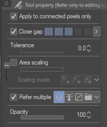
it can close gaps!! Now, I tend to draw pretty loose and my lines have a lot of gaps between them that are too big to close automatically, so I'll manually close them on my color layer with whichever color I'm using. I find this method works best when my pen and bucket tool have anti-aliasing turned off. I think other programs like Medibang and even Aggie.io have some sort of "smart" bucket tool, so I wouldn't be surprised if krita has something similar too.
the second method is simply Not Giving A Fuck and coloring sloppily without caring if the colors stay in the lines. I do this more for stupider comics where looking pretty doesn't matter so much
the third method is the same as the first but using a nice, textured brush so it looks Intentional and Pretty
I also tend to throw gradient maps on everything because they're so fun :)


the fourth method (which I did not demonstrate) is the good ol' polygonal lasso tool. I mostly used it when I used Photoshop. It's a really good and fast way to get all your colors blocked in without requiring so much precision, but it can still be a little tedious.
Bear in mind, I am not the kind of person that has each color on its own layer. A basic drawing like this one is lines, colors, and bg, with maybe a gradient map or adjustment layer. There are tons more ways than this to color (look into CSP's reference layers! pretty neat stuff), but these are just the ways that I like to use because I am very very lazy and am only willing to put in the absolute bare minimum effort
983 notes
·
View notes
Note
I’m not sure if you’ve been asked this before, sorry if you have, but would you show how you draw your characters? Like a layer by layer thing. I’d love to see how you sketch out the basic shape then add more detail, or whatever way you work.
I really want to get better at drawing full body figures (so I can create pretty oc’s and stuff them hehe) and I really like your style :) 💚💚💚
Hello there!! Thank you so much :) Sorry this took a while, here you go!
I start out by making a quick sketch of the body, just to set the idea of its positioning (it doesn't have to be pretty, just useful)- use lots of references, even pictures of yourself
Many references you find online are good, but a better reference is someone who isn't posing for it (imo): if you need a reference for someone sitting you might find a better one in a movie/video rather than pinterest
But yeah, the first sketch has to look wonky
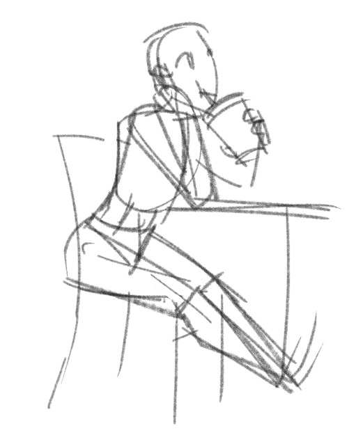
then I lower the first layer's opacity and draw it again, trying to give a more rounded-out idea of what I want the body to look like- not just the bodytype but also face, fingers/feet positioning and so on
Clothes aren't mandatory here, but sometimes I sketch them on this layer
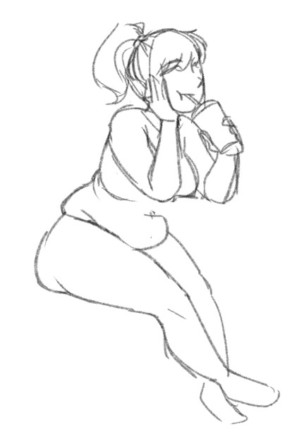
I lower the second layer's opacity and make a shitty (as in quick and rough) lineart, adjusting proportions and drawing as many details as I feel like- it's good if you're precise here but you don't /have/ to (it complicates things if you're not sure where you're going, I often make detailed linearts and regret it later as I realise I still haven't found the right exact positioning for the hand or something like that)
Sometimes I just clean up the first lineart and call it a day, sometimes I lower its opacity and make another layer
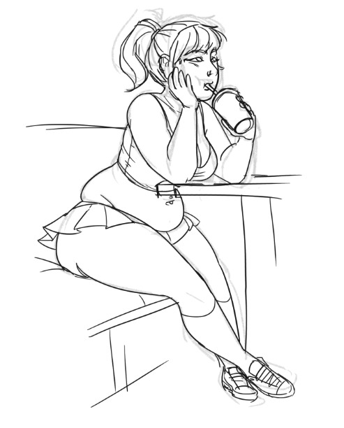
The last layer is the final lineart, I turn up the stabilization on my brush high as fuck and brace myself to CTRL+Z at least 25 times for every line
I don't have to concentrate on what I'm drawing (because I'm just tracing the previous layer), just the lineweight and whether it looks nice as a whole
That's pretty much it, my tip for getting better at drawing bodies is: don't worry if it doesn't look like you imagined it, you'll get there if you keep drawing, I promise (also take breaks if you get frustrated)
study body proportions, draw body structures on people on movie frames, trace them if you need to, once you get the hang of how this flesh cage of ours works then you'll learn even faster how to draw it the way you like it
something something get to know the rules so you can break em
Anyway, I hope this has been of some use to you!!! If you have questions, ask away!
#ask#anon#[teacher voice] i'm no artist but-#rediscovering my love for drawing chubby girls#long post
54 notes
·
View notes
Text
Okay, after a solid day’s work, here’s that step-by-step, accompanied by the amount of time it took for each step! :D
DISCLAIMER: This is page 107, which is 83 pages away from where we are here on the blog. It will be a long time before we see this page properly!
DISCLAIMER 2: I know this kind of defeated the point of this exercise, but I don’t usually spend this long on pages! But because it was a single page I had to worry about, I got really caught up on hand painting the backgrounds and doing complex shading. I’m not sure what I’ll do when I actually get to this scene myself because I can’t afford to spend that much time on every page if I want to maintain a 12 pages a week output. (this page is still twenty away from the last page I finished), but I’ll cross that bridge when I get there. TLDR: A normal page easily takes half the time as this one page.
STEP ONE: Thumbnail/Rough Sketch/First Pass: Very rough idea just to know who is where, what the angles are, and approximate expressions. TIME TAKEN: like thirty seconds lol I’m not even counting it towards the final time.
STEP TWO: Sketch: Just the final sketch before inks! TIME TAKEN: 30 minutes
STEP THREE: Paneling/Speech Bubbles/Dialogue: I use Clip Studio Paint, which has awesome options for how to make this nice and simple! Also blurred dialogue because spoilers, lol. TIME TAKEN: 5 minutes
STEP FOUR: Inks: I outline the sketches with a trusty pixel brush and fill bucket the character colors. The lineart color is typically a dark warm brown, but I had to eventually make it black for Cinderpelt. :( TIME TAKEN: 25 minutes
STEP 5: Backgrounds: Oh boy. My backgrounds are usually just rough painting, brushes and textures to just get the basic idea down, but I just had to hand paint this one. I always work from the background to foreground, with occasional exceptions. I use the basic “Real Pencil” in CSP for a lot of my backgrounds, as well as a few brushes both acquired through the online store or were already on there. TIME TAKEN: THREE AND A HALF HECKIN HOURS. A normal page would have taken one.
STEP 6: Shading/Adjustments: Like with the backgrounds, I spent a bit more time on this, but it’s all on one Multiply layer. I’ve found that just gets the best look most consistently while also keeping it simple to me. Also added the eye shine! For this scene, I duplicated and blurred the eye shine layer to get a glowy effect! TIME TAKEN: 1 hour, thirty minutes, normally takes 30 minutes.
STEP 7: Markings: And that’s it! I hid the spoiling speech bubble of course, haha. I think when I get to this page “for real”, I’ll make bits of Swift’s lineart black as well as Cinders. TIME TAKEN: 30 minutes
TOTAL TIME: 6 hours, thirty minutes! Give or take a few minutes. A normal page would take 3 hours.
#bird's process#step by step#tutorial#swifthawk's chance#swifthawk's chance spoilers#rc spoilers#process#injury#injury warning#you can barely see his leg but#still#bird goes overboard#cinderpelt#swiftpaw#fireheart#firestar#long post
238 notes
·
View notes
Text
POST MORTEM: the one with the parfait
this is something ive never done before so bear with me LOL
after i finish a drawing that i put a lot of time/energy into, i like to get into the habit of taking a step back and dissecting it. it’s good to think about what you just did and how you can do better next time. figured it might be interesting to write out some of my thoughts and send em out because i need to be KNOWN (and also it’s cool to have documentation)
let’s roll

so this started out as a pencil sketch of a parfait i did a couple weeks back. i rediscovered it on my bedroom floor yesterday night and went to work. part of the reason why i wanted to go with it is because i fuckin suck at drawing food. one thing that ive tried a few times and have always failed miserably at is the little swirls you get with whipped cream and icing. These little freaks. i dont know why but i cant wrap my head around the structure of it

overall i think i did fine - better than i have in the past - but its not as good as i wish it was, so i’ll have to try again in the future. i think part of it is the separation of light/shadow - it looks muddy because everything’s blended together too much, and you lose some of the definition in the ridges of the cream
ok let’s backtrack. here’s the sketch
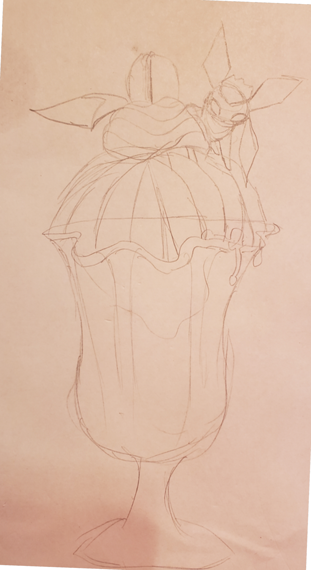
originally there was only one glaceon. the probelm here is that the bottom half of the picture is too empty! this was also originally gonna be a melon parfait until i realized i would have to draw all of those melon slices up at the top
lineart’s boring let’s skip that. i added a second glaceon during this step though. worth noting that while i was drawing it in, i was going to make it face the other way. i decided not to do this. That was a mistake!!!
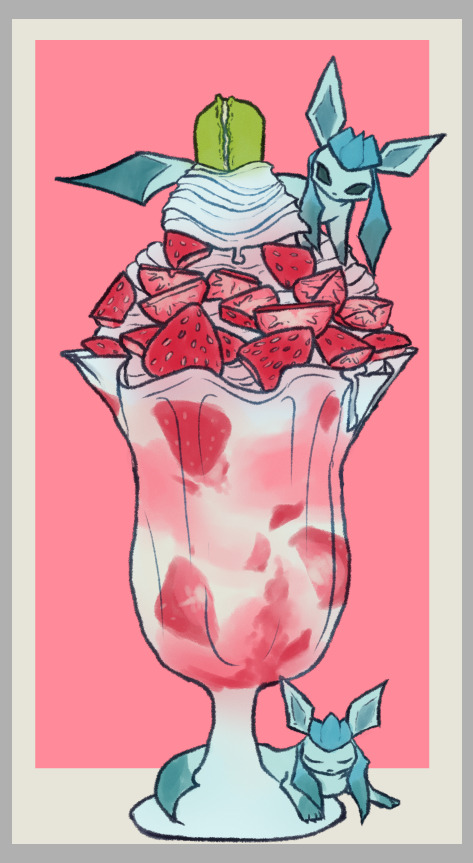
after doing the flats i realized that the bottom left was stupid empty. idk how to explain but having everything off to one side like this is almost anxiety inducing. looks like it’s going to tip over at any second. so back to the drawing board i went. imo the 3rd one didnt solve the problem completely, but it at least patched it up a bit
my last thought here is that i tried something new here: dithering in photoshop! it’s a large canvas, so it’s not super visible when the image gets shrunk down for the web. but at full size, it’s definitely noticeable

it wasn’t necessary, but i just love the look of dithering. ive seen other artists use it and it’s sooo cool looking to me. i’ll definitely be sure to play with it some more!
overall im pretty happy with this piece (as you can tell by me writing about it rofl). it took me 2 days in total, which is fucking insane for me (usually i try to get a piece down in a couple hours). my biggest regret is blending out the shadows so much, but i can just do better next time
anyways thats it. idk if this was interesting to anyone else but it’s out here now. thank u for reading mwah mwah
8 notes
·
View notes
Note
What art are you most proud of? And please show us a pic if you can! <3
Not gonna lie, this was actually p hard to answer. I’m honestly proud of any piece I get done, especially any full body, full color, full background pieces, and I refuse to let myself out-right hate anything that I draw in general now-a-days, unfinished or no. I draw for fun, always have, so I try not to put too much worry on how good something looks so long as it gets my idea across in a way that I like, or that I tried?? (And ik being proud of a piece doesnt have to tie into what the end result looks like, im just covering that base) I looked through all of my recent digital art on my ipad(that i’ve had what, 3-4 years at this point?) and found myself about just as happy with each finished piece-
-Except one. There is one piece that I forget about constantly but I’m honestly super proud of the amount of effort it had put in to reach the end result. It probably sees a number of glances infrequently(due to my sporatic activity on said blog) but isnt posted to this blog’s art tag.
It’s the blog banner I drew for my @thelostguardianau fic, of the(at the time) whole cast in the au. You can find the post to reblog it from here but i’m also adding it below for reference. (* and honestly I’ll mention every other art piece in this au posted to it’s blog stands at having this same proudness, as each individual characters complicated design fed into this big banner, each one having a giant set of uniquely drawn wings, complex body markings, and unique clothing and features. And I would not have been able to complete this banner without having those singular character chart pieces finished first, except for Thomas’s design, who has yet to be posted for ✨reasons✨)
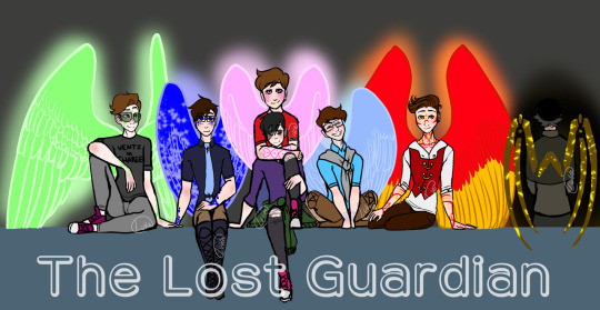
This fricking Banner was and still is(for now, *wink*) the most ambitious piece I’ve managed to finish. It took me so long, my wrist hated me, my ipad hated me, my ipencil hated me, medibang hated me, this piece pushed the limits of the poor app. Every time I try and open this piece up on the app it takes a solid couple seconds to open, save, and close.
From sketching to lining every single character, to having to uniquely match up Their Wing Sizes and Heights, because Guardians are fucking Tall, so Wing size and Height size was hell to calculate and portray. Why, you might ask?
Because I was limited to the proportions that would actually fit into a tumblr mobile banner. Which, funfact, is much smaller than you’d think!
I had to make sure they’d all fit, wings and all. And they didnt fcking want to. But I made it fit, because I wanted a full body + wings cast banner and goddamn it that was going to happen. And I did. And I lost a fuck-off amount of detail-space for it.
Coloring it wasn’t exactly difficult, but I will once again point back to this app hating this piece and it draining my battery because of it. I work in layers. My lineart will have 5-6 different layers in color before I combine them and set the hue to black, but I still keep my lineart seperate in that each character has their own lineart, and the background lineart is seperate.
I had their lineart, and probably still do, seperated into Seven different layers, one per character, each one w/ an extra masking layer for their wing glow. Each character got their own folder for colors, and had multiple layers for each colored section: clothing, skin, skin blush + eye whites, hair, wings, body markings, marking glow. And then there was the background layers, and the glowing affects, ect. The whole piece stands at having about 80 total layers having been used over the course of making it.
So yeah, Medibang does not like this piece when I try to open it. xD
But really, setting aside fighting and babying technology thats being pushed close to its limit, the real pride comes from the fact that this piece has Seven fully colored, near-full body characters drawn, all touching and interacting and accurate to the scale that I made. It is the most amount of characters in one piece that I’ve ever drawn, colored, and finished, and I’m pretty fricken proud of it.
Which makes it all the more daunting that said banner is going to get an upgrade, because it’s a Character Cast Banner after all, and its going to have four more fully designed and full winged characters added into it.
And by upgrade, I mean I get to redraw the whole dang thing. Because I gotta rearrange ✨everyone’s✨ positions. And at this point, the only way thats possible is by starting over.
wish me luck on that. o_o;
128 notes
·
View notes
Note
What about how you draw eyes?
i'm sorry this took so long to answer! not because i forgot but i had no idea how to do this and i tried filming myself but failed (how do people on tiktok do that?)
so here's a simple tutorial on how i draw eyes like this!
hope its not too hard to understand orz
first of all i use CSP! i dont think the brush is necessary (90% of my art is with the standard csp lineart brush. i didnt use it now ut its the same effect!)
so i dont do lineart, i just draw over my sketch in another layer. i always draw with the right eye for some reason

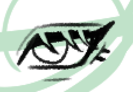
it also always depends on the eyeshape u want to give the character but i was going with a kind of cat-eye look. although i give pretty much all characters the "eyeliner" wing (idk how to call it)

then add lashes! (if u want to. i dont give some characters lashes or just upper/lower lashes, always depends!)
then i go with the eraser brush in and erase the lashes. just a personal preference
add the pupil and i make a line for the eyebags
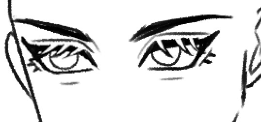
second eye! i know its kinda hard so i cheat and since i draw digitally i adjust the size / height so they fit each other
taking off the sketch layer and adding eyebrows and i got smth like ths

coloring flats / skin. i draw into the eyelashes
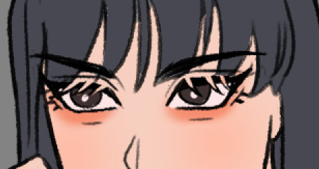
i color into the skincolor layer by adding a new layer and creating a clippy mask. adding an orangey-color and putting it with a soft brush where the eyebags should be! then just adjust the opacity until you like it. then use eraser tool to smoothen the lines
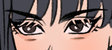
on another layer i add a light color (lighter than the skin color) for the inside also in with a very soft brush! and with a darker color i add some shadow

most of the times im too lazy so i stop here but for the sake for this tutorial i added some light for her eyes. then as a last step i use a orange/red color set on another clippy maks layer on top of the lineart to make it less harsh!
and here's the final result
26 notes
·
View notes
Last Seen Blogs
karenfordonte
Caring For Donte
flavoishfloreo
flavo
paiheme
paiheme
staffpickvideos
Staff Pick Videos
itsglitxi
Glitxi