
ama-artistic
Cyprus & The Wannabes
Carrd: https://extremeartism.carrd.co/
83 posts
Don't wanna be here? Send us removal request.
Last Seen Blogs
feminince
𝖙𝖚𝖗𝖓 𝖙𝖔 𝖘𝖙𝖔𝖓𝖊 .

lol-misantlery
misantlery

zamaconaphoto
Zamacona Photo

lost-identity97
Caught Up In A Dream

starlightsylveon1
Starlight_Sylveon
Text
👏👏👏👏👏
Day 4- Pumpkin
This one was a little difficult to work with, but I made a compromise. XD
Today is @ama-artistic's Cyprus dressed up as Jack from Animal Crossing. Jack is the Pumpkin King in Animal Crossing, after all! :P
35 notes
·
View notes
Text
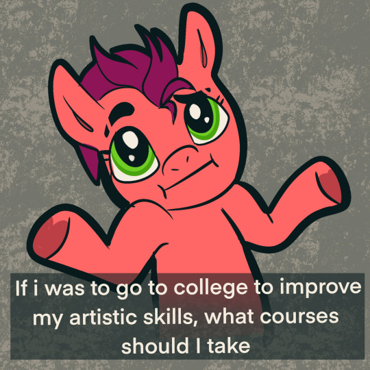
Advice and suggestions more than welcome
#trans artist#mlp oc#mlp#mlp ask blog#mlp fan art#mlp art#mlp fandom#mlp fim#mlp oc pony#mlp fan fiction#mlp comic#mlpfim#mlp commission#mlp friendship is magic#ask pony blog#ponysona#pony blog#pony comic#my little pony friendship is magic#pony fanart#pony art#pony ask blog#my litte pony friendship is magic#pony#mlp pony#my little pony#ponygram#please help#advice needed#advice
19 notes
·
View notes
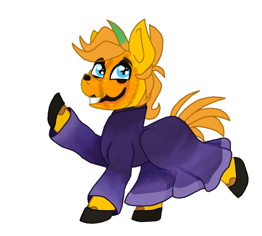
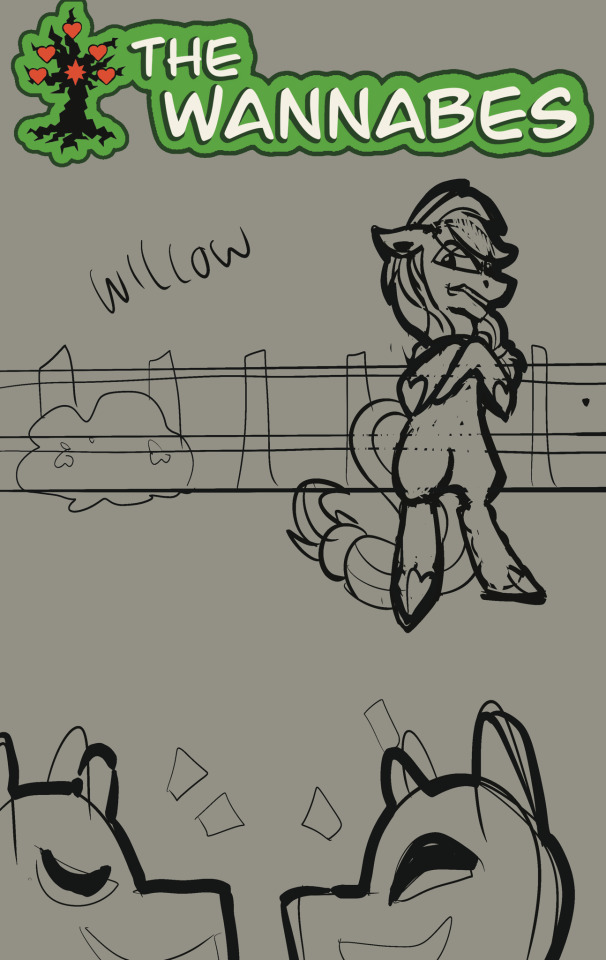
Text
Willow: No CAP this piece has rizz
((Thank you for this & all the feedback you have provided me over these few months I’ve been on tumblr!! Im going to start a collection XD))

Quick ponty pic for @ama-artistic
#fan art#fanart#gift art#mlp#pony#willow#mclovin#pointy pic#pointy pony#trans artist#mlp oc#mlp ask blog#mlp fan art
34 notes
·
View notes
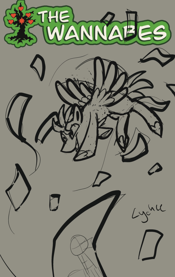
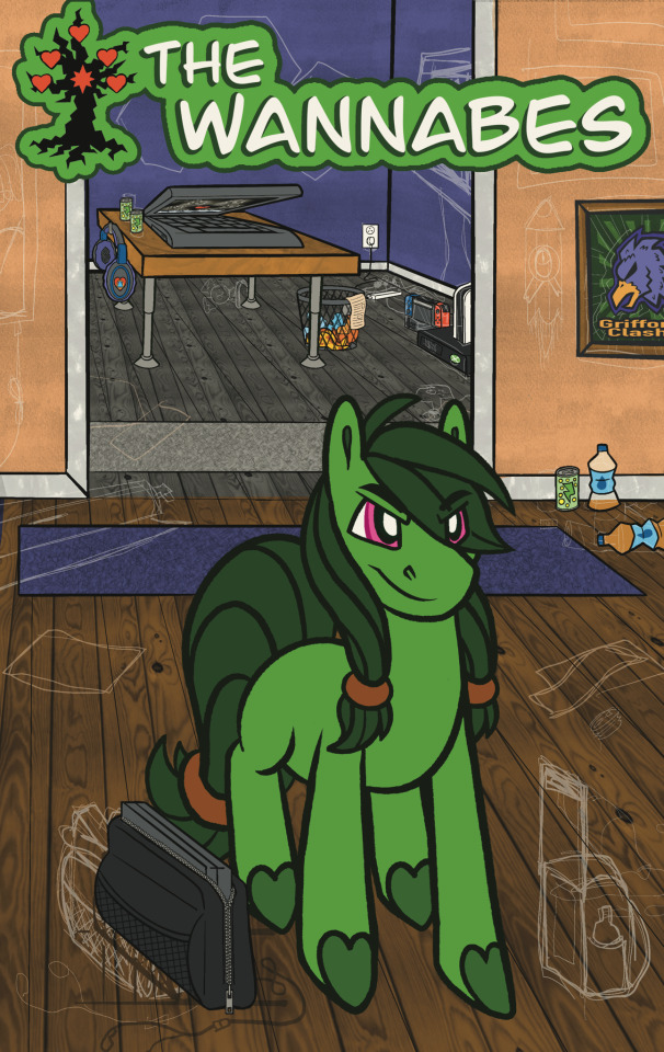
Text
SPEED PAINT
#TheWannabes Comic book cover Jacaranda
A very big thanks to the users in the community who provided feedback on the previous post! I learned a lot from it and look forward to applying the skills i have learned here to improve the other comic covers.
Song- Image Enchantmentalist by Mark Mothersbaugh
KOFI | Commission Pricing | TOS | Modblog | Carrd
#trans artist#MLPWannabe#thewannabes#mlp oc#mlp#mlp ask blog#mlp fan art#mlp art#mlp fandom#mlp fim#mlp oc pony#mlp fan fiction#mlp comic#mlp fan comic#comic#comic cover#pony art#my litte pony friendship is magic#ask pony blog#my little pony friendship is magic#pony comic#pony#pony fanart#pony blog#my little pony#mlp pony#pony ask blog#mlp original character#mlp oc ask blog#jacaranda
48 notes
·
View notes
Text

How it feels-
-to learn digital painting for your comic book covers… this is extremely out of my comfort zone but i feel it will greatly improve the product. Lmk what you think or if you have any tips please.
#trans artist#mlp oc#mlp#mlp ask blog#mlp fan art#mlp art#mlp fandom#mlp fim#mlp oc pony#mlp fan fiction#mlp comic#mlp fan comic#mlpfim#mlp friendship is magic#mlp oc unicorn#mlp original character#mlp oc ask blog#mlp oc alicorn#mlp oc art#mlp ocs#jacaranda#my little pony friendship is magic#pony comic#pony ask blog#pony fanart#ask pony blog#pony art#ponysona#pony blog#my little pony
50 notes
·
View notes

Text

ASKS OPEN
The ask box has been cleared and drafts have been started on the last 2.
Looking for some more interaction.
Feel free to send asks.
#trans artist#send me asks#anon asks#oc asks#asks open#pony ask blog#mlp oc#mlp#mlp ask blog#mlp fan art#mlp art#mlp fandom#mlp fim#mlp oc pony#mlp fan fiction#mlp friendship is magic#mlp fanart#mlp oc ask blog#my litte pony friendship is magic#mlp pony#pony art#my little pony friendship is magic#my little pony#ask pony blog#pony#pony ask oc#ask blog#ask me stuff#send asks#ask me anything
14 notes
·
View notes
Note
...Honestly, I look at all of you guys, and somehow, I just kinda absolutely agree.
Feels kinda like looking at what would happen if I were converted to Javascript and then decompiled.


KOFI | Commission Pricing | TOS | Modblog | Carrd
The anatomy of a Wannabe
Sometimes we all need to be stripped down into our basic parts and re-contextualized.
#trans artist#thewannabes#MLPWannabe#mlp#mlp oc#mlp ask blog#mlp fan art#mlp art#mlp fandom#mlp fim#mlp oc pony#mlp fan fiction#mlp fanart#mlp friendship is magic#mlpfim#pony ask blog#ask pony blog#mlp pony#my litte pony friendship is magic#pony art#my little pony friendship is magic#pony#my little pony#pony anatomy#anatomy#drawing anatomy#cyprus#mlp gif#mlp comic#mlp fan comic
22 notes
·
View notes
Text


KOFI | Commission Pricing | TOS | Modblog | Carrd
Comic Covers Draft v.3
Each element of the comic, including the logo, is currently in a draft stage, and there's much more to master in terms of blocking, framing, and other aspects.
See the original design & why it was scraped below the break.
We decided to move away from it as it lacked the dynamic touch and emotional depth that truly represents the characters.
The emphasis was largely on the background to communicate the essence of the character, rather than allowing the character's inherent reactions and behaviors to naturally express those sentiments.
#trans artist#MLPWannabe#TheWannabes#mlp oc#mlp#mlp ask blog#mlp fan art#mlp art#mlp fandom#mlp fim#mlp oc pony#mlp fan fiction#mlp fanart#mlp friendship is magic#mlp comic#mlp fan comic#mlp pony#pony#pony art#my little pony friendship is magic#my litte pony friendship is magic#ask pony blog#my little pony#pony ask blog#pony comic#pony fanart#pony fan comic#fan comic#web comic#comic covers
26 notes
·
View notes
Text
KOFI | Commission Pricing | TOS | Modblog | Carrd
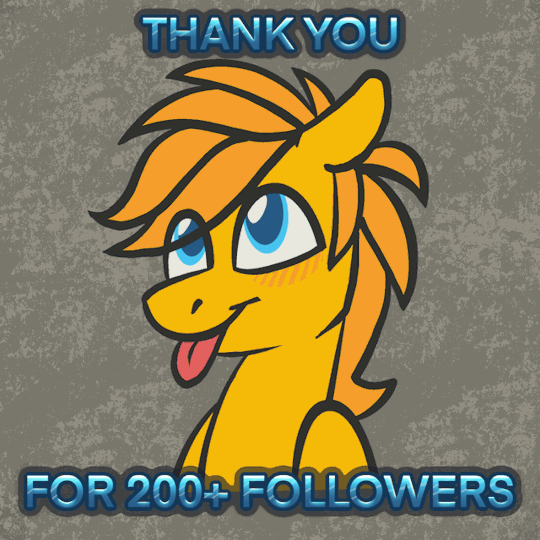
THANK YOU ALL FOR 200+ FOLLOWERS
In just over a week, we've reached our initial milestone of 100 followers, even before publishing the first page of our comic.
Now we have surpassed that by 100% to 200+ followers. We're immensely grateful for everyone's support and are committed to delivering captivating content with our vibrant ponies.
#trans artist#modblog#Cyprus#mlp oc#mlp#mlp ask blog#mlp fan art#mlp art#mlp fim#mlp fandom#mlp oc pony#mlp fan fiction#mlp friendship is magic#mlp fanart#mlp oc ask blog#mlp ocs#mlp oc art#mlp original character#my little pony friendship is magic#my litte pony friendship is magic#mlp pony#pony art#my little pony#pony ask blog#ask pony blog#pony#ponysona#pony oc#earth pony#mlp earth pony
35 notes
·
View notes
Text
KOFI | Commission Pricing | TOS | Modblog | Carrd
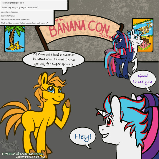
Featuring @asktwilighteclipse
Bananacon2023 the online tumblr con is a property of @askbananapie
#trans artist#cyprus#answered#mlp oc#mlp#mlp ask blog#mlp fan art#mlp art#mlp fim#mlp fandom#mlp oc pony#mlp fan fiction#mlp fanart#mlp friendship is magic#mlp oc ask blog#mlp oc art#ask pony blog#pony art#pony ask blog#my litte pony friendship is magic#mlp pony#my little pony friendship is magic#my little pony#pony convention#pony#ponysona#mlp ask oc#twilight eclipse#answered asks#bananacon2023
22 notes
·
View notes
Text
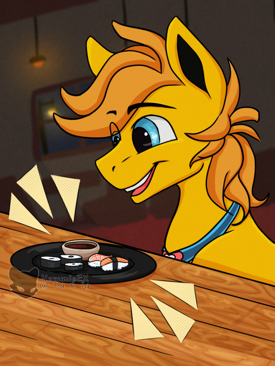
A wonderfully crafted surprise from @nezumie-ex
Everything involving their work is detailed and heartfelt we highly recommend checking them out
Little bit of gift art for @ama-artistic :>
Seen the pony and it kinda just happened lol
#fanart#gift art#pony#mlp#mylittlepony#my little pony#my little ponies#mylittleponies#mlpfim#fim#my little pony friendship is magic#friendship is magic#mlp art#mlp fan art#mlp fanart#mlp fandom#mlp ask blog#mlp oc pony#mlp oc#mlp friendship is magic#mlp fan fiction#mlp original character#mlp oc art#mlp oc ask blog#mlp ocs#my litte pony friendship is magic#mlp pony#ask pony blog#pony art#pony ask blog
17 notes
·
View notes
Note
Oh. So, they don't wield Elements, but they want to be an Element holder despite the Elements already having wielders?
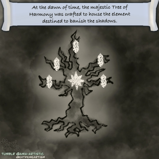


KOFI | Commission Pricing | TOS | Modblog | Carrd
The Chronicles of the Grand Tree of Harmony.
#trans artist#MLPWannabe#thewannabes#Cyprus#mlp oc#mlp#mlp ask blog#mlp fan art#mlp art#mlp fim#mlp fandom#mlp oc pony#mlp fan fiction#mlp fanart#mlp friendship is magic#mlp original character#mlp oc art#mlp oc ask blog#mlp ocs#pony#my litte pony friendship is magic#pony ask blog#pony art#my little pony friendship is magic#my little pony#ask pony blog#mlp pony#elements of harmony#mlp comic#mlp fan comic
22 notes
·
View notes
Note
What are the Wannabe Elements?

KOFI | Commission Pricing | TOS | Modblog | Carrd
Featuring ask from @foodielovethealicorn
#trans artist#answered#mlp oc#mlp#mlp ask blog#mlp fan art#mlp art#mlp fim#mlp fandom#mlp oc pony#mlp fan fiction#mlp oc ask blog#mlp ocs#mlp oc art#mlp original character#mlp pony#my litte pony friendship is magic#my little pony#ask pony blog#pony art#pony ask blog#pony#ponysona#my little pony friendship is magic#Cyprus#wisteria#lychee#alder & birch#willow#jacaranda
21 notes
·
View notes
Note
*Amber comes out of nowhere and gives you a stuffed fox*

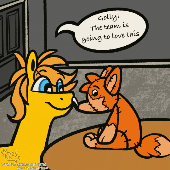
KOFI | Commission Pricing | TOS | Modblog | Carrd
Featuring ask from @ask-forestville
#trans artist#Cyprus#answered asks#answered#mlp oc#mlp#mlp ask blog#mlp fan art#mlp art#mlp fim#mlp fandom#mlp oc pony#mlp fan fiction#mlp fanart#mlp friendship is magic#mlp oc art#mlp oc ask blog#mlp original character#mlp ocs#my litte pony friendship is magic#my little pony#pony#ask pony blog#pony art#pony ask blog#my little pony friendship is magic#mlp pony#furry#furry plush#fox plush
36 notes
·
View notes
Note
I’m sleeping upside down in your closet 💤
KOFI | Commission Pricing | TOS | Modblog | Carrd
Featuring @ask-luciavampire
#trans artist#jacaranda#ask answered#answered#mlp oc#mlp#mlp ask blog#mlp fan art#mlp art#mlp fim#mlp fandom#mlp oc pony#mlp fan fiction#mlp fanart#mlp friendship is magic#mlp original character#mlp ocs#mlp oc ask blog#mlp oc unicorn#bat pony#pony art#pony#my little pony friendship is magic#mlp pony#pony ask blog#my little pony#ask pony blog#my litte pony friendship is magic#mlp blog#mlp batpony
37 notes
·
View notes
Note
Cheese...

KOFI | Commission Pricing | TOS | Modblog | Carrd
Featuring ask from @flashtheponyofwind
#trans artist#answered#answered asks#alder#birch#alder & birch#mlp oc#mlp ask blog#mlp#mlp fan art#mlp art#mlp fim#mlp fandom#mlp oc pony#mlp fan fiction#mlp fanart#mlp friendship is magic#mlp oc unicorn#mlp oc ask blog#mlp oc art#mlp original character#mlp ocs#ask pony blog#pony#pony ask blog#pony art#my little pony friendship is magic#mlp pony#my little pony#my litte pony friendship is magic
31 notes
·
View notes