#trending design
Text
#graphic design#rashed pervej#social media design#media banner design#bangla typo#product design#creative design#trending design#eye catching#google ad manager#display advertising#display ads#instagram reels#instagram post#business card#company profile design#flag design
0 notes
Text
പാട്ടും കൊള്ളാം കളിയും കൊള്ളാം മണം കവരും മനോഹാരിതയുമായി തിരുവാതിര കളി/ ക...
youtube
#classical art#dance#classical dance#indian tradition#dancer#traditional dance#trending design#indian dance#youtube#kerala dance
0 notes
Photo
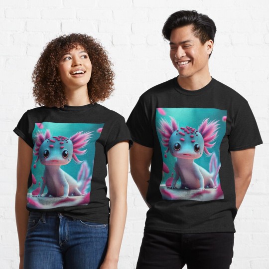
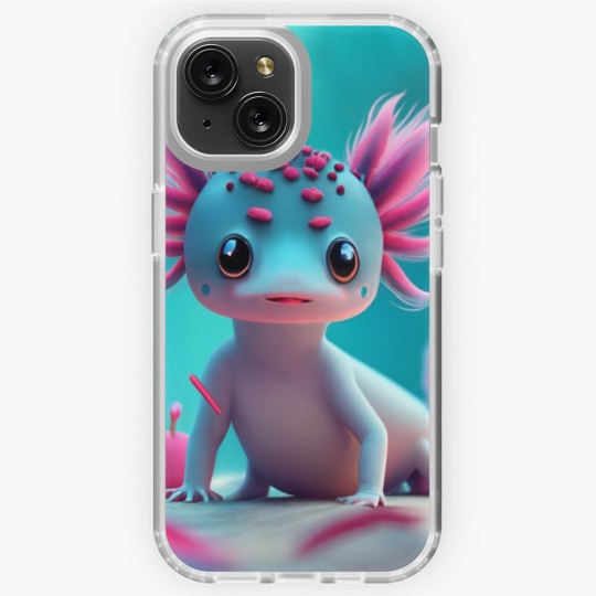
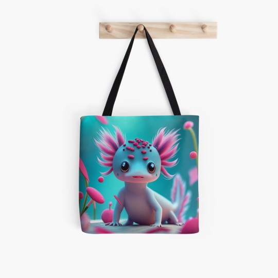
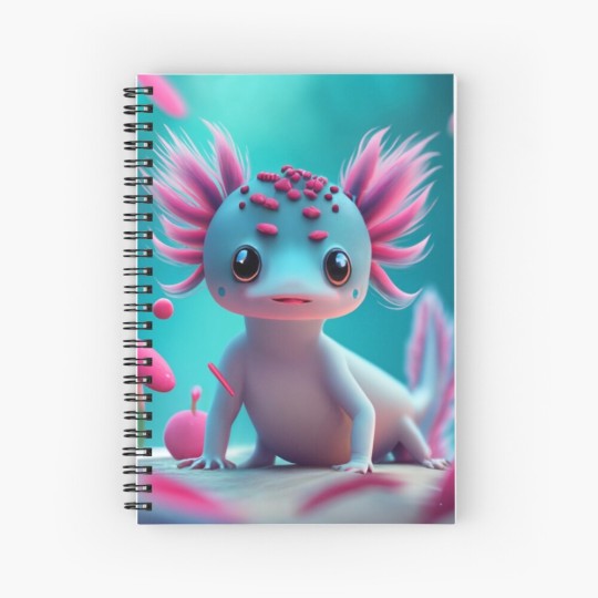
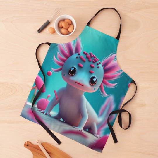
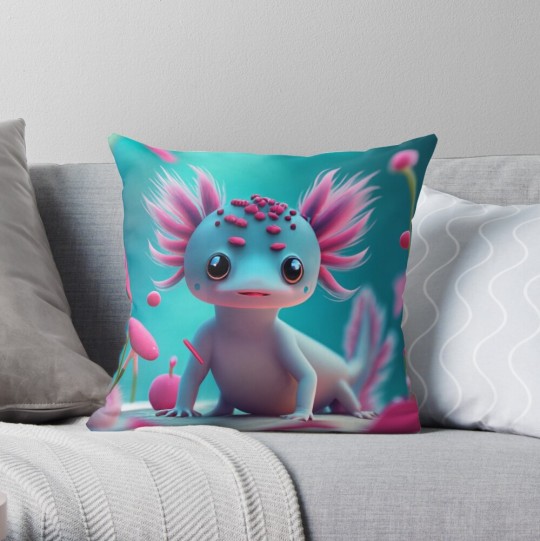
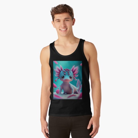
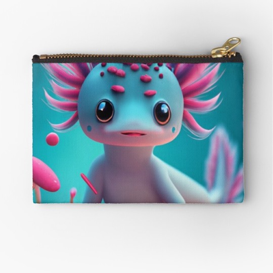
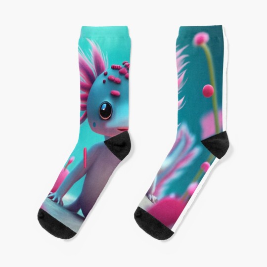
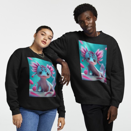
(via ""Axolotl dinosaur" - cute cyberpunk Axolotl gift." Magnet for Sale by Obinne)cut pink Axolotl dinosaur design for Axolotl lovers. This can be given as Best Christmas or birthday gift to boyfriend, girlfriend, boyfriend, who loves Axolotl. Make sure to check out this design on other products like t-shirt, mug, sticker etc
#findyourthing#redbubble#axolotl#axolotl dragon#axolotlcyberpunk#axolotldinosaur#christmas#christmasaxolotl#axolotlchristmas#axolotl lover#pink axolotl#amputee#trends#trendingnow#trending design
0 notes
Text
northern lights and coffee splash
"The northern lights are a reminder that even in the darkest of nights, there is always hope and inspiration. Just like a coffee splash, they can brighten up your day and give you the motivation to keep going."

#redbubble shop#Finearts1984#t shirt design#t shirt printing#t shirt for men#tee#stickers art#Magnets#Findyourthing#Best selling#Trending design#Trendy#Trends#Tote Bag#Northern lights#Coffee splash#Coffee cup#Coffee addict#Coffee lover#Coffee lover gift#Motivation#Inspiration#Motivational quotes#Inspirational Quotes#Redbubblefind#coffee shop#Northern lights gift#Northern light#Tote
1 note
·
View note
Text
These are the latest uprising GRAPHIC DESIGN TRENDS that will shape the design industry in 2024. Check them out
#graphic design trends#trends#trends 2024#graphic design#design trends 2024#design#trend#art#illustration#package design#art inspiration#inspiration#trending design#web design#illustration design#app design#product design#branding trends
1 note
·
View note
Text

Circus devil and a taxidermy deer start a podcast together!
Or: my Hazbin hotel dreamcore au.😂
#grey art#fan art#hazbin hotel fanart#Hazbin hotel#dreamcore#hazbin hotel au#im not super into the trend of re-designing these guys#so I’m rather taking inspiration and turning up the surrealism on them#hazbin charlie#hazbin alastor#Alastor#charlie morningstar#dreamcore au
4K notes
·
View notes
Photo
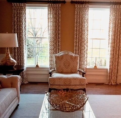
Enclosed Living Room in Philadelphia
Example of a large, enclosed, traditional living room with a medium-tone wood floor, yellow walls, and no fireplace.
#mixed metals#trending design#dark yellow walls#traditional and modern patterns#greek key fabric#custom window treatments#mixed textures
0 notes
Text

Here's mine!
3K notes
·
View notes
Text
Barbie Musketeer! 💗

Color wheel challenge day 8! And last character
#barbie#barbie and the three musketeers#barbie movie#barbie movies#color wheel#color wheel character challenge#color wheel trend#color wheel challenge#character art#drawing#digital drawing#illustration#digital art#illustrator#character design#fanart#barbie fanart#barbie art#drawing challenge#art challenge
9K notes
·
View notes
Text
#art#nature#photography#photographers on tumblr#tumbrl#sunset#sky#moon#sunrise#sunshine#sun#night#awesome#sea#science#digital art#design#drawing#original art#online#explore#evening#trees#travel#trending#gorgeous#mountains#light#landscape#water
2K notes
·
View notes
Text
ഒരു തവനെ കണ്ടാൽ വീണ്ടും കാണാൻ തോനും അടിപൊളി തിരുവാതിര കളി/ ഗുരുവായൂർ ഉത്...
youtube
Full cover is released now click here to watch https://youtu.be/mFIVcgPz95I?si=R_XshtMQkIpJ464K
For more videos Subscribe 👍🤗 to
https://youtube.com/@vasusamy1008?si=farxtmkST17qKmFS
#classical art#dance#classical dance#indian tradition#dancer#traditional dance#trending design#kerala dance#indian dance#youtube
0 notes
Text
I think 90% of my gripes with how modern anime looks comes down to flat color design/palettes.
Non-cohesive, washed-out color palettes can destroy lineart quality. I see this all the time when comparing an anime's lineart/layout to its colored/post-processed final product and it's heartbreaking. Compare this pre-color vs. final frame from Dungeon Meshi's OP.


So much sharpness and detail and weight gets washed out and flattened by 'meh' color design. I LOVE the flow and thickness and shadows in the fabrics on the left. The white against pastel really brings it out. Check out all the detail in their hair, the highlights in Rin's, the different hues to denote hair color, the blue tint in the clothes' shadows, and how all of that just gets... lost. It works, but it's not particularly good and does a disservice to the line-artist.
I'm using Dungeon Meshi as an example not because it's bad, I'm just especially disappointed because this is Studio Trigger we're talking about. The character animation is fantastic, but the color design is usually much more exciting. We're not seeing Trigger at their full potential, so I'm focusing on them.
Here's a very quick and messy color correct. Not meant to be taken seriously, just to provide comparison to see why colors can feel "washed out." Top is edit, bottom is original.
You can really see how desaturated and "white fluorescent lighting" the original color palettes are.
[Remember: the easiest way to make your colors more lively is to choose a warm or cool tint. From there, you can play around with bringing out complementary colors for a cohesive palette (I warmed Marcille's skintone and hair but made sure to bring out her deep blue clothes). Avoid using too many blend mode layers; hand-picking colors will really help you build your innate color sense and find a color style. Try using saturated colors in unexpected places! If you're coloring a night scene, try using deep blues or greens or magentas. You see these deep colors used all the time in older anime because they couldn't rely on a lightness scale to make colors darker, they had to use darker paints with specific hues. Don't overthink it, simpler is better!]
#not art#dungeon meshi#rant#i'm someone who can get obsessive over colors in my own art#will stare at the screen adjusting hues/saturation for hours#luckily i've gotten faster at color picking#but yeah modern anime's color design is saddening to me. the general trend leans towards white/grey desaturated palettes#simply because they're easier to pick digitally#this is not the colorists fault mind you. the anime industry's problems are also labor problems. artists are severely underpaid#and overworked. colorists literally aren't paid enough to do their best#there isn't a “creative drought” in the anime industry. this trend is widespread across studios purely BECAUSE it's not up to individuals#until work conditions improve anime will unfortunately continue to miss its fullest potential visually#don't even GET ME STARTED ON THE USE OF POST-PROCESSING FILTERS AND LIGHTING IN ANIME THOUGH#SOMEONE HOLD ME BACK. I HATE LENS FLARES I HATE GRADIENT SHADING I HATE CHROMATIC ABBERATION AND BLUR
2K notes
·
View notes
Text

starting a petition to end this dichotomy in warrior cats designs forever
#to be clear individual designs are not the issue obviously it's just how prevalent it is as a trend#it's less common nowadays but i still see people consistently do this especially for map designs and stuff#i think the only female characters people primarily draw like the latter are yellowfang and mapleshade#meanwhile with toms you got tigerstar(s) bramblestar lionblaze lionheart brokenstar pinestar goosefeather......#then if you make the example a wee bit softer-expressioned cloudtail tree shadowsight oakheart crookedstar graystripe purdy....#the girl cat here could be hollyleaf goldenflower feathertail silverstream cinderpelt squirrelflight nightcloud tawnypelt ferncloud daisy#bristlefrost sunbeam ivypool turtle tail honeyfern cinderheart poppyfrost brightheart mothwing willowshine sparkpelt frecklewish..........#you get it.
2K notes
·
View notes
Text

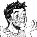
who are they even up against?
#jerma985#jeremy elbertson#winnie the pooh#pooh bear#twitch streamer#digital art#artists on tumblr#my art#art#art trend#digital artist#digital illustration#art tag#art meme#illustration#character design
1K notes
·
View notes
Video
youtube
The latest graphic design trends that will be on top in 2023.
Take a close look at some modern design examples to inspire you for your next project.
#graphic design#design trends#trending design#graphic design trends 2023#design trends 2023#2023#modern design#design ideas#design trend
0 notes
Last Seen Blogs
thegraymalkinwitch
I'll figure it out
alexander-folix
◄Folix►
cryptidskeep
muse hub;

amirocks
AmiRocks