#to describe a one character illustration
Text
i feel like people need to be better at making alternate text and captions for images.
the most major point for them is to be concise and to the point for a screen reader or someone unable to see an image properly.
please imagine sitting there with your screen reader going through an image that then has text that goes into excruciating detail of every little thing in it without getting to the point.
now imagine that for every single image on your dashboard that has any form of alternate text.
it takes a really long time to go through that. So, please be more clear and up front with your descriptions for images.
#i literally saw alt text that was 3 paragraphs long#to describe a one character illustration#that is not good
10 notes
·
View notes
Text

Little mouse no. 01 🐭🌼
I made her twice to compare watercolor papers, gonna post the second iteration tomorrow :-)
[ID start: watercolor drawing of a grey mouse standing on two legs and holding a wild flower in front of her that is very large compared to her, the mouse is wearing folksy clothes, a white blouse, a dark pink floral skirt, apron and a patterned shawl on her shoulders. end of ID]
#cottagecore#cozycore#mori kei#natural kei#mouse#anthropomorphic#watercolor illustration#illustration#watercolor#traditonal art#character design#this one is for sale actually and the second one as well but I think I'm gonna make#a spearate sales post for that hmm#described
3K notes
·
View notes
Text
book!l&co character lineup
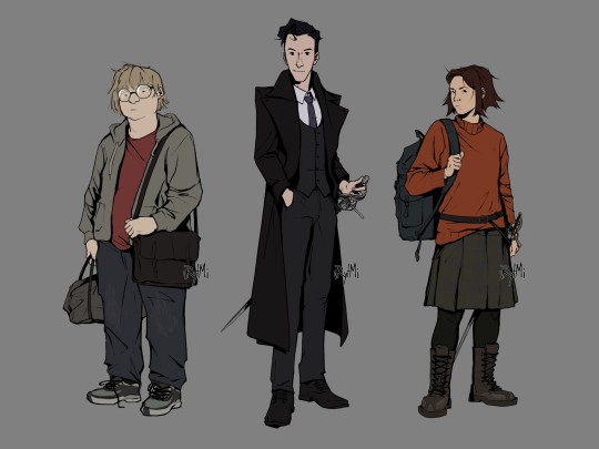
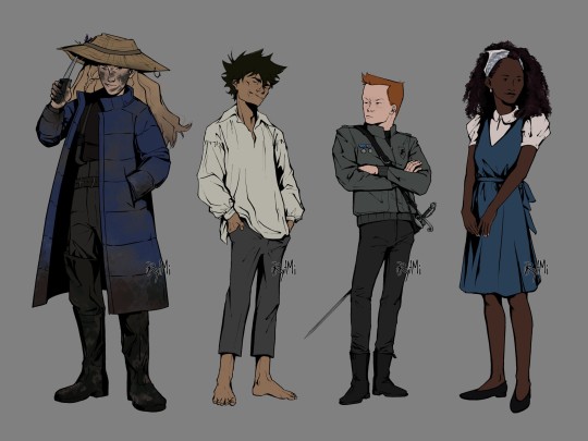


finally finished extended version of my L&Co designs, based on their book descriptions! it took months, but im happy with the results
ID of designs + thumbnail-sketch under the cut
[image ID: two digital drawings of characters from Lockwood and Co books, done in semi-realistic style, black lineart and plain colour against grey background.
image 1: from left to right there are full body drawings of George Cubbins, Anthony Lockwood and Lucy Carlyle. George is standing facing left, slouching, he's looking at the viewer with indifferent expression. he's fat, light-skinned and has medium length fair hair. George's wearing round glasses, red t-shirt, baggy jeans, unzipped grey hoodie and sneakers. he has a grey sport bag in right hand and a black messenger bag across left shoulder.
next to him there's Lockwood, he's standing half turned to right, he's facing the viewer with a gentle smile. Lockwood is paler than George, almost a head taller and slim with short, slightly wavy, black hair. he's wearing a grey three piece suit with white shirt underneath, as well as smart black shoes and a purple tie. on top of it is a black greatcoat. Lockwood stands with one hand in pocket and another resting on rapier's grip. the sword is in its scabbard attached to Lockwood's belt.
furthest on the right is Lucy, she's standing half turned to right, head facing left with a curious look directed at the viewer. her skin is light and her hair is warm brown, slightly uneven and spiky with middle parting. she has a wide frame and is the same height as George. Lucy's wearing a baggy orange sweater, plaid grey skirt, black leggings and tall dark-brown work boots with iron patches. she's holding onto a strap of her rucksack that is on her right shoulder. there's also a belt on top of the sweater which holds her rapier.
image 2: from left to right there are full body drawings of Flo Bones, human version of the skull, Quill Kipps and Holly Munro. Flo is standing half turned to left, facing towards the viewer with a smirk. she's light-skinned with long dirty-blonde hair, and her face has smudges of mud all over. compared to previous pictures, she's almost as tall as Lockwood, but not quite. Flo is wearing long blue puffer jacket on top of her darker clothes that resemble one of fisherman's with mudded thigh-high rainboots. she stands with one hand in jacket pocket, one raising a brim of straw hat with a knife. said hat has a fishing hook stuck on its brim and two lavender stems attached to hat band.
next to her is the skull in his human form. he stands half turned to right, slouching, hands in pockets, with head thrown back with a wide smirk across his face. skull is very thin and not really tall, he is tanned and freckled with spiky dark hair. skull is wearing ill-fitting clothes: a white old-timey shirt that is slightly too big and grey trousers that are too small and short. he stands barefoot.
third from the left is Quill Kipps, he stand half turned to right, crossing his arms, head facing left with a look of annoyance. Kipps is short and slim, he has ruddy and freckled skin and short ginger hair. Kipps is wearing a grey leather jacket with Fittes logo on it as well as two medals, tight black jeans and chelsea boots. his rapier scabbard has a baldric type of belt. rapier itself has green gems on a hilt.
finally, there's Holly Munro, she's standing half turned to left, head facing right with a gentle smile. she's pretty tall and slim with deep rich black skin tone and black shoulder length curls. Holly's wearing a white short lantern sleeve shirt with a blue dress with a cloth belt wrapped around and tied into a bow at the back, as well as low heel shoes. she has a light-blue scarf wrapped around her head. Holly also has white small earrings and beige nail paint.
all of the characters have artist’s watermark at the lower right side of them./end ID]
bonus sketch

#lockwood and co#l&co#character lineup#character design#illustration#digital art#fanart#lucy carlyle#anthony lockwood#george cubbins#holly munro#the skull#skull in the jar#quill kipps#flo bones#lockwood and co books#jonathan stroud#described#image description in alt#artpost#dont mind my silhouette practice#imho it's an upgrade from that one posts from almost 2 years ago (though designs haven't changed much)
574 notes
·
View notes
Text
"the fire can only go out when the movie's finished."
#fire punch#togata#togata fire punch#illustration#id in alt#tatsuki fujimoto#togata is truly one of the characters ever#2024#fire punch is a solid R rating btw. ive seen it described as 'chainsaw man but with no joy' and thats true#it has a lot of content warnings#fire#im not quite done w fire punch though i know a few more spoilers. anyway
35 notes
·
View notes
Text

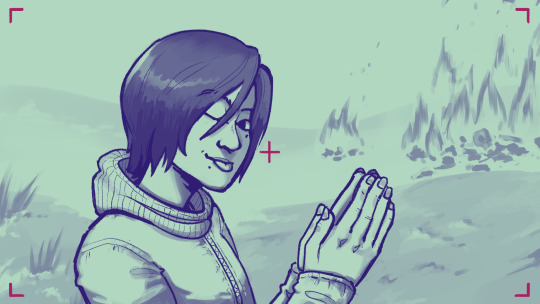
"You're my best friend."
[Image ID: A digital illustration of Ayda Aguefort, wearing a loose cream button up shirt with several of the top buttons undone. Her arms and hands are postured stiffly at her sides; arms held slightly away from her body. Her right hand is up by her chest - fingers clenched and crossed tightly over one another; the other is lower by her hip - fingers held rigidly apart at every joint. Her hair hangs loose around her face in warm gradient two strand twists, and her wings are open behind her shoulders. She wears two books in holsters around her arms, and keeps spell components in a pouch and loops on her belt. Surrounding her is a deep blue decorative frame, oranges in all four corners, a candle and two feathers on either side. Text at the top and bottom of the frame reads, "I love you too, is that normal?". End ID]
#art tag#dimension 20#d20#dimension 20 fanart#ayda aguefort#fantasy high#fantasy high sophomore year#d20 fhsy#canon autistic character#digital illustration#artists on tumblr#image described#aware that the quote in frame and the one in caption are from two disparate scenes;#i just wanted to underline the focus on ayda's friendship with the bad kids as a whole group instead of focus on one or two yk?#anyway she's my absolutely favorite of all time#and posturing is also my favorite autism stim/trait so <3
358 notes
·
View notes
Text

Image ID: An illustration of a bright character with a sun-shaped head in a colorful hoodie. The background features lines radiating from the head and is full of stars and subtle arcade carpet patterns. End ID.
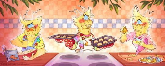
Image ID: A sequential piece featuring a yellow cyclops character baking some duck-shaped cookies. They are wearing various colorful outfits and they are in a cozy kitchen setting. End ID.
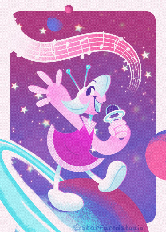
Image ID: A blue, pink, and purple illustration featuring a cheerful alien character with a microphone. She is standing on top of a planet, and there are music notes coming from her. She is surrounded by other distant planets and stars. End ID.
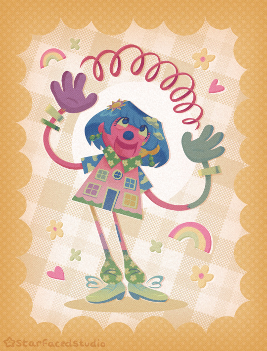
Image ID: A colorful illustration of a puppet character in an outfit that looks like the front of a house. They hold a pink spring-shaped object above their head and there are small rainbow and flower accents around them. They are against a yellow gingham-like pattern in the background. End ID.
more artfight attacks! >:)
Featured Characters:
Entity - FOOLS-IMP on Artfight
Goose - @idoodle2draw-marquer
Onomatopoeia - Ekul on Artfight
Funny House - @mtsodie
#froxart#froxposting#artfight#character art#illustration#described#more of them.... i remember having so much fun with all 4 of these pieces. i had fun with Most of the AF pieces i did but i#really Really enjoy the sorta postcard-fake-print ones ive done!!!#had a lot of fun trying to experiment with brushes for shading in these ones in particular too. again.... india ink brushes my Beloved.#also finally figured out how to make watercolory pieces!!!! i didnt know where to start with doing them for so long but i know now
54 notes
·
View notes
Text
I've been wondering how closely people stick to (or how far they tend to stray from) the rules of their native language when creating new names for people, things, and places in their writing, particularly in sci-fi or fantasy settings where they're not consciously trying to evoke something about a real place or culture.
Without having looked into this, my guess would be that a lot of people would make up names that mostly kept to the phonotactic rules and sound inventories of their language(s) while still sounding new and different. But you'll also have people who will write with the consideration that the language they're writing in isn't necessarily the language of the characters, and be more willing to add in sounds and constructions and 'formats' that would be out of place in the language they're writing in.
This might sound like a 'well duh' question but I'm genuinely curious about the factors that get someone to go beyond the bounds of their language when they're writing something, even if some of the factors may be more salient than others.
#writing#fanfiction#original characters#linguistics#worldbuilding#By 'formats' I mean things like using repetition or using elements in certain ways which I don't know how to describe#like repeating the same element twice like Vari Vari or using it as a girdle like Vari Eshti Vari#or changing one sound like Vari Nari or Vari Varo#Repetition and variations of it are really the only thing I could think of to illustrate this but if you have any other ideas let me know#I'm not an expert in the Lore and Ways of Names and my imagination fails me
9 notes
·
View notes
Text

character design work from last year
#i'm sorry for no image description for this one but i can't figure out how to describe this design for the life of me#(there's a reason i'm an illustrator over a prose writer...)#fiftytenart#character design
7 notes
·
View notes
Text
i got the cutscene <3
#its actually crazy that there was even more content i missed that impacted the story this much#like this rlly illustrated how even tho my character and astari0n have both become better people astari0n is still so behind in that#(we know why ofc. hes still acting like a feral cat trying to self preservere with teeth and nail and all until the very end; the ritual)#my character had his most obvious 'shifting point' at the transition from act 2 to act 3#like he fully realized that this is now truly bigger than himself. he has left marks on the lands and he has to go all the way#he has made true friends. one of his best friends is the kindest most compassionate person in the world#and very importantly he loves astari0n and THAT is the reason he now feels this actual compassion towards the other spawn#hes so personally invested in this issue now#and he can say that 'the world can be a wonderful place if you find your home in it astari0n' bc its something he has just recently had#a personal revelation abt#and astari0n deflects it and describes my character as someone who now 'spends their life sorting out other peoples problems'#and it rlly brings it to focus that he just cannot meet him where hes at anymore#just great conflict that feels actually meaningful and perfectly fits into the roleplay storyline ive made for my character#and omg the line 'im doing this for you too you know. to make sure were both safe. forever' from astari0n is just AAAAAAHDJJDJD. CRAZY#bc we know how toxic he becomes towards you if he completes the ritual!!!!!!#HHHHH this character!!!!! hes just MWAH. perfection#i cant wait until i get to doing the szarr palace again bc this added conflict will make the conclusion of this quest even more satisfying#anyway TOTAL tonal shift time. in start of the cutscene astari0n is standing next to the bed my character was sleeping in#so i can now have the hc that some nights they sleep in the same bed <3#(WELL. you know. my character sleeps while he meditates)
2 notes
·
View notes
Text
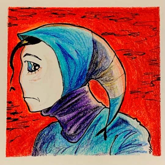
i love shading now!
(id: A bust and side profile of a character with pail white skin and big expressive eyes. They are looking behind them as if they’re looking out for something. They are wearing a light blue hoodie like garment that is crescent shaped and a violet neck warmer. The end of the hood is divided into three segments descending from dark grey, light grey, to white. There is a strand of black hair sticking out in front of their face. The background is a blood red color with scribbles of black clouds. A white border frames the piece. end id)
#my art#original character#prismacolor#color pencil#traditional illustration#artist on tumblr#jester#at least they were inspired by one#image described#described
3 notes
·
View notes
Text
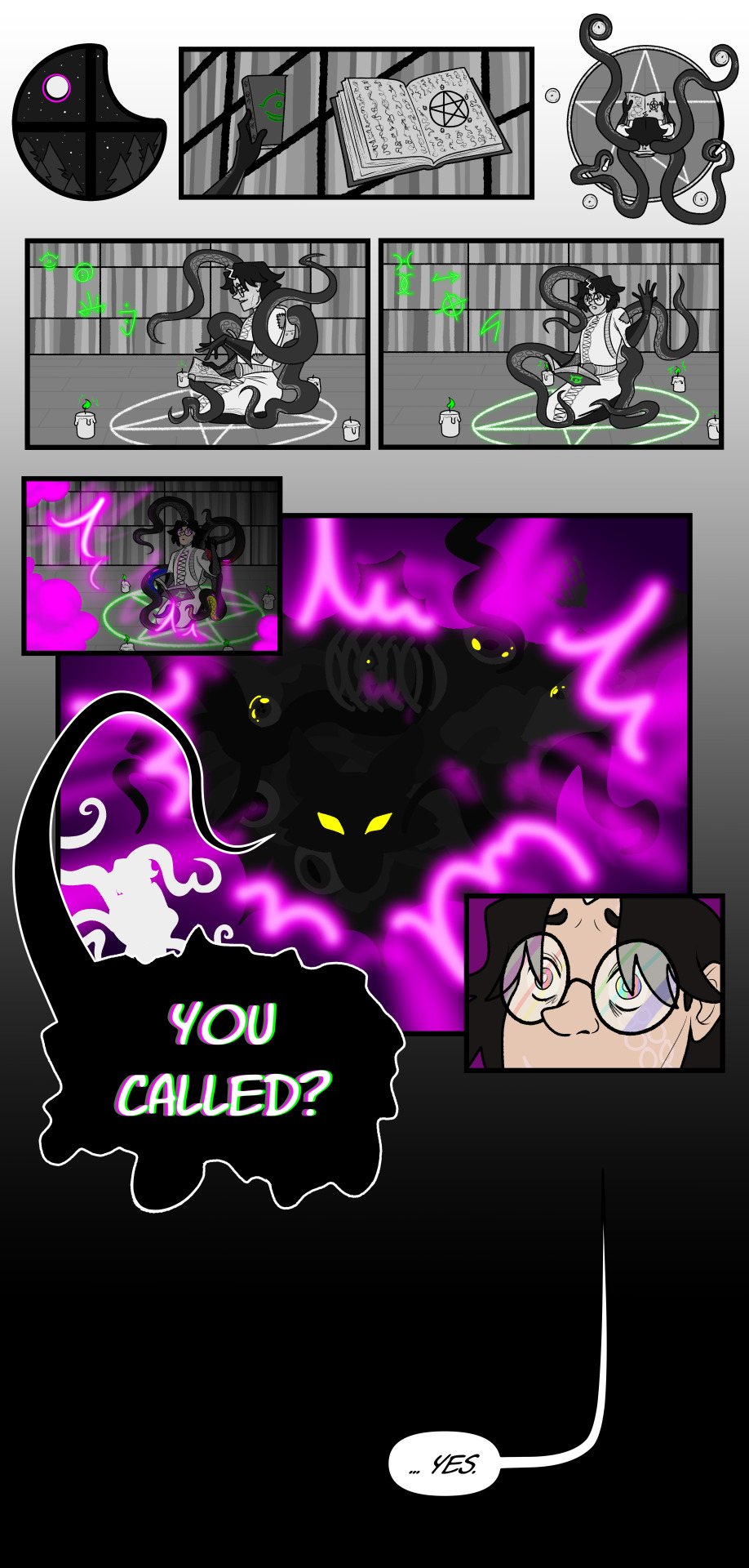
hey sorry it's been so long, I had a comic assigned as a midterm in one class and also the original file for it got corrupted so I had to start over, so I've been inches from walking into the ocean to never return, but here's the final product as yet another meaningless apology for my prolonged absence, yes it will happen again
#digital art#worshippdsun art#artists on tumblr#worshippdsun#digital artist#oc art#character: oc#OC: dr. sascha grim#dr. sascha corentin maria boucher von grimmelshausen#< that's their full name but as you can see it's a bit long for everyday use#comic#comic art#sequential art#narrative illustration#eldritch#cosmic horror#image described#id in alt text#idk how Well this one is described bc it's a comic but i tried my best
0 notes
Text
Dungeon Meshi Episode 7 was super interesting from an adaptation standpoint - this'll be a little different from what I usually write about (though I do still talk about the animation in the full video).

Studio Trigger have never done a straight-up manga adaptation before - and led by Yoshihiro Miyajima, a big fan of the manga who pushed hard for the adaptation to get made, and who has never directed a full series before, it was unclear if they'd be able to find the right balance between a simple panel-for-panel recreation and making something that's completely different.

And in the first few episodes, you could really feel the tension between the influence of a cautious young creative with great respect for the source material, and a studio with a unique established visual style. It kinda seemed like they were ping-ponging willy-nillily between the two sides of that spectrum.
But this episode showed that Miyajima (and series writer Kimiko Ueno) can take 3 chapters, slice them up and rearrange them into a cohesive-feeling episode while taking into account the differences between screen and page, and using them to their advantage.
Starting with the way the water looks. This line from the manga describes a faint magical glow to the water in this lake and you can see that the cavern fades into darkness above, but Kui's illustration style doesn't really define lighting and shadows very much compared to the cel-drawing style of animation. So the animators took the opportunity to use the water as the light source, and make a whole episode that's lit almost entirely from below. It really gives an otherworldly feeling to this area.
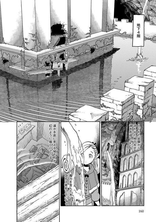
Particularly when the Kelpie shows up, that under-lighting works wonders to define its anatomy within the relatively simple line art.
What do you do when you can't show the immense fuck-off scale of a monster with a beautiful full-page spread like this?
Well you use what you do have: the ability to move the camera instead. This is such a great way to communicate the scale of this thing, AND such a great way to show some of Senshi's anime-original butt-cheeks!

This is one of my favorite shots from this episode - this whole sequence is super hectic, cutting quickly from character to character, but they use tricks like this to keep you from getting confused. This is framed much like it is in the manga, but with the moving image, they're able to use the trajectory of the fish head in the background to lead your eye directly from Chilchuck, right to the point where Senshi pops up in the foreground and transition seamlessly from one character to another!
Now, it's not all good - I am a bit disappointed that they removed Marcille's own Senshi-style soap-making montage, which was the perfect visual representation of the culmination of the character development and understanding built between Senshi and Marcille.
It's a shame to see it go.
I get more into that, what else was cut, and much more in this video where I broke down the entire episode!
Check it out if you feel like it. If you don't, jump in a ditch, cover yourself in leaves and jump out at people as they walk by.
Thanks for reading!
youtube
#dungeon meshi#anime#manga#laios touden#marcille donato#senshi#delicious in dungeon#video#mini essay#original
6K notes
·
View notes
Text

This is truly stiff competition for the worst case of willful false equivalence we've ever seen.
So, for those not aware: Ongoing embarrassment to gamers and the gaming industry, Mark Kern (former lead on FireFall), has been desperately trying to get Gamergate 2 going on X/Twitter... well after others have given up. If you need to get caught up on Mark, I recommend this video by documentary maker and experienced game developer, Dead Domain:
youtube
One of the latest fiascos in this mix has been the comparison of responses to character designs from Hades 2 (Aphrodite, left) and Stellar Blade (protagonist Eve, right). The post isn't by Mark, but is part of the general harassment campaign he's trying to lead.
If you're somehow not familiar with Aphrodite, she's the Ancient Greek goddess of love, lust and hot girl shit. It is absolutely perfect characterization for her to show up to a battle (or anything else) nude but for her hair teasingly covering the intimate parts of her body. But the buried lede here is, you don't fight her in Hades and nothing about Hades 2 indicates she'll fight there either, she just likes the aesthetic and has no reason not to indulge.
Stellar Blade will release on 26 April 2024, so we can't really give an informed discussion of her character. But what we do know is the studio head is the illustrator from Blade & Soul, Eve is described as being a member of "the 7th Airborne Squad" engaged in an "operation to reclaim the planet from the Naytiba", and the promotion material promises "an enthralling narrative filled with mature themes, mystery and revelation. Embrace the relentless pace, with no time to pause between moments where critical, story-changing decisions are made."
It's to be compared to games like Nier: Automata, Devil May Cry 5, Jedi: Fallen Order and Sekiro. And the screenshots look like this:
And yeah, unlike Bayonetta she's not supposed to be an unstoppable force of nature (and fashion) who is immune to self-doubt, she's supposed to be the scrappy underdog last survivor of her team.
Weird they gave her a costume that conveys... the opposite of literally everything they're supposed to be trying to tell you about her.
-wincenworks
#stellar blade#hades#hades 2#aphrodite#character design#costume design#commentary#mark kern#gamergate#dead domain#video games#false equivalence#blade and soul#nier automata#devil may cry#star wars#sekiro#bayonetta#firefall#science fiction#mythology#Greek#image#video#bikini armor battle damage#bikiniarmorbattledamage#babd#Youtube
1K notes
·
View notes
Text
The Magnus Archives (Season One) Production Design Project
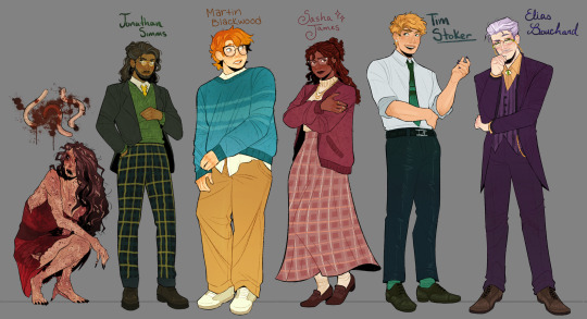

Hello everyone! Let me introduce myself- I'm Tilda (or Tilde), and I'm want to be a production designer.
Production designers create the overall look of a piece of media. From costumes, lighting, environments, props, etc., these designers make sure that everything looks cohesive and sets the mood.
So, I thought it would be fun to put my skills to the test by designing season one of The Magnus Archives. My winter break started as soon as I became interested in the show. Needless to say, a new obsession and an abundance of free time go well together.
You may have seen these illustrations posted separately, this is a master post of the whole project. My thoughts, processes, and critiques are all included under the cut. If you read them, I hope you enjoy! If, not, thank you for supporting my work regardless.
The Characters
When designing these characters, I tried to avoid being influenced by fan interpretations. Though, that was a challenge (especially with Jon and Sasha). I found that I looked to my friends for inspiration. Certain elements (Jon's glasses) were based off of what they wore.
Pinterest was also useful for finding clothing and pose references. Some looks were based off of different actors- in particular, Tim was inspired by Nicholas Galitzine and Elias inspired by Matthew Lillard.
Jane was the most fun to design! I believe in making terrifying characters actually terrifying.
Elias's design needs the most work. Having now finished the show, I see that it doesn't fit him. The purple is overly saturated, especially compared to the set. He looks out of place! I'd reverse the color palette to mostly green/yellow with purple accents instead. Although, I will forever defend the purple tint in his gray hair.
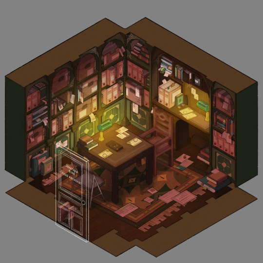
The Set
Jonathan's office was a treat to design! Balancing the color and clutter was especially important. This room is meant to be claustrophobic and uncomfortable, but not overbearingly so.
The wood looks to be full of splinters, but not so worn that it can be thrown out. The chairs offer no back support, and the shelves make the room smaller. The goal was to represented Jon's mind. Intricate, messy, and suffocating (Note: that is more of a season two description).
One goal was to capture the look of an actual archive. Valuable times was spent researching the different kinds of storage, files, paper, etc. The texture and color had to be accurate.
A split-complementary color palette of blue-green, yellow-green, and red was used. Of course, I had to get green in there, and the varying hues and desaturated reds worked well for the wood and filing supplies.
Jane's ashes and the Web lighter on the desk place this set at the end of season one. I find details like this to be important, it's one of my favorite parts of design. There is much needed abundance of eye imagery as well. Most obviously in the carpet, but eyes are carved into the table and watch from the shelves.
My main critique is the lighting- the filters used could be adjusted as to not distort the colors of the boxes. They look inconsistent. The Web lighter could also be more obvious, yet it is small and pixelated.
The Props
I designed these as I re-listened to season one, and it is the most recent piece I finished. Combining the details described in the show with what the objects would have realistically looked like was interesting. That was most useful for the clown, the Ming vase, and Ex Altiora.
Each of these objects came from a specific time with a specific look. Ex Altiora was bound in calf leather from the 1800s, so those books were referenced. Same with the frills on the clown's outfit.
The Ming vase was especially interesting, as it is from the Jiajing period. When looking at photographs of Jiajing vases, I found that many of them lacked handles and had an hourglass shape. That was fascinating to me, as many artists depict a standard oval-shaped vase. Also, the vase's design is described as straight lines that create distorted patterns when looking at it. That effect was achieved using chromatic aberration and the liquify tool (chromatic aberration was used to create a vertigo effect on Ex Altiora).
My critiques are... nitpicky. minimal. The shading on top of the garbage bag is unnatural. The thickness of the gold engraving on Ex Altiora is uneven. The "I" in "Immediate Consideration" is not capitalized. Other than that, I'm happy with how the props look.
Conclusion
First off, if you read everything, thank you!! It is a lot, I know.
My greatest takeaways are that 1) ask for critique, always 2) research skills are necessary for design 3) references are your friend! Seriously guys, use your references.
I hope you enjoyed this project and I'm excited to share more of my work in the future!
#and before anyone asks#i am not doing this for any other season#feel free to ask any questions about this project!#tma#the magnus archives#tma season one#production design#tildexart#tilda rambles
3K notes
·
View notes
Text
I’m posting the ever-so-rare photo of myself alongside one of my characters based on my childhood because today is World Autism Acceptance Day, and I wanted to show my little corner of the internet who this particular autistic person is:
I was officially diagnosed in February, at age 38 (I’m now 39). A lot of people thought I couldn’t be autistic. Some people who know me in real life still don’t. And until around 10 years ago, I didn’t think I could be either, because I was nothing like the stereotype media portrays. I was told that autistics lacked empathy (untrue), and never played make-believe (also often untrue) and only enjoyed STEM. I was — and am — an empathetic artist -- and make believe? I can spend days sketching finely bedecked bears brewing tea or carefully choosing the right words to weave tapestries of fiction — though perhaps my hyper focus was a bit of a red flag. Even so, how could autism describe me? I was a good student. I got straight A's. I didn’t act out in class. I can make eye contact…if I must. And lots of girls hate having their hair brushed with an unholy passion, right? Clearly I swim in sarcasm like a fish, so autism couldn't be why I was so anxious all the time, could it?
If someone had told me when I was younger what autism ACTUALLY is — instead of the nonsense I’d seen on screens — I would have seen myself in it. I didn’t hear that autistics have sensory issues until I was in my mid-twenties, which is when I first began to really research autism symptoms, and I had almost all of them: sensitivity to light, smells, fabrics, temperatures, textures, and certain touches, all of which make me feel anxious, I fidget (stim), I never know what the hell to do with my hands or where to look, I talk too little or too much, I have special interests, I have entire animated movies memorized shot-by-shot and can remember the first time and place I saw every movie I've ever seen but I often forget what I'm trying to say mid-sentence, I echo movies and tv shows (my husband and I have a whole repertoire of shared echolalias, making up about 20% of our conversations), I was in speech therapy as a kid, I have issues with dysnomia and verbal fluency, I toe-walk, I can't multitask to save my life, I like things just-so, I’m deeply introverted but not shy, I need to recover from all social interaction — even social interaction I enjoy — and I find stupid, every day things like grocery shopping, driving and making appointments overwhelming and intensely stressful, sometimes to the point where I struggle to speak. It turns out, I am definitely autistic. My results weren't borderline. Not even close. And while these aren’t all of my challenges, and not everyone with these symptoms is autistic, it’s definitely something to look into if you present with all of these things at once.
So why did it take me so long to get diagnosed? The same bias that exists in media threads through the medical community as well, and because I'm a woman who can discuss the weather while smiling on cue, few people thought I was worth looking into. Even after I was fairly certain I was autistic, receiving an official diagnosis in the US is unnecessarily difficult and expensive, and in my case, completely uncovered by my insurance. It cost me over $4000, and I could only afford it because my husband makes more money than I do as a freelance illustrator — a job I fell into largely because it didn’t require in-person work; like many autists, I have been chronically underemployed and underpaid, in part due to physical illness in my twenties, which is a topic for another day. But it shouldn’t be like this. It shouldn’t be so hard for adults to receive diagnoses and it shouldn’t be so hard for people to see themselves in this condition to begin with due to misinformation and stereotypes. Like many issues in America, these barriers are even higher for marginalized groups with multiple intersectionalities.
It’s commonly said that if you’ve met one autistic person, you’ve met one autistic person. This is why it’s called a spectrum, not because there’s a linear progression of severity (someone who appears to have low support needs like myself might need more than it seems, and vice versa), but because every autistic person has their own strengths and weaknesses, challenges and experiences, opinions and needs. No two people on the spectrum present in the same way. And that’s a good thing! No way of being autistic is inherently any better than any other, and even if someone on the spectrum struggles with things I don’t — or can do things I can’t — doesn’t make them more or less deserving of respect and human dignity.
But speaking solely for myself, the more I learn about autism, the happier I am to be autistic. I struggle to find words and exert fine motor control, but my deep passion and fixation has made me good at art and storytelling anyway. I find more joy watching dogs and studying leaf shapes on my walks than most people do in an entire day. More often than not, the barriers I’ve faced weren’t due to my autism directly, but due to society being overly rigid about what it considers a valid way of existing. My hope in writing this today is that maybe one person will realize that autism isn’t what they thought — and that being different is not the same as being less than. My hope with my fiction is to give autistic children mirrors with which to see themselves, and everyone else windows through which to see us as we actually are.
If you’re interested in learning more about autism or think you might be autistic, too, I recommend the Autism Self Advocacy Network autisticadvocacy.org and the following books:
What I Mean When I Say I’m Autistic by Annie Kotowicz
We're Not Broken by Eric Garcia
Knowing Why edited by Elizabeth Bartmess
Unmasking Autism by Devon Price, PhD
Loud Hands edited by Julia Bascom
Neurotribes by Steve Silberman
(trigger warning: the last two contain quite a lot of upsetting material involving institutionalized child abuse, but I think it’s important for people to know how often autistic children were — and are — abused simply for being neurodivergent).
Thanks for reading 💛
1K notes
·
View notes
Text

Image ID: An illustration of a blue-toned, dragon-esque goddess character with a golden halo and layered outfit surrounded by dark silhouettes of small dragons. She has her hands up in front of her, and looks concerned. There is a larger silhouette behind her of a secondary character with three eyes, horns, sharp teeth, and thin, stringy hands, looking down on her. They are surrounded by layers of clouds that recede into the background, where a bright sun lies. End ID.
attacka....... featuring @mossy-box's Mayonaka (and Elektra)!
#froxart#artfight#illustration#character art#described#clouds#sooo normal about weather themed characters...... i love any excuse to paint clouds. i need to do it MORE#maybe i should do some studies one day. if time permits lmfao#it was fun doing the sorta boxy/squareish style for this character also!!! love an opportunity to have fun w shapes
15 notes
·
View notes
Last Seen Blogs
potsieweber
smallest donation gets two six packs

alienrobotoctopusdong
ASSthetically pleasing

youlooksucculent
Underestimated
tuning-titanium-rtamo-blog
We Are Titanium Tuning Specialist.
apachx
She said I'm a robot