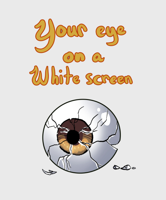
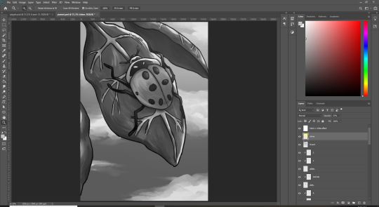
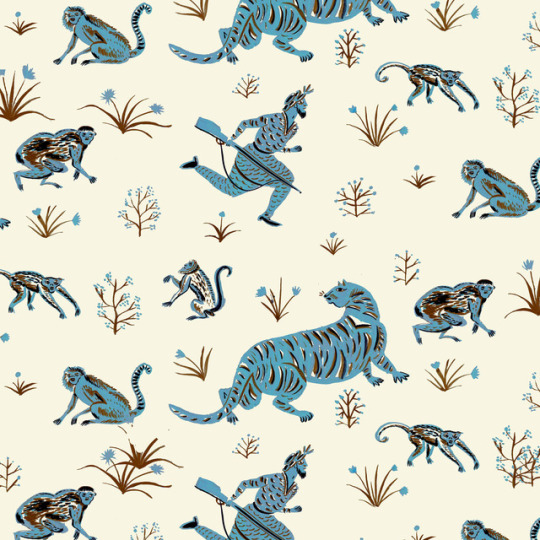
#this is mostly a chance for me to try and digitally color my pencil drawings in a way i dont hate
Text
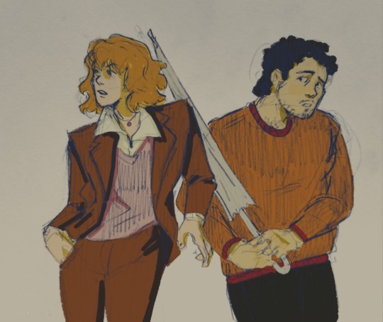
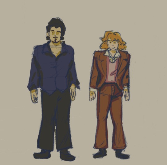
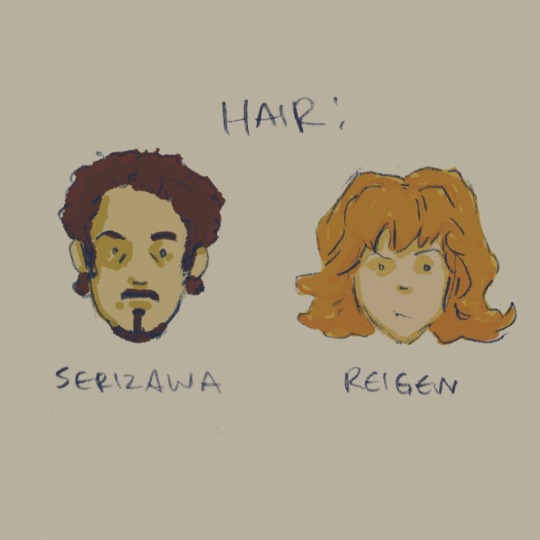

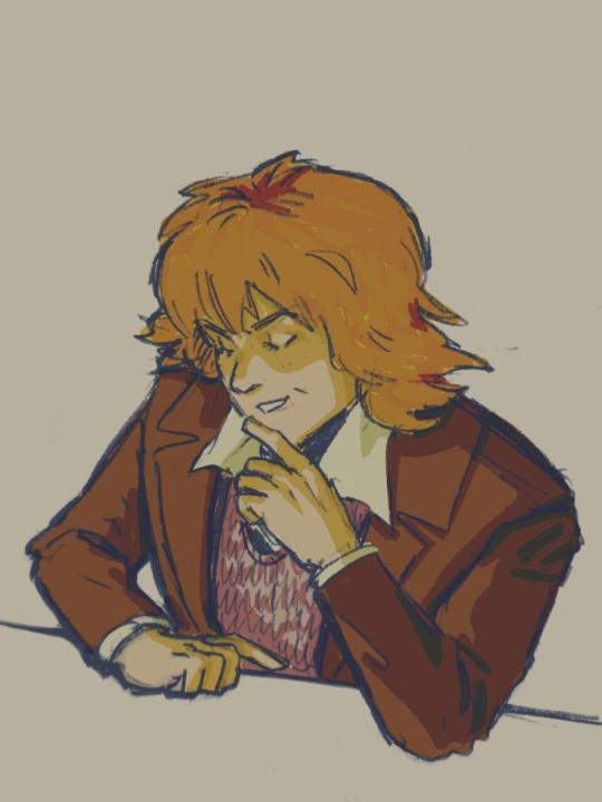
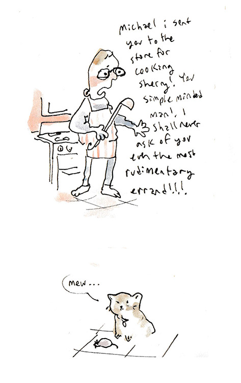
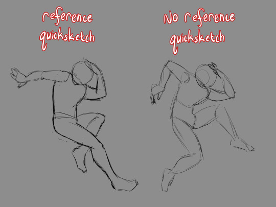
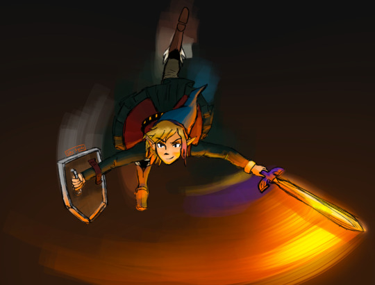
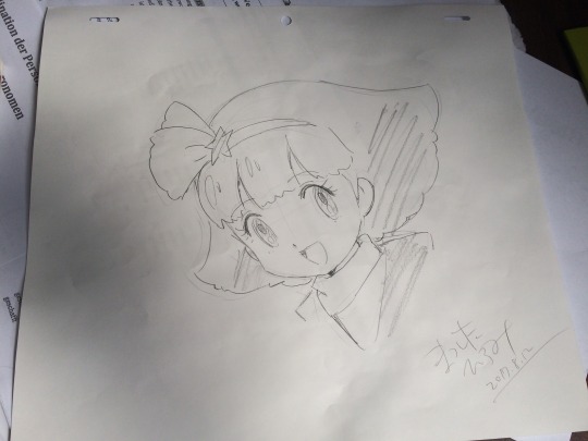
au where claw, not yet seeking world domination, is in the business of ousting and punishing fake psychics. suzuki sends serizawa to figure out if reigen's a fraud, but he forgets to factor in the power of gay tendencies. and also its the 1970s.
#in this au mob and reigen and co are also like. more organized and aware of claw#anyways serizawa is like okay ill pretend to be a client but before he reaches the office he bumps into reigen on his smoke break#reigen assumes hes there for the cafe. reigen flirts. serizawa clarifies hes here for spiritual consultation.#reigen has a crisis trying to switch from cool gay persona to salesman persona.#it is so so obvious he is not a psychic but serizawa goes to suzuki like um couldnt figure it out today! guess ill have to. go back!#serirei#reigen#serizawa#reigen arataka#serizawa katsuya#mp100#mob psycho 100#id in alt text#<- but they might suck tbh.#this is mostly a chance for me to try and digitally color my pencil drawings in a way i dont hate
319 notes
·
View notes
Text
on comics
[tl;dr i was worried for most of my life about being a ‘good artist’ but now i just make comics and you should too]
i spent april, may, and half of june 2020 rendering geometric objects in soft charcoal. i threw myself into what’s colloquially known on /ic/ as grinding fundies-- perspective exercises, bargue plates, and figure drawing. my intent was to git gud and finally launch a narrative webcomic-- something visually pleasing, digital, and well-written. i had finished scripts, thumbnails, character designs, etc. i had to take advantage of all this sudden free time from losing my job! this was my chance!
then last month i realized abruptly that i was not that kind of artist, i had never been that kind of artist, and i would never be that kind of artist. i could not go SCRIPT->THUMBNAILS->PENCILS->INK because it would kill me. i had to accept i could not “finish” anything that way. if i thought too much about the work i lost interest; if it took too long i got bored. even now, every comic is a race against my own attention span.

i think there are a couple factors at play here. one is my own brain. but another is a deeper problem inherent to the medium: i believe “writing” a script or words ahead of time sucks the life out of the work. (will eisner talks about this in “Comics and Sequential Art.” ideally the writer and artist should be the same person and it should be done at the same time; if they cannot be the same person, then the artist must have liberty to change the script as they see fit to better suit the pacing/visual storytelling.) comics are the interplay of words and image. the words feed the image, the image feeds the words. the fragmented process of, say, a typical DC comic-- script/pencils/ink/color all done by separate people hundreds of miles apart-- is antithetical to the medium and also why these comics are mostly bad. to go even further, the words and images should be done with the same tool. if i put the brush down to switch to a pen the words are not the same, and the disparate style is jarring on some level. the simultaneous creation of words and images is essential. there’s immediately life. your hands come up with things you didnt expect. what i very recently learned is that i have to work like a rollercoaster: start to finish, without looking back, and without stopping. thinking is not necessary-- “skill” is not necessary. (i still struggle with this last point but the mild popularity of a few of my left-handed comics prove it to me: people will respond to a shaky scribble as long as the scribble is alive.)
i got this practice from lynda barry. who else? when i first read that she just sits down and draws a comic from start to finish, i was horrified and jealous. she writes the words for a panel, draws the image, then moves on to the next. that’s it. it seems straightforward but it haunted me. i thought i was incapable of this and that anything done like this would be TRASH! (unless lynda barry did it, of course.) but that is how i am trying to work now.
it’s not easy. self-consciousness, self-criticism, and the years of thinking art must look a certain way are all against us. it gets easier, though. i think it got easier once i realized how fun it can be. i use crayons, cheap paper, collage, non-dominant hand drawing, anything to help me realize it’s not that serious. the tactile and permanent aspect of traditional art is another aid. some of my favorite cartoonists and inkers work digitally but my brain doesnt grok it-- on some level it doesnt think it’s real.
working this way, i am not making the type of comics i wanted to make. i am not making comics that a lot of people will like to look at or read. but i am making comics, and before this i was not.
everyone can and most importantly SHOULD make comics. i tell everyone i know that they should draw more, that they should make comics. the usual protests: “i can’t do that, i can’t think of anything, i can’t draw.” how do you know? i think the same things and these thoughts are the death of art. everyone has something to say-- if you draw a comic and show it to me i will love it because it’s something new.
i have nothing further to say about art that hasn’t been said by lynda barry, GOAT, whose books on writing and drawing i recommend to everyone. (”What It Is,” “Picture This” and, appropriately, “Making Comics”. i feel like these should be mandatory reading for humanity.) tom hart, one of the greatest living cartoonists in my opinion, has a big free [!] e-book available about cartooning and creativity with lots of exercises-- http://www.tomhart.net/how-to-say-everything.html
finally:

ok thanks for reading my manifesto xxx
1K notes
·
View notes
Note
Hey I'm Fred's fourth daddy anon! I sent that to you, and what felt like five minutes later you came in with that gorgeous sketch. Do you have any art tips or videos that have taught you cause I've been stuck draw trying to draw anything not resembling a lump for two years. Also yeah it was whirlwind episode, f*ck Rose, and Fred should have turned that loon in.
Hey FD Anon, thanks so much! I don’t draw a lot of “horror” art so I’m really happy with it’s progress so far!
While I do agree with you that Rose is The Worst, I think she added in an interesting dynamic and I’d be happy if she became a recurring character in the Scooby mythos at large. As for Fred not turning his dad in... I agree, but I also understand why he didn’t.
The episode went out of it’s way to show off how frightening and weird he is but Fred made it very clear that when he wasn’t wearing the mask he was a good parent, and that all of his crimes were shown as nonviolent. He didn’t seem to steal anything (unless I missed that line?) he just liked messing with people by confusing them.
As for art tips, I... honestly never expected anybody to ask for advice from me? That’s super flattering wow.
Okay, so I’m still pretty much a novice, but lemme give you some of my best tips and tricks:
1) Notice how my last sketch had a grey background? This wasn’t just for that sketch, this is how I use ALL of my digital canvases. I do this because the grey causes less strain to my eyes, and allows me to work longer and more easily. Being so close to a screen, especially a blue or white one, can make it harder to work for long periods of time.

2) If you want to do digital art, you need to learn “traditional art” (pencil and paper) first. It makes transitioning to digital more easy and it’s pretty much what any art teacher would recommend, for good reason.
3) Using one method of art not only limits you, but stops you from learning other techniques which can be incorporated into what you typically prefer. Not only that, but you can also discover a medium you really love that you never would have thought of before!
4) Whenever you get the chance, work in black and white or monochrome. This is a great way to help yourself learn about values and intensity, and just looks cool in general.
5) Piggybacking on that last point, if you’re ever worried about your shading, values, etc becoming muddled either A] take a picture and use a filter to make it black and white, or B] create another, pure white layer on top of the others and change it from “Normal” to “Hue”. Doing this can really help change your approach to coloring (black and white effect may be different for every art program).
6) If you want to get better at realistic faces, I was taught using the grid system. You have squares on your reference picture, squares on your paper, and then match up the body parts to the squares. I personally didn’t like this method, but it’s a really solid style of learning.
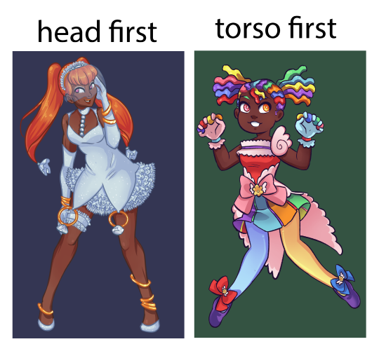
7) Start with the torso instead of the head. what you start with the head, the body may end up becoming wonky and having the neck stretched out at an odd angle or having a too small cranium. This is easier to fix in digital art but I suggest just remembering the importance of that rib cage (this is something I’m still training myself out of).
8) Asking for feedback can be an invaluable tool. For example, last year I had this really weird thing where I drew my eyes way too close together- I never noticed until I had it pointed out to me, and it took MONTHS to break this habit.
9) References are very useful, and one fun technique I’ve found great use in is to draw a pose, first with no reference, and then following that reference very strictly. This can be helpful when you want to see where you are developmentally.
10) Every now and then while drawing, you want to put the pencil down, prop up your paper, and walk away so that you can see the full image from a distance. If you’re working digitally, you zoom out a great deal so that the image appears smaller. This is a GREAT tool for seeing which sections of the piece need the most attention and how those smaller details hold up.
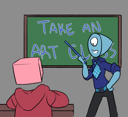
11) If you have the opportunity, you REALLY want to participate in an actual art class. Having a teacher that can see what you’re doing in real time and knows where you’re at skill-wise is an INVALUABLE thing to have- these people were specifically taught how to teach you these skills, recognize your problems and how to fix them. Don’t be afraid to talk to them and ask for advice about non-classwork art, either! You can’t receive help if you don’t ask for it.
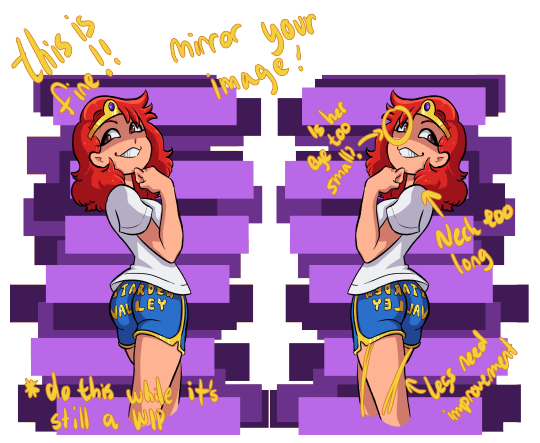
12) Flip your canvas! I know you’ve probably heard this before, but this is one of the best ways to check for anatomy inconsistencies.
13) When it comes to youtube artists, I don’t really actively follow any, but I do know of some!
Mark Crilley: While I don’t watch his videos much now, I used to follow his videos RELIGIOUSLY. He’s got some really solid advice on how to map out comics and mangas, and he taught me the importance of silent scenes and keeping your work from getting too wordy. He mostly does the soft anime look, but he also does some pretty stellar realism.
mikeymegamega: I’m not going to lie to you, anon- this man likes his cheesecake. This guy is all about the cute anime girls, so if you’re not looking for that, skip him, but I really can’t recommend his videos on hands, feet, and faces enough.
Proko: Has a video about best drawing exorcises and is the guy you turn to when you want to know about figure drawing. He tends to focus on the more realistic anatomy, and while his videos may be long he’s got some good advice. I’d say to check out his studying anatomy correctly video, and then just kinda scroll through his pages.
Ethan Becker: THE KNIFE MAN. The first time I clicked on him I thought he was making a troll video- but then he Got Into It and my dudes, my guys, he has some CRAZY good advice. The way he words things and shows you examples in his videos are amazing and I really can’t recommend him enough. He did a video called “Fixing PROKO's LAZY Drawings“ and while you’d think it would be a bash fest his advice on shading in it is just so incredibly useful. Click on pretty much any of his videos and you’ll be entertained and learning.
I'd also suggest watching speedpaints. Even if it was unintentional, I’ve learned several really solid art hacks from speedpaint and storytime videos- so always be aware that you have an option for that.
…. Oh! And also, practice! I know you’ve probably been given this advice from everyone already, but it’s worth remembering.
Sorry if this got a bit long, I just figured I’d try to give you some good hacks- and even if you have already heard of most of these, I hope I could at the very least entertain!
120 notes
·
View notes
Text
Meet the Creator!
Introducing: Squido!
Commission: I haven't and don't really intend to. I don't want to take anyone's hard-earned money. Just ask me to draw things and there's a good chance I will.
Social Media:
Tumblr: @sky-squido
AO3: https://archiveofourown.org/users/sky_squido/pseuds/sky_squido
Tell us a little bit about yourself!
Call me Squido! I love to draw and write but I'm also super extraverted and I love interacting with humans so always feel free to chat with me! Aside from drawing and writing, I just love being outside and have a tumblr sideblog dedicated exclusively to nature photos I take. I love mountains, the ocean, the sky, and just about everything else in this beautiful world of ours! If you ever feel like having an internet stranger give you a thousand word rant, ask me why my favorite color is blue and you will not be disappointed!
What got you into creating? what inspires you to keep creating?
I've been drawing for as long as I can remember and can't seem to stop, though I take long breaks sometimes I always seem to come back to it again. I try not to have anything in mind when I draw, but to start sketching and let the drawing happen. Sometimes I find that what I'm trying to draw is not what my drawing wants to be (if that makes any sense) and change what I'm making halfway through. It makes drawing a really relaxing and carefree therapeutic experience!
Writing is different. I've always enjoyed writing, but I didn't write much and never shared my writing with anyone because I thought it was super pretentious. It wasn't until entering High School and joining the literature club and making a deal with a friend that we'd share our writing with each other that I actually gained any sort of confidence in my ability and sought to improve it. Being in that club and sharing my pieces at the open mics was a really encouraging experience! I invite everyone to share their writing, even if it's with some random internet stranger (I'm open anytime!) if they're unsure of their abilities. A little encouragement goes a long way! Now that I'm on Discord, ao3, and tumblr, I receive so much more feedback than I ever have before! It's been super encouraging!
What inspires me most is definitely nature. Even if my ideas aren't directly related to the outdoors, I get my best ideas there. Fandoms are also a great idea generator. The sheer volume of headcanons and prompts is enough to make me dizzy with ideas!
What's your creative process like?
I love sketching. My favorite thing about drawing digitally is that I can sketch as much as I like and never worry about wasting materials! Often times my sketches turn themselves into drawings without permission and other times they stubbornly remain sketches for all eternity. I always dive right in because I have no patience and the idea I started out with generally isn't that great but in the process of pursuing it, it spirals out of control and sometimes the idea gets better and sometimes it gets worse but I just kinda roll with it. Creating is a really chill process for me and while I regularly scream stuff like "I'M DRAWING ON THE WRONG LAYER NONONONONONO" or "NO HECK FRICK SHOOT IT SMUDGED HECK HECK GET THE ERASER QUICK," the creative process is a great way for me to unwind. I'm the same way about writing. I never plan or outline and just kind of roll with things. I mean I generally have the basic jist in mind, but I try to not have a plan so I can keep the story driven by the characters and not force them into acting the way I wanted them to in the outline I made hours or even days ago. Creating is my opportunity to break free so I don't really see what good a plan or outline does me. I'm a pretty spontaneous person!
What kind of mediums do you like to use?
I like to take pictures, but it's not really my main focus. I've been mostly digitally drawing—I use my iPad Pro and Procreate—but lately I've been pencil sketching with just your average everyday mechanical pencil (I'd forgotten how nice the texture of paper was! Clearly I spent too much time drawing on my iPad!). I have these Stabilio chalk pastels I love to pieces, but have also spent a great deal of time with watercolors. Digital is my primary medium currently, though.
Is there a specific scene wrote that you are particularly proud of?
"Sky’s golden scales are glowing with reflected light from the sun while beneath them, the same pulsing blue in her mane runs like a river as her very skin is alive with electricity. The sun’s beginning to dip, fading through the color wheel from yellow to deep orange to scarlet and the world is bathed in watercolor and hue shifted through the rainbow until all that was blue becomes red. This new alien world begins to darken as red fades to deep purple-pink, the clouds catching last vestiges of gold in their pillowy folds, yet Sky continues rippling with lighting, the bright blue flowing like blood through her veins and the gold shimmering in the eerie azure glow. We weave through the winds and zephyrs and I close my eyes and let the breeze caress my hair and when I reopen them, I’m standing back on the ground again in a world long since darkened by night. I place my hand over my beating heart where Sky is still laughing with joy and smile because once you’ve awakened your dragon, you don’t need wings to fly anymore."
Is there someone who inspires you and your writing or art?
Every fanartist and fanfic writer that posts their stuff online is an inspiration to me. Even if their stuff isn't very good—especially if it isn't very good—it's a huge testament to the courage of the creator and their bravery in expressing themself! I sat on fanfic and fanart for years and never shared it and here were kids half my age putting out art that was their first experiment in a new medium and a little shaky but it was still out there and they were still being supported by the community and that really inspired me to reach out and stop lurking in fandom and actually get involved!
is there something that you struggled with that made you grow as a creator?
I feel like everyone has these periods where they were just gaining confidence in their artistic ability but suddenly everything they make is trash and they're not happy with any of it and they feel so down and worthless and "where did all of my hard-earned ability go? Will I ever get it back?" I think this is a pretty common experience and when I find myself there, I find it most helpful to share what I make anyway, even if I hate it, with someone who I know will give it to me straight because they'll point out the deeper problems—the root of the issue—that I hadn't even noticed and I can use that information to grow as an artist. Bad pieces are just as valuable as good ones.
There was also a time where I had a lot of trouble developing a style. I did a lot of experimenting and never found anything I liked. What happened is I just kept drawing and whatever popped out eventually evolved into my style. I used to get frustrated that I couldn't draw anything without a reference, but after years and years of using references and drawing some of the same things over and over again, you won't need the references anymore. I mean, they're great and you should always feel free to use them, but over time, you won't need to look up a picture of every little thing you try to doodle.
What got you into writing or art?
My silly twitchy fingers can't ever seem to stop drawing! Same with writing. Words and ideas follow me around, little plot bunnies pestering me until they get written down somewhere. I was greatly inspired by the works of C.S. Lewis in my writing, especially his Cosmic Trilogy. My art style was aided by Hiromu Arakawa's Fullmetal Alchemist, which was a valuable stepping stone in developing my own style. Other than that, it was my own insatiable desire to MAKE THINGS that spurred me onwards. I don't think I could stop if I tried!
What's your favorite part of the creative process?
After you've got that first paragraph and you've found a flow and you've got a topic and you just GO. I get into the zone and the story starts happening on its own and I'm not an author anymore, I'm just a channel between the world of the piece and the page. That's my favorite. I love watching things take shape. I love shading a sketch for these same reasons. The whole drawing comes together and becomes A Thing and it's the most exciting time to be a creator. Something else inside you has taken over and you're just along for the ride. I have no idea if my experiences are common at all but this is what it's like for me!
What's your least favorite part of the creative process?
EDITING. I HAVE ZERO PATIENCE. THE THING IS DONE. WHY DO I HAVE TO KEEP LOOKING AT IT. CAN I POST IT YET. This leaves me with a lot of holes in what I make and I can't do a very clean, super detailed drawing unless it's for an art class and I'm forced to keep working on it. I have a terrible habit of never proofreading my things!
What's your favorite type of scene to write?
AAH hard question! I love writing description and places where I can really let my inner 19th century romantic be unleashed but I also love a good emotional moment between two characters. Something tense. I like fight scenes, but I try to keep them brief and interesting. Sometimes I find scenes where I have no idea what's going on and I try to avoid that, but it's really hard sometimes.
What's the hardest for you to create?
I have so much trouble with endings. I can generally figure something out, but there's always a moment of panic before the end like "heck I wrote everything I wanted how do I wrap this up????" That's probably a byproduct of me planning nothing XD I sometimes have trouble with characterization and making sure everyone acts the way they actually would. The hardest part is continuing after you have an "oh heck what do I do now" moment that breaks you out of your zone and all of your ideas and plot threads turn invisible or evaporate or go wherever it is they go when you're looking for them.
What's your favorite genre to write?
ANGST ANGST ANGST ANGST. Wellll... scratch that. I love something adventure-y and plot driven with a lot of really meaningful character interactions. I've always had trouble putting my writing into genres, but I guess that kind of speaks for itself in a way.
What fandoms do you enjoy creating for?
Linked Universe is the fandom I have created and posted the most for by a LONG SHOT. I found LU shortly after making my tumblr and I joined the Discord shortly thereafter. Since then, it has been nonstop inspiration and creativity for me! I tend to get sucked into one fandom and it consumes me for a few months before I silently drift out of it and never think about it again. LU is the fandom I've been the most active in EVER though—and it's still going—so there's a good chance I'm never getting off this ride.
What's the work you are most proud of?
AAAAAAAAAAH MY BABIES. okay um here's the first and only fanfic I've ever posted anywhere but I'm really happy with: https://sky-squido.tumblr.com/post/618964544219463680/turn-back-time-a-linked-universe-fanfic
I have a lot of other pieces kicking about, but they're not fandom so I haven't shared them yet. I probably will after I touch them up a bit.
Do you have any fics inspired by real life stories?
Not really? I don't really know where my ideas come from to be honest!
Where do you post your finished works?
my tumblr. I tag stuff #squido writes and #squido draws so you can find them easily. I also put them on the discord but they get lost in the stream of other works pretty quickly so stick to my tumblr.
I also have an ao3 now! https://archiveofourown.org/users/sky_squido
If you have any fun stories about the pieces you made, please do share!
Turn Back Time was actually live written in the Discord, but entirely unplanned and in the #angst channel! It was just a headcanon but then I started describing it and like 2 hours and 5k words later I'm sitting in the Discord like "what just happened??"
33 notes
·
View notes
Photo
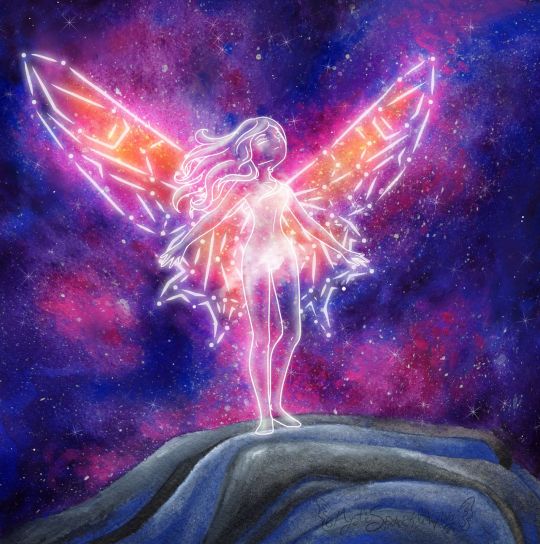
On The Edge
It feels like it's been quite some time since I sat down and got to work on a more involved mixed-media project. And in plenty of ways it has, but I have been working on other artsy projects behind the scenes, which I should be posting sometime soon, I hope.
Anyway, this artwork had to be moved to the top of my priority list and also my upload schedule (some of those other projects are already finished, just back-logged) because this is my entry into the Arteza Awards hosted by, shocker, Arteza, and the deadline to enter was the 24th.
I actually started working on this piece a week or two early, but me being me, I procrastinated and only just barely got it posted to Instagram with the appropriate tags (per the contest rules) with about 20 minutes to spare. Then again, maybe that's a good thing because I've been known in the past to pull some of my better work out of thin air at the last minute. If that proves the case this time, it would certainly be to my advantage.
Anyway. There was no set theme for the contest. The main rules were that you had to use Arteza supplies and they needed to be visible in the image posted to Instagram. I understand why, but I normally don't photograph my art with the supplies because I can usually get more accurate colors and proportions with a scan, and you can pretty much always see the details way better on a scan. But considering the prizes on offer, I wasn't about to let that stop me. I figured I'd just post the supply image first, then add the scan so you could swipe to see it. That way I could have my nice scanned version and still follow the rules. (Also, since they specify Instagram is the main platform for the contest, I'm assuming it doesn't matter if I don't post the supply picture everywhere else. If it does...whoops :P )
For reasons I don't think I should get into here, I knew I needed to go for something kind of high-impact when you first glance at it. But it also needed to not be too involved, lest I be working on it well after the entry window closed and my efforts become somewhat less valuable. I'm not exactly sure how, but this led me around to a concept I've had floating around in my head for a while: A girl (because I am one and know I can draw them better) standing on a mountain top, that looks as if she's one step from free-falling. Originally, I dreamed up this idea hoping to make it into an acrylic painting, but (aside from that fact that I didn't get around to executing the idea until now) I do not own Arteza'a acrylic paints (though I have wanted them for quite some time--It just hasn't happened yet) and also acrylics are not my strongest suit, so now did not seem like the time for an impulse-purchase that could compromise the integrity of my work and therefore my chances in the contest. Although for the day I do get my hands on their acrylics, I now have a solid idea to use to test them out. ;)
The Arteza supplies I do have at my disposal are their tube watercolors, woodless watercolor pencils, and 72 expert colored pencils. Which as I learned the last time entered a contest hosted by Arteza, is a fairly limited variety as to what I can actually do. The watercolors by far as the most versatile and my personal favorite of the three though, so they're what I used the most of here.
Also, somewhere between deciding to run with my standing-on-the-edge idea and actually doing it, I also decided to add-in the wings in this constellation style I've used somewhere infrequently but am very fond of. As a result, the whole concept has a very similar feel to me as this artwork that I found here on dA years ago and fell so in love with that it spent a good few months as my desktop wallpaper.
Obviously, the two images are very different, but to me the idea of the wings is similar: Their structural integrity to fly is questionable, as the wings in the original image appear to be made of glass. Maybe it matters, maybe not. Same thing here: Maybe the wings are really there and just look like a constellation, or maybe this girl just stood in exactly the right spot at exactly the right time. Is the girl even there? Is she real? Can she die? Does it matter if she falls? Would she choose to fly at all, whether the wings work or not?
It's sort of a Schrodinger's Cat situation, and something about that is really intriguing to me.
Anyway. I started out with a digital sketch this time, mostly to iron out the kinks with...well, everything.
I knew getting the right pose would be difficult, and I actually had a pretty different one of her looking out over the edge, maybe clutching her chest or something, originally, but I just couldn't get it to work the way I wanted to and I really struggled to find references for it, so I went with the pose you see here, that I found references for by accident while looking for the other one. I have to admit, seeing the final product I think this pose might actually have been the better choice anyway.
The mountain/cliff/whatever I was also having a hard time finding references for, at least for exactly what I wanted, so in the end I had to mostly wing it. I think it turned out okay, though.
The wings were probably the most challenging part to plan because I wanted something between traditional butterfly/fairy wings and something that stretches out farther like bird or bat wings. I toyed with the lines for a long time until I got something I was happy with, and then I actually went in and did the constellation lines for both sides by hand instead of doing one side and making a flipped copy, because I wanted to make sure I kept the overall shape of the wing on the (our)right (her left), as after all the warping I did to get the original lines, I wasn't sure I could replicate the process again.
I also drew 2 or 3 versions of a simple dress over the figure before giving up because I wasn't happy with how any of them were turning out and decided that I would instead preserve her modesty with magically misty cloud-things. Although, it's kind of a shame because that ended up mostly hiding the one piece of hair clinging over her left (our right) shoulder. :P
But once the digital sketch was done so I had some idea of what I was doing, it was time to move on to the traditional, actual artwork.
I cut a piece of my 100% cotton paper down to size (nice paper because I didn't want to be held back in that regard--go big or go home, as they say) and then held it up to me screen to trace my cliff lines into place, and some vague markers for the figure and her wings.
My idea from the very beginning was to make the galaxy largely with watercolor in such a way that it gives the wings color and focus, without having to actually color all the individual segments. This means lighter colors towards the main area of the wings, and getting darker as I moved out/away from them.
Now, because it has been a while since I was painting with watercolors regularly, I did set aside a smaller piece of the same paper and busted out a practice baby galaxy before diving into the final. I learned very quickly I was going to have to be extremely careful with my placement of this orangey color and black, less either of them ends up mixing with colors they weren't supposed to and leaving me with a big muddy mess. (The practice piece did survive though and I'll be posting it some other time.)
Before I could get to the fun part [the galaxy] though, I painted the mountain with a mixture of black and blue, which actually went a lot smoother than I thought it would. It took several light layers of blending out the paint built up slowly, but ultimately I'm pretty happy with how the color for it turned out...Even if it's still kind of up for debate how much it looks like a "mountain" or "cliff-edge" or not.
With that out of the way, I cut some paper to act as a mask for that section and then spent far too long going back and forth, putting down layers of color and blending them out, dabbing color on and waiting for it to dry, rinse, repeat, trying to get the Galaxy portion just right. I was actually having a fair amount of trouble getting the right color balance, and as sometimes happens with these things, I was pretty worried about how it was looking before I went to bed that night. (I had procrastinated just long enough that I had 2 nights to do this is; the bulk of the painting took place on night 2) But the next day, once it was fully dry, it didn't look so bad.
It did need just a few more touches before I went in and added the splatter/stars, though. So I broke out the colored pencils, which I really should have done sooner because they were much easier to blend out and had a bit more covering power over the watercolor than...more watercolor because watercolor is often transparent and there it can be hard to cover with it.
Admittedly, I still had more worries about the "naked" galaxy, but then I went to splatter town with the white, added a few pointed stars, and as it usually does, that really brought everything together and made it look a lot better. Never underestimate the power of a good splatter-fest! ;)
I must say though, I underestimated the combination of the white watercolor and white colored pencil together when I moved on to the figure and wings. I was trying very hard to not use my white gel pen (because the rules for the contest didn't say if it was okay to use non-Arteza supplies in conjunction with Arteza supplies or not) and so I was sort of bending over backward to find another way with my limited resources. (Although I assumed using a lightbox to see the lines underneath the paint, as is a normal practice for me, wouldn't really matter because it's not like you can really tell from the final product anyway.)
Still, even though a mixture of paint lifting, the white colored pencil, and the white watercolor were better than I expected, I still ended up having to punch the lines up a bit digitally to get them to pop the way I wanted them to. But oh well, at least it made a nice glowing effect and mostly worked for the cloud-mist covering. :P
Overall though, I do really like how it turned out. If it weren't a little on the small side I might actually consider using it as my new wallpaper/banner art everywhere. Maybe that's a conversion project of some kind for another day?
Point being, I'm pleased. I probably won't place in the contest because I'm just too small of a fish in this pond, but I made some pretty art and it was mostly fun, so no harm done. :)
Actually, if this could maybe be the excuse my brain needs to get back into posting regularly, that would actually be really great. I miss it, despite what my most recent journal entry and my spotty activity levels might lead one to believe. If it is, I hope you guys don't mind seeing some crafty things thrown into the mix! :D
____
Artwork © me, MysticSparkleWings
____
Where to find me & my artwork:
My Website | Commission Info + Prices | Ko-Fi | dA Print Shop | RedBubble | Twitter | Tumblr | Instagram
2 notes
·
View notes
Text
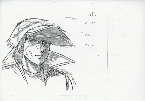
Notes on Animation Quality in Anime
I had a rare chance in 2017 to meet Hiromi Matsushita, one of Minky Momo’s most prominent animators. Matsushita is still active in the industry, and when I entered the room he was focused on drawing a scene, which he finished in around 10 minutes. I think he didn't lose his skills yet. I asked him for a drawing, of Momo of course, a request he found too hard even with the help of an image of Momo from google. More than 10 minutes passed, a lot of drawing and redrawing on the same paper, he handed me the illustration saying: “I’m sorry, this isn’t the real Momo.”
Now, I’m not saying he couldn’t draw her correctly because he got used to the radically different anime drawings of today, it may be because he just forgot how to draw Momo, or any other reason for all I know. Whatever the reason was, anime drawings and character designs had changed radically, evolved if you will, through recent Japanese animation history. The common answer to the reason behind this change always seemed funny to me, which is “because technology.” It’s not enough to just deny this claim, so I’d like to elaborate more on why and how anime drawings change over time. This is obviously a big topic, so what I’ll say here would be more of my (personal) perspective on the matter. Take it however you like.
I should start with defining what I mean with drawings. I’m not talking here about coloring, effects or the like, I mean the bare drawings themselves. This is literally the key drawings (frames), and to a lesser degree the in-betweens. Character designs are their own thing as well. This means that advancements in image quality and related technologies don’t count, since remastering a movie from the ‘70s in HD doesn’t mean the drawings themselves changed at all, forget about improved. Another point is the difference between the drawings on their own and how they move, i.e. the difference between animating and drawing, still there’s a direct influence between these two I’d like to talk about as well.
Sometimes, I feel like people look at the animation industry the same way they look at the gaming industry in this regard, not helped by the fact that mainstream high-budget animation productions in the US adopted the same technology for animating (CG). As for the Japanese industry though, it’s and has always been the pencil and paper. I’m not denying all the technological advancements that happened, but they weren’t fundamental changes that improved the quality of a drawing on paper. Even then, there were mostly only two new major technologies used introduced in anime production in the last decade: Digital coloring in the late ‘90s, and Xerography in the late ‘60s.
Xerography is basically a technique to copy drawings from normal paper to cels for coloring. Cels obviously can’t be drawn on due to their fragile nature, I believe. I rarely saw anyone talk about this technology before (in anime) so I’ll try to do a simple and short introduction. It was first introduced to Japanese companies through Disney’s Delmants 101, which caught the attention of Toei Douga (Toei Animation now). Toei took the device and modified it, most importantly adding an extra camera used for tracking perspective. Mainly to make drawings larger/smaller as they moved towards/away from the horizon. This device first saw use in Toei’s “Ken and Wolves” TV show early ‘60s. It wasn’t cheap nor easy, so Toei sought a better alternative, one of which was a device called “Trace Machine - ツレースマシン”, first used in “Sasuke” late ‘60s. It’s hard for me to point out how these two devices differed, but one advantage of the Trace Machine was conveying the original delicacy and feeling of the traced drawings better, something Disney’s machine didn’t manage to do quite well. Sasuke was praised for capturing the original soul of the manga, and it wasn’t Sasuke alone, Gekiga adaptations saw a rise in that era due to this machine making capturing the roughness of Gekiga drawings possible. Just look at Tiger Mask or Samurai Giants. I’m not sure here, but it seems like Xerography didn’t saw mainstream use until later in the ‘80s, probably because of costs. Anyway, here’s a Japanese article for more info.


As well-known it may be, we need a quick review: Astro Boy. Toei was aiming for a “Disney of the east” status, and really the idea of periodically producing anime was so strange back then, in Japan at least. The ~2 hours movies of the time needed years, so 20 minutes weekly was just insane. And insanely different were those TV productions from the quality movies of the time. You may have heard this before, but really watching clips of Astro Boy is the only way to understand how primitive it was. Nonetheless, it succeeded in becoming the standard for TV anime, and TV anime becoming the standard for anime in general later on even for movies. All the downgrade in quality of animation and everything.
This is where most people would start bashing the TV industry, yet I have a different perspective on the matter. The huge output of the Japanese industry is the main reason it reached its current international success and behind Japan’s status as the animation capital of the world. TV in America may have had a catastrophic effect on the industry, and wasn’t without negatives in Japan, but the way TV was handled and evolved is vastly different between the two countries and in turn the two vastly different outcomes we have now. TV in Japan presented a steady stream of relatively quick and flexible projects for Japanese creators to learn and experiment, a stream that only grew further increasing the variety of works and styles, the best thing the Japanese industry is known for now. Almost all well-known Japanese creators today had their start learning and experimenting in TV.
The huge amount of works produced was pretty useful for training creators in an environment that relies on learning by doing and still, to this day, mostly lacks any effective prior training system. Look no further than Tomonori Kogawa, who had a degree in fine arts, to see the important addition for properly studying and learning art. Kogawa kinda reminds me of Akino Sugino, not that their styles are similar or anything, it’s just that both care a lot about drawings quality. Ashita no Joe, which he supervised, had probably the best drawings quality of its decade.

When it comes to animation though, Toei Douga movies followed a similar realistic approach to Disney in treating characters as if they are actors on a stage. After TV anime emerged the principle remained the same, so creators just tried to replicate life in a working condition much more limited and restrained than that of Toei. Quality improved generally after some adapting and experimenting in this new landscape, but the focus mainly wasn’t on animation quality anyway. It was stories and direction that counted, Tomino and Gundam as a prime example. Even the “anime boom”, initiated by Yamato’s movie in ‘76, didn’t change that. The real change in that regard only came after treating animation in a more free way, free from the obligation of imitating real life I mean, which was the way Yoshinori Kanada treated it.
I won’t get into Kanada and his style, sources on him are enough anyway, what we need here is just the result of his wild popularity in the early ‘80s: Changing people’s view to anime. Before Kanada came, the only industry celebrities were directors, while animators stayed unknown. Not anymore. Kanada was maybe, for a time at least, number one in the industry, and this just goes to show the change in mindset: Animation is at the forefront now. And how did Kanada animate? Pretty unrealistically.
Let me detour a bit to talk about realism first. I remember some saying that Akira ushered in the age of realism in anime, a claim certainly far from the truth. Akira is rather the pinnacle of this long going approach. Pinpointing a start isn’t of much use in this discussion anyhow, and if not for my appreciation of documenting such info I wouldn’t have brought this up at all, but my argument is that the start of realism in animation is the start of animation itself.
Yet an important question must be addressed here: What realism are we talking about? If you think of it as just replicating life, then you’re oversimplifying animation as a whole. There’s only one way for things to move in real life, restrained by physics and all, but animation offers a multitude of approaches to represent movement, ways that imply realism nonetheless. And different approaches were popular at different times throughout anime history.
Take Utsunomiya for example, who wasn’t sure about joining the industry at first. He knew how the situation was, and how hard it would be to create anime in the same or similar to Disney and early Toei movies’ style that he so admired. I personally always found it weird how people held Utsunomiya’s style for realistic. His style is maybe considered as the epitome of what Toei’s theatrical realism aspired to achieve, and the main characteristics of that are exaggerated acting and theatrical movements, which is maybe not strictly realistic or natural. Nonetheless, as for weight and spacing, there’s no denying his accuracy and fine execution. Akira, and to a lesser extent Gosenzosama-banbanzai, are the embodiment of his and Takashi Nakamura’s approach in animating.
See this scene from Utsunomiya
I don’t know much about 70’s and 60’s realism, but the main description I read at least was, again, the theatrical realism influenced by Disney. The Kanada “revolution” was more of an abnormality, since realism returned to be the dominant style of anime after a while, and its evolution didn’t stop anyway. A lot of the pioneers of the next realism wave started or matured under the Kanada age, such as Takashi Nakamura or Utsunomiya.
There are different aspects to realism as well. One of Takashi Nakamura’s famous scenes, his scene in Gold Lightan, is considered to be a very realistic depiction of debris and stones in his time at least. Others depict effects and liquids realistically and so on. I feel like this is just a matter of approach and perspective. Utsunomiya for example saw the characters as actors on a stage, Ohira saw them a lot of times as gelatinous almost liquidy shapes, but all those approaches and depictions induce a realistic feeling in a sense, and are finely (and realistically) timed and weighed in their movement.
See this scene from Takashi Nakamrua. Notice hand and mouth movement.
Of course not all animators can do realistic movement well. Miyazaki and others complained about every other animator in the early 80s’ being a Kanada knock-off, a bad knock-offs in a lot of cases, yet Kanada’s style wasn’t hard to imitate, maybe not perfectly but definitely to a “good enough” degree. Realism on the other hand is hard, even harder in shows that lack talents such as Utsunomiya or time and budget. It was obvious after Akira, or even a while before Akira, which style the industry (or the audience) will prefer. And at that point the industry took a different approach to realism, not the realistic movement approach seen in Akira and movies that established this style in Japan to begin with, but an approach that gives the feel of realism in different ways, first being character designs and increasing the lines and details in drawings generally.
If we go back to the ‘60s and some of the ‘70s we can see many shows with designs rich in lines or styles close to realism, but it was mainly the exception and didn’t represent the main trend, some of which being caused by things like Gekiga or personal styles such as Sugino’s or Osamu Dezaki’s. Late ‘70s and early ‘80s mainly had simplistic designs which really helped Kanada’s style grow and spread. Simplicity contradicts realism by nature, and adding more lines or details to a drawing makes it harder to draw/animate. Straightforward, and this is just what happened after the demise of Kanada’s style, more realistic designs that barely move. Just look at any OVA from that period and compare it to any OVA from the Kanada wave. Amazing what 5 years could do!

Vampire Sensou in 1990. Interesting character designs, not much movement though.
Difficulty of drawing isn’t the sole problem here. Kanada’s style, despite its energetic nature, doesn’t require a lot of frames, actually the low number of frames is one of its strong characteristics. It’s a style born from the constraints of the Japanese industry to begin with, and if you think about it probably no other industry would have given born to such a style but the Japanese one. While you need a substantial number of frames to achieve a convincingly real movement. Maybe I’m over exaggerating here, but the Japanese TV industry tried two decades to achieve realism in an environment not suited for it and found Kanada’s style that embodied the sole of this industry, just to abandon it for an unconvincing realism.
Kanada’s OVA “Birth” in 1984 is probably the important turning point. Maybe you could say that the story of OVAs is also the story of Japanese anime, as OVAs reflected the state of the industry in general in each period. Maybe because OVAs were the direct way to reach the audience without the need for a TV channel or a distributor or even a high budget, in turn being a demonstration of the audience’s preference. It was definitely the free expression window for creators, young independent ones especially, free from any obligations for any big company. Obviously big companies were there, even more so in the late ‘80s after OVAs matured, but all in all it was the will of the creators that shined through. OVAs also played a decisive role in the late ‘80s and early ‘90s, when anime (TV especially) was facing a hard time due to different reason beyond the scope of this article. This led to OVAs influencing the development of the industry in interesting ways, hard to imagine if you look at the state of OVAs now.
The Japanese industry relied heavily on TV since pretty early on, so any problem facing TV anime is a problem for the industry as a whole. Middle/Late ‘80s wasn’t the best time for TV, a long story with multiple causes such as the change in demographics and emergence of video games, but our concern here is the paradigm shift that happened. For the most part and up to that point anime revenue came from games or manga or something else, a separate product. Not the show itself, meaning that its quality wasn’t a concern as long as it supported the primary product well. This obviously didn’t hold Ichiro Itano back from doing his wonderful circus scenes, or Tomino from executing his different depiction of mecha anime, but those again were creative acts on the personal level not the project as a whole, and in the end it wasn’t Tomino’s direction and vision that saved Gundam, it was the Gunpla.
It’s a fine system as long as the audience keeps on buying your primary product, something a lot of companies struggled with later on, reaching the OVA system where you just sell the show itself rather than a separate product. A similar system to movies, but simpler, safer and with less parties involved. We take internet for granted today, but in the ‘80s OVAs were the only choice for creators wanting to self-publish something weird or radically different, something that obviously won’t be backed by big companies.
Anyway, selling the show itself is completely different approach with completely different focus points. Quality comes first now, and first of all is drawings and animation quality, since anime is a visual medium after all. Without constraints or demands from distributors or any tight schedules, and with making less episodes, you’re able to raise quality considerably, the main selling point of OVAs. Patlabor, Gunbuster or Gundam 0083 all had high quality and were big successes, not only setting the standards for visual quality in anime, but also showing how important visual quality in anime is, both for companies and audiences. After this model matured, attempts to replicate this success in TV anime started, where the potential is much bigger due to the wider reach, which led to the contemporary late-night model we have now, maybe the most successful anime model till quite recently. Evangelion is considered to have played an active role in establishing this model, and in increasing visual quality in TV anime generally, and Ryusuke Hikawa claims that what he calls the “Quality Revolution” in the anime industry started in the ‘90s. I also think that Evangelion played no small part in establishing the production committee system we have now in every show, but I’m not quite sure.
Before I end this I want to link two nice resources for further reading. The mecha history research and an article that came in Akira’s Animation Archive, both by Ryusuke Hikawa.
6 notes
·
View notes
Photo


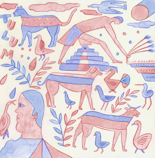

ART SCHOOL | Q&A with LLEW MEJIA
We’re digging the illustrations of artist, textile designer and part time tattooer Llew Mejia, whose beautiful work blends half digital and half traditional mediums to create colorful patterns, influenced by popular art of Mexico and the Southwest. We got a chance to chat with Llew about his art background, his process, his tattooing, and what he has coming the rest of the year–including his recent trip to Taipei for EVA airlines!
MAKE THE LEAP
Photographs courtesy of the artist.
Introduce yourself
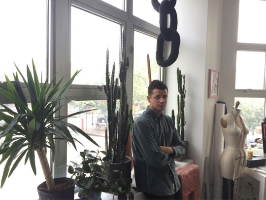
My name is Llew Mejia pronounced LOO MEHIA. I know its a doozy. and confusing. I am an illustrator, textile designer and part time tattooer. But I also just get really into things and have a bunch of hobbies like making chairs or rugs or whatever ceramics I basically just make a bunch of stuff. Some people may not know I live with three cats that look like gremlins with varying degrees of hairlessness haha.
When did you first get into drawing? What were some of your early influences?
I first got into drawing my last year of high school and into the first year of college. I was going to school to potentially be a surgeon, but I ended up feeling that the coursework and overall culture of the school was pretty empty for me and dropped out and applied to an art school in Minneapolis. That’s where my stuff really took off I think. Like most people my age, I was into graffiti and skateboard culture as well as the outdoors and traveling, all of these contributed to my style eventually I think.
What mediums do you love to work with? What are your essential art tools?
It really depends on the work I’m doing for people. Alot of the time it’s half digital half traditional mediums so computer aided gouache and inks for the most part. Alot of sketching and stuff is done traditionally and depending on what the client is looking for I find myself doing a traditional painting of a pattern from start to finish.
How would you describe your work and style?
I would say alot of my style focuses on a certain level of naivety and folkiness. I am fascinated by people’s interpretations of the world around them when they are not classically trained in making art, so I try to incorporate that vision in my artwork. There is a lot of stuff that comes from the popular art of Mexico as well as many other cultures I have seen in the Southwest which is where my family lived for some time.
Describe your artistic process for us.
Again this always depends on what I am making and for who. But alot of the time its super collaborative which is how I like it. Someone may have a vision and send me images and I work closely with them to see how it is we can come up with something we both like. It would probably start like most things I do with a simple pencil sketch of layout of a pattern since thats the majority of the work I do for surf/skate/sport brands and then we both come together on something we mutually vibe on. The final is addressed in the same way with a color palette we both like and a flow /scale of the pattern we both really like.
You’ve worked in various art mediums, which would you say is your favorite and which would you say you’d like to try out?
I think that gouache is definitely my favorite, but it could be a bit finicky, I like how it has alot of variety you can choose to make it really flat or really painterly. I think I would like to dabble a bit more into 3D work whether that be stone sculptures or plaster or something along those lines. I like the tactility of three dimensional work and the weight is satisfying.
What’s the art scene like in New York these days? Who are some local artists you’re stoked on?
Hmmmm that’s a really loaded question, I feel like I don’t pay too much attention to whats going on in the ‘art world’ here or anywhere to be honest, probably to my detriment, but I think now since we are exposed to so much it’s good for you to limit yourself on what you expose yourself to. It can really influence the work you make which for some people may be a good thing, but I dont want to riff off of people too much. It doesn’t mean I don’t go to Chelsea a few times a year for certain shows like the Barry Mcgee show or something, but I do make sure it doesn’t play a huge part in my practice haha I am just trying to live my life ! That doesnt mean there aren't a ton of really talented people in NYC though its really chalk full and oversaturated with talent haha.
What makes you smile when viewing someone else’s art? What is it you’re looking at – composition, color, line?
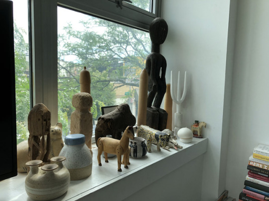
Yeah I think mostly composition and color are pretty important. I think what makes something good is obviously the whole package, but it’s so subjective. I am definitely drawn to unknown or unnamed artists of the past, i.e. folk artists no one pays that much mind to. I collect alot of it so I feel like it’s a pretty important part of my artistic vocabulary and what I find the most interesting.
When you’re not drawing or designing, what are your favorite things to do?
I tattoo during the weekdays too out of my studio. I think it really mixes things up for me, and since I only do my own drawings for the most part, or flash that I doodle it keeps it in my court. I am not making a living off of it, but its a fun part of my life and I love talking with and meeting new people. It fulfills my voyeuristic side and lets me hang out with people while also learning new things about how others live their lives. You can follow my tattoo account @tatu.poepoe
I like drinking beers, walking around, having people over at my house and eating alot haha just a classic dude nothing major.
What kind of music do you listen to when you’re working on something?
I listen to old country like Patsy Cline, Slim Whitman, Johnny Cash, Hank Williams, The Carter Family. Then some reggaeton, trap rap, some podcasts, some Rancheras, all sorts of different true crime because I have the ID channel on sometimes while I work. But really a mix of stuff.
What do you think you’d be doing if you weren’t an artist? What would be your career?
Uhhhh I hope nothing else, but let’s be honest, probably a biologist or something. You get to travel a bit and have a specialty and interact with the world in a way that most don’t.
What are your FAVORITE Vans?
Slip-ons by far they're just so versatile. Dress em up or down or just naked its all good
What advice would you give someone thinking about doing what you do?
DO IT. haha, naw but really you should do what you want and if you're passionate enough then you will succeed at the thing, it becomes your path you know? It sounds corny, but I believe its true.
What do you have going on coming up that you can share?
I just got to go to Taipei with EVA airlines and did some work for them over there for a week and got to explore the city. I am both nervous and excited about the project because I think im going to be on a lil spot commercial on youtube and stuff and I dont usually show myself in that capacity. But either way I am excited to share that with the world.
Follow LLEW | Instagram | Website
166 notes
·
View notes
Note
How do you pick out your colors? Love your art btw!
Hard to say ! I mostly have an idea already when I start sketching (like for example, today I’m sketching two characters in a flower field, I want it to be mostly green with a lot of tiny flowers (which are gonna be hell to line and colour)), and then it’s a mix of knowledge (ex: for that green field, tiny red highlights on the character’s hair could be nice because red and green are complementary colours, and very soft pink shadows could make the thing more etheral which is the feel I’m going for) and pure luck (oh that shade of blue is already out of the box ? well it’s closer to my hand than the one I was originally going for so I’m gonna use it :p) But yeah, I tend to build my drawings around one or two colours that I have in mind when I envision the drawing, so I don’t “pick” colours like you would do on a big digital wheel ! Also to be fair I suppose that I know my pencils very well so it’s even easier to say what’s going to mix well with what, and what it’s gonna look like once I put it in the scanner... (ex blue shadows for a green field ? it might look good on paper but once it’s digitalised there’s a big chance you won’t see the shadows anymore :/)I guess an easy way to pick colours is to look at the scenery for your primary colour (green field) and then the feel of the piece for the other colours (summery ? use yellows and golds. dreamlike ? pinks or pale blues might work. imposing ? grey could be nice to make hard, ray-of-sunlight-in-the-midst-of-storm shadows)
same for characters ! If your character has a “main” colour, you can try to mix it with its complementary colour OR just go with the feel of the piece (a character with white hair will look different with red highlights which might look like blood or danger or stuff like that, than with blue ones which might convey serenity or death or stuff like that !)
Anyway that was too long and wordy and I’m not even sure that’s really useful ^^’ It’s hard to describe what it’s like to “pick” colours especially for me because I tend to just go with the colour I like best at the moment without really looking to be realistic. It’s difficult to hear but really your best ally will be time and practice and if you colour a lot of things then you will acquire certain knowledge of your tools (even digital !!) which will help you paint faster with time ! So good luck I guess ^^’
#text post#art talk#thank you for the compliments on my art too ! i wish i could help you better but the truth is as i said#colours just kinda pop in my head when i start thinking about the drawing#and then i try to see which pencils would bring me closer to what i have in mind...#so hard to say !! i'm so sorry about it#anyway good luck !!#Anonymous#enthusiastic answers
22 notes
·
View notes
Photo

Okay, I remembered that in the last messy sketch, I used the wrong pencil tool. No wonder my sketches looked so weird.
I'm such an idiot sometimes haha Oh well this sketching is a lot more accurate with the pencil tool I normally would use. Except for the few parts I accidentally used the brush to sketch haha. For coloring sketches I still use the brush.
I normally sketch in dark blue, since it is the easiest for me to see. In Lunas sketch I sketched with blue as well and just changed the colored to match with a "filter" option later on.
Anyway was about time to draw Feather with my "labels" meaning the scarf and necklace. I have the necklace somewhere, but I think I lost it. Might buy a new one + a scarf like this (or make a scarf myself)
I'm Feather and I'm nonbinary and an asexual homoromatic person!
+I'm obviously a furry(sfw).
So I named this "Growing up", because it feels nostalgic looking back on my old art and than seeing how far I've come.
Starting digital art around 2013 (with a mouse I might add) and starting to draw with a draw-pad/tablet in 2017.
Writing improved a lot too.
Of course my depression is still there, sometimes almost none-existent and then completely at it, but very much manageable.
I learned how manage it, and despite that, I was once a really annoying kid to people I knew and shy and quiet beyond belief.
I mean I'm still rather quiet, but I wouldn't call myself shy anymore, just unresponsive(to comments etc.) if anything.
Of course I made my fair share of mistakes, but I can admit them now and can swallow my pride, which was hard when I was younger.
I now just throw the same mistakes I made in my face every once in a while so I can reflect, but not forget. So you'll occasionally see desc. filled with stuff like this. I like seeing who I am now and who I was and what I did.
I mean I'm still rather lazy and procrastinate a lot especially in the current Comic, which I can't wait going in hiatus for, so that the next chapter will improved by a huge amount. I really dislike the background, just look at my recent ones, it is just really simple. I really want to learn to draw backgrounds and that will take a bit of time to find something that'll work and looks good. Considering that the next chapters need a proper background, a hiatus (I mean I also have my final exams soon) is a good choice. And might as well finally read the book about how to make comics I had bought months prior. That should help quite a bit!
So the only new thing that I've started to do with Feather is changing the hair up, since I started the I am the man meme, in which I drew it like that, and it stuck haha
On my current situation tho:
-Last year of school! Meaning I'm about to write my final exams!
-Temporarily going to open two types of commissions soon, I'm still writing the Terms of Service for both.
-One is art, the other is Translations between English to German and German to English.
-I've been applying for an apprenticeship as an IT. Tho I'm still applying and got some rejections so far.
-In which I'm debating to start freelance early with license etc. if I cannot find a job in the IT-branch I want to work at, at all.
I hope I don't have to resort to that tho. It does suck that I'm having psychology as my main subject in school and not IT, which in turn comes to bite me in my application. Oh well I'll keep trying, I've just started applying, so I'm sure there are still plenty of chances.
-So between exams/studying and stressing over finding a workplace I think I'm doing fine, stressed, but okay.
-Covid vise ->As I normally don't go out and pretty much live somewhat like a shut-in I am pretty unaffected mostly
-shopping sucks a bit, since I have to take a shopping cart in as well(I don't shop alone, I drag my brother with me)
-I noticed how unhappy I was with continuously wearing a mask on school ground. I don't mind the mask that much, it is necessary, it just sucks that my glasses can't really "be on the mask" if you get what I mean, meaning it was quite troublesome and straining to look through my glasses, not to mention that they were foggy most of the time :/, so that was really unpleasant for me. (I am not able to see without my glasses! I got about -4 Myopia!) Ok I admit, this part was more of a rant, but when you sit 8 h with your mask on with these problems, it just is not fun. I'm much better now, now that the holidays have started. But my fellow people, wear your masks! Our suffering is nothing compared to those that can potentially die from covid, or perhaps anything else we might be carrying!
0 notes
Note
3,9,11,13,17,18,19,32,39,46,51,61,75? ^3^
3: what random objects do you use to bookmark your books? - Hair ties, metal wire, pencils, receipts, phone, paperclip, i can’t remember anything else.
9: do you like singing/humming to yourself? - Yes I do! I do that all the time wether it be in class or at home doing dishes. My friends know that I sing a lot, but i haven’t been singing as much as I used to (even though its a nice stress reliever).
11: what’s an inner joke you have with your friends? - Granite but pronounced as gran-night. X33
13: what’s something that made you smile today? - Seeing my cat cuddle with me when I woke up! She is a sweet heart.
17: what color do you really want to dye your hair? - Maybe either pink and purple or blue and purple.
18: tell us about something dumb/funny you did that has since gone down in history between you and your friends and is always brought up. - Back in highschool I brought a Kazoo on the day that the Super Bowl was happening. We were all in the library watching the super bowl on TV (or socializing) we ate food that the other students brought in and it was fantastic because we did nothing at school. Anyway, I was kayoing various songs and my friends were going nuts cause I Rickrolled them and my other musical friend joined in and it was hilarious.
19: do you keep a journal? what do you write/draw/ in it? - I do keep a Journal, but I only write in it (as it is digital). I mostly use it to vent and document my feelings and my life’s progress. Think Anne Frank but less tragic.
32: tell us a story of something that happened to you after 3AM when you were with friends. - Hmmm. Im not sure I have any of those. I didn’t have much female friends in highschool and only two sleep overs over the span of middle school. And my friends now all kinda go to bed early. *shrugs*
39: what color do you wear the most? - The colors I seem to wear the most are blue, red, and black/grey according to my laundry lol.
46: tell us the worst pun you can think of. - How does an astronaught cut his hair?
….. eclipse it!!!!
51: think of a person. what song do you associate with them? - I thought about my middle school and high school friend, I always associate her with “the sun goes down, the stars come out” song because she showed us the Halo parody of it that was p good.
61: what’s the stupidest gift you’ve ever given? the stupidest one you’ve ever received? - I think maybe last christmas I made a matching bracelet to the homemade necklace my sibling made for my mom. Both were made out of blue yarn and I made my gift for her literally like the night before. She says she liked it but I still felt bad about coping out. The stupidest gift I have ever been given? Now I try to appreciate all gifts that people have given me, because ppl put thought into the gift and I appreciate it. However there was this one christmas I had at my grandpa’s that one of my relatives (who did not know me much at all) got me this singing snow white doll even though I was 12 years old. It sang and light up, but I didn’t know what to do with it cause I didn’t really play with dolls and I also didn’t like it when things were too girly. It boils down to I didn’t like it because she assumed that since I was a young girl that I would like a glowing and singing snow white impersonator. I don’t know what happened to it after that.
75: tell us about your pets! - you have no idea what you have unleashed (lol). My girl cat, Bella, is the smallest of the bunch. She is really shy, and easily startled (we think its because she was rescued from an abusive owner before we got her). The first few years with her she just kind of existed and we didn’t know how to approach her, we could only pet her head because some one had previously shaved off her back fur and she was sensitive about it. It wasnt until i started living a there during the school season that I started to know her personality, and had the chance of bonding with her. She is now around six or seven years old and most of her PTSD has gone through that time. We can now pet her back too, but she still loves being pet on the head the most.She likes to cuddle with me any chance she gets, wether I am sitting at the table or laying in bed. Bella also likes to hang near me if my spot doesn’t allow her to lay in my lap. She is the one who does the feets pictures with me! The cute lil shrimp. She is a sweet kitty even though she poops on the floor from stress caused by the other pets.
Our biggest male cat, Mister, is also a sweet heart and a few months younger than Bella, he loves sweets and when someone is emotionally distressed he goes to them and tries to cheer them up. Some of his favorite foods include: beef, italian dressing (like me lol), chicken, fish, salad, ice-cream, lunch meat, popcorn, cheese, milk, basically any ppl food (and don’t worry, we only give him enough to taste). He is fat yet he has the muscle for carrying himself around, as he walks you can notice his muscles rippling and he can sprint really fast (think professional boxer). Doesn’t like to be touched unless he wants to be, and gets overwhelmed easily if you pet more than his head. He also greets people as he goes in the room or if they enter a room and gets meows excitedly if he’s getting a treat or he gets to drink from the sink (if he notices me heading toward the bathroom he will run after me just for sink water). He is a big lug that likes his personal space.
Our runner up biggest cat, and youngest by a year, is a male named Blue (after his eye color) he is very social and would readily approach strangers. He is a mama’s boy cause any chance he gets he would cuddle with my mom. Dominant over the other cats. Meows for anything, he will stare up at you and meow for attention and is very persistent in having the food bowl filled at a specific time in the early morning. He meows the loudest and longest, if you have something he wants he will bug you endlessly until you are done with eating or cooking. Loves to play fetch. This kitty is also the most photogenic and basically poses in everything he does accept for pictures. If you try to take a picture of him he will deliberately turn away from the camera and not sit still. Blue is also noise sensitive, he hates loud noises like the hairdryer and the vaccume cleaner, as well as sudden loud sounds. Overall he is cute, approachable, and very full of himself.
Thank you for the ask!! ^u^
3 notes
·
View notes
Text

This week, I had the pleasure of interviewing Niina Eveliina, creator of the webcomic Numb. Check it out after the cut.
Me: Can you share a little about yourself as an artist?
Niina: I see myself as a storyteller more than anything. Art is a perfect way to bring those images to life. I truly enjoy the eternal process of learning art and seeing the improvement. Comics have always been a major part of my self expression, but I'm also sucker for just drawing and painting sole illustrations. Mostly traditional stuff even though I'm slowly trying to take over digital as well.
Me: Could you give a brief summary of Numb?
Niina: Numb is a peculiar tale of different people who all yearn for connection, in some form or another. Levi and Susan are lifelong friends who seem to have drifted apart since those long summer days. One thing that specially rubs them the wrong way is the mysterious case around their friend Tim, who's not around anymore. Then there's Nikita, mischievous ghost who only Levi is able to see for reasons yet known. However, all of them are equally unaware of an otherworldly being, a sinister one, that's lurking closer and closer.
Me: Who is your favorite character--and why?
Niina: Levi! He has that childlike wonder in him that really hasn't had a chance to shine yet in the comic, but wait and see! He's a total sweetheart.
Me: Who is your least favorite character--and why?
Niina: Oh man...I know this is corny, but I cannot pick one. I really do love them all. I don't think I'd be able to write a character and continue having them around if there'd be even a tiny hint of dislike in my heart for them. And by this I don't mean they're all such a good people and deserve all the hugs. But I do love them as characters; they're all very interesting and fun for me to work with.
Me: What is your favorite part of the creative process? The least favorite part?
Niina: Favourite parts are definitely storyboarding, drawing the expressions and coloring (I used to hate it now it gives me life). Least favourite: Lettering and editing.
Me: Is it harder or easier to do your comic traditionally?
Niina: Easier. I find it way harder to make good looking digital art.
Me: How have readers reacted to your characters and story thus far? Are there any challenges that you’ve had to overcome when working on Numb?
Niina: So far based of what I've heard, Amy, Susan, Levi and Nikita are someone's favorite. It makes me happy to see so many of them are being liked. It makes me feel I've succeeded on making them all their own person. As for the current happenings on the story, there has been few upsets, but understanding ones. The story goes where it's gotta go. Challenges would be grammar and doing dialogue. I'm not a native speaker so it can come off as awkward sometimes, but I have helpful commenters who point out the mistakes so I can fix them fast! Other struggle is always with the art. It's improving, but I still have long way to go.
Me: Do you translate into English from Finnish when working on your comic? Or do you write directly in English?
Niina: Directly in English. It's easier that way since the languages are so different.
Me: What do you want readers to take away from your story?
Niina: Whatever they get from it, really. I like it when people come up with their own interpretations so I avoid making too on-point story just to make speculating more interesting. I feel best stories are those that leave you guessing a bit.
Me: What made you decide to pursue webcomics as a medium to tell your story?
Niina: Well I felt it was the fastest way to get the story out there, I was dying for getting to tell it! Also I know the story is a bit.. weird. So I'm not sure if I would have change with a publisher. Maybe I will try it once I've made enough pages.
Niina: Another thing is that I think this is excellent way to build your audience and get readers that are easy to interact with. That's my favourite part of webcomics.
Me: Who is your “intended” audience?
Niina: Hmmm.. fans of a bit weirder stories I'd say!
Me: Do you have any advice you want to share with other artists and writers?
Niina: Produce quality content and be on schedule with it. Also patience, some things take time.
Me: What tools do you use to create your comic?
Niina: Pencils and watercolors with A3 paper. After scanning I do the final adjustments and lettering in Photoshop.
Me: When does Numb update?
Niina: Every Monday and Wednesday.
You can read Numb at its main site, Tapastic, SmackJeeves, and Web Toon. Follow Niina at her social media sites: Twitter, Facebook, Instagram, or Tumblr. You can also check out her portfolio site here!
This post has been adapted from a Twitter interview. Check out my previous interview with Merriam Hayden and if you’re interested in sharing your thoughts or having your own interview, be sure to get in touch!
4 notes
·
View notes
Note
You mentioned you drew historical figures back in school? I didn't know you drew as well as writing beautiful things. I would love to see some of your artwork one day, if that's okay with you?
Oh boy I’ve uh... drawn since I could pick up a pencil. I drew before I started writing, and it was my main thing for a long time, but then writing became my main focus, and it has been for almost a decade now.
I still love art in all its forms, and I do draw on occasion, but it's been less and less as the years go. Partially because I drew as not only a form of creative expression, but of relief. It was a hobby, a passion that I could be solely devoted to without involving anyone else unless I chose to, and it didn’t depend on anyone else to be done. It allowed me to escape the real world, which was mainly school that I drew in, and I needed that since school was a very traumatic time for me. Less so for college, but it was still very stressful, and my social anxiety demanded an outlet. It’s always been art in some form.
But now that I haven’t been in school for a while (I’ve been trying to get back in but, it’s complicated), and I’m at home with my computer, this is my outlet. Digital art never took off for me; I never learned it at a young age, I never got the chance to learn it while I was still heavily an artist... and I’m just not nearly as good with a tablet as I am with just a pencil and piece of paper. I’m very simple with my art when it comes to mediums; I rarely color, sometimes I outline, mostly it's just sketches. Just a pencil and paper was all I needed, ‘cause often that was all I had to work with.
That said, I’m very much more proud of my writing than my art. I know my writing could actually be competitive in a financial market (or at least I hope so; I have confidence, and I always have in my writing). For my art, I’m very much aware that even if I have talent, it is nowhere good enough to be a commercial artist. I did do commissions a little like 5 years ago, but that was mostly pixel art. With a mouse. I’m not saying this to be ‘my own worst critic’ or to be hard on myself or whatever; I’m being realistic, where I know how to compare the value and talent / skill of my own artwork, vs that of other artists who are commercially successful. It’s a hobby, and a fun one, but it has nothing more to it.
And oh my god it gets tiring when people, especially older adults, see your art and they’re like ‘OMG you’re so good, you should do this as a career, blahblah!’ I hate to be blunt or rude but, in my head I’m always like ‘That’s because you’re not an artist. You very likely suck at art and couldn’t tell a Da Vinci painting from a muddy footprint, GTFO.’ People without artistic background or talent will always think your shit is good, because they don’t have it. So, yeah, gotta be realistic about these things.
That said, most of my art is old, I haven’t finished a drawn probably in at least a year or two. But I could probably dig something up if you guys wanted. Just don’t expect, y’know, anything fancy, psh.
#seriously you will be disappointed if you get your hopes up lmao#but that is really nice of you thank you <333#also wow sorry for the little transcript there#Anonymous#skyler answers
3 notes
·
View notes
Photo
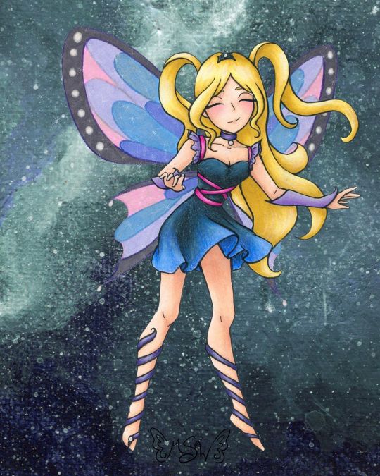
Fairy Enchanting
A bit later than I expected, but here we have the art that I used for the examples on my Commission Sheet!
(Unoriginal title is unoriginal and also a pun based on "very enchanting")
When I started thinking about putting together a commission sheet in the first place (which was something I wanted to do for the new year, as before I was just using a lengthy pricelist), I knew that I wanted to make a piece of art specifically for it and track my progress as I went, so that I would have an example for each stage in the process I take commissions for. And for the art, I more or less wanted to "go all out" since it's supposed to be an example, and I figure the example needs to be as close to top-notch as possible. Admittedly, I probably could've done even more than this, but me being me I procrastinated and ended up having less time to work on this that I initially expected, so...
In deciding what the drawing would be, I also decided to return to my roots a little, and a do fairy as an homage to back when I used to do Winx art all the time. Likewise, as Enchantix to this day is my favorite transformation from the show, I drew heavy inspiration from it, and I'm sure that's so obvious that if you know the show I probably didn't have to point it out to you.
Anyway. I actually didn't start completely from scratch with the sketch; I re-used this pose from a previous sketch I did that never saw a full-finished piece. I liked that other sketch okay, but it didn't feel like a "finish me" project. I did have to alter the feet because the original sketch was made with feet for ballet slippers (bigger heels, more rounded/curved toes, etc.) and much later on in the process I ended up angling the leg on the left more outward, as that felt more natural for the direction I was taking this new sketch in.
In sketching all the bits that make this sketch otherwise unique from the old one, as I mentioned, I was taking heavy inspiration from Enchantix. One of my favorite parts of the transformation has always been the leg-wrap/barefoot sandals, for reasons I can't explain. So those were a must. I also really like how the Enchantix outfits tend to be short dresses that are more form-fitting at the top and more flowy and soft at the bottom. Here, I decided to bring the ribbony look on the leg wraps up into the bodice, and to frame the collar/shoulder area I used a sleeve & choker style similar to what I did for the dress for Ink Dance, which itself was based on a dress I actually own and love to pieces despite never getting a chance to wear it because of how fancy it is. The main difference for both of the drawing versions is that I skipped the lace overlay that connects the sleeves and choker, mostly because both pieces are traditional and drawing lace/mesh traditionally, especially when it's so teeny, is a nightmare I do not want to engage with. And the choker part fits nicely, as in Enchantix each fairy has a necklace (usually a choker) that holds their fairy dust bottle. I'm not sure if this fairy has one or not, but she very well could!
Enchantix usually has long gloves, but I altered these to be shorter and fingerless (more like Magic Winx or Believix gloves) since this fairy is also based partially on myself, and I'd be more likely to wear that kind than the full-length formal gloves. And for the hair, as is maybe obvious, I was primarily inspired by Stella's for her Enchantix, since I've always loved that part of the transformation sequence for her's.
Also, even though it doesn't look that way on my commission sheet, IRL I drew only one wing and left it separate, off to the side, to make positioning and flipping it easier.
Once the sketch was done, I did try inking it traditionally/by hand once, and I just really wasn't happy with how it turned out. And I also realized I had drawn the skirt billowing/ruffling in completely the wrong direction anyway; It was moving to the left when it should've been moving to the right like the hair. So I had to take time out to fix that.
As opposed to wasting more paper trying to ink traditionally after that fiasco, I instead went with what had been my gut instinct anyway; I scanned the sketch in and did the lines in Photoshop.
Well, most of the lines. I was a dumb-dumb and when I did the lines for the wings, 1. it took forever because they're large curves everywhere and 2. I used a slightly bigger brush than for all the other lines, as I had mistakenly thought I was going to be re-sizing them significantly and the lines would be altered to for me when I did that. When I realized that wasn't the case, I did not want to have to redraw most of those curves again and risk not being able to get the right a second time. So I ended up booting a copy of the wings I'd already done into Paint Tool Sai and made use of the linework layers to redo the wings without having to draw the same line fifty times. Then I booted that back into Photoshop and adjusted the wings to be angled/aligned with the rest of the lines as I saw necessary. It was also at this point that I played around with positioning the leg on the left more outward than what it was on the sketch and ended up going with the position you see here.
I could have then gone back and added weight to the lines in some places, but at this stage, I was already thinking that I wanted to print the lines out and use my digital lines to hopefully get cleaner traditional ones, as opposed to just printing the lines off outright. (Mostly because I wanted to use some super thick mixed media paper that I would bet serious money will not go through my printer.) That's what I ended up doing, and I have to say that attempt went a lot more smoothly than me trying to ink from the original sketch. And once I had the initial lines done, then I went back and thickened them in certain places.
And I should probably mention here that the wings were a little tricky to figure out how to handle traditionally, as that's not something I've had to do very often. I ended up using my clear stardust gelly roll when I did the normal inking, and then, later on, I used colored pencils to go back over the outlines before coloring them in.
After doing some tests, I started coloring with markers for the hair and skin, and a little colored pencil for some blush. I tried to get a little more bold with the shading than I usually do, which I'm sure still looks pretty tame compared to most. But I'd rather the shading be too light than too dark.
Originally, I thought I was going to do all or mostly all of the coloring with alcohol markers. (Sidenote: is it just me or does it seem like there’s a lot of alcohol marker related stuff going on in the art world lately??) But then I did some testing with the lines I originally inked and didn’t like, and was reminded why I normally don’t use alcohol markers for gradients like the one on the skirt...frankly, I’m not very good at them...yet. Even though the test went better than expected, I still wasn’t happy with it.
Then I tried a few more tests with watercolor, and that didn’t fare much better. Watercolor would’ve worked if the gradient wasn’t also supposed to be shaded, I think, but trying to shade it without using another supply wasn’t working.
That left me with good ol' tried and true colored pencils. But colored pencils are relatively slow and textured, and I didn't really want that for the skin. The texture would've worked for the hair, but I didn't want to make the time investment for it either. And so I ended up sticking to my mixed media instincts and I used the colored pencil exclusively where I had to (on the dress so I could get the gradient for the skirt right) and then I used alcohol markers everywhere else, shading and all.
With the alcohol marker doing most of the work, then I came back and added additional shading/highlights with the colored pencils as needed to everything except the skin. I added blush, but otherwise, I was quite pleased with how the skin turned out and didn't want to touch it for the risk of ruining it.
The dress is supposed to be black/really dark gray, but I did brighten it up a bit with some of the blues from the skirt gradient as opposed to pulling out specific grays, so it definitely looks/feels more navy in the final product.
Although my relatively dark/saturated color choices for her outfit made figuring out what to then do with the wings more challenging.
I didn't want the wings to be the exact same colors as the rest of the drawing, because then they'd blend in too easily and be too distracting from the rest of the piece. But at the same time, I wanted them to match/look like they belong. (Again, similar to how the wings are in Enchantix)
After some back-and-forth testing and a LOT of color sampling, I decided to color the wings in with alcohol markers in colors that were similar to her clothes but overall lighter/more pastel and outline them and the sections inside the wings again in colored pencil. Most of the colored pencil is slightly darker than the marker colors I picked, but I went with purple for the black/gray rims of the wings because I thought a dark gray or black would be too harsh.
I'd already decided I wanted to do a slightly more complex background digitally, but even with that in mind, the traditional drawing still felt like it was missing one more thing after that. Namely, the wings didn't seem special enough.
I realize that sounds a little weird; I was just talking about how I didn't want the wings to be too distracting, but I think there is a delicate balance to having them be special in the way fairy wings should be while still not overpowering everything else. And I'm not sure I achieved that, but I at least tried to.
Though not a perfect solution, I ended up adding some metallic watercolor on top of the "true" (less purple-y) blue and pink sections on the wings. You can't really tell here on the scan, and what little you can appears to be the wrong color, but in person, both colors now how a lovely pink or blue sheen to them when you move the picture in the light. (The metallic paints, in this case, are very opalescent, so they're almost completely transparent when you see the flat color despite still have a really pretty metallic sheen in the light.)
After that, I felt there wasn't much more I could do traditionally, so I scanned it and moved on to that background.
At this point, I was kinda pressed for time because me being me, I had unintentionally put making my commission sheet off to the last minute. I really wanted to have it finished before the ball dropped on New Years' Eve ("new year, new me" and all that jazz), and I still hadn't finished my example art by sunset time the day of. So I had to keep things moving.
Early on, I'd had the idea to either digitally make a slightly more complex (but not too complex; I wanted to keep at least a little of the sanity I have left) background or perhaps make a special watercolor piece to use as the background. Unfortunately, I just didn't have the time for that anymore if I wanted to have the commission sheet finished by my self-imposed deadline. (And if we're splitting hairs, in theory, I could still go back and change the background if I wanted to, for reasons I'm about to go over, so of all the things to get rush-cut that's really not so bad.)
What I ended up doing instead was taking some of the left side of my Starfall Mountains painting (I was looking for a background-type thing I'd already done/made that would suit this drawing or that I could quickly tailor to make it work, and I'm just as surprised as anyone else that this frustrating tiny painting ended up being the one I liked best of my options) and I blew it up to comfortable cover the background here, flipped it around so the colors would flow a bit better, and used the hue/saturation slider to make it more of teal color for a little more contrast.
But of course, there was still just one more thing missing, even after all that.
After a little tinkering, I decided I didn't like trying to making the wings transparent (I could do it, I just didn't like the way it looked in this case), so I went in and added a touch of sparkles digitally to both tie them more into the piece as a whole and to give them a little more pizzazz.
And finally, blessedly after all of that, the artwork was finished, I was very happy with it, and I could move on to making the actual commission sheet.
I have to say, for as rushed as it was towards the end, I do really like how it turned out. More particularly I like just how blended both digital and traditional art ended up being here. To me, this is the next step beyond what I was able to do for mixing digital and traditional art with my Doodle Moon piece, and if I weren't currently in the middle of a tablet crisis, I'd really want to do more with this concept of going back and forth between the two on one artwork. However because of the tablet situation, the thought of really trying to do that right now kinda fills me with dread, so we're gonna have to wait a little while on that.
I do also really like the anatomy/proportions in this. Which is not something I normally feel comfortable saying.
It's not the best art I've ever made or anything, but looking at it makes me happy. It's good to see it finished and it's good to think of where a lot of the ideas for it came from. (Re: Nostalgia for my life a few years ago)
I'm not sure if I will since it kinda counts but also kinda doesn't(?), but I'm tempted to put this and some of my old Enchantix drawings up on the "Draw This Again" template, just to show how far I've come. I'm still thinking about it, we'll see.
Speaking of "we'll see," I got word that the sketchbooks from the contest I made Designiest Design for back in October are finally in, which means the prize packs should be sent out anytime now! I'm excited to see how the sketchbooks turned out and get my hands on the Powder Pack and see how said powders work! I was admittedly starting to wonder how that was coming along, so that was some good news and a nice surprise I'd really been needing here lately. Rest assured, there will almost definitely be an art piece talking about that stuff once I have it in my hands!
____
Artwork © me, MysticSparkleWings
____
Where to find me & my artwork:
My Website | Commission Info + Prices | Ko-Fi | dA Print Shop | RedBubble | Twitter | Tumblr | Instagram
#fairy#enchanted#enchantix#enchanting#fae#faerie#magical#magical girl#magic#winx#winx club#galaxy#space#mixedmedia#digital art#traditional art#alcohol markers#colored pencil#acrylic#photoshop#photoshopcc
2 notes
·
View notes
Text
Best Apps For DIY Home Renovations
With more and more technology being introduced into home renovations, why are we still doing processes the only fashioned way? With more cell phones in homes then computers, it only makes sense that the first resource most modern DIYer’s will reach for is the one in their pocket. With Android and iOS cell phones, DIYer’s have access to an unlimited number of resources to help, such as calculators, websites, video tutorials, augmented reality and apps galore. With so many different options out there, which is the best option for you? That is why we are going to take a look at 14 of the best apps for DIY home renovations.
Best Apps For DIY Home Renovations

14. Apple Measure App
Now included in all devices running iOS 12, Apple’s Measure app is a quick way to get an approximate measurement of an object. By utilizing augmented reality and the hardware within your iPhone, the app can allow you to know the size of anything.
With the ability to gauge the size of objects quickly, it also automatically can detect the dimensions of rectangular objects, as well as save a copy of the measurement photo for reference in the future.
In addition to the ability to measure objects, the app also includes a built-in level utility, thanks to the iPhones accelerometer. See if picture frames are hung right or if flat surfaces are level.
13. Woodcraft
Have you ever stuck staring at a pile of lumber in the middle of Home Depot, trying to imagine what the finished project is going to look like? We know we have many times! That is why we started to use Woodcraft. Costing $27.99, Woodcraft allows us to quickly draft up a visual model of what we are imagining before we lug around that massive 6”x6” beam.
By combining together CAD files and 3d elements, you will be able to design your project quickly, generate a bill of materials, export a shopping list and eliminate wood waste.
12. Woodworking with the Wood Whisperer
Learn from the one and only wood whisperer! With 100’s of articles and projects at your fingertips, there will undoubtedly be something that catches your eye. With detailed, step by step guides and in-depth videos, enjoy having the entire wood whisperer’s catalogue of work at your fingertips.
11. I.D. Wood
How many times have you stumbled across an unidentifiable piece of wood? Be it working with used pallets from your workplace or your friends leftover wood from their garage? With over 200 different woods in its database, I.D. Wood is one of the apps that every woodworker needs in their pocket.
10. Woodmaster
After going back and forth with my brother if we should call this app the swiss army knife for woodworkers, we’re going to let you guys decide for yourself. With more features you can shake a stick at, we love having the board foot calculator as well as the conversion feature in the palm of our hand.
On top of that, we use the fractional calculator option all the time when sizing up boards and the screw size charts when determining the correct hole size. The only major complaint we have with the app is the waste of space on some of the screens. Ideally, we would like to see more information on the length converter or fraction pages, as opposed to only the top third being used.
9. Color Capture
With any kind of DIY home renovation, you will need to have the best app for choosing the perfect color. Most likely at the point in your project where you have to finish it. Typically, this is done through stains, clear coats or our favourite, paints. This last one though is a bit of a nightmare if you have to match an existing colour. That is where Color Capture by Benjamin Moore comes in.
Just take a picture of the original colour and the app will show you what it thinks the colour is. With over 3000 different paint colors, you shouldn’t have an issue finding a match, and if you ever need to match the colour again in the future, the app has a built-in photo library so you can save all your matched colors.
8. Basic Angle Finder
We love this app for 3 main reasons; ease of use, convenience, and cost. Firstly, this app does what it sets out to do; find the angle. Start off by setting your phone starting position, then just moving it around horizontally or vertically will calculate the angle of movement from its starting position. We find this app is great when we are in a pinch and need to see if our saw blade is true to our cutting service or fence.
7. The Home Depot
Bring the entire Home Depot product offering to an optimized user experience makes this a fantastic app. Search by product description, SKU, or barcode for any product possible in the store. If you need some inspiration, the app also included a few dozen How-To guides, ranging from toilet installation to wall painting. The best feature is having your order done through the app and having it ready for pick-up at your closest store. The cons of the Home Depot app were the slow loading times, but we know that also depends on your download speeds.
6. Laser Level for Walls and Surfaces
Most DIYer’s will find themselves having to hang some form of artwork on the wall, be it painting, photo or something else. You finish hammering in the nail, place the art on the wall and step back to see it is hanging way too far to the left! That is where we resort to the Laser Level app. Laser Level gives you a digital grid on your screen to help align anything you would like. Finally, get your favourite picture collage on the wall in alignment or hang your recent vacation photos. We do find there is a bit of a lag between the grid lines on the screen and the image being shown through the phone’s camera. So we suggest just taking a second to make sure it’s hung right.
5. Magicplan
This app is a new one to me, even though it has been around the app store for quite a while now. I was talking with my wife about what size our baby’s nursery was going to be for a DIY home renovations project. So we started chatting about what features we want to change when I realized I need to have a floor plan of the existing room for reference. So I dig out my tape measure, ruler, paper, and pencil to start creating a scaled down floor plan. As I was halfway through crawling on the floor with my pencil in my mouth and my tape in my hands, my wife takes out her iPhone and starts stitching together a floor plan of the room on her phone! I was surprised at how accurate the measurements were (for our use case, it was perfect!) We did not get a chance to use the estimate and reporting features for this app, mostly because our use did not need it, but they are available for your convenience.
4. The Woodshop Widget
We know that the woodmaster app included on this list does share a lot of the same features as The Woodshop Widget, but what we use on a monthly basis it the Shellac calculate. It is fantastic being able to mix or dilute the exact amount needed to complete our projects without the worry of getting the ratio wrong. With us being metric in Canada, we don’t have to worry about converting the manufacturer’s instructions from Imperial anymore, as the app does it with an easy tap
3. WoodH2O
Greenwood, dry wood, Kiln wood, there is an abundance of different moisture content levels of wood across any and all species of wood. But at the end of the day what moisture content do we want for our projects? That is where WoodH2O comes in. WoodH2O provides DIYer’s of any size a simple, easy to use EMC Calculator. Also, it includes tips & tricks, as well as solutions for everyday moisture related issues, such as cupping or crowning, wood finishes, end splitting, and much more.
2. Pinterest
We know Pinterest can be a polarizing subject for a lot of DIYer’s out there since people are becoming desensitized to the amount of work goes into creating a beautiful reno. On the other hand, though, Pinterest is a fantastic place to find inspiration for new projects, especially with its visual layout. So remember, the next time someone says they exclusively build with 2x4s and pocket holes, everyone has to start somewhere! This one might end up being the best apps for DIY home renovations as it is a constant source of new inspiration.
1. The Notes App
The notes app is easily the best apps for DIY home renovations on our phones. Period. Having the ability and convenience of a readily accessible way to jot down ideas at a moment’s notice has been a blessing more times than we can count. We also love the ability to draw out an idea with the different options quickly. So the next time you are walking through Walmart and see something that you can easily recreate for half the price, write a note! That way, you will not forget it.
There you have it! The 14 best apps for DIY home renovations that are available right now. If there are any apps that we missed and you feel should be included on this list, let us know in the comments below. We love to hear from you all about what apps you use!
0 notes
Note
Any suggestions for aspiring artists?
(i included some examples of my own art, a lot of it is older art from around 2015-2017, i am a little better now I'd like to think lol)
ok my first tip is draw every day, i say this as someone who literally drew every day for almost 17 years of my life and stopped after graduating and im rusty as hell and trying to get back into the groove of things rn. even if its a quick couple of doodles on snapchat, or on your arm, or in mspaint, draw something. It does keep your skills sharp and just doing that will help you improve.
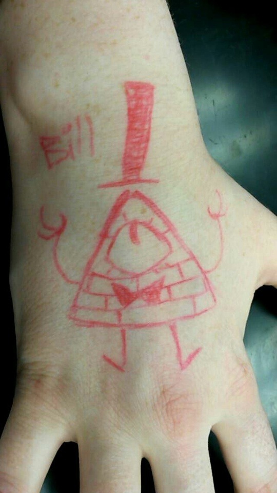
my next thing is only relevant if you draw people, so if you only make art of scenery, animals, cars, or something else nonhuman, skip this one. okay for artists who draw people: diversity IS important. No matter how good your art is in terms of presentation, one skinny white model does not a good artist make. Any artist who can draw the same person over and over again is not a good artist. If you can't draw people of color, people with differing body types (skinny, fat, muscular, any mix of the three) people with physical disabilities, women that arent just big doe eyed and pixie nosed, etc. etc. then you need to challenge yourself and learn to draw varied people, which brings me to my next point

step out of your comfort zone AND use references! there is absolutely nothing wrong with using references, especially when drawing something new to you. Tracing/copying a reference photo will help you get the feel for whatever youre drawing and will make it easier the next time bc of muscle memory. Then you can redraw it and adapt that first drawing into your own style once you understand the basics and flow of whatever it is
(these two i had to use references on, the left one moreso)

Also use social media! use tags! get your art out there! post frequently even if its just something small just stay active (i know this part is hypocritical of me but its true)
uhhh lemme see
something a lot of artists are scared of is accidentally copying other artists, but everyone gains influences from somewhere its literally unavoidable, as long as you're not blatantly copying or tracing someones whole thing and claiming it as your own, youre usually fine. taking little bits and pieces from the cartoons i watched as a kid is how i developed a style early on, but your brain will take influences without you even noticing sometimes, it happens and you arent a fraud or anything I promise. Also fanart is still valid art and can help gain a following so nothing wrong with posting it either!
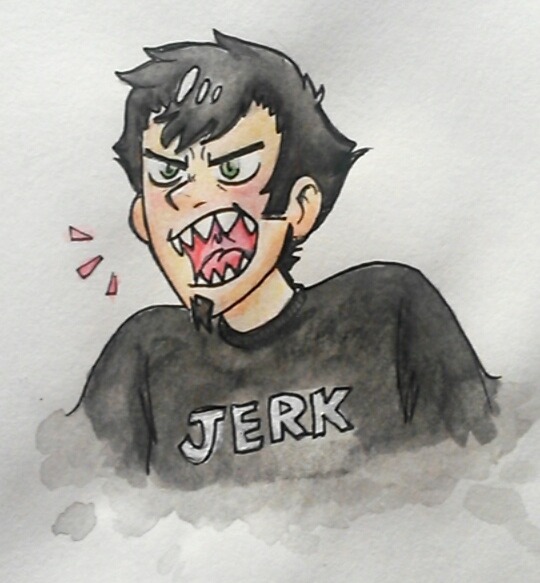
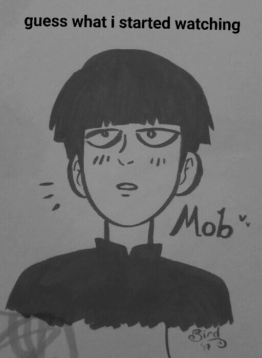
i would also recommend experimenting with mediums and styles a lot if youre able to! its good to know a variety of skills even if you only plan on doing one thing, still just take a chance you might like a technique or process from a different medium that you wouldnt have had access to before. just in this post my art has been in pen, marker, watercolor, pencil, acrylic, and digital, and now i know which ones are my favorite and which one will work the best for how i want a given piece to look!
And its okay to not just have one art style! its also okay to have one main style you excell at! its whatever works for you, as long as it makes you happy to create your art. Being a good artist is about finding a balance between challenging yourself and still creating what makes you happy! Also sorry since this is mostly about drawing, idk if youre a painter or sculptor or anything, but im speaking from personal experience rn, it still applies to any form of physical art tho!
Anyways sorry it took me so long to answer and its so long winded, im a gemini with adhd so im physically incapable of making it short! But thanks for even asking me artist anon! I wish you nothing but the best in your artistic endeavors! ❤💕💓💖

6 notes
·
View notes
Text
Robyn Flannigan

• hi robyn, can you tell us more about you ?
I live in Newfoundland, Canada. I taught myself to draw at the age of twelve, and by the time I reached high school I decided I wanted to make a career out of it some how. There was a Graphic Design course offered at a local college and, though I didn't know much about design, I decided to enrol. There were only a few illustration courses through out the program, but learning other areas of art helped me create a stronger and broader creative foundation. I spent the past four years working as a Graphic Designer. During my evenings and weekends I practiced illustration as much as I could. May of 2016 I finally got up the courage to post my work on social media. The positive feedback from my followers have been a source of motivation to keep creating and keep learning.
Je vis à Newfoundland au Canada. J’ai appris seule à dessiner à l’âge de 12 ans et depuis que je suis au lycée je sais que je veux travailler dans ce domaine. L’université locale proposait un cours de design graphique et même si je ne m’y connaissais pas vraiment en design, j’ai décidé de m’y inscrire. Il y avait seulement quelques cours d’illustration prévu dans le programme mais apprendre d’autres choses en art m’ont aidées à me créer une base créative plus large. J’ai passé les quatre dernières années à travailler en tant que Graphic Designer. Pendant mes soirées et mes weekends, j’ai travaillé l’illustration autant que j’ai pu. En Mai 2016 j’ai finalement eu le courage de poster mon travail sur les réseaux sociaux. Les retours positifs de mes followers ont été une source de motivation pour continuer à apprendre et à créer.
• what medium do you generally use ? (ex: acrylic, digital etc..)
I like to make digital illustrations, as It's much easier to adjust colour schemes and details late in the creation process. My architecture illustrations were made using a mouse and Adobe Illustrator. I picked up an iPad Pro and an Apple Pencil a few months back, and I've been drawing everything on it since.
J’aime créer avec le digital, c’est beaucoup plus simple pour ajuster les couleurs et les détails. Mes illustrations d’architecture sont créées à la souris sur Illustrator. Cependant, il y a quelques mois j’ai acheté un iPad Pro et un apple pencil et je dessine absolument tout avec.
• do you have favourite subjects ? with which one do you prefer to work the most ?
My favourite subject has always been people. Mainly women. It comes very organically for me to draw them. Chances are, if you see me mindlessly doodling, I'm drawing the beginning features of a face. Second to people, I practice drawing a lot of buildings and scenery as a sort of art study.
Mes sujets préférés ont toujours été les gens. Principalement les femmes. Ça vient très naturellement pour moi, de les dessiner. Lorsque je dessine sans réfléchir, les chances sont grandes que vous me voyiez dessiner un visage. Après, je dessine beaucoup des bâtiments et des décors, c’est comme un genre d’étude.

• do you have any particular method to work ? a planning, rituals, a playlist ?
My concept creation is very inconsistent, but undoubtably the most enjoyable part. A lot of my more meaningful work was thought up while under the influence. Everything I make starts out in my sketchbook. I think better with a pencil in my hand. Once I have a solid line drawing, I scan it, and trace over it digitally. During most of the process, I listen to music. It helps me get lost in the creation process. New Wave, synthpop, and shoegaze music are my preferred genres.
La partie où je conçois mes idées, mes concepts est très irrégulière, mais sans aucun doute la plus agréable. Tout ce que je créé a d’abord été dessiné dans mon carnet de croquis. Je réfléchis mieux avec un crayon dans la main. Une fois que j’ai une bonne base de dessin, je scanne le tout et je le redessine sur la tablette. Pendant la plupart du temps que je travaille, j’écoute de la musique. Ça m’aide à me perdre dans mon processus de création. La new wave, le synthpop et le shoegaze sont mes genres de musique préférées.
• can you describe your work space ? do you work in any other place sometimes ?
I have a little home office that I do most of my drawing in. I share the space with my lion head rabbit, who keeps me company while I work. The room itself contains many shades of green. I live on an island in the Atlantic, and we don't get much sun here, so having a lively office keeps me sane. I like keeping books on colour, design, and illustration close to me while I work. It's very windy where I live, but occasionally, it calms down and I get to sketch outdoors.
J’ai un petit bureau à la maison où je fais la plupart de mes dessins. Je partage cet espace avec mon lapin à tête de lion qui me tient compagnie pendant que je travaille. La pièce en elle- même a beaucoup de teintes de vert. Je vis sur une île dans l’océan Atlantique qui n’est pas très ensoleillée. Donc avoir un espace de travail vivant m’aide à garder un esprit sain. Parfois le temps est clément, alors je vais dessiner à l’extérieur.

• where do you find your inspiration to create ? (internet, books, nature..)
I've always turned to the internet as a source of inspiration. It's an endless pool of talent with so many styles to admire. When I first started getting serious about illustration, I was influenced by the beauty of the old buildings downtown. I had seen flat illustration styles online, and I wanted to apply that style locally. My recent work is taking me down a new path. I'm trying to create more work based off of my own life experiences and things that fascinate me, like horror movies, nature, mystery, metaphysical ideas, and my own personal reasons for needing feminism.
J’ai toujours cherché sur Internet pour trouver de l’inspiration. Il y a tellement de gens plein de talents avec des styles complètement différents à découvrir et à admirer. Quand j’ai commencé à me mettre à l’illustration de manière sérieuse, j’étais influencée par la beauté des vieux immeubles du centre ville. J’avais vu des illustration en flat design sur internet, et j’avais envie d’essayer. Mes travaux récents m’emmènent vers un nouveau chemin. J’essaye de créer plus de contenu basé sur mes expériences de vie et des choses qui me fascinent, comme les films d’horreur, la nature, les énigmes, les idées métaphysiques et mes propres raisons pour lesquelles j’ai besoin du féminisme.

• do you think that women artist should be more represented in general ?
I read a few articles recently on sexism in the art world. I naively hadn't even considered the sexism in my own industry until reading about it on a broader scale. My post-secondary class was composed of mostly women, my first boss in the design industry was a woman, and the majority of artists I follow online are women. So, it wasn't until I started stepping outside my own experiences that I could see the big picture problems. To answer your question, I think women artists should be represented more in general. I also think that women, like myself, owe it to themselves to raise their expectations for better treatment in the art industry, and do whatever they can to help each other become better represented. Much like what Women With Pencils are doing.
J’ai récemment lus quelques articles sur le sexisme dans le monde de l’art. J’ai, naïvement, jamais fait réellement attention au sexisme de mon propre milieu jusqu’à ce que je lise dessus et que je m’interroge à ce sujet de manière plus large. Mes classes en études post-secondaires étaient composées presque uniquement de femmes, ma première cheffe dans l’industrie du design était une femme et la majorité des artistes dont je suis le travail sur internet sont des femmes. Donc, ce n’est pas avant que je commence à me sortir de ma propre expérience que j’ai pu voir le problème de manière générale. Je pense aussi que les femmes, comme moi, se doivent d’élever leurs attentes pour être mieux traitées dans l’industrie de l’art et doivent faire ce qu’elles peuvent pour s’aider à être mieux représentées. Un peu comme ce que Women With Pencils fait.

• the colors you use are always really soft and harmonious, how do you manage to keep this harmony in your illustrations ?
I'm pretty sensitive to colour, so try to pick palettes that are not overwhelming to the viewer. Soft colours like pastels and muted tones are my go to. My favourite art movements to draw palette inspiration from are probably Art Deco and Impressionism.
Je suis très sensible aux couleurs, donc j’essaye de choisir des palettes pas trop vives. Les couleurs douces, pastels et assez éteintes sont mes favorites. Mes mouvements artistiques préférés pour les couleurs sont probablement l’Art déco et l’impressionnisme.
• what architecture inspires you the most when you draw buildings ?
I really like old buildings, and particularly, I really like squares. It's an odd thing to say, but that's what I like about capturing buildings. Drawing architecture has taught me to reduce everything down to it's most basic shape, and then add from there.
J’adore les immeubles anciens et particulièrement les carrés. C’est bizarre à dire mais c’est ce que j’aime le plus lorsque je dessine des immeubles. Dessiner des bâtiments m’a appris à d’abord les réduire un maximum à leur forme basique puis à rajouter des détails à partir de là.

• do you have any plans, projects, dreams for the future ? (if you can talk about it)
I have some pretty big dreams for the future. I started taking ceramic classes recently. I'm trying to combine my illustration with home decor. One day I'd even like to have my own small studio and shop. I really want to create beautiful, functional art for the average person, and maybe take illustration jobs on the side. In the short term, I'm working towards developing and defining my personal style. I hope someday, my work can be easily identified among a sea of global artists. At the moment, I'm working on a new print that's themed around a very meaningful song to me. I've been wanting to make more music-inspired art for a while now, so the fact that I'm finally getting around to it is exciting.
J’ai de gros projets pour l’avenir. J’ai commencé à prendre des cours de céramique récemment. Et je commence à mélanger mes illustrations avec les décorations d’intérieur. Un jour j’aimerais même avoir un petit studio et une boutique. J’ai vraiment envie de créer de jolies choses, de l’art fonctionnel pour les gens et j’aimerais aussi, pourquoi pas, faire des petits boulots d’illustration en même temps. À moyen terme, je travaille surtout à développer et à définir mon propre style. J’espère qu’un jour mon travail sera facilement identifiable parmi celui d’autres artistes. En ce moment, je travaille sur de nouveaux prints qui s’inspirent d’une chanson qui veut dire beaucoup pour moi. Ça fait longtemps que j’ai envie de créer de l’art inspiré par de la musique. Donc le fait que je m’y mette enfin me rend vraiment contente.
• can you tell which women artist inspires you the most ?
Emily Haines is my biggest influencer among illustrators, designers, ceramists, actors, musicians, etc. She is my favourite female artist. I've always felt that her music gives a voice to our gender, and on a more personal level, she's validated a lot of the uncertainty and discomfort that comes with being female in an unequal society.
Emily Haines est ma plus grande influence parmi les illustratrices, designer, céramistes, actrices, musicienne etc.. C’est mon artiste féminine préférée. J’ai toujours eu le sentiment que sa musique donne une voix à notre genre, et à un niveau plus personnel, elle a prouvé beaucoup d’incertitudes et d’inconforts qui sont présents lorsque l’on est une femme dans une société inégalitaire.
• most of our audience are beginners in illustration, do you have any messages/advice for them ?
It's easy to get caught up in comparing yourself to other creatives. Learning to admire different art styles without becoming consumed by them will lead to a healthy relationship with your work. I'm not exactly sure who said it, but when I'm in doubt about my abilities, I remind myself of the following quote. "You have to be willing to be bad at it in order to get good at it."
C’est facile de se laisser aller à se comparer à d’autres créatifs. Apprendre à admirer différents styles artistiques sans être « consumé » par eux vous aideront à avoir une relation saine avec votre travail. Je ne suis pas sûre de qui a dit ça mais quand je doute de mes aptitudes, je me souviens de cette citation «Vous devez être enclin à devenir mauvais pour devenir bon. »
Thank you Robyn for answering our questions !
Follow and support Robyn Flannigan : Instagram | Etsy | Website | Facebook
0 notes
Last Seen Blogs

smasterilli-patterns
Smasterilli - cross stitch, felt, sewing
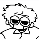
chaoticsamson
Cogwork Plural
chaoticsamson
Cogwork Plural
chaoticsamson
Cogwork Plural
chaoticsamson
Cogwork Plural