#stylised mouthes
Text
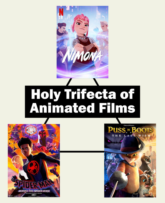
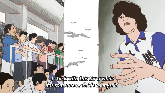
I can't keep being fundamentally changed as a person by animated movies, it's just not sustainable.
#animation#animated film#animated movies#across the spiderverse#across the spider-verse#spiderverse#puss in boots#puss in boots the last wish#puss in boots 2#nimona#nimona film#yes i'm posting this specifically because i just watched nimona and am feeling all kinds of things but really these are all PEAK TIER#the fact they have ALL been released within 7 months of each other...like...woah we are thriving right now#stylised animation with its own unique style reflecting the movie i love you forever kissing you on the mouth#films that make me ferally rip up any and all art blocks to shreds#and that's just the animation side of things#i won't get started on the plots. they also make me want to bounce off of walls#hugging all these close to my chest#as well as all the other great animated movies that exist because animation wins all catergories for me always#(let's not forget anime movies either; y'all are beautiful too! keeping 2d animation alive and i'm so here for it)
31K notes
·
View notes
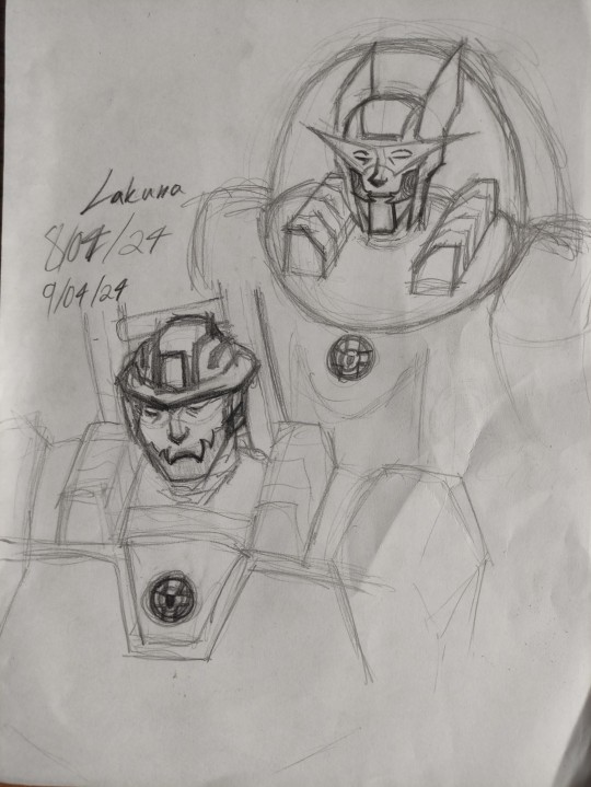
Text

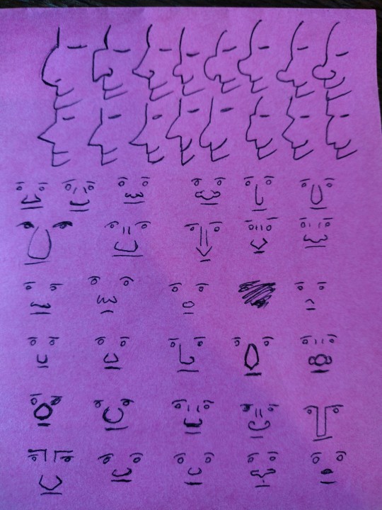
Testing out my anatomy-drawing skills which are all thanks to Eiririnn (aka goddess of art tutorials)
#sketch#sketchbook#art#anime#animeart#stylised art#animeartbutproportionate#teeth sketch#mouth sketch#semirealism#drawing#traditonal art
18 notes
·
View notes
Text
Calling it a night and I'm going to try and fall asleep before 2 in the morning
#and i want to ramble in the tags because eh i guess chatty mood#one thing i am quickly noticing looking at a few covers of spider-man & venom related stuff#is that the spider-man white-eyes design is so fucking cool actually#that's one thing that i am absolutely 100% on the comics side for#those white eyes just do Not look the same if they're not drawn in 2d#their design is so fun they feel so expressive#i feel like i did when i drew that like dozen of little bill ciphers making different faces#like i just unlocked a new thing you can do with your art and it's on my level and i need to try it out#i feel too sick for drawing though#when into the spiderverse came out and people were posting spidersonas i remember vaguely wanting to join in#but i feel like only now am i truly having the epiphany of how neat his suit looks#and i really do Not like the direction they took it in the movies#like the realism of it is kind of a turnoff for me#i like the way it looks in a 2d drawing but less the more realistic vibe of movies/recent video games#i love stylised shit!!!!! i love when stuff is stylised and works in ways that wouldn't necessarily work well irl!!!#i love the lack of texture and the textures you only get from a drawing#the fucking eyes...... i love those eyes#also i think i could be sold on the big pointy needle teeth venom has haha#i'm not too big into tonnes of teeth - two/four yeah i love vampires#but the mouthful of teeth was just a little too much for me at first#but the more i see it the less i find it yucky#i showed my friend a picture because i am incapable of being normal#and they were like oh he's so scary!!!#i got used to it personally and i just saw a style of vfx i'm not super fond of#ANYWAY. i love talking. if someone wants me to be background noise in vocal chat one day i love doing that#wow i have a ramble tag now
5 notes
·
View notes
Text

no way . four of them ?? thats so cool .
#lev.png#hyperfixation.txt#blood cw#<- mild ?? ig??#spider cw#(thanks shamura /j)#this is why i was screaming about having to draw a squid earlier#fuck you kallamar (/complimentary)#leshy is Short (tm) to me . ok .#'im going to try to not stylise them too much' - past me. past me lied#also yes i made leshy's mouth very tiny and visible in their usual form . it mildly bugged me how they didnt have a visible mouth when-#-heket is based around speak no evil and not leshy . ik its just bc his mouth happens to be aligned with his eyes but . shshshsh#animal list btw bc i tried to make them all actual animals (sorry to kallamar tho i couldnt rlly be bothered .) -#leshy is a bagworm but its not very obvious . his fur is actually moss#heket is a demonic poison frog#kallamar is just. some kind of squid still . idk if theres any blue squid species#and shamura is a purple tree tarantula :3#ok tag ramble over
11 notes
·
View notes
Photo

Towards a Transformation of Reality By Michèle Coudert “Artistic work is essentially #individual. Being part of a group such as the #DF Art Project allows me to access a #professional, yet #external outlook, #one which is objective but also benevolent. #United we stand! With my #stylised and #hybrid #figures, I wish to focus on an eye, an exchange of glances, sloping towards the #mouth that invites #dialogue. The #bridge of the #nose, the #shape of the #eyes, #arabesques which delimit the head like horns of #crowns, these make us think of #augmented reality. These faces aim to #foster a link between my imaginary world and that of the spectator. The geometric shapes assemble in fragmented forms to create diagrams and patterns. The mix of materials, sometimes sources of light, recomposes the figure in a mosaic of effects and colours, caught between abstraction and figuration. The face is one of the first points of contact with another. It expresses an emotion, tells a story, true or false. These singular figures are visual fairy tales that each can claim as their own.” Vers une réalité transformée Le travail artistique est par essence individuel. Faire partie d’un groupe tel que DF Art Project permet d’avoir un #regard #extérieur professionnel, objectif et en même temps #bienveillant. L’union fait la #force. Avec mes figures stylisées et hybrides, l’attention converge vers l’œil, dans un échange de regards, et vers la bouche qui invite au dialogue. L’axe médian du nez, le trait des yeux, les arabesques qui terminent les têtes comme des cornes ou des couronnes, renvoient à une réalité transformée. Ces visages cherchent à créer un lien entre mon imaginaire et celui du spectateur. Les formes #géométriques s’assemblent en #volumes fragmentés qui créent des plans et des reliefs. Le mélange des matières, parfois une source #lumineuse, #recompose la figure en une mosaïque d’effets et de couleurs, entre #abstraction et figuration. Le #visage est un des premiers contacts avec l’autre. Il exprime une émotion, #raconte une histoire, vraie ou fausse. Ces figures singulières sont des contes visuels que chacun peut s’approprier. » (at Paris, France) https://www.instagram.com/p/CnXwUlvLy-h/?igshid=NGJjMDIxMWI=
#individual#df#professional#external#one#united#stylised#hybrid#figures#mouth#dialogue#bridge#nose#shape#eyes#arabesques#crowns#augmented#foster#regard#extérieur#bienveillant#force#géométriques#volumes#lumineuse#recompose#abstraction#visage#raconte
3 notes
·
View notes
Text
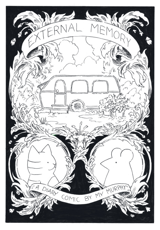
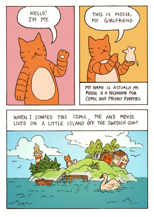
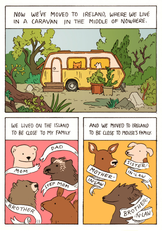
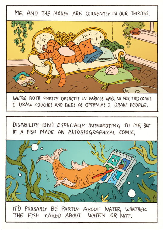
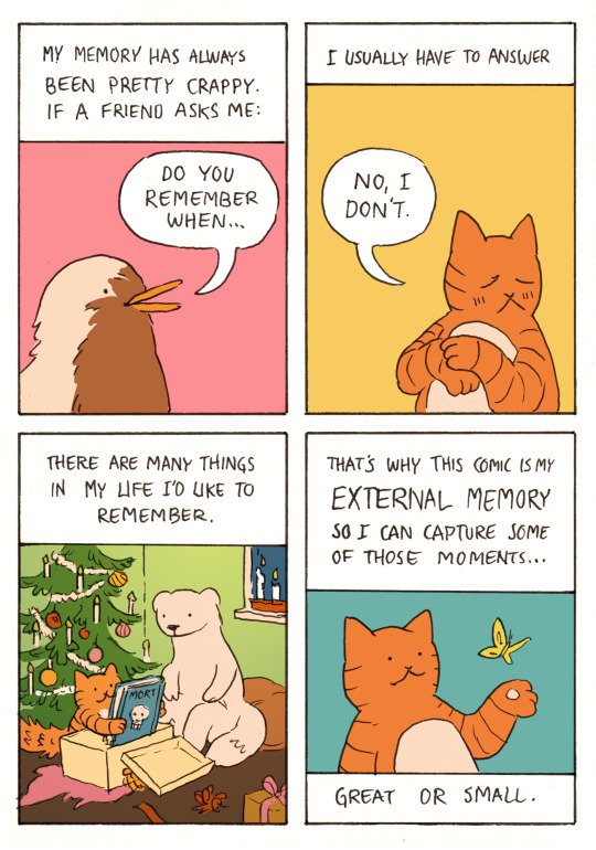
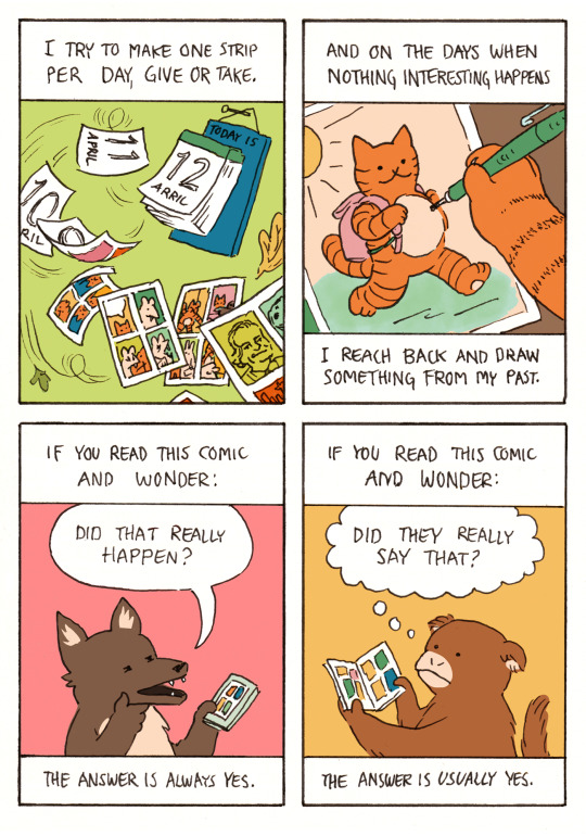
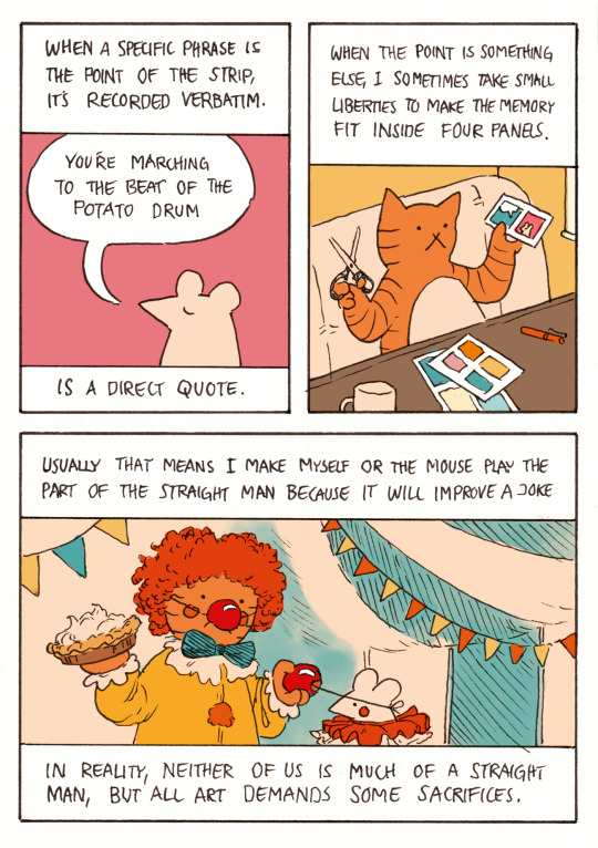
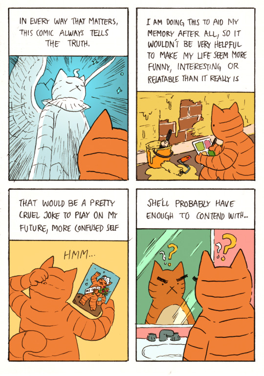
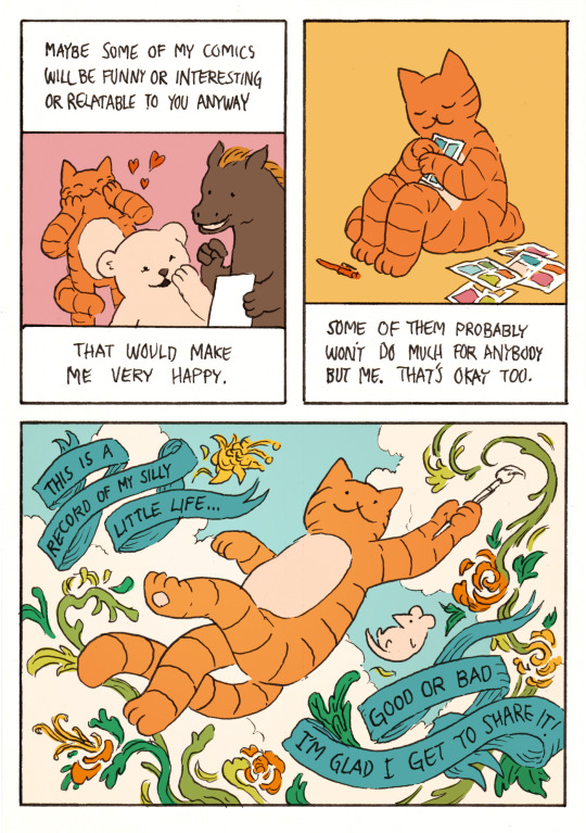
Image description:
A black and white illustration, designed to look like a book cover. On a decorative ribbon, the title at the top reads “External Memory”.
A scroll work border of leaves and flowers divides the illustration into three rounded panels. The largest panel is in the center and shows a caravan surrounded by greenery, puddles and potted plants. The two smaller panels beneath it show a cartoon cat and mouse respectively, facing each other.
At the bottom is another decorative ribbon with the text “a diary comic by My Murphy”.
After the cover follows an 8 page comic. The style is cartoonish and the colours are soft pastels.
Page one:
An orange cat waves and says “Hello! I’m My.”
The cat holds up a white mouse and says “This is Mouse, my girlfriend.”
Caption: My name is actually My, but Mouse is a nickname for comic and privacy purposes.
Caption: When I started this project, me and Mouse lived on a little island off the Swedish coast.
The panel shows a stylised, tiny island with a lighthouse, spruce and birch trees, leaning houses and a little dock with a row boat tied to it. The cat and mouse are standing on the cliffs and a swan floats on the water in the foreground.
Page two:
Caption: Now we’ve moved to Ireland where we live in a caravan in the middle of nowhere.
A small caravan, surrounded by greenery, overgrown trees, rocks, puddles and potted plants. The caravan has two windows and the cat and the mouse are looking out of one window each.
Caption: We lived on the island to be close to my family.
A ribbon with writing on it separates and labels four characters: “mom”, an ermine, “dad”, a wolverine, “brother”, a marmot and “step mom”, a squirrel. The ribbon has been torn in between “mom” and “dad”.
Caption: and we moved to Ireland to be close to Mouse’s family.
Three characters are shown, each with their own ribbon label. “mother-in-law”, a deer, “sister-in-law”, a jack russell terrier and “brother-in-law”, a hedgehog.
Page three:
Caption: Me and the mouse are currently in our thirties.
The cat lounges on an antique fainting couch and the mouse sleeps on a cushion on the floor. On the floor is an open bag of “let’s” crisps and a laptop.
Caption: We’re both pretty decrepit in various ways, so for this comic I draw couches and beds as often as I draw people.
Caption: Disability isn’t especially interesting to me, but if a fish made an autobiographical comic…
A fish under water paints a four panel comic with a brush held in its mouth. The panels the fish has painted show bubbles, waves and splashing water.
Caption: …it’d probably be partly about water, whether the fish cared about water or not.
Page four:
Caption: My memory has always been pretty crappy. If a friend asks me:
“do you remember when...” The question is shown asked by a red robin
Caption: I usually have to answer: “no, I don’t.”
The panel shows the cat giving this answer while looking away and blushing.
Caption: There are many things in my life I’d like to remember.
Mom the ermine watches as the cat opens a Christmas gift in front of a Christmas tree. The cat is much smaller than usual, its tail is bushy with excitement and it holds up a big book, “Mort”, with a skull on the cover.
Caption: This comic is my EXTERNAL MEMORY so I can capture some of those
moments…
The cat admires a butterfly hovering above its outstretched paw
Caption: …great or small.
Page five:
Caption: I try to make one strip per day, give or take.
Pages with dates written on them blow off of a daily wall calendar by a strong breeze. As they turn over, comic pages are revealed to be drawn on the back. One comic shows the mouse with long fangs, biting the face of the cat and then hissing behind a bat wing. One comic is a pastiche of Tim Buckley’s “Loss” comic and one features a portrait of Frasier Crane and the Seattle skyline.
Caption: and on the days when nothing interesting happens
A close up shows the cat’s paw drawing a comic panel. In this panel a smaller, rounder version of the cat runs happily in the sunshine carrying a backpack.
Caption: I reach back and draw something from my past.
Caption: If you read this comic and wonder:
A coyote looks at the comic on its phone, strokes its chin suspiciously and asks “did that really happen?”
Caption: the answer is always yes.
Caption: If you read this comic and wonder:
A monkey reads the comic in zine form and think “did they really say that?”
Caption: the answer is usually yes.
Page six:
Caption: When a specific phrase is the point of the strip, it’s recorded verbatim.
The mouse says “you’re marching to the beat of the potato drum.”
Caption: is a direct quote.
Caption: When the point is something else, I sometimes take small liberties to make the memory fit well inside four panels.
The cat sits at its drawing table, holding a pair of scissors in one hand and a paper with two comic panels in the other.
Caption: Usually that means I make myself or the mouse play the part of the straight man because it will improve a joke.
The cat and the mouse, dressed as clowns, stand in a circus tent. The cat pulls the clown nose from the mouse’s face and holds up a pie, ready to strike.
Caption: In reality, neither of us is much of a straight man, but all art demands some sacrifices.
Caption: In every way that matters, this comic always tells the truth.
The cat looks up at a large, glowing, winged sphinx statue version of itself. The statue and framing is a reference to the all knowing Southern Oracle from the film adaptation of “The Neverending Story”.
Caption: I am doing this to aid my memory after all, so it wouldn’t be very helpful to make my life seem more funny, interesting or relatable than it really is.
The cat draws a comic while watching paint dry on the wall.
Caption: That would be a pretty cruel joke to play on my future, more confused self.
The cat scratches its head at a drawing of themselves as the winner of a beauty contest, wearing a sash and crown, waving to the crowd and holding flowers.
Caption: She’ll probably have enough to contend with…
The cat looks suspiciously at its own reflection in the mirror, not recognising it. The drawing is a pastiche of a panel from the webcomic “Gunshow” by KC Green.
Caption: Maybe some of my comics will be funny or interesting or relatable to you anyway. That would make me very happy.
The cat smiles and presses its paws to its face in joy, seeing that a bear and a horse are reading the comic together and laughing. Cartoon hearts float over the cat.
Caption: Some of the comics probably won’t do much for anybody but me, but that’s okay too.
The cat presses a page of the comic to its chest, looking contented and protective.
In the last panel, the cat and the mouse are floating on air with a blue sky and white clouds behind them. The cat is smiling and twirling around, holding a paint brush out like a wand. From the brush flows paint that swirls around the two figures and making shapes of green leaves and orange and yellow flowers.
On two looping blue ribbons appear the last captions:
This is a record of my silly little life. Good or bad, I’m glad I get to share it.
End ID.
Here’s a little introduction to External Memory! It was fun to make a proper neat and full colour comic - it’s been a while ^^
(If you like this project, please reblog this post! You can also subscribe to my patreon where I post one comic every day ^^)
#comic#comics#original comic#web comic#webcomic#diary comic#slice of life#autobiographical comics#journal comics#comic artists on tumblr#external memory comic#slice of life comic#apologies for the long post tumblr does that any time I put in tags for some reason#described#long post
2K notes
·
View notes
Text


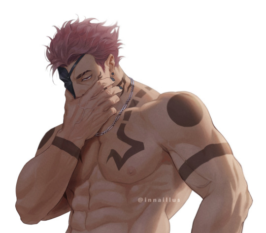
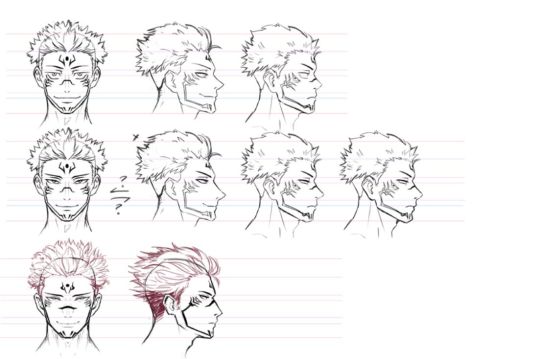
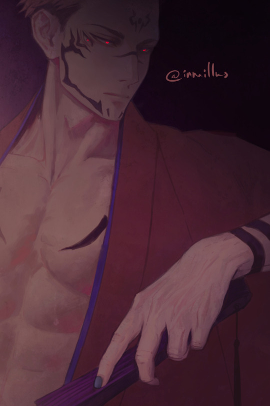
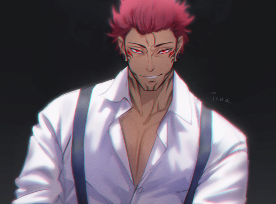
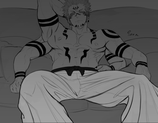
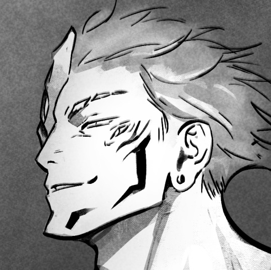
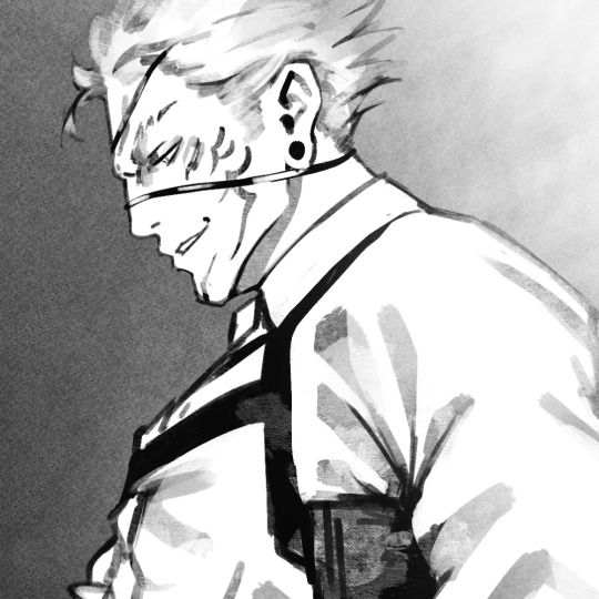
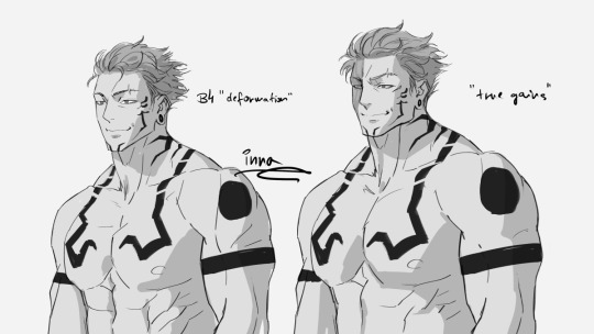
Drawing Ryōmen Sukuna
Development notes
This post has been in the making since last year, before the manga has reached its current arc. My aim was to respond to comments that pointed out that my version of that time didn't look like the one in the anime.
I calculate everything I do and the way I do it. My current goal is to share my thoughts on the development of my take on him - simply because I'm a nerd when it comes to anatomy and I love figuring things out. It involves a lot of thinking, questioning, analysis, dissecting information and building theories. So I totally understand if it's not anyone's cup of tea.
MANGA SPOILER WARNING
The very beginning
I used to have a serious case of lack of self-confidence. My earliest art of Sukuna dates back to 2021, but it always felt like my skills are not worthy of this particular character. I never shared my art. I was also struggling to find my artistic voice. I was obsessed with the idea of semi-realism, but even if I managed to pull it off after weeks of stylisation practices, I didn't like the results.
Due to personal reasons, I stopped trying to draw him for a long time.
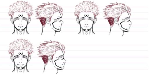
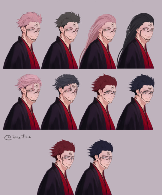
The development of "my" version
It was an entirely conscious decision to draw him differently.
The top reasons for the change was that I didn't want to sexualise him in his host, Yuuji, who is a minor. Back then I thought he inflicted the deformation on himself (extra limbs, eyes, etc), for the sake of efficiency, and I was curious what he looked like before that - or what he would look like in a civilised environment.
During the process, I considered a number of factors:
the beauty standard of the other JJK men - I wanted him to fit the lineup - his original appearance made him stand out quite much
in a setting where he adheres to the rules of society, more or less, I believe his MBTI personality type (ENTJ) would dictate a lot of his choices when it comes to appearance, at least to a certain extent. I thought he would choose to have an appearance that fits the beauty standards of the era
I kept his tattoos because it's a very distinguishing feature of him, but I also exercise freedom in the way I draw them, to make them as stylish as possible
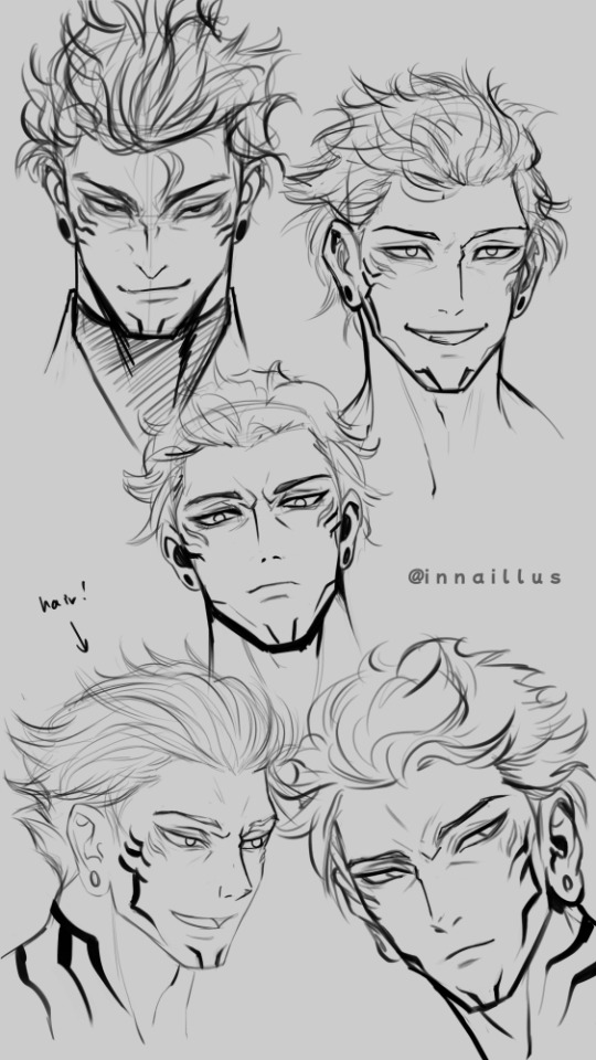
Reincarnation
I used to believe once he reincarnates, his proportions would be closer to that of a "normal" human, even if he has some extra limbs. However, his size and features are above and beyond of what we are used to, and even the story emphasises their malformed appearance. So a a whole new era of Sukuna started in my art. I chose my favourite manga panels of him and mix-and-matched the most attractive features into a figure that I consider on the fine edge of monstrosity and unconventional handsomeness.
Even when I draw him with a regular number of limbs, I keep his usual mass and proportions. I dubbed this form "true gains" form.
I also realised that some of the tattoos Yuuji's body displayed was a product of the partial reincarnation stage, like we see it on Tsumiki's forehead.
NOTE: Did anyone notice that Sukuna is getting progressively more and more human/handsome in the manga? When he took over Megumi's body, I also noticed that as the story progressed, he started to look older and more mature. I'm curious of it was a conscious decision.
Twin dilemma and speculations
According to the Japanese wikipedia page, the mythical figure Sukuna could have been a conjoined twin. Despite my extensive digging in the matter, I was shocked by the recent lore drop.
My question: what does Sukuna look like in a universe where he did not absorb his twin in the womb during development?
It hasn't been confirmed, but I find it very possible now that he was born with his extra limbs, eyes and mouth, as well as the deformed, wide features. (...as opposed to my first theory about him altering his own body for the sake of efficiency)
This, however, would mean that in a universe where both him and his brother are born healthily, he would look different. There is the obvious lack of extra arms, eyes and mouth - but I believe he would also be closer to the JJK beauty standard of men, as far as proportions go (eg. more narrow face, anime-esque nose, larger eyes).
At first I was hesitant to accept this idea, as I'm very attached to the 4-arm hulk / "true gains" form now, but then I realised: this would mean that "my"version of him actually has logically explainable place in at least an alternate universe.
Thank you if you got this far.
I may edit this post later. Let's see where the story takes us.

237 notes
·
View notes
Text

[id: a text post by @/oldwomanyaoi reading “do you think love can bloom between a guy who looks like O_O and another guy who looks like =_=”, followed by three stylised sketches of martin and jon from tma based on those by astrelle/mothcharm. the first pair show martin looking disconcerted and jon looking irritated, a cigarette in his mouth. the second pair show martin irritated and jon with wide, teary eyes. the last show martin smiling and blushing and jon, with many extra eyes, gazing at him lovingly. end id.]
i do. and what’s more i think they can be ambidextrous. i mean bisexual. i mean-
954 notes
·
View notes
Text
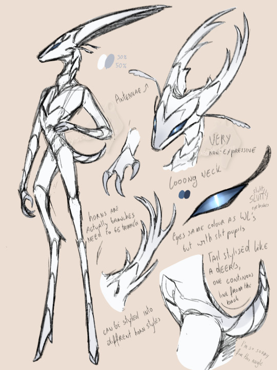

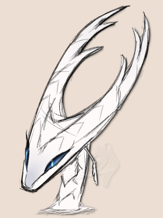
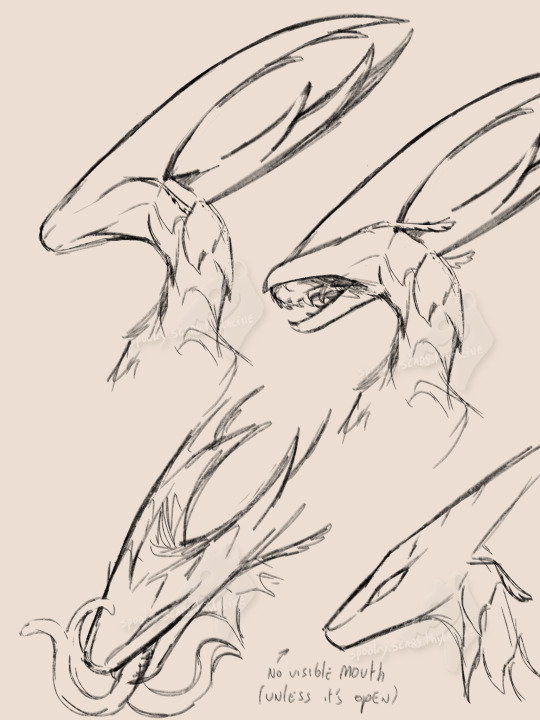
A plant/dragon hybrid who tries very hard to blend in with their bug civilians (and fails miserably at it)
(the second pic is just to show how far their markings reach)
Transcript of what's written on the doodles:
Antennae
VERY non-expressive
Looong neck
Horns are actually branches, need to be trimmed
Can be styled into different horn styles
Eyes same colour as White Lady's but with slit pupils
Slutty, SLUTTY eyelashes
Tail stylised like a deer's, one continuous line from the back
I'm so sorry for this angle
Mouth not visible (unless it's open)
#hollow knight#pure vessel#the hollow knight#hk thk#thk#spooky arts#'hm if I have antennae and my body's segmented that's enough to blend in with my citizens right?' no. No it is not.#If I don't give characters eyelashes I WILL explode. Doesn't matter if they're a bug or a plant. Put eyelashes on that bad boy#ALSO. I JUST REALISED THAT THE RIDGES ON THEIR NOSE FORM A HEART. NOT INTENTIONAL BUT I LOVE THAY#Tried to capture what would look like major uncanny valley vibes for a bug in HK
471 notes
·
View notes
Text
fwiw if you want to introduce more variety to how you draw faces I strongly suggest thinking really hard about noses
noses give you so much information about someone! they're usually one of the first things which define how we think of someone's face (after all - they're by far the feature that takes up most of it).
They change as we age - they take up more of our faces and move away from our mouths. babies almost all have round little tips of noses with no definable bridges, while depending on the type of nose an adult has they may get bonier and sharper or softer and flatter with age. nostrils widen, skin creases, eyes drop back from the bridge. I think often people try to age faces by putting wrinkles around an unchanged nose and it throws stuff off.
They're also a really racialised feature. like there is no one Black Nose or East Asian Nose or Desi Nose or White Nose, obviously, there's huge variation within and across ethnic groups, but there's a lot of overlapping trends in nose shape for different ethnicities and it's often a big contributing factor to people drawing characters of colour that kind of look like palette-swapped white people? like there are so many nose shapes that are super common but because they're relatively uncommon for white people, they're just not the noses people often learn to draw as standard.
but also a diversity of noses says so much about a character, the same way that their build or eye shape or face shape does. like. a long sharp narrow nose in a bony face? a round, slightly flat nose on a face full of smile lines? an upturned, softly rounded nose with freckles and no bridge? a long hooked nose with a curved tip? a crooked, broken nose? a bulbous, reddened nose? noses can imply strength, weakness, innocence, experience, childishness, wisdom, suffering, whatever you want to get out of a character design. don't neglect the nose!!!!
and like. obviously depending on how stylised the art is there's going to be information lost, but that's the thing - there's a real upper limit on how much variation you can put in eyes or mouths or face shape in simpler styles without making it overly realistic, but you can go really nuts on nose shapes! even with just one or two lines or one simple shape you can imply so many different noses by changing little things!
and yet really often I look at people who are trying to broaden variety on faces and they mix up everything except the noses, which stay like a circle or a triangle or a line or whatever their standard noise is, and as a result there's still this sameness to all the faces.
bc eyes and mouths and jawlines are all very well but noses are, in my opinion, the most varied part of the face. I can't think of any two people I know who have the same shape of nose except maybe me and my identical twin.
(and I'm not talking big Vs small, or hooked vs snub vs straight vs flat. really look at people's noses in real life cause there are so many variables)
(some leading questions under the cut)
how big is it? how long from the front? how far away from the face does it sit in profile?
does it have a rounded tip? how round? some people's noses have a profile that's basically a triangle point, some people's are basically a round tip with no visible cartilage above it, and everything in between.
What's going on at the bridge? in profile, is there a clear dip in between the brow and the bridge of the nose, or does the brow come straight down to meet it (or, if you have a kind of striking profile like Hangman Adam Page who looks like an early 2000s DreamWorks character, is your profile one line from brow to the top of your nose)? from the front, is there a clearly defined edge to the bridge of your nose or does it curve out? how much of the space between your eye sockets is nose, on a range from 100% to 0%?
What shape is the top of the nose in profile? Is it a straight line from bridge to tip? does it curve down? does it curve up like a ski slope? does it come to a sharp stop and angle out into a round tip?
does it have sharp edges? does it look bony, with a pronounced ridge? or is it all soft lines? Does it meet the cheek at an angle or at a curve?
does the tip come to a sharp point, or to a curve? does it angle up (so you can see the nostrils from the front), or down (so you can only see the line of the nose)?
how big is the base of the nose compared to the bridge? from the front, does it flare wide across the face at the bottom, or is it almost a straight line down? is it broader higher up the nose?
what are the nostrils doing? how big are they? are they round, or slit-shaped? do they sit behind the tip, with the noise all contained in a single pyramid shape, or do they sit to the sides? do they sit along the face, point forward towards the tip, or point up higher than the tip?
how does the nose interact with the other features? does it dominate the face? is it a tiny wee thing? does it sit over a very long upper lip with a pronounced philtrum, or is it almost touching the mouth? How much of the space between the eyes is taken up by the bridge of the nose? do the eyebrows curve towards the nose, or meet them at a hard angle? if they wear glasses, where on the nose do they sit?
colouration - is it all the same colour, or pinker at the tip or over the bridge? are the insides of the nostrils visible, and are they pale or dark pink? does the top of the nose get more sun - is it darker?
surface details - are there creases at the bridge or around the nostrils and cheeks? are they from scowling (vertical) or laughing (horizontal)? does their nose scrunch up when they smile, or flare when they're angry? is there hair? freckles? piercings? scars or breaks?
like the nose, jaw and brow are the structure around which the rest of the face is built. if you get to a place in your art style where you're comfortable playing around with that then you immediately add so much more diversity and life and verisimilitude to your characters!
also noses are just great. like they're so fun to draw and there are so many different gorgeous noses! I'm so into noses that usually the way I find how I want a character to look is to draw the eyes, draw the nose, then redraw the eyes and build the whole face around the nose.
(this advice is coming from the fact that the most common compliment I get on my art is the diversity and believability of characters and I would say that's like 50-60% in the nose/brow)
292 notes
·
View notes
Note
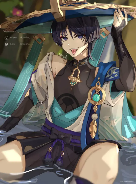
Genshin Men react to Their Thirsty fanart?😊
Ooooooo oh my gosh I love this!!! I hope you liked the characters I picked! If you'd like to see others just let me know! <3
─⊰⊹ฺ✿𝔾𝕖𝕟𝕤𝕙𝕚𝕟 ℍ𝕖𝕒𝕕𝕔𝕒𝕟𝕠𝕟𝕤⊰⊹ฺ✿─
{༻~Reacting to their thirsty fanarts~༺}
A/n: Slightly suggestive! A lot of characters this time because I went alittle crazy! (None of the artwork in this is mine! If you look in the reblogs the artists names are there! All credit goes to them and thank you again to that person who sourced them for me!)
(Includes: Diluc, Lyney, Albedo, Wanderer, Kazuha, Childe and Neuvillette!)
♡♡♡♡♡♡♡♡♡♡♡♡♡♡♡♡♡♡♡♡♡♡♡♡♡♡♡♡♡♡
𑁍༄Diluc:
Diluc would clear his throat, inspecting the picture while his cheeks became tinted with a light pink colour, his hand running through his firey red hair as he tried to think of what to say, settling with a safer answer. "Well...this is certainly a very amazing piece of artwork. It does however seem a bit...suggestive...flattering yes, but not very true to life. I've personally never held my claymore in that way or sat in that particular.. position. Still, I thank you respectfully for taking your time to draw me...even if it might have given others a bit to much...inspiration."
𑁍༄Lyney:
Lyney would take one look at the picture, a smirk playing on his lips as his violet eyes clouded over with mischief and flattery, possibly even a tad bit of lust, "Seems I've caught the attention of some incredible artists, their work is truly magnifique! Hmm..., because they've drawn me so beautifully and one of the main things a magician is supposed to do is please his watchers, I'll do a little comparison between the art and myself...so you can all see it for real~" He'd tip his hat before starting to recreate the pose, arching his back slightly and winking in your direction, his finger up against his mouth as he shushed you, his other hand holding the ace of hearts just right so you could see it. Seems he enjoys the attention the fanarts give him, even to the point of hoping everyone will creat more~
𑁍༄Albedo:
(...is he wearing bottoms in this picture? Cause like I'm not gonna lie...I'm not really sure...)
"Goodness..." Albedo would stare at the artwork of himself for a moment, trying to collect his words as even his pale skin turned cherry red. His voice would be shaky because of his flustered state and he'd mess up words whenever he glanced at the picture, but eventually he'd manage to say this,"I don't really know where t-to begin, I mean the art itself is impeccable, v-very stylised...and ehem...the artist clearly...k-knows their anatomy. I-...thank you for drawing me." He'd look away, his heart racing in his chest and his mind plagued with new thoughts like...would he actually look good in that situation...would people want to see it...should he...try it?
𑁍༄Wanderer:
Wanderer would look at the picture, his eyebrows furrowing and his mouth hanging open for a second, "W-what the hell is this?!? Why am I w-wet in it??? Perverts!" He'd clench his hands into fists, putting on quite the show as he tossed the drawing behind him and stomped away like he's just been highly offended...even though deep down, he found it slightly...appealing. To think someone actually had the nerve to draw him so scandalously...perhaps he'd have to find the artists who had done so, just to show them how wrong of a choice they'd made~
𑁍༄Kazuha:
"Oh my..." Kazuha would say, a blush spreading across his face and his calm personality faltering for just a second, before he quickly recomposed himself, scratching the back of his neck nervously as he chose the best words to say, "The art is very beautiful, I must say they've flattered me alot though...I don't truthfully look like that...not nearly as handsome. As for the marks...on the n-neck, I don't currently have any..." He'd probably mean that last sentence as a means to say he wasn't currently in a relationship, but to anyone who had heard it...they took it as a invitation to give him some~
𑁍༄Childe:
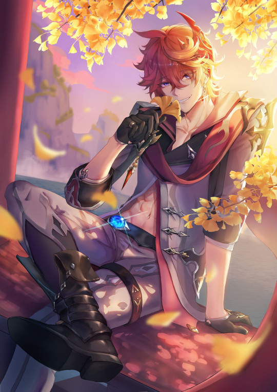
Childe would smile happily, leaning back against the wall with his arms crossed and his chest slightly puffed up with pride, "Comrades please, you all make me blush, the art is wonderful and in no small part because I'm in it...,but I assure you the real thing is better. I win, even in regards to myself.." He'd wink at you, leaving you captivated by his charm even though what he had said sounded silly.
𑁍༄Neuvillette:
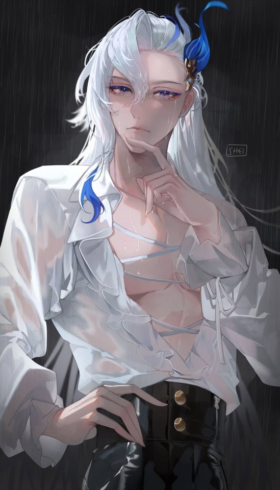
Neuvillette would look at the art for awhile, his purple hued eyes widening as he scanned it into his memory and rested his chin in his hand, his long white hair drapping over his shoulders as he wondered if someone had caught him changing, since how could they make something so accurate otherwise... "Apologies, but where did you get this again? The drawing itself is indeed very beautiful and well crafted, I believe the artist who made this should be very proud...I'm just curious how they know what I look like shirtless...and who else might know as well."
♡♡♡♡♡♡♡♡♡♡♡♡♡♡♡♡♡♡♡♡♡♡♡♡♡♡♡♡♡♡
ଘ(੭*ˊᵕˋ)੭* ੈ♡‧₊˚I hope you enjoyed*.✧
(Open!) Taglist: @kiokiee
#genshin impact#genshin x you#diluc headcanons#diluc x reader#diluc x you#genshin diluc#lyney x you#lyney x reader#lyney genshin#lyney headcanons#albedo genshin impact#albedo headcanons#albedo x reader#albedo x you#genshin wanderer#wanderer x reader#wanderer headcanons#wanderer x you#kazuha genshin impact#kazuha x reader#kazuha x you#kazuha headcanons#childe x reader#genshin childe#childe x you#childe headcanons#neuvillette genshin#neuvillette x reader#neuvillette x you#neuvilletteheadcanons
382 notes
·
View notes
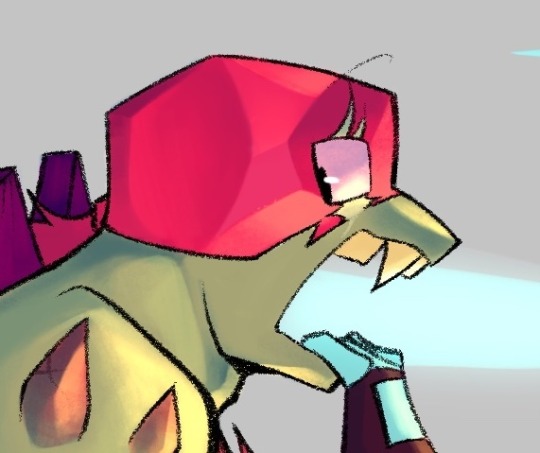
Text
Hiya buds! I think the Eclipse yesterday fucking possessed me because after not being able to draw anything for over a month I finally drew something!! I added some details today morning but I think they're done now.
They're both very messy sketches but it's tons better than anything I've done in a while, also they are stylised + head cannons, for example Blades has a bug mouth (mandibles) because helicopters look like dragonflies and I thought it would be a cool detail :3
Edit: I forgot to point out that Heatwave's mouth is supposed to be crocodilian-ish, it's not as obvious as I realised so I'm mentioning it now lol
(click image for better quality)
#transformers#rescue bots#transformers blades#transformers heatwave#Blades Chase Boulder and Heatwave are in a polycule because i said so#i love drawing bug mouths#is it weird? yes.#but so am i#i may be cringe but i am free#transformers art#transformers rescue bots
42 notes
·
View notes
Text
Ping-Pong The Animation: eps 1-3
So Masaaki Yuasa [AN12, AN28, AN150] can do no wrong, right? OK, well, I'll admit Ride Your Wave was kinda mid, and Devilman Crybaby goes hard as hell at the beginning and end but sorta treads water in the middle, but... generally speaking! No-one does it like Yuasa.
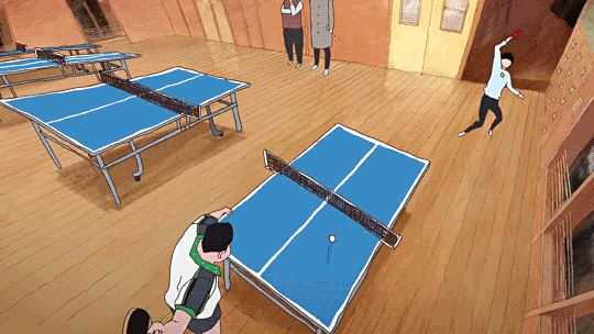
For reasons I don't really remember, I didn't get very far watching Ping-Pong The Animation some years ago. It should be entirely my shit: Yuasa pulling in a gang of wildly creative animators to put their unique spin on something. However, the first episode didn't entirely hook me, and I never got round to trying the second before something else punted 'watching Ping Pong' out of my brain. ADHD, y'know.
This is a shame because even the very next episode seriously goes, as does the one after that. But also this anime isn't entirely what I was expecting (crazy sakugafest full of Yuasa weirdness). Not to say it doesn't do a lot of really unique stuff with its cinematography and animation, but these first episodes at least are more about like... dissociation! ennui!
But more on that in a mo. First I wanna continue the thread of 'how do you animate sports'.
So, ping-pong, or table tennis. Not a sport I know much about, I'll be honest. (To be fair I don't know a lot about sports in general outside of some very specific niches. The sports I've pursued so far are rather eclectic: swimming, fencing, tai chi chuan, and roller derby; I never got particularly far in any and it's been years since I've done them.)
I'll inevitably be drawing a lot of comparisons to The First Slam Dunk, the other sports anime I've watched recently. I do think it's a productive comparison though! Both of them bring something of the visual language of manga into their presentation in unique ways. I have not yet read the Ping Pong manga, but it's by Taiyō Matsumoto, otherwise known for scifi manga like Tekkonkinkreet (god tier movie, still need to read the manga) and Number Five. So that's a pretty impressive track record!
If you go take a look at some scans of Ping Pong, what will immediately jump out is the shaky, rough line style and unusual camera angles and compositions.
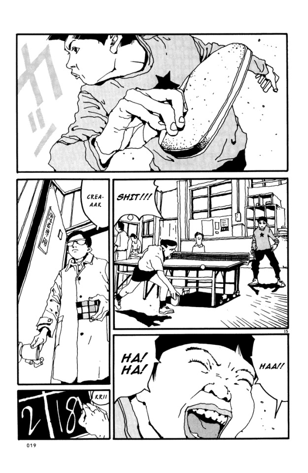
The stylisation is also very different from a lot of manga. Noses are fully drawn, eyes are realistically small, and in contrast, lips and mouths tend to get the emphasis - as well as hands.
Knowing this makes a lot of the creative choices in the anime make sense! It also adopts a shaky lineart style, and makes use of heavy line weights and spotting blacks to add definition. It also has a lot of crazy closeups and layouts, and it loves a visual metaphor. But most of all, the most striking element of this anime is how often it loves to split the picture up into little panels...
...which [eli]'s subs do a really good job of typesetting, incidentally, moving the dialogue to fit naturally into the split composition. And while this shot with 7 smaller shots is perhaps on the extreme end, splits of three or more are pretty frequent. It's a really interesting way to evoke the effect of seeing a whole page of manga
So, as you proooobably know, ping-pong is a game of bouncing balls off a little table and directing them into places the opponent will find it hard to hit them back. From watching this anime I picked up that there are a number of styles of holding the racket (e.g. 'penhold grip' and 'shakehand') and approaches to hitting the ball (e.g. 'chopping'). A lot of this pretty much went over my head, but honestly it didn't matter, since the narrative significance was pretty much always evident.
Compared to basketball, though, ping-pong is a pretty tricky sport to make visually interesting! Sure, you have the players running to and fro, and that can lead to some interesting poses, but how do you get the drama and tension into this?
Ping-pong additionally is all 2D, it doesn't have the sort of resources that Toei could throw at making the best looking 3DCG basketball game ever. It is limited to a TV-feasible drawing count. So it has to make use of clever limited-animation tricks to get the most impact out of fewest drawings.
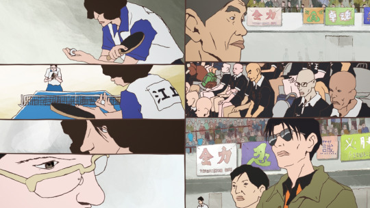
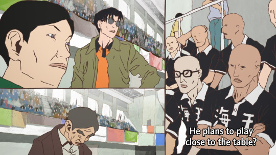
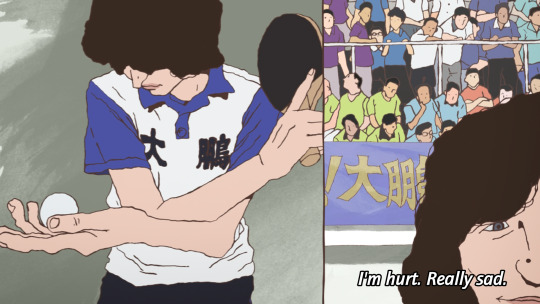
Let's take an example sequence from episode 3. A minor character is about to get his ass kicked by Tsukimoto. Tsukimoto is something of a pingpong prodigy, and yet he is very emotionally closed-off and even standoffish; he doesn't particularly seem to like the game very much, and doesn't particularly feel inclined to flex on other players and get into the status games. But other players, like Wenge, have heard about him and want to see what he's got.
First we have the setup. Other characters are observing and discussing the game. Since ping-pong tends to involve very rapid exchanges, it can follow the classic shōnen model where there's a lot of talking, flashy fight sequence, more talking...

The cut happens in two steps, maintaining the vertical dividing line. This approach to cutting is used a lot in Ping-Pong, and it's quite a creative way to keep visual interest when it's using a lot of largely static shots. The panel on the right is more animated than the panel on the left, a naturalistic depiction of bouncing the ball off the table.

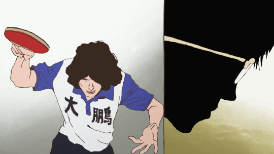
Things start moving faster here. A rapid pan on the image on the left disguises the fact that this anticipation pose is actually not moving at all. This then goes into a rapid, explosive moment as this guy serves.
The final pose is held for a couple of seconds while the voiceover line discussing his intended move finishes. This sort of elasticity of time is a very Osamu Dezaki type of move - it's something that Hayao Miyazaki and Isao Takahata actually really disliked.
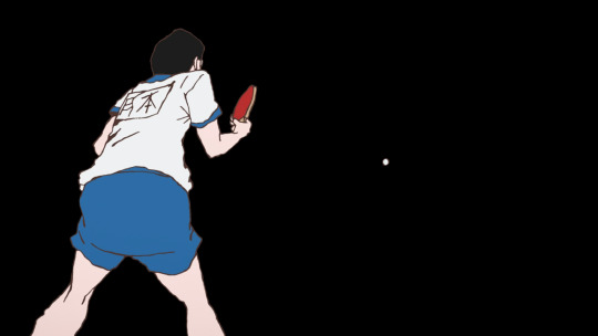
A sound effect hits as Tsukimoto appears on the right in silhouette, anticipating his reaction, and setting up the next shot which leaves the split picture and hides the background for just a moment, as if to put us in Tsukimoto's shoes: he only sees the ball.

Tsukimoto follows through and holds this pose - the ball is the only thing moving here. The ball moves mainly on 2s while Tsukimoto moves on 3s and 2s, and he and the ball move on alternating frames. He holds the pose as the ball zips off to the right (bouncing off the corner of the table), with a speed lines-like effect. At the end of the shot, the ball freezes in the air for the moment while the sound echoes.
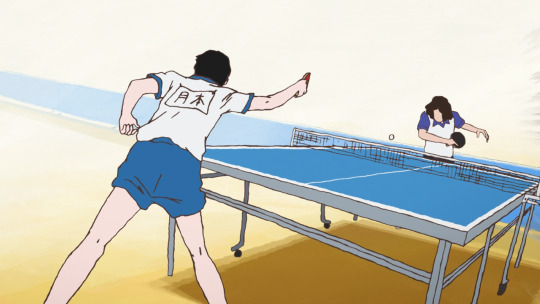
The actual table-tennis round lasts just seconds, and the drawing count involved is pretty minimal, but it does a lot with those drawings.
We go back to voiceovers and reactions in the next few shots, returning to the split video as Tsukimoto's opponent thinks about how he'd really rather be at the beach...
Often, these comic-like compositions will change one panel at a time, and while one panel is animated another panel will be still, naturally moving your eyes across the screen. It is an approach similar to some experiments I've seen in 'animated comics' viewed in a web browser, where the panels do not appear all at once, but enter with some animation.
So this is the sort of animation technique that Ping Pong uses. It's effective! Elsewhere the cuts are used in a less direct, continuity-editing way and more in a juxtaposition/montage way. For example, Wenge's desire to return to China is symbolised by match cutting/fading to shots of an aeroplane.

And there is a recurring image, which I'm sure will be expanded on, of Tsukimoto hiding in a cupboard and wishing for a tokusatsu hero to come save him from his isolation. As Tsukimoto's feelings about himself change, the toku hero is replaced by a robot. At this points it starts to feel like an outright Ikuhara anime.
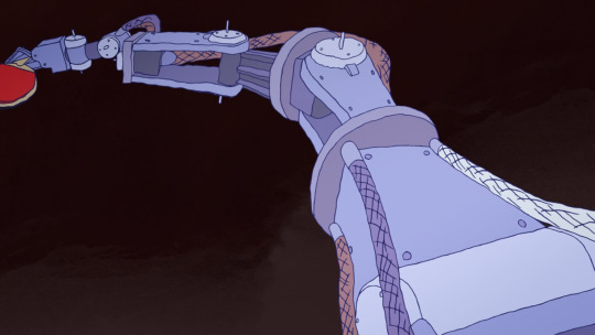
There is occasionally a little bit of CG, mainly when Tsukimoto uses a different type of racket surface, and the way the ball and racket make contact is the crucial thing that the shot is trying to convey...
It gets the job done, but I'm glad they stuck with 2D for most of it.
So I went in the first time expecting like, crazy elaborate sakuga - and to be fair, the OP, animated by none other than Shinya Ohira, delivers on that front - but if anything what I've seen so far in Ping-Pong is actually a triumph of storyboarding and limited animation techniques. I think back then I didn't have the eyes to appreciate it in the same way.

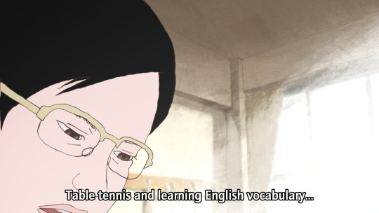
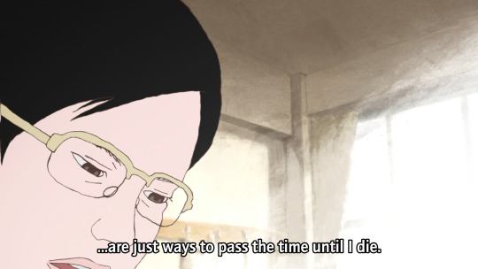
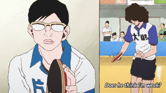
OK, that's the film nerd stuff, but what about the story? Ping Pong follows two school friends, Makoto Tsukimoto aka "Smile" (right), and Yutaka Hoshino aka "Peco" (left). Smile is defined by a flat affect and a standoffish persona. He's just going through the motions. He's very good at ping-pong, but to him it's just a way to pass time, and he's scornful about the idea of caring all that much about it. Much like Shinji with his casette player, Tsukimoto is pretty much always staring at a handheld games console rather than make eye contact with anyone.
Peco on the other hand is the more childish one - playful, kinda arrogant, very much an 'emotions on his sleeve' kinda guy. He sulks when he loses and gloats when he wins, and is constantly seen with bubblegum or other kinds of candy. He provides a lot of our commentary when he chats with the other players.
日本語上手 readers probably noticed the tsuki (moon) vs hoshi (star) symbolism thing they've got going on here!
High-school table tennis in this story seems to be a rather 'tough love' kinda world. Most of these players tend to look down on those who can't meet their level. Going easy on someone is seen as weakness, or cultivating bad habits, by almost everyone. Tsukimoto doesn't play at his full potential because he isn't as invested in winning as all these weirdos, but it seems that might be starting to change...

The coach is interesting. He's an old man and fairly disdainful of the club at large, and prone to speaking English randomly with a heavy accent. But he gets excited at the prospect of getting Tsukimoto to unleash his full potential, in terms that are repeatedly metaphorically compared to romance/marriage.
And when Tsukimoto gets sick of it, he challenges him to a game, with the stakes as...
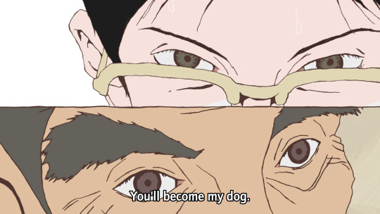

Cue Makima/Beatrice images here I guess.
Tsukimoto de facto wins when the coach collapses, but this episode marks a change of heart. He starts to think of himself as a robot - the affect of a robot replacing the affect of the toku hero in his fantasy. And in this way he does what people seem to want and plays ping pong with mechanical precision, expressed once again in visual metaphor (shot here from a cool transformation sequence)...

What if I just dissociate harder? This is gonna end well.
So it really is one of those kind of like 'ennui of being a teenager' kind of stories - c.f. say FLCL. 'Boy with complicated emotional landscape' is Yuasa bread and butter, but the particular variant here seems a little unusual for him - they tend to be a little more earnest. I'm curious to see how Tsukimoto develops.
I am definitely enjoying the arrogant Chinese player Kong Wenge. Dude's got a lot of screen presence, and while I'm sure he'll get shown up sooner or later, he makes for a very fun antagonist of sorts.
In comparison to Slam Dunk... one thing that's significantly different about table tennis is that it's an individual rather than a team sport, which means it's harder to have an ensemble cast all contributing to the protagonists' eventual victory - instead it's about a lot of individual arcs interweaving with each other, individual duels. Besides that, it does seem like it will be following a similar arc of a character in an emotional hole (grief for Ryota, depression for Tsukimoto) finding new meaning and purpose through sports - though I can't be sure how things are gonna go for Tsukimoto here!
The tone however is quite different. Even when it's silly, I feel like Slam Dunk is a very sincere story. There's little detachment or irony, or false consciousness - with perhaps the major exception of Ryota's mother, who lets her own grief and trauma get in the way of understanding her son. But ultimately 'why would you care this much about basketball' is not a question that anyone would ask in Slam Dunk. Even the judo guy in the manga who's trying to recruit Sakuragi is just as hot-blooded about his own sport of choice.
There's a difference in like, general affect about the players as well, which has something to do with the sport itself. Yeah, Sakuragi's superpower is his 'genius' ability to predict rebounds, and there is plenty of strategising in Slam Dunk - but basketball is still a sport that very much emphasises physical power, and as much as Slam Dunk will work hard to sell you on a clever trick pass, the visuals are also emphasising the speed that players are dashing, the height they're jumping, their physique. Table tennis by contrast seems to be a sport that's more about prediction and mind games.
That said it is equally just like Matsumoto's style being different from Inoue's. Now I know it's by the guy who wrote Tekkonkinkreet, a lot about this series falls into place! There's a sense of tension here, of being fundamentally at odds with the world. The autismfeels. This is reflected also in the drawings - the characters don't entirely seem comfortable in their embodiment.
So if that's what I'm getting from just three eps, I'm very excited to see what the remaining 8 have to offer. This series is probably too long to cram into Animation Night format, but we'll see...
51 notes
·
View notes
Text
Cyberpunk 2077 Gangs (The Sims 4): Maelstrom inspired
MORE SIMS 4 CYBERPUNK STUFF


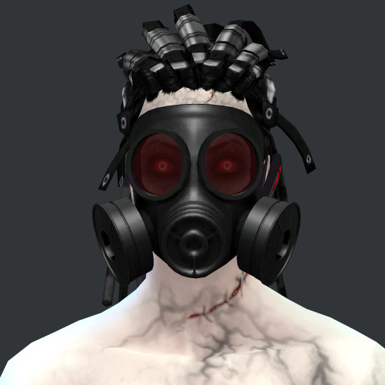
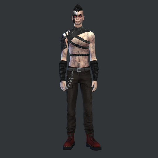


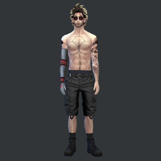
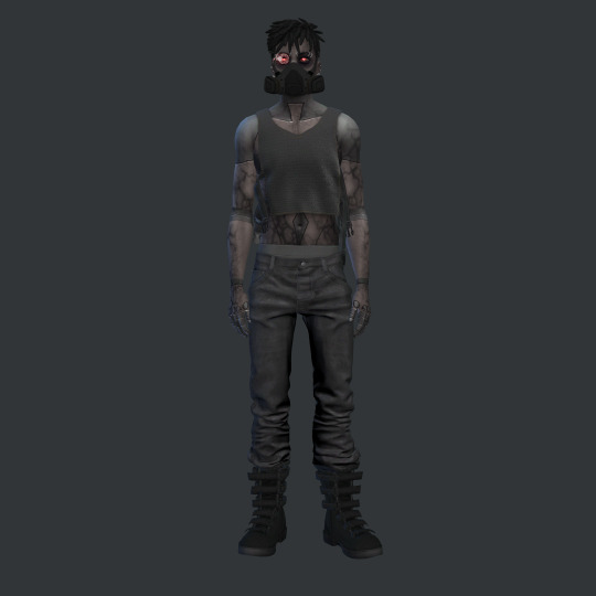
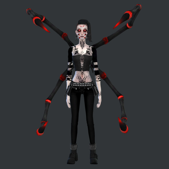
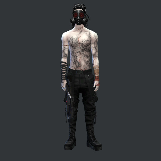

REFERENCE IMAGES

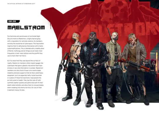
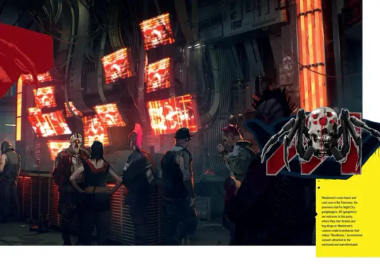
Inspired by Maelstrom but obviously I was limited. I didn't copy any particular character or NPC just the overall "creepy-cyborg-terminator-madmax" vibe. I used less baldness, less Hitler hair-dos, etc made them a bit more simple and stylised to my liking. I think they look a bit more anime lol. I tried to compensate with more piercings, spikes, scars, supernatural veiny skins and stuff for my lack of intense cyborg cyberware they have. I know the spider lady is a bit weird but I liked the spider legs in their graffiti logo and tried to include it imagining it's some sort of cyberware body mod. I found this cool Sims 3 CC but no ts4 conversion unfortunately. So just did my best, the light emitting contacts really helped. Overall I like how they turned out. Might make them creepy vampires haha or maybe make more "scary" looking ones later ╰(*°▽°*)╯This Totentanz build by Hamsterbellbelle is where I'm making them live (I'll probably build something in the basement) along with Littlemssam's live in business mod (so that it functions as a club even though it's residential)
youtube
Some useful CAS CC for these looks:
Cyborg Head ☢ Vallhallen Helmet conversion ☢ Vallhallen oculus third eye ☢ More eyes by Zaneida ☢ Spider mouth by natalia auditore ☢ Anakin arm by natalia ☢
cyberware by natalia auditore ☢ more cybeware by NA ☢ even more cyberware by NA ☢ Cyber decal eyeshadow ☢ Tecno glasses ☢ SSTS gauntlets ☢ Arachnophobia face eyes by Pyxis ☢ Ashwwa steampunk top ☢ Ashwwa scifi earrings ☢ Ashwwa safety pin earring ☢ Cyborg facepaint ☢ Pralinesims Spikey mask ☢ Steampunk Goggles ☢ Robo legs and Robo arms tattoos ☢ Standalone robotic arm accessory ☢ Body veins skin details ☢ Contacts with light ☢ Gas mask ☢ Dark side mask ☢ Mantis Blades ☢ Cyber blackout tattoos
If there's something you like that wasn't listed here let me know and I'll try to find it. The list of CC is very long so i included the most prominent and useful things that caught my attention; I also use plenty of MagicBot CC (piercings, skins, etc) and lots of clothes by Belloallure, Darte77 and @the-crypt-o-club and probably tons of other cc creators I can't recall now
#moonbiscuitsims#moonbiscuitsimsphotos#moonbiscuitsimscyberpunk#moonbiscuitsimscas#moonbiscuitsimslookbook#moonbiscuitsims4#cyberpunk#cyberpunk maelstrom#maelstrom cyberpunk#cyberpunk 2077#cyberpunk2077#cp2077#cyberpunk aesthetic#cyberpunk art#night city#cybernetics#cyberpunk cyborg#cyborg#the sims 4#simblr#sims 4#ts4 simblr#ts4 screenshots#sims 4 screenshots#ts4#sims 4 cas#the sims 4 cyberpunk#sims 4 cc finds#maelstrom#sims 4 lookbook
78 notes
·
View notes
Photo

somethings a bit different style-wise n fun ✷💦
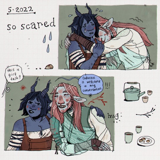
(referenced screencaps of laura and taliesin for these) !
[Image description: digital art of Jester and Caduceus from Critical Role, in three unrelated redrawn screenshots. They are all drawn in stylised black line-art with sage green backgrounds and small objects and shapes drawn around them.
1. Jester says "aaa!!!" excitedly, and Caduceus holds her shoulders from behind, peering past her with bemused interest.
2. Caduceus hugs Jester and hides his face against her shoulder as she cries, looking worried. Caduceus has wiggling lines around him like he’s shaking.
3. Someone offscreen says "This is girl talk!!" Irked but still lighthearted, Jester puts her arm around Caduceus's shoulder and says "Caduceus is welcome in any conversation!!!" Caduceus smiles with an open mouth and sleepy, happy, expression.
End description.]
#critical role fanart#critical role#jester lavorre#caduceus clay#team cleric#digital art#myart#2022#accessible
2K notes
·
View notes
Note
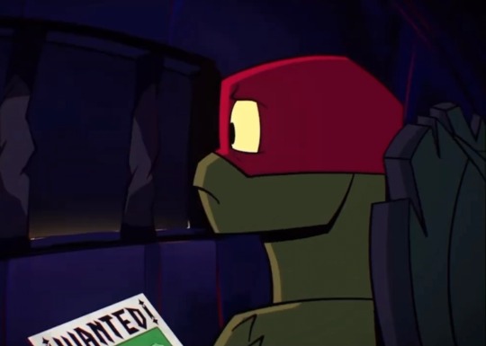
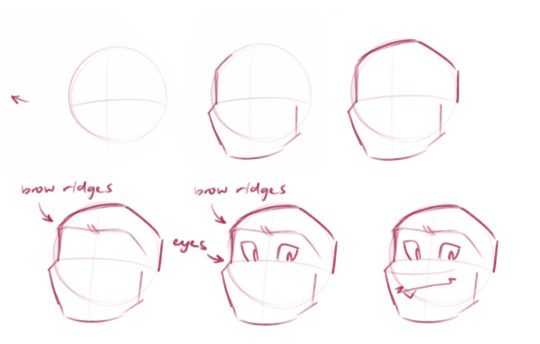
tips on how to draw raph? :3
I’m a raph lover but he is so hard to draw 😔
hey an!! listen i get u completely, this big spikey boy can be a real challenge
my main advice would probably be to recognise raph’s structure? his shapes and how he’s formed, etc. and the best way for that imo are references! i have a tag for this actually
and here’s some raph refs!
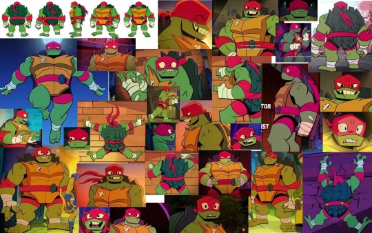
if u wanna know how to draw the entirety of the best boy this post wouldn’t do it justice so here’s some main things:
if you’re trying to replicate the show’s style keep in mind how angular everything is. raph's main shape is a square because of how bulky and rigid he is (helps to encourage his character's role too! love that they made him such a fucken tank)
raph’s head shape is basically if you widened leo’s head- they’re both pointed too
one main thing i do for any head really is keep in mind the eye placement and the cheeks
if u happen to draw faces with the fabled circle and two lines- i use the horizontal line to mark where the bottom of the eyes are- and where the start of the cheek begins (i’m doing my best not to make this into a ‘now draw the rest of the owl’ moment)
if that makes any sense. heres a really shoddy 'tutorial'
i kinda just blank out on my canvas and raph appears out of sheer will
but also just like.
figure out how you like raph's head to look (maybe u want his snout longer, or his jaw shorter, etc etc)
figure out where his brow ridges are located and how they're moving (is he grumpy? is he angry??)
make a mask for his eyes to go in (jebus take the wheel)
pronounce snout (it protrudes, which makes it easy to figure out his facial planes)
do whatever feels right for his mouth- im not exactly rigid with how i draw as of rn, i just do what feels right
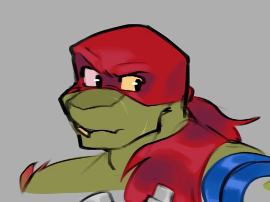
ive drawn raph with a more pronounced snout too, and oscillate between designs if i feel like it (truthfully i also sometimes begin his head shape with a square (i mean if im doing a different style), feel free to do that if it helps i dunno-)
if you want to draw his shell and plastron here’s what i do:
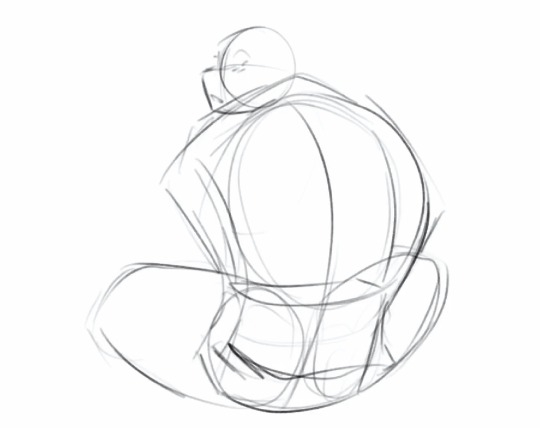
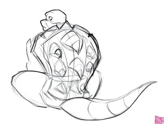
being able to carve out 3D shapes will help a lot with the border of his shell
by blocking out the main shape and then carving away at it you can then see how raph’s shell is structured (just. try decipher my sketch if u can pfghjhj)

for the actual shell itself it’s a lot like mikey and leo’s where it has a big curve and then dips at his midsection (where his belt goes!) also keep in mind the spikes of his shell follow those same curves (ft. dr belle)
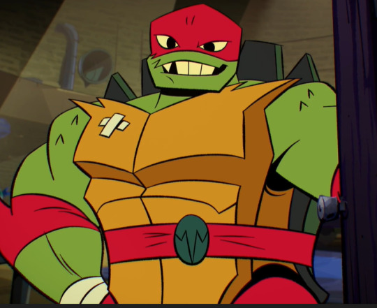
with his plastron (chest plate) i basically make sure it’s the same length of his clavicle? the jagged edges of it i mean. it helps a lot to map out where his shoulders meet his arms
(pls keep in mind my art’s inconsistent and i don’t even follow my advice- the hole in his shell changes every time i draw it 💀)

his body shape is also just in general wider and stockier- if i ever see people draw him skinnier than he is you'd be able to hear my soul exiting my body
all of him is wider in general! hes bigger than the rest of his brothers so dont forget to show it instead of just giving him a height difference. he BEEG.
i’m not sure how else to describe the process of drawing him other than just. draw him?? 😅 my best advice would be to draw him repeatedly based on references- and study your favourite raph artists’ way of drawing him (mine would be jacocoon and itz_jazzy_jazzin)
and it helps to study bc it can answer these questions
how do you want to draw him? do you like the way a specific artist stylises his features? do you want him more spikey? more sharp? maybe you want to draw him bigger! (i myself like to give him a tail, extra markings on his spikes + a few scars post movie and his mismatched eyes)
repetition is super important to get it all engrained in your brain- and it’s why i don’t really even use refs for him anymore fldjs
dont forget a very important rule: appreciate the big boy in all his glory
#im not exactly the artist to go to for help unfortunately dfkdjhsdh#hoping this helps somehow#its better to understand his structure#every now and then i apply it to my sketches#most times ill just dick around on my canvas#feel free to dm me if you want more in depth stuff ajhddgh#rise raph#rottmnt#rise of the teenage mutant ninja turtles#rottmnt raph#ask
59 notes
·
View notes
Last Seen Blogs
lisandra-phillips
i'm in love with the landscape
reltyxart
Reltyx: Arts & Memes
valeryfive
Valery Five
everythingisawayoflife
“i’m gonna play puck!”