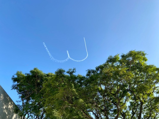
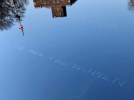
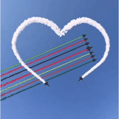
#skywriting
Text
95K notes
·
View notes
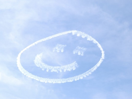
Text
Airplane said :)
They drew many many :) :) :)s that afternoon x3
53 notes
·
View notes
Text
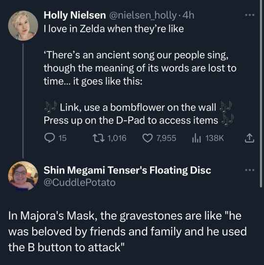
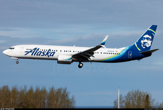
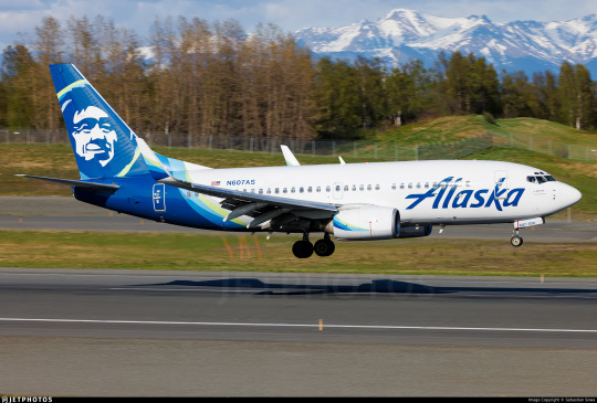
No. 51 - Alaska Airlines

This is one of my most requested posts. Apparently, a very significant portion of my readers fly Alaska Airlines!
That tracks. Alaska Airlines is the fifth largest airline in the US. A sort of anti-Flair, they are supposedly the least complained-about full-service carrier in the US. They are also one of five remaining US legacy carriers, along with American Airlines, Delta Air Lines, Hawaiian Airlines, and United Airlines. They operate a massive network primarily on the US West Coast, with bits branching out into nearby slices of the Americas. As one might surmise from prior knowledge of the size and population of Alaska, they're actually mostly based in Seattle.
Now, when it comes to their livery, there's one thing that stands out. At least, it stood out to me, and I'm sure at least some of you have had this thought too.
That is a human person's face on the tailfin. But who does that face belong to, and why is it on the Alaska Airlines fleet? This is precisely the sort of trivia I think anyone who knows me would expect me to be able to just rattle off, but actually...I don't know, and neither, as far as I can tell, does anyone else. Isn't that weird?
(By the way, it is indeed Alaska Airlines. I have always found that somewhat unintuitive. It's just not how you're used to hearing things phrased, right? It's Possessive Noun Airlines, Air Noun. America Airlines would sound weird. Alaska Airlines sounds weird. I am never surprised when people mistakenly say Alaskan Airlines, but it's Alaska Airlines. Just so we're all on the same page.)
Alaska's a bit of a hard place to navigate. Big empty place, lots of ice, lots of mountains, islands, trees...not very much asphalt. That's even true now, but it used to be way truer, and even back then people did still live there. And there's a lot of things those people might maybe like to have, like medical care, or food, or just the hypothetical possibility of getting somewhere without having to get the snowshoes out. In that sense, Alaska is a really perfect place for aviation to flourish.
More or less as early as physically possible, when there were planes available that weren't requisitioned for the first World War or owned by the ultra-rich, people were flying in Alaska. In a lot of ways the basic landscape hasn't changed that much. With its surplus of difficult environments and paucity of actual tarmac Alaska's harsh wilderness is an environment only suited for "bush" flying, using smaller, more rugged airplanes specialized for the environment. Some of the most popular models of bush plane are very old, not that dissimilar to what you'd see in the 50s and 60s - apparently, they just don't make them the same anymore, and as long as you don't get your de Havilland Beaver crunched horribly into the side of a mountain there's just nothing that can replace it. Alaska is full of planes on floats, planes on skis, and taildraggers on tundra tires, most of them high-wing and piston-engined. Bush pilots are a unique sort, often doing work that's neither glamorous nor lucrative (nor safe, with Alaska having two to five times the accident rate of the lower 48) but undeniably necessary.
That's not as true of Alaska Airlines. They have a modern fleet, a good safety record except for that one time, and as a category III carrier they make over a billion dollars in revenue each fiscal year, meaning their finances aren't too strained (except for that one time). Unlike the local carriers that connect remote parts of Alaska to resources and to major cities, Alaska Airlines connects Alaska to the rest of the nearby world. (Though it also does short, multi-stop milk run flights.) It's a necessary part of the ecosystem, helping to keep Alaska's beautiful but hostile terrain from getting in the way of daily life. Before they became Alaska Airlines, though, they were far more similar to what you might expect of...Alaska airlines.
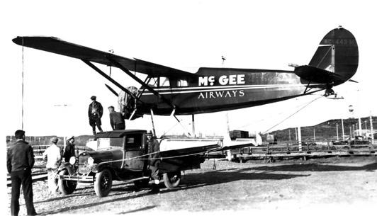
Image: Roy S. Dickson
In 1932, a man with the fantastic name 'Linious McGee' started his very own airline. You could just do that back then. In 1934 it was merged into Star Air Service, another tiny airline. Star Air Service had also been founded in 1932, born from the flight-school-starting dreams of a wealthy miner with the similarly wonderful name 'Wesley Earl Dunkle'. Apparently Star had its first ever aircraft, a Fleet B-5 biplane, brought to Alaska by steamship, which I just find fairly interesting. I guess this was before you could even ferry an airplane directly to Alaska by air. They ate up a few other small airlines (and their routes), and in 1943 they won a small scuffle against another pretender to formerly rebrand themselves as Alaska Airlines. So it's been 80 years of that now!
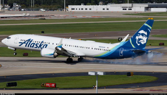
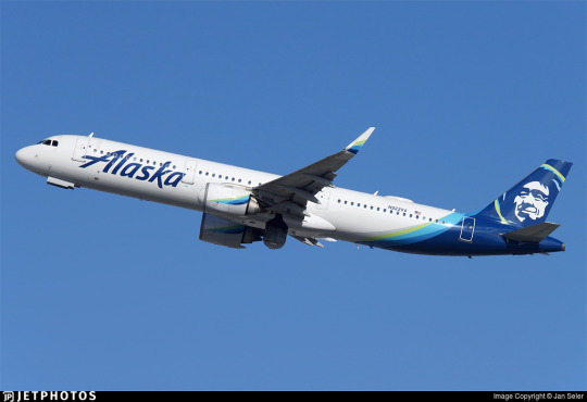
They've gone from flying Curtiss Robins, Ford Trimotors, and Lockheed Vegas to flying basically only 737s, save a few vestigial A320 family aircraft acquired when merging with Virgin America which they plan to phase out by the end of 2024. Their livery is also on E175 regional jets operated by Horizon Air and SkyWest. The airplanes flying for them number around 300. That's incredibly large even by the standards of major airlines (not even counting the SkyWest planes that have the livery).

The Alaska Airlines livery is not breaking any molds and I need to say that upfront. This is a very straightforward pattern I've taken to calling the Lufthansa Declined, or the Lufthansa Line SAS Variation. (Because the push and pull of trend cycles in brand identity is basically comparable to chess, right? Maybe? No? Not really?) I've recently codified the concept of the Lufthansa Line, the straight line continuing where the tailfin left off to carve through the fuselage. This is a very common and very disappointing fuselage trope. The Declined, or SAS Variation, is named for an airline I specifically contrasted with Lufthansa from my very first post on this blog, SAS.
The SAS Variation simply curves this line outwards towards the front of the plane, stopping the cutoff from being quite so blunt and hopefully undoing the unbalancing effect somewhat. This can solve some of the nastier effects of Lufthansa Lines, particularly on shorter planes, but can also look very wonky if implemented without enough care. It's not always a big improvement, but it's definitely not the exact same thing, either, and it's this shape which Alaska Airlines attempts. Being introduced in 2016, this livery actually pre-dates SAS, but Delta and Lufthansa weren't starting their own namesake patterns either. The names aren't attributed based on innovation, but on formative status in my own specific understanding of airline liveries. SAS as contrasted to Lufthansa is the holotype for my creation of the taxon, and thus earlier liveries are retroactively SASlikes. Birds are dinosaurs and whales are ungulates. Taxonomy is imperfect and has to accommodate new discoveries within a sometimes unintuitive framework. That's just how it is.
I think they do better than many. The fact that they use so many colors, layered over each other, is crucial to the effect. It accomplishes similar things as a gradient might, transitioning from dark to light with minimal pain in the process.

Image taken from Alaska Airlines's very useful branding style guide.

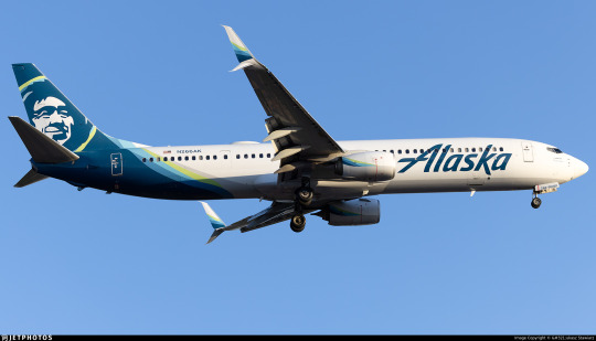
The shades of blue and green used resemble the Aurora Borealis. I can't find anything confirming that this is intentional but I can't imagine it isn't. I think they're very nicely chosen. Different lightings can make the blue (Alaska's material calls it midnight blue, but it's technically Prussian blue) look anywhere from true vivid blue to more of a deep ocean color, which is one of my favorite shades. In particular, the very washed out yellowish green is an absolutely gorgeous choice for a highlight color. I like that the colors aren't given equal purchase, though, and that the green is used sparingly for highlight, and to create that lovely subtle 'halo' around the face on the tail. Sometimes less is more, and this is one of those cases. In fact, their own website states:
Midnight is our primary brand color, and should be used sparingly to avoid overuse—giving more prominence to the Alaska Airlines brand.
(They also note that they took specific efforts in the design process to make sure these colors had significant contrast between them to meet accessibility standards, which I really appreciate and want to see more of.)
For example, if the 'intermediate' blue colors took up more of the plane, or were separate from the green, I would probably not feel any real way about them. I definitely wouldn't think they were nice if they just did a standard Lufthansa Line block with each color individually expressed. But using them as a trim to a nice clear deep blue, overlapping each other in a way that's very carefully mapped out but seems at a glance essentially random, halfway to mixing, like the dark tail is melting slowly into the fuselage...that's nice. That adds something.

The partially-overlapping, brushlike curves are further expressed as swashes on the winglets and engines. What's interesting to me is that if you look closer you can see that the little curves are on both the inboard and outboard sides of each engine and winglet, so you get that consistent curve, hypothetically, no matter what angle you see it from. I do think I appreciate that. The curves are just never going to all line up, because airplanes are inconveniently three-dimensional and there are as many angles to view them from as there are Planck lengths at a distance where you can tell what it is you're seeing. This is a weakness in all liveries more detailed than a Braniff jellybean and adding the curves to even the side of the engine that you're usually not going to see is definitely an appreciated attempt to mitigate this. Does it work? Maybe not totally, but I see the effort.

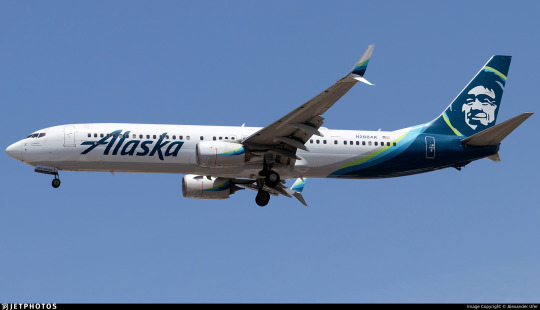
While there's never a perfect syzygy into one continuous line, the curves seem like they're part of the same nebulous body from most angles. I appreciate this approach. I think making things look pretty good from most angles is worth more than making things look really good from one angle and awkward from all others. As they say, the perfect is the enemy of the good. I absolutely love the use on just the inside middle of the scimitar winglet, which I already think is a gorgeous feature that just elevates the MAX and retrofitted 737NGs compared to the vanilla model. It's distinctive and stylish, and the limiting of the color to just the lower half of the upper blade has a real restrained elegance to it - these slashes of color are all the more effective for the way they interact with the space around them.

Just look at these winglets. They're such a tiny feature. It's absolutely wild that I can be this in love with winglets, but there's just something about split scimitar wingtips that make me go completely wild. The amount of space and the interesting shape leaves so much more room for creativity than just about any other wingtip device. Alaska Airlines does have planes with other wingtip styles, and it uses those effectively too - covering the lower half of canted/blended winglets and fully encompassing the interior of less pronounced split winglets - but this is where they look their best.
Back to bad angles, though...


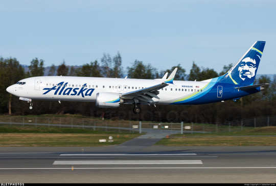
Alaska Airlines has a weird weak spot, and it's from the front and slightly above. All those gorgeous swoops on the winglets and nacelles are basically impossible to see due to their two-dimensional nature, and you can see how the colors don't fully cover the back of the fuselage. My normal policy is to judge liveries by their weakest link, but I honestly almost want to be lenient on this because of how unlikely it is that you're ever going to see an airplane from this angle. The only situations you're ever above an airplane in are ones you're basically never going to encounter as a regular passenger. Don't get me wrong, I still think this could have been designed in a way which eliminates this weak point, but as far as weak points go this is quite excusable. Is that what Thetis thought when she dipped her son in the Styx? Sure, probably, but I stand by my take. For a lot of liveries their worst angle is close to side-on, which is just fully experience-ruining. This? I'm okay with this, relatively speaking.

On the other hand, one of the better angles is one a lot more people will see - below and to one side. The taper of the different bands of color really prevents the awful jarring cutoff that Lufthansa Line and SAS Variation liveries often have, and I feel like they trick the eye into thinking up more of the fuselage is occupied than it really is. Also worth noting is that the grey underside, which resembles a shadow, is actually intentionally painted on, which is lovely. This is a feature common to the Deltalike livery trend that I outline at the start of my Southwest post, which I do think is one of the things that makes me honestly a bit sympathetic to Deltalikes when looking at them next to Lufthansalikes - at least there's an attempt to distribute visual detail evenly. Deltalikes were already a bit dated by 2016 (it was not the longest-lived trend, though it came at a time in my life perfectly positioned to make me think it was more prominent than it was) while SASlikes were on the rise, and this livery has aspects of each, but it feels less like a conflicted result of an intermediate period in dominant trends and more like something which intentionally pulled features from both where it thought they might work best. It's rare that I get this sense from a livery. That's the right way to use trends - as inspiration, not a template.

Alaska Airlines is definitely not a true Deltalike, and I would argue it's not a true SAS Variation either. (For the record, I would consider the 1998 SAS livery a Deltalike, funnily enough!) It incorporates features of both, which makes me feel uncomfortable classifying it definitively as either, though it's definitely more of a SASlike than not. For example, from the side it just is a SASlike, because the grey doesn't go high enough and isn't contrasting enough to be visible except from below. This is in contrast to actual Deltalikes, which have a thin but clearly visible line on the lower side where the underside's block of color bleeds out.

This grey color is also on the engine nacelles, although it is very subtle. This does bring up a minor gripe of mine, which is that the design on the pods cuts off at a bit of an awkwardly sharp angle, usually not worth remarking on but possible to notice from some angles if you are, say, a livery reviewer and you look at these things very closely. What I do like, though, is that the grey on the belly actively connects to the color on the tail, feeling like an extension of it instead of an awkward choice made to mitigate it.
The final specific feature of the livery I think I want to comment on is the wordmark. I really like the wordmark. It's not in their custom typeface, AS Circular, a Roboto-ish sans serif I'm not a gigantic fan of, although I really like their custom web icons. They also use Highest Praise by Adam Ladd, a fairly cheap commercially available font.

As for the wordmark itself, though, I can't seem to find what font it's based on! I have to say the original 1966 logo would be great if another airline were to use it, the 1972 is somehow giving supermarket chain, and the 1990 logo would be great if not for the weird way the K overlaps the A, which just feels sloppy and unprofessional. The 2014 and 2016 incarnations, though, are great. The 2016 one (designed by the firm Hornall Anderson) feels like a great update, just cleaning up the earlier version, though I somewhat miss the lightning-bolt S.


The placement is what I want to talk about, though. Placing a wordmark is more of an art than you might think - I'll show a couple examples of Alaska itself doing a slightly wonky job later - but when Alaska's placement is good it's great. It's one of the least cramped-looking wordmarks I've ever seen, feeling free and airy, spreading upwards above the window line. The descending line on the K and the trailing like on the A both create a feeling of freedom, like it could just keep going but doesn't want to, yet is tastefully restrained and doesn't actually overstep its bounds. I like the solid single color, and I like that it reaches almost to the engines, preventing that empty-forward-half feeling. The one thing I'll comment on for this set of images is that the left-to-right reading direction of English does mean that it looks distinctly worse seen from one side than the other. I much prefer the forward slant, which feels aerodynamic fitting with the motion of the plane, vs the alternative, in which it feels like the wordmark is trying to catch up with the aircraft's nose.
On shorter planes, though, Alaska fumbles a little. They choose to line up the wordmark with the engines instead of with the nose, creating an awkward look when it overlaps the door and nearly reaches the cockpit window. I would have leaned in the other direction were I them. This picture also demonstrates a strange feature which rears its head in certain lightings where the shading on the tailfin image makes it look almost wrinkled. I don't have anything to add to that or know how to solve it, but I need to point it out.
On a very long plane, conversely, the back half of Alaska's planes begins to feel that Lufthansa Line emptiness. The vast, vast majority of their planes are of a moderate enough length that neither issue is too overpowering, but I'm taking a wide view here! Also, the wordmark here seems to not be aligned with the engines, so...what's the idea?

Alaska Airlines is an interesting livery. More interesting than I thought I'd find it for sure. It's not just a SASlike with pleasing colors and a nice wordmark, it's a SASlike with thought put into features that can mitigate the inherent weaknesses of the SASlike. It doesn't always fully succeed, nor does it comprehensively fail, but it definitely tries.
At the end of the day, as usual, I wish there was less white. I'm sure it could have been done. I don't have an obvious solution in mind like I do for some hypothetical redesigns, so it's something I would have to think over and really dig into, but, like, Alaska Airlines makes more than a billion in revenue every year so I think that's reasonable to expect from them.
I initially started using the grading system as a way to categorize liveries without limiting myself to a very specific scale that I'll dither about for years and then change my mind about later, but it's started to end up in that role. I just don't know what better solution there is, so I'm going to continue trying to make it work. Alaska Airlines is a livery that I ultimately think I like, that I think is designed decently, but that is limited by the fact that a really good SASlike is still a SASlike - mostly white and rear-heavy. It's getting the most possible out of a flawed paradigm, and I've been inconsistent so far on how I rate a good SASlike or Lufthansalike because it causes me some legitimate cognitive dissonance.
I'm giving Alaska Airlines a provisional B-.
I think I might downgrade it to C+ later, which is why I say it's provisional. A good execution of something really limited - how do I even rate that? It's somewhere between tepidly good and better-than-average, which is a really awkward place to be. But that's probably a conversation for another day, because this post is long enough and I'm still not done.
Okay, I teased this earlier.

Him. Who is he?

The short answer: nobody knows. Not me, and not Alaska Airlines.
The long answer: deserves its own post. Both because it's long, and because I've hit image limit. And there will be images. Join me in tomorrow's bonus, where we climb our way through the rugged terrain of seemingly-lost history to attempt to put a name to this ubiquitous face.

#tarmac fashion week#grade: b-#era: 2010s#era: 2020s#region: north america#region: united states#alaska airlines#legacy carriers#lufthansa declined#deltalike#skywriting
51 notes
·
View notes
Text
Seasons Meetings
By Skyler10
Summary: Daisy brings her new girlfriend home to meet her parents, and Phil and Melinda are thrilled.
A/N: Wrote this on the plane home alone to a less accepting family and edited on the flight back, so I hope this helps all of us who have parents who wouldn't react in this welcoming of a way. *hugs
Read on Ao3
-----------------
Melinda May was in awe looking back at her past holiday family photos. She’d aged, despite her husband’s protests to the contrary. He had too, but gracefully, carrying the wisdom and laugh lines of experience, complimenting his gentle kindness. Their tiny baby transformed through each photo—first into a delightful and hyperactive little girl, then to an adorkable preteen, then to a depressed teenager with long hair dyed even blacker than her natural dark brown and with matching nails and thick eyeliner. She smiled, but it barely covered the truth. Those were rough years for them all.
But the photo tradition had continued. The longer Daisy was in college, the more she bloomed. She matured into a radiant young adult, if self-deprecating and with still a bit of that old insecurity when she ran into old classmates when home for the holidays. Former teachers and senseis and parents of friends asked every time when she was going to bring home a boyfriend, how she could possibly still be single, and didn’t she want to give her parents grandchildren?
Melinda always redirected the conversation, with a protective arm around her daughter’s shoulders. Both Melinda and Phil were quick to reassure Daisy that they were proud of her regardless of her relationship status or whether she ever had children. Daisy was grateful but said no more on the subject. She mentioned boyfriends here and there, and a girl or two, but none made it to Christmas or to meeting her parents. Melinda and Phil worried that Daisy's teen years were still haunting her all these years later.
In Daisy’s senior year of high school, she came out as bi to her parents in a tearful outpouring of secrets at the lowest point of her depression, but it proved to be a turning point. To Phil and Melinda, it was also a relief as it answered so many questions. It wasn’t just her ADHD, the high expectations on her as a tech genius, and the stress of moving away to college soon. She’d had her heart broken a year earlier by a girl who wasn’t ready to be out and denied they had ever had anything between them. The girl's friends shamed and bullied Daisy for months, but eased up over the summer and the fall semester. But as pressure mounted in the spring before graduation, Phil and Melinda found Daisy in her room crying so hard that dark streaks of mascara stained Phil’s shirt as he pulled her close. She’d been photographed flirting with another girl, and the photo had made its way around social media with meme text about sin and “confusion” in “our schools,” with the cyberbullying perpetuated by the girl from the previous year who had now joined an evangelical youth group.
No one could blame Daisy for staying away after high school graduation. She spent her summer breaks in impressive internships until one of those internships turned into a job at the end of those four years. But through university and now as a working professional, she always came home for Christmas.
This year, however, she wouldn’t be coming alone. She said she had a special guest, but she wanted it to be a surprise.
Melinda and Phil lit up when they saw their precious girl appear from the airport terminal. But the bombshell blonde with her made their smiles even bigger. The blonde caught Daisy’s scarf as it fell off and they stopped so she could wrap it back around Daisy’s neck. Daisy pecked a kiss to the blonde’s cheek and took her hand.
“Mystery solved then,” Phil quipped to Melinda. Melinda sent him an amused look of agreement before they waved to catch Daisy's attention.
After reunion hugs were exchanged, Daisy introduced them to the blonde who was politely waiting behind her.
“Okay, don't be weird,” Daisy warned, “but this is my girlfriend, Carol Danvers. Surprise! Carol, this is my mom and dad.”
Daisy's nervous smile told Melinda all she needed to know. Daisy was in love. This was no mere holiday invite because Carol didn't have plans. This was an official Meeting of the Parents.
“Wow, girlfriend, huh?” Phil stuck out his hand to shake Carol's. “I'm Phil.”
“We're so glad to meet you.” Melinda shook her hand next. “I'm Melinda.”
With this warm welcome, they walked together to the baggage claim.
“So this is the mysterious Carol,” Melinda began. “We've heard you've been spending time together…”
“… But we didn't know about the girlfriend part,” Phil finished.
Carol turned to Daisy in hesitation, “Wait, did they know before now that you're—”
“Oh! Yes.” “Old news.” “Yes!” The three hurried to answer.
“Just not that you two specifically were together in that way,” Phil explained his comment. “Carol, we can't wait to get to know you. We're really excited you're here.” Phil tried to rein in his enthusiasm to not embarrass Daisy, but Daisy and Melinda laughed at how obvious it was. Carol didn't, though. She seemed to relax.
“Thank you,” she said simply. Carol didn't hide it as well as Melinda did herself, but this girl clearly had some armor up. Melinda made it her mission to help Carol see her defenses were unnecessary here and that she was genuinely welcome.
“We weren't sure who this surprise guest would be so we made up the guest room,” Melinda explained. “But if you'd both be more comfortable staying in Daisy's room, that's fine too. Her bed is big enough for two.”
There, that was obviously supportive.
“Mom!!” Daisy groaned and blushed.
Phil shrugged. “This is our first time doing this. We don't know what you want.”
“Okayyyy,” Daisy turned to Carol, “now you see why I wanted it to be a surprise.”
Carol smiled at Daisy's childish embarrassment. “I think that's very kind. I'm okay with sharing if Daisy is.”
Daisy nodded and relaxed at how well this was going so far despite her anxieties, and Carol continued.
“Daisy told me it's the first time she's brought anyone home to meet you two. And she told me about all your Christmas traditions.”
Phil offered, “Do you have any of your family's that you would want to do while you're here, Carol? And are they okay with you being with us instead of with them this year?”
Carol exhaled heavily and looked to the still-quiet baggage carousel. “Yeah, they … will be fine.”
Daisy filled in, “Carol and her parents don't really get along.”
Ah.
Phil and Melinda nodded in understanding, and Phil offered, “Well, you're always welcome with us.”
He wanted to hug Carol, Melinda could tell, but the bags started to arrive. He was always finding young people in need of a mentor or father figure and helping them believe in themselves, whatever path lay ahead of them.
With their luggage acquired, they were ready to start their holiday. The four ventured out of the airport for a first Christmas together that they would each treasure for the rest of their lives, despite all of the awkward moments and hard conversations—and the heartbreaking realization that Carol had been worried about Phil and Melinda’s reaction to Daisy bringing home a woman. But Carol's courage and love had shown through, even in that misplaced fear, by being willing to come home with Daisy anyway. Which, of course, only endeared her to them more.
Even that same Christmas, after dropping the two young lovebirds back at the airport, Phil and Melinda mentioned it as soon as they were alone in the SUV. There was mutual agreement that this was The One for Daisy, but also that Carol clearly felt the same. She was the only person who could be worthy of their daughter, from the way Carol adored Daisy to the way she always looked out for Daisy's best, from that scarf in the first moment they saw her to handling Daisy's luggage with care when unloading at the dropoff on the way back.
“That girl’s going to be our daughter-in-law someday,” Melinda had remarked as they watched Carol disappear with Daisy through the airport sliding doors.
“You okay with that?” Phil asked just to be sure.
“Definitely. And you know I wouldn't say that about anybody else.” Melinda raised an eyebrow pointedly. “You?”
“Me too.” Phil smiled and pulled the SUV away from the curb and into an opening in the airport traffic. “One week and we already feel like a family of four.”
“People always asked me if we'd regret not having more kids,” Melinda confessed. “But I think this was the one we were waiting for. Not a sister for Daisy but a wife.”
Phil recounted this story as the father of the bride a year and a half later, in their wedding toast.
#daisy johnson#carol danvers#aos#agents of shield#captain marvel#daisy x carol#carol x daisy#wlw#sapphic fic#femslash#lesbian carol danvers#bisexual daisy johnson#skywriting#melinda may#phil coulson#melinda x phil#philinda#philindaisy#melinda may POV#holidays#Christmas fic#meet the parents#home for the holidays au
14 notes
·
View notes
Text
Sometimes when I’m birdwatching
13 notes
·
View notes
Text

New Yorkers hurry about their business without noticing the cross in the sky, 1959.
Photo: Burt Glinn via Magnum Photos
#New York#NYC#vintage New York#1950s#Burt Glinn#skywriting#urban life#street photography#street scene
63 notes
·
View notes
Text
On this day in 2019 … why don’t people skywrite anymore???
10 notes
·
View notes
Text
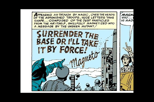
From "X-Men" in The X-Men #1, September 1963. Stan Lee script, Jack Kirby pencils, Paul Reinman inks, Sam Rosen letters.
#xmen#x men#x-men#magneto#mutants#marvel#marvel comics#skywriting#comics#comic#comic book#comic books#comic panel#comic panels#stan lee#jack kirby#paul reinman#sam rosen#magnetism#1960s#soldier#soldiers#military#base#military base#ultimatum
2 notes
·
View notes
Text


rainbow stimboard for the vast 🌁🌈!
🌈 | ☁️ | 🏳️🌈
🌌 | 🤍 | 🌈
🪁 | 🌈 | 🌄
#happy pride!#tma#stimboard#tma stimboard#pride#gay#sky#scenery#bath bomb#city#heights#aurora borealis#planes#skywriting#indoors#kites#timelapse#sunset#rainbow#blue#gif#mine#scheduled
20 notes
·
View notes
Text
textual frustration
words: 1581
rating: e (18+ readers only)
this one is inspired by the "would your wol take nudes" wolqotd. sorry about it. a few things to note: sam is left handed and this is set in me and egg's university AU!
It hadn’t started out as a particularly remarkable evening by any means, but Sam had been learning a lot—and not from the textbooks that sat forgotten on his desk across the room, shrouded by the darkness that extended past the piercing glow of his cell phone screen.
First off, he learned that sexting felt super weird (and a little embarrassing to start) but also felt super good, if the stiffness between his legs was anything to go off of. Euphie seemed to be into it too, unless she was lying about what his words were doing to her—but what reason would she have to lie?
Normally instead of texting all the things they wanted to do to each other they’d just actually do those things, but Sam had been insistent they spend a few evenings apart as finals week was rapidly approaching. Clearly his plan to study quickly went out the window as he was in bed with one hand on his phone and the other on his cock, too wrapped up in his budding sexual frustration to focus on study guides and notes.
Secondly, Sam learned that sometimes girls do want dick pics.
He’d never sent one before. Sure, he could be oblivious sometimes, but he wasn’t that stupid. Anyone who existed in this day and age knew that unprovoked photos of penises were almost always looked down upon. Besides, until just an hour ago he’d never sexted! He’d never had a valid reason to even think about taking a picture of his dick until now, as he looked back and read and reread the last couple texts he and Euphie had exchanged.
Euphie 💖: are you as turned on as i am right now?
im texting with my right hand…does that answer ur question lol?
Euphie 💖: show me~
He wasn’t about to leave her wanting, though. Kicking the blanket down a bit and pulling his erection fully out of his boxers, Sam aimed the phone in the general direction of his groin and tapped the camera button. The flash went off and the camera app clicked and Sam was presented with…probably the worst picture anyone could have taken of a dick in their life.
Sam didn’t really think that penises looked great to begin with, but this photo (blurry and washed out due to the flash, no less) was doing his member zero favors. Making a slight face at how ugly that first attempt was, he deleted it and pondered for just a moment before pulling up the web browser app on his phone next.
“How to take a good dick pic” wasn’t something Sam thought he’d ever have to Google, but here he was doing just that. Too much reading would make the boner go away, though, so he skimmed a few articles (and went through his texts with Euphie again to harden back up) before trying again.
Reaching over, he turned on the lamp on his bedside table, squinting as his eyes adjusted to the warm light that filled his corner of the room. The blanket was fully pushed to the end of his bed and his boxers followed suit, his t-shirt pulled up to expose his stomach and the happy little trail of hair that climbed from the base of his cock to his belly button.
Speaking of bases of cocks, that’s where one of his hands settled, holding his member up at what he hoped was a more appealing angle than almost laying flat against his body. With all the pieces in place all that was left to do was take the picture—making sure the flash was off this time.
The final product was better than the first, though it was still a little blurry, but maybe it just looked…artistic? Sam wasn’t good at these kinds of things and Euphie knew that, so he assumed she knew what she was getting into when she asked for a nude picture from him.
Attaching the photo to his next message he typed a quick message and hit send.
sorry that took a sec, idk how to take dick pics lol
The typing bubble showed up and for a split second, Sam was awash with an unfamiliar anxiety. They’d seen each other naked plenty of times and Euphie always told him how attracted she was to him, but maybe the picture wasn’t what she was expecting. Maybe she didn’t actually want a nude? His mind raced for a moment until her message finally popped up on screen.
Euphie 💖: oh my god sammie that’s so hot
The anxiety washed away and he was left with an incredibly strange sense of pride, though his face felt a bit flushed. It was a little embarrassing to keep seeing the picture of his own penis on the screen followed by her praise, though he didn’t have a chance to reply before the screen was filled with a photo from Euphie this time.
They had seen each other naked before, many times—but that didn’t stop a pang of need from coursing through him when he saw Euphie’s nude form on his phone screen, the hand that wasn’t holding her phone buried between her legs. His hips thrust forward almost involuntarily before he began to pump his left hand up and down his length again while his right fumbled as he attempted to text back.
fuck
so r u
Not poetry in the slightest, but Sam tended to get a bit of a one-track mind the closer he got to climaxing. Pulling his hand back for just a moment he spit in it (not a moment he’d be proud of in his future post-nut clarity) and continued to jerk off, trying to pretend the wetness from his own saliva could even compare to what it’d feel like to be inside of his girlfriend right now.
Euphie 💖: i wish you were here sammie
my fingers and toys dont feel as good as you
His eyes kept retracing her words as he continued to pleasure himself, thinking about how Euphie was doing the same, yearning for him as much as he wanted her in this moment. Scrolling back up a few messages his eyes locked onto the picture she’d sent, feeling that familiar tension building in his core.
euph im guna cum
(He didn’t care much about typos right now.)
It took only a split second before another series of text messages from Euphie showed up on screen.
Euphie 💖: show me
please
Slowing his hand for just a second he managed to pull open the camera app once more and flick the output to ‘video’ instead of ‘photo,’ hitting record just moments before he finished. Angles and lighting and whatever else be damned, he didn’t have time to try and make this aesthetic.
With one hand on his dick and the other on his phone Sam couldn’t suppress the sound that escaped him when he came, something between a whine and a growl that rumbled in his throat and devolved into heavy panting. As the orgasm faded and the last spurt of cum landed on his stomach, he stopped recording and sent her the video before he could get shy and second guess himself.
It took a bit for Euphie to respond, and it wasn’t with text but a video of her own. It was too dark to see much of anything but there were two things he could certainly hear—Euphie breathing his name over and over and the undeniable wet sounds of a very aroused woman touching herself.
If that wasn’t enough to get him horny again, the sounds she made as she approached and hit her own orgasm certainly were. Sam couldn’t help but play the video a few more times, relishing the sound of his name on her lips as she came. The video was interrupted by a new incoming text, however.
Euphie 💖: i just want you to know i came again but it happened so fast i couldnt record it for you
if it was anything like the one you sent me then i bet ur feeling really good
Euphie 💖: im still shaky and quivery sooo yeah. feeling amazing right now 💗
god dammit euphie, that was so hot im gonna get hard again and u kno i can only cum once lol
Sam was trying to will his rebound erection away to little success. Falling asleep after all this was going to be next to impossible, he just knew it.
Euphie 💖: heehee 😁 sorry sammieee~ guess you’ll just have to take care of it in the morning
might have to skip morning class and have you help me with that
Euphie 💖: what about getting ready for finals, huh??
yeah, because i did SO much of that tonight lol
Reaching over, Sam grabbed a handful of tissues to clean himself off before turning the lamp off and pulling the sheets up over himself once more (the tissues would be properly disposed of after getting up in the morning…probably). The banner across the top of his phone screen read 2 a.m.—definitely later than he wanted to stay up, but the warmth of love and satisfaction that filled the spots in his chest vacated by desire and lust just moments prior made it all worth it.
(And the thought of seeing Euphie in the morning to finish off what they’d started over text. That made it worth it too.)
3 notes
·
View notes
Text
8 notes
·
View notes
Text
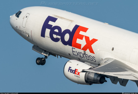
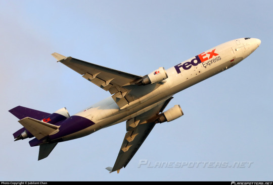
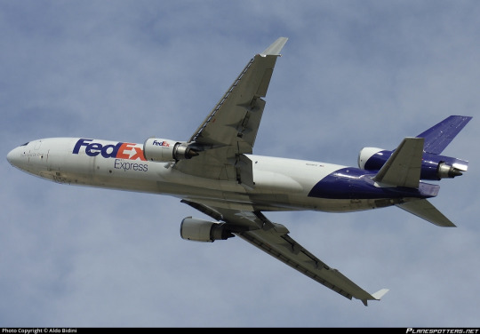
No. 44 - FedEx Express
If you have ever sent or received a package, particularly if you live in the United States, you may be familiar with FedEx, and @magic-gps requested that I discuss their airplanes!
FedEx (founded and formerly known as Federal Express) is a massive network for transportation of mail and cargo, and Federal Express Express (okay, no, I can't call it that, FedEx is legally the full name even though we all know what it's really short for) is its airborne branch, making up the largest cargo airline by fleet and freight tonnes conveyed in the entire world. Their largest customer is the US Postal Service, with whom they have an exclusive contract - any USPS air mail is carried by FedEx Express - but they also fly for countless other clients. They cover so much ground (air) that they not only have a dozen hubs but an additional SUPERHUB, located in Memphis. They're what DHL is for Europe but doing bigger numbers, and that's with UPS, Atlas Air, and Kalitta Air to compete with. Although they're based in the US, their website claims that their destinations include every US zip-code, plus "over 220" countries and territories. There are 195 internationally recognized countries at present. I don't think saying they fly everywhere is even really hyperbole at this point.
FedEx's fleet is massive and eclectic. They have the world's largest cargo fleet, with 650 planes (which are named by employees, frequently after their children). Add in FedEx Feeder, a second fleet of small propeller airplanes dry-leased to local carriers for use ferrying small loads to the full-size jets, and there's a total of 699 FedEx liveries in the skies with 88 more on order. They occupy whole swathes of tarmac. They're everywhere. Like snails after the rain.

Oh, and apparently this livery was designed by Lindon Leader (what a name) of Landor Associates, the prolific and highly regarded design firm responsible for hits like the SAS belly stripe livery and misses like JAL's two previous designs. I have higher standards for liveries that are just absolutely everywhere, so let's see if Landor was able to live up to them.
I'm going to be specifically talking about, because I presume this is what the requester meant, the livery FedEx adopted in 1994. The timeline of this is interesting, because the name of the airline stayed Federal Express until 2000, when the entire company rebranded from Federal Express to FedEx and added the redundant 'Express' to the airline's name. I've always thought that was very funny, and while that's charming to me I don't think I should be encouraging things like this. It's just sloppy and a bit weird to say.
Before they adopted the livery they did briefly trial a new logo. From 1991 to 1994 they had this!
Boy do I not like that! It's significant to the history of the company in that it shifted the colorscheme from indigo and burgundy to purple and orange, except that the difference in brightness here is really almost upsetting and the logo itself is...it looks like that. It's very TRON somehow. I don't find the tackiness pleasant. It's just ugly. The typeface they chose is bad. The wriggly X is nice but every other letter looks a unique sort of hideous, with the E in particular looking like a rake made of sponge which has been placed in water and left to soak. Thankfully they moved on quickly, replacing this logo at the same time as their livery.
The fact that there's six years between the visual rebrand and official renaming is interesting. Federal Express was already colloquially known as FedEx before the official renaming, and used it in their branding, but they weren't legally FedEx yet, so for that little span their planes bore both names.

This adolescent period in the life of modern FedEx featured the 'Federal Express' subtitle in this serif mystery font which I haven't seen mentioned at all anywhere. I couldn't find many more pictures with the full 'Federal Express', but there's a scattering of seriffed planes out there, it seems. It looks a lot better with the 'Federal' taken out just by virtue of legibility, and I have to say I'm very keen on the way the subtitle is offset to align with the start of the E. It looks nice and aerodynamic. When the first word is taken out it has the extra benefit of lining 'Express' up with the 'Ex' that stands for it.
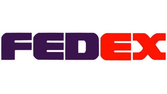
But there it is! The FedEx logo. Adopted in 1994, considered a contender for the best logo ever made, winner of over 40 awards.
I want to disclaim for a moment. I think it's always been somewhat implicit that my opinions are just one manifestation of the infinite variability of human thought and inevitably subjective but I do need to re-stress this now: these are my own hot takes. My opinion is not legally binding. Lindon Leader is an incredibly accomplished designer and I'm not even a designer at all. There is a reason that FedEx's logo is so widely acclaimed. My criticism of it is not an attempt to contest its legacy, and is - again - just my opinion. And it is an opinion colored not only by the fact that I'm an amateur, and by the fact that my tastes are different from other people's, but by the fact that this logo is quite literally older than I am, and tastes have most certainly evolved since then.

I think the FedEx logo is...okay. I certainly do not despise it, but I would stop very short of calling it the best logo ever. I'm going to talk about why I'm so underwhelmed by it, and it's going to sound like I don't like this logo for a bit, but if you power through that you will see that my opinion about it isn't as straightforward as the sum of my opinions about its parts.
The fantastic thing about this particular logo is that it's easily the most-discussed and best-documented bit of branding I've yet covered, so it was a delight to research. I didn't even have to call in my font wizard, for example, because Leader explicitly states what it is in this interview - a proprietary typeface heavily inspired by Univers 67 Bold Condensed and Futura Bold. I actually like Futura (the Cyrillic version is one of my favorite Cyrillic typefaces) but don't love Univers 67 - it reminds me way too much of the handwriting style I was drilled in at school. US schools have truly heinous taste in the penmanship they teach, and much like how Parker cursive inherently reminds me of third grade, Univers 67 feels to me like an adult version of something I've long since outgrown. The design of the letterforms here, with the exaggerated x-height and all the lines (crossbars included) having a uniform thickness of 'very', reminds me of the posters on the walls of elementary school classrooms.

Take a look at this. The green line is hypothetically where the baseline should be, but the E and D descend slightly below it. According to my font wizard this is fairly common as an attempt to some sort of visual trick, but I don't like it. I can make it out from a distance and it significantly bothers me.
Speaking of misaligned, I've always felt like the vertical line on the E was slightly wider than that on the D, but had dismissed this line of thought as an optical illusion - the darker color and the lack of detail at the top, plus the lack of gaps at any point in the E, artificially make the D look narrower than it is. I tried lining them up, and I was right, it's an optical illusion. I still hate it. What isn't an optical illusion is that the middle line on the E is thicker than the second line on the F - again, hate it!
And I just don't like this font! It's like if they fed different fonts to a neutral network and had it invent a weight bolder than bold, like the neural-network generated upperer and lowerer cases. I'm aware of the existence of ultra bold weights, and I'm not talking about those, because those are regular ugly and clearly made by humans. This looks like an algorithm expanded the letters until they were touching.
But the touching bit is intentional. The FedEx logo is hiding a little secret, perhaps the most frequently cited reason for why it's so beloved. Between the E and X, Leader slipped in an inconspicuous arrow.
And I can't pretend this isn't really clever. It's subtle but once you see it you can never unsee it. My problem is that one feature doesn't make something good on its own, particularly when it's something you can easily miss at first. The Sneeze interview linked earlier sort of implies Leader built the font in large part around the idea of the arrow, and I find that a little problematic. Sometimes an idea is so fantastic you just can't let go of it, but when you're designing something you just can't be myopic like that. And, to be clear, I don't think Leader sacrificed the aesthetics of the wordmark to accommodate the arrow. I'm sure he personally thinks this font is beautiful. But when I evaluate it for myself, I can't allow one good feature to overpower my own dislike for the font overall, even if it is legitimately clever.
I do have some nice things to say, though. Well, mostly one nice thing. I love the color scheme. I think the purple and orange shades here are a wonderful choice, an uncommon one but one that manages to be a visually pleasing combination. If either of the shades were less saturated, or the purple were brighter, it would lose its cohesion, but Leader chose the perfect shades to bring out the best in each other. The old red and purple shades were absolutely hideous, but he transformed them into something great.
But at the end of the day my opinion of the logo on a granular scale is irrelevant. And I don't say that because I'm in the minority here or because I'm not allowed to have an opinion or anything else of the like. It doesn't matter because the FedEx logo is older than me and it is FedEx. When I see something purple and orange, I think of FedEx first. Let me use an example by invoking something better left dead.
In 2018 the Overwatch League, an esports league based around the maelstrom of poor decisions which is Blizzard's video 'game' Overwatch, played its first season. A charter member was the Florida Mayhem, a team which was in all honesty sort of a joke (though not exciting enough to live up to their name). I stopped following OWL after the first season, so I'm not sure if any of this has changed, but they finished second-to-last, made some very questionable choices on the management end, and were representing Florida. All of these facts are ontologically comedic. But above all, these were their team colors.
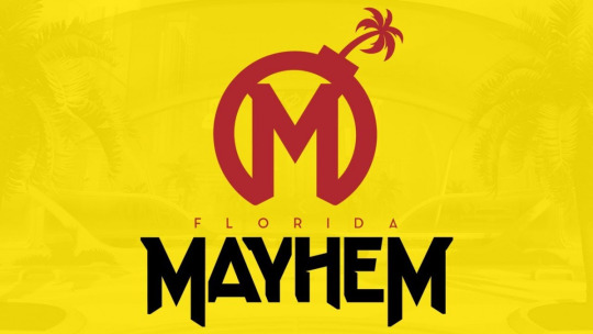

So, this creates the clear issue demonstrated above. Certain brands are so culturally entrenched that even a passing similarity in visual identity makes you immediately look like a pastiche, even if you're otherwise distinct. Mayhem's branding is, in my opinion, way better than McDonalds's, but it was still the right move when they changed to a completely unrecognizable color scheme in 2020. You just see some things and immediately recognize them.
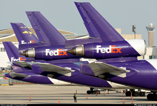
The cultural specter of the FedEx logo is very useful to the FedEx livery. As long as you do not royally mess up - which they have not - a FedEx plane will immediately resemble a FedEx package, even if it doesn't actually look like one, since they're mostly white.
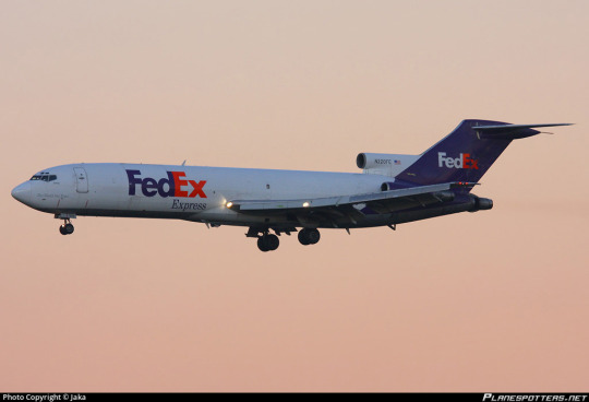
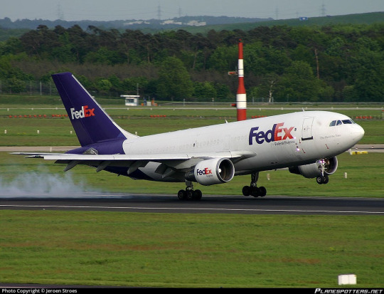
...well, okay, the planes are also mostly white. And I'll be honest, on the 727? This plane isn't half bad. The clean line of the t-tail makes this sort of straight-line-down livery look so much better, and the placement of the wordmark in front of the heavily swept wings keeps the white tube from looking quite so much like a white tube.
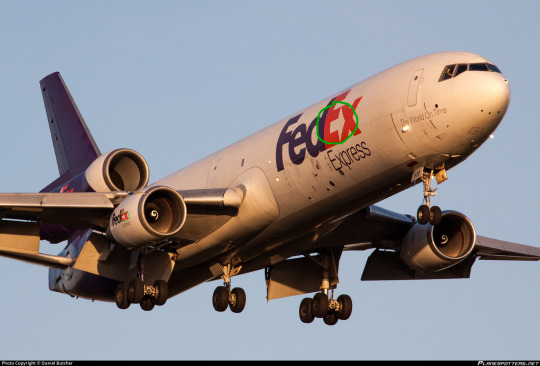
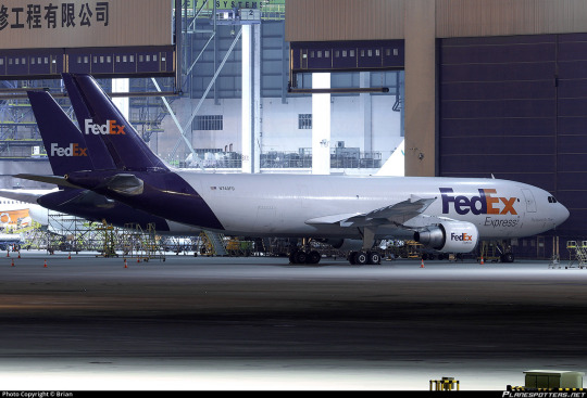
But the 727 isn't the only airframe they fly. They're the largest operator of six separate types, most of which are fully retired from passenger service, including the MD-11. Their MD-11s are literally the only trijets you'll see around in the US these days - they only started retiring their DC-10s in 2021, nearly ten years after they flew their last passenger flight. They're pretty unusual among large cargo airlines in that they flew the 747 for just over five years, and not particularly on their own initiative, having acquired a few from a merger with the Flying Tiger Line. So the way the livery looks on the 727 doesn't tell the whole story.
Okay. So that...is a couple of white tubes. That's somewhat unfortunate.
I want to clarify that, while this style of livery has become increasingly popular over time, culminating in its codification as an outright trend in the late 2010s and early 2020s, FedEx adopted this livery in 1994. It is wrong to say that the FedEx livery resembles TAM, Lufthansa, or Icelandair, and more correct to say that all of the above carriers are wearing a style similar to FedEx (though Qantas and MALÉV came first). Despite the fact that I've been known to call these 'Lufthansesque', Lufthansa didn't invent this style and didn't do it best. Still, doing it earlier doesn't excuse it.
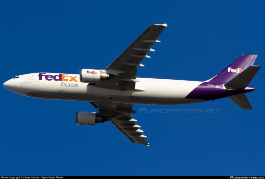
FedEx in particular suffers from the rear-heaviness issue. Though they have a larger logo which balances it out better than some (Lufthansa), it's kind of countered by the fact that FedEx exclusively operates planes I'd consider on the long and thin side. It makes the white look all the more dominant on the airframe.
FedEx does take one measure to mitigate this - the undersides are painted grey (in a style I've been calling 'Deltalike' to myself even though Delta absolutely did not do it first) instead of being the same white as the rest of the fuselage with the purple fully wrapping around. Also, they have the line remain straight on the third engine of trijets, instead of committing to one shade or the other, as older trijet liveries frequently did.

Compared to an ASL Airlines lease which keeps the underside white and the purple as a contiguous loop, this creates a much more streamlined look. But it's not enough to save this.
And I think what bothers me the most is how at odds this is with the thing people say is so brilliant about the logo - the arrow.
Arrows are, as Leader pointed out in his interview, definitely not a new phenomenon in airline liveries. Hell, we even had Arrow Air.

But there's a reason for that. Arrows represent forward movement. They're fundamentally indicative of speed, efficiency, and polish. And airplanes are more or less shaped like arrows, when you think about it.

Something being done very frequently doesn't make it somehow creatively bereft. And it's not like only painting the tail and the big of fuselage directly below it is reinventing the wheel either.
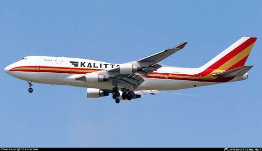
Cheatlines, and hockey sticks especially, were not a particularly new thing when my perennial example of 'boring idea, good execution', Kalitta Air, rolled out in the 1980s. In fact, they were done to death. But Kalitta Air's choice in color and shape, use of proportions, and stylish logo set it apart from every other airline to use this style.

There is a reason arrows are so common. They are speed and precision and kinetic energy. When you refuse to consider making something common your own, you often shoot yourself in the foot. With the logo constructed, with the motto 'the world on time' written on the nose of each plane, absolutely nobody would turn up their nose at FedEx having an arrow motif on its livery.

Ultimately, I'm a bit sad, because the FedEx logo, while I don't like a lot of the choices made in regards to the font, would provide a truly fantastic jumping off point for a livery that would elevate it beyond the point anyone could ever dismiss it as being part of a crowd of very similar designs, the way I have by lumping it in with Lufthansesques. Arrows, being a fundamentally long and tall shape, would also avoid the pitfalls of a livery type which I have already on multiple occasions critiqued for inherently creating a look of rear-heaviness, particularly on longer and thinner airframes, especially when the color used is a dark shade to contrast a white base.
That said, the FedEx livery gets a bit of a free pass where something like Lufthansa doesn't. FedEx's logo is so ubiquitous that unless you actively interfere with or muddle it, any plane bearing it will immediately be recognizable as a FedEx plane the same way a truck or package is. As a branding exercise it is certainly successful. It looks clean, it's by no means exceptionally ugly, it does its job...but it is so rich with potential and so impoverished in execution. Doesn't it just look like this plane isn't taking off, but being pulled by the weight of its purple slice towards the ground?

I'm giving FedEx a D+.
I don't feel good about doing this. I think this is an opinion which is not only contentious but downright unpopular. But as I've mentioned a few times my grades take into account more than just broad aesthetic appeal. Branding and environment factor in, but what also factors in is, as I said in discussing Saudia, wasted potential and a refusal to capitalize on what you have that's clearly good. When I graded Air Astra down for not reaching its potential I meant it as a kind gesture, not even a sort of tough love but an acknowledgment that I like what they have and I know they'll do better.
FedEx, however, is just disappointing. For the frequently cited best logo of all time, this is just unacceptable. This verdict brings me no joy, but the fact that this logo is so beloved doesn't mean I can go easy on it - to the contrary, it had a lot to live up to, and it just didn't.
#tarmac fashion week#grade: d+#era: 1990s#era: 2020s#era: 2010s#era: 2000s#region: north america#region: united states#fedex#kalitta air#cargo carriers#requests#lufthansa line#landor portfolio#skywriting
28 notes
·
View notes
Text
Hey Sweetheart: Ch. 1 Carol Surprises Daisy
By Skyler10
Summary:
Carol is away for a conference and Daisy is home alone, but Carol has a Valentine’s surprise in store that finds Daisy in an opportune moment. (Rated M)
Notes: I had this idea and then two more, so enjoy this first chapter and then eventually, there will be two more chapters with two rewrites with a similar general premise but with key tweaks that change the story!
Written for the @ficwip Hey Sweetheart event 2024.
Read on Ao3
---------
Flowers seemed to haunt Carol the longer she was away for work. This time of the year, the city was full of flower vendors on every corner with bouquets for Valentine’s Day. Roses, especially, were everywhere she looked, but others too. The hotel her conference was in was decorated with florals. The chic restaurant for their first night’s dinner and debrief session? The Lily and Lilac. The next night, the team grabbed food and drinks at a gastropub with artistically modern daisies on the menu. Even one of the presentations used aerodynamic models based on various seed and pollen shapes to describe how their aircraft would fly through the wind. Another day included a tour of a lab next to a greenhouse full of flowers for the upcoming romantic holiday. Each flower made her think of Daisy Johnson, her fiancee back at home.
The worst was yet to come: traditionally, the last night was the association president’s ball, a dressy dinner and dance where everyone paired up or partners would fly in early for a vacation starting after the business of the conference was over the next day. And this year’s ball would fall on Saturday, February 14. Daisy wouldn’t be one of the partners joining the fun, however, with a major deadline at work on unlucky Friday the 13th. Carol pictured herself dressed up for no reason, sitting alone in the hotel ballroom, watching all the couples dancing and singles flirting with each other, if only for the night. She’d probably drink too much champagne and wake up Daisy with a far-too-late phone call, moaning about wishing she was there and counting down the hours until they’d be reunited in 48 hours. Daisy would try to stay awake, but eventually Carol would let her go back to sleep, and then Carol would sit in her hotel room, hearing the echoes of partygoers stumbling back to their rooms for Valentine’s Day sex. She’d lie awake, wondering why agreed to come here at all. And Carol felt guilty that Daisy would be home feeling just as lonely and maybe resentful as she spent their only Valentine’s Day as an engaged couple alone.
But it was still Wednesday, February 11 for another hour, an hour filled with guilt, dread, anxiety over her presentation the next day, and exhaustion that brought hot tears to Carol’s eyes as she lay in her hotel bed in the dark. Carol’s best friend and fellow aerospace engineer Maria Rambeau snored in the other queen bed a few feet away, and Carol came back to the present. She wiped away the tears and reminded herself she was being silly. No use being depressed over something that hadn’t even happened yet.
The next day, February 12, Maria stood next to Carol as they watched rows and rows of flowers being wheeled into that same hotel ballroom for a wedding happening in that space after their conference’s main session had ended for the day. It was a busy hotel, and the staff were under tight deadlines to get the wedding reception in and out before the aerospace association needed the space again. Carol and Maria had just stopped in to see what all the hustle and bustle was about and stayed, curious to see the end result.
Maria cleared her throat, and Carol raised an eyebrow as she turned to catch Maria’s glance.
“Congratulations on your panel today,” Maria began. “You nailed it.”
“But?” Carol drew out, knowing there was more.
Maria shrugged. “That’s the last thing you had to be here for. You can go be where you really want to be.”
“What?” Carol scrunched her brow. “I thought you wanted me here.”
“I did, and you were great!” Maria turned to face Carol fully. “But I know that look. And you’re not really here, are you? And I’m just sayin’, you don’t need to be. We’ve got this. You did your part.”
Carol sighed, knowing where she was going with this. “I can’t. You all supported me through my panel. It’s only fair that I stay—”
Maria held up a hand. “We’re good. I know where your head is. Are you really going to get home to your fiancee late at night on February 15 with some discount chocolates from the airport? I don’t think so. Not on my watch.”
Carol had to admit, with all the Valentine’s romance in the air, she missed Daisy so much it ached. “Are you sure? Then you’ll be all alone here… I hate having to choose one or the other.”
Maria sent Carol a look of disbelief. “Alone? I don’t think so. I’ve got the whole team. And, the cutie from JPL is here. Remember Florida? Trust me, I’ve got Valentine’s Day covered.”
The hotel events manager walked in their direction to kick Carol and Maria out of the ballroom, so the conversation was over and the decision was made. Carol let her department manager and office administrator know she was taking advantage of the flexible dates of her airline ticket and coming home early. The soonest flight she could get would leave early on the 14th, and Carol would be home in plenty of time to surprise Daisy for Valentine’s Day weekend.
Conversely, it seemed like Daisy was being haunted by calendars. There were the usual, like work calendars that got subdivided into project calendars, and the usual phone app filled with the minutia of life. But now there was a shared calendar with Carol as they merged their lives and a related but more specific wedding planning calendar app with suggestions and recommendations for all of the deadlines to put down deposits and make decisions and hire professionals of various wedding expertise.
She wasn’t exactly royalty, but as the genius rising star daughter of Stark Industries’ VP of Strategy and Mr. Stark’s own private pilot, Daisy also wasn’t the typical codemonkey in her social circles either. She’d grown out of the “prodigy” compliments, but she still carried the heavy weight of being Somebody in her company, expected to do great things. She was marrying another former “prodigy.” A girl who had designed rockets at 16 that impressed not only Tony Stark, but his Pentagon contact, Nick Fury. Fury had instructed Stark that either Carol would be interning at Stark Industries with a path toward a career there or Fury was giving her an offer that led to her eventually becoming Stark’s competition within the Department of Defense itself.
Thus, Daisy met the love of her life while feeling highly praised but extraordinarily lonely as the youngest intern in her dad’s division. The two teens bonded and grew from coworkers to friends to inseparable best friends to head-over-heels lovers over the past decade. Between their jobs and grad school and financial independence, marriage had always been assumed but so far down the calendar, it hardly seemed worth stressing about. An inevitability, but vaguely so.
Now, the aforementioned calendars and planners and to-do lists stared Daisy down. She groaned and rubbed her eyes as she tried to answer the prompts in the wedding planning guide. “Fill these pages out separately, and then come together to talk through your expectations of your special day!” the guide instructed.
“Carol better be doing this on the plane home on Sunday,” Daisy grumbled. She should text her, just as a reminder.
“How was your day?” Daisy started. Best to check in first before being a nag.
“Ugh, long,” came Carol’s reply. “But more flowers everywhere today. Couldn’t stop thinking about you. Miss you. :( “
The text was accompanied by a photo of the wedding flower arrangements.
“150 days.” Daisy intended it to mean the countdown to their wedding, as the countdown widget on her computer reminded her. But it also felt like how long it had been without each other. The self-pity was strong in this apartment tonight.
Before Daisy could remind Carol about the wedding planning guide prompts, Carol asked if she was free the day after tomorrow.
Daisy snorted and sent back a laughing emoji. “Yeah, my Valentine is away for work. I’m going to be home with takeout and a spreadsheet of info on every wedding venue in the metro area.” She added a melting face emoji. Maybe she wanted Carol to feel a little guilty. Carol would be off having fun with their work friends from her team. And with all their other friends going out with their own Valentines, Daisy would be sitting on this same couch missing her, alone.
“We can do better than that,’ Carol sent back cryptically. “Don’t plan anything. I have an idea.”
“???” Daisy sent back.
“Nope. Surprise,” Carol returned, then “gtg, early start tomorrow.”
Daisy sent back a simple “I love you” with a purple heart, which Carol returned, with a red one. They exchanged goodnights with kiss emojis as well, and Daisy was left to try to answer what her ideal wedding aesthetic would be, how many people to invite, and whether the ceremony would be any flavor of religious/spiritual.
“It’s too late for this.” Daisy mumbled to her laptop and shut the lid. She had been staying up later and later this week, dreading going to bed without Carol. At first, many years ago now, sleeping together had been nearly impossible without staying up all night touching and making out and talking. Now, it was hard to sleep deeply without each other, they were so used to each other’s presence. The bed just felt so empty.
Eventually, Daisy did fall asleep and dreamt that the huge arrangement of wedding flowers from the text Carol had sent were being served as the cake. She shouted for the baker to not cut into the arrangement with a huge knife, but it turned out to be simply a delicious, if hyperrealistically beautiful, cake after all.
Maybe it was just a silly thought, but the reassurance in the dream that what seemed like a horrible mistake was actually a wonderful creation stuck with her throughout the next day. As tempting as it was to let her grumpiness over missing Carol sour her mood, she couldn’t shake the feeling that in the end, things would be okay after all. Daisy talked herself into making peace with the circumstances and not subconsciously holding it against Carol that she couldn’t be there. It wasn’t like she set the date of the conference, and the holiday was just a made-up date on the calendars that were surrounding her from all directions. So what if that date was blank on all of them?
Daisy closed out of her personal calendar and focused on her work one. If she got this week’s project done, she could leave the office this dreary winter Friday feeling free and ready for whatever the weekend held, even if it was just a quick video call with her fiancee tomorrow night and a trip to the store for 50% off chocolate on Sunday.
Saturday morning, February 14, Carol could barely contain her excitement as she boarded her plane home. She was practically bouncing in her seat. She’d passed a jewelry store that morning on her way to get coffee and donuts from a trendy place a block away from their hotel, and now the perfect pair of earrings was safe in her bag, gift wrapped by the store.
She’d stop on her way home from the airport for part 2: a bouquet of roses like the ones she’d been seeing all week.
“In a hurry to get home?” her seatmate asked. He was probably mid-30s, wearing a hot pink tie and French-manicured nails. His tiny dog napped in a carrier at his feet under the seat.
“Yeah,” Carol admitted. “Is it that obvious?”
“Mmmhmmm.”
“I’m surprising my fiancee by getting home early for Valentine’s Day,” Carol confided.
The man’s eyebrows shot up. “Girl! That’s romantic! And do you have plans for what you’re going to do with … him? Them?”
“Her.” Carol smiled. “Yeah, she has a favorite place I’m going to order dinner from, but I think we’ll probably spent most of it wedding planning.”
The man sighed. “Oh no, baby, no. My husband and I are celebrating 8 years of marriage this year, 15 years together, so trust me when I say, the wedding planning stress is not the romantic Valentine’s Day it sounds like. Go out, be young, have fun, or stay in and, you know, have fun there too, but trust me, vendor websites are not date night, especially having to find ones that aren’t jerks about people like us.”
“Good to know.” Carol worried her lip. Perhaps she had jumped into this plan a little early with excitement to get home, but not a romantic enough Valentine’s Day strategy after she got there.
Their drinks came and the man popped in his earbuds to watch a movie, but Carol signed up for the in-flight Wi-Fi instead and brainstormed date night ideas in their city that wouldn’t break the bank or be too booked up for Valentine’s Day already.
Honestly, she just wanted to be home, just the two of them. But Daisy was probably ready to get out and do something special. Elegant restaurants in their part of the city were all booked, and none of the plays or concerts or even movies seemed very romantic or their taste. She made a list of some ideas, varying from an evening at the planetarium’s wine-and-cheese adults-only night to cooking something more gourmet than usual at home. Whatever Daisy felt like doing was fine with Carol, so long as they were together.
Carol closed her eyes and rested back against the plane seat. She tried to remember every Valentine’s Day they’d ever spent together, even when they were awkward teenagers and then even more awkward university students realizing their bond was undeniably romantic. Her lips quirked at the memory of their first as a romantic couple, seeing each other in an entirely different light and nervous in a way they had never been before. They’d visited a lesbian bar that Valentine’s Day and—once the older women there learned of their baby gay status and new coupledom—received a baptism by full immersion into the queer culture of their city.
The bar had closed a few years ago, but they still followed the regular drag performers on social media and went to some of their shows. If only it were still open, that could have been a fun trip down memory lane for a Valentine’s date. Carol opened her eyes long enough to write down “queer bar” on her ideas list. She closed them again to think of more and relive their earlier years.
The next thing she knew, they were landing, and she was awakening from a much-needed nap.
Daisy kept her phone nearby all day. Carol hadn’t explained what their long-distance plan for Valentine’s Day was today, and she wasn’t answering Daisy’s texts. Probably busy with her conference all day. Daisy sighed and went about her unromantic day. They’d been together so long, she supposed it was time they settled into being an old married couple, even if they weren’t technically married yet. Just an ordinary cold, rainy, winter Saturday with laundry and catching up on personal emails and a virtual yoga class. As she ate lunch and checked in with her hacktivist group chat, her podcast playlist started an episode about “how to spice it up in the bedroom.” Not very useful to distract herself from missing Carol. She switched it to an algorithmically generated mix, but the first song, then the second, and third were all extremely horny.
“Not helping!” Daisy said out loud to the music app as a fourth song came on with the perfect lyrics and rhythm for a sex playlist. She turned on the TV and picked up where she’d left off before with a historical romance series that Jemma had recommended. Neither Carol nor Fitz were interested in the storyline, so it was something Daisy and Jemma watched separately and chatted about without their partners. It was much spicier than Jemma let on, with plenty of eye candy of all genders.
“You’ve got to be kidding me,” Daisy mumbled to herself as the tall, dark, and handsome male lead revealed chiseled perfect abs. But she was too far in to stop now, and she knew she’d regret not catching up while Carol was away. Still she sent a text asking Carol to just check in when she had a chance. Realistically, she knew Carol was just busy with her meetings, and she didn’t really know what she’d say anyway. Like, “I know you’re having important business meetings but got some time for middle-of-the-afternoon phone sex with your bored fiancee?” Not the best timing.
Daisy decided to give in and take care of the problem herself. It’d been a while since she’d needed to alone, but it’d been a long week and she was being haunted by sex everywhere she turned. So with plenty of time and no one else home, Daisy headed to their bedroom and opened the drawer of vibrators and various toys and accessories. She picked one of her favorites and put on more of the sexy music. She laid down on the bed and pulled up her long loose shirt. She touched herself lazily over her yoga pants, letting her memories in this bed come back in detail. Her fingers snuck under the band of her yoga pants and into her underwear, and she teased herself until she was ready to kick things up a notch. She pulled off her pants and underwear, and set the vibrator to its lowest setting. Might as well make this last.
She thought of Carol’s tongue on her, Carol’s fingers inside her, Carol’s hands grabbing and taking what she desired, Carol’s lips at Daisy’s neck and breasts and panting her name.
Daisy let out an involuntary mewl and bucked her hips. Alone in her imagination, she was free to relish in fantasies that would never work in real life, like not having enough hands to hold on to each other, support themselves, touch everywhere, and finger-fuck at the same time. She imagined a position where their labia slotted together perfectly to get each other off, for another example. Before she could get too into the physics of it, her clit demanded her full attention. Her orgasm swept over her in a delicious wave, but she was having too much fun. She kept going, chasing another high in her fantasyland.
Hearing the door to the garage open, therefore, jolted her harshly out of her fantasies and sent her heart rate skyrocketing for a different reason. She turned off the vibe, set it aside carefully, and stood up but froze, listening for confirmation that she had actually heard something, and if she had, what the intruder’s next move would be. She debated whether her martial arts skills were enough to disarm them if they had a gun or if she should hide. What kind of intruder just walks in in the middle of a Saturday afternoon, anyway? She heard rustling in the hallway coming toward her and grabbed her phone on the bedside table to call the police, but just as she did, Carol rounded the corner with the biggest grin on her face, her rolling luggage behind her, and roses in her hand.
“Ta DAAAA!”
“OH-MY-GOD!” Daisy gasped.
“Honey, I’m hooome,” Carol sang with a smirk. She set her bags off to the side and the bouquet on the bedside table. “I see you’ve been busy without me.”
Daisy blushed and looked down at her state of undress. Her long shirt was barely covering her. “Ah. No pants.”
“No pants,” Carol confirmed with a filthy grin. “Surprise!”
“Surprise!? I thought you were someone breaking in!” Daisy’s brain caught up with her adrenaline, and she watched Carol’s grin fade. Daisy launched herself into her fiancee’s arms. “You’re home! How are you home?”
Carol captured Daisy’s lips for a searing, desperate kiss. Just as Daisy decided the answer didn’t matter so long as Carol never stopped kissing her, Carol backed away and answered breathlessly. “I finished my panel, and Maria said I should come home, so I did. She could tell my heart and head were here anyway, and I wanted to surprise you. Happy Valentine’s Day.”
Daisy couldn’t stop kissing Carol, and Carol was happy to oblige her half-naked fiancee. Carol pressed a thigh between Daisy’s and rolled her hips, making Daisy whine.
“You were only gone a week. I don’t know why I’m reacting like this.” Daisy tried to regain some self-control, and her fingers found their home in Carol’s hair, lightly brushing in that way that always made Carol sigh in contendedness. “I can’t believe you came home early for me.”
Carol soothed her thumb across Daisy’s cheek and met her dark eyes, blown wide with desire. “I missed you so much. Every minute.”
“I missed you too. Obviously.” She rolled her eyes self-deprecatingly at her libido getting the better of her a moment ago. “But seriously, all this wedding planning made it harder this time.”
“Yeah, for me too. There was a wedding at the hotel and all this Valentine’s stuff…” She pulled away slightly and reached for her tablet. “I filled out the questions we were supposed to do on our own, though. And I have some leads on vendors we can afford.”
“Oh god, thank you. You’ve never been hotter, just so you know.” Daisy took the tablet from Carol, but instead of looking at Carol’s answers, she set it on the bedside table with her phone and the vibrator.
“Mmm, spreadsheets of URLs and budget items, so sexy,” Carol teased, resting her wrists on Daisy’s shoulders and massaging the back of Daisy’s neck.
Daisy shook her head. “I know we sound, like, a hundred years old right now, but seriously, this stuff is driving me crazy and knowing there’s less of it left to do is very attractive.”
“We’ll get through it all … every detail …. together,” Carol promised between light kisses. “But tonight, no logistics or schedules. Just you and me, whatever you want.”
“Oh! Oh no. We don’t have any plans or reservations or tickets to anything. I’m sure everything in the city’s been sold out for weeks. Where can we even go?” Daisy laughed at the sudden reversal of her dilemma.
Carol switched apps on her tablet and showed Daisy. “I made a list of a few things on the plane. Clubbing in our slutty clothes? Wine and cheese gala in our dressiest black tie? Indoor picnic? Ice skating at the mall?”
“Really covering all your bases there,” Daisy laughed as she read down the eclectic list.
“I like to be prepared.” Carol returned the tablet to the bag at her feet and brought Daisy in for another kiss. Daisy’s hands wandered, reunited with their favorite territory to explore, and Carol’s dipped under the oversized shirt until they found Daisy’s bare ass.
After a while, when their tongues had had time for a proper greeting, Daisy pulled away and shook her head. “Never mind the list. I can’t even think about going out, not yet.”
Carol licked her bottom lip and her eyes sparkled. “Sweetheart, I’m going to have you thinking about one thing and one thing only.”
“Only one? I can think of at least a dozen things I want to do to you,” Daisy challenged. Carol reached for Daisy’s shirt and stripped it off over her head, which Daisy took as her cue to unbutton and unzip Carol’s jeans so Carol could step out of them, then shortly after, Daisy’s bra joined them on the floor. They continued until they were both completely bare.
“No reason to rush, though,” Carol considered as she tossed her own shirt into the hamper. “It’s only 3:00 and we have all day and night.”
Daisy climbed onto the bed again and lay down on her side so that Carol would mirror her, but then as soon as Carol did, Daisy rolled on top to straddle Carol’s hips.
“Then there’s just one question left,” Daisy teased.
“How many times we want to come?” Carol suggested and let her fingers trail down from Daisy’s neck to massage her breasts.
“Mmm, that too,” Daisy chuckled softly and leaned down, giving Carol an excellent view. “I meant: Will you be my Valentine’s Sweetheart?”
“As long as we both shall live,” Carol promised. She used her free hand to weave her fingers gently through Daisy’s hair and drew her down for a kiss to kick off their afternoon of lovemaking.
#daisy johnson#carol danvers#aos#agents of shield#captain marvel#daisy x carol#carol x daisy#wlw#sapphic fic#femslash#lesbian carol danvers#bisexual daisy johnson#skywriting#mild spicy#rated: m#valentine's day#valentine's day fic#hey sweetheart
8 notes
·
View notes
Text
Skywriting - 021420241853
PROSE – RANDOM THOUGHTS
I’ve been here over a week. I’m not sure I have I left here on the front. My body is waging war against my spirit. My spirit is losing, but the battle is far from over. Last Monday, I walked into the ED thinking one thing and discovering another. Each day, we take another step toward victory. Each day, it feels we take five steps back toward defeat.
Despite this, I gaze…
View On WordPress
0 notes
Text
youtube
skywriters
1 note
·
View note
Last Seen Blogs
ntemid
Living ~ Loving ~ Laughing

superlameguy1515
Untitled
waspcup
just like a centipede!


poopystain
door frame