#no actually tho this is good advice
Note
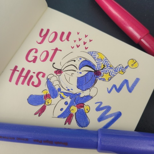
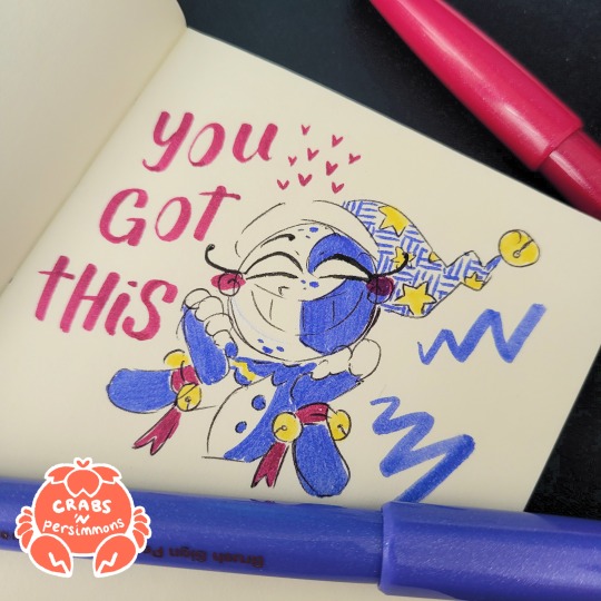
Hey Viv! Do you have any tips for drawing anatomy?
weh... not really... after spending most of the year taking a break and only recently drawing again, I've come to the realization that my anatomy has so much farther to go. I will, however, share some things that I think are valuable for me and a part of how I draw:
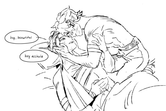
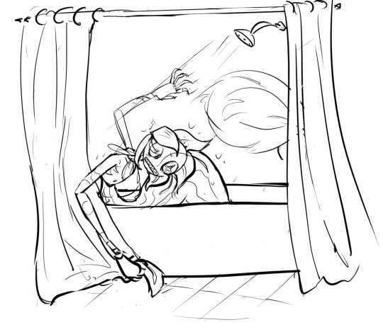
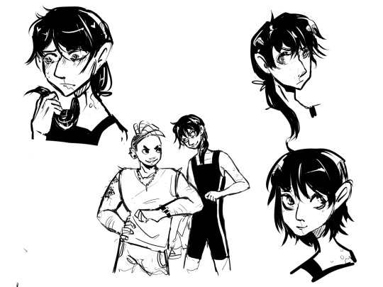
in terms of the basics: aside from online tutorials, which are a lot of help, I have multiple books that I studied intensely off of. my favorite is this. I've seen artists be able to draw without guidelines and the infamous circles and sausages, but the way I draw is pretty similar to that wherein I draw very basic forms. some examples I can show that aren't too embarrassing:
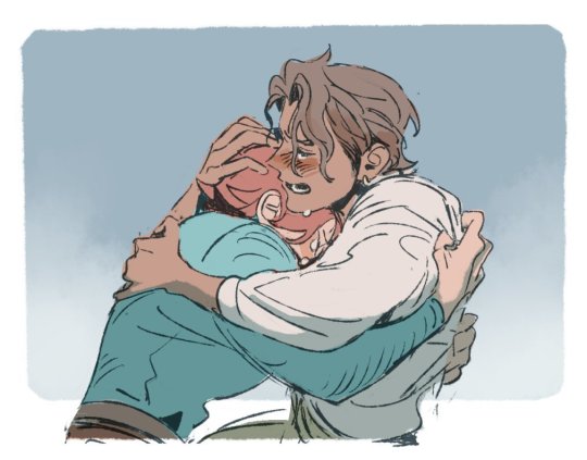

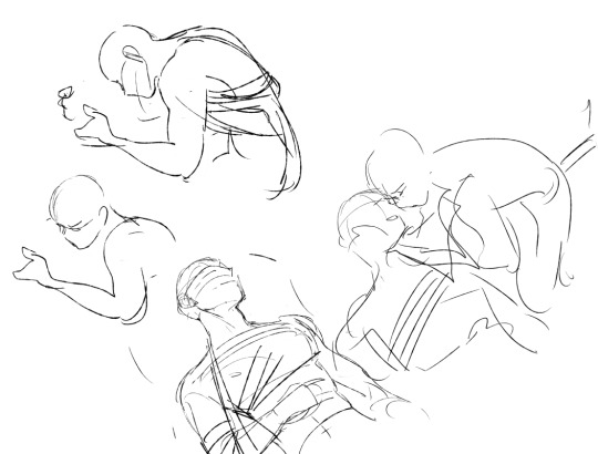
everyone has their own way of problem solving anatomy/poses. mine is this: start with stickmen, really bad doodles that vaguely capture the essence of what I want to draw. and then I draw a really bad doodle developed off that. then I try a more refined sketch. and I redraw the entire sketch multiple times (as you can see in the examples above). oftentimes I'll duplicate the layer and continue reworking the sketch, and going back and forth to see which iteration works better. I think this would be tedious for many people, but that's what works best for me
sometimes, it's not just about drawing the pose anatomically correct. it's also about drawing it in a way that's convincing and aesthetically pleasing. a pose may be structurally sound, but is it the best portrayal? would it benefit from a bit of angle adjusting? is the way a knee or elbow foreshortened awkward? is there a better way to depict the kind of motion or pose you're trying to express, yet it doesn't totally adhere to logic? ironically, sometimes breaking the rules a little can make a pose more convincing. this only truly works when you have a good handle on the ways the human body can bend and move, though
I did already answer this kind of question years ago somewhere on this blog with different answers involving reference pictures and practice (you can check it out if you feel like it) so there's not much more I think I can say on the subject. but aside from that, I hope any of this was useful!!
#ask#I HOPE IT HELPS? SOMEHOW???#I feel like I used to be more confident in giving tips but ermm I am relearning how to draw actually#i am honoured that u felt like i was good enough to give advice tho...sdkfjd
208 notes
·
View notes
Text
Thinking about an older C!Tommy, raising kids and being a good dad can be something so, healing. And fun and awesome
#dsmp#ctommy#au#mf should have grown up into a scuffy tall man with hair a bit too long that dresses feminine-ish that gives out weird but actually good#life advice. the homie that looks like he would not make it turning into the one who actually has shit together. as opposed to ctubbo#okay imma stop now before i go into my future au story#i would love to talk about it tho send me asks. it mainky focuses on the kids both canon and not. like shroud being tommys oldest son.
56 notes
·
View notes
Text


Blah more back burner stuff cause I haven’t had time to draw this week
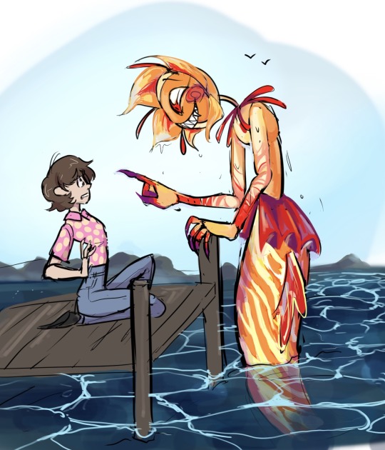
Had an idea for a Luca type au where like they are mermaids but can look human on land and blah blah blah
Self indulgence abound
Lol supposed to go along with these
Merm designs
Baby sun
the fic (don't read the tags if you don't want spoilers)
#sundrop#moondrop#mermaid au#also don’t mind the character in one of them#hiding the plot in the tags so no one reads it#met initially when they were younger#were good friends but one day sun got too dry and became human#moon freaked out and thought the human may be the cause#went to eclipse for advice and eclipse was all “oh ye it’s defo the human that caused this#also if u continue hanging out with them more bad stuff is gonna happen to u guys trust me#eclipse just has his own baggage regarding humans#but basically that scares moon so much he decides it would be better to no longer be friends with the human#makes a kinda stupid decision to wipe the#memories of both sun and the human#he was just a kid tho so ya gotta give him a break#now tho moon is super isolated and feels bad awww#he also figures out he also gained the ability to turn human as well#while having a crisis and not knowing what to do he runs into Monty#who is just a human in this universe#and like idk they actually get along really well and Monty is a good distraction for moon and also has a good straightforward mindset#all the while Monty doesn’t know that moon is not human#moon considers telling him but chickens out#eventually Monty has to move away due to his parents getting a new job#years later both the human they befriended and Monty return to the fishing town now adults#Bright now has a fear of the ocean due to the memory wipe and decided to move back by recommendation by their therapist#exposure therapy#Monty gets caught up in a group of people who want to kill the sea monsters that have been destroying fishing boats and eating people#bright notices new developments in the town like a hotel and oil rig. also the ocean seems a lot dirtier than it used to be…#anyway I’ve reached tag limit I’ll write the rest prob never but I’ll say later to try and motivate myself#Luca au
358 notes
·
View notes
Note
Hey Crabs! I have a small question! 🦀
How do you make the pictures of your traditional art look so good!?
They are always bright and easy to see! But when I take a photo of my drawings, they always have a blue or yellow tint to them. So how do you make it look the way you do?
(Also, I want to gobble up your art it is so yummy and pretty! Sun and Moon are so precious in your style!) ❤️
Thanks! And I hope you’re having a good day! :D
no prob! there's actually a couple things i do, so here's the tl;dr:
Lighting: i use daylight or light from a neutral white lightbulb
Editing: i use my phone's built-in gallery app to lightly edit the colours so they're clear and as colour-accurate as i can get (from my screens at least)
and i'll go into a little more detail with some examples under the cut
1. Lighting
a habit of mine that i got from my IG days (ugh...) is using daylight whenever possible. daylight just lights up the whole area more evenly and relatively neutrally. this is my set up:
glamourous
basically, i put the artwork near a source of natural light and prop up a reflector (in this case, a blank page from another sketchbook) that helps distribute the light more evenly across the page, so that even the side that is furthest from the light gets some light that bounces off from the reflector. i don't always have a reflector tho, like if i'm only taking a picture of a small drawing and not an entire page, there's no need.
now, if it's dark, then i rely on my desk lamp, which uses a neutral white lightbulb. regular lightbulbs come in different temperatures, from warm to neutral to cool—so that might explain why your photos are coming out with a yellow or blue tint. warm lights are common in houses because they're cozy, while blue lights are common in working areas because, like daylight, they keep us more awake. neutral white is in between the two.
here's an example of my Moon doodle that i did recently under different lights: warm (from my bedside lamp), neutral white (from my work desk), and daylight
(i don't have any cooler lights in the house, so i couldn't quite get the blue tint 😅)
now technically, NONE of these are colour accurate. so i always follow up with some light photo editing
2. Editing
now, i have 2 personal rules when it comes to editing my photos:
1) try to make it as close to the original as possible; and
2) don't spend too long on it
these are just my personal rules because... one) i'm lazy and i don't want to spend too long fixing every thing in my drawings, and two) i feel it is dishonest for me to make dramatic changes to my traditional art and still call it traditional art. whenever i do make digital enhancements (like colouring it digitally) i will tag it so no one would mistake it as purely traditional art. that's just me tho! there are no rules when you're having fun with your art and mixed media art is a thing! so do whatever you find fun and enjoyable.
also, i will try to make it as colour-accurate as possible, but i also recognize that not everyone's screens are calibrated the same way. my phone is set to a "Natural" colour setting, but on my new laptop (which i haven't figured out how to calibrate yet) is vibrant as all heck (like oh my gosh, maybe i need to start tagging everything with bright colours now, because what if someone else's laptop is this insanely vibrant and saturated??) but either way, i try not to spend too long on it because i know i won't be able to accommodate every screen.
anyways, for what i actually DO... i kinda just play around with different settings. if i took the picture under daylight, then there's not too much i adjust, usually it's the warm colours that are desaturated, so i try to make the reds pop more without effecting the blues too much.
or for my doodles, sometimes the doodle on the other side of the page is slightly visible, i'll tweak the lights and shadows and contrast levels until the background is clear enough (as long as it doesn't disturb the doodle i'm taking a photo of)
now, if your photos are coming out too yellow or blue because of your lighting, you can adjust that by tweaking the Temperature setting. here's an example of that warm Moon doodle:

already looking a little better, right? so don't worry if your photos aren't coming out accurate, there are work arounds!
here's the before and after of the Moon doodle by the way:
despite having daylight, i still needed to adjust the colours. specifically i needed to brighten up the reds and yellows, and bring back the page's natural yellowness. i also tweaked the Definition setting to make less hazy (sometimes i like the haziness tho, so i'll leave it as is sometimes).
and one other reminder: it doesn't need to be perfect, it just needs to be. a big reason why i keep coming back to traditional art is the fact that i can't control everything. i can't undo lines. i can't move things around. and i can't take the perfect picture. but it doesn't need to be perfect. drawing and sharing my art is supposed to be fun! and i don't want to put any barriers around that, or else it becomes unnecessarily stressful.
all that is to say, try out these tips if you want to, but don't treat them as hard rules and don't focus on trying to achieve perfection. just go have fun!
#ask the crab#sorry this took so long!#i wanted to make sure it was clear#cuz like#i totally understand the struggle of trying to take good pictures of your traditional art#like you worked so hard on a drawing#but then the photo ruins it 😅#so i wanted to share what i know so it might help#there are definitely more in-depth tutorials out there#this is just what i've gathered from some of them plus some advice from a food photographer friend of mine (her stuff is actually legit tho
19 notes
·
View notes
Text
no but fr once i saw ppl on twitter being like "ofmd fandom doesnt know how good they have it, back in my day i wouldve KILLED to have this kind of direct contact with actors and writers from my favorite shows" to which i have to say: WHY?????????
#txt#og#mine#ofmd fandom crit#WHY DO YOU PEOPLE WANT THIS I DONT UNDERSTAND#ARE YOU INCAPABLE OF ENJOYING UR SHOWS WITHOUT THEM??#DO U NEED THE WRITERS TO PAT U ON THE HEAD AND BE LIKE ''good job!'' CAN U NOT BE PLEASED WITHOUT VALIDATION FROM THE CAST/CREW??#the only interaction i would ever want with ANYONE from the show is to sit in on the writer's room and watch them work#i dont actually want to talk tho! nobody look at me!!!#i dont want the actors to retweet my art or fic (even if either of those were GOOD) i dont even want an autograph#at MOST i just want to pick the writers' brains for writing advice that's IT i dont want to talk to these guys at all!! stay away from me!!
71 notes
·
View notes
Text
🐇☁️🌷🐌
#seeing her actually went so much better than i thought it would#i was so anxious but there were no issues at all#the thing is she's such a chill and understanding person she really dont care if i jumble my words or say smth wrong or whatever#i dont need to worry abt sounding 'stupid' bc she just doesnt see it that way#so yeah my anxiety disappeared pretty quick c:#(i still feel like there's a wall between me and others tho my avpd isnt cured skskks)#and it was just nice. we walked a loooot. and sat by the beach and talked#she gave me lots of tips and advice abt applying for jobs and school stuff. she doesnt judge me for being 25 and not having started yet#and she's gonna start studying next year and suggested that we could study together sometimes to motivate eo#so hmmmm maybe it went a lot better than my doom mind thought it would#i rlly do believe ppl hate me but why would she even bother talking to me then??#so yeah it was a nice experience :3#it's been like 6yrs since i hung out w someone that wasnt my mom and it reallyyy is good for my mental health#i still feel like ohhh this isnt the friendship im craving but there are tons of different friendships. this is nice just bc it is.#i shouldnt let myself minimize it or think it's 'not real' just bc it isnt exactly what i long for. this is good still.
12 notes
·
View notes
Text
I am so tried of dreaming and false awakenings!
I snoozed through all of my alarms today and I was late to work which hasn't happened in years!
All because I had weird dreams and false awakenings one after another for what seemed like hours!
Just let me go to bed and wake up eight hours later remembering nothing, like god intended!
Fuck dreaming. All my homies hate dreaming.
#personal#i am so tried of being alive#I'll stop taking ashwaganda to see if it helps tho this has been happening before I started taking it#does anyone have any advice on how to wake up from a dream when you realize you're in one?#I've gotten pretty good at realizing I'm in a dream but I can't wake up#i can read in my dreams (at least well enough to confuse my brain even more)#i can read clocks as I realized last night#I realize I'm in a dream and tell myself to wake up only to get a false awakening and another dream and on and on and on until my alarm hits#plus nightmares or just weird dreams#last night it was that I accidentally killed some people#a common one#or that i didn't actually gratitude college or highschool which is a regular
4 notes
·
View notes
Text
okay wah oh i remembered the Outfit Interest. man i need to find more fashion youtubers that dont suck
#i found a girlie posting these incredible shorts talking about like. shopping for quality vs aesthetics#she covered brands that are considered more high end but still affordable-ish in canada and the us#and fuck she Knew what she was talking about i was so obsessed. i actually learned a lot from her !!!#one thing i remember rn is like. her advice for buying sequin dresses and tops and stuff#and how you gotta like. look at the edges and the seams to make sure the sequins arent gonna drive u insane in like 2 hours max#anyway yeah she was smart. when i checked the rest of her videos she was obsessing over skincare and retinol and botox. ugh#my favourite fashion youtuber started doing vlog content after she graduated from uni and now im FUCKED...#theres this one ange girlie and god her fashion advice is so good but i . really disagree w some of her beliefs wow#her winter fashion video was good. OH ALSO i liked what she said about slavic women in her winter bimbo guide (that title tho... ugh)#ahhh idk what am i talking about. tiktok of a woman in fashion uni styling her set of armour for a whole week save meee...#voidcore.txt
3 notes
·
View notes
Text
Yeah, the the incoming 2024 genshin players (because that's been a question on YouTube), I don't even play towards the meta and I think you're gonna have a shit time if that's your play style.
#my opinion isnt the popular one but i keep seeing sugary sweet hope for yall#i actually do hope yall have a good time but its just not realistic if you give into fomo too much and you want every character#ive been playing since 2021 and only from june-ish 2023 have i gotten more than 5 5-stars bc i suddenly had more hours and money to play#i genuinely suggest getting the welkin moon blessing. sacrifice 1 coffee youd get out & about & get the Welkin IF youre in the trenches lol#tho honestly better advice is to stop getting coffee altogether out and about. do yall realize just how much money you save???? crazy lol#but on positivity: its super possible to start now..... but GI is a gambling game dressed up as an open world and youd be so behind on some#4-stars that unless you know how to play games like GI (bc i didnt/ dont myself lol) i just really feel like youre gonna have a hard time#my gi#im NOT tagging the actual tag bc yall are mean af#oh thats another thing - like 50% of the community are legit toxic. pick your poison on starting in regards to THAT half of the fans
2 notes
·
View notes
Text
im very frustrated bc. yesterday i was late for work bc i had to dig my car out of the fucking snow. then when i got home i was able to park in front of my house like normal but i was pretty much stuck. i should've fixed it then but it was midnight and i was fucking exhausted. so today i tried to get it out and i couldn't and i would've been late again so i just called in. i'm gonna have to get it out tomorrow somehow and the snow is only getting deeper and this fucking sucks.
#actually i just checked and it looks like the snow is pretty much over#so there's some relief#but im just pissed off#watching new d20 tho so that's good#btw im not looking for advice or sympathy or anything#i just need to vent#personal#mine
2 notes
·
View notes
Text
I should probably do with Prime what i do with everything else I dont like about TWA, which is ignore canon and do whatever the hell I want
#canon prime i hate but i can make him actually good. i can headcanon anything. or whatever.#terrible writing advice#twa txt#like i already do this with so much of twa and yet didn't even think of doing it with prime which is stupid of me#but tbf i feel like primes character as a whole is just bad. not just a few parts. definitely won't stop me tho i feel.
3 notes
·
View notes
Text
Life is still meaningless
Anyone have advice for basic self care tasks that aren't so understimulating they just circle back around to being self harm by leaving me in my head
#advice needed#advice wanted#self care#taking care of myself usually consists of finding something to snack on and binge watching a show but#i think i need to like? get healthier#is there any way to take myself on walks or anything without boring myself into a spiral#and like making a healthy high calorie meal without wanting to actively kill myself with the cooking supplies?#how to be healthier without making myself worse#need an article or book like that#self help shit is always like 'meditate! be alone with your thoughts! you'll learn so much :)'#exactly the opposite of what i need#i need to get better#without backsliding so far i end up way worse than where i started#i think maybe hard things are easier with company? but i don't really have any#and anyway people are so stressful to be around with their expectations and their strange interpretations and their judgement and allat#cannot stand being alone cannot stand other people maybe i should stop self medicating and start talking to the voices#im joking! jeez. the last thing i need right now is unmanaged psychosis.#everyone loves the mentally ill badboy till hes a tranny and actually mentally ill#its alr tho im better than anyone who cant appreciate a good solid joke#delete later
5 notes
·
View notes
Text
ive been thinking of making yet another commander for wotr and this time id love to try an evil route so i was wondering whos the most fun to romance with an evil pc ? cmon mutuals give me the data
#i have xelara with arue. shes the aeon so yknow. lawful neutral#and then i have kyras. whos actually xelaras brother so hes not the commander in my canon. hes chaotic good-ish nd w sosiel#bc i Love that man#for this new commander i was thinking a dhampir. i wanted to see if i could romance camellia but there arent any mods that let you romance-#-her w a female pc????? at least i havent found any#so ig my only options are wendu and daeran? i feel like daeran might be too chaotic for my girl tho.... idk#gimme advice please#cami.txt#btw. i havent even finished my first playthrough......... i just love trying the different paths and stuff!!!!
2 notes
·
View notes
Text
I do think it’s really funny that I’ve tried quitting to 3 people at this point, all of whom have insisted I finish out this year, even after I repeatedly swore at the last AP I tried to quit to today, and literally no one will fire me or let me quit like damn y’all
#I don’t want to be a teacher anymore#I’m off tomorrow as a mental health day#I’m deadass just trying to get fired at this point and it has not been working out#so I’ve basically just decided that I’m henceforth going to do and say whatever tf I want#because they either fire me and I never have to see another bastard child again (win)#or I find out that I can actually in fact do whatever pleases me#which would also be a win#jlktalks.#YoU sIgNeD a 1 YeAr CoNtRaCt DoN’t YoU wAnT tO hOnOr ThAt CoMmItMeNt#bitch no#also like I love how principals will say that you shouldn’t work at a school if you hate kids#and that summers aren’t a good reason to teach and that this isn’t the job to sit down on#but then when you try to actually fucking quit they won’t let you??#like sis I am trying to take your advice#I don’t even need a job lmao my dad pays my bills#or whenever you complain about something they say it’s part of the job#yeah which is why I don’t want to do this job anymore please just let me leave?#why is it so hard to get fired?#watch my dumbass still sign on next year too tho#adventures in teaching#am I secretly in prison?
11 notes
·
View notes
Text

pfft! ok hear me out on this silly spicy thought, ok?!
so like-- you send either Peter or Miguel a certain porn video you thought was kinda hot and text them saying "Here, take some tips, it might help you out". 😭💀💀
#nahhh Miguel would whoop your ass (NOT in a good way btw ROFL) if you texted him that LMAO#but he WOULD fuck you just like the people in the said video tho (but most likely more rougher and harder just because of your sly comment)#RIP reader lool#but PETER on the other handddd lmao#he will/would ACTUALLY LITERALLY take your advice into consideration and do JUST THAT lol#of course he would add a bit more 'peter-sillies' in there from time to time (which you love)-- but best believe...that man DELIVERS 👀#miguel o’hara#peter b parker#spiderverse#pls i'm ovulating soo bad atm#🥴😵💫#thought this was funny lmao
3 notes
·
View notes
Text
Sorry if this has been said before but like
On one hand obviously alpha wolf dynamics are complete bullshit and were renounced by the person who wrote the book on them
But I love how Travis (and by extension Chetney) subverts how they're usually portrayed. Instead of the "some people are just born better" nonsense expected from most mentions of this, we instead get Chetney using it to build other people up. Recognize the Alpha is not about knowing who's better than you, it's about recognizing the good qualities in yourself and being the "alpha" in your own life. And I love it.
#murder gnome actually has good life advice who knew#we all know it was just travis being travis tho lmao#he just wants to stab someone with a chisel for charging too much for said chisel#critical role#cr meta#cr cast#critrole#cr#bells hellions#bells hells#cr spoilers#critical role spoilers#chetney#chetney pock o'pea#cr chetney#recognize the alpha in yourself man
26 notes
·
View notes
Last Seen Blogs

lockestudios
Locke Studios
your-queer-dad
YOUR QUEER DAD

daftdoll
ANICONISM

sissycuckyhubby
Cucked Kevin

tinytable-blog
blog under the table