#italian textile design
Text
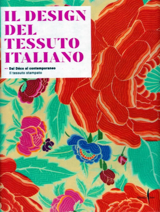

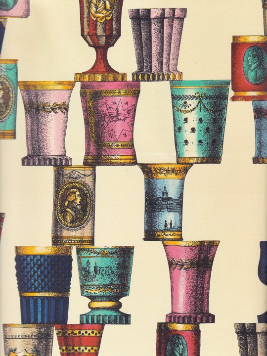
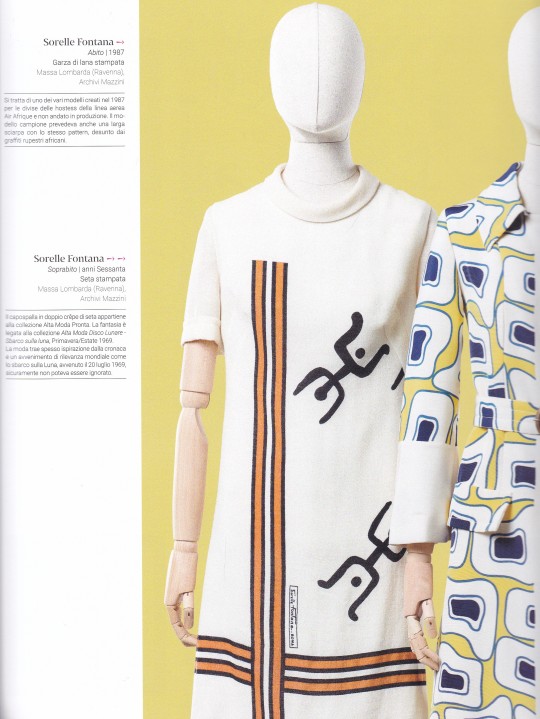

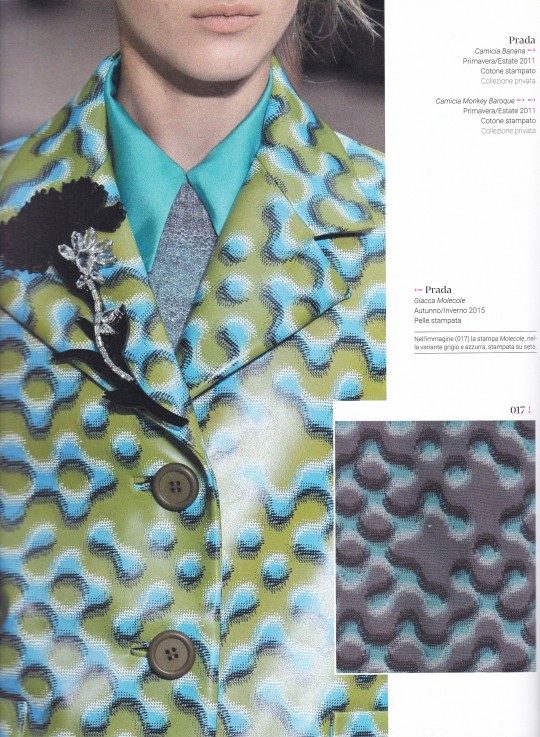
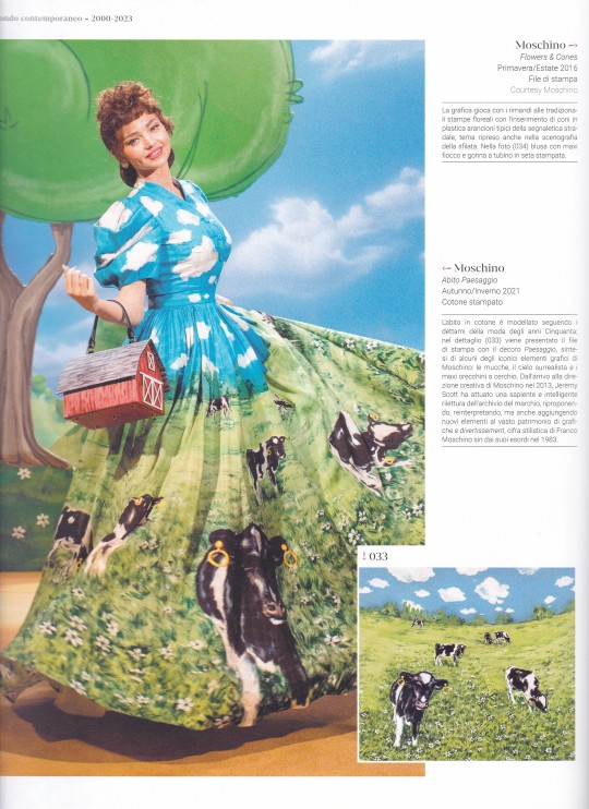
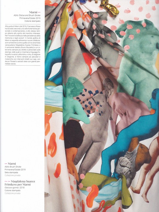
Il design del tessuto italiano
Dal Déco al contemporaneo Il tessuto stampato
Vittorio Linfante, Massimo Zanella
Marsilio Arte, Venezia 2023, 240 pagine, oltre 500 illustrazioni, 24,8 x 29,8 cm, ISBN 9791254630907
euro 48,00
email if you want to buy [email protected]
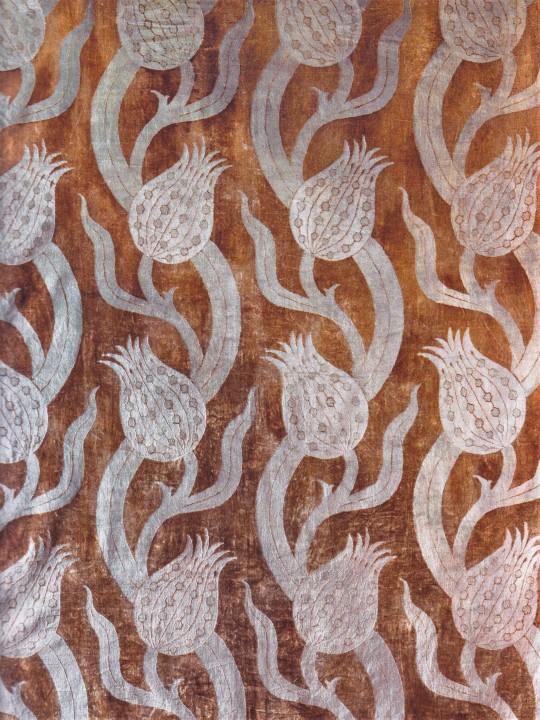
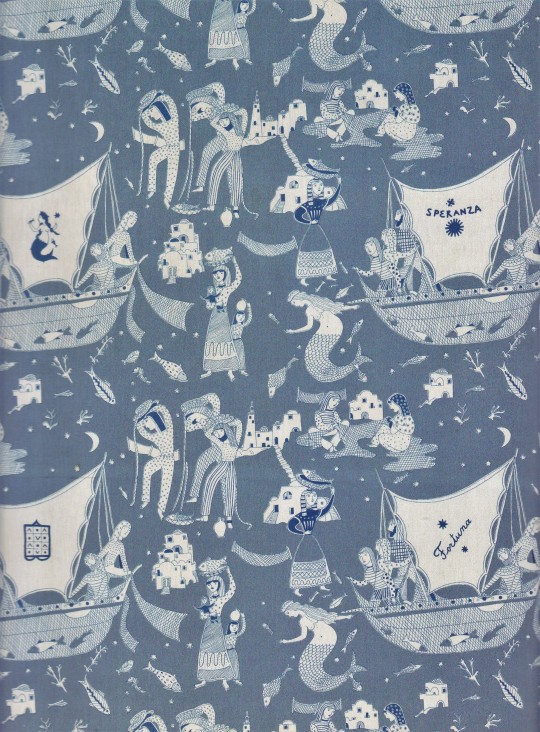
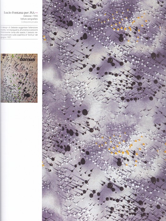
Dalle sperimentazioni di Lucio Fontana e Gio Ponti ai motivi optical di Germana Marucelli e caleidoscopici di Emilio Pucci; dagli effetti trompe-l'oeil di Roberta di Camerino alle sensibilità pop di Ken Scott, Elio Fiorucci, Gianni Versace e Franco Moschino; dal lavoro sull'heritage di Prada, Valentino e Marni alla valorizzazione dell'archivio aziendale di Missoni, fino alle ibridazioni grafiche di Maison Laponte, Gentile Catone, Colomba Leddi e IUTER: artisti, stilisti, designer e aziende che hanno contribuito a costruire la fama del tessuto italiano nel mondo dai primi del Novecento al contemporaneo. Una storia che si intreccia profondamente con la nascita del concetto di made in Italy, contribuendo in modo significativo alla fama internazionale dell'Italia come baluardo della moda e del design di alta qualità. Oltre 500 illustrazioni, fotografie e disegni preparatori - molti inediti e provenienti da archivi aziendali e privati - raccontano i più importanti successi creativi del nostro Paese.
05/06/23
orders to: [email protected]
ordini a: [email protected]
twitter:@fashionbooksmi
instagram: fashionbooksmilano
designbooksmilano
tumblr: fashionbooksmilano
designbooksmilano
#design tessuto italiano#Fortuny#Lucio Fontana#Fornasetti#Sorelle Fontana#Gianni Versace#Prada#Moschino#Marni#Gio Ponti#Germana Marucelli#Emilio Pucci#Roberta di Camerino#Ken Scott#Fede Cheti#Fiorucci#Valentino#italian textile design#Gimmo Etro#Lancetti#Brunetta#textiles books#fashion books#fashionbooksmilano#designbooksmilano
22 notes
·
View notes
Photo


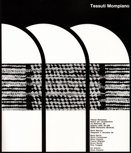
ED Group for Tessuti Mompiano, 1972. Maxima Series – hand printed, by Franco Grignani (+ design drawings). “It is the first time in Italy that a homogeneous group of architects and designers, preliminarily coordinated, operates in the field of furnishing fabrics” [Ottagono, 1972] Via Twitter Emiliano Camera Grignani
#italian design#franco grignani#textile design#1970s#mario bellini#bruno munari#pino tovaglia#op art
267 notes
·
View notes
Text


Strawberry print capsule collection by Dolce & Gabbana, 2022
#strawberry#fashion#2022#dolce & gabbana#capsule#print#pattern#surface pattern#surface pattern design#pattern design#textile design#textiles#printed textiles#leisurewear#athleisure#sneakers#shoes#fruit#italian designer
11 notes
·
View notes
Text
ANDRIA ITALIAN WOOL- Nisha Designs
Andrian Italian Wool- https://nishadesigns.com/andria-italian-wool/

View On WordPress
#ART#Artists#interiors#italian wool#natural fibers#natural textiles#Nisha Designs#Sustainability#sustainability a touch of magick#wool
0 notes
Text
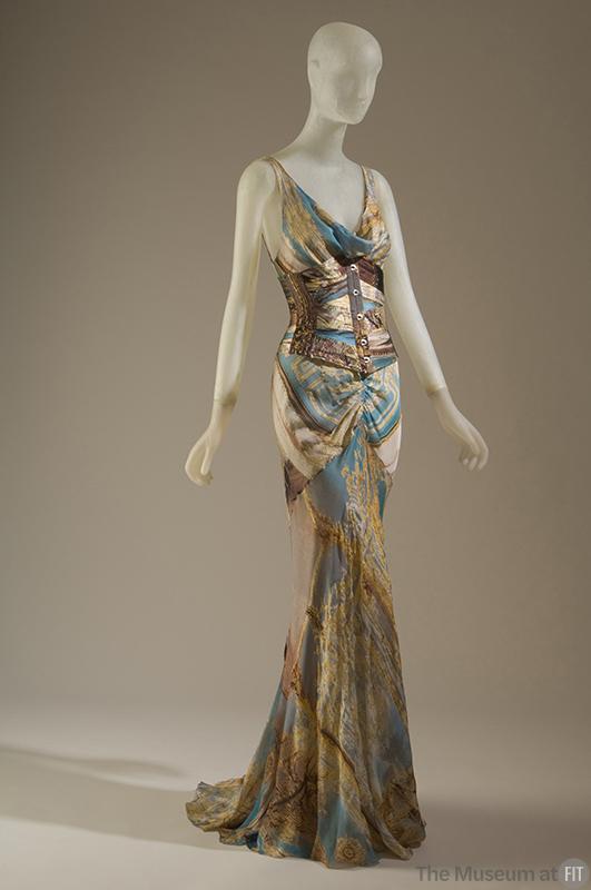

Dress and Corset
Roberto Cavalli, 2002
The Museum at FIT
"Roberto Cavalli is best known for an overtly sexy, feminine aesthetic that epitomizes the vibrant spirit of Italian fashion. Bold prints are another significant characteristic of his work that can be traced to his early training as a textile designer."
393 notes
·
View notes
Text
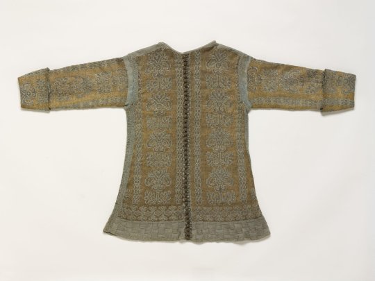
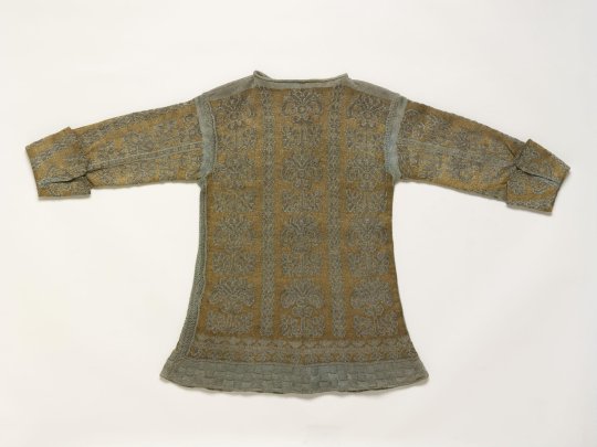
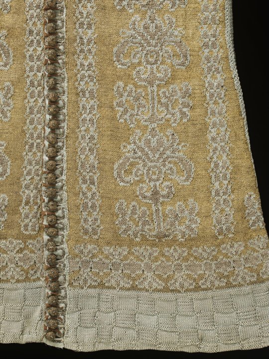
Knitted Jacket
1600s-1690s
Italy
Knitted silk jackets were fashionable in the early 17th century as informal dress. This example is very finely knit by hand in plain silk yarn and silk partially wrapped in silver thread, in contrasting colours of blue and yellow. Characteristic of this style of jacket, it has a border of basket weave stitch and an abstract floral design worked in stocking and reverse stocking stitches. The pattern imitates the designs seen in woven silk textiles. The jacket is finely finished with the sleeves lined in silk and completed with knitted cuffs. Along each centre front, a narrow strip of linen covered in blue silk has been added, with button holes and passementerie buttons, worked in silver thread. The provenance of the jacket indicates that it is probably Italian.
Victoria & Albert Museum (Accession number: 473-1893)
#knitwear#fashion history#historical fashion#17th century#yellow#silk#jacket#floral#1600s#1610s#1620s#1630s#1640s#1650s#1660s#1670s#1680s#1690s#italy#stuart era#v and a
201 notes
·
View notes
Text
Some period pants sold by high street retailers contain high levels of silver that could have health and environmental implications for consumers, an investigation has found.
Silver is used as an antimicrobial agent and is typically added to period pants to combat user concerns about smell and hygiene.
However, scientists have increasingly warned about the potential health effects. The US Food and Drug Administration found that nanosilver can kill lactobacillus, the healthy bacteria in the vagina that help fight off infection. This can put period pant users more at risk of harmful bacteria, potentially leading to an increased risk of bacterial infections and pregnancy complications.
Natalie Hitchins, the head of home products and services at Which?, said: “Consumers should be cautious buying period pants which contain silver as experts have concerns about the health implications.
“Which? believes brands should also clearly state which products contain silver so shoppers can make informed decisions about what they are buying and the possible risks.”
The consumer rights group worked with an Italian consumer organisation, Altroconsumo, to independently test popular brands and check if they contained any chemicals of concern. They were worried to find that some products contained significant levels of silver, and this was not always made clear on the packaging.
Intima by Bodyform and pants by Marks & Spencer in particular contained notably more silver than other brands, at 126.7mg/kg and 57.8mg/kg respectively. Other brands contained 8.3mg/kg, 7.4mg/kg, and 0.9mg/kg.
Essity, the owner of Bodyform and Modibodi, said silver copper zeolite was used to “prevent odour when wearing the pants for up to 12 hours”. It added that all of its “washable underwear is certified according to Oeko-Tex Standard 100, which means that every single component has been tested for harmful substances” and “that the underwear has been designated as harmless for human health”.
An M&S Spokesperson said: “We do not use either nano silver or silver zeolite and, like many brands, use a small amount of silver chloride in the middle part of the gusset – away from the skin – which is perfectly safe, approved by the UK and EU, and designed to combat odour.”
Which? said it believed the use of silver was unnecessary and that previous testing by Altroconsumo had shown that textile items treated in this way did not have the promised antimicrobial properties.
The European Chemicals Agency says silver treatments, such as nanosilver and silver zeolite, are toxic to aquatic life with long-lasting effects.
The tests Which? carried out can detect any silver above 0.1mg/kg, and it found none in Primark, Repeat, Wuka, Lovable and Sloggi pants. Sloggi’s website says it does use a silver-based antimicrobial, and Primark says it uses Micro-Fresh, which contains silver chloride.
A Primark spokesperson said: “The nature of period pants means there is a potential for odour to develop during wear (in the same way that bacteria can cause socks and shoes to develop odours during wear) and our antimicrobial finish minimises such odours.”
Sloggi did not reply to Which? at the time of publication.
There are no legal limits in the UK about how much silver can be added to period pants. Manufacturers do not have to declare the presence of silver on their packaging or website.
46 notes
·
View notes
Text
All of the Moschino References for Jr. High Amaya Raine (Plus: join me in finding out how much she paid for this outfit to wear to Junior High)
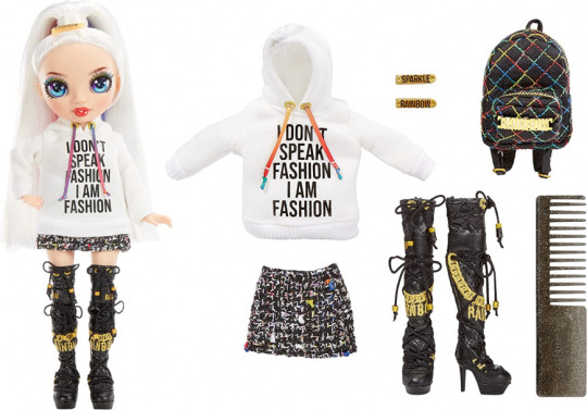
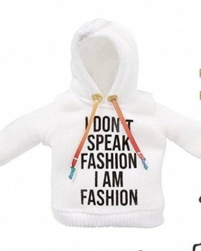
The sweatshirt is based on Jeremy Scott’s “I Don’t Speak Italian But I Do Speak Moschino” tee, which he wore to his debut runway when he became Moschino’s creative director in 2014. The phrase was supposed to reflect Moschino’s transition from being very elite and exclusive to one that was more accessible to the general public, especially young people.
Amaya’s hoodie combines the slogan with Coco Chanel’s famous quote (“I don’t do fashion I am fashion”). Cost: $180 USD

Her shoes are these thigh-high boots created for a collaboration with H&M. I think the doll-scale replica is my favorite part of this outfit. Cost: $100
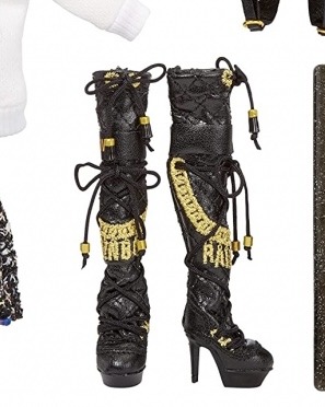
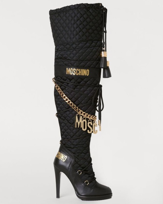
Her skirt I believe is this boucle miniskirt (boucle is a textile that’s like tweed made with softer material, a it tends to have a rougher, “messy” look.)


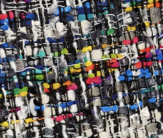
You can especially see the similarity when you look at the (real-life) skirt’s fabric up close. Pretty cool! And it better be, because it’s $450.
Her bag is this quilted logo backpack. This thing retails for $660 USD, why does a jr high student own this.

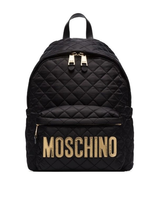
And she’s even got Moschino hair clips! ($400 worth of Moschino hair clips to be exact)

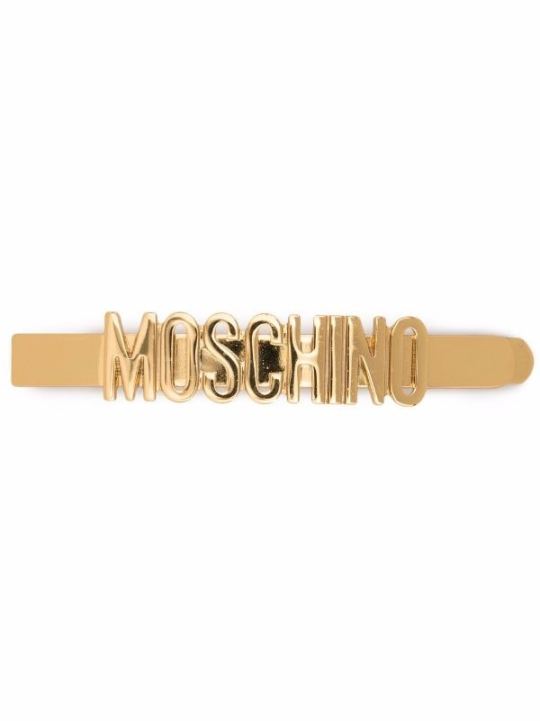
So this brings our total to an outfit cost of $1790! Join us next time to find out why a 13 year old is running around school in an eighteen-hundred dollar designer outfit for no reason.
#i literally find it so funny#i always start to like outfits more after I research them#like now I have a ~connection~ with the pieces#also holy hell this took me forever bc tumblr's post creator is going sicko mode#rainbow high#amaya raine#rainbow high jr high#rainbow high fashion references#rh amaya#dolls#fashion dolls#fashion#moschino#jeremy scott#doll collector#adult collector
403 notes
·
View notes
Text
Flag of the Federation of Patagonia

This is the flag of the Federation of Patagonia. It comes from a world where Britain conquered Argentina and Uruguay in the early 19th Century. Patagonia is a highly developed nation, and is often referred to as the Canada of the Southern Hemisphere. Patagonia also includes part of southern Chile. Chile has never forgiven Patagonia for annexing this land. Though, this occurred during the days of direct British rule. The Falkland Islands are considered indisputably Patagonian territory.
Like Canada, Patagonia is the result of the bending of two European peoples. In this case, British and Spanish. However, also like Canada, said people have historically had their tensions.
Northern Patagonia has historically been the heart of Hispanic culture. Meanwhile, Southern Patagonia has historically been majority Anglo. The name Patagonia used to refer to the region that became the southern provinces, but grew to refer to the nation as a whole. The ruling Anglos felt that Argentina and Plata were too Spanish for their taste. Hispanic Patagonians were pushed further and further north for much of the 19th Century. In fact, Buenos Aires and Montevideo used to be majority English-speaking cities. Though, Spanish speakers still accounted for a healthy forty percent of Buenos Aires and Montevideo’s population. Patagonia also experienced far less Italian immigration than Argentina did in our world. Catholic Italians weren’t eager to move to a colony of Protestant Britain. Subsequently, Patagonian Spanish has much less Italian influence than Argentina Spanish of our world. The northern provinces, initially, tended to be poorer than their southern counterparts.
Things would begin to shift starting in the 20th Century. Industry began to invest in the northern provinces of Patagonia. The influx of industry lead to an increase in wealth among Hispanic Patagonians. Several baby booms occurred during this time, ensuring that Hispanic culture would survive in Patagonia. Hispanic Patagonians made major political gains in the Patagonian parliament. Bilingualism became official government policy starting in the 1950s. Packaging is required to be printed in both English and Spanish, signs are printed in both languages, and all government documents are printed in both of the official languages. There are also numerous Spanish-language schools and universities, though most are located in the Hispanic-majority northern provinces.
Patagonia remains culturally divided among geographic lines. However, tensions have relaxed between Anglo Patagonians and Hispanic Patagonians. Patagonia is also home to immigrants from throughout the world, and prides itself on being a refuge for those seeking better lives. Patagonia has a friendly rivalry with Canada. Canada is referred to by Patagonians, with tongue planted firmly in cheek, as the Patagonia of the Northern Hemisphere.
The flag was officially adopted in the 1970s. Prior to that, Patagonia used a British Red Ensign. Care had to be taken, when designing the new flag, not to favor Anglos or Hispanics. The colors evoke the landscape of Patagonia. The white represents the snow-capped mountains, while the ice blue represents the glaciers. The shape is meant to evoke the textile work of Indigenous Patagonians. The three guanacos were chosen as a symbol beloved by Patagonians of all cultures. In fact, the guanaco is the official mammal of Patagonia.
Link to the original flag on my blog: https://drakoniandgriffalco.blogspot.com/2023/02/flag-of-federation-of-patagonia.html?m=0
#alternate history#flag#flags#alternate history flag#alternate history flags#vexillology#alt history#Flag of the Federation of Patagonia#Patagonia#Britain#Argentina#Uruguay#Chile#South America#Great Britain#United Kingdom#UK#falkland islands#falklands
33 notes
·
View notes
Photo

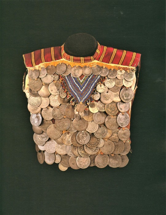
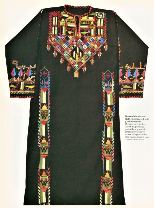
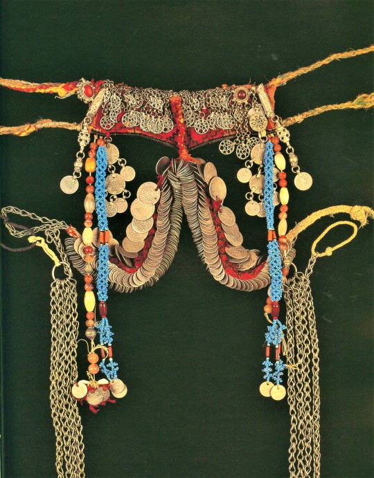


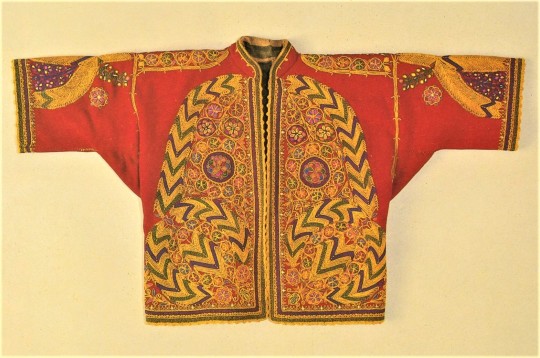
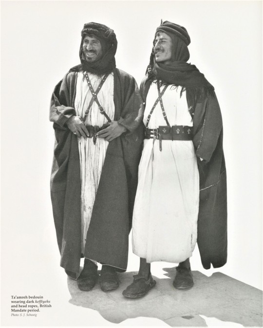
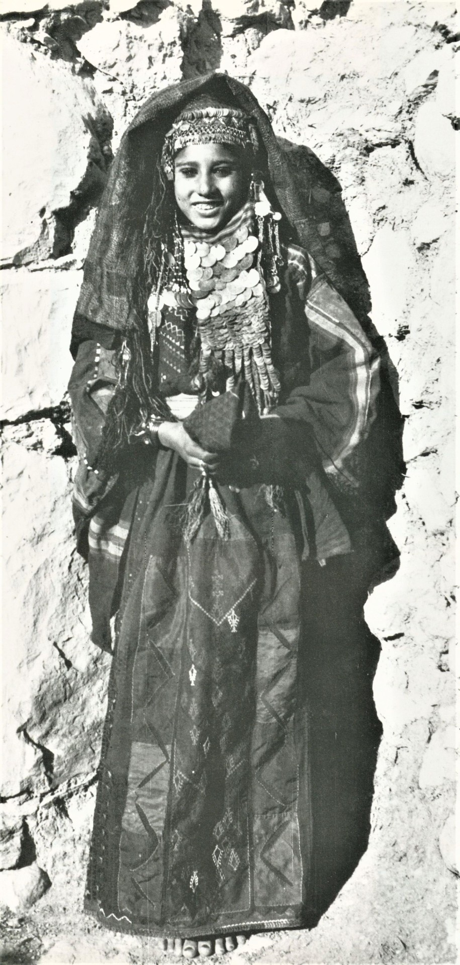
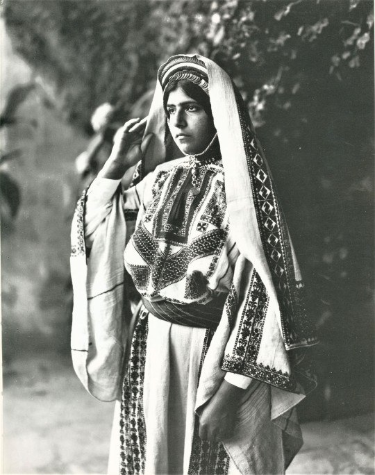
Fashion Friday
We’re highlighting traditional Palestinian garb this week, with illustrations from Palestinian Costume by the esteemed scholar of Palestinian costume, textiles, and embroidery, Shelagh Weir. Published by British Museum Publications of London in 1989, the book is the product of over twenty years of field research conducted by Weir as curator of Middle East Ethnography for the Museum of Mankind (British Museum). Weir pays special attention to the way costume acts as a sort of social language and pairs this linguistic reading of dress with an analysis of Palestinian wedding songs. It was designed by award-winning book designer Roger Davies and printed in Milan, Italy by Amilcare Pizzi, S.p.A.
Amilcare Pizzi (1891-1974) was an Italian footballer, typographer, and publisher who used his first paycheck from A.C. Milan to purchase a printing press in 1914. In 1933, Amilcare Pizzi became the first company in Italy to employ offset printing. Their factories were completely razed by Allied bombing in 1943, but Pizzi rebuilt and established an international reputation for fine art printing, working for institutions like the Metropolitan Museum of Art, the National Gallery, and the British Museum. The company’s own imprint, Silvana Editorale, publishes primarily exhibition catalogs and fine art monographs.
View photo captions (taken from the publication and edited for length) for more information about the images.
View more Fashion Friday posts here.
-Olivia, Special Collections Graduate Intern
#Fashion Friday#Palestinian Costume#Shelagh Weir#British Museum#Museum of Mankind#Palestine#Palestinian History#Textiles#Embroidery#Roger Davies#Amilcare Pizzi#Silvana Editorale#costume design#olivia
315 notes
·
View notes
Text

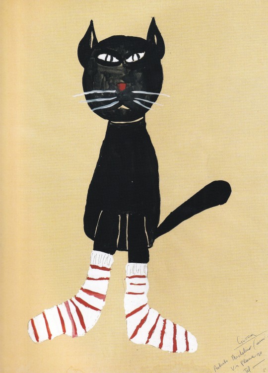
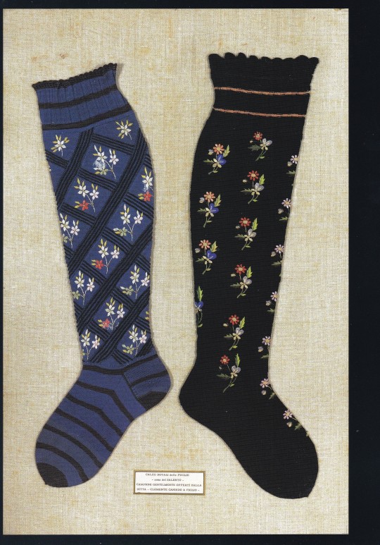

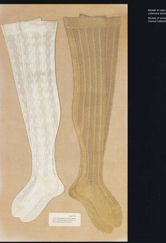


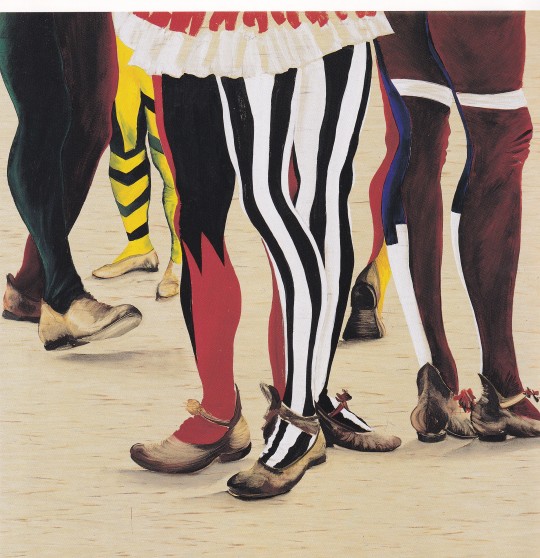
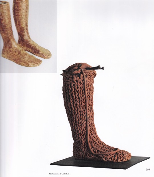
Ciocca 1912-2012
Cento anni di storia nel tessile / One Hundred Years of History in the Textile Industry
a cura di Massimo Martignoni
Skira, Milano 2012, 207 pagine, 25X29cm, ISBN 978-88-572-1369-9
euro 50,00
email if you want to buy [email protected]
I primi 100 anni di attività del Calzificio Ciocca, esempio centrale di industria tessile italiana del XX secolo.
Un traguardo importante, i cento anni di attività, è l’occasione per raccontare un percorso aziendale profondamente intrecciato con la vicenda generale del tessile in Italia. Il secolo di vita compiuto dal Calzificio Ciocca corrisponde infatti, per tempi e risultati, a una delle centrali esperienze industriali italiane del ventesimo secolo. Non si celebra tuttavia in questo volume una nostalgica rimembranza di fasti trascorsi. Spinti dall’esempio del fondatore Luigi Ciocca e del figlio Giuseppe, artefice del consolidamento del marchio, i Ciocca della terza e quarta generazione non si trovano impreparati. Le trasformazioni del settore li hanno portati a individuare una più elastica strategia manageriale, non imperniata come nel passato sul processo produttivo, spingendoli al tempo stesso a una riconversione quasi antropologica della loro identità imprenditoriale: aperta alle sollecitazioni del mondo dell’arte contemporanea e della moda, consapevole del proprio agire in uno scenario internazionale. Ciocca 1912-2012. Una storia che continua.
Massimo Martignoni, storico dell’arte e giornalista, è autore di numerosi studi e ricerche riguardanti l’architettura moderna e il design. Tra le sue pubblicazioni: La più amata dagli italiani. Scavolini 1961-2011 (Skira 2010); La Triennale di Milano (Skira 2008); Gio Ponti. Gli anni di Stile 1941-1947 (Abitare Segesta 2002).
02/03/24
8 notes
·
View notes
Text

A handknitted Italian jacket, c.17th century. From the V&A's description: "Knitted silk jackets were fashionable in the early 17th century as informal dress. This example is very finely knit by hand in plain silk yarn and silk partially wrapped in silver thread, in contrasting colours of blue and yellow. Characteristic of this style of jacket, it has a border of basket weave stitch and an abstract floral design worked in stocking and reverse stocking stitches. The pattern imitates the designs seen in woven silk textiles. The jacket is finely finished with the sleeves lined in silk and completed with knitted cuffs. Along each centre front, a narrow strip of linen covered in blue silk has been added, with button holes and passementerie buttons, worked in silver thread."
42 notes
·
View notes
Text
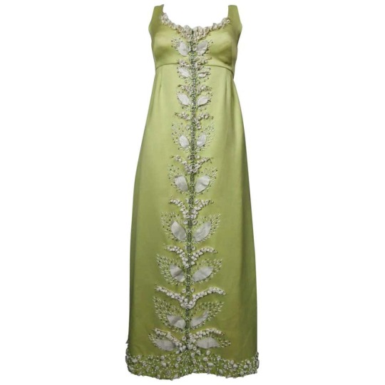

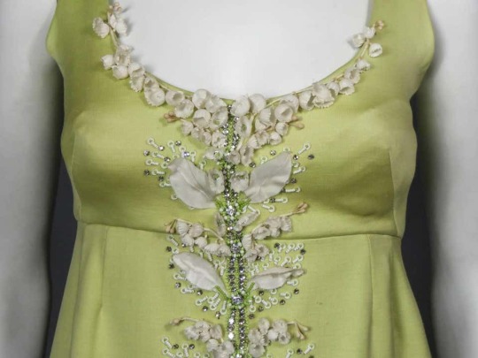
Lily of the valley embroidered evening gown by Tati of Milan, c. 1965
#lily of the valley#muguet#may day#1er mai#1 may#fashion history#fashion#embellishment#embroidery#italian designer#decoration#surface pattern#textile design#1965#1960s#evening gown#evening dress#tati
195 notes
·
View notes
Text
Before Deluca -- the sun's rage
I probably should have been alarmed that Lucient unpacked my bag and filled the—remarkably sized—closet upstairs in his quarters with my clothing. Possibly more alarmed that he had other clothing belonging to me in that closet. But, at the time, I was far too distracted by the materials of all he owned; silk.
Italian silk, with stitching too familiar not to be my family’s. Not to be Visconti. There were even a few jackets with my own signature embroidered into them, hidden in the swirling patterns along the borders—signs that I had personally touched the silk the jacket was sewn from.
He noticed me touching, staring, rubbing fingers along my initials, “Treasure, something wrong?” Soft, even in my mind his touch came too soft and his voice softer as he addressed what he found there, “Coincidence, I assure you. I’ve been buying silk from your family for…a long time. But I did not lie; that night was my first step on that dock.”
“And now they’re gone,” I didn’t look from the jacket, my initials, the slip of fabric that held too much and nothing all at once. It came then, the anger that should have come earlier, when I saw the memories, when he admitted it, felt no remorse for it. And I felt the sun in that anger, burning in fresh dawn against the closed curtains—silk as well, all of it, my silk, intricate textiles designed by mother’s worn and calloused hands that would no longer exist because of him—and it seared my anger to rage.
Lucient shrunk from me, backed from me, to the desk he all but fled but it didn’t matter. Filled with all that heat, red-hot and hungry, I couldn’t stop myself. I couldn’t see through what he’d done, what he’d stolen, and I wanted…needed to take from him.
“Mon tresor,” he tried to smile and his voice frayed at the edges, “am I to suffer so soon?”
I said nothing, could say nothing, words had burnt up with all else in that rage. I hadn’t known then, nor had he, but it was the sun at fault. It amplified all that I was, all that I felt, whether it touched me or not I could feel it boiling in my veins. And right then, it ached to burst and splatter Lucient all over that room.
So slender his neck, the whole of it fit snug in my hand, too easy to grip and lift and hold. Still I said nothing, even as he choked, kicking at me with those silk-wrapped legs. Everywhere it was, the silk, reminding me, burning me. His hands were no more than a gentle breeze on my arm, his nails chilled syrup with the blood they drew. But his eyes, his lips, they captivated…those silvery-blues bulged with tears beading in their corners and his perfect pout twisted with words I could not hear.
Yet neither begged, neither pleaded. He appeared resigned to his position, almost content in it. Do it, his thoughts whispered, if this is what it takes to bring you peace, to keep you with me, then do it. A hundred times, a thousand if you must; kill me.
As I closed my fist around his neck, the soft crackle of muscle beneath my fingers mixed too sweetly with his choking breaths. But as his limbs fell limp and his mouth slackened, dripping chill spittle down my arm, his thoughts called out, I would die again and again for you, my treasure, again and again and again.
I learned much in that death, in that loss of control. One was that I needed to keep hold of my emotions in the daylight. Two was that vampires do die, they simply do not stay dead. But more than anything else, I learned that Lucient would do anything to keep me…and I couldn’t recall a time in all my years where anyone wanted me so honestly.
Never had I encountered a single man willing to sacrifice for the privilege of my company, for even the hours it would take to leave the inn and be together in the open. To be seen, to be known, if only in the midnight hours where our safety was all but assured. Even then, even then, they were too afraid—or uninterested, perhaps—to be more with me. To be with me.
And yet there was Lucient, a man who only just met me, willing to die for the chance. That thought-spoken confession tempered my rage, not outright, I would not forget what he had done, who he had taken to have me. But his devotion to repenting, to making amends in any way I saw fit, softened me to him.
It also broke my rage into bitter tears.
Believing the sigils on the coffin existed for a reason, I brought Lucient’s lifeless body to the hidden room. Laying him on his bed, I spent an uncertain amount of time scrubbing the inside of that hellish box of all that remained of my living self. I left the dirt and petals, as much as I could salvage, and then I set him inside it—gently, with all the care he’d given me.
And I waited.
#writeblr#snippet#writing#novel#before deluca#horror romance#because i think that's what we're working with again#tw: death#no we aren't posting these in order#they're just fun bits i am forcing on all of you
5 notes
·
View notes
Photo
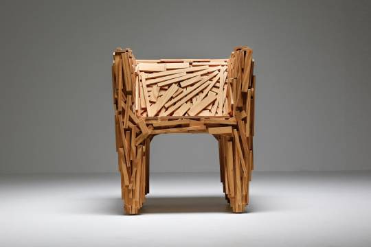
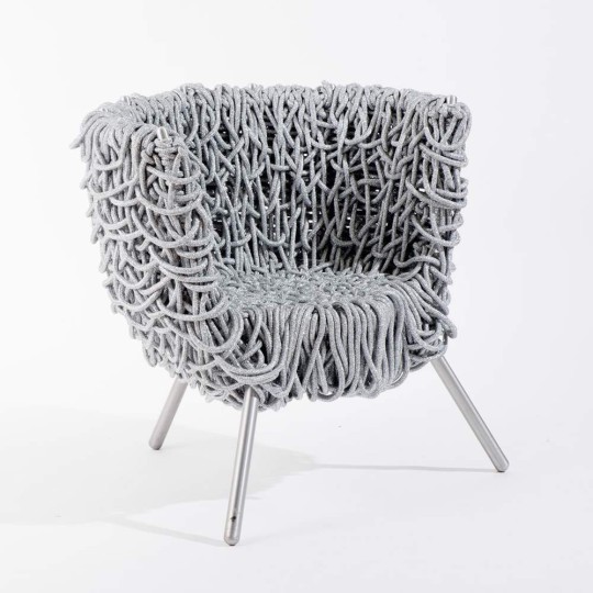

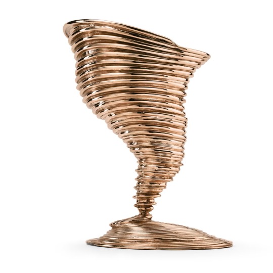

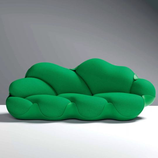


Fernando Campana (1961 – 2022)
Born in the rural town of Brotas, the São Paolo-based designer earned a degree in architecture from the Faculdade de Belas Artes de São Paolo in 1984, before creating Estudio Campana that same year with his older brother Humberto, an attorney.
During the 1980s the studio produced a series of sculptural metal chairs welded from iron called Desconfortáveis (Uncomfortables), eventually moving toward a practice using everyday materials like cardboard, rope, wicker, bamboo, and wood. Their iconic Favela Chair, from 1991 was fabricated with scraps of wood from discarded fruit crates, nailed and glued by hand. “The people who live in favelas construct their own homes, so I thought, why not construct a chair myself,” said Fernando in a discussion about the seat with curator Darrin Alfred from a 2010 interview. It was, he explained at the time, meant to symbolize a Brazilian shantytown.
It was in the 1990s—a time when the design world was primarily focused on the post-World War II movement of the Italians—that the Campanas came on the scene, with work that underscored Brazilian culture and its craft, sculpting furnishings from a range of raw and found materials. Their 1993 Vermelha Chair was a lesson in resourcefulness, hand-woven from cotton rope that enveloped a metal frame.
Design journalist Arlene Hirst was “gobsmacked” when she first encountered the chair, manufactured by Italian manufacturer Edra, at the Salone del Mobile in Milan. A year later the chair was included in Project 66: Campana Brothers/Ingo Maurer, a 1998 exhibition at The Museum of Modern Art (MoMA), curated by Paola Antonelli, the museum’s senior curator of architecture and design, an associate at the time. For this show, Antonelli paired the Brazilian brothers’ furniture with German lighting designer Ingo Maurer’s luminaires in vignettes that highlighted a shared passion for materiality and invention.
Both Fernando and Humberto were active in the production process as well, but as is often the case with partners, they remained elusive about specific roles. “Fernando had the training, so he was the more pragmatic one,” noted Antonelli in a recent interview, referring to his architectural roots. “He never discussed it. And I never questioned it. It was implied,” she said. The younger Campana also drew inspiration from his daily routines, local markets and wandering São Paolo’s streets. Antonelli recalled asking him about his use of found objects, asking if they weren’t too cute? His response, “They are not too cute. They are part of my life.”
Many of those found objects—including stuffed animals—made their way onto upholstered seating like the 2002 Banquete series, which became the equivalent of a sold-out Broadway show. It is still produced out of the Campana São Paolo studio, and handsewn by local craftspeople who are considered part of the extended Campana family.
In 2010 the New York- and L.A.-based gallery Friedman Benda began global representation of the brother’s work. “Campana Studio brought a completely fresh perspective, creating a dialogue with local crafts and the use of the readymade,” says co-founder Marc Benda, adding, “They were trailblazers.” The gallery assisted with support of the studio and helped them to balance the commercial success of their practice with its roots in the hand made.
One of the brothers’ last collaborations—presented in June at the 2022 Salone in Milan—is a collection called Metamorfosi, comprising five large-scale, pouf seats and a tapestry, created in collaboration with Italian textile designer Paola Lenti. Woven from remnants Lenti sorted and saved with CouLture Migrante, a social tailoring atelier (involving men and women asylum seekers residing in Como, Italy) the limited-edition pieces make their North American debut at Design Miami in December.
The work of Estudio Campana can be found at the Vitra Design Museum, Centre Pompidou, Musée Des Arts Décoratifs, MoMA, among other design-focused institutions. In 2020, they were the subject of 35 Revolutions, a retrospective at Museum of Modern Art, Rio de Janeiro on the occasion of their 35th anniversary.
Words by Melissa Feldman
Favela Chair for Edra, 2000, Pine, Height: 29.14 in (74 cm)Width: 26.38 in (67 cm)Depth: 24.41 in (62 cm)Seat Height: 15.75 in (40 cm),
Vermelha Armchair for Edra, 2019, Aluminium, Cord, natural cotton, Steel, 86 x 58 x h.77 cm,
Tornado Vase, Ghidini 1961, Bronze, W 11.81 x D 9.45 x H 14.57,
Jackfruit Table Lamp, Ghidini 1961, Polished Brass, Height: 19.69 in (50 cm), Diameter: 12.21 in (31 cm),
Bomboca Sofa GM, Objets Nomades, Louis Vuitton, 46.9 x 34.5 x 94.9 cm (18.5 x 13.6 x 37.4 in),
Bolotas Sofa (Cherry), 2019, Sheep’s wool, ipÊ, H: 95 W: 125 L: 215, Carpenters Workshop Gallery,
Edward Scissorhands side table, Giustini/Stagetti, 2014, Portorotype black marble and gilded bronze, 12 dia. x 22½ h in. (Casati Gallery),
Corallo Armchair for Edra S.p.A., Italy, 2004, Steel wire and epoxy paint, 38 x 60 x 39" (96.5 x 152.4 x 99.1 cm), Courtesy MoMa,
Sushi Buffet, 2012, Carpet, rubber, EVA, fabric and estela handcrafted into sushi rolls partially covering brass structure 28.25 x 78.75 x 17.75 inches (72 x 200 x 45 cm)
#art#design#furniture#lamp#vase#campana brothers#sofa#buffet#rubber#bronze#tornado#jackfruit#louis vuitton#edra#brazil#icon#legend#rip#bolotas#favela#chair#fernando campana#rip fernando campana
53 notes
·
View notes
Photo

Finally getting around to posting the Tumblr version of an exchange treat I made for @knuttydraws. Renaissance AU of Knutty’s Farie and Rylen. They’re wearing ensembles based on 1490s Italian court ensembles from Milan. The embroidery and sleeve textiles are traditional Lemko motifs, a nod to Farie’s character design. Rylen’s brocade is based on 15th century Italian fabric at the Metropolitan Museum of Art in NYC. I LOVED painting these two together <3
AO3 version here! <3
#dragon age#dragon age inquisition#dragon age fan art#fan art#farie lavellan#knight captain rylen#Renaissance Fashion#renaissance#historical fashion#renaissance au#1490s#15th century#italian renaissance#lemko embroidery#digital art#digital watercolor#my art#my artwork#musetta draws
34 notes
·
View notes