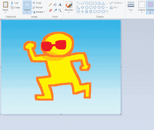
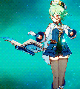
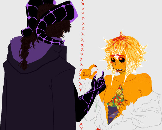
#i put it on to have in the bg while i was drawing
Photo

this show was way too funny to only have 1 season
#my art#lucy daughter of the devil#i put it on to have in the bg while i was drawing#i was trying to finish some mw2 doodles#n then i..........#got distracted .....#and started drawing the show instead askjhfkj#its such a fun show tho#also dont give me shit for how any of them look#theyre literal blobs in the show#i worked with what i had
22 notes
·
View notes
Note
I'm a fan
Hi there!! I'm combining these into one ask just to make it easier to reply to.
I've never actually played / watched a playthrough of fear and hunger, but it's definitely been mentioned to me in the past. It looks super interesting from what I can see though!
#replies#not art#i haven't really played many games lately bc i don't generally have the focus for them and/or want to work on smth else instead#but maybe if i can find a decent playthrough i can put it on in the bg while i draw or smth!
9 notes
·
View notes
Text
In case any of y'all are wondering why I haven't done (insert thing I said I was gonna do) yet, it's because I've collected such a big backlog of brain rot in the 2-3 months I was working on my 3rd year illustration finals I have paralysis and am doing nothing (well, I'm also working on introducing my cat to my families pets while I'm home for the summer and that's taking a lot of time)
#honkai impact#honkai rambling#theres more fandoms than that but honkais the only one i mentioned by name in the picture so its the only one im tagging#i have so much trigun and witch from mercury brainrot help#i also ended up putting on a lot of anime in the bg while i was drawing#so i have brainrot from a lot of different other places#and also my long term brainrot from madoka magica and fe3h#help#i need a checklist or something#but like none of these things are more important to me than the other thing#send an ask i guess if theres something on the list yall want to see first :/#god i need to see about getting that adhd diagnosis this summer
12 notes
·
View notes
Photo

No thoughts, only Modern!Keagan
#red dead redemption 2#rdr2#rdo#red dead online#rdo oc#digital art#original character#my ocs#my art#yeah this is a Time to post this lol#uh. I have been having brainworms abt him for a while now#he's supposed to have a fancy belt buckle but I could not be bothered to design that#I'll get to it later#no this isn't a better call saul au I have absolutely no idea what you're talking about#I put on corridor's videos in the bg and turned my mind off and somehow kept drawing???#I dunno#but thank u corridor for making me actually finish this lol
16 notes
·
View notes
Text
oi actually one last thing and then u can whack me with sticks… whenever I don’t know what to draw, I usually just doodle random faces but more often than not they look like my girlfriend :’D
#in fact Chevys influenced my style a lot idk how to explain it#when we first started dating admittedly I drew them sooooo much#and like even before they would always watch me draw I see to do like private streams for them and Blake#less private streams more just something in the bg while we all talked for days straight#:’)#but yeah when I first started dating chevy I was so happy I legit forgot how to draw#but the few things I could draw were us together because we were long distance at the time#I don’t draw them as much because I’m busy putting like. our brain baby on the page#we’re being these fucks to life together. but idk. maybe it’s the way one character laughs or smiles#or the way another’s brows furrow when they get angry#how another character crosses their arms sassily it’s all just shadows of chevy#and me ofc because I’m self centered#but yeah helps that chevy really brings these characters to life with the movements and acting they do#god if u could just see them#oh my god I was typing so fast my phone went into driving mode wtf#but yeah wow im. gay. so much of this is subconscious yk. I have trouble saying these things out loud#not out of a lack of wanting to im just. not good with words. i#I just hope it shows yknow#ur yeah wow okay that was a lot idk why I’m crying
5 notes
·
View notes
Photo


bike story
#ua s05#o#The bike died at the end. Sad i know. real angst right there#this is the first time you're seeing the first pic i did NOT post/finish it 6 months ago and took this long to do the second part#*wiggles my fingers magically so you forget how i did post/finish it months ago*#you get to see a glimpse of blue's house! im proud of that part it's the first time im. rly drawing the inside of a house#like i did draw rooms before but like. ONE room. here it's 3 rooms you can see#blue's 50s au home is somehow clearer in my mind than his regular self's appartement. go figure#he has lots of flowers. Your reaction when Blue comes up to you and complains that his flowers froze during the night: scream emoji#this au has a story but it'll be harder to convey than the tengu one- bc the latter i can do bg pics with no words and you stil get the jist#with this one it's like. Not possible to put most scenes without words. AND! it's the 50s they both have a specific way to talk#in my head it's not that clear- i just know basically spamt is the type to say 'golly!' all the while swearing like his canon self and blue#... He's like his regular self but more even formal i think? regular blue sometimes 'slips up' and uses words he normally dislikes to get a#point across. While 50s blue is formal except at work where he forces himself to be friendlier#there's so much you don't know about 50s spamt and blue waghgh hopefully i'll be able to find ways to share the stuff#dltr#spamton#spamton g spamton#blue addison
11 notes
·
View notes
Note
Most of the fan art made of Kaon would make people who do not know who he is think he is simply a walking shitpost when in reality he is only partially a walking shitpost and mostly just a terrible person who hardly ever shows up in the comic that derived a whole new personality from tons of speculation and headcanoning,,, sorry for getting all scientific but I think he s just so interesting
very true! just saw a funny image was all
#yeah he appears (checks) I think about 5 times?#tbh all of the djd excluding tarn and nickel have personalities that r almost entirely fanon#well. because. they don't have any#he is definitely terrible! absolutely he's one of the djd who's explicitly described to be SUPER into what he does#well his situation isn't As bad as say. trepan who I think I can count the panels he was in on one hand#also like the most big fanon thing I see about helex is him being a baker and/or a cannibal both of which well never happen in canon#just the Implication that he May Have put a brain in his mouth because he spits cranial fluid in the bg of one panel#and the Brain Kiss thing but that was scrapped! it's not real!#thank you for your ask anon#I kind of discovered mtmte through the djd and was devastated to discover how sparsely they actually showed up in it#I think in a folder I have every panel they appear in that I use.for drawing refs#oh and wow I haven't drawn a djd member who isn't kaon in a while#his design is burned into my brain pretty much#anonymous
5 notes
·
View notes
Text
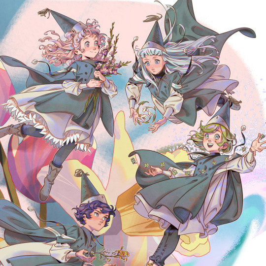
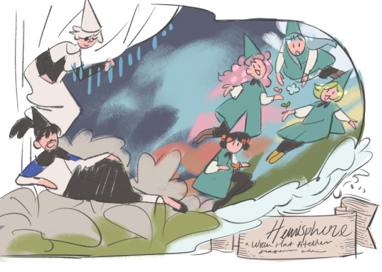
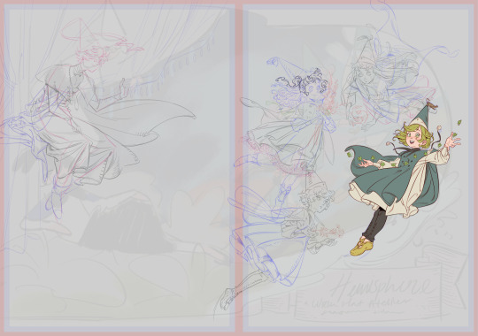
my piece for the Hemisphere: a Witch Hat Atelier seasons themed zine! thank you for having me! they're having a leftovers sale until stock runs out 🖋🍀🌷🍁❄🌧 WIPs + inspiration board + symbolism under the cut!
got some requests to put this on my inprnt! the site has sales very often & you can grab it as a small or big size print.
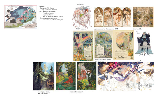
I had a pretty good idea of the composition from the get-go. I took inspiration from art nouveau (primarily Alphonse Mucha), German fairy tales, and some 1920s perfume ads. I wanted the girls to look like fairies, akin to The Root Children by Sibylle von Olfers.
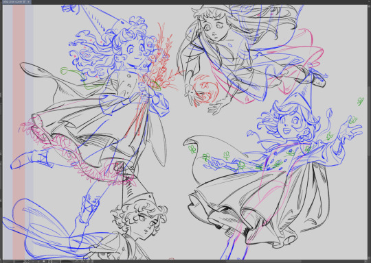
Olly just didn't work out in this drawing due to time restraints. I do love him very much though.
I actually kinda stopped making illustrations like these (including the TGAA/DGS tarot card + TGAA/DGS zine pieces a while back) because they were starting to get very hard on my arm, as I had an RSI (repetitive strain injury) a few years back during school. (Not putting the onus on the zines at all ofc! I genuinely love working with zine projects! it's def a me thing WAHAHAHA. my style was getting too anime and too detailed for my liking and everything was just taking forever to finish ngl. but I didn't have time to experiment with a more simple style outside of all of my deadlines)
I think that realizing you need to stop is okay. It's something that Shirahama teaches us in her story and I want to learn to take it to heart.
---
MILD SPOILERS AHEAD
(for those who havent read the story I guess)
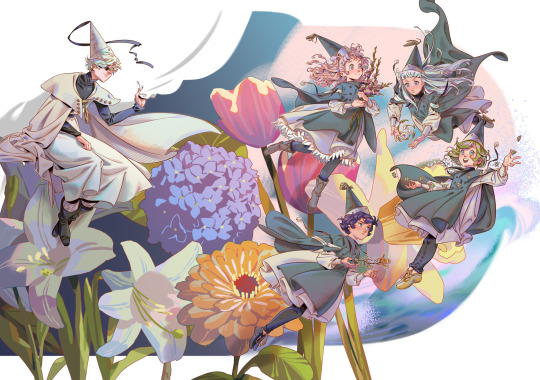
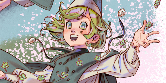
each character's symbolism:
- Coco - spring, clovers - Coco is the quintessential spring girl, and I wanted her to symbolize new beginnings, and oh boy did Coco bring a big one. The four leaf clover in particular symbolizes luck and good fortune - to some characters, Coco may have brought fortune, to others her presence brings misfortune, take that as you will.
- Tetia - summer, gladiolus - the name "gladiolus" comes from the Latin word "gladius", meaning "sword", based on the shape of the flower. you can interpret it as "you pierce my heart", perfect for a girl like Tetia, who has a contagious energy, with a romantic and grandiose nature.
- Agott - autumn, marigold - I read somewhere marigolds symbolize strength and power, perfect for our little magical powerhouse Agott. They can also symbolize jealousy (yellow flowers in particular have this association), which reflects on her rivalry with Coco in the beginning.
- Riche - winter, snowdrop - The white color of snowdrops has a strong connotation to innocence, which reflects on Riche's wish to stay a child forever. It can also symbolize rebirth and new beginnings (like Coco's clovers), as the snowdrop is the first flower to bloom in the spring, when the snow has not yet melted. I wanted the concept of "rebirth" to associate with Riche's friendship with Euini, and of his sort of "rebirth" into a new being.
- Qifrey - he does not have a flower per se, but as the caregiver and educator of the four girls, he represents the rainy season - precipitation being the one thing that binds all of these seasons together. (Note some areas of the world do not have a rainy season like where I live). I think somewhere along the line I wanted to put hydrangeas behind him, to really bring out the "rainy" theme, but the thought probably got lost somewhere in translation...
- bg flowers - honestly I just picked whatever. white lily, daffodil, hydrangea, zinnia, tulip
#witch hat atelier#tongari boushi no atelier#Δ帽子#coco (witch hat atelier)#agott arkrome#agathe arkrome#agott (witch hat atelier)#tetia (witch hat atelier)#riche (witch hat atelier)#richeh#qifrey#agott#tetia#riche#my art#i truly do not know how many tags show up in search anymore LEAVE ME ALONE#thank you for reading if you do - from the bottom of my heart#i am editing this post half asleep bc the full artwork refused to upload for like 2 days#and it finally worked now .#despite my struggles im very satisfied with how this one turned out#one thing that bothers me is qifrey's robe.. i wanted it to be like hes sitting on a flower#but i think the angle of the flower didnt work out LOL so it looks weird#*nitpicks my own art to hell as per usual. you know. the usual midnight thots*
2K notes
·
View notes
Text

ms paint. you know her. u used her age 8 to make loads of rainbow ovals all over the canvas and then scramble it with selection tool. now u will know her true powers with my handyrandy tips under the readmore. some will be pretty basic and others are very special.
this post has 8 cool trix to learn for you. enjoy and i may do another in the future if i remember/learn more stuff
some of it might be common knowledge. but its got some deep cuts. all tips have gifs to show process easily.
🙂 enjoy and i hope this encourages you to fuck around in mspaint more
soundtrack for this post (loop it while you learn for advanced learning experience)
TIP 1) the right click trick
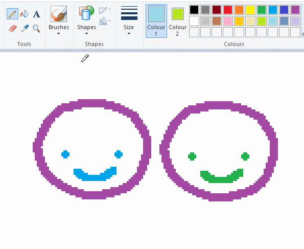
left and right mouse click correspond to col1 and col2 respectively, which u can see in the top bar. this applies to all brushes and the fill tool like above. when using shapes col2 will be the fill colour (if you have solid fill selected). right clicking with shape maker will reverse the colours use on the shape.
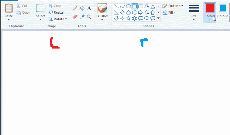
TIP 2) right click eraser
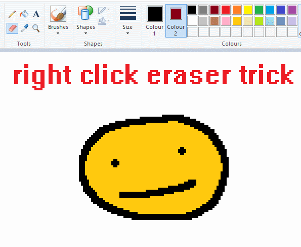
this one is extremely helpful for lineart or add shading. the eraser always uses col2. so your eraser can technically be any colour. but here's where you get powers: right clicking with eraser will only erase onto col1, with col2.
TIP 3) transparent selection change a guy destination
the beloved transparent selection tool works based on what is selected as col2. so long as you have the correct colour as col2 you can make any image transparent and put it on top of anything else. and yes this works with photo bg as you can see.
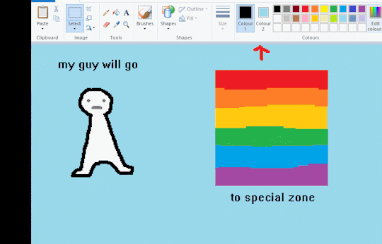
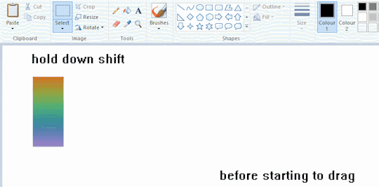
TIP 4) the gradience
this one is a little more complex. you want to start off with any canvas size, and make as many diagonal coloured bands as you want. (protip: holding down shift makes a perfectly diagonal line with line tool)
then you need to resize the canvas to a width of 1px (make sure you resize by pixels, and do not maintain aspect ratio). then resize again back to its original width (or a different width i cant stop you). you will have your lovely gradience.
TIP 5) superimposter

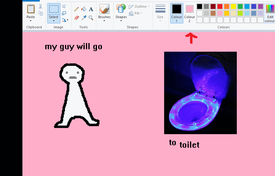
so. you got a cool gradient and wanna put a guy on it. heres what i do:
i open a 2nd mspaint with same canvas size and draw whatever i want on there. i then pick a completely unrelated colour to my entire piece, and set that as the bg. you could use white, pink, geen, whatever you want as long as it doesnt appear somewhere else in ur drawing. copy the guy.
go back to your gradient tab. ensure that col2 is set as that bg colour you picked (lilac for me). have "transparent selection" enabled. paste your guy in. cue fanfare
TIP 6) advanced superimposter
the great thing about this method is u can put multiple gradients in multiple areas of the image. this is where it gets all japanese printmaking type of shit. ukiyo-esque
all you need to do is make another canvas with a new gradient, ensure col2 is set as the colour you want to replace, then paste your original piece onto the new gradient. now my guy has a soft fade. you can do this as much as you want. (you could even make a canvas with a texture or photo and paste your drawing onto there)
TIP 7) "sketch layer"
so as you now know, col2 is what is removed when you click "transparent selection". which means you can also remove any instance of a colour from ur drawing. which means you can have a unique colour for sketch layer and remove it from the drawing later. i admittedly dont do this but it is a great trick to have.
now combine this with lowering your dpi for smoother lines. may seem obvious but it helps. its like a free stabiliser whenever u want.
TIP 8) rainbow art
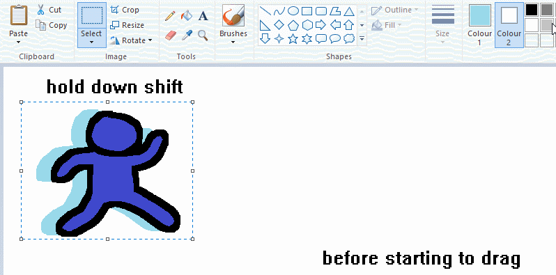
now this is where you can get dizzee rascal "bonkers". check out my small and shitty rainbow trick. you can select anything and hold down shift, then drag with left mouse, to turn that selection into its own brush. i even did it with a guy. and you can of course do this with a photo as well.
🙂well that it for now. hope you liked it thanks for reading now back to your regularly scheduled tgcg programming
2K notes
·
View notes
Text
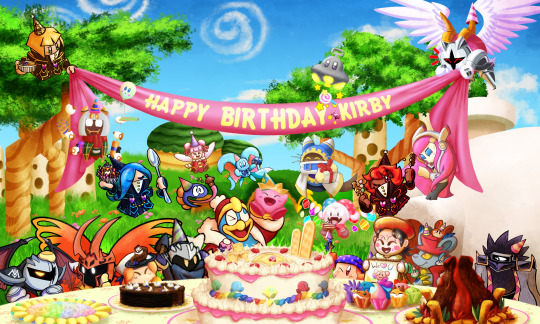
HAPPY BIRTHDAY KIRBY!!!
It is currently 1:03 AM at my end on April 27th, and I'm just done with rendering this beast, so I feel I can unveil this project that took over a span of 3 weeks on Far-Flung Starlight Heroes server - this collab!
The idea of this collab was simple - every participant picks a character from the series and draws them onto a rough placement sketch, while I afterwards put all of them together onto a single canvas. Kirby and banner were there since the start and were open for interaction.
No one suspected I would do an entire background for it >:3c
List of participants:
@sourghostsoda - Dark Meta Knight and Morpho Knight
@tinybandee - Sailor Dee and UFO
@metaknights-halberd-insurance - Meta Knight
@thesmaddee - Dedede
@deafeninggardenerpanda - Mage Sisters
@giantchasm - Taranza
@/thecreatorlynne (on Insta, doesn't have tumblr) - Gooey and DMS
@deefighter2739 - Ribbon and Adeleine
@qui-gg - Elfilin and Bandee
@ceragolor - Magolor
@popdotastro - Marx
@tastymarbar - Daroach
@erythteria - Susie
@spidersandtomatos - Galacta Knight
I did Kirby, BG and rendering!
#kirby#kirby series#kirby fandom#kirby 31st anniversary#kirby collab#do i tag everyone? fuck it i do#dark meta knight#kirby dmk#morpho knight#francisca kirby#flamberge kirby#zan partizanne#susie haltmann#meta knight#king dedede#sailor dee#bandana waddle dee#kirby gooey#elfilin#kirby ribbon#kirby adeleine#magolor#taranza#marx kirby#daroach#dark matter swordsman#galacta knight
1K notes
·
View notes
Text

[ ECTOBERHAUNT 2023 BANNER ]
I'm doing the banner for this year's @ectoberhaunt event~
The theme is Science vs Magic
I had so much fun making this~
Sam get the fantasy AU fit while Tucker gets Cyber/futuristic style
Sketch Progress

I like the idea of Sam being a druid bc nature connection tm
And Tucker would vibe very well with fancy future stuffs. i was gonna draw him with a bigger puffer but I couldn't figured it out. I like the one we got here too so yay
Okay so I was a bit pressed on time while working on this so I couldn't do as much research and references as I should.
On Sam's part, the somewhat floating book was inspired on how genshin impact's catalysts have their books/weapon just floats and it looks fancy n magical n Sam deserve that honestly
Her glowing tattoo are highkey inspired of this beautiful Sam with tattoos art by @the-stove-is-on-fire Mine is nowhere close to that but that's my main inspiration for this
I was gonna give Tucker his usual orange sweater but I noticed a lot of neon or cyberpunk outfit relies on dark backdrop to pop.
And since the background color is gonna be bright yellow, I gotta put the dark color somewhere else. And his sweater would be the perfect spot to balance out all the brightness with a bit of darkness
And it matches with Sam too so it works out great uwu
The magic circles on their back were mostly there to balance out the composition bc it looks too empty as is, gotta spice it up a lil bit uwu
But a direct halo would look.. too out there? I mean I can but like.. Sam is magic/fantasy based, why not lean on that n go for magic circles :D
Tucker's random bits on the background took the most out of me bc like.. its hard qwq I literally try to look up aesthetic bg to figure out how to work with his?? Eventually I just settle on less is more and added shadow under the bits to make em pops out against the orange
source
And for the color choices, I wanted the two of them to have purple, yellow, and green on them. The green color on to symbolize Danny bc I'm an Everlasting Trio shipper lmao
I wanted Sam to have some yellow and green on her magic, which kinda.. got covered with the whites honestly. But the greens stays with the vines so we'll go with that
Tucker was harder to figure out, so I settle with him with blue and greens instead of purple qwq
In the end, only the green end up staying lmao
It ends up unifying both sides so hell yea it all works out lol
302 notes
·
View notes
Photo


u guys wanna see more WIPs... similar to the last post, here are Some WIPs
all of these were started in sai before going on to procreate. before going back to sai again in the case of the strength card
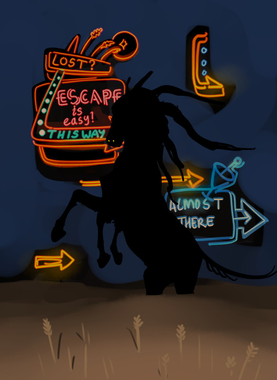
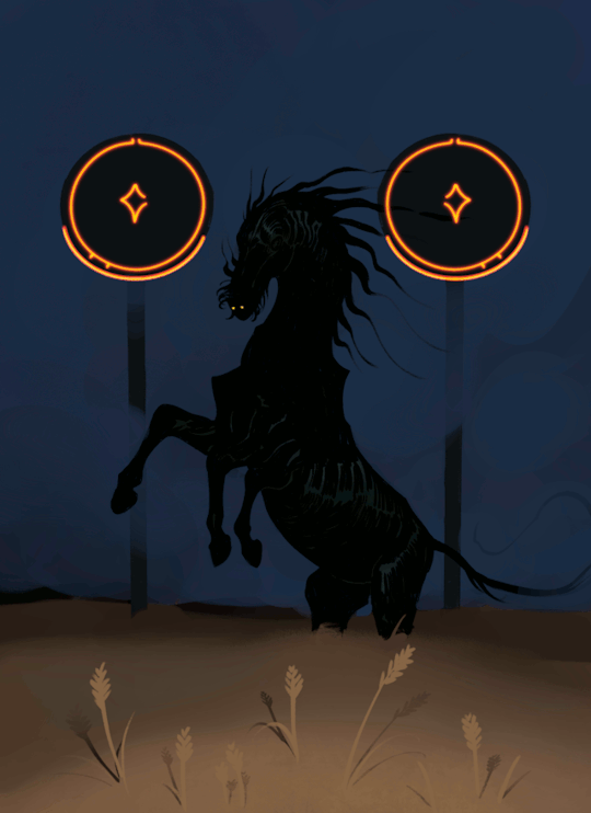
so Blue Sky/Out Of Time... yeah it’s extremely self-explanatory, it’s very obvious what this scene depicts and i’m sure everyone gets it (this is a joke i’ve had multiple people dm me asking wtf this even is). the one element that absolutely NEEDED to be there was the LED digital clock with a bullshit time on it, and i decided to replace it with an AIRE warning sign instead and put the LED readouts in the bg. the warning sign in this setting serves the purpose of informing ppl when there are hostile faeries around. i knew what the colours would be from the beginning, but it took a bit for me to realise what sort of shading style i wanted (it took forever). but i did know i wanted to contrast the very sketchy black void against the cleaner and almost cartoony/comic book style rest of the drawing, to emphasise the fact that the foreground sky and background void are made of two very different things. again i used a colour shifting brush to quickly make all the shards of sky different colours, but originally i planned to have some of the shards be dark or night time (with stars or the moon etc). unfortunately it didn’t work, it was too dark and pascal got lost against it.
My Eyes Are Up Here is pretty obviously the exact same scene with the same character, in the same field, but with a different sort of atmosphere. i sketched this in sai then did the final in procreate. originally it was going to have a black background

i really like this version tbh but the blue works better. i think he looks good against dark backgrounds where it’s kind of hard to see wtf is even happening there
so about the neon signs..... i’m well aware that the sketch has way more promise than what the final ultimately was, and that’s because i found that i didn’t have the technical or artistic ability to pull off the complex neon signs like i wanted to. i couldn’t get it looking good enough so i had to scrap them. but these signs will be back, i want to draw them properly and do them justice. the gif was unplanned too but i thought it would be fun to have the flicker be very intermittent so that if you scrolled past it you might not even realise, or you’d have to stick with it just to catch it looping. i used GIMP to make the gif and change the frame rate, and this actually took a very long time because i had to preview it over and over. anyway if you WERE to get lost in the púca’s field, in this story, you would see neon signs like this encouraging you to follow them.
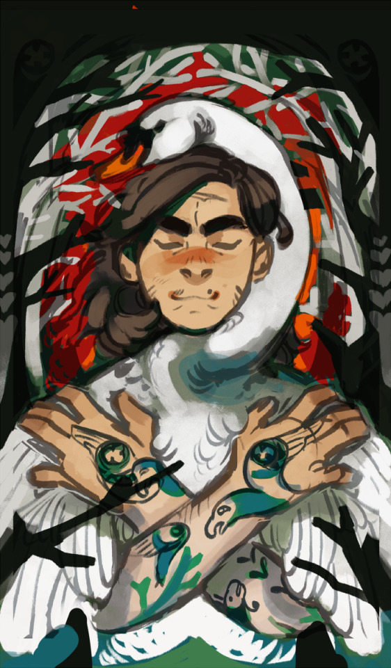
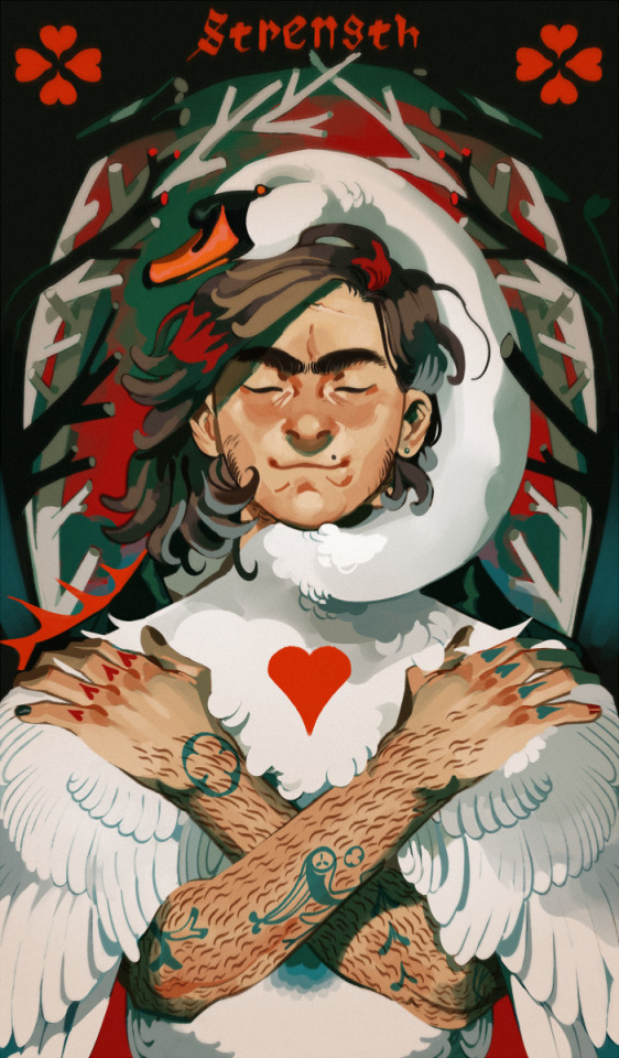
Strength is actually the last drawing i ever made that ended with a paint-over in sai, and the oldest drawing here. as such i actually don’t think it’s representative of my current ability but i do have a soft spot for it for sentimental reasons lol. the reason for the paint-over in sai was because i drew this at a time when i still did not trust procreate to be able to place the level of finish on it that i wanted
the background took me a thousand years to figure out. literally it was so annoying that i considered scrapping it for something simpler. but the idea was for it to be a kind of fairytale-ish lost in the woods sort of look while also appearing like the blood vessels around the human heart. the branches were also supposed to be heart-shaped in cross-section but i spent so long zoomed in painting them that i forgot to zoom out to see if all those fine details were actually visible, and it turned out they weren’t. i was disappointed that i couldn’t get félix’s tattoos to look right but that’s what i get for making a character with shit tons of both tattoos and body hair. i also got rid of the foreground branches really soon because they weren’t adding anything and muddied up the readability of his pose
the swan is from a daemon au and bears no relation to my other swan characters. i just like swans a lot
2K notes
·
View notes
Text
Vitalasubzam Week 2024 1st day: Flowers / Symbolism
since this day is about flowers and symbolism ofc i went with hanahaki
notes:
dandelions indicating zam is p obvious -- after all thats what the guy uses himself -- but the fact that they, or more specifically their seeds, are tied to wish-granting adds a neat layer to it i think considering zam's symbol of being a star (in my interpretation) also ties in to wish-granting
this whole thing is based on zam going "subz can fix me," and while i didnt know how to portray it without making an entire comic which i didnt really wanna do, he actually doesnt want the flowers gone he just wants subz to stitch not just his chest close but also his mouth
i was originally gonna make the thread purple but decided to go with green
the x's, while supposed to be tied to the whole stitching theme going on, are red instead of green because of zam
i had trouble picking the bg color cause on one hand i wanted to make it dark but on the other hand i wanted the focus on subz despite the composition which would need a lighter color, in the end i chose the same white as zam's shirt cause i like that it made him look cut off
zam has no nipples cause his species (skyformes) are homunculi in my Minecraft LoreTM (he should also have way more scars than just his neck but i havent decided where to put them yet)
this was actually drawn right when i changed zam's design to have red teeth but it made making the dandelion seeds visible a nightmare so i decided to just keep them white in this drawing
#gore cw#hanahaki cw#vsz week 2024#mcytshipping#lsshipping#subzam#sunshield#itzsubz#princezam#added note unimportant to the image but putting here in case i forget:#subz' violet arm pattern thing is supposed to evoke something between veins and gem cleavage#(taking the pattern of veins but more angular like gem cleavage)#changed subz' hairstyle to a messy choppy fucked up braid cause aparently zam said having a braid reminded him of subz#(havent gotten to that part yet so idk if theres any specifics or whatever)#also got some other ideas for this day but idk if i can get to them in time#if i did then yall will be seeing them too ig lol#but if i dont then just know that princess irene tulips are perfect for vitalasy while blue diadem cornflowers are perfect for subz#also also am gonna be trying to see if i can combine each days prompts rather than just one or the other#lets see if im successful lol#mine.art
88 notes
·
View notes
Note
Do you have any tips for people using digital art for first time? Thanks so much <3
ooo for first time i’d say do not let anyone tell u what brush u use doesn’t matter. artists will say this but they’re LYING bc they’re just too tired to send their brush links again (which is fair but still)
sometimes a brush can b make or break for drawing feeling comfortable or not, so play around a lot (settings, diff brushes, diff size, etc)
and get used to putting a gray bg temporarily so ur not staring at a harsh white canvas all the time, it’ll wear ur eyes out quickly !!!!
while brushes do matter, program doesn’t. just use what’s accessible for u and is fun to use🤝
that’s most important i can think of rn. it’s exciting that ur starting digital art !!!! i hope u have a good time !!!!
63 notes
·
View notes
Note
Can you draw Wally plz??
on tablet?
Do I really need an excuse??
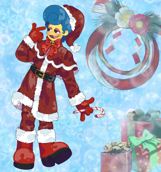
I Honestly wasn't sure what you meant! Because i have drawn him so so many times digitally BUT this one is special
BECAUSE!
Normally i do do my sketch Traditionally, But i chose to take this ask as a personall challenge to do the WHOLE thing digitally
looky at my digital sketch!!
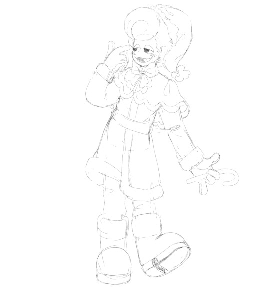
just like my trad sketches, it is just very very light. Im so used to drawing lightly because i erase a LOT
oh and hey, while i'm at it, just take my ding dang time-lapse
ahahaha just in case you guys ever wante to watch me manually color and yes yes, do those shading lines by hand because i love them.
oh and ty Ibis for having background elements bc backgrounds are HARD. (But putting the little stickers and bgs together feels like scrapbooking and its fun!!)
If you actually watched me draw, you may get motion sickness from just how much i move my canvas around lmao
#i feel like i took a day on the sketch with just learning process and ohh lasso tool!! i may get spoiled on re-sizing/moving#oh let me get tags#jazzart#jazzanswers#wally darling#welcome home#welcome home wally#christmas#santa#wally in a santa suit wally in a santa suit#ok i desperately need to do some lil christmas sketchies before its too late#but boyo i work retail and um im one of the boss ppl so i get thrown around a lot awaaaaaaaa#in case you guys were wondering if i slowed down a bit#i promise i PROMISE im still very obsessed and he lives in my head rent fucking free#i think a lot of artists are feeling a holiday burn rn#oh dang i skipped an older ask for this because i wanted the challengeeee#and to do a bigger peice#im so sorry#groovy is coming#ohhh and if i can make it in time#id love to draw groovy crimmus time!!#i loose track of time and days so easily#its a curse honestly#ohh going to rest now maybe eat
73 notes
·
View notes
Text
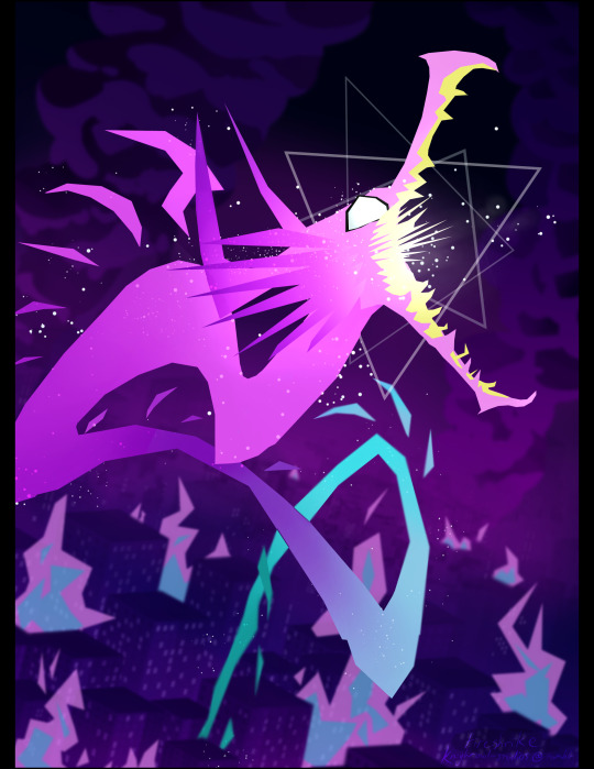
“This is a warning for Kray Foresight - free all captive Burnish immediately, or I’ll burn Promepolis to the ground!”
Many hours, layers, micromanaged bg assets, and egregious amounts of colorpicking later, it is finally done //passes out
As soon as I watched Promare I was legally obligated to draw the dragon.
Please do not reupload without permission!
(Very ramble-y) process notes and wips below the cut:
[[Shoutout to Tamberella’s wonderful city brushset, the bg would not have been possible otherwise!]]
I had to cross-reference so many stills and gifs from the movie in order to try and recreate the atmosphere and style XD This whole drawing was also the perfect excuse to whip out the polyline tool again, it’s one of my favorite things to draw with but I don’t actually use it much for...some reason lmao. Habit? Who knows...
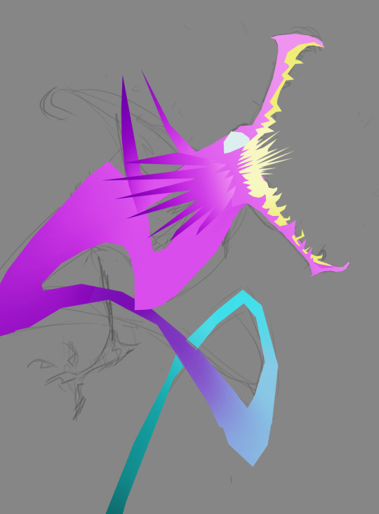
As you can see, it was initially supposed to include his lil arms, but I couldn’t find a way to make them flow well with his line of action and had to exclude them (which was a bit painful as I was really happy with how the claw shapes turned out). I figured since the film seems to cheat it the same way, it was fine for me to do it as well XD Though I don’t have a capture of it, originally his body was also in a more straightforward loop-de-loop kind of shape.
I wanted to put special focus into the pose and sense of action (two things Trigger really excels at), namely when it came to the head and jaws. I noticed that in a couple of shots the dragon’s jaw is “broken” - opened at an unrealistically wide angle - to better emphasize the action, and while I didn’t take it as far as Trigger did I wanted to try and capture something similar in my own way.


The windows required SO much micromanaging. I blocked out a “template” of windows using one of the brushes in the mentioned set, grid-warped it to align with the perspective, and then copy-pasted it onto each building and then manually went through each one to make sure every patterns of “lit” windows was unique and felt believable. The process had to be repeated twice, for both visible sides of the buildings. As far as individual parts of the pic go, that step probably took the longest.
I also really wanted to somehow incorporate triangles into the drawing since they’re so representative of the Burnish and the Promare, and adding some around the face seemed the most intuitive way to do it.
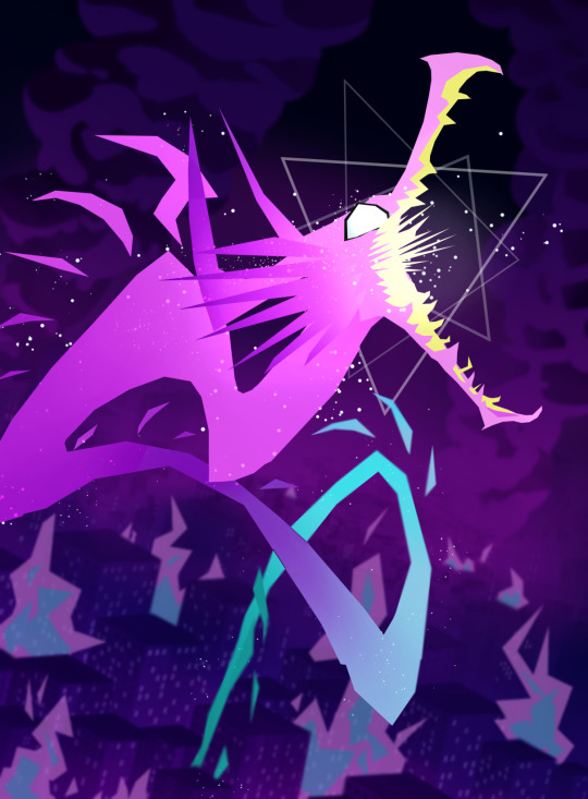
A lot of miscellaneous things were added at this point, such as the ground flares (polyline tool my beloved), the smoke, and smaller details like making sure the dragon felt more “sourced” in the scene by clipping the tail behind a tower. The background was also blurred, to help sell the perspective as well as keep the focus on Lio. The flares were one of the hardest things to manage in the latter regard, too, as due to some oversights in my initial color choices they were actually brighter than Lio and stole his thunder! So it took several different tries to find a way to successfully de-emphasize them without inadvertently making them some weird sickly color XD
If you read through all of these notes, thank you so much, I love you!! //hands you a cookie
Bonus layer screenshot:

#reupload#personal fav#promare#if you were one of the people who reblogged or liked the original THANK YOU!!#it meant so much to me you have no idea!#and if you ARE seeing this again in the tags please pardon the dust of reuploading it here too XD#I just still like this one a lot so I wanted to bring it to my new art blog as well#everything in one place and all :P
110 notes
·
View notes
Last Seen Blogs