#html how to put image. html how to change image size. html how to put images in a row. html how to center a row of images. html how to
Text
she's live

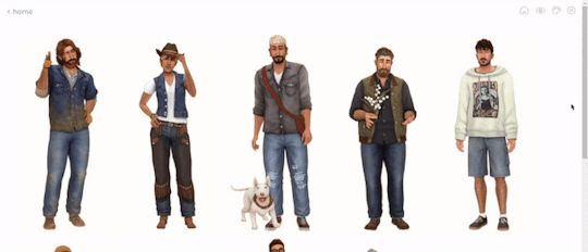
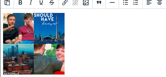
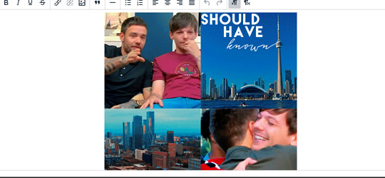
now you can see what everyones height is in my head because i refuse to download height sliders. look at ass <3
#also works on mobile btw ☝️ !!#me successfully making this is proof you can achieve anything with 500 google searches#you should see my search history#html how to put image. html how to change image size. html how to put images in a row. html how to center a row of images. html how to#their pinterest boards are disabled at the moment because i need to make them look good before i share them#and most tags don't work yet because i'm too lazy to go back through my whole blog and tag almost 2 years worth of posts 😭#going to christen it by reblogging one of those dress up your sim prompt ask games#if i can find it#and then i'm going to get completely stuck into rufus and sawyers gameplay yessss i can't wait#leaving virgils gameplay forever i think because when rufus and sawyer have a kid i'm moving him in as the babysitter#would you believe me if i told you there is 0 cc clothes in this#i've fallen in love with maxis clothing recently idk what happened to me#besides roxys boots and virgils bag its a vanilla lookbook#thank you to everyone who voted on the poll yesterday btw#even though it was 50/50 the majority of the time it was up#it ended up 60/40 after an hour tho so i went with my fav macmahon lifestages instead of young adult stages!#goodnight <3
231 notes
·
View notes
Text

✦ Okay, I give in. Let's upload our gifs on the beta editor to prepare for a gif pack page. Resources are available at the bottom, so lets get started !!
So first things first, you can only upload 30 gifs at a time. Now for me, I will always upload as I gif, around every 20 gifs, then upload to the page (this also ensures I don't skip any or have doubles) and keep gifing. That used to mean that I don't have to wait for tumblr to load 300 gifs and die from impatience. For the rest of y'all that means you're going to have to batch upload. I know, I'm sorry.
Note: With the help of @nataliealynlind we discovered that the daily limit is 250 gifs! So if you have more than that, prepare to upload your gifs over the course of a couple days or use a second blog. (imo this is another great reason to upload as you gif! that way you don't have to get stuck at 250!)
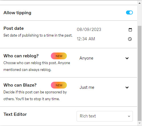
So after you upload your gifs (in this case I only did 10)*, you're going to go to the gear at the top of your post and click it. Then scroll all the way to the bottom where it says Text Editor. This looks familiar, right?
*Note: If you don't save it as a draft first, your gifs will be in .gif format, not .gifv. This means you can skip removing this tag later on, but I'm not sure if gifs that are uploaded but never saved/drafted will later disappear at some point. To be safe, I would save it as a draft. I just forgot at this part tbh
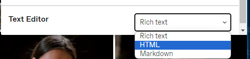
Well the good news is, you only have to change this once! The bad news is, we don't do Markdown then HTML anymore bc Markdown doesn't strip any of the code anymore 🙃 So just change it to HTML
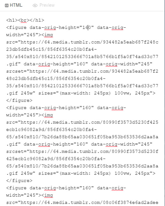
Now it should look like this! Fun!
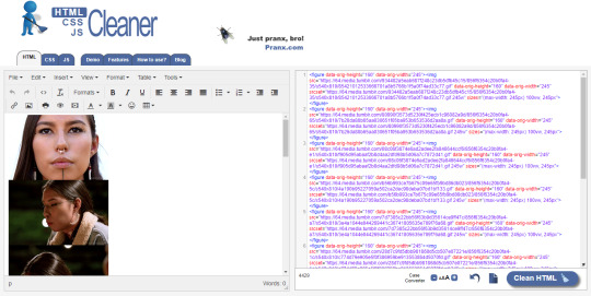
Okay, now we're going to copy that text and take it on over to our new best friend, the HTML Cleaner! So you're going to want to paste it on the right side of the screen. Your gifs should appear on the left side. If both sides have text, that's how you know you pasted it on the left.
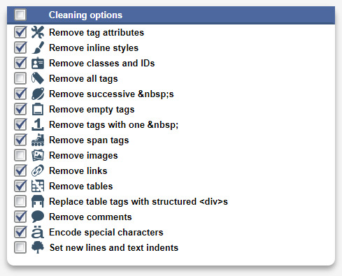
So in order to get ride of all this extra code, it's going to take a couple extra steps. First, you're going to check these boxes on the left hand side.
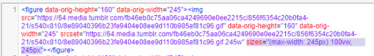
Now, on the right hand side, you're going to enter these under Find and Replace (copy/paste section below!!). I know you're like, uh what? Where the hell did you get those numbers? Well, I got them from our gif post code!
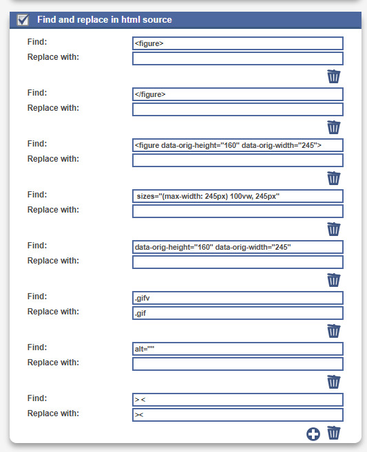

For easy copy pasting:
Find: <figure>
Replace: (leave blank)
Find: </figure>
Replace: (leave blank)
So after you add the specific widths for your gifs, you're also going to want to add the following:
Find: .gifv
Replace: .gif
Find: alt=""
Replace: (leave blank)
Find: /> <
Replace: /><
NOTE: If your gifs are usually the same size, I would recommend saving these snippits above on your computer's sticky notes or a draft to copy/paste for future uploads! While I do appreciate the viewer traffic, I'm sure coming to this tutorial every time is gonna get old real fast.
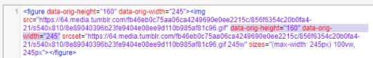
After all that, click Clean HTML
And now, your code should look like this! If there's still a space between your image links, just click Clean HTML again and it should get rid of it!

Now your code is nice and clean to put into your gif pages! Not quite sure how to do that? Read the Setting Up Your Sidepage section in this older tutorial!!
Resources
HTML Cleaner
My Gif Pack Page Codes
Recommended Gif Pack Page Codes (tag)
Previous Tutorial (How to upload to a Standard Sidepage)
Barebones Code (for previous tutorial)
#rpc#rph#gif pack tutorial#uploading gifs on beta#rp tutorial#beta editor tutorial#mytutorial#rp guide#me: i'm tired of this (remaking this tutorial every other year) grandpa#tumblr changing posts every five minutes: that's too damn bad!
159 notes
·
View notes
Note
Have you got any good resources for men’s clothing in Ireland (or even Scotland) during about the 1400’s-1600’s?
I have been trying to find anything that can give me better insight so I can recreate the clothing but so far I’m mostly seeing cheap rubbish costumes that are very clearly the generic “medieval” style that everyone goes to when they want to convey a vibe but don’t feel like doing historic accuracy.
Not to say there’s anything wrong with that but I’d like to really impress people in future gatherings that pertain to this time period
This is a tough one, unfortunately. The 2 best books for this have been out of print for decades and now sell second hand for $100+ USD. Your best bet for getting a hold of them is interlibrary loan. Neither of these books contains sewing patterns or construction information. They are:
Old Irish and Highland Dress by H. F. McClintock, 1st ed. 1943, 2nd ed 1950
Dress in Ireland by Mairead Dunlevy, 1st ed 1989, 2nd ed. 1999
The one book I know of that's still in print is Before the Kilt: How the Irish and Scots Dressed in the 16th Century by Gerald A. John Kelly. I haven't actually read it. I've heard it has some issues with the images being low resolution (probably because it was printed by a small press), but it does contain good primary source research.
The only place I know of that sells legitimate sewing patterns is Reconstructing History. I haven't actually bought any, but I have heard that their sewing directions are not the easiest to follow, and some people have issues with the size grading. Their patterns for the wool garments are all based off of extant period garments. Based on more recent research, I don't their léine patterns are completely correct, but they are at least better than some of the léine patterns out there. (Avoid anyone who tells you to put drawstrings in the tops of the sleeves or that a man's léine should be hip-length.)
Websites of reenactors and historical costumers who have put serious research into their outfits:
https://saffroncloth.wordpress.com/
https://www.wildeirishe.com/
http://matsukazesewing.blogspot.com/2014/06/16th-century-irish-dress_19.html
https://www.thelastprince.ie/
http://www.claiomh.ie/
A couple of decent videos on 16th-early 17th c Irish dress:
Traditional Irish Clothing in the Gaelic Period
Depicting and Describing Dress in Early Modern Ireland by Dr. Katherine Bond
If you're planning on doing the 16th c, definitely check out Susan Flavin's research. It has great information on what types of textiles, dyes, and trims that were available in 16th c. Ireland. You can download a pdf of her dissertation here.
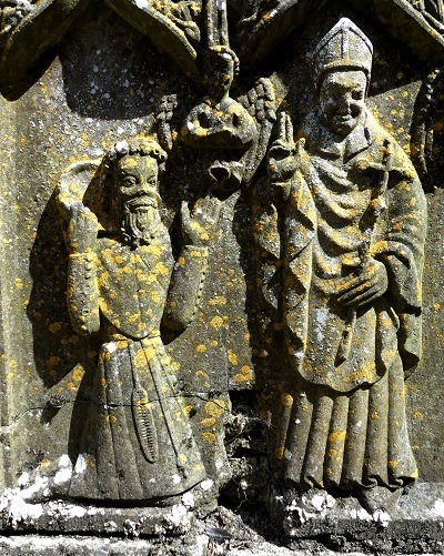
I'm sure you already know that 1400s-1600s is a long time period for dress history. Irish dress changed a lot during that period. If your goal is to make a single, well-researched outfit, I would recommend picking a period that's somewhere 1500s-1600. There are a lot fewer primary sources (extant garments, art, documents, etc) for 1400s Ireland. On the other hand if you enjoy making educated guesses, 1400s might be more fun. Just check out this neat 15th c. outfit from Strade Abbey, County Mayo:
If you have any more specific questions, feel free to ask. I can't guarantee I have answers, but I do have a bunch of random Irish-dress-history related articles for this period on my computer.
49 notes
·
View notes
Note
Ur website so cool!! ❤️❤️ Do you have by any chances coding tips? Been trying to make my own website for a while but adhd won't let me concentrate a second when it comes to learning coding
Thank you! And 100% It is deceptively approachable but also time consuming, I'm familiar enough with html from a highschool class where we did need to write code out by hand, and then soft practice with coding toyhou.se profiles and futzing around with free code snippets. Largely though I don't think you need to know everything or to write everything by hand, you just need to frankenstein code pieces together (As long as they're free ofc).
I used this first, it's fucking insanely handy and lets you make a simple layout with sidebars, navigation, header, footer and a body base ect, and then just generate and copy the code. The html itself also has greyed out little notes about what parts do what!
I'll be real the rest of it after that is just me googling what I want to do or googling html snippets bc I forgot them. So like html image link with size attributes ect ect, how to make a html image gallery. I don't use one site exclusively but w3schools.com has a bunch of common ones and also has a little live code editor in its tutorials.
Like I still get greatly stumped for hours bc code's kinda sensitive and one or two characters out of place will break sections of it especially when ur just frankensteining. Trying out little segments in live code editors is really helpful because you can kinda break it apart and diagnose the issue before putting it into your site html.
Also if it helps this is kind of how I break it down in my brain as another ADHD-er. so fuckign sorry for how this looks im doing it in snipping tool. But code bits love to live in cages even if it all looks the same, iit would also help if you clean your code up mine is pretty horrid but you just want to familiarize yourself with the little "Sections" ig that's where doing things by hand would help because you would 100% know what each chunk is for but yk yk.
CSS is a different beast I barely understand. The parts of code where it starts stacking on top instead of being horizontal is css and it's basically how you do fancier things to your code, it's linked to stuff you already have down. So like changing the background in the body text box or something, you can only do so much in there. Css targetting the body text box is where you can level it up. Again the sadgrl layout builder has notes so you're not completely blind in there. There's also 100% so many resources to explain what all these words mean, my mmethod is incredibly avoidant I don't know what flex is I haven't needed to fight her yet ect ect.

Sorry if this is confusing this is just my hack and slash understanding atm. Be humbled by code I've spent too long trying to fix up hysterical margin issues just because I had a random apostrophe somewhere or because I tried to spell it colour and not color ect.
31 notes
·
View notes
Note
Hi! Gonna start off and say that I love the work you're doing with the Welcome Home neocities website! It's perfectly stylized for the project/puppet show and I can see the work you're putting into it.
I'd love to learn how to make my own neocities website (for fun? For a personal project??), so I was wondering if you could provide some tips and/or pointers for a first-timer.
Thank you!
HAHA well first of all i'm flattered that someone would think i'm skilled enough to be giving pointers in the first place. i still consider myself a novice when it comes to web design (for example, if you're wondering why every page on welcome to welcome home has its own CSS, it's because CSS is Way harder for me to wrap my head around than HTML) so i can't give any Super advanced tips, but i can at least write about what's helped me so far:
GUIDES. neocities has its own tutorial and list of HTML/CSS resources, but user-made guides are your best friend when it comes to figuring out where to go from there. a.n. lucas and pauli kohberger both have really good guides for beginners, but for the more advanced stuff, i found myself referencing the resources on solaria's webspace and sadgrl.online the most. w3schools is also very helpful when it comes to answering more specific questions like "how do i use two different fonts on the same page?" (and probably more.) if all else fails, then usually just googling "how to (x) in HTML" or "how to (x) in CSS" will yield at least one useful result. for making your website more accessible, there's the accessible net directory and this masterpost by foxpunk on tumblr.
it sounds obvious, but it helps to have a solid idea of what kind of site you want to build before you actually dive in, and then snoop around on neocities to get an idea of how other users approach the same topic. for example, i got the idea to start a welcome home wiki on neocities after being reminded of the 8:11 wiki on the same site, and then i spent a couple days just looking up stuff like "wiki" or "fansite" on neocities and then clicking on any page that caught my attention to study it.
layouts! there's no shame in using a premade one, and you can even learn more about HTML/CSS in real time just by messing around with the base code before implementing any intentional changes. sadgrl.online's layout builder is a VERY popular choice, since you can already do a lot with the basic options it offers and it's easy to further customize once you have it set up on your page; it's what i used to make welcome to welcome home. sadgrl.online's webmaster links also feature a bunch of other options under the "layouts" tag, and if none of those work for you, then you can even find something just by looking up template/templates/layout/layouts/HTML/CSS on neocities itself.
side note: if you're reading this and you want to make a wiki then you can also use this wikitable code. it came out after i had already established the Look of welcome to welcome home, so i probably won't implement it any time soon, but i TOTALLY WOULD HAVE if it was around when i first set the site up.
you can scale images up or down using percentage, with 100% being the image's default size. i don't know how helpful or acceptable that is, but i use it a lot.
don't feel pressured to get everything done at once, even if you expect people to be visiting your site frequently. usually if you just slap on an "under construction" gif or even just write "hey this site is still under construction" then people will understand. i don't think i've ever seen anyone get super huffy about slow updates on neocities, anyway.
EDIT: OH. GRAPHICS. i mention all of these on welcome to welcome home's front page but i Also wanted to note them here: betty's graphics and websets by lynn both have HUGE collections of background tiles and other graphics that work especially well if you're going for that old web charm. i also like to use this mirror of patterncooler for backgrounds bc of the customization options. you can also make your own background tile and then use a seamless tile maker like this if all else fails.
EDIT 2: ALSO. obviously. do not be like me and use discord or any other chat client as a filehost, no matter how promising it looks, because one day you WILL get a very nasty surprise when the request signature on those urls expire and the images are no longer accessible on other sites. there are a myriad of other filehosts out there, but personally i recommend file garden (and also donating to file garden if you can, even if only for a couple months. i know i said that just yesterday, but if it gets more folks to subscribe then i'm gonna keep saying it.)
#imaginatorofthings#ask#welcome to welcome home#web design#? yeah i'll slap that tag on there why not#neocities
20 notes
·
View notes
Text
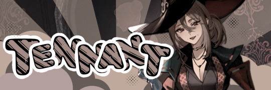
— THEMES ! —
SMALL DISCLAIMER!: I get my pngs of objects such as plushies, ribbons ect / official images and art from Pinterest! I simply add them to my banners/headers!
In here I will be discussing what apps I use, for what I use them, benefits, pros and cons.

🫐 — WHAT APPS DO YOU USE?
A loved and actually very common one is Canva. Canva is available in both mobile and desktop from what I know, and you can also use it on the website rather than having to get the app.
Here are some banners I made ONLY using Canva.


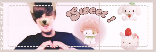
For banners I like to use the size 1500px x 500
PROS of using Canva is that you can do lots of editing, you have access to many features, filters (which is something I use a lot for my banners & headers) and most importantly fonts!
Another feature I know many will love is that you can put stickers or shapes to your banner and on most stickers you can change the color, if not, using filters can help a bit and adjusting as well!
Gradients or the fading color are also available like the ones you see in my banners and headers (revering to this if confused)

CONS: like most if not all editing apps you have to pay for prime to gain access to fonts that require it, as well as stickers.
This sadly can take away the ability to use various other fonts and such. However even without it you can still make pretty cool banners like the ones I made, I am a user who uses no prime for Canva!
…
Another app is IbisPaintx, surprise!
Ibis is mainly known for being a good digital drawing app, but editing? Meh, it isn’t as great as Canva, since editing is Canva’s MAIN purpose. However, Ibis has some good pro’s.
For banners and headers I use Canva AND IbisPaintx which can give you these results:


Again, you can get these results with Canva however I use Ibis for specific features, one being the infinite font options that Canva doesn’t have. Ibis can let you add fonts by downloading them, DaFont.com is where I get the fonts I use.
Ibis also had filters available, these are the main two I use and are pretty helpful for aesthetic purposes.
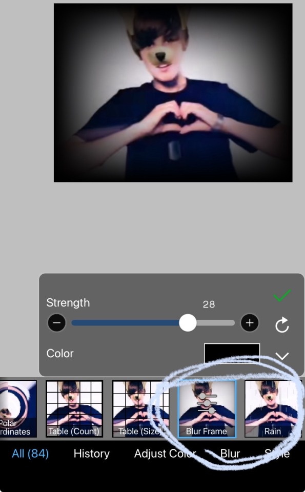
Blur frame can be adjusted and can also be changed for color as you can see the in image up there!
“Rain” can also be adjusted, its what I mainly use for my header to have those “snowflakes” or “glitter” running down. At first it will look like actual rain, long and thin but like the blur frame filter you can adjust the length, width, angle, and color!
🫐 — FONTS!?
CANVA FONTS THAT ARE FREE, these are fonts I personally like and recommend + the name
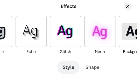
ALSO! When adding text you can also add effects to it to make it look less plain!

You can also curve the words by pressing “shapes” bit and adjust! So you’ll end up with something like this!

NOW BACK TO CANVA FONTS!

IBISPAINTX FONTS YOU CAN DOWNLOAD AND HOW!?
(video contains background music)
Fonts I like and recommend!

🫐 — WHERE DO YOU GET YOUR FONTS FOR TEXT, HOW TO MAKE TEXT GRADIENT, AND KAOMOJI?

Every aesthetic person’s website. You can scroll down and you’ll have endless choices!
Here is how you can get the text fonts in this same website!

GRADIENT TEXT!
use this link! Type in your text and you can pick the colors you want, then press “run” and youll receive your link.
For this method however I strongly advice using the website or desktop version of Tumblr if you are using mobile. This is because you must have access to HTML on “Text editor” and paste your link there, then go back to normal mode and you’ll see your gradient text!
🫐 — HOW CAN I CONVERT A VIDEO TO A GIF?
Many apps can give you low quality results and for high quality you must pay, however I highly recommend Ezgif! The quality won’t be exactly the best but its pretty good! You can also change the speed if it seems laggy, it helps a lot!
I really hope this helped although i’m bad at explaining things, asks are open of you have any questions!
10 notes
·
View notes
Text
How do you publish a comic on ComicFury? A beginner's overview
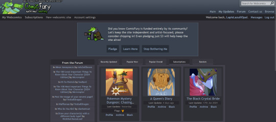
So, you're on ComicFury, see all these cool comics and think you want to make one of your own? Worry not, it's actually pretty easy :D When you have signed up, got accostumed, even subscribed to a few comics, you can go to the "new webcomic site" page to get started
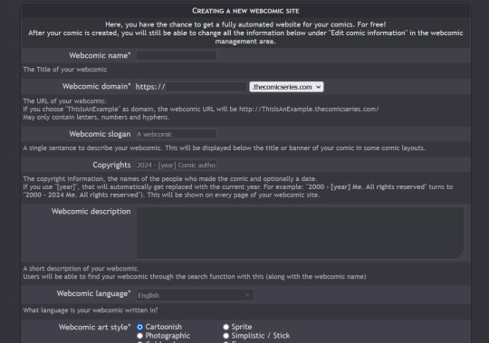
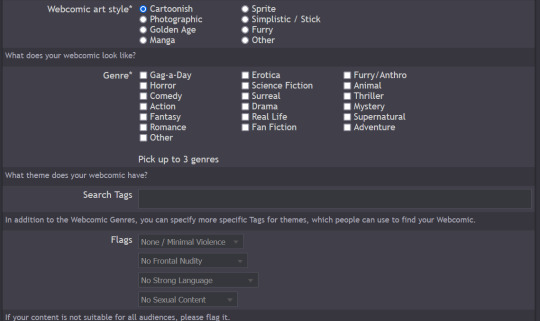
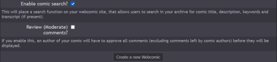
The screenshots cover the whole page, but I will summarize for you: you can chose title, description, slogan, language, style & genre, tags, content warnings and moderation settings (such as allowing comments and ratings)
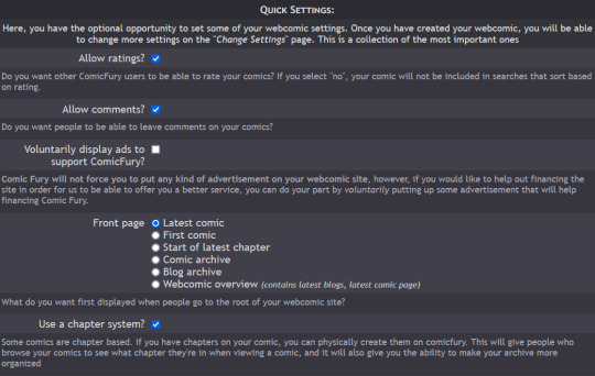
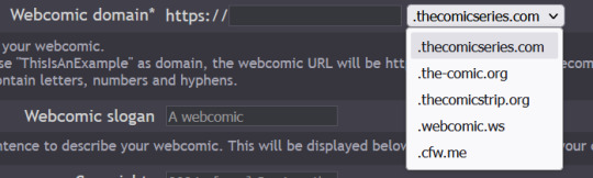
Additionally, you have five different domain options to pick from: .thecomicseries.com, .the-comic.org, .thecomicstrip.org, .webcomic.ws, and .cfw.me
Akin to tumblr's range of default themes to pick from, here you have to pick one default layout you will be able to customize later on (you can also work on the html if you're crafty enough)
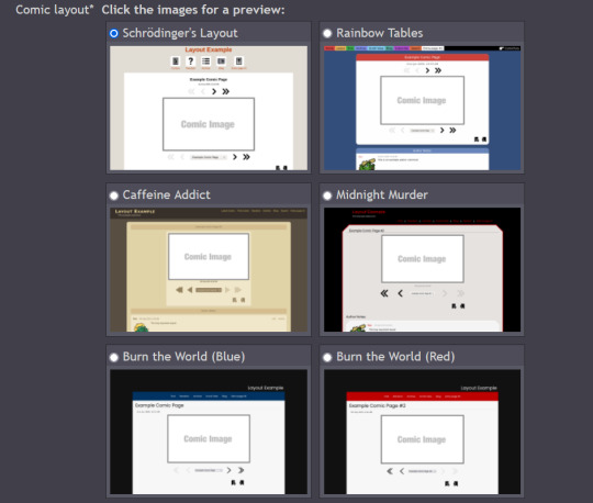
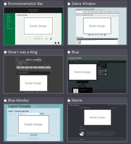
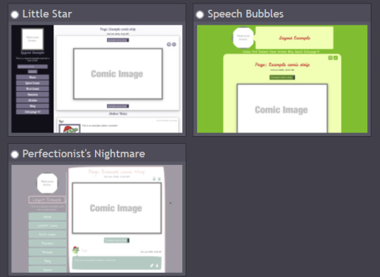
I personally picked "Rainbow Tables" because it already fits well enough the vibes of Wacky Races XD

Once you're done, you will find your webcomic or webcomics (there's no limit on how many webcomic sites you can open as far as I know) in the "My Webcomics" page. Your webcomic will have, in addition, a profile page which will be the first thing people will see when they browse on comicfury
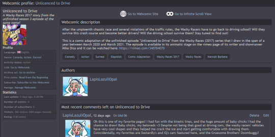
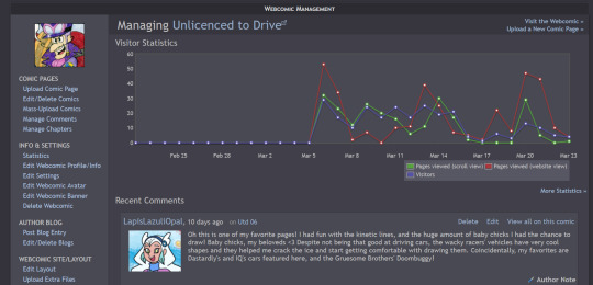
By clicking on "manage webcomic", you can do many things ranging from uploading/editing/scheduling pages to changing the website's layout
So now you want to upload some pages, right? Here we goooo
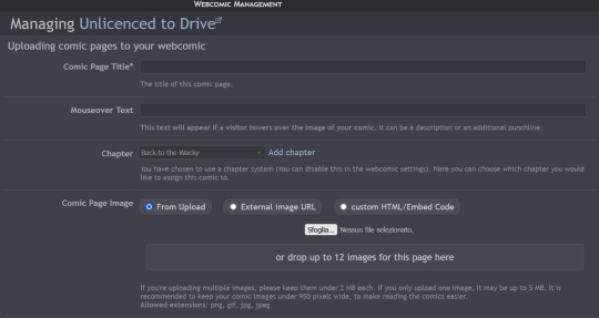
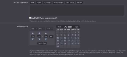
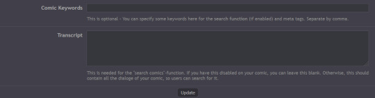
You have to pick a title for the page (could even be just Utd 01, 02 and so on), you can chose a chapter it will belong to (if you want to create chapters) then you can upload up to 12 images in the same page! But remember there's size limits: for multiple images it's maximum 2MB each, for a single image it's maxmimum 5MB. It supports png, gif, jpg and jpeg formats. After putting it some keywords that will make your comic easier to find and adding a transcript of the page if you want, you can upload your page!
Here's how you can create chapters by clicking on "manage chapters", you pick a name and you can add a description and a cover (that's optional though) As you can see, I have five chapters on my comic for example
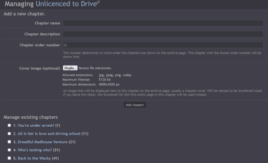
Now that you know the basis you can try it out yourself!! Mind you, it doesn't even have to be a comic, I've seen people create websites to host illustrations made for monthly challenges as well, or other webcomics can be made by photographing action figures, it can really be whatever you want! Have fun out there :D

#ComicFury#webcomics#how to use comicfury#I hope this can help anyone who wants to try out making a webcomic!#comic#webcomic#artists on tumblr#indie comics
3 notes
·
View notes
Text

hello! this is a tutorial for those people wanting to add images (or gifs) to their fics on ao3.
at this point you should know how to post on ao3 but if you don’t, check out this guide (credits: @bottomlouisficfest).
there are two options to post your work on ao3: rich text or html. i’ll post a guide on how to insert images (or gifs) using those two options (using google chrome).
for both options, you’ll need a host site where your image will be posted and where you’ll get the image address from. i recommend tumblr but you can use any other site. be aware that the moment that image is taken off that site, you’ll lose the image from your fic as well.
how to host an image on tumblr
1. go to new photo.

2. add the image(s) you want in your fic.
3. save as draft.
how to get your image address
1. go to your drafts and click right over your image (or gif).
2. select “copy image address”.

3. you can paste the link somewhere safe so you don’t lose it.
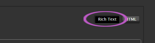
how to insert an image using rich text
1. once you’ve put all your fic info on ao3 and you’re ready to type or paste your work text, make sure you’ve selected “rich text”.
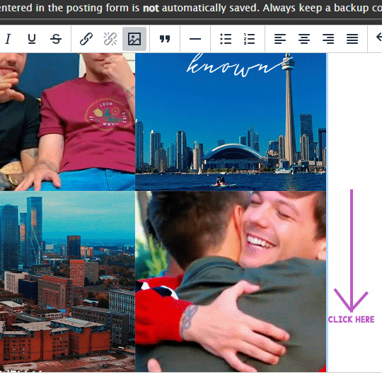
2. you’ll get a menu on top of the text box. click on the symbol for “insert/edit image”.

3. immediately a new window will appear. you’ll need to paste your image address in the “source” box.

4. once you’ve pasted your link, wait a few seconds and the boxes for “width” and “height” will be immediately filled. the image description is not necessary.

5. click on “save”.
6. your image will appear in the text box. you can notice how it is selected in blue. make sure you click next to your image—not on it—to deselect your image. once it’s not blue anymore, you can continue with the rest of your fic.
7. click on “preview” to see how it looks and you’re done!
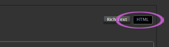
how to insert an image using html
1. once you’ve put all your fic info on ao3 and you’re ready to type or paste your work text, make sure you’ve selected “html”.
2. copy this code and paste it on your text box:
<img src="[image url goes here]" />
3. delete the [image url goes here] text and insert your image address. here’s a comparison for how the code looks before and after:

4. this way, your image will be shown as its full size. if you’re okay with it, you’re done with this step. if not, try the following.
5. copy this code and paste it on your text box:
<img src="[image url goes here]" width="[desired width goes here]" />
6. delete the [image url goes here] text and insert your image address. delete the [desired width goes here] text and insert the size you want. for this example, i’ll use 200. so the code should look like this:
<img src="[image url goes here]" width="200" />

7. as you can see, the image looks significantly smaller. if you’re okay with this size, then you’re done. remember you can change the size by changing the number of “width”.
extra: how to center your image on html
1. copy this code and paste it on your text box:
<center><img src="[image url goes here]" /></center>
2. delete the [image url goes here] text and insert your image address.

3. the code to change the size of the image and also to center it is:
<center><img src="[image url goes here]" width="[desired width goes here]" /></center>
i hope this info helped. if so, please reblog this! thank you.
31 notes
·
View notes
Note
Hnnnghh I was informed by tatp that u know about about coding wdgvbb any tips or whatever I’m trying to make a neocitys website or smthg
Since it's neocities website all you need is: HTML, CSS and maybe some graphics.
As I said before I'm shit at explaining stuff but I will try my best. So here's "I want to make my own website" the basics!
HTML - markup language, the base of your websiteCSS - style of your website, can change color of html elements, size, font etc.
I linked w3schools website since it's pretty easy to understand.Do you need to learn all of this before coding? No.
I think it's the best to just check things that you need for your website. If you need to change background color of your website just find a w3schools tutorial on it or simply search for "how to change background color in css".
You just should know html tags and basic attributes: id and class and how to link your css in html file so your style actually works!
Neocities has it's own tutorials on html and css so you could check them out too!
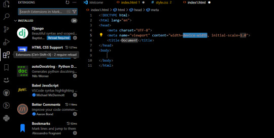
Neocities also has it's own code editor. You can edit everything in browser. I personally like to code in Visual Studio Code then just paste the code into Neocities editor. VS Code has a lot of addons (some of them are there by default) that make coding way easier for example: autocorrection of syntax errors and giving you suggestions!
Example:
If you type html in vs code html file you will get 3 suggestions:
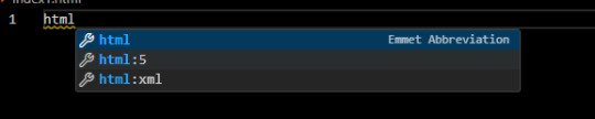
choose the html:5 one:
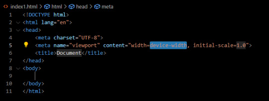
TAADAAAM!! VS Code just wrote the whole website structure for you!
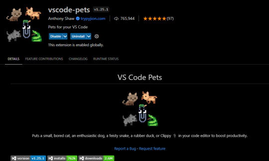
You can install more extensions here under extension section! There is this extension called vscode-pets it won't help you with coding but its really cute:
some yt tutorials: CINNIMANI (specifically for neocities), web coding playlist (this one is good for all websites in general);
https://sadgrl.online if you were on neocities you probably saw her website. She has a lot of useful resources including image resources and also she made her own WEBSITE BUILDER or acutally layout builder! It's pretty simple website builder but still. If you are looking for premade layouts you can just search them on google or get sum from the website I linked ^__^
Uploading your website to neocities is really easy since all you need to do is to put all the files on there! I guess that's all for now. If you have any problems or questions just ask. I'm here to help ^^
websites with free to edit code: https://codepen.io, https://github.com
5 notes
·
View notes
Text
ramble incoming about indie websites, neocities, and modern web design... putting below a read more because i wrote way more than i thought i would, oops.
whenever i see posts going around about how imaginative and creative old web design used to be, and how minimalist and same-y everything is now, while i do agree and wish that modern web design was more interesting and more dense with information... it's not as simple as "let's go back to how it used to be."
most old websites did not conform to modern accessibility standards, making the internet harder to use for many people, and on top of that we live in a smartphone era now where websites have to be designed in such a way that they work on both phones and computers... phones have a much smaller space to work with - kind of hard to decorate your website in pretty graphics and lay out the information in unique ways when you're designing for tiny screens in portrait resolutions!
i work pretty hard to make sure CPG displays on both mobile devices and computer monitors in at least decent fashion, and the website is absolutely less interesting looking on mobile. the sidebars are traded in for a toggle-able menu at the top of the screen (i'm considering changing it to a button that sticks to the bottom of the screen so you can open the menu without scrolling up, but i digress) and images that would float on the right or left side of articles in an aesthetically pleasing way have to be put into their own blocks between passages of text so that the text doesn't become impossible to read, squished on the sides. i'm not perfect at accessibility, nor am i perfect at optimizing the site for mobile, but i think i do an okay job with my relatively simple layout. i do this because i want my website to be viewable to people on any device, even people who aren't enthusiastic about the indie web, or desktop browsing. this would not be nearly as easy with some of the complex table layouts of the past.
it is interesting to me that a lot of people choose to simply not make their website usable on mobile and will put a notification that the site is either best viewed on desktop or doesn't work on mobile at all on the front page... there is nothing wrong with this, mind you, i'm not making a judgement of the person or their coding abilities, some people are just chilling and doing their hobbyist thing without fretting about that, or making their content for a specific audience that would mostly view from their computers, which is fine! how other people make and run their websites is none of my business. but i do think a lot could be gained from exploring mobile design and making the indie web space more accessible to mobile users, which take up a large percentage of the population. we'd probably have more eyes on us if our spaces were more accessible for people on phones. also, personally, i actually find making my site compatible for mobile with pure vanilla html/css/js a fun challenge.
at the very least, even if a website isn't built to be mobile-friendly, making sure everything is at least visible and clickable is a good thing. my website dynamically changes the size of elements based on the device viewing it, but there is also the option of making your entire website layout a set pixel width, so that it is the same on every device, people just might have to scroll horizontally or zoom in to see/click things... which is annoying but at the very least workable. i have seen some high quality neocities sites that do exactly this and i think it's a good alternative from dynamically sizing pages.
all this being said, i'm coming from the perspective of someone who actually wants their website to be seen and be used by as many people as possible because i'm providing niche game guides/tools/resources, so again, people who are just doing their hobbyist thing probably don't care as much about how many people see their site, especially outside of indie web spaces and especially neocities. it's a bit of an insular community where everyone on there is exploring their fellow users' desktop websites. also, just because a website is not workable on mobile doesn't mean people won't see it! plenty of people still use their computers to browse the web of course, it just cuts out some parts of the population. it's complicated and i'm not an expert on the subject but i don't know, i just felt like talking about it ww
TLDR; i think the ideal would be for a less corporate, more creative internet that still is accessible for disabled people and still allows the use of smartphone browsing. maybe one day when i'm more educated on code, i can make some cooler things in this regard...
#ayano.txt#ayano was here#i feel weird talking this much but i don't really have anywhere else to put these thoughts
10 notes
·
View notes
Text
step by step very simple neocities start tutorial based off of how i do it :] (might be wrong. who knows) this is long because i put incremental screenshots so ..my bad . . . @terrencetich this is what i said id put together!
sooooo to edit a page . . when you first make a neocities page, it looks like this:
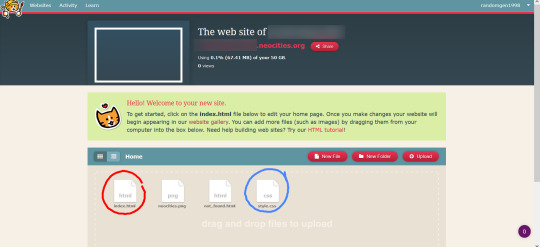
i circled the index.html file in red, and the style.css in blue. theyre the most important things here right now. if you go to edit index.html, this page shows:

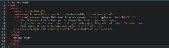
this is the html side of your page, and has some pre-loaded stuff on it that shows how some html tags work, like <p>, <h1>, <ul>, and <li>, as well as how to add an image and hyperlinks to your page. if you click on the “view” button at the top right, it’ll show you how the page looks on the web.
i’m going to delete everything from that first <h1> to the last </p>, which is what i put the blue rectangle around, so that i can put my own stuff in. everything between <head> and </head> is fine to leave, and is important for formatting dont worry about it. now the code looks like this:
and the site is like this:

pretty bare, but my text is there! time to look at style.css.

(one note i want to make is that it’s good form to put your .css files into their own folder labeled “css,” but you dont NEED to for this right now. also, moving things between folders on neocities isnt click-and-drag, so that detail can be left for later if its confusing)
our html file is what determines our page’s content, and the css file determines how it’s styled. right now, the only element defined here is the body of the page, which defines everything. if you add style “rule” to the body and background, it’ll apply across the page. css is cascading like that, where you can imagine your elements as things nested within each other. if we change the background-color from “white” to any hex code, then the entire page will change to that color.
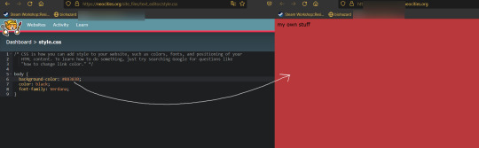
like this ^. theres a lot of ways you can alter your site’s body, but for now lets add a “div” element for the text to live in. divs are the main game with this... you can add one to your style.css like this:
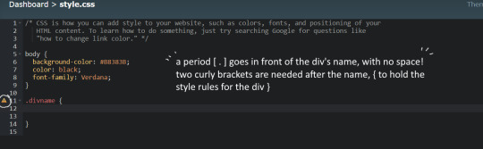
i used “divname” as an example, but you can put something else. just remember to put a . before the name, and { }. now, go back to index.html and put the text content inside of the new div! this is done by doing:
<div class=“divname”> my own stuff </div>
<div lets it know you want a div, class=“divname”> selects the specific div you want, since there’s usually multiple to choose from, ‘my own stuff’ is whatever content you put inside the div (you can put other divs, even), and the </div> endtag is the last slice of bread that closes the div.
(endtags are important always make sure you have good endtags)
this wont make any changes until you add some style rules. i want my text to be in front of a white background, so i’ll add “background-color: white” to .divname.
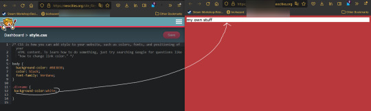
the semicolon is important for letting it know youre done with that line, also. semicolon = important!
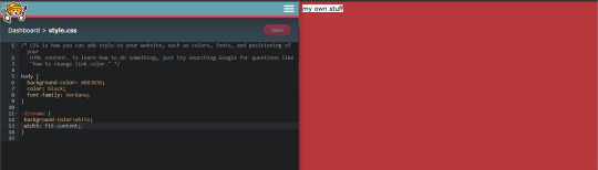
now it has a white background. it spans the whole page, since there’s no width set. to set the width, add “width: 500px;” to the line below the last one that was added.

except i just said 500px as a placeholder. try a few sizes. you dont have to put a number, though -- “fit-content” is a property that will fit the width of your div to the size of the content inside of it. if i change 500px to fit-content, my page changes to this:
neater! the text doesn’t have a lot of room to breathe, though, so lets add some padding.

and maybe i want the font size to be bigger, but i dont want to define the font size for the entire page, so i’ll define font-size in the divname div, but not the body --

sweet, its still in the corner of the page, though. what can help change that is adding set margins to the div. if i add “margin: auto;” the div will be centered horizontally, but not vertically:

to position it vertically, “margin-top” can be added and individually tweaked.

it made it 200px as an example, but you can do whatever. this is sort of the whole gist - making divs, adding content, and defining the style of the div until it looks like how you want.
the things i usually add are: width, max width, height, max height, margin (margin-left, margin-right, margin-top, margin-bottom), padding (padding-left, etc etc), outline, border, color (sets the color of the text), background-color, background-image, so on and so on....
but dont worry about these until it comes up! focus on “what do i want this to look like?” and gradually tweak until it fits that. look stuff up and use w3 schools and sadgrl! i just realized i have more to say about file organization. ill make a different post for that when im less tired. i hope this made sense! send an ask or dm if you want specific help....though like i said im just a beginner guy so ^--^ v
EDIT: WHY DID TUMBLR MAKE THESE IMAGES SO SMALL IM SORRY. i dont know why theyre so small.
edit 2: what if i remove the readmore
edit 3: doing that worked so...this will just be a long post..
42 notes
·
View notes
Note
Hi! I don't know if you'd be the right person to ask this but how would I add a fontawesome icon before a link in the sidebar? Thank you!
Hi Anon!
My ask box is always open for Coding Questions in SugarCube (it's in my nav pinned post) :)
~~~~
The answer to your question will depend on multiple things:
Whether you use the built-in/base UI or a custom one.
Which type of passage you have put your link.
I will only answer there in the case of the base SugarCube UI, because I wouldn't know how a custom sidebar is coded without the code in front of me.
The Sidebar has multiple Special Passage Name where you can include content, whether it is text, images or links.
Note: Using the Inspect Tool of your browser is super helpful to find which class to target in your CSS/StyleSheet.
INSTALL THE FONT
You can find how to install a font in this ask.
Please note that Font Awesome requires a few addition for the icon to appear. The font family must be defined as follow: "Font Awesome 5 Free" (where the number is the version, with the current being 6). And when using it in css, you need to include the following rule: font-weight: 900; . For example:
story ul li::marker {
font-family: Font Awesome 5 Free !important;
font-weight: 900;
}
Note: the !important is necessary when wanting to edit built-in icons (confirmed by TME in the Twine Discord). Also, if you do not have a Subscription with FA, make sure to use only Free icons (otherwise it won't appear).
For my own organisation, since I change a lot of icons, I will set the icon font-family and font-weight for all classes targeted, and then defined which icon for each class. It kinda looks like this:
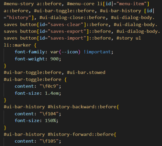
(I set up the family name in the :root {})
CHANGE THE BUILT-IN ICONS OF THE SETTING/SAVE/RESTART
All three are defined under the id #menu-core li[id|="menu-item"] a::before: #menu-core li being the list of buttons for those three API, a::before being the icon before the text of the link. If you are planning to change the icon for each of them, defined the font family/weight with this ID, before moving on to each button, being:
#menu-item-saves a:before
#menu-item-settings a:before
#menu-item-restart a:before
Within each, you need to define the icon name with the content rule, inside brackets (like the picture above). FontAwesome should give you the relevant code to include.
ADD ICONS TO THE STORYMENU LINKS
One passage which only accepts links is the StoryMenu. It is formatted similarly to the links in the section just before, but the class to target is this one: #menu-story a::before.
Note: defining an icon with this class will add the same icon to all links in this passage. If you want different ones for each link, you will need to use the :first-child, :nth-child() and/or :last-child selector.
ADD ICONS TO OTHER UI-BAR SPECIAL PASSAGE
For StoryAuthor, StoryBanner, StoryCaption, StoryDisplayTitle and StorySubtitle, there will be no need to fiddle with the CSS (unless you want to). Instead you just need to add the HTML markup of the icon of your choice before the link. For example:
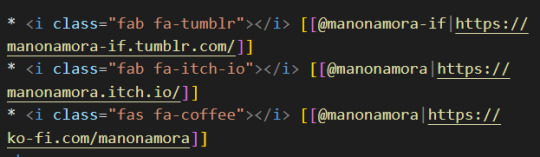
(I can't copy the code on Tumblr, but FontAwesome will have it for each icon).
If for whatever reason you want to edit the icon (colour, size, etc...) you'd need to target the i (for icon) inside the relevant id. Following the order of the Special Passage Names, it would look like:
#story-author i
#story-banner i
#story-caption i
#story-title i
#story-subtitle i
I hope this helps!
7 notes
·
View notes
Text
...
So, working on a project and one aspect of it is making a really simple scientific poster. I'm the design guy, I do the front nd design since I'm the only person who knows basic html and css, the only person who has taken art and design classes, and I do this stuff for fun so I go ahead and take charge of the poster. Plus they really just don't have the intuition for design at all, even when I or the professors give clear instructions on How To Do Things Right. We have to make tons of drafts and get feedback on them, and its kind of a dripfeed because staff would make comments on some things, neglect to comment on the other things, and make us turn in another draft based on those missed comments.
Every single fucking time my teammates would work on it, I would have to go back and fix allllllll of the margins and padding they neglected, and I would have to remake every image of a diagram into a simplified, vectorized. Every time we had to change text or images based on the feedback, I would have to go back and change those as well. Today, while I was working on this, one of my teammates was literally trying to edit the same thing at the same time (using figma and diagrams.net). I was going to lose my mind because I was just trying to fix all of the issues, like I had to do multiple times, that my teammates would neglect from the feedback, and so this was actively happening while I was trying to fix them.
I had everything in their own groups, so that it would be easy to change things out. My teammates didn't know how to work with that. Earlier teammate literally did not understand that a file cannot have two different file extensions, and sent me a rasterized image of a diagram instead of the actual editable file, because diagrams.net just lets you have an "editable (so like, able to move around the individual elements) png" saved to your google docs, exported it as a plain png and posted it in the project chat. When I couldn't open it they then tried to tell me like, well it worked for me and well it has the other extension too so it should work. It was only the filename that had the 'extension' of the proper file format. (this is the big csc senior class btw)
The fact that we went back and forth so much on that diagram to begin with was frustrating because they could've given me access to the editable file at any time, and would constantly ignore or forget feedback which meant having to fix it many, many more times, and most of those fixes were still missing the core design feedback like 'make the text size bigger' and 'eliminate unnecessary whitespace'. If anything, it would've been much better if I went through with porting it to figma instead of relying on them, but I'm over here not wanting to be a total control freak so I'm like... whatever.
So when I get access to that diagram I fix issues from all of the feedback, but at the end of our final feedback they go and try to edit at the same fucking time as I am editing, and I had been fixing the diagram all day up to that point. Then the same thing happened on the figma document, and of course they deleted my group for the section the diagram was supposed to go in, so I had to make it again, fix the margins, fix the padding, fix the sizing.
They also completely trashed my design for a page I worked on for the project itself like waay earlier in the semester, so I was like. Okay. You guys do your thing, I can put in all my junk later. I would like to avoid wasting my time as much as possible, considering how mentally ill and exhausted I already am.
oh yeah and also the examples the professors put in the powerpoint for posters had the same (margins and spacing or text inconsistencies, bad looking screenshots, that kind of thing) or worse issues (think black impact font on a busy patterned background, for fucks sake) that they kept nitpicking us for, so its kinda like. please actually showcase something that's relevant thanks.
At least it's finally(?) over.
1 note
·
View note
Note
Hii so sorry for bothering you but, I love writing I’ve been doing it for a long time. I’d like to post on tumblr but I’m kinda new to it and don’t really know how to use it (gifs, text colors,…) so if it’s okay for you could you maybe teach me how to use it or give me some tips?
Hi yes of course don’t worry!!
This is kinda long so I’ll cut it
—
Also if you’re curious how to do that ^^ just type in “:readmore:” and return. The cut will show up. But if you’re on computer there’s a three dotted icon that you can just press and it’ll do it for you.

This is on mobile but it’s similar to if you’re on the computer.
The one circled in blue is where you can find gifs created by gif creators on the app. And there’s a little search bar where you can type in whatever you’re looking for use that on your post. I’ve never actually created a gif before and I have no idea how to do it sorry.
The one circled in red is where you can insert images that you have saved on your device and put it on your post.
The icon circled in green is for you to insert a link. (Iinks to my navigation for an example)
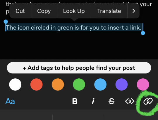
When you tap the icon this shows up and you can copy past a link to the words
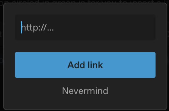
Also when you capture the word a bar shows up like before ^^

You can use that to choose the colours for the text, size, style. Also the “Aa” can give a few other options for you to choose from.
But if you want to do the gradient colour texts I use text Color fader. When copying the text, put a space between “Color:” and “#[hexcode];” remove the semicolon. And you can only do it if on computer to change the text editor to HTML. There was a tutorial I used but I can’t find it rn 😞.
Also if you’re going to be writing I highly suggest using tags!! It will help your work reach the target audience you want to read.
Sorry if this was too long or complicated or I didn’t explain enough. But you can definitely ask me if you have any other questions!!
3 notes
·
View notes
Text
How to build a classic theme in WordPress (Chapter 1)
There are so many ways you can create your own theme in WordPress.
In this article, I will explain how to build a classic theme for those who are not sure where to start.
As the name implies, classic theme is the most traditional way to create a theme.
Primarily, classic theme will be developed using PHP, so it may not be recommended for those who don't have basic knowledge of it.
Now we are ready to dive into it, I'll start with setting up all those files we need.
Inside your theme folder, create these files such as:
・index.php
・header.php
・footer.php
・style.css
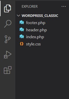
Now, we are going to take a look at our header file first.
This is our initial header file and we are eventually going to loop through each element so that we do not have to write every single HTML for each one.
...Before we do that, lets complete our HTML file first.
Go to index.php and write it as this way:

Don't forget to add header and footer function.
Then, footer as well.

Also, we have to put wp_head() and wp_footer() functions on each file as well. Otherwise, it might not work properly.
So, let's start with our site title.
At this point, the title of our site might be shown as "Wordpress Classic Theme". (Since we set it that way.)
We're going to make this title reflect the content that was set on Wordpress backend.
Change the title line to this:

We are using WordPress function with PHP.
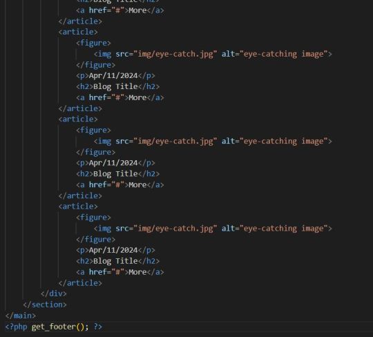
Let's actually set the name and description as well on WordPress.
Go to WordPress admin page, and click on 'Settings', then click on 'General'.
Now you see our Site Title and Tagline.
Change them to whatever you want.
Go to our website and check this out:

Okay, let's update other lines as well!
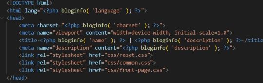
Looking good.
Now, we are going to set up our file path.
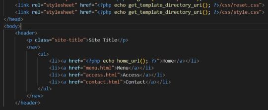
So, what do those functions do?
home_url() is just a URL of our front page, so we are just echoing out those link.
get_template_uri() directs to the URL of our website. If there is no domain set up, it means it is not able to navigate to the correct filepath.
Since this is just a simple lab for learning classic theme, we don't have any specific CSS files yet, but just to show you how things work.
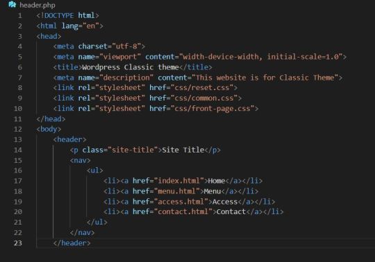
Next, we are going to put some images in for articles.
Create "img" folder, then choose some random image and put that into that folder.
Set filepath of image in index.php.

Ok, now let's go to our front page and see what happened.

There is an article image.
When you go back to index.php file and take a look at the code, you might have noticed something.
Yes, the code is too long and repetitive because we manually put all those articles into one section.
Maybe we can do it this way if we only have 10 articles on our website.
But what if we have 100 articles? Or even 1000+?
I'm sure it's going to take A LOT of time.
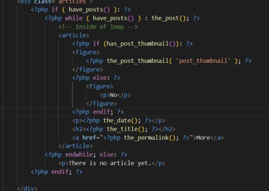
But, here's a solution. We are now going to loop through those articles and automatically genereates them.
So, how do we do this? Let's get started.
Put this code below to the bottom of articles div in index.php.

This code is basically saying if there is any post on the backend-side of WordPress, then it is going to start looping.
If there isn't, it will only show a message to the users.
Therefore, section between if and endwhile is going to be our main content of the loop.
And, of course, we need to put those article section into the loop.
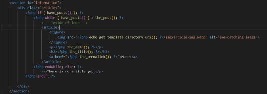
Then, we also need to loop every single title of articles.
Updating date and links can be a good idea as well.
Put these codes below and replace previous h2 element with it.
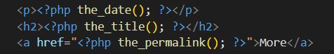
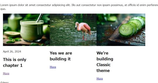
Why don't we go back to the admin page, and make some articles to see whether it actually works or not?
Here, I have created 3 differnt articles.
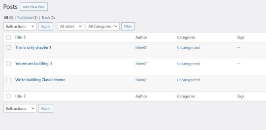
Now, let's go to our actual website and see how it goes.

Perfect, it successfully reflects all the articles. (I added some custom CSS and still looks not that good, but we're going to talk about this later.)
So, all that is left is to set the images.
Before we jump into the looping images, let me adjust the size of an image.
In order to do that, put this code into your image href.

But, there's also a problem with this. When we go to our backend page trying to make a post, we notice that there is no section for uploading thumbnail images.
In order to enable this, we have to create functions.php in the root of our file.
After the file was created successfully, now we have to create another function in it.
Put this code below in functions.php:

Now, we finally see the thumbnail post section here.

Let's put some images into the post.

Oh no, somthing is wrong.
Let's try again.
First, we are going to add some function into functions.php again.

By adding this function, we've set all post thumbnails. (400px wide, 200px tall)
Now I'm going to update the loop as well.
Let's take a look again.
It doesn't look that bad.
Alright, this is my chapter 1 tutorial post about how to build WordPress classic theme.
We still have a lot to learn, and lot to practise.
But, it is worth learning since it has much flexibility, and after you learn it you have a lot of choice for building a website.
Many companies are using WordPress for building their website too.
Rather than using classic theme, there is also block theme and you can even edit the website by drag and drop and you don't need to have to be a web expert to build your project.
But I will keep teaching you guys.
Thank you for reading this article and see you soon.
0 notes
Text
Convert SVG Icons into BASE64 – Free and Online
Converting free SVG icons into BASE 64 format requires developing an understanding of it. It cannot be done without the help and thus, mostly everyone has to rely on BASE 64 converters available in the market.
Before we delve more into its details, we must clear a few facts related to such conversions. We will also see if BASE 64 converter tools are the only way out or if there can be many other ways to do it without them.
We would begin first by talking more about Icons.

Icons, BASE 64and their usefulness
ICO is a file format that contains an ICON- a tiny digital-friendly image with a few striking features that makes it so popular.
The size and color of an icon can be altered.
The image depth can also be changed at any time.
ICO is mostly Microsoft Windows-friendly images.
The color depth of every ICO file must be less than 32 bit,
They will contain two types of bitmap- 1- AND bitmap alongwith XOR bitmap.
Any image that symbolizes or depicts a program, file type, or company is known as an icon. An icon’s uniqueness is what matters the most as they are used in websites, logos, and even features images.
Usually, the friendliest icon format is the SVG format. Many websites host a free SVG icon converter like Iamvector.com for creating proper SVG icons from other formats.
If you are here to know why we need an image or icon in the BASE 64 format, then you must also know a bit about BASE 64 before moving ahead to the conversion part.
To put it simply with BASE 64, one can make icon images in text format. The binary that goes into text coding creation (encoding data to its plain text) is present with BASE 64. It is extremely popular in the World Wide Web as its use in HTML or CSS text files is immense. BASE 64 is the process that goes into sending to-and-fro email attachments. It is the text version of bytes, in short, and frankly has nothing to do with images.
There are 64 characters in all BASE 64 formats. The format is generally given below;
Upper case alphabets as characters from A to Z
Lower case A to Z characters
Numbers from 0 to 9
Characters like + and /
The equal to sign is used for padding
As we know by now a lot about icons and BASE 64, we will see how it can be done.
Read rest of the article here
0 notes
Last Seen Blogs

pastormahesh
The Holy Spirit Will Transform You

betterthanurfaves-blog
Better Than Your Faves

letourart
Le Tour Art

deaththenarrator-blog
"i see everyone and no one in myself"

remoteteachingresources-blog
BI620: Remote Teaching Resources