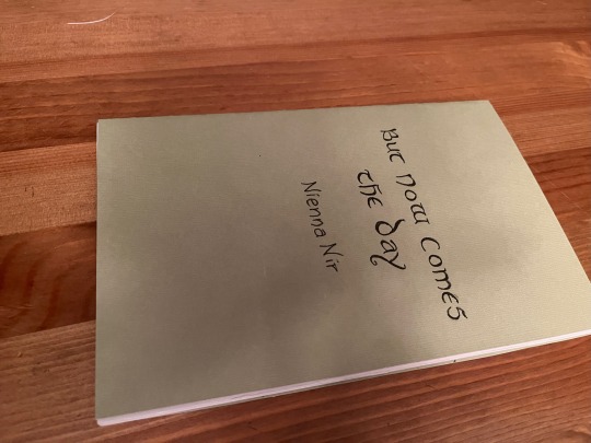
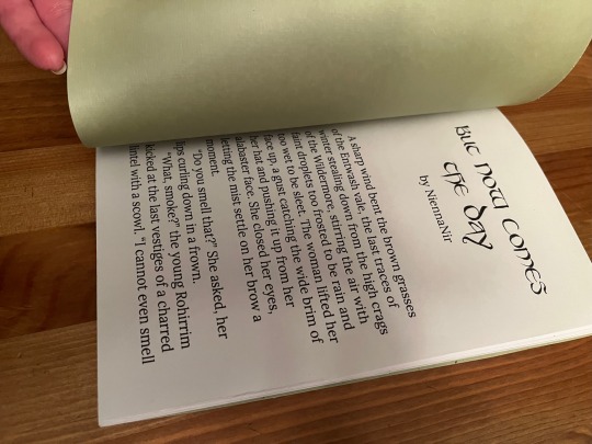
#having fun with the fonts i downloaded
Text
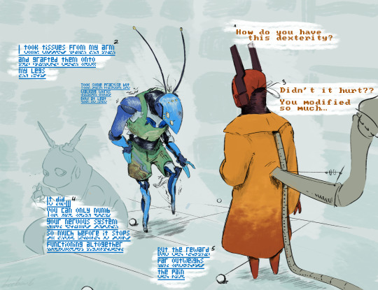
QS walking to their friend's house cuz her drivers liscense got taken away
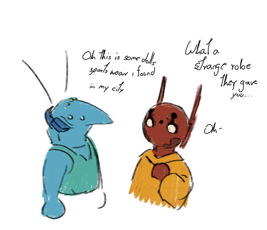
i'd like to imagine these were from a Ken doll also fun fact they wear these because part of their shell is transluscent and they don't want their innards to get sunburn
#rainworld art#rain world art#rain world oc#rw iterator#iterator oc#quivering skies#roads not taken#QS will do anything to go on walkies#having fun with the fonts i downloaded#rainworld oc time
33 notes
·
View notes
Note
Might I pester you for another monster clover?
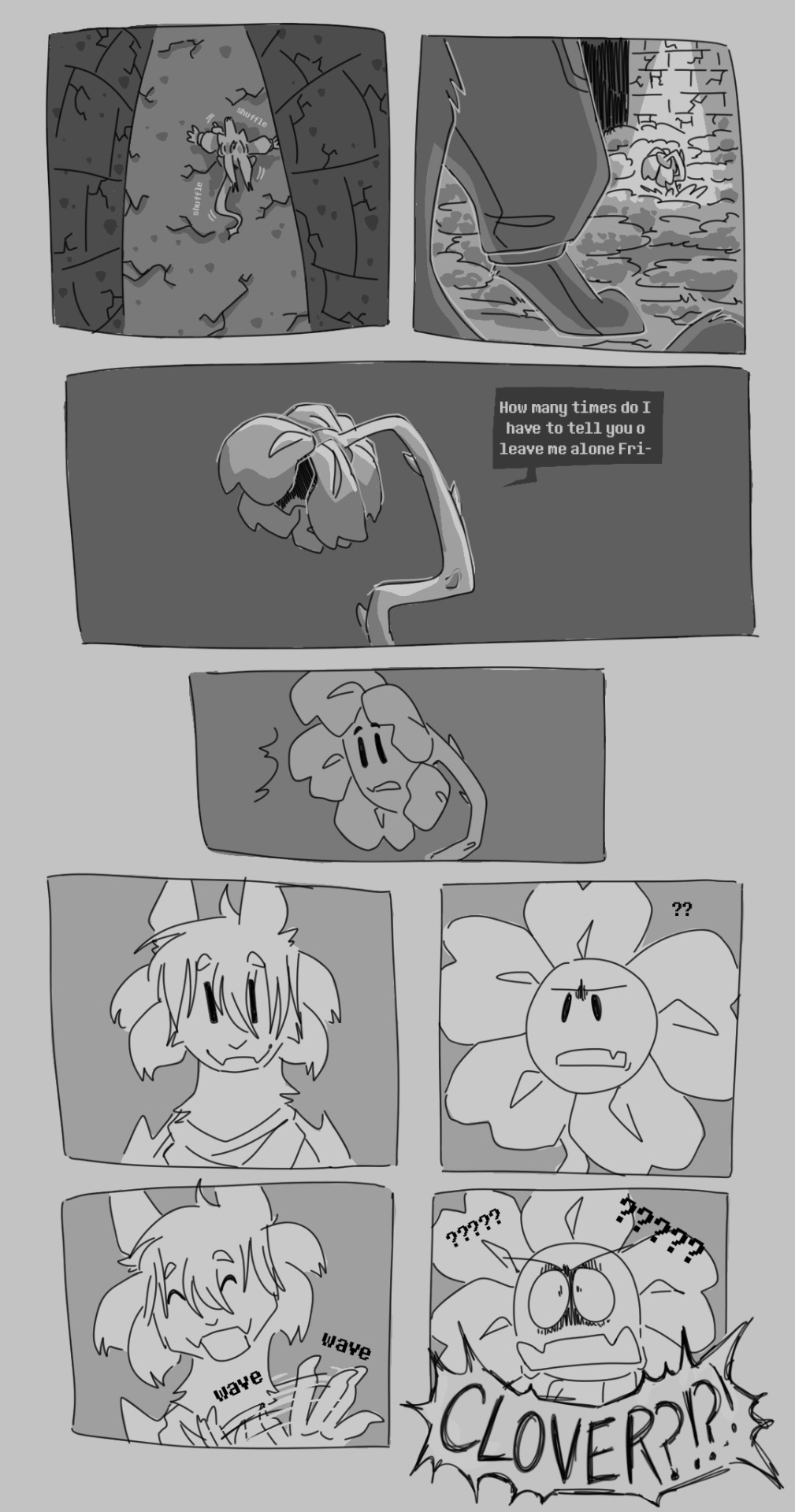
clover: just happy to be here :)
#undertale yellow#flowey the flower#clover uty#monster clover au#my art#idk if i mentioned this. but this is post true pacifist!#i have a second part to this tumbnailed out that may see the light of day#these little comic things are fun to do any ppl seem to like this a lot so!! we will be continuing in little snippets :]#i downloaded the undertale font for my last comic so now i Have to use it for this#mcau art#mcau comic
500 notes
·
View notes
Text
i love u adblock i love u firefox plugins i love you xkit i love u betterdiscord i love customizing sites to my own favorite colors and fonts and preferences and taking away the features that annoy me as well as adding quality of life plugins that i cant imagine living without i LOVE you i love uuu muah muahhh chuchu🥺🥺💋💋💋😘
#i know having a lot of plugins will slow down ur browser or whatever but STILL#customization is SO FUN#like today i just downloaded a tumblr plugin in which i can change the colors of the tumblr theme and now im rocking pink colors for post>B#i also changed my tumbrlr font into comic sans#AND i have a lil pink kitty following my cursor which is also from a tumblr plugin#AND my discord has a strawberry background and its so pretty and i love it so much#i Love LOVE skipping sponsor segments like 🥺 no thank you i dont want to hear about raid shadow legends the 9879th time <3#but yeah in Conclusion PLUGINS MY BELOVED <3
13 notes
·
View notes
Text
I think the thing that just continues to astound me about ttrpgs is the fact that people who meet up and are friends outside of the game just... refuse to try anything other than 5e? I've seen so many stories about DMs asking players to try a new system, and they just refuse.
Why? I mean if you come into the night like fully expecting to play 5e but instead they throw something new at you, I get that being frustrating. But I'm talking about DMs asking ahead of time for something new and being refused.
Hello???? These are your friends, you're like 99% going to have a good time even if all you guys can manage is rolling up characters. And 9 out of 10 times its another d20 system so the rules really are not that different.
We started out with 5e, played a full 1-20 campaign and did lots of oneshots. And you know what we all said when our DM, the guy who helped bring the world to life who does the most WORK, asked us to try a new system? We said, "Absolutely dude!"
And ya know what? We had fun! We made mistakes, we had to recheck rules, but we had fun! In fact, it was like playing for the first time again! That exact same sense of wonder and fun!
And guess what? We liked it more than 5e! Its our new standard go to system! We try out other systems occasionally too! And if we had hated it and the other ones? Well, 5e is still right there and we could go back at any time!
Anyway, all this to say, try something new. I mean ideally I want you to try something outside of DnD editions, but honestly just try anything outside of 5e. I promise, if you hate it 5e will still exist.
#sometimes i reqd those stories and inwonder if you guys are friends at all#i work i get it this is one of the few nights you have to relax#but if youre with friends youre goinf to have a good time#you guys meeting irl have an advantage!#face to face meetings are so fun!#we have to play online because weve all dispersed since college#but we still try new things!#idk this is just something thats always bothered me when i read stories of burnout#especially dm burnout#if the guy making the story and the game wants to try something new just try it#at worst you guys get to razz on a bad system#at best you discover something new that you love#val rambles#'i cant afford books'#hey i get ya dude#wizards is one of the worst when it comes to books needed and prices#and there was a website that had nearly every system uploaded for you ro download#but someone got angry hecause they font understand how piracy works again#and the site got taken down#qnyway if you cant afford it i get it
2 notes
·
View notes
Text
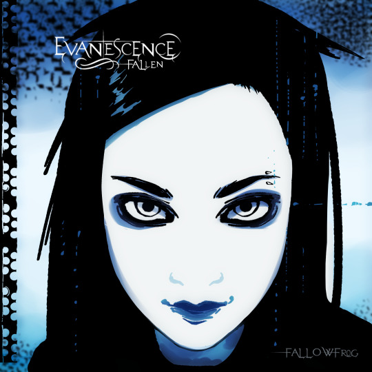
briiiinnggggg meeeee toooooo liiiiiifeeeee :33
#evanescence#evanescence fallen#fallen#amy lee#alt#evanescence fan art#fan art#fun fact i had to download the evanescence font for this#like i could have just ripped the logo from the album but im extra#even more fun fact is im seeing them in concert in august <3
4 notes
·
View notes
Text
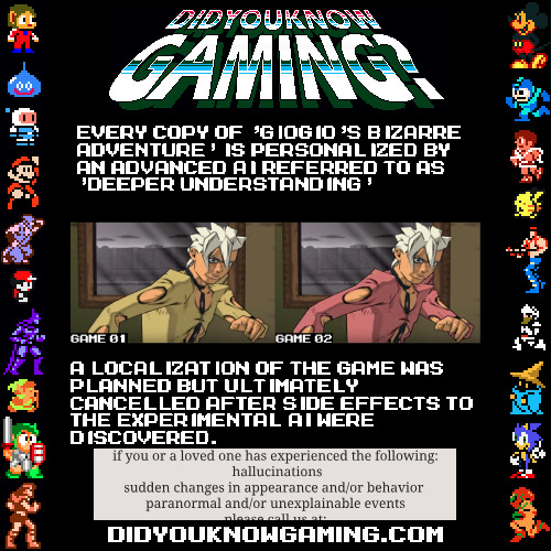
#jjba#I may be afraid to put this in main tags but SCREW IT I SPENT SO MUCH GODDAMN TIME CHANGING THE COLOR OF THAT SHIRT.#I DOWNLOADED THE MEGAMAN FONT FOR THIS SHIT.#yes the ai is named after a song that was out at a time where it could theoretically have been used for a name for something#if is-this-tf sees this it is in fact tf#giogio's bizarre adventure for the ps2 did get the localization cancelled though but not because of this. I think.#I may have stolen the idea from the sm64 every copy is personalized thing#but like. I think using it for a game where the worldwide release planned just mysteriously never happened is a fun idea y'know?#I wonder how much I can say in these tags
0 notes
Text
Listen to your elders
So last week I posted abut the importance of downloading your fic. And then three days later AO3 went down for 24 hours. No one was more weirded out by this than I was. But while y’all were acting like the library at Alexandria was on fire I was reading my download fic and editing chapter eight of Buck, Rogers, and the 21st Century. And also thinking about what I could do to be helpful when the crisis was actually over.
So first off, I’m going to repeat that if you’re going to bookmark a fic, you really need to also download the fic and back it up in a safe place. I just do it automatically now and it’s a good habit to get into.
But let’s talk about some other scenarios. Last October I lost power for over a week after hurricane Ian. Apart from not having internet or A/C I did find plenty to do, I collect books so I had plenty to read, but maybe, unlike me, your favorite comfort reads aren’t sitting on a bookshelf. So let’s do something about that, shall we?
In olden times many long years ago around 1995 we printed off a lot of fic. It was mostly SOP to print a fic you planned to reread and stick it in a three ring binder. And that’s totally valid today too, but you can also make a very nice paperback with a minimum amount of skill and materials.
Let’s start with the download; Go to Ao3 and select your fic, we’ll be working with one of mine. This method works best with one shots, long fic tends to need a more complicated approach. Get yourself an HTML download

Open up the HTML download and select all then copy paste into any word processor. Set the page to landscape and two columns, then change the font to something you find easy to read, this is your book, no judgement. This is all you have to do for layout but I like to play a little bit. I move all the meta, summary, notes to the end and pick out a fun font for the title:
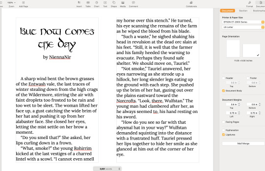
No time like the present to do a quick proofread. Congratulations, you’ve just created your first typeset. On to the fun part.
Now you’re going to need some materials:
8.5x11in paper
ruler
one sheet of 12x12 medium card stock (60-80lb)
scissors
pencil
pen or fine tip marker
sheet of wax paper
white glue
two binder clips
2 heavy books or 1 brick
butter knife
You’ll also need a printer, if you’re in the US there is almost a 100% chance your local library has a printer you can use if you don’t have your own. None of these materials are expensive and you can literally use cheap copy paper and Elmers glue.
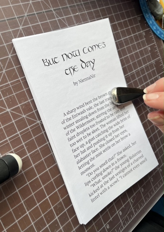
Print your text block, one page per side. Fold the first page in half so that the blank side is inside and the printed side out:
use the butter knife to crease the edge. Repeat on all the sheets. When you’ve finished, stack them up with the raw edge on the left and the folded edge on the right. I used standard copy paper, because you’re only printing on one side there’s no bleed to worry about. Take the text block and line everything up. Use the binder clips to hold the raw edge in place.
Wrap the text block in the wax paper so that the raw edge and binder clips are facing out. I’m going to use my home built book press but you don’t need one, a brick or a couple of books or anything else heavy will work fine.
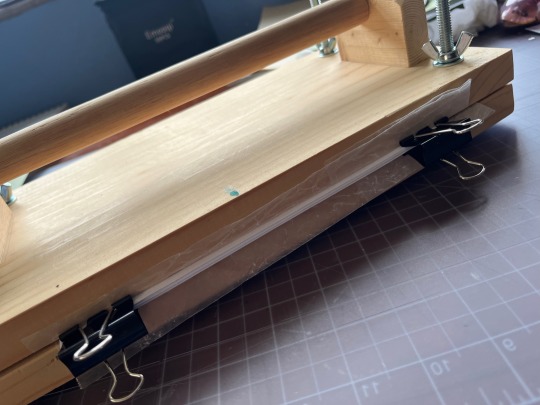
Once the text block is anchored down, take off he binder clips and get out the glue.
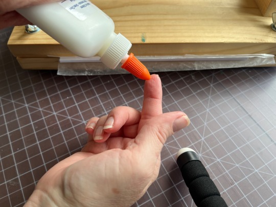
You can use a brush but you don’t need one, smear some glue on that raw edge.
Go make a margarita, watch The Mandalorian, call your mother. Don’t come back for at least an hour
In an hour smear some more glue on there and shift your brick forward so that the whole book is covered. This keeps the paper from warping. While glue part 2 is drying we’ll do the cover. Get out your 12x12 cardstock
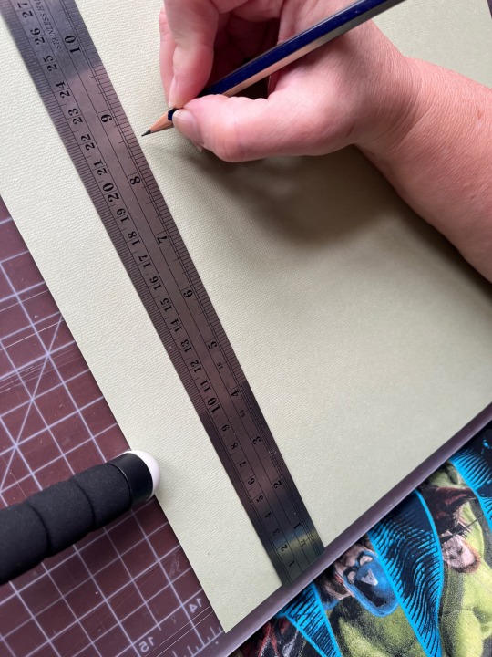
Mark the cardstock off at 8.5 inches and cut it. Measure in 5.5 inches from the left and put in a score line with the butter knife (the back edge not the sharp edge)
Carefully fold the score line, this is your front cover. You have some options for the cover title, you can use a cutting machine like a cricut if you have one, you can print out a title on the computer and use carbon paper to transfer the text to the cardstock. I was in a mood so I just freehanded that beoch. Pencil first then in pen.
Take your text block out from under your brick. Line it up against the score mark and mark the second score on the other side of the spine
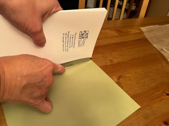
Fold the score and glue the textblock into the cover at the spine. Once the glue dries up mark the back cover with the pencil and then trim the back cover to fit with your scissors.
Voila:
I’m going to put this baby on the shelf next to the Silmarillion.
The whole process, not counting drying time, took less than an hour.
If you want to make a book of a longer fic, I recommend Renegade Publishing, they have a ton of resources for fan-binders.
21K notes
·
View notes
Text
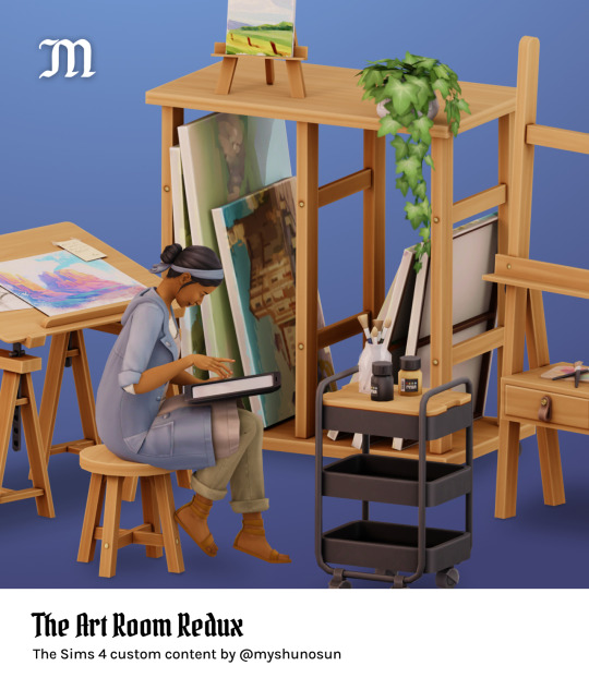
The Art Room Redux
The Art Room Redux is the reimagined version of The Art Room, a set that I shared a few years ago. You get 10 brand new items for your art-loving pixel people.
You can read more about the items and check out the in-game preview below.
Download (always free on Patreon) / Follow and support me
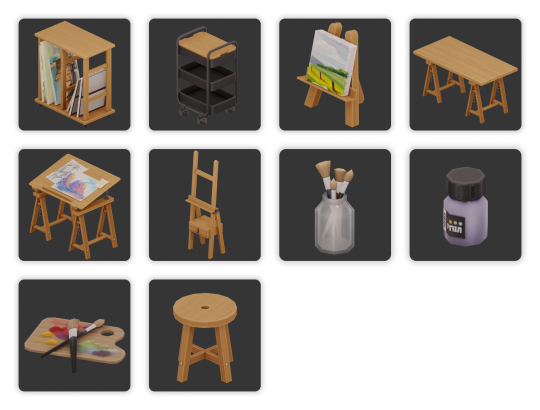
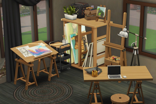
Here’s what you get:
Canvas rack, 12 swatches
Easel (functional), 18 swatches
Cart, 12 swatches
Desk, 12 swatches
Stool, 12 swatches
Drafting table (decor), 12 swatches
Jar with brushes, 1 swatch
Palette, 3 swatches
Paint bottle, 12 swatches
Tiny lil baby easel (decor), 12 swatches
More info and credits:
Base game compatible
New meshes, all LODs
Custom specular and normal maps
Custom catalog thumbnails, tagged swatches
Swatches come from my personal palette and from peacemaker-ic’s color palettes
Simlish font used in textures: Simlish Lengiza by gazifu
Have fun! You can search for “art room" or “myshunosun” in the buy catalog to quickly find these items.
Follow and support me here: Tumblr / Twitter / Patreon / Instagram / Bluesky / PayPal
@maxismatchccworld @s4library @public-ccfinds @mmfinds @sssvitlanz
#the sims 4#ts4#s4cc#ts4cc#myshunosun#mycc#simblr#s4mm#eacreatornetwork#eapartner#ea pratner#ts4 mods#ts4 cc#the sims#ts4 buy#ts4 maxis match#ts4 maxis match cc
6K notes
·
View notes
Text
the problem with forgetting to actually post the cover edits i finish for a while and accidentally building up a backlog is that im terrible at deciding what order to post things in, so i just sit in the figurative corner in a state of indecisive uncertainty until i make even MORE covers and still can't decide which one to post first
#is it over the top to make a poll just so i dont have to be the one deciding#i am having much fun downloading fonts tho handwritten fonts are my weakness#illogical rambles
0 notes
Text
Official Splatoon Fonts (Complete with Kanji) Download!
Hi! I see that a lot of Splatoon artists/youtubers try to use the Splatoon official fonts, and well there is the font reproductions out there, most only cover the basic English characters and sometimes hiragana/katakana (without kanji).

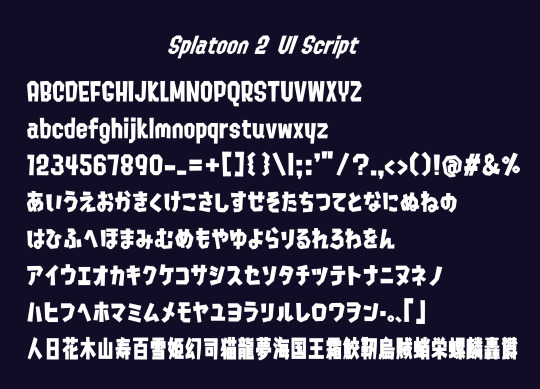
Since I've never managed to find a download provider ANYWHERE (both in English AND Japanese web) that had both the Splatoon scripts complete with kanji, I had to basically scavenge the internet to find any downloadable file with the complete fonts. I managed to find the Splatoon 1 font in Japanese font site, and the Splatoon 2 Ui font in a random link in google images to a site called FFonts (jp) with the file, both were complete with kanji.
SO to make everyone's life easier I just got both of the files and uploaded to Google Drive since there are no sites or posts that provide the links. (Please remember that these fonts use paid designs and are NOT provided for commercial usage, the font is owned by Nintendo).
(Please follow me for awesome art)
Here is the link to download both:
Pls reblog and share, I did sweaty work for the greater good of Splatoon artists, have fun!
2K notes
·
View notes
Text
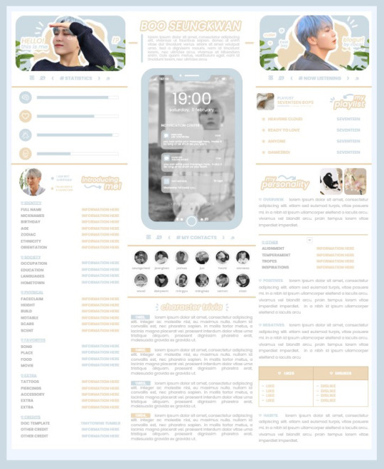
* ( ❀ ˆ꒳ˆ˵ ) ♡ Ꮺ 𝗧𝗜𝗡𝗬𝗧𝗢𝗪𝗡𝗦 — 𝟩𝖯𝖬 ੭

— introducing 7pm , the latest original google doc from tinytowns ! this document is designed to display the basics of a single - muse in one page &. captures a fun & youthful vibe with the inclusion of simplistic yet busy design , bright colours &. doodles ! features statistics , a playlist , basic info section along with character trivia & personality info ❀ the contacts section can be used as an exclusives section if desired ! space is left at the end of the doc so you can adjust easily & not have any of those annoying blank pages but it would be wise to take note of image positions as they are prone to moving. this doc can be considered moderate to difficult to edit due to the amount of edits that you will need to make in photoshop or photopea - but if you don't mind that then the document should be relatively simple to edit ❀ you can find the document link in the source code or under the cut , along with a known position issue + how to fix it , psd temps provided for this document , a video tutorial for adding your gif into a circle &. icon credits ! ( ˘͈ ᵕ ˘͈ ♡) ~
❀ PSD DOWNLOADS ( REQUIRED ! )
GIF CIRCLE - HERE
PHONE TEMPLATE - HERE
TOP IMAGES - HERE
♡ note : you will need to download the title cards to change the color , but if you don't mind the color then you don't need to - also , for full transparency on my end , i did need to touch up a few of the pngs after saving because the top text overlapped with the bottom text. be aware of that ! fonts used are poppins &. sant joan despi !
NAME TITLE - HERE
TRIVIA TITLE - HERE
INTRO TITLE - HERE
PLAYLIST TITLE - HERE
PERSONALITY TITLE - HERE
♡ note : you must change the color via layer style -> stroke for the title cards &. then save as png after deleting the background layer .
❀ KNOWN ISSUES
01. as a gdocs creator i use an external add-on called page resizer which is helpful for customizing the sizing of my canvas , as docs limits us with pre - set sizes. while this is nice to use , i'm aware that it can specifically cause an issue when you change the color of your background page. to fix this you must actually download the page resizer add-on through extensions -> add-ons -> get add-ons &. you should search for page sizer & download the one by nat burns. then you can access the sizer through extensions -> page sizer -> set page size &. what should be set for this document is a width of 9 &. a height of 12 !
this should fix the document , but i also know that sometimes , for what ever reason , the height &. width will flip. if that happens just make the height &. width opposite; so instead of a width of 9 , put 12 & for height , put 9 instead of 12.
02. i cropped the title cards in the document so that you wouldn't be trying to click something &. accidentally click on the titles ! however this means that when you replace image on the title cards they might go off center &. crop halfway through the word. just double click the title card that's bugging out & drag it to about the center of the black box. then it's fixed !
❀ DOCUMENT DOWNLOAD
7PM - HERE !
do not remove the credit , redistribute or profit off of my work.
❀ TUTORIAL
#01. go to file -> make a copy , in order to edit .
#02. to change the top two images double click on them &. a window should appear - in there you're going to click on it once &. hit replace image. the psd for this has been provided so it should be sized correctly !
#03. to change the title cards ( ex. boo seungkwan , my playlist , introducing me etc. ) you just need to click on them once &. hit replace image - please refer to #2 in the known issues section above this if you're going to do this though !! many thanks.
#04. to change the phone you're going to download the psd provided above &. when you've finished editing it you will click on the phone in the doc one time &. hit replace image !
#05. to change the thin color lines around seungkwan's name card you will press them once &. click edit - from there a window should open up &. you will click on it again & find the bucket tool which has a small yellow ( or blue if you clicked the long one ) line under it. that is where you change the color !
#06. the statistics represent intelligence , empathy , friendliness &. fighting skill ; to adjust the levels or colour you're going to double click &. a window will appear. from there you can either change colors with the bucket &. pencil tool ( pencil = outline color ) or you can shift the bars by clicking on the coloured parts of them and literally just dragging them.
#07. to change the playlist cover &. title you'll double click &. adjust inside the window by replacing image &. renaming things. the actual songs on the playlist can be typed normally !
#08. to change the gif circle , personality , &. contact images you again just double click &. replace image inside those windows. for the gif circle you must use the psd.
#09. to change the little bulletpoints beside the gif circle you will double click &. edit the text inside the window.
❀ VIDEO TUTORIAL 4 GIF CIRCLE
watch the tutorial right HERE !
make sure your timeline is checked ( the first thing i showed )
ignore the mistake i made while trying to show you where to end your gif LMFAOOO . . . im clumsy <3
to highlight all of your layers / frames click on the first one , then press shift + click on the last layer.
to bring up the list of options ( when i click convert into smart object ) you just right click.
❀ CREDITS
brain icon - Brain icons created by Vitaly Gorbachev - Flaticon
heart icon - Heart icons created by Chanut - Flaticon
support icon - Sport team icons created by Freepik - Flaticon
boxing icon - Boxing icons created by Freepik - Flaticon
plant png - josh ca.la.brese on unsplash
battery icon - Battery icons created by Stockio - Flaticon
wifi icon - Wifi icons created by Uniconlabs - Flaticon
signal icon - Signal icons created by Freepik - Flaticon
speech icon - Comment icons created by Freepik - Flaticon
close icon - Close icons created by ariefstudio - Flaticon
instagram icon - Instagram icons created by Prosymbols Premium - Flaticon
camera icon - Photo camera icons created by Kiranshastry - Flaticon
torch icon - Ui icons created by yaicon - Flaticon
#google docs#template#supportcontentcreators#gdocs#rph#google docs template#oc template#rpc#free rph#free rpc#docs#roleplay template#oc sheet#rp template#free#muse template#tinytowns#m: gdocs#m: original
1K notes
·
View notes
Text
GIT Font and PNG Generator

This post by @pichikui was the spark of inspiration for this whole project.
I'm super excited to share this project (though it's in beta stage) The first part is a font family based off of the glitch in time ghost speak codex.
The second part is PNG Image Generator that can copy the GIT font to the system clipboard as PNG, download it as PNG, and copy an HTML template to paste into AO3.
If you are unsure how to embed images into AO3, please consult this tutorial on the topic.
As I previously stated, this project is still in beta, so if you guys find any bugs or issues, feel free to reach out. I'm also open to collab as well.
495 notes
·
View notes
Text
irken flashcards! :)
for my friend's birthday today, i made a set of flashcards for learning the irken alphabet. this uses the AMAZING irken DOOM font by the IMMENSELY TALENTED @invaderlarx and @khaliarart, which is the most canon-adherent font, to my knowledge.


the deck is pretty simple: each card has a front (irken) and back (english), which can be flipped in anki. the pink highlighted english letter shows you whether the irken letter on the flipside is capital or not.
i could definitely see myself doing variations on this; if i've made any mistakes or there's something else you'd like to see done with these, absolutely lmk!
you can download the anki package here. actually can someone let me know if that works lol
have fun studying, irken soldiers! 🫡
221 notes
·
View notes
Text
HERMIT A DAY MAY - DAY 7
Mumbo Jumbo x Don't Starve
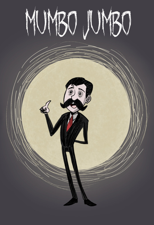
I drew Mumbo Jumbo in the style of the spooky, open-world survival game Don't Starve!
I chose this one for Mumbo because he reminds me of the default protagonist of the game, Wilson, who is a gentleman inventor that creates fantastical science and alchemy machines.
I also just thought he would look great as a Don't Starve character. And I was right, he looks fantastic! This was one of the most satisfying pieces I've done so far because he just fits the style so naturally.
To learn more about Don't Starve and see my style references, please continue below the cut!
(Also, check out the Hermit a Day May fundraiser for Gamer's OutreachI)
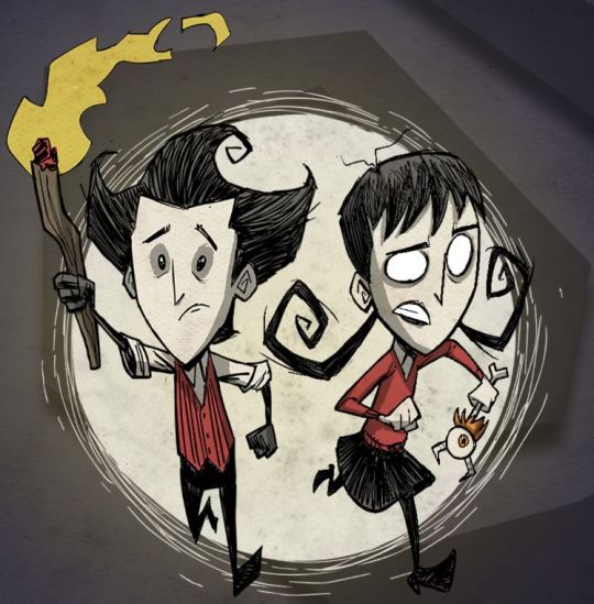
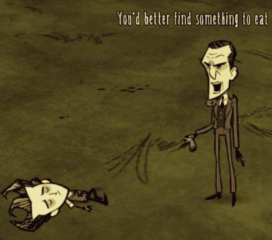
Don't Starve is a spooky, yet cute, rogue-like survival game that takes place in a randomly generated open world.
You play as a character that has been dropped into an unforgiving other world. Your goal is to survive and, when you enter story mode, try to find and defeat the entity that has trapped you there.
The game is very difficult as you only have one life to gather supplies, build tools, and try and live as long as possible. Nearly everything tries to kill you, and you have to also monitor your sanity, hunger, and environmental conditions, which can also kill you. When you play this game you will die many, many times, but it is always fun to restart and figure out ways to survive more successfully the next time.
The style of the game is heavily inspired by Tim Burton and the gameplay itself is fairly reminiscent of Minecraft on hardcore mode. The world of Don't Starve is strange and at times a little unsettling, but also full of funny moments.
Overall, the game is a delight to explore, just expect to die a lot. And anyway, there are always mods (lots of mods) if you want to make the game a little more forgiving.
Style references:
The style is very sketch-like with lots of points and spirals. The palette is muted with most (though not all) player characters being primarily red, white, and black (like Mumbo).
I made Mumbo a little taller than the average Don't Starve character since I imagine him as very tall in Minecraft. There is precedent for this in-game since the guy that brings you to the other world, Maxwell, is very tall.
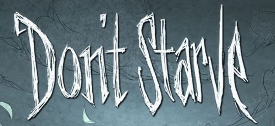
The Don't Starve title font. I downloaded a font called October Crow to make the title for this piece, so it isn't exact, but I think it looks really close.
#I honestly wouldn't be surprised if someone has already made a mod#where you can play as Mumbo Jumbo in Don't Starve#if not I think someone should get on that ngl#All the Don't Starve player characters have names that start with w#so you could name him Wumbo Jumbo#mumbo jumbo#hermitaday#hermitcraft
128 notes
·
View notes
Text

unca jams tattoos
i actually did it myself... yeaaa
what spurred me to make these was julia fox's cool shoulder tattoos, hence the name. i slipped in a few more with different text tho. have fun
5 swatches
upper chest category
both frames, teen to elder
disabled for random
font by ajaysims
04.04 update:
new cas thumbnail/preview
download: sfs / patreon
757 notes
·
View notes
Photo
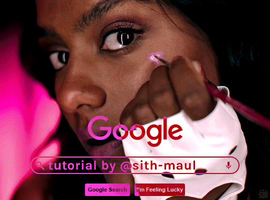
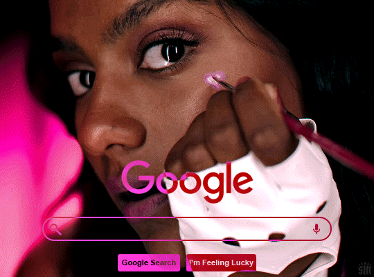
HOW TO: Make an Animated Google Search Overlay
A few people have asked how I did the effect in my pinned post and this set. So, in this tutorial, I’ll show you how to do this typing animation and give you a download to a template I made for the overlay! Disclaimer: This tutorial uses Video Timeline and assumes you have a basic understanding of gif-making in Photoshop.
PHASE 1: THE BASE GIF
I’m not going to show how I made this gif, but if you need any tips on basic gif-making, I have my full gif tutorial here. Instead, here are some tips for making a gif with this effect:
1.1 – Make your gif 540px width, especially if you’re using my template. My gif is 540x400.
1.2 – Use more frames. If you have a lot of characters in your search bar text, you’ll want to make a longer gif (i.e. one with more frames). The gif I made above was only 50-ish frames, so I doubled them and reversed the duplicates so it would play like a boomerang. That gif is a total of 98 frames 😅
1.3 – Have a “feature color” aka choose one color to make pop and make it the same as the overlay. Also, lots of contrast is especially ideal when you have an overlay set to Difference/Exclusion. (Check out the color tutorials on @usergif if you need help making your colors pop!)
PHASE 2: THE OVERLAY
2.1 – Download my template if you’re doing this layout
I made this template myself, so all I ask is that you don’t claim it as your own and that you give me proper credit if you decide to use it! Get the PSD with the transparent background here!
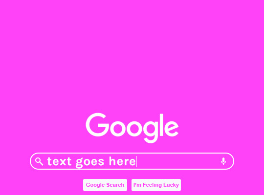
2.2 – Download the font Karla (optional)
The font I used for the search bar is Karla, a Google Font. It’s not THE Google Font, but I like the way it looks — which is more important to me than accuracy for this part. Here’s the Google Font link.
2.3 – Import the overlay
You can either drag the whole folder onto your gif from tab to tab or right-click the folder, select Duplicate Group, and select your gif as the destination document. Just make sure this overlay group is above your base gif!
2.4 – Set the overlay blending options
If you’re using my .psd, all the settings are already in place! If not, to get the metallic color effect, simply set the overlay to Difference:
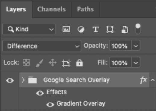
Then, add a gradient overlay that matches your base gif feature color. Here are my settings:
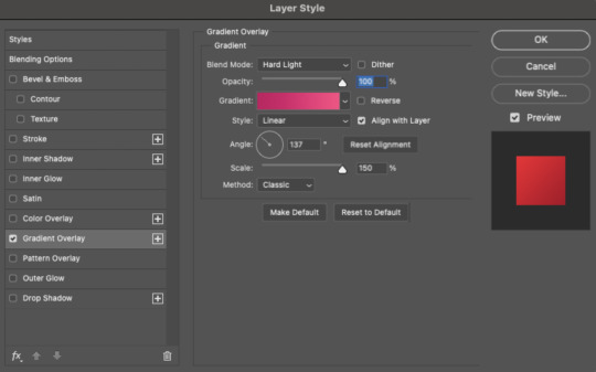
PHASE 3: THE TYPING ANIMATION
*Anakin Skywalker voice* This is where the tedious stuff fun begins...
3.1 – Add your full text
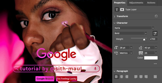
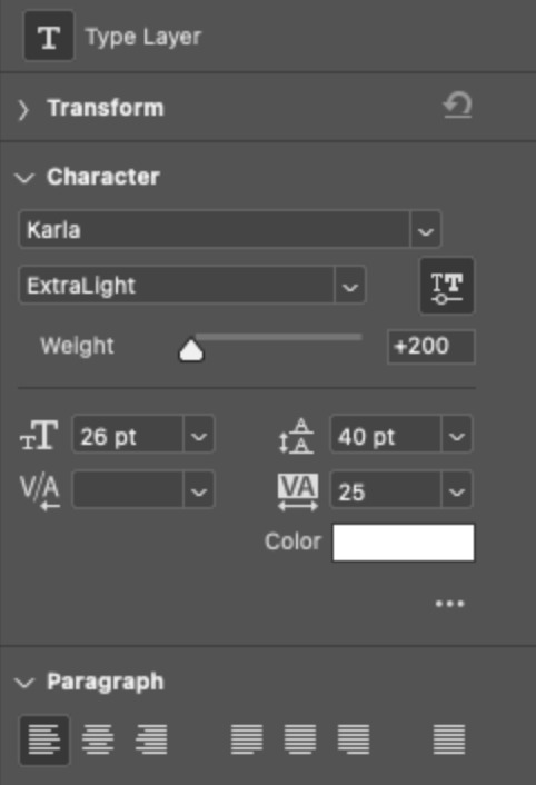
Create a text layer with the full text you want in the search bar! Here are my text settings:
— Font: Karla Bold
— Size: 26 pt
— Letter Spacing: 25
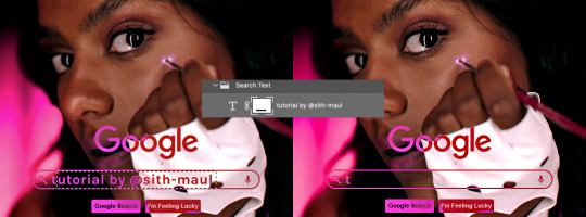
3.2 – Create a layer mask
This is how we’re going to create the typing effect without typing a new layer each time. You can add a layer mask to your text layer, use the Marquee tool to create a box around all but the first letter of your text, then fill the box with black to erase it. Now, all you can see is the first letter ‘t’
Btw the reason we wouldn’t use keyframes for something like this is because we want each letter to appear in a flash, not with a smooth, sliding reveal like a fade transition.
3.3 – UNLINK THE LAYER MASK
This is super important so you can freely move the layer mask with each letter. Just click that chain so it disappears!

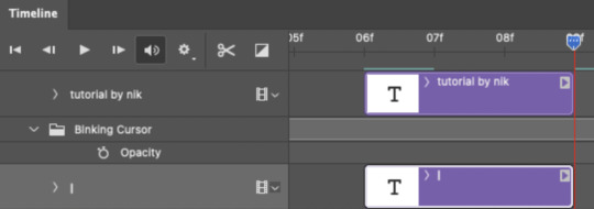
3.4 – Trim the text clip SEVERAL times
When I say several times... I’m not joking lmao:

Btw, you can click these images to view them at full size and zoom! Now, this part is a little tricky for me to break down into steps, but here are some key tips:
TIP A – Trim, Move Layer Mask, Repeat
To make it as easy as possible on yourself, the best method is this:
— Start with your original text layer (pre-trim) with the layer mask only exposing 1 letter
— Move the playhead (red vertical line with the blue arrow) to the spot you want to trim (see Tip B) and click the scissor icon to split the clip
— On the copied layer, move the layer mask (white box in the layer panel) to the right to expose another letter. Make sure your layer mask is unlinked (See Step 3.3)! You can see my layer mask moving by the dotted lines in the gif below.
— Move the playhead the same amount of spaces as before and trim again: you should now have the original trimmed clip (first letter) and a second trimmed clip (second letter)
— Repeat until you’ve done all the letters AND the spaces
TIP B – Make your trimmed clips about 0.03 seconds long.
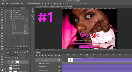
I’ve found this works well for me, especially because I’m working in Video Timeline. It reduces the amount of duplicate frames I get because, for whatever reason, Timeline pauses every 0.03 seconds (at least for me when I click the forward button).
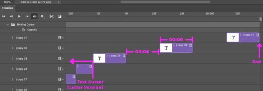
In the section above the pink line (image below), you can see I started with my full text clip. Then, under the pink line, you can see how I used the scissor/trim tool to clip them each to a duration of 00:03.

↑ Note: That screenshot is zoomed into the Timeline 100%. The other screenshots are zoomed out which is why the clips look bigger here.
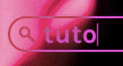
TIP C – Your text shouldn’t start at the very beginning.
Give yourself some space to let the cursor blink a few times, just like when you pause while typing on a computer. Where you start your typing animation is up to you! In the image below, you can see the first small purple block starts about 1.06 seconds into the gif:

TIP D – Backspace
I’m sure you’ve probably figured this out already, but to get the backspace effect I have in my gif, you just move the layer mask to the left to cover the letters you want to “delete.” Then once they appear “deleted,” just edit your next text layer clip with the new word you want to replace it with! (In my gif, I deleted “nik” and replaced it with “@sith-maul.”)
Here’s what the gif looks like without the blinking cursor animation:
Now that’s all explained, you basically do a similar thing with the blinking cursor! But no layer masks are involved :)
PHASE 4: THE TEXT CURSOR ANIMATION
4.1 – Create a text layer with just a vertical line like this one → |
I’m using the same Karla typeface as before, but thinner. Here are the settings:
— Font: Karla ExtraLight
— Size: 26 pt
4.2 – Trim, Move, Repeat (Letter Version)
This step will be super easy because each cursor clip that follows a letter will be the exact same duration as the letters you’ve already done: 0.03 seconds long. Take a look:
For each letter you reveal, move the text cursor so it’s slightly to the right of the letter, like this:
Do this for all the letters and even the spaces!
4.3 – Trim, Move, Repeat (Blinking Version)
This type of text cursor is slightly different because:
— These clips are “slower.” The reason is that the Letter Version cursor goes too fast for the Blinking Version. So I doubled the duration of the blinking cursor to 0.06 seconds!
— There are spaces between these clips that are the same duration as the clips themselves: 0.06 seconds.
— This text cursor starts at the very beginning of the gif and continues after the text is finished “typing,” directly after the last Letter Version cursor.
Just add however many blinking cursors you want to the beginning and end of your gif, skipping over the parts where you already did the Letter Version!
Here’s how it looks in the Timeline at the beginning of my gif:

Here’s how it looks in the Timeline at the end of my gif (note: it continues directly after the last Letter Version cursor):
Here’s how the blinking cursor would look at the same speed (0.03) as the letter version:

Here’s how the blinking cursor looks at double the duration (0.06):

PHASE 5: EXPORT
That’s it!! Just convert from Timeline back to Frames and export your gif! As always, I recommend checking your frames when you convert from Video Timeline back to Frame Animation — just in case you may have gotten any duplicate frames. Again, if you want to know more about that process, my full gif tutorial is here!
And ta-da, here’s the final gif!

And that’s it! I really hope this makes sense because I’m not really sure it does 😅 But if you have any specific questions, my ask box and DMs are open! <3
Also, check out these gorgeous recreations of this effect from @steverobin (Keke Palmer set) and @jakeyp (Jake Peralta set)!
#gif tutorial#completeresources#allresources#userelio#userannalise#usershreyu#useryoshi#useralison#uservalentina#userkosmos#usernums#tuserkay#userk8#tuserabbie#uservivaldi#userstar#usersole#resource*#gfx*#google*#this tutorial is long overdue oops lol
2K notes
·
View notes
Last Seen Blogs

jinkxmonspoon
gay and sleep-deprived
joshpup
Hiatus

carrie-organa
jamie tartt you f*cking king
nsayings
SNeha

ingridalmeidasblog
Ingrid almeida