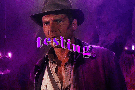
#edit: changed the text color so it's more readable hi.
Text
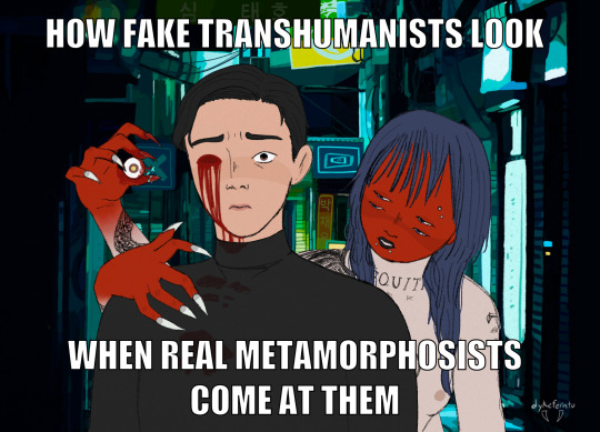
sometimes u start drawing something as a joke but then u realize u could actually make it look really cool if u wanted and it completely gets away from u. anyway.
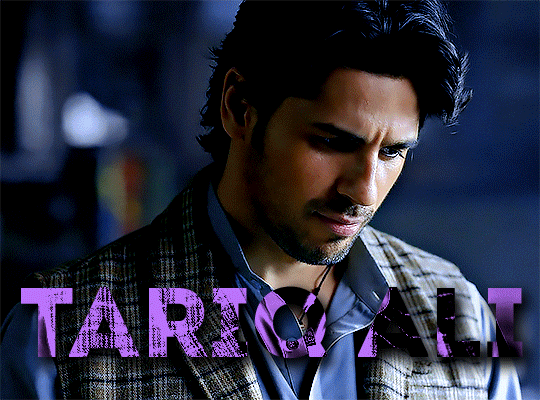
taeho (he/she) and his lovely sire jaeyoon (they/them) from a cyberpunk crossover chronicle :) textless under the cut
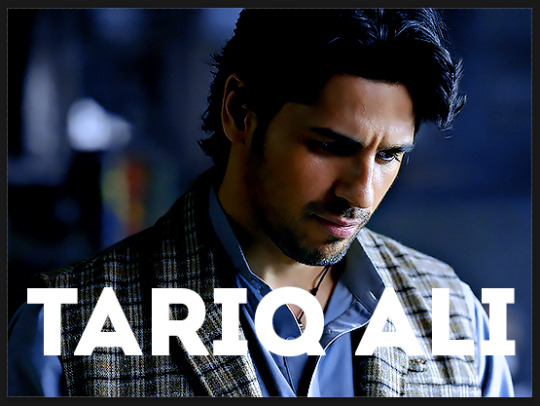
#edit: changed the text color so it's more readable hi.#q: why is jaeyoon naked#a: well they were wearing clothes but they had to take them off to transform rq#also free the nipple#don't worry abt the eye she got a new one#anyway. i'm so proud of how this game out omfg#my art#oc: taeho#ch: jaeyoon#chronicle: cmnd & cntrl#doodles#vtm#vtm oc#vampire the masquerade#cyberpunk#tzimisce#vamily#eye trauma#gore#world of darkness
83 notes
·
View notes
Text
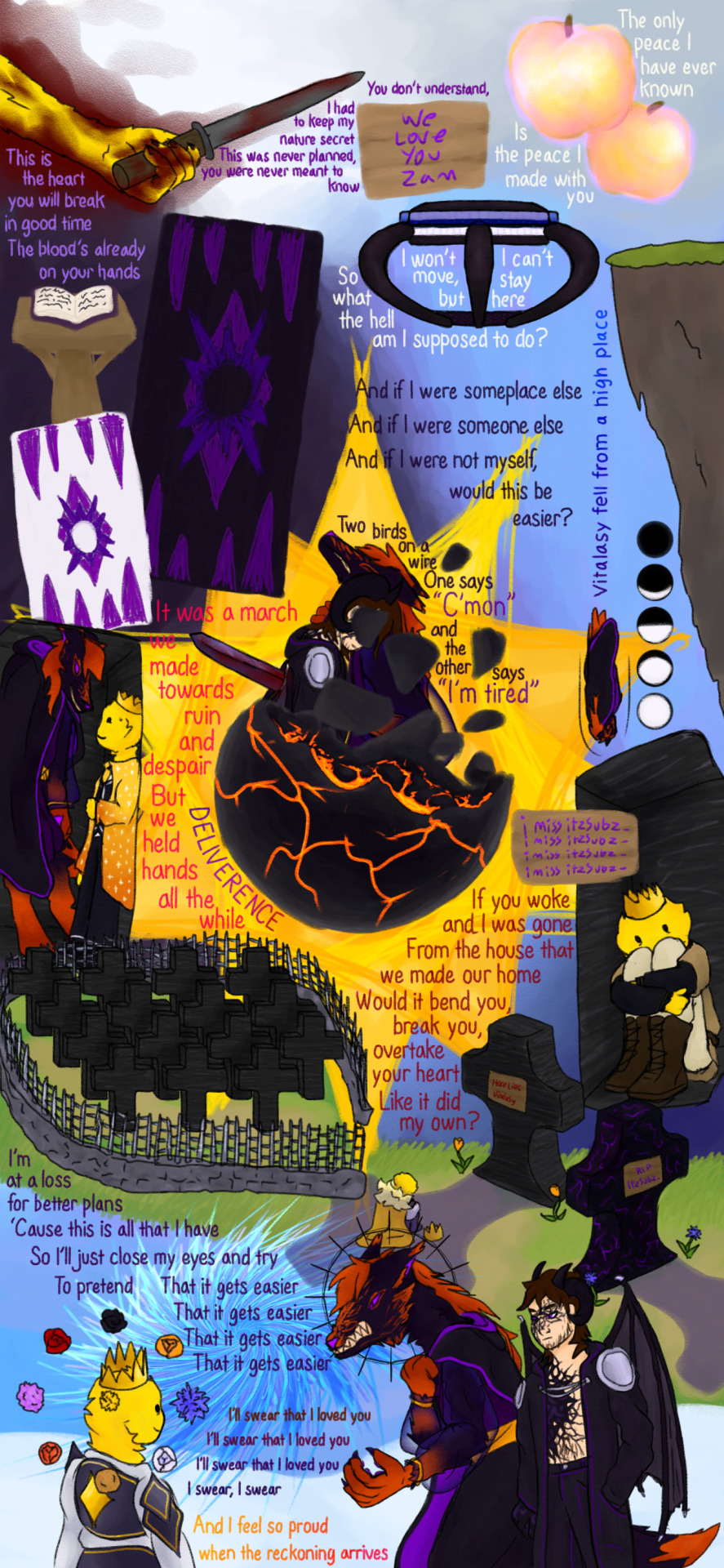
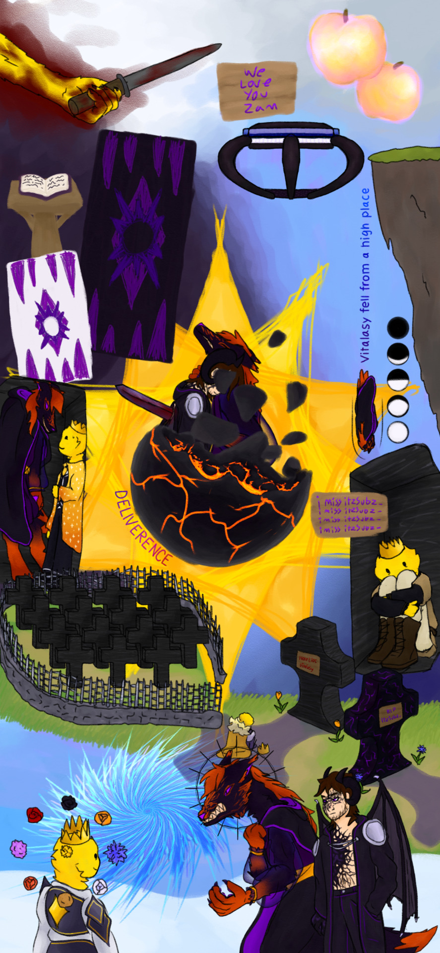
@mcytblrholidayexchange gift for @irrealisms !! you had lots of prompt ideas for writing, but not for art, so i hope you're happy with eclipse federation misery and agony compilation, plus song lyrics
lyric credits: Temporary - Chase Petra / Stranger - The Mechanisms / Easier - The Crane Wives (appears four times) / Two Birds - Regina Spektor / Little Soldiers - The Crane Wives (appears twice) / Heretic Pride - The Mountain Goats
feel free to ask if you want me to adjust some text to make it more readable or something, i think it looks fine but i know different peoples eyes and devices are different, and if i had more time i would definitely have spent more time messing with the colors on everything
speaking. of time. im really sorry i took so long ._. i kind of suck at estimating how long projects will take and how much time i have. thanks for being so patient!!
oh, also, some lyrics and drawings have story reasons for being grouped together, and some went where they looked good. uh. ideally id make sure everything had reason for its location, but this is one area where i did correctly estimate my time, instead of getting stuck in the planning phase.
also in the process of typing all this ive already gone back twice to change stuff in the images and re-add them to the post lol
OH also!! the part where vitalasy jumps off to his death! is as far as i can tell NOT canon accurate!! all the footage shows him jumping off the prison, since thats where he respawns. i didnt think to check this until after id already drawn most of the stuff, and already had the prison drawn, and i didnt want to reorganize the drawing. im telling myself that we only see a few of the later deaths and so theoretically the first one could have been jumping off a grassy ledge somewhere but its still bothering me and i needed to mention it.
anyway yeah really hope you like it i tried some new stuff with this one im not sure how well it turned out and thanks again for being so patient!!
EDITING TO ADD SOME MORE WORDS!!! i love talking about my art! so first, all the text on signs and stuff i did go back and look at videos and vods to make sure was entirely accurate, and i wrote all the words entirely by myself. for the lyrics and other text(death message and DELIVERANCE), i used a text tool first to make sure the words would be neat and where i needed them, and then traced over that on a new layer and deleted the original text layer. my handwritting fucking sucks always no matter what, this was a very necessary step. also! this is officially the first thing i have drawn entirely on my phone, rather than on my ipad like i used to do! also i dont use a stylus of any type i just draw with my finger lol.
#eclipse federation#vitalasy#princezam#itzsubz#mcyt#edited to add EVEN MORE WORDS below the cut. i am the yapper#lifesteal smp#chara makes things#<-somehow both tags i originally forgot.#EDITING AGIN. third edit. first was extra text second was extra tags this is for a critical spelling error(used a - instead of a / as the#divider between two songs by accident)
108 notes
·
View notes
Text
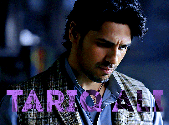
gradient text tutorial
This tutorial is for @ladynephthyss but y’all can have it too xD
We’ll be adding text so the final gif looks like this:
This tutorial assumes basic knowledge of gif-making, Photoshop, and coloring. I’ve only described the text tutorial in this.
Tutorial under the cut:
Couple things to note beforehand:
There is a lot of trial and error involved when doing any sort of text, and this is no exception! You might have to play around with the colors and the settings before you find something that looks good and readable!
This tutorial is inspired by the difference text effect in these tutorials: one and two by @anya-chalotra (highly recommend checking those out!), just done a different way.
This text effect works better on big gifs (540px width) that have quite a bit of movement below the text so you get that effect.
Find fonts that have bold shapes or some width to them, so you can see the movement.
This is my starting gif, after sharpening and coloring.

First, I position my text where I want it. (this can be moved around later, I just like to get an idea). Remember what I said about fonts? Try to use ones that are thick for this effect so you can see the gradient/movement underneath the letters. I’m using Intro.
It doesn’t matter what color the text is at this stage, I just do white text so I can see it:
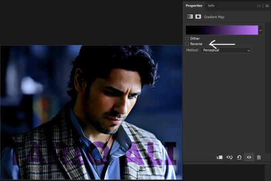
Then, add a gradient map in the color you want your text to be. For this one, I chose black and purple. The more contrast there is in your colors, the better it looks. You’ll be able to change this later though, if you don’t like the way it looks.
This is how it looks with the gradient map:
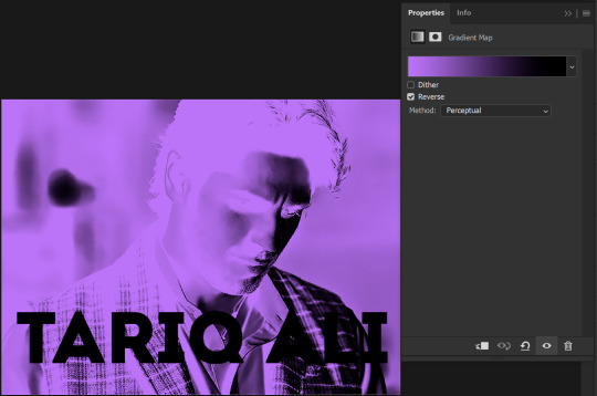
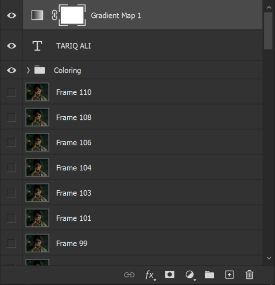
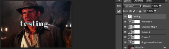
Now, we’re going to go over into our layers panel, and where we have the white box (the layer box), we’re going to select and delete that...
...so it looks like this:
Then, while pressing Ctrl, we’re going to hover our mouse over the T in our text layer. Your cursor should show a white box with a dotted border. Press the T in the text with the specialized cursor, and you should get a dotted line all around the letters, like so:
(I’m not able to get a screenshot of the cursor for some reason but I hope the instruction made it clear!)
Then, make sure you have your gradient map layer selected, and press the layer mask button (shown by a white arrow in the below image - it looks like a white rectangle with a black circle in the middle.)
This is what it should look like:
Right now, it’ll look like some solid color (which depends on your gradient). This is because we still have the text layer visible. Once we press the eye icon next to the actual text layer to hide it, you can see that this is what it looks like:

(You can also delete the text layer, but I don’t, just because if I decide to put these two words on two lines, or change their spacing or whatever, I don’t want to have to make a new layer. I can just edit that one before re-masking.)
As you play your gif, you’ll see that this is what the whole movement looks like:
You can see that the movement of him lifting the glass to drink his tea shows through the text, too. Almost like a weird color X-ray type thing, where the lighter color shows on darker shades of the gif, and the darker color shows on the lighter part of the gif.
Note: sometimes, depending on the way your gradient is made, you might get text that looks like the picture below. Just hit the reverse button (shown with a white arrow), and you should get the text looking like it does above.
This is the basic way to do it. Now, we can easily edit this, if we feel like there’s too much purple and not enough black. To do that, we go into the gradient, and change the slider positions of the colors. This is purely an aesthetic preference, but I’ll show you how to do it below:
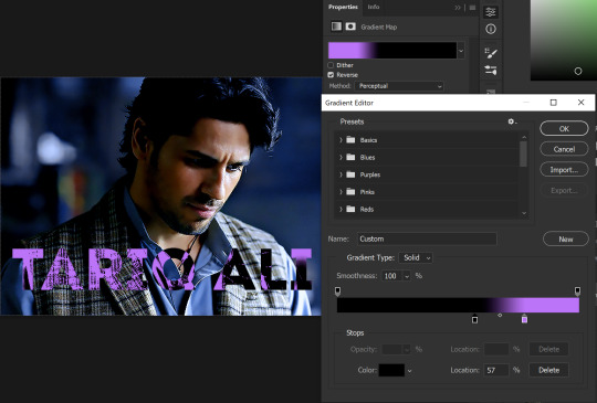
For example, I moved those sliders so there’s more black and less purple, and the gradient feels more like two colors only, instead of all the various hues of dark purple/gray-purple.
This is what the gif looks like:
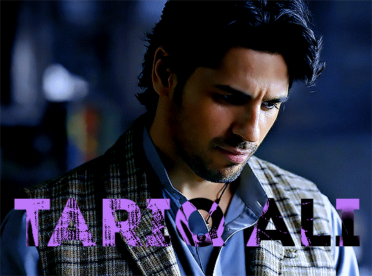
In the gif before this one, the black was more of a muted gray. In the one directly above, you can see that it looks much more striking. So play around with that until you find something you like.
It still doesn’t look very visible to me, so I’m going to add a drop shadow underneath (again, this is a preference thing). You’d do it just like you would with a regular text layer. Right click the Gradient Map layer and select Blending Options. Add a drop shadow.
This is what mine looks like:
And that’s it! You can keep playing around with the whole thing until you’re happy with it. You can even keep changing the color, and the great thing about that is you’ll be able to preview it as you change it to see what works with your scene. For example, I tried white and black text here:
And that’s it! Feel free to drop me an ask if anything’s confusing! Happy giffing!
#zee's tutorials#tutorials#gif tutorial#typography#gradient text#photoshop tutorial#resources#ps help#dailyresources#completeresources#itsphotoshop#allresources#dailypsd#userisha#userdahlias#alielook
423 notes
·
View notes
Note
Hi! Would it be possible to post a tutorial of how you created the text in this post /post/707087448305451008/removing-yellow-tint-on-photopea-heyyyyyy thank you :)

💜 TYPOGRAPHY TUTORIAL (PHOTOPEA EDITION) 💜
Hi anon! It's really easy! here's how i do it! <3 as always, basic gifmaking knowledge is required. feel free to ask if you have more questions <3
tutorial below the cut 💜
i. prep-work & coloring
You write out your text as normal in white, then you change the blend mode to exclusion
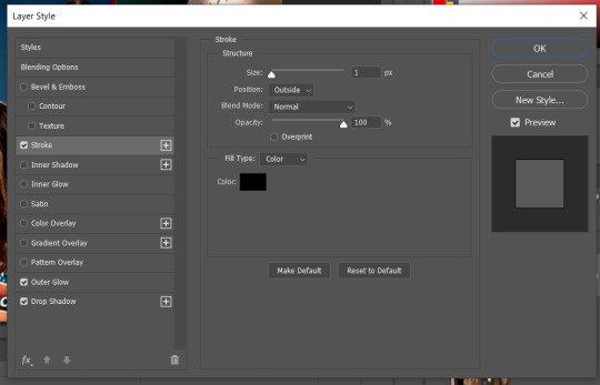
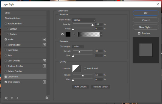
right-click on your text layer, and click on blending options to open the layer style window. Tick the color overlay box and click on the tab. there you'll be able to change the overlay color and the blend mode (i used pin light for this, but you might have to play around with the color and blend modes to find the one best for your gif)
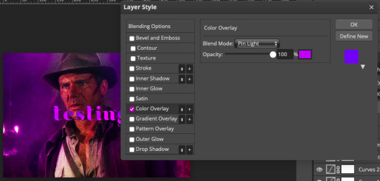
(i also added a background color to match the text)
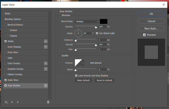
at this point you'll also want to add drop shadow to make the text readable. i usually turn down the distance to 0 and keep the rest of the settings as is, except maybe increase the opacity (which i didn't do here bc i'm laaaaazyyy)

ii. wobbly text
okay! so now the coloring bit is done. double-click on the white square on your text layer to select all of your text. on the top of the page you'll see options to change font, text size etc (idk what this is called but you know what it is). you'll need to click on the box that says wrap
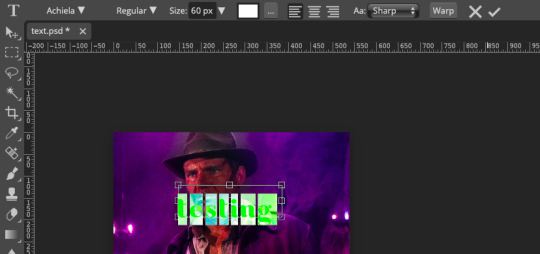
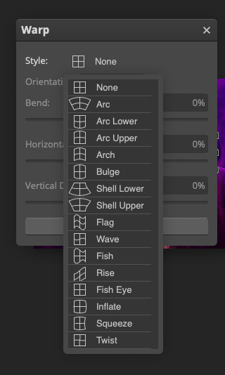
click on style > flag, and then you'll be able to adjust how "wobbly" you want the text to be (in this example the bend is at 40%)
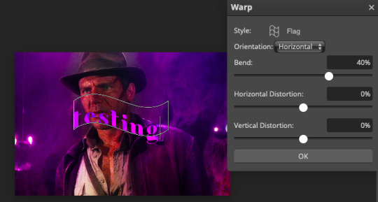
press okay and you're done! hooray!
iii. white outline
the last step is to add a line to make the text pop even more. first, create a new blank layer
right-click on your text layer and click on select pixels. click on the blank layer you just created. then you go to edit > stroke. these are the settings i use.
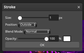
after pressing ok, you'll now have a white outline around your text. move the outline layer around until you're happy
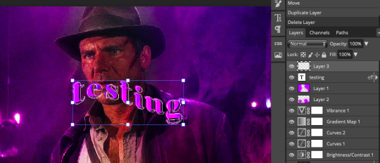
this is how it looks when it's done!
really not my best work but :P this scene is meant for a different gifset but i kinda like this coloring lol hope this answers your question!
#allresources#photopea tutorial#gif tutorial#typography#usergif#photopea#tutorial#*tutorial#it's not exactly like the text in my other tutorial but it's the same#it's all about the colours you chose and the blend mode
278 notes
·
View notes
Text
Sample of Upcoming "Enhanced Edition" CHICON 2007 Solo Jensen Panel
This sample was removed when I updated the full video with drastically improved video quality. I did not recreate the sample, but you can find the full video here.
Original post:
This is just a small, 1+ minute segment of a larger video that I’ll probably post next week. Thanks so much to the people who watched, reblogged, and/or liked the CHICON 2007 Enhanced Edition Breakfast video! It made me super happy to see some interest, and I know that was mostly thanks to those of you who managed to stumble across my obscure post and reblog it so people would actually see it.
I’ve started working on the main panels involving Jared and/or Jensen from the same convention. Jensen’s solo panel is next sequentially, so that’s what this sample is from. This clip was one of my favorite parts from his panel. I’m including Jared and J2 in the tags because Jensen talks about working with Jared here.
If you don’t have any particular interest in the subtitles, you can skip the wall of text below.
On this sample, I used a much lighter color of blue for Jensen’s subtitles. The more I looked at the shade I'd been using, the more I thought it was too dark to be read easily. It became more apparent to me while working on his solo panel because there’s so much more of it. I’d be happy to get opinions, good or bad. I was really attached to the idea of using blue for Jensen and red for Jared because of their marker tape colors, and I’m pretty sure the previous shade of blue was more accurate in that regard, but it’s far more important to me that the subtitles be readable than that they be symbolic!
If people like this color better, I’ll go back and update the subtitles for the Breakfast video to use the same color for Jensen. Subtitles are a separate file from the video, so it’s not too difficult to make changes and switch the subtitle file out without affecting the video itself.
Speaking of which, feel free to let me know if you catch any errors with the subtitles and I’ll fix them. Also, if there’s a subtitle that I marked as [inaudible] and you’re confident that you know what they said, let me know. There were parts I marked as [inaudible] even though I felt sure I could guess what they’d said based on the context, but I couldn’t hear any sounds or see any mouth movements to clearly confirm it. I tried not to put words in their mouths that they might not have said, and I didn’t want to force my own interpretation on anyone. Sometimes though, there were places where I felt like I should have been able to figure out what they were saying but I just couldn’t get the sounds to make sense to my ears, so someone else might be able to hear those. Other times, I would hear something for the umpteenth time, often when I was focusing on some other aspect of the video and not thinking about the subtitles at all, and suddenly it would seem blatantly obvious to me what they were saying.
As far as issues with the videos themselves, I can’t easily change them after I publish them because it would create a new video link on YouTube and I'd rather not create a confusion of links. However, please do still feel free to let me know if you catch any errors in my added content. I’ll keep a list of errata for my own notes in case I ever do have a reason to update the video. If it’s particularly egregious, I can at least put a note in the video description. (And since this is a sample, if you catch any issues, I can fix it for the full version.)
16 notes
·
View notes
Note
Hi! I saw you recently posted Harringrove social media au fan fiction.
I'm a Harringrove fan, so I very much would've liked to read it. Unfortunately I can't bc the text was forcedly colored black. I use dark mode on app and desktop because of readability (I can't see properly even with glasses) and the black text can't be read on dark mode. Yes I can switch to normal palette to read it and I will.
But just as a small request for the future, when you write more (and I wish you do, don't take this as a criticism against your writing please, this isn't that, just a technical thing) could you please either use the colors tumblr offers or then just leave the text normal? Then tumblr changes the text into white on dark mode automatically. It helps us other fans to read it, enjoy it, and spread it further.
I hope you have a great day, and thank you for contributing to the fandom with your talent 💖
Hi, I’m so sorry!! I had no idea that happened at all! I just copied and pasted it from my google docs, and posted it as it was :/ I did use the new text editor though, don’t know if that was the issue.
I don’t know if it’ll fix it, but I’m gonna try and edit the original post. Thanks so much for bringing it to my attention, it would’ve gone completely unnoticed if you hadn’t.
3 notes
·
View notes
Note
Hi! Loved your Loki "no touchy" gifset 😄 Can you tell how you made the "HOLD VERY STILL" appear like that? Looks very cool!
ty anon! 🧡
It’s actually not so difficult if you have basic knowledge of ps, but before, I wanted to say this is my way of doing this effect, might be other ways more simple or different!
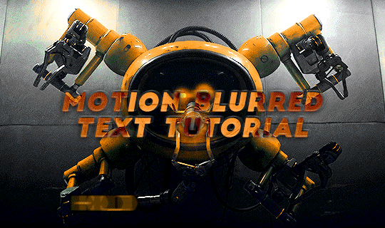
[REFERRED EDIT]
program used: ps cc 2019 + patience?
step 1:
prepare your gif as usual (sharpen + color) and type your text + whatever style to it
step 2:
I wanted to make this motion effect for each word so I duplicate (ctrl+J) x2 my text layer in order to have 3 in total.
Now for each of the 3 layers I apply a layer mask to highlight only the selected word. So, Rectangular Marquee Tool, select the first word (HOLD) in the 1st text layer and click on “Add Layer Mask”, try to make a selection that’s more wide than the actual word.
tip: I guess you can avoid the layer mask step and just type one word in every layer but I like to make my life complicated
step 3:
select all text layers > duplicate them (ctrl+J) > right click on the copies > rasterize layer
you should have for each word the actual text layer and the rasterized copy, make sure you have the copies underneath the layer that has your word, like this:
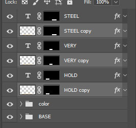
step 4:
we have to add motion now for every rasterized text:
filter > blur > motion blur [angle: 0° - distance: 15/20px you choose]
-- now we have our motion blurred text, our “readable text”, we have to make the transition.
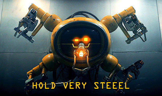
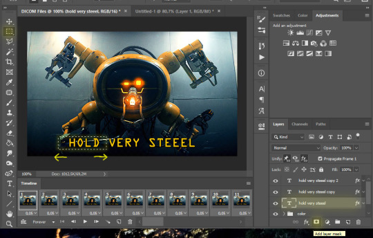
step 5:
you have to be in timeline mode, so if you’ve been working in frame animation click here: if not, good for you ™
so now, you should have smth like this: (I’ve only made visible the “HOLD” layers since we’re working on them for now)
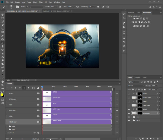
if you drop down the menu in the timeline for both of the “HOLD” layers you should see some options like transform, opacity, style etc.. and beside there’s a clock ⏱ this will determines when your transform/opacity/-- will start and end.
We will be changing the opacity, so let’s work on this.
step 6:
tap the clock beside opacity on both “HOLD” layers.
Make sure the blue time indicator is at the start, or at least at the beginning when you want the effect to start:
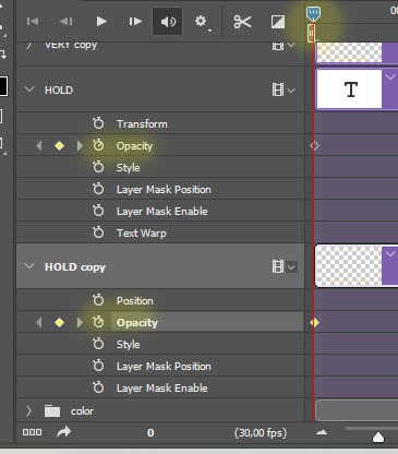
now we have to change the opacity of the layer; at the beginning I want the blurred one be visible (opacity: 100%) and the clear one not (0%)
then move the time indicator to the point you want the text animation to end and we going to change the opacity setting again (no need to tap the clock again, ps will automatically save all the setting change you make on these layers from now on)
at the end I want to make the clear text visible (opacity 100%) and the blurred one not (0%) like this: [click the picture to zoom]
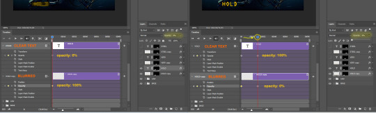
your effect should be life this:
I repeated the same process with the other 2 words, I made a quick video to show you how I set the transition:
vimeo
here’s the final gif:

I really hope this was helpful, I’m sorry if it turned out so long but I have no capabilities to syntax lmao and pls let me know if there's stilly any doubts ✨
#ps help#resources#tutorial#photoshop tutorial#typography tutorial#gif tutorial#allresources#i forgot to say that keyboard shortcuts are for windows users oops
163 notes
·
View notes
Text
Finally made the official blog for this mod
Changelog and development builds below! (WARNING: Changelog is probably long as hell)
==[Prerelease 0.1]==
- Attempted to fix a softlock with dying to Greyface as Niiue
- Reverted Magicant edition Bolster/Shield swap
- Entirely rewrote the boss spiral, eliminating the lag bug
- Changed Mint and Death themes. Death is now more usable, Mint should be mintier.
- Elmadan now smiles when accepted onto the ship. This does not apply in magicant. Dan should not smile during more serious moments.
- Elmadan wears armor in overworld before fights.
- Reflecto sprite moderately altered, mostly just given better shading.
- Dan's battle sprites now show him actually having some kind of mouth
- Custom menu, which is mostly the same, but has an attract mode
- PSI Shield for Zarbol, alpha is there by default, sigma is discovered at the 8th PoP
- ATB Wait mode Toggle machine added. Code is 2014
==[Prerelease 0.2]==
- Defense moves now have separate colors
- Some death colors have been adjusted somewhat
- Celine self-destruct mechanism gives warning in all chapters
- Basic Elmadan conversation options added, stored in a common event. DIALOG WHEN SPEAKING WITH COL. SATURN IS A PLACEHOLDER.
- Neptune fix attempt 1: Should be clearer where you can walk on Neptune, Cloud Ocean is the most likely place to have something overlooked but hopefully doesn't
- Swapped around ATB Wait mode. Apparently in 2.0 it's active by default, but in the copy this was built off of it wasn't. Behavior should be reverted as of now.
- Old saves can be slightly fixed if on the ship by talking to my crappy self insert. currently updates Zarbol's moveset and theoretically fixes ATB mode.
- Tweaked area around alinivar's cave in chapter 1, mostly just making "lighting" more consistent.
==[Prerelease 0.3]==
- Fixed Incorrectly colored text in death theme from 0.2
- Slightly tweaked attract mode map of magicant hub room
- Lowered Jupiter starman base ship status screen to indicate to dumbasses such as myself that yes, it is in fact readable
- Implimented a dumb little feature from a personal mod, you can now give gemblooms to the mook from chapter 1 who lost theirs. The fact you couldn't in vanilla bothered me for some reason.
- This gives you yellow tentacle ribbons, which are slightly stronger than red ones.
- Currently doesn't show up later
- Added a currently non-functional downstairs area to the ship, will eventually connect to 4 rooms which can be customized to some extent. only 1 of these rooms exists with no way to customize it.
- Customization is partially implemented on a variable level, so if you really want to, you can toggle the switches via debug to see what's there.
- Custom Elmadan battle theme added for Chapter 1 boss
- Tweaked some overworld mook sprites for better readability and consistency (Also to fix odd shading)
- Tweaked Battle Fungus sprite
==[Prerelease 0.4]==
- Attempted to fix broken flash effect in intro that indicates you have to check the video feed (Map tiles cannot flash, for some reason.)
- Made signs in intro animate to draw attention toward them when not read, hopefully making people more likely to do so
- Alinivar now has hueshifting in his sprites, making him 2% bluer
- EasyRPG Now gets a title splash
- Attempted to fix a bizzare crash in mobile versions of EasyRPG when trying to load a file which immediately should open a textbox. This crash should be fixed in Chapter 1, as well as, if nothing else, chapter 6.
- Bat enemies have different sprites in hard mode
- Added internal Elmadan Friendship Stat and a small reaction based on it.
- Changed how Elmadan's talk dialogue is handled internally just a little bit, hopefully making it less messy to look at.
- Started progress on Uranus Surface
- Changed a few midis to MP3s, some being remixes and others just. being the original track, when reasonable.
- Alinivar automatically goes toward the phone in hotel saturn before you use it for the first time.
- Made painting jump off of wall in chapter 1 more cleanly
==[Prerelease 0.5]==
- More hard mode sprite (and name!) changes.
- Still a work in progress, certain hard mode enemies may not have had name changes reflected in all encounters or scan opportunities
- Col. Saturn Recruiting cutscene has smoother running, may revert this? Not sure about it yet.
- More Music changes
- Col. Saturn Recruiting cutscene track no longer a midi.
- Bonus Elmadan fight added in hard mode. Room may be changed later.
- Extra case where deepsea can be fought in chapter 7 added to hard mode.
- Extra polish in "clown shoes" cutscene (Col. Saturn jumps over Alin to get behind him for the package delivery, rather than teleporting)
- Switched title screen to not use a debug color checking theme
- Debugging features
- Game now properly maintains wait mode status, and does not revert upon loading of saves. (WHY DID IT DO THIS???)
- Also this was probably kind of hack-y but who cares honestly if it works it works lol
- Minor Hard mode dialogue change for Dan
- Possible alternate deepsea encounter added to hard mode
- One magicant background changed to not use the default RTP
- Put the raw music files for my midi remixes into a folder in case anyone wants to poke around with those.
- Also Jummbox offline is in there too for people who want to do something with that, as well as a copy of the MIT license just in case.
- Changed a Mr. Saturn's dialog who called Giegue "big grey" to reflect that Giegue isnt that color in 2.0 onward. Now says "big white" instead.
- Niiue's theme now has a bit of the 8 melodies added to it
- Tweaked a chapter 7 cutscene to account for the new areas on the ship
Current build of 2.XX can be found here, though be warned, it's in a very incomplete state.
OUTDATED BUILDS:
0.4
0.3
5 notes
·
View notes
Note
Hello how did u edit and add subtitles to ur gifs
hi friend! thank you for coming to me with this question.
idk if you’re asking about the whole editing process or just adding subtitles, so before i go in depth about caption text, i wanna direct you towards my gif resources masterpost, where i compiled and organized a bunch of tutorials for different gif making processes. if your question isn’t answered here, its probably answered somewhere on there.
adding captions/subtitles to gifs: a detailed tutorial
(if this tutorial helps you in any way, please REBLOG it)
okay so when it comes to adding text to a gif it varies slightly whether you’re using frames or the timeline. i heavily recommend using the timeline function over frames just in general bc it allows for a lot more flexibility, ease, and precision with each effect that you add.
how to convert your gif from frames to timeline
when you add caption text to a gif, you wanna make sure you’ve resized the gif first. here’s a quick guide to gif dimensions. additionally, always make sure that your text layer is above all of your editing/coloring layers.
after resizing and editing, go ahead and click the lil text icon in the tools panel on the left.
your cursor will change shape, and and then you can draw a text box on your gif. it will fill with placeholder text at first:

press ctrl+a to select all the text in the box and backspace to delete it. type in your caption text:
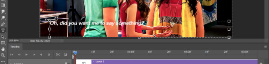
select all the text again and press the center icon (1) at the top of the screen to center it within the box. once you’ve done that, click the check mark (2) to tell photoshop you’re done editing the text:

now that your text is centered within the box, it’s time to center it horizontally on the gif. switch to the move tool:
and make sure your text layer is selected in the layers panel:
press ctrl+a. your entire gif should have a dashed line around it. press the center icon at the top:
(pro tip: this will work for any type of layer you want to center, not just text.)

from there, use the arrow keys to scoot your text up or down to whatever distance from the bottom you prefer:
now, let’s get into specifics like fonts, sizes, and shadows that will help make your text more clear and readable.
click the text tool icon again, click your text box, and press ctrl+a to select all your text. these are my preferred caption text settings:
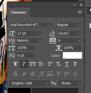
i use arial rounded MT bold font, 17pt for full size (540px width) gifs and 14pt for smaller gifs. i use the “faux italic” setting to add a slight slant.
next, let’s talk about blending. drop shadows and strokes are essential for helping your caption text show up clearly on any gif. right click on your text layer in the layers panel and click “blending options...” OR just double click your text layer.

these are my preferred blending settings for caption text:
click “ok” in the top right of the panel to save the settings onto your text layer.
all right! you’re almost there! the last thing to do (if you’re editing in timeline) is to make sure that the length of your text layer matches the length of your gif layer.
if your timeline looks like this:

or this:
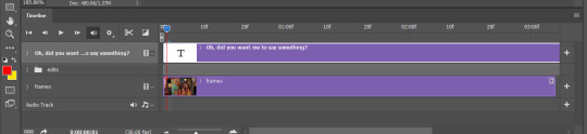
then you’ll need to adjust the length of the text layer. to do this, click and hold the right end of the purple bar representing the text, and drag it horizontally until it matches the length of your gif layer.
and you’re done! the finished product:
hope this helped!
#gif tutorial#how to make a gif#allresources#completeresources#caption text#gif caption tutorial#subtitle tutorial#gif subtitles#photoshop tutorial#gif help#gif tips#smilecapsules#quirkyresources#sibylresources#answered asks#anons#mytutorials#chaoticresources#finesources
65 notes
·
View notes
Text
hermit items
or, to be more specific, items i associate with the hermits
i plan to draw soon, but ive been kinda swamped by school and a big ol’ project lol
edit: jsut did a proofreading now that its the morning and i can like,,, properly read gjshgkjsdhf
i dont think much changed when it comes to readability, but there is a minor amount of clarification owo
under the cut bc hng long lol
wels:
wels's helmet's plume; (wels's plume is still a ponytail in my design im just makin it a true plume for this) the red, flowy part is made from dyed horsehair. the gold-plated ring is wide, too wide to be a true ring, but too small to be a bracelet
the pommel of a sword, it's made from iron, with a blue sapphire embedded inside it. the iron has various engravements, fitting those on his helmet. (i can pull up my wels design again if needed lol) it screws into the handle on a roughly centimeter long threaded rod that's been soldered onto the bottom of it
etho:
etho's headband; has shifting engravements, when the engravements shift, they dont dissapear and reappear, the points that make them up just "move," sort of like in stickbug videos where the lines move lol, it displays the expression of the person it is touching, and when it is not in contact with anyone the points move around idly, not making up any particular shape
a pair of diamond boots. nothing particularly interesting about them.
joe:
a pair of navy blue glasses, shaped like the ones he wears irl. near the hinges on the things i learned are called "temples," there are small @ symbols. otherwise, just a standard pair of glasses
an iron pick, enchanted. it's been repaired before. at the end of its handle, at the opposite side from the head, there is a small diamond with a cross going through it engraved in the wood. it looks like it was difficult to do.
a piece of lime green stained glass. its definitely new, and its definitely going to be placed. at some point. by accident. it has fingerprint smudges, and is more opaque and vibrantly colored than regular stained glass (thanks to one of my irl friends for the idea of this one gjsdhgkj)
mumbo:
his red tie; tied. it seems to have the sort of wear as a tie that's just loosened and removed, rather than repeatedly tied. there are redstone stains on the knot and along the middle section, with a distinct line where his blazer usually covers, along with an oddly shaped diagonal stain, that slightly feathers the right side of the distinct separation.
a block of redstone, accompanied by a small knife. a fourth of the block has been whittled away (presumably by the knife), but is otherwise normal. the knife is about the length of a hand. its handle is a deep maroon. whether this is from redstone staining or if it was made that way, you can't tell. there's a pair of sharpening stones attached to it by a piece of definitely redstone-stained-red string
(a small addendum: anything that's been stained red lightly glows when near powered redstone owo)
doc:
his red eye. now that you can see the full thing, it goes deeper than you'd expect, at least a couple inches into the metallic half of his face. there are wires leaving the end of it, its not the sort of thing that you can just pop back in and it'll work fine. the lens, which is clear, protects an assortment of LED lights, that can change their brightness at doc's will to depict images. the lighter metal frame, looks like aluminum, seems to be mostly aesthetic, though it does connect to his ear. its hard to tell what its function is, but doc seems quite insistent on having it back, so you’d rather not mess with it more.
a chunk of quartz, carved into the shape of a goat horn. doesn't seem to serve any other purpose, just a totem of the goat mother lol
ren:
his signature sunglasses. on the hinges of the lens frames themselves, there is a cyberdogs logo (red gear with a large center and says "CD," also red, on the inside)
a piece of beef, not the hermit. there are mycelia (as in mushroom roots, not the block) running through it. you're not sure of its edibility, but considering its label, which says "Pamela - RIP" you think worse things would happen to you than being sick if you ate it.
beef:
a butcher's apron, bloodstained. you arent sure of the blood's origins; you assume it's animal, but considering the look he gave you when you asked about it, you don't want to know. otherwise, it seems standard. there's a pocket on the front.
a tuft of llama fur. it's cream-colored. nothin special, just some wool lol
scar:
a cat's collar. it's purple, with the non-fabric bits being gold (not gold plated or pure gold, just gold colored). the tag says "jellie"
a diamond shovel. if you can call it that. it's more of a trowel than a shovel. it doesn't have any dirt stains, but it does have "vote for scar" written on the dark-oak wood handle in incredibly hard to read black text.
tango:
a ravager horn, just a standard trophy from what was likely a difficult- or first- kill
a stick of dynamite. you're not sure if its explosive or not, it seems like its gotten wet, but you'd rather not test
cleo:
the armor stand book, with some additions. there are extra notes added; the "check target" button has been circled about 30 times in about 30 different colors. the ink from that has telegraphed through the page. there are little drawings of all the poses in the "preset" menu, direction notes, and more you can't make out. you're sure she doesnt need these notes anymore. except the circling on the check target button.
im not sure what to give cleo as a second item lol
false:
a pair of pilot's goggles. the lenses are blue, and framed with polished iron. there are little cushions, which are made from black rubber. the lenses connect from either side via a brown leather strap.
the hilt of a broadsword. it's made from brass, and the grip is wrapped with a similarly colored leather to the one that's the strap of her goggles. the strips are woven like a basket. the pommel features a blue sapphire, a darker blue than the one on wels's pommel. the guard is that of a basket hilt.
#my post#spiders web#hermitcraft#welsknight#etho#joehills#mumbo jumbo#docm77#vintagebeef#rendog#goodtimeswithscar#tangotek#zombiecleo#falsesymmetry#if you have ideas for more feel free to add 'em!
126 notes
·
View notes
Text
Yu-Gi-Oh! SEVENS Blu-Ray: Episode 5
Google Drive ONLY (for now)
Support us on ko-fi
Blu-Ray episodes will come out one at a time every Friday, until I’m done with the full first season (1-13).
The next episode should be up on September 3rd, barring surprise events. We’re out of the RR era and into tempsubs now!
--------------
Please use either MPV or MPC-HC to view the Blu-Ray episodes. I do NOT recommend using VLC.
Please check the post for episodes 1&2 to see why.
--------------
!! This is NOT a final release !!
Nor are any of the files on Google Drive. They will be polished and edited one more time before being put up on Nyaa. Stuff I decide on changing halfway through these episodes will eventually be changed for Nyaa release.
Until that happens, the Google Drive folder is more like a “final draft” than a finished product. I will not be going back to change font, styling, or certain wording until I’m done with all the other episodes first.
--------------
Extended Translation Notes
Typesetting changes
The same as my post on them here for episode 62.
TL;DR
Bahnschrift -> Gandhi Sans Bold.
Athelas -> Berlin Sans FB Demi Bold (for Luke)
White text, black outline, colored shadow for summoning chants for the sake of readability
Bakuro’s font is Lato Black. It’ll be the default font used for most summoning chants unless it’s a special or important character, in which case I’ll stylize it differently.
These are what the subs should look like:


If they don’t look like these images, please reblog or reply to this post with a comment. I’ll try to fix it before final release.
Minor wording changes
“Rules” -> “Format”
They very clearly say “rules” in English over the course of this episode, but in the midst of translating this I realize that a more appropriate localization may be “format” because that’s what we would actually call something like Rush Duels in English.
Rather than “rules”, it’s very clearly a new “format”, which makes more sense for English speakers. When the final version is released on Nyaa after I’m done with everything here, I’ll probably scrub through previous episodes to switch “rules” to “format”, unless it’s fine as it is in context and makes sense.
You may see one or two “rules” in the subs for this episode; they were kept intentionally. Otherwise, we’ll mostly be using “format” whenever they refer to Rush Duels like this again.
Rush Dragon Dragears -> Striking Dragon Dragias -> Multistrike Dragon Dragias
So if you haven’t noticed, Dragias’ name has been on a wild rollercoaster ride since the start of this series. A lot of people are used to Dragears as it was the initial translation by YGOrg. This is not really wrong, by the way.
The reason why there is so much switching is due to localization. With the official release of the SEVENS Puzzles & Dragons collaboration event for global servers, we learned that the TCG name for Dragias is “Multistrike Dragon Dragias”.
This also backs up an earlier-released pillow set with English monster names, so you can expect to see “Yamiruler, the Dark Delayer” and “Prima Guitarna the Shining Superstar” in the subs after finalizations are made.
Why? Because I believe in using the TCG names as that is what people will be most used to once the game releases here in the West (and yes, it is coming). I have already been using TCG phrasing for various other terms, like “tribute summoning” instead of “advance summoning”, or “spell card” instead of “magic card”.
As we get more news on the TCG release of Rush Duels, I will be changing card names accordingly.
Light Bullet -> Light Blast
Some more minor Dragias changes. This is the name of his first attack. I felt like “blast” was a lot more accurate than “bullet” which is just the literal translation of 弾 (dan).
Bakuro’s lines
RoadRush:

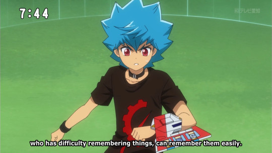
“Rush Duels [have] got very shallow rules, where even I, who has difficulty remembering things, can remember them easily.”
Original Japanese: 「ラッシュデュエルは覚えたての僕ですら簡単に勝てるほどの底の浅いルールだとね。」
This is just a straight-up mistranslation. Unfortunately, this is not what Bakuro said.
It should be something more along the lines of “Rush Duels are so shallow that even I, someone who’s just learned it, can grasp it so quickly”. Bakuro does not have a faulty memory.
覚える can mean “to remember” or “to memorize”, however its second definition is also “to learn”. What makes this definitively “to learn” is the presence of the ending たて (-tate), which is used to signify when it’s someone’s “just done” something.
In this case, Bakuro has “just learned” Rush Duels.
廃刊 (haikan)
“ceasing publication”
When Bakuro is defeated, he says these words. Earlier in the episode, they were translated as “shut down”, but the word specifically means “ceasing the publication of some news or article” which also includes things like magazines.
The reason the subs say “report... over” instead of “ceasing publication” or “shut down” is because I just felt like it was a really weird set of words to say out of context. I instead opted for something that makes more sense in English, like Bakuro who’s just finished reporting from the scene, therefore “report over”.
--------------
For people interested in the raw BDMV vs encoded final video comparisons, click here. (Click the image in the center to swap between “raw BD” and “encoded”).
--------------
Credits
Translation, timing: entame
Proofreading: angelthinktank (Yona)
Encoding: PelvisBass
5 notes
·
View notes
Note
Hi i hope this doesn't come off as rude or anything i just wanted to let you know that the description in your mobile theme is pretty much unreadable bc the colors are so similar :/ so if you could change the text to a darker yellow or orange that would be great! :)
Hello.
That wasn't rude at all. Thanks for reaching out so politely.
The colors have been edited, I hope they're more readable. :)
4 notes
·
View notes
Note
Hey, CW! I love your blog and personally apologize that you were forced into making it (I feel that on many levels), but, uh, quick question... how bad are you at web design because this design is awful and I'm sorry. The body text is a poor font choice for readability, the tag color is the same as the background, everything blends in FAR too much, there's no visuals whatsoever which is fine, maybe, if the colors differed, but you NEED a background of #4d0066 and an off-white text and also
Danny waited patiently after explaining his plan clearly and concisely, giving his friends the time that they needed to think everything over before deciding. He gave them twelve seconds, which, really, that was plenty of time. “So? C’mon, let’s get to work! CW is only gonna be distracted so long.”
“No, no, no, back up here. You stole their laptop- They have a laptop?” Tucker looked some mixture of delighted and confused, Danny feeling a surge of empathy for the same exact feelings he had gone through when discovering the laptop and subsequently the blog that CW had actually made (an event shortly followed by Danny being forced to sit down and finish his homework). “And you want to… what do you want to do?”
“Change their blog, duh. I mean, look- Here, let me show you what it looks like right now.” Danny, still in his ghost form, flew over to Sam’s large and ridiculously extravagant bed before letting himself fall and bounce a couple times before settling, making sure he was stable before pulling the borrowed laptop out of his backpack.
Sam and Tucker were quick to settle on either side of him, both of them making similar noises of disgust and horror once Danny brought up the correct blog, which, thank you, honestly. CW finally made a blog and apparently knew nothing about design.
“Jesus… I feel like I might actually cry over this- Did they use the same color for the text and background- What is this font- Danny. Danny, I can’t- I’m having an attack.” Tucker dramatically clutched his heart and fell backwards as he ‘died,’ Danny snorting as he turned to Sam.

“Well… it could definitely use some work,” Sam admitted, taking the laptop and getting to the customization screen in a few short clicks. “There, now if anything happens, they can blame me and you won’t have to go around pouting at being yelled at.”
“I don’t pout,” Danny muttered, leaning up against Sam as Tucker scrambled and moved to sit on Sam’s other side so she was now in the middle, laptop easily reachable by all of them. “Okay, so, that background color has got to go first. Like. Now.”
“No, no, we need a title for this blog first,” Tucker argued, leaning over to jab a finger at the screen. “Look at that empty space. It’s making me cry, Danny.”
“Boys, boys, settle down,” Sam made a clicking noise with her tongue, clicking around on the screen before bringing up a list of themes - free ones, Danny noticed. Honestly, disgustingly rich and she still searched for whatever was free or cheapest, which… fair. “We’re changing this blog theme, first. It’s disgusting.”
The three were silent as they scrolled through the choices, communicating in grunts, mutters, and disgusted noises. Danny was almost sure they wouldn’t actually get anywhere before he was jabbing the screen hard enough to move it, “There. That one. It’s perfect-”
“We are not giving him a Miraculous Ladybug themed blog, Danny,” Sam sighed, Danny offended at how Jazz the tone she used was. “We’re all better than that.”
“Speak for yourself,” Tucker snorted, finally shaking his head. “Forget it, colors and title first, then blog. At least with colors we’ll know what we’re looking for better, right?”
“Alright, alright,” Sam groaned. “Colors and title first. What should we use for a title? I don’t know enough about them to choose anything good.”
Danny blinked as the two turned to look at him, panicking for a moment before blurting out the first thing that came to mind. The looks only turned into confused frowns and baffled expressions, which, okay, fair, since Danny had spoken in Latin.
Clearing his throat, he spoke it more clearly, giving a shrug, “Pulvis et umbra sumus. It’s something I learned when they were helping me with Latin, it just means we are but dust and shadow.”
Sam and Tucker went quiet, shared a look, and then nodded together before Sam was typing it in with a quiet, “Fitting.” It really was, when Danny thought about it, so, there. That was one thing done. “Okay, next up is title font.”
Clicking open the options, Tucker was half-shouting at once, “Comic Sans! Sam, we gotta give him Comic Sans-”
“No, no, choose that Grumpy one, now that is perfect.” Plus CW’s reaction would be hilarious.
“What? No- Comic Sans!”
“But Tuck, c’mon, the pun-”
“Both of you shut up,” Sam snapped, glaring at the two of them almost at once which was actually impressive, if Danny had to admit to it. “We’re giving them 1785 Baskerville.”
Danny and Tucker were both quiet, sharing a long look before Tucker decided he wanted to become a ghost ahead of schedule, “Boo, you goth.” He was shoved off the bed for his troubles, something which Danny managed to not laugh at if only so he wasn’t shoved off as well.
Once Tucker crawled back onto the bed they got back to designing, arguing over colors (“Oh my God, it should not be taking this long to have a sample color just pick something!”), font choices (“No, screw you both, we’re going to use Google Fonts like a normal family we are not having another fight over this!”), and which theme they should go with (“You know what? Screw it- Screw it! We’re just going to use the Tumblr Official theme like heathens and edit that!”)
It was taking longer than Danny thought it would, but slowly and surely the blog was coming together, Tucker having firmly taken over once it got to the actual coding part of the website, which was how they ended up with transparent textures to go with their background color (“Aw, but, guys, c’mon, this texture looks like stars! How cool is that!”), a transparent texture for the posts themselves (“I know you like your stars, Danny, but it won’t work with the font color and look, the parchment fits, don’t you think?”), and even a cooler looking blog title (“You know what? Here, no, we’ll put a text-shadow command on the title- There. That looks pretty cool, don’t you think?”)
There were a few hiccups along the way in choices (“No, no, make his avatar shape a square, because… you know. He’s such a square.”), but at the end they had a nice blog that really had taken way too long and Danny was half-certain that CW was about to show up and yell at them any second.

“You know,” Sam said at the very end, “This is still kind of a boring looking blog, everything considered. We could have gone way more crazy with all of this.”
“I mean… yeah, I guess so,” Danny admitted, closing the laptop and carefully putting it back in his bag. “But I didn’t want to like, you know, really make something crazy, I guess. I mean… Their blog sucked, but it’s still their blog, you know?” Danny shrugged, floating off the bed and giving a light stretch. “Dunno, just figured I’d tweak it a little to fit them better instead of having them waste time on it. You know, show off that wise old mentor who cares and has everything together and stuff thing.”
Danny barely even finished before a pillow being thrown at his face, Tucker laughing as Sam booed him. “You’re too nice! Get that sickeningly sweet attitude out of my room!” She was grinning even as she ‘yelled’ at him, Danny rolling his eyes with a laugh as he did as told.
Not even half an hour later and Danny was back where he started, laptop returned to its proper place and back open and waiting.
It was the latest ask that he saw in the inbox that had him pausing, Danny reading through the ask and unable to help himself whatsoever as he snickered before clicking the ask to respond.
you know what asker? you’re absolutely right so lets try this out
-Danny
[Story and blog re-design by ibelieveinahappilyeverafter.]
#ask blog#danny phantom#clockwork#long post#text#(story)#(this post is basically saying danny took over the blog)#(and gave it a new look)#(blog owner is to friend as i am to danny)#(i hated their blog too much so i fixed it muah ha ha)
29 notes
·
View notes
Text
10 Benefits Of Social Media Advertising For Your Business
About 82% of people follow the recommendations of micro influencers. There are tons of fashions on there pushing their protein, water bottles, and related products. You don’t even need to be an enormous company for this type of advertising to be priceless. There are a few methods of measuring the success of your campaign.
This publish alone generated over 126,000 likes and important engagement for the brand. Dbrand partnered up with Marques Brownlee and his YouTube channel MKBHD for a $1,000 smartphone giveaway. The giveaway was quite profitable with the video incomes 1.6 million viewsand generating plenty of buzz on social media. For example, Amber Fillerupis a fashion influencer and an professional storyteller on Instagram with 1.3 million followers. Popular brands like Urban Outfitters and Nordstrom have often teamed up along with her to promote their brands’ stories. Let's take a glance at a quantity of examples of profitable influencer advertising partnerships.
This influencer advertising marketing campaign labored so nicely as a end result of Loeffler Randall knew its audience well and selected the most effective influencers to work with. It was his micro-influencer strategy that helped him kickstart his gross sales. I would offer micro-influencers, people with like eight,000 followers, an item they may make a giveaway with, or simply send them a number of free objects in trade for mentions.
Which Metrics You Have To Monitor While A
At the helm of selling affairs, you’re probably pressured to provide outcomes that drive gross sales. For you, conversion is the aim — to generate more leads for the gross sales team to work with. In many ways, that is only a reflection of what the FAANG corporations have known and practiced for the final decade. The thought is that an A/B testing program should kick-start a loop that persistently feeds itself to encourage one check after one other — all to improve customer experience.
In addition to textual content, copy, and format, mess around with elements on the web page that affect readability and conversion probability. Try navigation vs. no navigation, play around with bullets vs. no bullets, and rethink what parts you’ve placed above the fold. Be positive to “seal the deal” on the finish of your web page to get visitors to complete the motion you’re hoping for (submit, get a demo, be taught extra, etc.).
A Dutch retailer working with Mintmindsran a check on their product page that optimized the product carousel and unveiled spectacular award-winning results. It may not appear intuitive, however changes in the way you gather information out of your prospects can change the finest way they respond. Changing one area can increase or decrease the percentage of sign-ups by 5%-25%. This could embrace colours, factor placement, general style and themes, ease of flow , and types of engagement elements. This may include eradicating elements from the web page. Well, the identical thing occurs along with your web site visitors.
Explainer Video Weblog
Create a press launch that describes your app, who it’s for, and the issues it solves. A comprehensive press launch gives potential users a take a glance at your organization and a view of what to anticipate. Create movies you could share on platforms like YouTube, Vimeo, Instagram, and Facebook. Negative evaluations aren’t all dangerous either, so long as you don’t take the criticism personally.
If you need to study more about each tip, be at liberty to take a glance at the total publish on crafting the proper publish for each platform here. With Facebook seeing more than two billion searches daily, it’ll be price to optimize your movies for search. Alternatively, you'll have the ability to add text overlay to your videos using a video editing tool like Animoto. Colorful and to-the-point text overlays could make the video extra interesting and interesting.
By 2019, movies will account for 85% of online traffic in the U.S and a lot of different regions of the world like India. At Vyond, we’re dedicated to the highest security standards and to delivering a secure video creation platform to our clients worldwide. To higher protect our customers’ knowledge, we’ve implemented comprehensive security processes and controls to assist us comply with industry-accepted standards, laws, and certifications.
By producing details and statistics will show your audience that you are critical about what you are speaking about. It is crucial to remain real in reside broadcasts, but that doesn’t mean you have to go into them capturing from the hip. Anyone representing your brand on stay video must be, at a minimum, following tips established by communication professionals. The identical allure of the unknown that makes stay video attractive to viewers also makes it harmful to broadcasters.
The Way To Enhance Your Search Engine Rating
Social media is a wonderful way of listening to what your clients and potential prospects are saying about you, as well an outlet for partaking with them. That alone is worth being on those platforms, but the main level here is that Google also cares about this and it's a factor in how the search engine ranks your website. In addition to having your handle and phone number in the footer of your web site, and in other easy to seek out places all through your site, be positive to have a dedicated 'Location' page as well. This page is a great spot to add in some native keywords, instructions, and an embedded map.
For occasion, creating good, relevant content that isn't simply trying to promote your product lets you set up your web site as an authority, which is a part of what Google is looking for. SEO is an acronym that stands for search engine optimization, and it's the means of optimizing your web site to extend the standard and quantity of traffic from a search engine results page. web optimization is necessary because it ensures that your web site shows up for customers on search engine outcomes pages once they search key terms in your particular trade and the providers that you provide. search engine optimization efforts drive natural, unpaid traffic to your web site. That is a half of the consumer experience, getting new contemporary content on demand. The higher visibility your pages have in search results, the more doubtless you're to garner consideration and entice potential and existing customers to your small business.
Facebook is the world’s hottest social network, with over 1.65 billion active customers every month. As a business, you'll have the ability to publish photos, updates, and news with individuals who comply with their pages, allowing them to converse instantly with you. Building your fanbase on Facebook is crucial to connecting together with your audience. Google needs to see that you’re answering the user’s query and utilizing keywords that are semantically associated to one another. It’s extraordinarily essential to have 4 to 6 semantic keywords for every page or weblog, and these keywords should be naturally included all through your content material.
Something that we run into very often is a lack of know-how between the fundamental ideas of Search Engine Marketing and Search Engine Optimization . These are two very important terms on the earth of Digital Marketing and may imply plenty of new traffic for a enterprise. Not to get all philosophical on the situation, however we can confidently postulate that all web optimization is SEM, but not all SEM is necessarily SEO. The question of whether or not a enterprise should concentrate on organic or paid traffic in relation to their website is a query nearly as old as Google itself.
The 2022 Information To Digital Occasions
That’s why earlier than planning any virtual occasion you’ll wish to know its utility. One of the chief issues when pivoting to virtual is the method to recreate all of the completely different sides that make live events fun and interesting. Your digital attendees might be joining in from residence, which means there’s 1,000,000 ways they'll get distracted or lose interest.
Live illustration is a way of introducing artistic aptitude to your occasion or launch. A stay illustration artist (that’s me) will paint a window, or draw portraits, or personalise merchandise while your customers mill around the event taking pictures and sharing it all on social media. This is critical to event success because it lets you know the enhancements you should do subsequent time round. Also, that is a method of constructing your attendees feel valued and appreciated for his or her insights. You should allot cash for venue, journey, food, and accommodation with the first. Therefore, it’s essential to comply with some engagement methods that can make digital individuals excited and excited about occasions.
Webinars are normally streamed in real-time to comparatively small audiences, with restricted input from the attendees (Q&A, text chat, and participation in polls). You may probably stream a webinar on-demand, but that can limit viewers participation even additional. Most organizers live-stream their webinars and then repurpose that content to on-demand, so it might live on as public website content or advertising collateral. Virtual events bring a stage of flexibility, scalability, and accountability that simply can’t be reached by bodily occasions. But not all is peaches and cream with digital occasions, however I would communicate of attention factors quite than disadvantages.
Content Advertising Providers By Vazoola
Gather information on your buyer insight from journey maps, consumer feedback, self-importance metrics, and customer persona. This can encourage repeat gross sales and assist you to establish highly effective model advocates. In fact, in accordance with BIA Kelsey, 61% of SMBs say that half of their revenue is coming from repeat customers. Because they know that they are being taken care of by industry experts who can reply their questions and easily troubleshoot any issues. While providing priceless knowledge that can assist readers make a extra educated buying choice.
As some of the efficient strategies of growing audience engagement, growing your model presence, and driving sales, content advertising is a mission-critical development technique for many companies. Relevant, high-quality blog posts that ship priceless info whereas checking every search engine optimization field. Content advertising focuses on the top of the advertising gross sales funnel but in addition works to hold the buyer via it.
Rolex proves this by conveying the quality and timelessness of its model by way of glorious images which radiates high quality. The AARP The Magazine has received awards for the standard of its content material, design, and images, but there’s nothing mysterious about its success. Buffer now has 4 blogs, including the Transparency weblog and Open weblog, the place they've shared business ups and downs over time. Through this blog, OptinMonster has become an authoritative useful resource on lead era ideas, instruments, and techniques.
Exterior Paid Promoting Media
On the flip facet, if you’re a small business with a few clients that's trying to scale up, an company might be the way to go. That’s as a outcome of businesses have entry to a bigger number of team members with various ability units. If your business wants to up its PPC marketing campaign, for example, you call your company and they get it carried out. These numbers, nonetheless, don’t embrace further costs that come with sustaining an in-house staff, like taxes, insurance, retirement plans, and even equipment. On common, these expenses are40-100%of an employee’s wage, meaning the average advertising employee costs over $70,000 each year.
In the digital world, info is all the time only some mouse clicks away. The connectivity that permits organizations to construct virtual relationships with clients additionally offers tools to seize very important enterprise data. Market analysis is the practice of compiling data to tell choices that shape a advertising technique. Digital advertising incorporates a broad variety of on-line platforms, instruments, and techniques.
From this point ahead, you should concentrate on a means more tactical management. That means iterative testing of your content and creatives, of your target market segments and even of the phrases you utilize on your advertisements CTAs (call-to-action buttons). Go again to the client personas that you’ve created in the beginning of this course of and be sure that your strategy aligns together with your personas. Look on the developments, at the type of customers that you're going to be succesful of attain and tweak accordingly. If you’re about to launch a new service or product that prospects or prospects are not used to using or buying, you would possibly consider applying this psychology of change model. You would need your first tier audience to have good market potential for enterprise development and that it wouldn’t be a Via Delarosa to convince them to buy what you need to supply.
Paid mediais any sort of content or marketing channel that requires fee (i.e., Youtube advertisements, podcast sponsorships). If the UGC post is particularly in style, you would possibly even use completely different paid social adverts to further promote the products featured within the UGC. But while the effects of earned media are common estimations, most corporations really feel it’s well value it, as it builds authentic trust and loyalty for the model. In addition, it’s practically unimaginable to determine if an increase in visitors or gross sales comes solely from earned media.
Why Social Media Advertising Is Critical To Your Strategy
For organic content material, you’ll probably drive outcomes in “engagement.” Engagement metrics measure whether or not individuals commit their time to consuming or endorsing your belongings. This is when content material is designed to spark an action that's something other than an instantaneous and measurable purchase or conversion. When you throw paid into the mix, you can start measuring metrics associated to gross sales, leads, etc.
Without a plan, you have not any clear aim for what you’re attempting to achieve. seo means there’s no approach to know if you’re getting a return on that investment. They let you know how people are utilizing every community and highlight new trends to consider. Is someone saying something about your small business that’s not true? Be sure to share your aspect of the story in a polite, professional way.
You can observe gross sales if you’re using an in-app retailer like Facebook Shops. You see how many people purchased one thing in your web site from a social channel in your Shopify Analytics underneath Sales by social source. Social media engagement involves monitoring numerous completely different metrics.
1 note
·
View note
Text
Paimyn Weyere
@persephoneanmystery
(Oh man… Where doing this man, where making it HAPPEN! Last duo, starting with the last Beforan troll. Like always, I feel like he’s really shallow, but I feel your thoughts will help steer me down into the blue depths of his character.)
Universe: Beforus!
Name: Paimyn Weyere
“Paimyn” is a corruption of “Paimon”, one of the demons of the Ars Goetia, much like Malvas and Malphas. Paimon is the demon closest to Lucifer, a reference that this guy is the one with the actual dedication to Parisa. “Weyere” is a corruption of “Johann Weyer”, the man who wrote Pseudomonarchia Daemonum, one of the bigger sources for the Ars Goetia.
A fun note about Paimon is that he is also traditionally found in a trifecta of kings, of which he is the Leader. Which we can potentially do some fun character stuff with. It’s also speculated in Goetic texts that prior to the fall he was a Dominion, the secretive regulator and boss class of the lesser angels. So I love… all of that.
Now I’ve noticed that along with the Weyere name and his lusus, you have some monstery/occult stuff like, touched on in his character but you don’t go Into It. So I’m not going to change the name Weyere, but I am going to insist on more demonology content to his character with a name like that.
Age: Roughly 7 Sweeps
Theme/Story: Paimyn’s whole life has been trying to keep people from doing stupid things. A critic, publicist, and safety inspector rolled up into one, Paimyn specializes in the deeds (and reputations) of the rich and famous. The problem is that none of them ever listen to his advice, and just continue to do things that are either going to get themselves killed, or ruin their reputations! Life is just one rolling headache after another.
Strife Specibus: Chainkind
Paimyn’s the kind of person who likes to fight from a distance, but not an uncomfortable distance. Chains and hooks are a good way of pulling someone in, and keeping them there… (I debated “Signkind” as in “a sign with the word NO in red” but that seemed too silly).
Paimyn:
I do love the idea of him using a like, Roadhog style hook-and-chain combo, though. Get Over Here, he says, to his idiot clients who he’s trying to stop from being idiots.
Fetch Modus: Lasso
In order to try and get an item out of his modus, Paimyn has to literally lasso it out of the air, otherwise risking a crash and the item breaking. Paimyn’s always been good at grabbing things in tense situations, though.
This is neat for his tendency to operate well under pressure, but if we want to go with a like… a character who’s so themed on rigorous lack of options, maybe a Schedule modus would be better? Where he has to actually plan ahead of time when he wants to utilize items and isn’t allowed to take the item out a second sooner.
Blood color: Indigo
Paimyn isn’t what one would call “fun to be around”, despite the Indigo stereotype. This is partially because of his very Indigo special interest- in his case being limits, boundaries, and safety. This creates a very odd set of contradictions. Paimyn’s at once someone obsessed with keeping things under control, keeping things contained and safe, who’s blood forces and pushes him to be expansive, forceful, rampant.
Symbol and meaning:

SAGIBORN, THE RAMPANT
Trolltag: [TC] terrorizingCacodoxy
“Cacodoxy” is literally “wrong doctrine or opinion”, but I like to think that it basically means “the discourse”. Paimyn’s speciality is getting famous people to not, like, start discourse and feuds on twitter, via forms of terror usually.
Quirk: [I’m struggling here. I debating inverting W’s and M’s but… is that readable??? Who knows.]
You could do a good ol fashioned m= mn, n= nm. To reflect the triple bumps in your symbol!
Ex: The brownm fox jumnped.
Special Abilities (if any): Indigo’s are rather strong, and Paimyn’s no exception. He’s had to physically hold back one too many violetbloods in shoe stores for his upper arms to not have some kind of muscle.
Adore That. Of special note also is that Paimon is known to be like, really pretty. That’s not an ability but I wanted to say it here because he’s known to be like REALLY pretty.
Lusus: Paimyn doesn’t like to talk about his Lusus, who he keeps locking in a closet much of the time, especially when he has clients over. The thing with arms much too long doesn’t look so dashing in the suit that Paimyn has forced him to wear. It hungers and hungers, and Paimyn doesn’t know how long he can keep it contained.
God having a slenderman lusus is like Fun. I wonder if it stole him away when he was young? Like, he had a normal lusus and then this thing showed up and grabbed him and made off with him. In bringing on some more Rage Fun and also tying in some slenderman mythology, maybe being around this Slenderdad brings on a rapid onset of paranoia? Paimyn could have some psychic resistance to it, but lowbloods could be easily reduced to panic by a mere glimpse.
Interests: Control, Safety Regulations, Social Media (And the ways it destroys lives),Well Tailored Suits, The Latest Trend and Why It’s Bad, Politeness and Social Grace,
Like I said above, I definitely want to tie in just a liiittle occult interest here. It could be something as small as liking creepypastas, or it could be a deeper interest in the occult. Maybe he identifies a lot with those creepypasta stories about the monsters boiling inside people just beneath the surface, being taken over by someone else, etc. But it’s also some stupid scary indulgence, exploring risks in a controlled and measured way that jives well with his Regulatory Energies.
Since he’s so interested in control and image, he could also be fond of photoshop and image editing in general? I actually like that a lot, since Parisa and Malvas are both also the finnicky sort about their respective things. And the whole image editing thing could be a point of contention between Paimyn and Malvas (well, one of the many, many, many points of contention that exist) since Malvas is so particular about his videos and Paimyn is so particular about the perfect image. Butting heads artistically, constantly, all the time, just neverendingly….
Appearance: Possibly due to his monstrous lusus, Paimyn has a case of what he terms “scary eyes”, that have developed color much earlier than they otherwise should of. As a highblood already (he shudders at the possibility of being culled to Purple), he hides them underneath dark sunglasses, even at night. He keeps his hair impeccable and short, a classic Men’s Regular. Equally refined and perfect are the suits he wears, either black or a dark blue akin to his blood color. He knows he’s highblood, and he likes to flaunt it a little.
Personality: Paimyn struggles between wanting to be perfect and actually achieving perfection. A lawful and orderly figure, Paimyn tries to enforce those traits on everyone he knows, for better or worse. The fact that he surrounds himself with some of the most powerful chaotic energy on Beforus might be audacious or a form of self harm, depending on who you ask. He possesses a temper that can turn from tepid to boiling at the drop of a hat that he desperately tries to keep under control. Most of his friends would describe him as “wise” or “disciplined”, though how sincere they are depends on when his last flipout was.
Paimyn has a lot of things to balance in his life, from his style to his lusus without adding anyone else. But he’s a control freak, and doesn’t like anything in his sphere of influence to go unchecked and unordered. Clutter and emotionality are banal to him, and yet he is surrounded by both, in the forms of materialism and utter banality. On a deeper level, there’s a lot of feeling like a monster under Paimyn’s layers of perfect decorum, for reasons he can’t always explain. Having a Lusus that’s a joke nod to Slenderman might do that to you.
I for sure love all of this. I hope part of it is that… rageiness. Because what he has of rage right now is the limiting of potential, but what he Doesn’t have is that very rage-like “tear the whole world down and fuck the aftermath” attitude. In fact, he seems very opposed to that. He seems so strictly controlled. Instead of swinging in the direction his aspect wants him to, he’s utilizing his limiters and his explosiveness in the wrong way. So a bit of that feeling like a monster could be this bubbling overwhelming urge to Break. Fuck The Rules. Fuck The Reputations. Fuck It All. But that’s bad business, so he’s got to swallow it and deal with the boiling rage.
Title: Maid of Rage
Active Classes That Remain: Maid
Passive Classes That Remain:
Paimyn’s a Maid somewhere in the mid-stages of his development. He no longer fears his own Aspect, the Restraining Devil of Rage, but he’s having trouble incorporating it and owning it. Rage manifests in a lot of his behaviors, such as his obsession with safety, and safe ideas such as classic speech and timeless fashion. In a manner of speaking, he creates a lack of options in presenting himself, and aims to create a similar level of restriction in those who see him and envy his perfect life, his perfect house and his infuriatingly perfect haircut.
Maid inverts to Bard, and as an editor and self-proclaimed safety inspector, Paimyn actively restricts and passively destroys choice in those around him. He’s trying to use it for good (nobody’s arguing against guardrails, you see) but parts of him come off as spiteful.
Keeping his lusus locked away is an externalized symbol of his own issues as a Maid with Rage: he’s angry, he’s critical, he’s a downer, and he’s like that specifically because he’s locking away theoretically good parts of himself in the name of being safe and ineffable.
I’ve got nothing to comment on here excepting saying Yep Good. Yep Really Good!
Land: The Land of Rust and Junk
Paimyn crushes old metal into dust as he walks out onto the desolate surface of his Land. Everything about his insults him to his core. These pieces left to rust and to rot, they should never have come to this point. An overzealous creator keeps making half-finished inventions and chucking them down to the surface from somewhere on high. It’s up to Paimyn to improvise, to create as well as destroy, and find a way to get this guy to just… stop for a while. And that, of course, is his speciality.
Dream Planet: Derse
One does not get more dissatisfied than the person forced to clean up others’ messes, and without a shred of recognition for it, either! A “Thank you” or hell, a promise to not do it again might suffice but nooooooooooooo, those two just KEEP TRYING to commit social suicide.
I love him a lot even if he seems like SUCH a downer. Anyways design time:
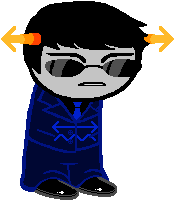
Horns: I gave him arrow horns that stick out to the side that look like those arrow headbands because I thought a serious guy like him having that sort of association would be... very funny.
Hair: Nice and simple and neat.
Face: Grumpy brows, grumpy mouth. His sunglasses are edited from Sollux’s.
Suit: I borrowed this from Dave and edited it mildly, put it in a nice deep blue, and then put his symbol across the jacket.
Shoes: They’re just meant to be sleek and clean, very simple and standard shoes all around.
This was a pretty simple design, but I think with a straightforward character like him that’s inevitable. I like him a lot! I hope some of my suggestions helped.
-CD
#persephoneanmystery#paimyn weyere#paimyn#weyere#blueblood#indigoblood#review#redesign#cd review#submission
2 notes
·
View notes
Text
Portfolio Psd Template

An impressive and informative portfolio is a must these days if you want to stand out from the crowd. Let’s be serious, we all know how important it is to present your work through a professional portfolio. No matter if it’s a photography portfolio, graphic design portfolio, fashion portfolio, resume portfolio or simply architecture portfolio, Flipsnack’s got portfolio ideas for every situation. You might say that is impossible to make a creative portfolio without design skills! This couldn’t be further from the truth. We’ve already done the design thing for you, so all you’ve got to do now is to edit whichever portfolio template you want! So easy, right?
Flipsnack offers you hundreds of free online portfolios so you can unleash your creativity and create the best portfolio ever that will definitely catch everyone’s attention! As we’ve said before, it can be any kind of portfolio, we have plenty of everything. Are you a passionate photographer and want to present your beautiful shots that you’ve captured? How about choosing an online photography portfolio from Flipsnack? Or maybe you’re an architect and you’re preparing to present your work to your next possible client. Try an architecture portfolio layout from us in order to impress! Give the world a chance to admire your outstanding work by displaying it in one of our creative graphic designer online portfolios. Are you looking for a job? What a better way to strike at the interview than creating a portfolio in this sense? Pick one of our cv portfolio templates and get that job! And from now on, we also have resume portfolio templates! What are you waiting for? Try these portfolio examples from Flipsnack now!
Flipsnack gives you the opportunity to fully customize the entire online portfolio. Pick stunning and professional images from our stock, or simply upload your own photos. Change the background colors, fonts, and graphics to fit your style with our easy to use Flipsnack editor. Create a powerful brand identity with our free online portfolio builder and inspire your audience. Once you’re pleased with the final result, download your portfolio design as PDF, JPG or PNG. And you can also share it with the entire world with just one click. It’s so nice to create stunning portfolios with Flipsnack!
Find & Download Free Graphic Resources for Portfolio Template. 4,000+ Vectors, Stock Photos & PSD files. Free for commercial use High Quality Images.
PSD Website Templates Home › All free resources › Download Photography Portfolio Template Freebie A free porfolio website template suited for pohotgraphers or for those that like to post and show photos from vacations of traveling.
Find & Download Free Graphic Resources for Portfolio Template. 4,000+ Vectors, Stock Photos & PSD files. Free for commercial use High Quality Images.
Jun 20, 2020 Palun is a personal portfolio psd template which is modern, clean, professional, creatinve and presentable. It is suitable for any personal portfolio, for web designers and developers, UI designers or any other person can show his works using this psd template. We have included a documentation file, to guide you through the psd.
Modern Portfolio PSD Theme. Templates & Themes. Portfolio PSD Theme. Templates & Themes. Architecture Icons. GerduKreatip: Agency Portfolio Theme. Templates & Themes. Cuda Single Page Portfolio Template. Templates & Themes. 200 Common People for Architecture. City of Architecture and pattern.
A portfolio is arguably the most crucial asset for any designer. Having an online portfolio should be one of your main priorities. Even though your resume is absolutely important and will be the first thing that employers will look at, your portfolio will be your secret weapon to stand out and show the complexity of the projects you have worked on. Using a template is smart! Too many designers overthink their portfolio and it creates unnecessary stress. Your portfolio is the true value of your job, so make it look fantastic with these free portfolio website design templates!
Unleash The Power of WordPress Ad
Awesome collection of 11,000+ WordPress Themes, including Bootstrap Templates & Design Assets
Business
WordPress
Blog & Magazine
WordPress
Creative Portfolio
WordPress
Ecommerce
WordPress
Landing Page
WordPress
Retail
WordPress
Kards is a modern and clean personal vCard website template. It has many cool features found in premium templates. It has timeline items, stats section, skillbars, working ajax form, frontend form validation, a portfolio section to showcase your works and many more. It looks great on all devices from mobile to desktop. It’s also retina ready so your site will look crisp and sharp on any device. Kards is the ideal template for creating digital personal resume and portfolio website.
Energy offers you severals layouts in order to present yourself and your experiences with simplicity and power thanks the one page template. This template is fully customizable and responsive design for any device.
It is a simple black and white portfolio website built with Bootstrap. It has a clean, minimal design; supports a slider with animated text effect for featured posts; and has awesome portfolio layout to showcase your works in minimal way. It is fully responsive and easy to set up. Whether you are a web developer who want to create professional portfolios or creative professional who wants to build a portfolio on its own you can be greatly benefited by this design templates.
Simple designs to showcase your photos, art, graphics, and other visual content in fully functional, lightbox-style image galleries.
Format is a creative, clean and modern, free website template that you can use for your next portfolio project. If you need a template as a designer, freelancer, agency, web studio, Format is perfect for you! It features pop up video, smooth overlay for portfolio, and animation upon scrolling.
Epitome is a beautifully crafted free resume and personal portfolio website template. It is modern, trendy and features a visually attractive design. An ideal website template for creative professionals and freelancers who want to create an online presence that would stand out from the average. Epitome has all the important elements of an effective resume personal portfolio website template: an awesome fullscreen hero banner, about and qualification section, services, portfolio, testimonial and contact section. Epitome is also mobile and retina ready. It will look great on any devices from mobile to desktop and on any screen resolutions.
Sublime is a Creative HTML5 one-page template designed for creative agencies, studios, digital design, and media agencies or other similar business. The template is a dark theme design with features like fullscreen header/hero section, responsive video lightbox, a nice portfolio section and much more. The template is primarily designed for creative agencies but it is versatile enough to be used for other purposes like a landing page for your startup or business website.
This is a modern and elegant single page HTML5 portfolio template, with a bold feel. Every single detail is carefully designed, in order to enhance user experience. It has a versatile design, which makes it the perfect choice for any kind of projects.
It comes with a very simple and minimalistic concept to make your pictures stand out. This is a clean and creative free responsive portfolio website for photographers who wish to share their incredible stories on stunning gallery style layout. Dropbox free download limit. It is fully compatible with mobile phones, desktop computers and tablets such as iPads.
Venus is a bright and dynamic landing page template for startups. This HTML template is a perfect solution to quickly present your mobile application or to start collecting early interest for an upcoming product launch.
Draco, a free PSD & HTML/CSS resume template. This is perfect for you who are building your resume online. If you’re looking to showcase your portfolio, this is a great template to consider. With its simplistic layout allows visitors to focus on the most important thing — your work. Showcasing your name, picture and bio, the author profile can be displayed on the homepage, which is perfect for telling readers more about yourself, especially if they’re new to your website.
The template is a great solution for photographers, designers and visual artists who need a simple portfolio for showcasing their own work elegantly. Nevada is build on the top of Bootstrap framework and comes with a lightbox gallery feature to make you navigate through the images at full resolution.
Alexis is clean, minimalist, simple and mobile friendly one page Bootstrap portfolio template. It’s lightweight and loads like lightning blot. Alexis is crafted with unmatched possibilities to fit with portfolio site for business firm, freelancers, artists, designers, photographers, creative professionals, and anyone looking for showcasing his high quality work. Alexis Bootstrap portfolio template is an excellent creation, can impress visitors in their first visit. Its interface is fabulous and polished, packed with sequential features which give answer each subconscious questions of potential customers and boost conversion exponentially. Best computer temperature monitor.
This free html5 portfolio template has meaningful interaction with beautiful design flow. So it will help you to impress your user with your portfolio and add more feeling to your works. The serif and sans-serif typography combination with great readability will help the user to understand the contents very well. We used google fonts so you can change these fonts easily anytime. You can customize this template very easily. The HTML, CSS and JavaScript codes are well structured and comment so you can easily modify them.
Architecture Portfolio Template Psd Free
Howdy is a modern & material design vCard / Personal Portfolio template, you can use it to show off yourself to the world in a better way. This template is fully customizable, responsive and bootstrap based. All files and code has been well organized and nicely commented for easy to customize.
MyJourney is a light, fast, responsive HTML/CSS template that can be used for both your personal and client webpage. The clean structure and minimalist design makes it a great choice for your next project. This resource has been created by Pixel Buddha exclusively for GraphicBurger.
The freebie of the day is a bootstrap template that would be a great choice for a startup landing page or any other projects you might consider. This template features a wide/boxed layout toggle and 8 color styles to chose from.
Memphis Design is often found in user interfaces. In fact, it is probably the best way to go with your next project. You could not know the name, you don’t even have to, but I’m sure you’ve seen it before — most likely in modern mobile, web or magazine designs. Discover Roxy, a stylish multi-purpose free Bootstrap template featuring an amazing animated hero section. It has a colorful style and menphis design for digital, business or agency content. The template is multipurpose, so if you like the style, you can use it to represent your art, business, an event, show your portfolio, start a blog, etc.
If you need to showcase your awesome works with elegance and professionalism, then you need to get Architect right away! Architect Free HTML5 Bootstrap Template for Architects and Portfolio Websites. The clean and minimal design along with beautiful typography, big images and smooth animation is ready to entice potential clients. Architect has sticky elements on project details, drop-down menu and off canvas on mobile. Bring your architect business to the next level with Architect!
Today we have for you a developer friendly HTML template with an organized structure that will make a great choice for a portfolio website. Personal is a grid based, ready to use template packed with animations and transitions for a smooth scrolling.
Studorlio is a template for your own personal site. You can have yours running on the cloud in exactly 10 seconds. But first, make sure you have a GitHub account. Ready, set, go!
Today we’d like to share a little decorative effect with you that we’ve encountered on Filippo Bello’s Portfolio, maybe you’ve seen it. It’s a really neat way to add some jazz to background images. The idea is to replicate boxes from a background with the same background image and make these boxes move in perspective towards the viewer. Adding a fitting shadow and some parallax makes all this look quite interesting. Furthermore, we’re employing anime.js, the easy-to-use JavaScript animation library by Julian Garnier.
Drifolio stands for Dribbble Portfolio. There are many designers around me don’t have enough time to setup and manage their own website. For them it could be a great template that needs one time setup. You just need to set your info and dribbble username, that’s all. And after that, whenever you post something on dribbble, it’ll come automatically to your website as well. There’s nothing to do there again. Exclusively crafted for the super lazy designers like me who designed thousand of websites till today but never got a chance to build one himself.
This is a free html code for portfolio layout. It has a beautiful, cool and modern design crafted with elegance in mind. This bootstrap 4 template is ready to give your portfolio website a cool, new look that will surely stand out.
Flat and responsive website template, designed and coded by Maxim Orlov.
An HTML5 minimalistic super-responsive portfolio and blog template. CSS-only hexagon hive gallery!
CVs include information on one’s academic background, including teaching experience, degrees, research, awards, publications, presentations, and other achievements. CVs are thus much longer than resumes, and include more information, particularly related to academic background. Post a link to your CV on sites where you need your personal profile page should be discovered by other users and that provide a lots of information about your professional skills and experience.
Expert is a free one page website template using bootstrap perfect for portfolio, freelancer, agency websites but you can tweak this to suit your needs. This template is responsive and it will look good in all devices. The features are smooth animation upon scrolling, lightbox for video and images, advance owl carousel sliders and many more. Built with the latest technology such as HTML5, CSS3, jQuery, Bootstrap 4 and SCSS.
Elit is an awesome looking onepage free template with a unique portfolio grid layout that is suitable for photographers, freelancers and visual editors that would like to showcase their portfolio online. It has a smooth animation upon the scrolling the page, testimonial slider and an awesome image popup using fancybox.
Create is a free one-page template for portfolio, agency, and freelancers alike of course you can use this to any type of website by tweaking it to suit your needs. The feature includes are lightbox using fancybox, modal video, smooth animation, and testimonial carousel. Build using HTML5, CSS3, jQuery and Bootstrap 4.
This minimalist website design style that the designer is trying to simplify his web interfaces and interactions by deleting unnecessary elements. Minimalism has become an overwhelming trend in current website design. And increasing number of designers have accepted this influential design style and widely used it in their designs. However, as an art of less, designing such minimalist websites does not mean to delete the elements of a website without any restriction. This is best simple, clean and intuitive style of minimalist portfolio website design template for developer and designer.
Clean and minimal design along with necessary content, navigation bar, social media icons, and other important elements make a website more efficient. Here’s another uiCookies free html5 template that is ideal for your next online business, Aside! Aside is a free HTML5 Bootstrap 4 website template perfect for all photography, restaurant, company, individual or agencies portfolios. This template makes it different from previous templates because of the site navigation places on the left side. It features owl carousel and smooth animation on images upon scrolling, mobile off-canvas menu and along with its clean and minimal design.
This is minimalistic, clean and modern template specially designed for all kinds of creators. Made with attention to details, it’s an excellent choice for the presentation of your beautiful portfolio.
Allium is a clean and minimalist porfolio website that allows your reader to focus on your content. It is a beautifully designed, intuitive and attractive, engaging and dynamic, powerful and accessible, gorgeous and flexible free portfolio website. It is specifically developed for creating all types of portfolio websites. Everything you need to build your personal portfolio you can get it through Box.
It is a simple, easy to use, modern and creative portfolio with awesome typography and layout. It is a unique website that delivers amazing imagery for your personal portfolio sites, with a standard two column grid supported by masonry , you’ll always expect a perfect design no matter which device you are on, be it your iPhone, android phone or desktop.
Starting a portfolio page is easy with this modern HTML template due to the features and flat easy going design, large header and clean design. It is responsive, cross-browser compatible. It has a welcoming header on the homepage to impress visitors at the very first sight. Its design is well thought to keep readers focus on content. It has been designed for everybody with or without previous coding experience to effectively and helps to speedily put together polished, professional quality websites without having to so much as peek at a single line of code.
Stylish Portfolio is a one page Bootstrap portfolio theme with off canvas navigation and smooth scrolling through content sections.
It provides a powerful way to showcase your work. It is built with the HTML5 and CSS3 latest technologies, but at the same time make it compatible with older browser versions.
Psd Template Brochure
Avana is a free minimal portfolio HTML template ideal for creative agencies that want to better showcase their own portfolio. The template is built on Bootstrap and takes advantage of Google Fonts and nice appearing animations on scroll. Designed and released by the creative team at Designstub.
0 notes
Last Seen Blogs
amike1055
Untitled
alicia0249
Untitled

3853-r1za
A che velocita devo camminare per dimagrire

queenooofhearts
RED
peach-salinger
𝐯𝐯𝐢𝐭𝐜𝐡𝐲