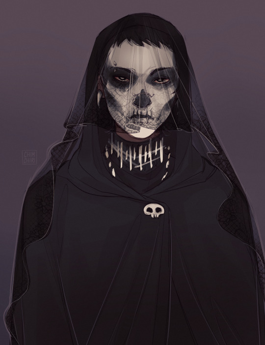
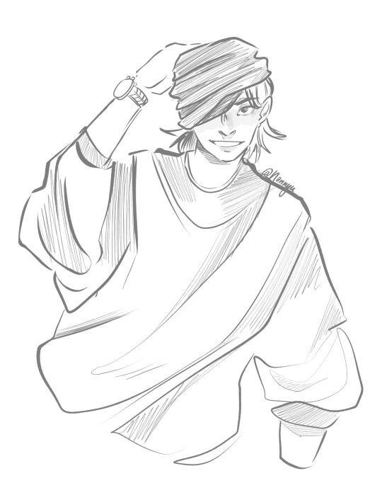
#critique my art
Text
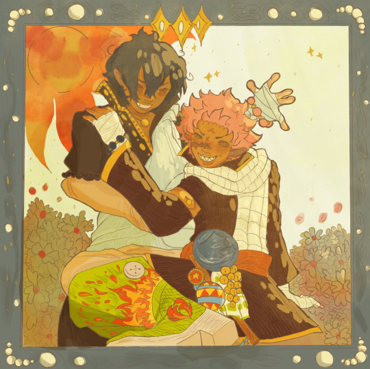
Am I crazy maybe but I’m happy
#natsu dragneel#fairy tail#fairy tail 100 years quest#fairy tail 100 yq#fairytail#dragneel brothers#fairy tail zeref#the dragneel brothers#zeref dragneel#fairytail fanart#fairy tail fanart#I lvoe dragneel brothers#erm#critique my art#I’m begging
135 notes
·
View notes
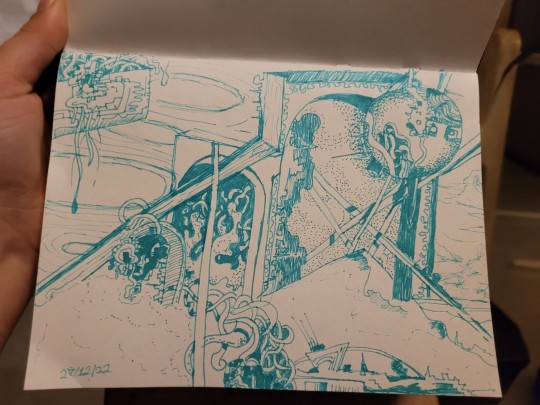
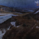
Text
@ artists! Can you critique this for me. Focusing on the background; I’m unhappy w how the it r urned out but feel at a loss for what to do to make it look “right”
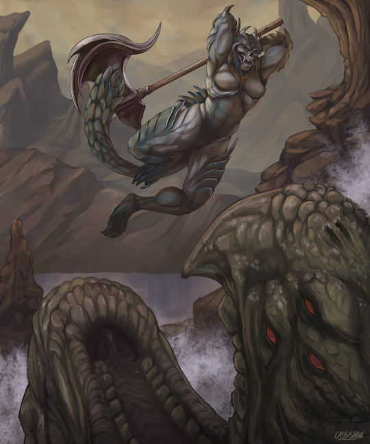
I finished it but more out o “idk wt to do” than satisfaction. I really appreciate feedback and critique n wan get better
#artist#artist help#art critique#art criticism#critique#critique my art#help me get better#art#art tumblr#artist of tumblr#digital art#digital painting#creature design#character design#fantasy#monster#illo#creature art#visdev#dark fantasy#art trade#critique me#art critic#hello! project#hello tumblr#outreach#art goals
9 notes
·
View notes
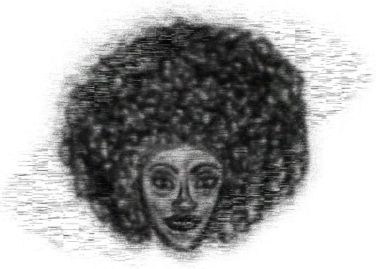
Text
Lately, I've been trying out a new approach to drawing...
I love the process, and the results are well... interesting. I'd love any feedback!
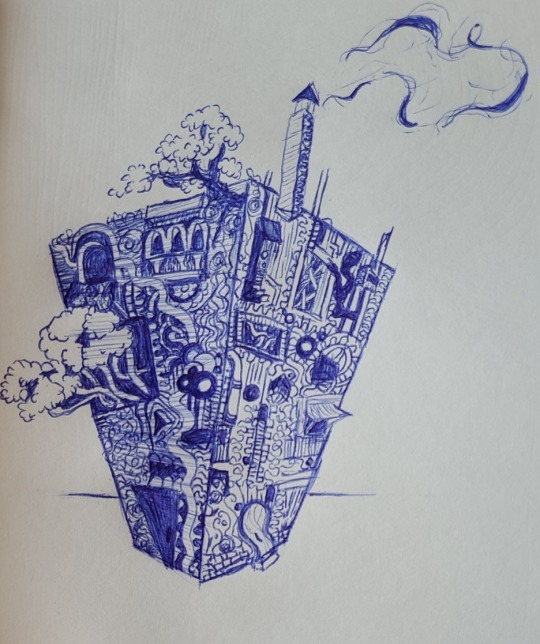
3 notes
·
View notes
Text
Every once in a while I have another go at this art, tweaking this or that. The previous version was really intensely pink and I didn't like that. So I spent a couple hours today making it orange instead. Still not really satisfied. The sky looks great but the sky is also so close to a skin tone that it's kinda jarring when it gets applied to two characters who have naturally medium-dark skin. Maybe I just need to commit more fully to a darker, browner value for them and let go of the high-contrast, black-and-white values I've got going right now.
*sigh*
One day, everything will be right. And in the mean time, if you have suggestions on how to improve my color scheme I would greatly appreciate it.
#cover art#digital art#artblr#art critique#critique my art#psd coloring#color scheme#color palette#help
2 notes
·
View notes
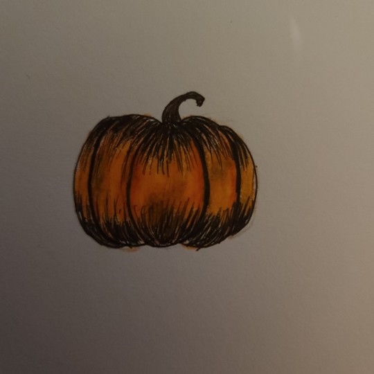
Text
Just a pumpkin today 😘🎃
2 notes
·
View notes
Text

for anyone that doesn't know, i recently started school again! (that's why ive been so mia) so ill be posting class projects whenever i finish them,,, this was a figure drawing assignment :)
you can get a print of this here!
#along with moving and starting school again‚ i had a bunch of family and health stuff thrown my way at the start of this semester‚‚#so im slowly catching up on work from this past month hsbdhdjf#my art#artists on tumblr#art#illustration#uhh i think that's all my original art tags#im really happy with how this piece turned out!!! :D#during critique someone mentioned how this felt like a representation of creative burnout and i was like omg. felt.
14K notes
·
View notes
Text
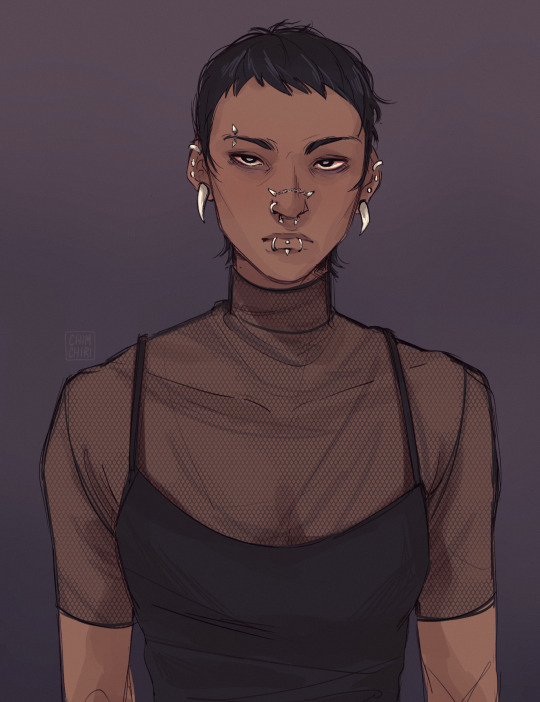
Took a break from the requests to draw Harrow with piercings. I came across this amazing setup on the piercing subreddit and fell in love with the small nose chain <3
Initially it was supposed to be a small doodle but then I couldn't stop and now it's.. two colored pieces...
I'm still kinda figuring out how to draw her but slowly getting there.
#this art looks way more 'professional' than all my other stuff ?#today was a good art day but ? Maybe I'm just not used to this kind of artstyle and that's why it's throwing me off#most of the other doodles and art are way more comic-like I feel#ok enough self-critique#my art#tlt#harrowhark nonagesimus
2K notes
·
View notes
Photo
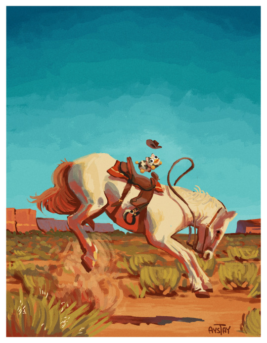
Mark Maggiori western painting study, as a warm-up
#no i do not accept critique#peepy#item label#peepy itemlabel#itemlabel#cowpy#mark maggiori#mark maggiori study#maggiori study#western painting#western#painting study#study#horse#cowpy itemlabel#bronco#my art
13K notes
·
View notes
Text
i now understand how certain people felt when harpy eda was revealed 😳
prints here
#toh#the owl house#toh fanart#lilith clawthorne#hooty#toh finale#watching and dreaming#captioned#WOW. WOOO OW. GOODNESS. MA'AM. QPR PLEASE??? PLEASE??? WOW#i both literally am her and i want to kiss her. Wow!#she is the ideal woman. her particularly early 20th century fashion sense. she's a big nerd. she appreciates history. she's aroace. she's a#bird lady who can fly. she has curly hair. Oh Jeez It Does Not Get Better Than That#sorry anyway i cant believe i won twice in a row with ladies (queen and lilith) who are specifically tailored to me and no one else /j#digital art#illustration#a small victory against my art block even though this took like 4 or 5 days to chip through. but i did it#there are some parts i feel a little clueless about so#critiques welcome#lilith please pick me up and fly my gay ass off into the sunset please im beg
8K notes
·
View notes
Photo
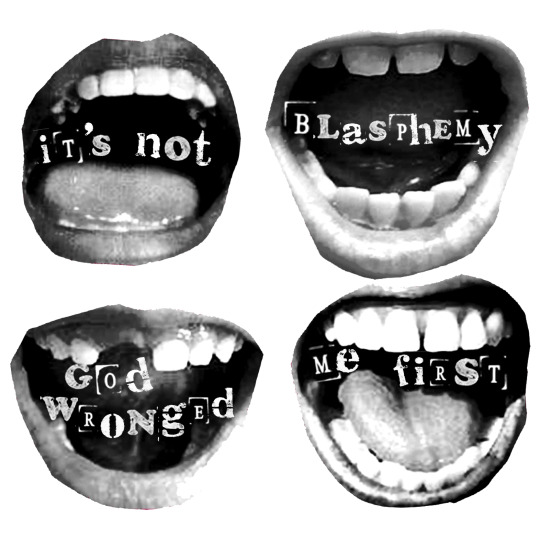

IDs: A black and white graphic of four open mouths with the words “It’s not blasphemy God wronged me first.” The second image is the same graphic inverted. ED.
#cw christianity#sort of#my art#trans artist#queer artist#autistic artist#disabled artist#um#anyway my take on blasphemy is that God is a relative concept and also#I take a gnostic standpoint that holiness is something inherent to all aspects of life#so it's actually impossible to blaspheme God. bc that's you.#but also critiquing God and the concept of God feels impt to me! woo
8K notes
·
View notes
Text


Jk jk jjk
#doomdle prompts from my ig lol#the last one isn't chosoyuki please dont tag it as such i was using it to critique the ship as it stands#or do ig idk whatever just know thats the intent#jjk#jujutsu kaisen#itadori yuuji#fushiguro megumi#itafushi#gojo satoru#nanako and mimiko#hasaba nanako#hasaba mimiko#ieiri shoko#kirara hoshi#fushiguro tsumiki#takuma ino#tsukumo yuki#choso#jjk fanart#jujutsu kaisen fanart#doodles#i found a new pen i wanted to use thats all lol#not been feeling super creative lately so yeah#niinnyu arts
483 notes
·
View notes
Text

Wip of a Danny/Ember fusion design.
#danny phantom#my art#character design#wip#If anyone’s got any constructive critiques lemme know bc it doesn’t feel finished yet#I don’t think the face shape and the silhouette are unique enough?#obsessed with the tatts tho#their name is Ashby#or Ashton?
2K notes
·
View notes
Text

Congratulations GemPearl for winning the trafficblr shipping poll!
this is compensation for missing the vote entirely please forgive
year of yuri off to a roar of a start!
#trafficshipping#traffic shipping#hermitshipping#gempearl#pearlgem#life series#geminitay#pearlescentmoon#shiny duo#my art#artists on tumblr#propaganda post#i swear tumblr dunked this in hot oil i promise it didnt look this jpeg-y when i uploaded it#idk what the protocol is for ship tags &whether or not to main tag this. i'll just do it &if 1 person complains I'll remove them#also added alt text. first time doing it. i followed a tutorial but im open to critique & if 1 person complains i'll change it
771 notes
·
View notes
Text
Everytime I draw realistic faces, they end up with non white features and I honestly think its because I love the proportions on non white people.
I honestly don't like anything about this but its probably the best thing I've drawn so far without tracing or using a tutorial and I was sorta proud of it but the more I see it, the more I dislike things about it. The glitch was added bc I was trying to hide things but really I think it only accentuated the flaws. It probably also doesn't help that there's no neck, but those are impossible for me so I didn't even attempt lmao
I'll redraw it eventually...maybe then it'll be better
In all seriousness this is the best freehand realistic-ish face I've ever drawn
Pls feel free to give me 110% honest critique here, if I didn't mention something here or in the tags that you see and wanna point out so I can work on it in the future 😁
#my art#i tried and i failed#i liked the lips and hair#i also put the illusion of teeth in but the glitchy effect took that away oops#the glitchy effect was because i hate the composition with all of my being and wished to hide every flaw#i failed bc the right cheek/jaw turned out awful AND visible#also what are the eyebrows doing pls help#and the nose is a mess i hate drawing noses#and then theres the fact that eyes are always nightmare fuel#and honestly i think the lips are out of proportion with everything else#and i had a hard time finding a stopping point with the hair#maybe i should just delete this from every inch of existence#critique my art#pls#judge me so hard so i can get better#im begging you#oh well ill redraw this one day
0 notes
Text

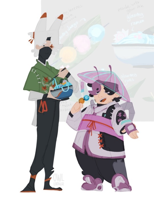

Joel!! (to be read in the way Iskall says it)
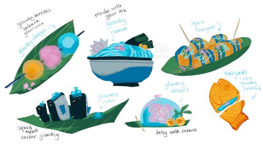
My idea that in Joel’s cyberpunk town food is made out of local ingredients that he farms: glowsquid, glowberries, and sakura ofc! (does he have honey as well?)
Oh, and those things on his back? They are some high tech stuff that allows you to model light after anything, so it can be basically used for carrying berries, or transform into an elytra!
#joel smallishbeans#hermitcraft joel#hermitcraft fanart#hermitcraft season 10#hermittblr#mcyt fanart#mcytblr#my art#digital art#artists on tumblr#digital illustration#character design#cyberpunk aesthetic#and eefo#I find it hard to nail Joel’s design#bug coded#I’m open to critique and helpful suggestions
285 notes
·
View notes
Last Seen Blogs
romeobutathletic
romeo jackson
eternalsimp
Work In Progress
rexoeatscake
REXO
vivaciousvalves
*~Horny~*
saltcherry
it's dark in here