#color harmony
Text
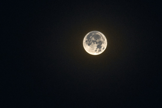
Fly me to the moon
22 notes
·
View notes
Text
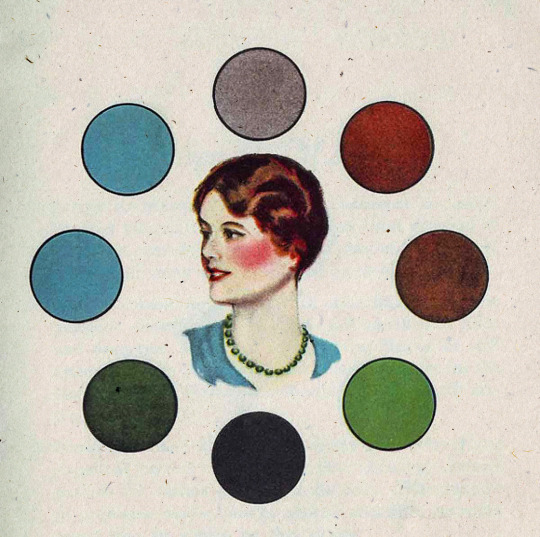
1930s era color harmony chart - Chart C.
#vintage illustration#color#color harmony#the 30s#color palettes#color schemes#infographics#interaction of color#color charts
25 notes
·
View notes
Text

Today's gonna be an old art work post. While I was home for the holidays I cam across more old art work from my time at Mississippi State. I'm still really happy with how this turned out.
Don't forget to like and follow for more art! ✨
3 notes
·
View notes
Text
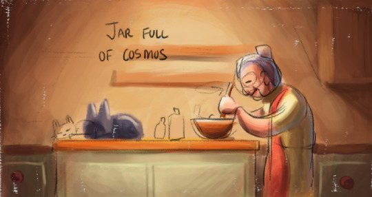
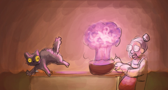
An attempt at a color script
I was kind of dreading this at first, but after gathering references it didn't feel so bad. It's interesting how different the results feel than what I had imagined. I'll have to think about if I want to change the lighting to make this a bit... lighter? Anyway, I tried to capture important moments in the short where the lighting and color might be unique. I should be able to use this as a map/guide to lighting my scenes. Onto modeling!


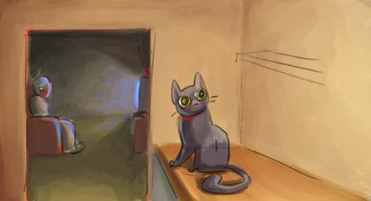
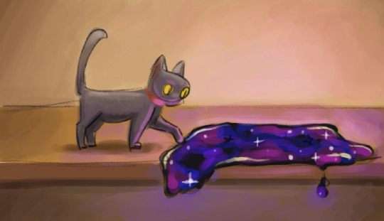
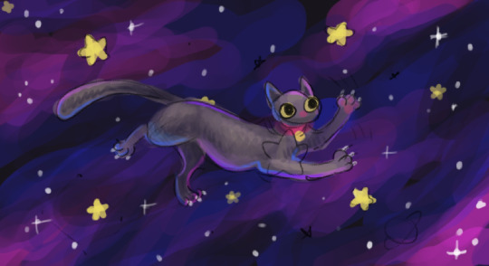
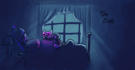
And of course, here are my reference images. I think they look pretty :]
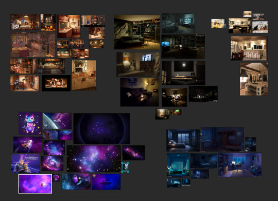
#Color Script#Jar Full Of Cosmos#Digital Art#Color Palette#Visual Storytelling#Color Design#Fantasy Colors#Witchy Vibes#Cosmic Hues#Artistic Process#Tumblr Art#Creative Journey#Color Scheme#Magical Tones#Concept Art#Colorful Narrative#Character Design#Fantasy World#Color Harmony#Storyboard Art#Blender Art#Artistic Vision#Creative Direction#Tumblr Creativity#Color Exploration#Illustration Process#Cosmic Palette#Color Composition#Visual Development#digital art
4 notes
·
View notes
Text
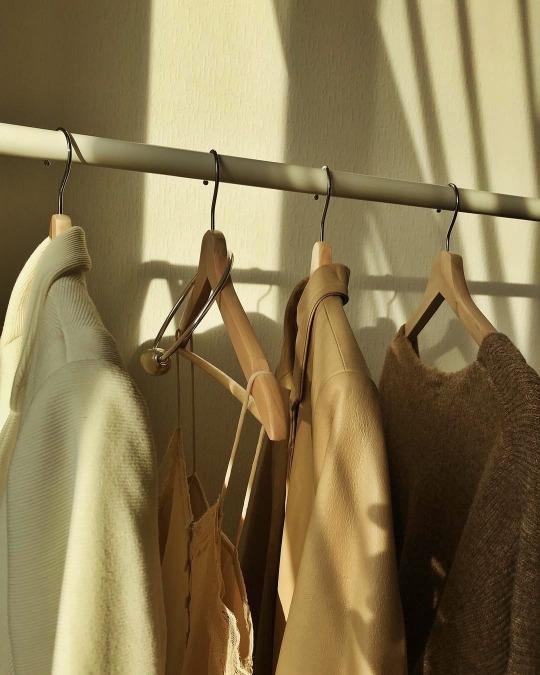
thebeiges:
Instagram: @solncevgolove
More posts like this here ♥
https://trashicorn.tumblr.com/post/641095803475247104/thebeiges-instagram-solncevgolove-more
Sent from Pixm! A Photo Viewer and Universal Tool for Discovering Beautiful Pictures. https://appsto.re/us/pWte2.i
#brown moodboard#brown sugar#brown aesthetic#brown color#color palette#color harmony#brown street style#brown outfit#brown#color coordinated#color scheme#earthy tones#brown dress#brown sweater#brown coat#brown jacket#corduroyjacket#brown leather#jacket#beige#leather jacket#beige tones#knitted sweater#hand knitted#sweater#silk blouse#silk shirt#satin and lace#closet#coat hangers
2 notes
·
View notes
Text
#marco bucci#painting#artists#art#art tips#art tutorial#art help#art resources#art reference#art resource#art video#how to paint#color theory#color harmony#character design
3 notes
·
View notes
Text
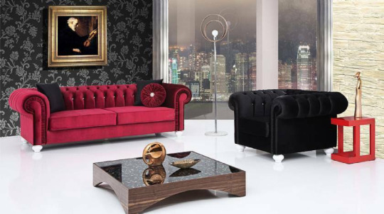
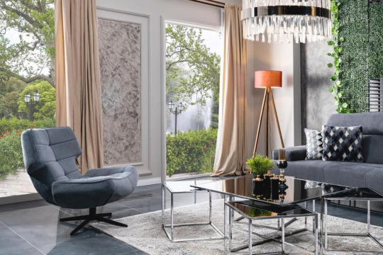
Color Psychology in Home Decor: Harnessing the Power of Color
Color plays a crucial role in home decor, influencing mood, perception, and atmosphere. Understanding the psychology behind color can help you create spaces that evoke the desired emotions and energies. Here's how to harness the power of color in your home decor:
1. Calming Blues: Shades of blue, such as soft sky blue or tranquil navy, evoke feelings of calmness and serenity. Incorporate blue hues into bedrooms and relaxation areas to promote restful sleep and relaxation.
2. Energizing Yellows: Yellow is associated with happiness, optimism, and energy. Use shades of yellow, from sunny lemon to golden ochre, in spaces where you want to create a lively and uplifting atmosphere, such as kitchens and dining areas.
3. Soothing Greens: Green symbolizes nature, growth, and renewal, making it ideal for creating harmonious and balanced environments. Bring the outdoors in with shades of green in living rooms, home offices, and meditation spaces to foster a sense of tranquility and connection to nature.
4. Passionate Reds: Red is a bold and passionate color that stimulates the senses and increases energy levels. Incorporate shades of red, from deep burgundy to vibrant scarlet, in spaces where you want to create a sense of excitement and intimacy, such as dining rooms and entertainment areas.

5. Grounding Neutrals: Neutrals like beige, taupe, and gray provide a timeless and versatile backdrop for any decor style. Use neutral tones as a base and layer with pops of color to add visual interest and depth to your space.
6. Serene Whites: White is associated with purity, simplicity, and cleanliness, making it a popular choice for minimalist and modern interiors. Use white as the dominant color in small spaces to create an illusion of openness and lightness.
7. Sophisticated Blacks: Black adds drama, elegance, and sophistication to any space. Use black accents, such as furniture, accessories, or accent walls, to create contrast and visual impact in contemporary and chic interiors.
8. Balancing Earth Tones: Earthy hues like terracotta, rust, and olive bring warmth and grounding to interiors inspired by nature. Incorporate earth tones in decor elements such as textiles, artwork, and accessories to create a cozy and inviting atmosphere.
9. Playful Pastels: Pastel colors, such as soft pink, mint green, and lavender, add a whimsical and playful touch to any room. Use pastel hues in children's rooms, nurseries, or creative spaces to evoke a sense of innocence and imagination.
10. Personal Expression: Ultimately, the best color scheme for your home is one that reflects your personal style, preferences, and personality. Experiment with different colors, textures, and patterns to create a space that feels uniquely yours.
By understanding the psychology of color, you can use color effectively in your home decor to create spaces that not only look beautiful but also evoke the desired feelings and emotions.
Discover a world of color possibilities for your home decor at xlfurniture.co.uk . Explore a wide range of furniture, textiles, and accessories in every shade of the rainbow.
#Color Psychology#Interior Decoration#Color in Interiors#Stylish Colors#Atmosphere Creation#Color Harmony#Inspiring Hues#Emotions and Colors#Color Schemes#Personal Style
0 notes
Text
Color Psychology in Home Decor: Harnessing the Power of Color
Color plays a crucial role in home decor, influencing mood, perception, and atmosphere. Understanding the psychology behind color can help you create spaces that evoke the desired emotions and energies. Here's how to harness the power of color in your home decor:

1. Calming Blues: Shades of blue, such as soft sky blue or tranquil navy, evoke feelings of calmness and serenity. Incorporate blue hues into bedrooms and relaxation areas to promote restful sleep and relaxation.
2. Energizing Yellows: Yellow is associated with happiness, optimism, and energy. Use shades of yellow, from sunny lemon to golden ochre, in spaces where you want to create a lively and uplifting atmosphere, such as kitchens and dining areas.
3. Soothing Greens: Green symbolizes nature, growth, and renewal, making it ideal for creating harmonious and balanced environments. Bring the outdoors in with shades of green in living rooms, home offices, and meditation spaces to foster a sense of tranquility and connection to nature.
4. Passionate Reds: Red is a bold and passionate color that stimulates the senses and increases energy levels. Incorporate shades of red, from deep burgundy to vibrant scarlet, in spaces where you want to create a sense of excitement and intimacy, such as dining rooms and entertainment areas.
5. Grounding Neutrals: Neutrals like beige, taupe, and gray provide a timeless and versatile backdrop for any decor style. Use neutral tones as a base and layer with pops of color to add visual interest and depth to your space.
6. Serene Whites: White is associated with purity, simplicity, and cleanliness, making it a popular choice for minimalist and modern interiors. Use white as the dominant color in small spaces to create an illusion of openness and lightness.
7. Sophisticated Blacks: Black adds drama, elegance, and sophistication to any space. Use black accents, such as furniture, accessories, or accent walls, to create contrast and visual impact in contemporary and chic interiors.
8. Balancing Earth Tones: Earthy hues like terracotta, rust, and olive bring warmth and grounding to interiors inspired by nature. Incorporate earth tones in decor elements such as textiles, artwork, and accessories to create a cozy and inviting atmosphere.
9. Playful Pastels: Pastel colors, such as soft pink, mint green, and lavender, add a whimsical and playful touch to any room. Use pastel hues in children's rooms, nurseries, or creative spaces to evoke a sense of innocence and imagination.
10. Personal Expression: Ultimately, the best color scheme for your home is one that reflects your personal style, preferences, and personality. Experiment with different colors, textures, and patterns to create a space that feels uniquely yours.

By understanding the psychology of color, you can use color effectively in your home decor to create spaces that not only look beautiful but also evoke the desired feelings and emotions.
Discover a world of color possibilities for your home decor at home24.ae. Explore a wide range of furniture, textiles, and accessories in every shade of the rainbow.
#Color Psychology#Interior Decoration#Color in Interiors#Stylish Colors#Atmosphere Creation#Color Harmony#Inspiring Hues#Emotions and Colors#Color Schemes#Personal Style
0 notes
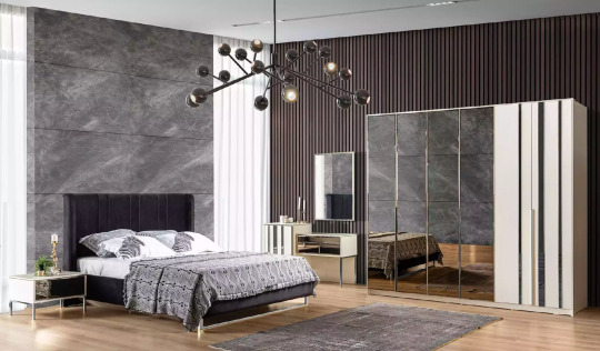
Text
Using Beautiful Blue Color Palettes in Modern Interior Design

View On WordPress
#accent colors#backyard#balcony#bathroom#bedroom#biophilic interiors#blue color palettes#bold wallpaper designs#color harmony#color psychology#cozy luxury#design textures#home decor ideas#home decoration#interior design#interior design catalog#interior design trends#living room#maximalist decor#modern aesthetics#modern interior design#natural elements in design#nature-inspired spaces#room color schemes#sustainable design#sweet home usa interior decoration#textured walls#timeless interiors#wavy wood furniture
0 notes
Text
Color Contrast and Harmony in Photography
This week, Julie, our Photography blogger, shares some of her contrast photos that she took for her Color Photography class. She also talks about the “Color Struck” exhibit which opens in Marywood's Kresge Gallery on February 11th! Check it out!

View On WordPress
#analogous color scheme#Art#art 318a#blue and yellow#color contrast#color harmony#Color photography#color wheel#complementary color scheme#Marywood Art#Marywood Art Department#marywood photo#Marywood photography department#Marywood University#Marywood University Art Department#photo classes#photo exhibition#photographer#Photography#photography project#shoes#split complementary scheme#tetradic color scheme#triad color scheme#Where Creativity Works
0 notes
Text

Elevate Your Style with Opal Rings
Selecting the right opal ring involves more than aesthetics:
Color Harmony: Match the opal's colors with your wardrobe palette.
Setting Selection: Consider a minimalist setting to let the opal shine.
Occasion Adaptability: Opal rings effortlessly transition from casual to formal events.
0 notes
Text
#geometric art#abstract design#pink and mauve#orange and yellow#navy blue#modern aesthetic#vibrant colors#home decor#office decor#wall art#contemporary art#sunset hues#color harmony#geometric shapes#intricate patterns
0 notes
Text

1930s era color harmony chart - Chart A.
#vintage illustration#color#color harmony#the 30s#color palettes#color schemes#infographics#interaction of color#color charts
11 notes
·
View notes
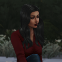
Text


Before & After.
Recent image from an editorial campaign.
#photo editing#editorial#portrait photography#portrait#nikonphotography#colour harmony#color harmony#red and green#red#green#female model#model
1 note
·
View note
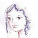
Text
Another drawing :)
#digital art#digital painting#disney animation#drawing#digital drawing#artwork#illustration#characterillustration#characterdesign#procreate#warm colors#color harmony
0 notes
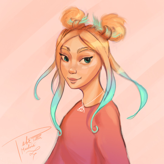
Text
I did some concept art on my oc and I am definitely going for warm colors on this and also testing the color harmony hack I saw somewhere.
Idk what to name her tho I can like give them a simple name but like I also want the name to have a meaning for the character. It suppose to have something to do with their personality or her story.

#oc tag#oc stuff#my oc art#concept art#my ocs my beloved#oc artwork#original character#color harmony#oc art#my ocs#art
1 note
·
View note
Last Seen Blogs
artsynaturopath
Of Doodles and Figure Studies

kb-engineering-blog
KB Engineering

htdmason
HTDmasons ARTdump
solitasims4
SOLITA SIMS

parental-unit-of-chaos
Autistic Crow Does Things!