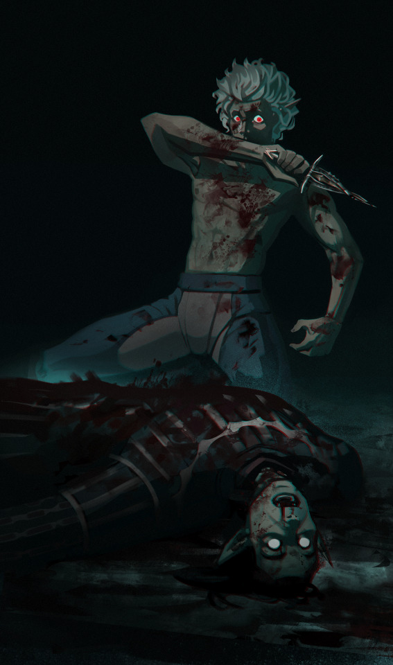
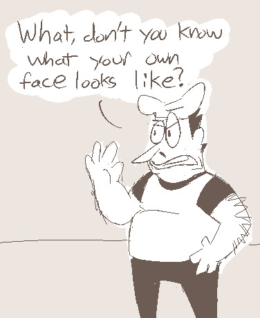
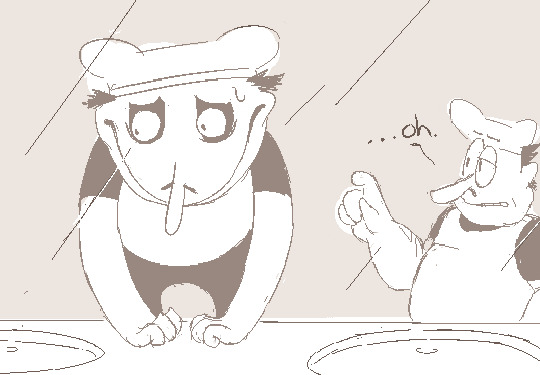
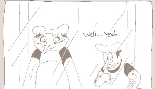
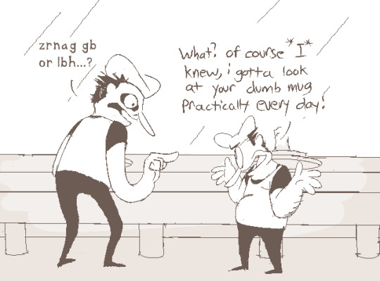
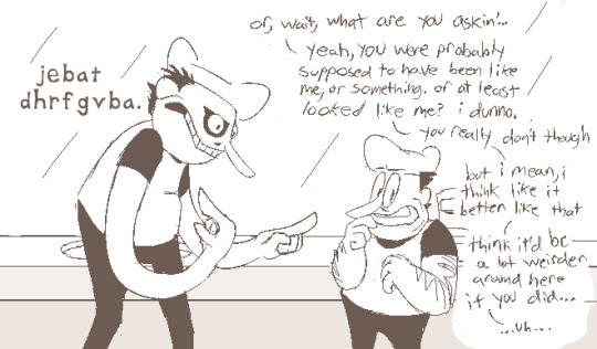
#but he seems to be like the rest
Text
It's not very helpful going to therapists and hearing repeatedly "that's a lot for just you to be dealing with" and "oh, you're getting that [mess] from all sides" with no follow-up advice or anything.
Like, I appreciated it in the beginning but guys, I KNOW I'm in a mess, I know it's a lot for me to deal with alone (that's why i'm HERE), I know I'm stuck with a fuckload of people I'd be better of away from! I need your help dealing with living with it all anyway.
It's like they're reading from a script and I've overloaded their servers and just keep getting the same pre-coded response. It's so frustrating.
#trauma recovery#abuse recovery#punkstyle#I'm just#ive got a new one rn#bc my last one got promoted#and hes nice#but hes also very....#whats the word#hes not very helpful is what im trying to say#hes kind#but he seems to be like the rest#and just thinks#welp this person has way too much shit#guess im just gonna...listen? and hope it eventually ends#he told me he doesn't really think i can heal until i get out of this house#and im like fhdsaofhsdjalfa#BUT I CANT LEAVE MOTHERFUCER#so like#im just frustrated#ok to reblog or comment or whatever#i'd appreciate any advice if anyone has it T_T
27 notes
·
View notes
Text
Fenton Coded
Tim... Tim just stared.
He...
Huh.
He had once entertained the idea that he wasn't really a Drake, a very long time ago when he overheard his mom and dad arguing and some words were said in the heat of the moment, but to be honest Tim always thought the obvious culprit of anyone being his dad would most likely be Bruce (Bruce even admitted he had a small fling with his mother but that was two years before her marriage)
But before little Tim's curiosity could really take hold on the idea, he had saw on the news Robin performing a Grayson flip and the hint of Tim not being a Drake left his mind. Robin was Dick Grayson! And if he was Robin that had to mean Bruce Wayne was Batman!
Then well... his stalking of the Bats started and the rest became history.
But now, as Tim was staring at his own DNA test, something he never bothered to do until that damned Demon brat wanted to make sure he was ONLY blood son of Bruce (and doing a DNA test something even Bruce never thought of doing due to well… how he was towards Tim during his first months as Robin)
He well…
He kinda needs to find out who this Daniel Jackson Fenton is.
(Tim finds out he isn’t a Drake, but also not a Wayne (because Damian wanted to make sure he was only blood son) but is instead a Fenton)
#danny phantom#danny fenton#crossover#dp x dc#blue rambles#danny phantom dc#writing ideas#random idea#dpxdc#Tim drake#this time Danny is Tim’s bio dad!#he meet Janet when exploring a ‘dead’ city#coughhewasspookingpeopleawaysotheydontdisturbthedeadcough#only Janet seemed to take things in stride and not run off like everyone else did#she caught him eventually and they got to talking#and maybe some ghost booze as well#she did leave the next morning when she realized she slept with Danny#then bam a couple months later Tim was born#Danny doesn’t know#he does favors for the dead when they want people OUT of their resting places#but don’t have enough strength to do so#he basically gets commissioned to do it#Tim finds out his insane luck and need to tinker with tech is a Fenton gene#and liking people who can kick butt#he kinda wants to meet his dad#but is hesitant#Danny when he finds out about Tim being his son goes full Jack Fenton hug
874 notes
·
View notes
Text

"Do the Evolution" - Pearl Jam
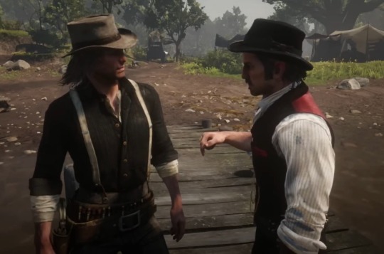
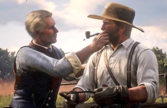
#ranna word dumping#this specific lyric of the song reminded me soooo much of dutch/john and hosea/arthur#obviously john is very different from dutch but i think there is a reason why he was considered to be dutch's favourite son#john seems closer to dutch in a similar way arthur is with hosea but in a different manner i think. there is obviously a tension present#dutch is observant but only when he wants to be (otherwise i think he would have kicked micah out of the gang a long time ago)#john is just observant. he saw first-hand what happened in blackwater and is sus of dutch throughout the rest of the game#he isnt as dumb or slow as he calls himself#i read a meta about it and it explains it 1000x better than i can#as for hosea/arthur the parallels are already obvious enough#also i am quite a fan of pearl jam so teehee i had to make the selfish parallel#might make more like this idk#rdr#rdr2#red dead redemption#red dead redemption 2#arthur morgan#rdr2 arthur morgan#dutch van der linde#rdr2 dutch van der linde#john marston#rdr2 john marston#hosea matthews#rdr2 hosea matthews#outlaws for life#pearl jam
588 notes
·
View notes
Text
Focus wallace 👁️


#welcome home#wally darling#clownillustrations#welcome home puppet show#my art#fanart#digital art#puppeteer wally#human wally darling#sketch#little comic#another one!#for fun#I love Sylvia#had fun coloring it#does the lighting make sense?#no.#but#I like it#hmm he seems to be spacing out a lot?#I think he needs to rest.
533 notes
·
View notes
Text
I also like the idea of Bakugo coming home from a long, overseas mission only for you to be surprised when you meet him at the airport cuz he’s twice as beefy and four times more scary looking.
#Bakugo#UGH IM IN A CAR so I can’t write this f*ck#but meeting him at the airport and being shocked he’s HUGE and a little bit shy abt it#and you take him home and are all quiet bc u think he wants to rest#meanwhile he’s all confused bc you didn’t seem so excited to see him? only gave him one measly kiss????#and knows he gained weight and is kinda… nervous u hate it#and when you get home you’re kinda creeping around him#and he just bursts out to ask if you’re not attracted to him anymore or found someone new#and all you can do is like whisper#‘I am so attracted to you right now I feel like I could d*e’#‘and I didn’t want to bother u after a long flight of other how wet my p*nties are’#and then u f*ck like animals for a whole week#gen#shii posts
2K notes
·
View notes
Photo
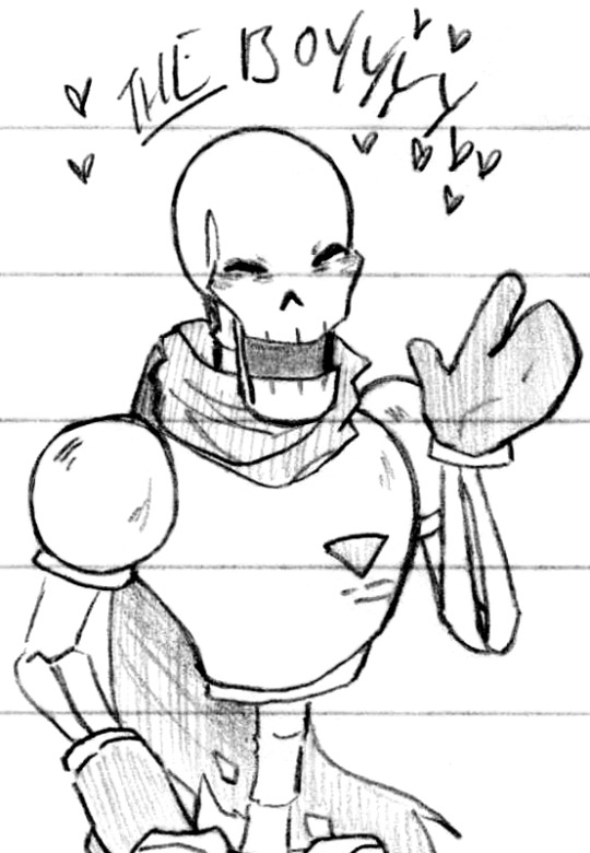

Those wacky skeletons ♥ (Patreon)
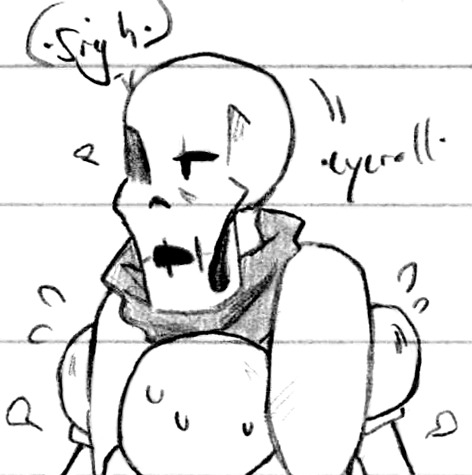
#Doodles#UT#Sans#Papyrus#Handplates#You can tell because of Sans' gloves lol#Getting-used-to-them-again doodles as well as just expressing Feeling <3 Happy towards them! Want them to be happy too!#It might seem silly for these - how many sets in now? - to still be getting used to drawing them again lol but it's because they're adults!#Their clothes and the way they hold themselves - but also especially Sans lol I dunno why I have such difficulty with him at times#He's got a cute face and I still find myself like ????how your face#Other than that tho it's just silliness hehe ♪ My favourite lads :D#I feel the need to make the distinction: I do actually have different favourites based on the AU lol#Like for example in classic I still love Flowey just a tiiiiiny bit more than Papyrus but it really is constantly neck and neck#Whereas in Handplates it's no competition even a little bit lol - Papyrus is just my Very Favourite#But Gaster is my favourite Handplates-specific character since he's unique to the AU! It gets a bit in the weeds lol#Sans isn't far behind at all of course the trio are very important! The duo even moreso imo#Going back to gloves tho I did carry over one of my quirks from my original UT doodles about Papyrus' gloves lol#I initially envisioned them as combination mitten-gloves with a free index finger and all the rest together#I still rather like the design! But it is admittedly not Handplates accurate lol#The occasional dip into self-indulgence who me? Lol#Sleeping on each other is important to me as well!! It is such a favourite hehe#Honestly I just imagined Papyrus getting so exhausted that he fell asleep in the snow lol poor lad#Sans teleported in but it's also funny to imagine him just walking up like ''you good? yeah he's fine'' *flop* haha#Silly lads <3 Do love 'em ♪
544 notes
·
View notes
Text
why Aurora's art is genius
It's break for me, and I've been meaning to sit down and read the Aurora webcomic (https://comicaurora.com/, @comicaurora on Tumblr) for quite a bit. So I did that over the last few days.
And… y'know. I can't actually say "I should've read this earlier," because otherwise I would've been up at 2:30-3am when I had responsibilities in the morning and I couldn't have properly enjoyed it, but. Holy shit guys THIS COMIC.
I intended to just do a generalized "hello this is all the things I love about this story," and I wrote a paragraph or two about art style. …and then another. And another. And I realized I needed to actually reference things so I would stop being too vague. I was reading the comic on my tablet or phone, because I wanted to stay curled up in my chair, but I type at a big monitor and so I saw more details… aaaaaand it turned into its own giant-ass post.
SO. Enjoy a few thousand words of me nerding out about this insanely cool art style and how fucking gorgeous this comic is? (There are screenshots, I promise it isn't just a wall of text.) In my defense, I just spent two semesters in graphic design classes focusing on the Adobe Suite, so… I get to be a nerd about pretty things…???
All positive feedback btw! No downers here. <3
---
I cannot emphasize enough how much I love the beautiful, simple stylistic method of drawing characters and figures. It is absolutely stunning and effortless and utterly graceful—it is so hard to capture the sheer beauty and fluidity of the human form in such a fashion. Even a simple outline of a character feels dynamic! It's gorgeous!
Though I do have a love-hate relationship with this, because my artistic side looks at that lovely simplicity, goes "I CAN DO THAT!" and then I sit down and go to the paper and realize that no, in fact, I cannot do that yet, because that simplicity is born of a hell of a lot of practice and understanding of bodies and actually is really hard to do. It's a very developed style that only looks simple because the artist knows what they're doing. The human body is hard to pull off, and this comic does so beautifully and makes it look effortless.
Also: line weight line weight line weight. It's especially important in simplified shapes and figures like this, and hoo boy is it used excellently. It's especially apparent the newer the pages get—I love watching that improvement over time—but with simpler figures and lines, you get nice light lines to emphasize both smaller details, like in the draping of clothing and the curls of hair—which, hello, yes—and thicker lines to emphasize bigger and more important details and silhouettes. It's the sort of thing that's essential to most illustrations, but I wanted to make a note of it because it's so vital to this art style.
THE USE OF LAYER BLENDING MODES OH MY GODS. (...uhhh, apologies to the people who don't know what that means, it's a digital art program thing? This article explains it for beginners.)
Bear with me, I just finished my second Photoshop course, I spent months and months working on projects with this shit so I see the genius use of Screen and/or its siblings (of which there are many—if I say "Screen" here, assume I mean the entire umbrella of Screen blending modes and possibly Overlay) and go nuts, but seriously it's so clever and also fucking gorgeous:
Firstly: the use of screened-on sound effect words over an action? A "CRACK" written over a branch and then put on Screen in glowy green so that it's subtle enough that it doesn't disrupt the visual flow, but still sticks out enough to make itself heard? Little "scritches" that are transparent where they're laid on without outlines to emphasize the sound without disrupting the underlying image? FUCK YES. I haven't seen this done literally anywhere else—granted, I haven't read a massive amount of comics, but I've read enough—and it is so clever and I adore it. Examples:


Secondly: The beautiful lighting effects. The curling leaves, all the magic, the various glowing eyes, the fog, the way it's all so vividly colored but doesn't burn your eyeballs out—a balance that's way harder to achieve than you'd think—and the soft glows around them, eeeee it's so pretty so pretty SO PRETTY. Not sure if some of these are Outer/Inner Glow/Shadow layer effects or if it's entirely hand-drawn, but major kudos either way; I can see the beautiful use of blending modes and I SALUTE YOUR GENIUS.
I keep looking at some of this stuff and go "is that a layer effect or is it done by hand?" Because you can make some similar things with the Satin layer effect in Photoshop (I don't know if other programs have this? I'm gonna have to find out since I won't have access to PS for much longer ;-;) that resembles some of the swirly inner bits on some of the lit effects, but I'm not sure if it is that or not. Or you could mask over textures? There's... many ways to do it.
If done by hand: oh my gods the patience, how. If done with layer effects: really clever work that knows how to stop said effects from looking wonky, because ugh those things get temperamental. If done with a layer of texture that's been masked over: very, very good masking work. No matter the method, pretty shimmers and swirly bits inside the bigger pretty swirls!
Next: The way color contrast is used! I will never be over the glowy green-on-black Primordial Life vibes when Alinua gets dropped into that… unconscious space?? with Life, for example, and the sharp contrast of vines and crack and branches and leaves against pitch black is just visually stunning. The way the roots sink into the ground and the three-dimensional sensation of it is particularly badass here:

Friggin. How does this imply depth like that. HOW. IT'S SO FREAKING COOL.
A huge point here is also color language and use! Everybody has their own particular shade, generally matching their eyes, magic, and personality, and I adore how this is used to make it clear who's talking or who's doing an action. That was especially apparent to me with Dainix and Falst in the caves—their colors are both fairly warm, but quite distinct, and I love how this clarifies who's doing what in panels with a lot of action from both of them. There is a particular bit that stuck out to me, so I dug up the panels (see this page and the following one https://comicaurora.com/aurora/1-20-30/):

(Gods it looks even prettier now that I put it against a plain background. Also, appreciation to Falst for managing a bridal-carry midair, damn.)
The way that their colors MERGE here! And the immense attention to detail in doing so—Dainix is higher up than Falst is in the first panel, so Dainix's orange fades into Falst's orange at the base. The next panel has gold up top and orange on bottom; we can't really tell in that panel where each of them are, but that's carried over to the next panel—

—where we now see that Falst's position is raised above Dainix's due to the way he's carrying him. (Points for continuity!) And, of course, we see the little "huffs" flowing from orange to yellow over their heads (where Dainix's head is higher than Falst's) to merge the sound of their breathing, which is absurdly clever because it emphasizes to the viewer how we hear two sets of huffing overlaying each other, not one. Absolutely brilliant.
(A few other notes of appreciation to that panel: beautiful glows around them, the sparks, the jagged silhouette of the spider legs, the lovely colors that have no right to make the area around a spider corpse that pretty, the excellent texturing on the cave walls plus perspective, the way Falst's movements imply Dainix's hefty weight, the natural posing of the characters, their on-point expressions that convey exactly how fuckin terrifying everything is right now, the slight glows to their eyes, and also they're just handsome boys <3)
Next up: Rain!!!! So well done! It's subtle enough that it never ever disrupts the impact of the focal point, but evident enough you can tell! And more importantly: THE MIST OFF THE CHARACTERS. Rain does this irl, it has that little vapor that comes off you and makes that little misty effect that plays with lighting, it's so cool-looking and here it's used to such pretty effect!
One of the panel captions says something about it blurring out all the injuries on the characters but like THAT AIN'T TOO BIG OF A PROBLEM when it gets across the environmental vibes, and also that'd be how it would look in real life too so like… outside viewer's angle is the same as the characters', mostly? my point is: that's the environment!!! that's the vibes, that's the feel! It gets it across and it does so in the most pretty way possible!
And another thing re: rain, the use of it to establish perspective, particularly in panels like this—

—where we can tell we're looking down at Tynan due to the perspective on the rain and where it's pointing. Excellent. (Also, kudos for looking down and emphasizing how Tynan's losing his advantage—lovely use of visual storytelling.)
Additionally, the misting here:

We see it most heavily in the leftmost panel, where it's quite foggy as you would expect in a rainstorm, especially in an environment with a lot of heat, but it's also lightly powdered on in the following two panels and tends to follow light sources, which makes complete sense given how light bounces off particles in the air.
A major point of strength in these too is a thorough understanding of lighting, like rim lighting, the various hues and shades, and an intricate understanding of how light bounces off surfaces even when they're in shadow (we'll see a faint glow in spots where characters are half in shadow, but that's how it would work in real life, because of how light bounces around).
Bringing some of these points together: the fluidity of the lines in magic, and the way simple glowing lines are used to emphasize motion and the magic itself, is deeply clever. I'm basically pulling at random from panels and there's definitely even better examples, but here's one (see this page https://comicaurora.com/aurora/1-16-33/):

First panel, listed in numbers because these build on each other:
The tension of the lines in Tess's magic here. This works on a couple levels: first, the way she's holding her fists, as if she's pulling a rope taut.
The way there's one primary line, emphasizing the rope feeling, accompanied by smaller ones.
The additional lines starbursting around her hands, to indicate the energy crackling in her hands and how she's doing a good bit more than just holding it. (That combined with the fists suggests some tension to the magic, too.) Also the variations in brightness, a feature you'll find in actual lightning. :D Additional kudos for how the lightning sparks and breaks off the metal of the sword.
A handful of miscellaneous notes on the second panel:
The reflection of the flames in Erin's typically dark blue eyes (which bears a remarkable resemblance to Dainix, incidentally—almost a thematic sort of parallel given Erin's using the same magic Dainix specializes in?)
The flowing of fabric in the wind and associated variation in the lineart
The way Erin's tattoos interact with the fire he's pulling to his hand
The way the rain overlays some of the fainter areas of fire (attention! to! detail! hell yeah!)
I could go on. I won't because this is a lot of writing already.
Third panel gets paragraphs, not bullets:
Erin's giant-ass "FWOOM" of fire there, and the way the outline of the word is puffy-edged and gradated to feel almost three-dimensional, plus once again using Screen or a variation on it so that the stars show up in the background. All this against that stunning plume of fire, which ripples and sparks so gorgeously, and the ending "om" of the onomatopoeia is emphasized incredibly brightly against that, adding to the punch of it and making the plume feel even brighter.
Also, once again, rain helping establish perspective, especially in how it's very angular in the left side of the panel and then slowly becomes more like a point to the right to indicate it's falling directly down on the viewer. Add in the bright, beautiful glow effects, fainter but no less important black lines beneath them to emphasize the sky and smoke and the like, and the stunningly beautiful lighting and gradated glows surrounding Erin plus the lightning jagging up at him from below, and you get one hell of an impactful panel right there. (And there is definitely more in there I could break down, this is just a lot already.)
And in general: The colors in this? Incredible. The blues and purples and oranges and golds compliment so well, and it's all so rich.
Like, seriously, just throughout the whole comic, the use of gradients, blending modes, color balance and hues, all the things, all the things, it makes for the most beautiful effects and glows and such a rich environment. There's a very distinct style to this comic in its simplified backgrounds (which I recognize are done partly because it's way easier and also backgrounds are so time-consuming dear gods but lemme say this) and vivid, smoothly drawn characters; the simplicity lets them come to the front and gives room for those beautiful, richly saturated focal points, letting the stylized designs of the magic and characters shine. The use of distinct silhouettes is insanely good. Honestly, complex backgrounds might run the risk of making everything too visually busy in this case. It's just, augh, so GORGEOUS.
Another bit, take a look at this page (https://comicaurora.com/aurora/1-15-28/):

It's not quite as evident here as it is in the next page, but this one does some other fun things so I'm grabbing it. Points:
Once again, using different colors to represent different character actions. The "WHAM" of Kendal hitting the ground is caused by Dainix's force, so it's orange (and kudos for doubling the word over to add a shake effect). But we see blue layered underneath, which could be an environmental choice, but might also be because it's Kendal, whose color is blue.
And speaking off, take a look at the right-most panel on top, where Kendal grabs the spear: his motion is, again, illustrated in bright blue, versus the atmospheric screened-on orange lines that point toward him around the whole panel (I'm sure these have a name, I think they might be more of a manga thing though and the only experience I have in manga is reading a bit of Fullmetal Alchemist). Those lines emphasize the weight of the spear being shoved at him, and their color tells us Dainix is responsible for it.
One of my all-time favorite effects in this comic is the way cracks manifest across Dainix's body to represent when he starts to lose control; it is utterly gorgeous and wonderfully thematic. These are more evident in the page before and after this one, but you get a decent idea here. I love the way they glow softly, the way the fire juuuust flickers through at the start and then becomes more evident over time, and the cracks feel so realistic, like his skin is made of pottery. Additional points for how fire begins to creep into his hair.
A small detail that's generally consistent across the comic, but which I want to make note of here because you can see it pretty well: Kendal's eyes glow about the same as the jewel in his sword, mirroring his connection to said sword and calling back to how the jewel became Vash's eye temporarily and thus was once Kendal's eye. You can always see this connection (though there might be some spots where this also changes in a symbolic manner; I went through it quickly on the first time around, so I'll pay more attention when I inevitably reread this), where Kendal's always got that little shine of blue in his eyes the same as the jewel. It's a beautiful visual parallel that encourages the reader to subconsciously link them together, especially since the lines used to illustrate character movements typically mirror their eye color. It's an extension of Kendal.
Did I mention how ABSOLUTELY BEAUTIFUL the colors in this are?
Also, the mythological/legend-type scenes are illustrated in familiar style often used for that type of story, a simple and heavily symbolic two-dimensional cave-painting-like look. They are absolutely beautiful on many levels, employing simple, lovely gradients, slightly rougher and thicker lineart that is nonetheless smoothly beautiful, and working with clear silhouettes (a major strength of this art style, but also a strength in the comic overall). But in particular, I wanted to call attention to a particular thing (see this page https://comicaurora.com/aurora/1-12-4/):

The flowing symbolic lineart surrounding each character. This is actually quite consistent across characters—see also Life's typical lines and how they curl:

What's particularly interesting here is how these symbols are often similar, but not the same. Vash's lines are always smooth, clean curls, often playing off each other and echoing one another like ripples in a pond. You'd think they'd look too similar to Life's—but they don't. Life's curl like vines, and they remain connected; where one curve might echo another but exist entirely detached from each other in Vash's, Life's lines still remain wound together, because vines are continuous and don't float around. :P
Tahraim's are less continuous, often breaking up with significantly smaller bits and pieces floating around like—of course—sparks, and come to sharper points. These are also constants: we see the vines repeated over and over in Alinua's dreams of Life, and the echoing ripples of Vash are consistent wherever we encounter him. Kendal's dream of the ghost citizens of the city of Vash in the last few chapters is filled with these rippling, echoing patterns, to beautiful effect (https://comicaurora.com/aurora/1-20-14/):

They ripple and spiral, often in long, sinuous curves, with smooth elegance. It reminds me a great deal of images of space and sine waves and the like. This establishes a definite feel to these different characters and their magic. And the thing is, that's not something that had to be done—the colors are good at emphasizing who's who. But it was done, and it adds a whole other dimension to the story. Whenever you're in a deity's domain, you know whose it is no matter the color.
Regarding that shape language, I wanted to make another note, too—Vash is sometimes described as chaotic and doing what he likes, which is interesting to me, because smooth, elegant curves and the color blue aren't generally associated with chaos. So while Vash might behave like that on the surface, I'm guessing he's got a lot more going on underneath; he's probably much more intentional in his actions than you'd think at a glance, and he is certainly quite caring with his city. The other thing is that this suits Kendal perfectly. He's a paragon character; he is kind, virtuous, and self-sacrificing, and often we see him aiming to calm others and keep them safe. Blue is such a good color for him. There is… probably more to this, but I'm not deep enough in yet to say.
And here's the thing: I'm only scratching the surface. There is so much more here I'm not covering (color palettes! outfits! character design! environment! the deities! so much more!) and a lot more I can't cover, because I don't have the experience; this is me as a hobbyist artist who happened to take a couple design classes because I wanted to. The art style to this comic is so clever and creative and beautiful, though, I just had to go off about it. <3
...brownie points for getting all the way down here? Have a cookie.
#aurora comic#aurora webcomic#comicaurora#art analysis#...I hope those are the right tags???#new fandom new tagging practices to learn ig#much thanks for something to read while I try to rest my wrists. carpal tunnel BAD. (ignore that I wrote this I've got braces ok it's fine)#anyway! I HAVE. MANY MORE THOUGHTS. ON THE STORY ITSELF. THIS LOVELY STORY#also a collection of reactions to a chunk of the comic before I hit the point where I was too busy reading to write anything down#idk how to format those tho#...yeet them into one post...???#eh I usually don't go off this much these days but this seems like a smaller tight-knit fandom so... might as well help build it?#and I have a little more time thanks to break so#oh yes also shoutout to my insanely awesome professor for teaching me all the technical stuff from this he is LOVELY#made an incredibly complex program into something comprehensible <3#synapse talks
743 notes
·
View notes
Text

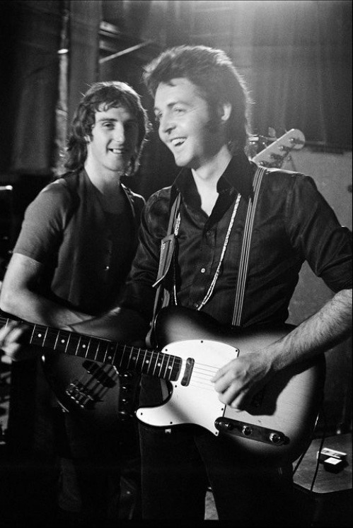
“I am very saddened to hear that my ex-bandmate, Denny Laine, has died. I have many fond memories of my time with Denny: from the early days when The Beatles toured with the Moody Blues. Our two bands had a lot of respect for each other and a lot of fun together. Denny joined Wings at the outset. He was an outstanding vocalist and guitar player. His most famous performance is probably 'Go Now' an old Bessie Banks song which he would sing brilliantly. He and I wrote some songs together the most successful being 'Mull of Kintyre' which was a big hit in the Seventies. We had drifted apart but in recent years managed to reestablish our friendship and share memories of our times together. Denny was a great talent with a fine sense of humour and was always ready to help other people. He will be missed by all his fans and remembered with great fondness by his friends. I send my condolences and best wishes to his wife, Elizabeth and family. Peace and love Denny. It was a pleasure to know you. We are all going to miss you. Love, Paul”
Paul’s post for his former friend and bandmate, Denny Laine, 5th of December 2023
#can’t believe he’s dead wow rest easy Denny I loved your sweet guitar#also can’t believe Paul lost him three days before the anniversary of johns death good lord give him a break#he’s losing so many people poor Paul#I’m glad they became closer again :/ they seemed to like each other#bye Denny <3 safe journey home#paul mccartney#the beatles#denny laine#the wings#john lennon#george harrison#ringo starr#classic rock#beatles#richard starkey#brian epstein#george martin#mine
475 notes
·
View notes
Text
#aaaaand just like that he's gone#(feels so surreal doesn't it?)#well done starlight#you okay tho#no seriously#you still with us?#hey-#WELL IM DEFINITELY NOT OKAY THIS SHIT HAD BEEN SITTING IN MY WIP FOLDER FOR A M O N T H#do you wanna know why#KAZOODOOR THAT'S WHY#BITCH KEPT MESSING EVERYTHING UP#DUDE YOU'RE DEAD HOW CAN YOU STILL BE SO ANNOYING#THIS ISN'T EVEN ABOUT YOU YOU'RE JUST A DECORATION HERE#REST IN PISS#NOBODY MISSES U#RRRRRRRAAAHHHHHHHHHHH#well at least our little star seems fine#he's not even crying#looks like he may in a second tho#BUT as art is all about CAPTURING THE MOMENT here's the moment where he's NOT crying#yet#and would you look at that I'm disrespecting the rules of anatomy again#kazoo's spine is broken#THAT'S WHAT YOU GET FOR KEEP MESSING UP MY PICTURE#Astarion did the stabstab I did the crackcrack#no regrets#astarion#bg3#baldur's gate 3#astarion fanart
520 notes
·
View notes
Text

headcanons for the employers have somehow turned into a crossover with de skills
#madness combat#so the thought process is this#based on the episodes the auditor is most likely to be associated with physical pain raw strength and endurance#he appears to be descended to the level of mortals and their physical world and he clearly doesn't mind drinking some sugary drinks#i also like the idea of stygian being his counterpart thematically related to souls and rituals#and through understanding other’s emotions they could be frighteningly comforting to those they guide through the mortal coils#the authority expressed by calling someone a worm seems comical#and the conductor sounds like someone who has something to do with interfacing#it would be interesting if they were the one who set nevada in motion with lightnings and stuff like that#that leaves the deliberator who holds all the knowledge and ability to reason for the rest of the employers#and like what if they were a little more dramatic.#madness project nexus#de skills#madness combat employers
779 notes
·
View notes
Text
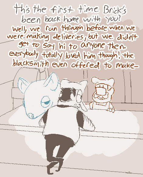
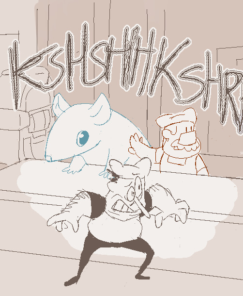

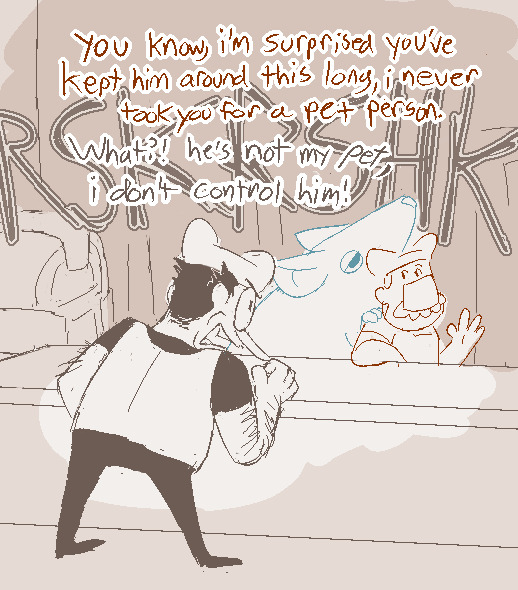


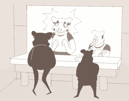
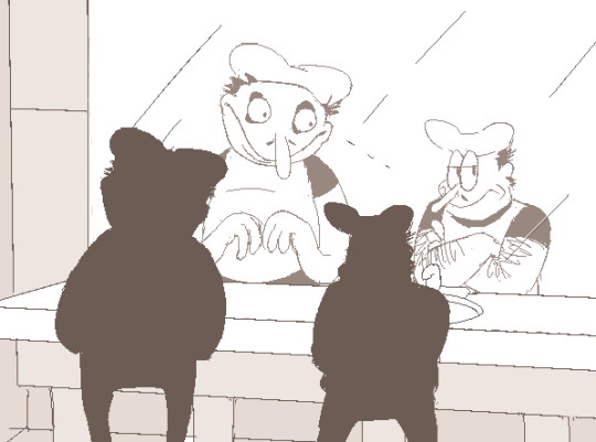
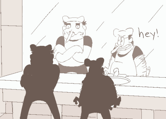

there's no way the bathroom at peppino's pizza is actually that big but ¯\_(ツ)_/¯ . hey ummm anyway.... i care them...... anyway there's a lil ramble on my take on fake pep's like psyche or whatever in tags on the og post if ur into that kinda thing :y
hey! it's a series! fake peppino world tour: [noise] [noisette] [peppino]<- u are here [gustavo] [gerome] [noisette again]
#ramble after realtags yeag. shoutout to serrangelic btw suggesting the silhouettes thing bc i would have Died otherwise#pizza tower#peppino spaghetti#fake peppino#gustavo and brick#arting#pizzaposting#so anyway i think fake peppino has like. a general awareness that he is supposed to Be Peppino and that he was Made to do that#and likewise he does generally try to...do that. the thing he does NOT realize is hes like really goddamn bad at it#not to be mean but like...c'mon. they are pretty distinctly different kinds of guys even beyond the physiology yknow.#he's neither on-brand nor fooling anyone dsjdsjjkgfsd. BUT!#since the rest of the cast generally likes him [at least as I play it] he thinks hes doing just fine#he's like 'oh they r happy with me so i must be getting a good grade in being peppino :)'#so getting told that 'yeah you actually really suck at that but that was never the reason people liked you'#and told that by og model peppino no less--yknow THE guy he's supposed to be living up to#who's already a bit intimidating for that and who ALSO totally wrecked him TWICE in the tower#making him acutely familiar with just how formidable the guy is and how much there IS to live up to....#it's a Moment for sure. not really a sad or hurt one though. just... contemplative.#thinking abt people liking him for being the guy he's already naturally been being even though that guy is Not Peppino#i don't think he's gonna be super broken up about realizing he has a bad grade in peppino given everything else hes got now#nor do i really think he cares enough to go like reinvent himself or whatever after the fact#he seems to b pretty clearly having fun with it already so i think he just keeps doing that#and in some cases he still has the pre-installed peppino traits/instincts like to cooka da pizza. and that's fine#is this projection. yes. but if youve been following me awhile you know most of my character writing is ghdhfdgf#gonna kinda expand on all this in the gerome one which is...one after next. itll be a bit but man.#anyway peppino will never admit to anyone and especially not himself that he's gotten a little attached to the guy. hee hoo#pep tends to be kinda surly but he certainly has his ways of showing he cares. all of which are on display here#''that thing is not my son'' says man currently watching thing's antics with the 'bemused dad' arms crossed pose. yeah ok buddy.#gus is totally onto him already but hes not gonna say anything.#if u read all this ur prize is not having to go decode fp's rot13. his lines are ''meant to be you...?'' and ''wrong question.''
1K notes
·
View notes
Text
Garp bringing baby Dragon to work: Sengoku look, this is my son! I wanted you to meet him!
Sengoku: Oh, right. Dragon, wasn't it?
Sengoku:
Sengoku: Why does he look angry?
Garp: I dunno. Haven't been able to get him to smile or laugh even once yet.
Sengoku: His face is just like that?
Garp: Yep. Wanna be his godfather?
Sengoku:
Sengoku: I mean, I guess.
#i like to think dragon and sengoku got along idk why it just seems fun to me#i bet they bitched about garp together sometimes#dragon had a perpetual resting bitch face from day one#sengoku: he looks like hes about to steal my lunch money#one piece#monkey d garp#monkey d dragon#sengoku the buddha#the penguin queue
197 notes
·
View notes
Text


IN THE SOOP — ending Q&A
choi seungcheol always thinking of his members ♡
#seventeen#svtcreations#svtgifs#s.coups#choi seungcheol#n.gif#g:svt#m:sc#he looks so boyfie and snuggly with this hoodie on :(((((#i'm so happy they had a good rest and got to enjoy some free time <3#they truly seemed like they had a great time 🥺#seventeen in the soop season 2#its spoilers
880 notes
·
View notes
Text
OH. okay so normally i dont touch discourse with a 20 ft pole, but this has been niggling at my brain tonight and i finally realized why
the people who are mad at qbbh for the memory loss and “dodging consequences” dont understand that he doesnt want to dodge consequences. Like they cant know that, they werent focused on him when he was literally feeding himself to the soul vultures and planning his eventual imprisonment and also. The Many Many Many hints he made towards suicide/sacrifice/Just Fucking Dying.
ccbbh is a subtle roleplayer, he’s been building this shit up for two whole months- it was day FIVE of the eggs going missing that he resolved to do whatever it took (hurting his friends) to get the eggs back. It was day three that he followed in dapper’s footsteps and started feeding himself to the soul vultures (and gaining a Massive headwound beneath his hood in the process- you can only see it if you go on namemc and remove the layers). He’s got impaired judgement. Even the memory issues arent a new thing- i cant remember exactly when they started, but one of the first big moments i remmeber was september 30th where he spent an hour falling into a delusional frenzy searching his base for cameras that he forgot he asked aypierre to plant.
The super murder of purgatory and the memory loss afterwards probably all feels very sudden for people who havent been following his story, but as someone who has been- all of this has been true to character. The only cheap swings he’s made have been combat-based in purgatory, and even the motive for those was built up in rp.
People are calling for consequences, but he has alrwady been experiencing self-inflicted consequences for months. The blue on his usual outfit is blood. This recent memory loss isnt a restart to get away with the atrocities - it is yet another consequence of his egg-protecting complexes and the ways he punishes himself for failing them.
he is NOT a moral character. he’s a demon hiding in plain site. he has eaten people. he has killed people. he understands the cruelty of his actions, and the consequences of them for the loved ones of his victims. but it matters when that harm is being done to his loved ones. he’ll still do it, because he will do anything for the eggs, but it matters, and that means that he has already started the process of self-inflicting those much-demanded consequences
#anyone who isnt a qbbh makn please extend some sympathy for us. our guy is being misunderstood again#so if people seem twitchier than usual that probbaly plays a factor#but if it ever gets annoying be rest assured he is doing his very best to train us in media literacy#and also the block and filter buttons are your friends#and qbbh mains join me in the genuinely freeing revelation that they have just. strawmanned him yet again#i feel like youve gotta be able to understand a character to truly hate them#and no one (not even us oh my fucking god) really understand him#and thus the vitrol means nothing and i am free of all woes#anyway tho genuinely if you want to know more about this cube im willing to talk about him#i have Credentials#one of my posts was dono’d to the cc almost word for word and he called me a know it all#qsmp#qsmp badboyhalo#discourse#<- mentioned#an interestinf discussion could be had too about xyz character Deserving xyz thing#and really people in general Deserving xyz thing#but i think that is a wasp nest i dont know enough about to join swatting#i ngeed. to go to bed
171 notes
·
View notes
Photo

Take any opportunity at all (Patreon)
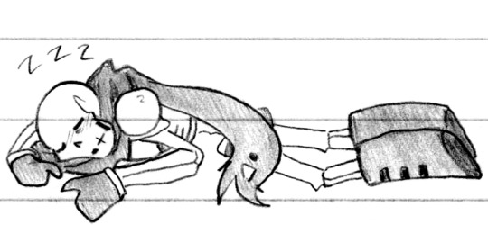
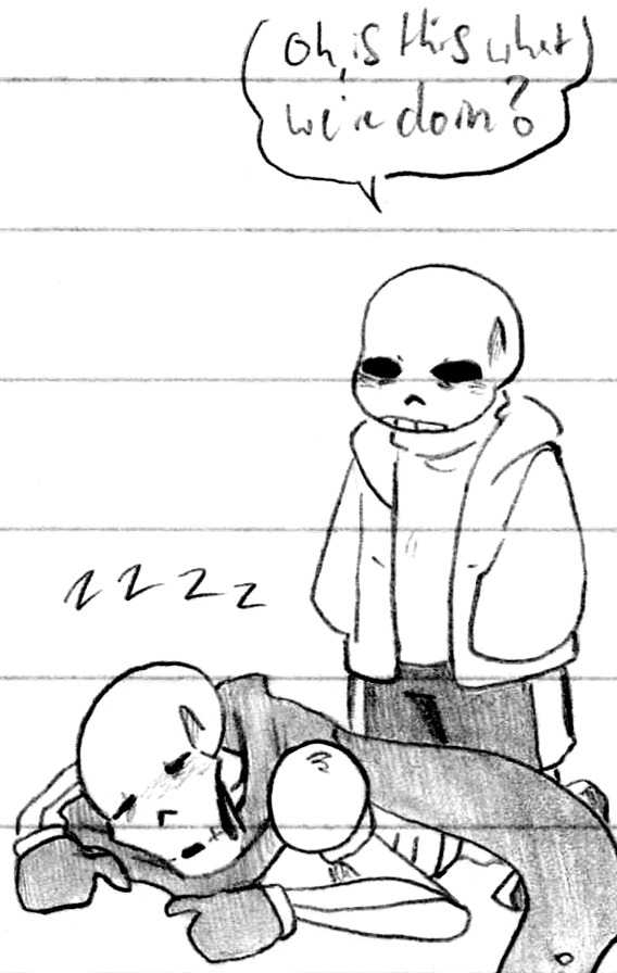
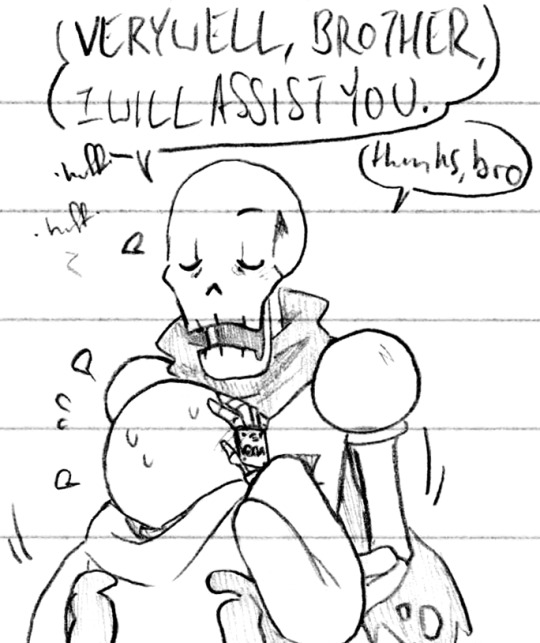
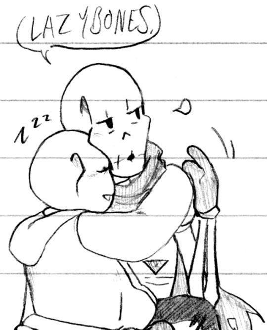
#Doodles#UT#Handplates#Sans#Papyrus#Sans was being silly and annoying and then The Consequences lol#He got Papyrus to lean down for a hug and then refused to let go so he could stand back up#So he stood up anyway lol#Sure he could teleport - or could he? He seems to be able to choose if he teleports someone with him even if they are touching#But Papyrus also has his glitch abilities :0 Also funny to think about him hovering around while carrying Sans haha#They combine their hovering-teleporting and noclip right out past the Barrier Oops#Anyway lol#Hanging on to him tired Sans out and then Papyrus picked him up - double whammy on naptime lol#Didn't even finish cooling off before knocking right out haha#Not that Papyrus /really/ minds - he's always got Sans! Even when he's being annoying and silly!#Also his forehead is resting halfway into Papyrus' jaw in the last one haha#Comfy and strange! Them to a T#The plates really make their hands look so delicate - especially Sans' - probably because of how small his hands are#So many details that are fun to draw! They have such pretty designs!! Then again Undertale is just Like That haha#Everyone so well designed ♪ A treat :)#And their dynamic is so fun to bounce off each other just fjdsklafdf it's all fun!! I love when it's so enjoyable <3 <3#Sans trusts him and Papyrus takes care of him so he trusts him and Papyrus feels needed I'm fine#Not just supporting underneath him but throwing an arm over his shoulder so he'll be comfortable and can hang onto him hehe ♪#Sweet siblings <3 S'why I keep pulling bits and pieces from my own sibling silliness it just fits! Haha
341 notes
·
View notes
Text
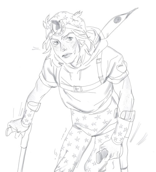
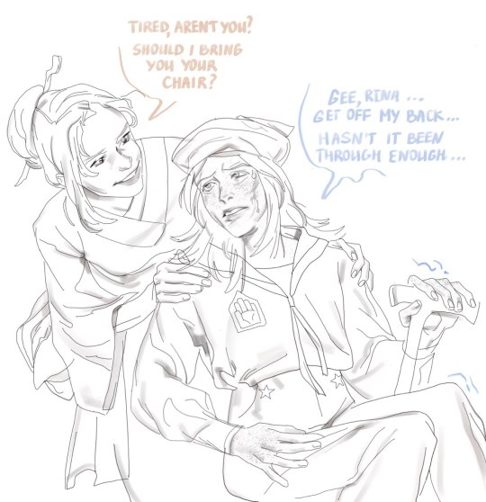
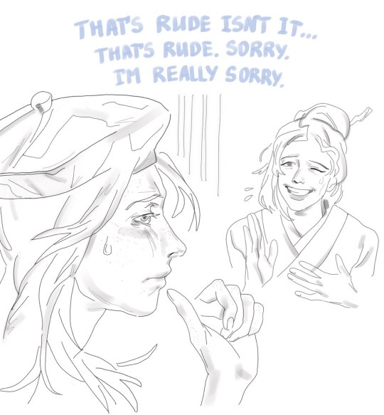
i think it's not my place to speak but the way johnnys disability was treated at the end of steel ball run feels wrong
he can walk a bit... as a treat <3 (the entirety of steel ball run is his physiotherapy)
#my art#jjba#jjba fanart#steel ball run#sbr#jojos bizarre adventure#johnny joestar#rina higashikata#jojo#jojo part 7#man there's really fifteen different ways to tag jojo isn't it.#i really wanted to imagine cute scenarios with him and rina but he just seems too mean and awkward.#the johnny joestar legend in jojolion made their marriage seem so magical but i feel like the reality of it was much more mundane#he is still disabled for the rest of his life#he is defined by his stubbornness and drive to overcome it to me
77 notes
·
View notes
Last Seen Blogs

bunnymedley
૮⑅˶• ˕ •˶ა
venusinta
live laugh yuri
t-thathandsomedevil
Danny!!
soooldout
Sunggyu's Head Tilt (blog closed)

404mg
404 media group