#art nouveau scene
Text
Paintings with Clannibal vibes (part 2):
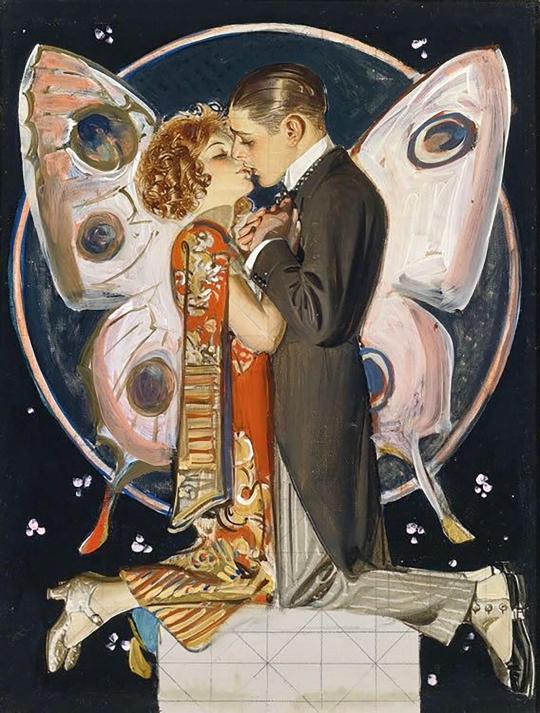
"Butterfly Couple" By Joseph Christian Leyendecker
"L'amour des ames" by Jean Delville.

“Lustige Blätter” by Artuš Scheiner

“Thief of the Moon” by Norman Lindsay
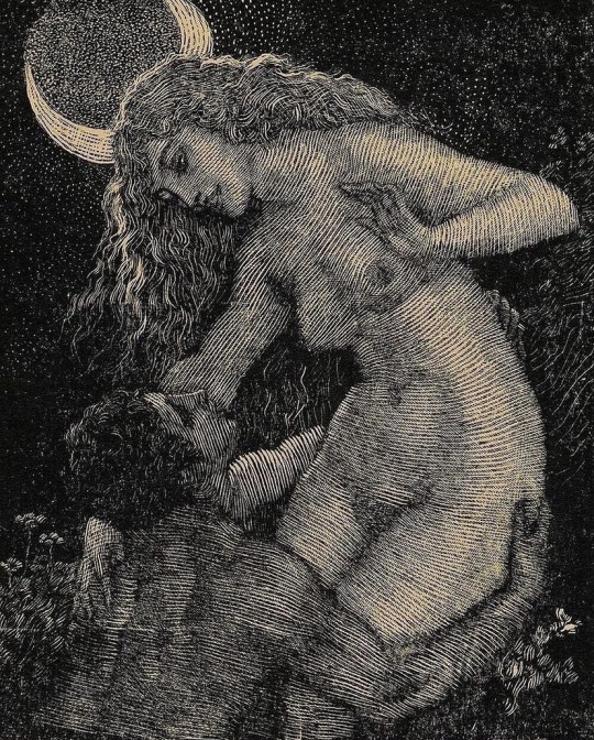
“Satyr Embracing a Nymph” by Norman Lindsay

#This user is in love with early 20th century art and it shows#Art nouveau is one of my favourite movements#I really need to organize my files#Also the last one is them after the wine scene... They sure share some quality time in Argentina#hannibal#hannibal lecter#Clarice Starling#clannibal#Hannibal x Clarice#art#paintings#aesthetic
78 notes
·
View notes
Text
Another - embellished because I’m a dramatic person - oil study, of my beloved Crowley ✨😈

She’s so prettyyyyyy ~
Also, here you go, the process if you’re interested ⬇️
#her look is breathtaking#gasping in front of this scene#art nouveau and christian icons bend so well#two obsessions in a row#art nouveau is love#art nouveau is life#good omens#good omens 2#crowley#david tennant#art nouveau
43 notes
·
View notes
Photo

Jeanne Mammen
Ash Wednesday. c. 1926
#jeanne mammen#painting#art on paper#art nouveau#new objectivity#genre scene#figurative#private collection
271 notes
·
View notes
Text
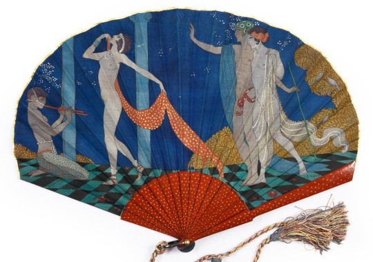
Georges Barbier for Jeanne Paquin, L'Odalisque, 1911.
Folding fan in balloon form, silk leaf stenciled with a dance scene, bone sticks painted with orange flowers on a midnight blue background, original tassel.
Sold for EUR 12,880 in 2021.
#george barbier#fan#1911#jeanne paquin#l'odalisque#art#vintage#art nouveau#la belle epoque#belle epoque#art nouveau fan#folding fan#tassel#dance scene#silk leaf#paquin
19 notes
·
View notes
Text
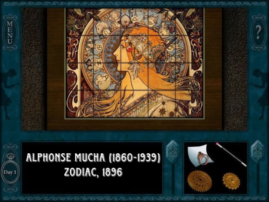
G’day, Clue Crew! Dropping in, to talk about one of my favorite artists: Alphonse Mucha. His work can be seen in several Nancy Drew games.
Alphonse Mucha, was a Czech painter, illustrator, and graphic artist, living in Paris during the Art Nouveau period, best known for his distinctly stylized and decorative theatrical posters, particularly those of Sarah Bernhardt. He produced illustrations, advertisements, decorative panels, as well as designs, which became among the best-known images of the period.
The slider puzzle box, as seen above, was featured in The Final Scene. The tiles have Mucha’s Zodiac decorating them. But this was not Zodiac’s debut in a Nancy Drew game—oh, no, no, no. She can first be seen in Abby Sideris’ bedroom, in Message in a Haunted Mansion.
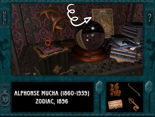
Zodiac is again seen in the gift shop of Castle Finster in The Captive Curse.

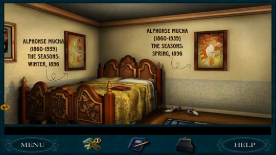
However, Zodiac isn’t the only piece of Alphonse Mucha’s work to be displayed in a Nancy Drew game. Emily Crandall, from Secret of the Old Clock, has no less than 5 Mucha pieces, in her bedroom. She displays every print from The Seasons series, on her walls.
This was Mucha's first set of decorative panels and it became one of his most popular series. It was so popular that Mucha was asked by Champenois to produce at least two more sets based on the same theme in 1897 and 1900. Designs for a further two sets also exist.
The idea of personifying the seasons was nothing new - examples could be found in the works of the Old Masters' as well as in Champenois's other publications. However, Mucha's nymph-like women set against the seasonal views of the countryside breathed new life into the classic theme. In the four panels shown here, Mucha captures the moods of the seasons - innocent Spring, sultry Summer, fruitful Autumn and frosty Winter, and together they represent the harmonious cycle of Nature.

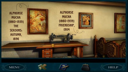
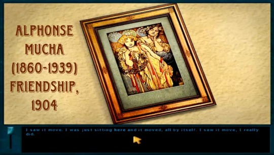
You’ll notice that the picture that “mysteriously keeps moving,” is not part of aforementioned polyptych. This Mucha piece is called Friendship. It was featured in the New York Daily News on April 3rd, 1904.
The New York Daily News referred to him as "the world's greatest decorative artist," and dedicated its Sunday Art Section to Mucha on April 3, 1904. For the illustration on the cover of that section, Mucha created a wonderful allegorical image entitled Friendship, in which America and France are each depicted as women. America, with stars on both her tiara and gown and red and white ribbons cascading from her hair, appears as the young protégé of France, who watches over her, protectively adorned with lilies in her hair and fleur-de-lys patterns on her dress. As Jirí Mucha points out, the two women are jointly "holding a wreath of lime leaves, [a] national symbol of Czechoslovakia.”
I personally adore Mucha’s allegorical style and really appreciate that he’s featured in the Nancy Drew PC games. One might even argue that Art Nouveau influences us, to this day. Perhaps it even played a part in the design and illustrations of some aspects of the games. Art is always changing—artists grow upon the backs of their predecessors. Mucha is still highly influential and relevant.
His work and the style he developed during the period of 1893 to 1903 came to define an era and forever serve as an influence to future illustrators
I loved the Alphonse Mucha pieces from the PC games, long before I went to university and wrote papers, on his work. I’d like to think I, in part, owe my love of Art Nouveau, to Nancy Drew. 🔎🖼
That is all. Happy scrolling.
#nancy drew#her interactive#clue crew#nancy drew pc games#nancy drew art#art nouveau#clk#mhm#fin#cap#alphonse mucha#secret of the old clock#message in a haunted mansion#the final scene#the captive curse
63 notes
·
View notes
Text
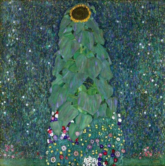
Gustave Klimt (Austrian, 1862-1918) • The Sunflower • 1907 • Private collection
#vienna secession#art nouveau#pastoral scene#flowers in art#gustave klimt#australian painter#art#painting#fine art#art history#early 20th century art
13 notes
·
View notes
Text

Raphael Kirchner (Austrian, 1876–1917) • Angel with Christmas tree, from the series Christmas pictures • 1901 • Color lithograph • © Museum of Fine Arts, Boston
#illustration#art#illustrator#artwork#raphael kirchner#austrian artist#early 20th century european illustration#art nouveau modern#art nouveau illustration#MFA boston#christmas scene#sassafras and moonshine blog
4 notes
·
View notes
Text

Dance in Cupid's Valley (Arthur Rackham 1904)
#arthur rackham#dance#watercolour art#watercolor#traditional media#vintage#illustration#alice in wonderland#art nouveau#nouveau#drawing#genre scene#new art
8 notes
·
View notes
Photo


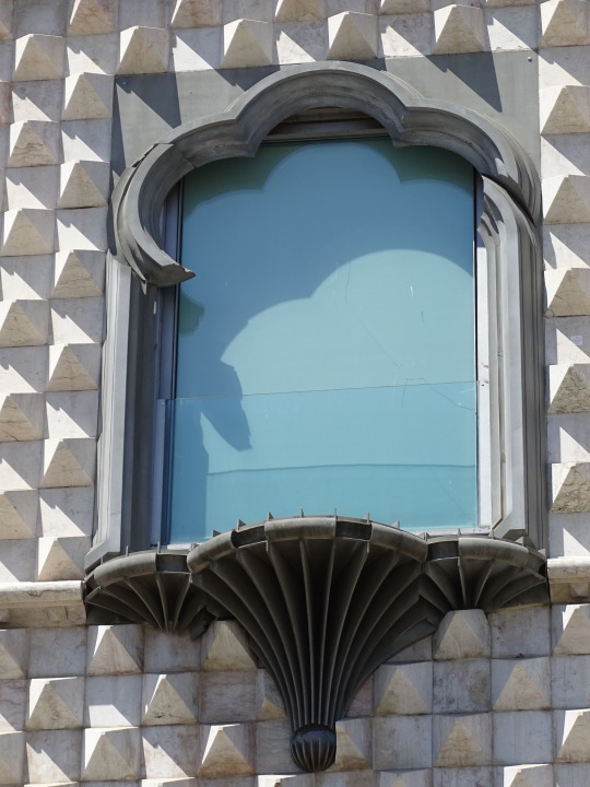


Architecture, Lisbon (No. 12)
The Casa dos Bicos ([ˈka.zɐ duʃ ˈbi.kuʃ], "House of the Beaks/Spikes") is a historical house in the civil parish of Santa Maria Maior, in the Portuguese municipality of Lisbon. The house, built in the early 16th century in the Alfama neighbourhood, has a curious façade of spikes, influenced by Italian Renaissance palaces and Portuguese Manueline styles. It survived the disastrous 1755 Lisbon earthquake that destroyed much of the city, but over time was abandoned as a residence and used as a warehouse. After a 20th-century renovation, it became the headquarters of the José Saramago Foundation and a location of the Museum of Lisbon.
The Casa dos Bicos is situated along the northern side of the street, contiguous with other buildings and identifiable by the surface treatment of its façade. It is a rectangular building of four floors, with irregular fenestrations (windows) and a tiled roof.
The principal façade, to the south, is decorated in diamond-shape protrusions. The floors are demarcated by frames that run along the façade. The first and second floors are framed by doors and windows in stonework; the first floor includes four simple doorways of varying dimensions and asymmetrical distribution (some rectangular, while two doors marked by convex arcs). On the second floor are four rectangular windows of varying dimensions and asymmetrical distribution. The third and fourth floors are marked by windows of varying dimensions and asymmetrical placement, using stylized single, double and triple rounded windows. Two styles of windows prevail on these floors: simple rounded-arch windows (a triple-frame on the third floor and two double-framed windows on the fourth floor) and styled curvilinear windows, based on Manueline elements.
The interior has been substantially altered from its early conceptions, and includes a steep, clear marble staircase with bold lines and contrasting black walls.
Source: Wikipedia
#Casa dos Bicos#António Marques Miguel#Art Nouveau#Jugendstil#travel#façade#original photography#Lisboa#Lisbon#tourist attraction#landmark#Lisbon Cathedral#architecture#street scene#cityscape#Portugal#vacation#summer 2021#Southern Europe#tram#public transport#spikes#exterior
4 notes
·
View notes
Text


Ink finished. I forgot to make this on watercolor paper so I am coloring it digitally.
also the wip video coming soon too 😁❤️.
hope everyone is enjoying spring too!
#art#bengeigerart#draw#illustration#ink drawing#no ai art#willow#tree#art nouveau#scene#landscape#artists on tumblr#tumblr art#art of the day#art on tumblr#sunset#ocean#oc#oc art
1 note
·
View note
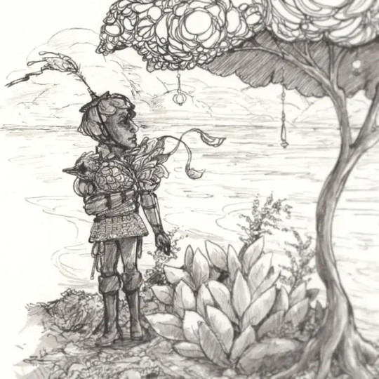
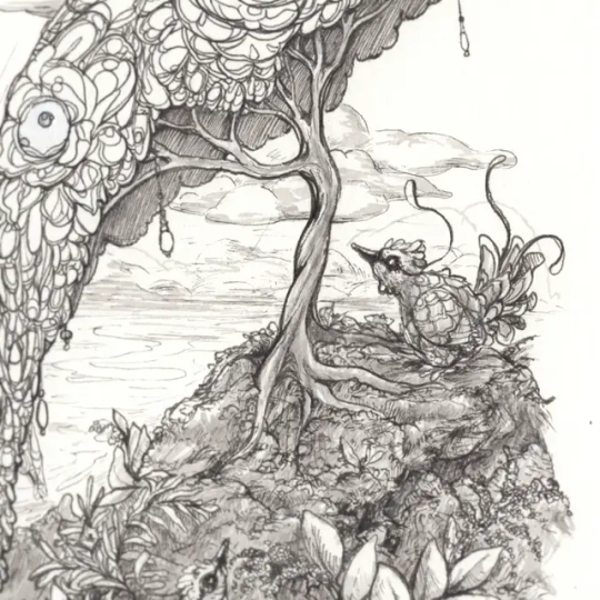
Text
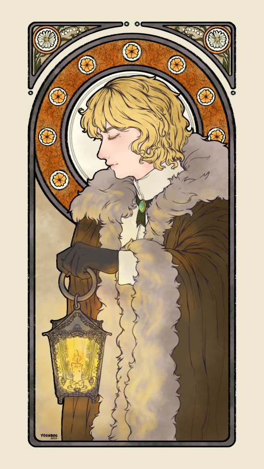
the gatherer
unknown artist
a piece found locked in a chest under an area of ruins believed to be one of the gatherer's temples.
no signature was found on the piece aside from a hastily written quote; “let his light guide the lost to where they long to be”. it was also found alongside old journals and moth-eaten paper and scrolls. surprisingly, the journals are somewhat well preserved with the writings still legible, albeit written in a language we can't understand. we're sending this to you and the others we've found, professor aufinch. i know you've got a decent team of historians and translators somewhere.
best regards.
#original character#my art#yogubog#deorc barratrum#ATTEMPTING ART NOUVEAU WAS A PAIN IN THE ASS and i will attempt it once more but with a different oc :3#or maybe not an oc. Idk#i.love my oc sm. this man. This guy. my favourite son. my beloved child.#*weeps*#ALSO attempt at lore lmao#was planning on typing out a scene based on this but its like. 2:34AM here and i am About To Pass Out.
1 note
·
View note
Text
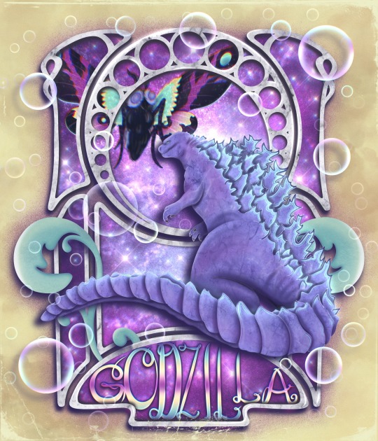
Scenes from a Hat July Challenge 3: Godzilla + Art Nouveau + Bubbles + “Muffin” color palette
#Godzilla#art nouveau#mothra#scenes from a hat july challenge#drawing challenge#disabled artist#procreate#portfolio
1 note
·
View note
Text
A lot of the time when I reblog jewellery on here, it’s art nouveau jewellery, because I really like art nouveau. In general, and in jewellery in particular. And most of that is the aesthetic. I like the natural forms, I like the twisty curly bits, I like the use of materials, I like how a lot of art nouveau jewellery is using metals and stones and other materials to create a specific form, an insect or a plant or a goddess or even sometimes nature scenes. I like …
I feel like a lot of the time with jewellery, it feels like ‘I’m going to use this object to show off the size and value of my pretty rock’. And there’s nothing wrong with that. Some of those rocks are indeed gorgeous. But art nouveau feels more ‘I’m going to use these pretty rocks, and several other things, to create the impact of this object’? I just love the use of materials, glass and enamel and colour, as well as precious stones and metals, to create a form or a scene.
Like, you get a diamond ring, it’s a diamond ring. But you get something like a dragonfly brooch (Louis Acoc):

Or a lilypad hair comb (Rene Lalique):

Or a wisteria branch (Georges Fouquet):
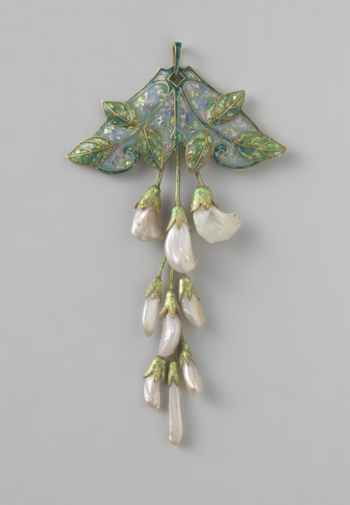
And it’s a whole creation. A little wearable piece of art.
And I don’t want to sound too dismissive. I know the craftmanship and skill and artistry that goes into any kind of jewellery making. That diamond ring took skill I will never have. I just.
I like the emphasis on form more than material that you get with art nouveau. Like normally you hear ‘glass jewellery’, ‘enamel jewellery’, and it’s cheap, it’s frowned upon, but in art nouveau it’s what that glass or enamel was used to make that’s the important part:
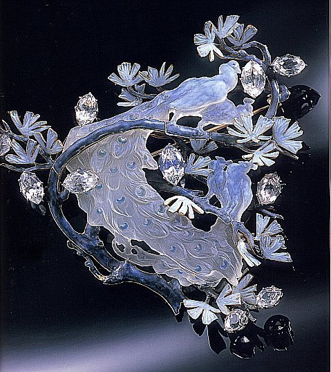
(Rene Lalique)
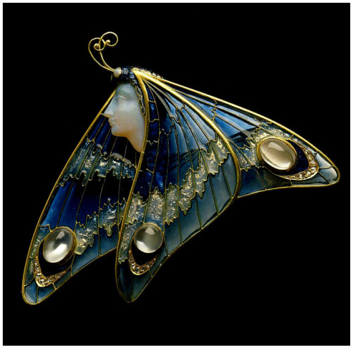
(Eugene Feuillatre)
Anyway. In summary, I really, really, really like art nouveau jewellery?
#art#jewellery#art nouveau#part of this is also that i just love glass as a material#and a lot of the 'cheaper' gems#but i would pay more for that dragonfly than for the largest gem in the world#if money was a thing i actually had anyway#opinions i have them
14K notes
·
View notes
Text

Gustave Klimt (Austrian, 1862-1918) • Birch Forest • 1902 • Private collection
#art#painting#art nouveau#fine art#art history#gustave klimt#australian painter#pastoral scene#forest landscape#early 20th century art#autumn#fall
9 notes
·
View notes
Text
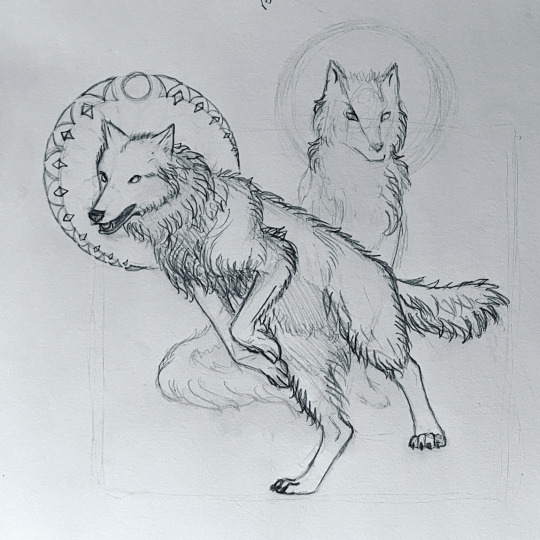
Little sketching from last night’s Twitch stream. I’ll be on Twitch tonight again at 18:00 CDT USA! Come say hello. 🌷
#wolf#wolves#sketching#art nouveau#pencil drawing#art practice#lino drawing#sketchbook#behind the scenes art#jumping wolf
0 notes
Text

Raphael Kirchner (Austrian, Eisblumen (Ice Flowers) • 1899
#illustration#art#illustrator#raphael kirchner#genre scene#art nouveau modern#late 19th to early 20th century illustration#austrian artist#sassafras & moonshine blog#illustration blog
2 notes
·
View notes
Last Seen Blogs

mommymilkerstittyblast
Heckin Uhhhhh
nadiawrimos
my writing side blog

dreamsmpimagnes
C!Wilbur is a DILF

t-baggerz
Untitled