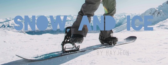
#also: i changed the font i used which took up 80% of the time working on this aka 25 minutes
Text


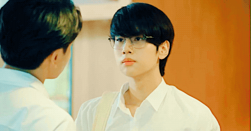

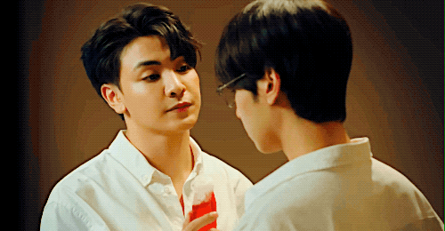
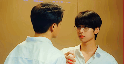
you remembered, quite observant |hidden agenda ep. 1
#hidden agenda#hidden agenda the series#joong archen#dunk natachai#aka very convoluted flirting strategies#i really like how needlessly chaotic this is already#i'm not even sure i want to get an explanation why joke doesn't directly hit on him before starting this whole thing#but i enjoy how charmed he is but also isn't so unrealistically enfatuated that he'd let bs slide#and i am not certain how airheaded zo is to not catch the i love you in mandarin by joke#love the petulant way he grabs his coffee (also in a way that screams 'I drink take out coffee a lot' - which probably is just dunk)#hmmm#first time i am watching a show with joongdunk and i enjoy them#some of the show feels a bit like it was made 2 years ago but it is pretty solid and i like the silliness of it all#i just hope nita doesn't have to suffer under their combined weirdness - i felt sorry when zo ripped the strap on her bag after not accepti#ng her refusal#but i appreciate that the show knows that he isn#t perfect - he did slap joke after all#also: i changed the font i used which took up 80% of the time working on this aka 25 minutes#still not 100% sure but the text reads crisper than on my older sets
57 notes
·
View notes
Text
Today's Topic is Hot Topic
"The pants command me!" Invader Zim
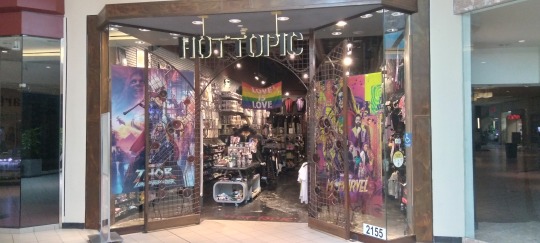
It turns out that one of the Hot Topics in the Tampa Bay area - at University Mall in Tampa - still has the old gate style entrance. I asked the gal working there why the owner never removed the gate, but she didn't know. She did confirm, however, that it is one of only three out of 675 Hot Topics that still have the gate.

I used to see these gates on Hot Topics all the time, and I am sorry to say, I didn't even notice when they stopped having these gates. But then again, my time of frequenting Hot Topic was back in the '90's. By the mid-aughts, I had stopped visiting the brick & mortar Hot Topics and started ordering everything I bought from them (which, admittedly, was never a lot) online. The last items I purchased from the Hot Topic website was several striped shirts, both long and short sleeved, of a type fairly difficult to find anywhere else, plus they were on sale, so I snapped them up.

As for my reminiscences of Hot Topic back in the 'good-ole-days' of the '90's, they might be a bit underwhelming. I was never a 90's mall rat, so you won't find any vintage pics of me wearing those super baggy pants, but I still went to malls about once a month during the 90's. Much less than the once a week, or more, during the 80's. I first encountered a Hot Topic about 1992 in either Richmond, Va, or Washington, DC. I didn't realize it was a chain, of course, until I encountered the second one. Independent stores similar to Hot Topic were common enough back then that I really only took particular notice of Hot Topic once I realized it was a chain and, clearly, doing quite well. Even back then, it was an expensive place to shop, so I rarely bought anything but would just browse. They used to focus much more on goth items and maintained that emphasis throughout the '90's, but by the early aughts they'd begun to shift to other areas until eventually evolving to the Funko Pop shop they are now.
Not that I have anything against Funko Pops. Folks really seem to like them, although they're not my thing. I'm still able to order gothy stuff via Hot Topic's website when needed, so it doesn't matter to me what they stock in their brick & mortars. They also changed the font at some point - also didn't notice when that happened - but this is how I remember Hot Topic from the '90's:

Another reason I'd usually visit one whenever in the mall, was to socialize with my friends working there. I might be the only person I know who didn't work at a Hot Topic for at least a week or two back in the '90's. I just don't have the customer service skills. But it was always fun visiting with friends and acquaintances and catching up on the latest news from my fairly large social circle. The Hot Topic folks always knew the latest since everyone else also stopped by to socialize, so they were practically town criers. And after inevitably quitting the job, they would lament that they no longer got to hear all the latest, juicy gossip. The last person I knew who worked at Hot Topic - a co-worker of mine at a haunted house - quit working her Hot Topic job in late 2005, and that's when I stopped visiting the stores with any degree of regularity.

I'd also always visit the Spencer Gifts that was, invariably, just a couple stores away from the Hot Topic. While Hot Topic has changed, Spencer's has remained the same - so much so that stepping into one is almost like traveling back in time to the 90's. And with over 600 stores, Spencer's strategy seems to be working as well.
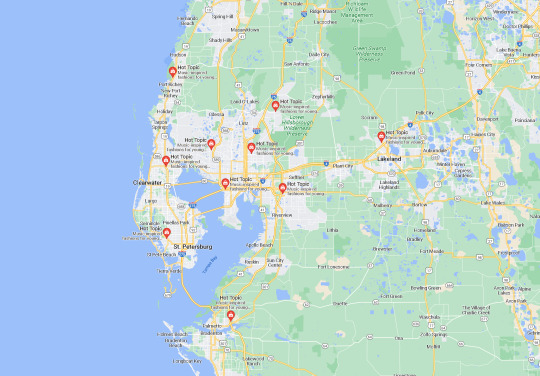
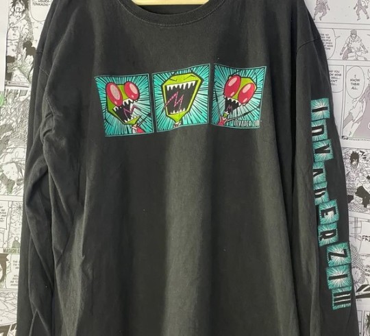
Another somewhat odd thing I discovered, is that the Tampa Bay area has an unusually high number of Hot Topics with 10. Orlando only has 4 and even the vastness that is the Miami metro only has 7. My old stomping ground of Richmond, VA, only has a single Hot Topic remaining. Why does Tampa Bay get 10 while Richmond only gets one? I don't know. And why does one of our ten still have the gate? Also, unknown. And what ever happened to that cool Invader Zim shirt I bought at the Hot Topic in Mall St. Mathew's in Louisville, Ky, back in 2003? Yet another great, cosmic mystery on par with GIR's...well, on par with GIR.
creaturesfromelsewhere 7-3-2022
#hot topic#funko pop#invader zim#hot topic gate#gir#goth#goth style#goth fashion#gothic#darkly inclined#the 90's#spencer gifts#malls in the 90's#musings from an elder goth#creaturesfromelsewhere
7 notes
·
View notes
Text
Honolulu: Pearl Harbor, Punchbowl
July 24, 2021
We were to meet our driver at 8am this morning for our day at Pearl Harbor and the Punchbowl. There was much confusion about what to pack, since Pearl Harbor doesn’t allow bags at all – except maybe a small clear sandwich bag. I brought my home made wristlet – made out of a clear sandwich bag and some duck tape. We all packed things in my little wristlet for the day.
We got down to the little sitting area next to the pull-through driveway and our group was congregated with our guide for the day, Olav. Olav told us that we didn’t actually have anywhere to be until 1:30pm, so we had some time to make sure that we all had what we needed. And also that he would be with us all day and we’d be in the same car all day. He also strongly recommended hats and water bottles. We made several trips back up to the room to grab things. We also learned that Olav is unvaccinated, doesn’t believe in COVID-19, and is a staunch Republican who believes in his “Constitutional rights.” He is also an incredible font of knowledge about Pearl Harbor, and only occasionally threw in some of his slanted views. There is no way I’m going to be able to capture, or remember, all the information he told us – it was a continuous stream of knowledge for about 8 hours.
Eventually, we had all of our stuff, and we walked to the 15-passenger van, parked on the street behind the hotel. After we got settled, Olav took off through the city to the Punchbowl. The Punchbowl is a volcanic crater in the hills surrounding Honolulu. The center is a bowl – the crater – and they punched a hole through one of the crater’s rims to allow entry into the bowl. Hence the name – Punchbowl. Inside the Punchbowl is a national cemetery. There’s a monument at the end of it, and on the steps up to the monument is where Hawai’i holds memorial services for Veteran’s Day and Dec. 7. We’re not allowed to get out inside the Punchbowl, but we can drive through. Lining the driveway in the Punchbowl are Banyan trees donated to the US from China. China was our ally during World War II, and we helped to defeat the Japanese who had invaded and were conquering China. There are 48 trees, which represent the 48 states at the time of World War II. They’re beautiful trees that have been groomed to prevent additional roots from taking root.
The area is quiet and calm, and beautiful. There are no traditional white headstones like in Arlington. Instead, the headstones are flat. They used to be white wooden crosses but were changed to flat stone headstones to respect other religions – and allow for easier maintenance.
From the Punchbowl, we drove to Pearl Harbor, and to the USS Missouri BB 63, which is now a museum. As we drove through the city, Olav pointed out a neighborhood that burned when a bomb went astray on Dec. 7, 1941. He also described in detail what happened on Dec. 7, 1941 – the day Pearl Harbor was attacked. We learned about the SS Cynthia Olson which was sank en route from the mainland and Honolulu by a Japanese submarine on the morning of Dec. 7, 1941. The passenger ship was carrying two soldiers to Honolulu but was a passenger ship. There’s a photo of the Cynthia Olson as it was sinking taken by a Japanese soldier on the submarine. The Cynthia Olson got a may day call out, and another passenger ship heard the call. That second passenger ship confiscated all the passenger’s binoculars and assigned watch duty to the passengers. When that ship landed, the USA government confiscated all of their radio records and logs. Olav believes the records were confiscated because they show the time of the Cynthia Olson’s may day call. If that call happened before the bombing at Pearl Harbor, but was ignored, it would look very bad for the US military command.
As we entered the Pearl Harbor base, we drove to a parking lot and Olav left us to get an officer who cam back and searched our van for bags. Once that was done, we drove over the bridge to Ford Island and the USS Missouri BB-63. BB-63 stands for Battle Boat 63 – the 63rd battleship the US built. This is necessary because there have been four USS Missouri’s. The current USS Missouri is a submarine that was also docked at Pearl Harbor today. Of course you can’t call it BS-63 (battleship 63) – so battle boat 63 it is. The BB-63 was the last battleship built in the world, the most powerful, and the last one to retire. It was launched during World War II, saw battle in the Battle of Okinawa, was where the Instrument of Surrender was signed by the Japanese to officially end World War II, served in the Korean War, was decommissioned in the 60s, then refitted in the 80s, saw duty in Desert Storm, before finally being retired in the early 90s, then being made into a museum. Its parked in Battleship Row – where all the Battleships were anchored on Dec. 7.
Olav told us a lot about how the Pacific Fleet came to be in Pearl Harbor on Dec. 7 – but then he seemed to contradict himself. The first story was that FDR ordered the Pacific Fleet to all be at Pearl Harbor as a “show of strength” to deter the Japanese. The Admiral of the Pacific Fleet thought this was stupid, because normally the Pacific Fleet rotated between several locations, and there was not enough of a supply chain, let alone docking berths, to allow the entire fleet to be in Pearl Harbor. He resisted, basically told FDR he was dumb, and lost his job. He had worked on the supply line, though, and worked on the docking situation too – which is how Battleship Row came to be.
As he told this story, I gathered that the next Admiral did as FDR wished and assembled the entire Pacific Fleet in Pearl Harbor. Olav made a point to say that FDR ignored the military advisors, and his Admiral, and all their knowledge to demand the fleet be in Pearl Harbor. Later, he told us that every year, the Admiral of the Pacific Fleet was required to inspect the fleet in Pearl Harbor. This always occurred on the Monday after the first Sunday in December. In 1941, that was Dec. 8. The Fleet was required to report to Pearl Harbor 24 -48 hours in advance of the inspection. Which then means that the fleet was assembled in Pearl Harbor on Dec. 7 in preparation for the inspection on Dec. 8 – which doesn’t seem to have a lot to do with FDR.
The deck of the Mighty Mo is covered in teak, which they did to preserve the steel deck, to lower the temperature inside the boat, and to provide a natural nonslip surface. The teak on the deck has been replaced three times, all using different processes. One time they messed up trying to save money by putting 1 inch of Douglas Fir below 1 inch of team (instead of 2 inches of teak) – not realizing that Douglas Fir rots faster than teak.
During WWII, the Missouri was attacked by a Kamikaze, which was captured perfectly on camera. We saw the place where the Kamikaze’s wing impacted with the Missouri. We also saw footprints on the deck where our personnel stood as they buried the Kamikaze pilot at sea as directed by the Missouri’s captain.
We toured the inside of the ship, which was interesting. They had several displays with stuff from the Missouri, the history of the Missouri, remnants from the Kamikaze attack, etc. We walked through the galley, the kitchens, the offices – including the dental office – the food lines, including the donut shop, the fast food line, and the Truman line, so called because the Truman family visited and used that food line. There were crew quarters everywhere – berths stacked 3 high, and each sailor’s locker. The kitchens were crazy – the appliances were huge, and they had everything you could want! Well, all the kitchen toys you could want. The Missouri was the first ship to have a network of interconnected computers which they called MO-Net. This was all before the internet was created. The inside of the Missouri was extensive – it seemed to go on and on. We saw throughout the ship ammunition chutes. And a couple of places that would be vulnerable to armor piercing rounds which can pierce through 16” of steel – so these areas were outfitted with 17” think steel. The guns on the ship were huge and could take out a target 25 miles away. The guns had to be fired over the water, because the rounds were fired at twice the speed of sound, and the concussion would tear the ship apart if the guns were fired over the ship. Missouri, the state, was responsible for providing the fancy silverware and place settings – which is interesting. There was a great map that showed where all of the different USS Missouris served. We saw the Chief’s lounge, and the Captain’s lounge, which was also used as a war room, and the tables can be used as operating tables in a pinch. It was a great insight into what the ship would have looked like while it was in service.
When we were finished touring the inside of the boat, we went to the deck, and then to the Quarter Deck. On the Mighty Mo, the Quarter Deck has been renamed the Surrender Deck, because it was where the Japanese surrendered to the Allied Forces to end World War II. Olav told a story about how MacArthur stepped out of the navigation bridge to walk down to the Quarter Deck but noticed that the Japanese contingent hadn’t arrived yet. So he went back inside, saying, “I’m not going to wait for them. They will wait for me.” He also told us that the British brought a fancy table they wanted to use for the signing, but the papers they were signing were too large to fit on the table. The Missouri’s Captain ordered a seaman to grab a folding table from the ship, and they used that. One of the Japanese had a false leg, and as he was coming up to sign the papers, he stumbled and hit one of the legs of the folding table. The crew, who knew it was a folding table, held their breath for the rest of the ceremony – hoping that the table didn’t collapse. (It didn’t.)
On the Surrender Deck, there is a plaque where the table was and the documents were signed. There’s also a display with replicas of the documents. On the replicas, you can see that the Canadian representative signed on the wrong line on the first document. There’s a picture of someone making sure that he signed on the correct line on the second copy!
They’ve positioned the Missouri so that the bow of the battleship points to the bow of the USS Arizona. The ship that started the US involvement in WWII and the ship where WWII ended pointing to each other.
We finished on the Missouri, went to the gift shop, got some Dole Whip, and then drove to the Pearl Harbor Memorial area for lunch. Lunch was at a permanent food truck outside, and was decent, although Meg and Marie didn’t like their nachos or hot dog. After lunch, we went to watch a 20-minute movie about the attack on Pearl Harbor, before making our way to the ferry to the USS Arizona Memorial.
Olav detailed how the attack happened but of course I’m not going to remember everything. There were three waves of attacks – the dive bombers, the torpedoes, and the other type of bombers. Eek. They came from different directions, and in two separate waves. There were about… or over?... 300 planes in total. The battle lasted for 2 hours. Most all of the ships that were sunk were eventually retrieved and put back into service, except for the Arizona, the Oklahoma, and the Utah. The Japanese adjusted bombs? Or torpedoes? With an additional fin that allowed them to fun in the shallow waters of Pearl Harbor and hit Battleship row. I think Olav also indicated that the aerial bombers were not the ones that caused the most damage, generally – it was the torpedoes.
The ride out to the memorial was quick – the warnings about not misbehaving on an active Navy boat were almost as long as the ride itself. Once the ferry docks, we disembarked, and headed back to the back room. The memorial itself is a white concrete building. The architect was a survivor of the Nazi concentration camps and wanted to build the memorial to remember the lives that were spent to save and free so many across the world, including in the concentration camps. The structure is a loose U-shape. The low point in the middle represents initial defeat at Pearl Harbor. The inclines on either side represent the slow climb to victory in Europe and the slow climb to victory in the Pacific. There are seven cut outs along either side and the top, which were for structural integrity, but have later been said to represent a 21-gun salute. The structure is situated across the middle of the sunken USS Arizona – the ship heaviest hit by the attack on Dec. 7. 1,177 seamen were lost with the Arizona and never recovered. Another 41 of the survivors, or relatives of those lost, have chosen to be interred in the Arizona.
As soon as I set foot on the dock, I smelled the oil or gasoline from the wreck. You could see it on the water, too. There is oil still leaking from the ship and will continue to leak for decades more. There were a lot of people at the memorial, but it was mostly quiet, as is fitting. We walked right back to the room where the names of those buried here are displayed. It’s made of the same marble as the headstones in Arlington. The room is beautiful but somber.
Just outside of that room is a hole in the floor of the structure that is situated over a part of the ship. I didn’t see much there. Outside, on either end of the structure, there are two white buoys that represent where the bow and the stern of the ship are. There are also pieces of the ship, like the gun turrets, and the flag staff, that are still sticking out above the water. It was a moving experience.
After the ferry back to the main site, we went and toured the USS Bowfin – a retired submarine that is only 27’ in circumference. It was tiny, and holy cow does it seem miserable to have served on it. They call it the Silent Service – the work of the submarines. The Bowfin was launched on Dec. 7, 1942, and was therefore nicknamed The Pearl Harbor Avenger. The kitchen was tiny, and only had minimal toys. Olav tells us that the food was cooked on the mainland, frozen, and placed in the submarine’s freezers.
The worst thing was hot bunking. There were only 36 bunks on board the submarine, but about 86 sailors on board. So they rotated beds – multiple people shared a bed. With the temperatures on the submarine running in the 90s or 100s, the beds were wet with the other guy’s sweat. Yuck.
The doorways between the areas of the ship were so small and short too! It was a workout to squat and contort myself through the doorways.
After the Bowfin, we drove back to the city Olav was kind enough to drive us to Costco. This Costco is the busiest on in America. I didn’t go in, but the parking lot was crazy! Anne, Aimee, and Marie went in to get food for the next few days, and they did a great job! Then, it was back to the hotel, and our time with Olav was over. He is a knowledgeable, talkative tour guide to be sure!
Back in the room, some of us split up for naps and downtime until dinner at 6:30. Rileys, Drew, and Todd stayed at our place to watch the Olympics and drink the 5th of rum we bought the night before. Todd made us a whole series of frozen drinks that were great, and did the job! We had a raucous good time watching Men’s Street Skateboarding, where the athletes wiped out more than they landed tricks. It was brutal!
We had tacos for dinner, and continued watching the Olympics, and the activity on the ocean. From our view from the living room and our balcony, we can see all the hundreds of surfers always hanging out on the water, and the couple that actually make surfing runs. There’s a lot of boat traffic, including a lot of boats that go out to watch the sunset. There’s also a surprising number of large cargo ships that travel pretty close to this beach. It was a great time tonight!
25 notes
·
View notes
Text
How to gif without photoshop
Hello! By popular demand (of like 4 people) I am going to write out a tutorial of how I make gifs when I’m on my personal laptop and don’t have access to photoshop. There is another method I use with a different software that is a bit more complicated and if people are interested, I will make a tutorial of that method as well. I’ll do my best to keep this concise, so let’s get started.
Warning that this is VERY text and image heavy because I know how frustrating it can be when a tutorial feels like it’s skipping steps and I want this to be as clear as possible. Also please read this on desktop, tumblr mobile kills the quality of gifs inside text posts.
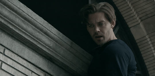
This is the video I will be giffing and here is the gif I will be making!
What you need:
A video to gif
For the best results, I recommend a video that is either 720p or 1080p (basically the higher the quality, the better). Videos with good lighting and bright colors also turn out the best. Unfortunately for me, I gif the TV show Prodigal Son a lot and that show has neither of those things, which is why my gif example is from that show; if you can make a scene with zero lighting or vibrancy look even somewhat decent, you can make anything else look good.
A video downloader or screen recorder
This is the video downloader I use and this is the screen recorder but basically any youtube video download website or screen recorder program works. Keep in mind that ezgif has a pretty low upload limit for videos, so if you want to gif something longer than like ~4 minutes, cut the video down to the specific parts you want first on a website like this one.
ezgif
A very straight forward website that anyone can access. You don’t need to download anything, it’s all online.
Bonus: Online Image Editor (not required, but I use this website to add text to gifs)
1. Making the gif:
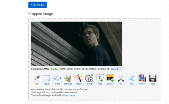
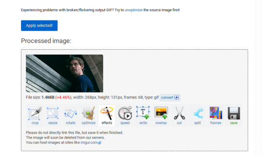
Once you have a video downloaded, you go to ezgif.com and go to the section video to gif. Click choose a file, scroll to your downloaded video, and hit upload video. Your screen should look like this now.
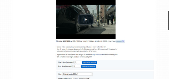
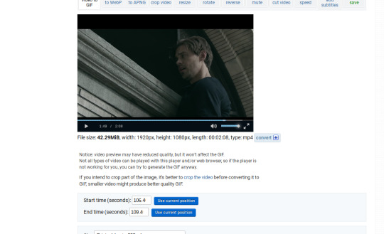
There are two ways to pull out the sections of the video you want to gif. You can either write in the start and end time in the little sections (you have to convert them to seconds: for example, if my gif started at 1:16 and ended at 1:20, it would be 76 seconds and 80 seconds respectively). Or you can do the method that I feel is easier, where you go to the section you want it to start on, hit pause, and hit the blue button that says “use current position” then let the video play until it hits your stopping point, hit pause again, and click on the second “use current position” button.
Once you have the start and end time recorded, scroll down to the next part of the screen with the size options. For size, select “540xAUTO (for Tumblr)” since tumblr gif sizes start at 540p and go down the more gifs are in a row. For frame rate, try to do either 20 or 25; the higher the frame rate, the smoother the gif will look. If you are trying to gif something in 540p that is longer, you might need to chose 10 to keep it under 5mb, which is the tumblr gif size limit. For method, leave it on FFMPEG. Then hit, convert to gif.

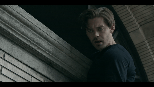
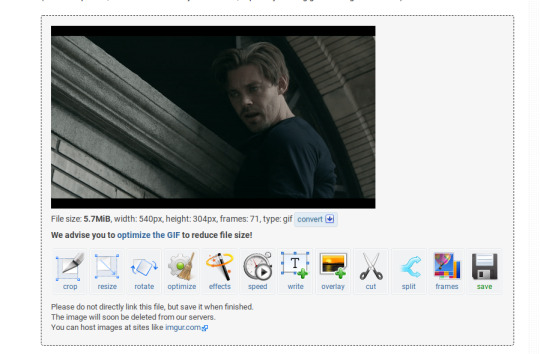
your gif will now look something like this!
Now, this gif is currently 5.7mb, which is above the size limit for tumblr (5mb or above gifs will still play if I recall, but the quality will be really bad when you post them). If I was planning on keeping the gif this size, I would go back and change the frame rate to either 20 or 10 to get the size down. However, I am going to resize the gif to 268p, so I don’t need to worry about it being to big.
Using the correct gif size for tumblr is one of the easiest ways to make sure the gif looks good! For gifs that take up a whole row, the size should be 540p wide. For two gifs in one row, the size is 268p each. For three gifs in one row, the sizes are 177p, 178p, and 177p in that order. Here is a visual of it.
The next step would normally be resizing the gif, but Prodigal Son youtube videos come with a black banner on the top and bottom that I need to crop out. You will see a menu full of options under your gif, and you want to click on “crop.”
Cropping is pretty straight forward; you just move the little box over the part you want cropped, then hit the “crop image” button. Make sure width stays 540p!

Your gif now looks like this
Next, you look at the options under your gif again, and go to “resize.”
Again, resizing is pretty straight forward. I just put in 268 into the “width” section and leave the “height” section blank since the site will automatically resize the height. You can ignore the other menu options.
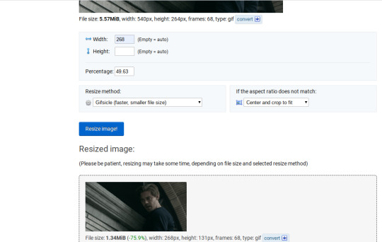
Your gif now looks like this

Next step is optional, but I usually do it. Once again, you go to the menu of options under your gif and select “speed.”

Speed is also super straight forward. I almost always reduce the speed of my gifs somewhere from 90% to 80% no matter what, just because I think it makes it look smoother. For gifs that are of short scenes that go really fast, I will reduce it to anywhere from 70% to 50%. You can try different speeds to test out what you think looks best. For this gif, I’m going to put it at 80%.
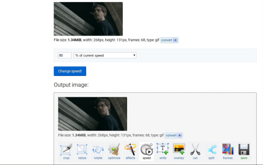
Here’s what we have so far. Congrats, you have made a gif!

Now for the fun part!
2. Coloring the gif
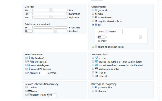
Go to the “effects” option, in the menu under your gif. You will see a LOT of options, but the panels I’m going to focus on are “colorize”, “brightness and contrast” and “color presets”. This section is going to vary a lot depending on what specific video you are giffing so remember to be flexible and try lots of different options out! It took me a while to get to a place where I can just eye a scene and know what settings to use. It’s super easy to go back and tweak a setting if the gif doesn’t look like how you want it the first time, but it’s a lot of trial and error.
The main option I focus on in the “colorize” section, is “saturation.” This is what will make all the color in your gif pop out. The saturation I use varies a ton; for scenes that already are colorful/bright, I usually keep it around 120 to 150, since you don’t want it to be over saturated. If I’m making an edit that is supposed to look toned down or more grey/neutral tones, I’ll decreases the saturation in the range of like 90-40. For a show like Prodigal Son, where there is basically zero color vibrancy, I tend to go full out with saturation, usually in the 150-200 range. For this gif, I have it all the way up to 200.
Next is brightness and contrast. This also varies wildly, but a good rule of thumb is I always try to keep my contrast at least 5 points higher than whatever my brightness is, it just makes the lighting more even. You need to find a good balance; obviously, the darker the scene, the higher you want the brightness and contrast, but if you go too high, the gif with be staticy/grainy. For Prodigal Son, which has horrible lighting, my brightness is anywhere from 10-30 and my contrast is anywhere from 15-35. For this gif, my brightness is on the lower side since the scene is outside in natural light; brightness is 16, contrast is 26.

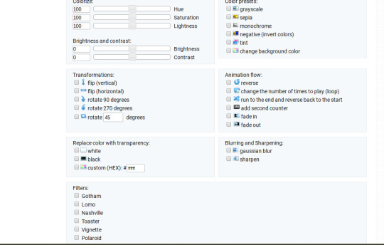
After you get those settings, I go over to “color presets” section and click on the “tint” option. It will pull up a color chart that looks like this
You ALWAYS want the intensity up to 100. This part is where the most trial and error occurs; there isn’t any one color option that works for every gif. The shade I use most often is light red/pink or light blue/light purple. For scenes that are lacking warm tones (which is almost all of Prodigal Son) I tend to go to the light reds, and for scenes that are lacking cool tones, I go to the light blues. The light reds are best for making characters skin tones look more...like actual skin tones and not totally washed out. To select a color, you just move your mouse around the chart. This is the range of color codes I tend to use.
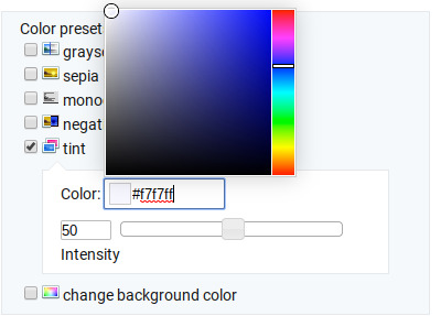
Again, intensity should be up to 100 (it automatically starts at 50 and I was too lazy to move it while getting screen shots :P).
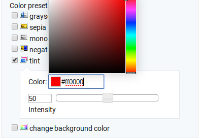
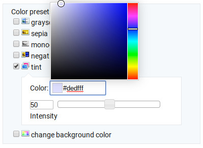
For this gif, I actually used a new technique I’ve been trying out where I start with a light blue tint to even out the color tones, then once that gif is done, I go back to effects and add a layer of pink to make the colors brighter. Usually, one color works fine, but sometimes it’s hard to find a good balance (the red colors can get too red and the blue sometimes brings out too much of a yellow shade). For now, I have my color tint set at #eeebff.
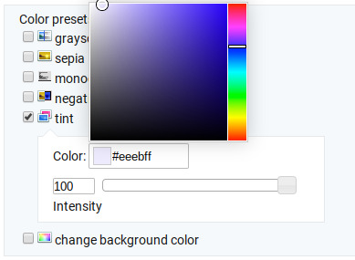
Ultimately, this is what my effect settings look like and this is what the gif looks like now.
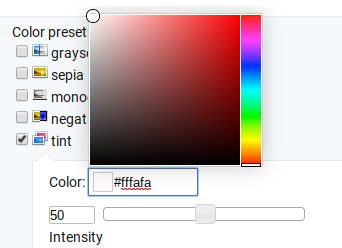
Now, like I said before, I added another layer of tint to this gif. All you have to do is go to the menu under your gif, and click on effects again.
It will take you back to the panel you were just on, expect now your colored gif is on the top and all the settings are blank again. The only setting you need to use now is the tint option; go there, and select a light red shade. I used #fff0f0.

And here is the final gif! To save it, just right click and hit “save image as.”
I know it seems like a long process, but once you get a hang of it, it goes by super fast, especially if all your gifs are coming from the same video.
BONUS: Adding text
If you are trying to gif something with dialogue or you want a quote to put over your gif, you will want to put text over it. ezgif has a “text” option that you can use if you want, but I personally don’t really like their font options, so I use the website Online Image Editor.
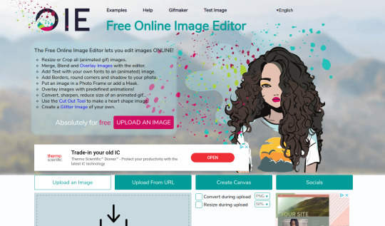
This is what it looks like. You can either hit “upload an image” and upload your saved gif, or you can go back to ezgif, right click the gif, hit “copy image url” and paste that url into the “upload from url” option. The web page should now look like this.
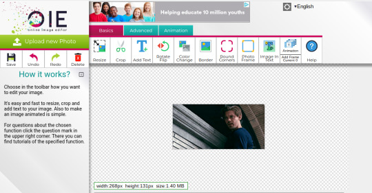
It’s pretty straight forward from here; click on the “add text” button and a menu will appear on the left hand with options for the text.
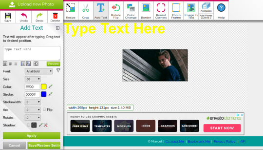
Type whatever you want the caption to be in the “type text here” box. This website has a ton of font options you can play around with, but when I just want to caption a gif, I stick with “Arial Bold Italic.” For a 268p gif, the font size should be 10-12, depending on how much writing you plan to put on each gif (if some gifs are going to have more writing than others, pick a smaller font size so it stays consistent!) When I make a 540p, the font goes up to 14-16. I use white for the color and black for the stroke. I make the strokewith 3 because it makes the caption stand out more. Once all these settings are selected, hit the “preview” button under the text box.
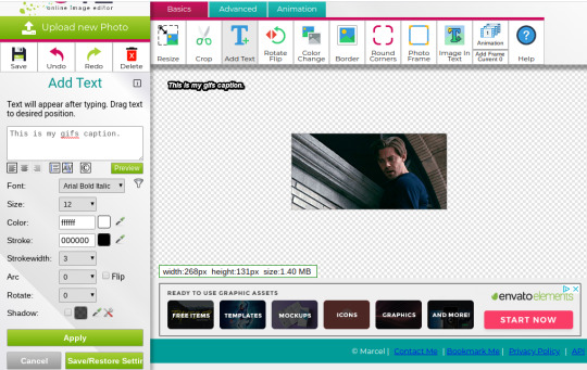
You can now drag your text anywhere you want on the image! The only bad thing about this website is that it doesn’t automatically center text, so you either have to eyeball it, or if you’re picky, like me, open up one of those online ruler applications and use it to measure out the center. For captions, I move the text just slightly above the bottom of the gif.
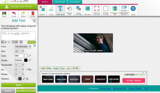
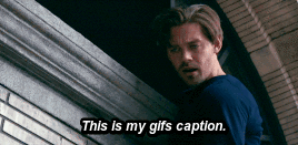
Finally, you hit apply. Once your gif has the text on it, all you have to do to save it is right click it and hit “save image as.” And here is the finished project!
That got a lot longer than I thought it would, but I hope it was informative! If anything was unclear or if you have further questions, feel free to send me an ask. Thank you for reading.
#gif tutorial#giffing tutorial#giffing#gifmaking#mine#my gifs#long post#I hope this makes sense lol#pls rb if it helped!!!#also if mobile doesn't keep the read more...idek
323 notes
·
View notes
Text
owen harper’s badges
i was struggling looking for places to get owen’s badges (and just find out what the badges actually were tbh) so now that i have finished im gna share my knowledge with u all
if i missed any lmk and ill add them<33
lets start off easy dkjfh
red che guevara badge

this is a pretty common find
very easy to find ; ‘che guevara badge’ in ebay or etsy would do the trick
here is one: Che Guevara BUTTON PIN BADGE 25mm 1 INCH Political Student Cuba Face Revolution | eBay
uk subs badge
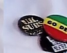
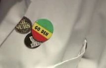
i love this band i will not lie 10/10 recommend
the photos we have of this are unclear - the badge looks mottled, like it could be khaki coloured in some photos, but there are no signs of badges like this online, so we could say its one of the more common black badges, but vintage, and has been weathered with time ? which honestly it looks more black in some shots than green
looking at different listings it does look like they fade to be greeny but i do not know
i dont have anything else to suggest so im going to blame it on weird lighting in the hub and move on
the plain black one is a common badge, one of the first things to come up when you type in ‘uk subs badge’ online (here is one for ur convenience UK Subs - Name Button Badge (rockbymail.com))
che guevara pop art badge (srry for lq image)
this one took me a while to find, but thats only because i made a spelling mistake and didnt realise for ages
id say its a pretty common badge, but it is out of stock everywhere- i put my email in on the site though so ill update the post if it comes back in stock (this site- Button, badge CHE GUEVARA - pop art | Tips for original gifts (ukposters.co.uk))
i managed to get one off of ebay, through a one-off auction, i dont imagine itd be too rare for that to happen again so just keep an eye out
manufactured by pyramid international, but is not on their site
8 ball badge
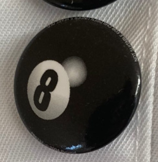
theres a lot of similar badges out there, and getting one slightly different probably wouldnt hurt that much
i managed to find an exact dupe on ebay (id drop the link but i got the last one)
this is a similar one: 8 Ball Pool 1 Inch / 25mm Pin Button Badge Black Snooker Billiards Hustler Fun | eBay
u can characterise it by the artificial reflection spot
crass anarchy and peace badge

to get an exact dupe of this badge would be pretty hard- i cant find a place that makes them with the red like owen’s instead of the black
because of this, im assuming that owen’s badge is a genuine one
if you want an exact one then keep ur eyes peeled on the likes of ebay, depop, etsy, etc one will turn up eventually
if ur lazy then a safe bet is probably just to get one made, or deal with it being a different colour (heres a link to one of those Crass - Anarchy & Peace - Button Badge - 25mm Punk Badges, Fridge Magnet Option | eBay)
john lennon badge
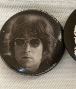
just a badge with john lennon on i found it pretty easily
John Lennon LP Cover badge Official Merchandise | eBay
siouxsie sioux badge

another punk icon i love siouxsie so much
this one took me FOREVER to find and it was so worth it i actually think its sick
this is the site i got mine from;
Siouxsie & the Banshees - Underwear Button Badge (rockbymail.com)
the clash badge
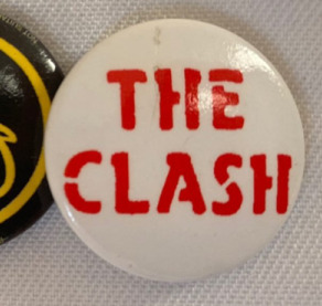
again... adore this band
i got the first one i saw on ebay, from this seller: THE CLASH Button Badge UK Punk Rock Band - London Calling, Combat Rock 25mm Pin | eBay, there is one left and i cant find another (red) for sale at the moment
there are a lot of similar looking badges out there, namely the same badge but with black text instead of red, which would work just fine (THE CLASH Button Badge - UK Punk Rock Band London Calling, Combat Rock 25mm Pin | eBay)
sex pistols im a mess badge
owen has good taste in bands
this one is pretty simple to find!! (was nice to have an easy one for a change)
owens looks to be light brown with blue text in some photos and then just look b+w in others; ur call
heres a link but if you look it up then youre almost guaranteed to find one
sex pistols im a mess | eBay
circle-a badge
kind of just ur bog standard circle a
if u want the exact badge then heres the link but ngl noones going to tell the difference between it and any other
Punk Rock Anarchy Symbol 25mm Button Badge (thevinylfrontierbarry.com)
i got my eight ball and sex and drugs and rock n roll badge (below) from the same ebay seller and they included a free one, and i love them for it
sex n drugs n rock n roll badge
pretty standard tbh
theres a few on ebay but if u google it then theres loads!!!
you didnt need me to tell u this
here is one: SEx n Drugs N rock n Roll 1 inch 25mm Button Pin Badge Punk Skin | eBay
and here is a holographic one because who does not enjoy a holographic badge SEx n Drugs N rock n Roll 1 inch 25mm Prism Button Pin Badge Punk Skin | eBay
yellow and black tongue stick out badge
this was one that i really had trouble with for some reason like i just could not find an exact match
i found a glittery one which honestly was very exciting for me
if you know where to get this badge pls hmu !!
manic street preachers badge
again, this is one i was unable to locate, unfortunately
this one was really bugging me so i made a post in forum to try and locate it, but i still came up empty handed. i think the best bet would be to get one custom made.
the text appears to be the logo on the front of their first studio album, generation terrorists (1992). i recommend btw.
like the last one, if u have any info on where to get one of these then hmu !! ill add it
sex pistols rock n roll swindle badge
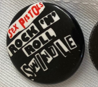
this badge had me confused for a while ngl
for a while i was sure that it was a different band and spent uh. quite a while looking for a badge that matched that description and then i checked my list again and i had a lightbulb moment where i realised that there were two sex pistols badges and id only done one (i may be stupid)
not that this realisation changed much as i still wasnt able to track one down anywhere
i played around in some editing software and made a (pretty bad but shhh) template thingy? which u can use to get ur own badge printed somewhere idk

onto the final badge (thats if i didnt forget one)
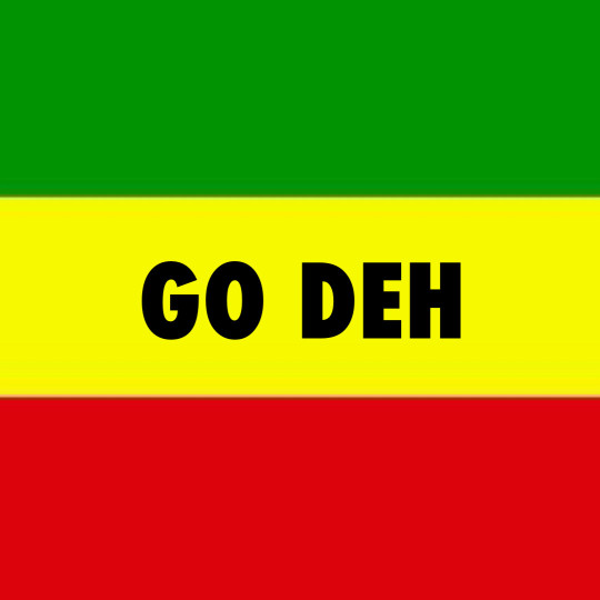
go deh badge
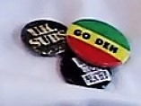

original badge manufactured by london based brand better badges (known for being one of the biggest exporters of punk badges in the 70s and 80s)
i cant find a place to recover one of these badges - i can only find two pictures of it online (that arent torchwood screenshots)
your best bet would to be get one made i reckon
i also made a template thingy for this one in case u wanted to get ur own printed. the font i used was futura condensed bold in case u wanted to do ur own (instead of using my ugly little attempt)
bonus: the frankenstein patch
Curse Of Frankenstein Sew On Patch Hammer Horror Film Movie | Etsy
dont think i missed any but in case i did then let me know!!! ill try my best to find them
thank u for reading hope i helped ! <333
when i was identifying some of his badges this post by scarecrowprops on ig really helped (https://www.instagram.com/p/CLuW01IjliB/) nd also this post (https://iant0jones.tumblr.com/post/141100170804/owens-badges-on-his-lab-coat/amp)
7 notes
·
View notes
Text
Tips on creating fun fanfic headers!

i had so much fun writing the fanfic writing tips yesterday and i got a few more questions about header-making, and so i decided to make one more of these! i hope these tips help somebody out there! hope you enjoy :)
p.s. these tips won’t require any hard editing skills or photoshop skills, nor any expensive tablets/apps!
typically i spend around ~5-10 min creating one header, and that’s either after i think of/finish a fic. i have so much fun doing it and sharing it with you that i figured i’d share how i do it!
why headers?
as I talked about in my fic tips, one of the most eye-catching things about fics are headers. when i’m scrolling through a rec page, my home page, a tag, or even someone’s masterlist, i’m immediately drawn to well-made headers. that’s what captures my attention, and then i’m more drawn in by the content. so, you can say that headers is your own version of an ad for your own fic, or an extension of it (like the cover of a novel!)
if you were writing your own book, imagine how much time you’d spend figuring out what you wanted your cover to look like. i try to have as much fun and invest as much time making my own headers because it’s just the cherry on top to my finished product :)
disclaimer: BUT HEADERS ARE NOT NECESSARY/DO OR DIE! if you don’t feel like you want to do this, then keep writing! its ok! this is just a suggestion. i’ve seen plenty of well-written fics without headers at all, so don’t beat yourself up over not having one/not wanting to do one. this is truly just a fun, extra kind of thing, and only keep reading if you want to learn how i do it! :)
tips for people who don’t want to make headers: if you still want something to make your fic stand out, use gifs! i use them in my drabbles a lot! this will at least give ur fic a lil boost!
how to find pictures
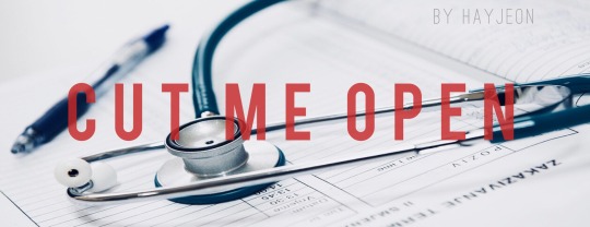
I typically use unsplash, which is a free website in which photographers upload their HQ pics for free use. the pics are really high quality, typically stock photos, and don’t have any logos on them like other ones on google. unfortunately, you won’t find any pics of the members or anything, but you’ll find beautiful stock photos of typical scenes like “ocean scene” or “desert scene.” I found the stock photo for cut me open (shown below) on that site by just looking up “medical” or “doctor”.
i used to use google a lot and just use keywords like “desert scene HQ” and edit the search settings to deliver HQ pics, and a minimum # of pixels, but unplash is definitely better in terms of quality, more aesthetic photos, and no logos/watermarks.

on some occasions, i will screenshot some scenes of youtube videos, turning up the quality to 1080p or 4k and zooming in so that the pixelation is as crisp as possible, and then editing it later to look good (which i’ll explain in a second!)
the above photo was a scene from the specific characters from the drama, “100 Days My Prince” that I screenshotted from a youtube video that TvN uploaded, recapping the drama. I cropped it just right so that their faces were left out, which i’ll also mention soon!
things to look for when picking pictures:
you want the picture to reflect a specific motif/theme from your fic! if its a moody fic, then try to find a moody scene that you can edit with filters/lighting to look even moodier; or if the characters’ jobs are a big portion of the fic (like cut me open/doctor theme) try to look for stock photos with that shown very clearly!
make sure its high quality: tumblr really dumbs down the quality of the photo when uploading it, so try your best to find something with a lot of pixels in it so that when you start editing, you don’t sacrifice too much of the quality already
try to look for something simple/clean: a picture with too much subject (ie. people in the background, or too much detail) may end up taking away from the main point of your header, which is your title. so find pics without too much clutter!
try to make sure its landscape: which will help during editing to save some of the quality better.
editing your pictures
now that you have a specific photo you want to use, now its time to edit! I use VSCO CAM (free app) and my own apple photos cropping tool for faster crops.
crop/adjust: if your picture is too large/wide, crop it to at least a 16:9 ratio. i’d say aim for skinnier if you can, so that you don’t take up too much space (especially if you’re planning to add headers to your masterlist). also crop out any faces, any clutter, any unnecessary details, so you have a nice, clean slate to work on when adding text.
contrast/sharpen/clarity/white balance/etc.: i’m not gonna give you a lesson on photography, but i’ll tell you I learned like 80% of everything that i know just by fiddling with it on VSCO! So just try it out and play with the app, see what you can make of it. i’d say a rule of thumb to follow is that you want happier fics with a brighter tone, and moodier/angsty fics with a darker tone so that it can reflect the nature of the fic further, without saying anything!
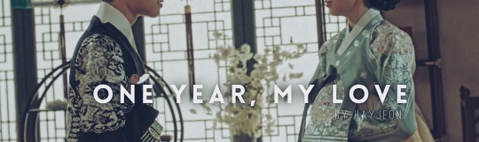
if you wanna be extra af like me, then go a step further and photoshop your pics. this one is a good example; when i screenshotted this scene from another youtube video for my fic One Year My Love part 2, i was specifically looking for a scene that would showcase the ornate/regal details of their clothing/environment in contrast to part 1′s modest clothing/scene (the first header in this post).
i found this scene, but actually, this scene portrays the Crown Prince and the Princess, not y/n. So, the actors weren’t smiling at all! They were actually frowning at eachother in this scene, to portray the tension between the two characters and their marriage.
So, I took the extra step, adjusting the pic with VSCO so that their shoulders/chins were at the same level, cropped off their faces up until their lips, and then used the adobe photoshop free app to photoshop their lips to be SMILING at eachother!!!! subtle, but important!
call me crazy for taking that much time but i’m so proud of how it turned out and i loved every second of making this one. that way, this scene makes it portray the happy ending for Jungkook and y/n!
adding text to your header
you can use any app out there, but i really like Font Candy! I actually ended up buying the 2$ version of this and never regretted it, but you can actually find a lot of their basic fonts on the free version; I tend to use the fonts: OSTRICH SANS, BEBAS, TREND, and INTRO the most! these are pretty clean-looking, block letters that look good whenever i put them as my titles.

I love this app too cause you can easily control the spacing between letters to make them take up more space, add shadows, or even make them contrast their background using the overlay feature; like this one i made for wildest dreams (see how the text changes depending on what part of the photo its on? amazing! it’s literally with a click of a button!!)
And i’ll always add “written by HAYJEON” or “by HAYEJON”, space it out, and add it somewhere underneath as my own branding.
orrrrrr
if you want to be more creative, you can even go a step further and use whatever you have on hand to enhance whatever you’re trying to portray.
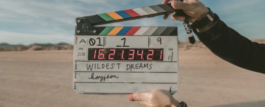
for this one, i ended up finding this amazing photo on unsplash and i thought it would do a create job of portraying the “movie-set” quality of what wildest dreams is going to be about. this stock photo had someone else’s names on it, so i used my ipad, and used instagram to just erase the existing writing with the color of the background, and then wrote in my own title and url with my own handwriting/apple pen!!!
i thought this was pretty cool because it’s like wildest dreams is its own movie/has its own movie set, which, once it’s out, you guys will see that it’s supposed to be!
saving/uploading
this is pretty easy/obvious, but i figured i’d mention it. all the apps i mentioned are available on the appstore, and they will save directly to your photos. after doing that, i’ll just upload them into a special folder i have on my google drive so that when i’m finished writing a fic on tumblr using my laptop, i can easily download the photos without sacrificing quality. easy!
and that way, i can save them forever; even if i have to delete them from my computer, i can always redownload them!
side note: making text separators
i just recently started doing this, but ever since tumblr took down their text separators, i’ve just been cropping the bottom like 5-10 pixels of the header to use as my text separators! (with my laptop)
i saw some other writer doing it and thought that it looked better than what i had used previously (a cropped photo of a random line i found on google); i found that doing this tied my fics together a little better and just looked better aesthetically;
so there it is! hope you enjoyed! :) i would love to see what other tips you guys have been using, feel free to send me an ask or reply to this post; and if you end up using any of my tips, please let me know! I love to hear from you guys all the time <3
lots of love, especially during these times,
hay <3
141 notes
·
View notes
Text
The Art of the Marvel Logos
Something a little bit different for you. Anyone who knows me (even a little) will know about my life-long love of Marvel (the superheroes, not the powered milk). From reading the comics as a child to the TV shows of the 70s and 80s (I’m looking at you Spider-Man and The Incredible Hulk) to the modern day movies that have dominated cinemas for the last 10 years or so, I’m, a life-long member of the Merry Marvel Marching Society.
Whilst the movies, under the stewardship of producer Kevin Fiege, are the epitome of the modern Marvel universe (let’s gloss over the ones that came before or from other studios) and I love them all dearly (maybe not equally, but dearly), there’s an aspect of them that often gets overlooked and that’s the graphic design that went into their logo’s.
Here I want to take a look at some of my favourite logos from the MCU and what I think is so great about them from a design point-of-view. It gives me a chance to geek out a little, tell you what I love about them (the logo, not the film) and hopefully you will come across some details you haven’t seen before that will make you appreciate the design work that goes into something people gloss over. There aren’t many sequels in the list (just adding a ‘2’ to it doesn’t make it any better) but there are a couple of notable inclusions.
Bear in mind this is just my list (in chronological order of release) and my own preferences, so it isn’t meant to be anything other than my own musings! I’ve also tried to track down the person / agency who designed the logo to give them the credit. Apologies if the details are wrong or missing. Once Marvel was bought up by Disney, I imagine they were all designed ‘in-house’ from that point. I haven’t included any of the Marvel TV shows or the Netflix ones either. Not that there’s anything wrong with them (the Luke Cage one is great), but I just preferred to concentrate on the movies within the MCU.
So, let’s start with the movie that kick-started the whole Marvel Cinematic Universe, starting with ….
1 - IRon Man (Released 2008)
It’s easy to forget that Iron Man was the first movie that was released by the then independent film studio Marvel had created. Marvel Studios, before it was bought up by Disney, was a newcomer to the world of cinema, and with the more widely-recognised of their characters owned by other studios (X-Men, Fantastic Four, Spider-Man, etc.), they had to go with what was deemed to be their ‘B’ List characters.
Fast-forward to today and it’s hard to think of Iron Man being anything other than the cornerstone of the MCU, but back in 2008, releasing a movie, their first movie at that, based on a lesser known character was a huge risk. We needn’t have worried.
The Iron Man logo, at least the one accompanied the movie (the logo was slightly different when the initial teaser was released) was created by designer Fede Ponce. As the studios first film, it had to convey not just the title of the film, but a confidence in both themselves and the film itself.
I think what I love the most about the logo is how it manages to combine the aesthetics of the original comic book logo whilst giving it a modern twist. The metallic (he IS Iron Man after all), photo-realistic texture, works perfectly, uniting the past and the present together in a relatively simple design.
Ponce, after reading the script, described the movie as being one of redemption, and he’s right. Tony Stark goes from being the money-focussed weapons dealer and businessman who cares for little except himself but, (SPOILER ALERT) after being captured and coming to see how his weapons are being abused, becomes the eponymous hero we all now know and love.
This redemption is reflected in the logo too, literally. Thanks to the metallic textures and use of sunlight reflecting and breaking through from the bottom of the text, it signifies this rebirth for Tony Stark at the dawn on a new era.
2 - The Avengers (released 2012)
Here in the UK, we had to contend with it being called ‘Marvel’s Avenger’s Assemble’ because of perceived complication with an earlier movie based on an old TV series called The Avengers. Eugh! For the sake of this, let’s just pretend it was called what everyone else was calling in.
Without their ‘heavy hitters’ to call upon, The Avengers brought together Iron Man, Captain America, Hulk, Black Widow, Hawkeye and Thor in a movie that would change what a superhero movie looked like forever, not to mention the culmination of the first real cinematic universe that continues to grow to this day.
The logo for Marvel’s first ‘team-up’ movie is probably the one that most closely resembles the original comic book logo, but that’s not a criticism. If it’s not broke, etc. It’s more of a dynamic refresh, rather than a full reboot of the original comic book design, with the classic Avengers ‘A’ leading the charge.
Within Marvel, this design cue was known as the ‘Big A’, not least because its larger type and the arrow thrusting forward. It was designed way back in the 1970s by designer and Marvel letterer (what a great job title) Gaspar Saladino. Gaspar, who also worked a lot for rival DC Comics, worked most of his life in the comic book industry. This piece of artistry from Saladino debuted in the Avenger’s comic in 1972.
The logo for the movie built on Saladino’s work by placing the ‘Big A’ inside a ring to give it more dynamism. Even the word ‘The’ was italicised to further portray forward momentum, something the studio was also experiencing following the success of Phase 1 movies they had released to great critical and audience response.
As with the Iron Man logo mentioned above, this also features an embossed metallic texture to signify their strength. The sharp edges and corners on the ‘G’ and the tie of the ‘Es’ (notice how the middle of the ‘E’ differs from the top and bottom) also help to define this.
As of writing, we’re now four Avenger’s movies deep and the logo hasn’t really changed that much over the course of those films, other than the addition of a subtitle. A sure sign that they were onto a winner as far back as the 1970s.
3 - Guardians of the Galaxy (2014)
This might seem like a strange addition to the list; a fairly plain logo for a movie based on a team most people won’t have even heard of at the time, but there’s actually a lot going on here. Allow me to explain.
This was another logo that was redesigned following it’s initial announcement in 2012 (thankfully),like the Avengers, the Guardians was going to be another Marvel team-up movie, but one for a group of ‘heroes’ (or maybe space pirates) based on a relatively recent comic book run (from 2008).
Whilst the name had been around in the comics since 1969, this was (mostly) based on the modern iteration by writers Dan Abnett and Andy Lanning.
The movie and its characters were out of left-field for a studio that had, until now, played safe with its choices (albeit limited by rights issues). Guardians of the Galaxy most certainly didn’t. That meant most people, even those relatively familiar with Marvel, didn’t know what to expect, which is why the logo utilises the fundamental style of the logos that came before it, albeit with some fun subtle twists. The metallic texture isn’t as polished and ‘new’ as Iron Man or the Avengers logos were; it’s worn, almost beaten down and looks a little tatty, just the like the team themselves.
Also look at how ‘of the’ is positioned. It’s clunky and off-kilter, placed far left of centre, just like the team in the movie. It also beautifully symbolises the relationships within the team of Star-Lord, Gamora, Rocket, Groot and Drax. We might not have known what to expect when it was announced, but we so fell in love with them when we saw the movie.
4 - Doctor Strange (2016)
Doctor Strange was the movie that took the MCU into the realms of magic, alternative dimensions and the seeded the multiverse. In design terms, it was also the movie that moved away from the metallic, block capitals that were starting to look a bit ‘samey’, but not eschewed it completely.
Doctor Strange isn’t just the character name, it’s literally the name of the protagonist. He IS Dr. Stephen Strange, a gifted surgeon who, following an accident, leaves him incapable of practising. As he searches the world for a remedy, he comes across The Ancient One who opens his eyes to a whole new world of magic, mysticism and martial arts (in the comics at least).
Dr. Strange isn’t your typical muscle-bound hero like we’ve been used to seeing, and the logo reflects this. The narrow, elegant font (it’s called 'Baker Signet if you’re interested) helps the logo stand out from those that came before, just as the hero does. It’s still reflective, but it’s also reflecting itself thanks to the ridged letters, just as the character reflects on himself to find his place in this new world he finds himself.
5 - Spider-Man: Homecoming (2017)
For me at least, when I think of Marvel, I think of Spider-Man. Together with the Fantastic Four, he was my ‘go-to’ character when I first starting reading the comics as a child. I think part of the appeal of any superhero character is that, when you see them, you can see yourself being them. OK, even at that young age I knew I couldn’t BE Spider-Man, but I COULD be Peter Parker quite easily.
I loved the comics, I even loved the TV show in the 70s with Nicholas Hammond and I also loved the Tobey Maguire iteration. They were all great, but for me at least still lacking a certain ‘something’; that one factor that would illicit those beloved memories of childhood.
When it was announced that Spider-Man was going to be part of the MCU, I was giddy with excitement. When I first saw Spider-Man: Homecoming in the cinema, it was, I think, the first time that the character I loved as kid in those comic books was truly brought to life on the screen. I loved the film and I loved the logo for it.
Spider-Man’s introduction brought with it a new youthful energy into the MCU. Peter Parker wasn’t a middle-aged white guy with muscles on his muscles, he was a teenager struggling to balance life, school and everything that the teenage years brings with it. He brought that sense of wonder and fun with his wide-eyed, some-would-say naive outlook on the world and the logo illustrates that brilliantly.
Logo’s that came before certainly tipped their hat to their comic counterparts, but were still very much ‘movie’ logos. This one, I think, was the first to fully embrace its comic book roots and not be ashamed of it. The youth of the character is reflected in the curved title and the graffiti-esque uses of the Spider-Man symbol forming the ‘o’ of Homecoming further establishes its younger aesthetic. You could see this logo grace any comic book, now or then. Welcome home Spider-Man.
6 - Thor: Ragnarok (2017)
After the much derided Thor : The Dark World (which isn’t actually as bad as people lead you to believe), the Thor franchise took at much needed twist with the recruitment of the brilliant Taika Waititi to direct the third movie. The logo for Thor: Ragnarok wasn’t excluded from this shake-up, but Taika’s influence is clear. The logo, when the film was first announced, was a much more sombre affair and owed much to the two films that came before it.
Ragnarok didn’t take it self too seriously. It was equally full of ironic wit, self-parody and production design that harkened back to the days of Jack Kirby’s colourful artwork from the comics. The logo epitomises all of this.
It was also part of the continuation of Marvel movie logos that veered away from the typical examples that came before it around this time. This, together with the afore-mentioned Spider-Man: Homecoming and even the Guardians of the Galaxy sequel when announced, all were much more playful in tone and styling.
It might look like a hodge-lodge of retro elements, from its 80s typeset to the jumble of video game colours. In many ways, as a logo, it really shouldn’t work, but it does. It perfectly represents Thor’s latest outing as something different from the masculine, all-too-serious muscle-fests we’d seen before.
7 - Black Panther (2018)
Not content with the first female-led movie coming over the hill (see below), Black Panther was the first Marvel movie with an almost entirely black cast. It proved to be a commercial and critical success and became the first Marvel movie to be nominated for the Best Picture Oscar at the Academy Awards. Many other MCU films had been nominated for the technical categories before this, but not one of the ‘big’ awards. It didn’t win, but it was (and is) still one hell of an achievement for a ‘comic book movie’.
The character of T’Challa was first introduced to the MCU in Captain America: Civil War. For his own solo movie, we got to look at the fictional nation of Wakanda, a mysterious but technologically advance kingdom, hidden from the rest of the world. Black Panther is a logo fit for a king, it’s both regal and dynamic, just like it should be.
You might think it’s asking a lot for a logo to reflect all of these things, but I think this one manages it. The sleek lines matched with the precision of the lettering display the spirit of technological advances Wakanda is known for. The uses of blue and gold, within the 3D letters, ooze majestic splendour. In addition, with the first and last letters of Panther larger than the rest and the elongated point of the ‘N’ gives a static logo a real sense of purpose and movement.
8 - Captain Marvel (2019)
With 2019’s Captain Marvel, we got our first female-led superhero movie. I mean technically it was 2019, but the film itself was set in the 1990s. making full use of the de-ageing technology on Nick Fury, not to mention the logo itself. It’s a nostalgic love letter to the period of Blockbuster video shops and painful computer loading times.
As you would expect for a movie set 20+ years ago, the logo is reminiscent of the the movies of that era. The red and gold colours with the retro (for now, futuristic for then) lettering places the movie in our mind perfectly. Imagine any Schwarzenegger or Stallone film of that time using that same font. Little fact for you; the font is actually called “CaptainMarvel” and was designed by FontStudio LAB.
What I really like about it though is the space between the words. Normally this would be just negative space, but here they have added a glow, an explosion perhaps or a callback to her uniform, but either way it tells us that this is still a superhero movie, with all the crash bang boom you’d expect from it. It’s just subtle enough to let you make your own mind up.
9 - Avengers: Endgame (2019)
Avengers: Endgame marked the culmination of 20+ movies spanning 10+ years in what came to be known as the Infinity Saga. The movie has to hit so many targets but it managed it (just) and the world seemed to agree, making it the highest grossing movie in history. For a movie so jam-packed with heroes, the logo has an almost wistful feel to it which, if you’ve seen the movie, you will understand.
Marvel kept with the classic Avenger’s logo, but by using a more mature colour palette and the aged look of the texture signifies the passage of time (which, again, if you’ve seen the movie, you’ll get) and gives a more sombre feel. Of course, that’s only half the story.
The ‘Endgame’ subtitle is also more muted, especially compared to the previous sequels Age of Ultron and Infinity War. You get just a faint hint of a sunset at the top of the lettering. The kern is also wider, more separated, signalling that the heroes we know are closing the curtain on their adventures and finding their own way from now on. Bittersweet maybe, but we love it 3000.
10 - Thor: Love and Thunder (2022)
At the time of writing, we’re still waiting to see this movie (I don’t think it’s even been finished filming yet!) but we know it’s coming with Taika Waititi back at the helm of Thor’s 4th solo movie. Fresh (well relatively speaking) from the success of Thor: Ragnarok and its fantastic logo, we have another retro-tastic entry for Thor: Love and Thunder. It’s also too much logo for one film; its over-the-top uses of bold colours tells us what we can expect from the movie. It’s going to be BIG!
Like many of the latter logos, it’s fun, it’s colourful and reminds me a lot of the Marvel cartoons from the 1980s and 90s in its pomp and splendour. I can't wait to see it when it’s released (if movies ever get released ever again - curse you COVID19)
We hope you’ve enjoyed this little jaunt through the MCU with our graphic design glasses on. This obviously isn’t all of the logo’s or all of the movies so if there are any that I haven’t included that you like, let us know in the comments below. Remind us in 10 years and we’ll do it again. Nuff said.
#Marvel#Marvel Cinematic Universe#MCA#Logo#Graphic Design#Kevin Fiege#Iron Man#Guardians of the Galaxy#Spider-Man Homecoming#Fede Ponce#Dr Strange#Doctor Strange#Luke Cage#MCU#Captain Marvel#Disney#metallic#logos#analysis#artwork#Gasper Saladino#Big A#Avengers#Endgame#Avengers Endgame#The Incredible Hulk#Spider-Man#Black Panther#Wakanda#The Best Logos of the MCU
5 notes
·
View notes
Text
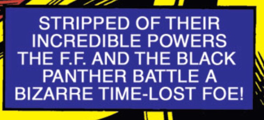
Fantastic Four Vol 1 #241
Sun Dec 20 2020
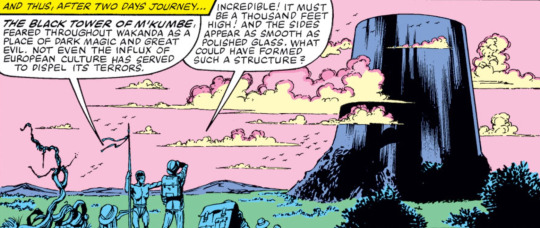
[12:49 PM] Wack'd: Front-cover tagline is one font change away from being a Jeopardy! clue
[12:50 PM] maxwellelvis: Who is "Kang the Conqueror"?
[12:51 PM] Wack'd: We open on Nick Fury showing the Four a digital map of Africa with a huge glowing spot indicating a massive power surge
[12:51 PM] Umbramatic: welp
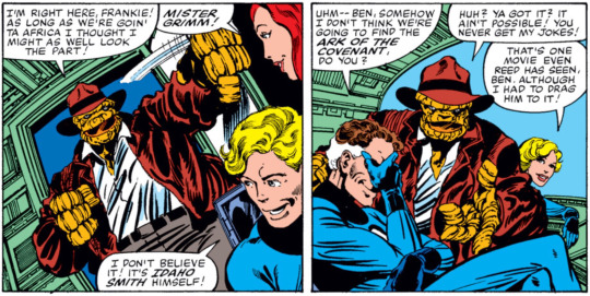
[12:51 PM] Wack'd: Ben thinks "maybe the ay-rabs got some new power source" which, y'know, fun
[12:51 PM] Umbramatic: oh geez
[12:52 PM] Wack'd: Anyway the cover's got Black Panther on it, so naturally this surge is on the Wakandan border
[12:53 PM] Wack'd: T'Challa won't let SHEILD in, and he's resigned as an Avenger, but Fury figures since the Four are old friends T'Challa might let them do some snooping
[12:54 PM] Wack'd: Ben naturally is like "wait, if you're respecting Wakanda's sovereignty how did you guys flag this"
[12:55 PM] Wack'd: Turns out SHEILD was following some other weird phenom and stumbled into this by accident. Said phenom turns out to be Attilan flying to the moon
[12:55 PM] Umbramatic: oops
[12:55 PM] maxwellelvis: Good thing Reed's collar stretches.
[12:56 PM] Wack'd: Reed says he took special measures to make sure every airspace that got violated got a message not to worry about it which 1. seems like a good way to make folks worry and 2. I guess he forgot to send SHIELD that memo
[12:58 PM] Wack'd: Hmmm. Not sure I like this
[12:58 PM] Wack'd: Also Raiders had like just come out which is weird to think about
[12:58 PM] Umbramatic: ben is cosplaying
[12:59 PM] Wack'd: He's cosplaying a Mightey Whitey character for an Africa trip which. There are worse options I guess
[12:59 PM] Umbramatic: oh
[01:00 PM] Umbramatic: that did not sink in at first
[01:00 PM] Wack'd: We're still doing huts and loincloths, huh? I am increasingly wondering when he Afrofuturism kicks in and we get a Wakanda that's less...this

[01:01 PM] Umbramatic: ...same
[01:01 PM] maxwellelvis: Not until black people start writing for Black Panther.
[01:01 PM] Wack'd: (Probably once Black people get a crack at writing it tbh--yeah
[01:01 PM] Wack'd: Also: did Bryne change Ben back to a lump for the sole purpose of justifying let's-you-and-him-fight bits
[01:02 PM] Wack'd: Because if so that's...actually pretty clever
[01:04 PM] Wack'd: Anyway the Four + Frankie go undercover as a safari complete with pith helmets and fatigues. Which always feels more like cosplay than realism when fictional characters do it no matter what the era
[01:04 PM] Wack'd: Like when characters from the American south wear white suits. I always assume it's something that got come by thirdhand even though who knows maybe it's a thing
[01:05 PM] Wack'd: Well something’s up

[01:07 PM] Wack'd: Hm. The implication that Wakanda has gotten less superstitious because of Europeans is certainly gross!
[01:08 PM] Wack'd: The Four get a closer look and find some Russians had also been investigating. Operative word being "had" because they're all skeletons now
[01:08 PM] Bocaj: No telling where the meat ran off to
[01:09 PM] Wack'd: No telling indeed
[01:10 PM] Wack'd: No sooner do they start investigating than the team are ambushed by a squad of folks in gold-and-red Roman centurion cosplay. Not wanting to blow their cover, the team lets themselves get taken hostage, but Sue turns invisible before she's noticed so the team has an advantage if things need to pop off
[01:10 PM] Umbramatic: spooky scary
[01:11 PM] Umbramatic: what's with all the fucking cosplay this issue
[01:11 PM] Wack'd: The team are led through a mountain stocked with Kirby-esque tech and led out the other side to:
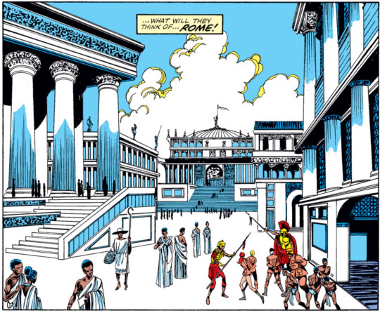
[01:12 PM] Umbramatic: well
[01:12 PM] Umbramatic: when in rome
[01:13 PM] Wack'd: You know when I asked when the writers will realize Wakandans should probably have some degree of advanced architecture and whathaveyou this is not what I had in mind
[01:14 PM] Wack'd: Frankie knows how to deal with sexual harassers and also racists

[01:14 PM] Umbramatic: good
[01:14 PM] Wack'd: ...god I hope the guy under that helmet is white because if this isn't deliberate I'm gonna go apeshit
[01:15 PM] Wack'd: ......unless I guess a white guy saying that doesn't necessarily mean the white guy writing it is deliberately writing a racist, considering *gestures at Wakanda's whole deal*
[01:15 PM] Bocaj: I hope this isn’t nova roma
[01:15 PM] Bocaj: That’s supposed to be in South America and also they tend to wear black face
[01:15 PM] Bocaj: Not Claremont’s finest hour
[01:16 PM] Wack'd: Does the name Gaius Tiberius Augustus Aggrippa mean anything to anyone. Also does it mean anything period, like, is that actual Latin
[01:16 PM] maxwellelvis: It's just nouns
[01:17 PM] Umbramatic: it sounds like a lot of emperor names mashed together and also that
[01:17 PM] Bocaj: It sounds like all Roman names because there were only like twenty names and every Roman used every so far one
[01:17 PM] Bocaj: Caligula’s real name was Gaius Caesar Augustus Germanicus
[01:18 PM] Wack'd: Having lost the element of surprise Reed orders an ambush but GTAA manages to neutralize their powers. Including Sue's, which, how'd he even know she was there, c'mon
[01:18 PM] Bocaj: Boo
[01:18 PM] Umbramatic: boo
[01:18 PM] Wack'd: It is time now for the traditional sequence in which the entire team is locked up and has to escape
[01:19 PM] Bocaj: It sure happens to them a lot
[01:19 PM] Bocaj: You’d think Mr Miracle was a fantastic four member at this rate
[01:19 PM] Phantom: Hmm it's interesting how much I associate Latin with species names
[01:20 PM] Wack'd: It turns out the deception vis-a-vis Black Panther was just the ol' Queen Amidala gambit. T'challa gets in a Batman boast about how you can't neutralize his powers because his powers are just having worked out a lot
[01:20 PM] Umbramatic: MUSCLES
[01:21 PM] maxwellelvis: This was before the Heart-Shaped Herb was a thing?
[01:21 PM] Wack'd: T'Challa has been put in a slave gally because of course. Reed and Frankie are shackled in dungeons to the ceiling. Sue....has been stripped naked and left in a lavish bedroom
[01:21 PM] Umbramatic: ...oh
[01:21 PM] Phantom: of course
[01:22 PM] Wack'd: GTAA has had "games called in [her] honor" which I assume means Gladiator. Maybe he'll surprise us by being big into baseball, who knows
[01:22 PM] maxwellelvis: What are the odds that Byrne actually knows what gladiator games were like?
[01:22 PM] maxwellelvis: I'm guessing not very good.
[01:22 PM] Umbramatic: GTAA is really into esports
[01:22 PM] Wack'd: Middling to low
[01:23 PM] Wack'd: T'Challa tries to break Frankie out of her cell by just being like "hey, I'm your king, knock off this fuckery" but the guards aren't having it
[01:23 PM] Bocaj: “You can’t neutralize my powers” is a weird flex when you get caught anyway
[01:23 PM] Wack'd: Yeah
[01:24 PM] Wack'd: GTAA decides to exposit his backstory to Sue
[01:26 PM] Bocaj: I like to imagine that she makes the blah blah gesture while he talks
[01:26 PM] Wack'd: He was an ancient Roman soldier sent to investigate a "falling star" which, of course, was actually an alien spaceship. He managed to dispatch its sole occupant and steal their armor, which imparted to him great smartitude
[01:26 PM] Bocaj: Sure, of course
[01:26 PM] maxwellelvis: Aaarrgh! No! Not another Prester John!
[01:27 PM] maxwellelvis: John Byrne, have you no decency at all, sir?!
[01:27 PM] Wack'd: By the time he got back his platoon had pulled out of the region for reasons unknown so he did what anyone from another culture with superior force and no mandate does when stranded across borders and take up dictatorship as a hobby
[01:28 PM] Wack'd: So, uh.
[01:28 PM] Wack'd: There are some...coloring discrepancies...in this book
[01:29 PM] Umbramatic: oh
[01:29 PM] Wack'd: I glossed over a panel with a Black Frankie Raye because, uh, I didn't really have a good joke about it, frankly
[01:29 PM] Wack'd: But it seems instructive because there are two flashback panels where GTAA is colored Black and then a further three where he's a white guy
[01:30 PM] Bocaj: In fairness
[01:30 PM] Bocaj: That is in character for a Roman
[01:30 PM] Bocaj: The dictatorship as a hobby I mean
[01:31 PM] Wack'd: Dude has gone increasingly mask-off, racism-wise--during his backstory he boasts about rendering all his subjects mute because their language offended them and trying to teach them Roman was a bust because he still hated their "gibbering monkey voices"
[01:31 PM] Wack'd: So, uh, I guess we'll see if this issue ends with An Aesop
[01:31 PM] Bocaj: ....
[01:31 PM] Umbramatic: wow dude
[01:32 PM] maxwellelvis: He... DOES know there were black people in Rome, right?
[01:32 PM] Wack'd: Bryne? I mean it's the 80s
[01:32 PM] maxwellelvis: Either or
[01:32 PM] Wack'd: Most pop culture assumed every country had monoracial societies in The Past until like ten years ago
[01:33 PM] Bocaj: Not that rome wasn’t racist to anyone not from rome but
[01:33 PM] Wack'd: You can pin a lot on Bryne but "yeah of course Romans were all white" is pretty on par
[01:33 PM] Wack'd: Oh also GTAA deliberately named himself after Caligula so there's that settled
[01:33 PM] Bocaj: Sure
[01:34 PM] Umbramatic: so we can stop calling him Grand Theft Auto Anarchy
[01:34 PM] Bocaj: We don’t have to
[01:34 PM] Wack'd: Anyway GTAA wants Sue as his bride and if she refuses he will force Johnny and Ben to fight
[01:35 PM] Wack'd: ...to the death, not like usual
[01:35 PM] Bocaj: Ha
[01:35 PM] Bocaj: It’d be funny if she was like “oh is it Tuesday already?”
[01:35 PM] Wack'd: *long, deep sigh*

[01:36 PM] Wack'd: Thankfully Sue's immediately like "his powers come from his helmet, right? All I gotta do is take the helmet off"
[01:37 PM] Wack'd: Turns out that helmet granted lots of powers
[01:37 PM] Wack'd: Like immortality for him and his subjects
[01:37 PM] Wack'd: And structural integrity for his city
[01:37 PM] Wack'd: And the suppressive effect on the Four's powers
[01:38 PM] Wack'd: Aaaaaaaaand there's no ontological inertia
[01:38 PM] Umbramatic: ._.
[01:38 PM] Wack'd: So just by taking the helmet off GTAA and all his slaves immediately die and the city crumbles
[01:38 PM] Bocaj: Of course
[01:38 PM] Wack'd: Kind of a bum deal for the people who spent twenty centuries in servitude
[01:39 PM] Wack'd: "WE'RE FREE!" 💀
[01:39 PM] Bocaj: Sue: “well that’s the most people I’ve ever killed at once”
[01:39 PM] Umbramatic: F
[01:40 PM] Bocaj: “I never wanted to be dead, Surfer. Frankly, I only died out of peer pressure”
[01:40 PM] Wack'd: And so everyone escapes, Reed does an exposition dump, and the story immediately ends
[01:40 PM] Bocaj: No moral?
[01:40 PM] Wack'd: Nope
[01:41 PM] Umbramatic: "don't wear funky alien helmets kids"
[01:41 PM] Wack'd: So...maybe Bryne was just being racist. I mean it seems probable but also it goes waaaaaaay mask-off in a way I don't think even Bryne woulda thought acceptable
[01:43 PM] Wack'd: Anyway I do not think I have time for another issue before I gotta leave for work. Perhaps when I return later this evening we will do the next story, which is about everyone's favorite established Four baddie
[01:43 PM] Wack'd: Terrax the Untamed
[01:43 PM] Umbramatic: :O
[01:43 PM] Wack'd: Who despite being from the 70s and thus far more recent I still had to look up
2 notes
·
View notes
Text
Yugioh S4 Ep21: Duke Puts on Duel Disk, Immediately Takes Disk Off
So last time we ended, Yugi and Tea were stranded in the middle of an ancient warfield that was hundreds of feet off the side of this cliff topped with a seldom used railroad track.
And yes, this is all somewhere in what should be one of the most populated parts of the Bay Area.

Amazed that this school uniform can go through such rugged terrain. But then again, last season it got hit squarely with a fireball, so...this school uniform is essentially a Batman suit.
But I just want to point out that Yugi didn’t take the duel disk off before vaulting up this cliff. Tea has a bag youknow...but gotta sweat up the duel disk that our entire world relies on.
It would be very funny if this season ended abruptly because Yami either dropped this thing on the ground and finally broke it, or just plain forgot he needed to charge it’s batteries.
And so now we just walk...kind of in the direction where they hope Joey and Tristan are?
I do appreciate that although Pharaoh is completely lost in a foreign country, he will not admit it.
(read more under the cut)
On the other side of the tracks, Joey is dragging his Sisyphean stone.

Please admire that this entire scene takes place somewhere in the Grand Canyon. Like it’s episode 20 and I just still can’t get past how they went to California and didn’t include a single beach.
Mai has decided she’s done screaming off the back of a motorcyle, and has decided to come over to Dartz’ lair to scream where the traffic isn’t quite so bad.
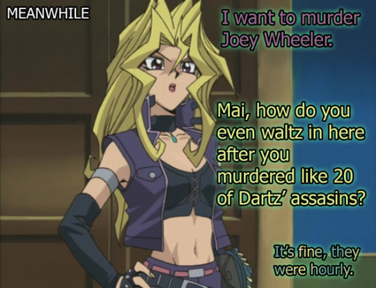

And she just rage quits.
Is this the first rage quit we’ve ever had in this show about games? Incredible.
Also, I didn’t realize you could just quit the end of the world cult in the final hours of ending the world, but I guess it doesn’t really matter much to Dartz. Whether Mai ends up killing Joey or doesn’t end up killing Joey, it’s still a soul in the Leviathan bucket so ¯\_(ツ)_/¯
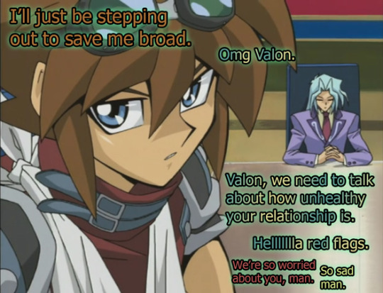
Now, in the actual dialogue of the show, Dartz tells Valon that Mai’s basically going to get what she deserves and no one here needs to even do anything to change or stop it. But, it was still somewhat surprising that this 10,000 year old serial murderer world destroyer was so down to shell out some relationship advice. Almost like maybe he has somewhat of a fatherly concern for his stupid ass murder boys. Kind of. Sort of.
Enough to try and tell Valon to leave this one alone because she’s gone maniacal pixie dream girl and there’s no coming back from that.
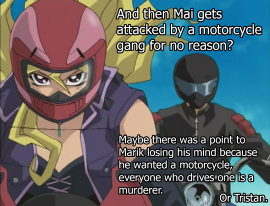
In order to have motorcycle gangs, you have to have bearable enough traffic for said gangs. That’s why we just don’t have a motorcycle gang problem in real deal California like a lot of 70′s-80′s movies would have you think. They’d only be able to drive in like...one lane, and they’d get constantly cut off and driven off the road by Google buses.
TBH the Google bus is our true modern motorcycle gang, there are just so many of these damn buses. And also, I deleted a lot of text right now when I went off about the ongoing bus war, which is absolutely a thing here. The motorcyclists are just doing me a solid by not being a car on the road and staying out of my lane.
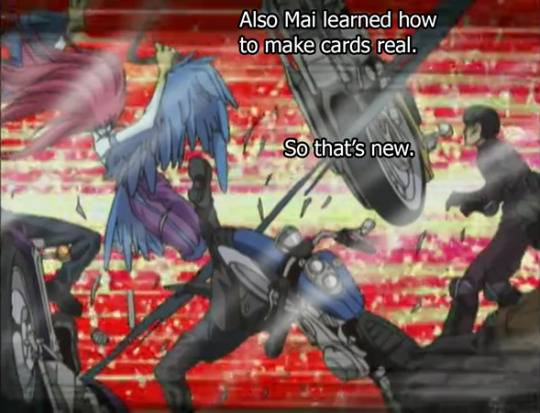
In a more realistic version of this show, Mai would have never made it to the desert, she’d be too busy watching only one single car able to turn right onto Octavia every light cycle because of all the damn private buses and uber cars flooding our itty bitty one way streets.
And to try and tame Mai, Valon decides to do this...motorcycle stand off?
It’s like he’s trying to catch a feral cat.
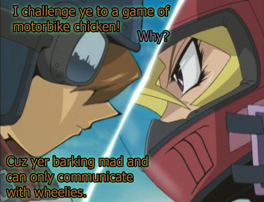
At some point one of them stops, and like I was focused too much on how good their brakes are to pay attention to who stopped first.
Probably Valon, because Mai is completely insane.
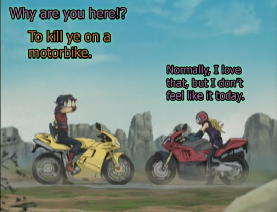
And so then he just...
Y’all I know they had to give Valon motivation to be in love with Mai, but this kids show jumped through so many hoops to make this very unhealthy relationship appear like Valons love was pure and true while still showing that this is a very unhealthy relationship. Kind of a hard balance.

It’s actually interesting how much work they put into Valon’s very tragic and problematic relationship after they’ve dodged every other problematic relationship this show has brought forth.
Like the villain with a heart of gold is a trope, but it’s a trope that works. There is no hope in the world that this relationship could pan out. They’re not a misunderstood pair like he thinks they are. They’re freakin terrible and they don’t deserve each other. But he’s gonna try and do it anyway.
We get to watch Valon bargain (mostly with himself) about how this relationship (which exists mostly in his head) is going to absolutely work out, because to him, if he feels so intensely, eventually she’s gotta feel the same. Most people haven’t murdered people, but it’s still a very relatable type of situation that the show displays without getting too preachy about how it’s clearly bad news. They just introduce it for the audience to come to their own conclusions, and I was really surprised by that level of maturity.
I’ve been sitting here saying “There’s no way this show could balance Tea with Yugi and the Ghost in his head. There’s no way they can really touch on Kaiba and that paper card. There’s no way that this show knows how to do a relationship because they don’t want to get involved with that weird gray area.” and you know what? Maybe they can.
Like they’re doing it right now. Did they just need 4 seasons of people complaining to go “Fine! I’ll write out the problematic relationship! I’ll do it!” because--this works for them. They finally did it.
Now, I’m not saying it’s Oscar worthy or developed beyond a trope, I’m just saying I’m genuinely surprised to see it on this show, and they should have done it more often. It’s a super weird pairing, but way more interesting than like...all that time we spent with Serenity because I actually have something to look forward to. (which will be when Valon inevitably dies in a ball of tragic glory)
So many romance stories give me nothing to look forward to, y’all. You have to give me something. Like, I’ve been reading a lot of not great romance in my life, and you have to have some sort of time limit in place for me to care about your couple. To have only have so much time before the other person gets married, moves, ends the world--I don't care--but man that time limit is crucial and so much romance just...forgets.
Like Bonnie and Clyde, Romeo and Juliet, and other ill fated couples, Valon and Mai end up being interesting because we just love seeing people fall into pieces. Hell, I just finished watching Tiger King and damn, what makes that show so good is that you are just waiting on that time limit to see how bad it gets. (and it’s crazy, super recommend Tiger King, although it’s very clear that they pushed the drama a little beyond realism but man. Good TV.)
Of course there’s always the chance that maybe Valon just got bored. But, youknow.

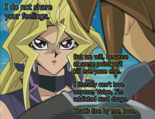
Anyway, it IS a romance on Yugioh, so we do have to very quickly drive a truck through it.

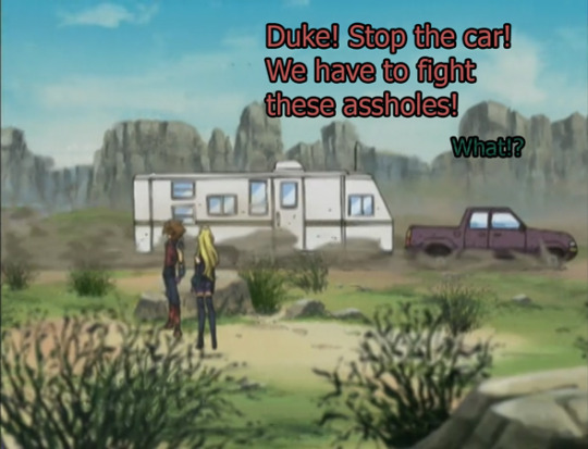
Man.
What are they DOING here?
It took me kind of a while to remember that Mai would be going where Joey would be living, which is most likely where Raphael dropped off Arthur Hawkins. But, if you don’t remember that fact, this is the most random thing ever.
Like you got this huge ass desert in the Califorizonado mesas, and then BOOM enter Rebecca Hawkins, just omnisciently lording over all of the West and just so ready to fight you.
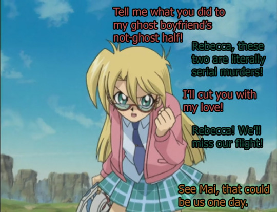
Every girl interested in Yugi Muto has this thing where they’re normally pretty chill and then they just snap and get angry as hell.
PS she’s in a different outfit now, but I don’t feel like changing her font color. I’ve had some Photoshop.......incidents.......and I don’t think I have this plaid pattern anymore and I don't feel like making a new one yet.
I mean Valon’s got the green outline on his text, so I figure we’re good.
Also, Rebecca wears a tie clip?
This 12 year old girl wears a tie clip.
And like don't get me wrong, this was 2003-4, alt rock was big, and yes, we did have tiny Avril Lavigne ties at American Eagle. I will admit that I very much considered getting an Avril Lavigne tie at one point in my life, but didn’t want the commitment of needing to pair it with a skirt.
But either way, old man tie clips aren’t alt rock. The only thing that makes Rebecca’s outfit not exactly that alt-grunge Avril Lavigne look is that tie clip. They were SO close to making her look cool. Just so close.
Also the bifocals. But anyway...

So Valon was going to straight up ignore Rebecca, because he has a warped sense of morality and will not kill a 12 year old (but will kill a 17 year old). But, Mai did ask nicely.
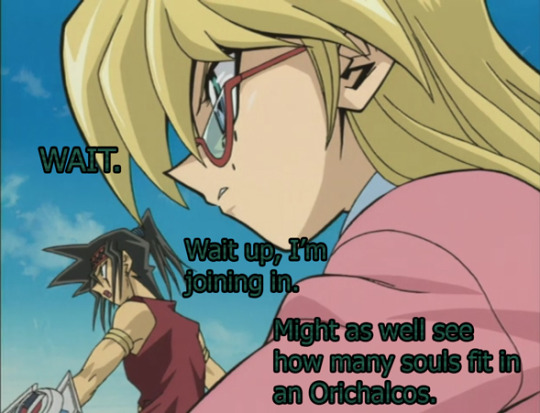
Thankfully, because of Valons weird sense of morality, he did not pull out the Oricalchos. Instead he pulled out...a new mechanic!
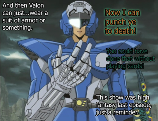
OK.
Fine, whatever. I don’t go over cards in this show so I don’t have to even worry about this.
And Rebecca and Duke freakin lost, because Duke is never allowed to win. Rebecca may have won if Duke didn’t join this battle with his ass luck, just throwing that out there.
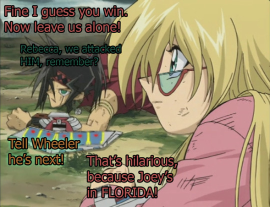
And Mai is like “wow, Valon is doing a really good job. He’s right, he IS amazing”
and she bolts.

And back on the tracks, we see another group of our protagonists sprawled on the desert floor.
REALLY lucky that this train track only has one operating train that is currently out of commission because you should not lie down on a track like this. Probably goes without saying that this is a great way to die. But youknow...the world is also ending so sure, why not? Getting killed by a train is probably more pleasant than the Leviathan.

And then, because we MUST talk about commuting, lets see Kaiba’s commute on this huge ass very normal plane.
I know.
That’s just a normal ass plane.
Even Kaiba needs to take a break youknow? And maybe since he hallucinated last time he drove a plane he decided to just...not drive one for a while. Probably a good move.
On the way, we get to see Seto’s form of parental advice. It was weird.
Like in the actual dialogue of the show Seto is just SO CLOSE to giving good advice and then just slips in these chestnuts where it’s like...well that’s gonna be like 12 years of therapy for Mokuba in the future Seto, thanks for that.
Also lets welcome back Seto’s dueling jacket. Been a while, big sleeves.
Also, the Aurora Borealis has also hit the plane, which is very Twilight Zone of them.


...
Correct me if I’m wrong but Alister was in Dartz’ room during that convo with Mai.
like...just a few hours ago?
Was that a hologram of Alister in Dartz’ boardroom or did the animation team forget?
Oh Alister.
Also, I just want to point out that the same day Seto sent Roland out to fix his problems, was the same day that Kaiba got hella abducted, just a few hours later. Man, Roland. Turn around for like 2 minutes and Seto’s back into cards, they’re both abducted by cultists, and they’re both half-way across the world to California. It must be hard to be Roland.
Anyway, if you just got here this is a link to read the rest in chrono order. All four seasons.
Hope y’all are staying safe in this Pandemic time, goes without saying. Been a weird couple of weeks, but thankfully the internet is still here to help us all keep sanity.
#ygo#yugioh#yu-gi-oh#valon#mai valentine#tea gardner#yami#yami muto#tristan taylor#joey wheeler#rebecca hawkins#duke devlin#seto kaiba#mokuba kaiba#dartz#man just every character was in this episode#episode recap#photo recap#S4#ep21
35 notes
·
View notes
Photo


Tagged by: @wilhelminafujita and @batgirl-87! Thanks, both of you!
Tagging: I was tagged by both of the people I would’ve tagged for HPHM, so I challenge anyone to do this, for any OC (or fan character in any fandom) they have if they want to! You might be surprised by how well it turns out. I sure was!
Original Template: (x)
I guess as a bit of a prelude I’m going to mention that I wanted to incorporate Jacob and Seren’s Siren heritage and their Animagus forms in equal measures, but I didn’t want them to just... have the same stuff in different colors, so I divided them up so that both get decent references to them.
Seren Aisling Dwyn
Hair: A darker brown than her dad’s, but lighter than her mom’s. Wavy when long, which translates to spikes that flare out and do whatever they want when short
Complexion: Pale as hell. “How are you not a vampire?” pale. No freckles, just Pale™
Wardrobe: I can only really describe her normal style as casual, comfortable, and shades of pop punk. Tends towards short-sleeved shirts with jackets on top. Has a mild thing for vests. If it’s simple to put on and comfortable, she’s wearing it. Doesn’t really try to coordinate nice outfits, but since all of her clothes tend towards “blues” and “neutrals,” they generally turn out fine. Her work clothes as an adult are more “goth and feathers” than anything
Element: Water. Besides the fact that she’s part-Siren, water is an element known for great change and adaptability. It can be a calm pool, unbreakable ice, or a storm and waves more dangerous than anything. I thought it fit her pretty well. Seren is usually pretty composed and accommodating, but is capable of becoming stubborn as ice or dangerously wild as a storm when pushed to it. There’s also water’s healing connotations, befitting someone who constantly goes out of her way to help others
Season: Winter. It’s a very quiet season. Understated, but like water it can be completely unforgiving if you find yourself on the wrong side of it. It’s a season of rest and sleep, which is the thing Seren probably looks forward to most about finding Jacob. And, most importantly, it always follows right behind Autumn, and finishes up the transitional work it started
Animal: Raven. It’s her Animagus form. A bird that’s far too clever for its own good. A scavenger that can take whatever it’s given and use it to survive. In some cultures it’s a trickster that doesn’t care for conventions. In most cultures it’s associated with death and ill-omens, befitting a girl who’s believed by many to be cursed, with danger following her every step. In Celtic mythology, ravens are a symbol of warfare and fate in battle, and Seren is very dangerous in combat. Ravens also tend to travel in pairs, so no one would bat an eye when she travels with Jacob (assuming they find each other)
Accessory: It’d be a mistake to not include Seren’s iconic scallop shell locket, inside of which is an enchanted photo of herself and Jacob from their childhood. She always wears it to keep him close to her heart. The scallop shell is because they grew up right next to the sea (and from a meta perspective, it’s a hint to their Siren heritage)
Texture: Feathers. She’s a bird. And also really likes birds (especially Augureys). They’re also soft to the touch, but much stronger than they appear. While most feathers can repel water, if the oil on them runs out they can get clogged up with it. Seren tries to just let problems go, but they always end up wearing her down and sticking to her
Home: I didn’t go with a specific home or anything, more just her kind of decorating style. She really likes having plants around and the fresher air they bring. She has a lot of things that she won’t get rid of, but it’s all organized and arranged with purpose. A big fan of having light-up objects in her room. Her sheets are chosen due to their Softness Quotient™ and I promise you that there’s a ridiculously thick pillow top on that mattress. Her interior decorating sense is where her Hufflepuff nature really shines through
Jacob Caradoc Dwyn
Hair: Got his mom’s dark brown, almost black, hair color, but the patented Dwyn unruly curls. He tends to keep it shorter in the back, but not short enough to be an undercut, and longer in the front
Complexion: Pale™. “Hello, Jacob, have you heard of this wonderful new invention? It’s called the sun”
Wardrobe: I was very tempted to go with his mid-Vault Hunting “couldn’t even be bothered to put his pants on the correct way” attire, but decided to just go with his general fashion sense. Like Seren, his casual wear mostly consists of things he finds comfortable, though he does put more effort into looking cool than she does. Hence, a leather jacket. Probably elaborate leather boots that take an eternity to put on. Would totally wear tighter shirts to show off his physique. The “goth and feathers” work clothes were 80% his idea
Element: Wind. A reference to his Animagus form being a bird, but also very suited to his personality. It does what it wants, when it wants. It can be fickle, much like how Jacob’s mind is always wandering around from place to place. Generally unassuming, but it’s easy to get swept up in its whirlwind of chaos when it really gets going. In some cultures it’s used as a symbol of discovery and uncovering the truth, much like the great detective he wants to be would do. And, like Jacob, wind can be there one moment and gone without a sound the next
Season: Autumn. It’s a season of constant, deliberate steps taken in preparation for one, ultimate goal, much like Jacob’s single-minded pursuit of his ambitions. It could be said that Autumn sets a lot of things up that it will never finish, since all of its preparations only get their payoff in Winter. Though, you could argue that whatever it does, it does so that Winter can do what it needs to do properly. And I couldn’t pass over the death connotations of the season since Jacob is, well... Jacob
Animal: Raven. It’s his Animagus form, just like his sister. And for the same reasons, too. He’s far too clever for his own good, and ridiculously resourceful. He’s much more of a trickster than Seren, and every bit as much of a bad omen to others, but he isn’t nearly as creative in a fight as she is. Trouble has always followed him around, and death has come to at least one person he was close to
Accessory: His partner to Seren’s locket is a pocket watch with a frame inside that has the same picture in it as her locket does. The watch is to keep him on task in class, where he could easily get distracted by the actual research that he’d prefer to be pursuing (but from a meta perspective it’s a symbol of his impatience). It only works because he’s constantly opening it to look at the picture inside. He’ll keep it in his breast pocket if he has one, to keep Seren close to his heart. If he doesn’t have it in his breast pocket, it’s in his jacket pocket
Texture: Fish scales, in reference to the fact that he’s part-Siren. They’re also just as tough as the feathers I picked for Seren, but scales can be smooth or rough depending on which way you touch them, just like Jacob will return the kindness or aggression of others depending on how they treat him. Water runs right off of them. Jacob is far better at shrugging his problems off than Seren is
Home: Like Seren, I went with something that symbolizes his decorating style more than any specific home he’s lived in. He likes low lighting, and everything is a mess literally always. I can guarantee you that there’s no such thing as an empty space in Jacob’s room. He’ll find something to put in there. Generally it’s a photo, one of the books he’s reading for research at the time, or a souvenir that he picked up from travel. It is his goal to travel the world, after all. In the same vein, his walls tend to be covered in photographs that he took. He had a pin board, but all of the space on it got used up so fast that he moved to just putting pictures on the bare walls. Now it’s basically pointless, but he’ll never take it down
I know that typically people just use a font similar to their character’s handwriting, but I wanted Jacob’s signature to really show off the fact that his handwriting is a nigh-unreadable disaster, so I made both of their signatures myself. I signed their full names above just so that people could get a feel for their handwriting style, but personally I’d say that neither of them typically sign their full name unless it’s on legal documentation. Normally both of them sign things (First Initial) Dwyn. So their actual signatures tend to be more like this:
#harry potter series#harry potter hogwarts mystery#hogwarts mystery#hphm#hphm jacob#jacob's sibling#jacob dwyn#seren dwyn#the dwyn family#not to toot my own horn here but i think both of these own#i was so picky with my images and it was so worth it#i intentionally chose those raven pictures so that they'd be sideyeing each other across this post and i'm so glad it worked#yo the guy i picked for jacob's hairstyle would be the perfect faceclaim for him if he was clean shaven not gonna lie
9 notes
·
View notes
Text
Collecting Research
Excluding type my allocated designer works with geographical shapes and sharp, prominent line work, and some collage work. examples below.
His major colour palette consists of black and white, and sometimes a pop of red. This is because Bierut got a job when he was just starting out, involving a colour wheel. This was a frustrating and overwhelming task, he realised he had “ chromatophobia, fear of colour.” A quote from Michael stating his choice of colours and why. “ from my earliest days as a designer I loved black and white. Such Authority, such decisiveness... Every now and then I dip my toe in the vast rainbow- hued sea. It usually comes up with no more than a little bit of red and an even littler bit of yellow.”
Above all his typographic style rules his work and the fonts he used most consistently, from 1980 to 1990, were helvetica , Futura, Garamond #3, Century Expanded and Bodoni. This was while he worked for Vignelli. Once he left that job in 1990, he went crazy with fonts. Now he uses fonts for different projects that are based on relation, such as architecture, picking a font designed by one. Because of the message he wants to get across, “straightforward and smart?” Futura. According to the theme, ugly or pretty. He has 13 steps in choosing a font. In the majority of his work, the type is bold and attention grabbing/ simple.
A lot of his works consist of logos and branding, here are a couple of examples. Bierut designed a series of posters for the Yale school of Architecture for promotion of lectures. An example below, these were all in black and white, and in one size. The series began in 1998 and consist of lots of large, strong and thick text, some with differing fonts. The smaller writing is highlighted by strong imagery that are actually positioned to bring attention to the text. The brief was to make the architecture program seem “ unpredictable.” He showed change through the text. However the reoccurring font was “ Franklin gothic light.” —— The Saks fifth Avenue logo in 2007. Images below. To create this grid like, strong logo which was presented on ‘ bags, boxes, ads and signage,’ he took the 1973 Saks logo and sliced into 64 squares, the aim? To make it look different every time you saw it. Bierut believes rather than a consistent logo that you remember, you are more drawn to change in something. They wanted something “ memorable and marketable” and the past one he chose had the identity of the company. Enlarging the text and separating it all made it “ dramatic.”
Michael bierut has also worked on things such as The MasterCard logos, design for The New York jets, and has featured on the side of the New York Times building.
Bierut has written books and won lists of awards. His work in famous art museums forever , ‘the museum of modern art, The Metropolitan, and the Cooper Hewitt National design Museum. He has served of president of the New York chapter of the American Institute of graphic arts from 1988 to 1990 and is president of emeritus of AIGA national. ‘ He has eight successful books on typography and design.
Bierut settled on his predominant style in the 80’s while working for Massimo Vignelli at “ one of the most important design firms in the world.” This because he wanted to generate designs that communicate well, are easily digested and that people WANT to spend their time reading. Unlike what he had seen before on posters etc, where people couldn’t be bothered because the typeface didn’t capture their attention. Since 1990 starting at pentagram this is where he has excelled.
From this information I’ve gathered I have realised elements I should include in my timeline and how it should look. The colour palette - black and white and maybe red or yellow for highlighting. If imagery, cartoonish and bold, black. Use strategically to bring attention to the text. Easily read and digestible text and layout to draw the eye in.


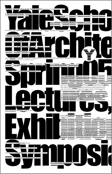
0 notes
Text
Creating my own Rave Flyer
I have created a rave flyer of my own, using 80s and 90s flyers as inspiration. It incorporates distorted typography, a digital illustration of eyes, CGI-like planets and a starry background. My main goal for this design was to look as appealing and intriguing as possible, I did this by producing strange imagery with bright and vibrant colours so it’s really bold. However this meant that when it came to communicating a concept, there isn’t any clear message I’m trying to put across. Instead I am leaving this piece up for interpretation, which in my opinion is really interesting because one person’s perception could be completely different from another’s.
Overall I am really happy with the outcome, I think it has a really effective retro look thanks to the textures and colours applied. I learnt to embrace experiments/mistakes throughout the process, because I could have never planned the planets to look the way they do without trying new things. I think I have balanced the colour pallet really well, because I was able to incorporate many different colours but still not look overwhelmed by them. Finally I am really pleased with the face portion illustration, many times I have showcased hand-drawings in my outcomes but this time I wanted to demonstrate what I could do digitally.
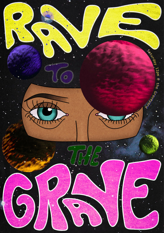
To come up with the overall design I sketched out some rough ideas, using a collage of 80s and 90s rave flyers as inspiration. I experimented with different typography, concepts and imagery, deciding to go with a funky styled outer space piece.
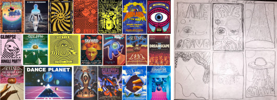
To begin with I digitally drew a section of a face using my drawing pad, the program I used for this was Illustrator as I could tweak and change my lines that I created. I used the paint brush tool to draw the lines themselves and the direct selection tool to adjust them, by making sure all of the lines are properly connected there are no gaps for colour to seep through and spread, plus it will look more tidy. After drawing one of the eyes I simply duplicated and flipped it for a perfectly symmetrical set of eyes, the only thing was the light reflection in the eyes so had to redo one of them to match.
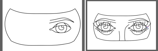
Once I was happy with my illustration I grouped the lines and expanded its appearance, this assured me that the lines wouldn’t shrink in thickness when moved to another program. On photoshop I copied in the drawing and added in 4 circles in-front of and behind the face, this was the beginning of my layout process where the planets would fill the circles.
Next I filled in the face section with colour using a mixture of tools, this included the paint bucket, brush and mixer brush tools. Then for a background I took a faded image of space, it’s filled with stars which is a pretty and subtle touch.
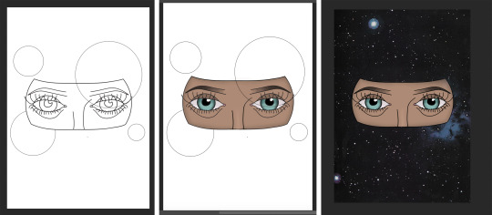
To create the planets I first tried filling in the circle selection with stripes of colour, with this I used the mixer brush tool to blend them together like Jupiter. However I thought this looked too flat so I wanted to see if there was a way to make it a sphere, to do this I clicked on the first thing that came up for ‘sphere’ but it turned into some strange 3D shape. Even though this wasn’t a sphere the texture of it looked perfect for a planet, so to make it one I rasterised the 3D which allowed my to then cut it into the space of a circle. I made sure that some of the shadow was displayed in the circle to help it look round, and I added a tiny bit more shadow by painting around the edge with the same colour.
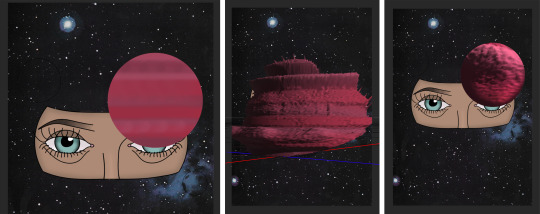
With this I duplicated the object and changed its colour through hue/saturation, I then experimented with different blending modes and put what I found appealing together. For example the yellow planet is made of two layers, one blended with overlay and one pin light. The two together display a clear round shape with a beautiful gold glow, and so I did the same thing with the other planets but choosing blending options that fit best.
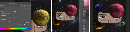
Once I had placed in the planets I also deleted the original circle lines, then I noticed that the face looked a bit too pale and colourless compared to the rest of the piece. Therefore I adjusted the vibrance all the way up to make the colours pop out even more, I also think the colours looked more pleasing anyway.

To add in text I saved the piece at how it was and transferred it over to Illustrator, I then locked this layer and added a new layer of which I would draw on. Using the paint brush tool I drew the words ‘rave to the grave’ with my drawing pad, fitting the ‘rave’ and ‘grave’ around the planets. I wanted to create a groovy kind of style for the type, drawing round and curvy lines that fit together like a puzzle. I also wrote out the words ‘to’ and ‘the’ put I planned to bled these into the art, therefore it can cover the objects and be moved around.
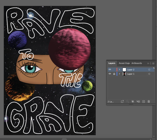
Once I was happy with my type I repeated the process to move it over to photoshop, where I placed it in the exact same position and put each word onto its own layer. Next I filled in the words with bright colours to match the pallet of the planets, the smaller words were then blended in so they stood out less than the main, large words. However as I looked at these words I felt that they stood out a little too much and looked a bit separate, therefore I searched for blending modes that will let specks through whilst maintaining its vibrancy.
With the design completed I wanted the piece to look less smooth and digital, rather more old and worn looking. To do this I laid a textured image over the entire piece and blended it using the overlay mode, this alone was too prominent so to mellow it down I lowered the opacity to just 26%. I repeated the same process using a grainy texture but only for the large words, this was because they still looked conspicuous and modern in comparison.
At first I was going leave this flyer as it is, however I then realised I hadn’t added any information on the event itself. I had to think of a way to incorporate it into what’s already there, so I thought having the text curve around the large planet would work perfectly. To do this I used the pen tool (path selected) to create a curved line around it, and then I clicked on the line with the type tool which allowed me to type along the path of the line.
I chose to display the days, time and location which is all you need for event information, I used ‘the Graveyard’ as the location for this design because it linked with the name of the event ‘Rave to the Grave’. This gives the name another meaning on top of a saying, it is now a literal sentence to match/promote the location.
The font was chosen for its wide gaps and straight lines, I feel this gives is a retro-digital feeling which is the aesthetic I was going for. I started off using yellow as the colour of the text but thought it looked too bland, therefore I played around with duplicating, blending and layering until it fit perfectly.
0 notes
Text
Thanks to @adamparrush I found out yesterday that there was a deleted scene from TRK that had Adam singing Mr. Mister (which I took to mean mr. mister the band, as in the songs broken wings and kyrie) to Ronan and it’s a TRAVESTY that we never got to see that so…here. I did the thing.
(In my head this takes place probably early on in TRK’s timeline – definitely before Ronan’s birthday anyway. Also I’m not gonna bother putting this on ao3 because it’s too short. I know the font on my theme is small, but it’s not so bad if you zoom, and if you’re on mobile it should be easy enough to read anyway. I hope you enjoy!)
It was late on a Wednesday and Adam was alone at Boyd’s, as he so often was. Just him and the cars and the radio, cranking out hits from the 70s and 80s that worked miracles for keeping Adam awake after long days.
He finished up his last job for the night and started to tidy up, and it was then that he felt a rush of air as the shop door swung open behind him.
Adam didn’t have to turn around to know who it would be, and he quickly suppressed a smile. Ronan had been making a habit of this whenever Adam worked lates at Boyd’s. It wasn’t something they really talked about, but it was still a thing that happened. And then after Adam had finished, more often than not Ronan would end up sleeping on the floor of St. Agnes.
Adam didn’t want to necessarily call it a routine, but it did kind of feel like a routine. He sort of thought he might like it.
“Jesus fuck, Parrish,” Ronan said, and Adam turned around to face his visitor at last. “How can you listen to this crap?”
Adam shrugged. “I like it. They’re classics.”
“Fuck classics, let me find you a real radio station,” Ronan said, reaching for the radio dial.
“Leave it, Ronan,” Adam said quickly, and Ronan froze with his hand a whisper away from the controls. He arched an eyebrow and Adam shrugged again. “Boyd’s funny about people touching his radio. This is his favourite station and it’ll take me ages to re-tune it afterwards if you change it.”
Ronan held his hands up and backed away. “Alright, Parrish, I’ll leave your golden oldies on.” He went and perched on the edge of the counter and crossed his arms. “Although Boyd should really give you a raise if you have to listen to this all fucking day. What even is this, Parrish?”
“It’s Mr. Mister, you uncultured swine,” Adam said, wiping his hands off on a nearby rag.
Ronan listened for another few seconds. “Oh yeah. I know this song.”
“Everyone knows this song. It’s a cla–”
“Classic, you’ve mentioned,” Ronan cut in, rolling his eyes.
Adam huffed a quiet laugh. Something that felt an awful lot like fondness started to unfurl inside him as he watched Ronan valiantly try not to enjoy the song. But no one could resist for long.
Adam figured it was pure tiredness lowering his inhibitions, but when the chorus kicked in, he started to sing along.
“Take these broken wings, and learn to fly again, learn to live so free.” He was fairly quiet at first, but he soon grew in confidence as he sang along whilst putting the last of the tools away. “When we hear the voices sing, the book of love will open up and let us in. Take these broken wiiiiiiings…”
He looked up and locked eyes with Ronan, who had gone dangerously still, something akin to awe on his face. Adam felt his cheeks heat, which seemed to snap Ronan out of whatever might have been running through his head.
“Don’t mind me, Parrish,” he said casually. “Carry on.”
“Fuck off,” Adam said, but he was smiling.
“Nah. You’ve got a surprisingly decent singing voice, don’t be shy.” Ronan grinned sharply but his eyes were kind, and it was this that let Adam know he wasn’t being made fun of.
He hummed through the next verse because he didn’t actually know all of the words, but cut back in with an exuberant, “I need you sooo…” right before the next chorus kicked in.
Adam incorporated a few… ‘dance moves’ probably wasn’t the right term, but gestures might work. Clenched fists pulled close to his chest with exaggerated emotion, eyes closed as the chorus soared, belting out the words with reckless abandon, and then Adam was rewarded with the elusive genuine Ronan Lynch laugh.
By the time the final chorus rolled around, Ronan had joined in. And then they were just two teenage boys alone in an auto-shop, laughing and singing along to Mr. Mister. No Cabeswater, no quest, no school, no worries – at least for as long as the song lasted. Just fun.
The song died away and the radio DJ started waffling on about something and for a moment Adam and Ronan just looked at each other, both smiling, both a little breathless.
And then Ronan cleared his throat. “You, uh, you done yet, Parrish?”
“Yeah,” Adam said. “Yeah, just let me grab my bag.”
He headed into the little staff-room in the back, giving himself a minute to calm his heart down. When he’d got himself sorted, he went back out to Ronan.
A new song was starting to play, and Ronan jerked his head towards the radio.
“See, this, Parrish, this is a banger.” He looped an arm around Adam’s shoulder and started to sing. “Oh, ho, ho, it’s magic, you knoooow, never believe it’s not sooo. It’s magic, you knowww…”
“Alright, alright,” Adam said, laughing as he leaned over to turn the radio off. “You can sing it to me on the way back to mine.”
Ronan’s grin was back. “Well if you insist, Parrish. But you have to sing along.”
Just for reference on the off-chance you don’t know the song I’m referring to, it’s Broken Wings by Mr. Mister and the song Ronan starts singing at the end is Magic by Pilot (which will get stuck in your head forever and ever you’re welcome).
Also, if you feel like wasting a bunch of your time, I have many more TRC fics here. <3
157 notes
·
View notes
Text
Give your iPhone a makeover with these 13 tips
CLOSE

Using a few iPhone tips, you may not need the newest version because your phone still works well.
USA TODAY
Apple is hosting its customary September product unveiling for the news media next week signaling the imminent arrival of the newest iPhones. But the latest hardware is only part of the story, and not the biggest part at that if you plan to sit out this next buying cycle and instead focus on what you could to do to add features and breathe new life into your current iPhone.
The way to do that is to install iOS 13 when it is officially released in the next few weeks, since this freshest version of Apple’s free mobile operating system is compatible with models dating as far back as 2015’s iPhone 6s and 6s Plus.
Some of the coming features that have claimed a fair bit of early attention include an optional darker design aesthetic, the promise of faster speeds and better privacy and security, “look around” Maps, a swipe-able QuickPath keyboard, a Photos app makeover with new editing tools for video, and – one I’m particularly excited about – the ability to automatically dispatch incoming calls from robocallers or other unknown numbers directly to voicemail without ringing your phone.

Apple has revamped the look of its Photos app in iOS 13. (Photo: Apple)
But there’s a lot of other new features that are more under the radar, though for some of the iPhone faithful anyway, no less helpful to have around. And taken as a whole iOS 13 represents a pretty vast upgrade, and I see little risk in installing the software when it is available.
I’ve been running beta versions most of the summer and for the most part like the changes I’ve seen.
With that, here are 13 features or tips that might make your new or older iPhone more useful or productive.
1. Finding a lost iPhone
Apple has long offered a feature called Find My iPhone which can help you track and retrieve a lost device remotely, provided your missing handset is connected to the Internet and picked up by a Good Samaritan willing to arrange a return. Find My iPhone is now part of a newly revamped and named Find My app that also incorporates what had been a separate Find Friends app. Anyway, you may now have a puncher’s chance of finding the lost phone even if your device is not connected to Wi-Fi or cellular. How so? The phone can emit Bluetooth signals that may be detected by other iPhones in the vicinity, which can then relay the lost device’s location.
Battery settings in iOS 13. (Photo: Edward C. Baig)
2. Optimized battery charging
Nobody wants a battery that poops out too soon. If you flip on the optimized battery charge feature added with iOS 13 – head to Settings then Battery Health – the iPhone is supposed to learn from your daily charging routine over time so that it can wait to finish charging above the 80% level until you need to use it. This is supposed to slow the battery aging process.
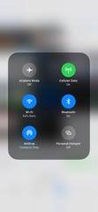
You can switch Wi-Fi networks within Control Center in iOS 13. (Photo: Edward C. Baig)
3. A more controllable Control Center
Control Center is the handy toolbox of controls and tools: screen brightness, calculator, flashlight, music player, Do Not Disturb, airplane mode and more. You summon it by swiping down from the upper right portion of the screen on the iPhone X or later models or by swiping up from the bottom on older iPhones, all without having to dig deeper into the iPhone settings. With iOS 13, Apple has improved it. Most useful of all: You’ll no longer have to go to settings to scan for and switch Wi-Fi networks or Bluetooth connections. Instead, press down on the section of the Control Center with such wireless settings to change your network or Bluetooth devices right then and there.
Employees are planted with chips: Wisconsin workers embedded with microchips
4. Moving the cursor
On the surface, this is a small change, but I’m all in. You can move the cursor more quickly and with more precision by simply dragging it to where you want it to be on a line. You won’t have to tap and hold the screen and drag the magnifier loupe that was previously required. It’s gone.
5. Three-finger shortcuts
If you take three fingers and swipe from right to the left on the screen you can “Undo” the last thing you did. Swiping from left to right instead, adds back what you just took away. You can also Undo by double-tapping on the screen with three fingers. I find these gestures much simpler than shaking the iPhone to initiate Undo and Redo commands, which by the way you can still do. Apple’s three-finger monte in iOS 13 doesn’t end there. For example, you can pinch up with three fingers to quickly copy, pinch up with three fingers two times to cut, and pinch down with three fingers to paste.
6. Block unwanted Mail senders
Welcome addition: You can have all the mail sent by a particular sender blocked and routed to trash. Select the address and choose “Block this Contact.” This works across all your Apple devices.
7. Mute Mail notifications threads
You were once an active participant in an email thread but no longer so, and find the ongoing notifications that keep piping up a pain. Apple’s solution is to let you mute such notifications. From the Mail app inbox, swipe part of the way from right to left across a message that represents the thread and tap More. Then tap Mute from the pop-up menu that appears (or Unmute should you eventually choose to rejoin the conversation).

In iOS 13, Apple has added easier ways to format email. (Photo: Apple)
8. Easier formatting in Mail
iOS 13 makes it much simpler to dress up and format your email messages. Start composing a message and select some text. A new format bar appears above the keyboard letting you bold, italicize, or underline text or add a strikethrough. Available controls also let you can change fonts, colors, text size. And you can more easily add photos, drawings or attachments too.
Safari lets you apply controls to specific sites as part of iOS 13. (Photo: Edward C. Baig)
9. Per site website controls
Inside the Safari browser, you can now make specific choices for specific websites. That is you can allow a given site to access the phone’s camera, microphone and location or refuse such access. You can also determine for individual sites whether Safari will automatically display the “desktop” or mobile-optimized version of the sites (assuming there’s more than one such view). Or choose whether articles will appear in a reader-friendly mode that strips out ads.
10. File downloads in Safari
Apple’s Safari web browser in iOS 13 now includes a helpful download manager. Just tap on a link in the browser and (by default) the file will be downloaded onto iCloud Drive. Changes to your downloads folder will sync across all your iCloud devices.
11. Do Not Disturb While Driving
It’s been a couple of years since Apple added the Do Not Disturb While Driving feature to help you avoid distractions when you take the wheel. In iOS 13, Apple will let you automatically activate the feature in CarPlay. What’s more, the company says it will no longer turn on the feature when you’re riding as a passenger in public transit. The iPhone has often thought I was driving when in fact I was a passenger on a bus.
Apple has improved Screen Time in IOS 13. (Photo: Apple)
12. ‘One more minute’ in Screen Time
Introduced last year, Apple’s Screen Time tools provide valuable insight into how much and where you (and the kids) are spending time on the phone, and it offers some tools to help you all go on a digital diet. It remains to be seen how effective this will prove to be, but among the improvements coming to Screen Time in iOS 13, is the ability to request one more minute to wrap up what you’re doing and save your work before an app limit you’ve established kicks in. While you’re at it, you now have more control about the limits you do set. For instance, you can combine app limits for specific apps, apps categories or websites. Be forewarned: Your kids may not be happy.

Voice Control settings inside iOS 13. (Photo: Edward C. Baig)
13. Voice control
Though Voice Control is found under the numerous accessibility tools and options Apple provides, anyone might choose to use it from time to time. For instance, you can use your voice to swipe, pinch, zoom, or perform other gestures. Or you might talk aloud to open apps by name, adjust the volume of the phone, tap buttons, take a screenshot, dictate or edit text and more. Get started by tapping on Settings, then Accessibility, then Voice Control. Or ask Siri to turn Voice Control on or off.
Email: [email protected]; Follow @edbaig on Twitter.
Baig is coauthor of iPhone For Dummies, an independent work published by Wiley.
Read or Share this story: https://www.usatoday.com/story/tech/columnist/baig/2019/09/03/ios-13-hidden-ways-get-most-out-your-iphone/2165746001/
Sahred From Source link Technology
from WordPress http://bit.ly/2ZVKLuM
via IFTTT
0 notes
Last Seen Blogs

pacedoherty85
The Blogging of Cain 441
vampjepha
bandit
blkshogun999
SHOGUN
restraininghollywoodblog
RESTRAINING HOLLYWOOD's BLOG

patate879
into the wild