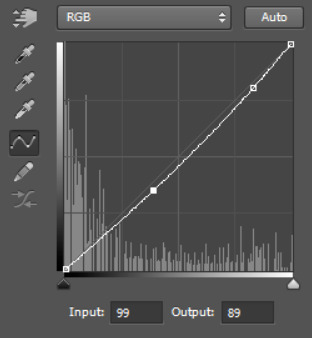
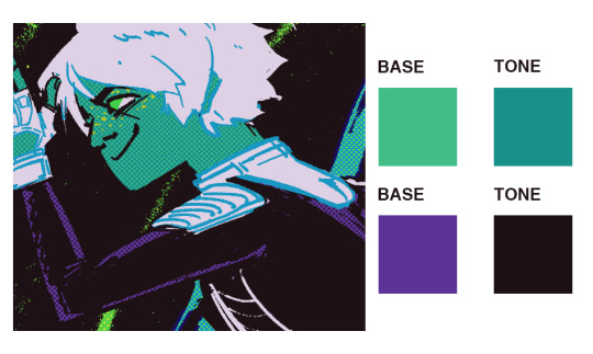
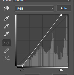
#also i did all of my color correction on these using only curves layers
Photo
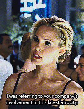

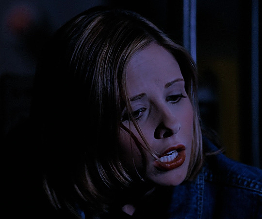
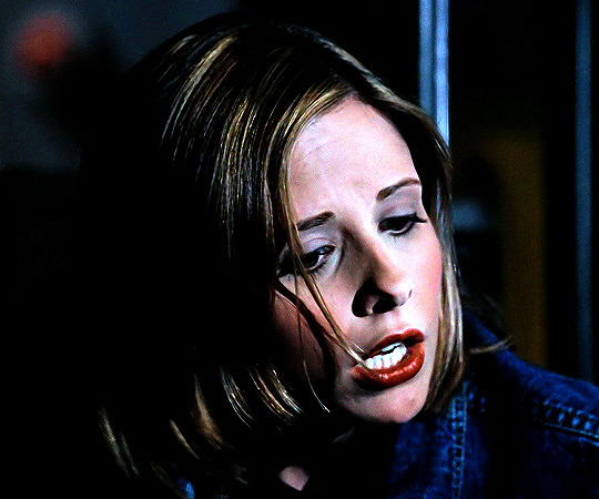
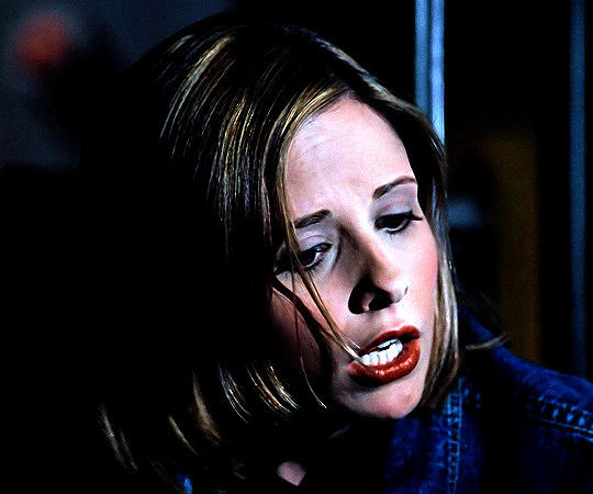
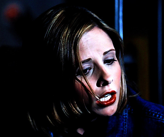
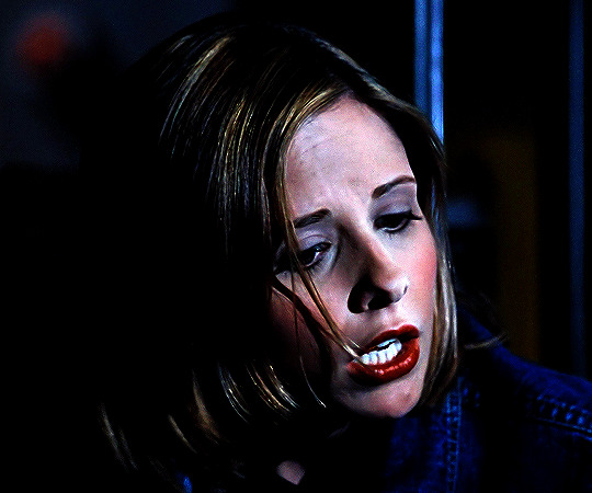
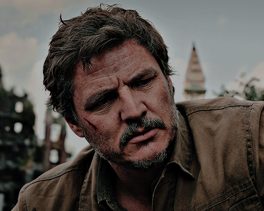
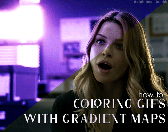
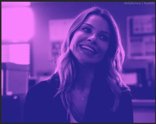
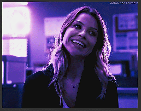
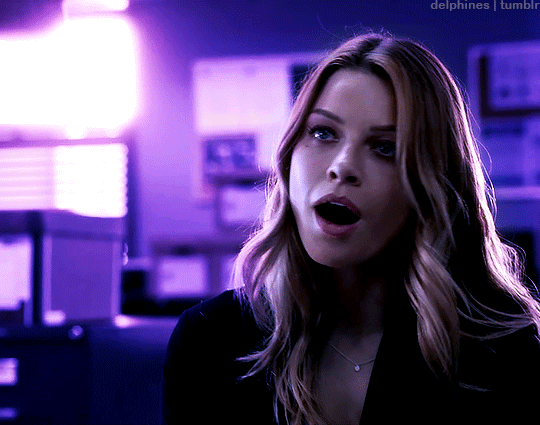
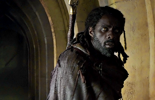
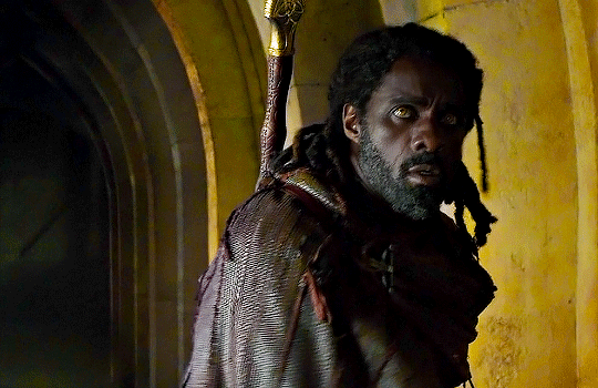
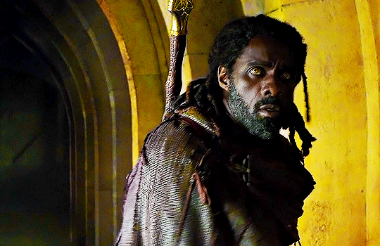
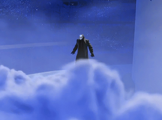
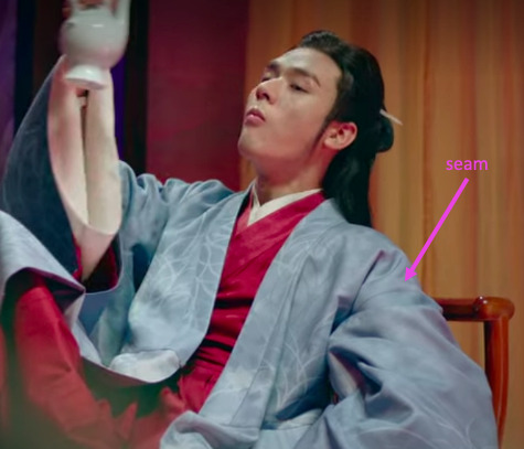
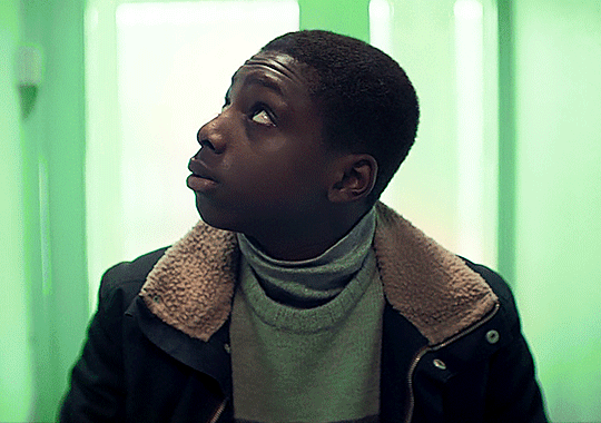
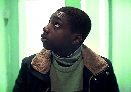
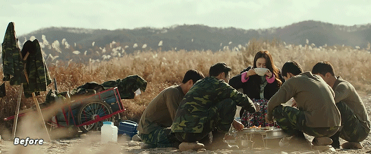
#i made this a while ago but i just think it's so funny#tony stark#character: christine everhart#movie: iron man#also i did all of my color correction on these using only curves layers#so i'm quite proud of that#jon favreau stop using so many red and yellow lights on your actors faces challenge#impossible
20 notes
·
View notes
Text
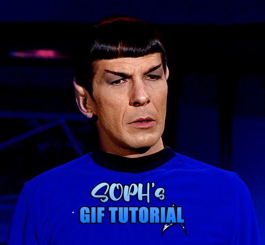
a very foking detailed GIF tutorial you asked for and how I color my gifs
However, I color them individually, so there will be explanation of tools I choose instead of showing what settings I used for this specific gif in this tutorial.
I will go through entire process of how I create gifs, the process of gifmaking can be different for others and there is no obligation of how to create a gif. Basically, do it however you like and enjoy the process.
this is part I, part II is here\in reblogs.
First, you will need to prepare everything, you choose the moment you want to gif and make screencaps. I use mpv player to create them, here is a great tutorial on how to install it. So I won't go over it, just follow it and or use another player which allows to make screencaps, such as kmplayer.
Once you make screencaps go to photoshop - file - scripts - load files into stack - browse - select screencaps and upload them.
At this point I will also add that I use keyboard shortcuts a lot, you can set them up to your preference, that is much easier for me and might be for you too, and I am so used to them that I forget where are some settings. You can do it from edit - keyboard shortcuts, you may set up anything there.
You will have all screencaps uploaded into one file. Once I have it I change canvas/image size, I also remove 10 pixels from each side, because I hate that some files have that weird black line which looks awful on gifs. But that's up to you. Use proper dimensions for tumblr, that is important since your gifs will look 'not good' when you upload them. I will go with 540x500px this time. (correct dimensions for tumblr are 540px for big gifs, 268px for two gifs along each other and 177-178-177px for the three gifs together)
Go to images - image size (crtl+alt+i) and change the size.
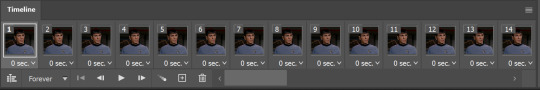
After that I make animation, because without it we would not be able to convert all the screencaps into smart filters. Go to windows - timeline
you will have something like this by default

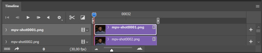
click on create frame animation - then on 4 horizontal lines which will open menu - make frames from layers
click on convert to video timeline (that 3 horizontal lines and 1 vertical line or whatever it is, right under the first layer) you will get something like this.
now, this will be animated. If you choose convert to video timeline right away it will not be animated.
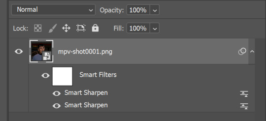
Now, select all the layers - filters - convert to smart filters
You will have something like this, and if you play it - it will be animated anyway. That way you can edit ALL the screencaps at once.
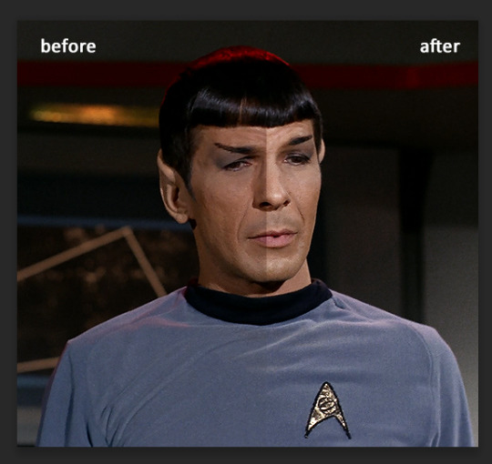
I usually start with sharpening, settings may change according to the files I have, for some you will need more sharpening, for some less. I go with filters - sharpen - smart sharpen and usually that's enough
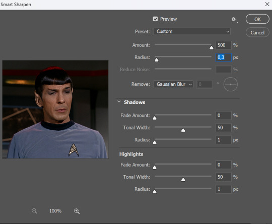
but I sometimes add more sharpening, just change radius to 0,2. So, repeat the action.
You will have it like this
and at any point of making gif you will be able to change settings for it, if after coloring it will look not as good as you wanted to.
I will not go into a lot of details about coloring for this gif, because does not matter how good the coloring on this gif will be, it won't work as good on another gif.
There is no right way to start coloring, you may start with curves, levels or selective colors depending on the screencaps you want to edit.
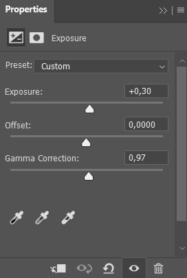
Well, this time I did start with layer - new adjustment layer - curves. (yeah, i guess by the end of the day we all do lmao)
(Always use 'layer - new adjustment layer'. That's the only thing I suggest to remember when you color. )
Just to brighten gif a little bit, but you also can change colors with it.
those are not settings I used for this gif!
Curves have option to edit colors, just press RGB and you will see options for RED, GREEN, BLUE. Upper slider adds the said color, the slider at the bottom removes it. That's a great tool if you have a very red\yellow\blue\green scene, with those settings and moving sliders here and there you will be able to add the color you want, for red scene I suggest to use more green and blue, as well as for yellows but with less green. Just move them to see what fits your gif better.


there are also eyedrop tools which will help you to edit picture, with the first one you need to find the darkest part of your gif and click, it will adjust your picture according to it. If there's too much red, it will make it bluer, etc. The middle one is the one I use the most out of them, cos it changes the midtones, it's great if you have very yellow picture, just press the yellow part and it will make it bluer\greenish, depends on the picture, and then you can adjust it to make it look better. And the last one you can use to lighten picture as well, just find the brightest part of the picture and press it. It will adjust other colors accordingly.
I like to play with settings, I could add more darkness to the gif by levels, by selective colors making dark colors even darker, but sometimes I just use layer - new adjustment layer - black & white. Putting it on soft light blending mode and changing opacity. Idk, I like the effect :D Also, by using these, you will be able to darken part or lighten specific colors
so yeah, play around and figure out what is the best way for you.
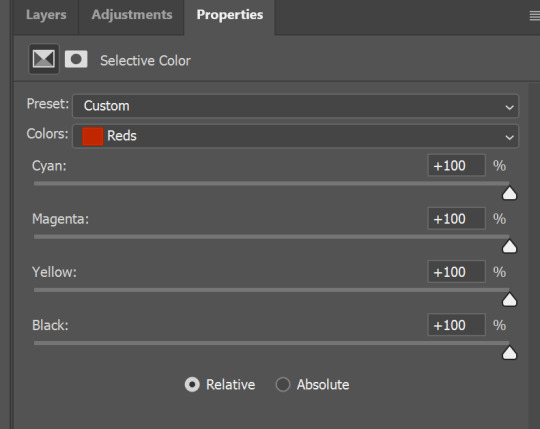
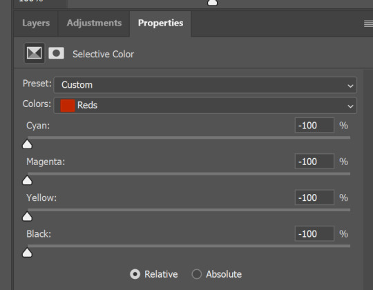
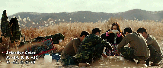
after that I used layer - new adjustment layer - selective colors. I think this is one of my favorite tools out there, I love it, I usually end up with 30 selective color layers if I make a super complex gif :D
You can change colors with it, make them more vibrant, or less.

for each color you will have 'cyan, magenta, yellow and black' and by dragging sliders you can change colors, make them darker or lighter for the lovers of those paster gifs :D

But don't worry, that's not where I will go with the gif, so it will look better, i promise.
You know how much I love making blue even more blue. So I go with more selective color layers to enhance it.
You do not have to use just one, and you won't be able to make it with just one sometimes. So add as many as you like to get the result you want.
next is one of my favorites - layers - adjustment layers - levels
with it you can darken colors or lighten them, there's also auto, as well as on curves, which will find the most suitable settings for your picture.

I hardly ever change the middle slider, cos
nope.
so, we are at this part of the gif by dragging sliders.
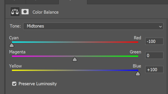
next one I used is layers - adjustment layers - color balance.
right now I will stop adding directory, this tutorial is already long enough, so most of the things are there in layers - adjustment layers.
Absolutely love it, most of settings do the same things but a little differently, this one changes colors but also entire picture, not just part of it. You have shadows, midtones and highlights
Each of them is really great when you have a yellow\red\blue\green picture to edit. And each of them has 3 sliders cyan\magenta\yellow.
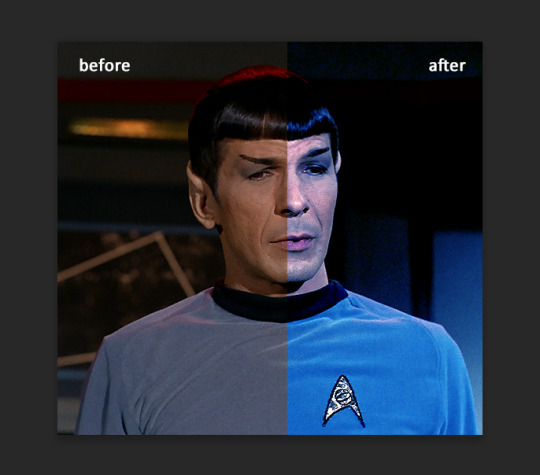
You see, if you drags sliders the other way it will make picture more yellow.
END OF PART I
since tumblr
102 notes
·
View notes
Note
Hello! How do you choose your colors if you don't mind me asking?
Hi! It's honestly just base colors with gradient map correction layers on top 😅
!: I'm in no way a professional artist, this is not a "correct" way to do it, It's just how I do it!
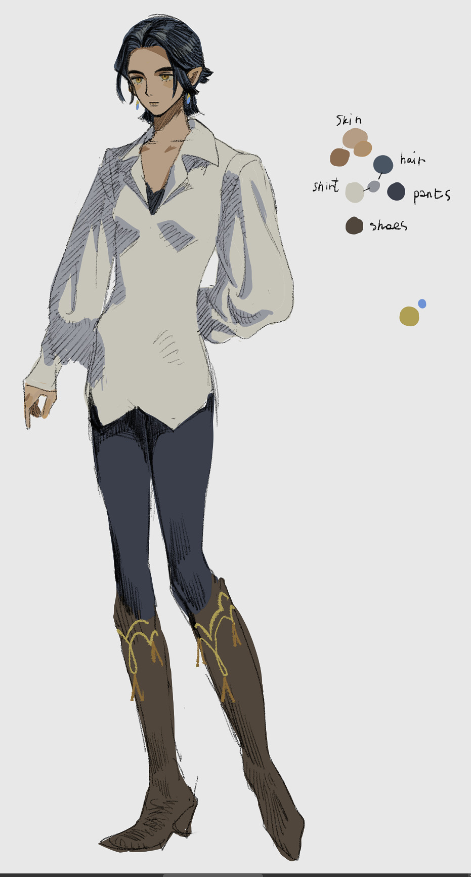
This is an example of my base colors. Sorry, I'm very into muted colors lately haha.. but everything sort of revolves around the combination of:
- white (the shade of white can sort of control the temperature of the whole image?);
- middle color, not too dark - not too bright, usually it's also the most saturated of the three (in this case it's blue, I also usually add the skin color at the same time);
- and the black (the darkest color present without counting the lineart).
For the black i tend to just use the slightly darkened version of the main color but that's only because the way i do the lineart allows me to do it? I fill the darkest parts with lineart but not completely (like hair and pants on this image) so the color can sort of peek out, I'd imagine this approach wouldn't work for everyone; also on this example i used brighter blue for hair and darker blue on pants so this is confusing... I think i did it because i wanted the hair to stand out more? After all that i add "accent" colors to the picture, they are usually complimentary or just more saturated versions of base colors. For the shadow colors i mostly wing it tbh but i try to have connections with other colors if it works, shirt's shadow is connected to the blue here; lighter colors absorb, darker - reflect. Does this make any sense..?
In general - I try not to stray too far from the triangle of my white, middle and the black colors.
Here are examples with gradient map correction layer on top, I make it low opacity and change the layer blending mode to "Difference"; it's subtle - i try not to overdo it. I usually have to fiddle with tone curves after this.
Some gradient maps on the CSP asset store: 1845993, 1846498, 1847360, 1963412.
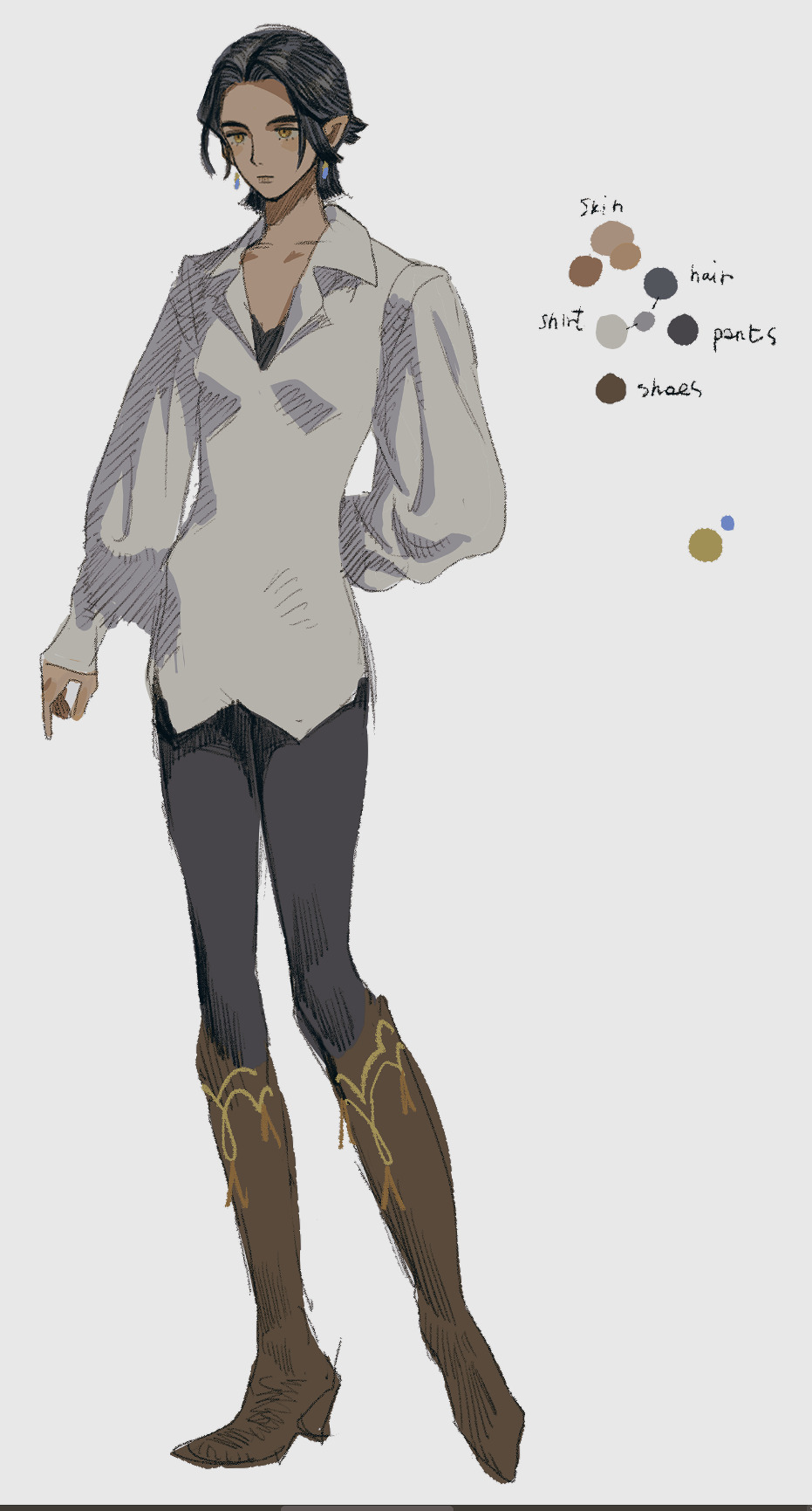
This is just a very simple character standing in the white void though - things turn way more complicated when you add more complex details and background... but this is pretty much how i go about it i guess!
55 notes
·
View notes
Note
Hey how do you colour your gifs? I’ve been trying to get better and would really appreciate any tips
bear with me cause i have adhd and i am very bad at explaining things
I’ll start by saying i use Photoshop CS6 so you know what program i’m working with. Now i’m gonna list all the layers i typically use when i’m coloring a gif.
Brightness & Contrast: sometimes i add this layer after all the others (but beneath all the others as if it’s the first layer i added) to reduce the brightness a bit if the whites are too bright
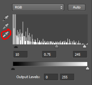
Levels: this is pretty much always the first layer i use which i mostly use to color correct which also often brightens the gif (it depends though i can’t always use it to color correct+brighten the gif). the method i use is using the eye dropper to pick the blackest point and the whitest point in the gif (which is what can color correct it and most often also brightens the gif a whole lot)
I tried to find the tutorial where i learnt about this but i could mostly only find tutorials with people using the eye dropper method with the “curves” layer but it’s the exact same concept as the “levels layer” and i did eventually find one using the “levels” layer so i’ll link to those tutorials below:
tutorial #1, tutorial #2, tutorial #3, tutorial #4, tutorial #5
i also decided to include my own screenshots so this below is the levels layer with the black point eye dropper circled in red:
and this is the levels layer with the white point eye dropper circled in red:
I tried it out with the curves layer after seeing these tutorials but i’m gonna be sticking to using the levels layer cause i know how to use it better and so when i color correct with the eye dropped i can also then adjust the blacks/grays/whites here (all circled in red):
Color Balance: i usually always add a color balance next and adjust them in this order:
Midtones
Highlights
Shadows
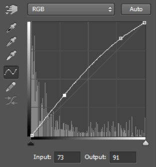
Curves (#1): then i often add a curves layer to lighten up the gif and add some contrast which can often looks something like this:
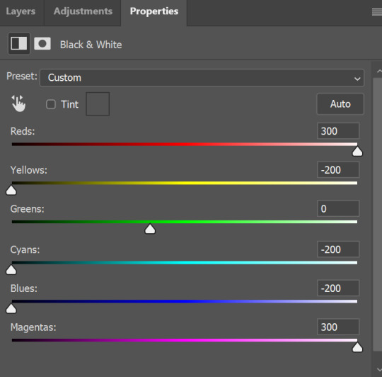
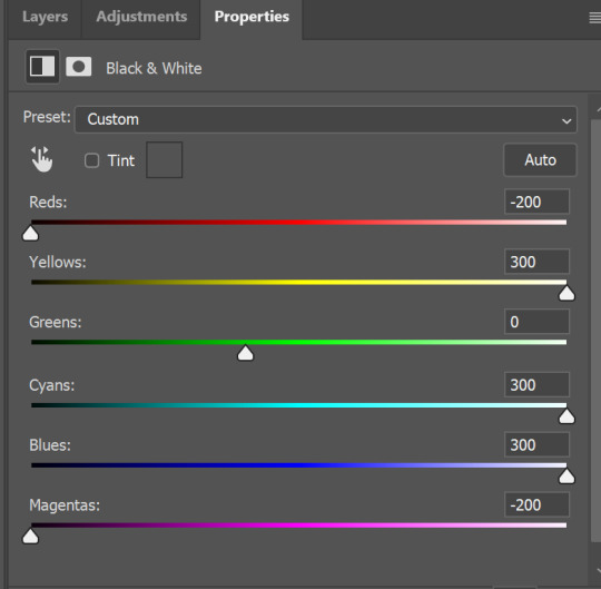
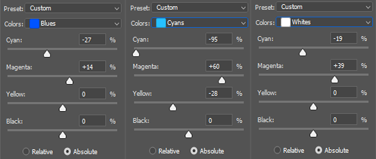
Selective Color (#1):
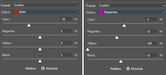
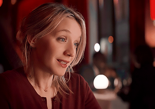
Reds (most often something like: Cyan: -20 to +10, Black: -10 to +10)
Yellows (often decrease Yellow: -20)
If there’s some green/cyan/blue/magenta colors in your gif i.e. green/blue/purple/pink colors then mess around with you can mess around with the Cyan/Magenta/Yellow in each color below:
Greens
Cyans
Blues
Magentas
Curves (#2): sometimes i add another curves layer, after adjusting the colors to make them pop, to brighten the gif just a bit more so that when i adjust the whites they look how i want them too, not really sure how to explain but i guess it adds contrast to the rest of the colors and idk make the gif look less flat? and it can also sometimes give the gifs a bit of a glowy effect like this gifset here for example
Curves (#2: alternative second curves layer): sometimes i’ll add a second curves layer not to brighten the gif but actually to make it darker, but because i’ll already have made the gif brighter at this point i can control how dark i make it and it won’t end up pitch black unable to see anything. it can make for some interesting results to darken the gif like this. the layer to make it darker can look something similar to this but you might wanna play around with it for awhile to get it right:
but basically this time your two points on the curve are on the other side of that gray line you see in the middle whereas if you look back to the curve i used to brighten you’ll see my two points are on the other side of the line or above it
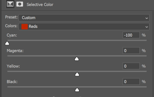
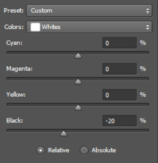
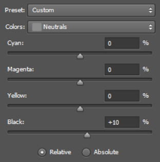
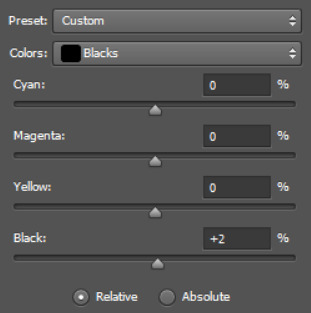
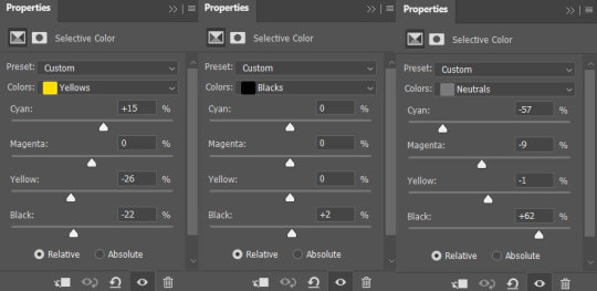
Selective Color (#1):
Whites (most of the time Black: -20 sometimes more like -30 and sometimes even all the way to -100. it just depends on the gif)
Neutrals (most times i have Black set to +10 but sometimes it needs less or more than that like +5 or +15 and sometimes i use it in the opposite direction like -10 to brighten the gif up)
Blacks (this makes the darkest colors (dark gray/black) a more pure/absolute black and it very often doesn’t need to be much higher than +1 or +2, also if you’ve got blue in the gif that’s creating a pixel-y/grainy effect you can add +5 or +10 to the Yellow to keep the blue but get rid of a bit of the pixels ending up with a clearer nicer looking gif)
I decided to include screenshots below:
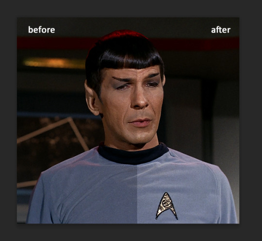
As you sent in this ask very soon after reblogging this gifset, i figured i’d include a bit of the coloring process for that gifset.
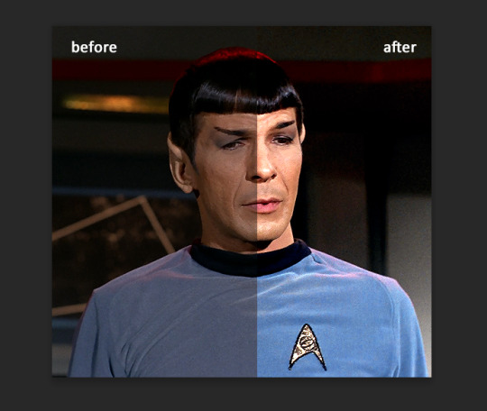
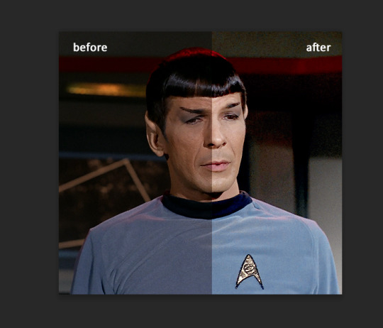
So this is the gif (as a still image so there’s no movement) with no coloring, just the sharpening:
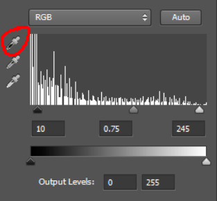
Then i added a Levels layer and used the eye dropper like i mentioned above to color correct which as you can see also greatly brightened the gif:

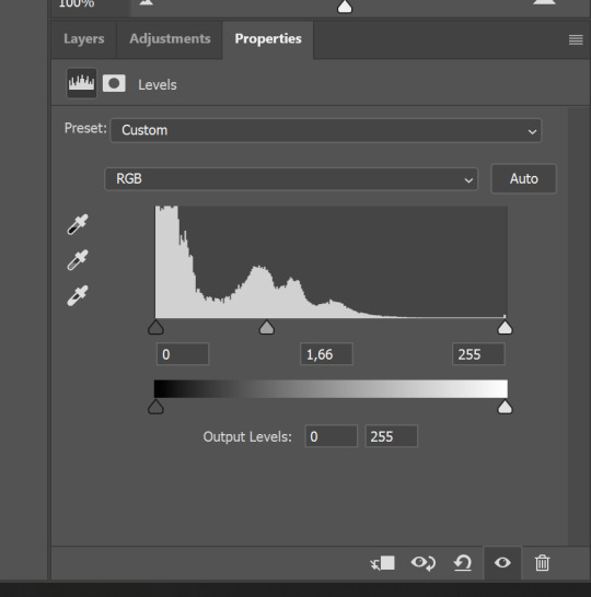
There’s a bit of a lack of contrast though on her face so i adjusted the levels layer to this:
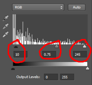
So i brought the blacks down (10) making it darker, the grays (0.75) the default is 1.00 and i brought it down to 0.75 making the gif darker on the whole not just the blacks and then i brightened it a bit by moving the whites from 255 (the default) to 245. so now it looks like this:
next i added Color Balance cause the colors were looking a bit off, a bit orange in this case
then i added Curves to darken it a bit cause i found it a bit too bright:

next i used Selective Color to make the reds/blues pop + adjust the whites/neutrals/blacks
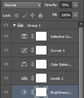
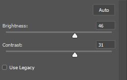
i found it a bit to bright in certain parts of her face at certain points of the gif so i added a Brightness/Contrast layer at -20 (brightness) and 10 (contrast) i put underneath all the other layers
This is what the layers look like in case any of this was confusing (which shows apparently i found the B/C layer made it look too dark so i changed the opacity to 70%):
Note: i feel it’s hard to see the differences after every layer added just seeing the images one below the other but if you click on the first image of buffy you can then click the arrow keys to go left/right and see the gradual progress of the coloring.
While searching for the tutorials mentioned earlier i found this helpful general coloring tips post i decided i’d include:
https://whitewolfofwinterfell.tumblr.com/post/181682828552/gif-colouring-tips-this-post-is-some-top-tips-for
Also this is an old gif/coloring “tutorial” i made years ago when i had just gotten back into giffing, so like it’s outdated cause my coloring process has changed a lot since but it could still be helpful. One thing i mentioned in it is how i like to do my coloring before i crop and resize my gifs which really helps me color things easier cause i can really see every pixel and color i’m working with and how i’m affecting each one (unless you’re making a big gif anyway then i guess you could crop/resize it first but i’d still recommend coloring before resizing) whereas every tutorial i’ve ever seen always says to crop/resize first THEN color but i’ve found the other way ‘round to be easier. So there might be some other helpful things even if it’s somewhat outdated to how i make my gifs now.
#asks#answered#5bi5#gif help#gif stuff#gif tutorial#photoshop tutorial#photoshop help#photoshop#my tutorials#this is so much text i cannot make myself reread all of that to make sure it all makes sense and there are no typos#so sorry if there are any and good luck reading/understanding this#hope it makes sense!
20 notes
·
View notes
Note
hi okay i just came across your post /640162675590135808 and i was wondering ....... how did you get it to be so perfect coloring wise like, what.
post in question:
oh jeez i can’t remember!! i’m just making a guess at what i did, but it’s likely (in photoshop) Image > Auto Color. those are typically used to normalize the colors when the whole thing is overcast with another color (in this case it was a muddy green that lowered the visbility a lot), for example:
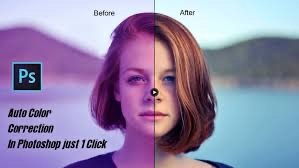
“Auto Color is similar to Auto Tone. It also darkens the darkest pixels to black and lightens the lightest pixels to white on a channel-by-channel basis, so once again, the Red, Green and Blue channels are affected separately and independently of each other. But Auto Color goes a step further. Rather than simply redistributing all the other tonal values in between, it tries to correct any unwanted color cast by neutralizing the midtones in the image. This usually (but not always) makes Auto Color the best choice for both boosting contrast and correcting color problems at the same time.”
that’s the main color correction. after that it was just fiddling with brightness and contrast with sliders to see what looked best. (heres some more information about coloring my gifs if you’re interested too, like my philosophy about it if you can call it that? https://weirdmageddon.tumblr.com/post/680080656293888000/).
i think gifset of your inquiry is the only time i strayed kind of far from how the original looked. i wanted link and zelda to be the focus of it, so i removed the green overlay to make them pop out (but also the original looked too ugly for a gif and i couldn’t find a way make it look good with contrast and brightness sliders and curves anyway). but other than auto color to remove the green overlay i didn’t do any color work, really only doing subtle changes with brightness, contrast, and sharpness. but again, this still follows my gif-making philosophy of just enhancing and making minor adjustments to what is already there without getting too crazy (i wanted to enhance the visibility of link and zelda). i like to sit back and let the brightness, contrast, curves, and light layer modes do the work instead of handpicking color changes
20 notes
·
View notes
Note
Hi!!!! No worries if you don’t want to tell me or respond lol. But I really like the colour grading you did on that most recent Joel Miller gif set. I do photography and I’ve been struggling for ages to find a way to bring out the warm sort of brown tones without making things feel too muddy or red. Just curious about what HSL adjustments you made / what colour grading helped you get that look?
ohhhh my god thank you so much??? this might be a convoluted answer/unnecessary rant so i apologize in advance lol but i tend to keep the colorings/psds i use for gifs saved in a folder so every gif i make in a set is consistent with color/lighting/shading/whatever. i get anxious if there's even a little bit of difference per gif lol
a lot of what turned out in those gifs has to do with the lighting/coloring that's already in the show/that specific episode/scene. i've got the rest of the episodes' gifsets made and finished but i can try and kind of show what i'm talking about. they all look different color-wise, at least in my opinion, because of the differences in each episode's lighting. if that makes sense.
the goal with any gif i make, regardless of show/movie, is to make them either
1) better than what was there before (for example, if the movie is INCREDIBLY blue/yellow then i try and color correct that blue or yellow to be more neutral)(i'm looking at you triple frontier and your dark, blue ass scenes dfjkdflh)
and
2) not whitewash pedro. this is incredibly important (at least in my opinion) because i've noticed a lot of gifmakers (or least they used to) went for a really pastel/pale look and it whitewashed poc so dramatically and it was ~problematic~ to say the least. (i used to make gifs for a band that consisted of all mexican band members and i got hate a few times/people policing how i should color my gifs so the band wouldn't get whitewashed, so it's something i've been hyper aware of ever since)
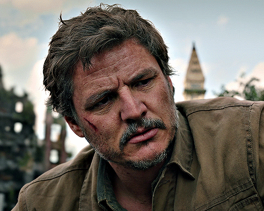
so, even if i'm going for a more moody/darker aesthetic like i am with these gifsets of tlou, i never try and diminish the color pedro has in his skin tone. he's got a lot of color in his skin and i want to be able to see it, y'know what i mean?
basically, that boils down to keeping a lot of the warmer tones while also going for an ~aesthetic~ and it can be really hard sometimes. sometimes a show or movie, in this case the last of us, every episode is lit a little differently since it takes place over the course of a year.
i'll put some examples under the cut:
ok so i'll use episodes 2 and 8 as my examples.
to begin with, the last of us has, what i call, a "post-apocalyptic filter" over the top of it so i kinda have to work with that from the start. lots of greens/earthy brown tones and stuff.
this is with only sharpening applied and no color or anything:
and this is with my previously mentioned ~dark and moody~ psd applied on top of that sharpening:
now, this is the same color grading i used on that gifset you were mentioning.
this is also the same color grading i used on episode 8, which takes place in the winter/snowy areas so the coloring to begin with is going to reflect that:
and now with the coloring:
the big thing between these two scenes is that in the winter one, he's also recovering from actively dying and being deathly pale so any color he had in his face is really minimal lmao
so this is already way too fucking long and i don't think i even actually answered your question i am so sorry lol
to start, i ALWAYS start with an automatic curves layer and then adjust accordingly.
the actual color grading part mostly consists of vibrance, hue/saturation, selective color, channel mixer, gradient map, and level layers. i'm willing to give you the psd privately if you'd like to have a closer look at them!
thank you so much for asking and for putting up with my ranting lmao
#toointojoelmiller#asks#i really hope i answered this jfc#if i didn't i'm really sorry#it felt like i was trying to explain like 7 things at once lmao
3 notes
·
View notes
Text
Sketch to lineart!
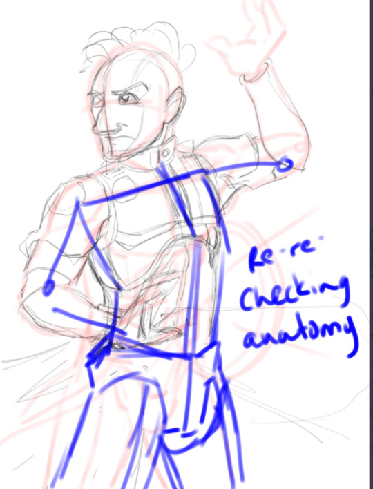
So this is how I tend to start off a drawing. It's a hot mess on layer 1. I also REALLY exagerate anatomy. It's easy to trim it down, but it helps me see things. (Quick note, I’m using Krita and an XP pen digital drawing tab.)
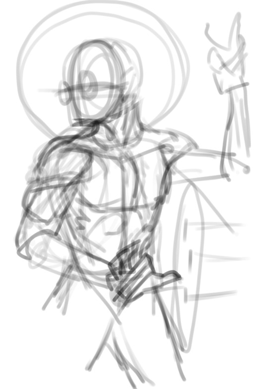
Next is step 2, and it DOES look a lot like step 1, lol. I start a new layer and use a different color. Tidy anatomy, move some stuff around. But now I can kinda see what I'm going to want to change, where I want to move with this.
For instance, now I can see that I'm going to want to pull the chest up and out, which will give the spine more of a curve. There's nothing wrong with this, but that'll give the image more motion. Still thinking about that bottom hand. Probably I'll rotate it so its more side-on.
Oh, I didn't really address this, but I use a big, chonky brush for this so I don't get hung up on details. When I paint using my oils irl, I squint so I can only see big shapes of value at first. (If you’re dehydrated, this has the hilarious side effect that it deforms your eyeballs so you think maybe you need to go to the emergency room for a couple hours after you’re done squinting. Drink your water.)
So, this is steps 3 - ? because it's the wierd middle bit. I have enough anatomy down to start building outfits and details on, but doing that reveals more anatomy issues and frequently composition issues. So this wiggles back and forth a lot. Literally because this is where I start really flipping the canvas back and forth.

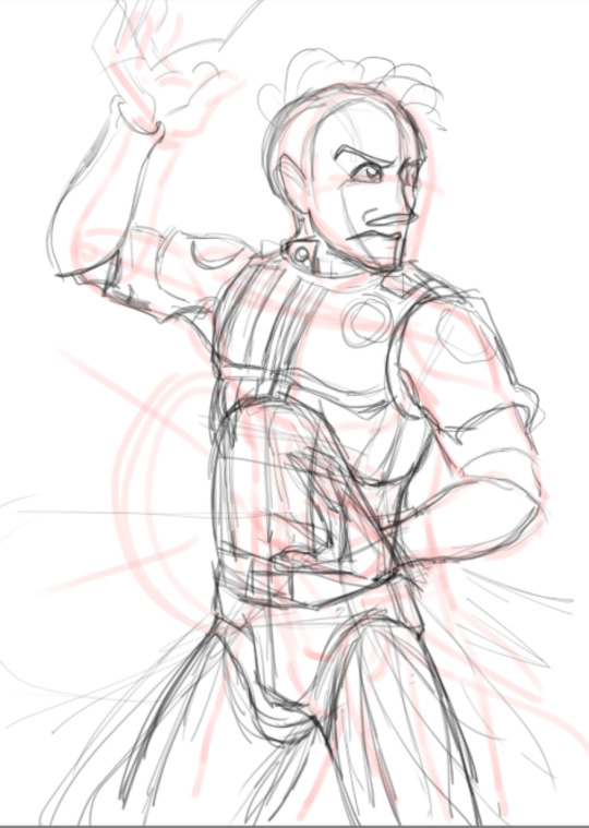
All the layers turned on for funsies.
Okay, so next I have lines, and they are mostly correct. You can see where I was like, "oooh, these are entirely correct" and started weighting them. Alas, there are still tweaks needed. Also, I made Wyn smaller so there would be room for magic. I always seem to draw things too big for the canvas, so I’m in love with that tool that lets you smoosh stuff down. This was, haha, a huge problem for me in art school when I was just using traditional media.
List of tweaks: The hair is wrong, and I think it's actually because the back of the skull is too big. I need to soften the facial featurs, and probably lift the mouth a bit. The biggest one is that I think the chest part of the chest armor needs to stretch down more.
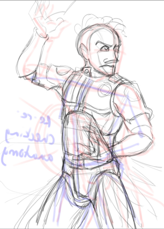
Okay, so this next bit gets a little tricky to explain with just snips (why I'm excited to figure out the record function in either Krita or on my graphics card eventually). To make the above adjustments, I take the layer I want to tweak down to about 50% opacity, and on top of it, draw the changes. Ruducing the opacity of the below layer helps me “ignore” it a little, and drawing on top, of course, keeps the changes separate in case I have to revert. (Don’t mind my weirdo little notes about process and lore.)
Once I have some adjustments made, if I'm confident, I'll take the eraser brush at like, 30% opacity, and erase under the adjustment layer (blue here). It lets me see even better without destroying the work if I need to revert. The skull and chest plates show this. (The black arrow is pointing to an erased portion and the green is pointing to one where all I did was lower the opacity.)

Quick note about why Wyn is where he is. People like threes. So if you bust up a canvas into thirds vertically and horizontally, it's always good to put points of interest at the intersections. Wyn’s face, and his lower hand are about spot on. His upper hand isn’t, quite, but it’s close enough. I also want to leave enough “low value” space here for magic effects.
The last step before I have what I call finished line art is just so much fiddling with the lines. Make this one darker, make that one lighter, smooth this, make that pointier etc. Just a bunch of small adjustments. But at the end, ta-dah!

#trying to explain my brain process art digital art shotgun wizard i had to write this all down and think about it#oc#oc artwork
0 notes
Photo
An anon recently asked me what process I use to color my gifs, and the short answer is: gradient maps! But since that process is a bit difficult to explain succinctly, I thought it was best to turn it into a tutorial. I don’t color all my gifs this way, but it is my favorite and most frequently-used method.
This tutorial assumes you have a basic understanding of gifmaking (cropping, sharpening, etc), and are using the timeline in photoshop. Tutorial under the cut!
1. Basic Adjustments
Alright, so here is what I’m starting with - the gif after just being cropped and sharpened, no coloring yet:
Before I start any coloring, I do a couple basic adjustment layers. I usually start with brightness/contrast, then curves (using the dark and light eyedropper tool), and levels. Here’s the gif now, after applying those basic adjustments:
2. Channel Mixer (if necessary)
Some shows/scenes have very strong filters put on them already, a fact most gifmakers are painfully aware of. These filters can make scenes challenging to color because you’re not starting from a neutral base, but thankfully there is a solution: the channel mixer! This adjustment layer is explained in more detail in this wonderful tutorial by @selinakyle, but essentially it allows you to isolate certain colors to correct them more accurately.
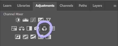
For this scene, I’ll be using the channel mixer to counteract the strong yellow-green filter that’s already baked into the footage. As you can see from my settings below, I’ve set the output channel to “blue” and then adjusted the “green” slider. That means that I’m adding blue into the green tones in the image. This will remove that yellow-green tint from my gif and allow me to start coloring with a better base.
3. Color Balance
Next, I add a color balance layer. This layer allows you to adjust the color of the shadows, midtones, and highlights of your gif separately. To be honest, I feel like this layer is all about experimentation; you never know what’s going to look good until you test it. You can see me testing out the sliders below.
It’s not usually a good idea to move the sliders around as drastically as I did here, I did that to give you a visual of how much the color balance layer can change the look of your gif.
The color balance settings I ended up going with are below. You can only see my midtone settings here, but my shadow and highlight settings are similar.
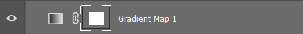
4. Adding the Gradient Map
After the basic coloring’s done, I add a gradient map, which is also located in the adjustment layer panel.

When you first add a gradient map, it will automatically add a gradient of your foreground and background colors, which is usually not the look you’re going for. To edit the gradient, simply click on the gradient itself in the properties panel and it will open up the gradient editor.
In the gradient editor, click the tiny squares on the bottom of the gradient to edit each side of it. You can also add more colors to the gradient as well if you want more than two. It’s usually a good idea to put the darker color(s) on the left and the lighter color(s) on the right so that they correspond to the shadows and highlights properly.
Now that my gradient is added and the colors changed to my liking, my gif looks like this:
5. Adjusting the Gradient Map
The colors are nice, but I don’t like the way they just sit on top of the image, I want the gradient to look more natural. So it’s time to adjust the gradient map’s blending mode.
Every adjustment layer’s blending mode is set to normal by default. Adjusting it is easy - simply go to the layers panel, click the button that says “normal,” and scroll through the choices in the drop-down menu.

Like so many parts of coloring, which blending mode works best really depends on the scene and the look you’re going for. I usually start with overlay and see how it looks, but other popular blending modes are multiply, soft light, and color. I’ve also used hue and color burn.
For this gif, I decided to use overlay. Now that it’s been changed, my gif looks like this:
6. Adding a Layer Mask
The purple color looks great, but now the character looks unnaturally purple as well. In order to remove the purple from her face and hair, we’ll need to add a layer mask.
To add a layer mask, select the gradient map layer and then click the icon at the bottom of the layers panel that looks like a box with a circle in it.

After you click it, a small white box should appear beside your layer’s name.
Make sure it’s selected, then select the brush tool. Set the brush to black, increase the size if necessary, then start painting over the character’s face. Painting on the layer mask will obscure part of the gradient map layer itself, so that only the basic coloring we did before is visible. The darker the brush, the more opaquely it will remove the gradient map. Also, the larger the brush, the softer the look. Since I want a soft edge to my layer mask, I’m using a larger brush.
This is what a layer mask in progress looks like:
7. Keyframes
Now I’ve successfully removed the purple from the character’s face - so I should be done, right? Well, let’s export the gif and see:
Nope, still not ready. The layer mask I added is stationary, but the gif itself is not. This character moves around quite a bit, and since the layer mask stays still, it means that she dips in and out of the purple and sometimes reveals spots of the basic coloring on the wall behind her.
To fix this, we have to animate the layer mask so that it moves with her. We’ll do this using keyframes. To add keyframes, you’ll first need to unlink the layer mask. Go into the layers panel and click the little chain icon next to the mask.


Once the chain icon has disappeared, the mask is unlinked from the layer.
Next, go into the timeline, find the proper layer, and click the drop down arrow on the left side. This should show you a list of properties with little stopwatch icons beside them.
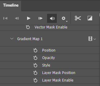
Each stopwatch toggles the keyframes for their respective property. Since we want to animate the layer mask position, we’ll want to click the stopwatch beside “layer mask position.” Now, it should show a small diamond beside the stopwatch - this means that keyframes have been enabled.
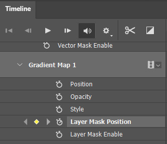
To animate the mask, make sure the timeline slider is placed at the very beginning of the gif. Drag it slowly across the timeline and stop as soon as the character moves beyond the mask. When this happens, use the move tool (do NOT use the transform tool/ctrl + t!) to drag the layer mask into the proper position.

Since keyframes are already enabled, every time you move the layer mask, you will create a new keyframe. This means that photoshop will animate the space between the two keyframes automatically. You’ll know that you’ve added a new keyframe when a small diamond shape appears at your slider’s position in the timeline.
Continue doing this throughout the whole gif, being careful to move slowly, as it’s very easy to miss a spot if you go too fast. This is how many keyframes I ended up creating for this gif:
Once you’ve gone through the entire gif, you’re done!
8. Exporting the Gif
Something that’s annoying about using keyframes is that, when you either convert back to frames or save and open the gif separately to adjust the frame delay, your frames will be duplicated. What does this mean? It means your gif will look like this:

Not great. The solution is easy, but tedious. Simply select every other frame and delete them before changing the frame delay (0.05 is the standard) and exporting. Now the gif should animate at the proper speed:

And you’re done!
I feel like a lot of coloring/keyframes/etc is really hard to explain, especially through text, so feel free to send me an ask if you need further clarification. Also, my lovely friend Sole (@fionagallaqher) recently made this tutorial using a very, very similar coloring method, where she explains both how to use keyframes and how to color frame by frame. Please check that out if you’re interested in learning more!
#mytutorials#rambling#usersole#useralison#userannalise#useryoshi#userelio#tusersoph#usershreyu#uservalentina#userfnuggi#uservivaldi#supervalcsi#usernums#tuserkay#userkarolina#tuserrex#userdean#usercera#usernorah#tuserjen
434 notes
·
View notes
Note
Ok, so, I love your style. Soo much. I noticed in one of your earlier posts (around August I think) you added color to another artist's sketches and I was just wondering?? Like how did you shade with Ben day dots??? It looks like u used a pen of some sorts in some places but I can't figure out if that's the correct assumption or not
It looks amazing, really :0
thank you for the praise and for the question! i've actually been meaning to explain this for months 😂 prepare for a text wall bc i have a lot to say about this.
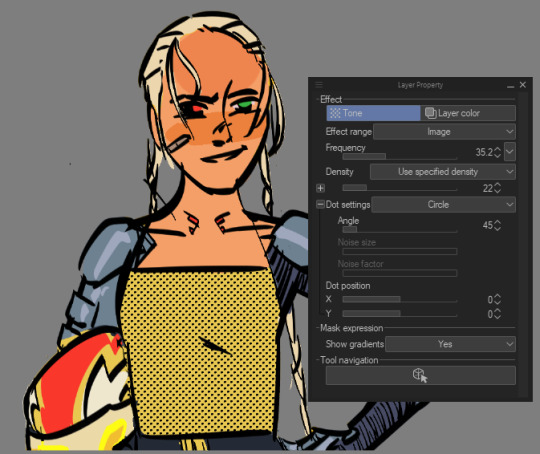
i actually don't use a brush for the process at all! clip studio paint (which is what i use) has a built-in function for laying Ben Day dots (more often known as halftones or screentones). so for anyone curious, that's what i'll be going over here, as well as a few ways i use halftones in my art!
you certainly can get brushes for the job (ie true grit texture supply's sampler), or you can use halftones in photoshop, but imo clip studio's method gives you the most control.
say i want to add a screentone to a concept sketch i have lying around. select the target area, find the selection bar hovering under the selected area and hit "new tone". it's the icon with the box of dots and the plus sign.
you'll get this popup, which'll show you a preview of the tone you're going for. you can change all of these settings retroactively in the layer properties panel, and i'll go over them when i explain that, but feel free to play around with things now if it floats your boat.
the area will now be flooded with dots, and the layer panel will sprout a host of new settings:
effect range is exactly that, what the tone is effecting. selecting "mask image" from the dropdown menu will give the tone an inverted effect.
frequency is the size of the dots. smaller frequency = larger dots. it's usually best to get the dots pretty small.
density is how close the dots are together. if you're adding to an area that already has a base color, you're always going to want either "use specified density" or "use brightness of image", because "use color of image" will make the dots black and white instead of black and transparent.
dot settings i don't use a lot, but you can control the shape and angle of the dots. if you choose the "noise" setting from the dropdown, you can alter the size of the noise and give it a motion blur sort of feel via "noise size" and "noise factor".
here's what it looks like now that i've tweaked the settings, upping the frequency and lowering the density:
that looks nice, but say i didn't want the dots to be so uniform. i often use textures with halftones to achieve that effect, and to do that, you'll want to clip/mask/otherwise limit the texture to the target area, then click "tone" in the layer properties panel. don't use the selection bar like last time; it'll just make a new tone.
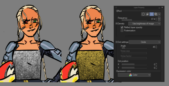
(note that i have the layer set to "use brightness of image", which is what will make the white points transparent.)
the layer properties panel looks a little different than when we used the selection bar function. "effect range" is gone entirely, and since we already gave the program a bunch of values to work with instead of just one, the density slider is grayed out. the only way to change the density of the tone would be to change the value of the layer itself through your weapon of choice (brightness/contrast, curves, hue/saturation/luminosity, etc.) the "reflect layer opacity" box is also a lot more relevant in this case: as you lower the opacity, the density and frequency of the dots decrease.
you can give the dots a color by going back to the layer properties panel and choosing "layer color". i chose a nice, conspicuous cyan for this example.
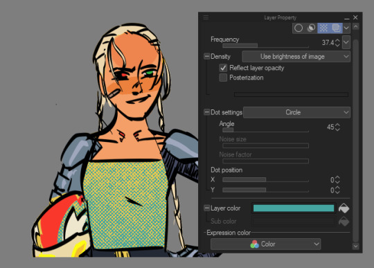
a few words on colored halftones:
relative color is a BIG keyword when working with halftones, because they're going to impact the overall hue & value the audience sees. a good example of this that i often refer back to is jordie bellaire's work in the true lives of the fabulous killjoys: national anthem:
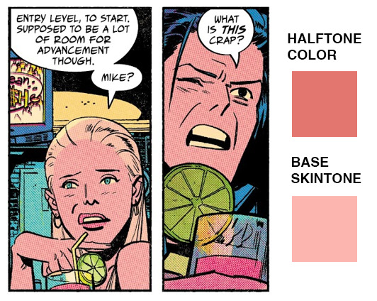
the dpi is super small, so you can only see the halftone if you look closely, but it contributes a sickly pink undertone to the characters' skin that heightens the seedy mood of the scene.
i had to do something similar for my ppg/dp crossover comic cover:
the base tone of danny's skin is a lot lighter & more green than you'd think, and the base of the suit is a lot more saturated, huh? but because of the color choice in the halftones, they look very different. point is, if you're working with a base color and halftones in the same block of color, be open to tweaking either one. the frequency & density of the halftone will also have an effect-- play around with that to get an effect you want.
and that's how i use halftones! i hope that was helpful.
#answers#tutorials#halftone tutorial#clip studio paint tutorial#id in alt#clip studio paint#manga studio
73 notes
·
View notes
Photo


✨ COLORING GIFS FOR RAINBOW SETS ✨
hello!! so this ask had just been sitting in my inbox for days, and since i finally got some free time (and an incentive) i thought i’d put together a general coloring tutorial - especially for those who are interested in rainbow sets, or just want to get freaky with their gifs, hehe.
photoshop: cc 2021, but tbh this tutorial is compatible with most versions of photoshop
for: beginners / anyone with a basic understanding of adjustment layers and brush tool (optional)
the tutorial will show how you can: (1) enhance colors in a neutral/washed out scene (2) change the overall color of a shot (3) make the colors bolder/stronger (4) convert the dominant color to another color
in other words: i rarely save my psds so this is what we’re stuck with
1.

usually, when i’m making a color set, the first thing i do is open the hues/saturation layer and pull the saturation to a 100. this gives me a pretty good idea of the colour palette i can work with. and since this shot is more on the dark side, i brightened the gif a bit, and then moved saturation to a 100. this is what i get:
now that i know the dominant colour is yellow, i can drag the saturation back to 0 and start working on the actual coloring! i go to curves, and brighten the gif a little. most of the time, the white and black points (the first and the third inkdropper) does wonders in color correcting your gif. buut, marking the white point of for this gif would remove what little yellow we have, so i just did a manual adjustment until i was happy with the result.

(since he’s a poc, i used a brush tool at 35% capacity over his face on the curves layer mask. it’s soft, and barely noticeable, but it stopped him from looking lighter, which would become a problem once we move on to the vibrance layers. basically, the lighter the subject, the more susceptible it is to being affected by color enhancing layers.)
next, i go to the yellow hue/saturation option, and increase yellow saturation to 50. i usually don’t do this much, but the yellows are very very light in this scene, so we’re enhancing the colors wherever we can. i also lowered the intensity of the reds using these settings:

the reason i’m reducing red saturation is because - remember the dominant color on his face was red/yellow? - i don’t want my vibrance layers to end up reddening his skin too much. we already tackled a portion of this when we used the brush tool with curves, but this just ensures that the final product doesn’t have his skin looking too yellowy/funny, hehe. this is my gif after the saturation settings:
honestly, the difference is minimal, but now we have an actual color to work with. now it’s just a matter of enhancing that color. at this point, his skin may also look washed out, but the color will return once we get started with the vibrance/color layers.
now, i open the vibrance layer, and - this is always dependent on the gif, btw - drag the sliders around until the colors are bolder. this is my gif now:

the yellows are much more evident now, and there’s a bit more color in his face - so yay! at this stage there’s really no need for selective coloring - so i’ll just add a brightness layer and another vibrance layer:

and voila!! mans lookin good
2.

changing the overall color of the gif is a fairly easy process. i think one thing to look out for is if there are people/a lot of skin that would end up being affected by the coloring – unless there’s minimal movement that you can use a brush tool for.
loki is more or less a silhouette in this shot, and all i’d need to do would be increase the contrast between him and the fog, and slap on a color. this can be done one of three ways: selective coloring, color balance, and gradient map. i’ll be using selective coloring here because i felt that worked best and it’s also an adjustment layer i’m most comfortable with.
enhancing the contrast comes first, and since the brightness/contrast layer didn’t work as well as i’d hoped, i opened up the exposure layer and put in these settings:

and i get this:
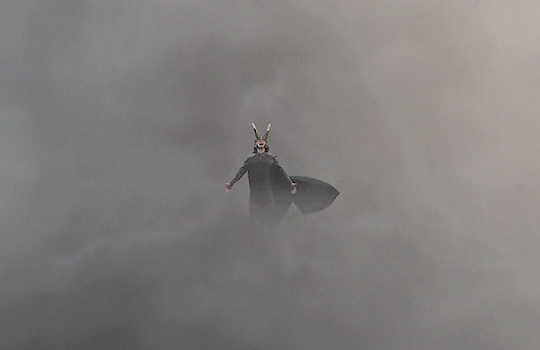
now that loki is much more prominent against the fog, we can move on to the coloring. since i want it to be pink, i’m gonna open the neutral selective coloring, and use these settings:
just make sure your selective coloring is on “absolute” because it colors your gif independent of the original gif and makes your colors more strong, whereas ‘relative’ colors your gif relative to the original gif – which doesn’t work all that well for color sets. (read: makes it look ugly)

i got the color, but methinks its still a little too dull, so i’ll add a brightness/contrast layer to make the color pop

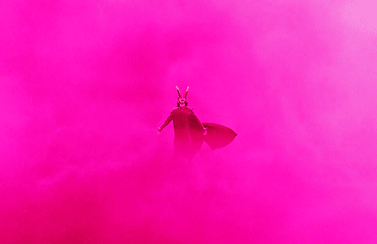
and done!!
3.

animation gifs are much more easier to color because the colours are easily isolated, which is just chefs kiss when you use selective coloring. for this one, i just want to enhance the blues / reds, and remove the magenta tone so that the colours are more vivid. first, i increase the contrast:
it’s sharpened the colors a bit, and reduced the dullness:
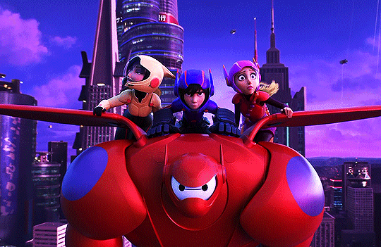
now, because i want to enhance the blues/reds, and reduce the magenta, i’m going to use these settings in my selective coloring layer:
i didn’t want to make the red too bright, since red has an annoying tendency to pixelate, and lowered the magentas just enough so that the three of them still have a bit of color on their face. now the blues:
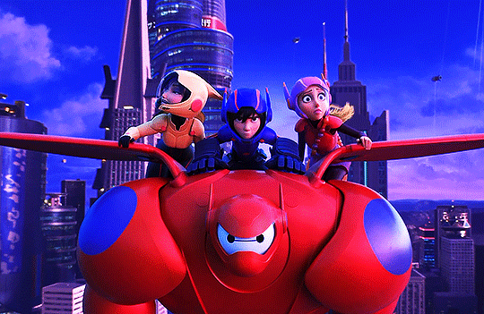
now that that’s done, all we need is to brighten up the gif. i’ll use curves for this:

i selected my white point (the white inkdropper) from the white part on baymax’s face (which i just realized makes no sense bc his entire face is white) which immediately brightened up the gif and erased the excess magenta.

if you want, you could still make it brighter by selecting your white point a little towards the shadows in baymax’s face - but methinks this gif looks fine by itself ehehe
4.
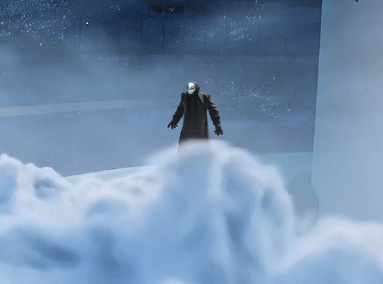
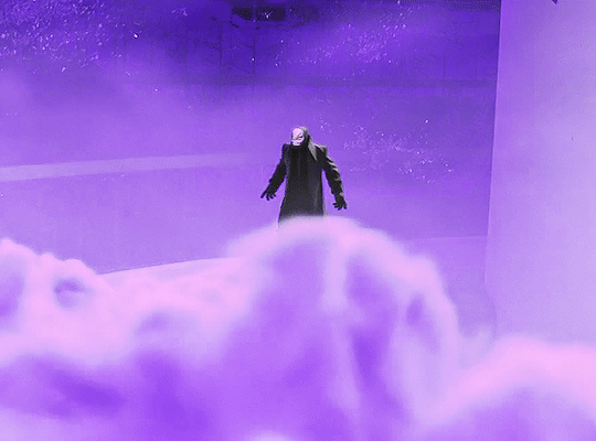
this one will be fairly easy - especially for a shot like this where it’s just blues and black - and will only require selective color and some brightness layers. so, i want to make this a violet gif. the very first thing i’ll do is open up selective coloring and enhance the blues:

idk if this is a thing others do djsajskl i feel like they do, but i do this because i’ve always found it easier to do color convert when the colors are enhanced - so, the more enhanced my blues are, the easier it is to convert to violet. this is what i have now:
now it’s time for violet!!! yee!!!
i increased the magenta in the whites because the highlights in the cloud were looking VERY white, and would end up looking very weird once i increased brightness. so this is just for…. consistency

now we can get on with brightening!! i open up the brightness/contrast layer and use these settings:
and another curves layer, where i’ve intense-ified the dark parts (the grey slider is at input: 27) and lightened the rest (the white slider is at input: 220)
(i just feel like it makes the coloring look crispy)
and tada!!!
i hope this helped! i’m still in the learning process when it comes to coloring, but if you have any questions/clarifications, please don’t hesitate to reach out!
#gif tutorial#coloring tutorial#yeahps#completeresources#chaoticresources#usershrimp#usermazy#jokerous#userchaitali#usernums#uservalentina#tuserdi#userholtz#tusersammy#userhella#userjochi#userelm#usersmile#gif help#tutorial
1K notes
·
View notes
Text
An idiot’s guide to making cdrama period dress - the Wen Ke Xing edition.
Like many people, I was sucked into the cdrama Word of Honor and it has consumed more of my life than I’d like to admit. I’m always big into making character outfits under the pretense of a great Halloween costume, but really, I should come clean that I just like to do some cosplay/historical dress/fun outfits. Thank you pandemic lockdown and lack of traveling; I really got into historical dress youtubers and it shows in my new interest in natural fibers and vintage patterns.
My goal is the make a full replica of the following outfit from the show.

I chose this one for several reasons.
i.) this is one of the simpler outfits that WKX wears. The outer green jacket has a fairly straight cut in front and has unstructured shoulders.
ii.) the blue and red layers and both following a ‘long shirt’ pattern, and again are simple in structure.
iii.) the belt is also a large band with a red cord as the major accent.
iv.) color scheme; I personally prefer his blue/green/purple outfits and I like the pop of red he frequently wears as a part of layer 2, a reference to his role as the ghost valley master.
With this in mind, I did some research using ye olde interwebs. I tried to find resources, but they are rather limited in English. I can find tons of images for patterns in Chinese with an image search, but what I want is a step by step guide for how to sew it together and to know what parts can be modified and what parts have to be kept constant.
There is a website with resources based in Toronto, but I suspect this was written by an engineer based on how text heavy it is and the use of a CAD program.
https://torguqin.wordpress.com/hanfu/hanfu-tutorial-list/
I’ve read it several times over and as someone with sewing experience, I would have preferred more pictures. Maybe this makes more sense to other readers, but I felt pretty meh about it.
I turned to finding a more traditional pattern making guide and purchased this book; Hanfu Pattern Making by TT Duong. It is available as an ebook on Amazon with both metric and English units.

I chose the English units version as I’m currently in the States. Sure, I could have gotten the metric one - I use metric for my job and lived in Canada for 5 years for work meaning I only do temperatures in Celsius but but but. . . . I bought my sewing machine in the States and the seam allowance markers are all in inches. American scientist problems, am I right?
The Hanfu Pattern Making book is fairly easy to understand; the major concepts for making a wide variety of garments and highlights the mix and match abilities of them as well. This was how I determined that the red and blue layers of WKX’s outfit are following the long shirt pattern shown here. I think this corresponds to the Zhiju/直裾 - straight-hem robe as described by @ziseviolet
Most importantly, the book helps you estimate the total yardage of fabric you will need and instructs how to lay the pattern down on the fabric and how to cut it out according to the grain line and selvedge. This is critical for getting the correct draping effect with the fabric and will it allow to fit and flow better when you are wearing it.
With the wider teardrop shaped sleeves, I decided on an extra yard of fabric. I’m still not sure if this will be enough - I may need to make it a little less curved and not quite as wide but I’ll update as necessary.
This requires you to draft your pattern ‘from scratch’ and I can already state that a mock-up will be essential. The guide also has estimates e.g. a curve of 4-6″ at the base so make sure you are consistent with your choices. I am going to give a suggested order of events on how to most efficiently establish your workflow.
Fabric selection:
Although a bit counter-intuitive, I chose to purchase my fabric first. After over thirty minutes of searching for good fabric matches from domestic suppliers ranging from Mood to JoAnn’s to my aunt’s sister’s shop, I realized it would be easier to [gasp] order fabric directly from China even with a variable shipping time. Plus, I could find patterns that are much closer matches to the original than anything here in the States.
I picked a bamboo fabric for the coat in a baby green color ordering 4m which is ~4 yards.

The fabric was in stock and shipped out fairly quickly and cleared customs without issue arriving 20 days faster than expected.
For the blue layer ( Zhiju/直裾 - straight-hem robe?) I went with this fabric with a leaf pattern. I choose it as a color match, not as a pattern match since I couldn’t find any fabrics in dusty blue with blades of grass. I also ordered 4m, again ~4 yards.

Unfortunately, this was still in production when I ordered it and I’m currently waiting for it to ship out. The seller has updated me on the status and I’m hoping it ships out soon. Update - my blue fabric arrived safely in the States, 1 day after the original predicted delivery date. Nice! I would highly recommend this fabric seller; excellent customer service.
The red layer ( Zhiju/直裾 - straight-hem robe?) I decided to save some money and purchase a cotton fabric locally at JoAnn’s. I wanted cotton since it breathes and something that looked close-ish but under $10/yard. I chose this cotton calico, which normally would be used for quilting, but the calicos have abstract patterns that mimic the patterns woven into silk. I bought 4 yards.
Update - I had to buy another 1.5 yards b/c I couldn’t quite fit my pieces; the fabric isn’t very wide and my sleeves were going to end up too short. Double check the width of your fabric. Unlike the imported fabrics this fabric was pretty short for width compared to other fabrics.
I may change my mind in the future and upgrade it also to silk but for right now I’m curious to see if it works out fine as it is only the second layer.
For the white Zhong Yi/中衣 (middle clothes) first layer, I just got basic cotton twill, and purchased 3 yards. I’m not including a picture b/c it is just basic white cotton.
Lastly, I bought 4 yards of white cotton muslin at $6/yard to make a mock-up. Also no fun picture of crappy fabric for you.
Make sure to wash and iron all of your fabric before using! I washed the cotton on cold with an unscented detergent air-dried it and then ironed out major wrinkles.
Drafting the pattern:
Following the directions in Hanfu Pattern Making, I took a bunch of measurements of myself. This would likely be slightly more accurate if someone else did this for me, but I live alone and my cat isn’t capable of assisting me. The fact that the book tells you exactly what to measure and then how to apply it, is vastly easier than the link above (sorry likely Canadian engineer).
The measurements allow you to plug and play to generate your draft pattern. This was my first sketch, which is rough and not drawn to scale.
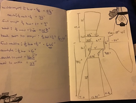
On the left you can see the measurement for various parts. Above was my first attempt for layer 2. For the flare at the base, I chose 4″ and followed the suggested 3/4″ curve.
back armpit measurement is equal to: 1/4 bust + 5/8″
my bust is 32″, so 1/4 is 8″ and I add 5/8″ to that = 8 and 5/8″
waist is equal to: 1/2 waist + 2″
my waist is 27.5″, so 13.75″ (13 and 3/4″) + 2″ = 15.75″ (15 and 3/4″)
Therefore, once you are done calculating the various measurements you can add them onto a rough sketch of the shape of the pattern.
I choose to start with what the book refers to as layer 2 for my initial measurements. This is because I wanted to do the mock-up to correspond to the red second layer. I don’t think it matters which layer you decide to start from since you will either be adding or subtracting from a layer to change to the one above or below it.
With my Hokkaido cat notebook in hand, filled with my notes and numbers, I drafted the pattern. For drafting paper, I went to Target and bought gift wrapping paper as it has a grid pattern on the backside. This pattern is massive, even with my kitchen table, I still couldn’t fit all of it on my cardboard cutting guide! You can’t clearly see the grid on the ‘wrong’ side of the wrapping paper, but it is there. Since the wrapping paper wanted to curl, books were used on the corners and I didn’t need that many extra tools.

For drafting, I used a 2B pencil, the 2″ wide by 18″ long ruler with holes in the middle (from JoAnn’s) and the 12″ curve ruler. I also had a measuring tape to roughly mark of distance. I went over the pencil with a ballpoint pen once I decided on the lines and shape.
The curve of the neckline was the hardest part. I made an X in the corner of the neck line and an X at the waistline point. I then connected this with a straight line and at the halfway point took the line in by 1/2″ (towards the side of the body). The suggestion of the book is 3/4″, but I decided to be a little more conservative. I then gently made the slight curve by hand so that the most curved point was by 1/2″.
The armpit/shoulder is the next most difficult part. My sketch above isn’t quite correct, the 6″ should be doubled, 6″ for the front and 6″ for the back based on my measurements. You need to make sure that the armpit curves are in line with each other! I had the back one off and I had to erase it and redraw it.
I started with the initial curve of a 1″ armpit as suggested in the book. It says the curve can between 1/2″-2″. Note that the book is designed for a very small size range, from about 5′ to 5′5″ (152.4-165 cm) and I am 5′3″ (160 cm).
To make the curve, I used the curved ruler to trace a nice smooth line. Just make sure you use the same part of the ruler e.g. 1″ to 3″ or 9″ to 12″ etc. I went with the curve that looked the best.
This pattern doesn’t include seam allowance - you will have to add that on when cutting. To be most accurate, trace the pattern onto your fabric. I like to use the removable fabric markers like these:

You can then use the other color to mark out dots along the fabric for seam allowance, like 5/8″. If you can’t use fabric markers there are also removable mechanical pencils that come in yellow, magenta or you can be old school and use chalk.
I transferred the pattern to the cheap cotton muslin fabric and cut it out. There aren’t many seams to sew and I ignored the sleeves since I wanted to determine if the pattern fit me well. I placed the right sides together and first sewn together the back seam. After that I did the armpit/side seams, leaving the armpit unfinished on the end and check the fit. Already you can see that the neckline isn’t laying flat and the armpits are super tight.

I just grabbed a long scarf to tie it down and adjust the fit at the waist.
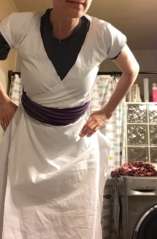
Leaning forward you can see the neckline is even more of a mess and the armpits are far to tight even though I am wearing a fitted t-shirt underneath (as this is layer two).
I went back to the drawing board to adjust the pattern. I kept my original pattern and added more paper to the armpit and neckline area to draft a new pattern and cut it out instead of a completely new draft since the waist down was totally fine, falling around my ankles.
This time I made a 2″ curve for the armpit, added more length to the armpit as well and only sewed the top with some scrap blue fabric. As you can see here, it was a more optimal armpit fit.

I also shifted the neckline curve to reduce it to 1/4″ instead of the 1/2″ from the first mock up. This was an excellent decision as it fit in the chest area much better. This is my sketch to reshape the neckline.

This is how it looked on me. Excellent!
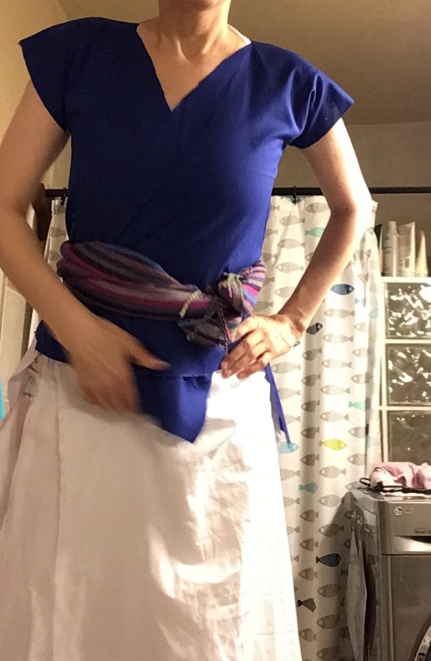
The neck still looks wide because I haven’t added the neck placket but the fabric lays much more naturally. My conclusion to date is that if you don’t have a very large bust size, err on the side of making the neckline less curved.
What I also concluded from this mock up is that my measurements for layer 2 are more likely my layer 1 measurements since they were quite form fitting on top.
The next step (backwards compared to the suggested order in the book) was to add sleeves. I guessed what shape would work best and my first draft was terrible as shown here.

The bottom was too square and I was trying to figure it out based on this scene from the drama. I chose this model for the sleeve since you can tell that the white layer in WKX’s outfits has a relatively wide sleeve.
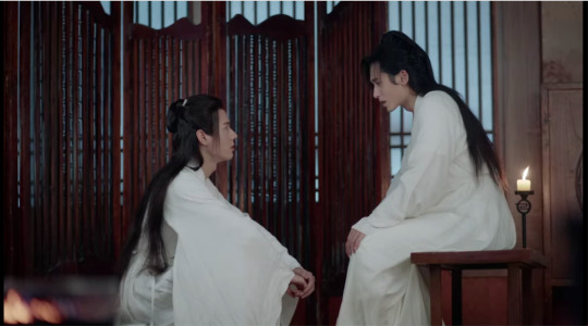
The only part that I used the pattern for reference was how to attach it to the armpit at the shoulder. The overall sleeve shape was just what I thought looked nice. Keep in mind that the shoulder seam sits fairly low on the shoulder compared to a modern garment. The seam line is a few inches down from the shoulder and you can see that the garment will naturally pucker in front of the armpit. In his several days of drunken sulking, you can see the seam line is even with the back of the chair.
The weight of the sleeve itself helps to hold the shoulder structure and it doesn’t pop up as you see on my second mock-up with the blue fabric.
I drastically reduced the size of the sleeve curve and made a pattern based on something that seemed alright. With all of this mock-up work done, I decided to turn to making the first layer, the Zhong Yi/中衣 which I have summarized as a separate post.
#stickey#wen kexing#word of honor#sha he ling#WOH#shl#hanfu#cdrama#cdrama dress#pattern drafting#sewing#cosplay#sticky
243 notes
·
View notes
Text
How to color with Hue/Saturation and Selective Color layers in PhotoShop
@jackarthurdavenport asked me how I am coloring gifs for my rainbow gifsets like this and this set.
This tutorial is really image heavy.
I don’t like using new layers and gradients for coloring, I think the gifs look more natural if you use the colors that are already there. So I will show how to use only the maximum of three layers for the whole coloring. For this kind of coloring you have to chose scenes that already have the color you want to achieve in the end, or it contains colors that can be easily modified. I am going to show how to color lighter scenes and darker scenes. The method is really similar, only the end is a bit different.
1. Young Assane + Green
This is the base gif we are working with, it was cropped and sharpened, but not yet colored. The yellows and the cyans in the background will help us to get to the light green we aimed for.
First step: brightening
For brightening I like use just a bit of Curves adding lightness to the scene. Most of my brightening happens with Levels and Brightness/Contrast layer. After adding more whites to the scene with both layers I always add some dark and contrast to make the colors pop. But you can do the brightening part as you wish.
This is how our gif looks like now. Brightening brought out a few colors we can use later.
Second step: Hue/Saturation
After our brightening Assane’s face became a bit too orange, so I took back the saturaion of the reds and yellows. In case of the yellows I first added some hue so even after taking down sat the background got a greenish tone. On greens I upped the sat and played with the hue to get the green I first had in mind. After this we can still see what other colors the scene has, in this case cyan was most prominent. I added more sat to the cyans so we can see where it is located in the scene and the alter it with hue, until it matches the other greens of the scene, I did the same with blues but reduced sat there, because his jacket also turned an unnatural color. And in the end I reduced magentas and altered them a bit, so his face wasn’t purple after taking away from the reds and yellows.

We are here now, we could leave it at this, but I also wanted to give some more greens to the background, so now come my favourite tool, the selective color.
Third step: Selective color
Since most of the background stayed white I went to the whites and added as much green as I could and darkened it. This move also turned part of his face and clothes a bit green so I added a layer mask and painted over those part. This works best with gifs that don’t have much movement, but with a white background some moving is no problem. As finishing I added one more selective layer and corrected all the colors a bit more. First the yellows so his face looked a bit more natural, then the greens to make the background pop. As a finishing I added to the blacks with just +3, to get more deepth.
Finishing step: Exposure
I like to add an exposure layer to all my gifs as a finishing touch to bring out the colors and add some more depth. And we got our gif!
2. Claire + Red
Our base gif already contains the red we are aiming for, but not everywhere. For this gif I will only show the coloring, because the brightening and the exposure layers are the same I used before.
Hue/Saturation
First of all I reduced yellows and altered the hue a bit to make it lean toward red a bit more. On this layer I am not doing anything with reds because I don’t want to mess with her face. As we can see other than red, the background contains three main colors, magentas, blues and cyans. On all these colors I upped the sat so I can see where are they exactly and played around with the hue until I reached a red look.
Not yet what we wanted but we are getting there. In the next step first I will correct her skintone and then with a new layer color the remaining parts that are not yet red.
Selective Color
For her skin tone I again reduced the yellows and reds and lightened it a bit to look more natural. Then added some black to get a bit of depth. After adding a new selective layer, we are working with our secret weapon, neutrals. Neutrals can color everything that don’t have a color yet, using it works similar like color balance, so we have to be careful if we use it for correcting colors. In this case most of our background is quite gray, so first we add red to it, to match the color we want. I wanted a vibrant dark red so I added a lot of red and black and corrected it a bit with green and blue to get a deeper color.
!But neutrals will also color her face too! So I added a layer mask and painted over her face and the area on the left side of the gif, since that was already red. Again this coloring method works best if there is not much movement. After adding a final exposure layer the gif is ready.
This method can work with almost every scene, but it still needs a base that is already close to what are we aiming for. I am using this kind of coloring for color palette gifs too, but there first I add a new layer and paint on it in one corner the color I want to have and then start coloring under that layer. If the colors match with the one on the new layer, I can delete that layer and the gif is ready.
I hope his was helpful and understandable. Please let me know if you have any questions!
#completeresources#allresources#photoshop tutorial#coloring tutorial#usermouffe#usertk#userpavi#userkraina#usersof#userelm#useroli#userdyamond#itsphotoshop#dailyresources#tutorial#chaoticresources#bbelcher#wehearttutorials#*mine#*mytutorial
382 notes
·
View notes
Text
COMPREHENSIVE GIFFING TUTORIAL (vapoursynth + ps cc 2018)
+ some tips and tricks on color correction, blending and subtitles
You guys asked for it, so here we are! This is by no means the gold standard to giffing. Rather, this is simply my process and my own preferences. Take it as you will. Additionally since I use a mac some of my controls/panels may look different than what you would see for windows users.
DOWNLOADING YOUR SOURCE
This step is extremely important to the quality of your gifset. If you want high-quality gifs I would recommend giffing sources in 1080p whenever possible (especially if you’re going for larger dimensions). You may get away with 720p for smaller gifs. For kdramas, your go-to source would be dr*maday or torrents. (you can search my faq tag if you’d like to know specifics on finding and downloading torrents).
IMPORTING + PROCESSING YOUR FILES WITH VAPOURSYNTH (VS)
Please note that this tutorial does not cover basic installation and set-up of vs. If you would like to know how to download and set-up vapoursynth (it works for both mac and pc) along with some of it’s basics you can find more information at: https://hackmd.io/@nibreon/vapoursynth-book/%2F%40nibreon%2Fvapoursynth-book
Once you’ve identified what portion of your video you’d like to gif, simply drag your video file into VS. Specify the start time and duration of the clip you’d like to import. Typically you’ll be aiming for ~3-8 second clip depending on how big your gifs will be. I am very lazy when it comes to importing. The less of it I have to do, the better. Therefore, I often import clips that are 10-15 seconds long, sometimes even up to 20 seconds. I wouldn’t recommend going over 15 seconds most of the time though, because this will usually bring you over the 500 frames photoshop allows you to import at once. (when I do go over, I will sometimes import the processed VS file into PS in segments). You can also choose to import the VS output as segments if you want all your gifs on separate canvases. (I'll go into more detail on this later)
Once you’ve imported the clip into VS your screen should roughly look like this once the resizer pops up:
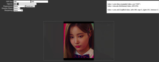
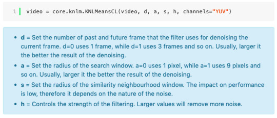
In the top left is where you will be applying your cropping, sharpening and denoising filters. Cropping: Keep in mind the Tumblr dimensions: 540px for full-width gifs and 268px for half size gifs, 177/178/177px for 3 gifs across. The height is completely up to your own preference. Usually I work in 540x300px. Once you edit those parameters you can drag/resize your video file to fit your new canvas. Sharpening + Denoising: You can choose to skip this if you would rather sharpen in ps. I personally do all my cropping, denoising and sharpening in vs. I use finesharp and KNML for sharpening and denoising respectively. Once you select those two filters from their drop down menus, be sure the select the checkbox as well. You should now notice 2 additional lines of code in the top right box. The line that reads: video = core.knlm.KNLMeansCL(video, 0, 6, 4, 1.2, channels="YUV") is where you will adjust your denoising parameters. You will only be adjusting those 4 numbers. I usually use: 0, 1, 0, 1.2. Now find the line that reads: video = hnw.FineSharp(video, sstr=0.22). These are your sharpening parameters. once again we’re only adjusting the number at the end. I typically use somewhere between 0.33-0.55. Depending on the quality of your source and preferences these parameters may change.
Here is a breakdown of the KNML parameters (source: @/nibreon HackMD):
Once you have finalized your parameters, copy all the code in that top right box and paste it into your vapoursynth editor. Note: you can ‘inactivate’ certain lines of code by adding the # symbol at the start the line. That line of code will then be greyed-out. This is what your code should now look like (the highlighted section is the part I just copy and pasted):
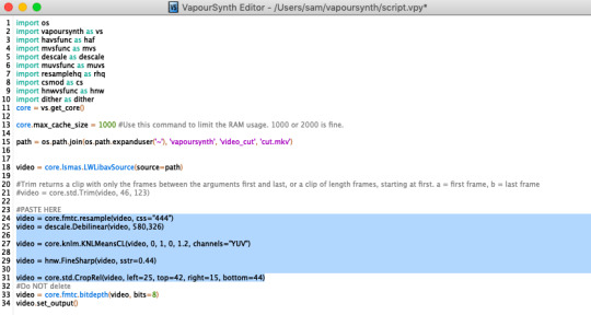
If you would like to preview your filters and see if you need to make any adjustments, simply navigate to the top bar and select script > preview. If you like what you see, great! If not, you can adjust the parameters directly in the editor until you see a result you’re happy with. Once you’re happy you can move onto the final step in vs: processing.
Processing: Once again, navigate to the top bar and select script > encode video. Another window should pop up. Make sure you set ‘header’ to ‘Y4M’ then click ‘start’. Patiently wait for that to finish processing. The longer your clip is and the more filters you add, the longer it will take.
IMPORTING YOUR CLIP INTO PHOTOSHOP (PS)
Now you’re done with the vapoursynth section! Not too hard, right? I use the timeline method when I gif. To import your video file into ps navigate to file > import > video frames to layers. Here you can use the sliders to further specify what range you would like to import. Make sure the ‘make frame animation’ box is checked. To optimize smoothness of your gif, avoid checking the ‘limit to every _ frames’ box. Hit ‘OK’ and wait for the frames to import. Depending on the size of your clip, ps may notify you that you are importing a large file and it may take a long time to process, simply say ‘ok’ to this. UNLESS you get a message saying it will limit to 500 frames. This means your clips contained more than 500 frames and you should select a smaller section to avoid cutting out any critical parts. (Note: you can always go back and repeat this process to select a smaller range of frames from the same video clip until you’ve imported all the frames you need).
Timing: You can adjust the timing of your gifs before converting to timeline. Select all the frames (Navigate to the icon with the 4 bars at the bottom right of you screen. Select “select all frames”). Click the drop down next to the timing of any of the frames. Select ‘other’ and input a your preferred timing. I personally use ‘0.04′ but I've seen people use anywhere from 0.4-0.8ms. Also as a note: when you convert your gif to timeline it has a tendency to mess up your timing so even if you input 0.04 or 0.05 it won’t actually be that timing later. If you want the true frame rate you can set your timing right before saving. You can also adjust timing at the end. (see export/saving gif section for more info)
Now the next part can be tedious and for that reason I’ve created numerous actions to speed up this process. But for the sake of this tutorial I will walk you through the steps. At the bottom of your screen is your timeline. As you can see, it defaults to frames, but we want to convert this into a smart object so that all your coloring/edits are made to all of the layers. To do this: 1) Navigate to the icon with the 4 bars at the bottom right of you screen. Select “select all frames” 2) Now select all your layers in your layer panel. On mac you can use cmd + option + A as a shortcut. 3) Back to the icon with the 4 bars, select “convert to video timeline” 4) Right click on all layers (which should still all be selected) and find “convert to smart object”
(Aside: Actions) actions are SUPER helpful to streamlining your giffing process. you can find actions people have made available on resource blogs like itsphotoshop OR you can choose to make your own custom actions. To do this, all you need to do is locate your action panel. Then from the controls at the bottom of the panel select the one that looks like a sheet of paper to “create a new action” Once you’ve named it and hit ‘ok’ the record icon should now be red. PS will now basically ‘record’ whatever you do. To stop recording hit the square icon. Now whenever you want ps to execute the same set of steps you just did, you can locate the action you just made and ‘play’ it by selecting the triangle icon. I highly recommend making an action for the steps I just outlined above to convert your gif into a smart object timeline. It will make your process much faster and more painless.
COLORING
Now the fun part! I focus on emphasizing the colors already present in the video source or getting rid of some less-than desirable overtones when I color. It gives the gif a natural look, but makes everything pop a little more. We will be working with selective color, curves, levels, and brightness/contrast mostly. This is the original gif I will be using to demonstrate coloring:
Curves: I always start with curves. The first curve layer I use to set a desirable black point. To do this, locate the top dropper icon from the curves panel and select the darkest point of your image. This will set that section to “true black” Feel free to play around with this until you find a desirable outcome. Now add another curves layer. This one we will be using to adjust the brightness/contrast. First, I always start off with ‘auto’ and see where that takes me. If you like the outcome, great! If you don’t play around with the different curve points until you get an outcome you like.

Selective Color: This adjustment layer will be your best friend. For me, I will typically work with reds, yellows, and black. If the source has a lot of blue/cyan I will use those too. Basically look at your source and determine which base colors you’d like to emphasize/alter. For blacks I usually up the black by +1-5 depending on the source. For reds, it also depends on the source. But I will typically either decrease cyan (to make red stand out more) or increase cyan (to make the red not look so overexposed). You want to be careful here. Overexposing the red can make your skin tones look like red tomatoes! And for my content base, where most of the actors are of asian descent, we should be emphasizing the yellows and NOT the reds (see aside on color correction + skin tones for more info). After altering the reds to my liking, I do the same process for the yellows. To bring back natural skin tones and color, you will likely want to darken the yellows, expose them a bit more and maybe even up the yellow slider. A common rule of thumb: if you want to make any of the colors less exposed, increase the cyan. If you want to increase exposure on any of the colors, decrease the cyan. If you want a color to appear more strongly or prominently, increase the black. The magentas and yellows I use more to adjust hues. You can add multiple selective color layers to further emphasize your changes.
Levels: Now we will work on the lighting some more. This creates more contrast and depth to your gif, often making them look ‘crisper’ To emphasize the bright parts, move the right-hand slider to the left. The emphasize the dark parts, move the left-hand slider to the right. You may also choose to move the middle slider to adjust more neutral lighting. Do so until you find a setting to your liking.
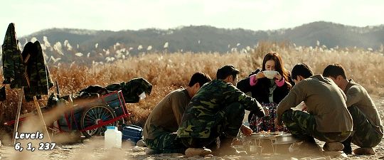
Miscellaneous: Depending on your gif you may need to play with other adjustment layers. Some other ones I often use are the brightness/contrast and exposure to adjust lighting and add more dimension to the gif. For additional color correction I use color balance and to a lesser extent hue/saturation and vibrance.
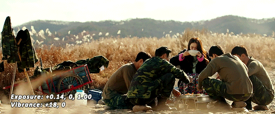
(Aside: Color correction + skin tones): We are anti-whitewashing and anti-redwashing when it comes to asian media. Like I mentioned earlier, natural asian skin tones have yellow undertones, not red/pink. Therefore when you’re bringing in color you should be mindful of this delicate balance. Adding more red does NOT equal un-whiteashing. Be VERY careful how you balance the yellows with selective color/hues/color balance.
^^ Here is an example of what I mean by overexposing the reds. Poor seungho is looking as sunburnt as a cherry tomato. Note: if your original source is already overexposed with red, fix it! You can do this by applying the same basic principles I explained earlier. Try upping the cyan on the reds in selective color, or shifting the color balance to favor cyan over red with the color balance adjustment layer. You may also choose to favor the yellow over blue.
^^ Now this is straight-up whitewashing. This is what happens when you are not careful with your correction of yellow. I’m not saying you can’t touch the yellow slider or get rid of some yellow form the overall image (because sometimes it is very much needed), but you should be very mindful how your corrections can affect skin tones. If you decide to decrease saturation of yellows, or decrease yellow in the selective color section of the reds, do so with caution. If your reds are looking too pink, add some yellow in the red selective color, up the yellow and black of the yellow selective color.
^^ If you hit that happy medium, you can emphasize the natural skin tones without overexposure. Here the underlying tones are very much still in the yellow range.
(Aside: Blending): I will very briefly talk about how to blend two gifs together. First make sure you’ve imported both your gifs into ps and converted them into the timeline format. On one of the gifs, right click the gif layer in the layer panel > duplicate layer > select the canvas of the gif you’d like to blend the gif with. On the canvas you just copied your second gif to, you can now drag the two layers around the on the canvas to get your desired positioning. On the top gif apply a layer mask. This can be found in your layers panel at the bottom, and is indicated by the white rectangle with the circle. Next, make sure you select the mask in the layer panel (it will show up as a white rectangle on the layer you applied the mask). Grab your paintbrush tool and make sure your color is set to black. Now you can effectively ‘erase’ the part of the top gif you don’t want to show anymore. I recommend setting your brush hardness to 0% to get a smoother transition. You can also play with the opacity settings. If you want to add back in a part you erased, just switch to a white paintbrush and you will be able to undo what you had just ‘erased’ with the black. When you merge the gifs, they will play the same number of frames. This means your blended gif length is limited by the gif with the fewer number of frames. You can move around your timeline layer and shorten the included portion by dragging either end of the timeline layer in until you get both gifs to play the parts you want.
CAPTIONS/SUBTITLES
I often get asked about my subtitle font/styling settings. Personally I find the best fonts for subtitles are calibri and arial. I use calibri with the following settings: 12-14px, bold italic plus faux bold, 1px black stroke (optional: drop shadow set to ‘multiply’ at around 85% opacity), and tracking (VA) set to 75. If you would like your subtitles to fade-in or fade-out you can apply the ‘fade effect’. Locate the b/w square icon in your timeline panel. Select fade and drag it onto your text layer in your timeline. You can then right click on the wedge shape to adjust your fade duration. I usually use 0.35s. If you drag and drop the effect towards the beginning of your text you can get the fade-in effect. To get the fade-out, simply drag and drop your fade towards the end of your text layer.
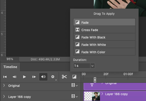
SAVING/EXPORTING YOUR GIF
We’ve reached the final stretch! If you need to adjust your frame rate timing: you will need to revert your timeline to frames. To do this: 1) Navigate to the icon of 4 bars at the right of your timeline panel. Select convert frames > flatten frames into clips. 2) Navigate to the icon of 4 bars at the right of your timeline panel. Select convert frames > convert to frame animation > when promoted hit ’ok’. If at this point you see more than one frame in your timeline panel, delete the frames until only one is left. In the example below I would delete the first frame by hitting the trash icon from the timeline panel.

If there is only one frame, leave it as is. 3) Navigate to the icon of 4 bars at the right of your timeline panel. Select ‘make frames from layers’ You will most likely need to delete the first frame in your timeline panel (it won’t have your coloring). Sometimes ps adds in some ‘blank’ frames as well, delete those too. Now you can adjust your timing.
Once your timing is set: When you’re saving your gif, just keep in mind it must be under 10mb. Navigate to file > export > save for web. When it comes to your save settings I typically use either selective diffusion or adaptive diffusion. I also also occasionally use adaptive pattern (I find this is best for dark scenes without a lot of contrast). Set colors to 256, quality to bicubic and looping options to forever. If you want to preview your gif, hit the preview button in the bottom left. Otherwise, go ahead a hit ‘save’ and you’re DONE!
ADDITIONAL RESOURCES
Feel free to check out my ‘ps things’ tag for more photoshop stuff/mini tutorials. Additionally @/nibreon and the hackmd site I linked previously are your best resources for vs questions. If you would like to see my giffing process in motion feel free to check out this video. It’s sped up but you can slow down the playback. Additionally be sure to check out resource blogs like itsphotoshop for more helpful tutorials and resources.
If you reached the end of this beast, kudos to you! I hope this helps and never be afraid to reach out with any questions.
523 notes
·
View notes
Note
Hey there! Do you have any advice for making your gifs look (for the lack of a better word) even/matching? Whenever I gif different scenes for one gifset, I use the same process on each but the scenes are often so wildly different in hue/lighting/etc that the gifs end up looking like they were made by different people. And when I tamper with the finished results and try to assimilate them, I only seem to make it worse. It seems so awfully tedious to adjust them each by nuances just to match.
Hello! Sadly, the only way (that I know of) in making different gif scenes have consistent coloring is to do the awfully tedious thing.
To start, here are two uncolored 'gifs’ below. They’re both from Little Women (2019) but one has cool tones and the other is warm.
First, color grade one gif then apply the same adjustment layers to the other gifs. In this example, I colored the left gif first and it looks okay to me, but the right got much too warm.
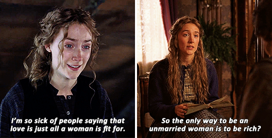
Color correct the other gifs. The skin tones and the scene lightings don’t match (especially since they did that on purpose for timeline purposes if I remember correctly) so I’m going to color correct the second gif.
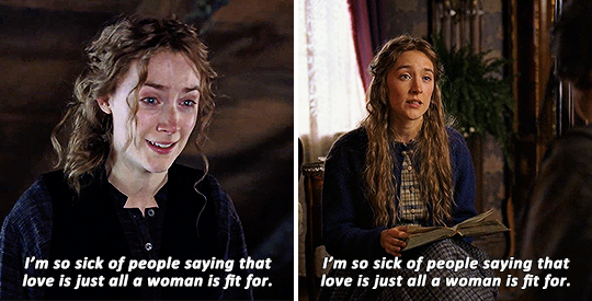
Second, adjust the Curves layer. The warm tone was first removed by experimenting with the Curves—mostly Red, some green.
NOTE: I used the Curves eyedropper tool for the left gif (here’s a useful Curves tut), but I didn’t like how it worked on the right hence the experimenting.
Third, adjust the Selective Color layer. I added a new Selective Color adjustment layer to target the warmness (reds and yellows).
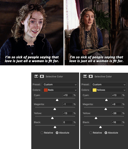
I upped the Cyan for both to make it cooler, upped the Magenta and decreased the Yellow to lessen the yellowish tones.
Fourth, adjust the Hue/Saturation layer. I added a new Hue/Saturation adjustment layer to modify the warm colors (reds and yellows).
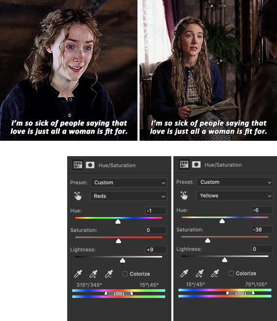
For the Reds, I only tweaked the Lightness to lighten the shadow on her cheekbone a little bit. For the Yellows, I made the Hue go left which makes it more pinkish than greenish, and I desaturated the Yellows to really match it with the gif on the left.
Now, we’ve got this desaturated gif (my bad) and I think it’s because I removed the scene’s major tone.
Fifth and last step, make some minor changes to other adjustment layers, including the first gif. So I’ve tried to fix this a bit by upping the Vibrance adjustment layer and the Brightness and Contrast (it was low to begin with).
I’ve also decided to up the warm tones of the first gif a bit using Hue/Saturation and Selective Color so they can both sort of meet halfway. 😂
Comparing it with what we started (second set above), the final edits look good to me.
TL;DR: To achieve color consistency for a gifset with different scenes, play mostly with the Curves, Selective Color and Hue/Saturation adjustment layers.
You probably expected for a less tedious way to do this but I hope this helped :)
〰️
So... I just noticed, after typing this all out, that I got the subtitles of the second gif wrong in some pics 😬 Very sorry about that!
94 notes
·
View notes
Text
Making Normal Channels in GIMP (with njob)
Hello everyone! I was explaining how to do this in the Sims of History discord server and realized how much of this process I learned through trial and error. There isn’t really a good step-by-step tutorial about how to do this in GIMP, only in Photoshop (at least no text-based tutorials). While I use both Photoshop and GIMP for various things, I prefer to make my normal channels in GIMP. This tutorial will walk you through the process and hopefully demystify normal channels in GIMP.
Normal channels (bump maps) add additional depth beyond your mesh, which is useful for things like folds, painted on pockets, and buttons.
This tutorial is particularly for how to make Create-a-Sim items, not objects, but a lot of steps should be transferable.
You will need (all free programs):
GIMP
njob
Sims4Studio and/or CAS Tools

First, open your diffuse texture in GIMP. I often try to use the light/base texture rather than one I have colored already, but if you have already colored it and didn’t save a base, don’t worry, it doesn’t make much of a difference. Don’t use an image which has a pattern applied to it, as that will create a bump on the pattern and appear like applique or something along those lines (unless that is your goal).
I recommend doing this step after you have tested your diffuse texture image and mesh (if applicable) in the game. If you have any last minute changes to either of these, you will probably need to re-do your normal from scratch.
If your image is in layers for recoloring, or not, choose to flatten the image. Transparency isn’t helpful in making normal channels, so get rid of it so you won’t have to worry about it later.
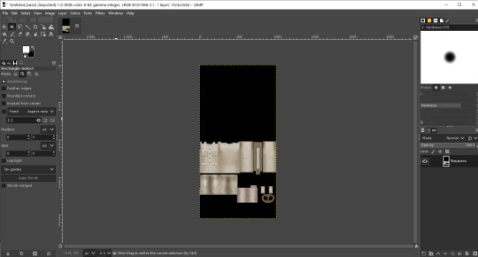
Once you have flattened it, the background usually turns either black or white. It doesn’t really matter which one, it won’t make much of a difference in njob.
Now, select the crop tool. You can see the current dimensions of the image in the “aspect ratio” box. For a CAS items, the original will be 1024:2048, which is 1 x 2. We will need to crop the image into a 1 x 1, or perfect square.
To have your normal channel as high quality as possible, you should use 1024:1024. This will work for clothing items like full body outfits, tops, bottoms, gloves, socks, and tights (basically anything mapped in this bottom portion of the UV map). For all of these items, you must use a square and cannot crop it to be smaller. For shoes, this means a very large blank area.
For accessory items like jewelry and hats, the cropping is different. For instance, a hat would be 512:256. If you are unsure of the dimensions to use, export the normal channel on the maxis item and copy its dimensions. The following instructions will assume you are making a clothing item and not an accessory item.
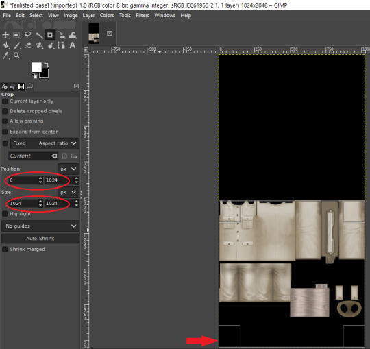
Click anywhere on the image while you have the crop tool active, then adjust your dimensions in the box to the left. You can manually type it in or drag the box and follow the size in the box as you drag.
The box should be perfectly aligned with the bottom and have no space below. If you have space below, just drag it as far to the bottom as you can. GIMP will stop you from dragging it outside of your current dimensions. If a little is sticking out at the top, that is okay. Nothing can be mapped outside of the 1024:1024 dimensions, so it is probably just bleed over or space filler that you are cropping off.
Press “Enter” on your keyboard to complete the crop.
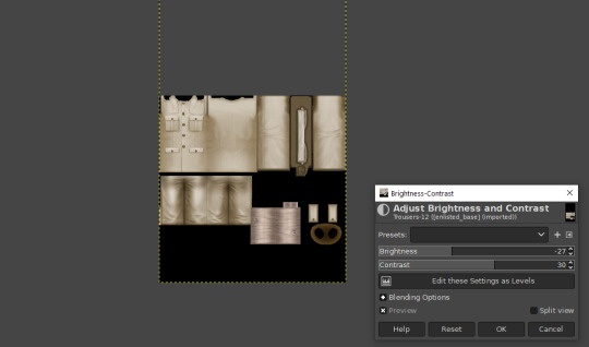
Optional Step: If you desire, you may want to decrease the brightness and increase the contrast on your image so there will be more for njob to pick up. If you already have a lot of contrast, you may not need to do this.
Next, export your image as a PNG or BMP. Be sure to not overwrite your original diffuse texture.
You can now close GIMP, though you will need to open it again later.
Open njob, then your saved, cropped image.
Maximize your screen so you can see what you’re doing.

Go to Filter > Diffusemap > Heightmap and select that option.
The screen will pause to load for a bit before opening up a new box.

Your image will convert to black and white and may look a bit strange. The first step is to change your “Course Detail” setting to the lowest (or close to the lowest) setting and your “Fine Detail” to the highest setting. I generally play around with the “Mid Detail” and “Scale” until I get what I want. Try to have what you want to be visible stand out, while folds should be soft and fuzzy but still somewhat distinguishable.
Once you have what you need, click OK and go to Filter > Heightmap > Normalmap

There are two settings, “Scale” and “Blur Radius.” Neither of them have “ideal” settings, so you will need to adjust as you need. “Scale” controls the depth of the contrast and “Blur Radius” impacts the softness of the image. If your edges are too harsh, your normal map may look odd in game.
You will probably also have lines in areas in no texture. This is normal, and I will go over how to remove those later.
Once you are satisfied with how things look, save the image as a bitmap.
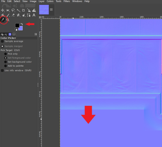
Now, open your bitmap image in GIMP. It is time to clean up the image and get rid of the artifacts. Unfortunately, unlike a specular, a normal map doesn’t have a mask to prevent bleed over onto skin or other textures. The unused areas need to be a midrange, solid grey. It is easier to edit at this step before you create your transparency.
Select a midrange blue color from one of the blank areas with your color selector and make it your background color by using the arrow button between the foreground and background colors.
Select the areas that should be blank and delete them, which will replace the lines with a solid blue color. This would be areas around the neck, wrists and ankles, and also places like the filler beneath skirts and tops that doesn’t need texturing. Be sure to select the odd lines around the image, which are usually a bright teal or hot pink color. Those can be very visible.
Sometimes, you may need to take your paintbrush and clean up the artifacts if they are in curved or very small areas. If anything looks too sharp, you can also use the smudge brush to smooth it out (very lightly). But don’t move anything around too much.
Once you have cleaned up your image, export it again as a bitmap. This is just so you can go back to it if you make a mistake later or need to modify it. Usually I save it as a new image, but you can overwrite the old one if you are feeling confident.
I have to point out that sometimes you can get away with not cleaning the artifacts from your image. But I have had too many issues with it in the past to skip this step.
Now it is time to make the normal map. Finally!

In the layers area, right click on your single layer and add an alpha channel to it. There is also a small button at the bottom you can use to add an alpha channel. You will need this transparency for the next step.
Next, go to Colors > Components > Decompose.

A small box will open up. Change your color model from RGB to RGBA to enable the alpha channel as a separate channel (layer).

Now, a new image will open that is your bitmap but greyscale. You will see four layers on the side called red, green, blue and alpha.
Select the red layer and click CTRL + A on your keyboard to select the entire layer. Then, click CTRL + C to copy the layer. (If you don’t have a keyboard, you can do “Select all” and “Copy” but this takes longer).
Now, go to your layer named alpha and press CTRL + V (paste) and CTRL + H (to anchor the layer). Now, you have replaced the alpha channel with the red channel.
Next, go to the green layer and select and copy it. Paste and anchor it into the red and blue layers, just as you did before with the red layer and alpha layer.

Your image won’t look too much different right now, it will just look like the green alpha channel rather than the visible red alpha channel when you opened it. Go back to the top bar and choose Colors > Components > Recompose. This will alter your original image, so the one you have open in layers will stay open. Go back up to the top and select the original image to go back to it, or close your layered image.

Now, your image should have changed from mostly blue to a transparent, mid-range gray with only a few elements visible. This is how it is supposed to look. If you don’t have transparency or it looks very different, then you probably messed up somewhere. Generally, I find it easier to go back to the original cleaned up bitmap (that you saved for future use) and start from scratch rather than trying to figure out where I messed up. That is usually faster.
Next, export your single-layer image as a PNG or DDS file (your preference). You will need a DDS plugin to save DDS files.
Open your item in Sims4Studio and import your new image file in the normal texture category. You will see a small preview in the box, which will probably show more details than you were able to see in GIMP. If it looks correct, save it and go to check it in game or in CASTools (which has a feature for previewing bumpmaps that can help you check for alignment problems). CASTools can be particularly useful if your computer doesn’t open the Sims quickly and you want to preview multiple bumpmaps. The only issue with CASTools is that it doesn’t really look much like it will look in game.
In CASTools. You have to select to see the bumpmap in the Previewer tab.
In game.
As I have only been making normal channels for a few months now, it’s possible I have missed some things, so if you know an easier or better way let me know and I can update the tutorial. I hope this is useful to you!
93 notes
·
View notes
Photo


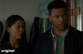

maziekeen’s coloring tutorial (part 1, base)
part 2 for dark scenes here
before anything, here are some helpful resources for what i’m about to do cause i think you need to test everything to see what will work for you and will learn so damn much in the process:
how to use curves: curves tutorial by completeresources. and gif tutorial by barrysberkman. curves is the best and it’s what i use to “fix” the coloring before proceeding with the coloring
how to color yellow-ish/terrible scenes: coloring tutorial by jungshoseok. i’m always going back to this tutorial when i’m stuck with my coloring or need a reminder of a different way to color difficult scenes, and again, sami uses curves!
and there is more on my resources tag here
downloads/settings
download the psds
save for web settings
sharpen settings
text settings
crop sizes (new dimensions)
my ko-fi ♥
the tutorial, finally lol
tv show high fidelity. this gonna be simple scene before going to the annoying dark/yellow/green/blue scenes on the second part of the tutorial.
this is important: i don’t always get right the first time like i’m showing this tutorial. i do all this process and then go back to the layers and adjust a few to get what i want
before:
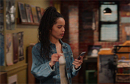
after:

1) curves. first i brighten the gif just a little with RGB so i can see how to color correct, and to do that i use the red, green, and blue there. instead of using them up, i decrease their values, trying to leave as natural/red/magenta as possible, sometimes i increase, like i did with blue, but it’s really just a bit
okay, what do i do? i decrease the color that’s bothering me. when you increase the RGB, the color that stand out is what you will use the others to fix. like this one, the gif got too yellow, so i decrease red. then it was too green, so that’s the next one to change. i get this “controlled” yellow, it’s good but i want more red-ish/magenta tone so i can work with the colors only later, so i increase the blue just a bit for that. then you get the result
i always try to "take off” the colors here so i have more control of them in the future and edit the way i want
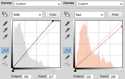
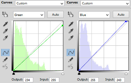
result:

2) levels. i use for both darken and brighten, nothing too extreme
the white arrow to brighten, it depends on the gif, but since i'll use exposure to that later, i only use around 200 to 250
the gray one to darken, if you increase this one too much then you’ll be whitewashing the shit out of the gif, i only use this way or don’t use at all. exception if it’s a really dark gif
the dark one is to darken too, i use only around 0 to 10
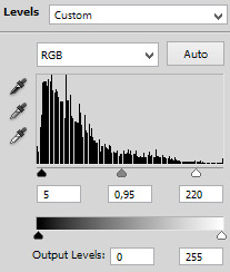
result:
3) exposure. this one is the one i use to brighten, here the different is minimal, but in a dark gif this works really well as you’ll see on part 2. also, i know it looks like the levels was for nothing here, but most of the time you go back to previous layers and edit a bit more. or even after use exposure and need to darken, levels is there for it
exposure. i never use more than 1,00. and sometimes only +50 is enough in a dark gif
offset. nope, never, no
gamma correction. also, never use more than 1,10. sometimes 1,05 is more than enough
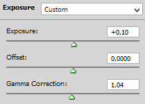
result:
4) gradient map. i wasn’t a fan, but now that i see the difference i’m always using it. i like that controls the dark parts of the gif, i could use more levels for that, but it would get weird
always soft light, and the fill i only use around 20%. sometimes my standard is 15%. i got this from sami’s tutorial and it’s amazing even tho it doesn’t look like much here
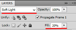
result:

5) color balance. i’m still in that thought of “taking off” the colors, because after this layer that i’ll edit them.but also here i fix the color if the gif is practically ready. i only used midtones, but sometimes i use highlights to make the gif as natural as possible. it doesn’t look like it changed much here, but you’ll probably get back here after finishing the psd to fix a thing or two

result:

6) selective color. the fun part! honestly, just mess around the colors. i can’t really say do this or that here because i change this a lot depending on the gif, so here are some tips:
reds and yellows. i use to fix whitewashing, make the person more vivid too, you know? usually i’ve been using magenta with yellow together, you have more control if the red will stay red or it will be pink-sh, and if the yellow will stay yellow or be around green
cyans and blues. if you come across a gif where the white is blue, you adjust this on cyans. decrease the cyan and mess around magenta and yellow
magentas and whites. sometimes the gif seems too red-ish, or something, so you decrease magenta and it will make a LOT of difference. the whites it’s helpful too when the white on the gif have another annoying color, you adjust here just like the cyans
neutrals and blacks. nothing hardcore, sometimes i don’t even use neutrals. and i used to use blacks on 10 and it’s just the worst on most of the gifs, so now i use top 5, depending on the gif
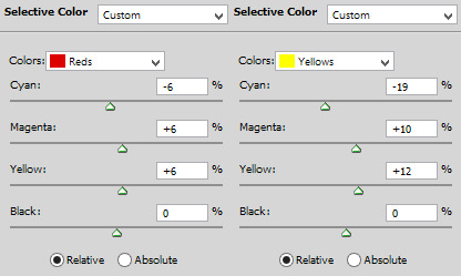

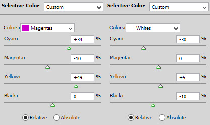
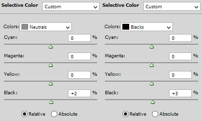
result:

7) vibrance. i don’t overdo because it will ruin everything i edited previously, like, if add more vibrance the yellow would go crazy along with the background and ugh, this way is so clean and exactly what i want. so, i never use more than 50, some scenes are really with no color, so i use more

final result:
other examples using the same process are in the post previews since tumblr won’t let me add more gifs here ;)
PART 2 OF THE TUTORIAL HERE
there i’ll color dark/yellow-ish/blue scenes <3
#dearindies#coloring tutorial#gif coloring#tumblr psds#high fidelity psd#zep psd#legacies psd#nancy drew psd#resources#my tutorial#psds#my coloring tutorial#base psd
919 notes
·
View notes
Last Seen Blogs
blisseds
𓏲 ·˚₊ why so curious?

southlanbd
Untitled
craftsmansedge
The Craftsman & His Naughty Nerd Wife
invaderventblog
Dead Blog
freak-toy
Princess