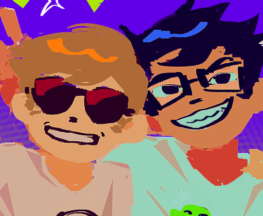
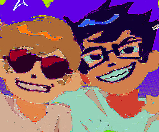
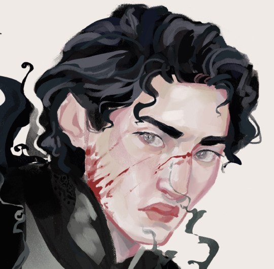
#also a cool-toned color palette? in my art?
Text
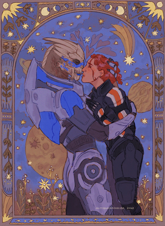
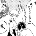
#mass effect#mass effect fanart#fan art#shakarian#commander shepard#female shepard#garrus vakarian#garrus x shepard#shepard x garrus#oc: senna shepard#back to my usual style#also a cool-toned color palette? in my art?#it's more likely than you think#i'm trying to build back my confidence in drawing with shep and garrus#they have me in a chokehold#i love them so much <33
2K notes
·
View notes
Text

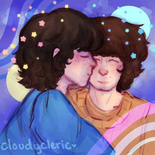
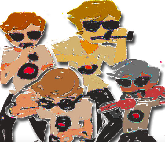
the quickest of doodles of a future donnie to try to figure out @knightish-knight 's coloring style because it is so nice
and i think i figured it out! <- did not figure it out
#my art#tmnt#tmnt 2018#2018 tmnt#tmnt 2k18#2k18 tmnt#rottmnt#rottmnt donnie#rottmnt donatello#tmnt donnie#tmnt donatello#aklsjdhfkjalshdf i literally do not understand how you choose your color palettes or how you make such cool toned palettes look good#also it was so much fun drawing older donnie i should do it more often
113 notes
·
View notes
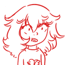
Text
finished :)
#byler#byler art#my art#i really don’t like the palette of this one :(#i like the colors but i don’t think i can pull off cool tones#also i need to draw more dynamic poses but i don’t want to
26 notes
·
View notes
Text
alright, here it is: ZENO'S COLOR GUIDE 3.0 !
here, i'll have three "chapters" regarding color:
CH1: how i color in illustrations
CH2: color and character design (in zeno's case)
CH3: how zeno makes his colors cooler
CH1: HOW I COLOR IN ILLUSTRATIONS
it must be noted that, as of lately, i heavily use halftones in my art and the way i use them for gradients effects my color choices. of course you don't need to use halftones if you don't want to, as it's just my personal choice, but anything regarding halftones here could (probably) also apply to regular gradients!
when choosing colors in an illustration, i usually have three things in mind: mood, character, and contrast. we'll be using "gloomy bunny naptime" as an example here.
MOOD: what's the vibe of the piece? for example, here in "gloomy bunny naptime", wanted a mellow, sleepy vibe, so purples and pinks seemed like the best choice. these colors also have a dreamy effect due to being common in real-life early mornings/summer nights - basically, i tend to use associative colors in illustrations.
i usually only use a pallete of 3-7 colors, though of course more characters calls for more colors. for multi-character pieces, i would actually make a "rainbow" of colors based on the mood of the piece - essentially, a bank of colors to use for your colorful casts based on the actual rainbow. you can alter this based on the saturation levels you want! hope that makes sense. i'm not the best at this though, so i would heavily recommend looking for guides from artists who are more skilled in that department.
CHARACTER: velvet is the focus of the piece, and as a character her palette is made up of many purples and pinks. of course, it's easier because she and ribbon both have similar designs, but i would still recommend using colors based on/complementary to the focus character's pallete, though this is a rule that can and should be broken if needed. gradients can be used to provide a smooth transition from color-to-color and add depth to the piece, as well as showcase velvet's pallete. when making any gradient, you probably want to have a vibrant middle color. this is difficult to achieve in most art programs, so i'd do it like this:
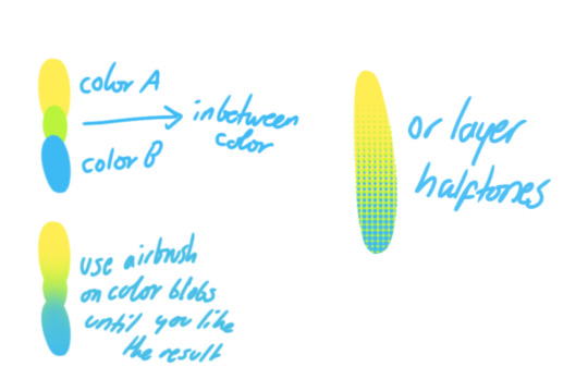
you can use gradients in lots of cool ways to make stuff pop! (i think this collage shows i use too much purple and pink though.)

CONTRAST: the context of the piece also aids the color through contrast. (that's a lot of Cs!)- we see that velvet is just waking up, and the light from her switch is glowing brightly. i wanted to convey something like her switch suddenly turning on in the middle of the night, waking her up - so the console emits "light" in the form of illuminating the contrasting color of pink against the purples. it might seem specific to this piece, but what i'm trying to say is that contrasting colors can lead the eye to the focal point of the piece, that being velvet herself. because a great deal of the rest of the piece is dark, we look at the contrasting switch screen - the brightest thing in frame - and our eyes move around and up to take in the focal point character. at least that's how i wanted it to be ;w; i guess you could convey it as something like this?
CH2: COLOR AND CHARACTER DESIGN (IN ZENO'S CASE)
this is where i start to get annoying, so stand back! when deciding on colors for a cast of characters, there are many factors: time period, variety, personality, and more that i can't think of.
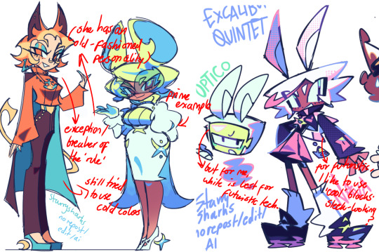
TIME PERIOD: this one is simple. for example, a futuristic time period (such as that in x-calibur) calls for colder colors, such as greens and blues. for characters involved in futuristic professions such as space exploration, this works incredibly well. for modern time periods, less focus can be on colors and more on the shapes of the clothes, but this is not a shapes tutorial! i don't have any ancient times oc stories, but i'd probably use earthy and warm tones.
VARIETY: this is also rather simple. i try to be aware of the palletes that i used, and the similarities they might have with other characters. i try to use similar colors for characters who belong to certain organisations or have a uniform, but of course, it's not like catholic school students adhere their entire look to their uniform, so this is a rule that can be broken yet again. art is all about learning things and breaking them, remember that!!!
color can also be used for symbolism. my absolute fav example for this is vivica and octavia - the amount of red in their designs is supposed to represent the amount of freedom/passion/anger/confidence they have or are allowed to express under their different circumstances. as vivica belongs to a strict organisation, she has far less red in her design, showing her emotions are stifled - meanwhile octavia has it as her main complementary color because of her freedom to express her emotions, though those emotions may be destructive because of her circumstances.
PERSONALITY: what colors are associated with your character's personality? i actually usually refer to magical girl groups to see what's commonly associated with different colors. here's the main trend:
red: hot-headed, passionate, firey
orange/yellow: bright, happy-go-lucky, sunshine personality
green: wise, mellow, kind
blue: serene, graceful, elegant
purple: magical, regal, fancy
pink: usually the main character (though this because magical girl anime tends to be marketed towards young girls), sweet, relatable, determined
of course these are only stereotypes from one genre of anime, and different colors have tons of different meanings. color theory is the best way to learn this! these colors can also express different moods, which ties into ch1. i myself constantly ignore these rules - v-con, a bombastic hyper DJ, is purple (though he does have yellow accents) for example. basically, i just take them as a general rule and try to have them in mind while drawing.
CH3: HOW ZENO MAKES HIS COLORS COOLER
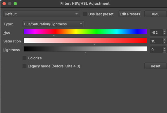
this might be the most important part of this guide. once again, there are a few things to consider here: filters, hue, overlays, and more!
FILTERS: for ibispaint, you can use an adjustment layer on your whole piece to use a filter. i usually only use brightness/contrast here - upping the brightness (or darkening it based on the mood of the piece) and upping the contrast. this helps to better express values and intensify the colors if that's what you want. i often use it in all my pieces to some extent.
hue/saturation/lightness is also helpful in moderation. you can alter the hue - though it usually only helps if you bring it back or forward by just a few points, or the entire pallete will change. saturation is what it sounds like, and slightly over/desaturating the piece can help with atmosphere. lightness is what it sounds like - lightens the colors in the piece. i don't use it at all.
posterize and sharpen mask are some that i've used recently. posterize can add some crazy effects to your art, but i'd probably need to edit it slightly after using it because it can mess with certain colors.
HUE: it's a layer type that can change the overall hue of the piece. i usually use it at a low percentage for atmosphere. kind of like a gradient map but nothing like it? idk
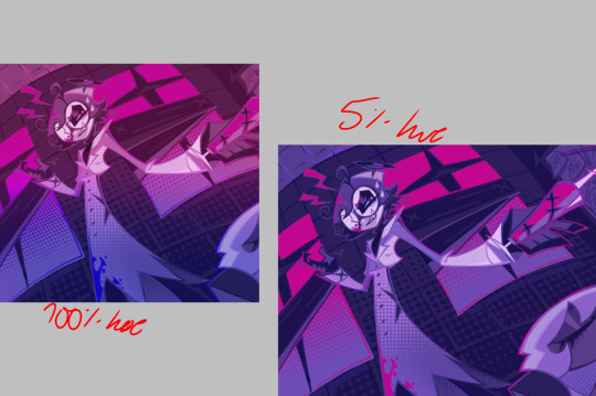
and OVERLAYS: i just use a very saturated blue/purple color over the entire piece at a very low percentage, around 5-10%. it can wash out the piece at too high a percentage.
and that's basically it! sorry it kind of derailed at the end i spent like 2 hours on this and got super tired. goodnight i'm going to sleep please also look at other artists etc etc. bye.
#zeno's art#long post#color tutorial#liar by korn is actually a really catchy song yea the lyrics are weird but its so good tbh#peak drums and bass and guitar and vocals and then the lyrics are hot booty. this is what nu metal's all about people#ask questions if you want#about nu metal or art i dont care
314 notes
·
View notes
Text
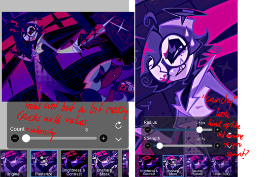
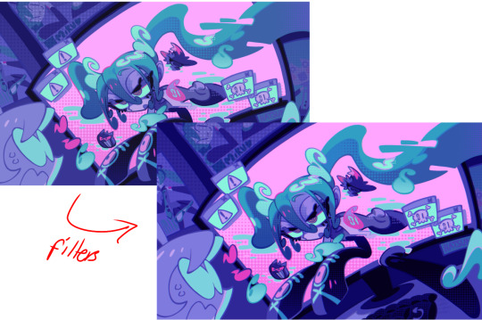
Tips and Tricks for krita (part two electric boogaloo)
Ok so this one is going to be a doozy because im going to include a lot of examples and tips for how to use filters (AKA YOUR NEW BEST FRIEND)
Link to part one.
Ok so filters in krita can be a doozy so ill cover the ones i use in my art the most, these will be adjust, artistic, and enhance dropdowns. I will be using my art pieces to show how i modify my art- colourwise!
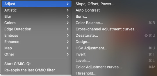
Obviously, start off with opening the filter menu up. Color balance brings you to this menu, where you can play around with the colour of your shadows, your midtones, and higlights. Its a lot of trial and error, just messing around to see what fits, and its how i got to this point. through just pushing the dials up and down. Honestly, a lot of this part of the tutorial is going to be me telling you to hit those dials and levers like you dont know nobody.
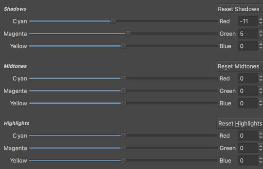

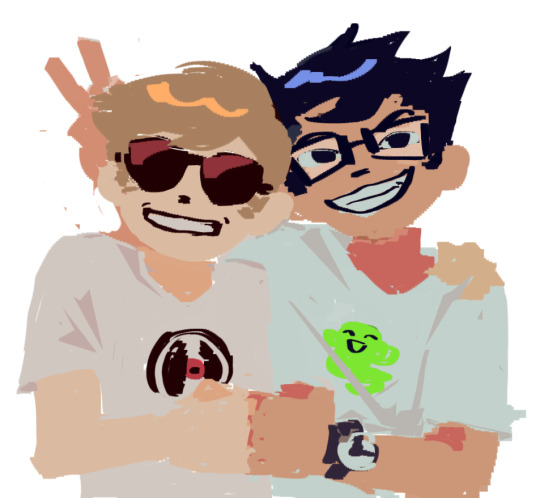
Even just small modifications as you can see can play so much of a difference. For here, i upped the cool tones for john, and upped the warm ones for dave. Colour theory without colour theorising i suppose you could say.
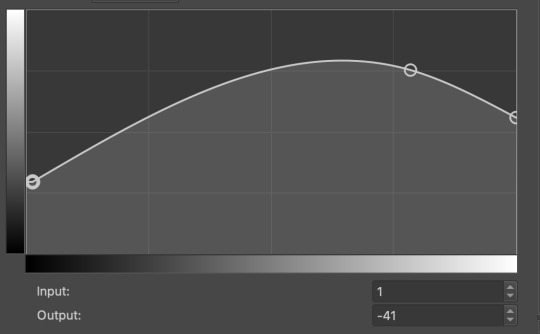
Crosschannel adjustment curves can help with contrast and colour intensity. Usually i have one point which i use to move up and down per my whims to control how bright my work is, and it can really help with really bringing out those colours so it doesnt all fall into one hue.
Colour adjustment curves works similiarly, play around with them to get the desired effect.

Krita also has HSV adjustment, but i usually use just the hue and saturation. Theyre pretty self explanatory, and can switch up your palette in pretty fun ways.
Now we move on to the ARTISTIC part. Again, i recommend you play around with them yourself, but i find index colours works really well for making really pretty art really fast! You just put in a few colours with descending lightest to darkest and you get an awesome art piece! Id say this is useful for pixel artists, but also useful for other parties. I might just start using this more myself. Its so easy wtf.
AND FINALLY THE MOST IMPORTANT THING.
HOW MY ART IS SO CRUNCHY.
If youve been following me for a while you probably noticed theres a slight crunch to my art. It gives it a slight bit of texture and makes it noticable. How do i do it?


You're welcome.
insert image of face on 90% opacity and comedic text for purpose.
Alternatively, if youre looking for a sbahj level of crunchiness, smack that "mean removal"for some fun.
Thats all! Happy drawing.
96 notes
·
View notes
Note
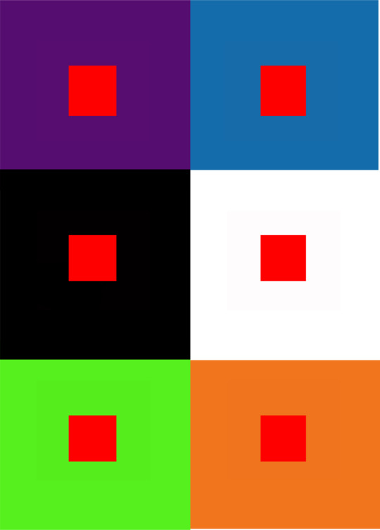
do you have any tips on color harmony and the colors of the rainbow? I'm trying to draw a 10 color rainbow but I'm struggling to make the colors match and any color system like RYB, RGB, CMYK or Munsell doesn't work (Usually green doesn't go well with the transition to blue or purple and yellow get stronger shades than other nearby colors)
Color harmony is a really complicated subject, so definitely remember to be patient with yourself.
Colors are significantly affected by how they interact with each other. A red next to orange will look different than a red next to green, which will look different next to blue... etc.
This is really important when it comes to making a color palette, because the colors you use WILL play with eachother, so you have to be sure they're playing nice.
This piece, for example, is entirely red. It's all the exact same hue, but the value and saturation makes the colors still distinct from eachother.
When making a rainbow, especially with 10 distinct steps, you have a lot of potential with your colors.
Personally I use HSB/HSV sliders when I'm illustrating. Hue, Saturation, and Black/Value. This lets me be as precise as possible when I'm selecting my colors.
I'll be explaining everything with these terms! (Hue, Saturation, and Value)
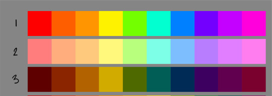
1: These colors vary only on hue
2: These colors vary on hue and saturation
3: These colors vary on the hue and value
You can see how much each of these will affect the colors and how they look next to eachother. Manipulating these factors can give you a lot of control over your palette.
Now, I'm varying which color is the "focus" of the palette. I'm also modifying every aspect of HSB to make them play nice.
4: This palette has a lot more yellows and oranges than the rest, and barely any/no blues
5: This palette is an even spread, 5 colors are warm and 5 are cool.
6: This palette focuses mostly on green
7: this palette focuses more on the purple and blue side of the spectrum.
If you're finding you're struggling well with green transitioning to blue and purple, then you can just have some more greens to make it feel smoother.
When manipulating all three sliders, you can make rainbows that are entirely tinted to a certain hue. This can get you really cohesive palettes.
8: tinted yellow
9: tinted blue/green
10: tinted pink/purple
When your palette is like this, you'll find that putting in a contrasting color will pop significantly more.
(These contrasting colors are pulled from the original fully saturated rainbow that I put together, #1. Notice how different the colors look here than they did in their original palette!)

You can use this effect as you please or avoid it as much as you like!
As always with art more information is key to making your decisions.
Exercises I suggest to understand color theory better:
Making pieces without using specific colors (try to make something look "Green" without using green)
Make a cool toned rainbow and a warm toned rainbow (every color has a cool and a warm variant) and draw something with each of them (one drawing cool, the same drawing warm)
Use red for shadows and green for light, and then draw the same thing with green for shadows and red for light (or any 2 opposite colors
Copy art and photography that has colors you like, but DON'T color pick until you're done to see how close you were (don't post pieces where you copied someone else's work without explicitly saying you did so, it's for study)
Paint from life
Take some colored pieces of paper and shine lights on them and watch how the light reflects off of the paper onto different objects
Here's some studies I did for one of my classes in school. They're old, I can't paint traditionally anymore without pain. But what I learned was still important whether or not the art is old!
I also suggest keeping these timed, All of these were under 1 hour (traditional) or under a half hour (digital). The more practice you get, the better!
And, if you can practice in different media (I understand it can be expensive, take up a lot of space, or even be painful), I personally find that each media has different pros and cons and forcing yourself to work within the limitations of a particular medium will teach you a lot!
(digital still lifes)

(gouache studies)
(Acrylic studies)

(digital copies)
I hope something in here helps!
Good luck!
307 notes
·
View notes
Note
Hi! I really love the way you color, and I was wondering If you could make a tutorial about it, I of course completely understand if you Can't/don't want to do it thanks in advance If you decided to do it and have a good day/night.
Hello hello!
Ooooh, a color tutorial! I've never done one before so I'm not sure if I'll be any good at it haha. But I don't mind sharing my thinking process when it comes to coloring my works.
So when it comes to color, I very much have a traditional painter's approach since that's how I learned color in art college. My painting professor never allowed us to use black or white paint, we could only use other colors to create darker colors or new colors altogether. And you're probably thinking, "What the hell? That's insane." And I wouldn't blame you haha. But this approach helped me a lot to not rely on tints (colors mixed with white) and shades (colors mixed with black) when I color. For the most part, I purely thinking about value and hues when I'm coloring.
Finding the right values:

So for this drawing, I did two different takes (one with direct harsh lighting and one without). The reason why I'm showing this is because when it comes to color it's very important that your values aren't clashing with each other. When I started out, all my coloring felt flat because I was using colors with the same values so there was little to no depth. A lot of people don't realize this but color does have value!
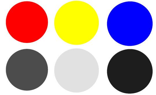
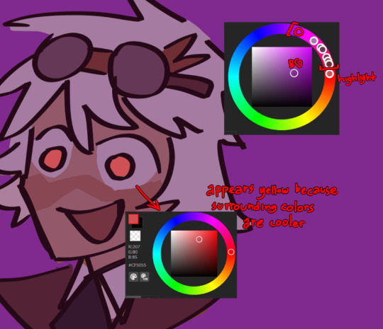
If we put the primary colors on greyscale, you notice how each color has its own value. Blue tends to be a dark value, red has a mid to dark value , and yellow is a much lighter value. This is why if you ever look at my work, the color I use for shadows lean into blue/purple tones. You can also have warm shadows since red does have a deeper value compared to yellow. But these values are when the primary colors are at the highest saturation. What would happen if we knocked down the saturation levels?
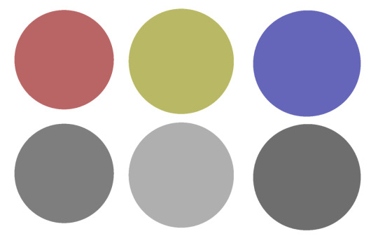
The values start to become more similar. Since we're not always using the most saturated colors, it's important to understand the values behind the colors you'll use. Once you unlock that, you can pretty much do whatever you want with color haha. That's why I hardly ever use black or white in my digital art when mixing (also I don't mix color with a brush, I just pick from the color wheel which might be insane).
While it's not wrong to use white or black to create darker/lighter colors, color in real life doesn't always act that way. Shadows and highlights can have color. For myself, letting go of white and black has opened a world of color combinations that I didn't think of before taking my first ever traditional painting class. Now, I can freely pick colors and experiment with palettes since I've blocked out what values I need (like the image below).
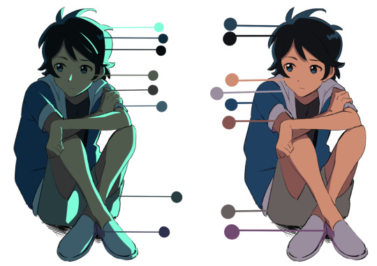
Even if I'm using blending modes like in the next image, I'm always thinking about making clear value separations. If I can't understand the image in black and white, then I'll have a hard time seeing it in color.

And when you get very comfortable, you can start placing characters in different color environments and match them (which essentially is the job of a color designer in TV animation).
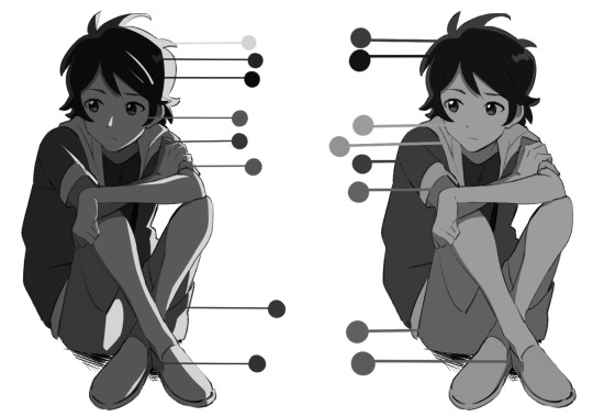
The right image is the official color palette for my character which already uses a lot of blue/purple for the shadows. But on the left side, she's in a night-time environment so I leaned even more into the cool colors to the point that the white T-shirt is actually a very very light purple/pink color haha.
Or like this example where the left drawing gives a more sunset/golden hour lighting while the right one is more blue hour/night time lighting. But you can read the colors clearly 'cause the values are clear to begin with.
While that wasn't really a tutorial this is pretty much my thought process when I'm coloring my digital works. ^^; I very much do follow an academic approach to color theory but even then I think it's okay to break the rules. As long as you have understanding of colors' value, I think you'll be able to unlock any color style you want!
I hope that answered your question and was helpful!
#digital art#digital illustartion#color#anon#ask#send me anon#send me asks#color theory#tone and value
229 notes
·
View notes
Note
Can I just say that your art is amazing? Your vibrant colours always look so stunning and I wanna know how you do it. Colour picking has never been my strongest suit or making stuff vibrant so I'd like to learn at least a little from one of my favourite artists!

AAAA THANK YOU SO MUCH!!! thankfully i have these stuffs saved bc i have moots/ppl ask me about how i color!
With how I color I usually go for color that contrast each other between lighting and shading
warm lighting x cool shading or vice versa depending on the colors
also color theory is very important but the easy way to know your colors or memorize how they work is analogous and complementary
for overly saturated colors too, always focus on this area! yes you can still use white/black but light saturated tones of any color would work that can look white and same with dark tones complimenting with dark saturated cool tones

this is how my color palette works too for reference

hope these stuffs help! : D wish i could offer a thorough explanation/tutorial soon
49 notes
·
View notes
Note
hi its me again i feel legally obligated to ask about your thoughts on the new riz design (but also extends to al of the other new art for the bad kids too!!!)
HI SHOKO sorry this took so long to asnwer, it feels a little late to the party now but I have lots of thoughts and this has been in my drafts for a hot minute so I'll break my thoughts down in order <3
Fig
GOD DO I LOVE FIG'S DESIGN. It hasn't changed too drastically in many ways, it's largely the same beats with the plaid skirt, leather jacket, biker gloves, and docs, but there's a lot more detail pertaining to her character now. Ayda's feather earring is abviously a huge win, everyone loves to see it, but I love the small details like the added wallet chain on her skirt, the added ear piercings, and her painted nails. If I had to choose something I didn't like, it'd be the color of her shoelaces, which isn't a huge deal bc you know spyre might have different cultural beats, but it's very reminiscent of punk doc lace codes, which were a way to sort of factionize yourself among punks. Fig wears one purple and one red, and traditionally purple means gay pride(which is great and i would've picked it for her too) but red usually means you allign yourself with neo-nazi's and similar groups which. is definitely Not Fig. It's not a HUGE deal but, maybe some more research could've been put into it.
Gorgug
Gorgug's new design is so. Perfect. Amazing. Spectacular. No notes. It's exactly the changes I wanted to see. The goggles, the dirt-covered face, the ripped jeans, the bags and tools, the gloves, the most disgusting worn pair of convers you've ever seen. It's absolutely amazing and the artist has managed to bring all the beats we loved about his original design(his extremely fashionable purple pants) and mixes them perfectly with all of the new facets of Gorgug's personality that have changed and grown theough their adventures. A little detail I love is how the color of his headphones has changed to match with the rest of his outfit better, creating a more cohesive design with the introduction of more red/maroon tones. This was always a little bit of an issue with the old design for me. The colors sort of didn't go together.
Kristen
She's going through a break up. She's at the most chaotic she's ever been and she's trying to fix it. It is so genius to make her jacked. The bright yellow tracksuit is beautiful and exactly something Kristen would buy and wear every day. Plus the tiedye purple sports bra tying in her old church camp shirt aesthetic is brilliant. I'm mourning the loss of her sandals, but the matching shoes to her tracksuit can't be complained about. Not a whole lot to say, I'm excited about how this design will change and reflect her growth this season! Praise Saint Kristen Applebees!!
Adaine
THE ELVEN ORACLE IS COOL NOW!!! I love her jacket, all the patches and the toned down fur lining is absolutely perfect. I also love the cool strapped bags on her hips and legs, it's just a really cool adventurer addition cementing her as a bad ass practical caster. Her entire face seems more assured and relaxed, which is absolutely amazing for her and reflects how her resting state is no longer as addled with panic and anxiety as it used to be. Her hair also seems a lot more her! Not sure how to describe it, but it seems like she's focusing less on keeping herself perfect, and more on just keeping herself, herself! Not very big design swings or changes, but she doesn't need to change, she just needs to be true to herself. (Also. a huge fan of her cool magic circle shirt.) My only gripe. Give her blue hair. And pronouns. And glasses pretty please.
Fabian
That boy is the future of dance!!!!!!!!!! I love the color palette shift for his design, it's a really great way to show how he's grown out of Bill's shadow and embraced his own passions with the grey tones with red and gold accents. Also a huge fan of the fancy robed pants, tons of great movement lines and something a dancer would totally wear. On the same note however, I feel like it doesn't really go with the rest of his outfit. I love how the changes made are geared towards movement and dance(his shoes changing from sneakers to dance shoes is great) but I feel like the changes are all sort of mismatched? The dance shoes look a lot like tap shoes, but the pants look more big and flowy, better for a more leaping and running style of dance, and his jacket has almost nothing to do with dance. It's delightfully artsy and detailed, which is so chic and Fabian, but the shapes of it don't really match up, and especially without a clear view of the front it makes him look like he's wearing half of a matador outfit. I would've loved to see a more dramatic silhouette without the use of the battle sheet(which is absolutely perfect, no notes) with either lots of flowy parts for movement, or a sharp jacket with skinnier pants for that exaggerated silhouette. Again, I think this is really all due to a lack of research, but the spirit of Fabian is still in the room with us. The colors are great, the bandages on his hands are perfect, and the fanciful element is very on point, just needs some better shape language and cohesiveness.
Riz
There he goes, he's gone from gritty detective to gadget-heavy superspy. I LOVE the character choices that Murph made for Riz, he's become even more of a loser and seems a lot less hard and fast, and more generally passionate. In freshman and sophomore year, he was entirely goal oriented, completely focused on completing his mission and solving the mystery, this time around he's still got a mission, but because he can't do it all himself, he's sort of given the opportunity to branch out and explore himself. This is all to say, i love the insufferable loser hipster kid that he's become. He is truly the trinket goblin of all time, I love all his wild little gadgets and jewelry, and all the extra arcano-tech screens on his glasses are brilliant. I'm also a huge fan of his torso gun-holdster, which is a beautiful homage to his detective nature. The undercut is also obviously perfection. The loser teen-boy urge to cut away your beautiful hair for a nerdy undercut is so painfully lore accurate that it's one of my favorite details. It's probably because he's a dork. but I would love to know why he has rolled up pants and no socks. What is that. Why would he do that. ALSO STOP BEING A COWARD D20. GIVE HIM DIGITIGRADE LEGS AND A TAIL. CAT GOBLIN TRUTHERS UNITE!!!!!!!!!!
anyways that's probably the end of my rant for now. I love the bad kids and overall their designs are great. constantly wishing all of my headcannons were real but understanding that the cannon will never relent.
#dimension 20#d20#fantasy high#bad kids#adaine abernant#kristen applebees#fig faeth#fabian aramais seacaster#riz gukgak#gorgug thistlespring
59 notes
·
View notes
Text
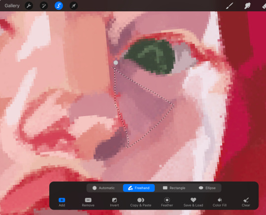
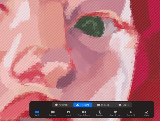
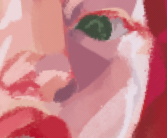
a trashcan’s guide to coloring
using @thoughtfulshepherdmongerkid beautiful ivy rose, because I’m thinking of her always and also really struggling w the comm sorry (also this is long as hell fair warning)
sketch/line-art. I suggest making it at least kinda neat so you have a solid guideline, but honestly just do whatever you gotta do. I also like to set my sketch layer to multiply so that the line art meshes w the base
2. usually I lay down one base color (in this one it’s pink), then I use a clipping mask to lay down some flat colors. the brush you use for this won’t really matter because it’s gonna get covered by rendering (merge layers when you’re done)
3. get your references!! you’ll need them for when you start painting over your base, trust me. references changed my life and saved my summer harvest
4. now, on a layer created above your sketch and base, go in w/ a mix of lasso tool/freehand brushing and start blocking in your colors. the values on our faces naturally form blocky shapes, so try to focus your energy into getting those down
I like to use the spectra brush to render because it adds a nice texture, but feel free to experiment with what you’ve got. also, I tend to go darkest -> lightest -> middle in terms of coloring order
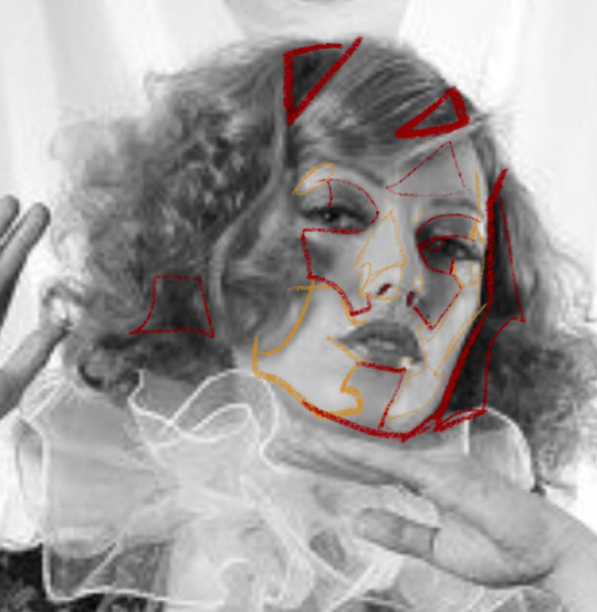
if you struggle with value, I suggest finding any picture (make it black and white by turning saturation down) where there are 3 clear values (black, grey, and white). then with a colored brush, outline all of the different shapes those values make. kinda like this!
5. quick color theory run down before we wrap up: use a cool toned grey (red based, pink based, purple, etc) for the blue parts of the skin, a desaturated red/pink for purple, and gray yellow for green. this will give you very lively and compelling coloring without being too crazy. obviously, you can do whatever you’d like, but I’ve found that this makes my palettes more cohesive and adds depth to the skin
6. so I can’t really finish this piece because I have to start working on commissions again, but after an hour ish of blocking and blending, you should end up with this
and then if you continue and blend a whole lot more, you’ll end up having something more like this!
also, little lasso tool guide
to lay down the colors you’ve gotta click the brush, personally I like to freehand instead of color drop, but you do you
finally, if you aren’t satisfied, you can either 1) merge all of your layers and add a gradient map, or 2) merge your layers, duplicate your new layer, add a gradient map at 100%, and change your canvas blending mode to soft light + change the layer opacity. this���ll make your piece more vibrant and cohesive
#final disclaimer: you will not get these exact results if you aren’t at my skill level#art tutorial#sage’s art tag
72 notes
·
View notes
Text
PSA
If you mock someone for some harmless* thing that brings them joy, you are being an asshole.
*seeing something on social media that you don't enjoy is not harmful. It is your responsibility to use the tools available to you in order to curate your own online experience.
Cynicism, mockery, cruelty, apathy - these are corrosive, and they damage the people that use them just as much as the people they are used against. The more you try to chip away at someone else's joys, the more you damage your own ability to experience joy. It's a process of corruption.
So often, the things we are most inclined to mock and attack in others are reflections of the parts of ourselves that we are most ashamed of. The cruelest people are often the people that hate themselves the most, who fear themselves the most, and are desperate to direct attention on others to save themselves from being the targets of the same hatred that they so freely spread.
Just as it's easy to learn these patterns of behavior, you can also unlearn them. Do it in phases.
When you see something and want to say something about how cringe/embarrassing/whatever that thing is:
Think whatever you want, but don't post about it.
Once you've broken the habit of reflexively posting, practice thinking "I don't enjoy X, but that person does. That's okay, I don't have to do/enjoy X just because someone else does."
Next thought to practice: "I may not enjoy X, but that person does. Good for them to have something that they enjoy."
Next thought to practice: "It's nice to see positivity and excitement and creativity. Everyone deserves to have hobbies they love."
And then: "What is it about X that they like so much? They seem to be drawn to the bright colors/happy endings/emotional tone/pretty people."
And then: "You know, I think I might like Y for similar reasons that they like X. I prefer a neutral color palette and subtle textures while they seem to like very bright colors and bold textures, but we are both enjoying the aesthetics of the art. Well met, fellow art enjoyer. I'm happy each of us was able to find some art that fits our taste."
And then sometimes after a while: "You know what, I haven't thought about this in a long time, but one of my friends used to make fun of this hot pink sparkly notebook I had when I was in school. I really loved that notebook, it made me feel happy to use it, but after my friend said those things I threw it away, and then I started making fun of other people with similar ones so my friend would think I was cool. It's sad that something that made me happy once got turned into a weapon I used to make other people unhappy. I'm glad I don't do that anymore."
Then you get yourself another pink sparkly notebook. And you use it. And you let it make you happy. And a little sore place in your heart that's been festering heals.
#cringe culture is dead#taste and morality are not connected#the things you like do not define you as a person
84 notes
·
View notes
Note
what's your process for coloring like? the look of that elendira is so textured and interesting, i can't figure out how you do it
AA THANK YOUU ^__^ !! textures & brushwork are my favorite things abt my art, so im happy you find it interesting hehe . its SOO cool to look at & so much fun to draw imo
i prefer to color by building in layers , if that makes sense 🤔!! hundreds of them !! such that i'm always drawing on Top of previous layers, working from big & messy blocks of color to, eventually, small and refined blocks of color until it feels processed enough. as a result, i rarely ever erase (!!) and i rarely ever draw lineart aside from the initial sketch
a rough, patchy textured brush is key here, as it'll give you dimension and variability w/ your colors. i recommend "Brush and various sets of fountain pen style (万年筆風ブラシと色々セット)" on Clip Studio (ID: 1679706) !! :3

im terrible with explanations though, so i'm going to show a step by step of that elendira drawing if you dont mind :3
sketch layer !! because i mostly render through color alone, i try to make this as close to the finished thing as possible . ^__^ i hateee drawing the same thing over and over and like the expressivity and movement of my sketches anyways , so the more i can preserve at this step, the better. if u were to look at a side by side of my sketches and finished pieces, youd notice a lot of those og lines are present in the final drawing :3

2. flats !! pretty self explanatory, but the solid background gives me an idea of where the figure begins & ends while the colors themselves help distinguish whats what . i stick to ambient lighting @ this point because im usually not sure what i want to do with the overall palette or lighting yet . having two tones (ex, dark and light in her hair or dark and light on her skin) can also help in identifying key features early on that u wanna preserve. as you build layer by layer, sometimes these areas will remain untouched and i think it makes for a rly lovely feel at the end

3. start blocking !!! to be totally honest with you, i dont really know what i do here HAHAHA. like i just scribble the shit out of it, usually focusing on what i might want to do with lighting (ex: grey areas to accentuate folds in her costume). i think i like to start "erasing" the sketch where possible by coloring on top of it .. like if you look at her hat or her arm , you can tell i'm starting to get a sense of the shapes i like vs the ones i dont. it's at this point that the final image starts to emerge in my mind , like im gradually pulling her from a tarpit of scribbles until shes recognizable lol. chipping away at the marble until i can free her. tbh.

4. keep blockingg...when u think u are done , block some more . as you can probably see, the brushwork becomes more intentional as i add more shape, with specific focus on line weight. this is also where the patchiness of that textured brush comes in - notice how none of the colors seem totally uniform (ex: the red cross or the original sketchlines for her waist). you can see bits and pieces of the layers underneath pushing through and i really like that !! ^__^ its very fun and sketchy to me, so i try to keep them around. those areas are also great to colorpick from, because it'll give you "new" colors to work w/ that are already part of your palette.

5. GRADIENTS & GRADIENT MAPS !! TONE CURVE !! COLOR PICKER !! this is the best stage tbh. flatten your image so its all on one layer and just go crazy with all the color settings in ur program. add gradient layers and set them to darken, or overlay, or subtract, orrr. lighten or dodge glow or divide or soft/hard light.! OR!! edit the hue, saturation, luminosity and contrast.and then color pick from these edits, block even more on top of ur image, flatten, color edit again, etc. etc. until u feel satisfied.
ANYWAYSS . i hope that makes sense @__@ sry i wrote this out and deleted it like 23 times trying to make it make More sense but thats what ive got HAHA i hope its useful though :3 !
#SRY I STRUGGLED 2 EXPLAIN THIS#dude its like my brain bcomes stuffed w/ cotton anytime i try 2 write#i hope it makes sense tho..#it also probably sounds so redundant to make new layer one after the other for just a few brushstrokes#but those brushes i linked have a multiply property so if you draw on top of prev lines they'll create dark patches#and so if im working over a large area ill generally need like . 5 layers each with one brushstroke :sob: if that makes sense#this one had . 84 i think. total. layers i mean. the merylvash one had 300+ HAHAH so it rly depends#like YEAAH i could just use a normal brush but i really like the way this looks#andd sometimes the multiply function works really well or will give me the proper shadow tone im looking for#anywas.wanywaysn anyways#asktag#anonymous#long post
58 notes
·
View notes
Note
Hey !! I just wanted to say your art is CRAZY good and I was wondering if you had any tips on picking color palettes?
Sorry for taking forever to respond, but hi!!! Thank you so much!!! wahh always wild when I am percieved, makes me v happy :)) As for color, your ask got me really excited since it my favorite part of the artistic process! So sorry if this post is very long and wordy, but I really wanted to talk about colors.
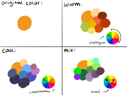
The long and short of it is that I like to use color theory (complimentary, analogous, triadic colors, etc) to minimize the amount of color in my work while using a variety of saturation and value to create the variation! Complimentary being colors across eachother on the color wheel, analogous are the colors next to eachother, and triadic are colors equidistant from each other,,, triangularly.
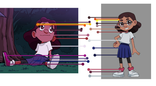
I typically don’t like starting out with a rigid number of colors of specific shades when I do my work cause it feels really limiting, and I enjoy adding color when it feels right. However, when I do color pick, I like to get a main big overall color scheme in mind then start placing various shades and saturations within that minimized pallete. The important part for me is not to stray too far from my pallete without some intent.
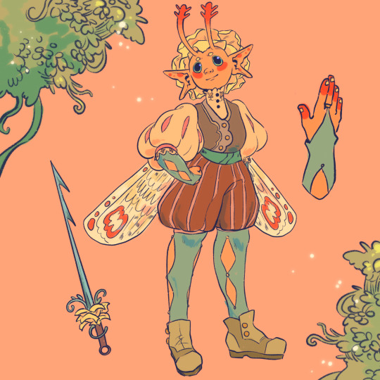
For example, when creating my character Peter, my goal was to make her a very warm colored character. To do that, I used an analogous color scheme of oranges and yellows with green sparingly. By minimizing the amount of different colors used, it helped the piece feel far more cohesive, but the amount of saturated and desaturated forms of the color created a lot more energy. And even though the colors I used were all next to eachother on the color wheel, the green provided a cooling contrast that I used in the eyes and portion of her costume to connect the two and emphasize. I also tried to use saturation and value to separate her from her outfit. Her skintone, hair petals, and markings are all very bright, while the outfit is desaturated tones. This made the seperation of the two more apparent to the viewer that this is body and this is clothes. I also like throwing in multiple color schemes to create even more visual interest. For example, for the lineart I used a deep saturated blue since blue is the complimentary to orange, her main color. This caused the lineart to stand out against her even more so than black lineart would.

To the upper right I also sketched out a different costume for her while maintaining the motif of orange and green (though some of the colors I’m not necessarily happy with).
Here are examples of some of my other stuff to show the “main colors” of the work. And as a secret, if a color isn’t matching my scheme, I like putting a color from my color scheme over it with a lower opacity and color pick from there ;) helps with melding it into it.

Of course these rules are not set in stone and I break them when I gotta, but this is generally how I like to find my colors. Anyways,, I hope this made some sense!! I’m not very good at writing my thoughts down, but I really enjoy color :)))
33 notes
·
View notes
Note
Art question time! Cause im curious and as a fellow artist im always looking towards my peers for advice ^^
- When sketching do you break up form into shapes? [Ex: head is a circle with an chin, ribs is an upsidedown trapezoid]
-How often to you use references while drawing?
-How do you choose your colors?
-Just like, tell us about your process pretty please? You are such an amazing artist
awe thank you 🥰 sure thing
1.I draw the head as an oval or a vague head shape, the torso and crotch as 3d boxes and the limbs as tubes. I don't pay much attention to the head in the first sketch because I always seem to ignore the guidelines lol. my average sketch looks like this

(the horizontal lines helps with foreshortening, which is pretty neat.)
2. somewhat often! I open up references like, pretty much every time I struggle with something. mostly unusual angles. I like to use those model posers you can find online (my favorite one is pose.myart! had my back since 2021)
3. okay I'm not professionally educated in any way so bear with me. I pick out a tone for my art and base the whole palette around that. you can make this easier by coloring the background first (you can change it later.) I also like to pick a few colors that would stand out, like using warm accents in a canvas that is mostly cool or having a few spots of bright colors on a dark piece, etc. it's completely optional, though.


attempting to explain here


you can also make a color layer on top and fill it with white to check the value and make sure that the colors are distinguishable, I also use this method when character designing.

you can also of course, use tone curve or an overlay layer (Difference is my favorite), this isn't cheating as much as it's just using a tool. just do it if it helps, if you feel shame don't listen to it that's the devil talking

HOOOO boy that was a long explanation. I really hope I make at least a little bit of sense because they're like unspoken rules for me aka I never put them into words lmao
but yeah, hope this helps! :D
39 notes
·
View notes
Note
LOVE your work!! how do you choose colors? I'm an artist myself and I struggle to find color palettes that feel like me and what I want my art to look and feel like
Color theory is absolute butts and ass and I slept through the classes I tried to take in it so I cheat. I make really ugly flat color layers and then throw a bunch of color adjustment layers on top until I like how they look. Then I smother the skin layers in blush (the naughty artists' technique), do a cold toned multiply layer for shadows on top, airbrush in contrasting warmth, and then top it all off with a gradient map correction layer to bring it all together. (The gradient map is key for color harmony - I definitely recommend looking up how to use them)
The only color theory that rooted in my brain of any kind was complimentary colors, so I use those a lot, with a preference for the green and red combination. Like pretty much on every level I use complimentary colors, when choosing character designs, when making backgrounds and atmospheric lighting, when coloring skin etc etc. I know there's much cooler and smarter things than that but tbh sometimes simplicity is where it's at.
Another random note - it's good to color code character designs in comics and other narrative works. This way you can change their outfits and hair and such and they remain easily recognizeable because of their color coding. It also makes it easier to distinguish them from each other in framing. For example, Gwen wears pale, cool toned colors with gold and Aleksei mostly wears black and silver with bold color accents, usually green and or red. This is so they contrast both in saturation and values and stand out easily in panels against each other.
Simpler color palettes are generally better, it's best to refrain from using more than 3 distinct colors in a design unless it's supposed to be chaotic/flamboyant. You can use as many values and saturations within those colors as you'd like tho so it's not as limiting as it sounds.
48 notes
·
View notes
Text
Here, have some fashion suggestions (brands and designers) if you need ideas or references for an art piece. These skew heavily to my own tastes, but hey. Gotta start somewhere!
Paolo Sebastian's "Once Upon a Dream" collection is a megafave, but all of his stuff is good for the whimsical pastels vibe. Also does bridal.
Egyptian revival: I would definitely look into Cucculelli Shaheen, specifically the Alucinato collection. This seems really specific but ngl I just really want to rec them. Also does bridal.
There are a lot of bridal designers out there, but there are two (well, one bridal, and one bridal-adjacent) that I love for large ballgowns:
- Mak Tumang does a lot of structured hemlines and stiff skirts, brightly saturated colors with a very costume ballgown vibe, the sort of thing you'd see in a masquerade scene in a fantasy movie. Good for a red carpet, IMO. (Not primarily bridal)
- Kiyoko Hata tends to have more pastels and slightly desaturated jewel tones, with much less of a structure in favor of petticoats to build the shape, more layering of sheer fabrics. Very swishy. (Primarily a bridal designer)
- For more 'normal' bridal in a standard palette, I'd look into Kim Kassas, Berta, Galia Lahav, Madeline Gardner, Krikor Jabotian, Rita Vinieris, Sophie Couture, Jimmy Choo, Julie Vino Glam, Vera Wang, Hian Tjen, Essense of Australia, Hayley Paige, Randy Fenoli.
For tea dresses (like a past-the-knee petticoat dress you wear to a garden party where you pretend to be rich) and general semi-formal:
- The Matoshi sisters tend to work a lot with mesh and embroidery. Their floral elements tend to be very Secret Garden. They have some vintage inspiration in their bodices sometimes, but overall their boned bodice dresses are just really cool overall.
- Chotronette have a similar style, but where the Matoshi tend to have a single heavier layer at the top with designs, Chotronette's are much more light-and-layered, and while they do have some floral, they use more celestial themes. They have a few designs that dip a bit into armor-inspired looks without going full fantasy costume.
- IMO the best way to talk about the two in contrast is that the Matoshi sisters feel more solid and vintage-inspired, while Chotronette are more ethereal and fantasy-inspired.
Mark Bumgarner: For big structured skirts that straddle the line between tea dress and gown, but IMO he's a bit hit or miss. Good floral embroidery, though.
Red carpet and evening wear: There are a handful of designers that are just. Insanely good imo, and those are Zuhair Murad, Ziad Nakad, and Elie Saab. All three are really big names, and I wasn't sure until I checked but all are Lebanese, so I guess Lebanon just has a really good fashion industry. I believe most of them (definitely at least Saab and Murad) do bridal as well.
Girl's casual fashion: "All Pretty Girls" boutique
Professional wear: Poem Bangkok do some Ridiculously cool office wear ombre stuff, and the lines on their stuff are SO clean.
Chinese fusion: Heaven Gaia is also one of those brands that does a lot of work with ombre, but they lean into their roots a bit more than Poem. They have some massively cool work with embroidery, mandarin collars, capes, and so on.
Witchy looks:
- Linda Friesen has some major vibes with 3D printed elements around the shoulders; good for fantasy costume territory.
- Wulgaria Evil: If you want something a bit more high school/college goth.
Royal Black Corsetry for, well, corsets; the head of the company specializes in custom tailoring.
If you're looking to get into fashion for references, I would also follow blogs like @wedding-affair, @fashion-runways, @lacetulle, and @evermore-fashion.
For a more vintage reference set, @sartorialadventure is a good starting point, as is @lookingbackatfashionhistory.
If you're into lolita fashion, I'd rec @lolita-wardrobe
218 notes
·
View notes
Last Seen Blogs
notsunnyowo
Have a cookie 🍪
a-sleepycoffee
lost in space

hyvhuynh
stay together, learn the flowers, go light.

dustiarab
Dusti has thoughts
wailuacrossing
Wailua Crossing