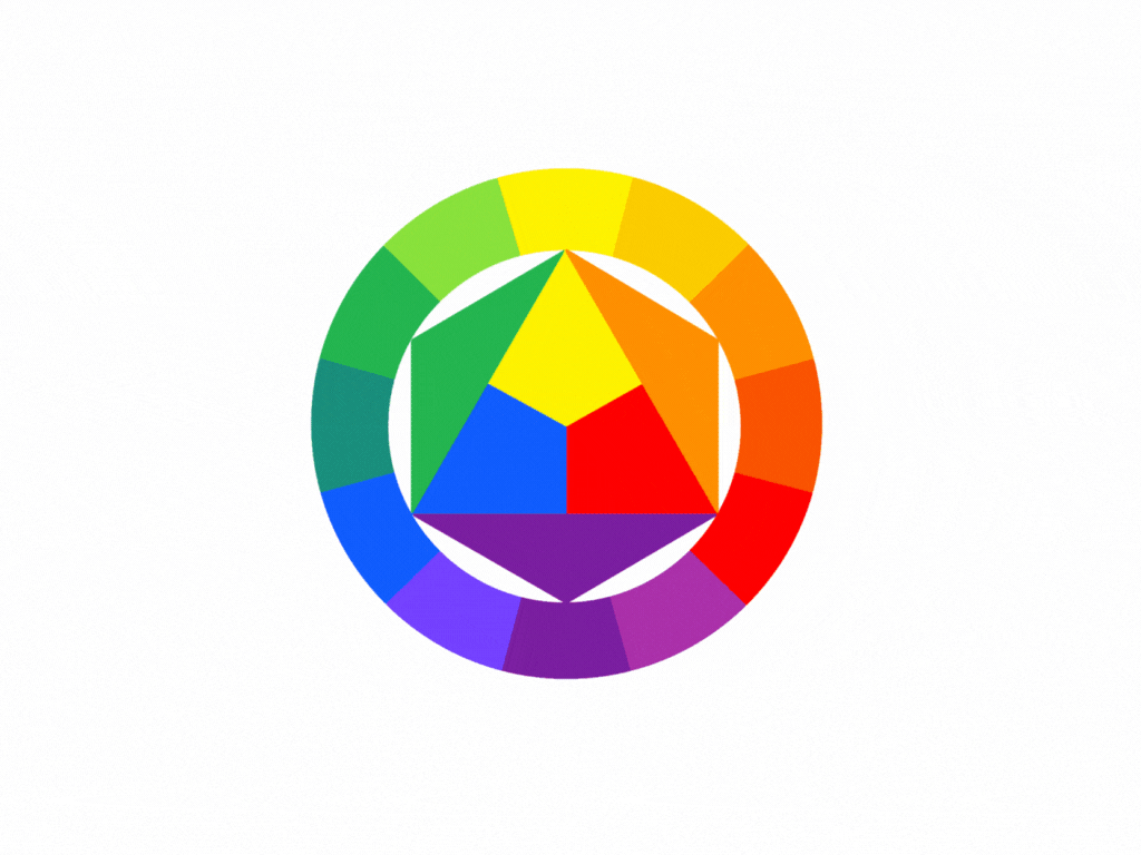
#How to Use the Color Wheel
Text
Art Tip #1 - Color Theory: A Crash Course
Art isn't complete without colors, right? Unless you'd consider a blank white sheet of paper as art, then by all means...
In today's first stop at the Art Terminal, we will be learning how to use colors using Color Theory!
Being knowledgeable about basic color theory can really help you develop your skills as an artist no matter what medium you'll be using - be it traditional art, digital art, or even a mix of both!
It may seem confusing at first but with this guide, you'll be making well-coordinated compositions with flying colors in no time!
PART 1: How to use the Color Wheel
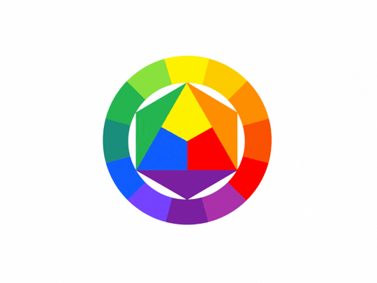
This infamous wheel by Isaac Newton helps you see the relationships between the colors.
Keep in mind these 3 categories:

⓵ Primary Colors: Red┃Blue┃Yellow
These are the first three basic colors - all other colors can be created by mixing them in different ways.
Tip: mixing all three creates the color brown!
⓶ Secondary Colors: Purple (red+blue)┃Green (blue+yellow)┃Orange (yellow+red)
If you've noticed, these colors are created by mixing our primary colors.
⓷ Tertiary Colors: Red-Orange┃Red-Purple┃Blue-Purple┃Blue-Green┃Yellow-Green┃Yellow-Orange
As you might have guessed, we get these colors by mixing our primary and secondary colors.
Part 2: What are the Color Properties?
Keep in mind Color has 3 primary properties:
⓵ Hue: the colors in their purest state - or in other words, a color's name.
⓶ Saturation: the brightness or dullness of a color - the intensity or purity of a hue.
Tip: High Saturation/Saturated = color looks very bright ┃ Low Saturation/Desaturation = color looks washed out or greyed out

⓷ Value: the degree of lightness or darkness of a hue.
Tip: There are 3 ways to change a color's value: Shade┃Tint ┃Tone

Shade/Shading: a shade is a color that is produced by adding black.
Tint: a tint is a color that is produced by adding white.
Tone: a tone is a color that is produced by adding grey.

PART 3: What is Color Harmony?┃What Color Combinations or Schemes can we use?
Go back to the Color Wheel as it is a good reference in helping you create appealing schemes.
Here are 6 common combinations you can apply in your work:
⓵ Analogous: uses colors (around 2-4) that are next to each other in the color wheel - Match them!
⓶ Complementary: uses colors that are opposite or across of each other on the color wheel - if you can't match 'em, clash 'em with their opposites!
Tip: matching these colors creates great contrast and visual interest so they can overpower each other sometimes so keep that in mind.

⓷ Split-Complementary: 1 base color then 2 colors adjacent to its complementary color - if the contrast too much, split them!
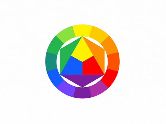
⓸ Tetradic: uses 2 complementary pairs. This forms a rectangle on the wheel - if you need more variations go double complementary!
⓹ Triadic: 3 colors that are evenly spaced out in the color wheel. You're free to choose from a variety!
⓺ Monochromatic: uses different tones, shades, and tints of a singular color. Sometimes it just works!
PART 4: What is Color Temperature?
Ever wonder why some compositions feel cold or hot? It is a fact that color has the ability to evoke feelings or emotions. As such, color temperature is the one responsible for this - it is the "warmth" or "coolness" of a color.
Warm colors: Reds┃Oranges┃Yellows
Generally seen as colors that are bright, cheerful, active, or happy
Cool Colors: Purples┃Blues┃Greens
Generally seen as colors that are dark, mysterious, melancholic, or gloomy
And that concludes this stop for today! These tips are a lot to take in, we feel you, and that's alright - come back to this station when you need a quick reference. We hope you learned a lot from this and that you'll be able to apply them in your paintings or digital illustrations!
Now pack your art supplies and start creating! Safe travels~
– Post by Leonardo
#Art#Drawing#Digital Art#Traditional Art#Illustration#Art Tutorial#Art Tips#Art Reference#Art Guide#What is color theory#What are the major elements of color theory#How to use Basic Color Theory#How to Use the Color Wheel#When to use Color Combinations#Quick color theory crash course#Color Theory Guide#What color combinations or schemes can we use#Color Theory#Basic Color Theory#Art Terminal PH
50 notes
·
View notes
Text
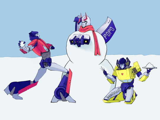
A little late but happy holidays!
#transformers#maccadams#tf idw#sunstreaker#sideswipe#prowl#this was for a little server event that i wasn't going to do#and then 1 day before deadline i decided to go for it#im not sure how i feel about the colors; first time using blend modes#i think everything worked out though#i messed up the design though#i forgot wheels existed so sideswipe only has 2 and sunny...yea
91 notes
·
View notes
Text
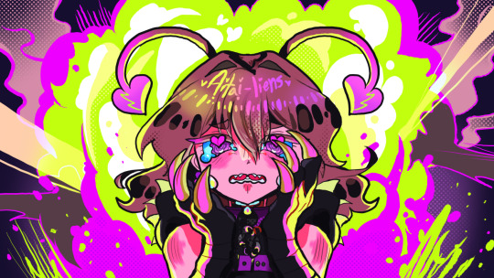
i really wanted you to be the hero of this story, you know?
the references i was working with btw. the speech bubble said smth but whatever
#muu kusunoki#milgram fanart#deco*27 aitai seijin/aitai-liens#? ig#bright colors cw#rambling commences#the devil works fast but i work faster surely#5 hours tops and at least an hour was spent googling how to use krita☠️☠️#its a lot brighter than i wanted but my art tablet desaturates and changes the color of like Everything im working on a different color#wheel man#i guess shes pink now. whatever#i was gonna put some writing of the line i used for the caption there#but 1) in the mv i guess i cant really read yet.#2 idk if theres an outline effect like there is in ibis#and my shit died as soon as i tried to look#so☠️☠️☠️☠️not as swag as it could be#i dont rlly vibe with the expression either but it is what it is…#thats a lot. lots to say#it doesnt even really look like muu but without the shading it did. what da fuck#bug muued too hard its because i made her eyes purple instead isnt it….sigh
47 notes
·
View notes
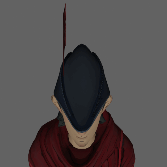
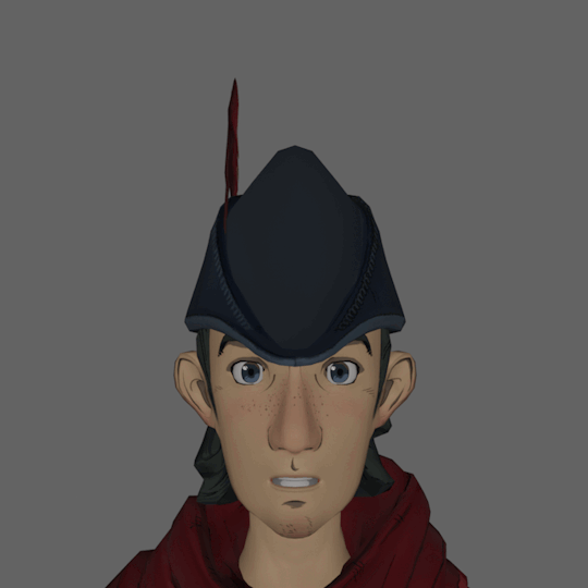
Text
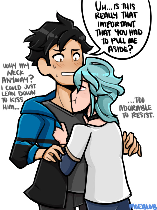
(throws them into a modern AU)
So since Ymber wouldn't be a deity there are some things he lacks physically - such as no pointed ears and no bright blue undertones to his hair. Just the basic blue. (does he dye it in a modern AU ? who knows) Also while he doesn't have a collar to symbolize his servitude to humans I still think he should have a choker.
I had some help a while back brainstorming how there would be some form of "superior" dynamic could still exist and I really liked the idea given that he's a famous architect. (he does design all constructs for his city as a deity so it checks out - he likes buildings) And Deacon just admires all the guy's works and never expects to run into him but of course they do! Gotta have a very awkward "oh it's you I'm going to melt into the earth" and "I have no idea who you are but we should hang out".
Sooo Deacon still just really admires Ymber and feels like they're on totally different levels and doesn't understand why Ymber would want to associate with him since he's just a "boring human".
#my characters#then deacon proceeds to ask a lot of questions about designing buildings and somehow they manage to be weird questions#you cannot take the weird questions away from him i wont allow it#this man has to accidentally make things even more awkward with ymber#also i was thinking about drawing them then was like mmmm maybe different ocs ?#and then spun my RNG wheel that is just colors and it landed on blue so whatever they're blue coded lets go#ymber the architect is just a fun idea and i love it let the man design things#and let deacon just appreciate all the work without having met the guy but accidentally meet him#there are only two problems with this kinda au and that is now that ymber ISNT a deity and DOESNT have a deity aura glow#how does deacon with facial blindness just know its him right away#and the other problem is aside from ymber just liking his neck in all universes ive decided - hes also injured when they meet in two#so its important to figure out how hed be injured in an au where he just is sort of reclusive and designs buildings#like how does mr ymber get injured here#there are things i need to figure out#also up for debate is ohime and ohiwe since they were originally just one person#i think i might use oh solo for the modern au instead of a duo since they wouldnt have the magic to be divided for misbehaving#i dont usually do the mermaid may stuff but i wanna do something for these two even if just as my sole contribution to the month
25 notes
·
View notes
Text

would-be promotional art
#jsr wii#idk if i sjould be using that#my stuff#jsr#jet set radio#jsr tab#jsr beat#jsr yoyo#unfortunately image 1 will forever be unfinished. WHICH SUCKS BC I LOVE IT SO BAD!!!!!!#and i spent so long on ittttttt trying to make it look all official…#i may redraw it though#also thats what made me realize how much their designs have in common#look at the glasses/hair and skate/wheel colors…for example#well not here i my other posts ig#in*#I ALSO LOVE THIS TAB DESIGN#HES SO!!![]]58499¥{_]3#nobody gets himlike i do. /j#oh i didnt mention#i redesigned the main 3 bc i didnt want to just Copy the original concept art
76 notes
·
View notes
Text
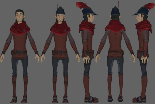
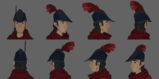
Hey! I finished up another little resource I've been slowly putting together.
I've put together a turnaround reference of every character in the game, with every alternate appearance, both full bodies and profile views.
The full body views include a hatless young Graham for scale. There is a bit of an issue regarding characters with armor- I'm not very savvy with blender admittedly, and all of the metal comes out really dark. It isn't too bad, save for Manny, who doesn't even have his green feather. I'd like to fix those once I can. Also, capes are omitted. I think that only applies to Graham and Whisper though.
I'll be finishing up doing the same for the animals at some point, and I'm planning on making a few references for certain character's weapons, or other interesting items.
Also- along with the profile views, I included some of Graham's head at every angle by 10 degrees, from head on, lower, and upper angles. Thought it would be helpful to see how his hat works from any direction. The images are huge, here's a gif of them all together.

Hope these will come of use! I've been working on it for a while.
#kings quest#king's quest#king’s quest#kq2015#kq#the only metal object i successfully fiddled with was the crown. because it looked horrid if i didnt#also chester and hagatha have an extra angle in their profile views bc they are hunched over with long noses#so at a 45 degree angle it didnt have the view i wanted and i just threw in an extra#only them tho and only from the front not from behind#also theres only 4 goblin profiles and 8 different goblins in full body bc they have the same heads. 4 heads and 2 body types#ive been actively doing this for over a year just not constantly... its easy work but its a time sink#ive been WANTING to do it since 2017 ever since i could access the models in a modelling program#since then we've found more references from the artists but still lack all of them. like graham's >:(#im gonna take a break before getting to the animals and items. there are a few animals already done though#ps these are great refs for art but i wouldnt colorpick from these images due to how blender adds some shading to the models#just use them to pick colors from the color wheel or find the character's texture in the extracted textures and pick from that if you must#anyway thats all my commentary here. have fun go nuts i really hope you guys find this useful
27 notes
·
View notes
Text
Just in case, i'm still here x)
#i see your messages and i'll answer them i promise!#the thing is at first i took a break from everything for a few days (and ofc the boys went to the military on these days exactly!)#then i tried to use my new laptop and i don't like it#i don't like how the colors look on it (evn tho they were calibrated) so i can't make gifs from it#so maybe i'll sell it and try to buy a proper pc#and also my cat didn't feel well these days#as usually last week of vacation and i am literally a hamster in a wheel nothing new x)#but in the meantime i finished bv3#and as much as i liked it the scene with jin who was left alone in the bar brought back some painful memories i was literally shaking#so this season gave me mixed and bittersweet feelings in general (at least they gave me yoonjin date)#but now i'm catching up on run bts and i just finished the blue village and it was even more fun than i expected#but both parts of golden bell are my favorites for now😁#hope y'all are doing better than me💖 i miss you guys
14 notes
·
View notes
Text
Blinks loud as fuck
#WAS ANYONE GONNA TELL ME SOME WHITE GUY MADE UP THE MEDICINE WHEEL OR WAS I SUPPOSED TO FIND OUT MYSELF#fucking hell#saw one of my family members (derogatory) on facebook share a video where some native guy was going on abt#how the medicine wheel represents the four colors of man (white black red yellow) with red being natives and you can guess the rest!#and started assigning different traits inherent to each and i was like. damn this is just native phrenology#and then i remembered my parents tried to tell me the same thing when i was younger like oh us natives knew#about the other races before contact thats why the medicine wheel is those colors and as an adult looking back im just like.#thats racist#and anyways this led me to googling id the medicine wheel is based off race and i found out its some bs#a white guy who claimed to be native made up.#jesus fucking christ.
6 notes
·
View notes
Text

Me when I get my hands on 10 cra-Z-art super washable markers also yes I know I can't color inside the lines it's an issue I've had for 17 years believe it or not
I just wanted to use my coloring book to practice shading I don't know how it came out so cool and irl the yellow shading gives it a weird like. Yknow the red blue 3d glasses filter you can put on photos and stuff it's that except yellow like it shouldn't be on paper and instead on a digital screen idk it's really cool and im sad the camera didnt pick it up because my bedroom has shitty lighting
#art#coloring#coloring book#markers#i see trends of people going “doing art with shitty markers” and just. like i have REALLY nice markers but i didnt want to go find them and#the cra z art ones were right there so i decided to fuck around and find out#maybe next time i use cra z art markers or markers in general in this book ill find a page for an oc#though i think i may have. absolutely wrecked the orange marker#ill run it through water or something and go look up how to fix dry markers before i use it again#it also turns out i love limited color palletes but only physically#i have alot of color pallete challenges saved for digital art but just. idk when you have a whole color wheel its less appealing to limit i#talk talks
3 notes
·
View notes
Text
tell me you've never had to use skype without telling me you've never had to use skype: you complain about discord
#liz blogs#what am i doing that i am actually completely 100% ok with the way discord runs right now and what they have behind paywalls#what am i doing that other people seem to not be doing that they get frustrated#i hate corporations more than the next guy but they do. still have to make money. to Function#its just bad when the app barely functions Without giving it money#its the difference between having a basic car and having four wheels 1 seat and a steering wheel. only the latter is bad#but the vanilla discord experience is... just fine?? you're not losing out on any Necessary features without it#it's Nice having custom colors and profile themes and funny icons but you don't Need them#the objectively best feature of nitro is the emojis and i am fine shelling out $30 A Year to use them where and however i want#in the basic nitro tier because i cannot fathom how much money it must cost#to run discord and host the insane amount of data it does. can you even Comprehend the sheer Size of what it stores#it is in fact the Only subscription to Anything i currently have#i think the 'fuck corporations fuck capitalism' attitude is Excellent but i think when most people Cannot think critically at all#everything is just black/white to them and they see Any service trying to make money as Bad and start screaming about it#tumblr and discord are on my very short list of services that i am actually very happy with and fine letting them make money#i feel strange watching the internet turn on discord the last couple years. it's still the same app. nothing has changed#literally trying to encorporate n//fts and AI is the only real Shit Move i can think they've ever made and to be fair#like every fucking company is jumping on that right now out of ignorance and not malice#nitro is not the problem though 🥴 are y'all ok#yes i saw people pissing and shitting their pants about discord giving nitro users more themes and thought they were insane#dark mode/light mode is just fine for basic functionality. you dont Need colors. shut up and go burn down an amazon warehouse instead
17 notes
·
View notes
Photo

Heres a better pic!
OHHH HE'S SO SHAPED AND I TRULY LOVE HIS COLORS
#THANK YOU ANON I LOVE HIM#I LOVE#HE USED TO HAVE PURPLE IN HIS COLOR PALETTE THATS SO NEAT#i love how even if its been literal decades apart every designer has decided on two things#1. Blue#2. Orange/reddish face#also i guess the wheels on the shoulders#Thats also a constant sajkbfsakh#would love to see how he looks with a bit of purple in his latest design on the wreckers comic tho that would be so cool#BREADKDOWN PURPLE DECALS......#ALSO THE PARTS HE HAS ON HIS BACK LOOK LIKE TINY WINGS TO ME AND I CRY OVER HHOW CUTE HE LOOKS#hes so shaped no matter his design i love him so much#breakdown#tf breakdown#fer talks#anon#for me
40 notes
·
View notes
Text
"it's just a phase"-i'm telling myself while i make a storyboard for little cute and stupid Amell/Alistair comics
"I'm not actually back in this fandom while it's seemingly half dead"-i'm telling myself while i do a second storyboard for much more serious comics about Amell's nightmare
"i'll snap out of it soon"-i'm telling myself
#dragon age#yeah i'm 6 years late at the party#in my defence when da was everywhere i was like..15#i tried to do fanart but it was pure shit and only my two friends saw it#but NOW i'm better now i'm stronger now i know The lore and how to use color wheel#I don't even know how the fandom is doing#should i even finish those comics or just leave them for my personal delight
8 notes
·
View notes
Photo

trying out clip studio paint with the default brush packs, so here’s an aria~~
#aria#my ocs#clip studio paint#i’m so excited!!!#we got it when it was on sale during the anniv#and whoooo babey#im just trying to figure out if i can get the color wheel#layers and tools and brush size to all appear at once#on mobile#bonus points if they dont intrude too much on the canvas#definitely a lot of fun#(i refuse to look up guides)#(jk but also rly bc all the ones i find seem to be for like#desktop users#which is chill but adgjkfgfg)#lemme know what u guys think of the brushes#— if u want#i like how soft she looks#i should rly try doing lineart instead of using just the sketch#and modifying that for my final#but either way#there’s some shading on her hair and some patches on the shirt#to give it some reflectivity#didnt color in her tattoos nor her collarbone scare oops
6 notes
·
View notes
Text
Who would win?
Prismacolor, X-acto, General’s, or any other name brand sharpeners?
Or my die-cut novelty train-shaped sharpener from a railroad tourist shop?
#ghost posts#is it called die cut if it's 3d?#any shout out to my mutual for the train sharpener#even has working wheels#i'm almost mad at how good of a sharpener it is#but for my colored pencils i do use the general's one bc it's bigger#it breaks my other pencils though#railroad train sharpener my beloved#my mutual who sends me train merch and makes me look like a railroad enthusiast even though i know nothing about them <3#they run along tracks and whistle thats's about what i've got
3 notes
·
View notes
Text
I like the idea of the sims 2, but in practice? Some of the features are so different. I don’t like not being able to go into cas and change everything about my sim and having to go to a store to shop for clothes because I downloaded a new outfit for Aredhel. I couldn’t figure out how to zoom in, why is it the z key, I don’t have a mouse. I like the cars though, I wish they were in the sims 4.
Adding this: siblings putting each other in headlocks all the time. Why? This is totally a Celegorm thing but Turgon keeps doing it and it’s kinda annoying. I do love all the interactions though, there’s so many things you can do.
Can you not go to another sim’s house? I want Fingon and Maedhros to meet…
#I like sims 3 gameplay the best and sims 4 cas but sims 3 color wheel reigns supreme#sims 2 is a little lacking in this department#it confuses me i'm better off playing the sims 3#i just downloaded nraas for sims 3 and i've never used any mods for it so we'll see how that goes if i end up playing it#also downloaded sim blender for sims 2#i want fingon and maedhros to go to prom so i think i'll end up playing sims 3 bc teens in sims 2 seem lame#apparently a new sims 4 pack will be for high school so i hope that adds prom even if the game is super hollow and i only use it for cas#and making all my elven sims related through mc command center aka the best mod ever
6 notes
·
View notes
Text
for all the artists out there, here are my favorite resources i use to learn!
Files
The Complete Famous Artist Course
Art Books and Resources
Art, Anatomy, and Color Books
PDF Files of Art Books
Internet Archive
YouTube
My YouTube Playlist of Tutorials
How to Draw Facial Features
Drawing and Art Advice
Drawing Lessons
Art Fundamentals
Anatomy of the Human Body
2D Animation
Perspective Drawing
Websites
Pinterest Board for Poses
Another Pinterest Board for Poses
Pinterest Boards for References
Reference Angle
Figurosity
Sketch Daily
Line of Action
Human Anatomy
Animal Photo References
Humanae - Angélica Dass
Fine Art - Jimmy Nelson
Character Design References
CDR's Twitter Account
iamagco's Twitter Account
taco1704's Twitter Account
takuya_kakikata's Twitter Account
EtheringtonBro's Twitter Account
Drawabox
Color Wheel
Color Palette Cinema
Free Images and Pictures
Free Stock Photos
FILMGRAB
Screen Musings
William Nguyen Light Reference Tool
Animation References - sakugabooru
Animation References - Bodies in Motion
#art#art resources#art books#anatomy#composition#painting#art tips#art help#art tutorial#perspective#color theory#art reference
18K notes
·
View notes
Last Seen Blogs
whysoo-serious
The musings of a madman
netunokinoart
N E T U N O A R T S

heiprah
Que sera sera
gayfantasyandspirit
Magic and Fantasy by Polish Gay

stabilitytriumphsmentality
Littered calligraphy