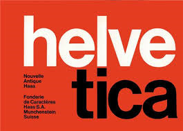
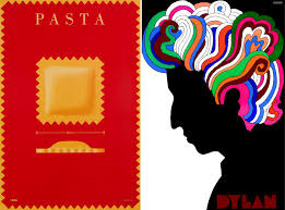
#Basel Grotesk
Text

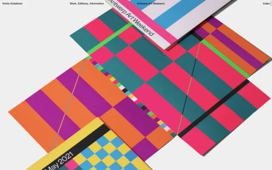
No Free Pitches
#No Free Pitches#Creative Industry#clients#professionals#petition#typographic#list#white#typography#type#typeface#font#Basel Grotesk#2024#Week 06#website#web design#inspire#inspiration#happywebdesign
3 notes
·
View notes
Note
what font do u think looks cute for subs? i was watching pearl yesterday n thought... these letters could look cuter
i usually use antique legacy / neue haas grotesk / gerstnerr program / basel
but if u cant find those for download literally just use our queen arial bold
24 notes
·
View notes
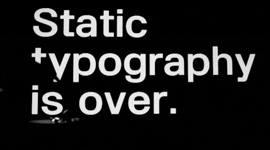
Photo
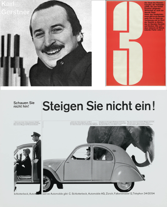
At first, a uniform grid structure seems binding – a way of ensuring everything fits neatly into place as a part of a larger structure – but it’s simply a matter of perspective. Ellen Lupton feels the style gives her the feeling of keeping her room tidy (1995), but states that “Swiss designers used the confines of a repeated structure to generate variation and surprise” (2010). One such designer was Karl Gerstner, a Basel-born typographer, who helped build the popularity of Swiss Style through work with Max Schmid and Armin Hoffman. Gerstner believed the grid to be a complex program for the uninitiated, but an indispensable and an “almost inexhaustible tool” for anyone who understood it (1964). Such was his focus on text, that he dissected Akzidenz Grotesk into its basic elements, and used these foundations to build Gerstner Programm – a no frills font that would stand up in a world where phototypesetting was the norm. This creation process was technical, specific and, in my opinion, inspired. The focus with which Gerstner built the letters within his beloved grid-system, and the delicacy of selecting angles for italics show how dedicated he was to his text being a stand-out example of how information should be communicated to the reader. A fine example of this is Gerstner’s 1960 advertising campaign for Citroen cars. Rather than have stylish fonts creating an impact, Gerstner believed the text should speak for itself – with posters proclaiming “DON’T BUY THIS CAR” with a subtitle of “unless you want something out of the ordinary. REFERENCE
1] Lupton, E. (1995). Scher, Paula - Ellen Lupton. [online] Available at: http://elupton.com/2010/07/scher-paula/ [Accessed 6 Sep. 2020]. 2] Lupton, E. (2010). Thinking with type: a critical guide for designers, writers, editors, & students. New York: Princeton Architectural. 3] Gerstner, K. (1964). Designing programmes. Arthur Niggli. 4] Museum für Gestaltung eGuide. (n.d.). Kaufen Sie diesen Wagen nicht! [online] Available at: https://www.eguide.ch/en/objekt/kaufen-sie-diesen-wagen-nicht/ [Accessed 6 Sep. 2020].
ARTWORK
Clockwise from top left: TypeRoom (n.d.). An ode to the pioneer of typographic brilliance Karl Gerstner - TypeRoom. [online] www.typeroom.eu. Available at: https://www.typeroom.eu/article/memoriam-karl-gerstner-1930-2016 [Accessed 6 Sep. 2020]. The Museum of Modern Art. (n.d.). Karl Gerstner. 3 Liberale Partei: Liste 3. 1959 | MoMA. [online] Available at: https://www.moma.org/collection/works/4850?sov_referrer=artist&artist_id=2136&page=1 [Accessed 6 Sep. 2020]. Museum für Gestaltung eGuide. (n.d.). Kaufen Sie diesen Wagen nicht! [online] Available at: https://www.eguide.ch/en/objekt/kaufen-sie-diesen-wagen-nicht/ [Accessed 6 Sep. 2020].
5 notes
·
View notes
Text
//SWISS STYLE
Clean lines. Grids. Asymmetry. Helvetica. Minimalism. Order. Clarity.
What is Swiss Style?
Swiss Style – or International Typographic Style – is the design movement of the mid-1900s that gained fame in Switzerland. It can be visually characterised by clean lines and design elements constructed in a grid, with asymmetrical organisation and use of sans-serif typography. (Budrick, 2020)
Where did Swiss Style come from?
Swiss style has roots in the early 20th century and has been linked to Ernst Keller. Keller was thought to have pioneered the idea that design problems should have solutions derived from its content and should not contain ‘beauty for beauty’s sake’ (Meggs, 2006).
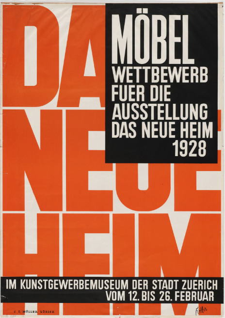
Ernst Keller, 1928, Möbel Wettbewerb fuer die Ausstellung "Das Neue Heim"
(Furniture Competition for the Exhibition "The New Home")
Further development of Swiss Style would occur in two art schools in Basel and Zurich, led by Armin Hofmann and Josef Muller Brockman respectively. The curriculums and design processes developed within the schools focused on the use of mathematical grids and typography.
What characterises Swiss Style?
Grid-based design in Swiss Style served as a framework for the organisation of information, giving the content a presented structure. The use of grids acts as an aid in creating a hierarchy of content.
The design also features asymmetrical layouts and the use of whitespace which provide a minimalist feel as well as ‘asymmetrical balance between the positive and negative elements in a design’ (Bradley, 2013). Photography was also favoured over illustration as it was considered more effective in communication.
Arguably one of the most recognisable characteristics of Swiss Style is the use of sans-serif typography. The Akzidenz Grotesk type is thought to have been featured in Swiss design due to its absence of flourishes and simple yet effective style. It is this font that is thought to have influenced the design and emergence of the popular font – Helvetica. (Homola, 2004).
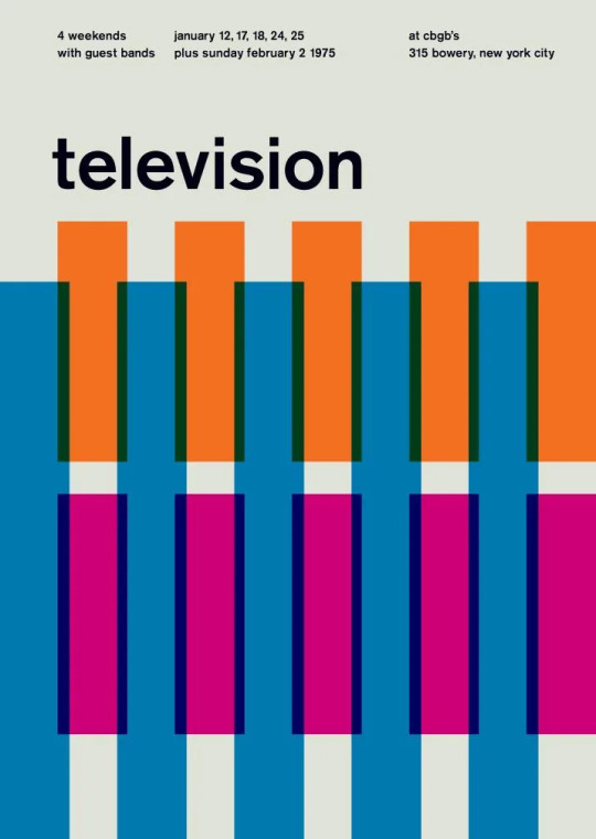
Swissted - Vintage rock posters redesigned in Swiss Style, available at https://www.swissted.com/.
What’s good about Swiss Style?
Swiss style could be likened to the old phrase ‘less is more’. The style has been praised for centring the content of a piece. The formula behind the design allows for content to be the main feature, and for the delivery of information to be achieved with ease.
This allows designers to bring uniformity and be ‘objective’ in their work. It brings about a scientific approach to design that delivers a crisp and clear display. Swiss style embraces design being factual and to the point, yet aesthetically pleasing.
What’s bad about Swiss Style?
The approach in Swiss Style design risks becoming overly formulaic. A formula suggests that there are only so many outcomes that can come from it. This has been a critique of Swiss Style throughout its conception and use, and some even consider it to produce boring work. However, you could instead consider it as a basis in which design can be perfected.
What’s my take?
The cleanliness and clear readability of Swiss Style is appealing for so many reasons. There’s a lot of beauty in simplicity and minimalism, and I believe there’s always room for better communication, so to incorporate that into the design of any type of work is going to be beneficial for designers and consumers. There’s a benefit to a formula in design, as it can offer results that are precise and perfected.

Scott Coleman, Swiss Design in a Historical Context: Available at: https://www.behance.net/gallery/1408737/Swiss-Design-in-a-Historical-Context
References:
Meggs, P.B. and Purvis, A.W., 2006. Meggs' history of graphic design. 4th Edn, John Wiley & Sons, New Jersey.
Homola, W., 2004. Type design in the age of the machine. Available at: https://web.archive.org/web/20110112014111/http://www.typefacedesign.org/resources/dissertation/2004/WolfgangHomola_dissertation.pdf
Budrick. C., 2020. Swiss Style: The Principles, the Typefaces and the Designers. Available at: https://www.printmag.com/post/swiss-style-principles-typefaces-designers
Bradley. S., 2013. Swiss (International) Style of Design: The Guiding Principles That Influence Flat Design. Available at: https://vanseodesign.com/web-design/swiss-design/
3 notes
·
View notes
Text
The (type)face of it all
International Typographic Style took hold in the early 1950’s and was brought to internationally recognised status by extremely talented designers in Swiss Art Schools such as Josef M ü ller-Brockmann of Kunstgewerbeschule in Zurich and Armin Hoffman of Allgemeine Gewerbeschule in Basel. Both of these pioneers trained under Ernst Keller before World War II.
Ernst Keller
Coined as the “father of Swiss design” [1]. Teaching fine arts from 1918, Keller’s teachings were known to be the start of the grid system that is synonymous with Swiss Style. He taught his students a shift in belief, to refocus design to the simplicity of the content and of course, the importance of typeface in design. His work was very different to that of his students, however he paved the way for some of the most iconic Swiss designers
Josef Müller Brockmann
Mülller-Brockmann was a leading designer in the 1950’s - his dedication to grid-based designs and iconic posters made up of simple graphics, striking photographs and heavy use of type set him ahead of the curve. He returned to teach at the very school he learnt in as Keller’s replacment and later opened his own design studio. His most famous works include concert posters for Zurich Town Hall.
- Akzidenz-Grotesk type is heavily used by Mülller-Brockmann
- One of Müller-Brockmann’s iconic Zurich Town Hall Posters
Armin Hoffman
Armin Hoffman was considered a trailblazer of the times - his unusual way of teaching did not go unnoticed and his exploration of Swiss Style is distinctive. He believed posters were the most effective means of communications and his work was heavy with typography. He, and his students, became fixated on visual communication and using type over illustration. He was a key player in bringing typography to the united states.
- A great example of Hoffman’s iconic use of tonal contrast
[1] https://www.printmag.com/post/swiss-style-principles-typefaces-designers
Sources Used:
https://99designs.co.uk/blog/design-history-movements/swiss-design/
https://www.smashingmagazine.com/2009/07/lessons-from-swiss-style-graphic-design/
http://www.designishistory.com/1940/armin-hofmann/
https://www.printmag.com/post/swiss-style-principles-typefaces-designers
2 notes
·
View notes
Link
9 notes
·
View notes
Text
The rise and popularity of Helvetica.
“In 1947, Hoffman hired a talented designer named Max Miedinger as a customer counsellor and typeface sales representative for the Haas Studio in Münchenstein near Basel. Miedinger was trained as a typesetter and had attended evening classes at the Kunstgewerbeschule in Zurich. Between 1936–46, he worked as a typographer in the studio of the town’s Globus department store. In 1956, he went freelance, and Hoffman commissioned him to work on Haas’s new sans serif typeface. Hoffmann also directed Hermann Eidenbenz’s work on Clarendon.
Hoffman and Miedinger were motivated by the renewed, post-war demand for san serifs in Europe at the time. European sans serif typefaces were of a distinguished pedigree. Experts consider them descendants of the great Khan of the San Serifs: Akzidenz Grotesk. However, Hoffman and Miedinger felt th older ideas needed refreshing. Dan Reynolds writes: “While Helvetica was not simply a reworking of Akzidenz-Grotesk, its initial development as Neue Haas-Grotesk in Switzerland reflected, in part, the popularity that Akzidenz-Grotesk had begun to enjoy in Western European graphic design during the immediate postwar years.”
- https://uxdesign.cc/an-ode-to-the-joy-of-retail-therapy-3e5d148445c9
“Postwar movements sought, like the Romantics before them, to emphasize the foolishness of the elites. One particular line of attack was on the serif. What had once seemed ornate and the very definition of “civilized,” harking back to the grand Roman Empire, was now viewed as chintzy and messy. Designers sought to distance themselves from the aggression and destruction of European imperialism, which was embodied in the serif.”
- https://modus.medium.com/the-serif-66c4830c8a3f
Helvetica was first released in 1957, under the name Neue Haas Grotesk.
“Swiss designers Emil Ruder (1914-1970) and Armin Hofmann (born 1920) were on the faculty at the Basel School of Design, and it was their teachings that gave rise to the Swiss Style of design during the 1950s and 60s. Ruder was the typography instructor, placing great importance on the use of sans-serif typefaces. He taught that type loses its purpose when it loses its communicative meaning; therefore, legibility and readability are main concerns. "Typography has one plain duty before it and that is to convey information in writing," he said. The even and almost homogenous form of Helvetica (Latin for Swiss) aligned well with the school's typographical philosophy.”
- https://www.bbc.co.uk/news/blogs-magazine-monitor-26383185
In 1960, Neue Haas Grotesk was renamed as Helvetica, in order to improve its marketability in the United States.
“Not long after Helvetica's release, students from the Basel School of Design spread the typeface's merits to the US when they returned to Yale and other American schools (Mike Parker graduated from Yale with a Masters in design).”
- https://www.bbc.co.uk/news/blogs-magazine-monitor-26383185
During the 1960′s and 1970′s, Helvetica was a popularly used typeface for billboards and general advertising.
“Helvetica’s sleek lines and modern sensibilities were just what companies were looking for to remake their identities and set themselves apart from the past.
Corporations stick by Helvetica because of what they have invested in it. Because of this, it has become associated with corporate culture and business to some degree. This is one reason why American Apparel chose to use the font for their own brand identity to poke fun at corporate culture in America.”
- https://www.webdesignerdepot.com/2010/01/the-simplicity-of-helvetica/
“Some design historians consider the popularity of Helvetica is a fluke. In my opinion, however, in matters of the collective public consciousness, like in a major tennis tournament, there are no accidental winners. It cannot be that one designer, on a whimsy, decided to use Helvetica. From one throw-away advert in a barely read publication, Helvetica simply by a process of accidental reuse became one of the most prominent public typeface in the United States. It just doesn’t work that way.“
- https://uxdesign.cc/an-ode-to-the-joy-of-retail-therapy-3e5d148445c9
In the late 1960′s, Helvetica was used for the restyled New York Metro map.
“Helvetica is particularly well-suited to signage and other designs where legibility is key. This is further reinforced by the wide variety of companies that have used the font in their logos or other corporate identity materials (American Apparel, American Airlines, Target, the NYC Subway, etc.)”
- https://www.webdesignerdepot.com/2010/01/the-simplicity-of-helvetica/
in 1983, Helvetica was restyled for digital use, and in 1984 it was released on the first Macintosh computer.
A review of Helvetica: A Documentary “Second, the meat of the film is a story of the font in modern, post-modern, and contemporary Western culture, which goes from the historical moment in modernist design in which it first emerged in the ’50s, its creation and instant explosion in the ’60s and early ’70s, the post-modern reactions against it in the late ’70s and ’80s, its rebirth as a standard computer font in the ’90s, and then to the present day.”
- https://mmderakhshani.github.io/posts/2011/03/helvetica-a-documentary-a-history-an-anthropology/
1 note
·
View note
Text
Zitat des Tages: Volksbegehren ist „Angriff auf die Demokratie“
Compact: „Volksbegehren ‚Bündnis Landtag abberufen‛ startet. (…). Landtagspräsidentin Ilse Aigner spricht von einem ‚Angriff auf die Demokratie‛.“ (Bayerischer Rundfunk) „Gleichzeitig wird der Opposition, der man die Debatte verweigert, die Nazi-Schelle umgehängt. (…) Wie grotesk das ist, zeigt eine repräsentative Untersuchung der Universität Basel: Demnach haben bei der letzten Bundestagswahl 21 Prozent der Corona-Skeptiker Die Grünen gewählt [...]
Der Beitrag Zitat des Tages: Volksbegehren ist „Angriff auf die Demokratie“ erschien zuerst auf COMPACT. http://dlvr.it/S9cFkM
0 notes
Text
Artist Research: Armin Hofmann
Armin Hofmann was a Swiss graphic designer most known for his cautious and reliable style of designing which used the fundamental elements of point, line, and shape to their full extent while subtly proving simplicity, complexity, representation, and abstraction. Alongside working in graphic designing, he was more so into teaching graphic design and had introduced an advanced graphic design class and soon was appointed the head of the graphic design department.
Starting in 1947, Hofmann taught at the Schule für Gestaltung in Basel, where he instructed students to be more abstract and playful with their use of grid systems in design. He would later travel outside of Switzerland, working in teaching positions in Philadelphia, New Haven, and Ahmedabad, India.
Influences?
Hofmann was influenced by and worked with designers:
- Josef Müller Brockmann,
- Emil Ruder
- Max Bill
Working with these, Hofmann was able to help shape a style of modern-inspired graphic design. He worked in the art movement, Swiss Style which was influenced by Russian Constructivism and included such as photography and type specifically the 19th Century font Akzidenz-Grotesk.
0 notes
Photo

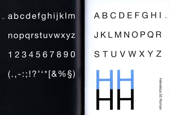
Typography Tuesday
What do these five publications in the top image have in common? Well, yes, they are all indeed artists’ books, but they also are all printed in Helvetica type.
Helvetica?!! You mean that dull and anonymous traffic-sign typeface?
No. Helvetica, that timeless, upright, round and open san-serif face of eminent readability.
Helvetica was the brain-child of Eduard Hoffmann, head of the Haas Type Foundry near Basel, who envisioned a new Swiss design based on the 1890 (re-cut by Haas in 1900) Schelter & Giesecke Grotesk, the official Bauhaus typeface, and entrusted the design to Max Miedinger, an expert on Grotesk typefaces. After much input from Hoffmann, the type was cut and cast, and first appeared as Neue Haas Grotesk in 1957, and renamed Helvetica in 1960 by the Stempel Type Foundry. The rest, as they say, is history.
The out-sized cultural impact of this much-heralded and much-maligned typeface is exquisitely expressed in what is perhaps our favorite documentary on typography, Gary Hustwit’s Helvetica (2007). In it, graphic designer Michael Bierut -- in what may be the most expressive part of the movie, if not the funniest -- describes what it must have been like when Helvetica first appeared on the scene:
It just must have felt like you were scraping the crud off of, like, filthy old things and restoring them to shining beauty . . . . Can you imagine how bracing and thrilling that was? That must have seemed like you’d crawled through a desert with your mouth just caked with filthy dust and then someone is offering you a clear, refreshing, distilled, icy glass of water to clear away all this horrible, kind of like, burden of history.
Bierut goes on to give examples, first showing magazine ads from the early 1950s displaying “every single visual bad habit that was endemic in those days. . . . zany hand-lettering everywhere, swash typography to signify elegance, exclamation points, exclamation points, exclamation points.” Then he shows a Coke ad when “Helvetica was in full swing”:
No people, no smiling fakery, just a beautiful, big glass of ice-cold Coke. The slogan underneath: It’s the Real Thing. Period. Coke. Period. In Helvetica. Period. Any questions? Of course not. Drink Coke. Period. Simple.
View a short clip of Bierut’s “Coke” example, or watch the full, hilarious 4-minutes of his take on the Helvetica transition.
Shown here, from the top:
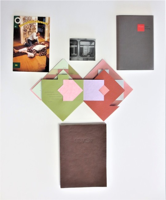
Ian Tyson. Seven Motes of Zen Dust. San Diego, California: Brighton Press, 2015. Edition of 40 signed copies, with the text was set in Helvetica Neue, reworked for Sempel in 1983.
Claire Van Vliet and Margaret Kaufman. Aunt Sallie's Lament. West Burke, Vermont: Janus Press, 1988. Edition of 150 copies.
Mark Strand. Prose: Four Poems. Portland, Oregon: Charles Seluzicki;
Sweden, Maine: Ives Street Press, 1987. 187 copies printed by Barbara Cash, with the text is set in Monotype Univers by Mackenzie-Harris (an Helvetica redesign by Adrian Frutiger), with titles handset in Stempel Helvetica.
Ricardo Bloch and Kevin Kling. The Incredible Servant and the Master of the Unknown. Minneapolis: R. Bloch, 1991. Edition of 2000, set in Helvetica Narrow.
Jenna Rodriguez. Overheard. Chicago: Jenna Rodriguez, 2013. Printed in Helvetica CY.
Creative Type: A Sourcebook of Classic and Contemporary Letterforms. London: Thames & Hudson, 2005. With type designer Günter Gerhard Lange’s entry on Helvetica.
BTW, this entire post was written in -- you guessed it -- HELVETICA!!
View our other Typography Tuesday posts.
#Typography Tuesday#typetuesday#Helvetica#Eduard Hoffmann#Max Miedinger#Haas Type Foundry#Stempel Type Foundry#Neue Haas Grotesk#Gary Hustwit#Helvetica (film)#Michael Bierut#Helvetica Neue#Monotype Univers#Adrian Frutiger#Helvetica Narrow#Helvetica CY#Günter Gerhard Lange#type history#janus press#Charles Seluzicki#Ives Street Press#Ricardo Bloch#Jenna Rodriguez#Brighton Press#20th century#san serif type
7 notes
·
View notes
Text
Vrints-Kolsteren
#Vrints-Kolsteren#design#studio#designer#Antwerp#portfolio#colors#type#typeface#font#Basel Grotesk#2023#Week 44#website#web design#inspire#inspiration#happywebdesign
5 notes
·
View notes

Photo
País amfitrió
presentació
DISSENY SUÏSSA MATCHMAKING RENDEZ-VOUSPro Helvetia
Es presenten 9 joves estudis de disseny i start-ups. El que tenen en comú és la visió d’una emprenedoria de disseny eficaç en un context ecològic, social o cultural. La intenció és cooperar amb Àustria. Els Rendez-vous 'estan dirigits al públic especialitzat en disseny, innovació i emprenedoria.
PLANISPHERE és una agència de xarxa de producció creativa i consultoria estratègica. Presenta el millor cas "ON": un esdeveniment fet a mida dissenyat per al Kunstmuseum Basel. La música, l'art contemporani i el disseny es van combinar en una obra d'art exploratòria i única.
planisphere.eu
Robin Eberwein va desenvolupar "Genoma Grotesk": una tipografia revolucionària que s'adapta al context respectiu, per exemple en publicitat exterior. La gran flexibilitat d'aplicació, mida i amplada, així com altres atributs, garanteixen la llegibilitat sense augmentar la mida del fitxer.
robineberwein.ch
L'estudi INT presenta "Replices interactives": una nova manera tàctil d'experimentar objectes de museu. Mitjançant la manipulació de rèpliques tridimensionals impreses, els visitants i els clients poden interactuar amb l’obra d’art digitalitzada a la pantalla.
int.studio
Anuvad és un estudi de recerca i desenvolupament fundat per Chhail Khalsa amb l'objectiu de "humanitzar" els e-tèxtils a través de l'artesania tradicional amb un credo ètic.
anuvad.co.in
"Oblo" és un sistema anticipador amb un algorisme de regulació de la calefacció que recopila dades meteorològiques per reduir el consum d'energia. oblosolutions.ch
"Seguir llegint" és una funda intel·ligent i multifuncional per a iPhone amb ulleres de lectura unisex fines i integrades.
readon-mobile.com solsolito.com
L’agència de disseny Superdot demostra el poder de la visualització de dades amb “Out of Balance”: una història de dades interactiva que aporta llum sobre el problema social global de la desigualtat salarial.
superdot.studio
"Casino Bern Tabletop Bistrobar" de l'estudi de disseny crisp-id combina versatilitat, material sofisticat i producció local i justa.
crisp-id.ch
"Dagsmejan" és un nou tipus de roba de dormir: amb les seves fibres innovadores i el seu disseny funcional, compleix les nostres necessitats fisiològiques de son.
dagsmejan.ch
https://www.viennadesignweek.at/.../design-switzerland.../https://www.viennadesignweek.at/programm/
0 notes
Photo

Heute eröffnet Space Grotesk, der Pop Up Store für Schweizer Design im Erlenmattquartier. Arno Wolf ist mit Möbel und Objekten dabei. #spacegrotesk #eröffnung #baleoerlenmatt #erlenmatt #swissdesign #design #swiss #opening (hier: Basel, Switzerland) https://www.instagram.com/p/Bw_rO1apgOX/?utm_source=ig_tumblr_share&igshid=11s6bgenpohgb
0 notes
Text
CI Job Role Research
Graphic Designers and Examples
A graphic designer is someone who works in the creative industry who creates visual concepts by hand or by computer, and communicate with clients to inspire and give ideas for visual concepts.
Graphic designers communicate ideas through images and the layouts and templates of printed pages as well as web screens. Designers work with text and images as well as using design elements to achieve decorative elements and effects into their work. As designers usually work with text and images, they often select the type of font, size and colour of text as well as deciding where the images and text will go and how they’ll go together.
Max Miedinger
Max Miedinger was a graphic designer who primarily designed typefaces and is well known for designing the Helvetica typeface. I really like the typeface designs he created, especially Helvetica because I like how clear the font is how aligned it is with letters, and is currently my favourite typeface.
In terms of the visual style of the design, I think that Helvetica has a professional outlook. Max Mieding was employed at the Haas Type Foundry in Basel, CH and the main factor that influenced the creation of the Helvetica font was the Akzidenz-Grotesk by Berthold.
Milton Glaser

Milton Glaser is a graphic designer who was known for primarily producing posters and architectural designs, and is well known for his art style that has similar features that you will expect in pop art. I like this example of graphic design done by Glaser above because of the brights colours together with dark colours on the image on the right as well as colours and shapes used on the left.
In terms of the visual style of the design, I think that, Glaser’s work has a professional as well as creative outlook.
Illustrators and Examples
An illustrator is someone who works in the creative industry who creates 2D images for various industries and companies, e.g. fashion design, magazines, advertisements, etc.
As there are various types of illustrators for various types of industries, the production of the work they produce may contrast with others. However most illustrators are hired / commissioned by companies and industries to produce a visual representation of an associated idea. Illustrators usually begin by sketching a draft of the ideas, once the illustrator gets the outline of the idea, they progress onto finishing the illustration, by paper or computer.
Tom Whalen
Tom Whalen is an illustrator who is known for designing poster illustrations of many different movies. I like this example of an illustration done by Whalen as well as many other works done by him, because I like the different variety of colours used, especially for this piece, but I also like how Whalen uses pantone for certain poster designs. In terms of the visual of the design, I think that Whalen’s work also features an abstract and creative outlook. It also features a profession outlook, as much of his work is poster illustrations for movies.
Matthew Skiff

Matthew Skiff is an illustrator who is known for creating posters and art pieces that are heavily influenced by pop art. I like the work that Matthew Skiff creates, especially the illustrations shown above, because I like how his work features different characters as well how well detailed the illustrations and the colour pantones used for certain pieces. In terms of the visual of the design, I think that Skiff’s work also features an abstract and creative outlook.
Interesting Job Roles
One job role in the creative industry that really inspires me is the role of a freelance artist. Freelance artists are paid by clients to produce a piece of art of their original ideas of what the client wants to be drawn.
Freelance artists also specialise in certain theme of art, e.g. manga / anime, anthro / furry, cartoons, comics, etc. and many artists usually draw both traditionally and digitally, whilst other artists only do one than the other.
0 notes
Text
the Swiss Style research document
Swiss Style is Beautiful
The International Typographic Style, also known as the Swiss Style, is a graphic design style from Regina, the Netherlands and Germany in the 1920s and was made famous developed by designers in Switzerland during the 1950s.
SWISS DESIGN
The International Style led by designers Josef Muller-Brockmann at Zurich School of Arts and Crafts and Armin Hofmann at the Basel School of Design, the style favored objective, and plainness (the state of having a form) of the many contributions to develop from two schools were the use of sans serif typography, grids and asymmetrical layouts. Also stressed was the combination of typography and photography as a means of visual communication.
The Swiss International Style
Joseph Muller-Brockmann had ideas of different design and art movements including Constructivism, De Stijl, Suprematism and the Bauhaus. He is the most well-known Swiss designer and his name to show appreciation when talking about the period. He was born and raised in Switzerland and the age of 43 he became a teacher at Zurich school of arts and crafts. He published several books include The Graphic Artist and His Problems and Grid Systems in Graphic Design. He spent most of his life working and teaching even into the early 1990s when he traveled to US and Canada for speaking about his work. He died in 1996.
Armin Hofmann
The age of 27 Armin had completed an apprenticeship in lithography and taught typography at the Basel School of Design. His colleagues and students were adding to work and theories that is Swiss International Style, which stressed a faith in an absolute and universal style of graphic design. The style of design they created had a goal of communication above all else, practiced new techniques of photo-typesetting, photo-montage and experimental composition and heavily favored sans-serif typography.
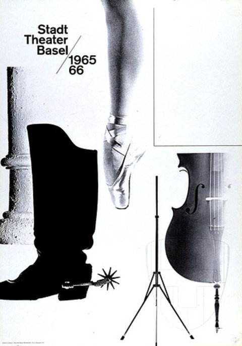
He taught for many years at the Basel School of Design and he wasn’t there long before he replaced Emil Ruder as the head of the school. The Swiss International Style and Hofmann thought that one of the form of communications and was the poster and Hofmann spent much of his career designing posters for the Basel Stadt Theater. His Graphic Design Manual still is reference book for all graphic designers.
Emil Ruder was a typographer and graphic designer who was born in Switzerland in 1914, helped Armin Hofmann form the Basel School of Design and establish the style of design known as Swiss Design. He taught above all typography’s purpose was to communicate ideas through writing. He placed a heavy importance on sans-serif typeface and his work is both unblock (clean) and shortly from his typography.
Most designers classified as part of the Swiss Design movement he favored asymmetrical compositions, placing a high importance on the counters of characters and the negative space of compositions. His style has behavior by designers and his use of grids in design has influenced the development of web design on having a surface without bends.
GRID SYSTEMS
A grid system is framework that is supposed to help graphic designers in meaningful, logical and consistent organization of information on a page. The book Grid System in Graphic Design by Josef Muller-Brackman which helped to spread the knowledge about the grids thorough the world. When we learn from the Swiss Style; it’s easy to embrace the grid system as a visual framework. The grids are more than the art of placing elements; there’s a subtle layer of semantic organization of data not being inherent to the grid is a big part of the Swiss Style’s essence.
This principle is one of the reasons why Swiss Style graphic designers pay so much attention to type. To the Swiss movement, add more elements without exploring the potential of the fundamental ones can be considered a ‘waste’. These basic elements like typography have aesthetic potential, there’s a need for other visual graphics elements.
The Swiss style typography is the use of sans-serif typeface such as Akzidenz Grotesk and Neue Haas Grotesk (a.k.a Helvetica) with this philosophy, graphic designers were aiming at clarity and simplicity. Helvetica is a typeface that is popular because it is used in corporate identity, street signs, magazines and everywhere. The Swiss Style typeface doesn’t have to be expressive in itself, unnoticed instrument of formulation (expression).
The Swiss Style graphic designers use of sans-serif typefaces, they weren’t paying an attention to the historical legacy (something that is) and experimentation with something new. Jan Tschichold himself admitted his book was too strictly. A single lesson from the Swiss Style to love and respect typefaces
Font-Size is a tool for readability It’s very common to spot the use of font-size contrast in the works of Swiss Style. Different font-sizes not only generate visual impact but also provide readers with a hint about the hierarchy of the presented data. The top-level elements are in the content’s information architecture and page’s hierarachy.
Photography is one important part of the Swiss Style is it remarkable use of photography. Following the modernist ideas in which photography was more better tool to portray reality than drawings and illustrations, a very important Swiss graphic design publication at the time, a big part of its satisfied (content) to photography and its application in design.
Graphic Designers hear the term of Swiss Design all the time, if asked to define it, couldn’t better than point to a vague, general gestalt: crisp, blocky layouts, minimalist design ethos, and sans serif typefaces. Swiss Design is basically synonymous with Helvetica means “Swiss” (in Latin, Switzerland was the Confederatio Helvetica) which was designed in 1957.
Their style, which was called the International Typographic Style at the time was guided by the ethos that design should be as invisible as possible. All traces of the designer’s subjectivity should be suppressed in order to let the “happy” of a work shine through. To the axiom of architectural modernism that form should follow function.
Swiss Design was the use of asymmetric layouts with text aligned flush-left, ragged-right; sans serif typefaces like Akzidenz Grotesk and later Helvetica (called Neue Haas Grotesk); the use of photographs instead of illustration; and most importantly, the deployment of a mathematically determined grid to determine the placement of design elements – a method that remains important to this day in web design.
0 notes
Last Seen Blogs