
Last Seen Blogs

runningrider
RunningRider

aymavonkrach
Ayma von Krach

wealthpersonal97
wealthpersonal

songsformonkeys
Songs For Monkeys

ernest-klimko
Ernest Klimko
Text
Infulential Graphic Designers 1960-1975.
“In a sense, the 1960s was a revolution in graphic design. Like in the 1950s, you still have Saul Bass and Paul Rand creating posters and modifying logos, but a lot of changes were happening in their design as well. Alan Fletcher and Erik Nitsche became famous for their branding campaigns, and Keiichi Tanaami delved into animation, lithograph, illustration, and editorial design.”
https://www.hellocreativeagency.com/blog/design-through-the-decades-the-1960s
Wes Wilson
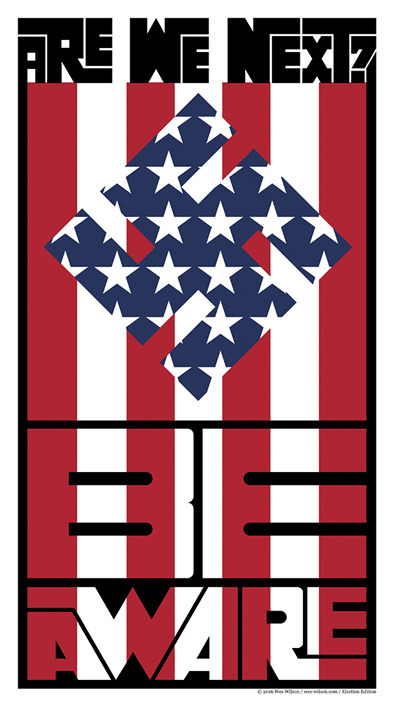
“Wes Wilson might not be a familiar name to many, but his mark on this iconic ’60s design style is not to be missed. He is most known for the “psychedelia” print of letters that made words look like these were moving along waves or even melting off the paper. The psychedelic typeface that Wes Wilson used was a mainstay in the music scene, appearing on posters, magazines and editorial designs that are now synonymous with a “trippy look.”
Victor Moscoso
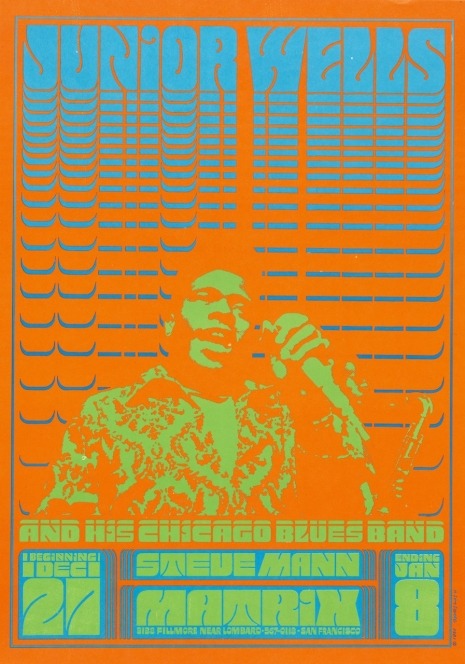
“Borrowing the psychedelia typefaces, Victor Moscoso elevated Wes Wilson’s style by popularizing the use of neon color schemes on poster images. Moscoso was known to be the first to explore the possibility of combining the loudest shades of colors on opposite sides of the color wheel to create intense imagery.”
“Being a former student of the Bauhaus artist Joseph Albers in the 1950s, Victor Moscoso was influenced by him in launching the vibrating colour trend that would typify the psychedelic posters and design concepts.”
https://veradesignblog.wordpress.com/2017/02/23/graphic-design-trends-the-60s/
Roy Lichtenstein
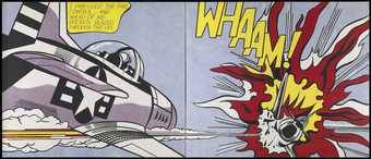
“Roy Lichtenstein is best known for his comic book style that influenced commercial designs as well as today’s design spheres. Rather than using Victor Moscosco’s neon colors, Lichtenstein’s posters sported chromatic color schemes, strong outlines, and repeating dot stencils and speech bubbles — all familiar elements of comic prints.”
Andy Warhol
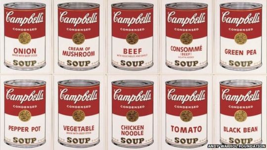
“The most recognizable artist of this era, Andy Warhol, was a graphic designer who aimed to bridge the gap between “high” art and “low” art by using recognizable household brands and items like Coca-Cola and Campbell’s soup cans as a design expression that is still being used today.”
https://creativemarket.com/blog/60s-graphic-designs
Rick Griffin
“Richard Alden Griffin was born near Palos Verdes, California in 1944. Rick learned to surf at the age of 14 at Torrance Beach. In high school in the 1950’s, Rick began copying images from Mad Magazine and then developed his own style of surf doodles. Rick's friends would pay him 50¢ for an original piece penned on their shirts. Rick was also interested in Hot Rod cars and motorcycles, their decoration being amongst his earliest professional work.”
https://www.bahrgallery.com/artist-master/rick-griffin
“Chet Helms and Bill Graham both recruited Griffin to work on their promotions. From March of 1967 through November of 1968, Rick Griffin produced more than two dozen posters for the Family Dog and Bill Graham, plus almost as many commissions and projects done for the Berkeley Bonaparte poster company (in which he was a partner) and for out-of-town clients. Griffin’s first official Family Dog poster hit the streets in March 1967.”
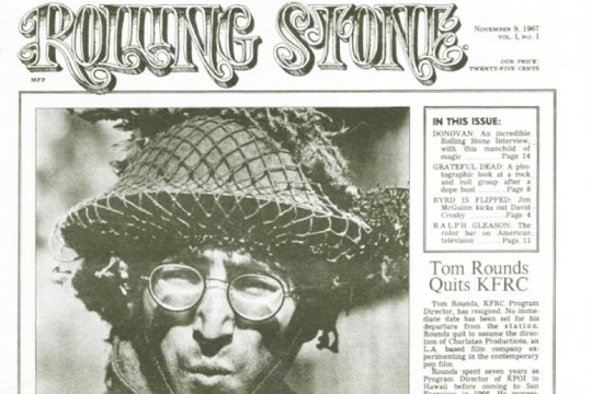
“Early in 1967, Griffin was commissioned to design the logo for a new magazine called Rolling Stone. By July 17, the Big Five (Wilson, Kelley, Mouse, Moscoso, and Griffin) were the subject of the solo “Joint Show” at the uptown Moore Gallery, which generated huge opening-night crowds and massive publicity, including a review in the San Francisco Chronicle. On September 1, Griffin (alongside the Big Five, except Mouse), was featured in a LIFE cover story called “The Great Poster Wave.”
https://www.classicposters.com/artist/rick-griffin/
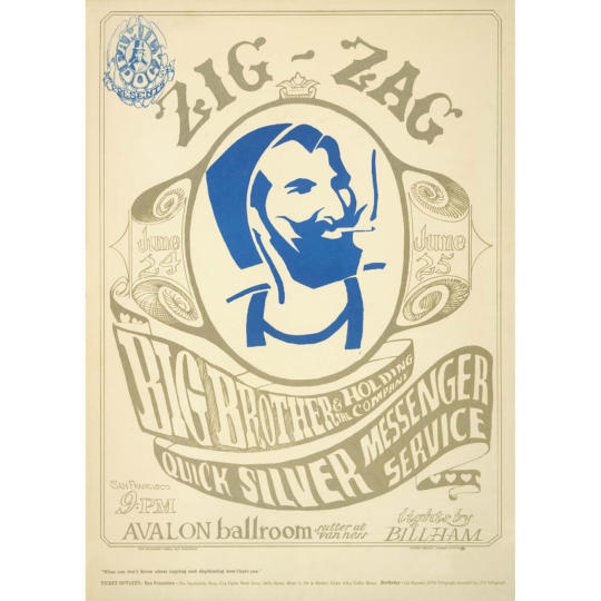
Stanley Mouse
“Stanley found a niche in the Detroit hot rod culture by detailing extraordinary paint jobs on vehicles until no quality hot rod in town could be seen without a Mouse pin-striping job. Soon after, he began applying his favorite subjects to T-shirts with an airbrush. In the tenth grade, Stanley did some graffiti on the high school hang out and was expelled from high school, the silver lining being that he then enrolled in art school.”
“Stanley received his formal training at Detroit’s School for the Society of Arts and Crafts which was connected to the Detroit art museum. He dropped out to follow a higher calling to do rock posters in San Francisco during the sixties wartime era of social revolution, political passion and musical innovation. History was made when Stanley met Alton Kelley – they collaborated for over 15 years and changed the course of advertising art forever. Two of their most famous images, one featuring ZigZag cigarette rolling papers and another, the Grateful Dead skeleton and roses motif, became symbols of a generation. Kelley and Mouse were innovators of the most important art movement of the latter part of the twentieth century. They captured the passion and excitement of the times with their distinctive styles. In 1970 Stanley returned to Detroit and was given a one man show at the Detroit Institute of Art.”
“In the late sixties Stanley moved from San Francisco to London to flame Eric Clapton’s Rolls Royce. From there he did art for Blind Faith and the Beatles and returned to America to work on the signage at Woodstock with Kelley. Kelley and Mouse were working on a Jimi Hendrix cover but Jimi died before it was released. That art morphed into several covers for Journey, including Infinity, Escape and Captured.”
https://mousestudios.com/about/
Alan Fletcher
“Synthesising the graphic traditions of Europe and North America to develop a spirited, witty and very personal visual style, Alan Fletcher is among the most influential figures in British graphic design as a founder of Fletcher/Forbes/Gill in the 1960s and Pentagram in the 1970s.
Alan Fletcher is one of the most influential figures in post-war British graphic design. The fusion of the cerebral European tradition with North America’s emerging pop culture in the formulation of his distinct approach made him a pioneer of independent graphic design in Britain during the late 1950s and 1960s. As a founding partner of Pentagram in the 1970s, Fletcher helped to establish a model of combining commercial partnership with creative independence. He also developed some of the most memorable graphic schemes of the era, notably the identities of Reuters and the Victoria & Albert Museum, and made his mark on book design as creative director of Phaidon.”
https://www.alanfletcherarchive.com/biography
Erik Nitsche
“Born in 1908, Erik passed away 15 years ago, and his work (which ranged from art direction, book design, illustration and typography to advertising and packaging design… Phew!) has now come full circle to fill the gap that many young designers dream of filling; uncluttered, geometric and iconic images, with a smattering of colour which begs to be categorised as “vintage” but, actually, deserves far more in terms of recognition.Working in Germany and Paris in the 1930s and 40s and later in New York and Connecticut, Erik found himself creating imagery which merged the rationalism popular to Bauhaus with more Art Deco inspired references, which perhaps accounts for his popularity among employers. Especially worth checking out is his extensive sci-fi-esque work for General Dynamics Corporation, an American aerospace company, for whom he created imagery more worthy of charmingly antiquated films than an engineering company.”
https://www.itsnicethat.com/articles/erik-nitsche
Keiichi Tanaami
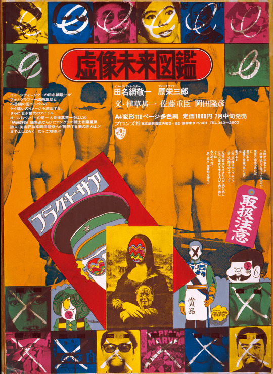
“From the front line, Tanaami observed the Neo Dadaism Organizers' movement, started up in 1960 by artists Ushio Shinohara, Genhei Akasegawa, and Shūsaku Arakawa. "Masanobu Yoshimura had a studio in the Hyakunincho neighborhood of Shinjuku; it was the first private residence designed by Arata Isozaki. Young artists would gather there nearly every day at around sunset, and would hold parties that raved through the night. They were a feast of sounds that existed in that alternate dimension that really represented the '60s, like a feverish ritual with brains and bodies clashing with great noise." Steadily building his career in commercial arts on the one side, Tanaami was also greatly inspired by the presence of these friends. "There was an allure to the air of excitement they exuded and the life they lived, these artists who had adopted antiart, the polar opposite of [commercial arts]. It occurred to me that this mode of expression that stripped away every sort of institution and constraint, that this, too, was indispensable to me."In 1966, Tanaami published Portrait of Keiichi Tanaami, a pop art book which blended Japanese manga with American hero comics, as a "piece of art that is a book, that does not adhere to exhibition on a gallery wall". In the book he wrote the following statement: "I want us to break away from the fixed notion that printed material = facsimile, and to comprehend it rather as the existence of an infinite number of original works. The notions of the quality or the rarity value of a painting are a myth from an era dominated by the idea that only the single piece containing the trace of the artist and every thought within, constituted as art, the pure form of painting." In 1967, Tanaami changed his mind with conviction upon seeing some of Andy Warhol's works in person during his first trip to New York.”
https://keiichitanaami.com/en/bio.html
0 notes
Text
Trends that could’ve effected branding, 1960-1975
“Trends come and go, but historical influences are forever. Art movements have always been defined by the events that shaped a certain period. A new way of thinking often eventually gives way to new ways of expression. The 1960s is one such era, which paved the way for innovations and colorful counterculture that inspired much of the graphic design that we know today.“
https://creativemarket.com/blog/60s-graphic-designs
“The 1950s was an era of newfound American Dream innocence, and what followed was a shattering of that naivety. Graphic design in the 1960s emerged after the brutality of the Southeast Asia wars, an increasing racial divide, and the rebellion of the youth against the cultural norms. Sex, drugs, and rock and roll dominated the scene, and the art and design of era reflected these changes. From the geometric layouts and clean and prim forms of the 1950s, graphic design in the 1960s evolved to incorporate asymmetrical experiential styles and messy grunge abstracts.”
“The geometric layouts of the ‘50s filled with straight lines and angles were replaced by dizzying optical illusions with repeating patterns. Known today as “Optical Art,” this abstract style aimed to show the mind-altering perceptions that defined the 60s. Pop art also emerged and evolved with Andy Warhol. It was an ironic homage to materialism and consumer culture and served as a kind of protest art against the rising elitist impressionism of art culture. It ultimately served to bridge the divide between high-end art and contemporary culture.”
https://www.hellocreativeagency.com/blog/design-through-the-decades-the-1960s
From the beginning of the 1960′s design was about rebelling against the normal and trying something inventive.
There was a push back against consumerism, and Helvetica around the same time, two things that were closely associated. During this times, there were lots of brands that decided to follow trends of the 50′s and develop organically, and those who wanted to keep up with pop-culture which was anti-consumerist at the time. This is interesting because with a push back against big brands, certain brands wanted to re-brand to disassociate with a ‘corporate’ image, and present themselves as friendly, warm and welcoming.
“The 1960 is an important decade in history, as a series of major social, cultural, environmental, political events and technological advancements-determined a powerful shift within the society. Major events like the Vietnam war, the Cuban revolution, the fight for women’s rights and black people’s liberation, the mass culture, pop music and hallucinatory drugs, all these found graphic expression. The strictness and conformity of the previous decade was now challenged by the people, and as any other aspect of it was affected, graphic design too became subdued to change.”
“The new forms and ideas filled the gap between the cold formality of the Swiss style and the popular taste, and released a new wave of energy which was also shown through the avalanche of posters-ranging from cultural events to protest messages.”
https://veradesignblog.wordpress.com/2017/02/23/graphic-design-trends-the-60s/
“Psychedelic Art borrowed most of its design identity from art nouveau, using hand-drawn illustrations and typography styles that leaned heavily on curvilinear shapes and vibrant, almost neon, color schemes.”
“Pop Art evolved from an homage to consumer culture to a now enduring style of mixing different media from different times to evoke a sense of familiarity. It is usually known for its use of everyday items in branding for businesses. The pop art movement is also known for eye-catching deliberate collages of the familiar that artists use to paint society as they saw it.”
“Optic Art or Op Art was primarily inspired by the repeating abstract patterns of the previous decade. Similar to the modern day optical illusion, Op Art sought to confuse and amuse through vibrant color schemes and dizzying arrangements of shapes and other design elements.” “The Op Art style feels like the middle ground between the ’50s and ’60s. The clean repeating shapes in vivid colors changed at the turn of the decade and these straightforward design choices gave way to a trend that featured optical illusion-inspired imagery.“
“Lesser known styles that were also cultural hallmarks of the 1960s include minimalism and conceptual art. Minimalism as a movement was a response to the consumer culture-driven decade that came before it, finding expression in clean lines and textures that elevated liminal or empty spaces.”
https://creativemarket.com/blog/60s-graphic-designs
“As the 1960s were times of radical social changes, with the beginning of the peace movement and the psychedelic era, with it came new fonts and designs which were created to support the innovative ideas flourishing at those times. One of the most important designers of psychedelic posters was Wes Wilson, who heavily influenced typography by inventing a new font around 1966, which became synonymous with the era. It was the psychedelic font which made the letters become more dynamic and look like they are melting away from the prints. Typography was used as a way of spreading ideas about the ongoing social changes, protests and ways of adopting a new lifestyle. One of the key designers who also played an important role with his color experiments was Victor Moscoso, who used the concept of vibrating colors on his typographic posters, created by taking colors from the opposite end of the color wheel, with equal value and intensity.“
“Concerning the technology of the 1970s, it included the invention of third-generation typesetters which used electronically stored font data.”
https://www.widewalls.ch/magazine/typography-history-art
“Graphic design in the 1970s was all about bright and clashing colors with balloon like letter forms. It was as if the serif fonts of the 60s got eaten by the rounded typography of the decade. However, the psychedelic rock concert posters remained and added to the bright and glorious 70s. Bell-bottoms and disco ruled the decade. Some hated it, others feel nostalgic about it. Either way, graphic design in the 1970s got to be experimental. Everyone was playing with different styles and types. It was a playful and memorable time for everyone.”
“Graphic design in the 1970s saw an evolution in advertising. In this era, close-up faces of people declaring their devotion to a product became the norm. Cartoons and drawings are filled with anthropomorphic characters. Photography also became more popular. Photos were often dazzling or in grayscale. Collages were also widely-used together with eye-catching typography. The sullen, starkly-drawn housewives of the 50s were also replaced with perky human beings.”
“Typography in the 1970s also developed due to the availability of typesetting technology. This technology made revolutionary typography possible. In this decade, typography was used to combined with photography to create attractive graphics. Everything was bold and bright. Elements such as 3D styles and large letterings were the standard.”
https://www.hellocreativeagency.com/blog/design-through-the-decades-the-1970s
“The free-flowing style of typography took a prominent place in the 1970s as a retro design trend. The technique of writing fonts in a very flowy and free manner and not to write anything in a congested form. From bubble and cloud-like shapes to texts in neon sign-inspired linework.”
https://www.glorify.com/learn/retro-design-trends/
0 notes
Photo


Significant Events 1960-1975 that could’ve effected branding.
1956 Japan becomes member of the UN.
1960′s - UK - For the first time, virtually all houses had electricity.
1960′s - UK - The first supermarkets opened – mainly in town centres. Now you could buy all your food in one shop.
1960s popular music began to diversify and more sub-genres emerged as the worlds of R&B and Rock 'n' Roll became more profitable.
1961 Soviet Cosmonaut Yuri Gagarin becomes the first person in space. One month later, Alan Shepard becomes the first American in space.
Live trans-Atlantic satellite television via the Telstar satellite was made possible in 1962.
1962 The first computer video game, Spacewar, is invented.
1962 The Beatles release their first single, "Love Me Do," in the United Kingdom.
1962 Sam Walton opens the first Wal-Mart store in Arkansas.
1963 United States President John F. Kennedy is assassinated by Lee Harvey Oswald.
The Beatles began their career. They leapt to fame in 1963 with 'Please, Please Me'.
1963 U.S. Civil Rights Leader Martin Luther King Jr. gives is famous "I Have a Dream" speech.
1964 The first successful Minicomputer, Digital Equipment Corporation’s 12-bit PDP-8, is marketed.
1964 NASA's Mariner 4 space probe successfully approaches Mars and becomes the first spacecraft to take images of a planet from deep space.
1964 The Ford Motor Company begins to produce and sell the Ford Mustang.
1964 Tokyo hosted the Olympics, marking the first time the Games were held in Asia.
BBC 2 went on air in 1964 and was the first channel to have colour in 1967.
1965 Sony markets the CV-2000, the first home video tape recorder.
1965 The Vietnam War escalates and opposition to it begins to mount as anti-Vietnam protests become more common.
1965 Mary Quant designs the mini-skirt in London and it becomes a fashion craze.
1966 The first episode of the popular television show "Star Trek" airs.
1966 The Soviet Union's Luna 9 unmanned spacecraft lands on the Moon.
1966 All cigarette packets in the United States must carry the health warning "Caution! Cigarette smoking may be hazardous to your health."
1967 Rolling Stone publishes its first magazine issue.
1968 The first public demonstration of the computer mouse, video conferencing, teleconferencing, email, and hypertext.
1968 The first manned Apollo mission, Apollo 7, is launched by NASA.
1968 Japan surpassed West Germany to become the second largest economic power in the world.
1969 Arpanet, the research-oriented prototype of the Internet, was introduced.
1969 Neil Armstrong and Buzz Aldrin become the first men to arrive on the Moon during NASA's Apollo 11 mission.
1969 The Woodstock music festival takes place in New York and features such acts as Janis Joplin, Jimi Hendrix, Jefferson Airplane, and The Who.
1969 The popular children's television show "Sesame Street" debuts.
1969 Student protests against the Vietnam War and American use of bases on Japanese soil culminated in a short-lived takeover of Tokyo University.
1960′s - UK - Most homes had televisions by the end of the decade.
By the 1970s Japan ascended to great power status again. Japan had record high economic growth during the Japanese economic miracle.
The best-selling car of 1970s was the Ford Cortina.
Pocket calculators and digital watches first went on sale in the 1970s. By the end of the decade, they were cheap enough for most people.
It was only by the middle of the 1970s that more households had a telephone than did not. Even in 1979 only just over half of households had a family car.
1980 Japan became the biggest motor vehicle producing country in the world with 11,042,884 motor vehicles compared to the USA's 8,009,841.
1983 The domestic North American video game market crashes, allowing the Japanese industry to take America's place as the world's largest video game market.
4 notes
·
View notes
Text
Mazda 1975
The company was established in 1920 in Futu, a suburb of Hiroshima. Its founder, the son of a simple fisherman, Jujiro Matsuda, bought the building materials factory but decided to produce not only products for the construction of traditional Japanese houses but also engineering equipment. During this period, several motorcycles were manufactured at the factory, one of which won local races in 1930. And in 1931, the first lorry named Mazda appeared on the streets of Hiroshima.
The brand’s name is derived from the name of its founder, Jujiro Matsuda, which European pronunciation is Mazda. But it also has another meaning — in Asian civilizations there is a god of harmony, wisdom and light, Ahura Mazda. The brand’s founder was a very spiritual man, so Mazda name and logo are considered to have a lot of hidden meanings inside.
In the first years of its history the company was focused on manufacturing tools and heavy machinery. So the original brand’s logo was simple and minimalistic.
Have you ever wondered about the history and evolution of the Mazda Logo? After all, it has seen some drastic changes throught history. The Mazda logo we see today is actually a highly-styled “M” with its arms raised like wings, symbolizing the brand’s “flight toward the future.” This emphasizes the wide “V” angle in the middle of the “M,” which represents the automaker’s self-proclaimed creativity, vitality, flexibility, and passion. It’s circled by the future, the doorway to the 21st century. Overall, it intends to appear sharp, evocative, and hopeful.
In the first years of its existence, when the plant produced only engineering equipment, the emblem was a stylized image of a milling cutter for metal cutting and machine parts.
1934 The first emblem placed on the front radiator of the car was only the name of the company, written in elegant oblique italics in the Japanese style of writing – with thickening letters and pointed edges with small serifs – dark-blue color.
The logo was again radically changed. The year 1959 was a landmark for the company – the first Mazda passenger car was released. The emblem was a white circle in a thin red frame. In the center is the handwritten letter “m” in the lower case with elongated sidewalls – left up, right down. The bright red letter attracted attention with its soft, soothing lines and unusual presentation. And under the circle was placed the name MAZDA in capital letters, but with a slope. The color of the inscription is blue.
The oil crisis struck the automotive world in 1973, the demand in vehicles powered by rotary engines suffered a major decline due to poor fuel efficiency. That caused setback in Mazda expansion and the company was forced to sell a big stake to Ford Motor Company.
In 1975, the owners decided to return to a simpler and more spacious logo – only the name of the company but made in the original minimalistic and stylish font. It was developed by order and had no analogs. This font is called “Mazda” and is still in use today. Its peculiarity is low capital letters, the spelling of the first “m” in lower case, and the letter “z” with white diagonal stripes. The color is light blue.
https://logos-world.net/mazda-logo/
https://1000logos.net/mazda-logo/
https://www.berwickmazda.com.au/2019/10/09/mazda_logo_evolution/
https://car-brand-names.com/mazda-logo/
0 notes
Text
Nasa 1975
The National Aeronautics and Space Agency (NASA) is the institution in focus. It has and continued to lead one of the ambitious and adventurous space explorations in history. Its contribution to the world of science and technology is gigantic and impactful.
One of the most reputable and influential organizations in the world, NASA, hasn’t had many logo redesigns during its history, but the two that are still in use by the Administration are very well known across the globe and both have funny nicknames — “Meatball” and “Worm”.
Though there was one more logo, not that famous. It was a visual identity for the National Advisory Committee for Aeronautics, or NACA, the predecessor of the NASA, formed in 1915.
The logo of NACA featured a stylized badge with wings, colored in yellow with the black outline. The wordmark, executed in black was placed in the central part of the emblem and written in a simple yet stylish sans-serif typeface.
It was a well-balanced and professionally executed badge, which brilliantly reflected the nature of the organization and its purposes.
NASA was born in 1958, and its logo — one year after, in 1959. It was developed by one of the Administration’s employees, James Modarelli, and instantly got its “Meatball” tag. The logo, which was used until 1975 and brought back in 1992, is composed of a blue circle, representing the sky, with white stars, and a red V-shaped line or ribbon, which was aimed to represent the aeronautics in general.
The wordmark in bold serif lettering is colored white and placed in the center of the circle, with a thin white orbit around it.
Widely influential logos are significant to the target market they serve. The NASA logo design with its graphic elements of stars, orbit, and planet is important to its mission of exploring the solar system.
The NASA trademark is highly memorable. Its creative use of blue, red, white, and other recognizable design elements creates positive connections with its stakeholders. This emotional connection sticks in the minds of its audience and helps them to remember it.
With a short attention span among people, designers aim for simple logo designs. Though some people may argue that the NASA logo contains many graphic elements, it’s not overly elaborate. It’s modest enough for its audience to understand its emotions.
Pioneer 10 and 11, which launched on the 2nd of March 1972 and April 5th, 1973 respectively, both traveled to Jupiter and Saturn. Their mission was to explore the composition of interplanetary space and the two planets.
In 1975, NASA launched the two Viking spacecraft to look for basic signs of life on the planet Mars. They arrived at Mars in 1976 and were, at that time, unable to detect any signs of life.
Other important probes include the highly successful Voyager 1 and 2 craft. These were launched on the 5th September 1977 and August 20th, 1977.
In 1975 Richard Danne and Bruce Blackburn developed a new emblem for the space organization. This move was a part of the Federal Graphics Improvement Program. All the lines forming the word “NASA” had the same width, while the bars from the “A” characters disappeared, and thus the customized type resembled a worm. That’s why the emblem was nicknamed the “NASA worm”. This version of the emblem was used for 17 years, then the company decided to get back to its roots and return to its “meatball” insignia.
The “Worm” insignia was designed for NASA in 1975 and then was replaced by the circular emblem in 1992, but brought back as a secondary badge in 2020. It is a logotype, where capital letters are executed in a custom smooth sans-serif typeface, featuring rounded angles and distinct cuts. Both “A” of the inscription have their horizontal bars removed.
the red worm logotype came in a custom sans–serif Std Bold and Nasalization Bold. They are clean, readable, and attractive.
The smooth contour of the inscription resembles a worm in motion, this is where the funny nickname came from.
The “Worm” emblem has an inscription made with a simple smooth sans serif typeface, provided with clear cuts and rounded corners. Both “A” has no horizontal bar. Moreover, the right leg of the central “A” is connected to the beginning of “S.” The Meatball logo has an uppercase font, thin letters with serifs. The palette is three-colored and consists of white, blue Pantone 286, and red Pantone 185.
1990 saw the launch of the hugely important Hubble Space Telescope into Earth's orbit. As momentous an occasion as this was NASA scientists would soon realize that there was a problem with their new toy.
It was discovered that a microscopic spherical aberration in its polished mirror was causing significant limitations to its potential power. This was corrected during a scheduled servicing mission in December of 1993 when a team of astronauts performed a series of spacewalks to corrects Hubble's optics.
1992 Nasa began to use the previous ‘meatball’ logo again.
https://1000logos.net/nasa-logo/
https://logos-world.net/nasa-logo/
https://blog.logomyway.com/nasa-logo/
https://interestingengineering.com/a-brief-history-of-nasa-60-years-of-exploring-the-unknown
0 notes
Text
Patagonia 1973
Patagonia sportswear brand is unique, as it is the initiator of the so-called circular economy. The history of the company, as well as its logo, is very interesting and instructive and is a classic example of how a hobby of one person can create a new direction of world significance.
Initially, he (Yvon Shuinar) was engaged in the production of climbing equipment, but in 1970 from a trip to Austria, he brought home several sports kits that his friends and colleagues liked. And then Yvonne decided to switch to the production of expensive and very high-quality clothing made from natural materials intended for tourism and mountaineering. The founder chose the name for his eco-company in honor of his favorite mountains in South America.
The logo of the American clothing line Patagonia depicts the Fitzroy Massif in Patagonia, one of the company founder’s favorite places.
The founder of the clothing line, Yvon Chouinard, is a keen rock climber. At the beginning of his business career, he forged hard, reusable pitons by hand, and sold them. By 1970, however, he found out that the pitons, which were his company’s main source of income, destroyed rock routes. As an environmentalist, he made the tough decision to stop producing them and replace them by aluminum chocks.
Yvon’s another business venture was connected with clothing business. During his trips abroad, he bought unusual, unique clothes and sold them to the rock climbers he knew. The business flourished, so Yvon decided to start his own clothing line.
He used to spend a lot of time in Argentina and enjoyed climbing the Andes Mountains in Patagonia – the southern part of South America. At the time, he just returned from there, so the idea to call the company Patagonia seemed perfectly natural.
For the logo, he chose the skyline of the Cerro Fitz Roy (the Fitzroy Massif) in Patagonia, above El Chaltén.
Jocelyn Slack, the author of the logo, described the process of creating it in one of the company’s catalogs. She said that it was actually Yvon Chouinard who “designed” the logo, while she “simply executed” it.
They worked together: Jocelyn did sketches and modified them according to Yvon’s comments. She had never visited the place, so she relied on his ideas and, of course, photos of the range. As Jocelyn put it, the logo is as powerful as the desire behind it. “Yvon knew what he felt and what he wanted,” Jocelyn recalls, and that was why she called him the author of the logo.
Jocelyn Slack is an artist working in a variety of fields, from sandblasted glass and magazine illustration to fabric design. She studied in California College of Arts and Crafts and Banff School of Fine Arts in Alberta, Canada.
The typeface featured on the Patagonia logo looks exactly like Belwe Bold. The serif typeface was designed by Georg Belwe of the ITC type foundry.
In addition to black and white, the emblem also comprises several shades of blue, and a soft shade of orange. This combination represents the colors of the Patagonian sky when the sun is not far from the horizon.
For the first time, the emblem appeared on the label of branded products in the 1976 spring collection.
Today, the brand is the largest in its industry; the company was one of the first to master the production of thermal underwear, and also began to use new materials and bright colors in sportswear. Patagonia has its philosophy, which is expressed in every detail of products and unique types of service.
Integrity. Trustworthy. The ability to stand the test of time.
Mountains are powerful symbols that communicate strength, confidence, adventure, and purpose. They also represent nature and the expansiveness of the great outdoors.
It’s no surprise, then, that mountains are popular symbols in logo design, especially in industries like beer, bottled water, tourism, camping, outdoor equipment, and more. (Also, if you have the word “summit” in your company name, there’s a good chance you’ll have a mountain in your logo).
https://1000logos.net/patagonia-logo/
https://logos-world.net/patagonia-logo/
https://uxdesign.cc/how-to-design-a-mountain-logo-that-reaches-new-heights-6d8541a84e36
1 note
·
View note
Text
Crayola 1972
The logo of the US-based manufacturer of arts supplies Crayola has a positive and artistic mood. The design has gone through over ten complete overhauls since 1903.
“From its earliest days, Crayola has been a color company. During the last 100-plus years, Crayola has grown beyond our founders’ wildest dreams. By applying technical innovation, unparalleled quality, consumer satisfaction and product value, Crayola has become the preeminent producer of hands-on products for creative personal development and fun.”
- https://www.crayola.com/about-us/company/history/
1967-1983 Helvetica Logo? First time lower case letters have been used.
1972-1997 A simple black-and-white color scheme was adopted. The type was bolder (Futura Bold). This wordmark was easier to reproduce on various surfaces. The brand usually uses visual devices features to inject artistic flare into the brand identity. The only logo with no colour, and no artistic flare.
This iteration doesn’t reflect much of the brand identity, and the font adds nothing to suggest the purpose of the product.
1997 The design adopted an optimistic and artistic mood. The wordmark was now dark green with gradient and shades adding some volume. A rainbow coloured stroke below embodied the artistic spirit of the brand. The first time the rainbow was introduced to the logo.
Font The earliest logos featured serif typefaces, while, in 1930, the era of sans serif fonts started. The current type (Cronos Bold) looks plump and rounded, which creates a friendly impression.
Colours Yellow and green have been present in the Crayola logo, in one form or another, for much of its history. And yet, the company has experimented with the palette a lot, changing the hues and the proportions, as well as adding various other colors.
The most current logo it made up of design features from older logo’s, from before and after the 1972 logo, but not the 1972 logo.
https://1000logos.net/crayola-logo/
https://logos.fandom.com/wiki/Crayola
https://frankdonnivyn.wordpress.com/2011/01/28/the-progression-of-the-crayola-logo/
0 notes
Text
Burger King 1969
Burger King is a fast-food restaurant chain, which was established in 1953 in the United States. The chain is famous for its hamburgers and french fries and today is one of the most popular fast-food brands worldwide.
The visual identity of the world’s famous fast-food chain had five redesigns during the company’s history. It took the brand 16 years to find its signature style and three various logos were created from 1953 until 1969. However, after the success of 1969, the chain only refined and modified the iconic emblem, keeping the color palette and compositions almost untouched.
1953 It was a bold all-caps wordmark with half of the sun, rising from it. A bright and friendly emblem, which stayed with the brand for only one year.
1954 The logo was changed to a minimalist bold inscription in a custom sans-serif typeface, with uneven edges of the letters. It was a simple logotype, without any additional details, which was the symbol of the brand for three years.
The very first BK’s own logo was this one – a rather basic black writing that says ‘Burger-King’. The font is interesting – it features abrupt and artistically inconsistent letters. Still, it wasn’t very prominent, which is why they scrapped it just a few years later.
1957 The typeface and color palette of the logo was changed in 1957. Now the red lettering was placed on a light ochre background, looking bright and memorable. The font was changed to a bolder and neater one, it was something close to the TILT font, a modern sans-serif with playful letters.The new logo featured a delicate “Home of the Whopper” tagline, where all letters except for “Whopper” were black.
Its predecessor was Insta-Burger King, founded in 1953 and named after the Insta-Broiler oven, where the patties were originally fried. It was renamed in 1959 after restructuring. The brand didn’t redesign it’s logo immediately after restructuring, as we see with some other brands. It took 10 years to redesign the logo, and the changes were not significant at all.
1969 The prototype of the iconic Bun logo was created in 1969. The red bold lettering was placed in two levels between two halves of the bun, colored in ochre. The color palette was taken from the previous logo version, yet the style, composition, and shape were completely different.The inscription was now executed in a bold rounded sans-serif with sleek smooth lines. The “King” part was enlarged, in order to create a better balance between the layers.
For many years, the logo consisted of two halves of buns (Bun Halves) with the company’s name in between. All the shapes were fluid and soft in this iteration. This detail has become a key part of the brand’s image.
1994 The company refined the logo in 1994. The typeface is now more traditional and solid, while the ochre of the buns was changed to bright orange, making the logo more energetic and strong. The red and orange color palette symbolizes passion and young free spirit, showing the main audience of the company.The wordmark in all capitals is executed in a bold rounded sans-serif, which is close to VAG Rounded ExtraBold font, but with the letter “G” and tails of both “R”s flattened, which makes the inscription look more solid and confident.
In 1999 the Burger King logo was redesigned by Sterling Brands agency. The wordmark between the bun-halves was now placed diagonally, with buns colored yellow with some white strokes. The red lettering is now enlarged and executed in a new modern sans-serif typeface with sleek lines and sharp angles.
Today’s version of the logo has a rounded shape, unlike the previous ones. The emblem has a blue C-shape line, framing in on the left, an accent, making the logo brighter and more professional, adding confidence and a sense of expertise.
The Burger King logo is one of the most iconic visual identity designs in history, it is perfectly balanced in terms of color and shapes, and evokes a friendly and welcoming feeling.
In 2021 the Burger King visual identity gets a new design from Jones Knowles Ritchie. The new logo is composed of a bold red lettering placed between two orange buns. The light cream background of the image also makes a framing for the emblem, making it look warmer and friendlier. Blue color is completely removed from the brand’s palette.
The logo of Burger King is a reflection of a modern and powerful company, which values tradition and legacy. Its emblem is a perfect reflection of the company’s nature and purpose, instantly recognisable across the globe.
https://1000logos.net/burger-king-logo/
https://logos-world.net/burger-king-logo/
https://logolook.net/burger-king-logo/
0 notes
Text
Co-op 1968
The Co-operative Group is one of the world’s largest consumer co-operatives, owned by more than eight million members. It is the UK’s fifth biggest food retailer operating across the country with almost 2,800 local, convenience and medium-sized stores.
1968 This was an iconic and simple design that had mass appeal and was easily recognised globally. When looking to rebrand the Co-op looked at various options for their new look. Do they spend a fortune on a complete new look and rebrand or is there merit in sticking with a tried and tested brand.
Founded in England in 1844, and now commonly known as the Co-op, the group has brought back its “clover leaf” logo, originally designed in 1968.
London-based North initially investigated creating a completely new identity, but following extensive research into the Co-op’s history they decided to propose a move back to the past.
The logo was redrawn from archive material and given an updated colour scheme to modernise the 1968 palette. It’ll be seen on signage, packaging, uniforms, vehicles, literature, and digital content.
“Returning to the familiar can be a radical act, but it is the timeless quality of this iconic logo that makes such a move possible — it is distinct, recognisable, approachable, and dynamic, giving us the opportunity to signal a shift back to the ideas that made the Co-op special for its customers.”
— Sean Perkins, North
“Back in the 60’s the Co-op was the biggest supermarket in the UK. This is a return to that confidence, to make their own way and do things in a c0-operative way.
The new signage especially is much better, less brash, generic, corporate cookie cutter, cheap looking signage. This reflects the fact that the Co-op generally has pretty good products and lots of ethical lines (they were a pioneer of Fairtrade products).”
https://www.logodesignlove.com/co-op-logo
0 notes
Text
H&M 1968
H&M is a popular Swedish company that manufactures and markets a wide range of clothing lines. Its products are available in brand stores around the world. In 2008, the range expanded to household goods.
Erling Persson, the company’s founder, originates from Sweden. He has been affected by World War II just like many of his peers. However, it also helped his business a lot. He got to the USA where he witnessed a completely different approach to clothes commerce. They paid more attention to the needs of the customers. And so Persson decided to adopt the tactics and offered usable clothes designs at reasonable prices in his homeland. That’s where the history of H&M begins.
The evolution of the logo of this brand began with the word “Hennes.” This word was on the first version of the company logo. It translated from Swedish means “Her,” which single-handedly flaunted on the original emblem. This continued until the founder of the brand bought another retailer – a competing retail chain.
The H&M logo represents the company itself since it contains nothing but its name. The sloppy but stylish lettering design symbolizes youth and energy because the main target audience of the brand is students and teenagers.
It was then that the name of the company changed to Hennes & Mauritz and with it the logo. In the same period, designers added a graphic to the verbal designation. But gradually, the phrase was “narrowed” to two letters, which laid the foundation for a recognizable image. The trading network has three basic varieties of the logo and one variation.
Scandinavian design tends to be minimalistic and the first H&M logo wasn’t an exception.
1947-1968 In the year of foundation, the company received a simple logo: a light name on a dark background. The word “Hennes” is written in italics and is positioned at an angle extending upward. This is an interesting psychological technique, as optimists write this way, directing the end of the line not down, but up.
Persson bought Huntsman clothes store, and the previous owner (Mauritz) became the first shareholder of the new Hennes & Mauritz.
1968-1999 Interestingly, in that period, two emblems arose almost immediately: one in a detailed version, the other in a minimalistic one. Full symbolism included graphic and textual parts. It was the double name “Hennes Mauritz,” obtained after joining another company to the main company. Words are located separately from each other to the left and right of the trademark and made in a thin font in the upper case. Between them is the abbreviation “H & S,” divided by an ampersand and placed in an uneven circle.
The second logo is short and bright. If the first option is presented in black and white, then this one is in deep scarlet. It contains the letters “H & S” made under careless brush strokes – exactly as in the previous version.
This is the first time colour was introduced into the H&M logo.
The lettering was written in Sans-Serif that was a very popular font back then. And shortly after that, in but a few years, some redecorations were applied to the logo resulting in an ultimate H&M logo version that hasn’t been changed throughout centuries. Logo is featured a HM Amperserif font.
Why is H&M logo red? The creators of the H&M logo made it red to make it bright and memorable. Thanks to this color scheme, the symbol immediately attracts attention.
1999 The logo of that time acquired intense colors: designers replaced scarlet with dark red. Letters slightly corrected, stretching them out and slightly increasing the slope to the right. It is only known that in 1999 it was updated by the designers of the independent Swedish agency BVD. They tweaked the lines a bit to make the letters more harmonious.
The modern version consists only of letters and ampersands, so the developers paid great attention to the font. It is individual, italic. Its distinguishing characteristic is the crossbar at the letter “H,” which is much wider than is accepted in the classical spelling and goes beyond the boundaries of the vertical sidewalls. In particular, the developers focused on simplicity, energy, youth, and passion, which influenced the choice of color.
The “H&M” lettering on the logo is in a personalized font. The letters are drawn rather than printed: strokes are of uneven thickness and look like brushstrokes. The horizontal stripe at “H” is beveled and extends far beyond the two vertical lines. Although the typeface was created specifically for the company, it is vaguely similar to Dom Diagonal by Peter Dombrezian.
In general, the logo conveys passion as well as youths’ desire for standing out from the crowd and finding where they belong. It is extremely recognizable. You can hardly confuse it with some other logo.
https://logos-world.net/hm-logo/
https://turbologo.com/articles/hm-logo/
https://1000logos.net/hm-logo/
0 notes
Text
Nintendo 1967
Nintendo is a Japanese video game and consumer electronics multinational company based in Kyoto. Founded in 1889 by Fusajiro Yamuschi, Nintendo started out as a playing card company and enjoyed great success long before the era of electronic toys and videos.
However, it wasn’t until the release of Nintendo Entertainment System in 1985 that the company became a truly globally recognizable brand. Today, the Nintendo Company Ltd. is one of Japan’s most valuable companies, with a considerable market share of the worldwide video game industry.
The cards were also quite durable, which meant relatively poor sales since customers did not have to replace them that frequently. To address this problem, the company started making lower-quality, cheaper cards while also expanding distribution to such cities as Osaka, where the demand for card games was very high. Additionally, local merchants liked the prospect of customers being able to continuously renew their decks, which helped avert suspicions regarding the re-use of the cards.
From official company records, the first western-style deck by Nintendo was released in 1902. Other documents date this to 1907 when the company partnered up with Japan Tobacco to distribute its card games through the latte’s cigarette stores operating throughout the country.
In the same year, Yamauchi adopted his son-in-law, Sekiryo Kaneda, so that he could later take over the family business, as was dictated by Japanese culture. Sekiryo would later go on to become the president of the company in 1929, by which time Nintendo Koppai had established itself as the biggest card game maker in the country.
1950: Hiroshi takes over the company from his grandfather Sekiryo and renames it Nintendo Playing Card Co. Ltd. Hiroshi makes a host of other major changes such as centralizing manufacturing operations.
1950: Logo in English
1967: NEW LOGO (Helvetica Condensed Black Modified)
1969: Gunpei Yokoi joins the company to run the research and development department, thanks to his experience in making electronics devices.
1970: The company produces the Nintendo beam gun, Japan’s first electronic toy. The company starts trading in the Osaka stock exchange around the same year.
In 1979, Nintendo opened its American subsidiary in New York City. The company created a new arcade games department in the New York subsidiary, with a view to developing new electronic arcade games. In 1980, the company released Game & Watch, the first handheld video game system. The product became a huge success, with sales of more than 43 million units worldwide and a total of 59 games created for the device.
By 1975, the Nintendo wordmark's typeface reached its final form. The standalone wordmark, without the rounded rectangle shape surrounding it, is only used on copyright notices, Game Boy boot up screens and its corporate headquarters in Kyoto. It was used as the sole logo until 1977, which was around the time Nintendo released its first home video game systems. This wordmark is still used internationally today.
11 versions of logo between 1950 and 1975. Lots of different font styles.
https://blog.logomyway.com/nintendo-logo/
https://logos.fandom.com/wiki/Nintendo
https://logos-world.net/nintendo-logo/
https://turbologo.com/articles/nintendo-logo/
0 notes
Text
Nissan 1960
The meaning of the Nissan logo comes from the “traditional” Datsun logo, inspired by Japan’s “Land of the Rising Sun” nickname and Japan’s flag. ‘Rising Sun’ represented in early logos and later on by incorporating red into typeface.
The name of the company, Nissan, can be translated from Japanese as a “sun product” or a “birth of the sun” (“ni” stands for “sun”, and “ssan” means “birth” or “product”). And the brand’s visual identity has always been a good reflection of the name’s meaning.
Nissan always aimed to give new designs and technologies to the world’s automotive industry, showing the value of its roots and heritage.
In 1931, DAT Motors produced a smaller car called the Datsun Type 11. It was called Datsun because it was the ‘son of DAT’.
1934 Company renamed Nissan.
At the beginning of the 1950s, the brand simplified its logo, by using a rectangular with all-caps lettering on it. The colour palette remained red and white, while the font became stronger and the letters — bigger.
The red rectangular had rounded angles and a white framing, which made it look soft and stylish.
1953 was a dramatic moment in Nissan’s history because of anti-communist sentiments after the Korean War ended. Nissan’s labor union acted harshly and fired hundreds of workers, and even had union leaders arrested. Eventually a new union was formed that helped Nissan expand rapidly, in terms of technology.
Nissan started expanding worldwide in the late 1950s, when it realized that the small Datsun would fill a hole in the Australian and US auto markets. Nissan showed cars at the Los Angeles Auto Show in 1958 as Datsun, and then opened a subsidiary in the US in 1960. A plant was built in England in 1986 and by 2007 produced over 400,000 vehicles per year, which became the highest producing plant in Europe. Nissan also has plants in Brazil and sells cars all over the world. Nissan is especially popular in China, where it sold more than half a million units in 2009.
1959-1960 The new Nissan logo was based on the previous version, but the lettering became more angular and there was no frame this time.
The sharp and straight lines of the typeface were a reflection of the progress and power of the brand.
In 1960, designers went on an experiment: removed the background geometric shape and made the word red. To enhance the effect, they chose the original handwritten font.
1960-1967 The Nissan logo from the 1960s features cursive lettering with sharp lines. It looks modern and elegant. The wordmark is now executed in red in a white background. It is a minimalistic and sophisticated visual identity, which stands out among other brand logos.When placed on cars the wordmark is silver, which makes it look more expensive and stylish.
1970-1983 Nissan brings the rectangular framing back. The wordmark is in all-caps again, with a traditional serif font. The thin and straight line of the letters makes the logo look clean and neat, it is now modern and evokes a sense of technologically-centered approach.
https://logos-world.net/nissan-logo/
https://blog.logomyway.com/nissan-logo-and-the-history-of-the-company/
https://1000logos.net/nissan-logo/
https://www.nissanofcanton.com/dealer-info/history-of-nissan
https://www.nissan-global.com/EN/COMPANY/PROFILE/HERITAGE/HISTORY
https://www.osv.ltd.uk/history-of-nissan/
0 notes
Text
The opposition of Helvetica (1970 onwards)
‘“Everyone has an opinion about Helvetica. Not surprising. It’s everywhere, as ubiquitous as gravity. Or to quote Erik Spiekermann, “you have to breathe, so you have to use Helvetica.” People who may not know much about lettering or graphic design—who may not even know the name of any other letter style—know what Helvetica is.”
- https://www.printmag.com/print-design-articles/helvetica-the-backlash/
“It might now have a love/hate relationship among graphic designers, but that's generally more to do with its misuse, placed in the wrong surroundings, rather than any fault with the typographical design. For example, choosing Helvetica for a logo in order to distinguish a company within its marketplace isn't going to work given the ubiquity of the typeface. With a clean, professional, and what can today be called "safe" appearance, it's easy to understand why committees in large companies have previously reached consensus on Helvetica's use. International brands from BMW and American Airlines to Lufthansa and Panasonic have adopted the design in their logos.”
- https://www.bbc.co.uk/news/blogs-magazine-monitor-26383185
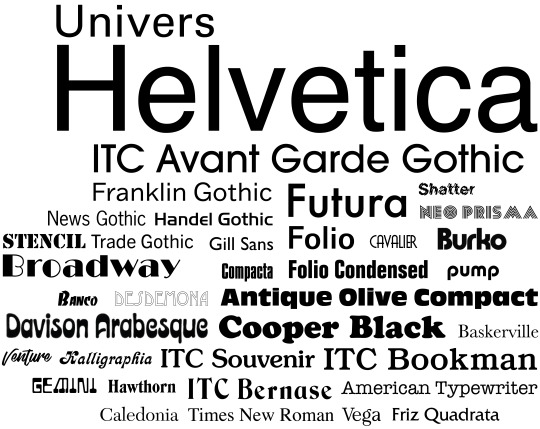
Could the backlash Helvetica faced during the 1970′s be because design had evolved past the need for the typeface? Perhaps because Helvetica was used so much during the 1960′s, typeface design had worked overtime to compete, and by the 70′s there were better fitting or more interesting options.
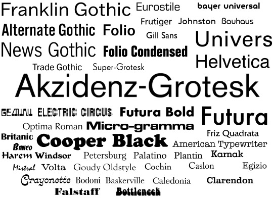
“As it concerns identity design we all recognize Helvetica as a bastion of the rise of the practice of corporate identity in the 1960s, deployed with unrelenting passion by the likes of Massimo Vignelli and Unimark in the U.S. and Total Design in Europe. It helped shed decorative logos and present a unified front for corporations of all sizes in the most serious of manners. It was, in a way, a unifying technology of the era, establishing a specific standard for how logos should look. And that's my biggest issue with Helvetica: It's 1960s technology, 1960s aesthetics, 1960s principles.”
- https://gizmodo.com/why-i-hate-helvetica-5919546
The backlash Helvetica faced during the 1970′s is absolutely more about it’s usage than it’s form, although, of course there are those who will critique the typeface design.
“Perhaps a lot of the present-day ill-will towards Helvetica stems from the bandwagon or me-too mentality — it’s kind of cool to be ‘in on the joke’ and, like the conspiracy loons, who revel in their ‘knowledge’ of clandestine secrets, they take smug solace in their shared vituperative consternation.“
“Compared to Akzidenz Grotesk, Helvetica has hardly any new features. Though claimed to be an improvement on Akzidenz Grotesk, it lacks all the character and charming clumsiness of Akzidenz Grotesk. Helvetica is blunt and colourless; the fact that its italic is slanted makes it even blunter. What a missed opportunity!“
- https://ilovetypography.com/2015/06/27/the-last-word-on-helvetica/
“I also was morally opposed to Helvetica because I viewed the big corporations that were you know, slathered in Helvetica as you know, sponsors of the Vietnam War. So therefore if you used Helvetica it meant that you were in favor of the Vietnam War. So how could you use it?“
- Paula Scher. ‘Helvetica’ (2007)
“That criticism was overstated, he recently told Magenta. A bigger, widespread crime, according to him, is now widespread — the lazy practice of defaulting to all-caps Helvetica type. “People are barely even seeing that, if they’re reading it at all,” he says. “Because we’ve seen it everywhere, it’s always kind of forgettable.” It’s easy to see why Carson thinks that mainstream graphic design has taken an antiseptic turn flipping through the off-kilter, visually arresting, and mood-setting spreads of old Ray Gun issues.”
- https://magenta.as/the-father-of-grunge-typography-calls-out-lazy-design-daae470a685a (David Carson)
1 note
·
View note
Text
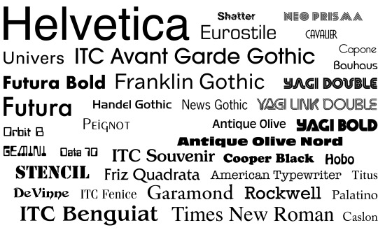
The rise and popularity of Helvetica.
“In 1947, Hoffman hired a talented designer named Max Miedinger as a customer counsellor and typeface sales representative for the Haas Studio in Münchenstein near Basel. Miedinger was trained as a typesetter and had attended evening classes at the Kunstgewerbeschule in Zurich. Between 1936–46, he worked as a typographer in the studio of the town’s Globus department store. In 1956, he went freelance, and Hoffman commissioned him to work on Haas’s new sans serif typeface. Hoffmann also directed Hermann Eidenbenz’s work on Clarendon.
Hoffman and Miedinger were motivated by the renewed, post-war demand for san serifs in Europe at the time. European sans serif typefaces were of a distinguished pedigree. Experts consider them descendants of the great Khan of the San Serifs: Akzidenz Grotesk. However, Hoffman and Miedinger felt th older ideas needed refreshing. Dan Reynolds writes: “While Helvetica was not simply a reworking of Akzidenz-Grotesk, its initial development as Neue Haas-Grotesk in Switzerland reflected, in part, the popularity that Akzidenz-Grotesk had begun to enjoy in Western European graphic design during the immediate postwar years.”
- https://uxdesign.cc/an-ode-to-the-joy-of-retail-therapy-3e5d148445c9
“Postwar movements sought, like the Romantics before them, to emphasize the foolishness of the elites. One particular line of attack was on the serif. What had once seemed ornate and the very definition of “civilized,” harking back to the grand Roman Empire, was now viewed as chintzy and messy. Designers sought to distance themselves from the aggression and destruction of European imperialism, which was embodied in the serif.”
- https://modus.medium.com/the-serif-66c4830c8a3f
Helvetica was first released in 1957, under the name Neue Haas Grotesk.
“Swiss designers Emil Ruder (1914-1970) and Armin Hofmann (born 1920) were on the faculty at the Basel School of Design, and it was their teachings that gave rise to the Swiss Style of design during the 1950s and 60s. Ruder was the typography instructor, placing great importance on the use of sans-serif typefaces. He taught that type loses its purpose when it loses its communicative meaning; therefore, legibility and readability are main concerns. "Typography has one plain duty before it and that is to convey information in writing," he said. The even and almost homogenous form of Helvetica (Latin for Swiss) aligned well with the school's typographical philosophy.”
- https://www.bbc.co.uk/news/blogs-magazine-monitor-26383185
In 1960, Neue Haas Grotesk was renamed as Helvetica, in order to improve its marketability in the United States.
“Not long after Helvetica's release, students from the Basel School of Design spread the typeface's merits to the US when they returned to Yale and other American schools (Mike Parker graduated from Yale with a Masters in design).”
- https://www.bbc.co.uk/news/blogs-magazine-monitor-26383185
During the 1960′s and 1970′s, Helvetica was a popularly used typeface for billboards and general advertising.
“Helvetica’s sleek lines and modern sensibilities were just what companies were looking for to remake their identities and set themselves apart from the past.
Corporations stick by Helvetica because of what they have invested in it. Because of this, it has become associated with corporate culture and business to some degree. This is one reason why American Apparel chose to use the font for their own brand identity to poke fun at corporate culture in America.”
- https://www.webdesignerdepot.com/2010/01/the-simplicity-of-helvetica/
“Some design historians consider the popularity of Helvetica is a fluke. In my opinion, however, in matters of the collective public consciousness, like in a major tennis tournament, there are no accidental winners. It cannot be that one designer, on a whimsy, decided to use Helvetica. From one throw-away advert in a barely read publication, Helvetica simply by a process of accidental reuse became one of the most prominent public typeface in the United States. It just doesn’t work that way.“
- https://uxdesign.cc/an-ode-to-the-joy-of-retail-therapy-3e5d148445c9
In the late 1960′s, Helvetica was used for the restyled New York Metro map.
“Helvetica is particularly well-suited to signage and other designs where legibility is key. This is further reinforced by the wide variety of companies that have used the font in their logos or other corporate identity materials (American Apparel, American Airlines, Target, the NYC Subway, etc.)”
- https://www.webdesignerdepot.com/2010/01/the-simplicity-of-helvetica/
in 1983, Helvetica was restyled for digital use, and in 1984 it was released on the first Macintosh computer.
A review of Helvetica: A Documentary “Second, the meat of the film is a story of the font in modern, post-modern, and contemporary Western culture, which goes from the historical moment in modernist design in which it first emerged in the ’50s, its creation and instant explosion in the ’60s and early ’70s, the post-modern reactions against it in the late ’70s and ’80s, its rebirth as a standard computer font in the ’90s, and then to the present day.”
- https://mmderakhshani.github.io/posts/2011/03/helvetica-a-documentary-a-history-an-anthropology/
1 note
·
View note